
You’ve spent money on the bed frame. You’ve agonised over the bedding. You’ve got the lighting more or less sorted. And then the wall directly behind the most important piece of furniture in the room is just… paint. Maybe the same paint as every other wall. Maybe a slightly different shade if you were feeling adventurous. The bed back wall is the single most visible surface in the bedroom, the backdrop to the room’s central composition, and treating it as an afterthought is a design decision by default that these ideas will make you deeply regret tolerating.
The Back Wall Architect
Transform the room’s most consequential surface from an afterthought into a masterpiece.
Why the Wall Behind Your Bed Is the Room’s Most Consequential Design Decision
Everything in a bedroom orients toward the bed. It’s the largest piece of furniture, it occupies the room’s primary visual axis from the doorway, and it’s the first thing anyone sees when they enter. The wall behind it isn’t a supporting player — it’s the backdrop to the room’s entire composition, and whatever you put there determines the visual register of everything else. A plain white wall behind an excellent bed frame makes the bed look like it was placed in front of a wall that wasn’t ready for it. A considered back wall treatment makes even a modest bed frame look intentional.
The back wall needs to extend beyond the headboard width to read properly
The most common mistake with bedroom back wall treatments is stopping the feature exactly at the width of the headboard or the bed frame. A back wall treatment that exactly matches the headboard width looks like a panel stuck behind the bed rather than an architectural feature of the room. The treatment needs to extend to the full wall width — or at minimum significantly beyond the bed’s footprint — to read as a wall feature rather than a headboard accessory. The difference in impact between these two approaches is not subtle.
Height matters as much as width — most back walls are underscaled vertically
A feature panel that stops at a visually arbitrary height, or a wallpaper application that doesn’t reach the ceiling, produces a back wall treatment that looks incomplete rather than designed. The most impactful bed back walls run from floor to ceiling, or from floor to ceiling with a deliberate cornice or trim detail that makes the stopping point look intentional rather than limited. Partial-height treatments require more design skill to execute properly than full-height ones, and they fail more visibly when they don’t work.
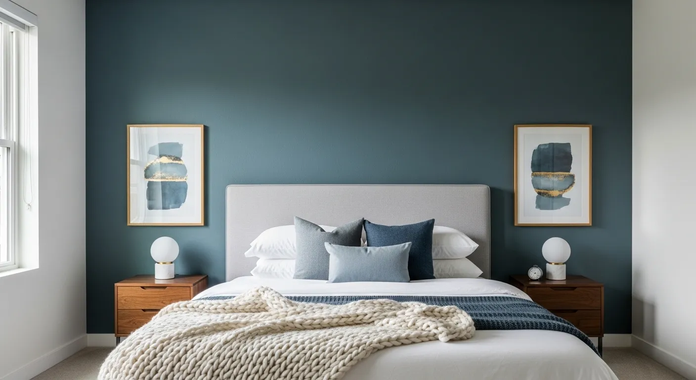
The relationship between the back wall and the headboard determines the room’s focal point
A headboard that disappears into a back wall treatment — matching in colour or material in a way that creates no visual distinction — produces a composition that has no focal point. A headboard that contrasts sharply with the back wall in colour, texture, or material creates the room’s primary focal point immediately. Getting this contrast relationship right — enough differentiation that the two elements read as distinct layers, but enough shared design language that they clearly belong together — is the central design challenge of the bed back wall and the thing that most attempts get wrong.
Lighting built into or directed at the back wall transforms the material’s appearance
Almost every back wall material — timber panelling, stone, fabric, plaster, tile — looks significantly better when it’s lit. LED strips behind a headboard that wash the back wall with warm light, recessed spots directed at a stone or plaster feature, perimeter cove lighting that grazes the back wall surface — these treatments turn a material that looks competent in daylight into something that looks extraordinary in the evening. The lighting design for the back wall is as important as the material selection, and should be planned before the material is installed, not added afterward.
The Architectural Anchor
Why the wall behind your bed is the room’s most consequential design decision.
Extend beyond the headboard
A treatment that matches the bed’s exact width looks like a stuck-on accessory. It must extend significantly beyond the footprint to read as genuine room architecture.
Vertical scale is non-negotiable
Panels that stop at arbitrary heights look incomplete. The most impactful walls run from floor to ceiling or terminate at a deliberate architectural cornice.
Contrast creates the focal point
A headboard that camouflages into the wall creates a visual dead zone. Sharp contrast in colour or texture against the back wall establishes the room’s primary focal point instantly.
Integrated lighting reveals texture
Materials look competent in daylight but extraordinary when lit. LED halos or perimeter grazing turn texture into drama. Lighting must be planned before installation, not after.
Bedroom Bed Back Wall Ideas
Warm Timber Chevron Panel With LED Halo and Crystal Chandelier
A large-format warm timber panel in a fine chevron inlay pattern running floor to ceiling and wall to width behind the bed, LED strip lighting creating a warm halo along the panel’s perimeter on all four sides, and a sculptural ring crystal chandelier overhead providing the room’s overhead drama. A channel-tufted taupe velvet headboard sits in front of the lit panel, a tufted bench in matching fabric at the bed’s foot, and a single circular gold wall sconce providing the nightstand lighting on the right side. The surrounding walls and ceiling in near-black graphite make the warm timber panel the room’s only point of warmth and light. Pro tip: A lit perimeter behind a headboard panel — LED strips hidden in the reveal between the panel and the surrounding wall — creates a floating effect that makes even a simple timber panel look bespoke, and the warm tone of the LED against a dark surrounding wall does more atmospheric work than any decorative element you could add to the surface of the panel itself.
Dark Navy Wall With Flanking Timber Slat Columns
Deep navy matte paint covering the full back wall with two vertical columns of warm dark timber acoustic slats flanking either side of the bed zone — narrow enough to function as texture elements rather than competing panels, wide enough to read as architectural features rather than decorative trim. A round gold-framed mirror centred above the channel-tufted navy velvet headboard reflects light back into the room. Two rattan pendant lights hanging at nightstand level replace table lamps entirely. Matching warm oak nightstands with pampas grass and small white ceramics, a plush grey shag rug, and a ceiling fan overhead maintaining the warm-toned practicality. Pro tip: Flanking vertical slat columns on either side of a painted back wall add three-dimensional texture to what would otherwise be a flat colour treatment without requiring the full-wall commitment of a slat installation — they frame the bed zone architecturally while letting the paint colour carry the room’s atmosphere.
Dark Grey Ribbed Wall With Illuminated Arch
A full-width, full-height dark grey ribbed plaster wall with one dramatic element: a tall arch shape traced in warm LED strip lighting that frames the headboard zone from floor level to ceiling height, creating a glowing architectural surround for the bed without any additional surface treatment. Two gold globe pendant lights hang at asymmetric heights flanking the arch. A charcoal channel-stitched duvet, dark taupe cushions, and a circular patterned rug in warm ochre and brown tones sit in front of the wall. A fluted black cylindrical nightstand with sculptural objects and a warm-toned ceiling cove lighting complete the composition. Pro tip: An LED-lit arch integrated into a back wall is one of the most cost-effective high-impact treatments available — it requires no expensive surface material, adds architectural scale through lighting rather than construction, and creates a focal point that photographs dramatically and looks even better in person.
Full-Width Dark Panelled Wall in Grid Pattern
A full-width, full-height grid panel wall in deep near-black navy with equal rectangular raised panels running in a regular grid from skirting board to ceiling — no LED strips, no integrated lighting, no material variation, just the shadow depth created by the raised panel geometry against the same paint colour. In front of it, a grey upholstered headboard with clean architectural segmentation, white crisp bedding with navy velvet cushions and a grey throw runner, and matching white nightstands with grey-bodied table lamps on either side. The restraint is the point. Nothing competes. Everything is in service to the wall’s quiet authority. Pro tip: Grid panel walls painted in the same colour as the background wall — with no contrast between panel and field — derive all their visual interest from shadow depth alone, which means the panel profile needs to be substantial enough to cast visible shadow at normal room lighting levels; thin MDF strips painted over will look flat and unimpressive, while deeper routed or applied panels with a proper reveal depth will create the shadow geometry that makes the whole treatment read as architectural.
Warm Timber Slat Wall Continuous From Ceiling to Headboard
Warm dark timber slats running continuously from the ceiling plane down the back wall — the slats transitioning from horizontal on the ceiling to vertical on the wall in a seamless flow that makes the ceiling and wall read as one continuous surface — with warm LED strip lights integrated into the slat channels creating parallel lines of warm light. Flanking the bed, vertical panels of hexagonal gold mirror tiles arranged in stacked columns with hexagonal wall sconces in warm white providing the bedside lighting. A grey suede upholstered bed with V-shaped geometric headboard detailing, abstract brushstroke print bedding, gold accent strips on the bed frame, and a cream shag rug at the foot. Pro tip: When timber slats transition from a ceiling plane to a wall plane in a single continuous installation, the junction between ceiling and wall must be handled with a deliberate curve or a clean mitre — any visible gap or rough transition at that junction will draw the eye and undermine the seamless effect that makes this treatment look genuinely custom rather than assembled from two separate panels that happen to meet at a corner.
Oak Panels & LED Glow: Get Calm With Texture, Not Boredom
If you’re after that zen vibe minus the cheesy spa clichés, start with oversized, vertical pale oak panels for your bed wall—size matters here, so go tall and wide, not dinky planks. Keep seams subtle: nothing ruins the flow like busy lines. Slide in horizontal linear LED uplighting just above your headboard to spotlight that grain, but don’t go overboard; a soft glow beats airport runway vibes. Build slim brass shelves right into the wall and stick to minimalist ceramics—no tacky collectables. Pro move: Float your nightstands and ensure all lighting (hello, indirect cove!) stays warm. If you crave peace, dial back the pattern and keep your bed neutral; paint those linens creamy and let the oak take the lead.
Champagne Checkerboard Wall: Flex the Glam, Ditch the Flat
If your inner diva needs a wall to match, do not shy away from custom geometric paneling. Alternate glossy champagne lacquer with matte frosted glass for a checkerboard that’s all drama, no disco. Frame it out with perimeter LED strips, because ambient light is way chicer than harsh overheads. Center your bed against a thick velvet headboard and throw in mirrored nightstands—yes, mirrors double the impact and fake extra space. Pro tip: Keep pendant lights slim and bedding crisp white; the contrast lets your wall shine, not distract. Herringbone wood floors with sculptural vases put the ‘glam’ in your glam; resist the urge to crowd—this wall screams luxury when you let it breathe.
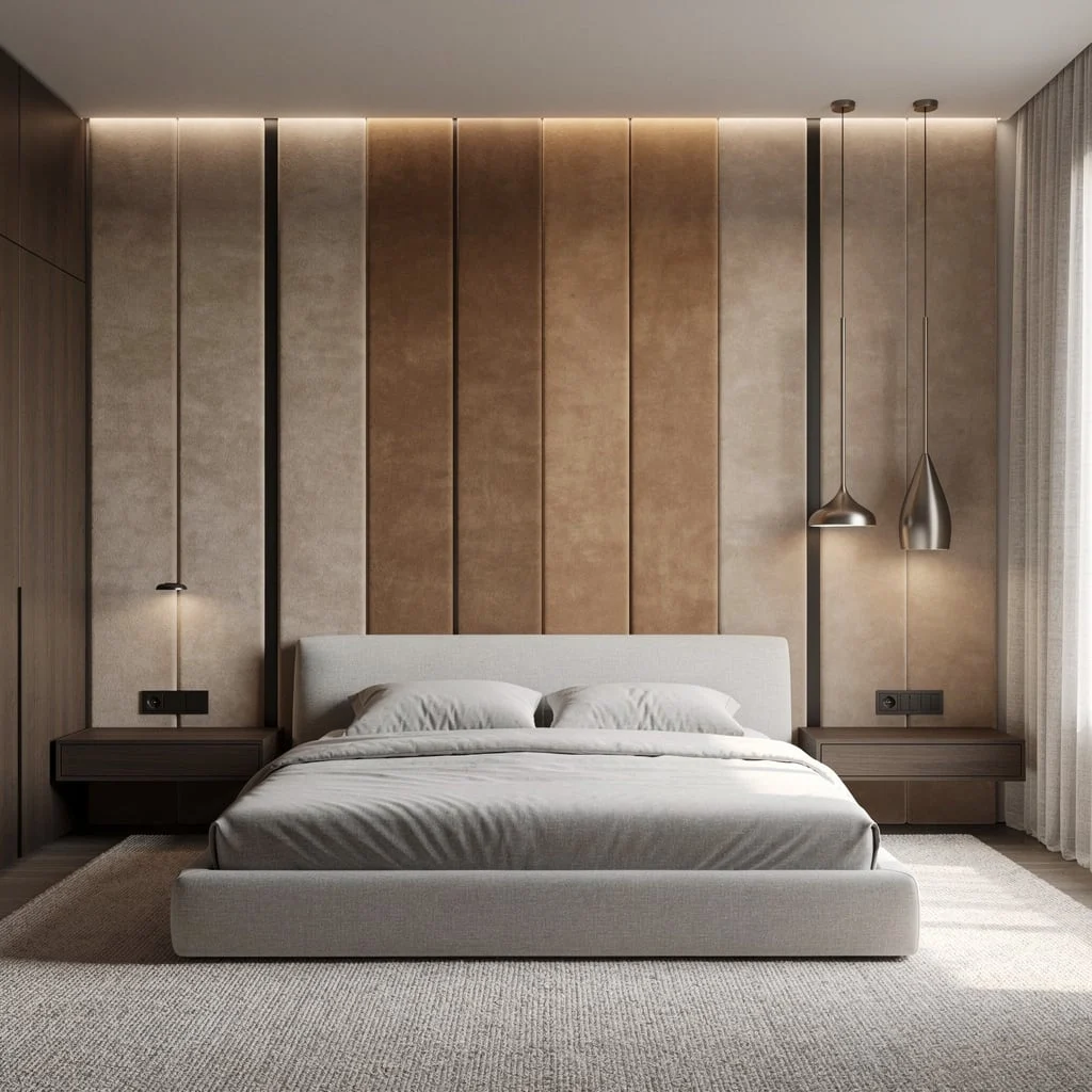
Leather Panel Wall: Chill Tactile Luxe Minus Cringe
For a calm, grown-up vibe, stack oversized leather panels horizontally in muted taupe (don’t look for vibrant colors, you’re not at a bachelor pad). Divide with skinny brushed bronze trim to add metallic punch without going tacky. Embed concealed LED spotlights above your headboard and let the light wash gently—never spotlight like you’re interrogating the bed. Float a walnut nightstand (just one if you want asymmetry) and stick to minimalist upholstery in linen tones. Major flex: Slap an earthy-toned mural above the panels, but keep colors grounded and brushy—not literal landscapes. Keep carpeting pale, wall sconces minimal, and ensure every texture feels layered. Fun fact: Horizontal lines make your room feel wider, which is a sneaky hack for small spaces.
White Marble Slab Wall: Drama Without Going Full Kardashian
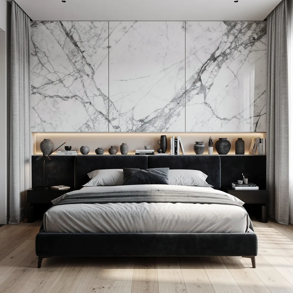
Ready to drop jaws? Go for oversized marble slabs on your back wall and pick ones with gnarly gray veins—plain stone is just depressing. Keep joints seamless, because nothing kills luxury like obvious grout. Install a full-width shelf behind your headboard and add warm LED strips underneath; books and black-and-white ceramics keep it gallery, not granny. Park your bed against charcoal velvet for instant contrast, but keep your bedding linen and light, not shiny. Pro hack: Black bedside tables and light oak flooring anchor the space. Hang curtains floor-to-ceiling, and always go light gray—never matchy-matchy with the wall. Dead simple trick: Integrated illumination makes marble pop at night, so test your lighting at dusk before you commit.
Abstract Wallpaper Mural: Your Wall Is Not a TV Screen
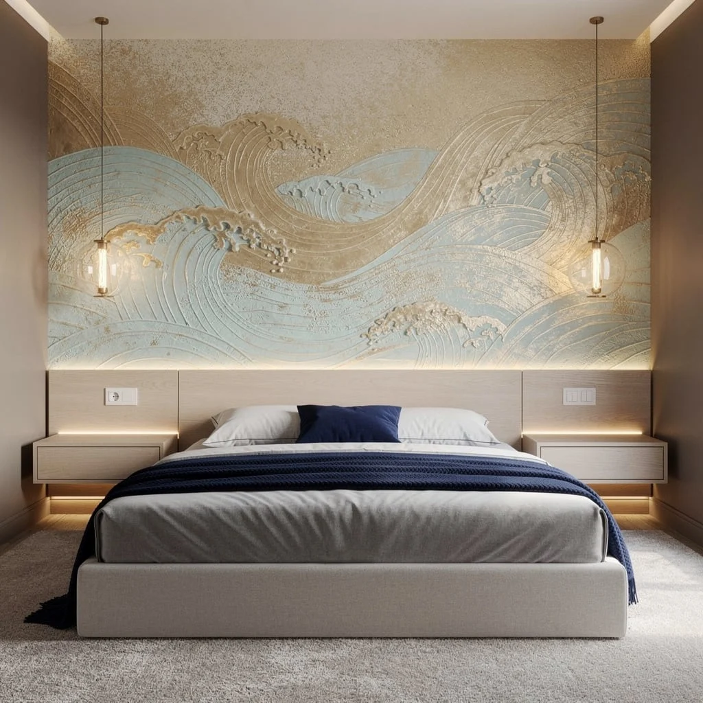
If you refuse to settle for basic paint, wallpaper murals with abstract waves in gold and powder blue are your ticket (skip literal landscapes, unless you’re stuck in 1997). Go for touchable embossing—flat paper is amateur hour. Place your bed against a slim wood headboard, then add floating nightstands with integrated strip lighting so everything glows, not glares. Pro tip: Hang glass orb pendants right where your hands can’t smack them in the dark; symmetry is overrated—just balance height visually. Keep carpeting plush and pile a navy blanket for grown-up luxury. Don’t let your wall art do all the talking; taupe walls and minimalist decor keep the mural from screaming. Major cheat: Don’t crowd with more artwork—let wallpaper own the drama.
Porcelain Tile Back Wall: Clean, Seamless, and Totally Unboring
Tired of walls that look like you gave up halfway? Swap for oversized, overlapping porcelain tiles in sage—muted wins over bold, unless you want ‘hospital chic’. Leave discreet horizontal gaps and backlight with ambient LEDs for mood-setting without turning your room into a club. Throw a pale linen headboard against the tiles, and build floating shelves at both ends for minimalist decor: only one accent piece per shelf, or risk clutter hell. Bronze pendant lights add a low-key shine, and pale oak plank floors keep it all feeling fresh. Keep your area rug toned down and textured, so nothing fights with the wall. Ultimate hack: Stagger tile overlaps to avoid the dreaded grid look—seriously, you’re not laying subway tile.
Maple Cabinetry Wall: Storage That Smacks of Designer (Not Dorm Room)
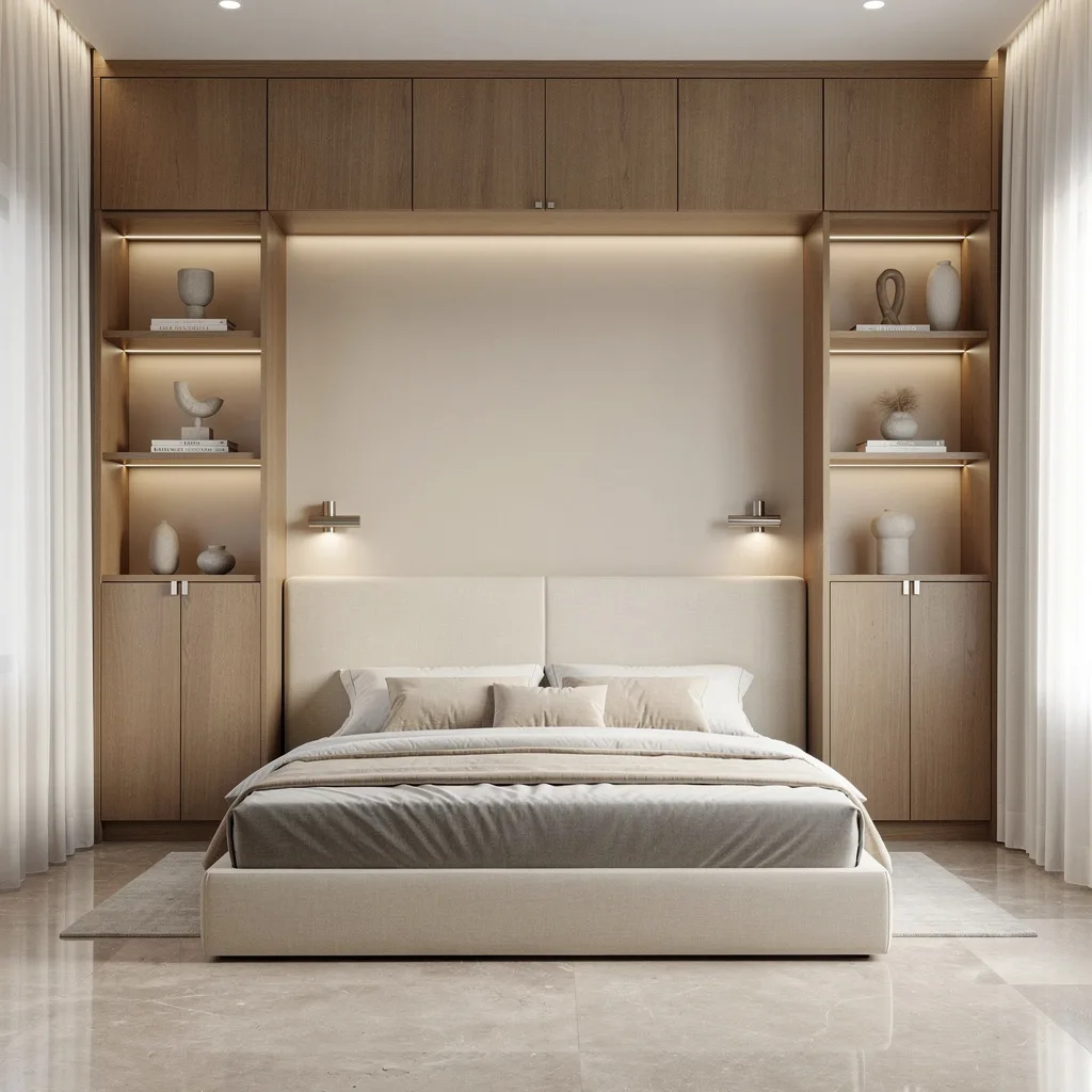
Want your back wall to actually do something? Go full-height custom cabinetry in warm brushed maple and integrate open niches—not those cheap cubbies, but real, softly-lit display spots. LED spots inside each niche make even your boring vase look expensive, just keep decor minimal. Match your bed’s headboard in creamy tones to the cabinetry—otherwise it’ll look like you raided the showroom. Polished stone flooring adds luxe points and makes vacuuming a breeze. Don’t skip brushed nickel sconces for grown-up lighting just above the bed, and keep your drapery soft and white. Pro styling tip: Align niche height with your headboard so nothing gets lost, and always go wider rather than taller for backdrops—vertical lines are for other wall types.
Dove Gray Plaster Wall: Moody Texture That Makes Art Pop
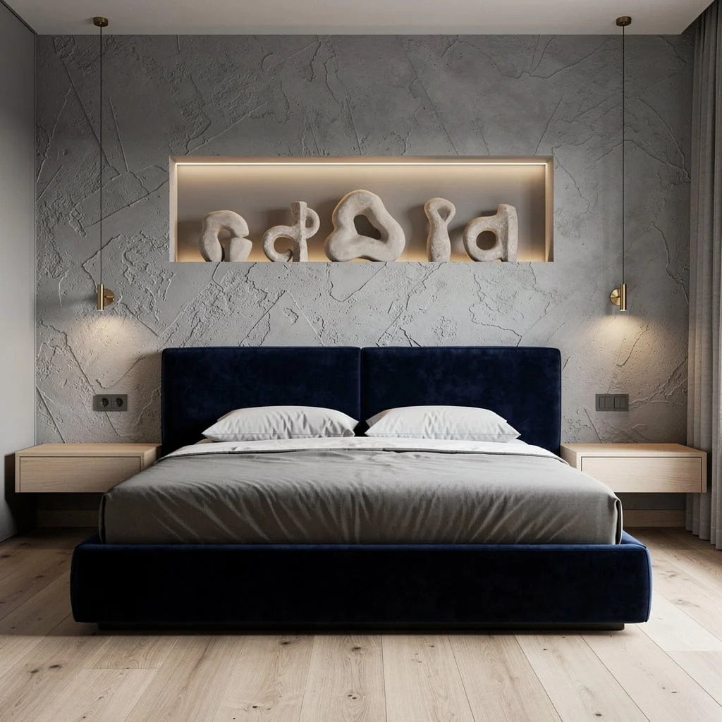
If you’re craving art gallery vibes, slap textured plaster on your wall in dove gray, and hand-trowel for that bespoke, never-replicable finish. Cut in a rectangular niche above your headboard and spotlight sculptural objects with hidden warm LEDs—basic lamps won’t do. Make your headboard deep midnight blue velvet, because contrast is king, and stick to minimalist floating tables so nothing blocks the wall drama. Light accoya wood floors prevent the look from getting stuffy, and brass spotlights are the only accents you need—gold just looks try-hard. Secret move: Use soft white bulbs to prevent your objects from looking sad and flat, and always aim for that niche to be wider than the headboard.
Travertine & Brass Strips: Stone Statement, No Italian Villa Cringe
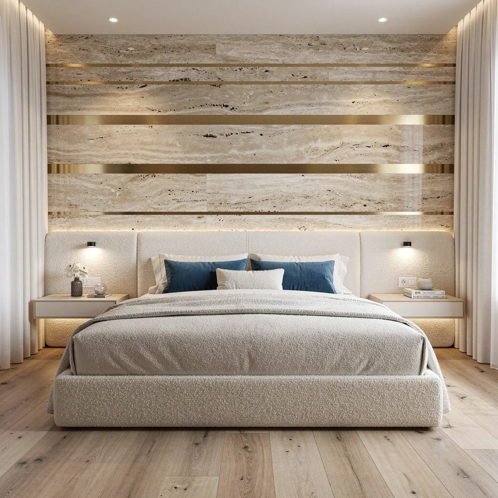
Who says stone walls have to look cold or ancient? Alternate wide polished travertine strips with slim satin brass inlays, running horizontal for rhythm that’s unmistakably modern. Center your bed against a creamy boucle headboard for tactile balance, then match with plush bedding for instant softness. Float nightstands to either side and only put subtle decor—think one object, max three books—illuminated with built-in spotlights. Wide plank light oak floors keep things grounded, while azure pillows and tall white curtains add just a hint of color and air. The pro secret: Horizontal bands visually stretch the space, so use this trick to fake bigger rooms. Don’t skimp on stone; fake versions always look lame.
Vertical Suede Gradients: Soft Luxury for Serious Vibes
Want a wall that feels as good as it looks? Go vertical suede panels in taupe and sand gradients, separated by skinny matte black spacers. Avoid fake suede—your wall isn’t a car seat. Integrate ambient LEDs above for soft, layered lighting, and anchor with a minimalist gray upholstered bed (nothing tufted, please). Pair ultra-slim floating nightstands in dark oak for a perfect contrast, and use soft carpet to tie in all the textures. Keep your pendant lights brushed gunmetal and your drapery linen and airy—heavy fabrics ruin the whole vibe. Pro tip: Gradients should run without harsh stripes, and always keep your spacing uniform. The magic is in the soft feel, not wild patterns.
Brushed Aluminum Grid: Modern Luxe Without The Tech Bro Glare
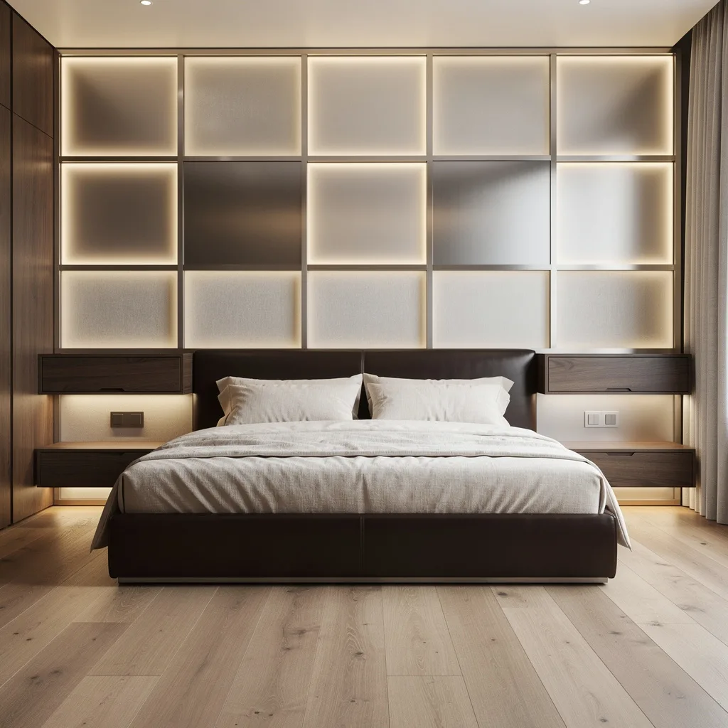
Go all-in with oversized brushed aluminum squares and frosted glass in a grid. Keep your hidden LEDs behind the panels, so the whole wall glows, not just random spots. Plant a low, sleek bed in dark espresso leather dead center—anything chunky kills the modern mood. Float walnut nightstands with built-in ambient lighting and only display objects you’d show to your mom, nothing cluttery. Lay wide plank oak flooring and layer creamy linen bedding for softness. The pro cheat: Always balance metal with natural wood, otherwise you’re creating an office, not a bedroom. Match your linen tones to the frosted glass for cohesion; don’t let aluminum streak the palette. Keep styling sparse—grid walls do enough talking.
Final Thoughts
A bed back wall that was genuinely designed — where the material was chosen for its specific qualities, the scale was committed to rather than hedged, the lighting was planned as part of the treatment rather than added afterward, and the relationship between the wall and the headboard was considered as a composed pair — changes the entire register of a bedroom. It transforms the room’s primary surface from a neutral background into the architectural moment the room was designed around. The plain painted wall behind the bed isn’t neutral. It’s just a decision that hasn’t been made yet.