
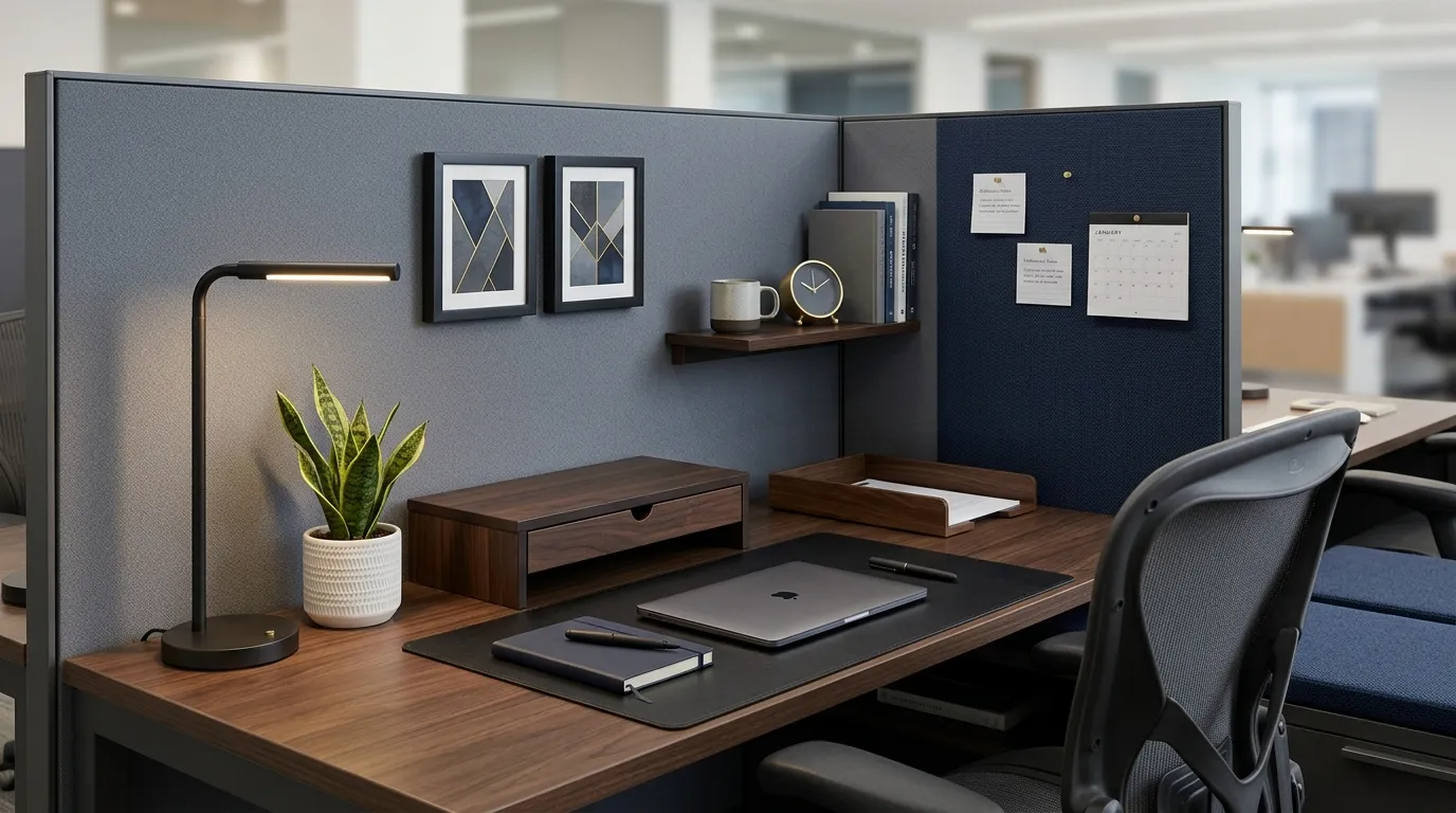
Beige is not neutral. It’s a decision, and most people made it by accident, decades ago, and nobody in facilities has revisited it since.
Walnut, brass, and a working desk lamp are also a decision. The difference is that one of those decisions makes you look like you were issued a cubicle, and the other makes you look like you chose one.
Nobody is asking you to install crown molding in a fabric-walled box. That’s not the assignment. The assignment is smaller and harder: making a rented six-by-eight-foot rectangle look like it belongs to someone who reads actual books.
This is the version of cubicle decor that doesn’t announce itself. It just quietly makes everyone else’s desk look unfinished.
The Difference Between Corporate and Trying
Fake Brass Is Immediately Obvious
Gold spray paint over plastic has a specific sheen, and everyone’s eye clocks it in under two seconds, whether they can name why or not. A lamp that looks like brass but weighs nothing gives itself away the moment someone picks it up.
Real brass tarnishes unevenly, develops small dark patches near the joints, and has actual weight in the hand. That imperfection is what reads as genuine. A uniform, mirror-bright gold finish reads as a costume.
Buy fewer metal objects and make them real, rather than filling the desk with a dozen gold-toned plastic accessories that all catch the light identically.
Too Many Table Lamps, No Focal One
A desk with three small lamps scattered across it looks like someone panic-bought lighting without a plan. None of them gets to be the star, so none of them registers as intentional.
One substantial lamp — a real banker’s lamp with a glass shade, or a solid brass gooseneck — should be the single dominant light source. Everything else on the desk should be lit by it, not competing with it.
If the overhead office lighting is already doing the practical work, that one lamp only needs to do the emotional work. Let it.
Antique Without Function
A vintage-looking object that doesn’t actually do anything — a decorative inkwell that’s never been filled, a rotary phone not plugged into a line — sits there as a prop, and props read as staged the moment someone looks twice.
The strongest classic desks use old-feeling objects for real tasks: an actual fountain pen that gets used, a genuine leather notebook that gets written in, a working desk clock that keeps real time. Function is what separates a collection from a museum diorama.
If an object can’t do its job, it doesn’t belong on the desk, no matter how good it looks in a photo.
Classic Cubicle Ideas
Walnut Riser Book Stack
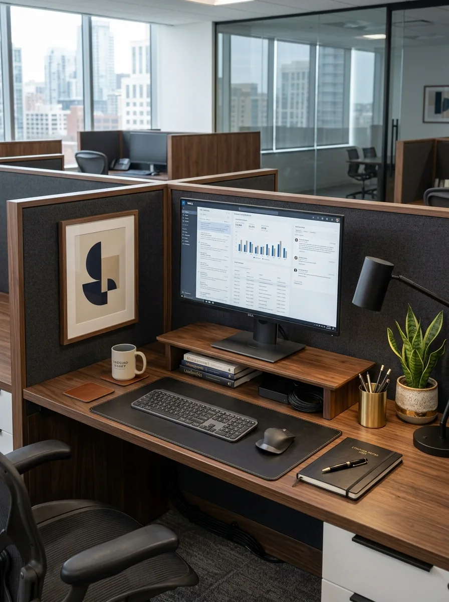
Anchor the desk with a low walnut monitor riser, and instead of leaving the space underneath empty, stack two or three real hardcover books inside it at monitor height. The books do double duty as both a riser and a small library, which reads as far more intentional than a plastic monitor stand ever could.
Add a small brass cup beside the riser holding actual writing pens, not a mixed bag of office ballpoints, and let a leather desk mat run the full width of the keyboard area. An abstract geometric print in a thin dark frame, hung slightly above eye level, gives the wall a single graphic anchor instead of a scattered collage.
Keep the plant to one structural variety — a snake plant works well here — rather than a soft flowering one. The hard, upright leaves match the geometry of the print and the clean lines of the riser instead of softening them.
Brass Mantel Clock Corner
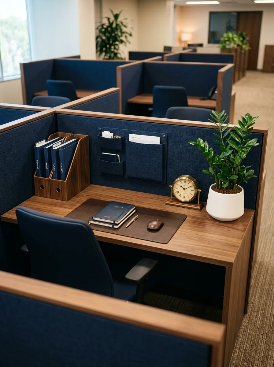
Center the back corner of the desk on a real brass mantel clock, the kind with a visible mechanism and a genuine tick, rather than a digital or battery display clock. Its slight imperfection in keeping time is part of what makes it feel like an object rather than a gadget.
Mount a fabric wall organizer in a deep navy directly above the clock, using its actual pockets for real mail and papers rather than leaving them empty as decoration. A single potted ZZ plant in a plain ceramic pot balances the clock’s weight on the opposite side of the desk.
Stack a small set of matching hardcover notebooks on the desk pad, spines facing out, so even the notebook collection reads as curated rather than grabbed from a supply closet.
Green Leather Desk Set
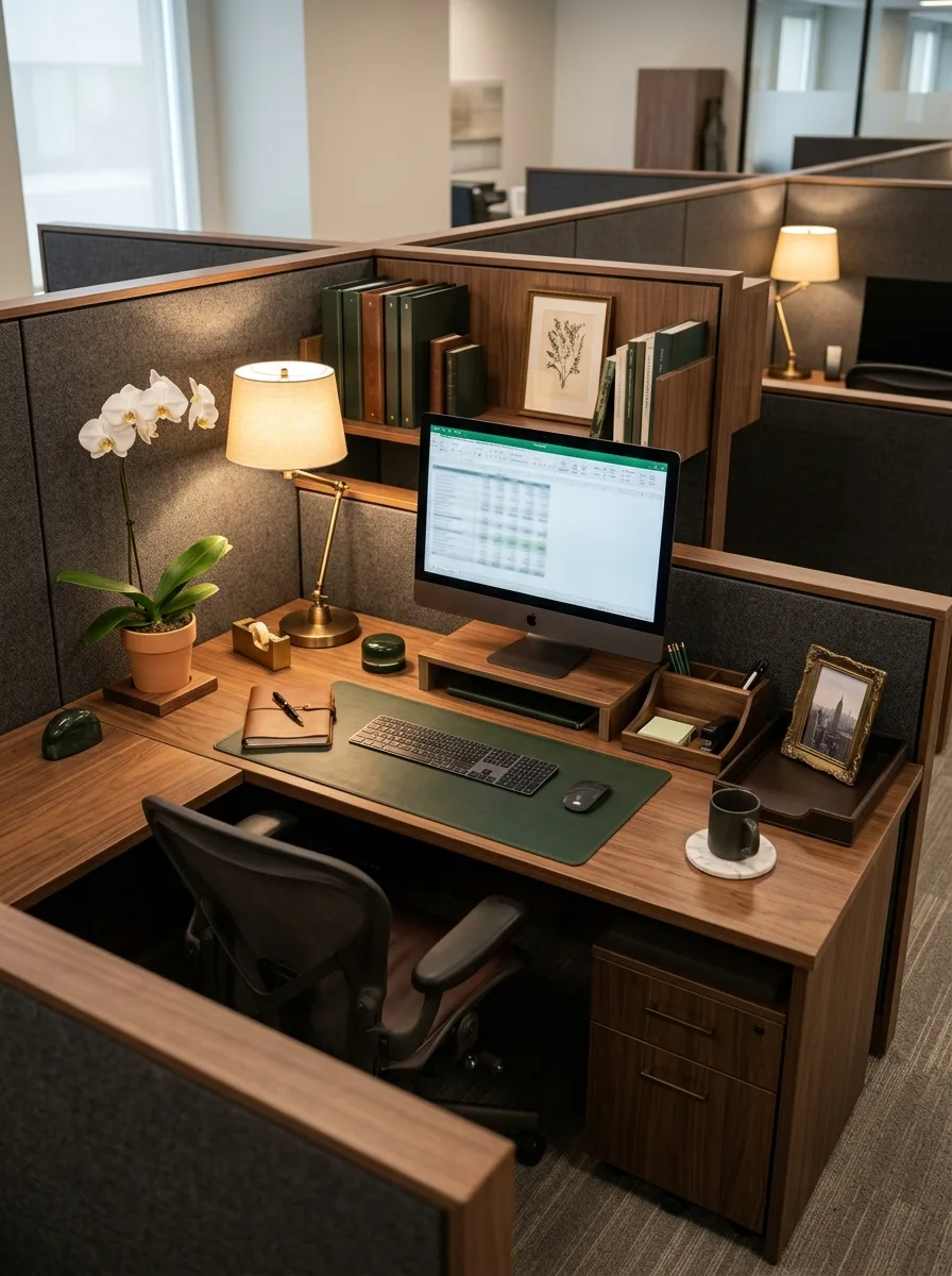
Lay down a deep green leather desk pad as the foundation, then build the rest of the surface around that single color rather than introducing green elsewhere. One strong color statement in leather is more effective than green accents scattered across five smaller objects.
Add a genuine brass banker’s lamp with a green glass shade positioned at the desk’s back corner, letting its light pool across the leather at an angle. A small potted orchid brings in the one soft, organic element the leather and brass don’t provide on their own.
Behind the desk, line a low shelf with dark green and burgundy book spines, mixed heights, spines slightly uneven rather than perfectly flush. A single framed botanical print leaning against the books, rather than hung, adds the feeling of a desk assembled over time instead of installed in one afternoon.
Blueprint Sketch Gallery Wall
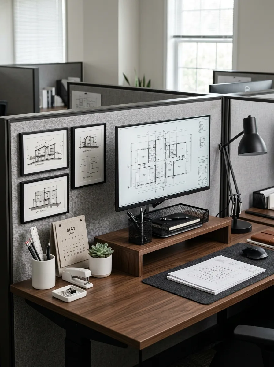
Hang three small black-framed architectural sketches in a tight horizontal row along the panel wall, each one a different building elevation, so the row reads as a body of work rather than three unrelated prints. Keep the frames identical in size and color for this one — this is the rare case where matching frames actually helps.
Set the monitor’s desktop wallpaper to an actual floor plan or blueprint image, letting the screen itself continue the drafting-table theme even when it’s on. A mesh pencil cup holding real drafting pencils sits just beside the monitor stand, doing real work rather than sitting there as a prop.
Weight the desk down with a stack of thick reference books beside a small potted succulent, and let a single loose desk calendar, not a bound planner, sit open on the mat. The looseness of a hanging calendar page against the precision of the sketches is what keeps the whole corner from feeling too stiff.
Vintage Map Framed Pair
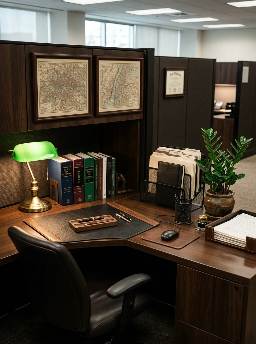
Hang two vintage city maps in matching dark wood frames side by side above the desk, chosen specifically for cities that mean something — a hometown, a place someone studied — rather than generic decorative maps bought for their color. Specificity is what keeps this from reading as a hotel lobby.
Below the maps, a genuine green-shade banker’s lamp lights a small built-in shelf of leather-bound reference books, spines slightly worn, arranged by height rather than color. A brass letter tray holds real correspondence rather than sitting empty.
Frame a single certificate or diploma-style print off to the side, at a slightly lower height than the maps so it doesn’t compete with them for attention. This corner works because everything in it looks like it was earned or chosen, not ordered as a set.
Woven Basket Wood Paneling

Cover the desk’s back panel in warm wood paneling rather than fabric, immediately shifting the whole cubicle away from standard office texture. Every object placed against that paneling should share its warm tone rather than fighting it with cool greys or blacks.
Fill two woven baskets with actual working file folders and notebooks, stacking them on the shelf above the monitor rather than tucking them out of sight. A small eucalyptus stem in a clear glass vase and a lit ceramic mug bring warmth and life to an otherwise hard-surfaced corner.
A cork board layered with a calendar, handwritten notes, and a small woven wall hanging finishes the top of the panel. The layering matters more than any single object — nothing on that board should look like it arrived alone.
Botanical Print Leather Pad
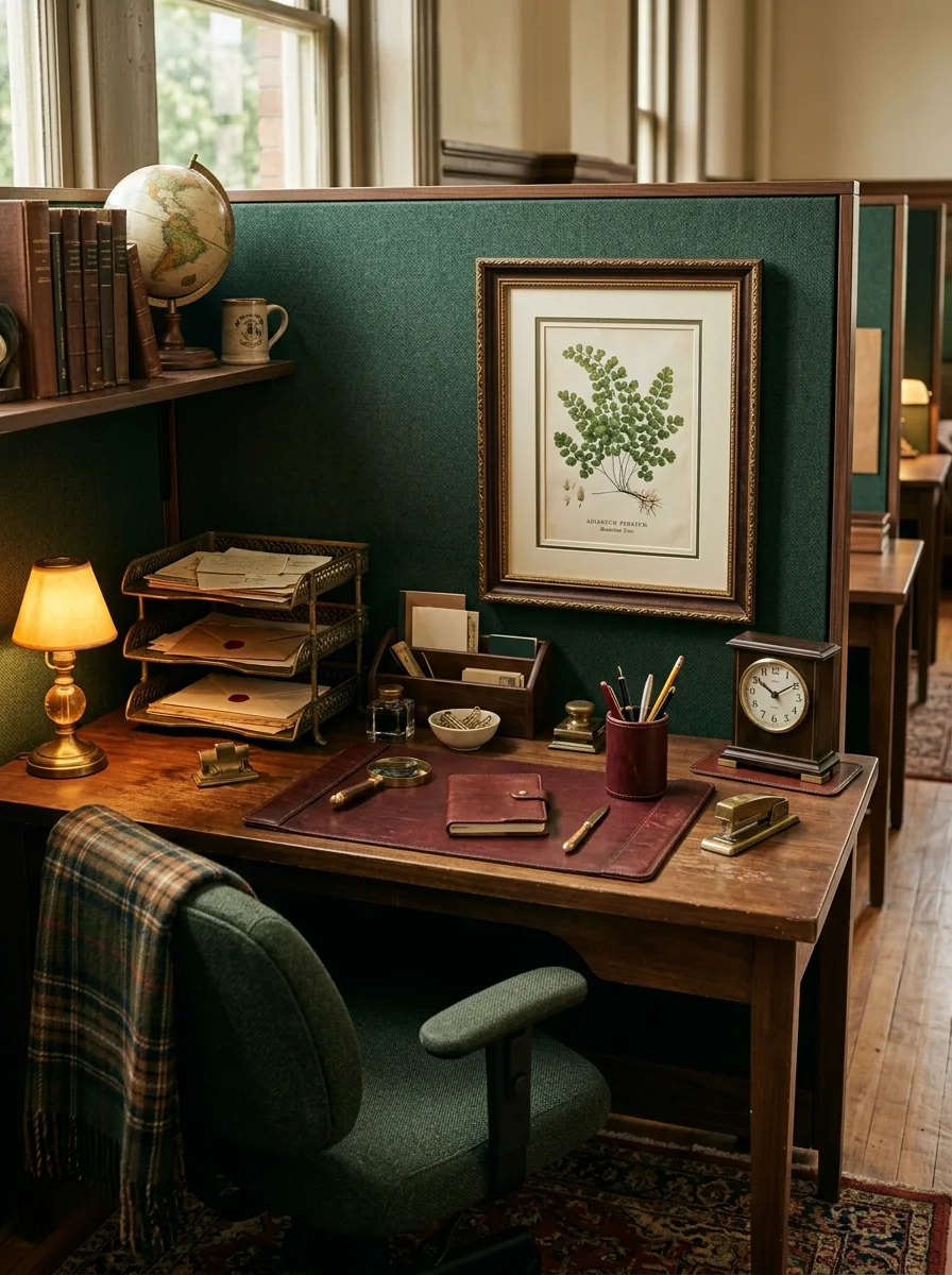
Frame a single detailed botanical illustration in a substantial gilt frame and give it the entire center of the back wall, rather than surrounding it with other art. One serious print, well-framed, outweighs a wall of smaller ones.
Below it, a brass banker’s lamp with a genuine glass shade lights a leather-topped desk arranged with a magnifying glass, a wax seal, and a leather journal — objects that suggest correspondence rather than spreadsheets. A small ceramic bowl holds loose paper clips instead of a plastic dispenser.
Drape a plaid wool throw over the back of the chair, letting one corner hang loose rather than folding it neatly. That one imperfect fold is what keeps the whole setup from looking like a furniture showroom display.
Bonsai Floating Corner Shelf
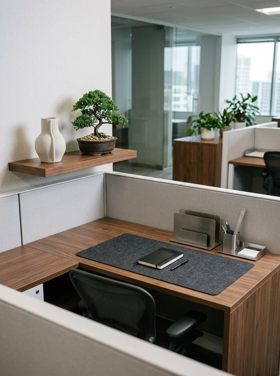
Mount a single slim walnut floating shelf at the corner where two panel walls meet, and give it exactly two objects: a live bonsai tree and one ceramic vase. This is the most restrained entry on the entire list, and it works because of that restraint, not despite it.
Beneath it, keep the desk itself almost entirely functional — a felt desk mat, a metal letter sorter, a simple pen cup — with no additional decorative objects competing with the bonsai for attention. The tree is doing all the personality work up top; the desk below just needs to stay quiet.
A single closed notebook and pen, placed at a slight angle rather than perfectly parallel to the desk edge, is the only concession to looking “styled” rather than simply tidy. Everything else here is function, on purpose.
Brass Frame Magazine Rack
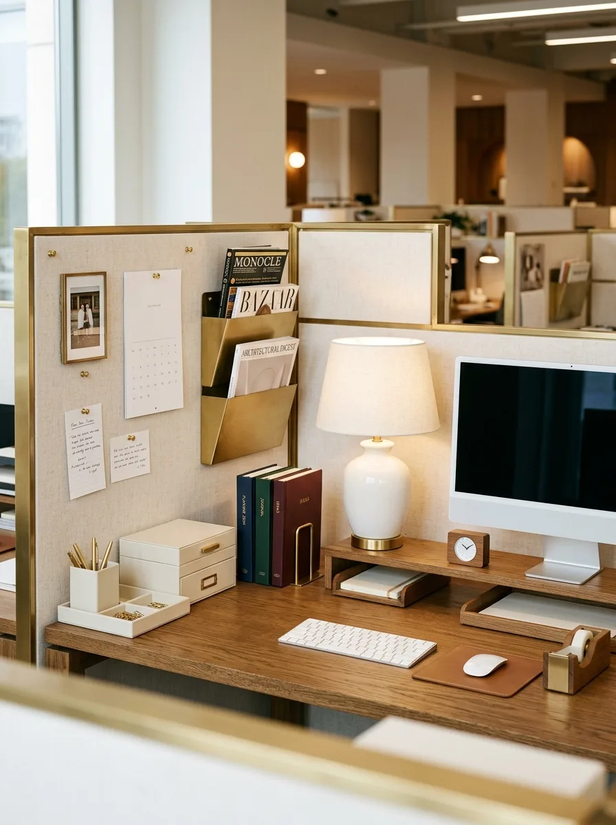
Frame the entire back panel in a brass border, turning the fabric wall itself into one large pinboard rather than treating brass as a small accent. A wall-mounted brass magazine rack holds real design magazines and hardcover books, spines out, functioning as both storage and art.
A single ivory ceramic lamp with a linen shade sits beside the monitor, its softer material breaking up what would otherwise be an entirely hard-edged, metallic corner. A small brass tape dispenser and stapler tray keep even the mundane office supplies in the same material family as everything else.
Pin handwritten notes and a small photo directly to the linen panel inside the brass frame, using the frame’s structure to keep what would otherwise look like clutter feeling instead like a curated board. The brass edge is what turns loose paper into an intentional display.
Black White Architecture Print
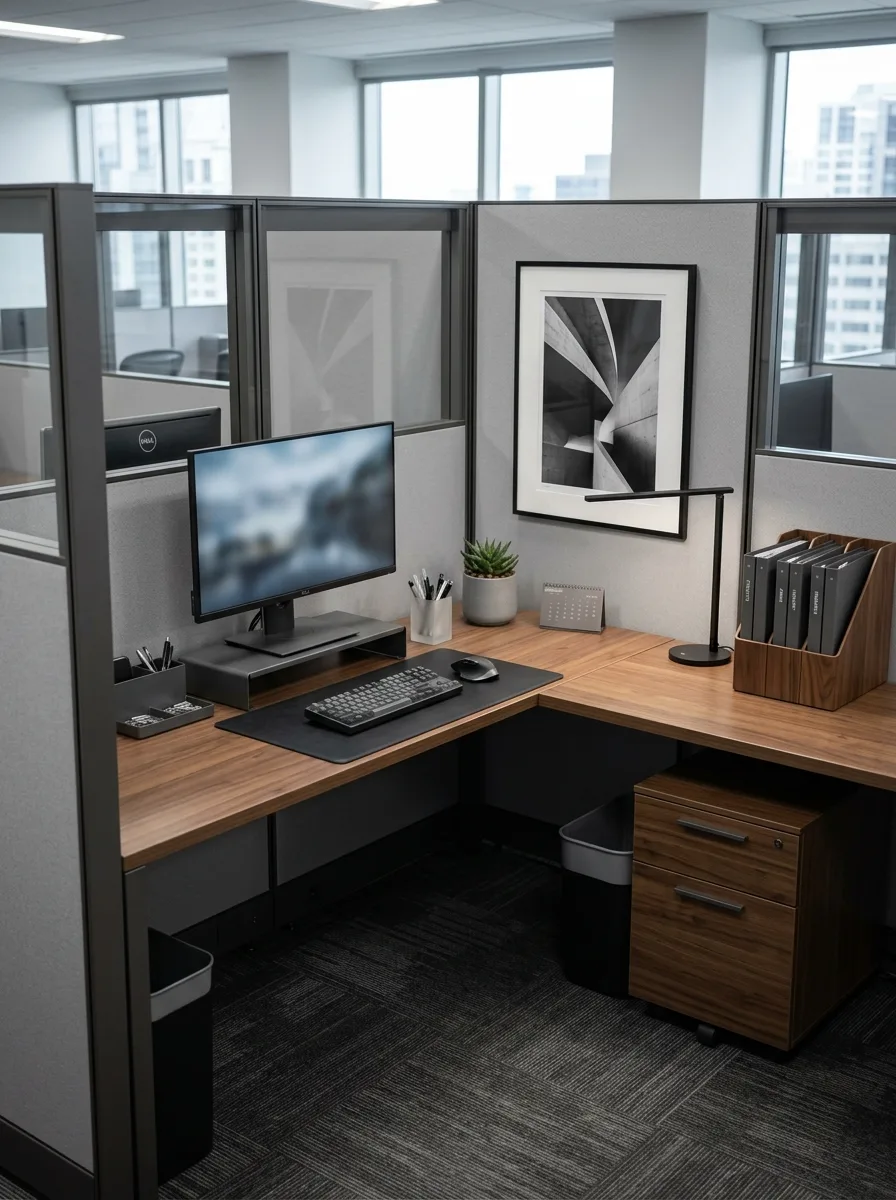
Choose one oversized black-and-white architectural photograph as the desk’s single visual anchor, framed simply in black with a generous white mat. Its scale does the work that five smaller prints couldn’t — this is one object clearly worth stopping to look at.
Keep the rest of the corner in matching dark tones: a black desk mat, a walnut file sorter, a small black metal lamp positioned to cast light across the keyboard at an angle. A single small succulent is the only organic object in the entire setup, and it’s enough.
Let the desk’s wood grain show through wherever the mat doesn’t cover it, since bare walnut against the black-and-white print is what keeps this look from feeling cold. Warmth comes from the material, not from adding more objects.
Leather Bound Book Wall
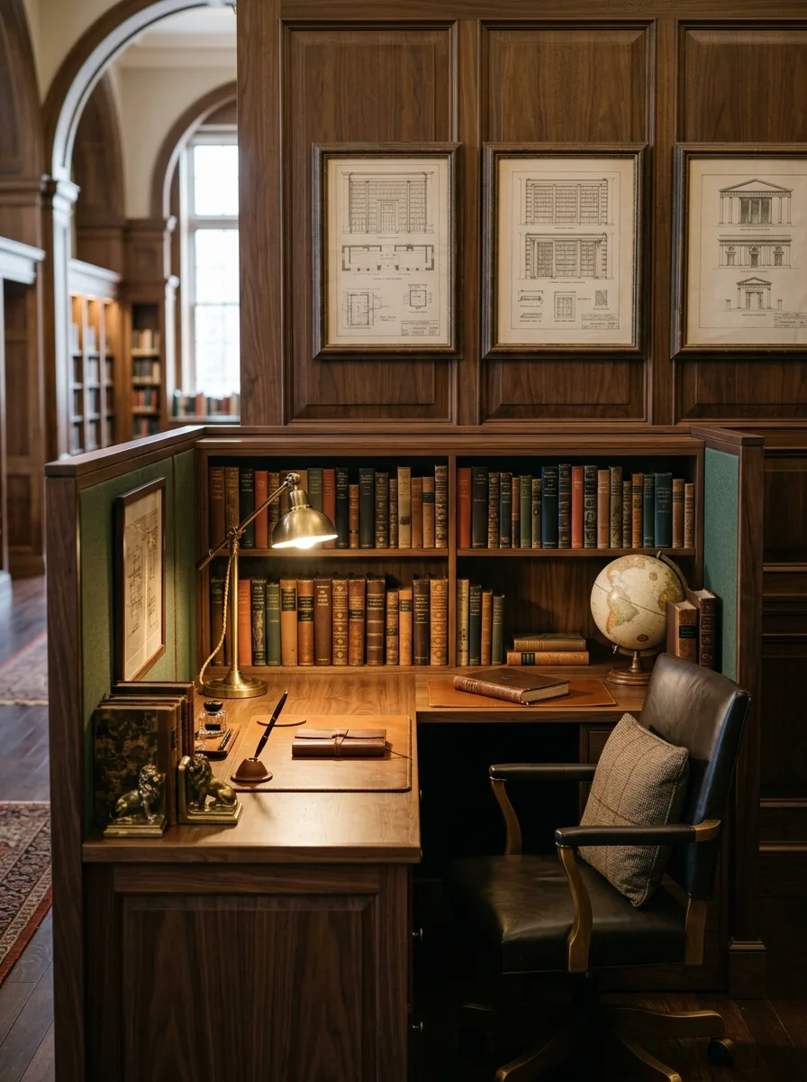
Build the entire back wall out of shelved leather-bound books, arranged in loose color blocks rather than alphabetically, with a small globe positioned at one end to break up the rows. The sheer density of real books is what makes this corner feel like a private study rather than a cubicle.
A brass gooseneck lamp with real weight and articulation lights the writing surface below, positioned so its arm extends over the desk rather than sitting straight up. A pair of bookend sculptures, heavier than they look, anchor a smaller stack of books directly on the writing surface itself.
Leave the desk surface otherwise nearly bare: a single closed leather journal, one fountain pen resting at an angle. The wall of books is already doing more visual work than any desk arrangement could add to.
Bamboo Stacked Storage Boxes
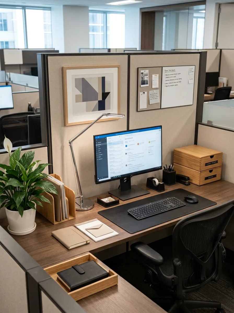
Stack two matching bamboo storage boxes with visible drawer pulls at one corner of the desk, using them for actual supplies rather than as pure decoration. Their pale wood tone against a darker desk surface is what gives this corner its contrast, so don’t paint or stain them to match everything else.
An abstract geometric print in muted tones hangs just above eye level, and a single peace lily in a plain white pot softens the otherwise angular composition. A slim wood file sorter holds real folders at the desk’s edge, in the same pale wood as the storage boxes.
Keep the desk mat neutral and unpatterned here — this look depends on the wood tones and the print doing the visual work, and a busy mat would compete with both.
Linen Fabric Box Stack
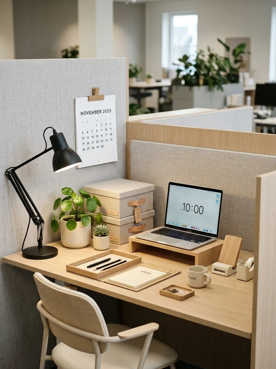
Stack a pair of linen-covered storage boxes with leather luggage-tag labels at the desk’s edge, treating them like small pieces of furniture rather than office supplies. The visible labels matter — blank boxes read as generic, labeled ones read as considered.
A single articulating black desk lamp, positioned close to the monitor, keeps the lighting modern against an otherwise warm, natural material palette. Two small potted plants in varied pot shapes sit near the lamp, deliberately mismatched rather than bought as a set.
A plain paper tray holding a stack of blank cream notecards finishes the desk’s working corner. The restraint in color here — mostly oak, linen, and cream — is what makes the one black lamp stand out as a deliberate contrast instead of a mismatch.
Green Banker’s Lamp Mantel
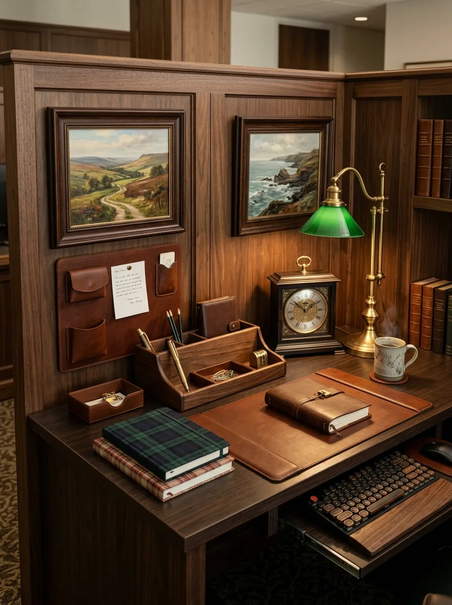
Anchor this corner with a genuine brass mantel clock and a green-shaded banker’s lamp positioned close together, letting their similar warm-metal tones read as a matched pair even though they’re two separate objects. A steaming mug placed just beside them adds the one lived-in detail that keeps the vignette from feeling staged.
Stack a plaid-covered notebook and a leather one together at an angle on a full-desk leather mat, rather than laying them flat and square. The slight angle suggests someone was just using them, which does more for authenticity than any prop ever could.
Behind the desk, a leather wall organizer with visible pockets holds a handwritten note, tucked in rather than pinned flat. Small details like a folded letter peeking out of a pocket are what separate a desk that looks decorated from one that looks worked at.
Gold Accessory Blueprint Corner
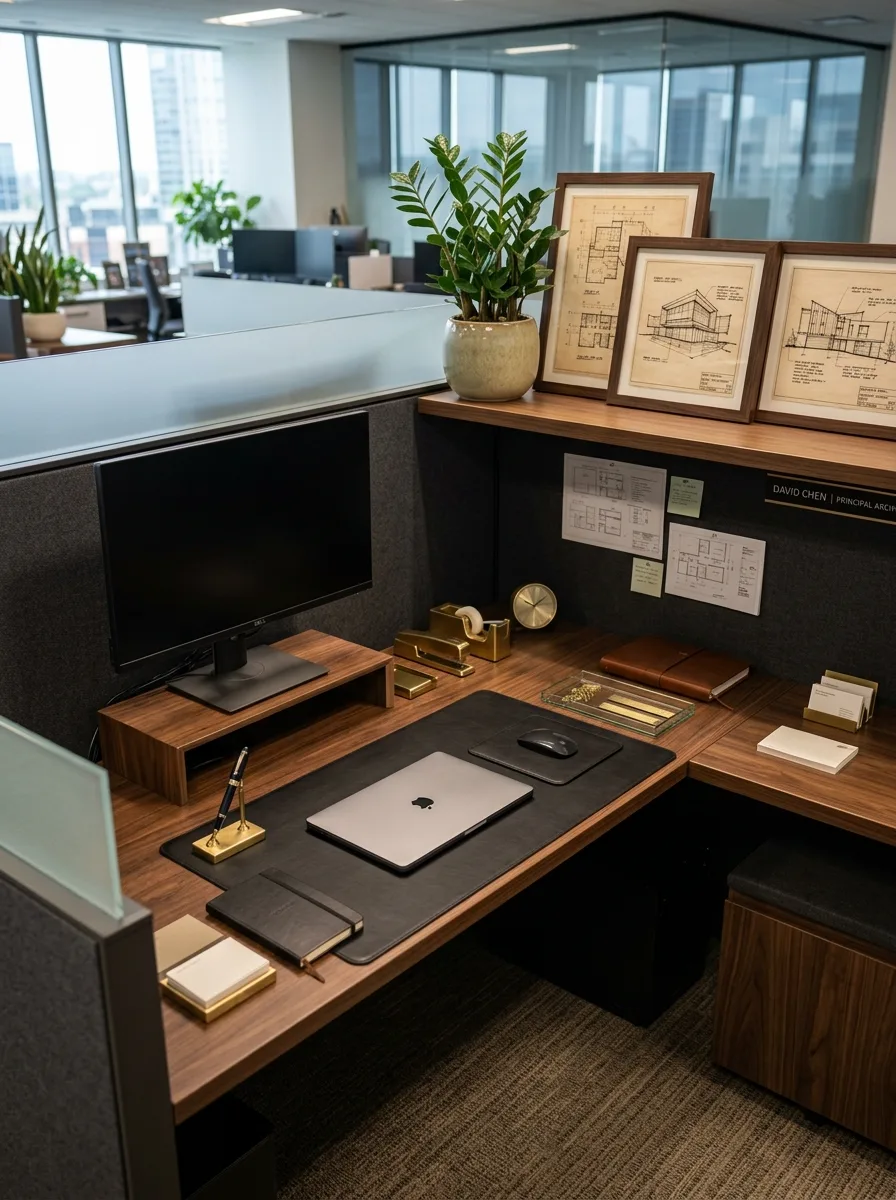
Frame three architectural blueprint prints in matching dark wood along the top shelf, positioned above a small brass nameplate that gives the whole corner a sense of ownership. The nameplate is a small object, but it’s doing a lot of the “this desk belongs to someone specific” work.
Layer gold desk accessories — a tape dispenser, a small clock, a stapler — across the surface, but keep every one of them genuinely useful rather than purely decorative. A soft leather portfolio and notebook, closed, sit at the desk’s edge alongside a small tray of gold paper clips.
A single MacBook, closed, rests at the center of the leather mat rather than open and glowing. Closed technology reads as more intentional in this particular style — the desk is staged for a photograph, not for typing, and that’s the point.
Marble Coaster Line Art
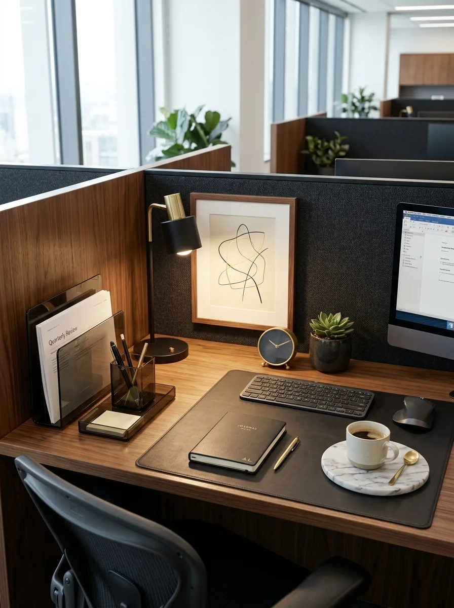
Hang a single abstract line drawing in a thin black frame directly above the desk, its loose, sketchy quality offsetting the otherwise rigid geometry of the cubicle walls. This is one of the only entries on the list using genuinely modern art rather than vintage or botanical prints, and it works precisely because it’s the outlier.
A round marble coaster holding a ceramic mug and a small spoon sits at the desk’s front edge, its cool white surface breaking up an otherwise all-walnut, all-black composition. A small navy clock and a single succulent balance the opposite corner.
Keep the desk mat a single solid black leather, letting the marble coaster and the pale line art print provide the only two breaks in an otherwise dark, warm palette. Two contrasts are enough. A third would start to look busy.
Bold Black Frame Prints
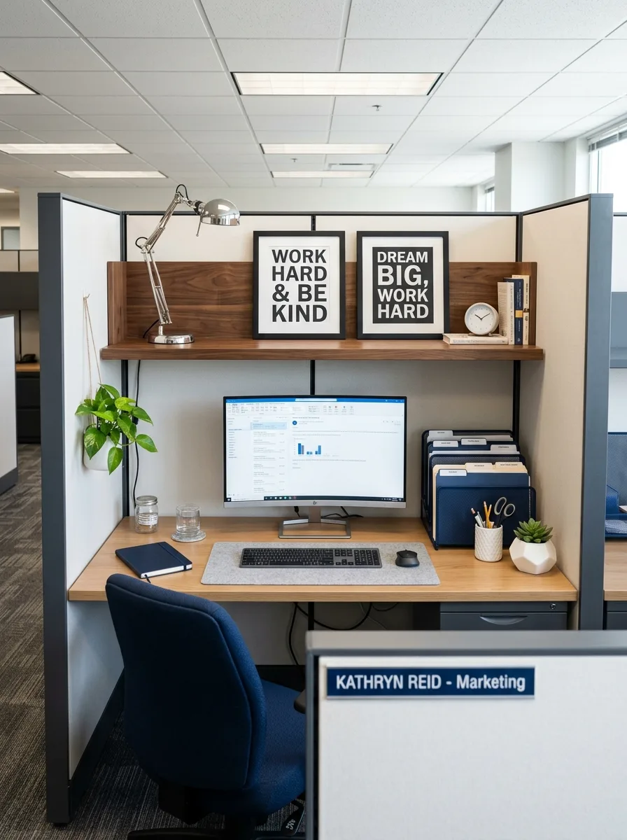
Choose two black-framed word-based prints instead of imagery — short phrases in bold serif type — and hang them side by side at the top of the shelf, treating them as a matched graphic statement rather than separate pieces. Word-based art reads as more office-appropriate than most decorative prints while still having real personality.
A single trailing plant on the panel wall beside the monitor softens the bold black-and-white graphics with something organic and a little unruly. A stack of hardcover books sits beside a small round clock on the shelf, adding height variation the two matching frames don’t provide on their own.
A hanging nameplate at the cubicle’s entrance, visible before anyone even reaches the desk, extends the personalization past the desk surface itself. That small detail is what makes the whole space feel claimed rather than simply occupied.
Rattan Tray Olive Branch
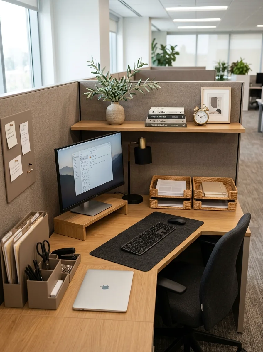
Set a tall ceramic vase with a single olive branch stem at the desk’s back corner, letting its height and irregular shape break up the horizontal lines of the shelf above. One well-chosen branch does more here than a full bouquet would.
Below it, two rattan document trays hold real folders and notebooks, their woven texture softening what would otherwise be an all hard-surface desk. A small black articulating lamp and a stack of hardcover books on design and strategy round out the shelf without overcrowding it.
Keep the desk’s lower surface almost entirely functional — a dark felt mat, a closed laptop, a simple mesh organizer — so the personality stays concentrated in the shelf above rather than spreading across every available surface.
Vintage Patent Print Trio
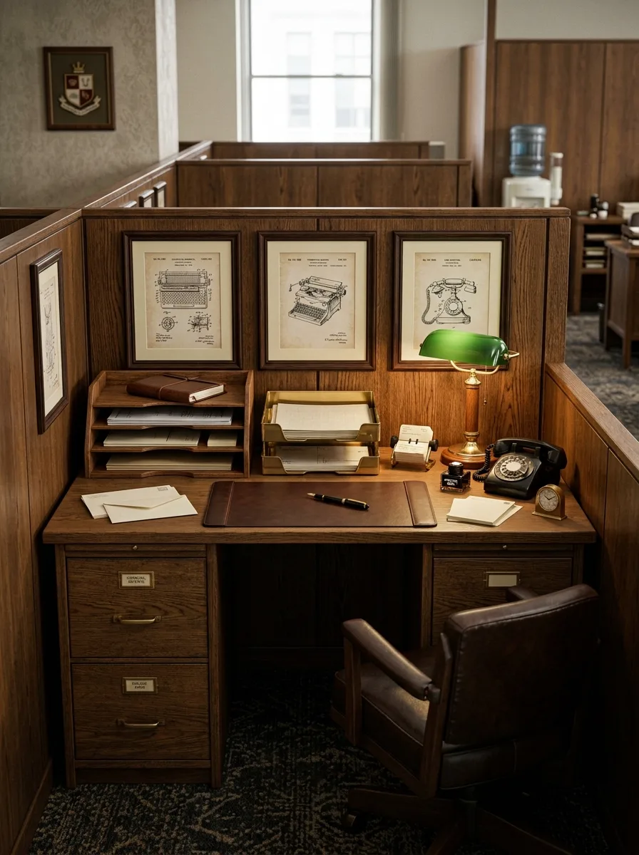
Frame three vintage patent illustrations — old mechanical drawings of everyday objects like a typewriter or a rotary phone — in a matching row above the desk, choosing objects that echo whatever’s actually sitting on the surface below. The connection between the framed drawings and the real objects on the desk is what makes this corner feel designed rather than decorated at random.
A genuine rotary phone, plugged in or not, sits beside a green banker’s lamp and a brass carriage clock, all three objects sharing the same warm, aged metal tones. A leather-bound notebook and fountain pen complete the writing surface.
Label the desk’s drawers with small brass nameplate holders rather than leaving them blank. That single detail, easy to skip and rarely noticed consciously, is what makes the whole desk feel like it belongs to an actual office from another decade rather than a prop shelf.
Fluted Panel Gold Accents
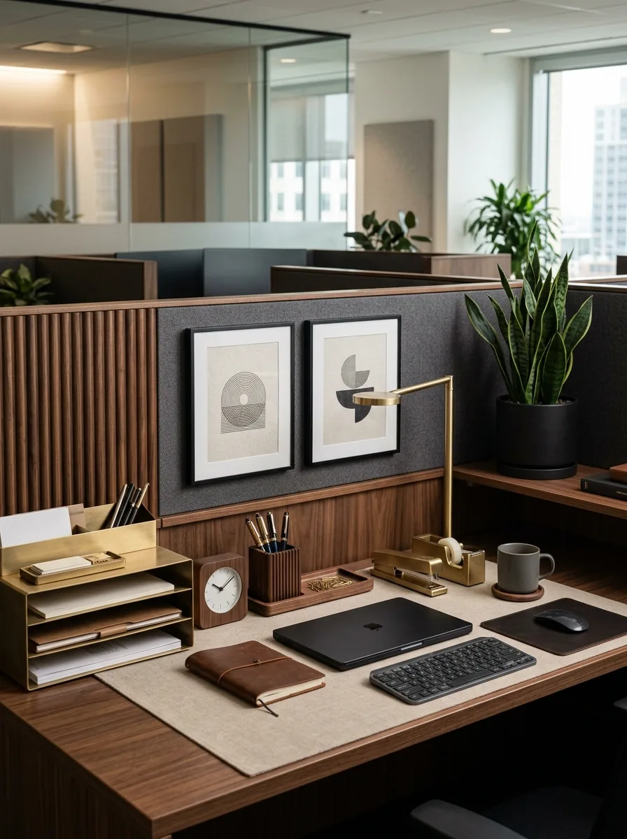
Install fluted wood paneling on the lower half of the cubicle wall, leaving the upper half in standard dark fabric, so the two textures read as a deliberate architectural choice rather than mismatched materials. This single build-out does more to elevate the whole cubicle than any amount of desktop styling could.
Layer gold accessories across the desk — a stacked letter tray, a pen cup, a tape dispenser, a small round clock — all in the same brushed gold finish, so the metal reads as one cohesive system rather than scattered accents. A single snake plant in a matte black pot provides the one green note in an otherwise metal-and-wood palette.
Keep the desk mat a plain woven linen rather than leather here — the fluted paneling and gold hardware are already carrying plenty of texture, and a heavier leather mat would tip the whole desk into feeling overdone.
What Classic Actually Means Once You Strip the Word Away
None of this is really about brass or leather or which decade the objects are pretending to be from. It’s about treating a rented cubicle like a room worth finishing properly instead of a placeholder you’re waiting to leave.
Every desk on this list shares one habit that has nothing to do with material or color: someone chose fewer things and thought harder about each one, instead of filling every inch because empty space felt unfinished.
That restraint is the actual through-line, more than any wood tone or metal finish. A desk with three excellent, considered objects will always outlast the trend cycle that a desk with thirty coordinated but disposable ones can’t survive.
The cubicle was never going to look like an office of its own accord. Someone still has to decide it’s worth the effort — and then, more importantly, decide when to stop.