

You know the wall. You’ve known it since the day you moved in. You’ve stood in front of it holding a tape measure at least four separate times and put the tape measure down each time without doing anything.
That wall is not going to decorate itself, and it is not waiting for the “perfect” piece to magically appear in a shop window.
Most empty walls stay empty because people are looking for one single answer — one painting, one mirror — when the actual answer is almost always a system. A cluster. A layered arrangement that does more work than any single object ever could.
This is the list that finally gets something on that wall.
Empty Wall Decor Ideas
Vine-Framed Photo Grid
Hang a cluster of mixed-size photo and print frames in a loose, asymmetrical grid rather than a strict rectangle. Leave uneven gaps between them so the arrangement feels assembled by hand, not templated.
Add a floating shelf above or beside the cluster and let a trailing pothos spill down from it, threading naturally around the frame edges as it grows. Encourage the vines with light wire guides so they wrap the corners of a few frames rather than hanging straight down.
Mix black and warm-wood frames within the same cluster, keeping the mat color consistent across all of them so the variation reads as intentional. One small framed quote card breaks up the photography without stealing focus.
Water the plant more than you think you need to — a thin, sparse vine reads as neglected, and this whole look depends on it looking lush.
Arched Mirror Floor Lean
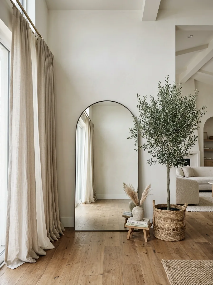
Lean an oversized arched mirror directly against the wall rather than hanging it — the slight forward tilt and visible floor gap read as considered, not unfinished. Choose a height that reaches at least three-quarters of the wall for real impact.
Place a large potted tree just beside it in a woven basket, letting a few branches slightly overlap the mirror’s edge in reflection. A small stack of books topped with a bud vase at the mirror’s base fills the empty triangle of floor space without cluttering it.
Keep the wall completely bare apart from the mirror itself — this look depends on negative space around it to read as deliberate rather than temporary. Resist the urge to add a shelf or a piece of art nearby.
Works best against a wall with height to spare, where a hung mirror would otherwise stop short of the ceiling.
Salvaged Frame Cloud Wall
Collect dozens of mismatched frames in wildly different sizes, finishes, and eras — flea market wood, chipped gold, plain black — and arrange them into one organic, cloud-like silhouette rather than a rectangle. The shape of the overall cluster matters more than any single frame inside it.
Leave several frames empty or filled with plain textured paper rather than art, so the wall reads as sculptural rather than purely pictorial. A few painted frames in a single accent color, like mustard or teal, act as visual anchors inside the sea of neutrals.
Start from the center and work outward, adjusting spacing by eye rather than a grid, letting the edges of the cloud taper naturally into the bare wall. This look takes patience — plan for an afternoon, not an hour.
Lean into the imperfection. A cloud wall with dead-straight edges has missed the point entirely.
Slat Wall Floating Console
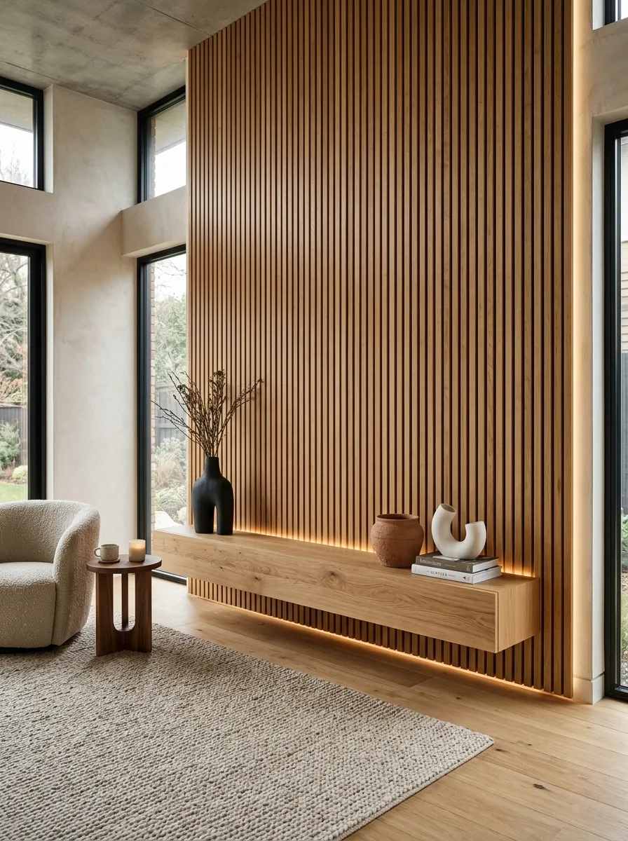
Panel a full accent wall in vertical wood slats and mount a long, low floating console directly onto it with no visible legs or brackets. The floating effect against the ribbed texture is what makes this feel architectural rather than furnished.
Add a hidden LED strip beneath the console to cast a warm glow down onto the floor, and keep the console’s surface styling minimal — one sculptural vase, one small pot, a short stack of books. This is a wall built on texture and shadow, not on objects.
Position a single low armchair beside it rather than a full seating arrangement, so the wall stays the room’s clear focal point.
Skip hanging anything on the slats themselves. The paneling is the art here — adding frames on top of it competes with the very texture you paid for.
Backlit Slat Mirror Nook
Panel one section of wall in vertical wood slats and mount a full-length mirror directly against them, edged with a hidden LED strip that washes light down both sides. The backlight is what turns a plain mirror into a focal point instead of a functional afterthought.
Extend the slat paneling upward into a series of floating shelves, keeping the same wood tone throughout so the mirror and shelving read as one continuous built-in. Layer each shelf with a trailing plant, a diffuser, and one small framed print, alternating heights so nothing lines up too evenly.
Add a single potted tree in a woven basket just beside the mirror’s reflection, doubling the greenery visually without adding more floor clutter. Keep the LED on a warm setting, never cool white — cool light kills the effect completely.
This works best in a hallway or entry with enough depth to step back and take in the whole reflection.
Framed Abstract Panel Wall
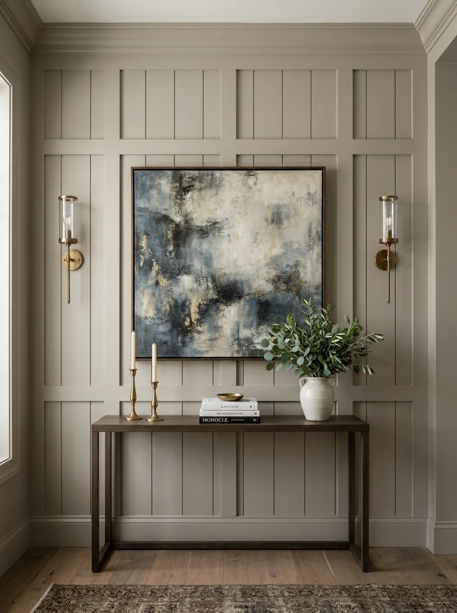
Paint or panel the wall behind a console table in raised rectangular moulding, then hang one large abstract painting inside the largest panel as the room’s clear anchor. The moulding does the framing work that a physical frame would otherwise need to do.
Flank the artwork with a pair of matching brass sconces at eye level, positioned to wash light evenly across the canvas rather than pooling in the center. Keep the console below simple — books, two candlesticks, one ceramic vase with loose greenery.
Choose art in tones that echo at least one material already in the room, whether that’s the console’s wood or the rug beneath it, so the piece feels built into the space rather than added on top of it.
Resist adding smaller art pieces around the large one. This wall works because there’s exactly one focal point, not several competing ones.
Hanging Branch Light Feature
Mount a single large decorative branch directly to the wall, wired through with warm micro-string lights woven between faux leaves along its length. This one object replaces an entire gallery wall’s worth of decor with a single sculptural gesture.
Position it above a sofa or console at a height where the lowest hanging leaves clear any furniture beneath by a few inches. Let the branch extend slightly wider than the furniture below it, rather than centering it exactly — asymmetry keeps it from looking like a factory-made headboard.
Turn overhead lighting off and let this be the room’s primary evening light source. The warmth of the small bulbs against the leaves is the entire point, and competing light washes it out.
Skip any other wall art on the same wall. This piece needs to be the only thing happening there.
Living Wall Moss Frame Grid
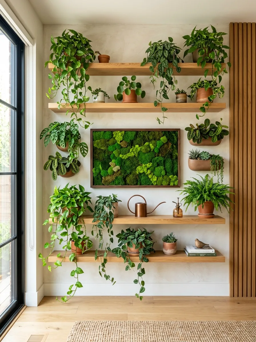
Cover two full floating shelves and the wall between them in a dense arrangement of trailing and upright houseplants, then mount one framed preserved-moss art panel directly in the center of the cluster as an anchor. The moss frame gives the eye a still point among all the moving foliage.
Choose plants with genuinely different leaf shapes and growth habits — trailing pothos, upright ferns, compact succulents — rather than repeating the same variety, so the wall reads as a real collection rather than a matched set.
Add one or two small metal watering cans or brass tools directly on the shelves as functional decor, letting them double as styling objects between the pots.
Water on a strict schedule. A wall this dense with real plants will show neglect within days, and a few droopy leaves undo the entire effect faster than almost any other look on this list.
Sculptural Bronze Disc Cluster
Group three or four oversized textured discs — resembling tree rings or hammered metal — in an irregular cluster on a plain wall, varying the sizes so no two are identical. The organic, asymmetrical spacing is what keeps this from reading as a matched decor set.
Mount a console table below in a material that echoes the discs’ warmth, like a rich walnut or bronze-toned wood, and keep the tabletop styling sparse — one large vase, one bowl, a small stack of objects. The wall above should stay the loudest element in the vignette.
Add a single warm sconce beside the console rather than symmetrical pairs, letting light rake across the discs’ texture at an angle. Angled light is what reveals the carved detail; head-on light flattens it.
Keep everything else in the room quiet. This is a maximalist wall moment that needs a minimalist room around it to actually land.
Layered Object Ladder Shelves
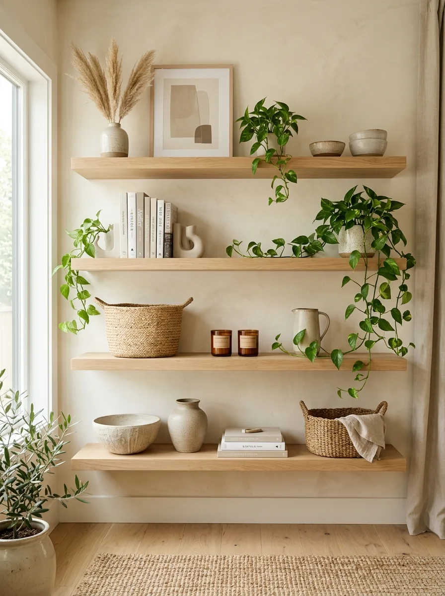
Install three or four floating wood shelves stacked with generous vertical spacing, then style each one with a mix of books, ceramics, and one trailing plant per shelf rather than repeating the same object type across all of them. Vary the silhouette from shelf to shelf so the overall wall has a rhythm, not a repeat.
Let at least one plant spill from the top shelf all the way down past the shelf below it, connecting the tiers visually. Keep a woven basket on the lowest shelf to catch anything that doesn’t have a designated home yet.
Group candles and small vessels in odd numbers — threes work better than twos — and vary their heights so nothing reads as a straight matched line.
Leave the back third of each shelf empty. A shelf styled all the way to the wall behind it reads as crowded even with beautiful individual pieces.
Woven Fringe Tapestry Bench
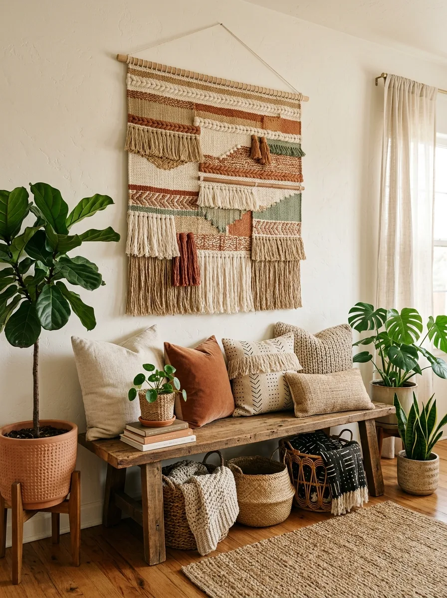
Hang a large woven wall hanging with visible fringe and tassels above a sturdy wood bench, letting the tapestry’s width roughly match the bench below it for visual alignment. The fringe adds movement and texture that a flat framed print never could.
Layer the bench with a mix of textured throw pillows in complementary tones — velvet, chunky knit, mudcloth — arranged with the tallest pillows at the ends and lower ones toward the middle. Tuck woven baskets and a folded throw blanket underneath for storage that doubles as texture.
Flank the bench with two potted plants of different heights and leaf shapes, keeping the greenery loose and slightly overgrown rather than manicured.
Keep the wall hanging as the only pattern in the vignette. Patterned pillows next to a patterned tapestry will fight each other for attention.
Architectural Photo Ledge Row
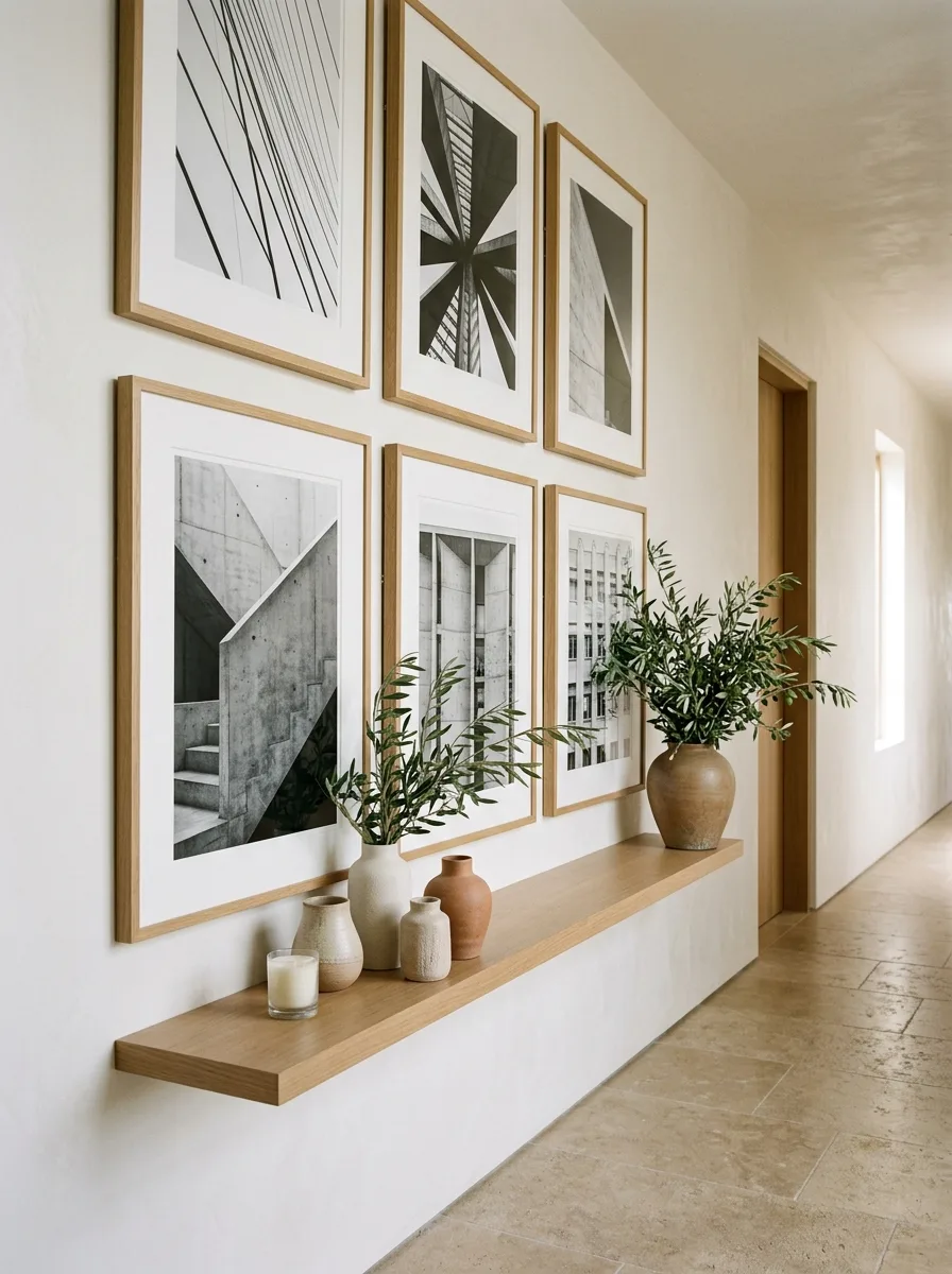
Mount a single long, thin floating ledge shelf and lean six matching-frame black-and-white photographs against the wall above it in two even rows, rather than hanging them individually. The leaned, unhung approach makes future rearranging effortless.
Choose photography with a shared subject or mood — architecture, landscapes, abstract lines — so the collection reads as curated rather than random. Keep all frames the same wood tone for cohesion, even if the images themselves vary.
Style the ledge itself with a cluster of ceramic vases in varying heights, one holding loose olive branches or dried stems, plus a single lit candle at one end. Leave at least a third of the ledge empty.
This format works especially well in a hallway, where the shallow shelf depth won’t intrude on walking space.
Walnut Console Statement Art
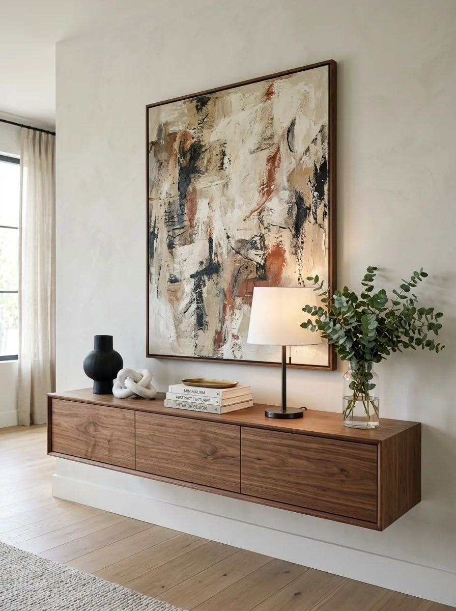
Mount a large abstract canvas in warm, earthy tones directly above a floating walnut console with no visible hardware or legs. Choose a piece roughly the same width as the console below it so the two elements read as one composed unit rather than two separate purchases.
Style the console asymmetrically rather than centered — a black ceramic vase and a knotted sculptural object on one side, a stack of books topped with a lamp toward the middle, a loose glass vase of eucalyptus on the opposite end. The uneven weighting keeps the eye moving.
Choose a lamp with a simple fabric shade over anything ornate; it needs to read as a light source, not compete with the art above it.
Keep the wall around the composition completely bare. This look depends entirely on isolation — a single powerful moment, not a busy one.
Arched Panel Textured Canvas
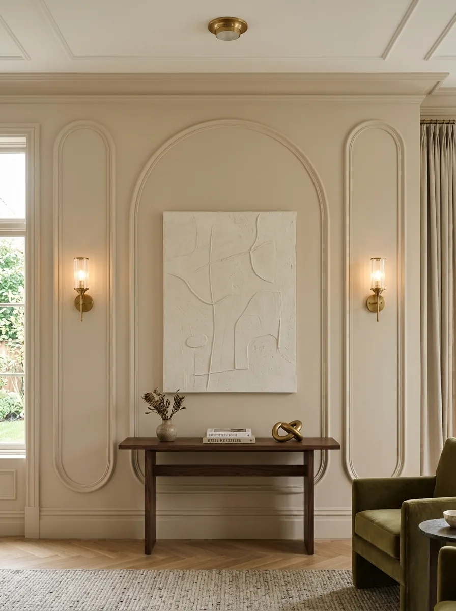
Build a single large arched moulding directly into the wall, flanked by two narrower oval panels on either side, and hang a heavily textured plaster-effect canvas inside the central arch. The raised plaster texture catches light differently than a flat painted canvas, which is what elevates this beyond a standard frame-and-art setup.
Mount slim brass wall sconces inside the flanking oval panels rather than beside the artwork directly, so the light sources become part of the architecture instead of separate fixtures.
Keep the console below narrow and low, styled with a single small vase and a short stack of books, so the wall’s architectural detail stays the clear priority.
Paint the entire wall, panels included, in one consistent tone. Contrast paint on the moulding turns this into a trim project instead of the quiet, sculptural statement it’s meant to be.
Curated Frame Ledge Wall
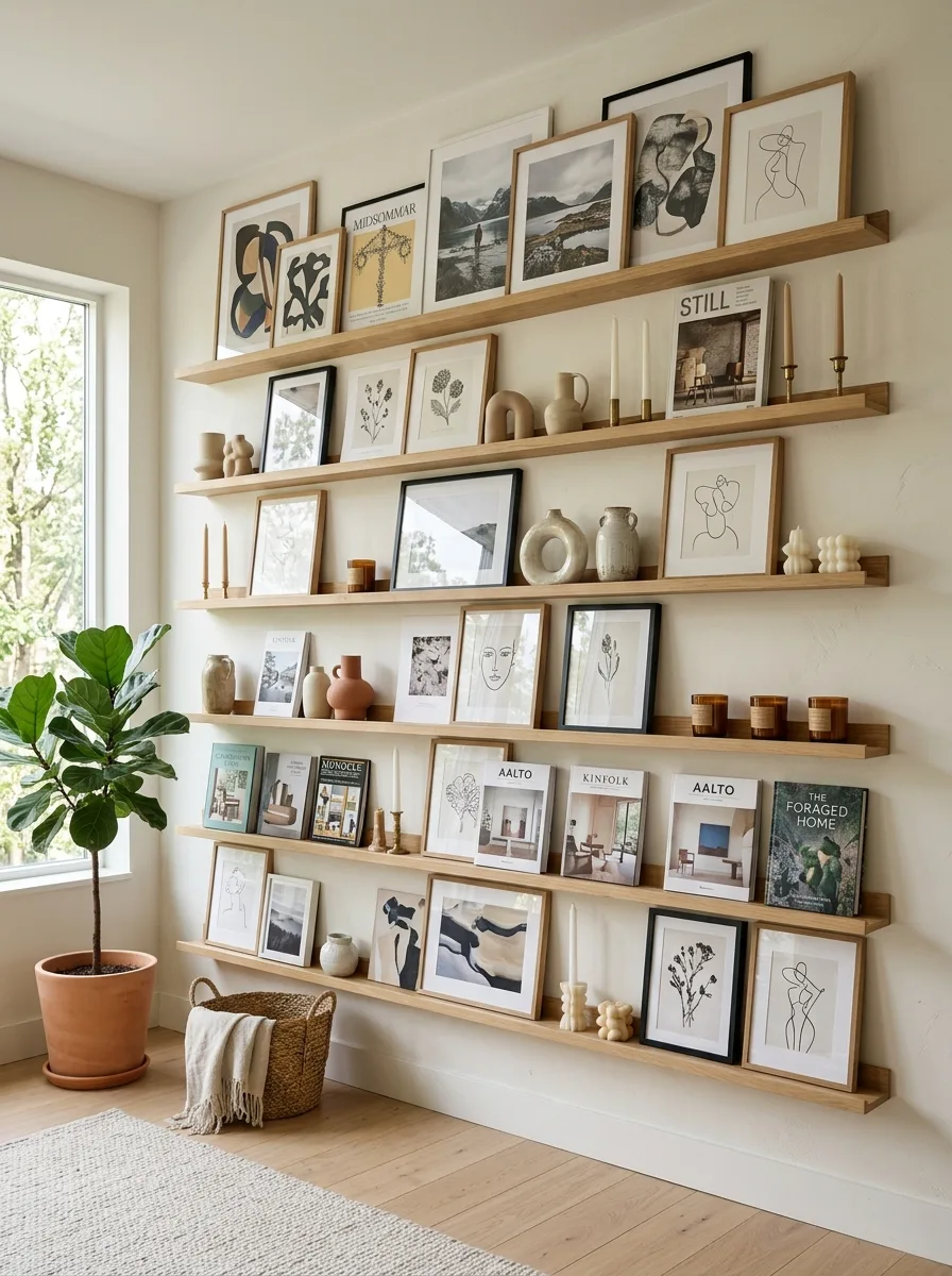
Cover a full wall in five or six long floating picture ledges stacked with generous spacing, then lean a dense, deliberately eclectic mix of art prints, book covers, and small objects across every ledge. This format is the easiest large-scale wall to actually maintain, since nothing needs to be re-hung to change the arrangement.
Alternate framed prints with unframed book spines turned outward, plus the occasional small ceramic vessel or candle tucked between pieces to break up the rhythm. Vary frame widths so pieces slightly overlap their neighbors rather than sitting in isolated single-file rows.
Choose one restrained palette — black, white, and warm wood tones work reliably — even though the objects themselves vary widely in style. That shared palette is the thread holding an otherwise chaotic-sounding wall together.
Refresh the arrangement seasonally. Since nothing is permanently hung, this wall can change in twenty minutes flat, which is the entire advantage over a nailed gallery layout.
Modular Box Shelf Grid
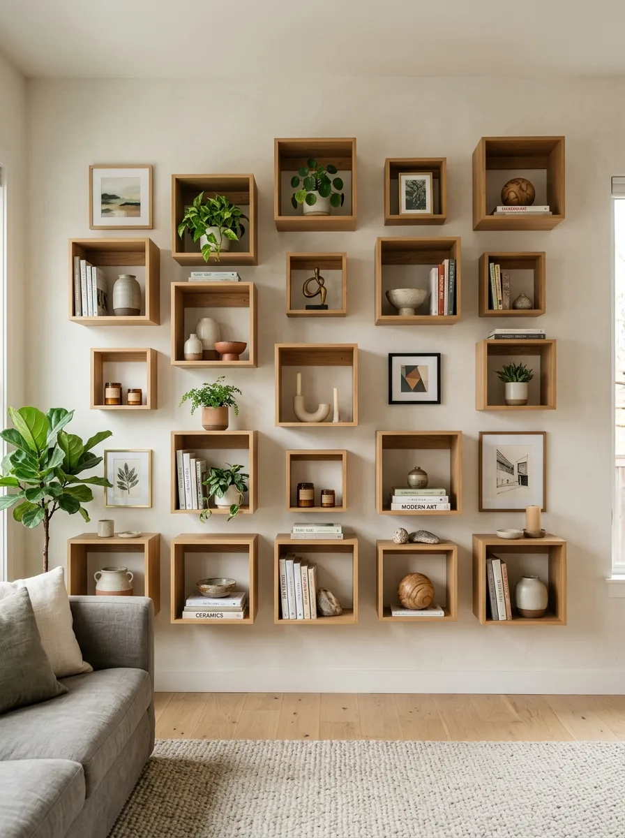
Mount a grid of open wood box shelves in a slightly irregular arrangement — not every box the same size, not every row perfectly aligned — across a full wall. The irregularity is what keeps two dozen identical cubes from reading as a big-box furniture display.
Style roughly two-thirds of the boxes and leave the remaining third empty or holding just a single small object. Fully packed boxes on every square read as busy no matter how nice the objects inside are.
Mix in books, small plants, framed prints turned to face outward, and a few purely sculptural objects like stone or ceramic forms, keeping color to a narrow warm-neutral range so the grid itself stays the visual structure and the objects don’t compete with each other.
Step back and check the wall from across the room periodically while styling. What looks balanced up close often looks lopsided from six feet away.
Carved Wave Wall Panel
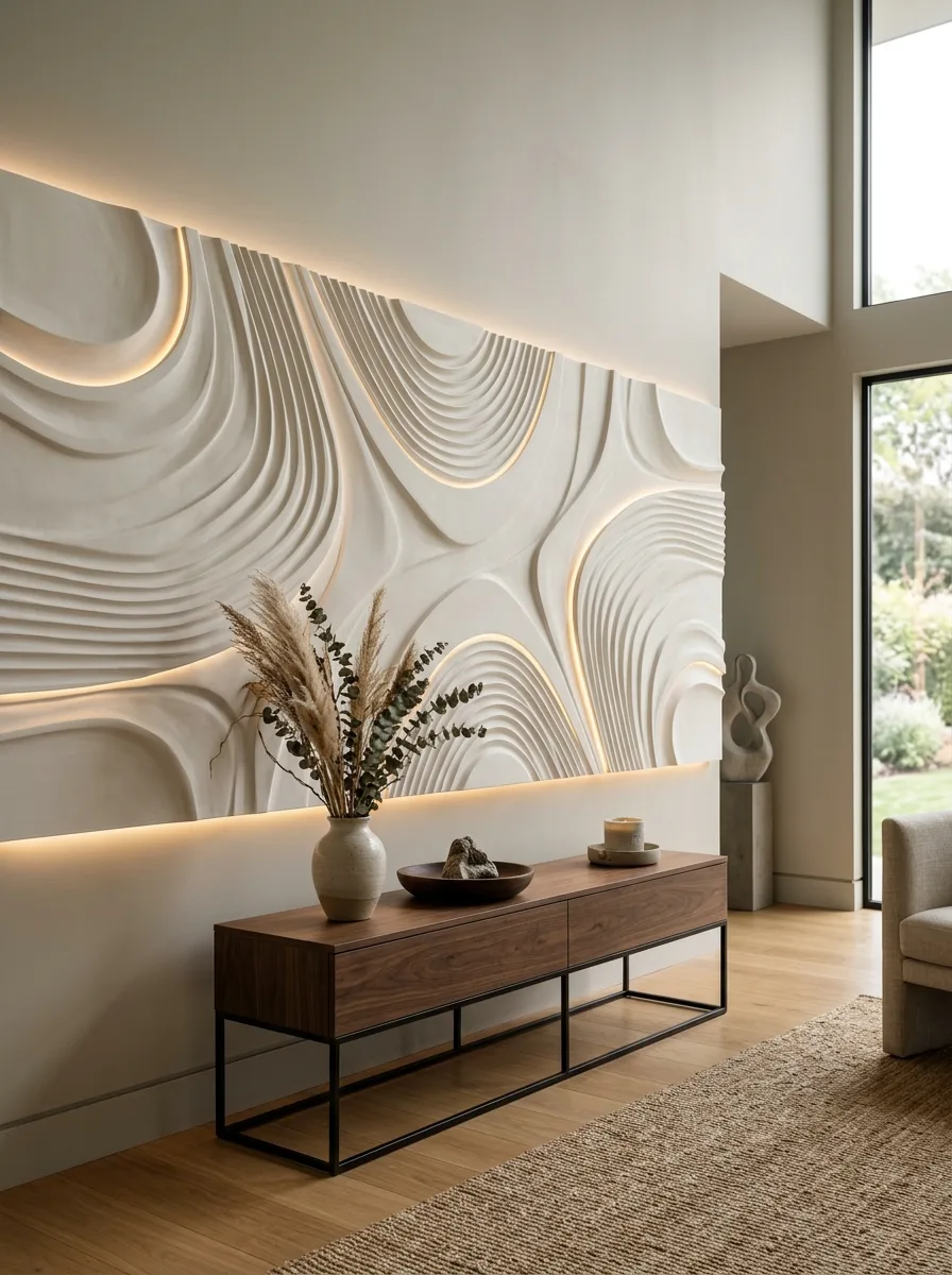
Commission or install a large sculptural plaster or wood panel carved with flowing, wave-like ridges, and run a hidden light strip along its upper and lower edges so the grooves cast soft shadows across the texture. The lighting is doing as much work as the carving itself — flat light kills the dimensionality entirely.
Mount a simple floating console beneath it in a material that contrasts rather than matches — dark walnut against a pale plaster panel reads far more dramatically than a wood-on-wood pairing.
Keep console styling to two or three sculptural objects with rounded, organic forms that echo the wall’s flowing lines, plus one tall dried arrangement for height. Skip anything with hard right angles here — it fights the whole premise of the piece.
This works as a true single-statement wall. Every other decision in the room should defer to it.
Botanical Print Gallery Sideboard
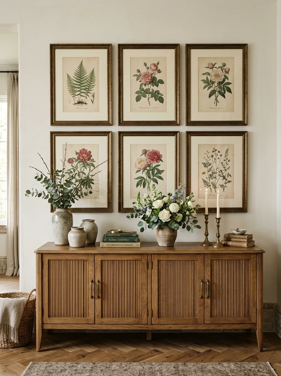
Hang six matching gilt-framed botanical prints in two even rows above a long wood sideboard, keeping identical spacing between every frame for a formal, symmetrical effect. This is one of the only looks on this list where perfect alignment is the correct choice rather than a mistake.
Style the sideboard with two tall stoneware vases holding loose branches or seasonal blooms on either end, a stack of hardcover books in the center, and a pair of tall taper candles for height variation.
Choose prints with a shared botanical subject — all florals, all ferns — so the formal grid reads as a coherent collection rather than a mismatched set forced into a grid.
Vary the flower stems seasonally while keeping the frames and sideboard styling constant. It’s the easiest way to keep a formal, symmetrical wall from ever feeling static.
Geometric Textile Console Corner
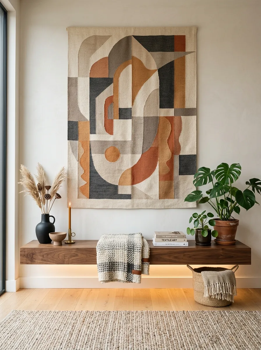
Hang a large geometric woven wall hanging in a muted, earthy palette above a floating dark-wood console, choosing a piece with enough scale to fill most of the wall’s width on its own. This look relies on one bold textile doing the job that five small frames usually attempt and fail at.
Add a hidden light strip beneath the console for a soft glow, and drape a chunky knit throw casually over one end rather than folding it precisely — the slight mess reads as lived-in against the textile’s structured pattern.
Style the console with a single dark ceramic vase, a short stack of books, and one small potted plant, keeping the palette limited to tones already present in the hanging.
Place a woven basket on the floor beside the console for the same textural family without adding to the wall itself.
Antique Mirror Collector’s Wall
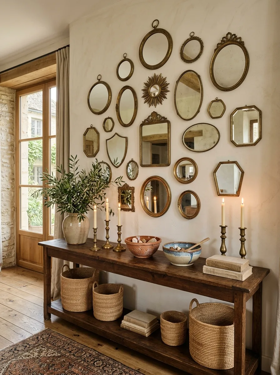
Cluster a dense collection of mismatched vintage mirrors — round, oval, sunburst, hexagon, shield-shaped — across the wall in a loosely organized but irregular grid, letting frame finishes range from tarnished gold to aged brass. The variety in shape is what makes a wall of forty mirrors feel collected over decades rather than bought in one trip.
Anchor the grouping with a handful of larger mirrors placed centrally, then build outward with progressively smaller ones toward the edges, so the whole cluster has a natural visual hierarchy despite the chaos.
Below it, style a long wood console with candlesticks of varying heights, a large stoneware vase of olive branches, and two ceramic bowls filled with natural objects like shells or stones. Woven baskets underneath handle overflow storage.
Let the mirrors reflect different parts of the room rather than trying to line them all up to reflect the same thing. The fractured, varied reflections are part of what makes this wall feel alive.
Final Thoughts
Every wall on this list started as the exact same problem: a blank stretch of drywall nobody had made a decision about yet.
What separates the ones that finally got solved from the ones still sitting empty in someone’s house right now is almost never budget or taste. It’s the willingness to commit to a system — a cluster, a grid, a single oversized gesture — instead of waiting to find one perfect object that could carry the whole wall alone.
That perfect single object rarely exists. The wall doesn’t need it to.
Go look at your own blank wall again. Not for the one thing that might fix it, but for which of these systems it’s actually been waiting for all along.