
Carpet in a hallway gets absolutely no respect. It’s the flooring choice that people make reluctantly, install quickly, and replace the moment it starts looking tired — which, given the foot traffic a hallway handles, is usually about three years after installation if you chose badly and significantly longer if you didn’t. Most hallway carpets are chosen for what they won’t show rather than what they will, which produces exactly the kind of anonymous, inoffensive, completely forgettable flooring that makes people assume their hallway is just a functional space rather than a designed one.
The premise that carpet is somehow the less glamorous hallway flooring option compared to tile or hardwood is entirely a styling failure, not a material one. A carpet chosen with genuine intention — the right pattern, the right pile weight, the right color relationship with the walls and woodwork — can do things for a hallway that hard flooring simply cannot. It absorbs sound. It creates warmth underfoot. It introduces pattern and texture in a way that tiles and planks only achieve at significant cost. And a genuinely good runner laid over hard flooring gets you the best of both without having to choose.
The problem is that most hallway carpet decisions are made from a catalogue page in a neutral colorway because it seemed safe, which is how you end up with flooring that neither offends nor impresses and steadily develops a worn path down its center that makes the whole space look apologetic. Safe carpet choices aren’t safe — they’re just failures that take longer to identify.
Why Hallway Carpets Fail When Everything Else in the Room Is Fine
The single most common hallway carpet mistake has nothing to do with color or pattern — it’s pile weight. A carpet with insufficient pile density in a high-traffic corridor will develop visible wear paths within months, no matter how carefully you vacuum it. The hallway is not the place to buy the mid-range option in the hope it holds up. It’s the place to buy the heaviest, densest pile your budget allows, because the alternative is replacing it in three years and starting over.
The second mistake is choosing a runner that’s too narrow for the floor it’s sitting on. A runner that leaves equal amounts of floor visible on both sides reads as proportionally correct and intentional. A runner that’s noticeably narrower than the space it occupies looks like it was chosen for a different hallway and placed here because it was already bought. Width matters as much as length, and most people get the length right and the width wrong.
What a Great Hallway Carpet Actually Does for the Space
Beyond the obvious function of cushioning footfall and reducing noise, a well-chosen hallway carpet does something visually that hard flooring rarely achieves: it draws the eye down the corridor length and creates a sense of destination at the far end. A patterned runner particularly does this — the repeating motif creates visual rhythm that pulls you forward through the space rather than letting the eye stop at the nearest wall.
Color is the other significant factor. A dark carpet in a hallway with lighter walls creates a grounding effect that makes the ceiling feel higher. A light carpet under darker walls creates contrast that makes the space feel more defined. A patterned carpet introduces color notes that can be picked up in art, lighting, and accessories to tie the entire scheme together vertically — which is the difference between a hallway where everything is in the same room and one where everything is in the same scheme.
The Runner vs Wall-to-Wall Decision Nobody Talks About Properly
Both have specific applications and the wrong choice for a given hallway is immediately obvious even if you can’t articulate why. Wall-to-wall carpet makes sense in upper hallways, landing areas, and corridors where the flooring underneath isn’t worth exposing, where sound management between bedrooms is a priority, or where the hallway is wide enough that a runner would look stranded in the middle. A runner makes sense when the hard floor beneath it is a genuine design asset — good hardwood, quality tile — because covering it completely would waste a surface that’s contributing to the scheme. A runner also allows for seasonal changes and easy replacement without the commitment and cost of a full recarpet.
The mistake is treating either option as inherently superior. A beautiful wall-to-wall in exactly the right tone and texture is more successful than a mediocre runner, and vice versa. The quality of the decision matters more than which category it falls into.
Hallway Carpet Ideas Worth Walking On
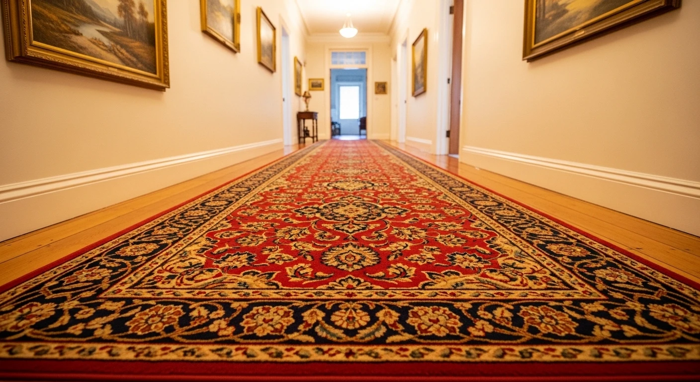
Black Ground Floral Persian Runner:
2.5 x 15 ft high quality hallway runner
by u/BeachBum419 in BuyItForLife
A densely knotted traditional runner with a black ground, ivory border, and an intricate repeating floral pattern in dusty rose, sage green and cream — laid over rich dark walnut hardwood that it has absolutely no interest in competing with. This is a runner that was chosen because someone understood that a hallway with warm dark wood floors and warm-toned walls needed something at floor level with enough visual weight to anchor the space, and a traditional Persian pattern in a dark colorway does exactly that without requiring anything else to change. The ivory fringe at both ends finishes it properly rather than leaving the edges looking cut off. The white doors flanking the corridor provide the only contrast needed. This runner isn’t decorating the hallway — it’s completing it, and there’s a meaningful difference.
Black and White Ticking Stripe on a Dark Hallway:
Ink-black wainscoting, white walls above, black staircase and banister, a vintage-style frosted glass pendant — this hallway was always going to be dramatic, and the fine black-and-white ticking stripe carpet running its full length and up the staircase is what stops it from tipping into oppressive. The narrow vertical stripe creates a visual texture that reads as light from a distance, lifting the dark woodwork rather than adding to its weight. The stripe continuing seamlessly from floor to stair is the detail that elevates the whole scheme from good to considered — the carpet doesn’t stop at the bottom step and change character, it flows through the space as a single uninterrupted element. A colorful print on the left wall provides the one moment of contrast that the monochrome scheme needed.
Multi-Tonal Pink and Red Striped Runner:
Deep plum-purple walls, white wainscoting and trim, dark hardwood floors, brass cage pendants — this corridor was already a strong scheme, and the multi-tonal striped runner in burgundy, pink, crimson and dusty rose is the element that makes it genuinely extraordinary. The runner picks up tones from both the purple walls and the warm brass fixtures simultaneously, which is the kind of color relationship that makes a scheme feel inevitable rather than assembled. Running its full length down the corridor, it creates a path of warm color between the dark floor and the dark walls that stops the space from feeling tunnel-like. The micro-check pattern within the stripes adds texture at close range that plain stripes wouldn’t achieve. This is a carpet that was clearly chosen after the rest of the scheme was established, with a specific brief about what color notes it needed to introduce.
Custom Wavy Spine Runner:
Pale wide-plank white oak floors, dark slate grey walls, white LED skirting board uplighting, framed abstract art along the corridor — and running down the center of it all, a completely unexpected custom runner in a sinuous wavy organic shape, its pattern a sequence of black-outlined vertebrae-like forms in ivory and amber gold against a black ground. This runner is not interested in being subtle. It has an irregular shaped edge rather than a straight border, which means it reads as a sculptural object sitting on the floor rather than a conventional floor covering, and that’s entirely the point. The contrast between the pale floor and the dark runner maximizes the graphic impact of the pattern. This is what hallway carpet looks like when someone decides the floor should be as interesting as anything on the walls, and acts accordingly.
Textured Neutral Loop Pile:
Warm greige walls, white woodwork, a staircase with a dark newel post and white painted balusters, a black open-frame shelf unit styled with ceramics and a folded throw, a woven wire pendant overhead — and throughout the floor and continuing up the staircase, a warm neutral loop-pile carpet in oatmeal tones with a subtle self-pattern that adds texture without adding color. This carpet is doing the hardest thing in design: being genuinely restrained without being absent. The texture is visible up close and contributes warmth and softness to the scheme, but from a distance it reads as a clean, unified floor that doesn’t compete with the architectural elements. The continuation up the staircase without a break in the carpet is the detail that makes the scheme feel resolved. Every element here was chosen to support the others rather than announce itself individually.
Black Herringbone Stair Runner With Geometric Hallway Rug: Two Patterns, Zero Arguments
White and dark navy painted staircase with twisted white balusters, warm greige walls, light stone-effect floor tiles in the hallway, a Christmas garland twisting up the banister — and a bold black-and-natural herringbone stair runner continuing onto a black-and-cream geometric diamond-pattern rug in the hallway below. Two different patterns in the same black-and-neutral colorway is a combination that requires genuine confidence to execute and rewards it completely when done right. The herringbone on the stairs and the geometric diamond in the hall are distinct enough in pattern structure to feel like separate design decisions while remaining visually unified by their shared palette. The black stair edging binding the runner makes the whole installation look custom-fitted rather than purchased and placed. The lesson here is that pattern on pattern works in a hallway when the color relationship between the two is exactly right, and this one is.
Go Green—Luxurious Emerald and Gold for Grown-Up Drama
Tired of hallway boredom? Go for muted emerald and subtle gold threading—because you deserve rich vibes, not cheap thrills. Grab a deep-pile carpet with geometric gold accents for instant ‘I made it’ feels. Pair it with crisp white walls and brushed brass wall sconces, but stop before you drown the space in shiny metal. Slim walnut paneling keeps it grown, not grandma. Remember, wide windows and recessed LEDs are your best friend—natural light makes plush carpet look even fancier. Don’t forget sculptural vases in niches; clutter is the enemy, but art is non-negotiable. Pro hack: keep those trims slim and straight; chunky trim will ruin your shot at sophistication.
Get Deco: Smoky Blue-Grey Carpet—Urban Luxe Without the Price Tag
Ready for that Gatsby look without the mortgage meltdown? Grab smoky blue-grey with an embossed silver Art Deco motif. That’s how you fake refined urban glamour. Matte black wainscoting paired with taupe walls will punch up the contrast—don’t be shy, bold edges show confidence. Use bronze vertical wall lights with indirect uplighting in the coffered ceiling to layer the glow, not fry your eyeballs. Giant frameless doorways equal major attitude, so keep the door trim minimal and shiny. Rule: make the carpet the hero—don’t bury it under generic runners.
Gradient Game: Subtle Stripes and Organic Vibes for Calm Boss Energy
Trying to Zen out your hallway? Don’t reach for plain, reach for a hand-tufted wool carpet with a gradient from dove grey to creamy linen. Stripes add just enough action, but keep them understated. Brush limestone walls and pale oak beam ceilings bring organic luxury—you aren’t living in a cave, after all. Display only a few ceramics on minimalist shelves, and max out the natural light with glass doors at both ends. Pro move: always run the stripes lengthwise to fake a longer hallway. Keep things curated, not cluttered; if you can’t explain why it’s there, pitch it.
Midnight Maven: Swirl Motifs and Navy Carpet—Welcome to Glamville
Want drama without the divorce? Midnight navy carpet with ivory silk swirls is basically Instagram filter for your floor. Glossy walnut baseboards are mandatory—don’t cheap out. Go for linen-textured wallpaper in sand tones to break up the darkness, and use frosted glass sconces to diffuse light, not spotlight your dust. The sleek white ceiling and linear LEDs keep it looking rich, not dated. Remember: the carpet is your conversation piece, so avoid weird prints elsewhere. Pro tip: match the motif size to your space; big swirls for big hallways, small swirls for small—unless you enjoy visual chaos.
Blush Boss: Pink Carpets and Platinum Grey—High-End, Minus the Stuffy
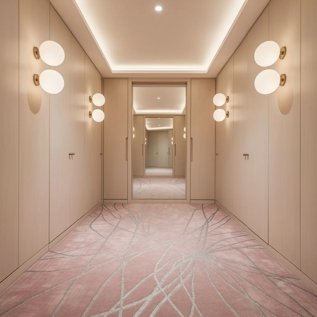
Sick of cold, lifeless walkways? Choose blush pink carpet with abstract platinum grey lines—soft, but not saccharine. Pair with pale wood veneer walls and suspended globe fixtures in frosted glass to bounce light, not blind guests. Use mirrored alcoves at midpoints to fake depth and reflect your good taste. Hide storage in the walls and ditch visual clutter; nobody’s impressed by your shoe pile. Stick with subtle ceiling cove lighting for a cozy glow, and make sure your carpet’s tactile details stay visible. Pro trick: add a mirror to amplify carpet color, but don’t let it double the mess—keep the space clean, always.
Lattice Luxe—Ivory Carpet With Taupe Details Is Instant Chic
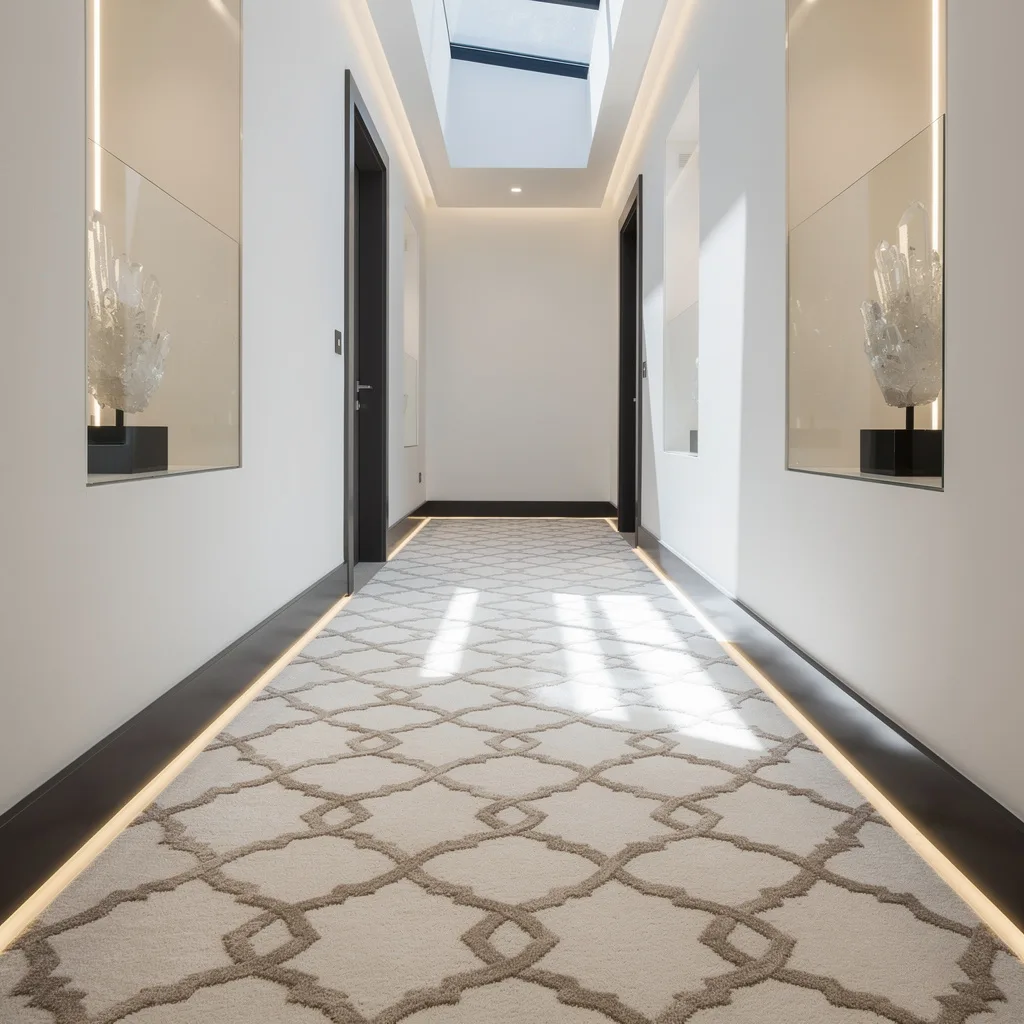
Ready to make your hallway look pricey without trying too hard? Ivory carpet with taupe lattice patterns is your ticket. Frame it with matte charcoal baseboards and minimalist white walls—no need for fifty shades of color. Add skylights that cut daylight across the carpet, and later, perimeter LED strips for nighttime glow. Glossy side niches with crystal objects are good for flexing style, but keep objects sparse. Rule: never let taupe bleed onto your walls; contrast amplifies luxury. Always run the lattice pattern parallel to the hall for pro-level flow—and for the love of style, vacuum regularly.
Aubergine Attitude: Jewel-Toned Carpets and Rose Gold—Drama That Works
Jewel tones are here to stay, so grab an aubergine carpet with metallic rose gold threads—angular patterns keep it edgy, not tacky. Use soft dove grey walls and textured stone veneer panels for contrast—don’t overdo the rocks or you’ll end up with Flintstones chic. Ceiling-mounted cylindrical lights should highlight, not overwhelm, your carpet. Add built-in benches in leather to balance luxe with function. Pro hack: let the carpet color drive your accessory palette—don’t force random colors that clash. Keep the metallic threads visible; dim lighting hides the magic.
Cloud Carpet: Grey Herringbone Is Chic Calm—No Fuss Required
Want your hallway relaxing but not snoozy? Go for pale cloud-grey carpet with a subtle embossed herringbone pattern in dense wool. Pair with driftwood-toned oak paneling on the walls—hello texture, goodbye monotony. Use geometric plaster ceiling moldings and ambient LEDs; never settle for boring overhead lighting. Corner niches with uplighting and porcelain sculptures add minimalist flair. Pro styling rule: never let the carpet hug the walls; keep ‘negative space’ so the texture shines. Frosted window light softens the vibe—bright, but not clinical. Trust wool to stay plush; synthetics can’t compete.
Caramel Comfort—Textured Carpets With Raised Squares Mean Tailored Luxury
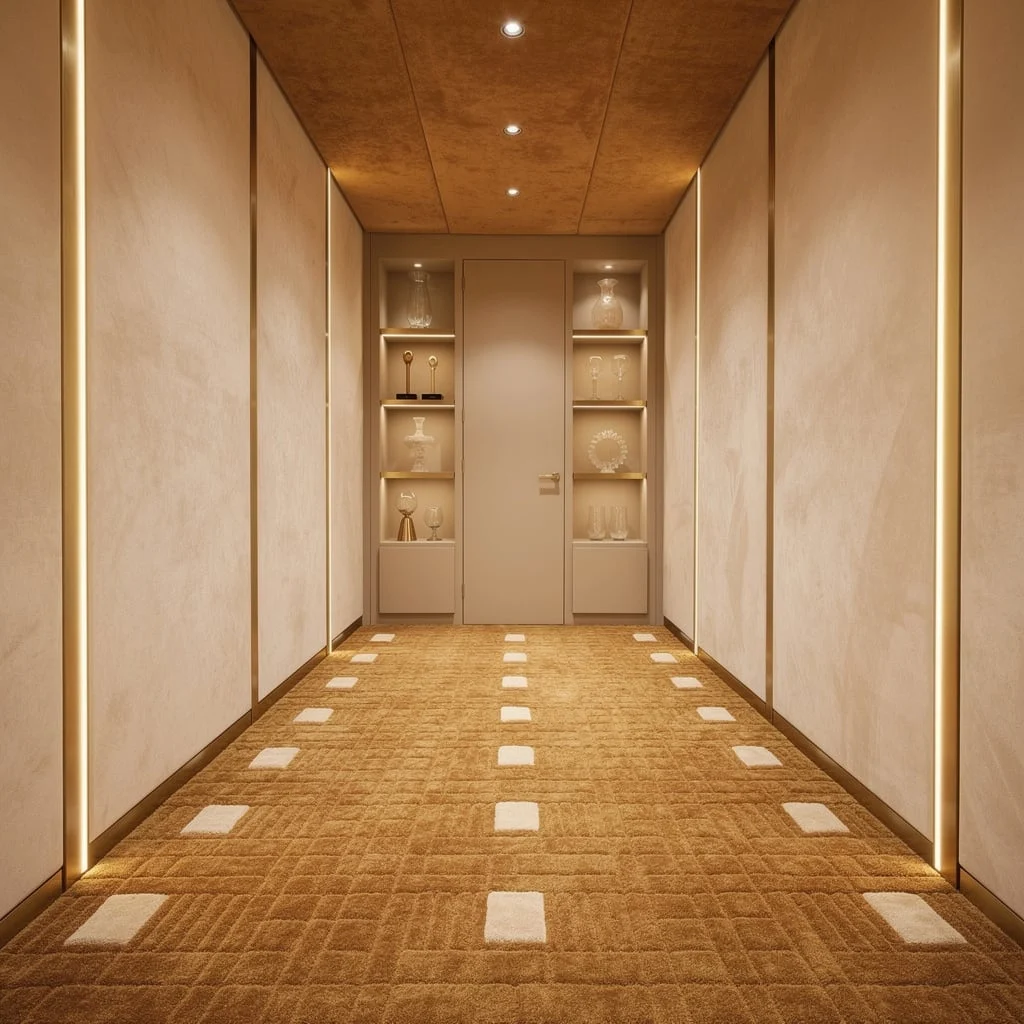
Want coziness without sacrificing sophistication? Choose a warm caramel carpet with ivory raised squares; it feels custom, even if you scored it on sale. Hand-polished plaster walls add extra dimension, while vertical brass light strips bring soft illumination—they’re more interesting than sassy pendant lights. Sand-colored suede on the ceiling and discreet downlights keep it luxe, not loud. Add glass decor on built-in shelving for sparkle. Rule: always use one shade lighter or darker on walls and ceilings; matchy-matchy is for the indecisive. Keep the carpet pattern consistent; randomness kills the tailored vibe.
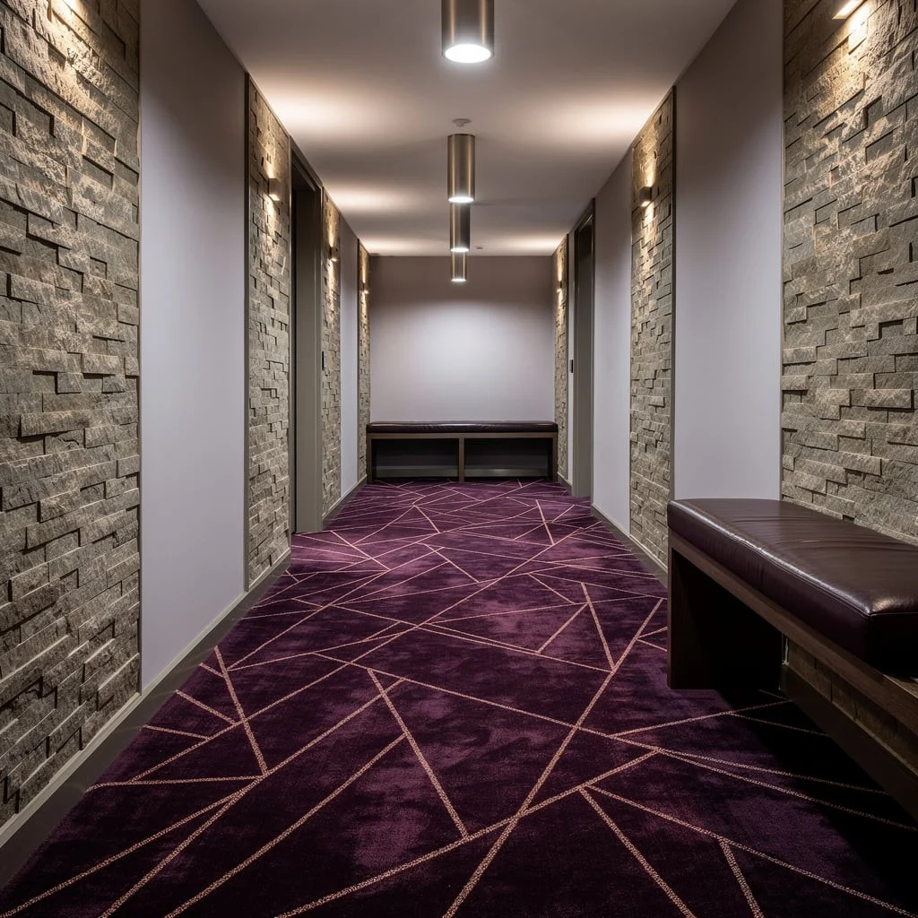
Slate-Blue Circles—Organic Meets Geometric: The Chill Hallway
Drop the neutrals and try soft slate-blue carpet with overlapping circles in matte and glossy finishes—they add texture, not chaos. Eucalyptus wood panels are the vibe; never settle for basic pine. White stucco walls create balance, and hidden LED strip lighting under the panels gives your carpet a gentle spotlight. Use a narrow crystal console for minimalist decor—don’t let clutter ruin your cool. Rule: Usually, echo the curve of circles with your decor shapes; square frames with circle carpet is awkward. Keep the lighting soft so the sheen effect stands out, not gets lost.
Copper Crush—Metallic Carpets With Silver Flashes for Real Luxe
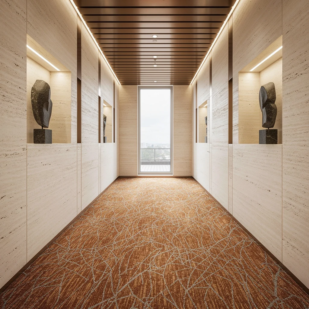
Want hallway swagger? Pick a vibrant copper-toned carpet with silver thread for random abstract patterns—metallic meets moody. Pair with creamy travertine stone wall panels—forget wallpaper, stone is forever. Brushed bronze ceiling slats and ambient lighting add warmth; don’t skimp on fixture quality. Basalt sculptures in the recessed niches are your ticket to grown-up taste. Let a full-height window pour daylight onto the carpet so those metallic hues pop. Styling move: never match the ceiling and carpet colors—contrast or bust. Keep the sculptures minimalist; overdecorating is a rookie mistake.
Final Thoughts
Hallway carpet is not a settling decision. It is not the choice you make when you’ve run out of ideas or run over budget or decided that the floor doesn’t matter as much as the walls. It is a full design decision that shapes how the entire space feels, how the acoustics work, how the color scheme reads vertically, and how the hallway performs over years of daily use.
The carpets worth choosing are the ones that were selected with the same specificity you’d bring to any other significant design element — chosen for what they contribute to the specific scheme rather than what they won’t make worse. A runner that introduces a color note the walls needed. A wall-to-wall that grounds a scheme that was floating without it. A custom piece that treats the floor as seriously as the art above it.
Your hallway floor handles more footfall than any other surface in your home. It deserves to be chosen on purpose.