
Ready to stop making your kitchen corners look like the set of a sad cooking show? Quit ignoring that prime real estate and let’s get down to what actually works. These are not your grandma’s dusty cookie jars or another round of basic fruit bowls. Scroll through this guide if you want sarcastic, actionable advice, not beige blah blah. Spoiler alert: I’m about to school you on every material, finish, and pro move from quartz curves to moody stone corners, so your counters can finally earn their rent.
The Lamp on the Counter Move
Styling my kitchen counters
by u/gwinny in HomeDecorating
Yes, a lamp. On your kitchen counter. If that sentence made you nervous, congratulations — you’ve been playing it too safe. A small vintage lamp with a floral shade tucked between a stack of warm-spined cookbooks and a retro kettle on a wooden trivet transforms a counter from functional surface to actual living space. The lamp does something overhead lighting categorically cannot: it creates a pool of warm, personal light that makes your kitchen feel inhabited rather than merely operational. A small digital frame propped alongside it adds the finishing touch of a space that belongs to someone with taste and opinions. Rule: the lamp only works if everything around it is edited — one lamp, a tight book stack, one hero appliance, and nothing else competing for attention.
Books, Dried Stems, and the Art of Restraint
Here is a counter styling formula so simple it’s almost offensive: stack three design books spine-out on a wooden riser, place a round stoneware vase stuffed with dried grasses in front, tuck a handmade ceramic berry bowl beside it, and finish with a utensil crock in the same neutral family. That’s it. The herringbone tile backsplash behind it provides all the visual texture the arrangement needs so the objects themselves can stay quiet and confident. Nothing shiny, nothing matching, nothing that came in a set. Rule: dried stems beat fresh flowers on a counter every single time — they ask nothing of you, photograph beautifully, and never drop petals into your coffee.
The Coffee Corner That Justifies Your Caffeine Habit
If you’re going to spend that much money on coffee, the least you can do is give it a proper home. A sage green Nespresso machine is already doing significant aesthetic work, but the real magic is in the supporting cast: a brass rail mounted under the cabinets with S-hooks holding a rotating lineup of mugs, a scallop-edged tray corralling the sugar and accessories, a tiny lamp with a matching scalloped shade for mood, and a carved white mini chest of drawers that has absolutely no business being this charming on a kitchen counter. Scalloped cabinet trim overhead ties the whole vignette together into something that looks deliberately designed rather than gradually accumulated. Rule: a coffee corner earns its counter space when every object in it is both used daily and worth looking at — if you wouldn’t display it, decant it or hide it.
The Bamboo and Natural Materials Counter
Not every counter needs to look like a magazine spread. Sometimes the most impressive thing you can do is make practical storage look genuinely considered. A bamboo mat as a base, white labeled canisters for salt, pepper, and everyday spices, a utensil pot, a soap dispenser, a small potted plant, a dish brush, a wooden drying rack leaning against the backsplash — all of it organized within a defined zone so it reads as intentional rather than cluttered. A black rail with S-hooks on the wall above handles everything that would otherwise pile up in a drawer. Rule: functional counters styled this way only work when the materials are consistent — commit to wood and white throughout and it looks curated; mix in plastic and chrome and it just looks like a counter.
The Rustic Vignette with Candlelight
This counter styling understands something most people don’t: kitchen counters don’t have to look like kitchens. Two worn wooden chopping boards leaned casually against the backsplash panel, a distressed stone amphora vase in the foreground, a potted trailing plant on a small wooden riser behind it, and a black candle in a glass jar flickering at the front edge — this is a still life, not a counter arrangement, and that distinction is everything. The dark granite surface grounds it all and makes every organic texture above it pop. Rule: leaning boards against a backsplash instead of hanging them immediately makes a kitchen feel like a home — vertical storage displayed casually is one of the fastest ways to add warmth to a cold kitchen.
The Corner Display That Does Everything Right
Corner counters are the most wasted real estate in any kitchen and this one refused to accept that fate. An open upper cabinet painted dark inside becomes a display case for a collection of white hobnail milk glass — jugs, vases, lidded jars — that looks intentional and curated against the dark backdrop. Below on the counter, a small ribbed lamp glows beside a glass cookie jar, a cream stoneware vase of dried branches, a wooden tray organizing terracotta mugs and glass canisters, and a round wooden board holding actual cookies like the counter belongs to someone who bakes and is not ashamed of it. Rule: open upper cabinets only look good when everything inside is the same color family — commit to all-white, all-wood, or all-ceramic collections and the display reads as deliberate; mix randomly and it just looks like you ran out of drawer space.
Go L-Shaped Luxe: Master The Seamless White Quartz Corner
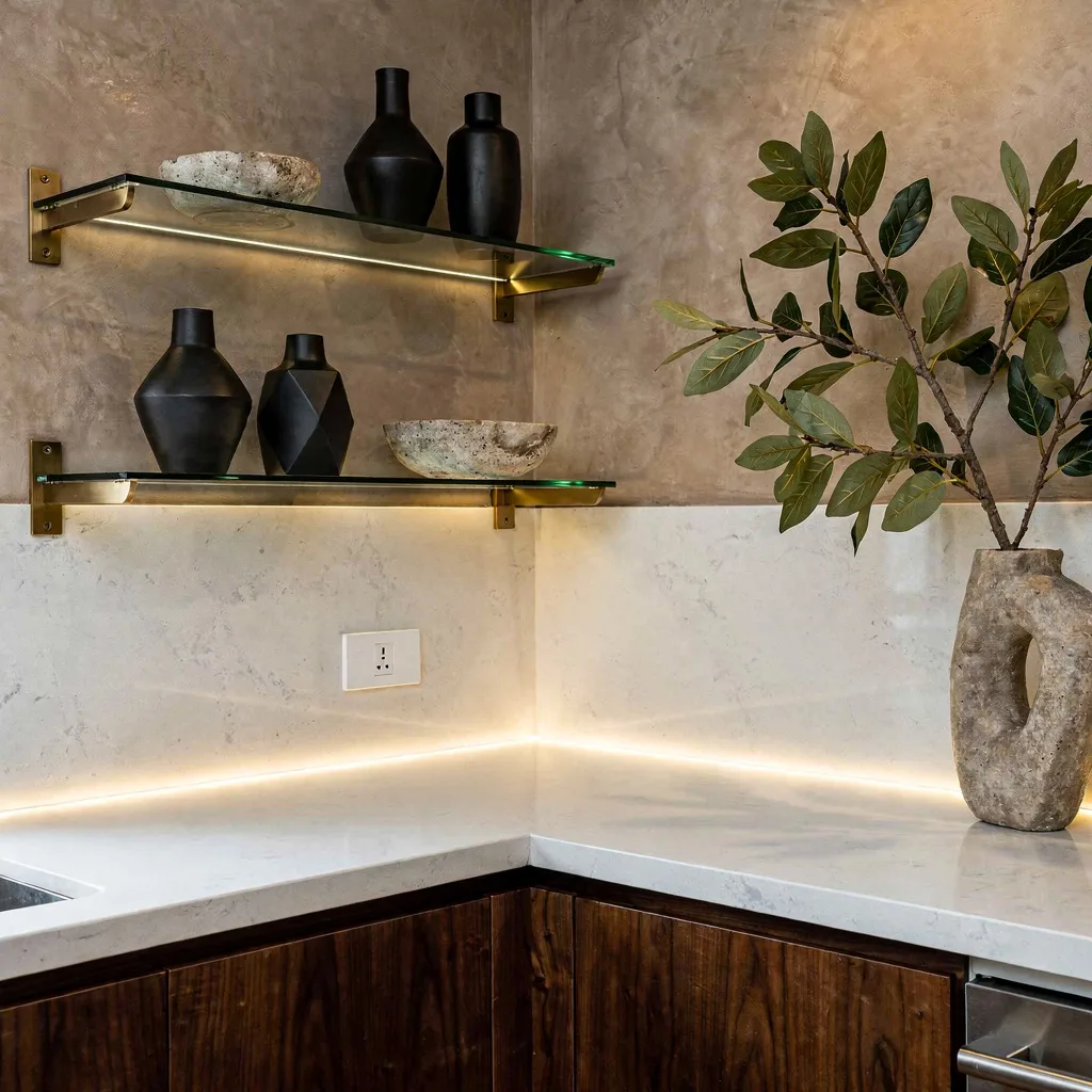
If you crave magazine-level luxury, it’s time for a double-whammy of clean lines and material flexing. Install an L-shaped white quartz countertop for major seamless vibes, then blast that corner with soft LED strips under the cabinets—because moody ambient lighting hides both sins and existential dread. Ditch the overdone wooden shelves and mount floating glass with matte brass brackets instead. Style them with matte-black geometric vases and edgy stone bowls, but don’t get sentimental—curate ruthlessly. Ditch visible outlets and match them to your backsplash unless you want tech to be the centerpiece. Want peak drama? Finish it off with a single oversized leafy branch in a sculptural vase; it’s the secret handshake to organic-meets-modern chic. Pro tip: Never crowd your corner—three objects max or you’re basically opening a pop-up thrift store.
Keep It Chill: Minimalist Soapstone and Porcelain Cool
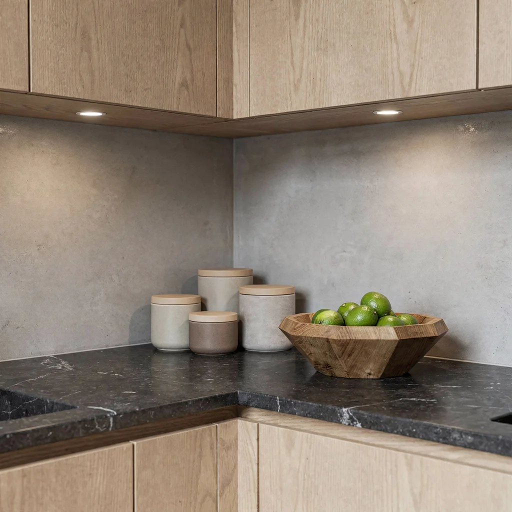
Minimalism isn’t an excuse to be boring—ditch the clutter and channel that architect energy with a polished charcoal soapstone counter at the perfect ninety-degree angle. Float ash wood cabinets above a barely-there micro-cement backsplash in soft grey; no heavy wood grain allowed. Collect matte porcelain containers in quiet earth tones and bunch them, not scatter—no one needs random spice jars freeloading all over. Upgrade the fruit situation with a faceted solid oak bowl, but stick to green limes only—don’t start a farmers’ market. Light the whole thing using focused recessed downlights for high-end museum vibes. Pro tip: Never over-accessorize; if you can’t fit everything on a dinner plate, rethink your choices.
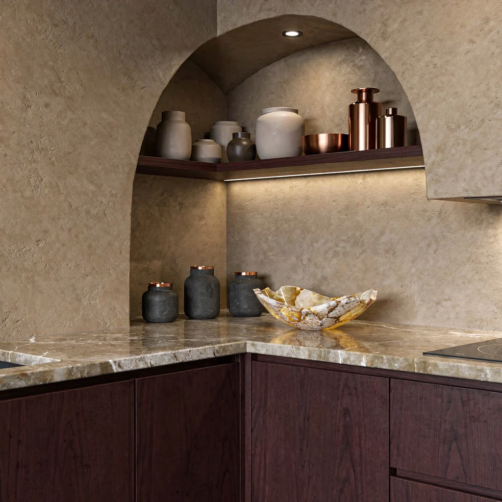
Bring the Drama: Calacatta Waterfall & Metal Marrying
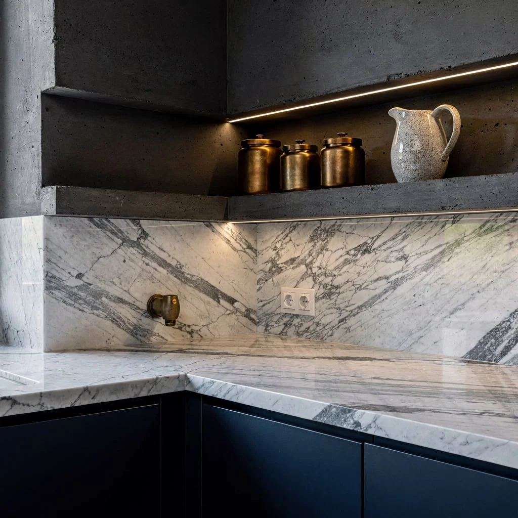
If your space is screaming for personality, go full drama with a waterfall-edge Calacatta marble countertop. Let the marble’s veining take over, both horizontally and vertically, for that seamless rich-person energy. On the accent wall, carve out a tiered niche—extra points for charcoal cement—and spotlight the heck out of your best artisan metallic canisters and a clay pitcher that looks like it could star in a still-life painting. For the cabinetry below, go matte navy, not basic blue, and sneak in a soft antique brass outlet. Pro tip: Contrasts are what make this sing, so always combine cool stones with warm metals instead of playing it safe with all one or the other.
Lighten Up: Terrazzo, Glass, and a Botanical Hit
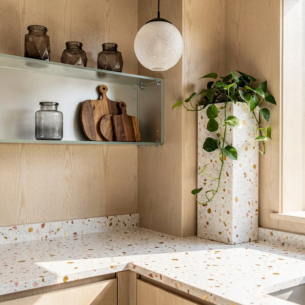
Still terrified of color and daylight? Get over it and use a creamy white terrazzo countertop that refuses to be gloomy, sprinkled with flecks of gold and pink for a bit of extra without going full clown. Ditch symmetrical shelves and stack floating frosted glass in weird, artsy ways—this is where your geometric jars and sculptural cutting boards come out to play, but keep it curated, not chaos. Wrap the walls in light maple paneling and cram in an oversized built-in terrazzo planter stuffed with trailing pothos. Hang a minimalist sandblasted glass pendant directly above the action for glow without hype. Pro tip: Don’t let shelving become a junk zone—rotate your jars seasonally or risk the TikTok mob calling out your clutter.
Texture Layering: Walnut, Sculpted Tile, & Artisanal Glass
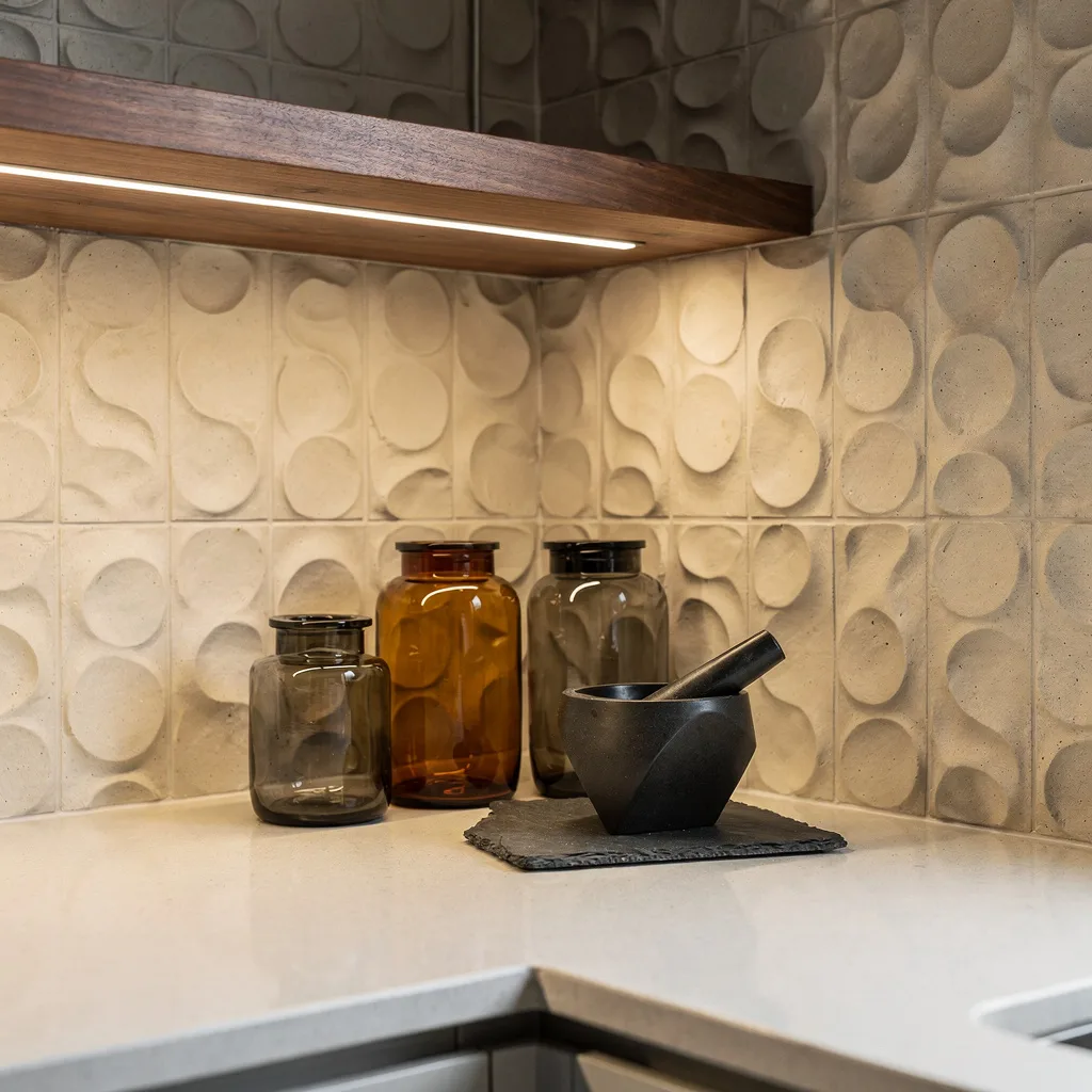
Stop settling for bland flat walls and basic shelves. To score depth, hang a cantilevered walnut shelf above a pale creamy quartz counter, then back it with three-dimensional sculpted clay tile—because if your wall is boring, you are too. Line up handblown amber and smoke glass jars (never clear, never basic), then hit the contrast with a matte black mortar and pestle on a slate tray. Fire up under-cabinet LED spotlights to send dramatic shadows everywhere. Pro tip: Always combine at least three distinct textures—wood, glass, and stone—or your kitchen will look like it came straight out of a generic catalogue.
Earthy Richness: Basalt Stone, Olive Cabinets, and Bronze Bling
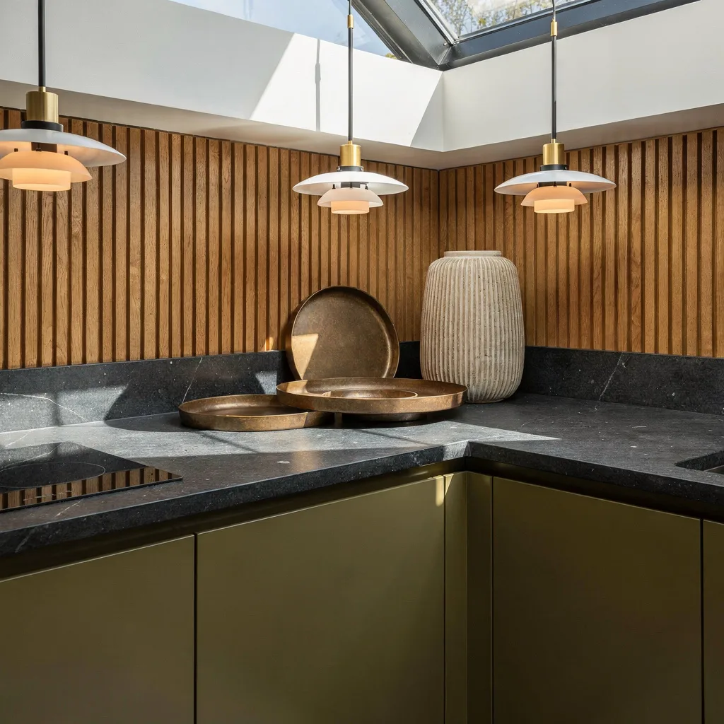
Ready to ditch the all-white nightmare? Layer up with a honed basalt stone countertop, sunk flush into olive-hued lacquered cabinets. Flank the corner with a slatted oak backsplash, because flat drywall is for rental apartments. Go strong with sand-cast bronze trays and scale-heavy, ridged ceramics so you don’t end up with yet another ‘Pinterest but poor’ vibe. Float a custom pendant above with skinny blackened brass arms and soft opal shades for drama and daylight. Pro tip: Play shadow games—don’t blast everything with overheads. Let sunlight and moody pendants do their thing for that tailored luxury you swipe for but never achieve.
Modern Mosaic: Concrete, Oak, and Emerald Accents
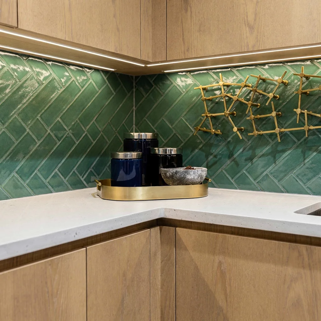
Tired of farmhouse repetitiveness? Slap down an architectural white concrete counter with zero visible seams, then deck it out with rebated oak cabinetry (read: hidden grip, no tacky knobs). The backsplash isn’t just an afterthought—hand-glaze emerald green tiles in herringbone for a flex, and light it up using sneaky LED strips. Anchor a matte gold tray (no granny filigree!) holding midnight blue glass canisters and a solid soapstone spice bowl. Add a geometric brass wall sculpture for prime TikTok jealousy. Pro tip: Real art beats ‘Live Laugh Love’—invest in sculptural wall pieces, even if you have to eat instant noodles for a week.
Richly Layered: Burgundy, Marble, and Microcement for Grown-Ups
Think dramatic but sophisticated, not wannabe vampire lounge. Drop a veined dolomite marble counter with a thick edge onto burgundy wood cabinets—try to act like you found this at a Parisian auction. Toss a sand-tone, hand-troweled microcement on the wall for bonus texture and park clean monochrome stone canisters in the nook. Show off your single best sculptural onyx bowl—if it’s not striking, don’t bother. Up top, float an arching architectural shelf for ceramic and copper treasures. Spotlight your stone with tiny recessed lights. Pro tip: Always spotlight stone or onyx accents from behind or below; if you just hit it with overheads, don’t bother. Drama is a lifestyle.
Pastel Fresh: Waterfall Onyx, Lime-Wash, and Crystal Chic
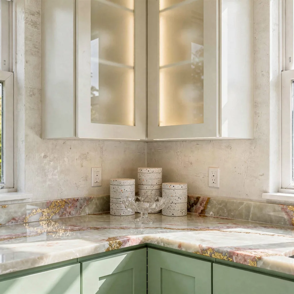
Embrace your pastel villain era with a pale polished onyx waterfall counter spiked with flecks of gold and pink—bold beats basic, always. Slather the wall in lime-washed off-white for soft cloud vibes and pair up edge-lit frosted glass cabinets because symmetry, for once, is your friend. Choose pistachio cabinetry for that subtly cool pop—save the boring for somebody else. Plan your countertop with staggered tiny terrazzo jars and a faceted crystal fruit holder that doubles as flex-worthy art. Let the daylight blast in and for once, don’t block the window. Pro tip: Only style with delicate, transparent objects—skip anything heavy and you’ll keep things feeling like a summer day, even in February.
Sculpted Serenity: Champagne Metal, Fluted Stone, and Minimalist Flow
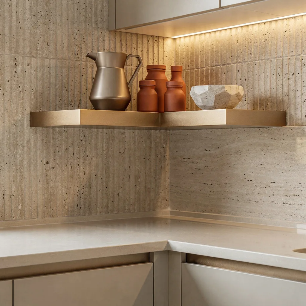
Sick of visual chaos? Install a floating cantilevered shelf in hand-brushed champagne aluminum—finally, some bling that’s not tacky—above a flawless matte porcelain slab counter. Run fluted travertine vertically up the wall and blast it with discreet uplights for a nonchalant architectural flex. Style your shelf with a frosted glass pitcher and perfectly graduated terracotta spice jars; round it out with a faceted pale stone bowl for substance. Forgo handles on base cabinets to keep lines clean and drama-free. Pro tip: When in doubt, subtract one accessory. Serenity is achieved by empty space, not by piling on more stuff.
Congratulations, your kitchen corners are about to throw shade on everyone else’s. Remember: no more sad corners, no more kitchen shame spirals. Only mood, texture, and ruthless edits. Pick a vibe, steal these pro tips, and don’t forget—less clutter, more style. Stop waiting for a magical kitchen gene and start styling like you mean it. You’ve got savage ideas; now go make your space look expensive and intentional. Nobody wants a boring corner. Not even your mother-in-law.