
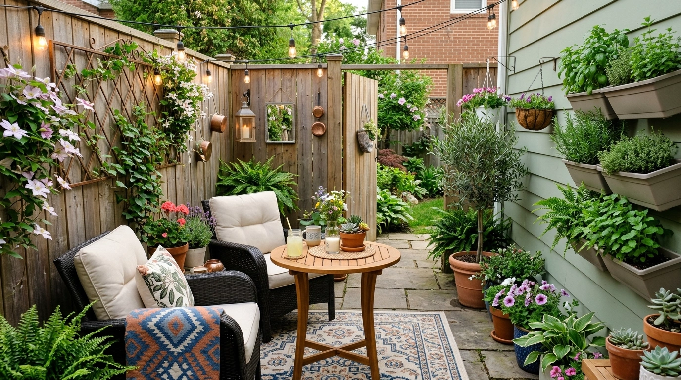
Small patios have a funny way of exposing every decorating decision. In a large yard, one odd cushion or mismatched planter can disappear into the background. On a compact patio, it sits there like it has been called into a meeting.
Color matters because there isn’t much room for visual confusion. The wall, floor, furniture, textiles, pottery, and planting all sit close together, so unrelated shades become noticeable fast. A good palette doesn’t mean everything has to match. It means the different parts of the space have a clear relationship.
Small Patio Color Palette Ideas
Warm Sand, Terracotta, and Olive Courtyard Patio
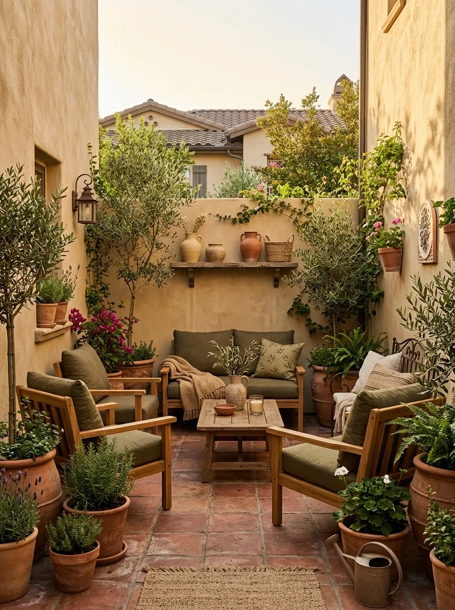
Warm sand stucco gives this compact courtyard an easy visual base, while terracotta appears across the floor, pottery, and a few small accents. Olive cushions bring in a deeper natural tone, and honey-colored wood keeps the furniture from disappearing into the background. The result feels collected without looking overly decorated.
The key is repetition. Terracotta appears in more than one place, olive connects the seating to the planting, and the sandy backdrop quietly holds everything together. Nothing is fighting for attention, which is useful when there isn’t much square footage to begin with. Too many unrelated accents would turn this calm composition into patio karaoke.
Cream and Soft Black Modern Patio
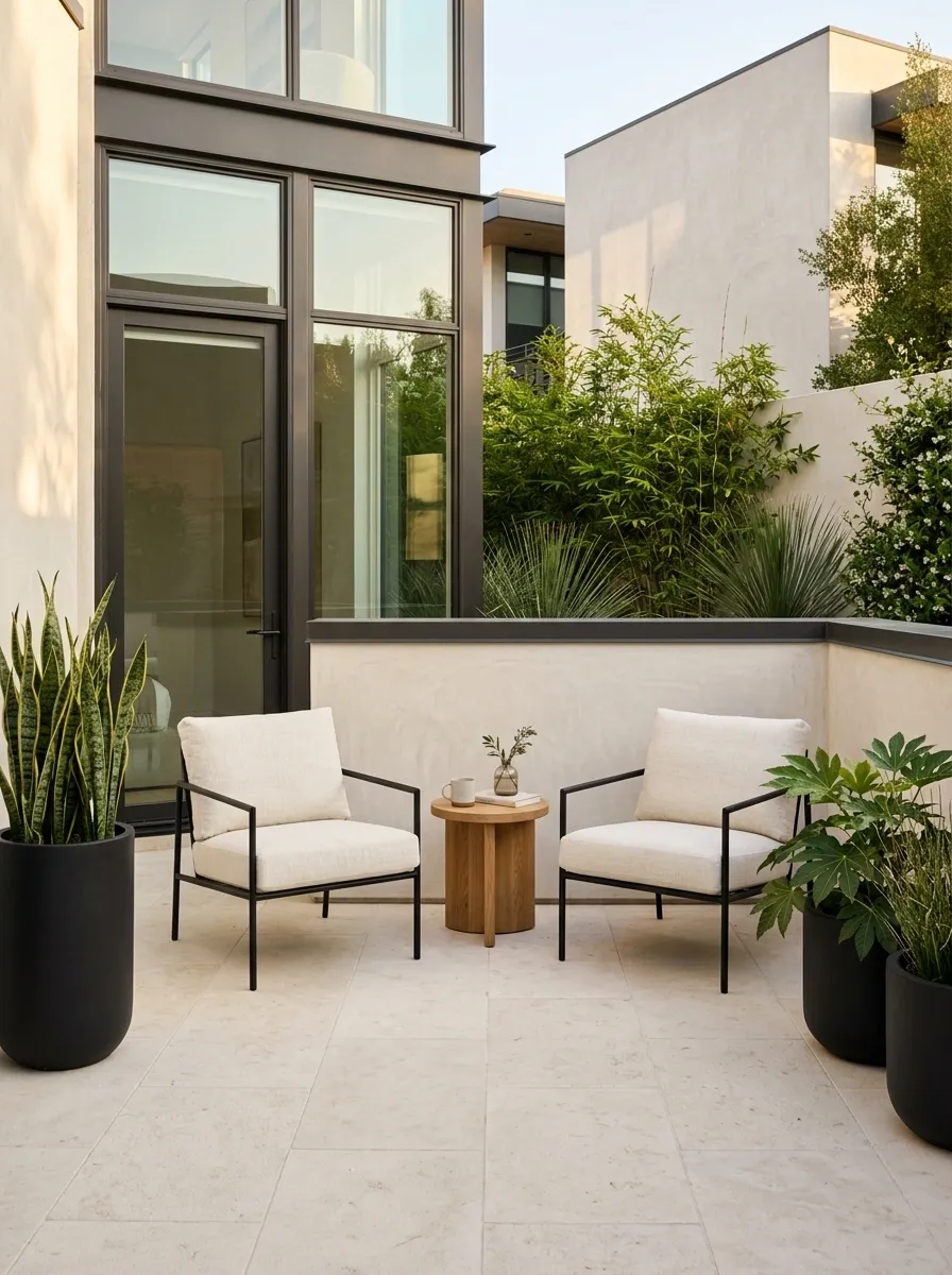
This patio goes in the opposite direction, using cream as the dominant backdrop and soft black as the architectural contrast. Pale paving keeps the footprint visually open, while black chairs, planters, and narrow framing elements create definition without making the space feel boxed in. Ivory cushions soften the contrast, and a small amount of warm timber keeps the palette from becoming cold.
The trick here is concentration. Black works because it has been given specific jobs instead of being scattered everywhere. The eye can quickly understand where the structure begins and ends. Add five more dark accessories and the clean composition starts getting a little too enthusiastic.
large surfaces
textiles
structure
Sage Green and Natural Wood Patio
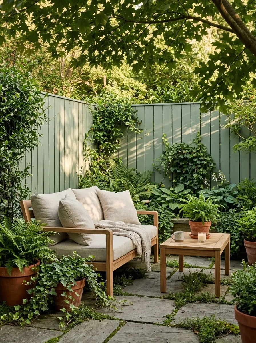
Sage green turns the fence or main wall into part of the garden instead of treating it like a blank boundary. Natural teak seating adds warmth, oatmeal cushions keep the composition soft, and clay pots introduce a subtle earthy note without stealing attention from the planting.
This palette works because the colors feel related to the outdoor setting instead of competing with it. The green connects visually with leaves, while the wood and clay bring in warmer materials at a slower pace. The overall effect is relaxed, but not bland. And unlike a patio packed with trendy accessories, this one still looks convincing after the novelty wears off.
Dusty Blue and White Coastal Patio
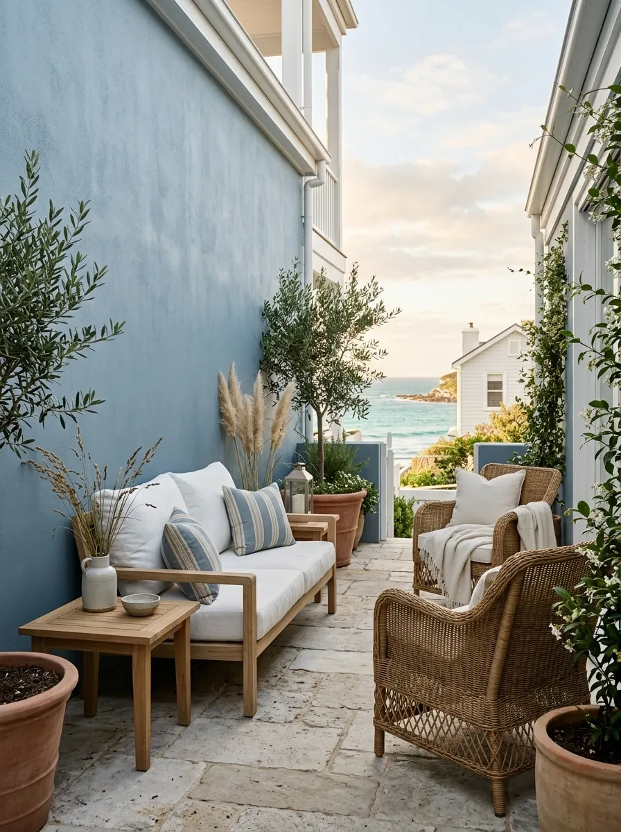
A narrow patio can get plenty of character from a dusty blue backdrop without becoming a themed beach set. Here, the blue sits on the main wall, while white cushions lighten the furniture, pale timber introduces warmth, and woven seating adds texture. The flooring stays quiet so the wall and furniture can carry the color story.
The softer blue matters. A harsh saturated blue would make the little footprint feel louder and more enclosed. Dusty blue has enough color to establish a mood while still letting daylight do some of the visual work. Keep the accessories restrained. There is no need for a miniature lighthouse to complete the argument.
Chocolate Brown and Cream Garden Patio
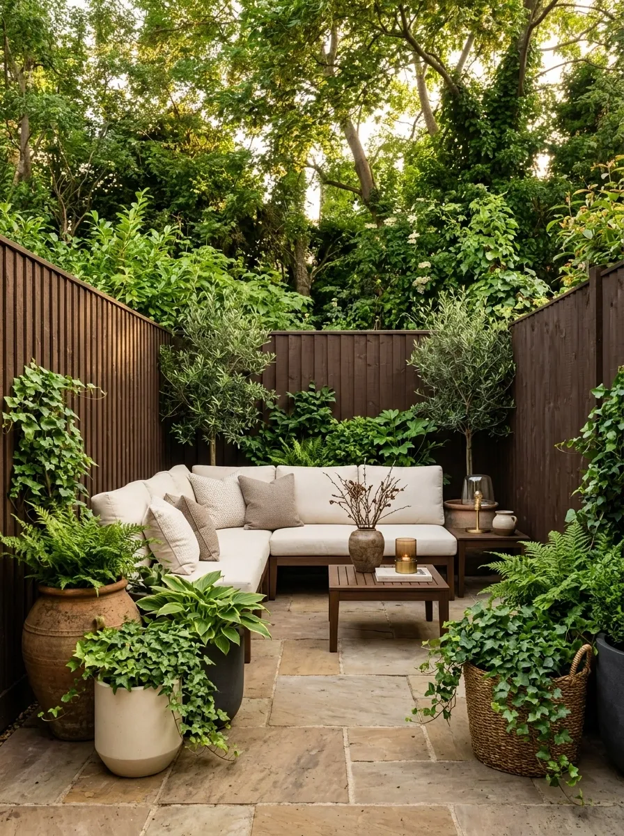
Deep brown gives this small patio a surprisingly strong backdrop, especially when the space opens directly into a garden. Dark timber or fencing frames creamy cushions, warm stone flooring, and layered green planting. Instead of making the patio feel heavy, the dark background helps the lighter seating and foliage stand out more clearly.
The contrast is doing most of the decorating here. Cream furniture creates breathing room, while greenery breaks up the darker surfaces and keeps the composition connected to the garden. The palette also has enough warmth that it avoids the hard, high-contrast feeling of pure black and white. Dark colors can absolutely work in small spaces. They just need something lighter to argue with.
Peach, Clay, and Warm White Patio Nook
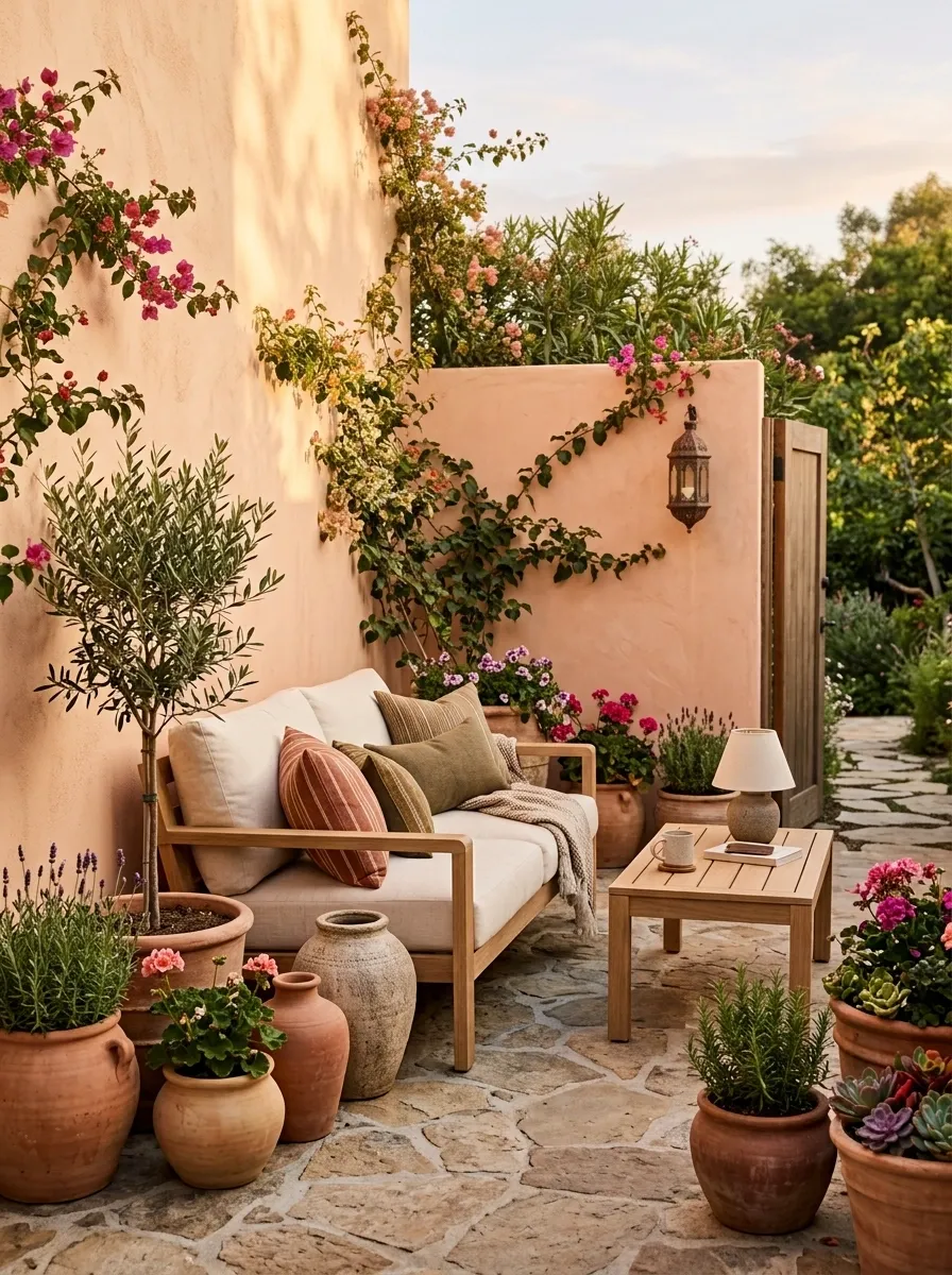
Soft peach walls give this compact patio a sunny base without going full candy shop. Warm-white cushions, light wood furniture, and terracotta pots add depth while keeping the overall palette relaxed. A few flowering plants bring in a slightly brighter note, but the main colors stay soft enough that the tiny footprint still feels open.
The clever part is the temperature. Every major surface leans warm, so the patio feels connected rather than chopped into unrelated zones. The wood also stops the peach from becoming too sweet. Keep the stronger terracotta tones near the floor and lower half of the space. Putting that much orange overhead would make the patio start auditioning for a restaurant makeover.
Charcoal, Rust, and Natural Green Patio
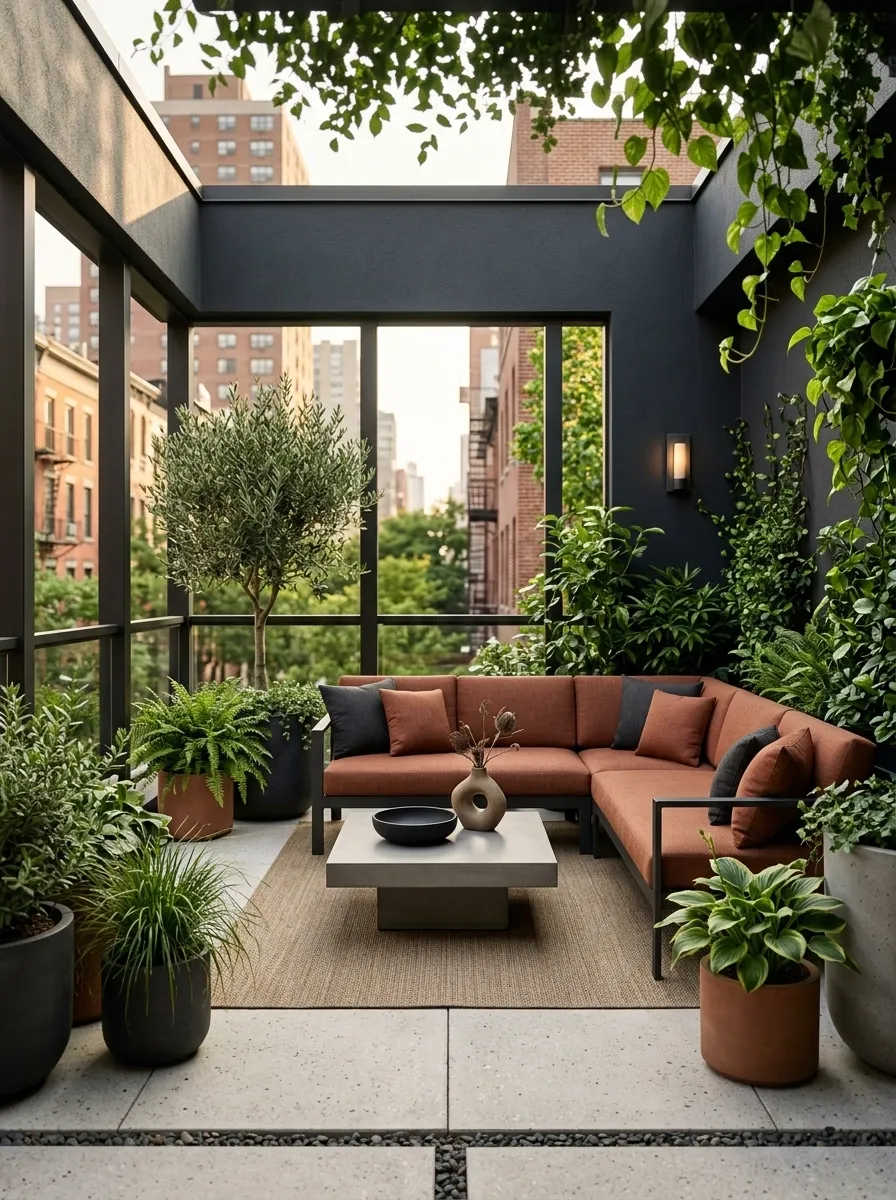
For a patio that needs more attitude, charcoal creates a strong architectural shell while rust upholstery warms it up. Concrete or pale stone flooring keeps the base from becoming too dark, and generous greenery softens the hard lines around the seating.
This palette feels modern because the darkest tone is doing structural work rather than acting like a random accent. Rust then becomes the memorable color, appearing mainly through cushions or one larger textile. Greenery provides the third layer and keeps the whole composition from feeling overly urban. The important move is restraint. Once charcoal, rust, green, and six decorative objects all start competing equally, the patio has officially entered its “too many opinions” era.
Ivory, Taupe, and Black Scandinavian Patio
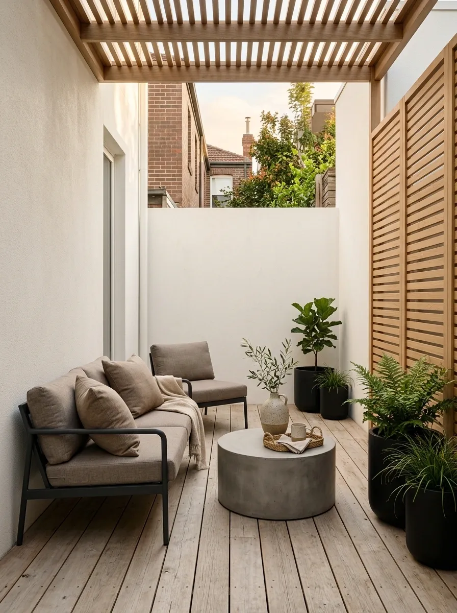
A Scandinavian-inspired patio doesn’t need to look like someone emptied an oatmeal cupboard onto the furniture. Ivory walls, taupe seating, pale timber, and slim black details create a softer interpretation of the look. The palette stays light enough for a narrow patio while black framing adds just enough definition to keep the scene from fading into one beige blur.
The strongest feature is the balance between softness and structure. Taupe handles the larger seating surfaces, ivory opens the background, and black appears in selected furniture or planters. Natural wood quietly fills the gap between them. Keep the decorative pieces sparse and useful. The goal is calm, not an outdoor storage unit with very good branding.
Terracotta and Cream Mediterranean Patio
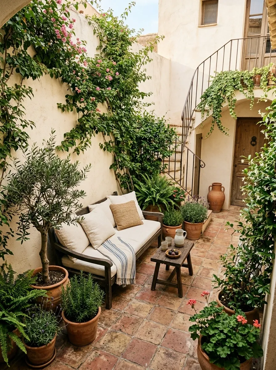
Cream stucco, terracotta flooring, rounded pottery, dark wood furniture, and dense green planting give this little patio the feel of a Mediterranean courtyard without needing a giant villa attached to it. The palette is warm from top to bottom, which makes the space feel cohesive even when the footprint is compact.
Terracotta carries the strongest color, but it appears in several related forms instead of one loud statement piece. Cream keeps the walls and seating visually quiet, while dark wood adds weight and stops the whole scene from becoming too pale. The rounded pots and softer furniture shapes matter too. With a palette this warm, harsh black accents would change the character quickly. Sometimes the patio knows exactly when enough contrast is enough.
Forest Green and Tan Urban Patio
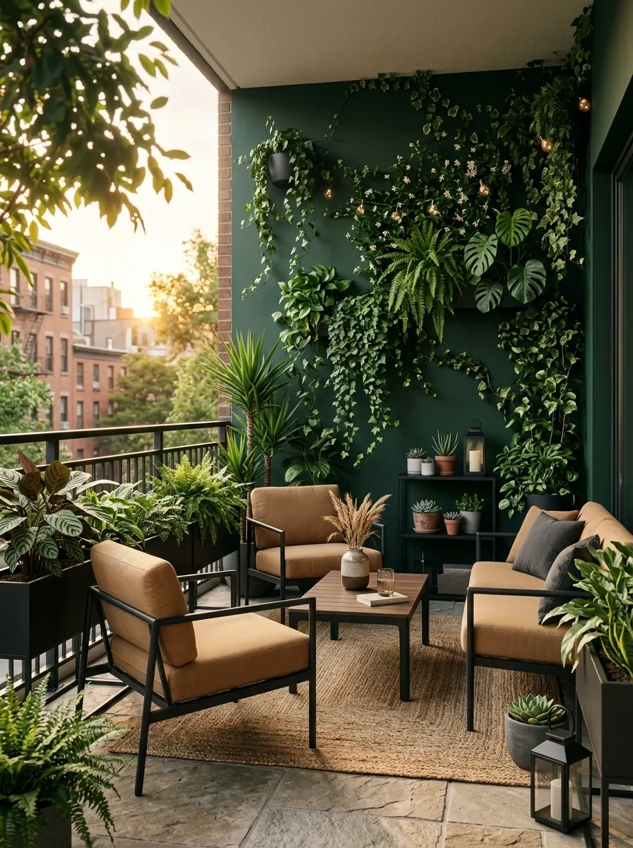
Deep forest green turns the boundary of this small city patio into part of the planting story. Tan upholstery adds warmth, natural stone gives the floor a grounded appearance, and black details provide just enough structure around the furniture. The result is rich without becoming gloomy.
The darker wall is doing something useful here: it makes the furniture and greenery stand out instead of asking every surface to be bright. Tan is especially helpful because it bridges the deep green and the neutral stone. Keep the black details narrow and architectural, such as chair frames or planters. Covering every available object in black would flatten the palette and make the patio feel much heavier than it needs to.
Mushroom Beige and Muted Green Patio
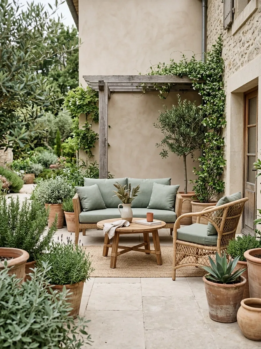
Mushroom beige gives this small patio a soft architectural base, while muted green cushions and foliage add enough color to keep the setting from looking washed out. Woven furniture introduces texture, and clay-toned planters quietly warm the lower half of the composition. The result feels relaxed and natural without becoming aggressively themed.
The palette works because the contrast stays gentle. The eye can move from the walls to the furniture and then into the planting without hitting a sudden color interruption. That matters in a compact space. Keep the green dusty rather than bright, and let texture do some of the visual work. Not every patio needs to yell “look at my color palette” from three houses away.
Whitewashed Brick and Warm Wood Patio
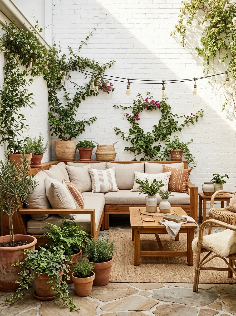
White-painted brick brightens the backdrop while honey-toned wood gives the furniture enough warmth to keep the patio from feeling stark. Beige cushions bridge the two, and terracotta planters introduce a small earthy note near the floor. The setting feels relaxed and collected, with the kind of variation that suggests the pieces were chosen over time rather than delivered in one giant box.
The warmth comes mostly from materials, which keeps the palette from getting cluttered. Whitewashed brick reflects daylight, warm timber defines the seating, and terracotta gives the lower edge of the composition some visual weight. Repeat the same timber tone across the main furniture instead of collecting three different shades of brown. The patio doesn’t need a wood census.
Navy and Warm Beige Bistro Patio
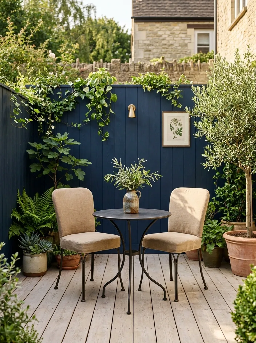
A compact bistro arrangement gets a richer look through navy paired with warm beige, pale timber, and a little greenery. Navy can occupy the main wall or fence, giving the patio a clear visual anchor, while beige upholstery and a light floor keep the footprint feeling open. Dark metal furniture reinforces the tailored look without adding another strong color.
The warm beige is what keeps the navy from feeling too formal. Pale wood does the same thing on a larger scale, creating a softer transition between the cool backdrop and the furniture. The palette works especially well with a small round table or narrow café setup because the stronger color gives the tiny arrangement a clear identity. Keep the accessories restrained. The patio is already making its point.
Olive, Cream, and Black Contemporary Patio
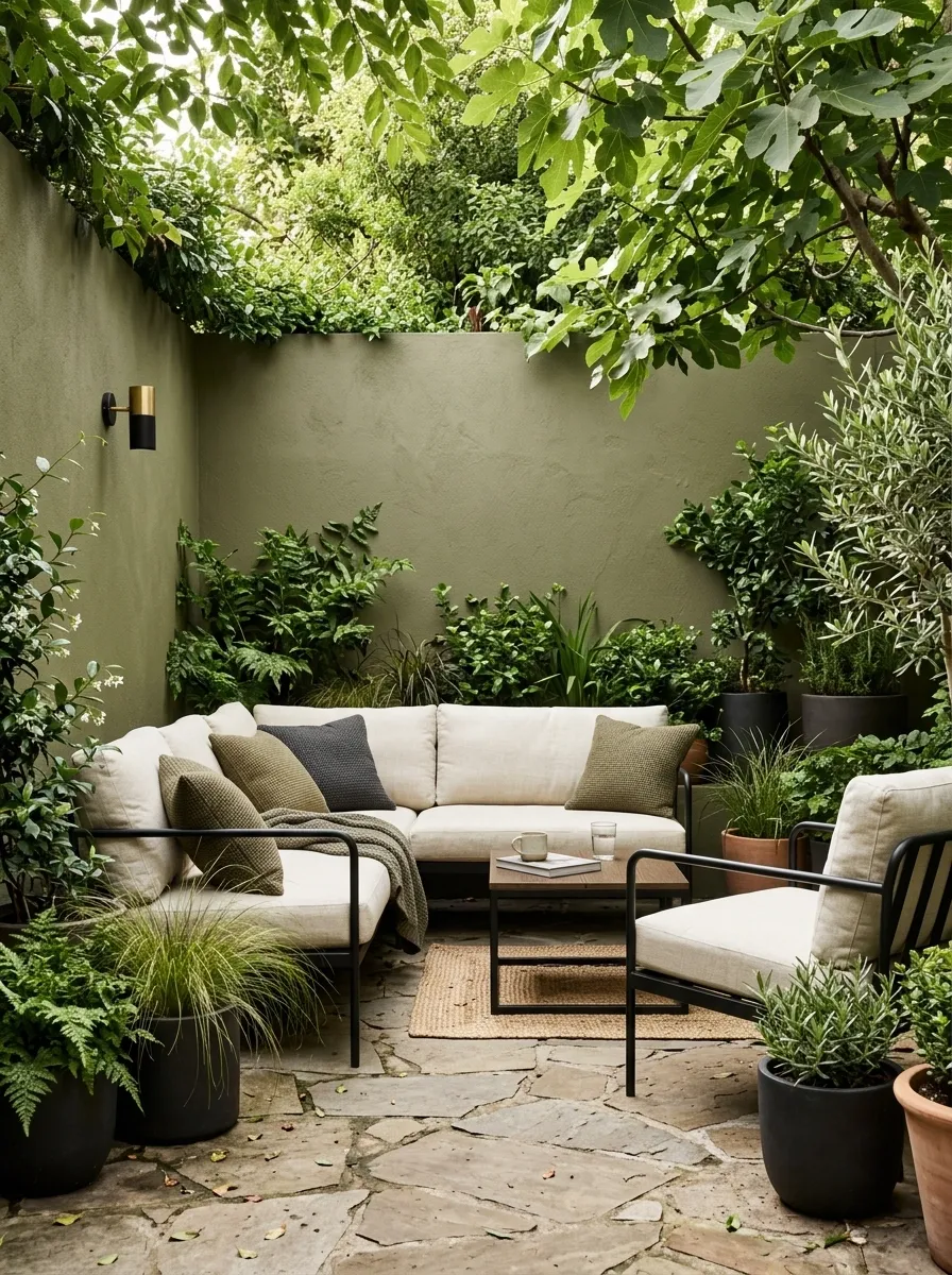
Olive walls create a grounded backdrop, while cream seating keeps the compact lounge area visually light. Black-framed furniture and dark planters sharpen the edges, and natural stone underfoot connects the composition to the garden. The overall effect is contemporary without becoming cold or overly geometric.
The darkest tone has a very specific job here. Black defines furniture frames, legs, and selected containers rather than covering every possible surface. Cream carries the visual center, and olive ties the architecture to the greenery outside the seating area. That relationship is what makes the palette feel considered. Repeat black only where a structural line needs emphasis. Otherwise, the patio starts looking like it was assembled from one very enthusiastic black-furniture catalogue.
Blush Beige and Walnut Small Patio
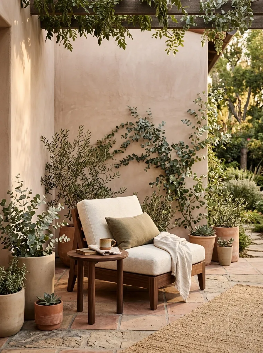
Blush beige gives the walls a soft warmth, while walnut furniture creates a much richer visual center. Ivory cushions keep the seating bright, clay pottery adds a low earthy note, and muted greenery completes the scene without introducing another loud accent.
The palette works through gradual changes rather than sharp jumps. Blush beige leads into walnut, ivory lightens the seating, and the plants carry a softer version of the same natural mood outdoors. That makes the patio feel layered without looking busy. Keep the blush dusty and understated. A stronger pink would change the entire character of the space, and suddenly the patio would look like it has plans involving cupcakes.
Light Gray, Cedar, and Green Patio
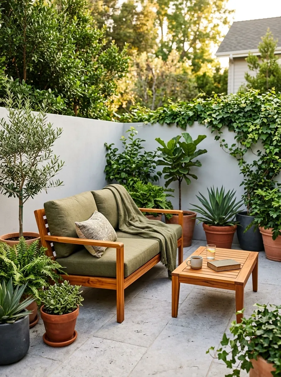
Light gray creates a clean foundation here, but cedar furniture keeps the patio from drifting into cold contemporary territory. Olive-green cushions echo the surrounding plants, while pale stone flooring carries the gray through another part of the scene. The result feels modern without looking overly polished.
The balance comes from pairing a cool architectural base with warmer natural materials. Cedar supplies enough orange-brown warmth to keep the gray lively, while green gives the palette an outdoor connection that feels obvious rather than forced. Keep the cedar fairly consistent across the furniture. Mixing honey, orange, and red wood tones would turn a simple palette into a surprisingly complicated family meeting.
Black and Terracotta Mediterranean Courtyard
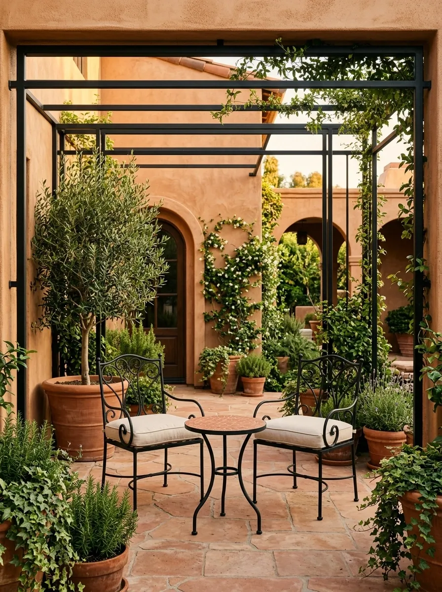
Black and terracotta create a much stronger visual statement than the softer palettes earlier in the collection. Matte black chairs and framing give the patio a graphic structure, while terracotta appears across the walls, pots, and selected floor details. Cream cushions soften the contrast, and dense greenery fills the spaces between the harder materials.
This palette works because the warm terracotta keeps the black from feeling severe. Cream then becomes the quiet middle layer between the two. The result has plenty of character without needing decorative clutter. Let the architecture carry the drama and keep the accessories simple. Once every surface gets another pattern, texture, or color, the Mediterranean mood starts competing with itself.
Butter Yellow and Soft Sage Patio
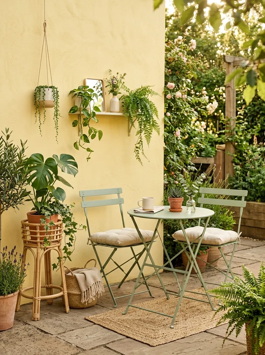
A pale butter-yellow wall gives this tiny patio a cheerful backdrop, while sage furniture and cream cushions keep the color story calm. Natural rattan adds another warm surface, and leafy planting reinforces the sage tones without making the entire setting green. The result feels sunny, but not sugary.
The muted versions of both colors are doing important work. Strong yellow and bright green would make the same composition much louder. Here, the colors have enough softness to sit comfortably together. Keep the flooring neutral and let the wall carry most of the yellow. There is no prize for making every object match.
Main wall or backdrop
Furniture and planting create the calmer layer
Textiles keep the seating area visually light
Stone Gray and Rust Modern Patio
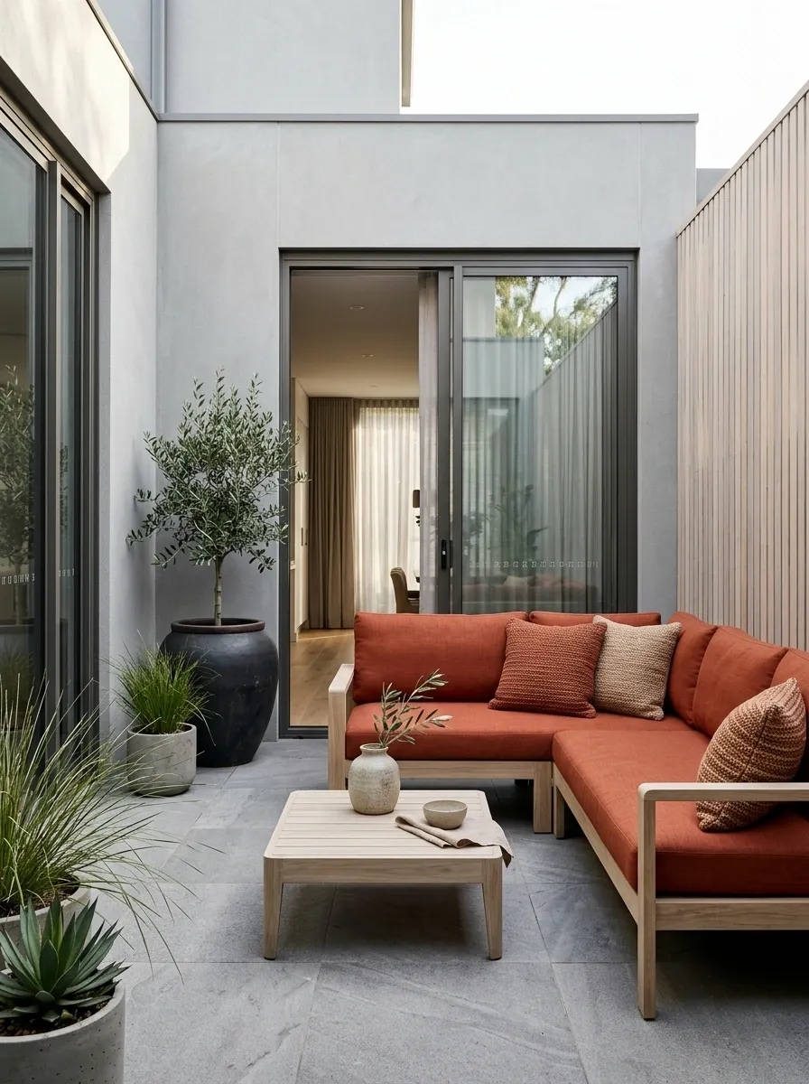
Stone gray forms the shell of this compact contemporary patio, appearing through the paving, wall finish, and a few larger architectural surfaces. Rust-colored cushions bring warmth into the seating area, while pale wood prevents the gray from feeling too hard. Sparse greenery keeps the palette connected to the outdoors without adding another dominant color.
The rust is intentionally limited. That small amount does more because it contrasts with so much neutral structure. A larger dose would change the whole character of the patio. This is a useful approach when the architecture already has strong lines and clean finishes. Let the neutral shell do the quiet work, then give one warm color a memorable supporting role.
architecture + paving
textiles
furniture
Warm White and Dusty Green Cottage Patio
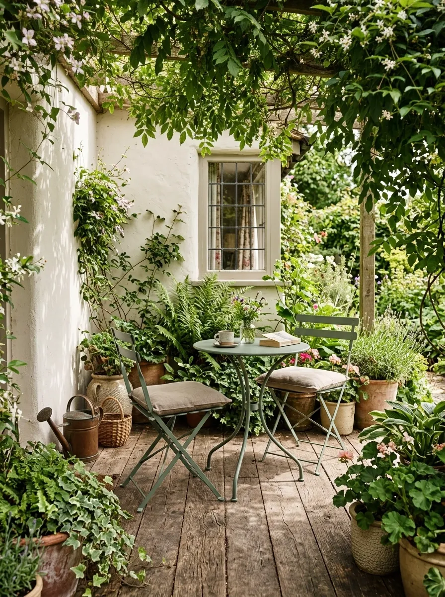
Warm white walls make this compact patio feel open, while dusty green furniture gives the setting a softer cottage character. Weathered wood adds age and texture, beige cushions bridge the two main colors, and overflowing planters bring in several natural green tones. Nothing looks aggressively new, which is exactly why the space feels comfortable.
The color palette benefits from a little imperfection. Weathered timber, textured pots, and varied foliage keep the whites and greens from becoming too polished. Green also appears in both furniture and planting, creating a visual connection that makes the patio feel more complete. Keep the beige subdued and let the plants provide the variation. The patio already has a full cast. No decorative rooster required.
Caramel, Cream, and Black Patio Lounge
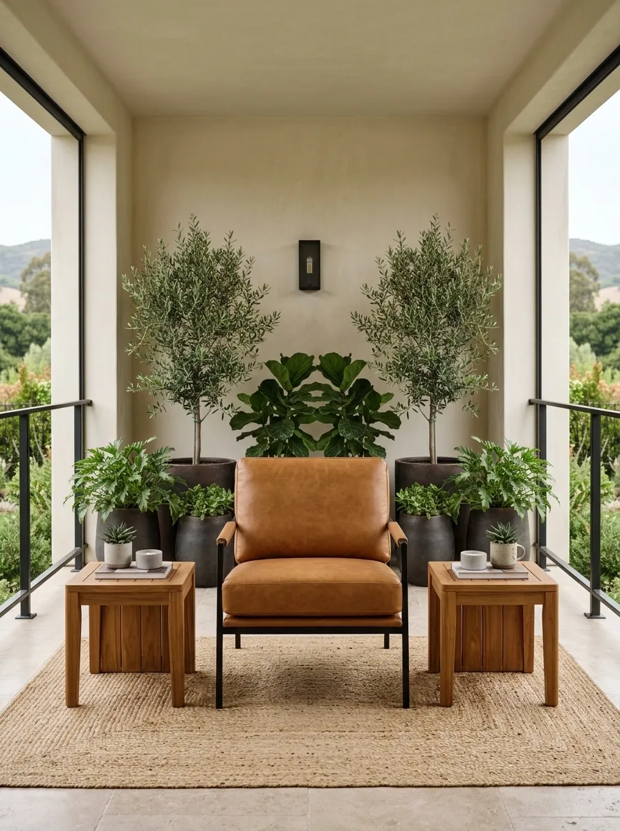
This compact lounge uses caramel as the warm center of the composition, with cream walls and cushions keeping the setting light. Slim black furniture frames add definition, while warm timber introduces another natural layer without changing the overall color story. A few leafy planters soften the harder edges and keep the patio visually connected to the outdoors.
Caramel is doing more than adding warmth here. It gives the seating a clear focal point while cream keeps the background calm. Black works best in narrow doses, especially around furniture legs, frames, and small architectural details. That contrast gives the patio a tailored look without making it severe. Keep the floor quiet and neutral. There is already enough happening above it.
Muted Blue-Gray and Terracotta Patio
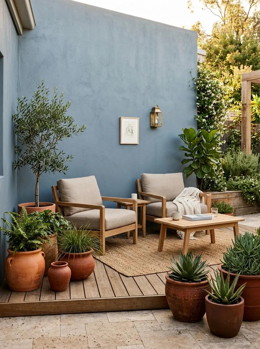
Blue-gray walls create a cool, settled backdrop while terracotta pottery and warm timber bring the temperature back up. Beige upholstery keeps the seating soft, and a handful of plants add a natural green layer without changing the palette into a garden-themed color explosion.
This combination has more personality than a basic blue-and-white patio because the terracotta gives the cool blue-gray somewhere warmer to land. The wood does the same thing on a larger scale. The result feels relaxed but architectural, especially when the patio has simple paving and clean furniture lines. Keep the terracotta concentrated near the floor. A giant orange canopy would have a few things to say about that plan, and none of them would be polite.
Deep Plum and Olive Garden Patio
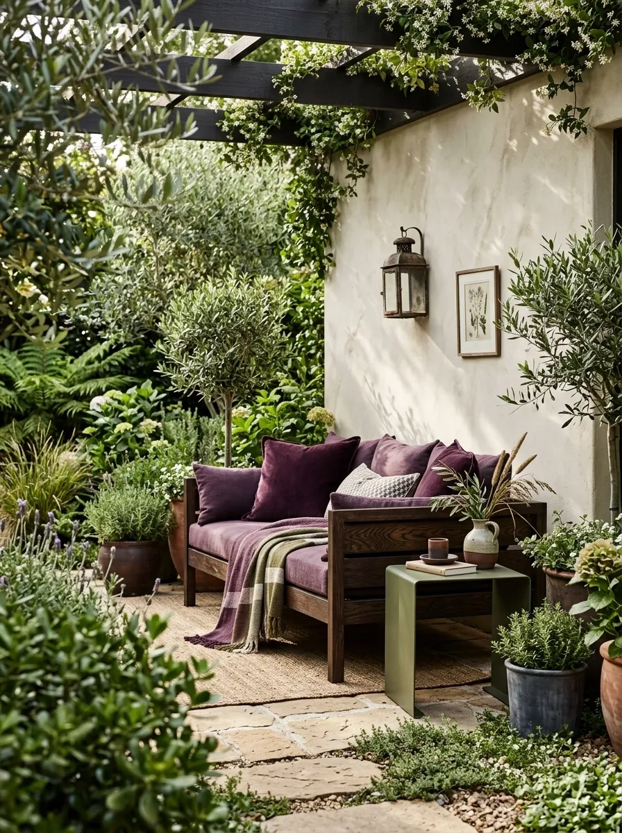
Deep plum is an unexpected choice for a small patio, but it becomes surprisingly elegant when used through cushions and textiles rather than covering the entire space. Olive furniture, dark timber, warm stone, and dense foliage create a richer composition around it, while a muted cream backdrop gives the darker colors enough breathing room.
The plum works because it stays concentrated. It appears where the eye naturally lands, then the olive and greenery carry the color story outward. This creates a more layered look than simply choosing one bold wall color and hoping for the best. Keep the surrounding materials quiet. Plum already has enough drama to enter a room wearing its own soundtrack.
Cream, Caramel, and Woven Texture Patio
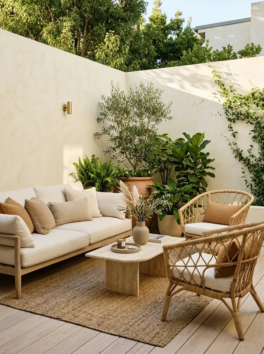
This palette keeps the colors intentionally close, then lets texture create the visual interest. Cream walls and cushions establish a light base, caramel upholstery warms the seating, and woven furniture introduces natural variation through rattan or wicker. Pale timber and leafy plants finish the scene without forcing another strong color into the mix.
A compact patio often benefits from this kind of quiet layering because there simply isn’t much room for dramatic color changes. Different textures allow the space to look detailed without looking crowded. The woven pieces are especially useful because they sit visually between the softer fabrics and harder architectural surfaces. Keep the caramel warm but muted. There is a fine line between “layered neutral” and “every brown thing from the storage room.”
Pale Gray and Eucalyptus Green Patio
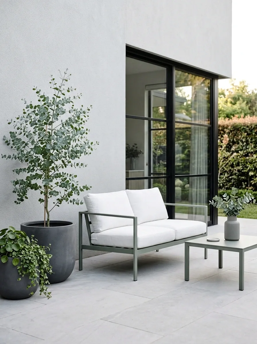
Pale gray walls and paving give this patio an airy architectural base, while eucalyptus-toned furniture introduces a soft green that feels fresher than a typical olive palette. White cushions brighten the seating and delicate greenery repeats the same family outdoors. The result is clean, quiet, and slightly cooler than the earthier designs in the collection.
The eucalyptus shade is important because it avoids a hard color break against the pale gray. It sits somewhere between neutral and green, which lets the patio feel colorful without losing its calm appearance. White is best used on the seating rather than the main wall, where it could make the composition feel flatter. Keep the furniture lines simple and let the color relationship provide most of the visual interest.
Rust, Walnut, and Cream Entertaining Patio
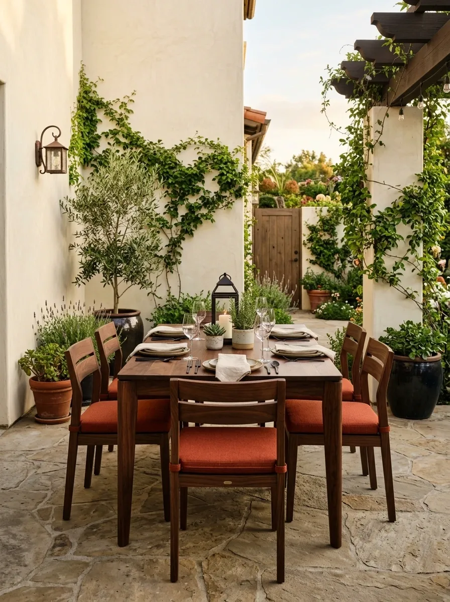
This patio uses a compact dining arrangement rather than a lounge, giving the color palette a different spatial focus. Walnut furniture provides the darker foundation, rust upholstery adds warmth across the seats, and cream walls keep the surroundings bright. Small dark lanterns and a few planters complete the setting without crowding the table.
The palette suits an entertaining space because the warmer colors create a more intimate atmosphere around the dining zone. Walnut and rust are close enough in temperature to feel connected, while cream prevents the whole area from getting visually heavy. Keep the rust concentrated around the chairs and cushions. Once the wall, table, floor, pots, and napkins all become rust, the dinner guests may reasonably assume the invitation came from a paint company.
Pale Clay and Charcoal Minimal Patio
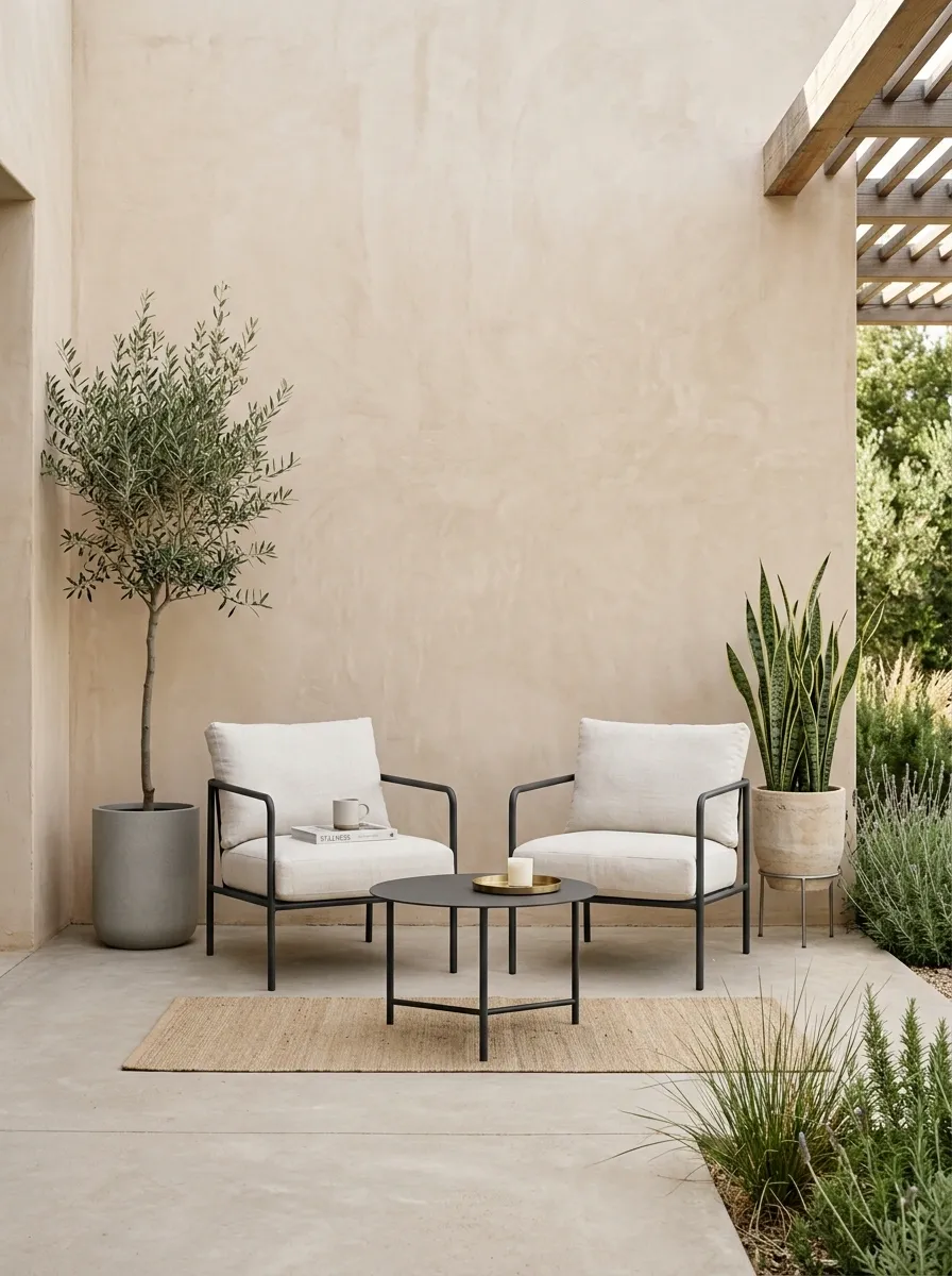
Pale clay walls give this tiny patio a warm architectural shell, while charcoal furniture provides a strong outline. Off-white cushions soften the seating, concrete flooring keeps the lower half simple, and a few sculptural plants add organic shapes without cluttering the composition.
The appeal is the controlled contrast. Pale clay is softer than beige but warmer than gray, so it already carries some personality. Charcoal then creates the sharper edge around the furniture without making the whole patio feel dark. Keep the plant selection restrained and architectural. The space doesn’t need twelve different leaves fighting for screen time.
Sea Green, Sand, and Driftwood Patio
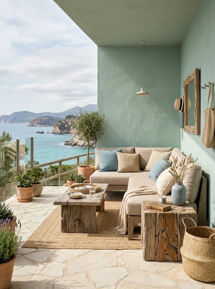
Soft sea green gives this patio a relaxed backdrop, while sandy beige upholstery and weathered driftwood tones make the furniture feel naturally settled. Pale stone keeps the floor understated, and a restrained amount of blue in the textiles adds a cooler note without turning the space into a themed coastal display.
The palette works through gradual transitions. Sea green connects to the plants, sand keeps the seating light, and driftwood adds texture and warmth. Nothing needs to be perfectly matched because the materials already live in the same visual family. Keep the blue secondary and let the sea green carry the architectural color. A coastal patio can suggest the ocean without decorating itself like a souvenir shop.
Mocha, Oatmeal, and Deep Green Patio
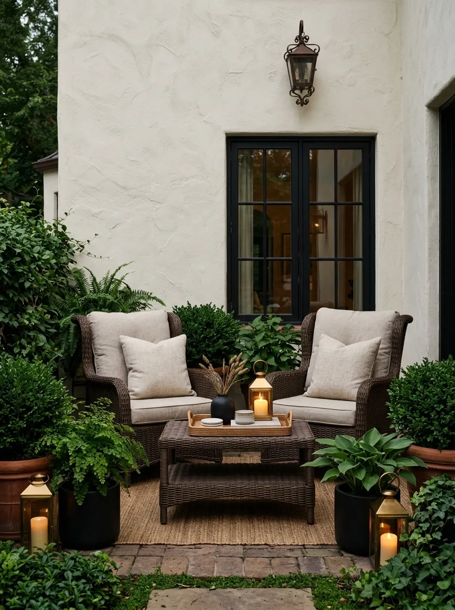
Mocha furniture gives this compact patio a rich base, while oatmeal cushions lighten the center of the seating area. Deep green planting provides the strongest natural color, and a cream wall keeps the background from disappearing into the darker palette. Warm lantern light makes the combination especially atmospheric later in the day.
The palette has more depth than a standard neutral scheme because the brown tones are allowed to become genuinely rich. Oatmeal is important because it stops the furniture from blending into one heavy block, while deep green breaks up the warmth. Use lighting selectively around the seating rather than washing the entire patio in yellow light. The goal is evening atmosphere, not an accidental audition for a haunted café.
Apricot, Olive, and Natural Stone Patio
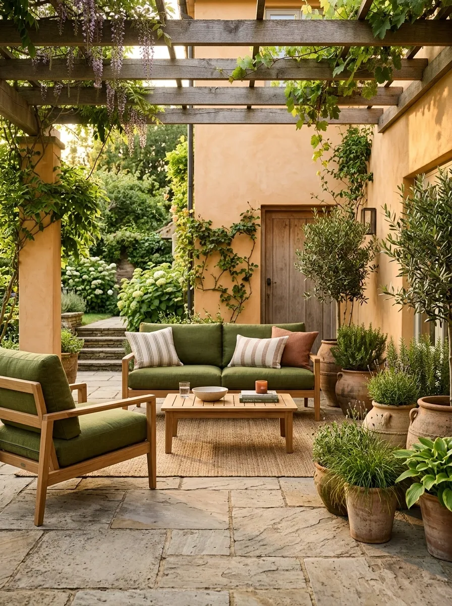
Soft apricot walls give this contemporary garden patio a warm identity without overpowering the setting. Olive cushions sit against teak furniture, natural stone grounds the floor, and terracotta pottery adds a small earthy echo near the planting. The colors feel distinctly warm, but the stone keeps the composition from becoming too orange.
The hierarchy matters here. Apricot owns the backdrop, olive provides the strongest furniture accent, and stone and teak act as the quieter materials connecting everything. Terracotta appears only as a finishing note, which gives it more impact. Keep the planting varied in texture but restrained in color. The patio already has a strong visual story. More color would simply interrupt it.
A small patio doesn’t need a huge number of colors to look interesting. What matters is how the colors relate once they share the same walls, furniture, floor, and planting. A palette becomes much easier to judge when it is treated as a finished scene instead of a handful of swatches floating on a screen.
Start with the part of the patio that is hardest to change, such as the wall, floor, fence, or major furniture. Build the rest of the composition around that. Then repeat important colors in a few places so the space feels connected without looking overly matched.