
Nobody visits your house to inspect the bathroom. And yet it’s the one room you painted the same flat, forgettable white as every rental unit in the country.
Color drenching is the opposite instinct. One color, everywhere — walls, ceiling, trim, sometimes the tub — until the room reads as a single decision instead of a collection of afterthoughts.
It’s not subtle. It’s not for people who want their bathroom to “feel timeless,” whatever that means. It’s for people who’ve accepted that resale value is somebody else’s problem, twenty years from now, possibly never.
These twenty bathrooms went all in. None of them hedged. Here’s exactly how each one did it, and what you can lift straight from the photo.
Why Most Color-Drenched Bathrooms Look Like a Mistake
Color drenching has a failure mode, and it’s ugly: a bathroom that looks like someone started a project and ran out of paint. The difference between intentional and accidental usually comes down to three specific decisions, made badly.
Stopping At The Walls
Most people start strong. They pick a color, they paint the walls, and then somewhere around the trim they lose their nerve.
The logic is always the same: keep the ceiling white “to bounce light,” leave the door frame white “to define the space.” It sounds reasonable. It looks like a compromise nobody asked for.
A white ceiling on top of a saturated wall doesn’t open the room. It just draws a line across it and announces exactly where the commitment ended.
Every successful drenched bathroom in this list skips that line entirely. Ceiling, trim, door, sometimes even the inside of the shower niche — all one color, no exceptions.
Picking An Indecisive Mid-Tone
There’s a specific kind of color that ruins a drenched room faster than anything else: the in-between. Not quite sage, not quite grey, not quite green.
On a paint chip it looks sophisticated. On four walls it looks like a mistake nobody caught before the painters left.
The rooms that work commit to one end or the other. A true jewel tone — emerald, oxblood, navy — or a true pastel — lilac, mint, blush. Both read as decisions. The middle reads as indecision.
If you can’t describe your color in one confident word, you haven’t picked it yet.
Forgetting The Floor
The floor gets decided last and planned least, which is backwards, because it’s the one surface that touches every other surface in the room.
A generic grey floor tile under a teal-drenched room doesn’t read as neutral. It reads as the one thing nobody thought about.
The rooms that get this right either commit the floor to the same color family — a hexagon tile a shade darker than the walls — or pick a deliberate contrast, like terracotta against teal, that looks chosen rather than left over.
Decide the floor at the same time you decide the wall color, not after the tile order’s already been placed.
The Principles Nobody States Clearly
Color drenching isn’t really about the paint. The paint is the easy part. What actually separates a room that feels designed from one that feels accidental are three quieter decisions most people never make on purpose.
Pick One Metal And Stop
Brass mirror, chrome faucet, nickel towel bar — drop any one mismatched metal finish into a room and it’ll look unfinished no matter what’s on the walls.
Every room on this list commits to a single metal finish before anything else gets bought. Mostly brass. Sometimes nickel, sometimes copper. Never a mix.
Decide the metal before you order tile. Faucet, mirror frame, light fixtures, towel bar, even the hinges if you can manage it — all the same finish, all at once.
It’s the single cheapest decision in the whole project, and it does more work than the paint color itself.
Let One Element Stay White On Purpose
A fully saturated room needs exactly one place for the eye to rest. Without it, the room reads as suffocating instead of immersive.
That’s the job the white tub does in an emerald room, or the marble counter does against black tile, or the stone vessel sink does on a burgundy wall.
The mistake is letting that contrast piece happen by accident — keeping the old white tub because replacing it felt expensive. The fix is choosing it on purpose, before the paint goes up, as the one moment of relief the room is allowed.
One contrast piece. Not two. The second one starts diluting the drench instead of completing it.
Texture Carries The Room When Color Can’t
Once a room commits to a single color, pattern is mostly off the table. Texture has to do the job pattern usually would.
That’s what the ribbed tile, the zellige, the marble veining, and the reeded wainscoting in this list are all doing. Same color family, different surface, so the eye still has somewhere to travel.
Flat paint on flat tile in a single color reads cheap, even in an expensive house. Add one textured surface — fluted, glazed, veined, hand-applied — and the same color reads expensive instead.
Pick your texture before your tile order goes in. It’s much harder to add after the grout’s dry.
Color-Drenched Bathroom Ideas
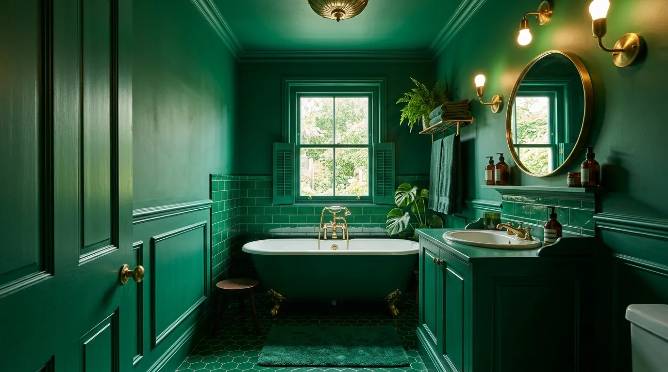
Ribbed Green Tile Floor-To-Ceiling
Source fluted or reeded ceramic tile in a deep hunter green, the kind with vertical grooves that catch light differently depending on where you stand. Run it floor to ceiling on every wall, no chair rail, no stopping at standard backsplash height.
Order ten percent more than your wall measurement. Vertical ribbed tile eats material on cuts around windows and corners in a way flat tile doesn’t.
Paint the vanity to match the tile’s undertone, slightly darker, so the cabinet reads as furniture rather than more wall. Top it in white marble with grey veining — the only material in the room allowed to be a different color.
Stick to aged brass for every metal surface: mirror frame, sconces, tub feet, faucet. Mixing in chrome here breaks the spell instantly.
Hang one trailing plant from the ceiling in a brass planter. It’s the cheapest, fastest way to add life to a room that’s otherwise entirely hard surfaces.
Veined Marble Slabs Gold Chandelier
Anchor the wet zone in slab marble with heavy gold veining, then paint everything else — walls, trim, the coffered ceiling — in a deep burgundy that pulls from the marble’s undertone.
Slab marble is expensive. Large-format porcelain slabs that mimic the veining cost a fraction of the price; book an installer who can handle slab seaming for a join you can’t see.
Hang an inexpensive gold chandelier in the wet zone, rated for the moisture, plus an oversized ornate gold mirror. Both pull visual weight off the dark stone.
Don’t lighten the ceiling “to open up the room.” A coffered ceiling needs the same color as the walls to read as one structure instead of a capped-off box.
Fresh flowers in a dark, heavy room do more work than any other accessory. The contrast of soft petals against stone is the whole point.
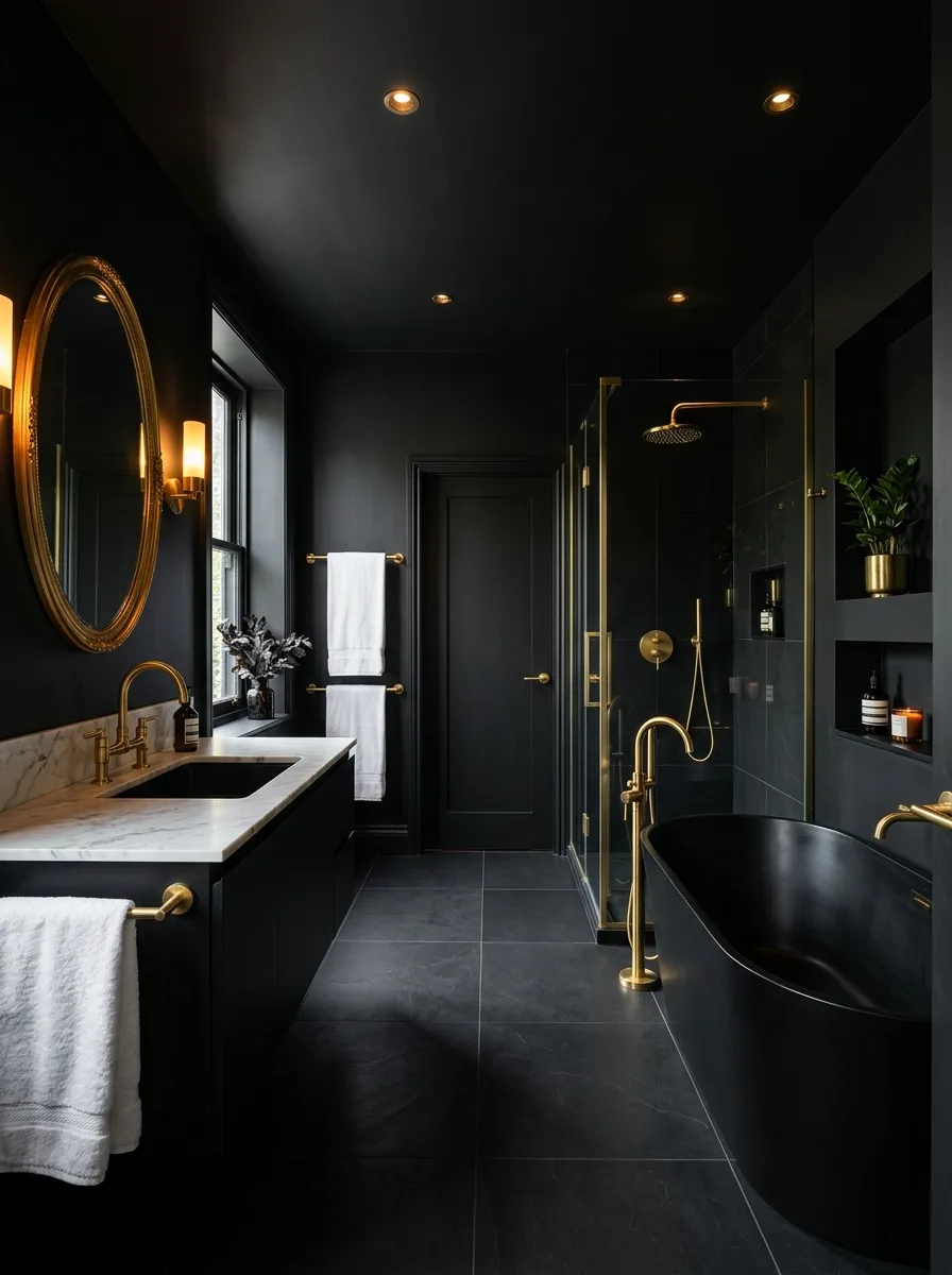
Pillar Candles Black Tile Walls
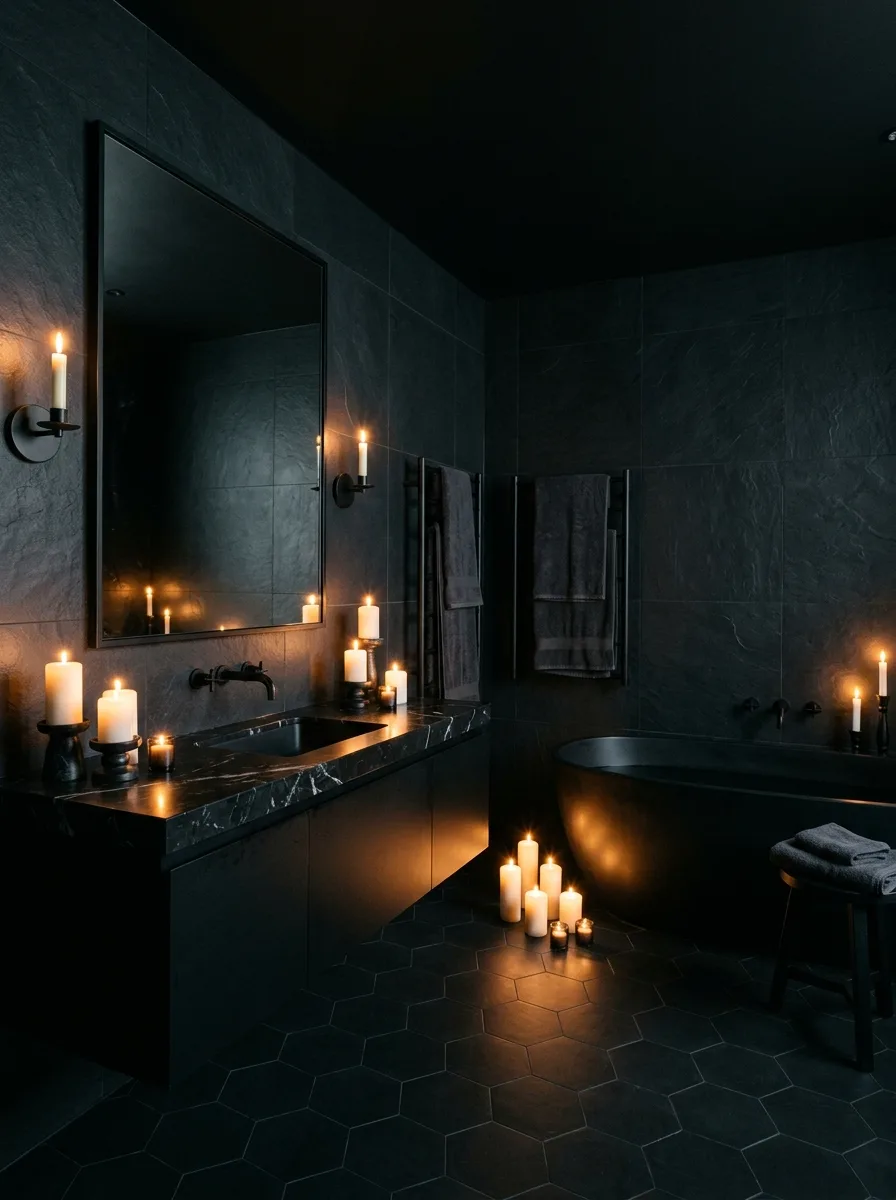
Go matte black on large-format tile, floor to ceiling, with a black hexagon floor underneath. Commit to all black before adding a single light source.
Install black wall sconces near the mirror, but let most of the light come from real pillar candles grouped on the floor and counter, not electric fixtures standing in for them.
Cluster a dozen or more candles in varying heights near the tub and vanity. Odd numbers in tight groups look gathered; evenly spaced candles look like a kit someone bought.
Skip the white towels “for contrast.” The point of an all-black room is the absence of relief; one white towel ruins it the way a typo ruins a tattoo.
This look only works with real flame, not LED candles. The flicker is doing half the design work.
Zellige Tile Walls Copper Fixtures
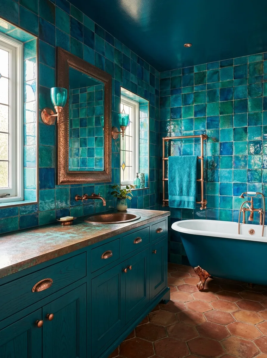
Cover every wall floor to ceiling in handmade zellige tile in mixed teal and turquoise tones, then paint the ceiling a glossy version of the same family.
Order zellige from a supplier who ships with natural variation built in, and reject any batch that looks too uniform. The imperfection is the entire appeal.
Commit to copper for every fixture — a copper vessel sink, a hammered copper mirror frame, a copper towel warmer — and break from the teal on the floor with terracotta hexagon tile.
Don’t tile a flat wall with zellige and stop there. The glossy ceiling and the contrasting floor are what turn a feature wall into a finished room.
Leave any original stained glass or window detailing exactly as it is. It’s doing more for the room’s character than the tile.
Scalloped Pink Tile Pattern
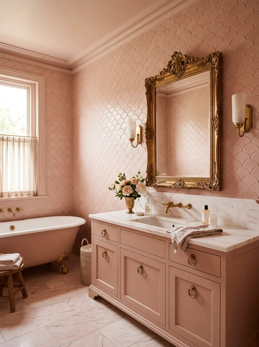
Apply a scalloped, fish-scale pattern in soft blush across every wall and the ceiling, either in tile or a textured wallpaper if the budget won’t stretch to tile.
Hang an oversized ornate gold mirror with baroque detailing. The wall pattern is busy enough that it needs one strong, simple anchor rather than another decorative object.
Pair with white marble counters to keep the palette from tipping sweet, and stop there — one loud surface, everything else quiet.
Don’t add a second pattern anywhere else in the room. Patterned towels or a printed rug on top of a scalloped wall is one pattern too many.
Fresh blush or peach roses on the counter pull the room from “little girl’s bedroom” toward “expensive hotel,” which is the entire point of the exercise.
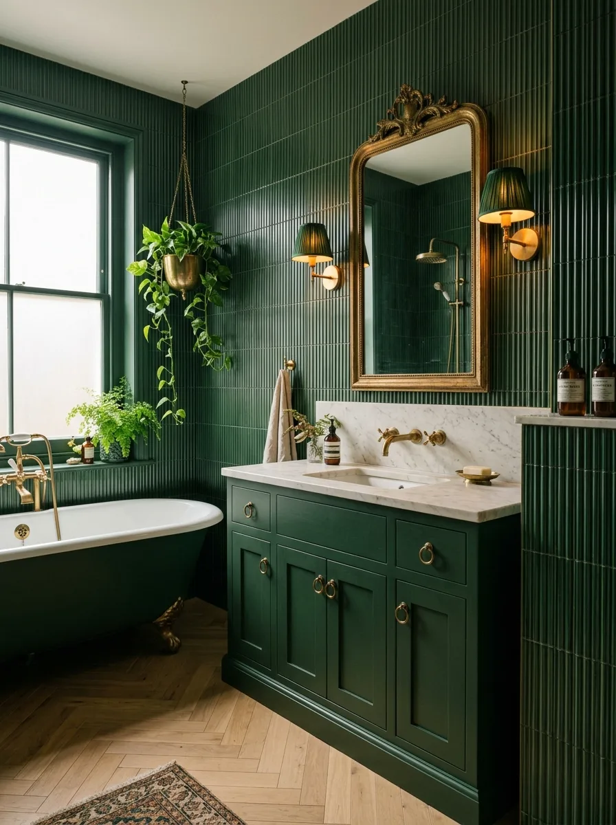
Arched Mirror Hanging Pendant Light
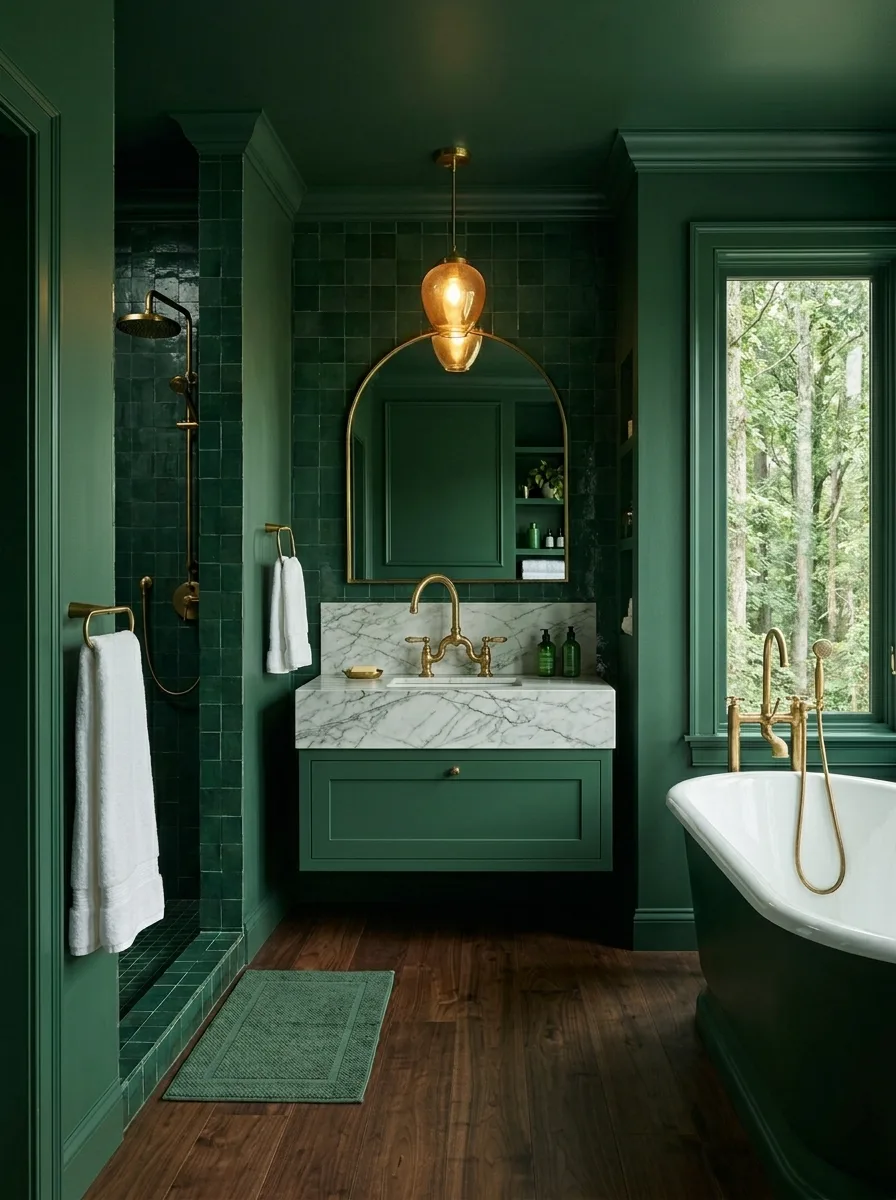
Paint every wall a deep forest green, then carry that same color family into the shower as tile rather than paint — drenching doesn’t require one material, just one color logic.
Hang an arched brass-framed mirror over a floating marble vanity, then suspend a small brass pendant directly in front of the mirror rather than beside it. Layering a light source over a reflective surface is what makes the room feel designed rather than decorated.
Ground it in walnut or dark oak flooring. Pale wood against this much saturation will look like an unfinished mismatch instead of a deliberate pairing.
Don’t center the pendant over the sink the way a builder-grade fixture would. Off to the side, in front of the mirror, is the move.
Leave the window uncovered if the view is worth it. A glimpse of real trees outside a saturated room does more than any styled accessory could.
Navy Walls Brass Hardware Throughout
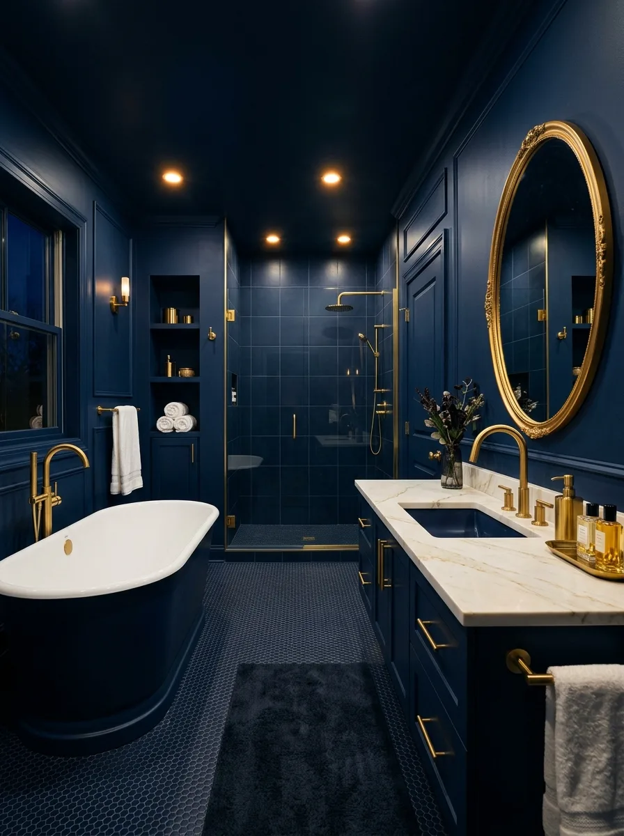
Paint the walls and ceiling the exact same navy with zero break between them — that single decision is what makes this room read as drenched rather than just “a blue bathroom.”
Run brass across every fixture: faucet, mirror frame, towel bar, shower hardware. Swap a shower curtain for a glass divider so the dark color doesn’t feel like it’s closing in.
Lay small hexagonal or penny floor tile in a near-black tone to extend the depth downward without needing to match the navy exactly.
Don’t lighten the ceiling “so it doesn’t feel like a cave.” The cave feeling only shows up when the drench is incomplete; finished properly, the same darkness reads as rich.
Fresh flowers in a clear or brass vase are the one soft, living thing this hard-edged room actually needs.
Round Wood Mirror Sage Walls
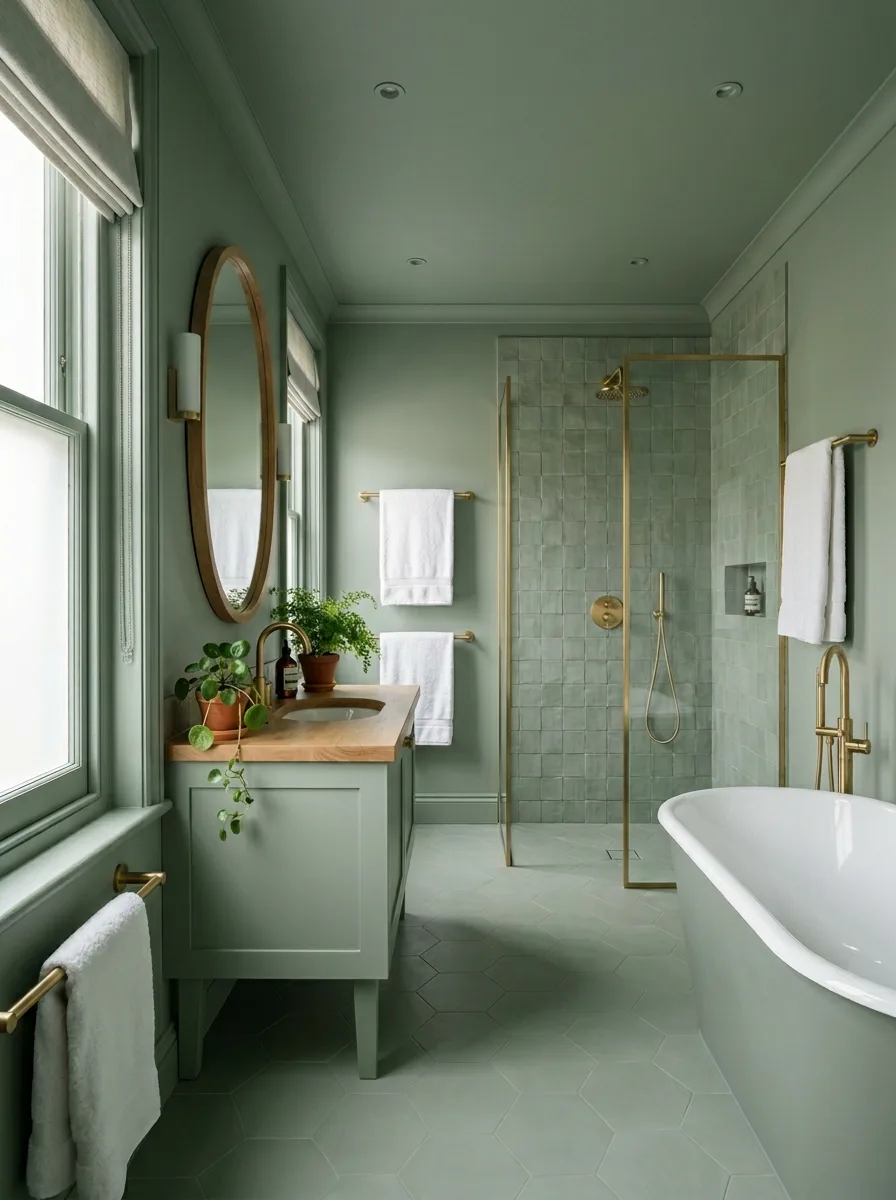
Choose a muted sage for the walls and ceiling, and tile the shower in zellige from the same tonal family rather than a contrasting one.
Frame the mirror in natural wood and top the vanity in wood as well, to pull warmth into a cool-leaning green. Keep brass consistent across every fixture.
Fill every windowsill with plants, plus a trailing variety on the counter. Sage reads as “plant green,” and the room needs the real thing to back it up.
Skip a stark white counter or chrome mirror frame. Either reads cold against this particular shade and undoes the warmth the wood is working to build.
Swap a solid shower door for a glass wall. It keeps a narrow room from feeling boxed in once color covers every surface.
Lavender Walls Nickel Fixtures Only
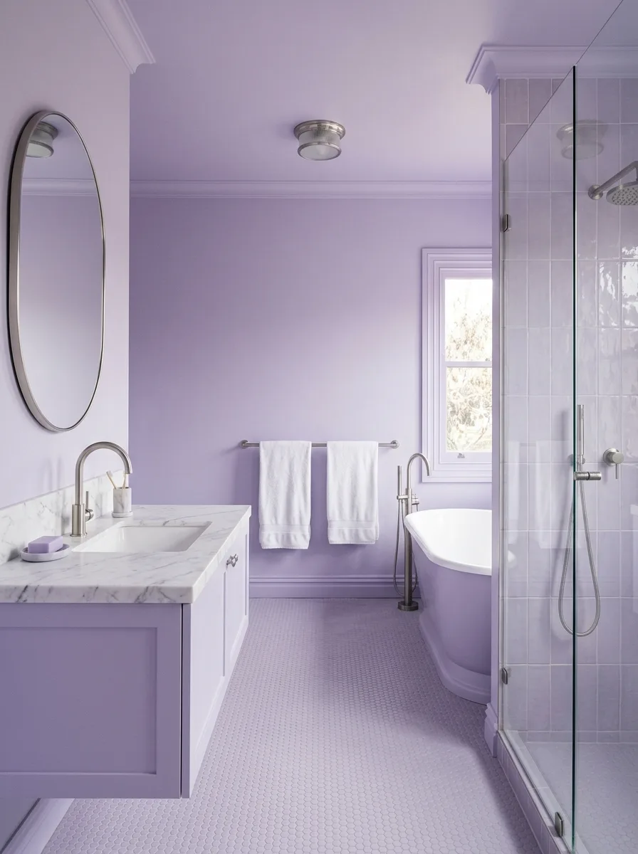
Carry one soft lilac across walls, ceiling, the tub exterior, and the vanity cabinet, so every painted surface in the room matches exactly.
Choose brushed nickel for every fixture instead of brass. It’s a deliberate departure from the warm-metal default, and it’s the single choice that keeps this pastel from tipping into nursery territory.
Lay small penny floor tile in white or pale grey, giving the eye somewhere neutral to land since the major surfaces are all the same hue.
Leave gold and brass out of this room entirely. Lavender plus brass reads dated fast; lavender plus nickel reads current.
Choose a glass shower wall with minimal framing. It keeps the room feeling light despite the saturation, which matters more in a pastel drench than a dark one.
Oxblood Drench Glazed Shower Tile
Paint the walls and ceiling a deep oxblood red, then continue that color onto a hexagon floor tile in a close, complementary brown-red.
Tile the walk-in shower in glazed brick for the room’s one textural break. Everything else stays flat-painted, so the shower tile gets to do the visual work alone.
Choose a dark stone or composite counter close in tone to the walls, rather than defaulting to white marble — the one spot most people accidentally break a drench.
Don’t skip the window treatment. A heavy roman shade in a tone-on-tone fabric finishes the room; bare glass against this much saturation looks unintentional.
Cluster pillar candles on the counter and floor in uneven numbers and varying heights. It should look gathered, not arranged.
Teal Drench Light Wood Counter
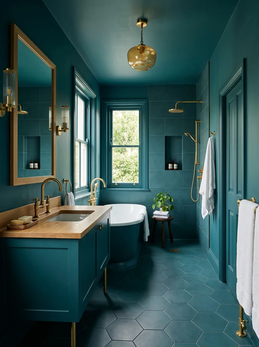
Run a deep teal the full length of the room, walls and ceiling both, with no break at the door frame or window trim.
Top the vanity in light oak or ash. It’s the single material choice that keeps this much teal from turning heavy, paired with brass fixtures and a wood-framed mirror to repeat the warm note twice.
Lay a hexagon floor tile a shade darker than the walls to extend the depth downward without an exact match.
Skip stone or marble on the counter here. White marble against this teal looks like a missed opportunity; wood is what actually completes the palette.
Hang a small brass pendant with a glass globe, low, as a second light source a single overhead fixture in a long narrow room can’t manage alone.
Black Tile Marble Counter Contrast
Tile the walls in matte black, large-format, and paint the ceiling to match — but drop the floor a shade lighter, into charcoal slate, for definition underfoot.
Let a white marble vanity counter be the single deliberate break from black in the room. It earns its place by being the surface you actually touch every day.
Run brass across every fixture, and swap a solid shower door for glass so daylight from the window carries further into the room.
Resist adding a second contrast material. One white counter is plenty; a white floor or ceiling on top of it dilutes the drench instead of completing it.
Add one plant in a shower niche and stop. More green would compete with the marble for the job of relief.
Floating Vanity Irregular Stone Floor
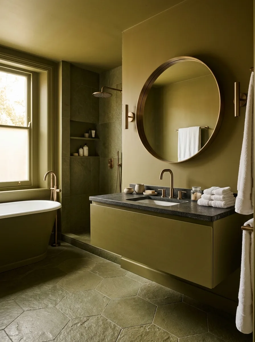
Paint the walls a muted olive-khaki, then lay an irregular cut stone floor that runs from the main room straight into the shower with no threshold.
Mount a floating vanity with a dark stone or concrete-look top and no visible legs, then pick a round mirror in an aged bronze frame to soften all the hard angles in the room.
Order irregular flagstone-style tile by square footage rather than piece count, with extra set aside for the inevitable awkward cuts at the shower threshold.
Leave patterned textiles and printed shower curtains out entirely. This look depends on the stone and the wall color being the only two things doing visual work.
Style with a few simple ceramic vessels, left mostly empty. It finishes the counter better than any styled vignette would.
Aubergine Walls Matching Floor Tile
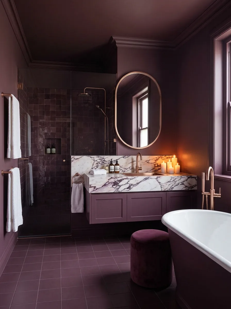
Paint walls and ceiling a deep plum, then match it almost exactly with a square floor tile in the same family, so wall and floor look like one decision even though one’s paint and one’s tile.
Float a marble vanity top in white with grey veining as the contrast piece, paired with an oval brass mirror and a velvet ottoman in a slightly deeper plum for texture.
Tile the shower in glazed brick a shade or two darker than the walls, giving the wet zone its own identity without breaking from the palette.
Don’t default to a generic grey or white floor “to save cost.” A mismatched floor under this much wall color is the fastest way to make the whole room look unfinished.
Group candles on the vanity and light them at night. Plum needs warm, low light to read as luxurious instead of bruised.
Mint Drench Penny Tile Floor
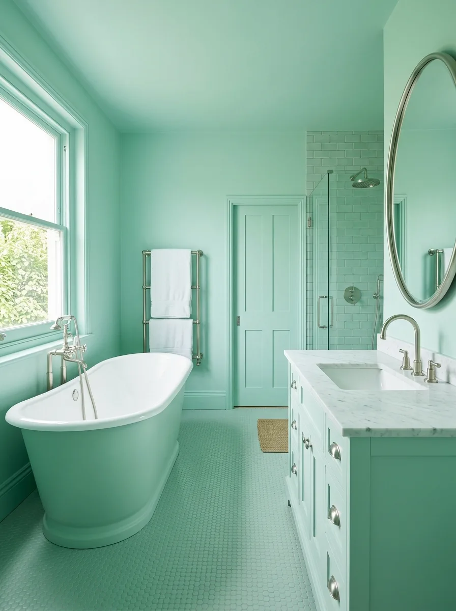
Paint walls, ceiling, and door a clean mint, then lay a penny tile floor in the same mint to carry the color underfoot.
Top the vanity in white marble and choose brushed nickel fixtures throughout, including a round nickel-framed mirror, to keep this particular green crisp rather than retro.
Tile the shower in white subway tile rather than mint, giving the wet zone a clean break that reads as a deliberate choice rather than a missed spot.
Leave brass out of the sourcing list entirely. Warm metal against this clean, slightly cool mint pulls the room toward vintage diner instead of fresh and current.
Finish with a jute bath mat — the one natural-texture object this otherwise glossy room needs.
Emerald Drench White Contrast Tub
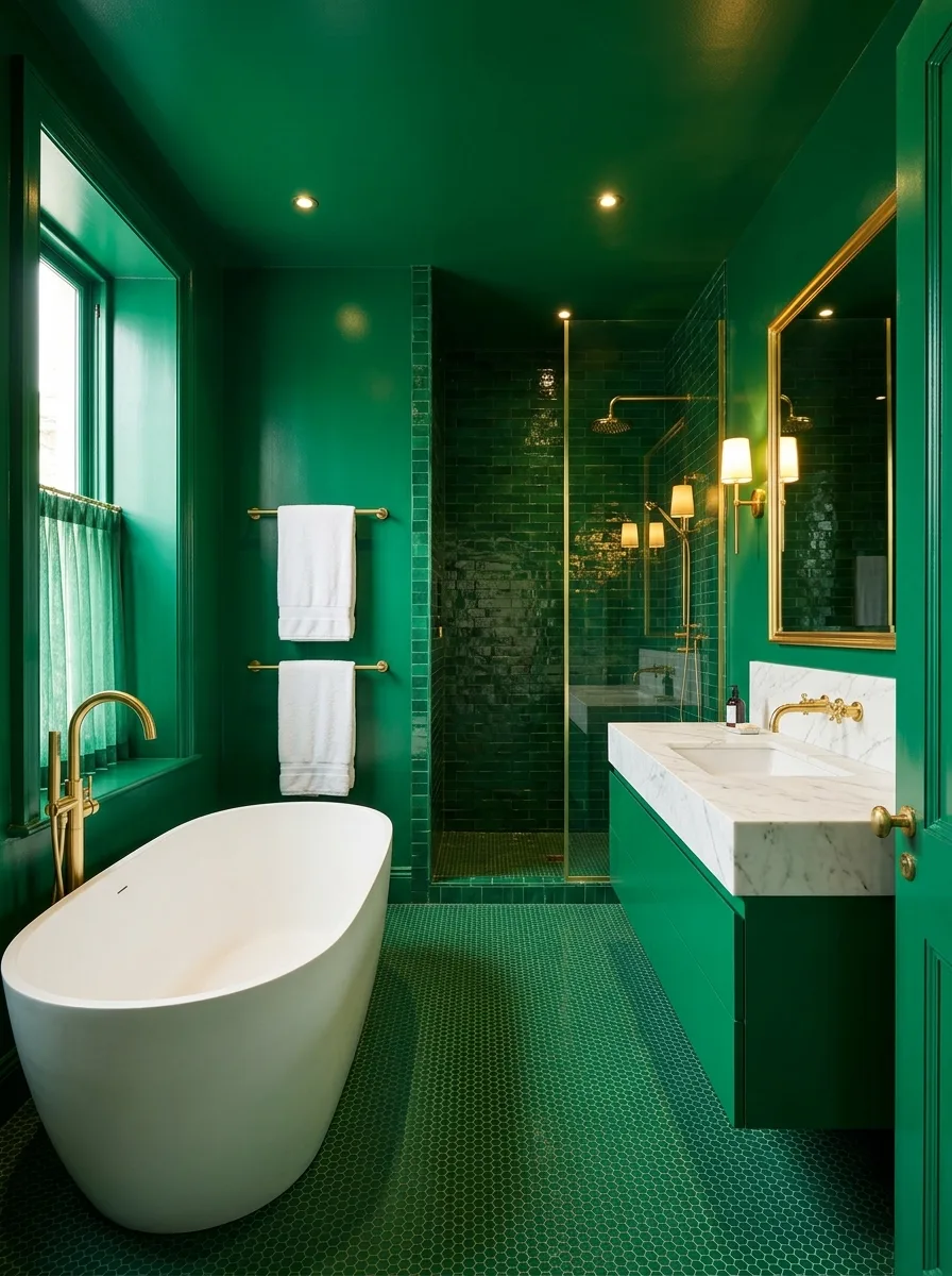
Paint the walls and ceiling a saturated emerald in high-gloss finish, then tile the shower in glazed subway tile from the same color family for texture.
Keep the freestanding tub white and let it be the room’s single contrast piece. It works specifically because nothing else in the room competes with it.
Run brass across the mirror frame and every fixture to tie the metal together, and ask your painter for high-gloss specifically rather than the eggshell most default to — gloss reflects more light, which matters in a color this dark.
Don’t paint the tub to match. A white tub against this much green is doing the job a contrast piece is supposed to do; matching it removes the room’s one moment of relief.
Carry a hexagon penny floor tile in the same emerald all the way down, so the white tub reads as a choice rather than an oversight.
Reeded Wainscoting Vintage Floral Gallery
Split the wall into two textures: a dusty rose or terracotta paint above, and a reeded wainscoting panel running halfway up below, in a shade darker than the upper wall.
Source pre-primed reeded panels from a lumber yard and paint them the same color family as the wall above, just deeper, so the two-tone reads as a deliberate choice rather than an accident.
Hang a small gallery of vintage floral paintings and prints above the wainscoting in mismatched frames. The mismatch is the point — don’t hunt for a matching set.
Skip symmetry when hanging the art. This look depends on appearing collected over years, not bought as a set last weekend.
Add a small side table doing double duty as a plant stand. It finishes the room for almost no cost.
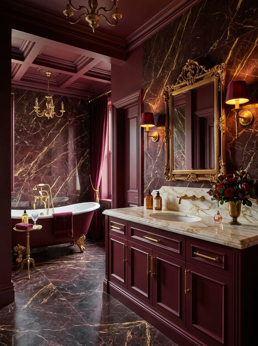
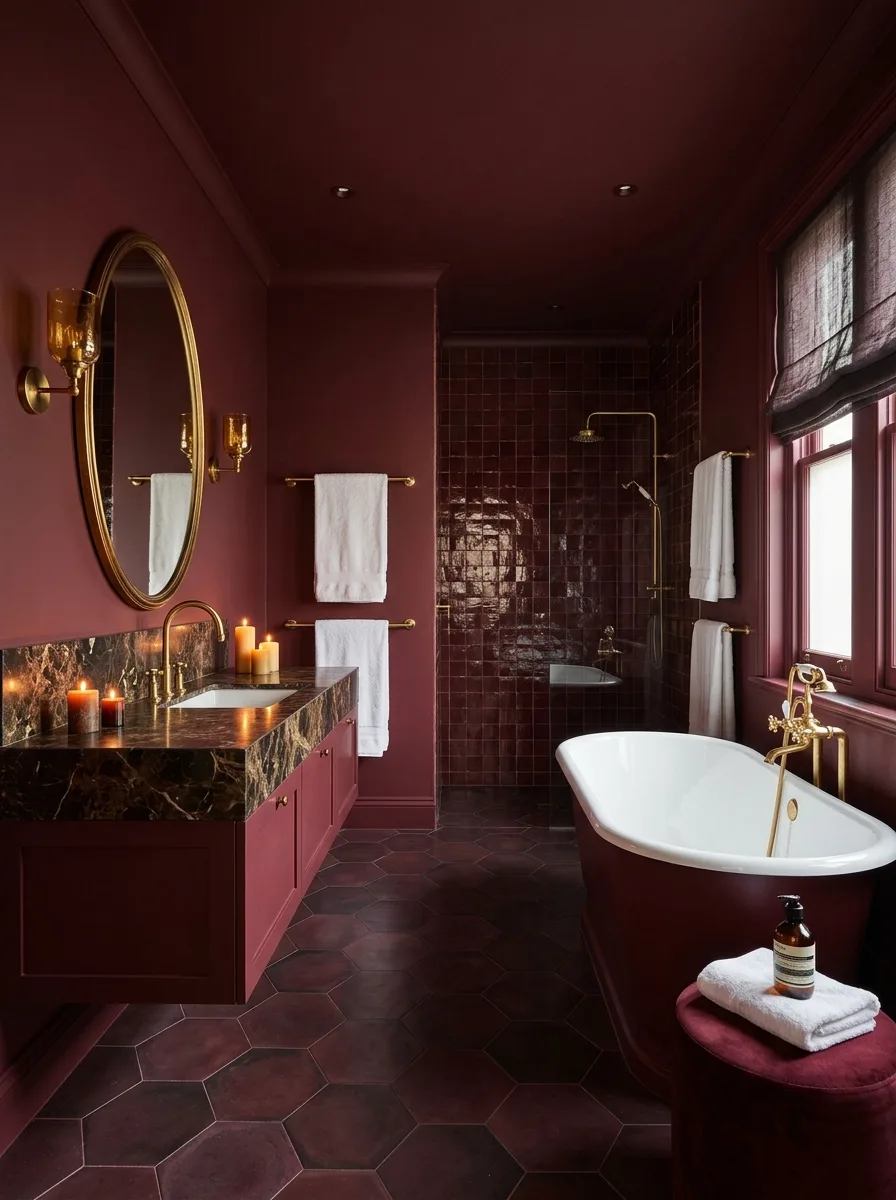
Brass Vessel Tub Stone Sink Bowl
Paint every wall panel a deep burgundy, picking out the existing moulding in the same color rather than a contrasting white, so the panel detail reads as texture instead of trim.
Center the room on a brass or gold-finish freestanding tub, and pair it with a stone vessel sink bowl set directly on a marble slab counter rather than tucked into an undermount.
Choose a marble slab with dramatic, moving veining rather than a quiet, uniform one — it becomes the room’s second focal point.
Don’t skip fresh flowers, and don’t go small. A room this dark and dramatic needs something living and slightly oversized, or the arrangement gets lost.
Keep the toilet in a dark, matte finish rather than standard white porcelain. A bright white toilet here would stick out in exactly the way you don’t want.
Beadboard Walls Backlit LED Mirror
Paint a slate grey-blue above a beadboard or tongue-and-groove half-wall panel, treating the split as the room’s version of drenching in a space too small for full saturation.
Mount a backlit LED mirror with a warm-toned edge light, and pair it with a gold ladder-style heated towel rail. The mix of a modern mirror with a traditional rail is intentional, not a mismatch.
Choose a small ribbed or fluted ceramic sink in pale pink or cream, giving the room one soft, contrasting object against all that grey-blue.
Avoid a floor tile that matches the wall color exactly. A warm-toned floor, slightly blush or beige, keeps a small dark room from closing in on itself.
Hang one piece of vintage floral art, framed simply, and stop. A room this size doesn’t have room for more.
Patterned Ceiling Raised Panel Walls
Paint raised panel wall moulding a deep olive-green, then break from the solid color in exactly one place: the ceiling, finished in a botanical or scenic patterned wallpaper.
Set a round vessel sink on a green marble floating vanity, and choose a wall-hung toilet to keep sightlines clean in a small footprint.
Specify ceiling-rated wallpaper when ordering. Not every printed paper comes in a finish built to hold up overhead, and the wrong one will sag or peel within a year.
Don’t add a patterned floor or rug to match the ceiling. One patterned surface is a feature; two is a clash.
Fill the empty corner beneath the vanity with a pair of textured ceramic vases instead of shelving or storage. It finishes the room without adding clutter.
Final Thoughts
None of these twenty bathrooms hedged. That’s the actual throughline, more than any specific shade of green or burgundy or lilac: every single one of them made a decision and then followed it into every corner of the room, including the ones nobody really looks at.
That’s harder than picking a color. Picking a color takes an afternoon at the paint store. Following it onto the ceiling, the trim, the inside of a shower niche, the grout — that takes nerve, and a willingness to live with a choice instead of constantly second-guessing it.
Most bathrooms fail not because the color was wrong, but because the commitment ran out halfway through the project. White bathrooms aren’t really a style. They’re what’s left when nobody decided anything.
Paint the ceiling. Paint the trim. Pick one metal and stop. The rest, as twenty very different rooms just proved, takes care of itself.