
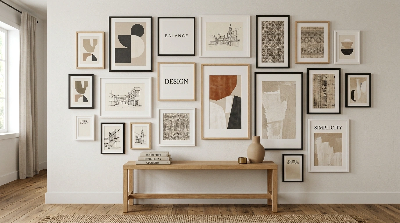
A gallery wall can look great in individual pieces and still feel wrong when everything goes up together.
The frames may be attractive. The artwork may be interesting. The colors may even seem compatible. Yet the finished wall can end up looking scattered, too heavy, or disconnected from the room.
The problem is usually the composition.
Furniture, wall color, frame finish, artwork scale, spacing, lighting, and the empty space around the arrangement all affect the final result. A loose collection that feels right above a linen sofa can look awkward in a narrow hallway.
That is why complete gallery wall ideas are more useful than isolated decorating tips. Seeing the entire room makes it easier to understand how the wall actually works with everything around it.
The designs below take very different approaches. Some are layered and collected. Others are crisp and structured. A few rely on unusual shapes, darker colors, or dimensional pieces.
Each one is built as a complete visual direction, so you can save the overall look rather than trying to piece it together from separate suggestions.
Find Your Gallery Wall Style
Collected European
Modern Monochrome
Organic Modern
Vintage Eclectic
Coastal Natural
Gallery Wall Ideas Worth Saving
Botanical Gallery Wall With Trailing Vines
A warm plaster wall acts as the canvas for a mixed collection of black and wooden frames holding nature prints and botanical sketches.
A light wood floating shelf anchors the top of the arrangement, while lush green pothos vines weave playfully through the entire display.
The trailing foliage softens the rigid lines of the frames, making the whole wall feel alive and effortlessly styled.
Collected European Gallery Wall Over a Linen Sofa
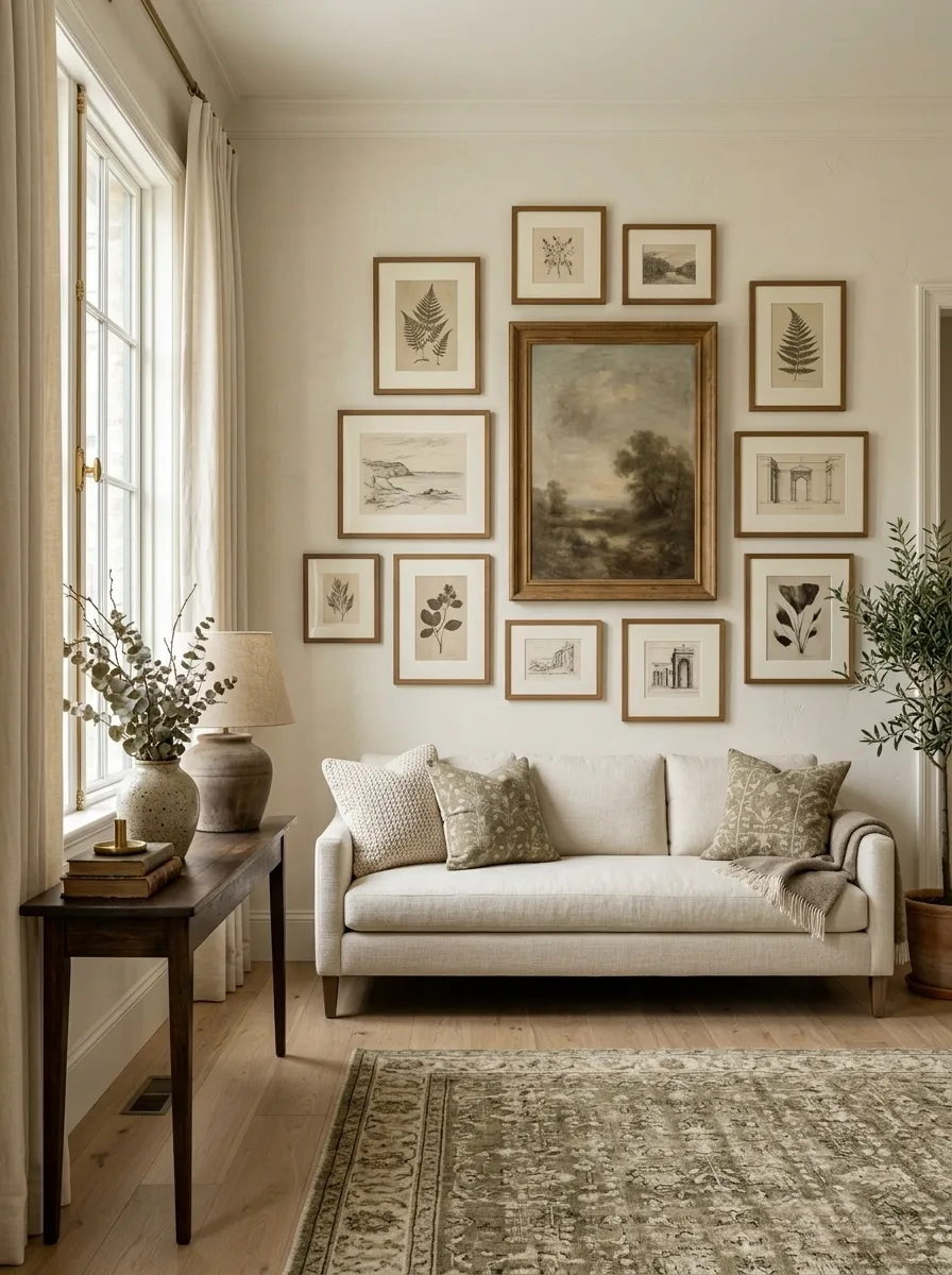
A warm ivory wall carries a loosely arranged collection of aged oak frames, muted botanical prints, faded landscapes, and small cream-matted sketches.
The largest artwork sits slightly off center rather than locking the arrangement into a rigid grid.
A low linen sofa grounds the composition below. A slim wood console, ceramic table lamp, and restrained objects complete the room.
The charm comes from the variation.
The frames don’t need to match exactly. The warm wood, softened artwork, and quiet palette give the collection a clear visual thread.
Keep the furniture simple so the layered arrangement has room to breathe.
Why this one works: the wall feels collected because the differences are controlled, not random.
Spiral Staircase Frame Display
This striking gallery wall transforms a tall stairwell into an immersive art installation using a sweeping spiral layout.
A vast collection of mixed-media frames in varying sizes curves gracefully alongside the descending wooden staircase.
The open composition uses scale and placement to turn empty vertical space into a captivating architectural feature.
Oversized Black-and-White Gallery Wall in a Modern Living Room
This composition takes the opposite approach.
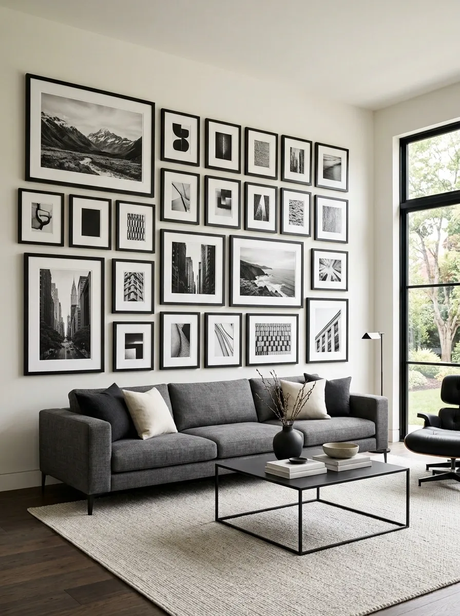
A long charcoal sofa sits against a clean warm-white wall filled with large black-and-white landscape photography, bold architectural prints, and smaller graphic pieces.
Thick black frames create strong vertical and horizontal lines, giving the arrangement an almost architectural quality.
A low black coffee table and pale rug keep the rest of the room visually quiet.
The key is scale.
The larger pieces do most of the work, so the wall doesn’t need dozens of small images.
Consistent frame color makes the varied artwork feel like one collection.
I’d leave more breathing room around the outer edge than you might expect. The open margin helps the arrangement feel deliberate instead of oversized.
ANCHORS
Gilded Hallway Gallery Wall
A sophisticated hallway wall glows under warm brass sconces, showcasing an eclectic assortment of vintage art and gilded frames.
A central round mirror breaks up the rectangular grid, reflecting light and adding depth to the rich composition.
The traditional wainscoting below grounds the ornate frames, creating a timeless and inviting corridor.
Warm Wood Frame Gallery Wall With Earth-Toned Art
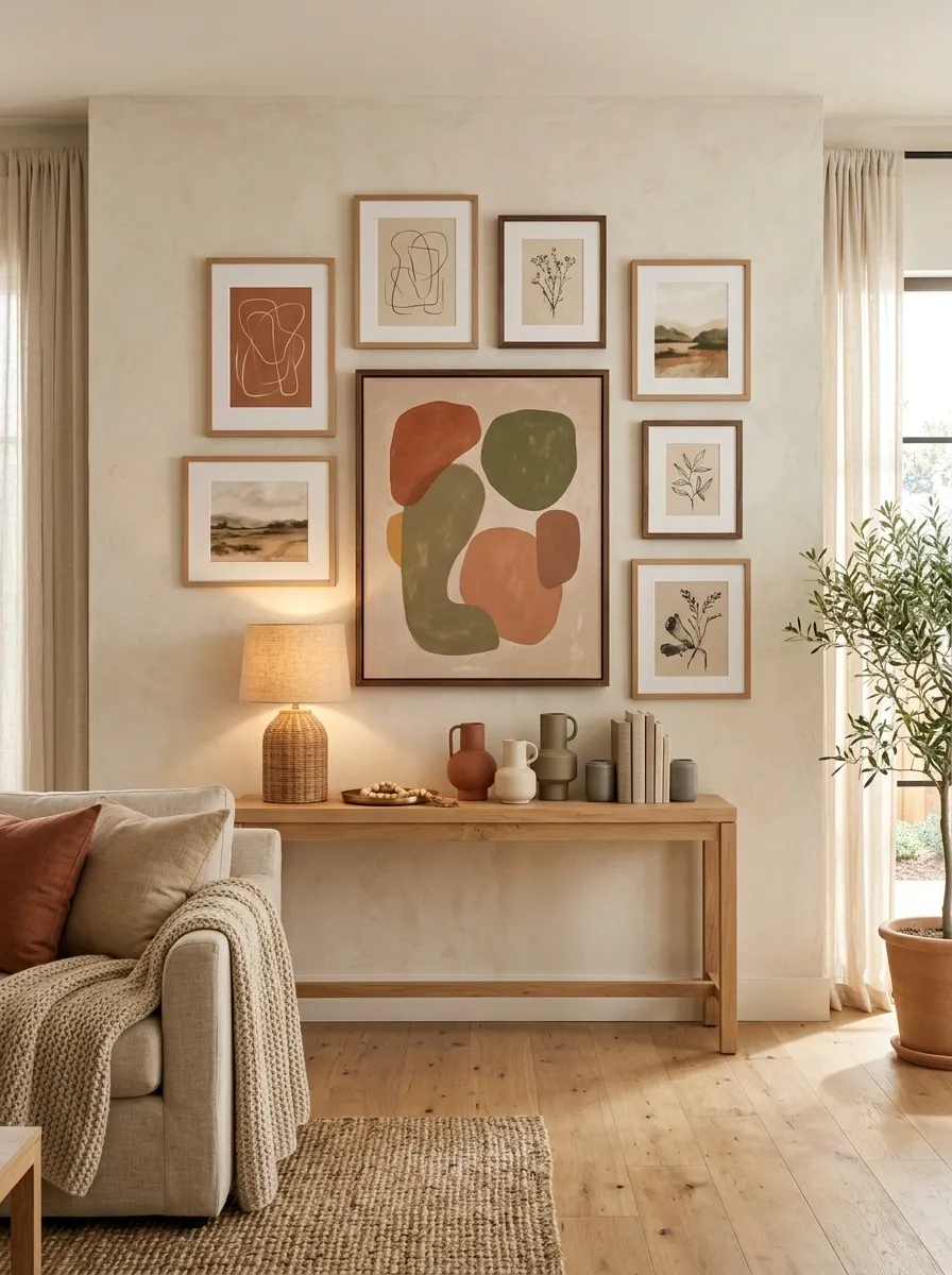
A pale plaster wall becomes the backdrop for a warm, grounded arrangement built around natural oak and walnut frames.
The artwork moves through terracotta, dusty olive, ochre, clay, and sandy beige, with one larger abstract piece acting as the anchor.
A simple oak console sits below the wall beside a woven lamp and a restrained ceramic arrangement.
The wood is important because it connects the artwork to the furniture.
Without that repeated warm material, the earth tones could feel like separate color choices. Here, the frames create the bridge.
This design suits rooms that already have wood flooring or natural furniture.
I’d avoid adding lots of shiny metal nearby. The strength of the composition comes from its matte, tactile finishes.
French Country Wallpaper Gallery Wall
Soft floral wallpaper creates a charming backdrop for a curated collection of antique frames and delicate ribbon accents.
A rustic wooden console table below holds layered ceramic decor, a textured wreath, and a simple floral arrangement.
The muted tones and vintage botanical prints give the space a warm, deeply personal cottage aesthetic.
Floor-to-Ceiling Gallery Wall in a Tall Stairwell
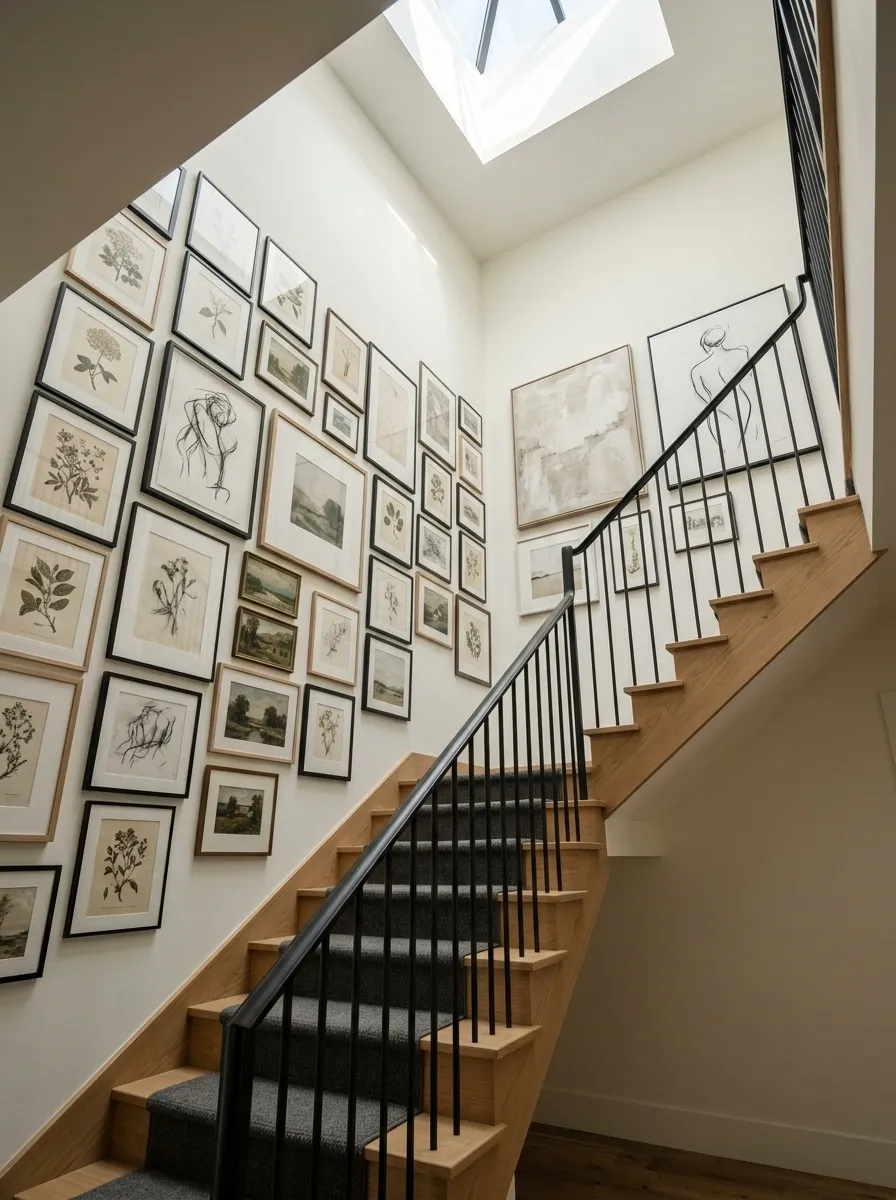
Instead of treating the stairwell as a leftover wall, this design turns the full vertical space into one continuous art composition.
A mix of botanical drawings, small landscapes, charcoal line work, and neutral abstract pieces follows the movement of the staircase.
The lower section is slightly denser, while the upper landing opens up around two larger pieces.
The arrangement works because it follows the architecture rather than fighting it.
The artwork rises with the stairs, making the wall feel connected to the home’s vertical movement.
Keep the frames restrained here. The architecture already provides plenty of structure, so excessively ornate frames can make a tall stairwell feel visually heavy.
Tighter grouping, smaller supporting pieces
Mixed scales following the stair line
More breathing room, larger anchors
Soft Neutral Gallery Wall Above a Bed
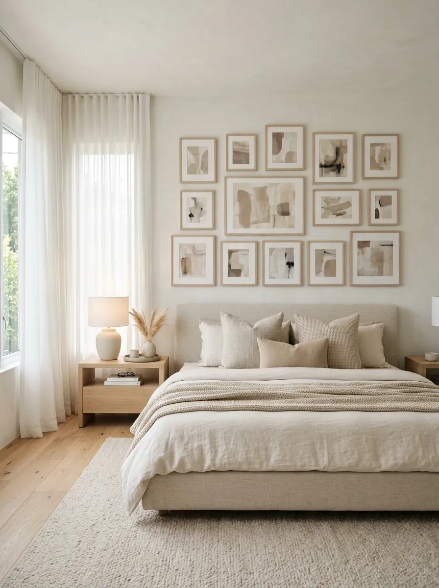
This bedroom uses the gallery wall as a quiet layer rather than the main statement.
Thin light-oak frames hold cream, taupe, faded beige, soft brown, and subtle charcoal artwork above a low upholstered bed.
The surrounding room repeats the same palette through linen bedding, a textured rug, pale wood furniture, and softly filtered natural light.
The arrangement mixes small and medium pieces, but the overall value range stays close. That keeps the wall restful.
There is enough variation in texture and line work to stop it from becoming flat.
I’d keep the frame finish lighter than the floor or larger furniture pieces. That small distinction helps the artwork float visually instead of forming one heavy block above the bed.
Warm cream artwork
Pale oak frames
Taupe and beige
Soft charcoal details
Minimal Black Frame Grid for a Narrow Hallway
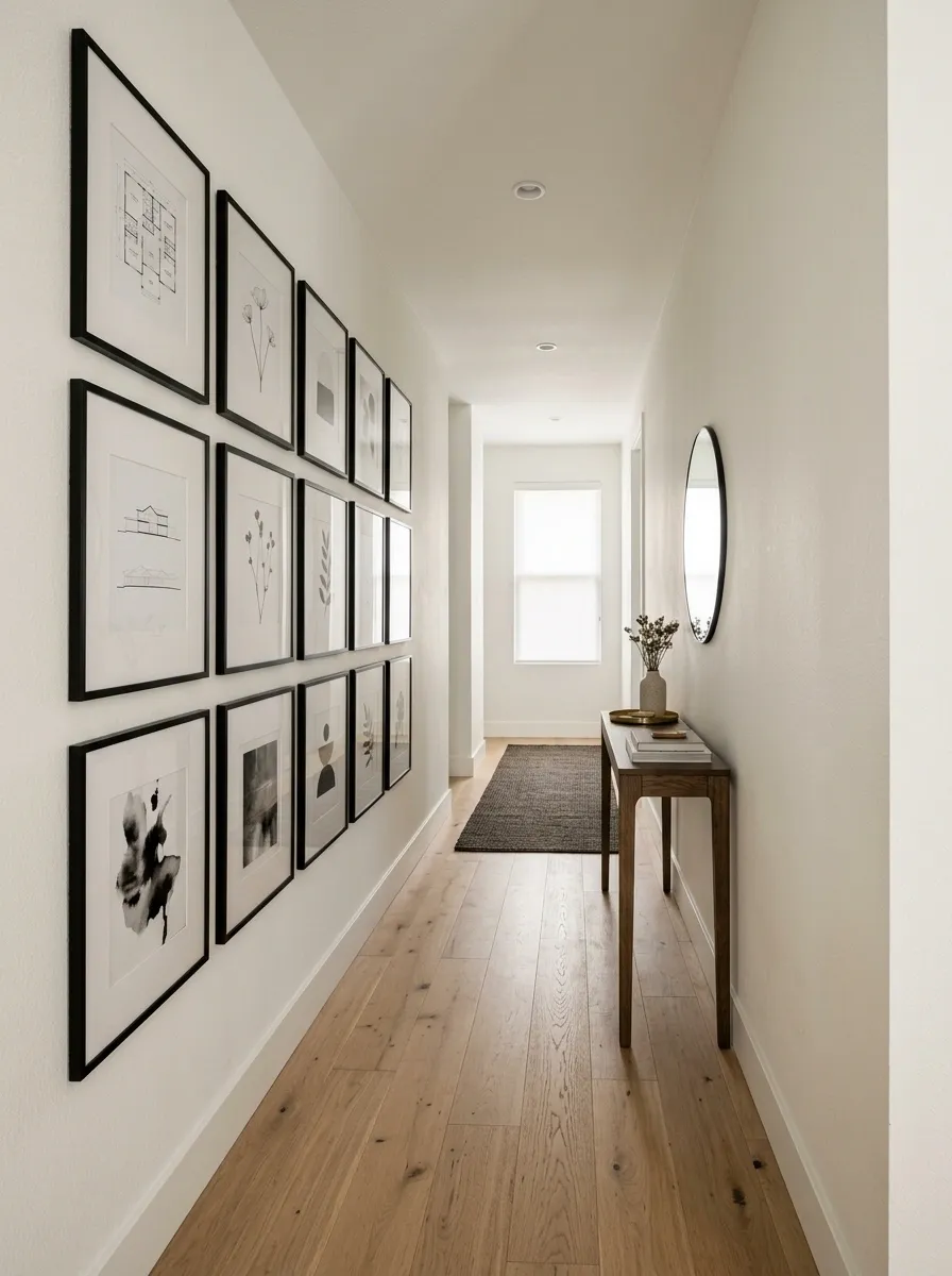
A narrow hallway benefits from repetition more than visual clutter.
Here, identical slim black frames form a clean rectangular grid along one long wall, filled with restrained architectural drawings, botanical silhouettes, and monochrome abstract prints.
The flooring remains light, the walls stay warm white, and a very narrow console preserves the walkway.
The repeated frame size gives the corridor a sense of rhythm without making the space feel smaller.
This is a good example of letting the architecture establish the composition.
The important detail is consistency.
Once you commit to a grid, uneven gaps or random frame sizes weaken the whole effect.
Organic Modern Gallery Wall With Curved Forms
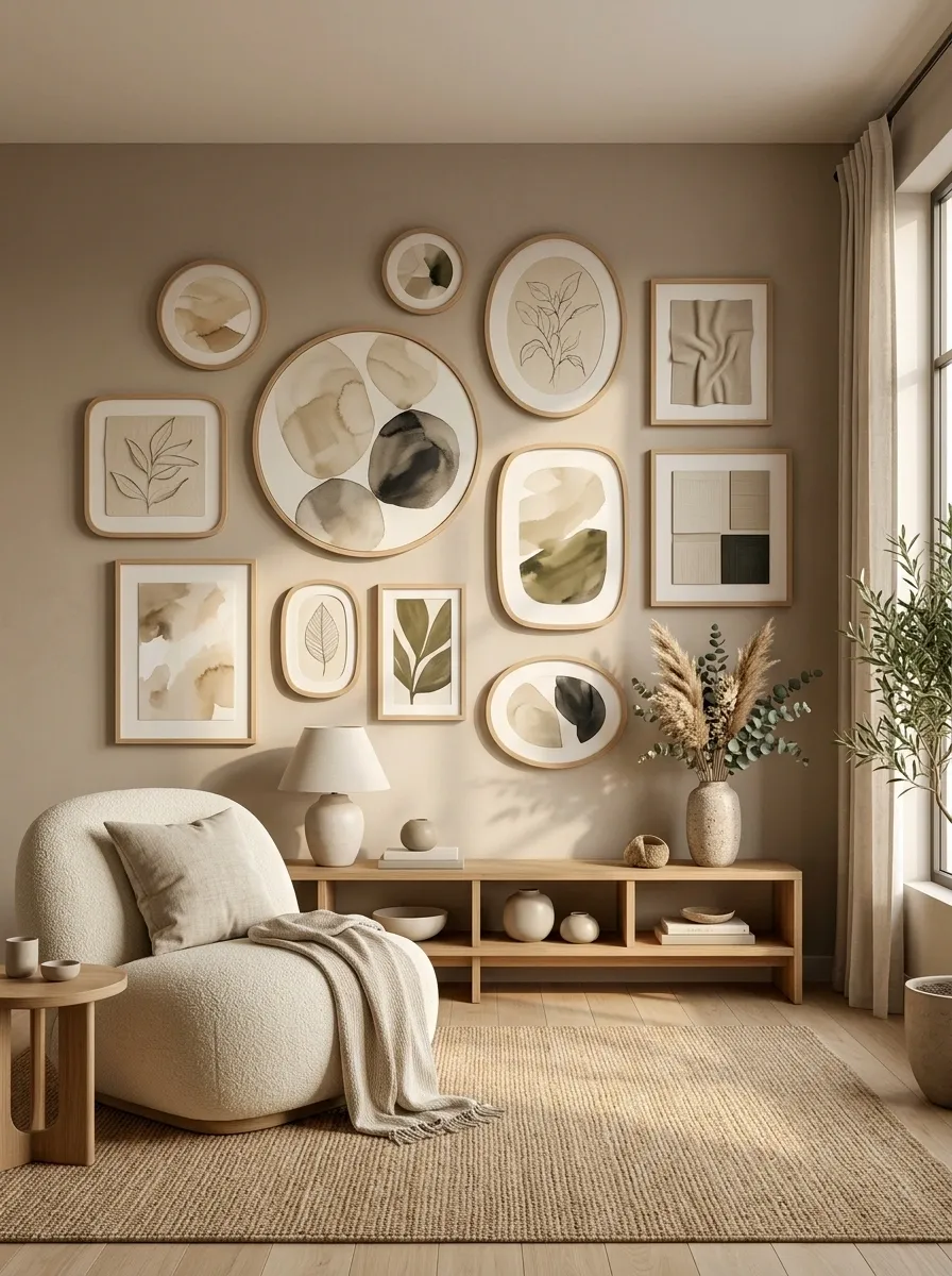
This arrangement softens the usual rectangular gallery wall with circular frames, rounded artwork, pale oak, and abstract pieces inspired by stones, leaves, and natural contours.
A curved lounge chair, woven rug, and low wood console reinforce the same visual language so the gallery doesn’t feel disconnected from the room.
There is still plenty of structure, but almost nothing feels sharply geometric.
That’s what gives the finished wall its relaxed character.
Use the rounded pieces selectively.
Too many circles can become a gimmick. A few curved forms surrounded by quieter rectangular artwork feel much more sophisticated.
Classic Symmetrical Gallery Wall Around a Fireplace
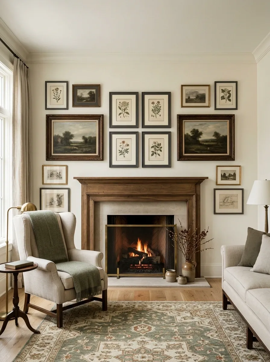
The architecture takes the lead in this composition.
A traditional fireplace sits below a balanced arrangement of framed botanical illustrations, quiet landscapes, and two larger artworks positioned evenly around a strong central axis.
Cream walls, natural wood flooring, and a simple mantel keep the room classic without making it feel overly formal.
Symmetry gives this gallery a sense of calm because the fireplace already provides a natural center point.
The artwork reinforces that structure instead of competing with it.
The easiest mistake here is overdecorating the mantel. Keep the objects low and simple so the wall remains the dominant visual feature.
Coastal Gallery Wall With Faded Blues and Natural Frames
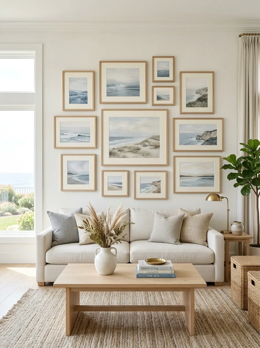
A bright room with pale flooring and warm white walls gets a relaxed coastal treatment through faded blue landscapes, soft seascapes, simple natural wood frames, and cream mats.
The gallery stretches above a light sofa, while woven accents and pale oak furniture carry the same natural feeling into the rest of the room.
The design avoids obvious themed objects.
Instead, the coastal feeling comes from the colors, artwork, and materials.
Keep the blues slightly desaturated. Strong navy or bright turquoise would change the entire character and make the wall feel much more literal.
Maximalist Salon Wall in a Colorful Dining Room
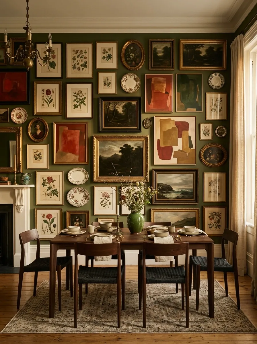
This is the most immersive composition so far.
A colorful dining room is surrounded by a dense salon-style wall featuring botanical prints, landscapes, abstract artwork, decorative plates, and varied frame shapes.
The pieces reach across most of the available wall, while the dining furniture remains visually simple.
A maximalist wall needs repetition to avoid looking random.
Here, warm reds, olive greens, faded cream, and dark wood appear throughout the arrangement, creating a shared visual language.
The trick isn’t adding more.
It is knowing where to leave small pockets of breathing room so the wall can still be read as a collection.
Gallery Wall Wrapped Around a Reading Nook
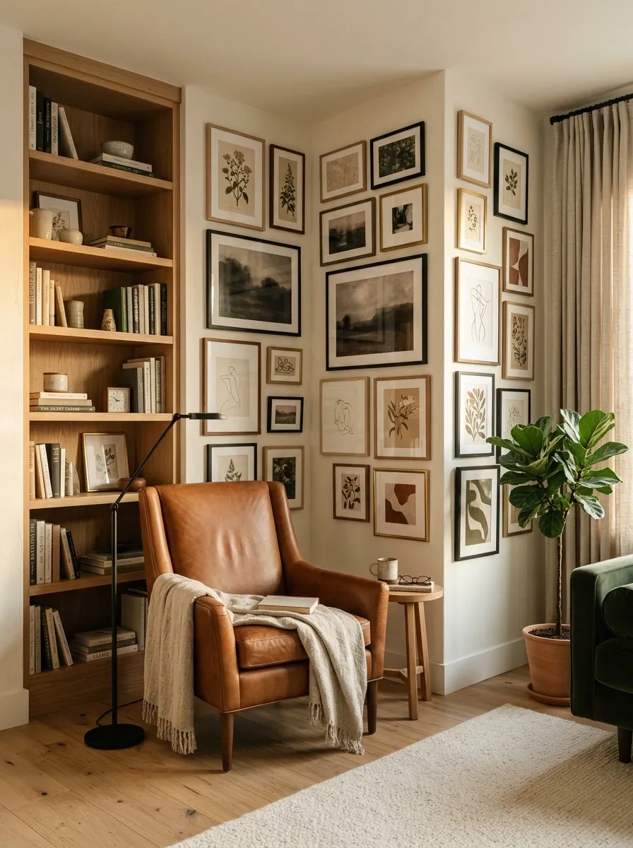
Instead of stopping at one wall, this design carries the artwork around a reading nook and onto the adjacent surface.
Botanical illustrations, quiet landscapes, line drawings, and small abstract pieces visually connect the reading chair, floor lamp, bookcase, and neighboring wall.
The corner feels more intentional because the artwork creates continuity between two planes.
It also makes the nook feel like a distinct little destination within the larger room.
The key is keeping the transition gentle.
The artwork on the second wall should support the main collection rather than creating a second focal point.
Black-and-Brass Gallery Wall With Graphic Artwork
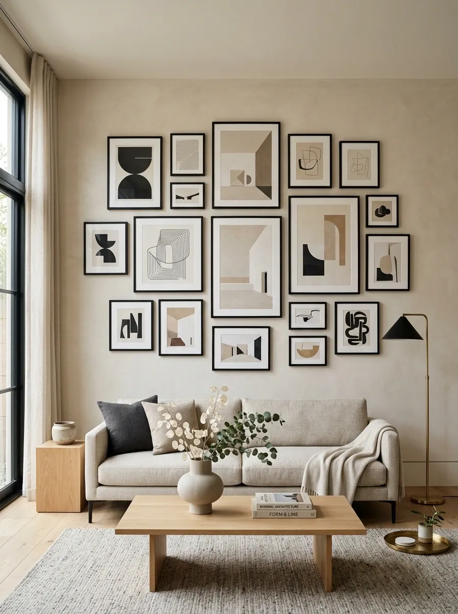
A warm neutral wall supports a sharp collection of graphic prints inside slim black frames, with restrained brass accents repeated through the lighting and nearby furnishings.
The artwork uses strong geometry, abstract line work, and a few architectural compositions, giving the room a more structured appearance.
The brass matters because it softens the black.
Without that warm metallic note, the arrangement could feel overly stark.
Keep brass limited to a few nearby details. Too much metallic shine would pull attention away from the artwork.
Cottage-Style Gallery Wall With Botanical Prints
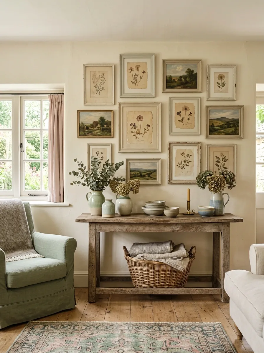
This arrangement takes a softer, more traditional route with faded botanicals, pressed-flower artwork, small landscapes, pale painted frames, and a weathered wood console.
The wall has enough variation to feel collected, but the artwork stays within a narrow range of soft greens, creams, dusty pinks, and faded brown.
The aged quality is what makes the composition feel convincing.
Crisp modern frames would change the mood completely.
I’d pair this wall with natural fabrics and uncomplicated furniture. The artwork already supplies plenty of delicate detail.
Sculptural Gallery Wall With Ceramics and Shadow Boxes
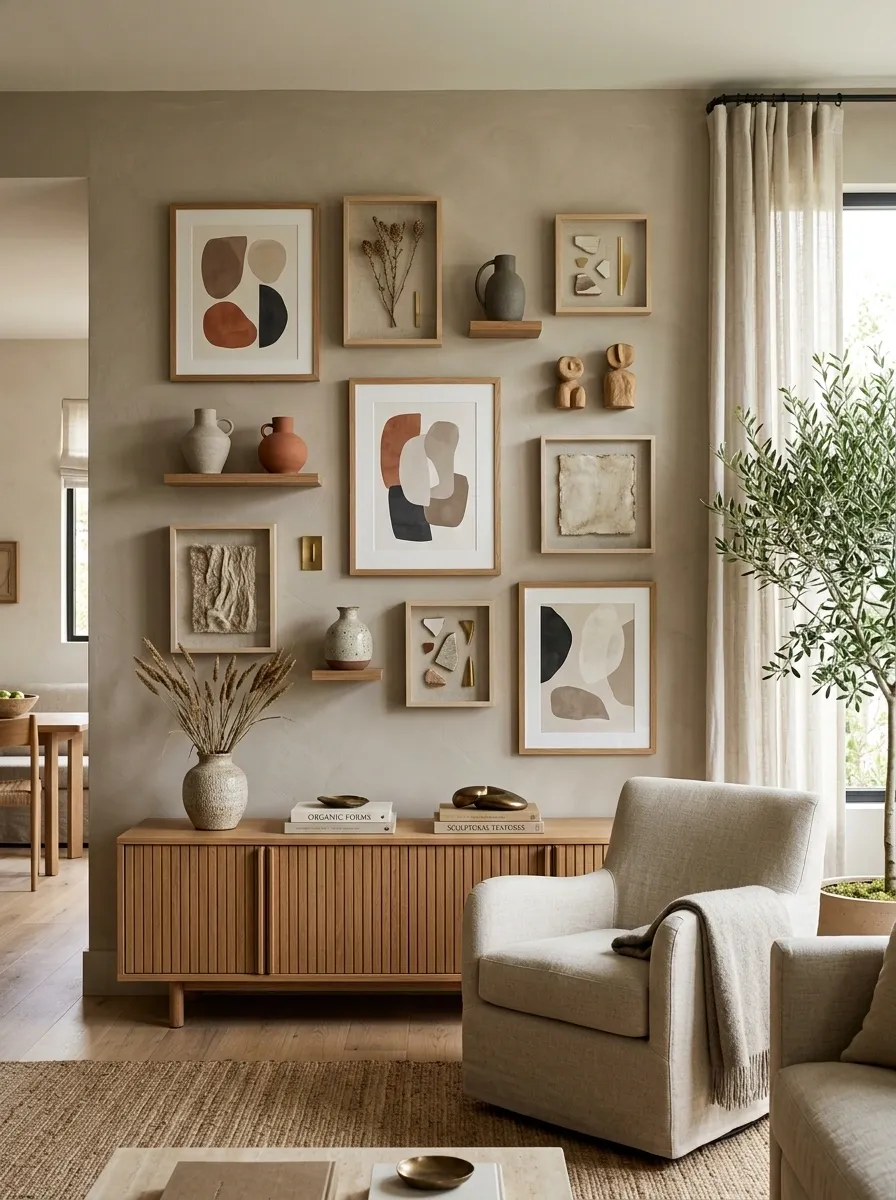
Flat artwork becomes much more interesting when a few dimensional pieces join the arrangement.
This wall combines abstract prints with shallow shadow boxes, small ceramic forms, carved wood objects, and framed natural textures.
A low cabinet beneath the collection echoes the same earthy materials.
The depth changes as you move across the wall, creating shadows and visual pauses that flat artwork alone cannot provide.
It feels more like a small private collection than a standard framed-art arrangement.
Keep dimensional objects shallow. Anything too bulky can make the wall feel crowded and difficult to live with.
Small Apartment Gallery Wall With a Compact Vertical Layout
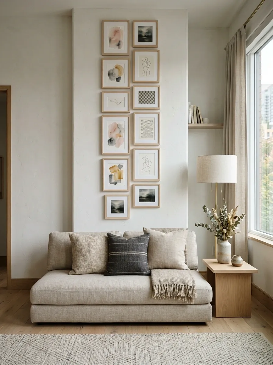
A compact apartment doesn’t need a huge wall to make a gallery feel substantial.
This arrangement stacks small and medium artwork vertically beside a sofa, using light frames, narrow margins, and a tall overall shape to make the most of limited wall width.
The artwork includes soft abstracts, line drawings, and small landscape pieces.
The vertical orientation works particularly well beside a sofa because it uses height without competing with the furniture’s horizontal footprint.
Keep the surrounding styling quiet.
A crowded wall and crowded room together would make the apartment feel smaller.
Warm Contemporary Gallery Wall With Large Abstract Art
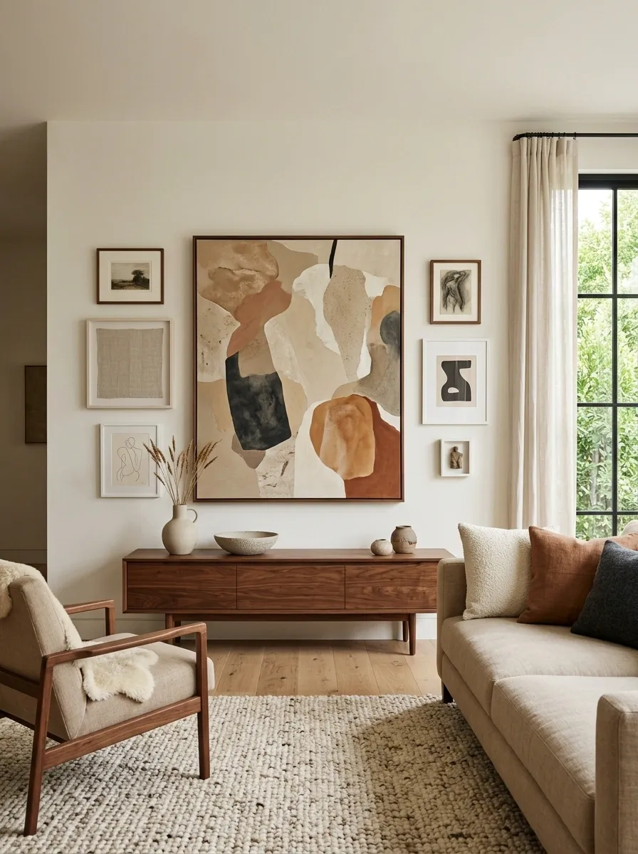
A single oversized abstract composition anchors this wall, surrounded by a handful of smaller works in sand, clay, charcoal, and cream.
The artwork sits above a low walnut console with minimal styling, allowing the large central piece to remain dominant.
A textured rug and soft upholstery add enough warmth to keep the contemporary room from becoming severe.
The composition works because the scale difference is obvious.
The large artwork establishes the visual center while the smaller pieces build around it.
Do not add too many supporting prints. The strength of this arrangement comes from leaving the central artwork clearly in charge.
Vintage Travel Gallery Wall With Maps and Old Prints
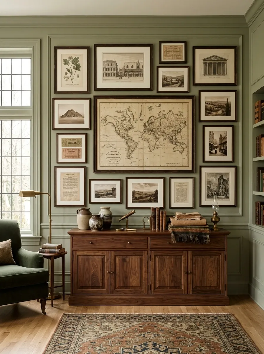
This wall creates a sense of travel without using a literal themed display.
Antique-style maps, architectural drawings, old botanical prints, landscape studies, and small typography pieces are arranged within dark wood frames around a larger central map.
A walnut cabinet and warm paper-toned textiles continue the historical feeling into the room.
The different subjects work because they share similar paper tones and age.
That repeated quality turns unrelated images into one visual story.
A modern bright-white frame would break the illusion. Darker wood helps the whole collection feel like it belongs together.
Soft Pink and Terracotta Gallery Wall in a Bedroom
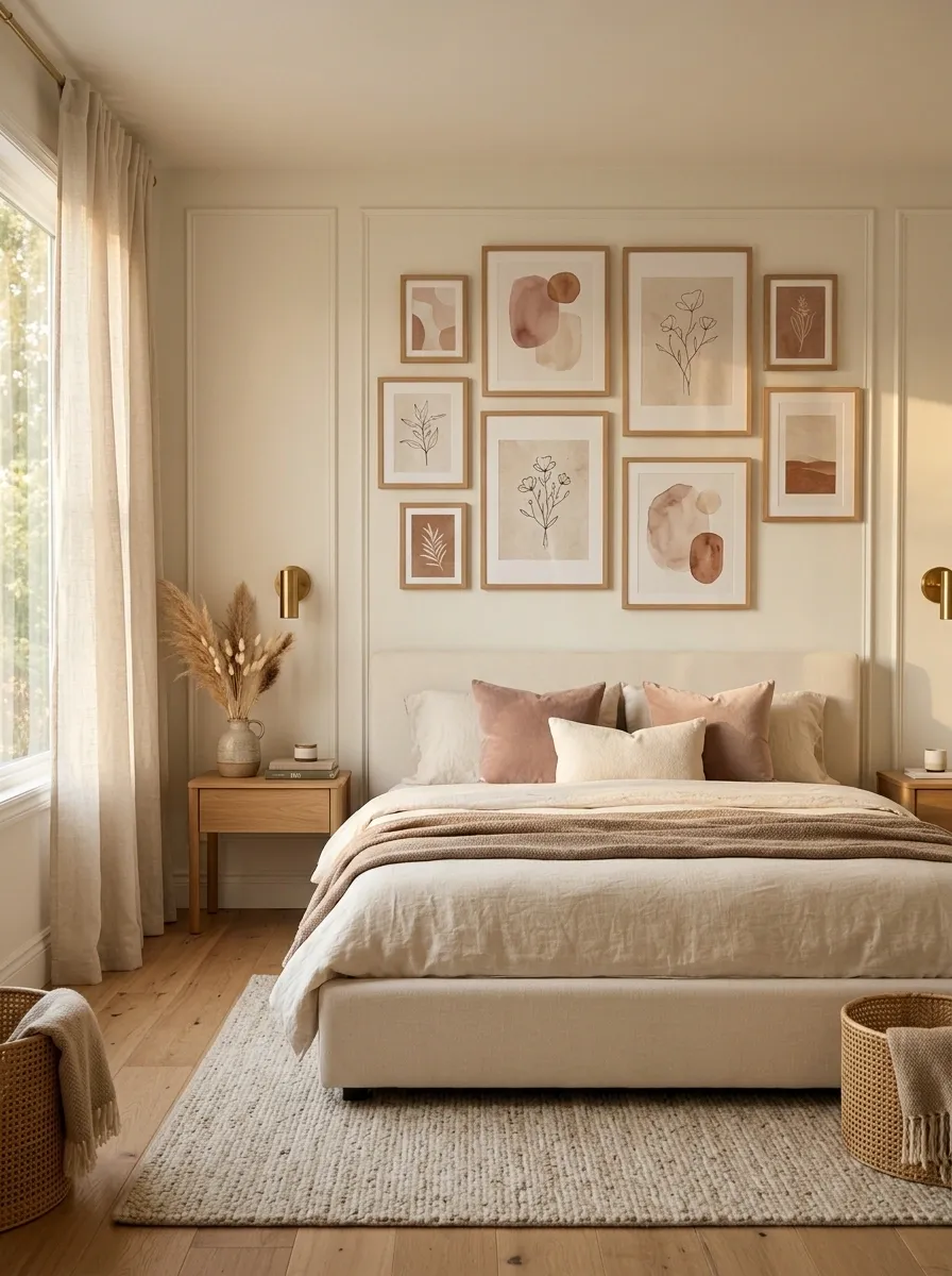
Dusty blush, muted terracotta, cream, and soft brown artwork give this bedroom a warmer personality without making the room overly sweet.
Light wood frames surround abstract shapes, delicate botanical forms, and understated line work above a simple upholstered bed.
The bedding, rug, and bedside furniture repeat the same warm palette.
The terracotta is the useful bridge here. It gives the pale pink enough depth to feel sophisticated rather than sugary.
Keep the pink dusty and slightly muted.
Brighter pink would change the entire character of the room.
Architectural Gallery Wall With Oversized Line Drawings
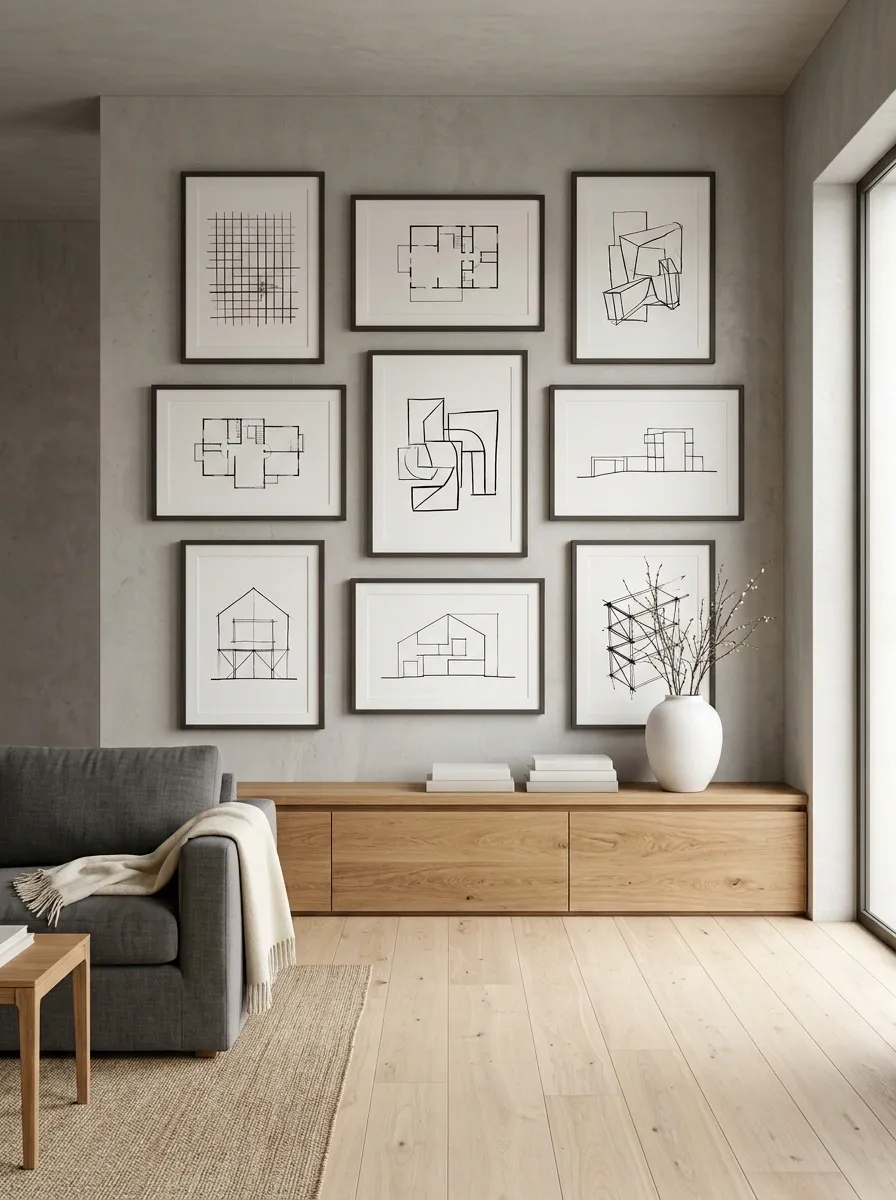
This composition uses the language of architecture itself.
Large black line drawings, simplified floor-plan studies, abstract elevations, and structural sketches occupy a clean wall above a long console.
Slim dark frames give the artwork definition while the rest of the room stays sparse and modern.
The strength here comes from line weight and negative space rather than color.
There is enough empty wall around the collection to make the drawings feel deliberate.
This approach suits rooms with clean architectural features, concrete, plaster, wood, or other simple finishes that don’t compete with the precise artwork.
Playful Color-Blocked Gallery Wall for a Creative Room
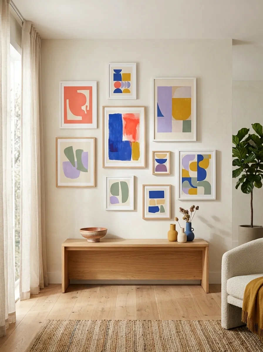
This gallery uses art as a controlled burst of color.
Coral, cobalt, mustard, lavender, muted green, and cream prints sit against a quiet wall with simple frames.
The artwork varies widely in subject and shape, but generous breathing room keeps the collection from becoming visually overwhelming.
The neutral space between the pieces is just as important as the colors themselves.
It separates the saturated artwork so each piece remains legible.
Use simple frames here. The artwork already supplies enough personality, and decorative framing would make the composition too busy.
Refined Tonal Gallery Wall With One Dramatic Artwork
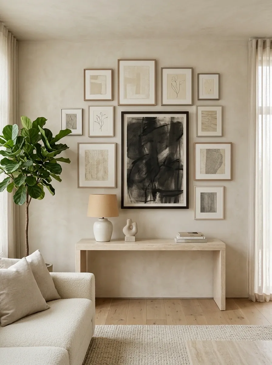
The final concept is intentionally quiet.
Soft plaster walls hold a restrained collection of cream, taupe, beige, and charcoal artwork in thin neutral frames.
Near the center, one large dark composition provides a sharp visual punctuation point.
A pale stone console and simple sculptural lamp keep the room refined without introducing competing details.
The dramatic artwork works precisely because everything around it is quieter.
It gives the eye one place to land without requiring a large collection.
This is a strong choice for a room that already has interesting architecture or materials. The gallery adds structure without fighting the rest of the space.
Final Thoughts
The strongest gallery wall is usually the one that feels connected to the room rather than simply attached to it.
Once the overall direction is clear, the frame finish, artwork scale, colors, spacing, and furniture beneath it all start to make sense together.
A collected vintage wall needs a different visual balance from a clean monochrome grid. A small apartment arrangement needs a different shape from a tall stairwell composition.
Before buying anything, save the complete arrangements that feel closest to your space.
Look at them together and notice what keeps appearing. It may be pale wood, dark frames, wide spacing, layered artwork, muted colors, or one oversized focal piece.
That repeated visual language is often the clearest clue to the direction that will work best in your own room.
Save your favorite gallery wall looks now so you can come back to them when you’re ready to plan your own wall.