
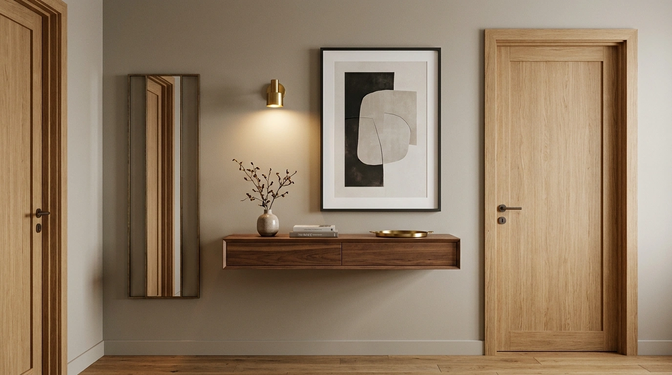
The wall between two doors is often where decorating plans fall apart. It looks too narrow for substantial furniture, too important to leave empty, and too interrupted by trim to treat like an ordinary wall. A piece that looks right in a shop can suddenly feel oversized once two doorways, handles, and walking paths are taken into account.
That awkwardness is exactly what makes this part of a room worth treating as a complete composition. The right arrangement doesn’t try to disguise the doors. It works with them.
Some spaces need a low bench and a large mirror. Others benefit from built-in shelving, a quiet piece of art, a painted architectural treatment, or a carefully chosen console. The most successful versions have one clear visual idea, enough breathing room, and a relationship between the furniture, wall, lighting, and surrounding architecture.
Finished Ideas for Decorating the Space Between Two Doors
Playful Ledge Shelves With Children’s Books
This charming arrangement puts the awkward wall to work by turning it into a miniature reading station. Narrow picture ledges hold colorful children’s books face-out, transforming everyday reading material into vibrant vertical art that kids can easily reach. Above the shelves, a framed botanical print ties the composition together and adds a soft touch of nature against the pale gray wall.
The spacing is everything in a setup like this. Keeping the shelves neatly stacked leaves just enough breathing room between the two white doors so the passage feels open rather than cluttered. The uniform white ledges echo the door trim, creating a cohesive backdrop that lets the bright book covers take center stage.
Function meets style when you use shallow displays in tight circulation zones. This approach adds personality and storage without encroaching on the floor space needed to open doors comfortably. Keep the upper art piece centered to balance the entire vertical axis of the wall.
Slim Walnut Console With an Oversized Arched Mirror
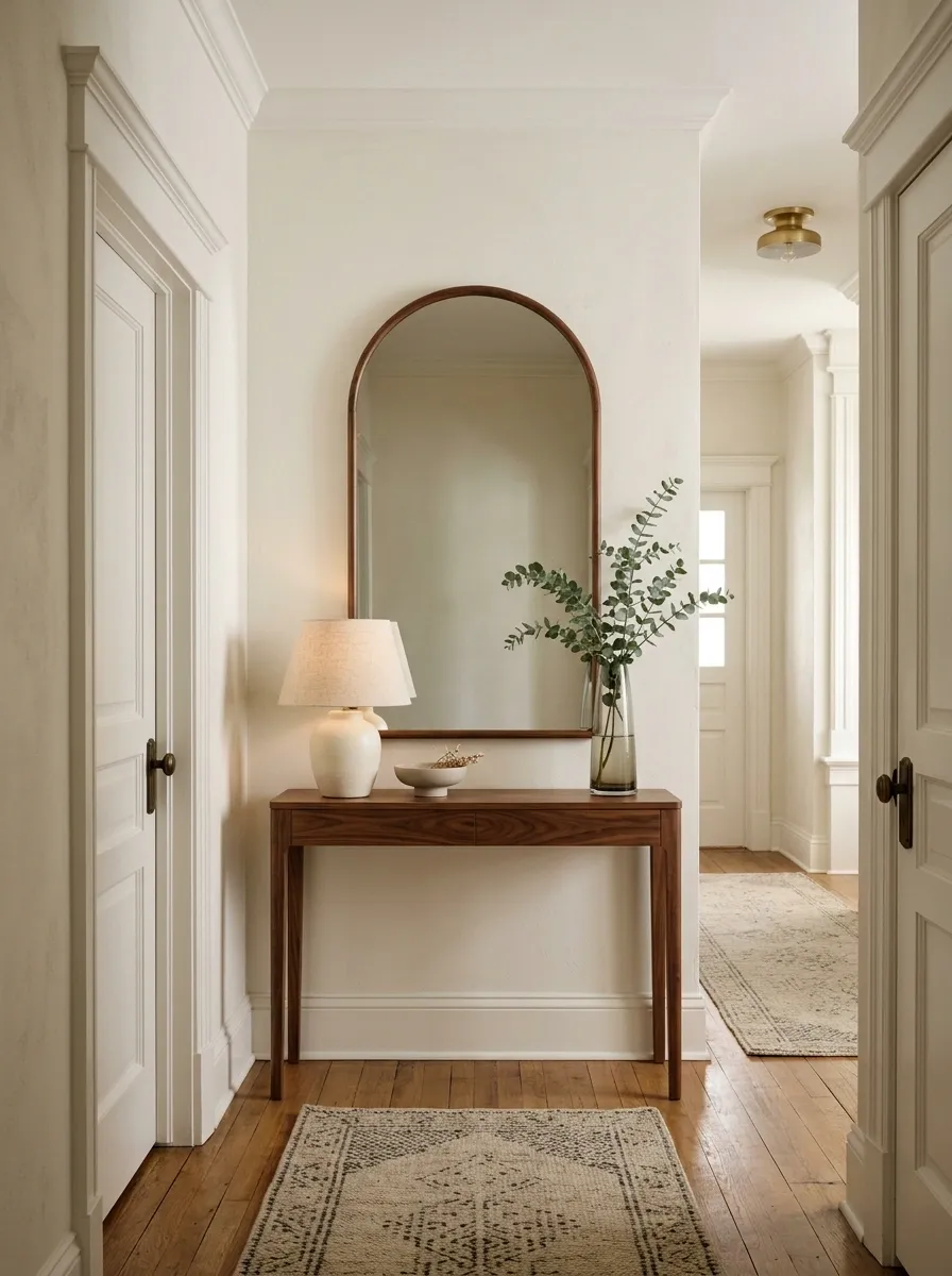
Warm walnut immediately gives the awkward wall a sense of purpose, while the tall arched mirror softens the strong vertical lines created by the two doorways. The finished composition uses a narrow console with just enough depth for a ceramic lamp, a shallow bowl, and one organic branch arrangement. Creamy walls and traditional door casings keep the setting light, while the darker wood creates a grounded center.
The key is proportion. The console should remain visually light enough to leave the door openings dominant, while the mirror rises high enough to connect the furniture to the architecture. Keep the accessories low and restrained so the arch remains the memorable shape.
architecture
mirror
console
styling
Dresser and Mirror Between Double Doors
A crisp white dresser anchors the awkward gap between two white doors, giving the passage a functional and intentional purpose. Above it, a tall arched mirror mimics the soft curves often found in traditional architecture, bouncing light around the room and visually expanding the narrow corridor. A simple woven tray and a delicate floral arrangement finish the top surface without overwhelming the space.
Scale plays a major role in making this furniture placement work. The chest is wide enough to feel substantial against the blank wall, yet leaves ample clearance for the door hardware on either side. The mirror rises high to connect the lower furniture piece with the upper wall geometry, creating a unified vertical composition.
Keep styling minimal to maintain a calm and orderly feel in a high-traffic zone. A few curated decorative accents preserve the light, airy atmosphere while ensuring the area remains practical for daily use. The monochrome palette keeps the overall look timeless and serene.
Built-In Bookcase Nook Framed by Two White Doorways
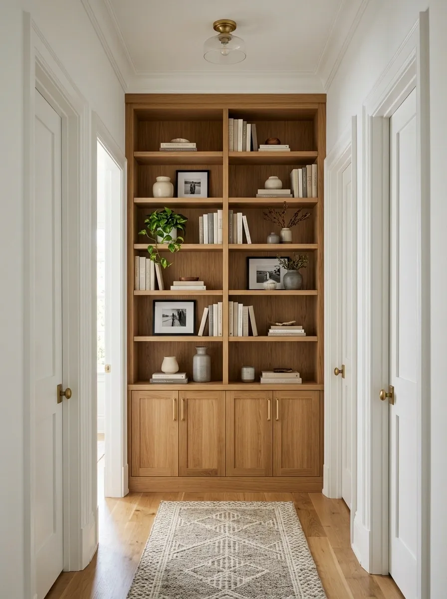
Rather than decorating the wall in front of the reader, this approach turns it into a shallow built-in library. Warm oak shelving fills the space between the doors, with books, ceramics, framed photographs, and a few open areas that prevent the shelves from becoming visually heavy. Lower cabinets hide less attractive items and give the entire arrangement a more architectural finish.
The contrast between the clean white door trim and the warmer wood makes the wall feel intentional from across the room. Shelf depth matters here. A shallow installation keeps circulation comfortable and prevents the doorway approaches from feeling pinched. The strongest styling leaves some shelf sections deliberately open.
Textured Tile Feature Wall With Integrated TV
This clever layout transforms the awkward zone between two warm wooden doors into a stunning media focal point. A patterned geometric tile backdrop frames a sleek recessed television, turning standard electronics into a deliberate design feature. Below the screen, a minimalist floating wooden shelf echoes the rich tones of the surrounding door frames.
The warmth of the wooden doors contrasts beautifully with the crisp texture of the tiled surface, making the entire wall feel custom-built. By centering the television within the patterned section, the design achieves a balanced look that doesn’t compete with the nearby entryways. The shallow profile of the lower shelf keeps the floor plan open and inviting.
Material repetition is the secret to pulling off this look. Matching the wood tones of the lower console to the door frames ties the disparate elements together into a cohesive room design. Keep surrounding decor minimal so the textured tile and clean lines remain the star of the space.
Quiet Gallery Wall With One Oversized Artwork
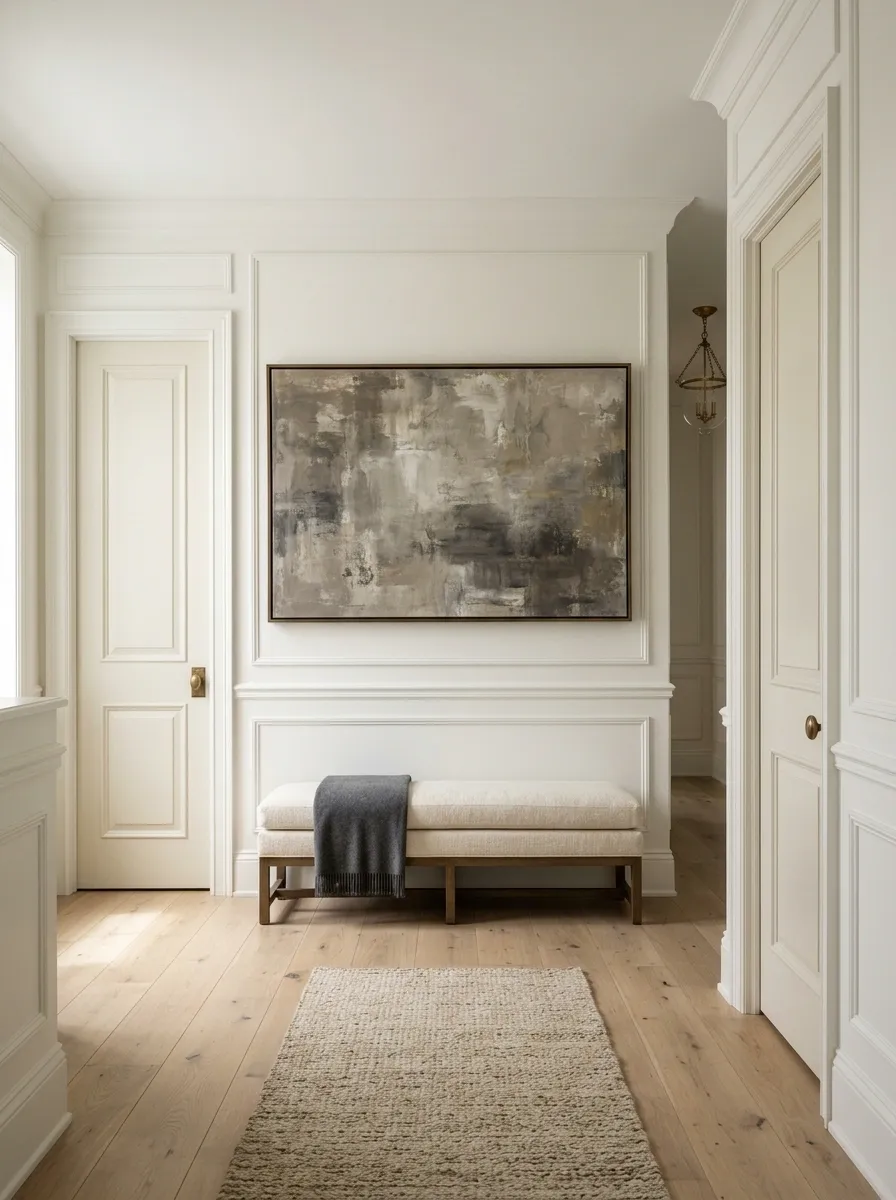
A single substantial artwork can make the center wall feel more considered than a collection of small frames scattered around it. This composition uses one wide painting or photographic print above a simple upholstered bench, with warm white walls and minimal accessories. The two doors create a natural frame for the artwork, giving the piece more presence without requiring a busy gallery wall.
The visual strength comes from scale rather than quantity. The artwork should have enough width to visually occupy the center without reaching awkwardly into the door casings. A bench below provides a second horizontal line and makes the wall feel connected to the rest of the room. Keep the floor styling quiet so the artwork remains the dominant element.
Dark Modern Vanity With Matching Stool
Sleek black doors create a dramatic frame for a matching dark vanity nestled right in the center. The built-in mirror reflects natural light while the golden-yellow upholstered stool introduces a warm, cheerful pop of color against the moody tones. Clean hardware and minimalist styling keep the compact makeup station feeling upscale and uncluttered.
The strength of this design lies in its bold, monochromatic commitment. Dark finishes give the center wall a grounded presence, while the mirror bridges the gap between the furniture and the surrounding architecture. It is a brilliant way to utilize an otherwise dead zone without making the room feel cramped.
Proportion is vital when squeezing furniture between two swing paths. The vanity remains shallow and streamlined to ensure comfortable movement throughout the space. Stick to restrained tabletop accessories to preserve the clean, modern aesthetic.
Warm Japandi Bench With a Textured Wall
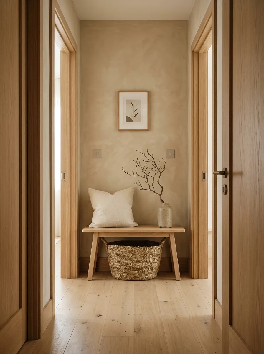
This version strips the space back to a handful of tactile materials: pale oak, soft linen, plaster-like wall texture, woven fiber, and warm neutral color. A low bench sits between the doors with a simple cushion and one basket tucked underneath. Above it, the wall stays deliberately sparse, perhaps with a quiet abstract artwork or a single organic branch.
The low furniture prevents the passage from feeling crowded, while the textured wall keeps a minimalist composition from becoming flat. The materials do most of the decorating. This look works best when the floor, door trim, and surrounding furniture share similarly warm undertones rather than fighting for attention.
Narrow Black Cabinet With Sculptural Lighting and Art

For a more contemporary room, a slim black cabinet creates a crisp visual anchor between the doors. Above it sits a dramatic artwork, while a sculptural table lamp adds a warm pool of evening light. Pale walls, a simple floor, and minimal accessories keep the arrangement from becoming too severe.
The contrast is what gives this design its character. Matte black supplies visual weight, while the artwork and lamp introduce shape and warmth. Closed storage is especially useful in a passage because it keeps everyday clutter out of sight. The cabinet should stay narrow, and the lamp should be chosen for its silhouette as much as its light output.
Soft Blue Color-Drenched Wall With a Vintage Console
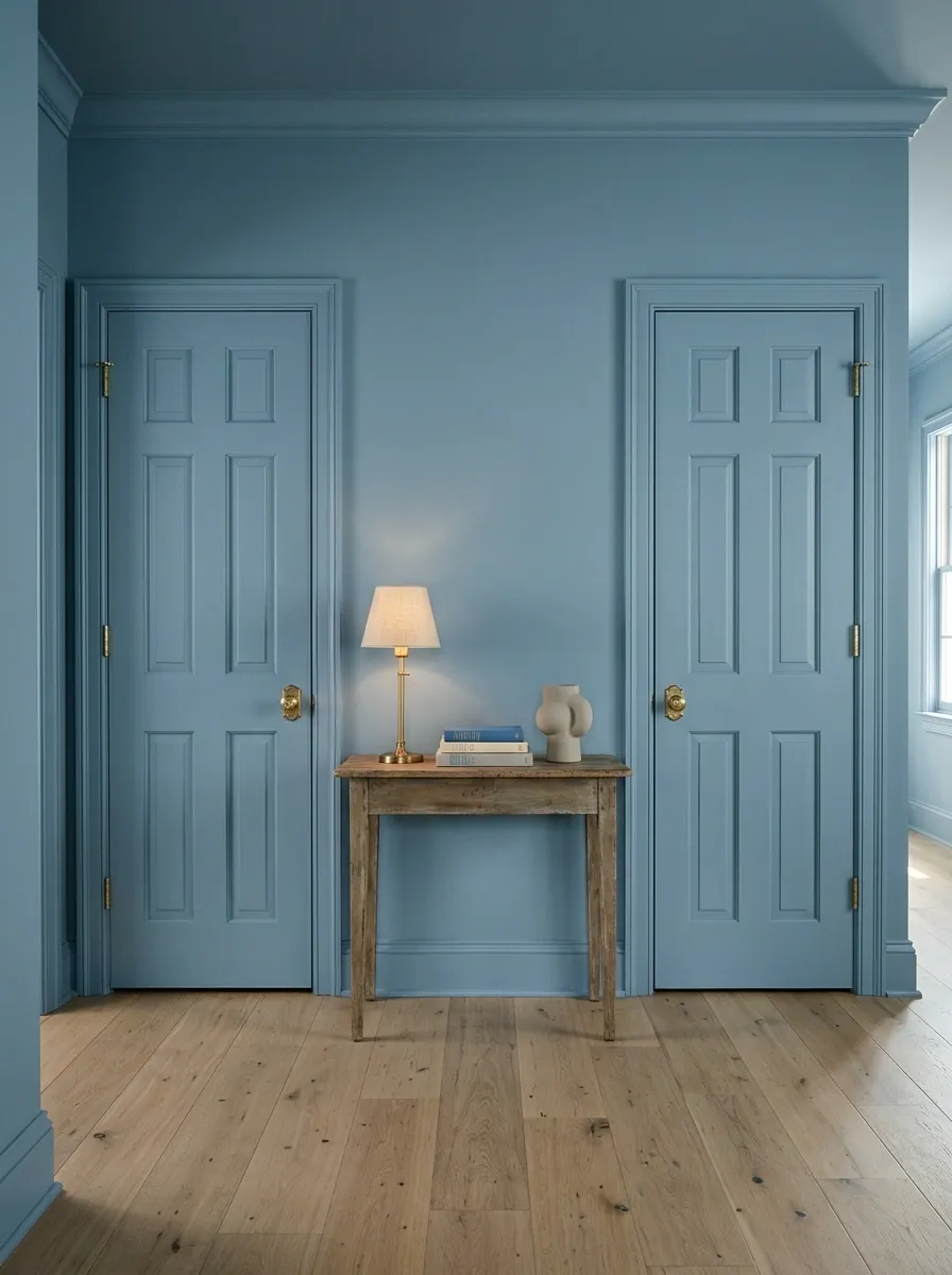
Color can make the space between two doors feel intentional without adding much furniture. Here, muted blue covers the center wall, door trim, and surrounding woodwork, creating one continuous architectural field. A slim vintage-style console sits against it, topped with a small lamp, a few books, and a single decorative object.
The monochromatic treatment gives the wall more presence than a collection of unrelated accessories would. The furniture can then remain simple because the paint provides most of the visual character. A slightly weathered wood finish adds warmth against the cooler blue. Keep the accessories restrained so the uninterrupted color remains the main feature.
Statement Wallpaper Panel With a Quiet Console
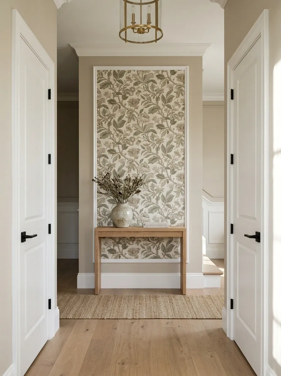
A patterned wall can turn an otherwise awkward gap into the room’s visual punctuation. This design uses a distinctive wallpaper only across the center section, framed by the two doorways, while the surrounding walls remain calm. A simple wood console below keeps the composition grounded without competing with the pattern.
Containing the wallpaper to this architectural zone makes the pattern feel deliberate instead of overwhelming. Choose a print with enough scale to read from across the room, then repeat one of its quieter colors in the console styling. The surrounding finishes should remain simple. With a strong pattern already carrying the wall, extra artwork or decorative clutter weakens the composition.
PATTERN ZONE
Long Floating Shelf With Layered Art and Ceramics
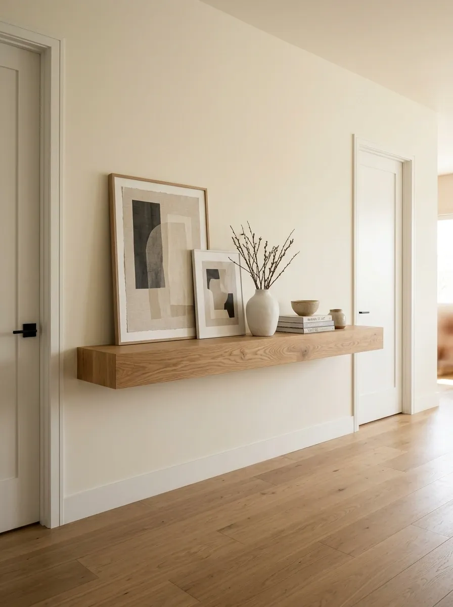
A floating shelf creates a relaxed modern composition without the visual weight of a console cabinet. A long oak shelf runs between the two doorways, carrying a few leaning artworks, handmade ceramics, and a small stack of books. The floor stays completely open, making the arrangement especially useful where circulation is tight.
The appeal comes from layering rather than quantity. A larger artwork provides the tallest point, while smaller objects create a gradual descent toward the ends of the shelf. Leaving visible stretches of wood keeps the arrangement from looking crowded. A soft wall color and minimal door trim allow the shelf to read as one long horizontal gesture across the center.
Vintage Chest With an Aged Brass Mirror
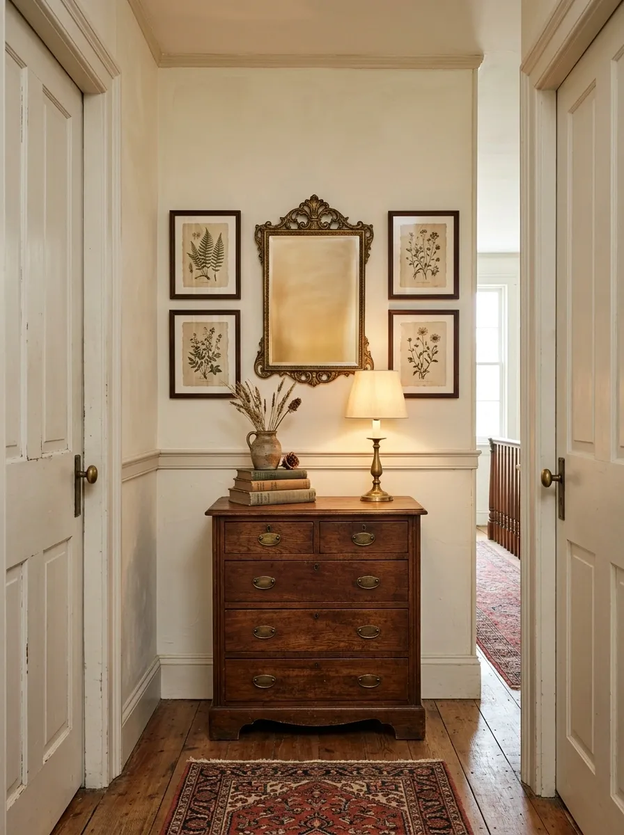
The space between the doors takes on a collected, slightly historic character with a compact vintage chest, an aged brass mirror, and warm cream walls. A small table lamp adds a soft glow, while two or three framed prints create a loose vertical layer around the mirror. The wood should show some natural variation rather than looking freshly manufactured.
The mix feels richer because the finishes aren’t perfectly matched. Aged brass picks up the warm tones in the chest, while the cream wall keeps the darker furniture from becoming heavy. Keep the styling edited. One lamp, a few books, and a small vessel are enough to make the arrangement feel lived in without turning the passage into a display cabinet.
BRASS
Full-Height Vertical Paneling With a Compact Accent Chair
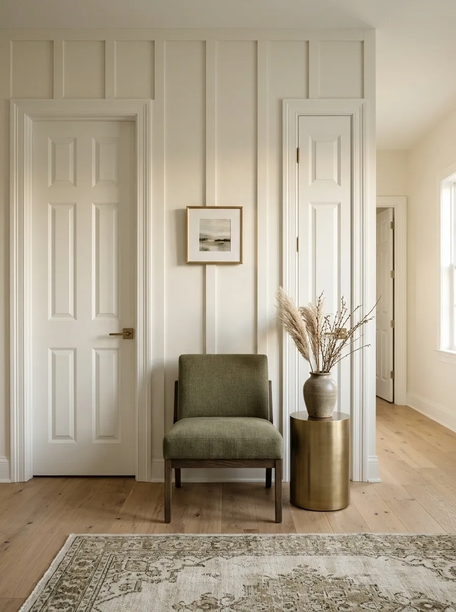
Instead of filling the wall with accessories, let the architecture do the work. Full-height vertical paneling gives the space between the doors a strong rhythm and makes the wall feel like an intentional architectural feature. A compact upholstered chair and small side table occupy only one portion of the wall, leaving the paneling visible above and around them.
The vertical lines create height without requiring a tall piece of furniture. A warm off-white paint keeps the effect refined, while a muted olive or natural linen chair introduces softness. The important detail is scale. The chair should read as a small seating moment, not as a piece of furniture wedged into a passage.
Moody Olive Wall With Pale Oak Furniture

A deep olive wall can make the area between two white or warm-painted doors feel unexpectedly sophisticated. This finished composition pairs the dark wall with a pale oak console, a softly framed botanical print, and warm lighting. The darker center creates depth, while the lighter furniture stops the passage from feeling visually dense.
The balance depends on keeping the dark color contained to the wall where the composition lives. Pale wood introduces enough contrast to make the furniture visible from the doorway. Warm bulbs and cream textiles reinforce the warmer side of the olive rather than pushing it toward a cold green. Keep surrounding rooms relatively calm so this section can act as a visual punctuation point.
Low Storage Bench With a Large Round Mirror
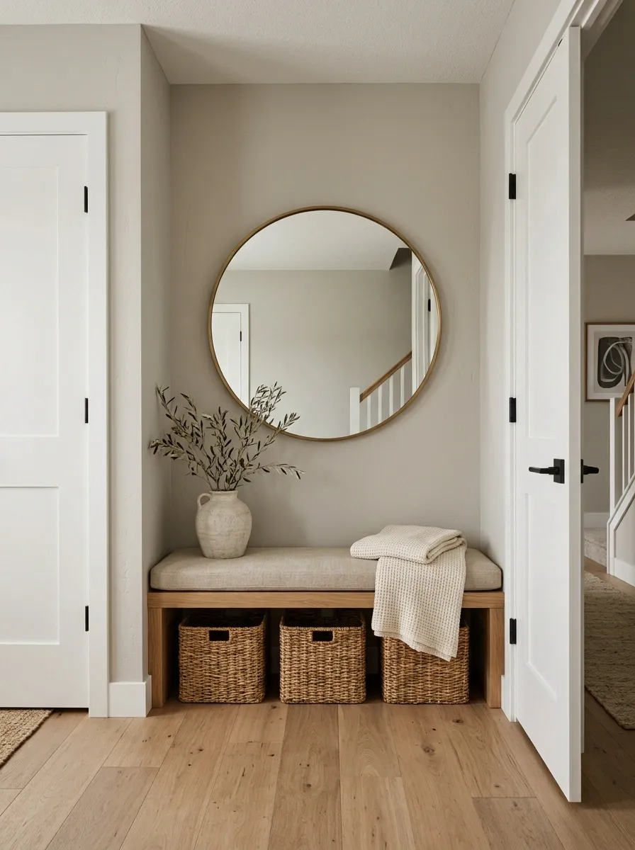
A long storage bench paired with an oversized round mirror creates an easygoing composition that feels finished without becoming formal. The bench provides concealed storage and a place to sit, while the circular mirror breaks up the strong horizontal and vertical lines established by the doors and furniture.
Natural wood, soft upholstery, woven baskets, and a warm neutral wall give the design a relaxed character. The mirror should be large enough to hold its own between the two door casings, but the bench should stay visually low. That contrast in height keeps the arrangement balanced. Use only a few objects on the bench so the storage remains practical rather than decorative clutter.
Minimal Stone Console With Linen Art and Black Accents

A pale stone console gives this narrow wall a refined architectural quality without making the area feel crowded. Above it, a large linen-textured artwork adds softness, while a few black-framed details provide just enough contrast against the warm neutral backdrop. The doors remain visually important because the furniture is deliberately low and restrained.
The composition works through texture rather than decoration. Smooth stone, woven linen, painted wood, and dark metal each bring a different surface to the arrangement. Keep the styling sparse, especially when the stone has noticeable veining. One sculptural vessel and a small branch are enough to finish the console without distracting from the larger materials.
Narrow Floating Desk With a Calm Work Nook
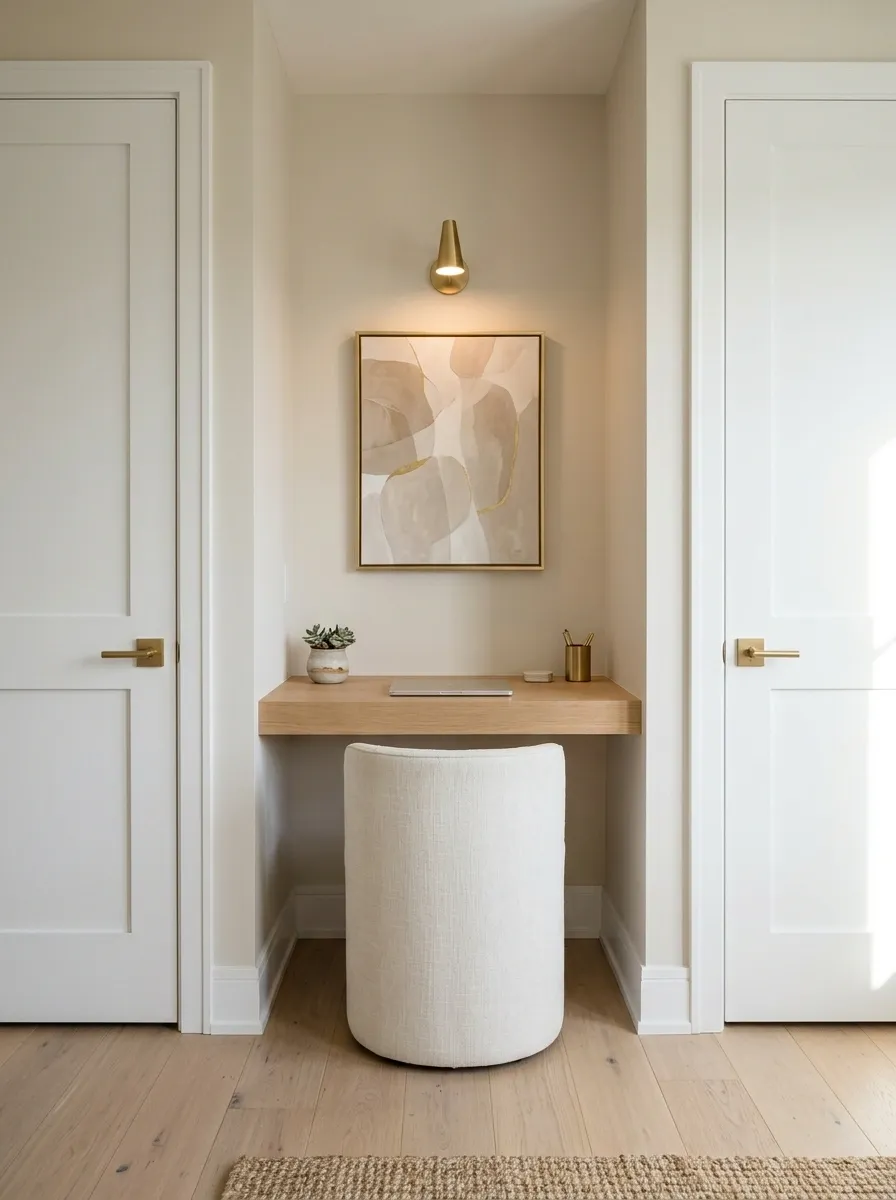
The wall between two doors can become useful workspace when floor area is limited. A floating oak desk sits high enough to keep the floor visually open, paired with a slim upholstered chair and a single framed artwork above. A small wall-mounted light provides task lighting without introducing another piece of furniture.
The important distinction is that the work nook still reads as part of the room rather than a makeshift office. Keep the desktop nearly clear and route cables out of sight. A chair that tucks completely beneath the desk preserves circulation when the workspace isn’t being used. The finished effect is compact, quiet, and practical.
Symmetrical Console With Twin Lamps in a Formal Hall

For a room with traditional architecture, symmetry can make the awkward center wall feel surprisingly composed. A substantial console sits directly between the doors, with matching lamps, balanced accessories, and one centered piece of artwork above. The arrangement echoes the formal proportions of the surrounding trim instead of trying to disguise them.
The symmetry works because everything is intentionally quiet. Matching lamps provide repetition, while a single artwork supplies one strong center point. The console should have enough visual weight to hold the arrangement but remain shallow enough for comfortable passage. This look suits spaces where the architecture already feels classic, orderly, and somewhat formal.
Natural Wood Slat Wall With an Integrated Bench
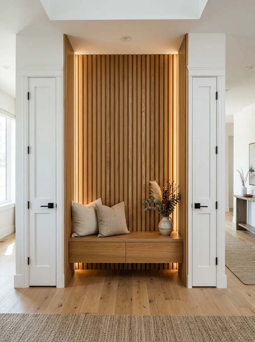
Here the wall itself becomes the feature. Vertical natural-wood slats run from floor to ceiling between the doors, creating a warm textured backdrop for an integrated bench below. Cushions and hidden storage make the arrangement useful, while a narrow strip of warm lighting adds depth between the timber lines.
This approach feels strongest in a contemporary or organic-modern home where wood already appears elsewhere. Matching the tone of the flooring or nearby furniture helps the slatted wall feel connected rather than inserted. The bench should be built as part of the composition, with no unnecessary legs or bulky hardware. That keeps the architectural effect clean.
Black-and-Cream Checkerboard Moment With Warm Wood

A restrained checkerboard pattern gives the wall or floor zone between two doors a strong graphic identity. The key is to let the pattern have one clear role rather than repeating it throughout the room. Warm oak furniture, creamy walls, and simple black accents soften the contrast and stop the graphic element from feeling harsh.
A low bench or narrow console can sit within the composition, but the rest of the styling should stay sparse. The checkerboard becomes memorable because everything around it is quieter. Use a moderate pattern scale rather than tiny checks, especially in a narrow passage where small details can quickly become visual noise.
Soft Vintage Floral Wallpaper With Painted Wood Furniture
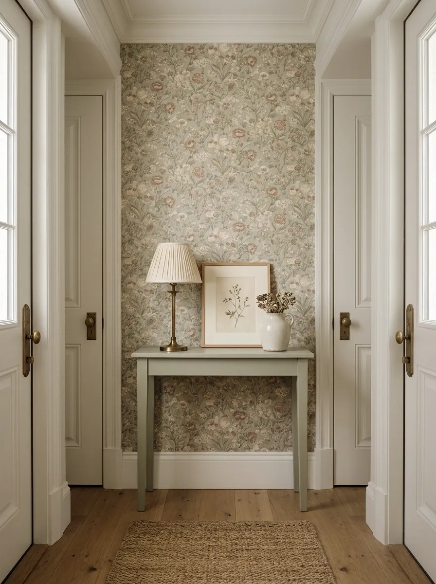
A muted floral wallpaper can give the narrow wall between two doors the character of a small boutique-like sitting hall. This version pairs a dusty floral pattern with a painted wood console in a soft cream or muted sage. A petite lamp, a framed botanical print, and one ceramic vessel reinforce the old-fashioned character without making the space feel theme-heavy.
The palette matters more than the number of decorative pieces. Pull two or three quiet tones from the wallpaper and repeat them through the furniture and accessories. That creates continuity without making every surface match. Keep the door trim simple and light so the floral center remains distinct.
Shallow Closed Storage With Art Above
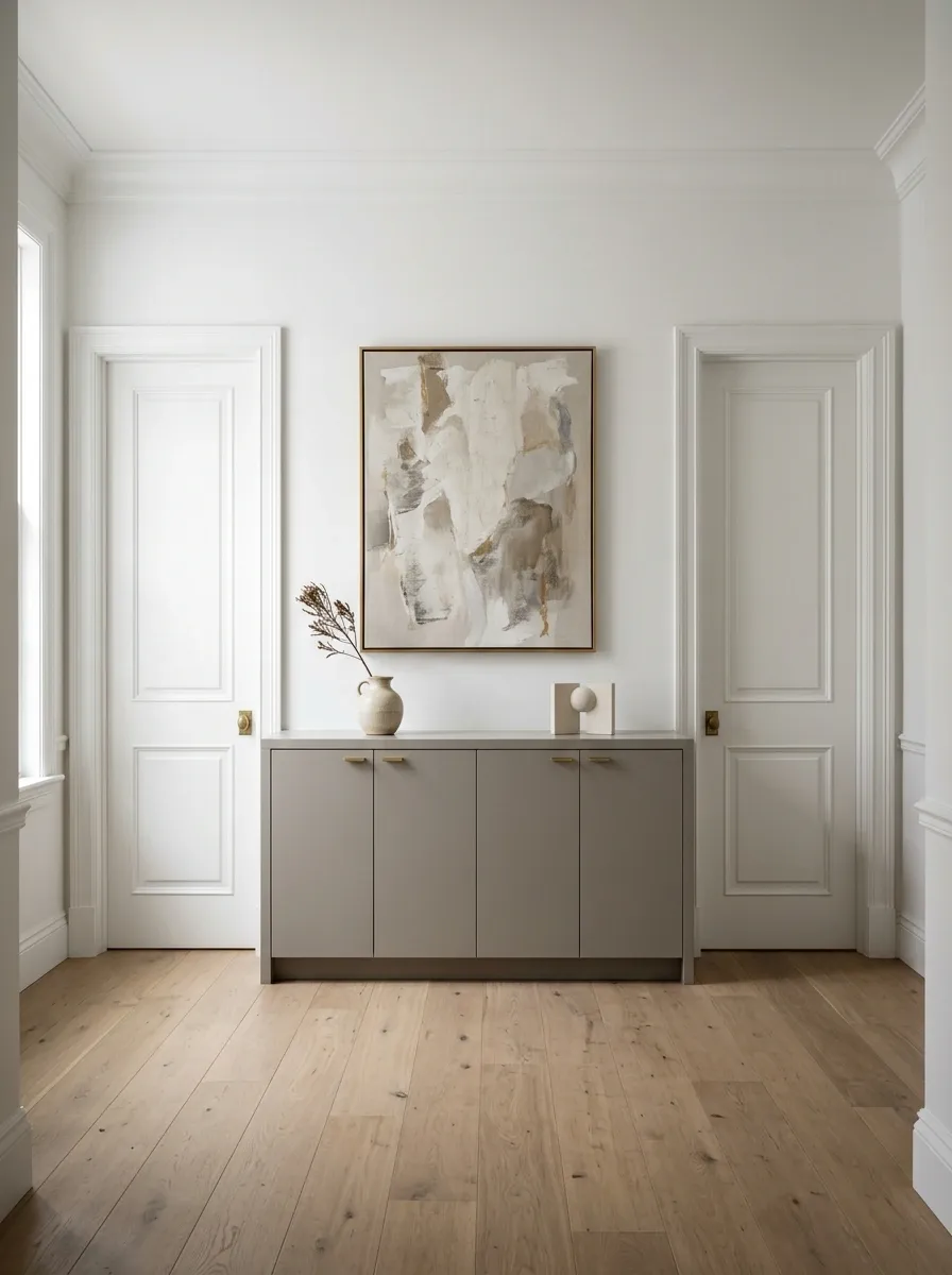
Storage becomes part of the architecture in this practical arrangement. A run of shallow closed cabinetry occupies the space between the doors, topped by one substantial framed artwork. The cabinet hides everyday items while its simple front keeps the wall visually clean. A small vase or sculptural object provides just enough decoration without turning the storage into a display shelf.
The height of the cabinetry is what makes this composition work. Leave enough wall above it for the artwork to breathe, rather than pushing the art directly against the cabinet. Flat fronts and simple hardware keep the piece closer to built-in architecture than conventional furniture. This is especially useful when the wall needs to carry real storage without looking like a storage zone.
Oversized Landscape Artwork With a Simple Oak Bench

One wide landscape artwork can create a strong horizontal bridge between two doorways. This composition uses a large framed painting above a clean oak bench, with the surrounding walls and accessories kept quiet. The artwork carries the visual interest while the bench grounds the lower half of the wall.
The horizontal proportion is the defining feature. A landscape format visually connects the two vertical door openings and makes the center feel wider. Choose artwork with a palette that relates to the flooring or nearby textiles rather than introducing an unrelated color story. A simple bench is enough underneath. Adding a large collection of objects would dilute the calm, gallery-like effect.
Warm Plaster Finish With a Curved Console
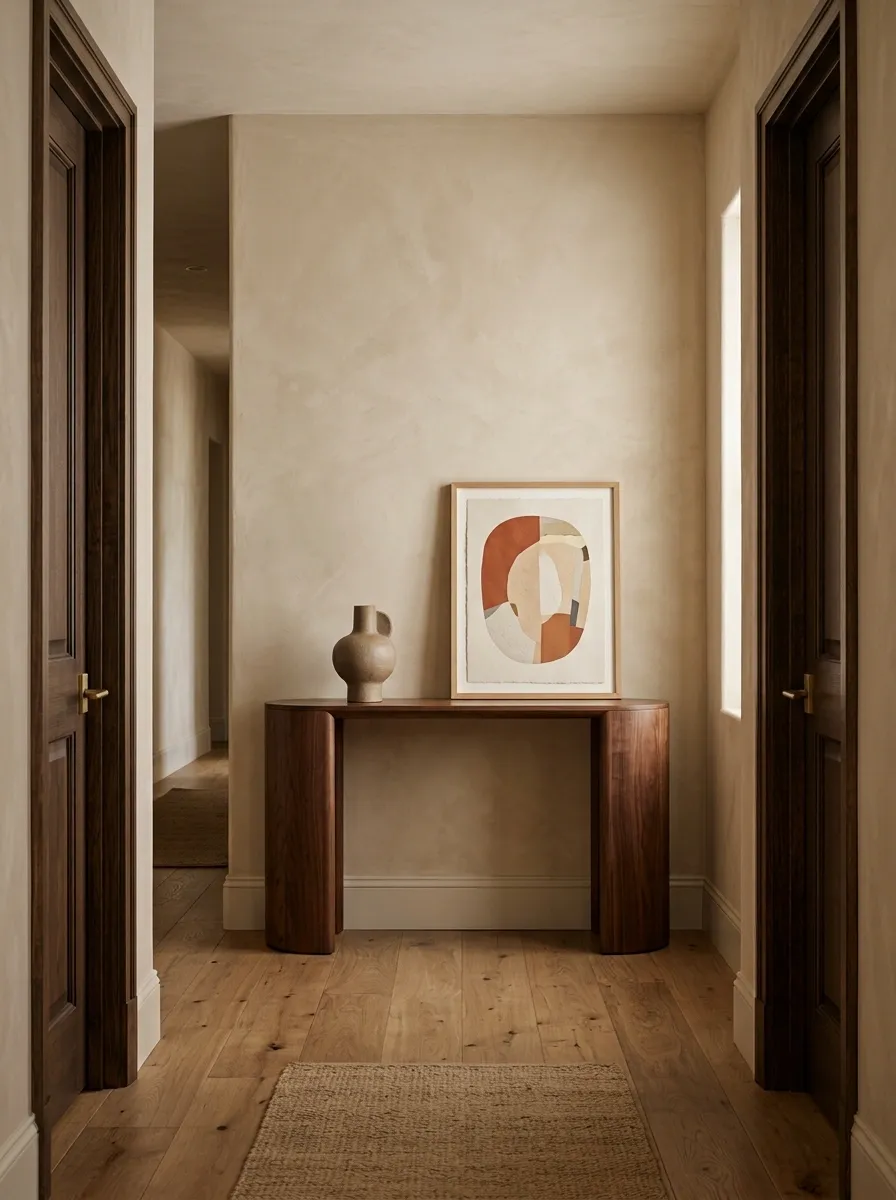
A softly textured plaster-like wall brings depth to the space without requiring a busy arrangement. Against it sits a curved console with a sculptural vase and one rounded piece of artwork. Warm beige, limestone, natural wood, and subtle terracotta accents keep the palette grounded and organic.
The curves are what distinguish the composition. The rounded console and softened artwork edges counter the strict geometry of the surrounding doors, creating a pleasing change in shape. Keep the rest of the room relatively simple so the wall texture remains visible. Too many decorative objects would compete with the gentle forms and make the composition feel fussier than intended.
Layered Gallery With Mirror, Bench, Lighting, and Art
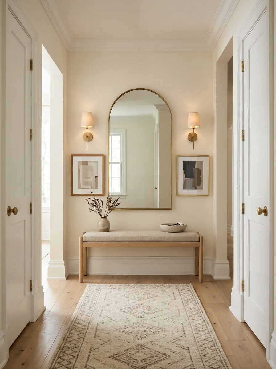
The final composition brings several ideas together without allowing any single element to dominate. A slim bench anchors the lower wall, an oversized mirror provides height, framed artwork adds visual layering, and a pair of understated wall lights create a warm evening glow. A textured runner connects the arrangement to the floor while a few carefully chosen accessories finish the scene.
The design works because each layer has a job. Architecture supplies the boundaries, the bench provides weight, the mirror creates vertical lift, art introduces personality, and lighting adds atmosphere. Restraint keeps the combination from becoming cluttered. The most successful version leaves generous breathing room around the central arrangement so the two doors still feel like part of the composition.
Make the Awkward Wall Feel Intentional
The most satisfying solution isn’t always the one with the most decoration. In fact, the opposite is often true. A strong console, one oversized artwork, a built-in feature, or a carefully painted wall can give the space enough identity that everything else can stay quiet.
The doorways should remain easy to use, the trim should still have room to breathe, and furniture shouldn’t force people to squeeze past it. Those practical boundaries are part of the design, not obstacles to work around later.
Start with the architecture already present. Choose the element that should catch the eye first, then let the remaining pieces support it through scale, material, color, and lighting. Once those relationships are right, the small wall no longer reads as an awkward gap. It becomes one of the places where the room’s character is easiest to see.
Save the designs that fit the room’s architecture, then return to them when it’s time to choose furniture, paint, artwork, or storage.