

Japandi has a very specific way of going wrong. The room starts with good intentions, then everything becomes cream, beige, pale oak, and another beige cushion because apparently the first six weren’t enough.
Add a tiny plant, three matching vases, and a boucle chair nobody can actually sit in, and the room is officially one Instagram reel away from becoming a showroom.
Good Japandi isn’t that sterile.
The look works because it has tension. Soft upholstery sits beside raw wood. A dark frame breaks up a pale wall. A chunky ceramic piece gives a smooth coffee table some character. Curved furniture stops all those clean lines from becoming painfully predictable.
That’s what makes the style interesting. It isn’t about owning less just for the sake of owning less. It’s about choosing pieces that have the right shape, texture, proportion, and visual weight, then giving them enough space to actually be noticed.
The Japandi Reality Check
Japandi works because restraint gives the room visual calm, while wood, linen, stone, paper, ceramics, and soft lighting keep that calm from becoming sterile. The mistake is treating minimalism like a shopping challenge. More matching accessories won’t make the room more considered.
A strong room usually has fewer focal points, clearer furniture spacing, and a mix of smooth and rough textures. That’s why the ideas below focus on complete compositions instead of random decorative add-ons.
Japandi Living Room Ideas
Build the Room Around a Low, Soft Sofa
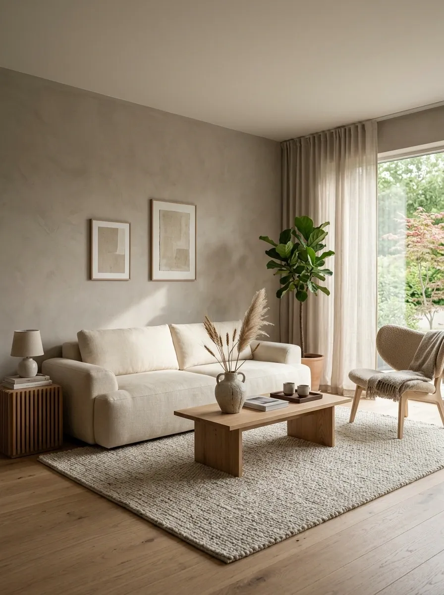
The sofa sets the visual height for the whole room. A low profile instantly makes the space feel more grounded, especially beside a simple coffee table and a generous rug.
Look for broad cushions, rounded edges, and upholstery in oatmeal, warm ivory, taupe, or muted mushroom. Skip the giant overstuffed sectional that eats half the room. Japandi likes comfort, not furniture with its own zip code.
The sweet spot:
- Low seat height
- Soft natural-looking upholstery
- Clean arms with little visual bulk
Pair Pale Walls With Warm Medium-Tone Wood
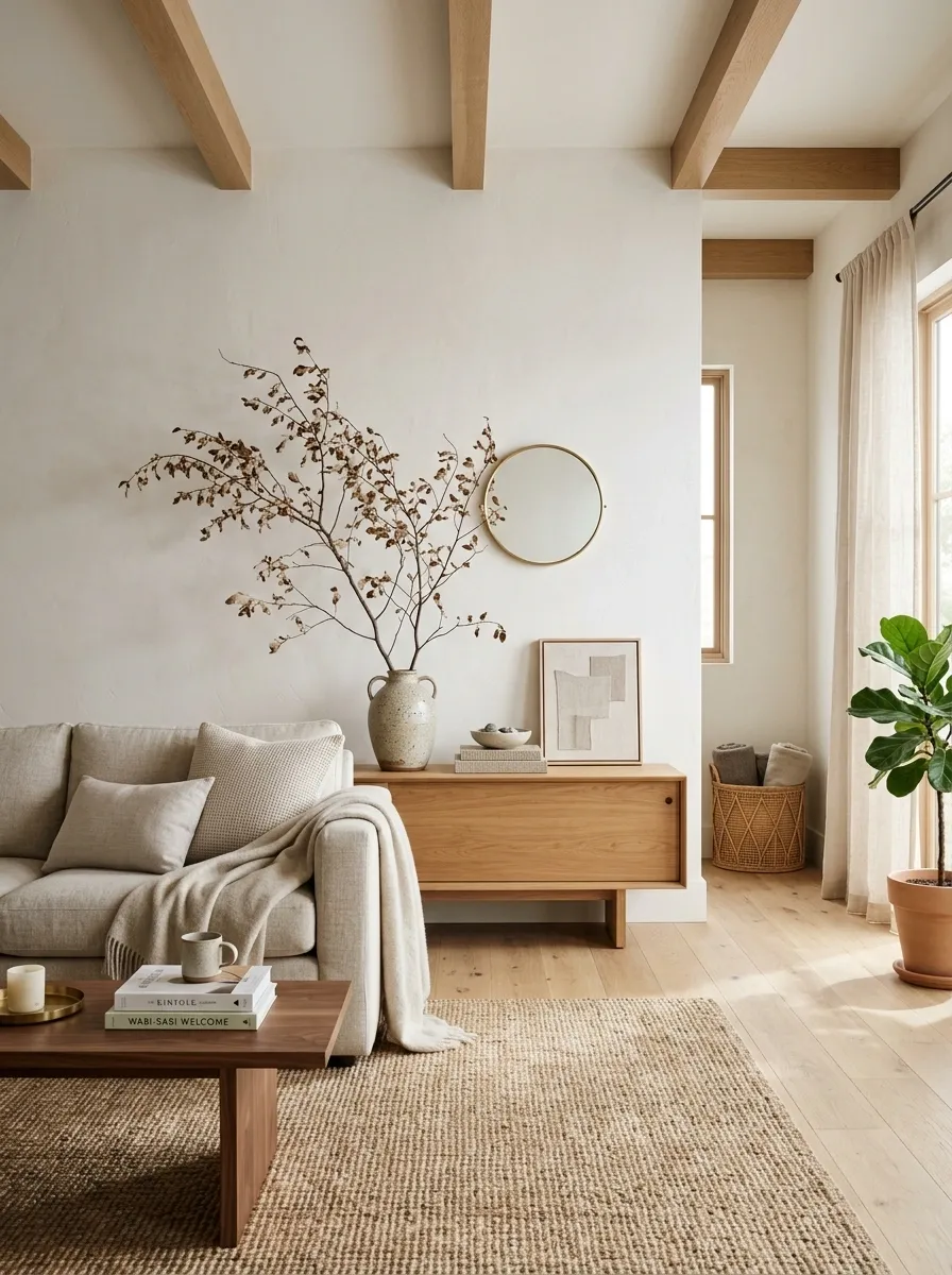
Pure white walls can make pale furniture look washed out. Warm wood fixes that without needing a pile of decorative objects.
Choose oak, ash, walnut, or another natural-looking finish with visible grain. A medium wood tone works especially well because it adds warmth while still keeping the room light.
Use the pairing like this:
- Pale cream or warm white walls
- Medium-tone wood flooring or furniture
- Soft beige upholstery
- One deeper wood accent nearby
Use One Dark Wood Piece to Ground the Room
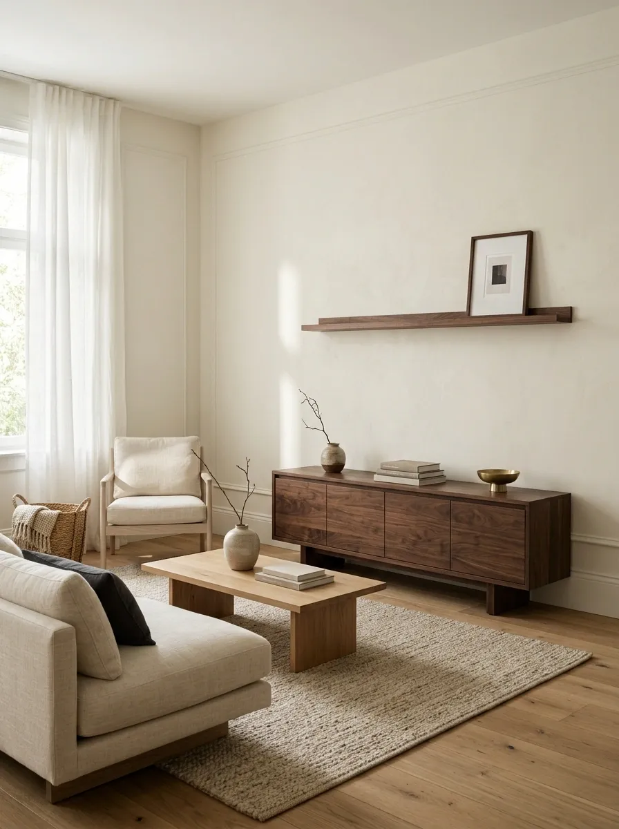
A Japandi room doesn’t need every piece of wood to match. In fact, a darker element makes the lighter finishes look richer.
Use one noticeable anchor, such as a dark walnut media console, sideboard, stool, or substantial coffee table. Keep the rest of the wood lighter so that one darker piece reads as a deliberate contrast instead of a second competing palette.
The rule is simple: one strong dark wood moment beats five little dark accessories scattered around the room.
Cream upholstery
A small dark frame or lamp base
Everything else doesn’t need to match.
Keep the Coffee Table Simple and Low
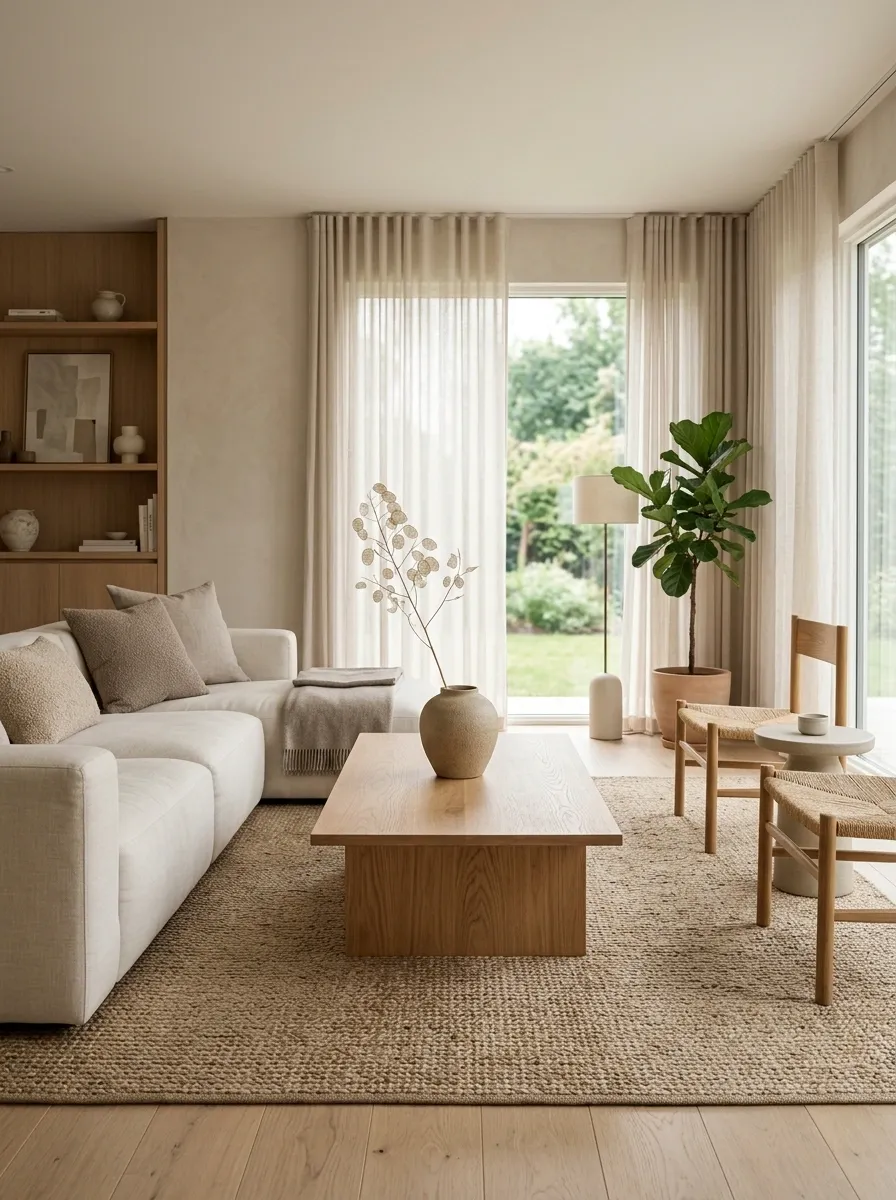
The coffee table shouldn’t become a tiny flea market in the middle of the room.
A low rectangular table in wood, stone, or a wood-and-stone mix gives the seating area a clear center without fighting the sofa. Keep the surface mostly open and use one deliberate arrangement instead of filling every inch.
A clean setup looks like this:
- Low table with a broad, simple shape
- One ceramic vessel or bowl
- One small stack of books if the room needs extra height
- Plenty of visible tabletop around everything
Layer Linen, Cotton, and Bouclé Without Clutter
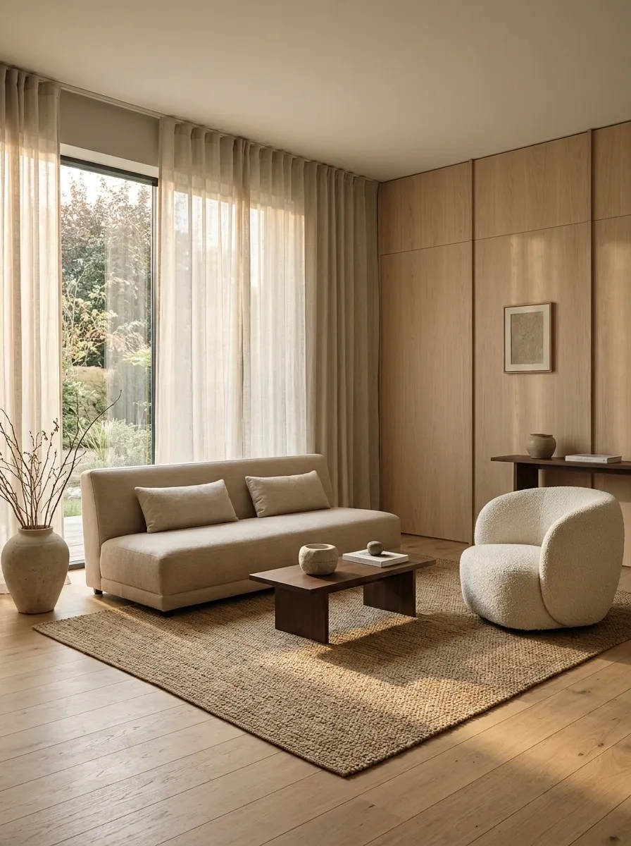
Texture does the heavy lifting when the palette is quiet.
A linen-look curtain, cotton cushions, a nubby bouclé chair, and a woven rug can create plenty of visual interest without throwing more colors into the room. The key is changing the surface, not collecting more objects.
Keep the shapes simple and let the fabrics provide the detail. Nobody needs seven decorative cushions fighting for custody of the sofa.
Let a Large Rug Define the Seating Area
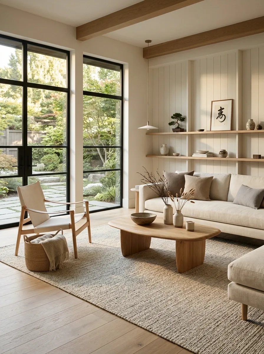
A tiny rug floating underneath a coffee table makes an otherwise thoughtful room look weirdly unfinished. Japandi needs the seating area to feel connected.
Choose a rug large enough for at least the front legs of the main seating pieces to sit on it. A flat-weave, wool-look, or subtly textured rug in cream, oatmeal, stone, or taupe works beautifully with natural wood.
Aim for this composition:
- Sofa anchored partly on the rug
- Coffee table fully on the rug
- Side chair touching or sitting partly within the rug zone
The rug should quietly hold everything together, not sit there like a lonely bath mat.
Use Organic Shapes to Soften Straight Furniture
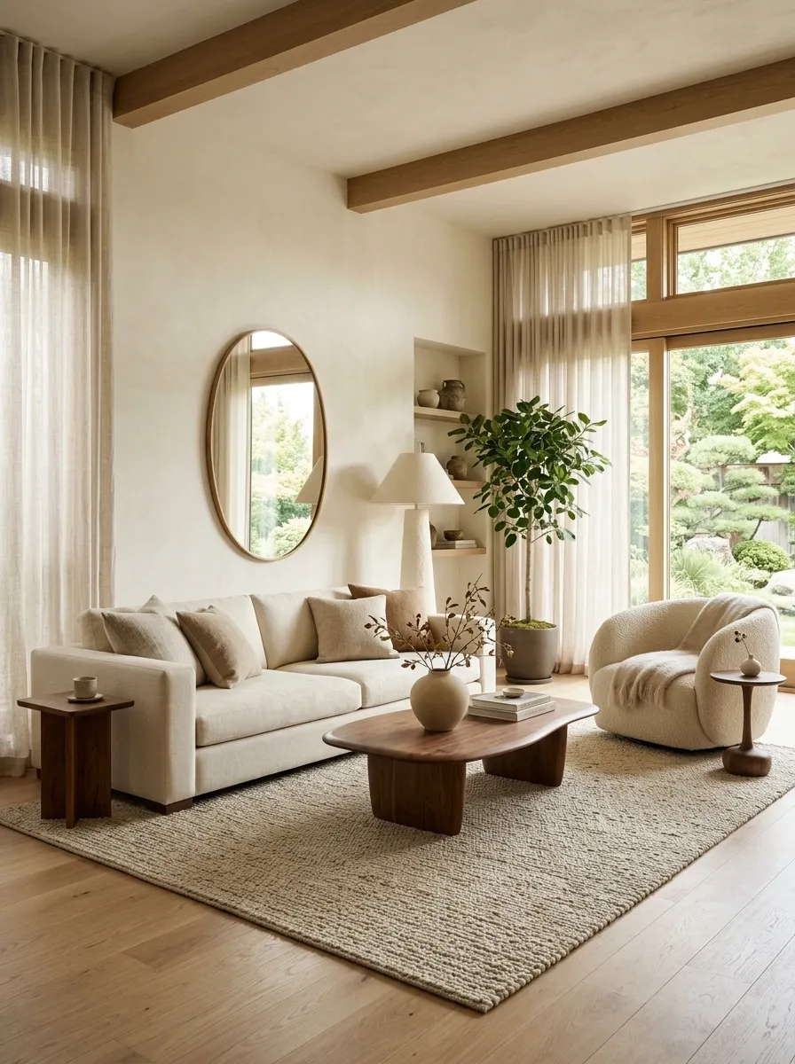
Japandi can get boxy fast. A rectangular sofa beside a rectangular table beside a rectangular rug is a one-way ticket to Furniture Spreadsheet City.
Break that repetition with one or two curved forms. A rounded coffee table, oval mirror, sculptural lamp, curved lounge chair, or softly shaped ceramic piece is enough.
Keep the balance controlled:
- Straight sofa
- Rounded coffee table
- Angular wood console
- One curved accessory
The point isn’t filling the room with curves. It’s giving the eye somewhere softer to move.
Make One Statement Plant Part of the Layout
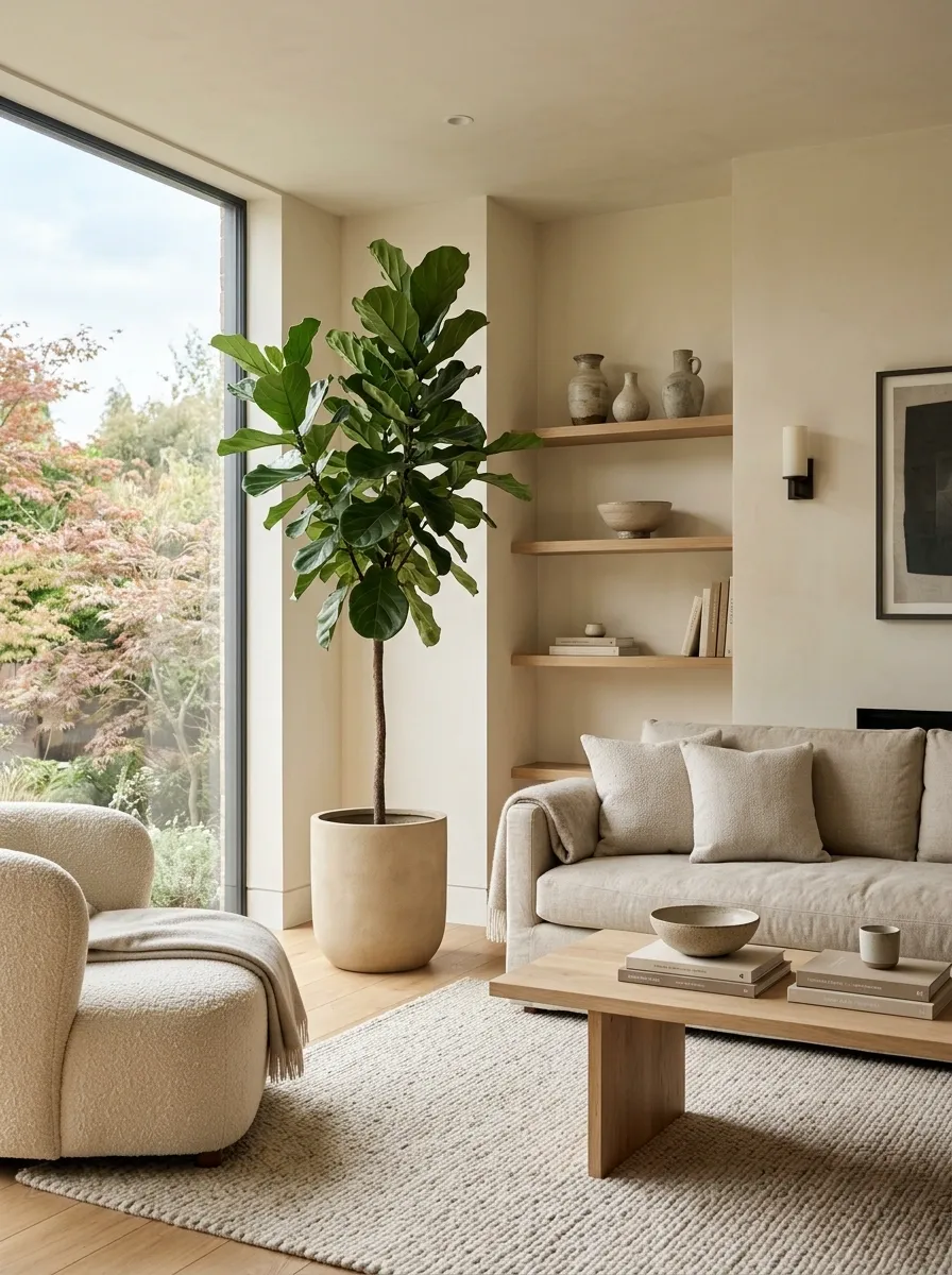
A single tall plant can bring life into a restrained room without wrecking the calm composition.
Place it beside the sofa, near a bright window, or in an empty corner that already feels intentional. A simple ceramic or textured planter keeps the plant connected to the rest of the room.
Don’t scatter tiny plants across every surface. One substantial shape has much more presence.
Beside the sofa or in a naturally open corner
Matte ceramic with a simple silhouette
Swap Tiny Decor for a Few Handmade Pieces
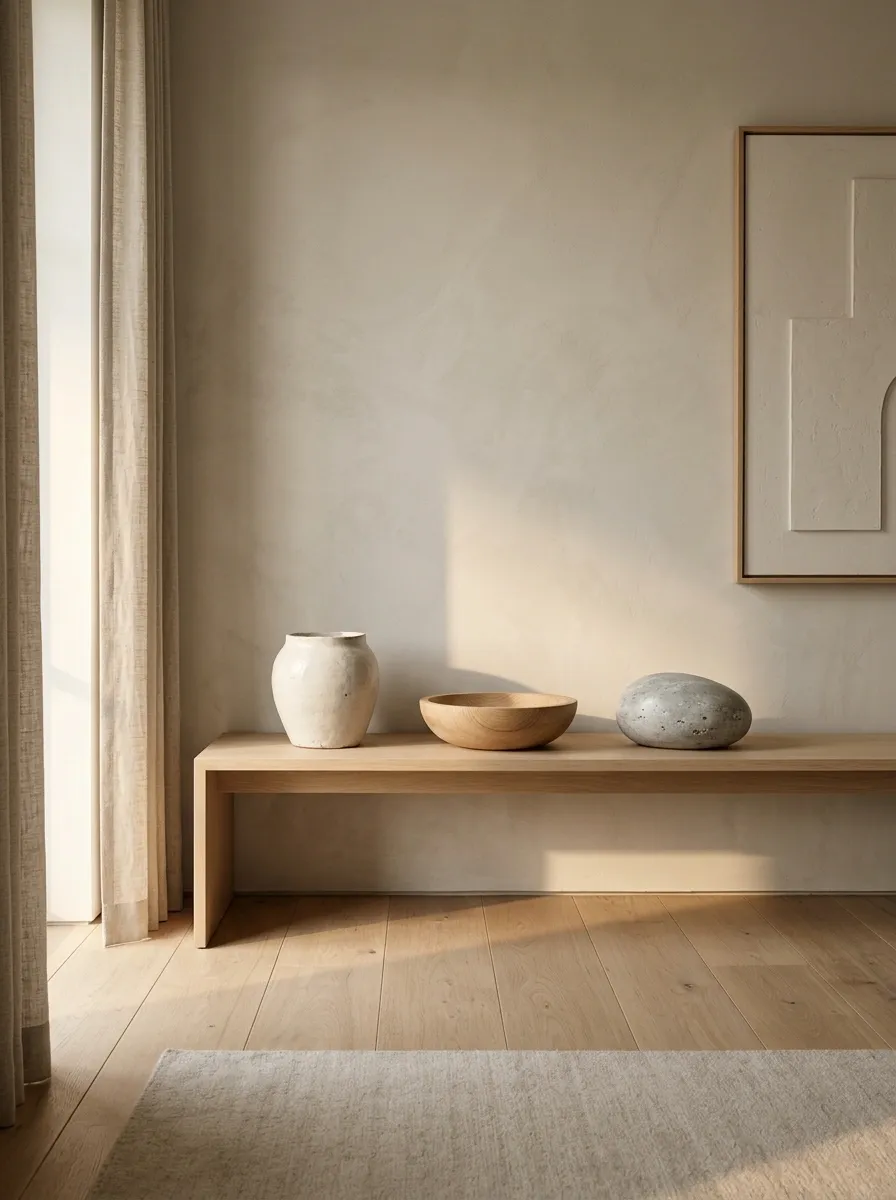
Tiny accessories are where minimal rooms quietly become cluttered. Five little objects scattered across a console don’t look collected. They look like the shelf got nervous.
Choose a few pieces with visible texture and imperfect shape instead. A handmade ceramic vessel, carved wooden bowl, stone object, or woven piece gives the room something tactile to look at.
Keep the shortlist ruthless:
- One larger ceramic piece
- One natural wood object
- One tactile woven or stone accent
Leave the rest in the shop. The shelf doesn’t need a supporting cast.
Create Contrast With Black Frames and Lighting
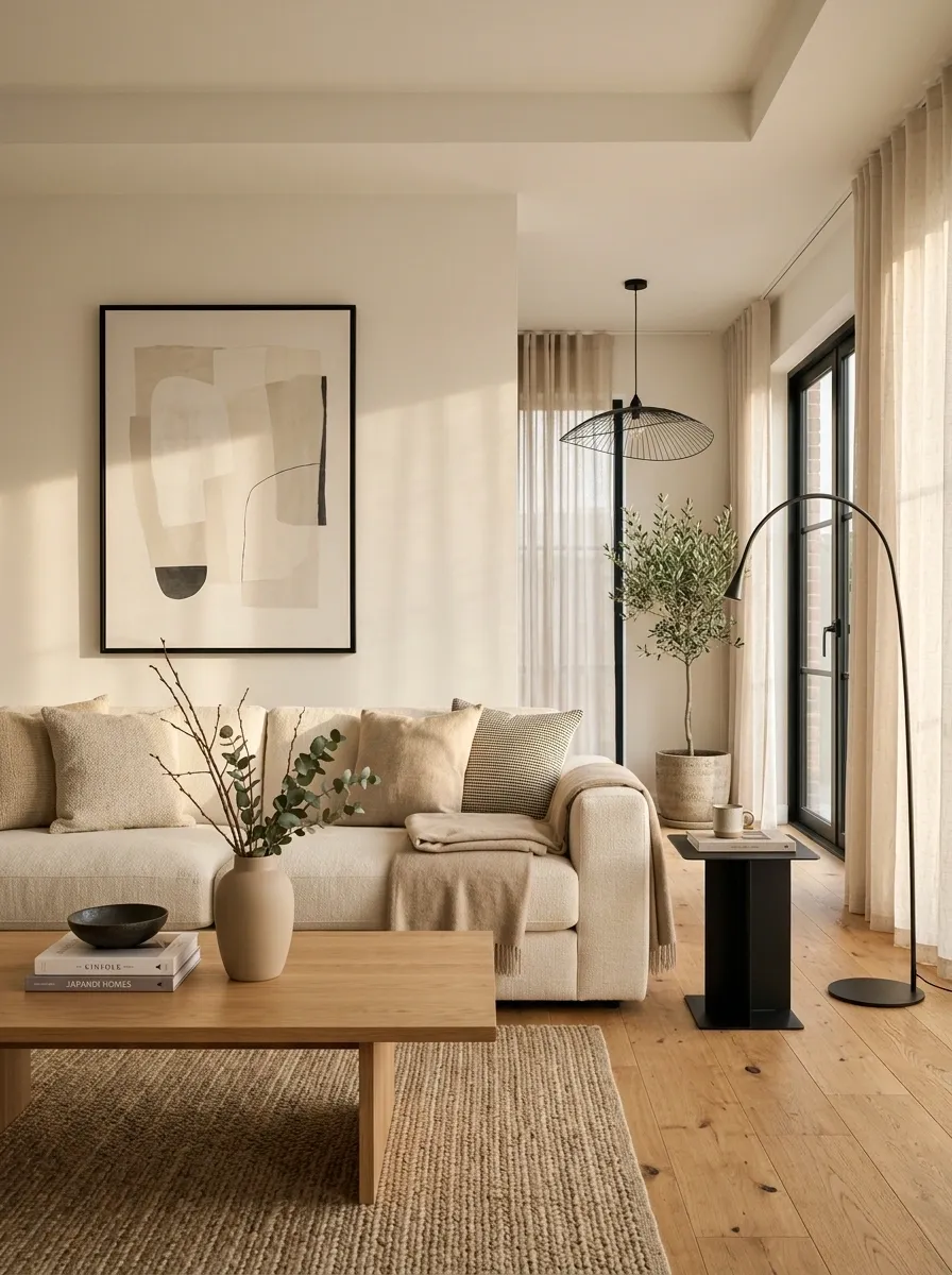
A room made entirely from pale neutrals can lose its definition. A few black details sharpen the whole composition without making it harsh.
Use a slim black floor lamp, picture frame, pendant fixture, or small side table. The trick is repeating the dark tone in a few places so it feels connected rather than random.
Think tiny punctuation marks, not an entire black paragraph.
A black frame near a dark lamp base can be enough to give pale walls, cream upholstery, and warm wood a much cleaner edge.
Keep Window Treatments Long, Plain, and Soft
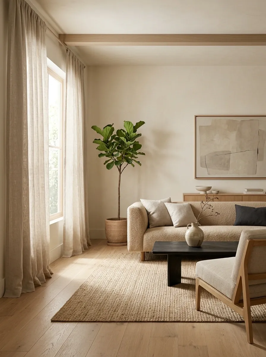
Heavy patterns aren’t doing Japandi any favors. The windows should bring in light and soften the room, not become the loudest thing happening on the wall.
Choose floor-length curtains in linen, cotton, or a similar matte fabric. Hang them high and let them fall with a little natural fullness rather than a stiff, hotel-style finish.
A warm ivory or soft oatmeal curtain works especially well against pale walls.
Add a Bench or Floor-Level Seat Near the Sofa
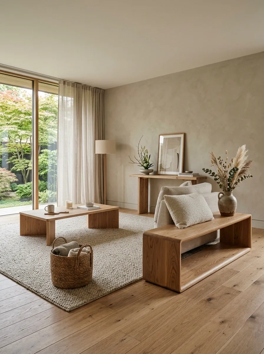
Not every seat needs to look like it came from the same furniture collection.
A simple wooden bench or low upholstered seat adds another layer to the composition while keeping the room visually light. Place it opposite or slightly beside the sofa where it can work as flexible seating without blocking the main path.
Choose a shape with clean lines and natural material. The bench should look useful even when nobody is sitting there.
Oak or walnut
Near the main seating zone
Low, open, unobtrusive
Mix Light and Dark Wood Without Making It Busy
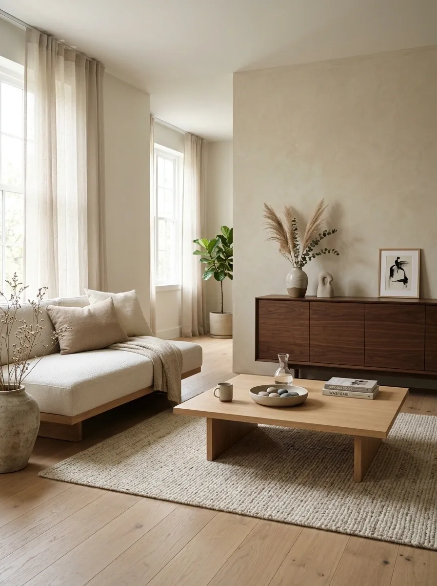
Wood tones don’t need to come from one matching box. The room only starts looking chaotic when every surface introduces a completely different finish.
Pair one main light wood with one supporting dark wood. Keep the shapes consistent and repeat each tone enough for the combination to feel deliberate.
Easy pairing: light oak furniture + dark walnut accent.
Avoid mixing pale yellow oak, reddish wood, gray wood, and espresso brown all at once. That’s less Japandi and more furniture showroom after closing time.
Use Textured Walls or Plaster-Look Finishes Sparingly
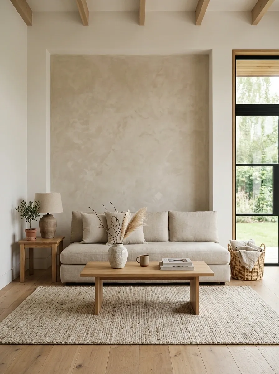
Plain walls work beautifully in Japandi rooms, but a subtle textured finish can give the background more depth without adding objects.
A plaster-look wall behind the sofa or media console works particularly well because the texture catches natural light and creates quiet variation across a large blank surface.
Keep the treatment limited to one important wall. Covering every surface in texture turns a calm room into a visual lecture.
Build a Reading Corner With One Simple Chair
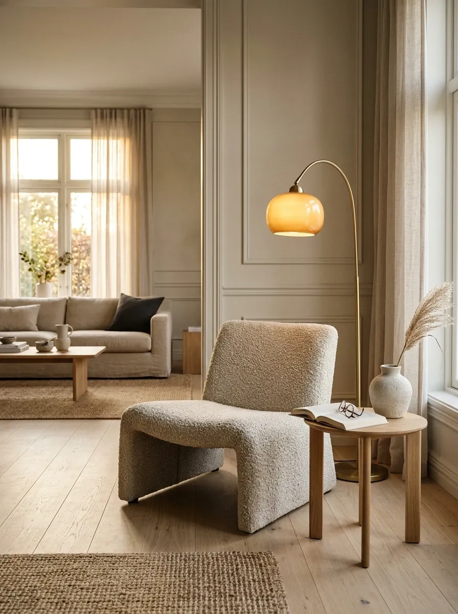
An empty corner doesn’t need five decorative objects to prove it has a purpose.
A low lounge chair, small wood side table, and warm floor lamp can turn an awkward corner into one of the strongest parts of the room. Choose upholstery that relates to the sofa but doesn’t match it exactly.
Place the chair at a slight angle toward the main seating area. That tiny change makes the entire room feel more conversational instead of arranged in rigid rows.
Keep Open Shelving Half Empty on Purpose
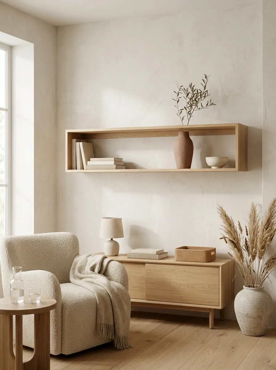
Open shelving looks intentional when the wall behind it can still breathe. Fill every level with books, bowls, candles, and little souvenirs, and the Japandi calm disappears faster than a clean kitchen five minutes before guests arrive.
Use the shelves for a small mix of useful and sculptural pieces. Leave obvious gaps between groups so the eye can read each object separately.
Shelf edit:
- One horizontal stack
- One tall ceramic
- One small natural object
- Plenty of empty shelf around them
Choose Oversized Art With Quiet Natural Imagery
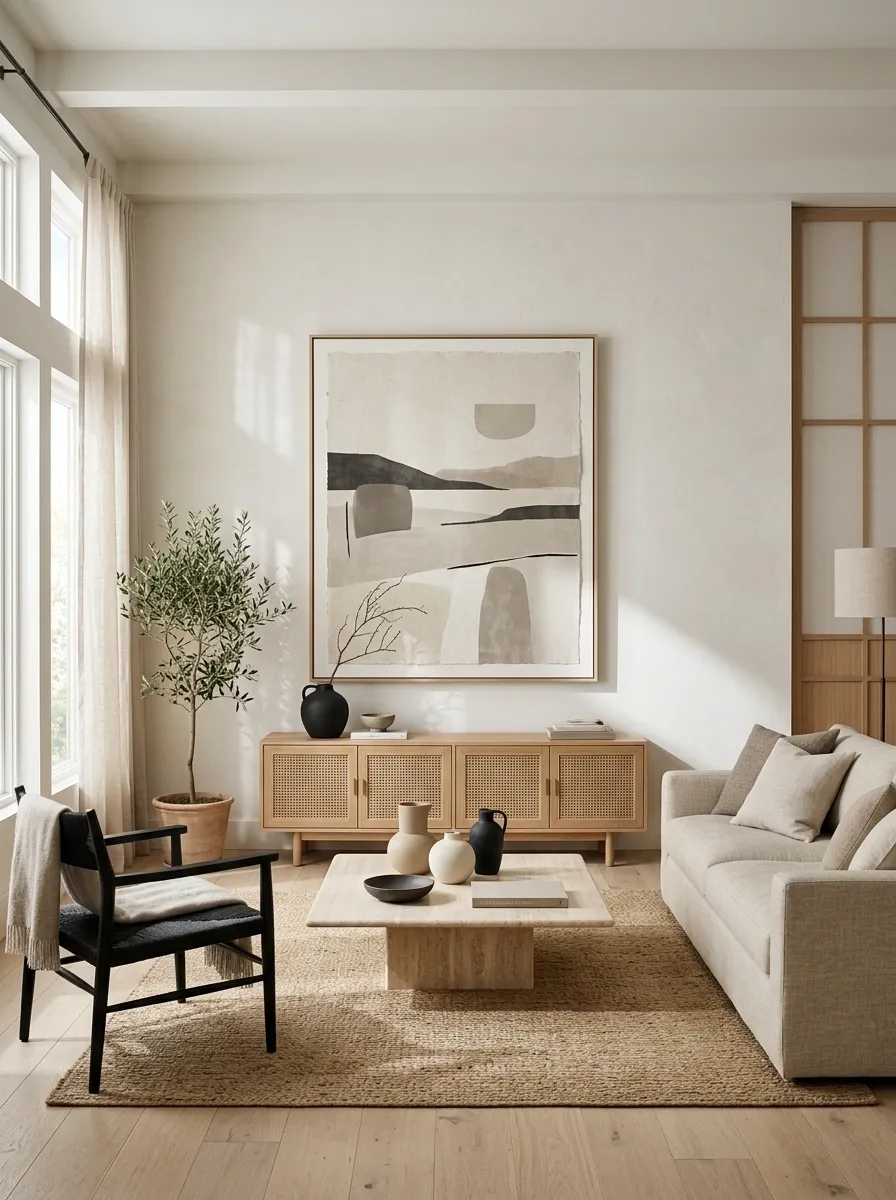
Small art scattered across a large wall usually makes the wall feel busier, not richer. One oversized piece has much more authority.
Look for abstract landscapes, restrained botanical forms, textured paper art, or simple black-and-neutral compositions. Keep the palette connected to the room rather than introducing a completely unrelated color.
Hang it above the sofa or a low console with enough wall around it to make the piece feel deliberate.
Good Japandi art has something to say without screaming it in all caps.
Hide Everyday Clutter Inside Closed Storage
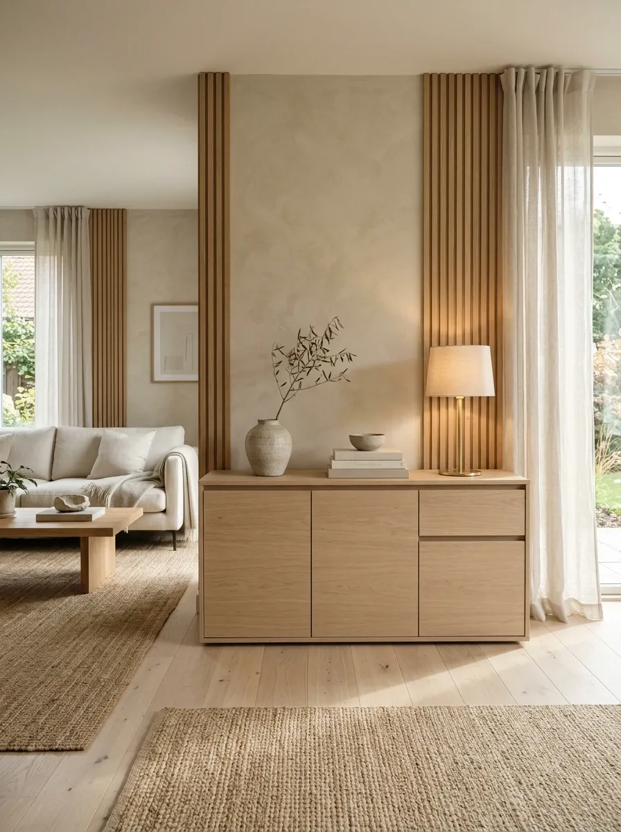
The fastest way to ruin a serene living room is to leave everyday objects on display. Remotes, chargers, papers, toys, cables, and random little things don’t suddenly become minimalist because they’re sitting in a wicker tray.
Closed storage gives the room a cleaner visual field while keeping daily life practical.
Use a low media cabinet, streamlined sideboard, or built-in-looking storage piece with simple fronts. Keep the exterior calm and let the messy stuff live behind the doors.
Warm Up the Room With Soft Layered Lighting
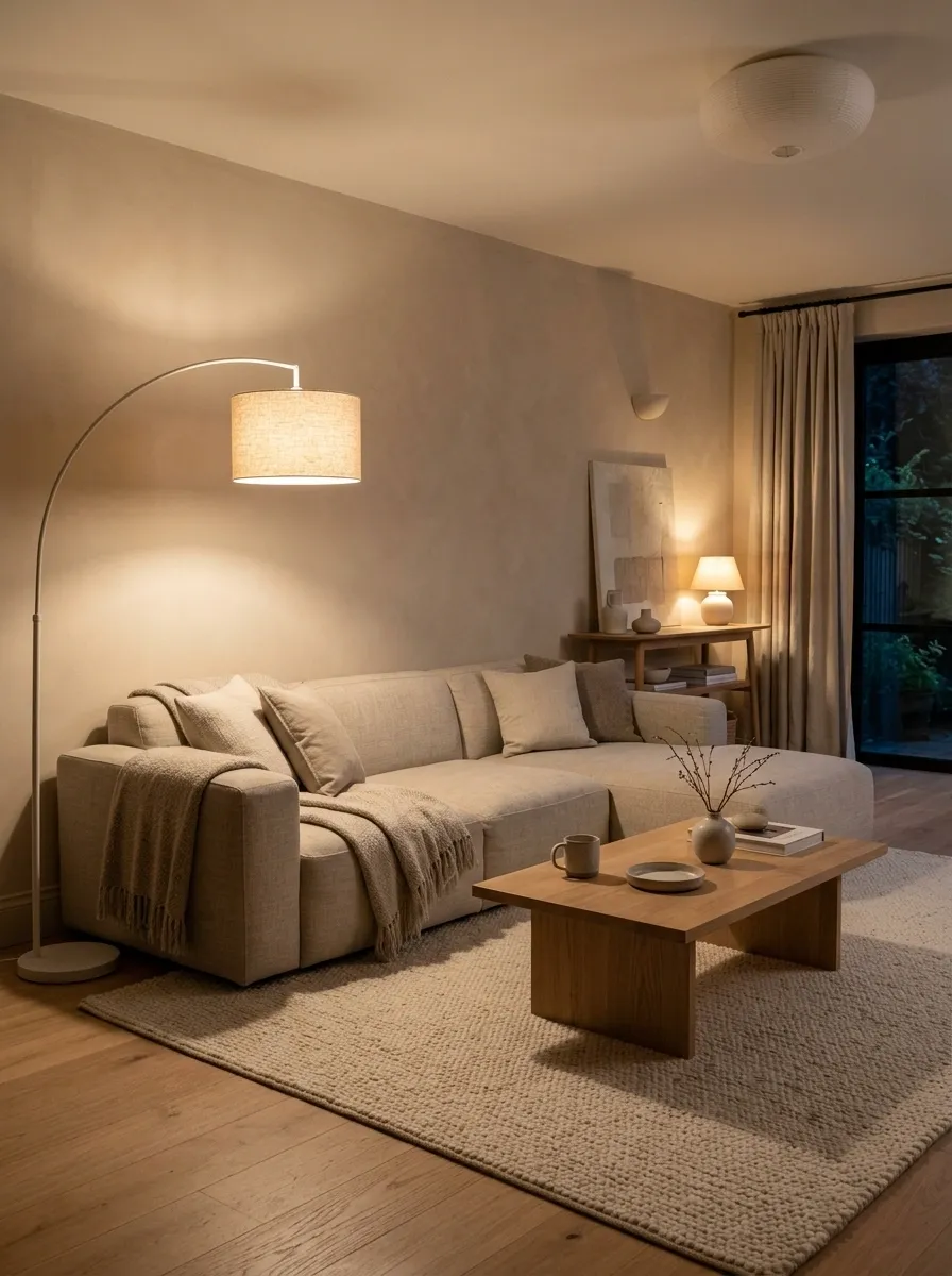
One bright ceiling light flattening the entire room isn’t doing the furniture any favors.
Layer the lighting instead. A floor lamp beside the sofa, a small table lamp on a console, and a warm overhead fixture create separate pools of light that make wood and textured fabrics look richer at night.
Use lighting in this order:
- Ambient light for the whole room
- Floor or table lamp near the seating
- Small accent light near art, shelving, or a corner
The room should still look good when daylight clocks out.
Use a Muted Accent Color Instead of More Beige
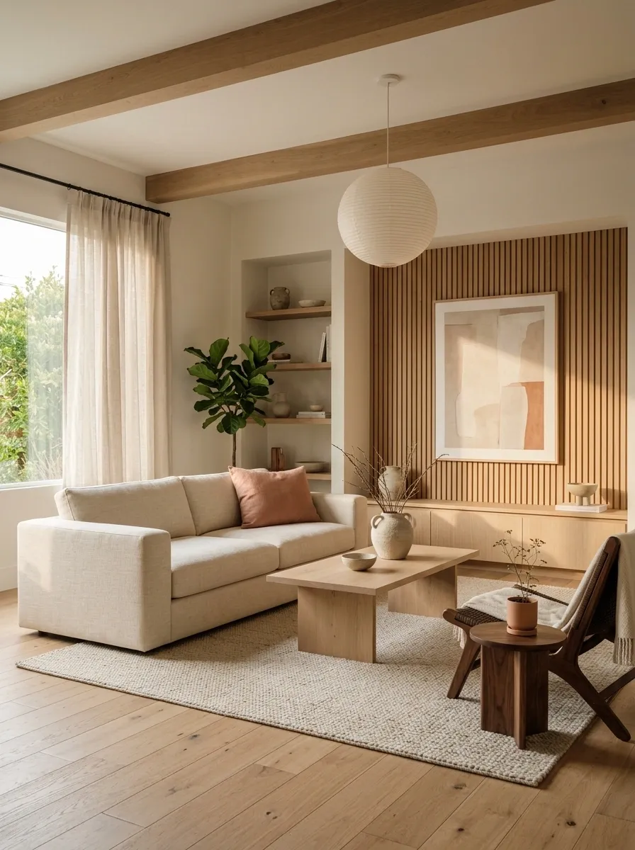
A Japandi palette can stay neutral without becoming a beige endurance test.
Introduce one restrained accent such as dusty sage, clay, muted olive, charcoal blue, or soft terracotta. Use it on one cushion, a piece of art, a ceramic vessel, or an upholstered chair.
The key is keeping the color slightly softened. Bright primary shades fight the natural materials instead of supporting them.
Works with pale wood and natural greenery.
Adds warmth beside cream and walnut.
Sharpens a pale room without going harsh.
Bring in Woven Baskets Without Turning Rustic
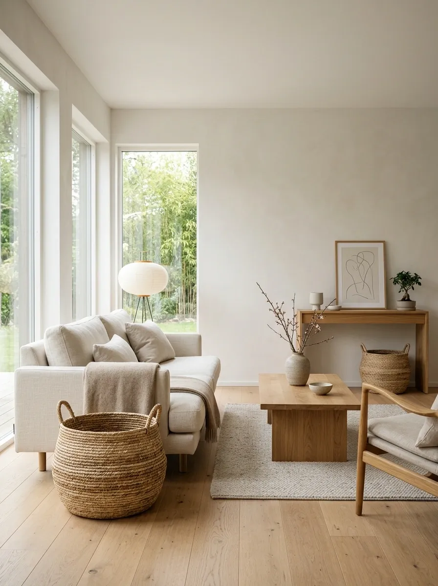
Woven baskets can work beautifully in Japandi rooms, but the wrong style can push the room straight into farmhouse territory.
Choose simple baskets with clean shapes, subtle natural fibers, and minimal pattern. A large basket beside the sofa can hold throws, while a smaller one under a console can hide practical items.
Keep the rest of the room refined. One woven element feels intentional. An entire collection of baskets starts looking like the room has developed a hobby.
Large basket for throws and soft textiles.
Lower visual clutter while using dead space.
One or two pieces have more impact than a basket army.
Center the Furniture Around Conversation, Not the TV
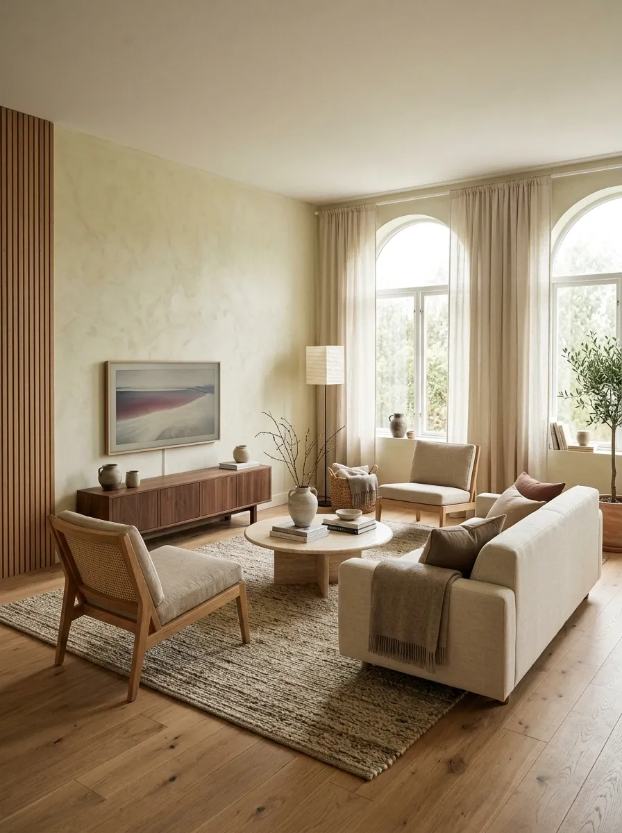
The television doesn’t always deserve presidential seating arrangements.
Set the sofa and chairs so people naturally face each other, then let the TV remain visible from the main seats. A slightly angled chair can make a huge difference because it turns the room into a social space instead of a cinema with decorative furniture.
A low media console keeps the technology visually quieter, especially when the rest of the room has low furniture.
Use a Statement Ceiling or Pendant Light
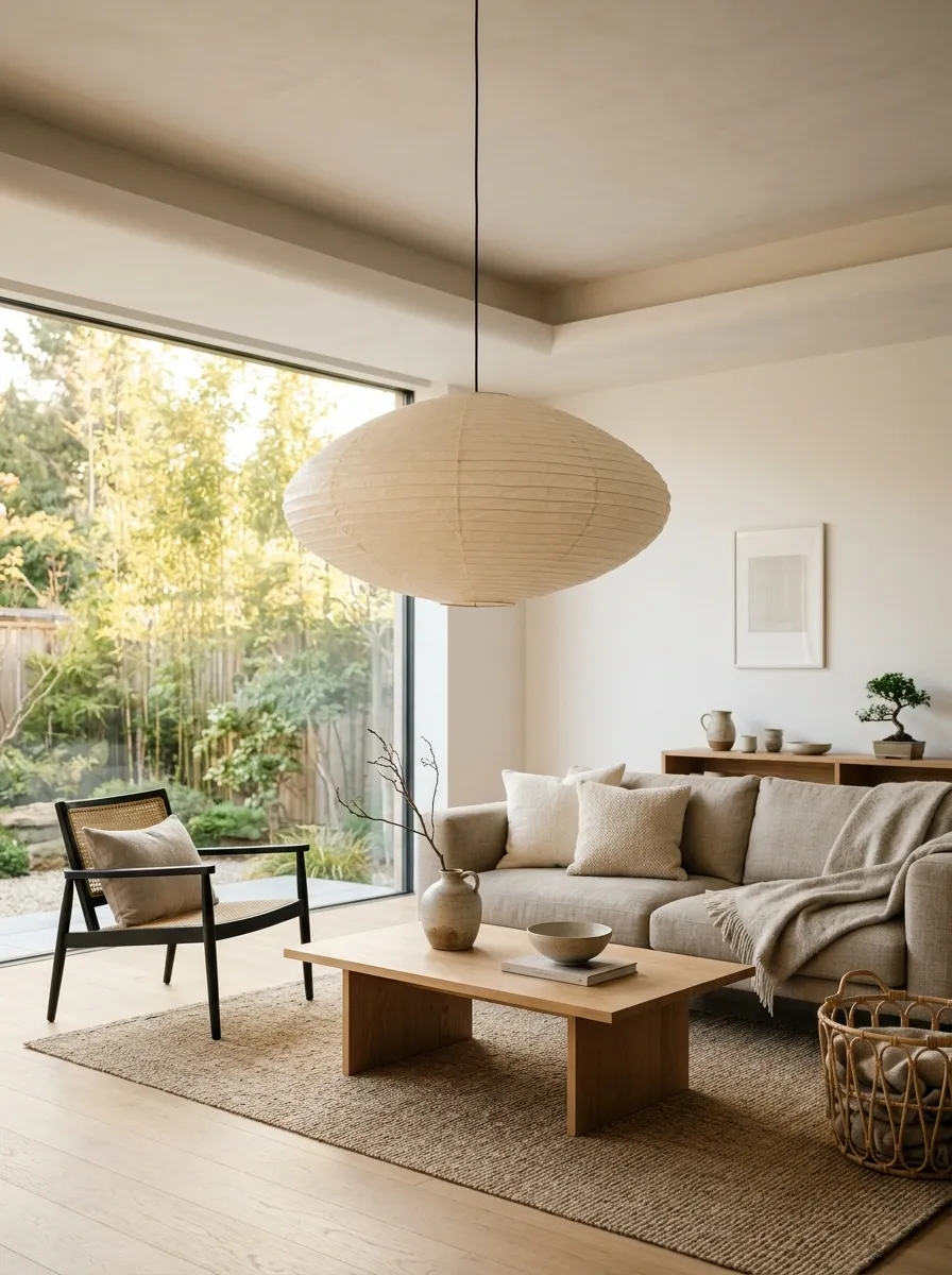
The ceiling is easy to forget because most living-room styling happens at eye level. A sculptural pendant changes that immediately.
Choose a fixture made from paper, linen, wood, ceramic, or another matte natural-looking material. A broad rounded shade works especially well over a low coffee table because it echoes the softer shapes used throughout the room.
Keep the rest of the ceiling simple. The fixture should be the interesting part.
Keep Decorative Objects at Different Heights
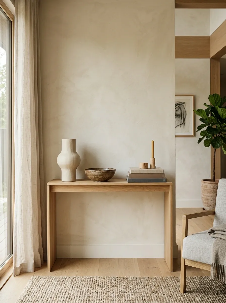
A console filled with objects that all sit at the same height looks strangely flat. Varying the scale gives the arrangement more depth without adding more pieces.
Pair a tall ceramic vessel with a lower bowl and a small horizontal stack of books. Keep the shapes different too, so the arrangement doesn’t look like three versions of the same purchase.
Think tall, low, middle.
That’s enough structure to make a quiet surface look styled without turning it into an accessory convention.
Finish With Empty Space Between the Important Pieces
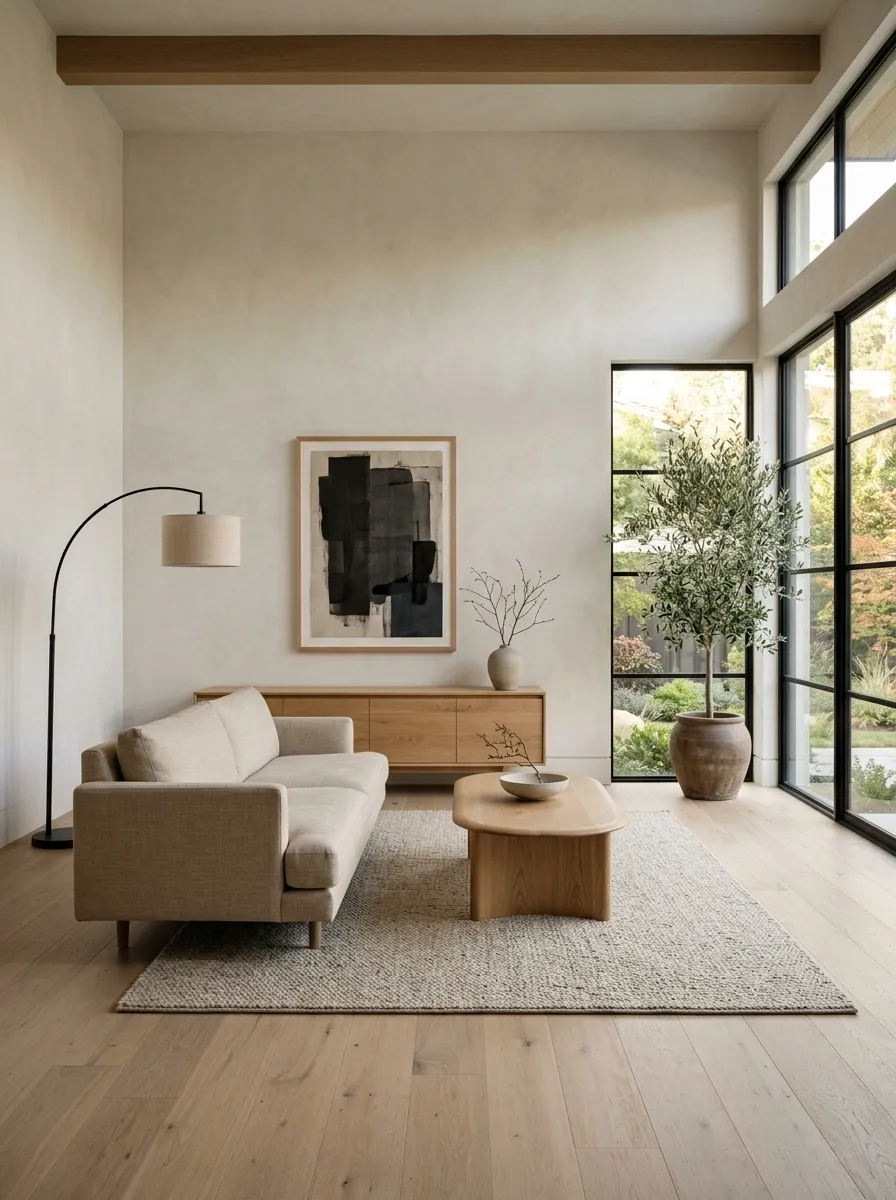
This is the detail that makes everything else work.
A beautiful sofa, rug, wood table, artwork, and lighting scheme can still feel messy when every piece is crowded against the next one. Give the major forms room to register.
Leave clear floor around the furniture, open wall around the art, and breathing room between decorative objects. Empty space isn’t unfinished space. In Japandi, it’s part of the composition.
And honestly, a room doesn’t need another vase just because there’s a shelf left.
Keep walking paths clear and furniture visually separated.
Let the wall frame the artwork rather than compete with it.
Leave visible tabletop and shelf space around the objects.
Final Thoughts
The best Japandi living rooms don’t look like every item was ordered from the same catalog. They have variation, but the variation is controlled.
Warm wood gives pale rooms some weight. Textured fabrics stop neutral upholstery from looking flat. Curved forms break up strict lines. Dark accents give softer colors a little backbone. Good lighting brings out the grain, fabric, stone, and ceramics that make the room worth looking at in the first place.
Most importantly, the room needs breathing space.
That’s the part people keep trying to fill. Don’t.
A few strong pieces with room around them will always look more intentional than a shelf packed with things that technically match.
Save these Japandi living room ideas on Pinterest for the next room refresh, especially when the urge to buy another beige cushion starts getting suspiciously strong.