
A small house can have a great floor plan and still look strangely underwhelming from the street. The problem is usually not the size.
It is the way the roof, windows, entrance, materials, driveway, and front garden are trying to exist at the same time without agreeing on a plan.
Suddenly the facade has three cladding materials, four window shapes, a giant garage door, and a front door hiding somewhere in the middle like it missed the meeting.
BIG FRONT.
Small Modern House Exterior Ideas
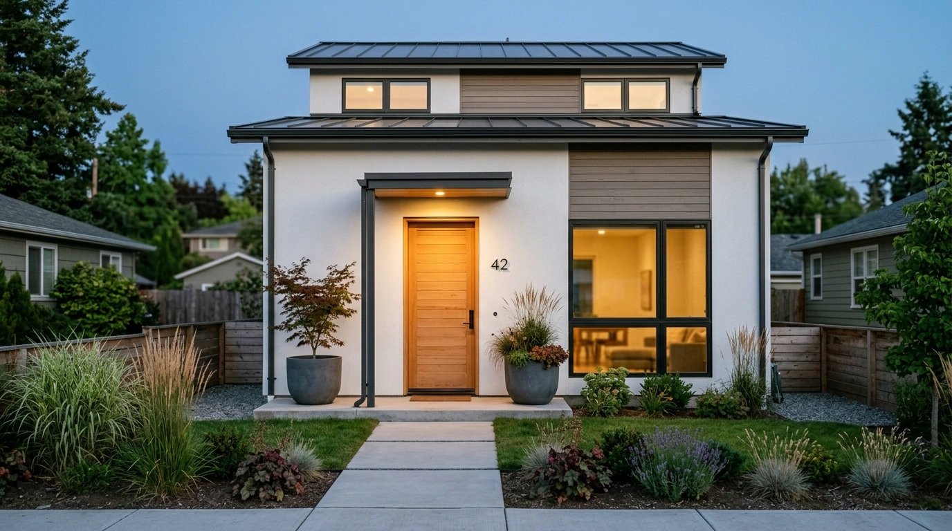
Compact White Cube With Black Grid Windows
This tiny white volume packs a massive punch by keeping the color palette brutally simple and letting the oversized black grid windows do the talking. A recessed entry porch creates an instant sense of depth, while warm wood decking softens the crisp perimeter walls.
Lush potted greens frame the front steps without blocking the sightlines, and smart exterior sconces cast a warm glow against the bright stucco. It proves that a small footprint doesn’t have to mean sacrificing high-end architectural detailing.
The real trick here is scale management. By sticking to high-contrast monochrome and keeping the landscaping neat and directional, the entire tiny facade reads as a custom modern jewel box.
Warm White Stucco House With Recessed Oak Entry
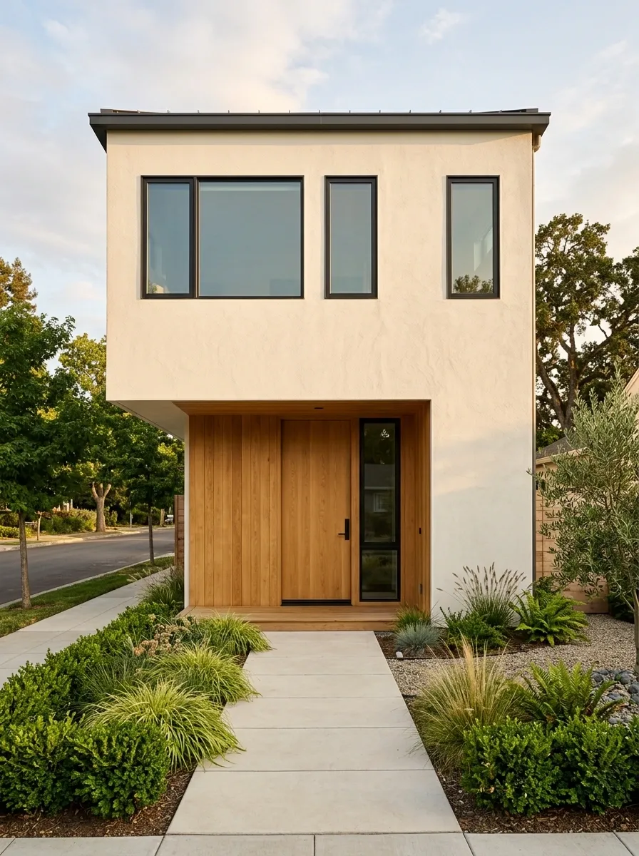
Warm white stucco gives this compact two-story house a quiet base, while a recessed oak entry keeps the facade from looking flat. Slim black-framed windows add just enough contrast without turning the exterior into the usual black-box-everything situation.
The upper floor shifts slightly over the entrance, creating a small sheltered threshold and giving the simple box some depth. Pale concrete paving continues from the sidewalk toward the door, while low grasses and clipped greenery define the edge without crowding the facade.
The key is restraint. The oak is concentrated around the entrance, so it reads as an architectural moment rather than random decoration. This works especially well when the front elevation is narrow and needs depth more than more materials.
Asymmetric Gable House With Multi-Level Glazing
Taking the classic pitched roof and dragging it straight into the twenty-first century, this design utilizes an asymmetric upper gable dominated by massive glass panels. Warm timber siding on the right anchors the structure, balancing out the dark framing and crisp white lower level.
The integrated garage door matches the dark upper framing seamlessly, keeping the color blocking intentional and clean. Warm interior lighting spills through the oversized upper windows, making the compact layout feel expansive and deeply welcoming from the curb.
This build succeeds by letting the roofline and glazing create the drama. Instead of cluttering the facade with decorative elements, the architecture relies on bold geometric volumes and mixed materials to command attention.
Charcoal Modern House With Cedar Privacy Screen
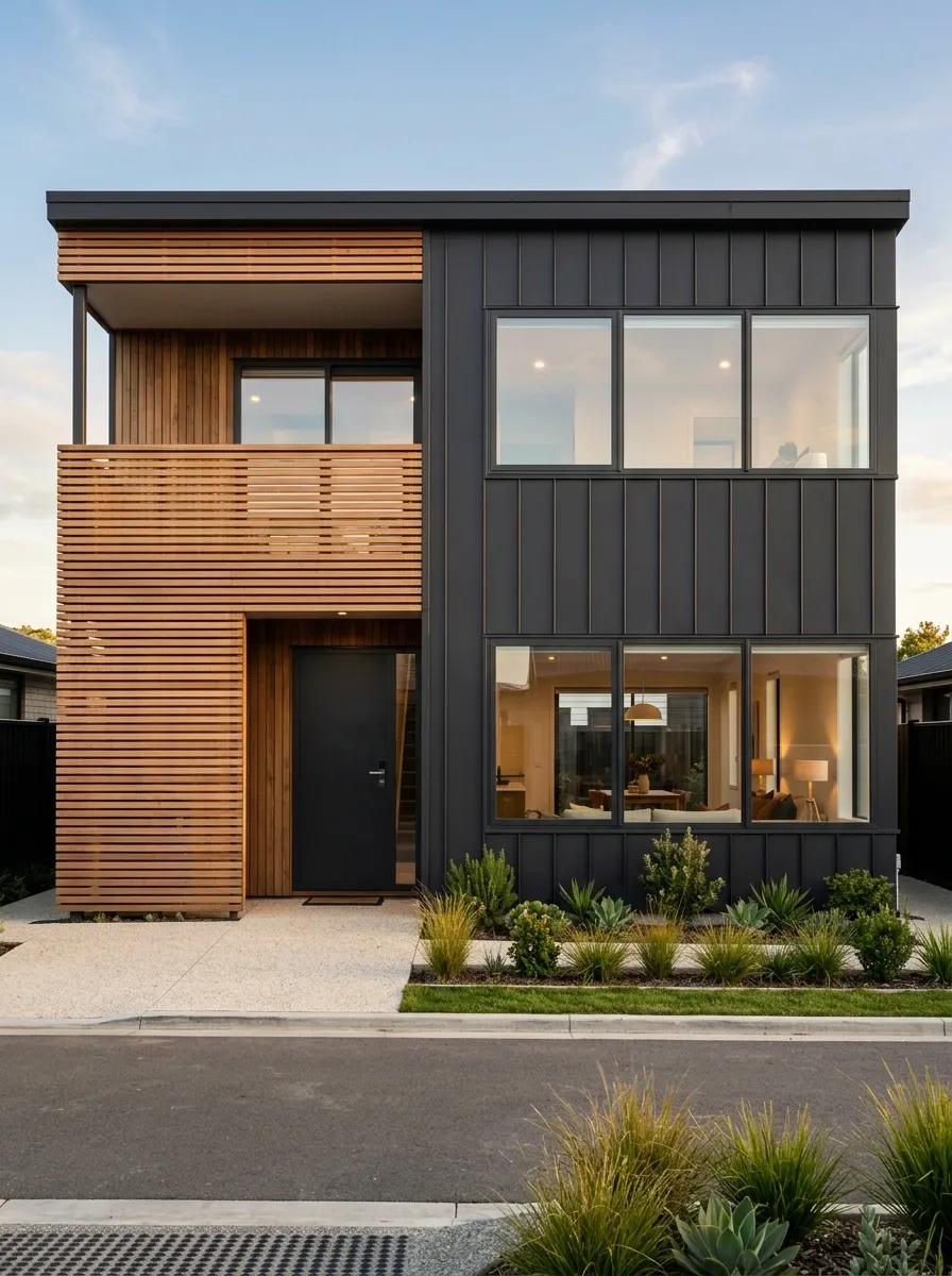
This facade goes darker and more architectural, using charcoal cladding as the main volume and warm cedar slats around the entrance. The timber screen is not just decoration. It hides part of the doorway from the street, filters views, and breaks up what could otherwise become one large dark wall.
Broad horizontal windows keep the composition connected to the living spaces, while pale concrete paving and a narrow planting strip stop the front from becoming visually heavy. The contrast between rougher timber and smooth dark cladding gives the house its character.
There is also a useful lesson here: privacy can become part of the architecture. Instead of adding a fence in front of the facade and calling it a day, the entrance itself does the screening. Much cleaner.
Pastel Modern Villa With Sculpted Arch Entry
Soft pastel tones get a modern makeover with crisp white walls and a dramatic purple architectural arch framing the entryway. Vertical slit windows add rhythm to the facade, maintaining privacy while letting filtered light pierce the compact layout.
A sleek white scooter sits parked on the rain-slicked paving, blending seamlessly into the resort-like tropical landscaping featuring towering palms. The entire exterior feels effortlessly chic without relying on heavy industrial materials or stark black paint.
This design excels by embracing curve appeal alongside clean lines. The sweeping arch detail turns a standard front wall into a memorable focal point, proving that small homes can carry playful architectural moments with absolute confidence.
Scandinavian Gable House With Pale Timber Cladding
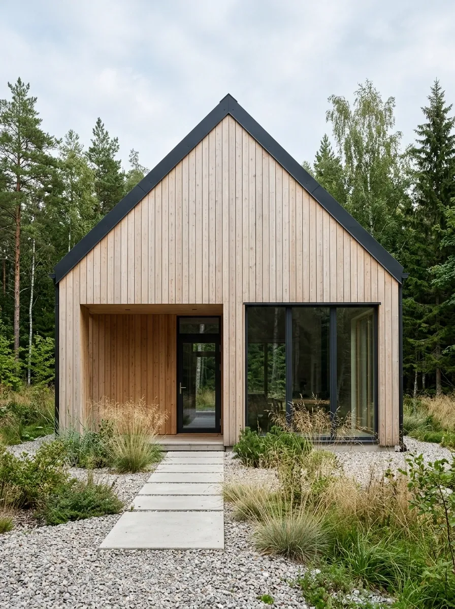
The familiar gable shape gets a cleaner modern treatment here. Pale timber cladding covers the compact structure, while a dark roof and dark-framed windows give the facade enough contrast to avoid looking washed out. A modest covered doorway sits beneath the roof edge instead of sticking out as an obvious porch.
The front garden stays deliberately loose, with gravel, low grasses, and a simple concrete path. That soft landscape works with the pared-back architecture instead of competing with it.
What makes this version convincing is the strong silhouette. The pitched roof does most of the visual talking, so the materials can stay quiet. There is no need for five different textures desperately trying to become the main character.
Defines the gable from a distance.
Keeps the main wall visually light.
Connects the openings to the roof tone.
Warm Oak and Matte Black Minimalist Kitchen
Open-concept living meets restrained materiality in this bright kitchen and dining space defined by warm oak cabinetry and a striking black range hood. A delicate glass pendant light floats above the wooden dining table, surrounded by woven chairs that add organic texture to the room.
Floating timber shelves display carefully curated ceramics and wooden cutting boards, keeping the white backsplash functional yet uncluttered. Large black-framed glass doors at the far end flood the space with natural light while connecting the interior directly to the outdoors.
This layout works because every element has a purpose. The towering wood storage wall frames the kitchen cleanly, ensuring the space feels architectural and intentional rather than just a collection of furniture.
Flat-Roof Concrete House With Deep Window Reveals
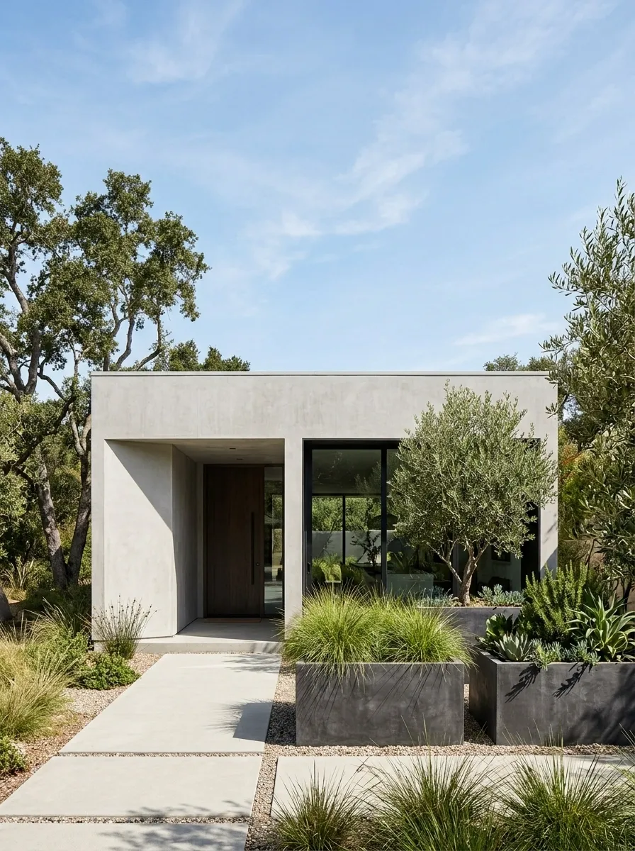
A compact single-level house can look substantial without adding decorative fuss. This design uses smooth light-gray concrete walls, deeply recessed black-framed windows, and a sheltered entry tucked into the facade. The depth around the glazing creates strong natural shadow, so the exterior has texture even though the palette is restrained.
A small entry court sits beside the main walkway, with oversized planters adding greenery without taking over the front yard. The architecture remains the hero.
This approach suits a house where clean lines matter more than surface decoration. The deep window reveals also keep the facade from reading like a flat wall with holes punched into it. That little bit of depth does a lot of work.
Black-and-Wood House With Offset Upper Volume
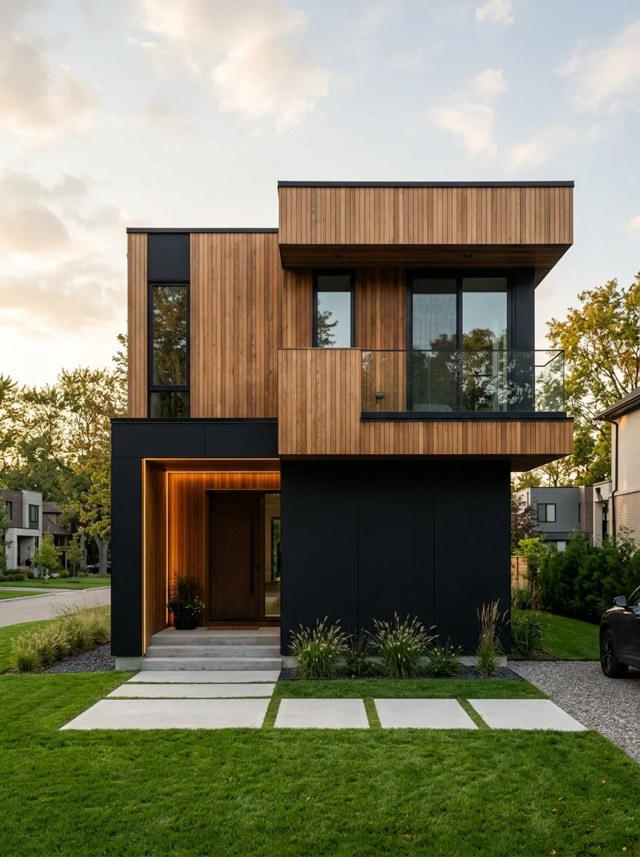
This compact two-story home uses a matte black lower volume and a warm timber-clad upper level shifted slightly to one side. The offset immediately breaks the boxy shape, while the recessed entrance sits beneath the upper floor for a more sheltered arrival.
A simple lawn and concrete stepping path keep the ground plane almost intentionally boring. That is a good thing here. The architecture already has enough going on, and adding ornamental planting everywhere would muddy the strong geometry.
The warm wood also keeps the black facade from feeling severe. It gives the house a residential softness without turning the exterior into a rustic cabin. The result feels modern because of its proportions first, materials second.
Modern Brick House With Oversized Corner Windows
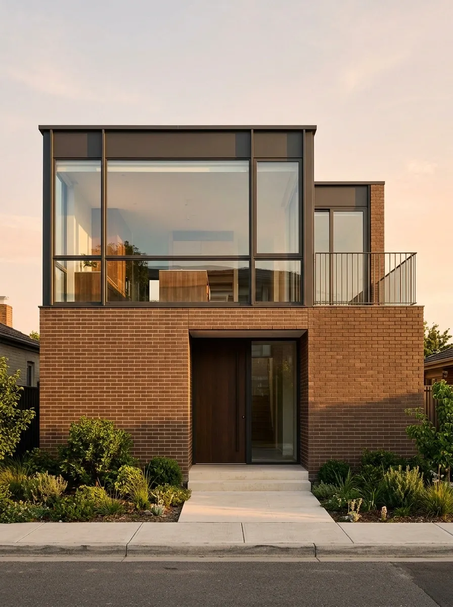
Warm brown brick gives this compact house a grounded, almost timeless base, while oversized corner windows make the upper facade feel much lighter. Instead of covering every wall with glass, the glazing is concentrated where the main living spaces benefit from it, which keeps the street elevation balanced.
A recessed front door sits between the masonry and a slim dark frame, with a narrow garden running along the sidewalk. Pale concrete at the entrance adds just enough contrast against the brick.
The mix works because each material has a clear job. Brick supplies weight, glass supplies openness, and the dark framing ties everything together. No decorative stone wall has been summoned for absolutely no reason.
Soft Gray House With Cantilevered Bedroom Volume
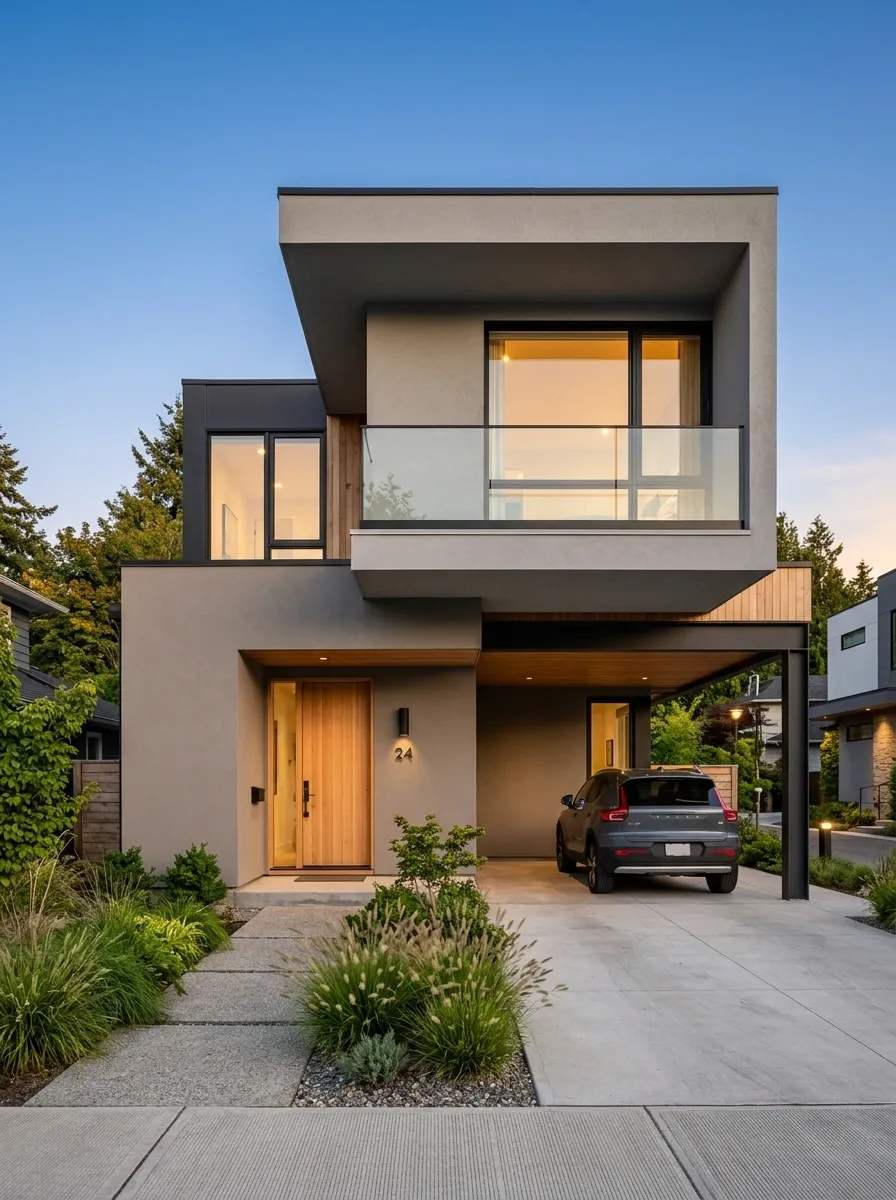
A projecting upper floor gives this small house a much stronger silhouette than its footprint would suggest. The lower level stays calm with warm gray stucco, dark windows, and a recessed wood door, while the upper bedroom volume extends forward slightly over the entry and covered parking.
That small overhang creates a natural sheltered zone below, so the entrance feels deliberate instead of squeezed onto the front wall. A narrow strip of planting softens the pavement without blocking the architecture.
The important move is the change in depth between floors. The facade does not depend on a complicated material palette because the building itself creates the interest. Sometimes the architecture can do the flirting. The wallpaper does not need to join in.
Japanese-Inspired Modern House With Timber Screens
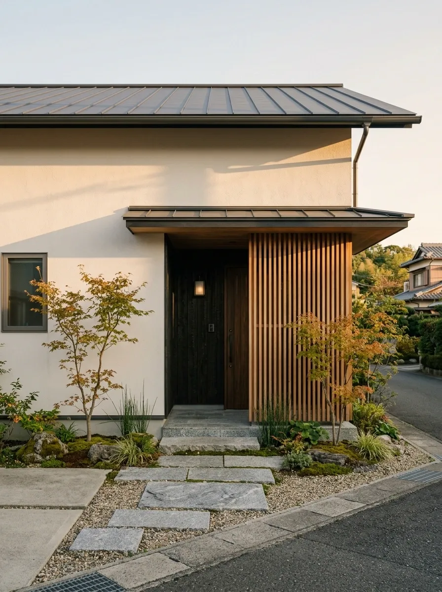
This compact facade keeps the street side intentionally quiet. Off-white plaster forms the main shell, dark wood defines the entrance, and vertical timber screens partially hide the doorway from direct view. Deep roof overhangs add shadow while also giving the simple geometry more depth.
The planting is equally restrained. A few sculptural greens sit beside stone paving, leaving plenty of negative space around the entrance. That open foreground matters because the facade depends on calm proportions rather than a pile of decorative features.
The result feels private without becoming fortress-like. The entry reveals itself gradually from the path, which gives the front of the house a slower visual rhythm. Basically, the door does not need to scream “LOOK AT ME” from the sidewalk.
Dark Green Modern Cottage With Black Trim
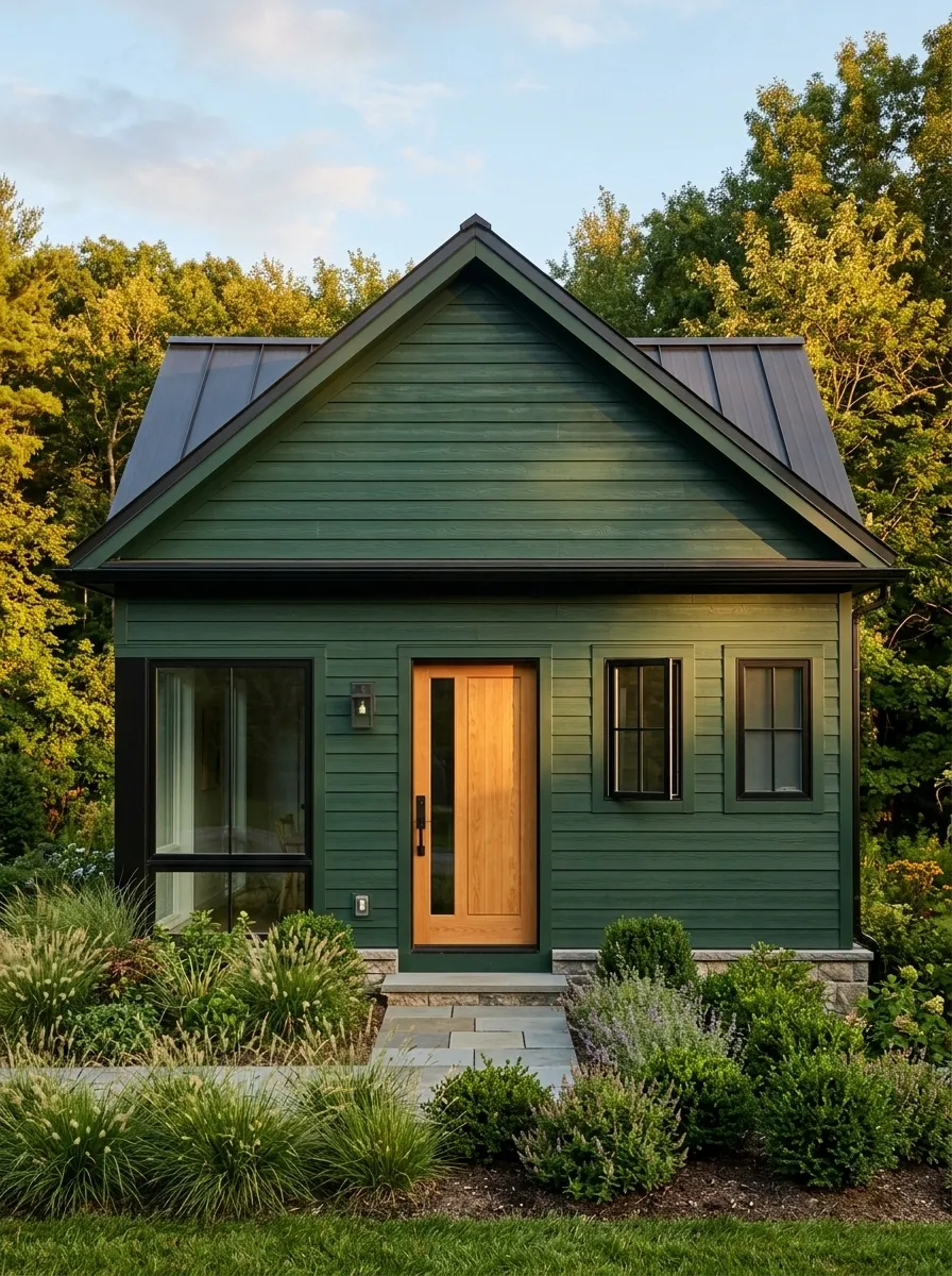
Deep green siding gives this compact cottage a richer exterior without abandoning the clean lines of modern architecture. The simple pitched roof stays dark, black-framed windows sharpen the openings, and a natural timber door provides the one noticeably warmer element.
Instead of a large paved forecourt, the house sits behind a modest planting bed with grasses and low shrubs. The restrained landscaping lets the green facade stay visually dominant while keeping the frontage residential rather than overly formal.
This concept works because the color is doing something architectural. The dark green unifies the walls into one calm shape, while the black trim quietly defines the openings. Add seven more exterior colors and the whole thing would probably need a group chat to sort out its feelings.
Narrow Urban House With Tall Vertical Windows
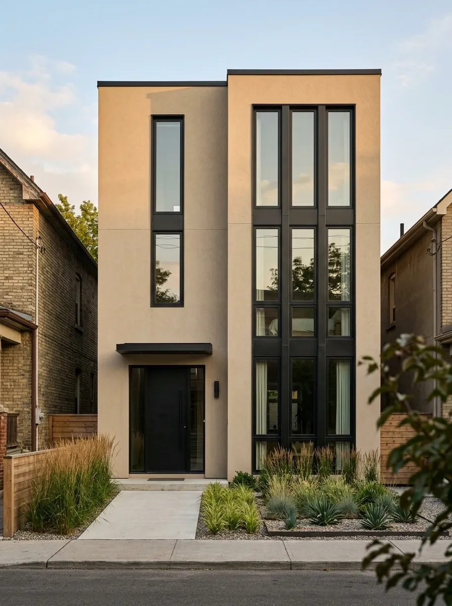
This design makes a tight frontage feel taller and more deliberate by emphasizing vertical lines. Warm beige stucco forms the main facade, while tall dark-framed windows stretch upward through the two-story elevation. The recessed entrance sits slightly off-center beneath a slim canopy.
A narrow planting bed follows the edge of the house, paired with a simple concrete path that leads directly toward the door. The landscaping is intentionally linear, echoing the shape of the windows rather than introducing another visual language.
The facade works especially well on a narrow lot because nothing tries to pretend the house is wider than it is. The proportions are embraced instead of disguised. And honestly, that is much better than forcing a giant horizontal garage door onto a tiny frontage and hoping nobody notices.
Draw the eye upward.
Modern White House With Terracotta Entry Wall
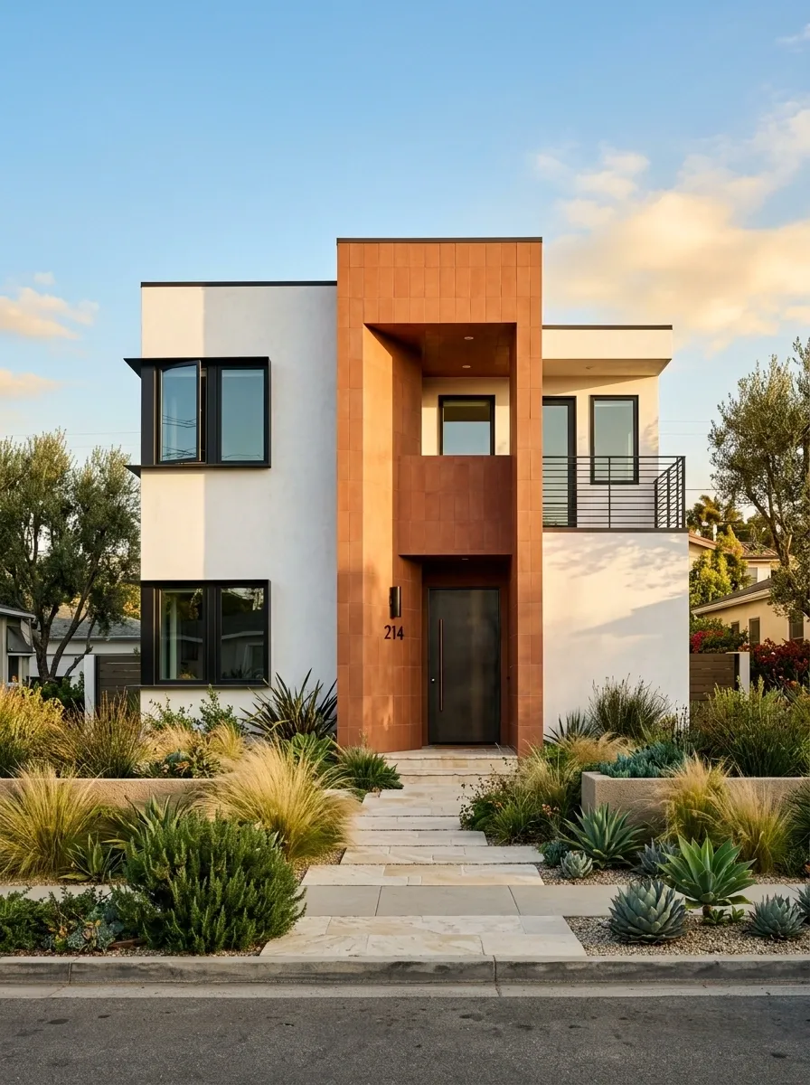
A crisp white exterior gets one confidently warm architectural move here: a terracotta-colored wall wrapping the front entrance. Instead of scattering color across the facade, the design concentrates it in one vertical plane, making the doorway immediately legible from the street.
Black-framed windows keep the upper facade graphic, while pale stone paving and low drought-tolerant planting create a softer foreground. The white walls stay visually quiet so the terracotta does not have to compete with five other “statement” features.
It is a strong choice for a compact home because the colored entry wall creates depth without requiring a complicated floor plan. The trick is keeping the rest of the exterior disciplined. One memorable move beats a whole committee of them.
Split-Level House With Stone Base and Glass Upper Floor
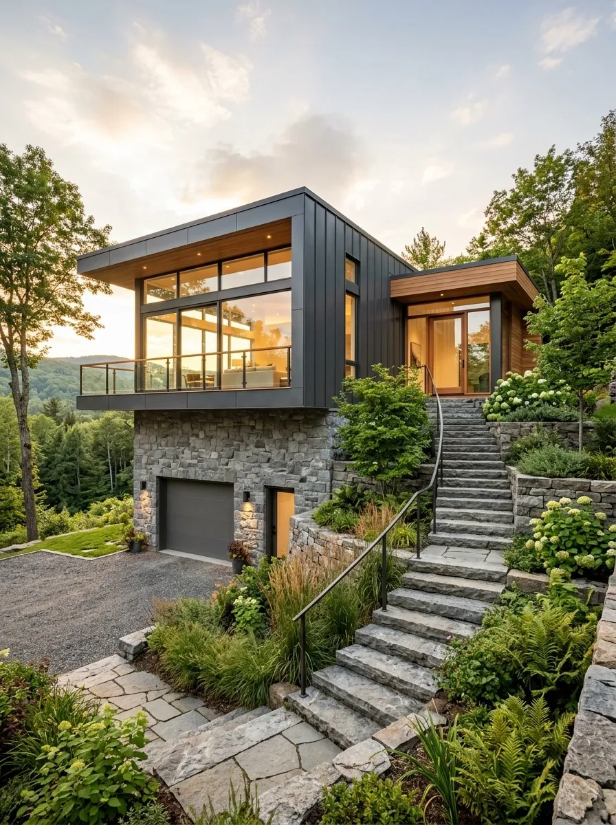
A sloped site becomes part of the design instead of an obstacle with a retaining wall awkwardly shoved into the foreground. The lower level uses natural stone to visually anchor the house to the ground, while a lighter upper volume combines dark cladding with generous glass.
Exterior steps rise alongside planted terraces toward the entrance, creating a layered approach. The stone base feels substantial, while the upper floor appears lighter and more open. Together, the two levels give a relatively compact house a much richer silhouette.
The strength here comes from the change in visual weight. Heavy below, light above. Simple concept, strong result. The house does not need to pretend the site is flat, because pretending usually makes architecture look suspiciously like a very expensive cake.
Compact Modern House With Attached Carport
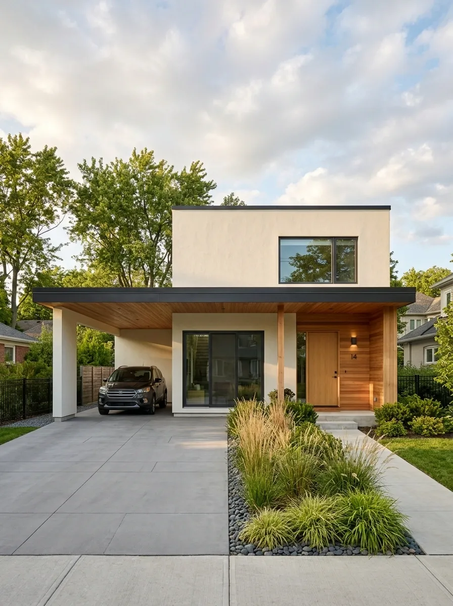
Here, the carport is treated as part of the architecture rather than a giant rectangle that arrived after the house had already made its plans. A flat-roofed parking bay extends naturally from the main volume, creating one clean horizontal composition across the frontage.
Warm white walls, charcoal window frames, and timber beneath the porch and carport roof give the facade a simple material rhythm. A narrow planted strip separates the paving from the house without stealing valuable turning space.
This arrangement is especially useful when a small lot needs parking without sacrificing the visual quality of the entrance. Keeping the rooflines connected makes the house appear broader and more settled on the site.
The practical stuff is doing aesthetic work here. Rare, but we will take it.
Warm Gray Stucco House With Stone Entry Court
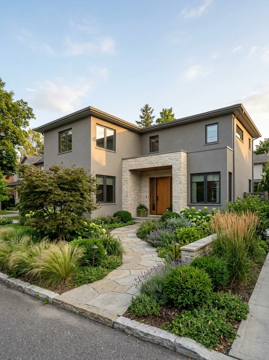
A compact L-shaped plan creates a surprisingly private entrance by turning inward around a shallow front court. Warm gray stucco wraps the main walls, while pale natural stone marks the entrance zone and gives the doorway a stronger sense of arrival.
The front path bends slightly rather than running straight through the garden, allowing planting to soften the view toward the door. Dark window frames and a warm timber entry bring contrast without making the facade busy.
This is a particularly useful composition when the street frontage feels exposed. The house does not need a tall front wall to create separation. A small change in geometry can do the job more elegantly. Apparently, architecture discovered privacy before someone invented another decorative fence panel.
Contemporary House With Sloped Metal Roof
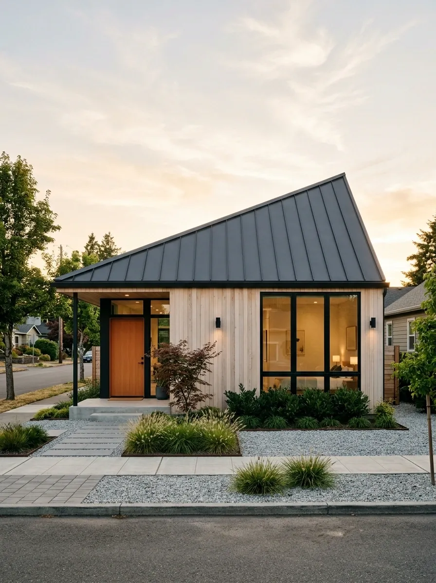
A single mono-pitch roof gives this compact house a dramatic silhouette without making the building complicated. The roof rises above a pale vertical-clad facade, while the lower edge extends far enough to create a sheltered entrance.
Dark metal roofing and black-framed windows give the pale walls a crisp outline. The front garden stays intentionally spare, using gravel and low planting so the roofline remains visible from the street. A warm timber door is tucked beneath the low roof edge, providing the only major change in tone.
This design proves that a small house can have one big architectural gesture and stop there. The roof already has main-character energy. Nobody asked the landscaping to start a subplot.
Modern House With Horizontal Wood and White Concrete
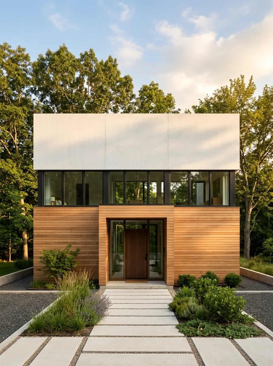
This compact facade is built around a clean horizontal split. Smooth white concrete forms the upper portion, while warm timber cladding runs across the lower level and around the entrance. Dark-framed windows sit between the two materials, acting almost like a visual pause between light and wood.
The landscaping follows the same low, horizontal rhythm. A narrow strip of greenery runs beside pale paving, keeping the frontage open and easy to read. There is no need for an elaborate garden when the facade already has a strong composition.
The real trick is the material placement. The wood feels intentional because it occupies a defined zone instead of randomly appearing around the house. Random wood panels everywhere are how a clean exterior slowly becomes a mood board with walls.
Small Desert Modern House With Gravel Landscape
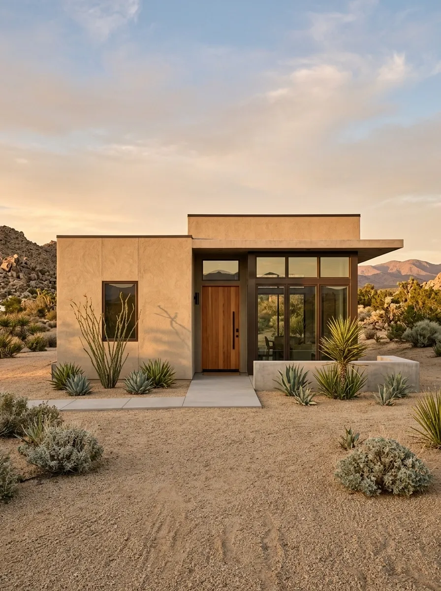
This low modern house uses sandy stucco, dark bronze windows, smooth concrete, and a gravel garden that feels deliberately sparse rather than unfinished. The roof stays flat and visually quiet, while a recessed timber doorway gives the otherwise earthy facade one warmer focal point.
Instead of filling the front yard with planting, the landscape uses a few carefully spaced drought-tolerant plants surrounded by gravel. That negative space is important. It keeps the house legible from the street and gives the facade room to breathe.
The palette also helps the architecture feel connected to its surroundings. Sandy walls, warm paving, and muted planting sit close enough in tone to create continuity, while the dark glazing provides the contrast.
A tiny house does not need a jungle in front of it to look “lush.” Sometimes three plants that actually have breathing room beat thirty fighting for screen time.
Gravel keeps the small lot visually open.
Spacing lets individual plants read clearly.
Coastal Modern House With Pale Wood and Blue-Gray Accents
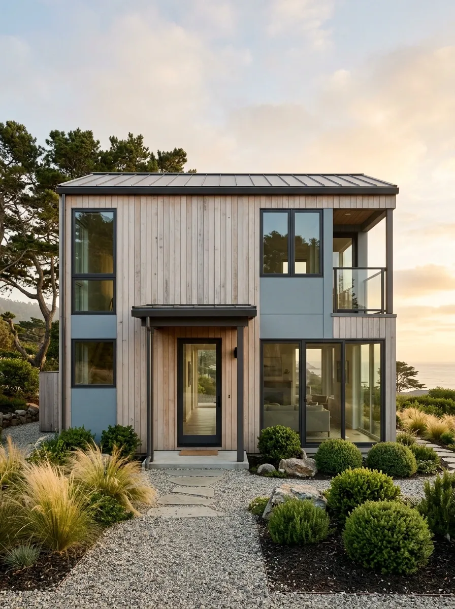
Pale vertical wood gives this compact house a light coastal character, while muted blue-gray panels introduce enough contrast to keep the facade from becoming washed out. Broad dark windows sit between the two materials, and a modest covered entrance creates a clear transition from the sidewalk.
The landscaping is simple, with gravel, soft grasses, and a few rounded shrubs rather than a themed collection of nautical props. No anchor-shaped decor has been harmed in the making of this facade.
The design works because the coastal influence stays architectural. The palette, wood texture, and open composition suggest the setting without turning the house into a holiday souvenir shop. It feels fresh, relaxed, and contemporary while still having enough contrast to remain visually interesting.
Modern House With Large Covered Porch
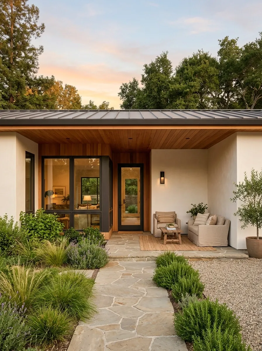
A deep covered porch gives this small single-story house the kind of front elevation that feels larger because more of the everyday life happens outside the walls. Warm white walls, timber ceiling boards, comfortable seating, and dark-framed windows make the porch feel like a genuine extension of the interior.
Low planting defines the edge of the path without closing the space off. The front door sits beneath the same roof, so the entire entrance reads as one sheltered composition rather than a door attached to a wall.
The porch is the main architectural move, so the rest of the house stays relatively calm. That keeps the entrance from looking like an outdoor furniture showroom. The goal is a useful threshold with enough depth to feel like a genuine part of the home.
Basically, the porch gets the spotlight. The outdoor cushions can relax.
Black Modern House With Warm Illuminated Entry
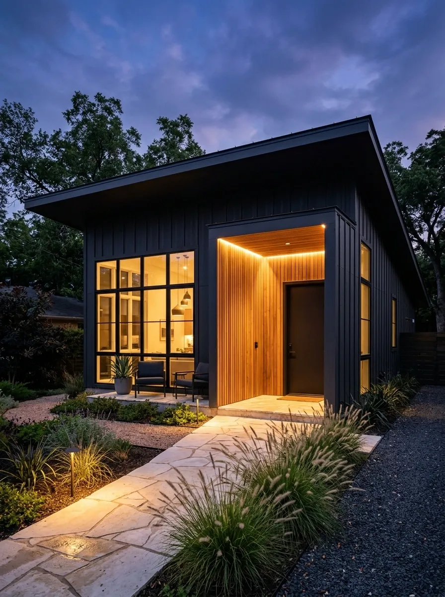
At first glance, this facade is almost entirely charcoal. A recessed warm-wood doorway, however, creates a bright visual interruption beneath a broad overhang. The dark exterior is paired with slim black windows, pale paving, and grasses that catch the warm evening light.
The composition is particularly strong after sunset because the lighting is integrated into the architecture. Soft illumination washes the entry wall and walkway rather than blasting the whole front yard with white light.
That distinction matters. Exterior lighting should help explain the building at night, not make the property look like a small airport terminal.
The design stays sophisticated because the light is concentrated where people actually move. The entry feels warmer without losing the clean, graphic quality of the black facade.
Modern Farmhouse Exterior With Crisp White Gable
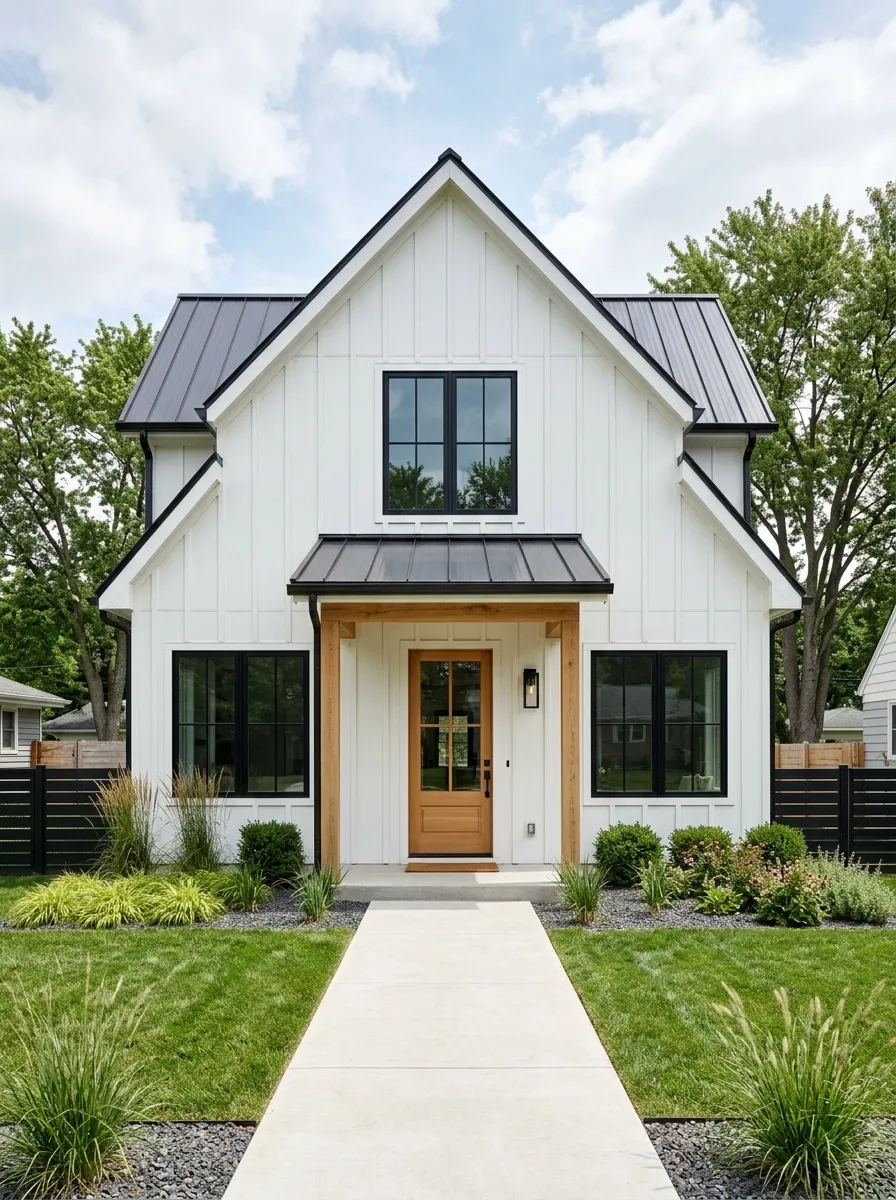
This compact modern farmhouse keeps the familiar gable shape but strips away the decorative clutter. Crisp white vertical siding covers the main volume, while a dark roof and black-framed windows give the facade a much sharper outline. A natural wood door sits beneath a simple covered entry, adding warmth without turning the house rustic.
The front path is broad enough to feel intentional, with low planting tucked along the edges instead of taking over the entire yard. That restraint makes the house feel current while keeping the farmhouse character recognizable.
The best part is what gets left out. No decorative shutters pretending to have a job. No six different porch materials. No random little trim pieces auditioning for attention.
Compact House With Vertical Concrete Fins
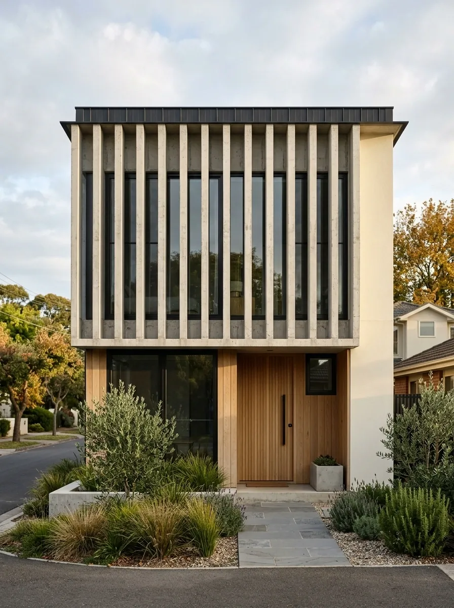
This narrow two-story house gets its identity from a series of vertical concrete fins positioned across the upper facade. Pale stucco forms the quieter background, while the fins partially screen the upstairs windows and create a repeating architectural rhythm.
The entrance sits within a warm timber section on the ground floor, giving the heavier concrete elements a softer counterpoint. Dark glazing fills the spaces between the fins, making the upper level feel layered rather than visually flat.
The design works especially well when a small facade needs privacy without losing daylight. The fins filter the street view while keeping the windows prominent from inside.
And yes, vertical fins are technically decorative. The difference is that these actually have something useful to do, which already puts them ahead of roughly half the “modern” details on the internet.
Small House With Courtyard-Style Front Entrance
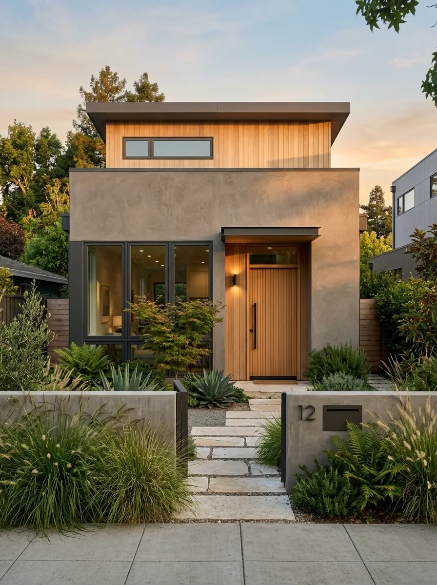
Rather than placing the front door directly against the street, this compact home creates a shallow courtyard between the sidewalk and the house. A low wall defines the boundary, while planting softens the edges and gives the entry some separation from passing traffic.
The facade uses textured warm-gray stucco, dark glazing, natural timber, and pale paving. The entrance sits slightly off-center, so the approach feels more layered than a straight path aimed at the middle of the wall.
This arrangement is especially effective on sites where the front door would otherwise feel exposed. The courtyard creates a sense of arrival without requiring a large setback.
It is basically the architectural version of putting your notifications on silent. Everything is still there. It just does not demand attention at the same time.
Soft Beige Modern House With Arched Entry
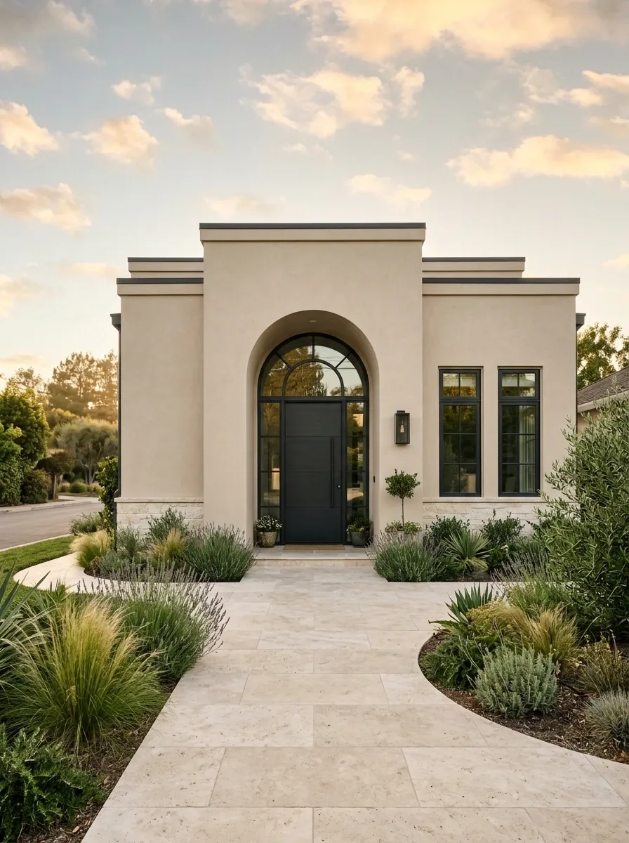
A tall arched doorway becomes the defining feature of this compact facade without making the house feel traditional. Soft beige stucco keeps the main volume quiet, while dark-framed windows establish a crisp modern contrast around the single curved opening.
Pale stone paving continues toward the entrance, and rounded planting beds echo the shape of the doorway without turning the garden into a collection of matching circles. A simple roofline keeps the rest of the architecture rectangular, making the arch feel deliberate rather than accidental.
The curved entry gives the facade a little softness while the overall palette remains contemporary. It is proof that modern architecture does not require every line to look like it was drawn with a ruler having a personal grudge against curves.
The arch creates the memory.
Two-Tone Modern House With Raised Entry
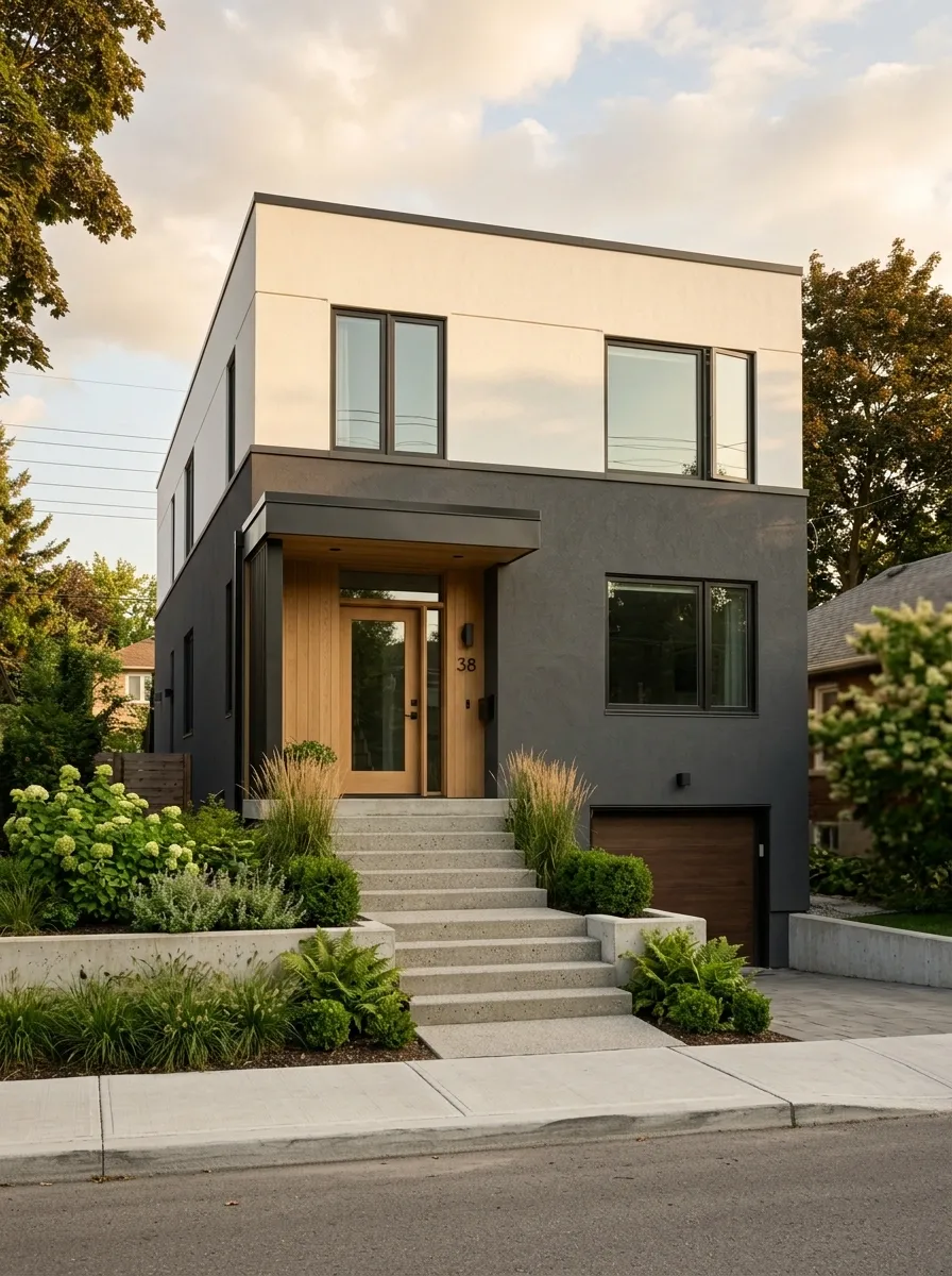
A slightly elevated entrance gives this compact home a stronger relationship with the street and creates a more substantial base. The lower portion of the facade uses a dark charcoal tone, while the upper floor shifts to warm white, producing a clear horizontal division.
Broad steps rise toward the front door, with planting tucked along the sides rather than scattered across the entire approach. A simple canopy protects the entrance while reinforcing the horizontal line between the two floors.
The change in level becomes part of the visual identity. Instead of hiding the elevation with excessive landscaping, the design makes it obvious and controlled.
There is something oddly satisfying about a house that simply admits, “Yes, I am three steps above the sidewalk,” and makes it look intentional.
Modern House With Brick-and-Black Facade
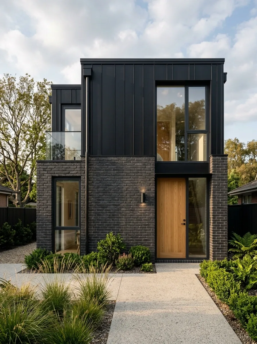
This compact two-story house uses dark brick across the lower level and matte black cladding above, creating a strong shift in texture and visual weight. The heavier masonry keeps the base feeling grounded, while the upper level appears cleaner and lighter.
Large windows cut through both zones, and a warm timber front door breaks the darker palette at the entrance. Pale concrete paving and restrained planting create a quieter foreground so the facade does not become one giant block of dark material.
The lower-to-upper transition gives this house much of its character. It feels substantial without needing extra shapes, balconies, columns, and seventeen decorative panels trying to prove a point.
Sometimes the best exterior detail is simply knowing when the facade is finished.
Minimalist House With Nearly Frameless Corner Glazing
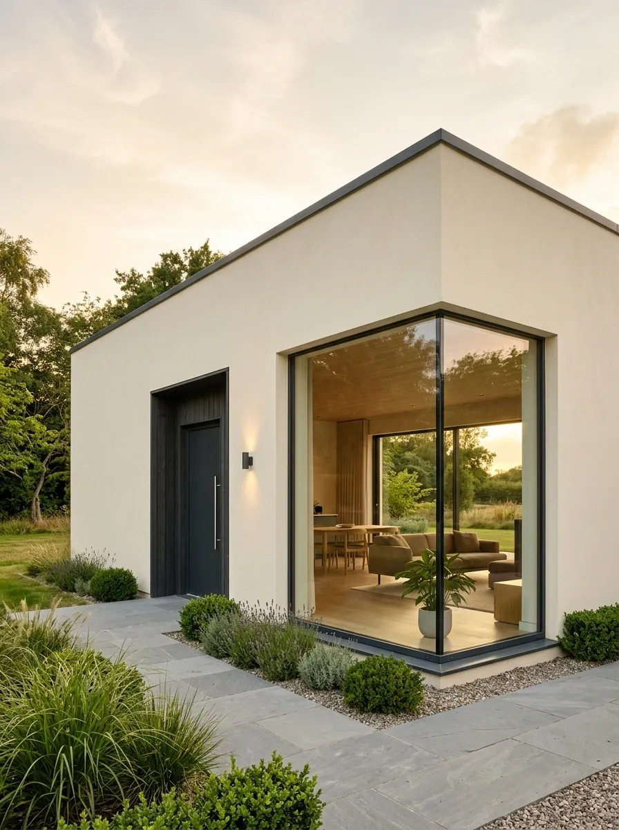
This small flat-roofed house takes a quieter approach, using a pale rendered exterior and one large corner of glazing as the main architectural event. Instead of covering the facade with windows, the glass is concentrated around the living space so the transparency feels deliberate.
A dark recessed doorway sits in a narrow slot beside the glazing, creating a visual transition from the solid wall to the more open corner. The garden remains restrained, with simple paving and low planting following the clean geometry.
The house feels larger because the corner opens outward visually. There is no need for decorative facade tricks when the architecture already has a strong relationship between solid wall and glass.
The understatement is doing a lot here. Which is refreshing in an internet where apparently every house needs an accent wall having a personal brand.
Small Modern House With Green Roof Terrace
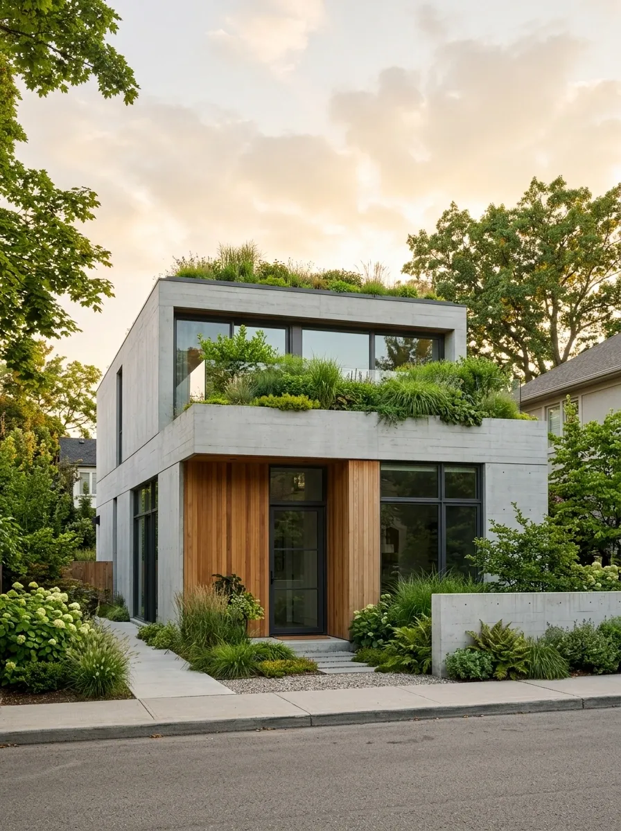
This compact two-story home adds greenery at the roof level, creating another visual layer above a simple architectural shell. Light concrete walls form the base, while dark glazing and warm timber around the entrance provide contrast. The planted roof terrace becomes part of the home’s silhouette rather than an afterthought added somewhere out back.
Ground-level planting echoes the greenery above, visually connecting the roof terrace with the garden below. The middle of the facade remains relatively quiet so the planted upper edge can stand out.
The result is especially interesting from nearby street views, where the roof becomes part of the landscape. It also gives a modest house a more distinctive profile without adding another complicated roof shape.
A green roof is doing double duty here. Looking good while occupying roof space is a fairly respectable résumé.
Contemporary House With Deep Timber Soffits
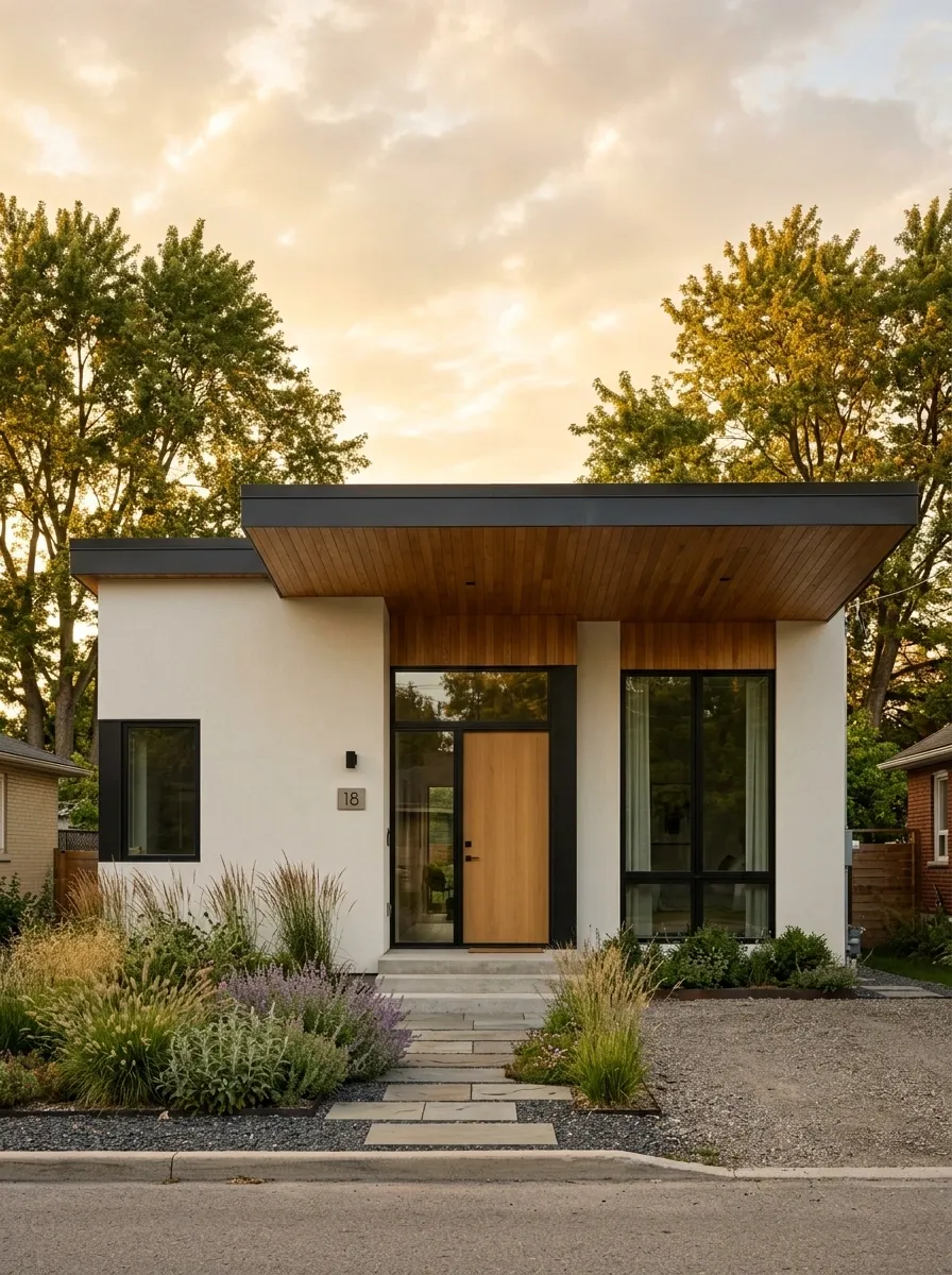
The exterior walls of this small modern home stay intentionally pale and simple, allowing the deep timber soffits beneath the roof and porch to become the main source of warmth. The wood is most visible from below, creating a sheltered ceiling plane that changes the character of the entry without adding another material across the entire facade.
Dark windows provide contrast, while a simple timber door connects the entrance to the overhead wood. The landscaping stays low and loose, leaving the roof edges and warm soffits clearly visible from the street.
This is a subtle design move, but the effect is surprisingly strong. The house looks warmer because the warmth is built into the architecture rather than sprinkled around as decoration.
Basically, the ceiling understood the assignment.
Compact House With Long Linear Planters
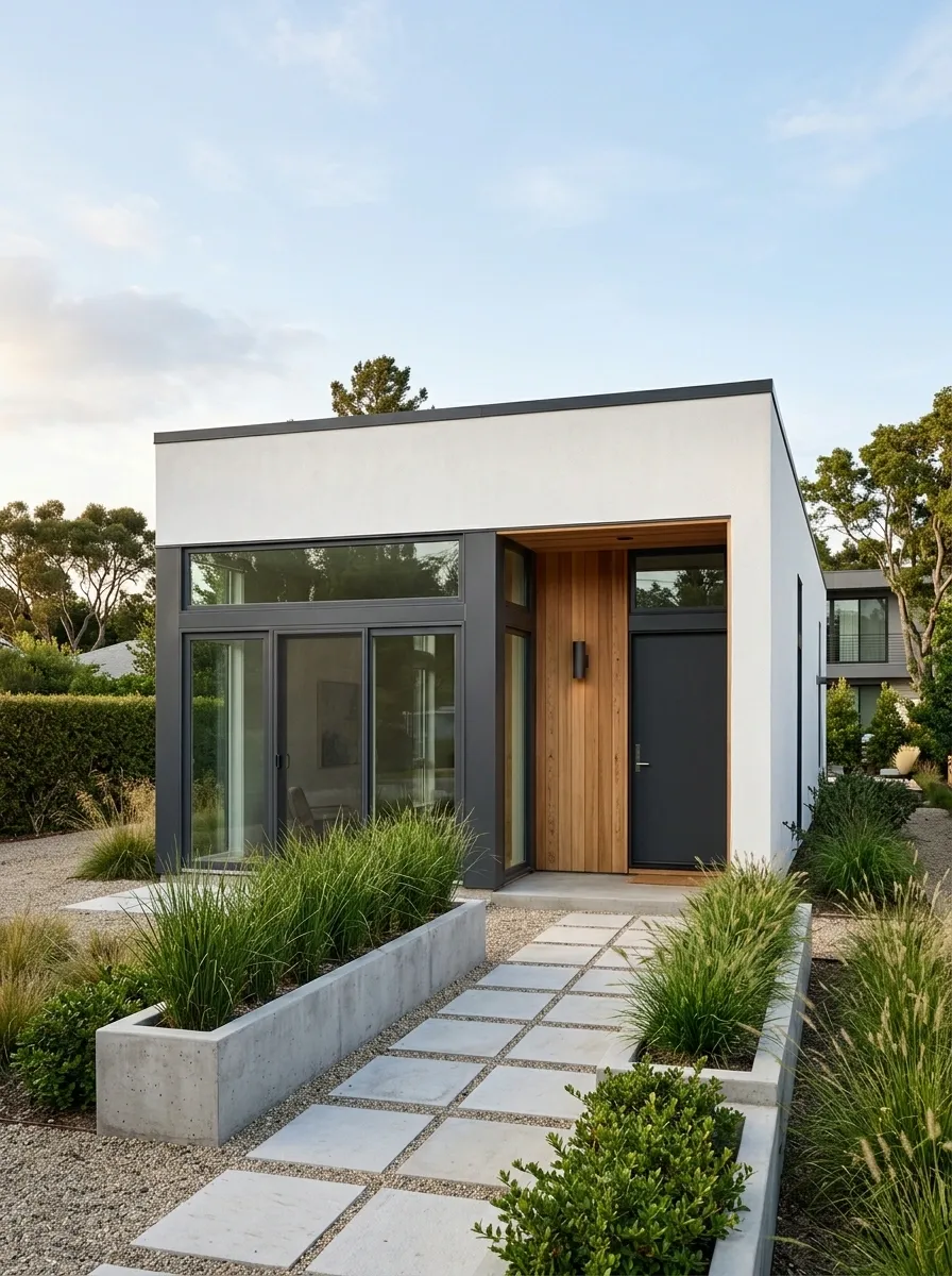
This small box-shaped house uses one deceptively simple move to connect the architecture with the front yard: long narrow planters running parallel to the facade. White stucco provides the background, charcoal windows sharpen the openings, and warm timber marks the entrance.
The planting strips run in the same direction as the house, while pale paving follows the clean geometry toward the door. Because the greenery is contained in long bands, the garden feels structured rather than scattered.
That shared direction matters. The roofline, windows, path, and planting all reinforce the same horizontal rhythm, making the compact site feel longer and more organized.
No giant ornamental shrub has been asked to carry the entire aesthetic department. The house has enough support staff already.
Modern House With Stone Accent Volume
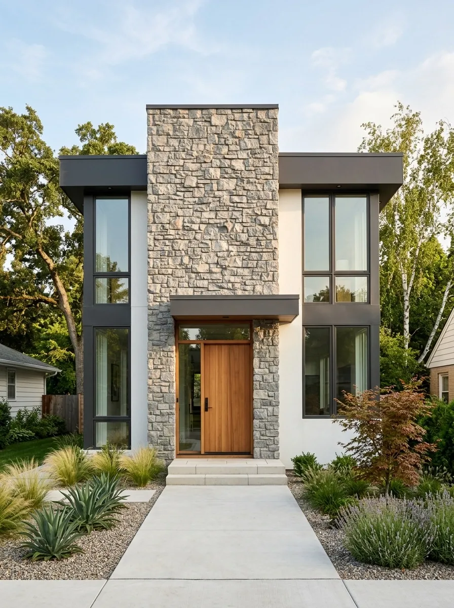
A compact white-and-charcoal home gets its strongest architectural moment from one prominent natural stone wall that rises from the ground level toward the upper floor. Rather than spreading stone across every available surface, the design concentrates it around the entrance and lets the surrounding facade remain quiet.
Dark windows sharpen the white walls, while a timber door introduces warmth beside the textured stone. The front paving stays pale and uncomplicated, and a few structured plants frame the entry without hiding the material contrast.
The stone works because it behaves like a volume, not a decorative patch. It gives the facade something substantial to wrap around while preserving a clear hierarchy.
One stone wall with a purpose is a lot more convincing than a whole house desperately trying to cosplay a mountain lodge.
Calm Nordic-Inspired House With Black Gable and Wood
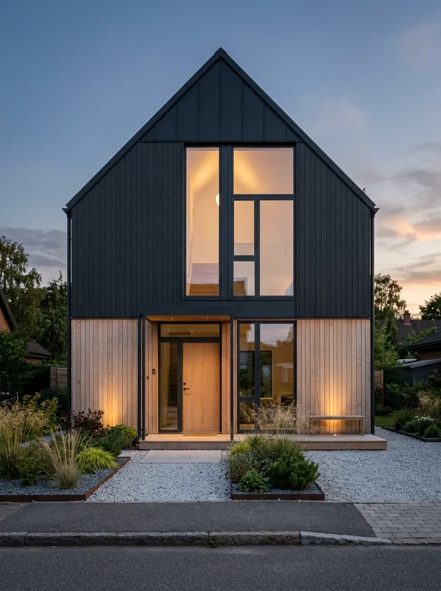
A compact gabled home uses a near-black roof and upper facade as its strongest visual mass, while pale timber wraps the lower portion around the entrance. Tall windows break through the darker shell, and a simple canopy creates a small sheltered threshold.
The front garden stays deliberately understated with gravel, grasses, and warm exterior lighting. The planting does not compete with the architecture, which is important because the dark gable already creates a strong silhouette from the street.
The palette feels restrained without becoming cold. Warm wood gives the lower level a grounded residential quality, while the dark upper form keeps the house looking modern.
It is a very simple formula: dark above, warm below, clean in between. The facade clearly received the memo about not doing too much.
When the Whole Exterior Finally Makes Sense
The strongest small houses are rarely the ones with the most going on. They are the ones where the pieces seem to belong to the same sentence.
A good facade has a clear visual order. The roof gives the house its silhouette. The windows reinforce the architecture instead of floating across the walls. The entrance feels connected to the path. Materials have defined roles. Landscaping frames the building instead of swallowing it. Even parking can become part of the composition when it is handled with some actual thought.
That is the difference between a house with modern features and a house that actually feels modern.
Before choosing colors, cladding, doors, or planting, save a handful of complete exteriors that feel genuinely distinct. Compare the overall proportions and the way each design handles the street, entry, roof, and landscape. Pick one visual language and build from there.
Save this collection now. Future renovation decisions become considerably easier when the inspiration folder contains actual houses instead of 47 close-ups of someone else’s front door.