
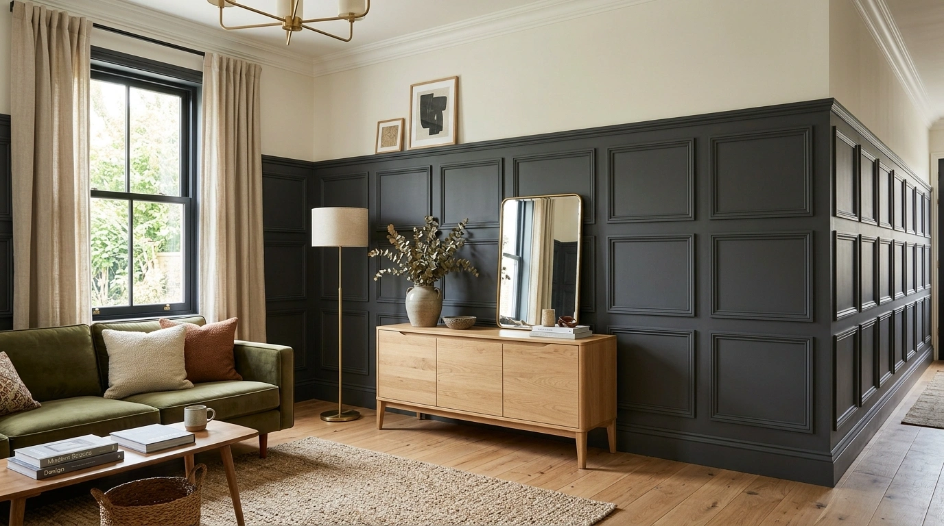
Minimalist rooms have a funny way of looking amazing in a saved photo and strangely lifeless once recreated at home. Remove too much, and suddenly the sofa looks lonely, the walls look unfinished, and the whole room has the personality of a vacant apartment waiting for keys.
The fix isn’t piling things back in.
The difference comes from how the entire room is composed. Warm wood against pale walls. Soft fabric against harder surfaces. Furniture with enough scale to anchor the room. Lighting that creates depth after sunset. A small number of objects that actually add something instead of simply occupying available shelf space.
That is where minimalist cozy home decor ideas become useful. A finished room shows how the pieces relate to one another, which is far more helpful than a random list of objects that allegedly make everything “cozy.” The concepts below take different approaches, from tiny bedrooms and compact kitchens to moody bedrooms, soft Scandinavian spaces, rustic fireplaces, and collected interiors.
Some are extremely pared back.
Some have more character.
None require the room to look like it has been waiting for furniture since 2022.
Minimalist Cozy Home Decor
Sunlit Minimalist Bedroom With Floor Bed and Plant Life
Natural light floods this expansive white room, hitting a low platform floor bed that keeps the entire space feeling open and grounded. A collection of potted plants adds vibrant green life against the crisp walls, while a gallery wall of framed art and vinyl records brings personality to the backdrop without crowding the room.
The secret to this layout is keeping every single piece of furniture below eye level. By dropping the bed to the floor and letting the tall ceilings breathe, the room feels remarkably vast yet intimately cozy under the warm morning sun.
Skip the temptation to fill every corner with furniture. Let the empty wall space and simple wooden accents do the heavy lifting for that effortless, lived-in aesthetic.
Cream Living Room With Low Walnut Furniture and Linen Layers
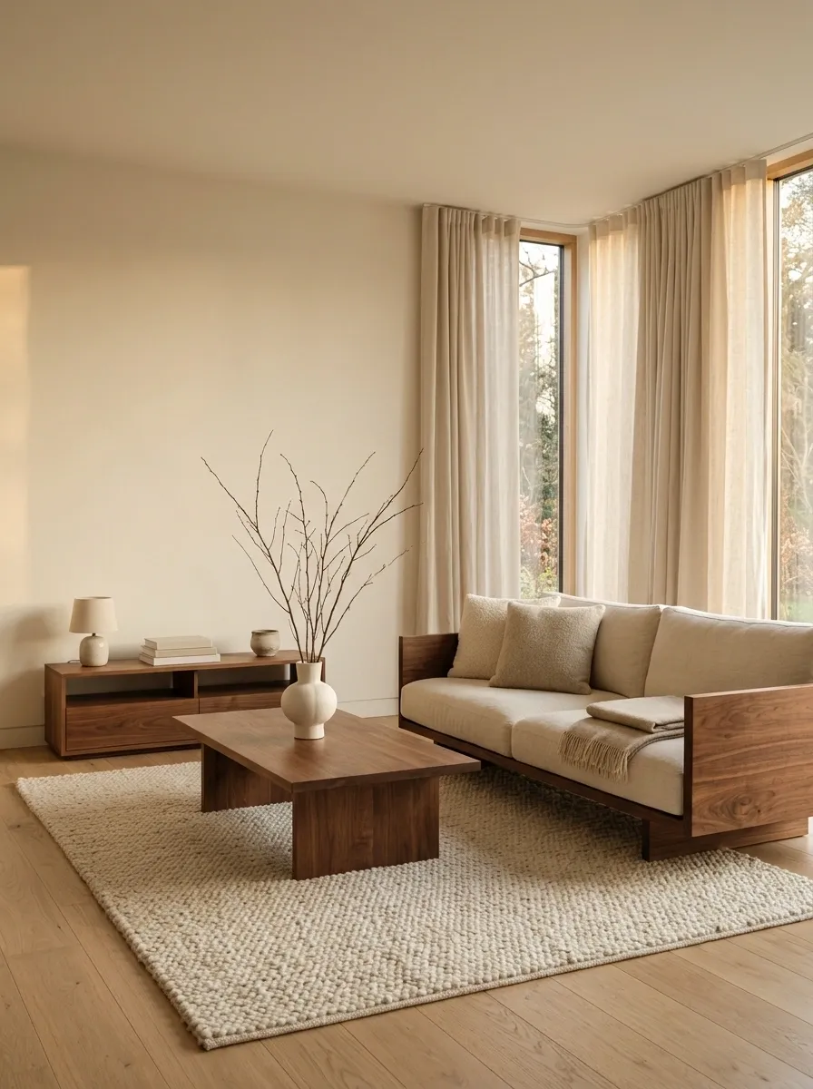
This living room gets its warmth from restraint, not from filling every empty surface. Cream walls and oversized linen curtains create a soft envelope around a low walnut sofa, a simple media unit, and a broad textured rug. The coffee table stays substantial but unfussy, while a single branch arrangement gives the room some height without turning the corner into a plant nursery.
The walnut matters. Without it, the cream palette could drift into bland showroom territory. Here, the dark wood creates a strong horizontal anchor while the linen keeps everything from feeling too polished.
The smartest move is leaving the walls mostly alone. The room already has enough visual weight in the furniture and materials.
Layered White Bedding With Pendant Lighting and Neutral Textures
This bedroom leans entirely into a monochromatic white palette, using heavy waffle weaves, rumpled linen, and piled pillows to build incredible depth. Dual minimalist pendant lights hang above, casting a soft glow that accentuates the quiet textures of the bedding and the delicate floral arrangement on the bedside table.
A single color scheme only works when you vary the tactile surfaces significantly. The juxtaposition of the quilted coverlet against the smooth ceramic lamps creates visual interest without introducing a single extra hue.
Keep your bedside styling intentional and serene. A couple of mugs and a woven throw at the foot of the bed are all you need to make the space feel genuinely inviting.
Soft Beige Bedroom With Platform Bed and Paper Lantern Lighting
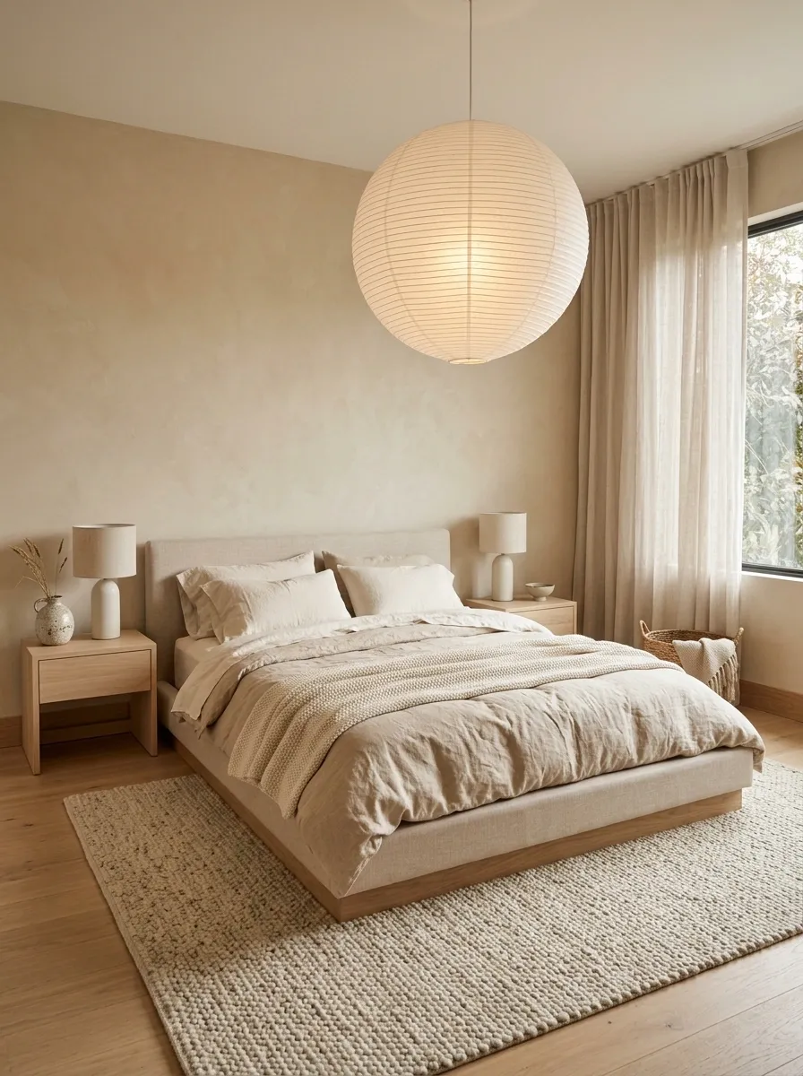
The entire room sits low, soft, and quiet. Warm beige walls meet a low upholstered platform bed dressed in rumpled linen, while pale oak nightstands keep the furniture visually light. A large paper lantern hangs overhead with enough presence to become part of the architecture rather than a tiny ceiling accessory nobody notices.
The lack of clutter is intentional, but the room never feels unfinished because the textiles carry so much texture. The bedding has visible folds, the curtains have movement, and the rug adds a slightly heavier surface underfoot.
Keep the bedside styling almost comically simple. One lamp, one useful object, done. The giant pile of “cozy” accessories can stay at the store.
Warm Neutral Hallway With Wooden Art and Floating Shelf
Narrow hallways often get neglected, but this minimalist transition space proves that a warm beige tone and thoughtful styling make all the difference. Matching botanical prints in light wood frames hang neatly above a slim radiator cover, leading the eye toward a floating wooden shelf adorned with a candle and a potted plant.
The restrained color palette unifies the tight corridor, while the vertical artwork emphasizes the height of the walls. A small textured runner rug underneath adds a soft surface underfoot without overwhelming the narrow floor plan.
Do not overcomplicate transitional zones with bulky furniture. A single floating shelf and carefully chosen wall art provide maximum impact while keeping the walkway completely unobstructed.
Warm Scandinavian Living Room With Oak, Bouclé, and Clay Tones
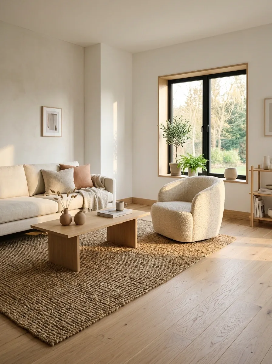
Pale oak flooring sets the base for cream seating, a rounded bouclé chair, and a broad woven rug that quietly defines the conversation area. Small clay-toned accents appear in ceramics and textiles, giving the room a warmer note without breaking the soft Scandinavian palette.
What makes the composition interesting is the mix of surfaces. The oak is smooth and directional, the rug is visibly woven, the bouclé catches light differently, and the ceramics bring a matte finish. There are not many objects because the materials are already doing the talking.
This is the kind of room where adding six more decorative pieces would actively make it worse. The empty space is carrying its share of the design budget.
Earth-Tone Minimalist Bedroom With Light Wood Bench and Ceramics
Soft beige plaster walls set a serene tone in this inviting bedroom, featuring a large upholstered headboard and an abundance of neutral linen layering. A light wooden bench at the foot of the bed holds stacked books, a lit candle, and a smooth ceramic vase, grounding the lighter textiles with organic warmth.
The composition succeeds because it balances expansive empty wall space with deeply textural foreground elements. The arched mirror leans casually against the wall, reflecting light and expanding the perceived boundaries of the room effortlessly.
Resist the urge to add heavy furniture where it isn’t needed. A simple wooden bench acting as a surface for quiet, everyday objects brings instant warmth to an otherwise stark minimalist layout.
Minimalist Earth-Tone Kitchen With Oak Cabinets and Stone Counters
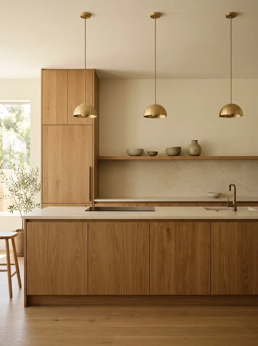
This kitchen takes the minimalist route without becoming cold and overly clinical. Flat-front oak cabinets run across the room with creamy stone counters, integrated appliances, and warm pendant lighting above the main work area. A narrow open shelf holds only a few ceramics, so the wall still feels useful without becoming a display rack.
The color story stays close to the materials: warm oak, pale stone, soft cream, and deep brown details. That limited palette gives the kitchen a strong architectural look while keeping the finishes approachable.
The key is visual quietness around the busiest working zones. Countertops should have room to breathe. The toaster does not need a supporting cast.
Japandi Bedroom With Dark Wood, Cream Bedding, and Soft Shadows
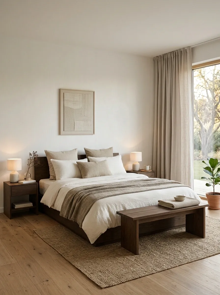
Dark oak furniture gives this bedroom its weight, with a low bed, compact side tables, and a simple bench grounding the composition. Cream bedding and off-white plaster walls keep the upper half of the room light, while woven textures and low bedside lighting soften the darker timber.
The room works because the heavy elements stay low. The ceiling remains visually open, the bedding catches natural light, and the curtains fall in broad, quiet panels instead of competing patterns.
There is no need to add extra contrast just for drama. The dark wood already provides it. Add too many black accessories and the whole thing starts auditioning for a moody hotel lobby.
dark wood
taupe and woven texture
cream walls and bedding
Small Apartment Living Room With Compact Sofa and Hidden Storage
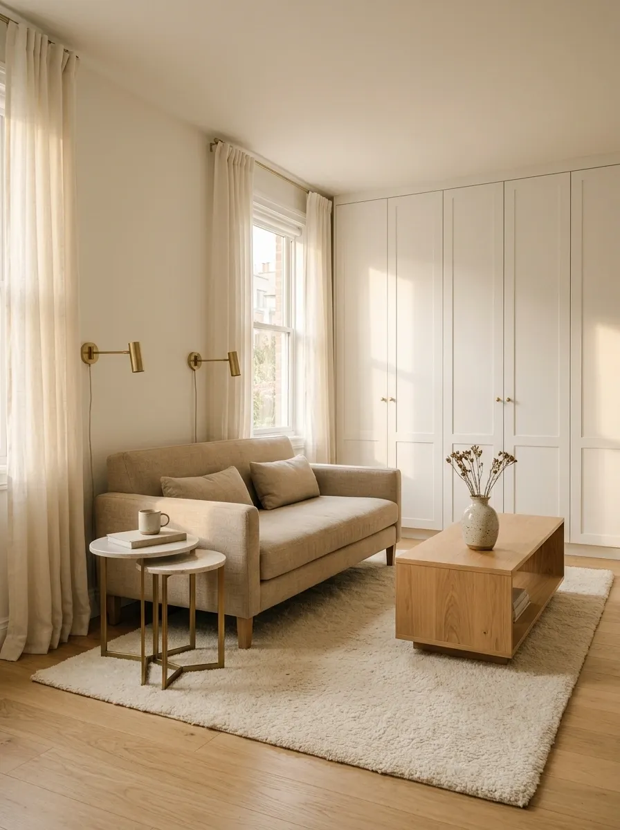
Small rooms don’t need more furniture. They need furniture that understands the assignment. This compact living room pairs a slim sofa with a low media unit, nesting tables, one generously sized rug, and closed storage that swallows the everyday mess. Wall-mounted lighting keeps the floor clear, while warm curtains soften the harder edges of the apartment.
The room still feels cozy because the few large pieces have enough space around them. Nothing is fighting for attention, and the circulation path remains obvious.
The rug does a lot of work here. It visually joins the sofa and tables so the room reads as one composition rather than several unrelated purchases that somehow ended up sharing an address.
Keep the sofa, rug, and tables visually grouped.
Leave a clear path between the seating area and the room entrance.
Use closed cabinetry for the things that make a small room look smaller.
Organic Modern Living Room With Limestone, Walnut, and Olive Textiles
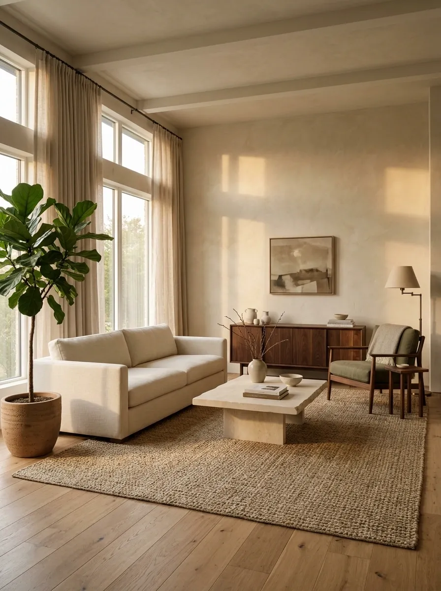
Limestone-inspired surfaces, walnut furniture, and olive textiles give this living room a grounded palette without turning it into a rustic retreat. A pale stone coffee table sits between a low sofa and a substantial woven rug, while the walls have a softly textured plaster finish that catches daylight instead of reflecting it harshly.
The room feels rich because the materials have different visual weights. Stone feels solid, walnut adds depth, and the upholstery softens both. The olive appears in controlled doses through cushions and a chair, giving the otherwise neutral room a little life.
There is a fine line between earthy and “every object came from the same rustic gift shop.” Keeping the shapes simple keeps this one firmly on the better side.
Cozy Minimal Entryway With Built-In Oak Storage and Bench
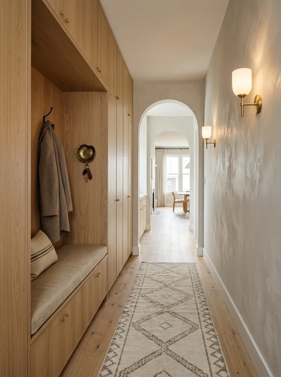
A narrow entryway can become the home’s most chaotic square meter very quickly. This version shuts that drama down with full-height oak cabinetry, a built-in bench, concealed shoe storage, and a small section of open hooks for the things used every day. A soft runner stretches the length of the space, while warm wall lighting replaces the usual harsh overhead glare.
The important part is the split between visible and hidden storage. A few daily-use items can stay accessible, but most of the visual noise disappears behind doors.
That balance makes the entry feel calm without becoming impractical. Because “minimalist” does not mean standing outside while the shoes hide somewhere.
Quiet Gray Living Room With Charcoal Sofa and Warm Wood Accents
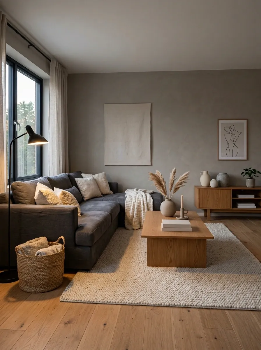
Gray gets blamed for being cold, but the wrong gray is usually the actual culprit. This living room uses a warm gray backdrop with a deep charcoal sofa, medium oak furniture, cream textiles, and a thick woven rug. Soft directional lighting adds pools of warmth after sunset, keeping the room from flattening into one giant neutral block.
The charcoal sofa provides enough contrast to anchor the room, while the oak interrupts the cooler palette with a natural mid-tone. Cream appears around the seating area to keep the darker furniture from taking over.
The secret is contrast in layers rather than contrast everywhere. A single dark sofa can look sophisticated. Six dark accessories scattered around it can make the room look like it is preparing for a thunderstorm.
Minimalist Home Office With Built-In Desk and Full Wall Storage
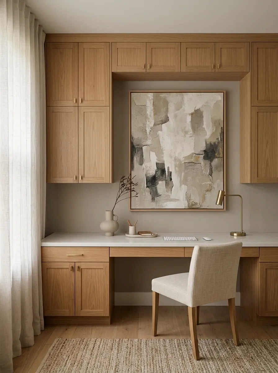
A calm home office doesn’t need a giant desk covered with notebooks, cables, three mugs, and a plant that has somehow become part of the payroll. This design uses a full-width built-in desk with warm oak cabinetry above and below, a simple upholstered chair, concealed cable management, and one oversized artwork piece.
The cabinetry keeps practical office clutter out of sight, while the open desk surface stays intentionally sparse. Soft curtains and warm lighting take the edge off the harder built-in surfaces.
The oversized artwork is important because the wall needs one clear focal point. Ten tiny prints would only create visual static. One confident piece does the job without asking for a group meeting.
Clear enough for actual work, not decorative archaeology.
Creates personality without filling the wall.
Finds a home inside the cabinetry.
Cozy Reading Corner With Built-In Window Seat and Warm Oak Shelving
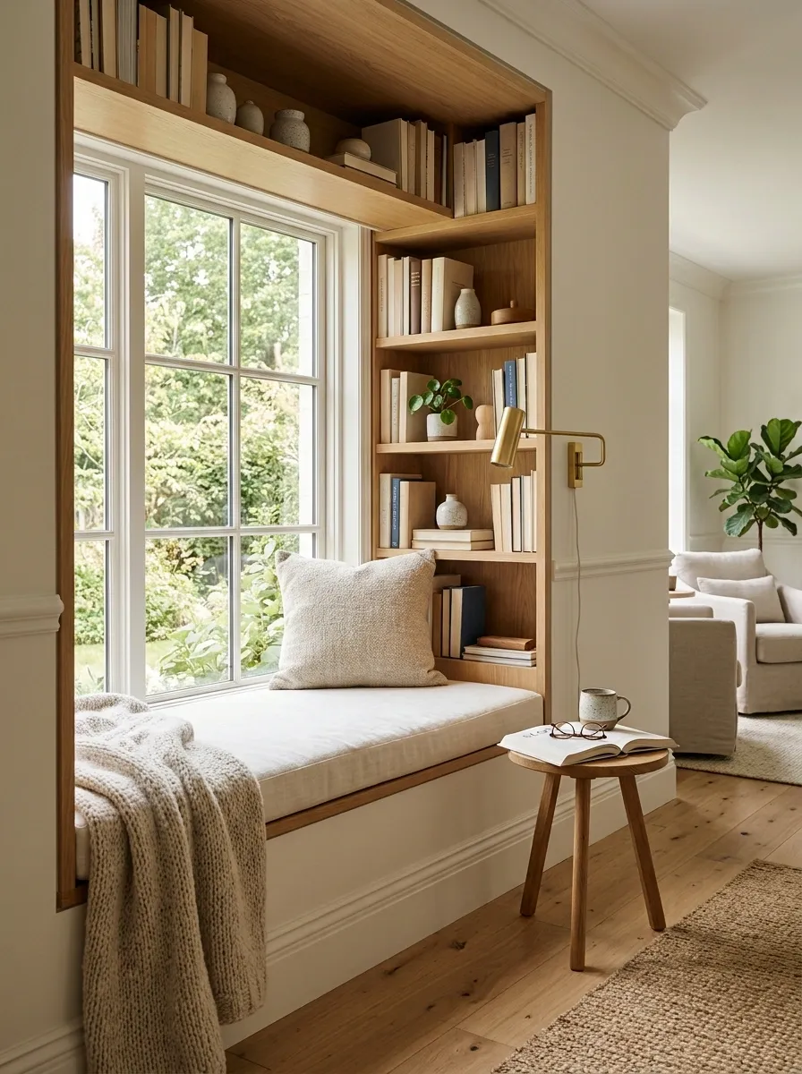
A deep window seat turns an awkward stretch of wall into the most inviting part of the room. The seat is layered with a long linen cushion and one or two pillows, while warm oak shelves frame the window without crowding it. A compact side table sits close enough for a mug or book, and a soft lamp provides focused evening light.
The design feels special because the architecture does most of the work. There is no need for a giant chair, oversized floor basket, and decorative ladder all competing for the same corner.
The shelves should stay edited. Books, a few ceramics, and useful objects are enough. The goal is a reading space, not a tiny branch of the local library.
deep and soft
within easy reach
framing, not crowding
Minimalist Cottage Bedroom With White Walls and Aged Wood Furniture
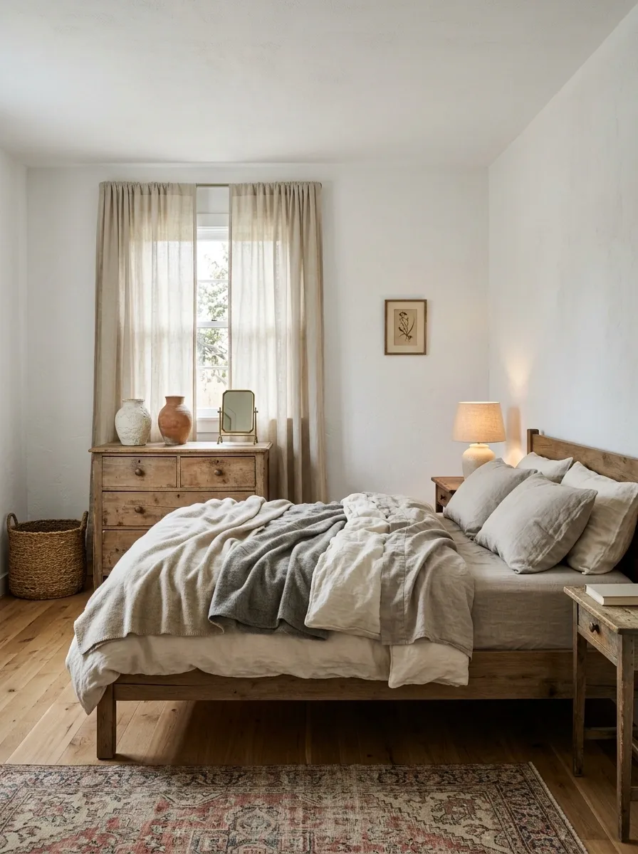
White walls and aged wood are doing the heavy lifting here. The bedroom uses a simple wooden bed, a weathered chest, washed linen bedding, a woven basket, and a muted vintage-style rug. Warm bedside lamps soften the white backdrop after dark, while full-length curtains give the room a little movement.
The furniture has visible character, so the styling can stay extremely simple. That’s what stops this from looking like a generic cottage bedroom set assembled five minutes before a catalog shoot.
The aged wood should remain the star. Avoid pairing it with too many rustic accessories, distressed signs, or deliberately old-looking objects. One convincing vintage element beats an entire collection of fake nostalgia.
Aged wood = character.
Warm Minimalist Bathroom With Limestone, Oak Vanity, and Soft Lighting
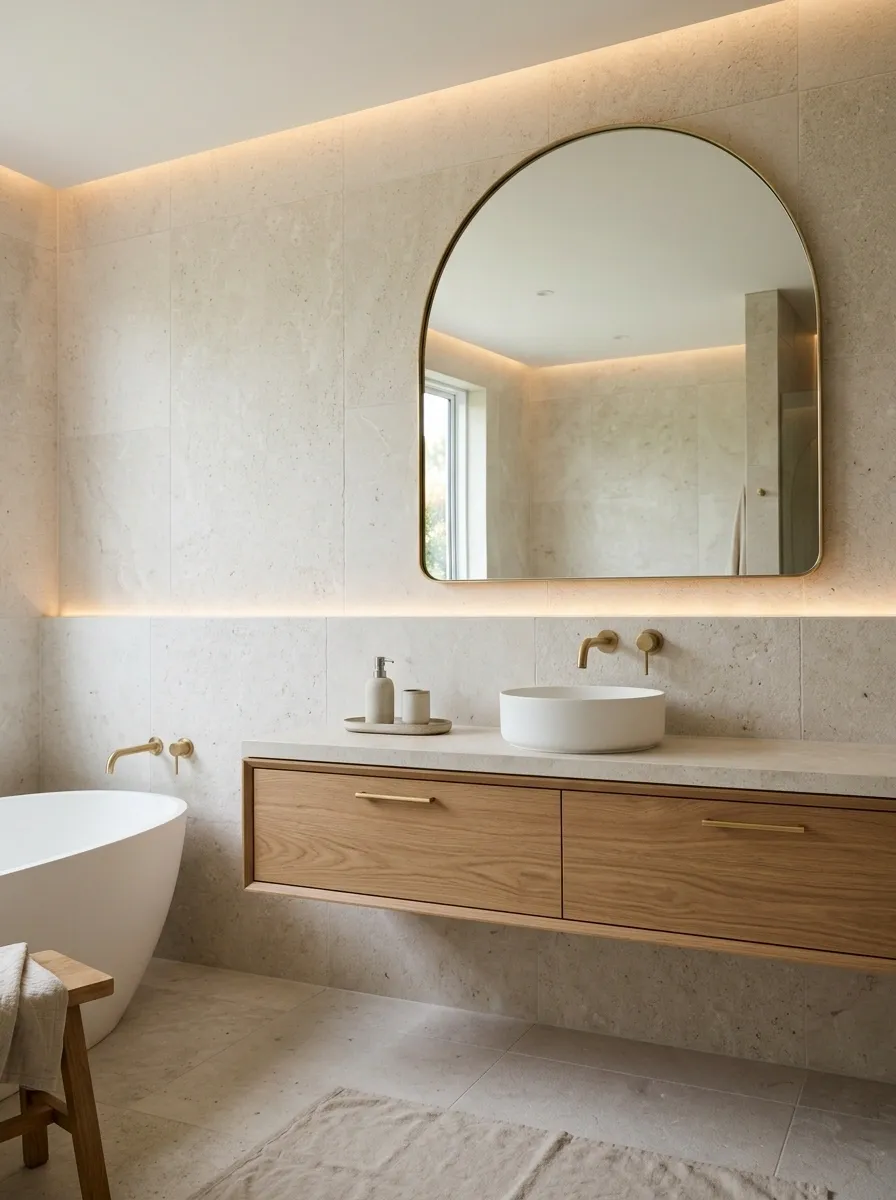
This bathroom keeps the material palette tight: pale limestone-inspired surfaces, a floating oak vanity, a rounded mirror, brushed metal fixtures, and warm concealed lighting. The result feels substantial without relying on decorative clutter or a dozen little bottles lined up like contestants.
The floating vanity leaves a strip of visible wall and floor beneath it, which gives the room a lighter architectural feel. Rounded edges on the mirror and lighting soften the harder stone surfaces without making the space look overly decorative.
Storage should stay mostly behind the vanity doors. Open shelving has its place, but the bathroom counter already has enough opportunities to become the dumping ground for everyone’s daily routine.
Moody Minimal Bedroom With Espresso Wood and Cream Upholstery
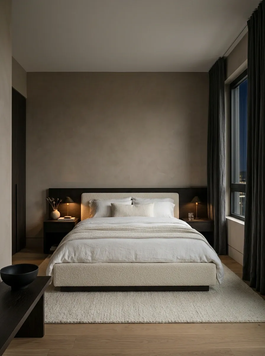
This bedroom takes the cozy side of minimalism much further. Espresso-toned furniture sits against warm taupe walls, with a cream upholstered bed, dark curtains, and low bedside lamps creating a deep, layered palette. The bedding stays light enough to create contrast, while the floor and furniture carry most of the darker tones.
The room feels intimate rather than gloomy because the darkest colors are concentrated below eye level and balanced by soft upholstery. Lighting is deliberately low and warm, giving the textures enough depth to show after sunset.
This scheme does not need many accessories. The palette is already doing plenty of talking. At this point, another black vase would simply be interrupting.
Minimalist Family Room With Deep Sectional and Hidden Media Storage
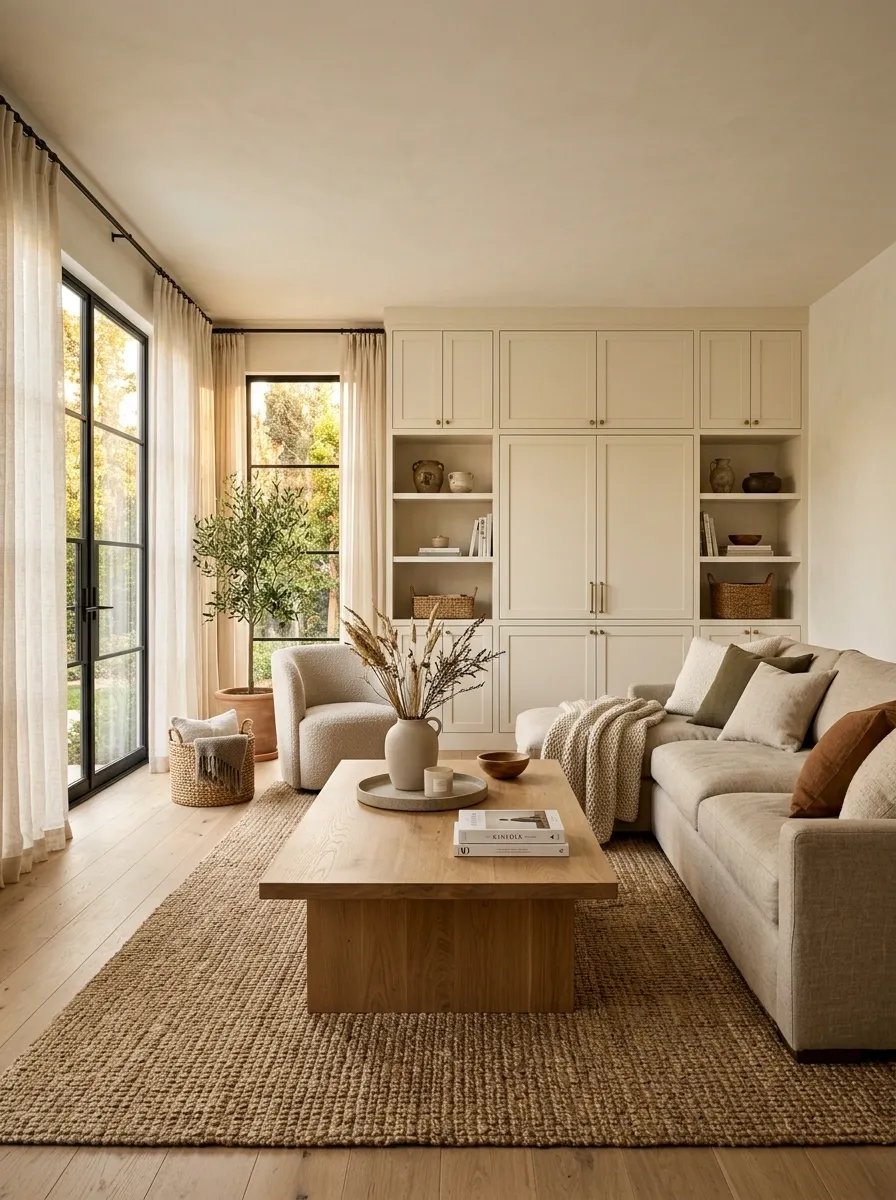
A family room still needs to survive actual family life, which makes this one refreshingly practical. A deep neutral sectional fills the main seating zone, a large woven rug connects the pieces, and a solid wood coffee table gives the center enough weight without looking bulky. Along the main wall, closed cabinetry hides the television equipment, games, chargers, and all the other tiny objects that apparently reproduce overnight.
The room feels relaxed because the furniture is generous, but the storage keeps the background quiet. Soft curtains and textured cushions add warmth without turning the sectional into a pillow warehouse.
The goal here is not to make a family room look untouched. It’s to make the everyday mess easier to contain.
Warm White Kitchen With Soft Green Cabinetry and Wood Accents
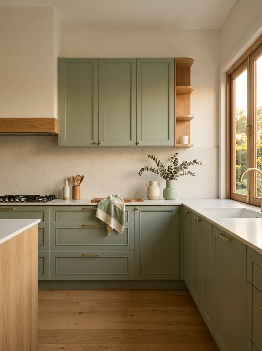
Muted sage cabinetry gives this kitchen personality while the rest of the room stays quiet. Cream walls, warm wood accents, simple hardware, and understated lighting keep the green from becoming too decorative. The cabinetry carries the color in one continuous architectural field, while the counters and backsplash remain pale enough to create breathing room between the lower and upper elements.
The wood is deliberately warm rather than orange, which keeps the palette sophisticated and ties the cabinets back to natural materials elsewhere in the home. A few ceramics or linens can echo the green, but repetition should stay subtle.
This is how color works beautifully in a minimalist kitchen. Give one finish a clear role instead of making every surface audition for attention.
sage cabinetry
quiet cream surfaces
warm wood accents
Minimalist Bedroom With Plaster Walls, Linen Curtains, and Floating Nightstands
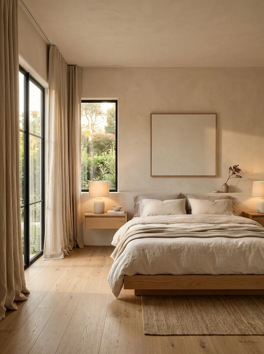
This bedroom leans heavily on architecture and negative space. Warm plaster walls form a softly textured backdrop for a low bed, while full-length linen curtains frame the windows in broad vertical folds. Floating nightstands disappear into the wall line, leaving the floor almost completely clear. Simple ceramic lamps provide the only visible bedside decoration.
The room’s character comes from what isn’t competing for attention. There are no bulky chests, no crowded gallery wall, and no furniture interrupting the curtain line. That emptiness feels deliberate because the plaster texture, fabric movement, and low furniture give the eye enough to study.
This is minimalism for anyone who likes calm rooms but isn’t interested in making the bedroom look like an empty property listing.
Clear curtain line.
Clear wall above the bed.
Compact Galley Kitchen With Warm Wood and Cream Surfaces
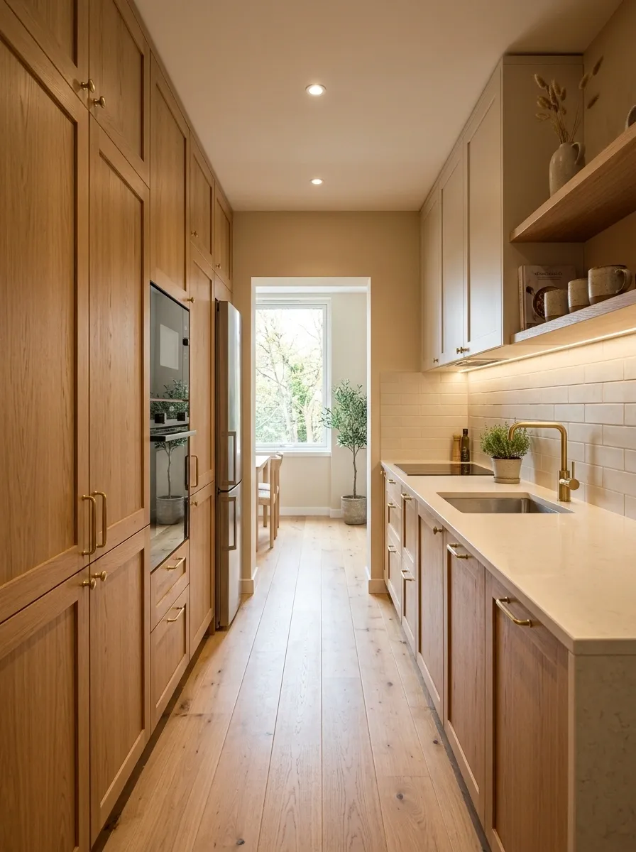
A narrow galley kitchen benefits from visual discipline more than almost any other room. This version runs tall oak cabinetry along the main storage wall, while cream counters and a pale backsplash keep the opposing surfaces visually lighter. Appliances are integrated wherever possible, and open shelving is limited to a short section that breaks up the cabinetry without stealing valuable storage.
The layout reads as one long composition because the finishes remain consistent from one end to the other. Lighting sits close to the work surfaces, keeping the narrow passage bright without adding bulky fixtures.
The real luxury here is a clear route through the kitchen. No freestanding cart parked in the middle. No decorative chair blocking a cabinet. No obstacle course before coffee.
WORKING PATH
Cozy Minimal Living Room With Arched Architecture and Curved Furniture
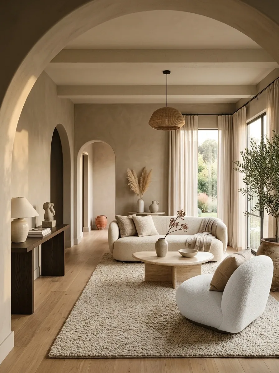
Soft curves completely change the mood of this minimalist living room. An arched doorway frames the seating area, where a low curved sofa faces a rounded coffee table and a sculptural bouclé chair. Limewashed or lightly textured walls keep the background matte, while full-length curtains soften the windows and a broad rug gathers the furniture into one defined zone.
The repeated curves make the room feel cohesive without requiring lots of decoration. The architecture creates the first echo, the furniture creates the second, and the styling stays quiet enough for both to remain visible.
The trick is not to curve absolutely everything. A few straight pieces give the composition some contrast. Otherwise the room starts looking like furniture has been put through a very expensive bendy straw.
Minimalist Bedroom With Terracotta Bedding and Pale Oak Furniture
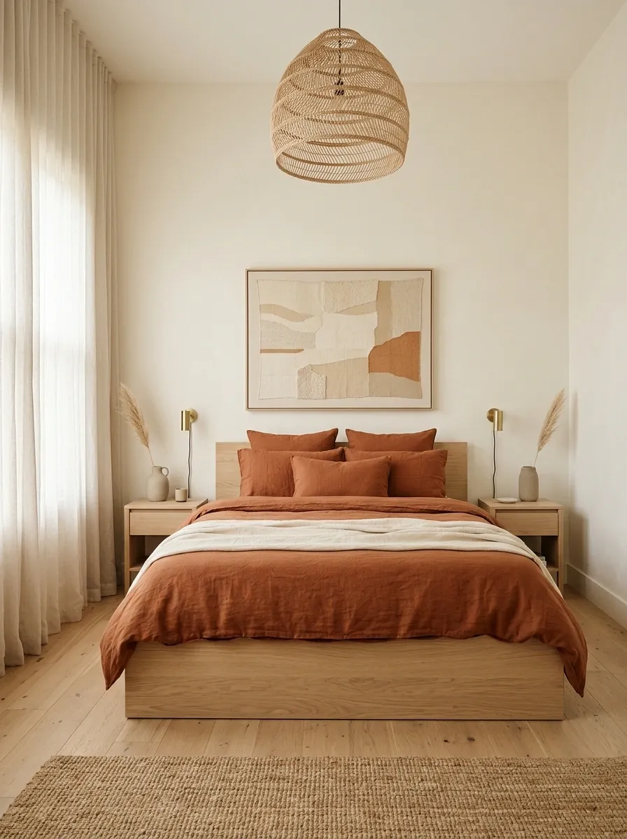
A quiet bedroom becomes much more interesting when one warm color gets a proper job. Here, pale oak furniture and creamy walls create the neutral base, while terracotta bedding adds a deeper note across the bed. A woven pendant, soft linen curtains, and one oversized artwork keep the rest of the room restrained.
The terracotta works because it is concentrated in the largest textile surface rather than scattered across ten tiny accessories. That gives the room a clear focal point while keeping the palette grounded.
The rest of the styling should stay almost boring on purpose. Once the bedding brings that much warmth, the room does not need a collection of little orange things holding a committee meeting on the nightstand.
cream backdrop
terracotta textile layer
pale oak grounding
Calm Apartment Dining Nook With Banquette and Wall Sconces
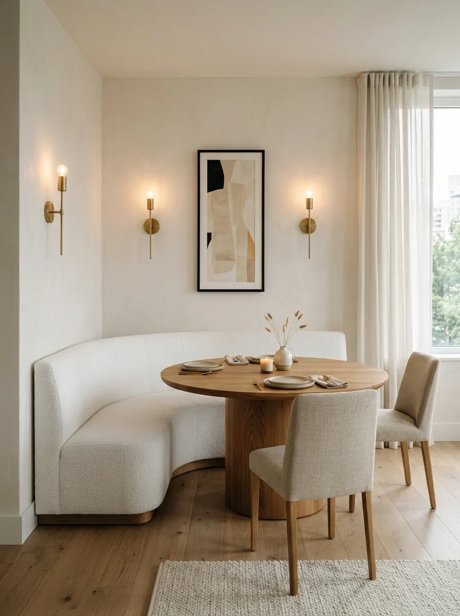
A compact dining area can feel built-in and intentional without needing a separate dining room. This nook uses a curved or lightly rounded banquette against the wall, paired with a round table and two upholstered chairs. Wall sconces provide evening light without stealing surface space, while a narrow artwork arrangement gives the wall some personality.
The banquette changes the proportions of the entire space. Instead of leaving clearance for chairs on every side, one side of the table becomes part of the architecture. That frees up floor area and makes the setting feel more permanent.
The composition stays simple because the seating already creates enough shape. Another decorative chair in the corner would just be unpaid overtime.
Minimalist Cozy Nursery With Natural Wood and Soft Oat Tones
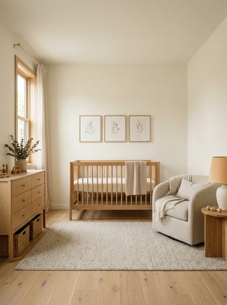
This nursery avoids the temptation to turn every wall into a theme park. Natural wood furniture, oatmeal textiles, cream walls, a low-pile rug, woven storage, and soft lighting create a gentle room that still feels like part of the home.
The crib and storage pieces have simple profiles, while the upholstered chair introduces a softer shape for feeding or reading. Instead of covering every wall with themed decor, one restrained artwork grouping gives the room identity without visually shrinking the space.
The neutral palette also lets the furniture and textiles carry the design. That makes the nursery feel calm rather than overly coordinated. The stuffed-animal convention can remain optional. The room has enough going on without a plush zoo taking over the shelves.
Modern Rustic Living Room With Stone Fireplace and Linen Seating
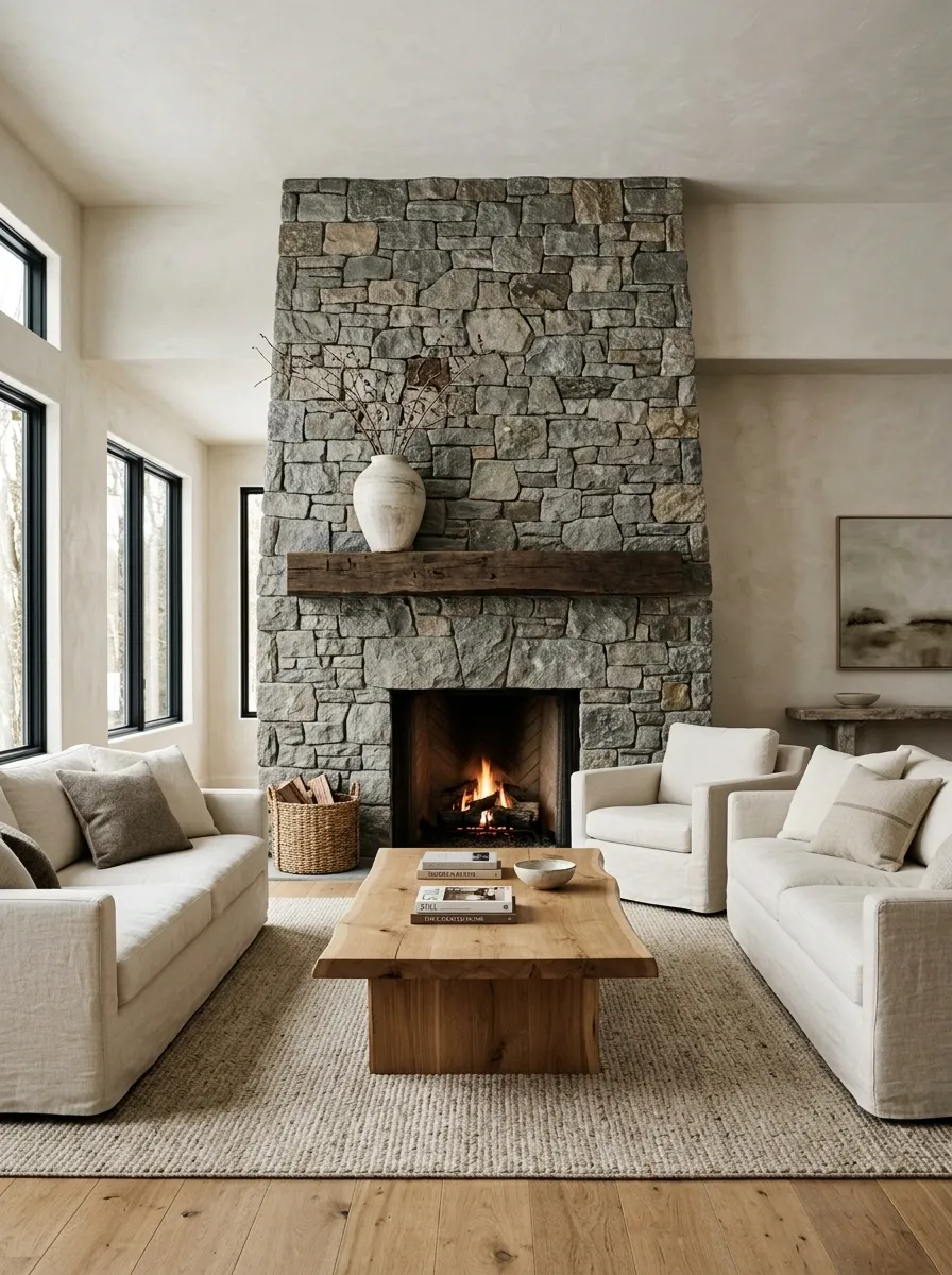
A substantial stone fireplace provides the architecture in this living room, so the furniture can stay quiet. Low linen seating surrounds a broad wood coffee table, while warm plaster walls, woven textures, and a restrained rug soften the roughness of the stone. The fireplace remains the visual anchor from nearly every angle.
The balance comes from pairing hard and soft surfaces rather than adding more decoration. Stone feels weighty. Linen feels relaxed. Wood bridges the two and keeps the composition from leaning too cold or too polished.
This look works best when the stone has room around it. Covering the mantel with twenty objects would defeat the whole point. The fireplace already understood the assignment.
Wood connects.
Linen softens.
Minimalist Cozy Sunroom With Rattan, Linen, and Natural Light
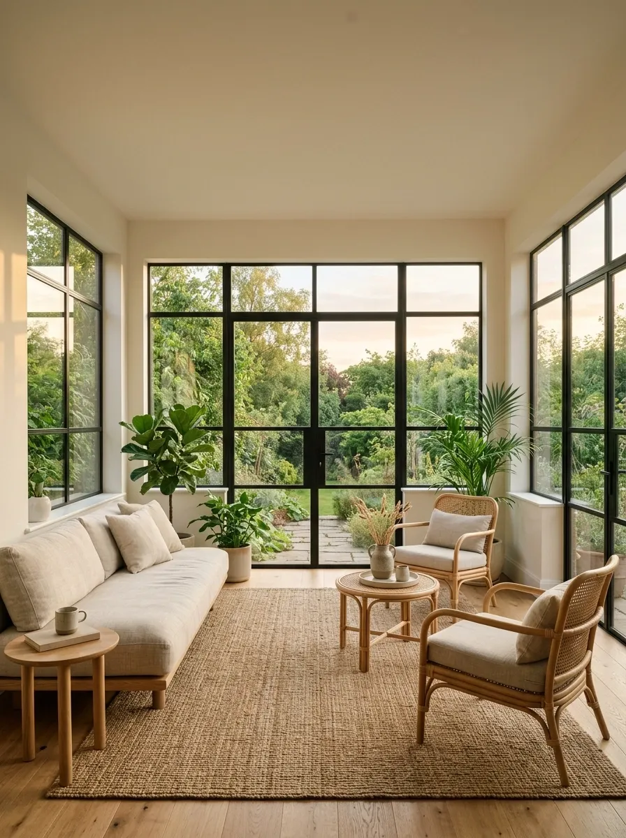
This sunroom is built around the windows rather than against them. Pale linen upholstery, restrained rattan seating, natural wood, and a soft woven rug create a comfortable arrangement that leaves the brightest part of the room visually open. A few plants sit where they make sense, rather than forming an accidental indoor jungle along every windowsill.
The furniture has enough texture to look interesting in strong daylight, while the neutral palette keeps the views outside part of the composition. Nothing tall blocks the natural light or interrupts the sightline.
That is the whole strategy: let the windows remain a feature. There is no prize for covering the best part of the room with furniture.
Soft Transitional Bedroom With Taupe Walls and Traditional Wood Furniture
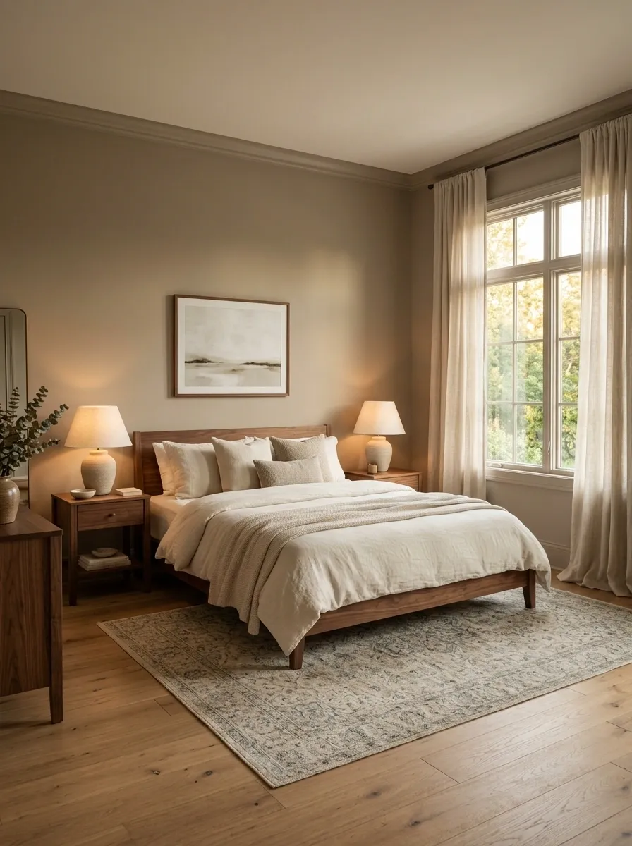
Traditional furniture and minimal styling make a surprisingly good pair. This bedroom uses warm taupe walls as a soft backdrop for a walnut bed, simple matching nightstands, classic table lamps, and relaxed linen bedding. A restrained rug adds pattern without taking over the floor, while long curtains keep the room feeling finished from ceiling to floor.
The furniture has enough shape and detail to give the room character, so the accessories can stay almost nonexistent. That’s what stops the design from sliding into old-fashioned territory.
The secret is editing the traditional pieces. Choose a few with good proportions instead of filling the bedroom with matching furniture until it starts looking like a showroom from another decade.
Minimalist Loft Living Room With Exposed Brick and Soft Neutral Furniture
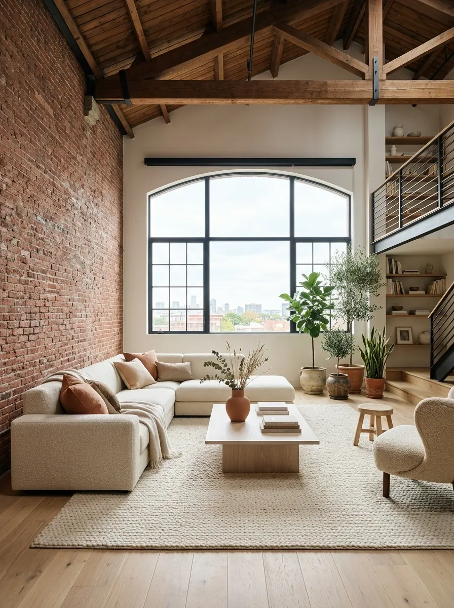
Exposed brick gives this loft plenty of personality before a single decorative object enters the room. Large windows, high ceilings, and the textured brick wall create a strong architectural shell, while cream seating, pale wood, a broad wool rug, and simple lighting bring softness into the space.
The furniture stays low enough to preserve the loft’s height. A large sectional defines the main seating zone without chopping the room into separate little areas, while a few warm textiles stop the brick from feeling industrial and severe.
This design works because the architecture is allowed to remain visible. Covering the brick with artwork, shelves, baskets, and twenty-seven tiny objects would be like putting sunglasses on a lamp and asking why the lighting feels weird.
Tiny Bedroom With Wall-Mounted Furniture and Layered Cream Textiles
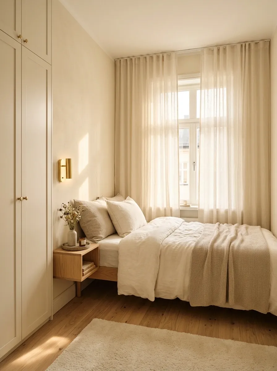
This tiny bedroom uses vertical space to protect the floor. A compact bed sits against a warm neutral wall, with a wall-mounted bedside shelf replacing a bulky nightstand. A tall closed wardrobe takes storage upward, while vertical wall lighting frees the bedside area even further.
Layered cream bedding, a soft rug, and full-length curtains keep the room warm despite its limited footprint. Nothing is oversized, but nothing looks miniature either. The furniture has enough scale to feel intentional.
The biggest win is the floor. With fewer pieces touching it, the room feels noticeably less crowded. Small bedrooms don’t need ten clever organizers stacked everywhere. Sometimes the clever move is simply refusing to put furniture where it doesn’t need to be.
Warm Minimalist Patio With Teak Furniture and Soft Neutral Textiles
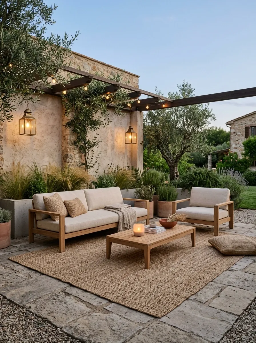
A compact patio can feel like a proper outdoor room without being covered in furniture. This design centers a teak seating arrangement around a low coffee table, with neutral outdoor cushions, a textured rug, warm lantern-style lighting, and a small amount of restrained planting around the edges.
The wood provides enough visual warmth that the textiles can stay pale. The rug visually gathers the seating together, while the surrounding edges remain open enough for movement and maintenance.
The plants are supporting players here, not the entire cast. Keeping them around the perimeter leaves the main seating area usable and makes the patio feel larger.
Outdoor minimalism is especially satisfying because it prevents the classic patio situation where three chairs, six pots, two stools, and one mysterious side table are all competing for the same square meter.
kept to the edges
keeps movement clear
Collected Minimalist Home With Warm Neutrals, Vintage Pieces, and Modern Lines
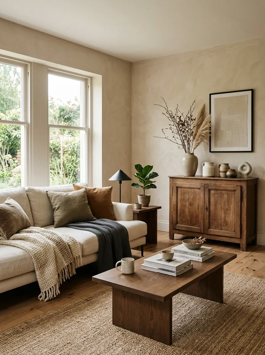
This final concept loosens the rules without abandoning them. A low modern sofa sits beside a vintage wooden cabinet, a simple contemporary coffee table, woven textiles, and a few carefully chosen objects. Warm plaster walls and natural wood keep the palette cohesive, while one or two older pieces introduce irregularity that makes the room feel personal.
This is minimalism with fingerprints on it. The modern pieces provide a clean framework, while the vintage furniture stops everything from looking like it was ordered during the same twenty-minute shopping session.
The balance comes from limiting the number of statement pieces. A vintage cabinet has more impact when it gets to be the interesting thing in the room. Add four more “interesting” things and suddenly nobody is interesting anymore.