
A room can have great furniture, good lighting, and a decent color palette and still look oddly unfinished. The walls are often the problem. They sit there doing absolutely nothing while the rest of the room is trying to look intentional.
Modern wainscoting changes that by giving the walls structure, rhythm, and a stronger relationship with the furniture and architecture around them. But paneling isn’t automatically a good idea just because it is installed correctly. The wrong height can make a ceiling feel lower. The wrong spacing can make a narrow wall look chopped up. A style that works beautifully in a dining room can look completely out of place in a small bedroom.
That is why the ideas below focus on complete rooms rather than isolated molding tricks. Each design shows a finished visual direction, including the wall treatment, furniture, materials, colors, lighting, and surrounding architecture. The goal is simple: find a room that feels worth saving, not another checklist telling you to buy trim and hope for the best.
Modern Wainscoting Ideas
Classic Taupe French Molding
This sophisticated taupe wall treatment takes traditional picture frame molding and gives it a thoroughly current update. The layered recessed panels create incredible depth, while integrated vertical sconces wash the muted surface in a warm, flattering glow.
A pale wood floor and a sleek potted plant keep the corner feeling grounded and organic. The restraint in the decor ensures the detailed geometry of the wall remains the undisputed star of the space.
The real genius here is the monochromatic approach. By painting the molding the exact same soft taupe as the wall, the room achieves rich architectural interest without an ounce of visual clutter. Sometimes the best way to make a statement is to let the architecture speak in a quiet voice.
Warm Oak Wainscoting With Soft Plaster Living Room
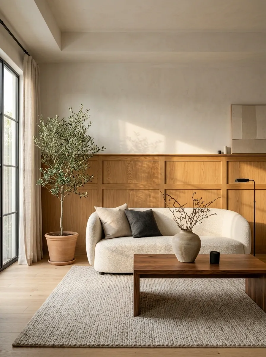
Warm oak paneling gives this living room its architectural backbone, while the soft plaster wall above keeps the composition relaxed. The lower wall uses simple vertical panels rather than ornate molding, which makes the wood feel current instead of farmhouse-coded.
A low cream sofa, textured rug, walnut accents, and small touches of black keep the room grounded. Natural light moves easily across the oak, bringing out its grain without making the wall feel visually heavy.
The smartest part is the restraint. The upper wall stays quiet, so the wood has room to register as architecture. Add five more competing feature walls and the whole room starts looking like it lost an argument with a showroom.
Tailored Taupe Dining Backdrop
A sophisticated taupe dining room comes alive through the clever use of dual-zone wall paneling. The upper and lower framed sections wrap the room in subtle architectural structure, while warm globes and slender sconces add a soft, layered glow.
A contemporary marble dining table paired with elegantly curved upholstered chairs keeps the sophisticated mood intact. The neutral palette allows the fine details of the millwork to take center stage without overwhelming the dinner party conversation.
The design succeeds because every element has a distinct role to play. The taupe paneling creates an enveloping frame, the modern lighting introduces warmth, and the streamlined furniture keeps the perimeter breathable. Balance is everything when working with classic wall details.
Deep Charcoal Paneling in a Dramatic Dining Room
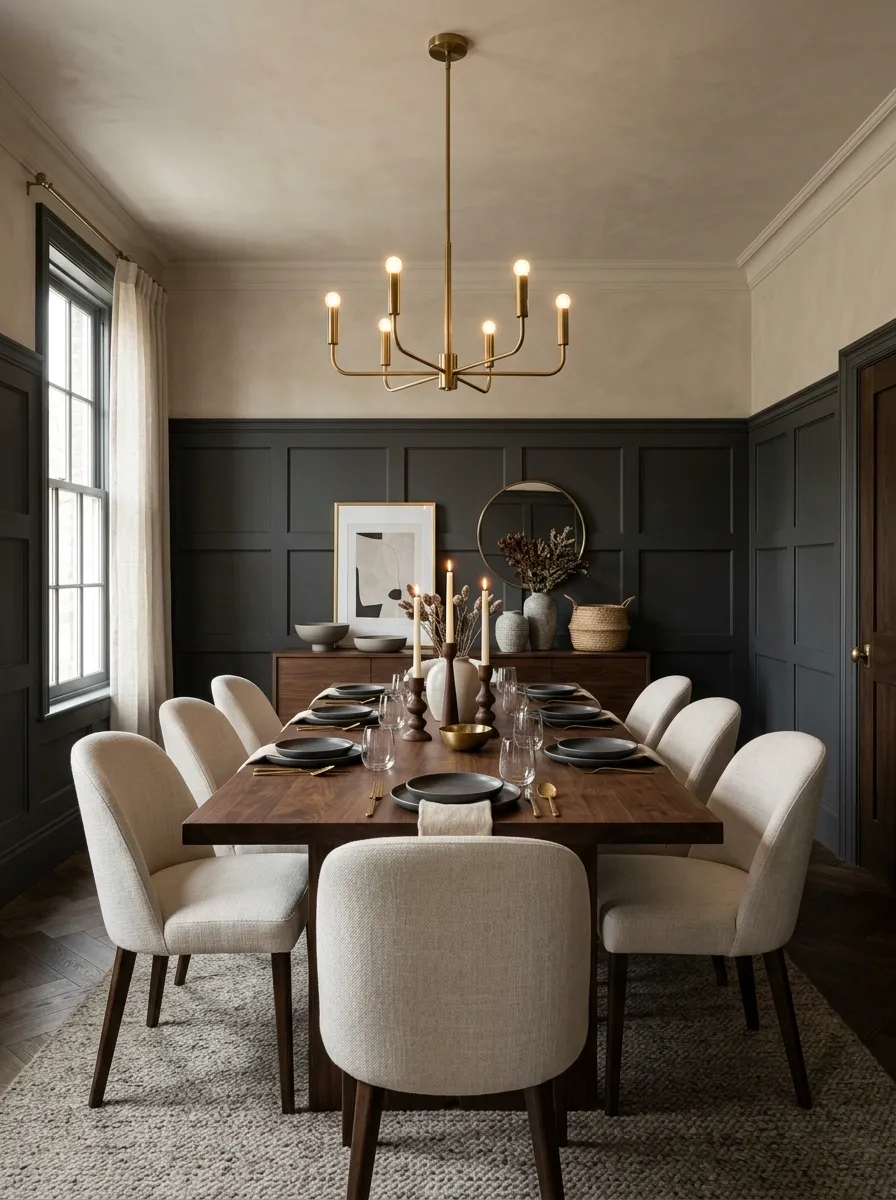
This dining room takes the opposite route and lets the wall carry real visual weight. Deep charcoal rectangular panels wrap the room, while the ceiling and upper surfaces stay warm and light enough to prevent the space from closing in.
A dark wood dining table continues the depth of the wall, but upholstered chairs in a softer neutral create separation. Aged brass lighting adds warmth without turning the room into a brass showroom.
The contrast works because the finishes have different jobs. Charcoal creates the architectural frame, wood adds depth, and lighter upholstery gives the eye somewhere to rest. The trick is keeping the upper wall quiet. Once every surface gets a dramatic finish, dramatic stops being dramatic.
Moody Black Paneled Hallway
This striking hallway proves that dark wainscoting can completely transform a modest transition space. Deep black rectangular panels anchor the lower half of the wall, while crisp framed artwork adds a gallery-like polish to the moody backdrop.
A minimalist white vase filled with textured branches brings an organic touch that softens the stark color contrast. The pale hardwood flooring bounces light back up, keeping the dark perimeter from feeling heavy or enclosed.
The magic lies in the high-contrast pairing of dark walls and bright framed art. By keeping the artwork light against the dark panels, the space achieves instant depth and sophistication. It turns an ordinary hallway into a proper architectural moment.
Slim White Box Molding in a Layered Bedroom
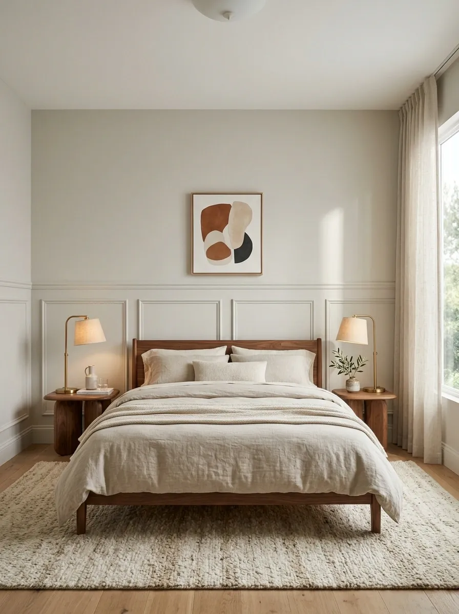
White box molding can look surprisingly modern when the geometry is shallow and the rest of the bedroom does the heavy lifting. Here, the lower wall uses clean recessed rectangles against a pale greige backdrop, creating structure without shouting for attention.
A low walnut bed, linen bedding, softly shaped bedside tables, and warm lamps introduce enough contrast to keep the white paneling from blending into the background. The artwork is simple, and the textiles carry much of the room’s softness.
The important relationship is between crisp wall geometry and relaxed materials. That contrast keeps the bedroom from feeling too formal. The paneling provides order, while the bedding and wood stop the room from becoming a giant rectangle convention.
Muted Mural and Classic Wainscoting
This breathtaking hallway pairs traditional white wainscoting with an expansive, painterly landscape mural. The crisp lower panels provide a structured foundation, allowing the dreamy, muted colors of the upper wall art to take center stage.
A warm wooden console table and a geometric black-and-white tiled runner introduce sharp graphic interest to the floor plane. The rich hardwood flooring ties the entire vignette together with classic warmth.
The brilliance of this space is the dialogue between classic millwork and artistic expression. The wainscoting acts as a quiet anchor, giving the dramatic wall mural the room it needs to breathe. It is proof that mixing traditional architecture with artistic flair always pays off.
Sage Green Paneled Dining
A soothing sage green wainscoting instantly elevates this dining room, wrapping the lower walls and trim in a calming, sophisticated hue. The crisp white upper walls and matching crown molding create a refreshing contrast that keeps the space feeling bright and airy.
A statement chandelier draped with delicate beads hangs overhead, adding a touch of romance to the balanced room. Striped upholstered chairs and a minimalist floral centerpiece complete the refined, welcoming scene.
The triumph of this design is the harmonious color blocking. Sage green grounds the lower zone, white opens up the upper zone, and the soft textures bridge the two effortlessly. It is a masterclass in using color with absolute intention and restraint.
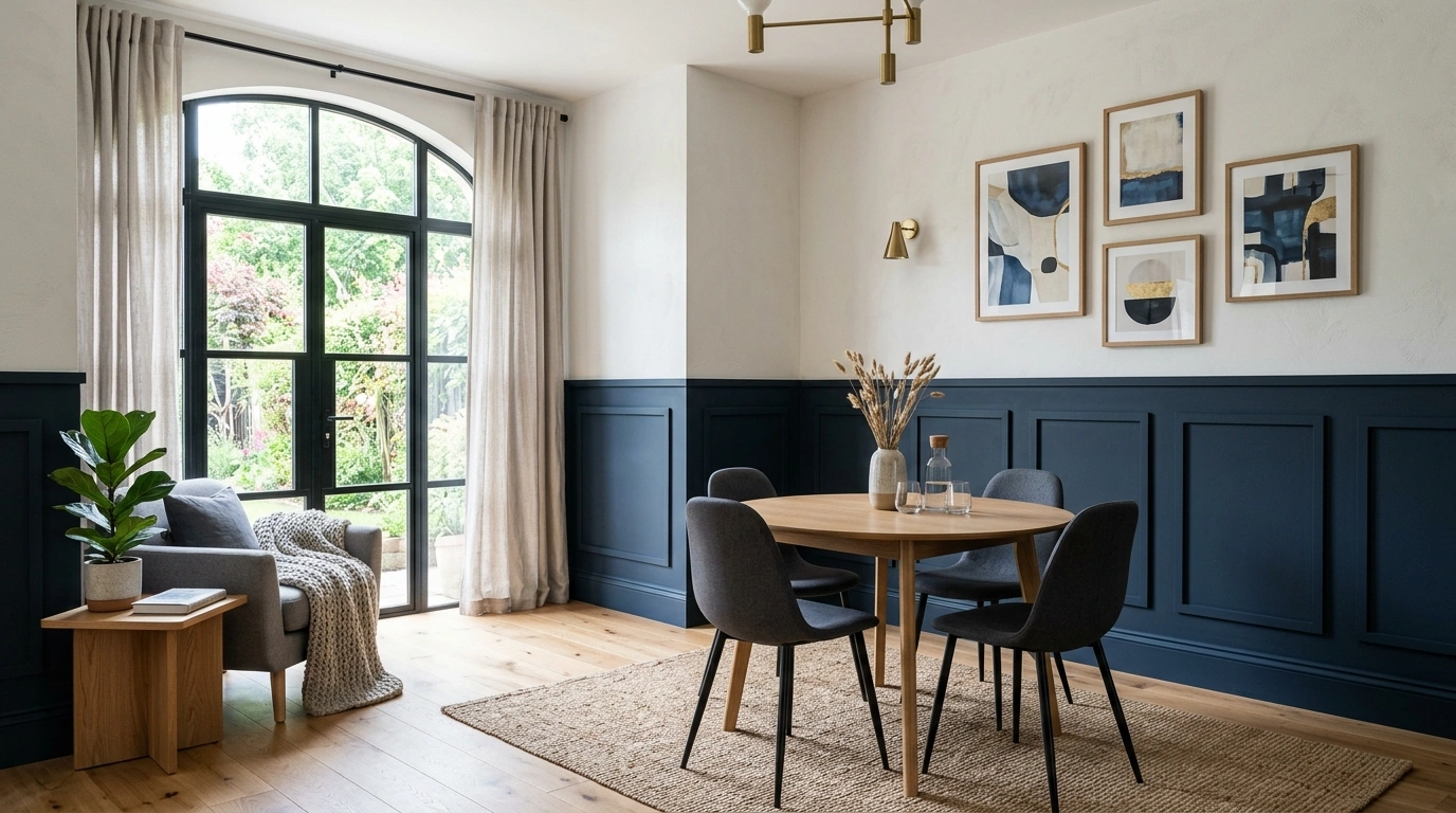
Soft Navy Lower Wall With Warm White Upper Wall
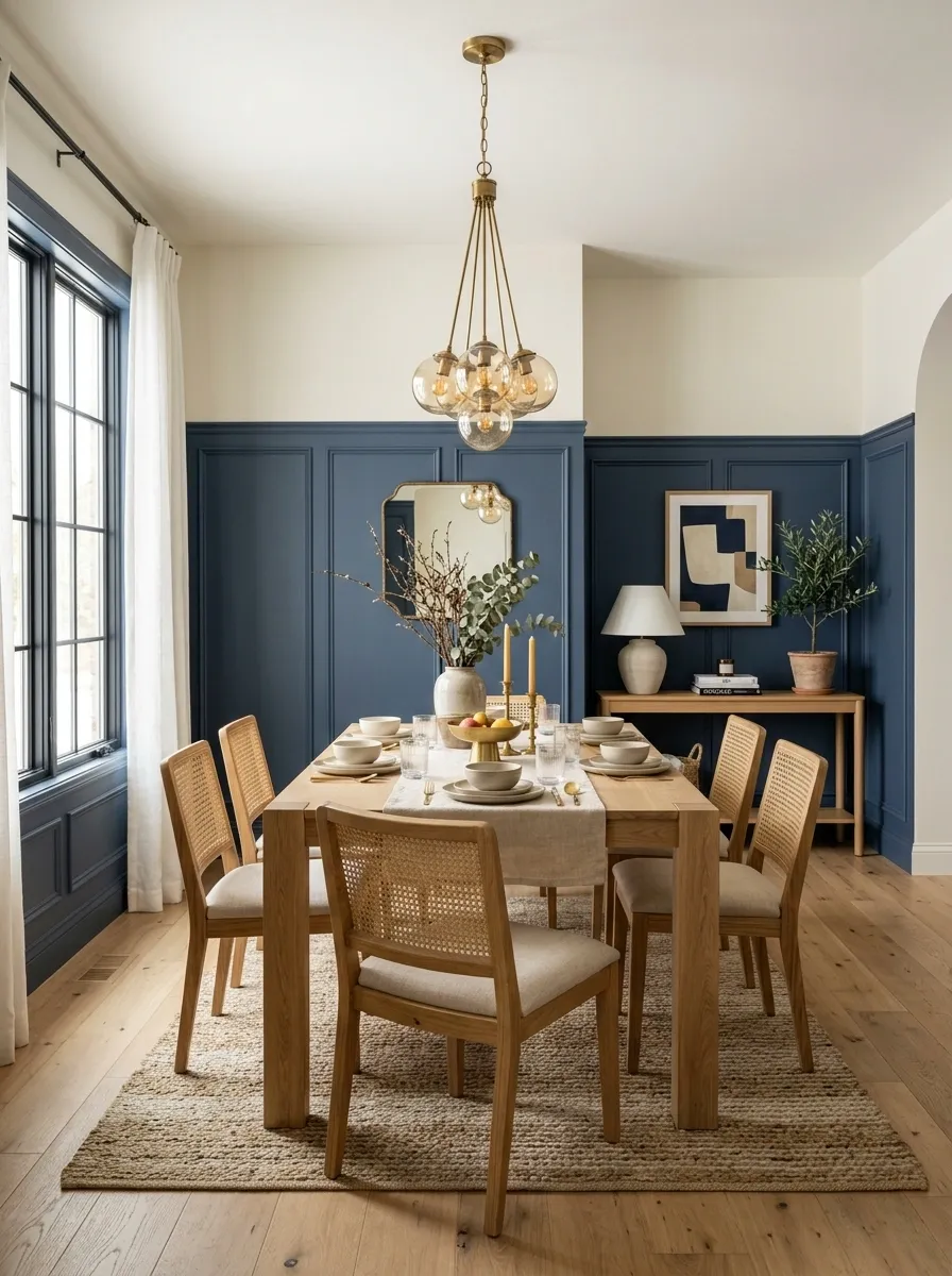
A muted navy lower wall gives this dining room a strong visual foundation without making the entire space dark. The paneling sits comfortably below warm white upper walls, creating a clean break that feels classic in structure but modern in color.
Light oak furniture keeps the navy from becoming too formal, while woven dining chairs soften the transition between the painted wall and the wood. Aged brass lighting adds just enough warmth to make the cooler blue feel intentional.
The success of this room comes from contrast with boundaries. Navy gets the lower zone, white gets the upper zone, and oak connects the two. That clear hierarchy is why the color feels sophisticated instead of random. There is a difference between using a color and letting a color run the meeting.
White Paneling With a Crisp Black Architectural Line
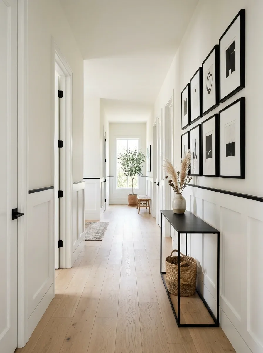
This hallway gets its character from an unusually simple contrast. Clean white recessed-panel wainscoting covers the lower wall, while a slim black line marks the transition to the warm white wall above. Black-framed artwork and pale oak flooring repeat the same visual language farther down the space.
The result feels architectural rather than decorative because the dark line has a clear job. It connects the doors, artwork, and lighting without adding another competing color. The furniture stays minimal, which is probably for the best. The wall already has opinions.
The strongest detail is the alignment. When the transition line relates to nearby door trim and furniture heights, the paneling feels built into the architecture instead of stuck onto it.
Olive Green Wainscoting in a Moody Home Office
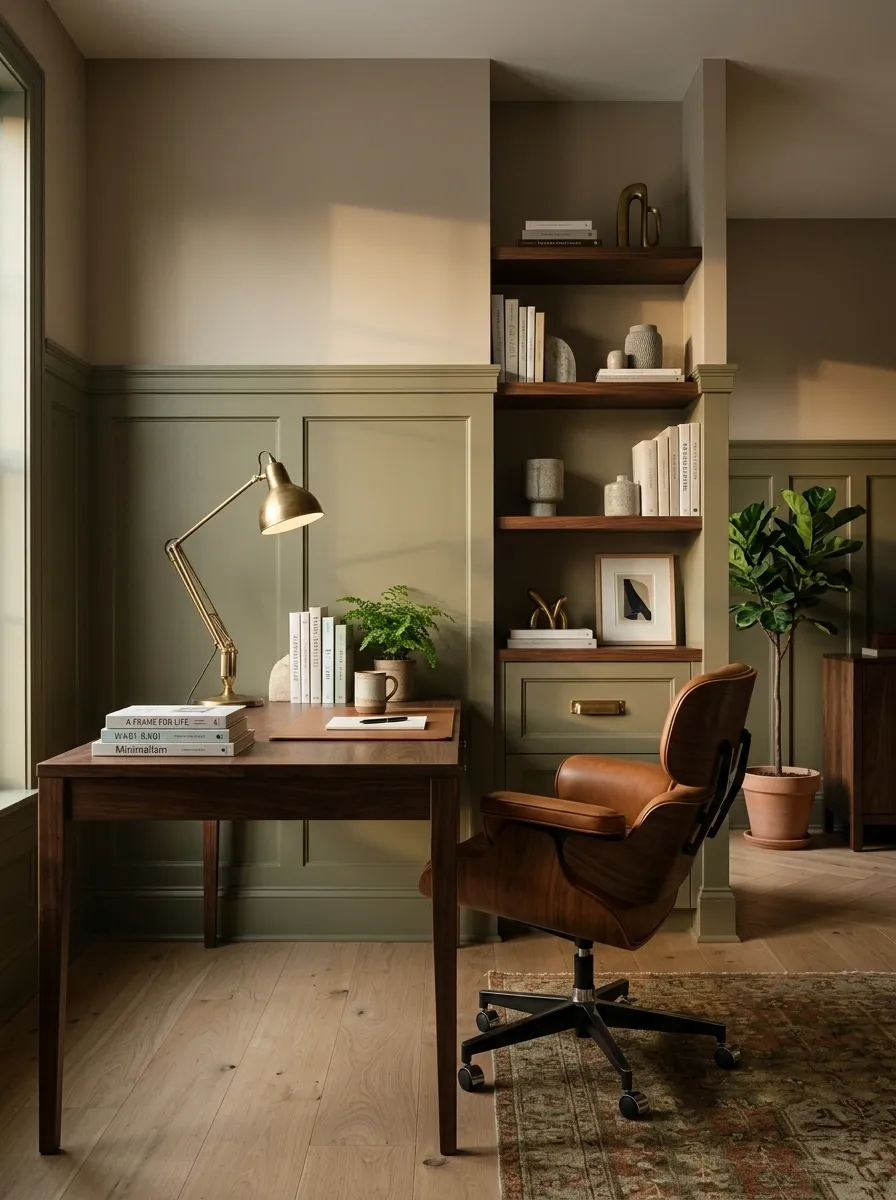
Muted olive paneling gives this office a grounded, library-like feeling without pushing it into traditional territory. The lower walls are painted in one continuous deep olive tone, while the upper walls shift to a warm mushroom neutral.
A dark walnut desk sits against the paneling, joined by a leather chair, aged brass task lamp, and open shelving filled with a deliberately small collection of books and objects. Nothing is fighting the wall for attention.
That restraint matters in a compact office. The deeper lower wall creates a visual base, while the lighter upper section keeps the ceiling from feeling lower. The palette also lets the wood and leather look richer without needing a pile of decorative nonsense.
Clay-Toned Wainscoting With Natural Oak Bedroom Furniture
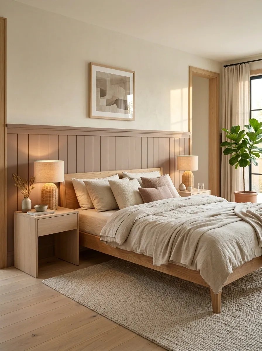
Dusty clay gives this bedroom a warmer personality than the usual white or greige paneling, but the color stays muted enough for the room to remain calm. Vertical panels occupy the lower wall, while the upper portion shifts into a creamy neutral.
Pale oak furniture, oatmeal bedding, woven lamps, and a soft rug create a deliberately earthy material mix. There is very little hard contrast, which makes the paneling feel more like part of the room’s envelope than a separate feature.
The combination works because the clay and oak have related warmth but different textures. One is matte and painted, the other is natural and grained. That little bit of material contrast gives the wall enough interest without turning the bedroom into a color experiment gone rogue.
Arched Wainscoting Around a Modern Bed
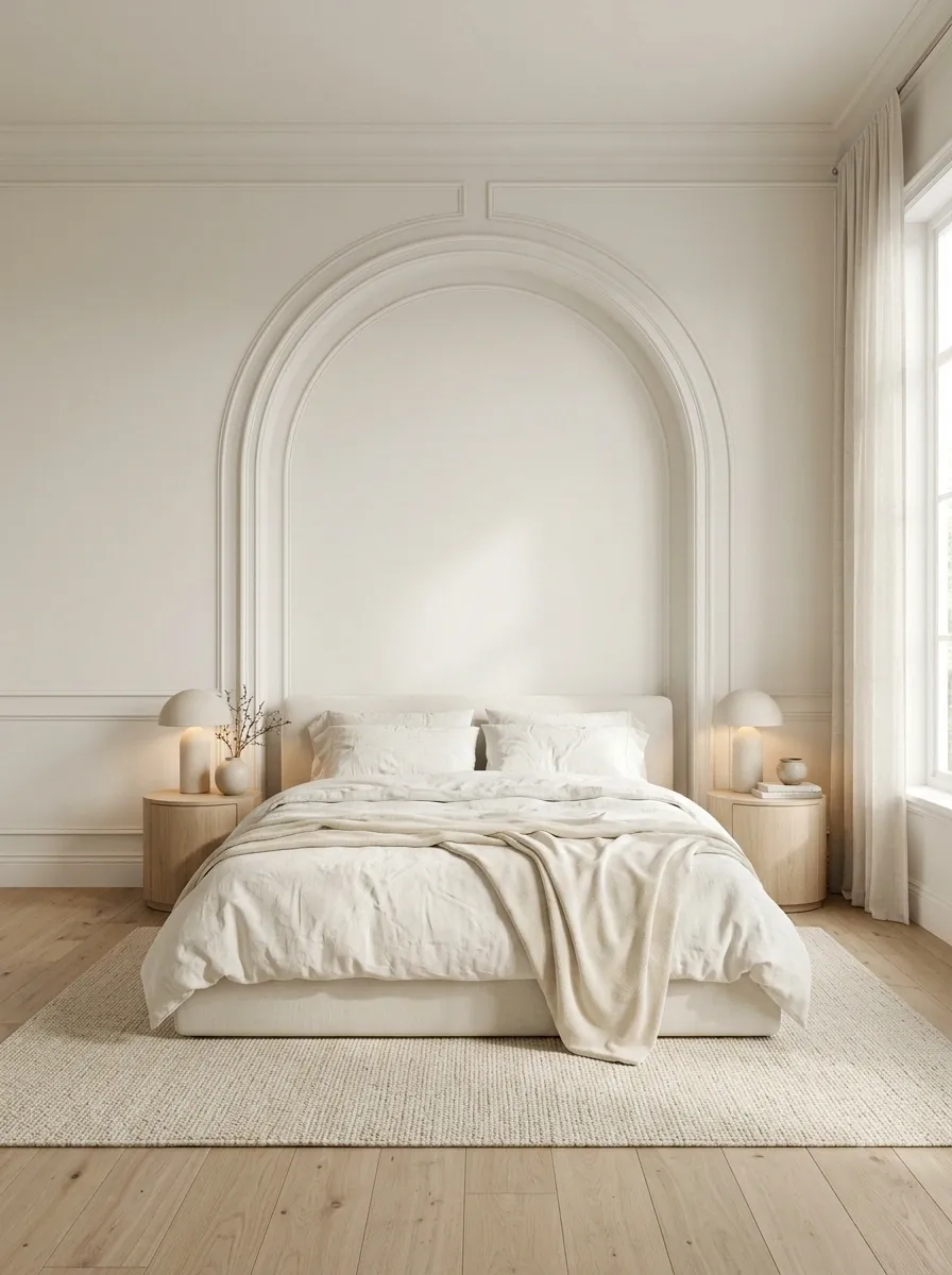
Instead of covering the entire room with repeating rectangles, this bedroom uses one oversized architectural gesture. A broad arch is built into the paneled wall directly behind the bed, creating a framed backdrop that gives the sleeping area its own identity.
The rest of the room stays restrained. A low upholstered bed, rounded bedside tables, plaster lamps, warm white walls, and pale oak flooring echo the arch without copying it everywhere. That repetition is just enough to make the curve feel intentional.
The negative space matters as much as the molding. The arch has room around it, so it reads as an architectural feature rather than another shape competing with the furniture. One strong curve can do more than twenty tiny decorative ones.
Modern Board-and-Batten Stair Landing
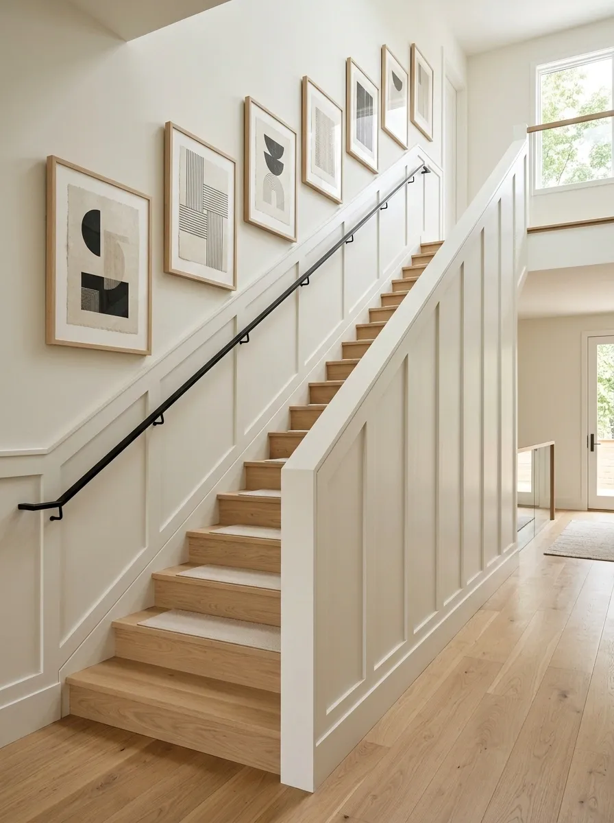
This staircase treatment follows the architecture instead of pretending the stair wall is a separate decorating project. Simple vertical battens continue along the landing and rise with the staircase, creating a consistent rhythm from the lower floor to the upper level.
Pale oak treads, a slim black handrail, warm white walls, and a handful of oversized framed prints keep the setting bright. The wall treatment adds enough structure to make the stair feel finished without competing with the railing.
The key is continuity. The battens visually travel with the staircase, so the treatment feels connected to the building itself. A random panel height would break that effect immediately. Staircases already have enough geometry to manage without adding another argument.
Geometric Panel Grid Around a Fireplace
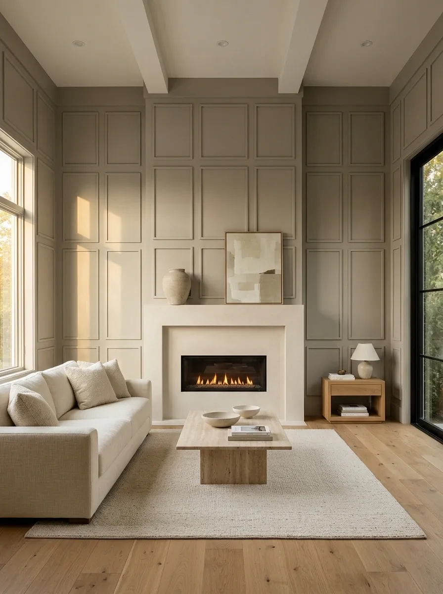
A fireplace gives wainscoting an obvious architectural partner, and this living room takes full advantage of it. A structured grid of rectangular panels spreads across the fireplace wall and continues onto the adjoining surfaces, creating one large architectural framework instead of a collection of disconnected details.
The fireplace itself stays relatively quiet in pale plaster, while a long low sofa, travertine coffee table, warm wood, and minimal artwork add softer shapes in front of the geometry. The contrast makes the wall feel deliberate without making the room overly formal.
The panel grid works because it responds to the fireplace rather than ignoring it. The center has a clear anchor, the side sections support it, and the furniture sits comfortably in front. A wall with this much geometry doesn’t need twelve decorative objects screaming for attention.
panel field
anchor
panel field
Modern Vertical Paneling Around a Breakfast Nook
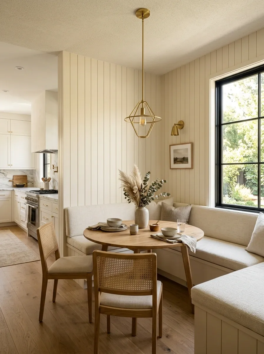
This breakfast nook uses the wall treatment to make a small everyday space feel like a real architectural zone. Vertical painted paneling wraps the wall around an L-shaped built-in banquette, while a compact round oak table fills the center without blocking movement.
Warm cabinetry nearby keeps the palette connected, and a single pendant hangs directly over the table. Linen cushions add softness without covering up too much of the paneling, which is important because the wall is doing much of the visual framing.
The design is especially useful in open kitchens where a breakfast area can otherwise look like someone just pushed a table into an empty corner. The paneling gives the nook boundaries without adding a wall. Tiny space, clear purpose, very little drama.
Narrow Vertical Wainscoting in a Powder Room
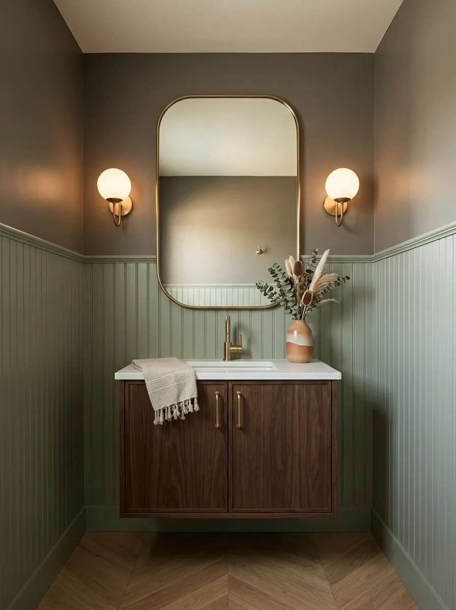
A small powder room can handle a stronger wall treatment because the entire room is already compact and visually contained. Here, narrow vertical panels wrap the lower walls in a muted painted tone, while a deeper neutral sits above them.
A compact walnut vanity adds warmth, and a large rounded mirror interrupts the repeated vertical lines. Warm wall lighting gives the surfaces enough depth for the panel rhythm to remain visible without making the room feel enclosed.
The narrower panel spacing is what makes this concept distinct. Broad rectangles would feel too heavy at this scale. Fine vertical rhythm gives the walls detail while keeping the room visually taller. Basically, the wall learned to make the most of its tiny footprint.
Asymmetrical Wainscoting in an Open-Plan Living Room
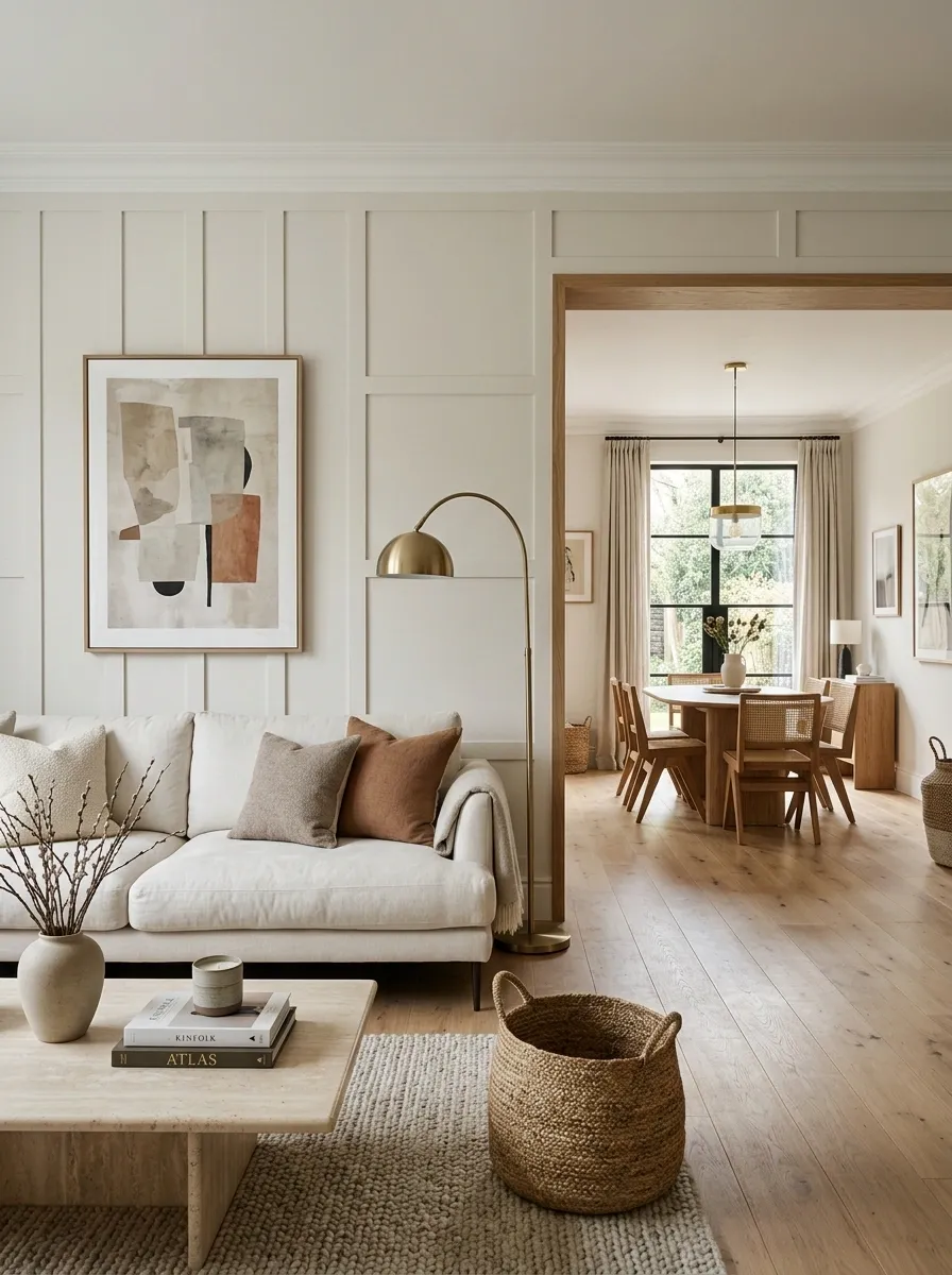
Perfect symmetry isn’t required for a paneled wall to look polished. This open-plan living room uses wainscoting only on the main seating wall, then stops it deliberately at the opening toward the dining zone.
The paneling is slightly offset rather than centered around the entire room, which allows the sofa, oversized artwork, and floor lamp to create their own balance. Warm oak flooring runs continuously through both areas, visually tying the zones together even though the wall treatment changes.
This is a particularly useful approach when one wall needs architectural definition but the entire open-plan room doesn’t. The stopping point becomes part of the design. And yes, stopping before something becomes excessive is still allowed. Instagram has survived worse.
Paneling gives the living area its own architectural identity.
The dining area stays lighter so the two spaces don’t blur together.
Banquette Dining Room With Deep Green Panel Walls
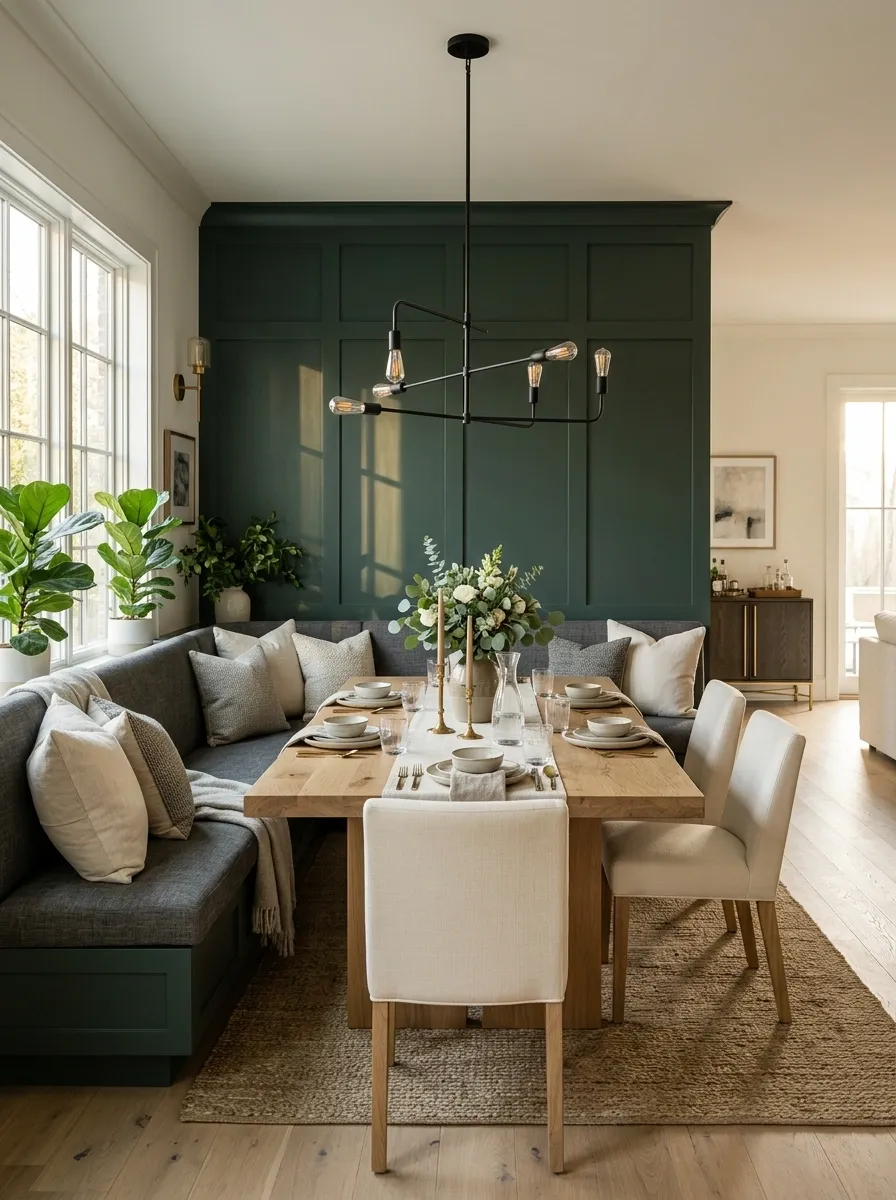
Deep green paneling turns this dining area into a proper destination instead of a table parked against a wall. The wainscoting rises behind a built-in banquette, giving the seating zone a strong architectural backdrop while the rest of the room stays relatively restrained.
A long natural wood table sits in front of the banquette, with cream upholstered chairs on the opposite side. A sculptural pendant hangs low enough to visually connect the ceiling to the table, while linen cushions soften the hard lines of the paneling.
The secret is that the wall and seating behave like one composition. The banquette doesn’t fight the wainscoting for attention, and the table breaks up the darker backdrop. This is what happens when the wall actually knows what the furniture is doing.
Low Wainscoting With a Distinctive Picture Rail
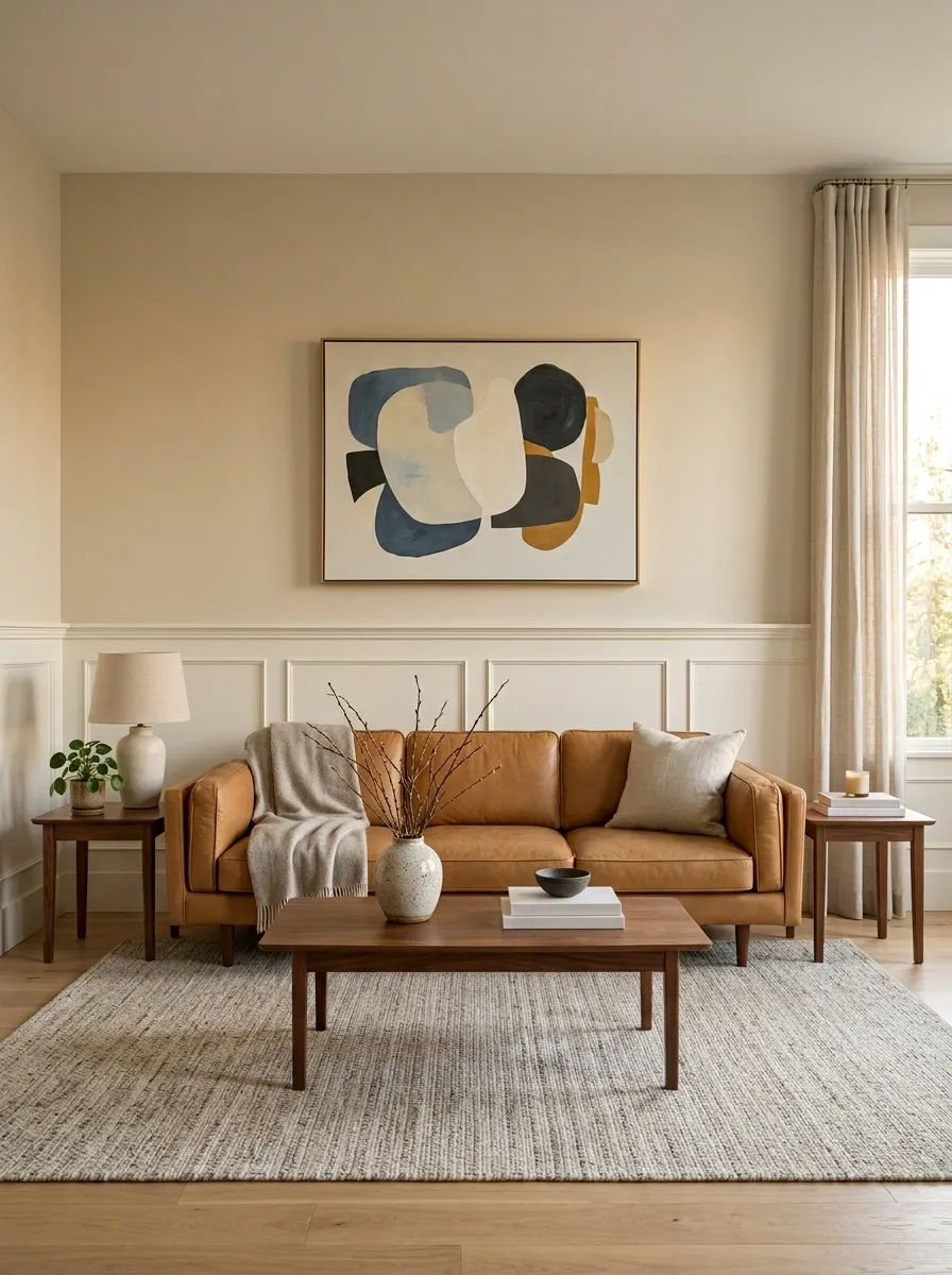
Sometimes the smartest wainscoting is the one that doesn’t climb very far up the wall. This living room keeps the paneling low, then adds a slim picture rail that establishes a strong horizontal transition beneath a warm beige upper wall.
Large framed artwork sits above the rail, while a camel-colored sofa, walnut tables, and a soft rug bring warmth into the room. Because the paneling stays low, the upper portion of the wall remains available for larger art and plenty of visual breathing room.
The result feels tailored without becoming formal. The low treatment gives the room structure, while the art becomes part of the architecture instead of looking like something randomly hung after move-in day.
More visual freedom Picture rail
Sharp transition Low paneling
Grounding layer
Micro-Paneling in a Long Hallway
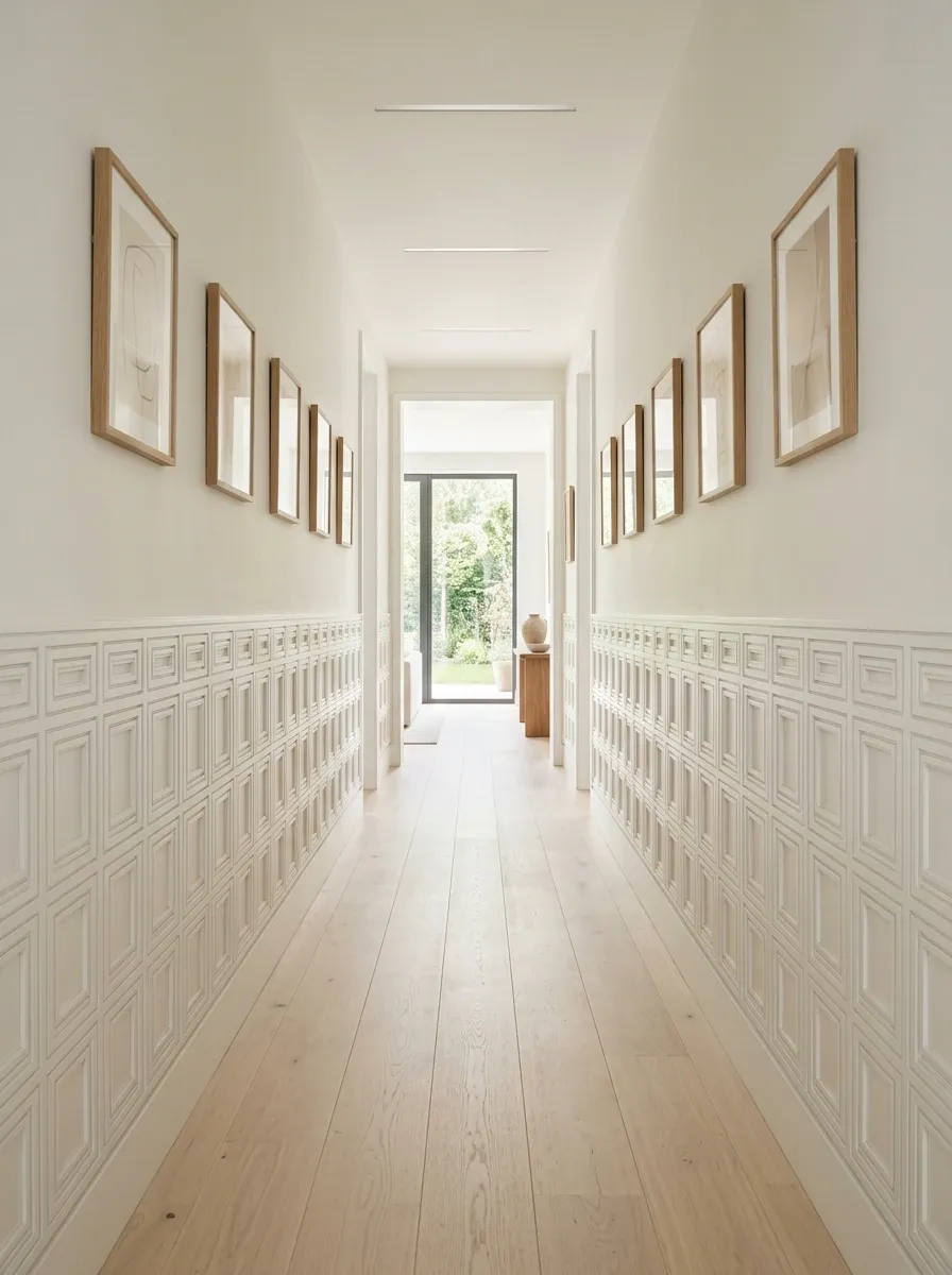
Long hallways can become visually repetitive very quickly, so this design uses small recessed panels to create rhythm without adding bulky architectural elements. The treatment continues along both sides of the corridor, giving the narrow passage a consistent visual language.
Warm white walls, pale oak flooring, simple ceiling lights, and a few carefully chosen framed pieces keep the corridor bright. The panels are small enough to relate to the hallway’s scale rather than making the walls feel divided into oversized sections.
Spacing is doing most of the work here. The repeated pattern creates movement as the eye travels down the hall, but the restrained palette keeps that rhythm from becoming busy. Basically, the hallway finally has something to say besides “here are six identical doors.”
Matte Black Wainscoting in a Modern Study
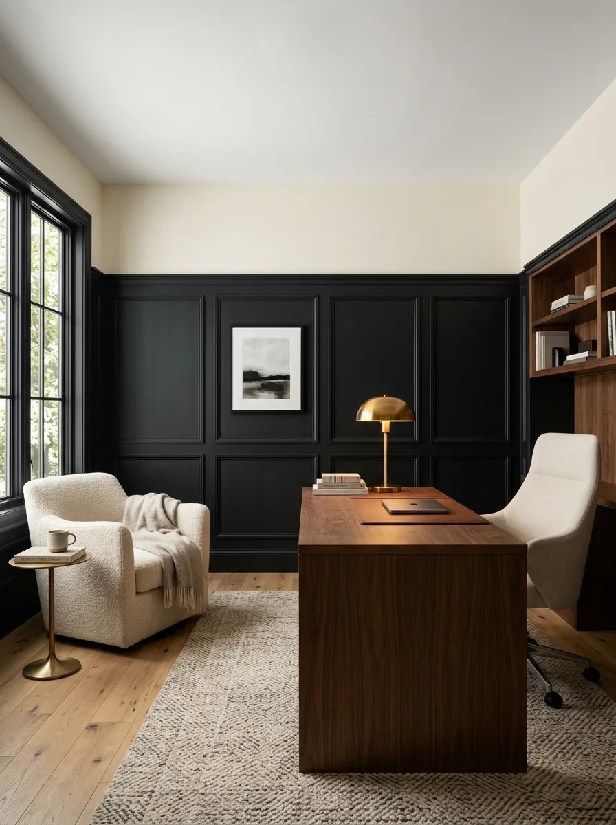
Matte black paneling gives this study a dramatic shell, but the rest of the room deliberately refuses to compete with it. The lower walls are deep and nearly graphic, while the upper walls remain warm ivory.
A walnut desk, cream reading chair, brass library lamp, and softly patterned rug introduce enough variation to stop the room from feeling heavy. The ceiling stays bright, which makes a noticeable difference in a space with a dark lower half.
This composition works through controlled contrast. The black is broad and architectural, while the lighter furnishings break it into usable layers. There is no need for five more “statement” pieces. The wall has already submitted its application.
Dusty Blue Wainscoting With Light Oak Architecture
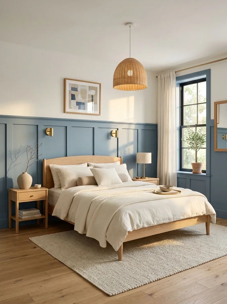
Dusty blue brings color into this bedroom without making the wall feel overly decorative. The lower portion uses clean recessed panels, while the upper wall remains warm white so the blue has plenty of visual breathing room.
A light oak bed frame, woven pendant, cream bedding, and a pale rug create a softer counterpoint to the painted wall. The furniture is simple, allowing the combination of blue, oak, and ivory to carry the room without a collection of matching accessories.
The color feels current because it isn’t trying too hard to announce itself. The paneling provides the structure, dusty blue provides the mood, and oak keeps the composition warm. No anchor art required. No seventeen matching cushions required either.
Olive Paneling With a Walnut Bed Wall
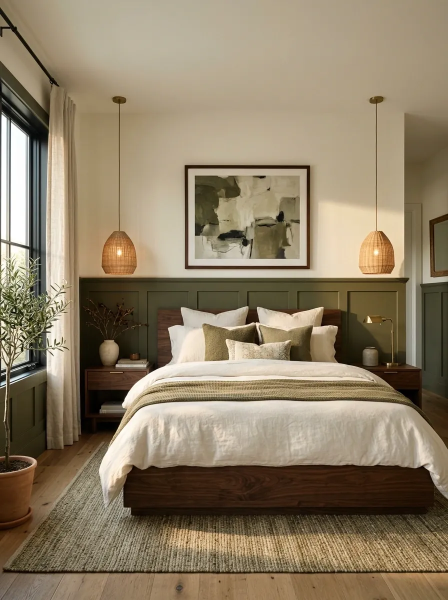
This bedroom uses olive wainscoting as the room’s continuous architectural layer, wrapping the lower walls in a deep muted green while the bed introduces a warmer, darker wood presence. The result feels grounded without becoming overly traditional.
A walnut bed, woven pendant lights, cream bedding, and muted artwork create several levels of texture against the painted paneling. The furniture has enough weight to belong in the room, but the pale bedding keeps the dark colors from taking over.
The olive and walnut combination works because both are rich, but they aren’t competing in the same way. One belongs to the architecture, the other to the furniture. That’s the distinction that keeps the room sophisticated instead of looking like every surface joined the dark side.
Belongs to the room’s architecture.
Belongs to the furniture layer.
Pale Blush Wainscoting in a Sophisticated Contemporary Bedroom
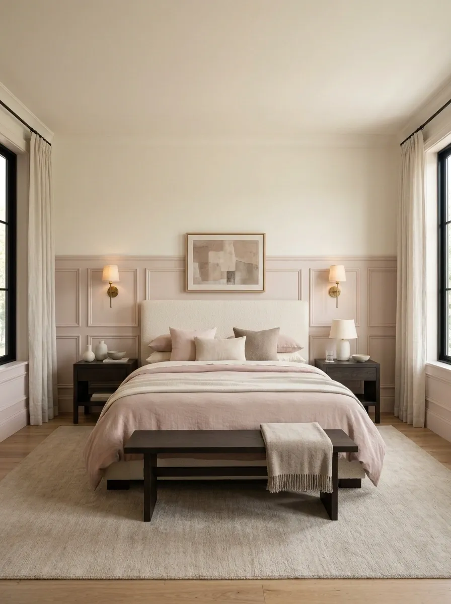
Dusty blush paneling gives this bedroom a subtle color story without pushing the room into sugary territory. The lower walls carry the muted pink tone, while the upper walls remain warm ivory and let the color settle into the background.
A cream upholstered bed, dark wood bedside tables, aged brass lighting, and restrained artwork add structure and contrast. The furniture is fairly substantial, which keeps the soft wall color from making the room feel overly delicate.
The trick is the saturation. A dusty, quiet pink behaves almost like a neutral when surrounded by warmer materials. Bright pink would completely change the composition. This is the grown-up version, basically the difference between “soft color” and a bedroom that looks like it was decorated during a sleepover.
Textured Wallpaper Above Simple White Wainscoting
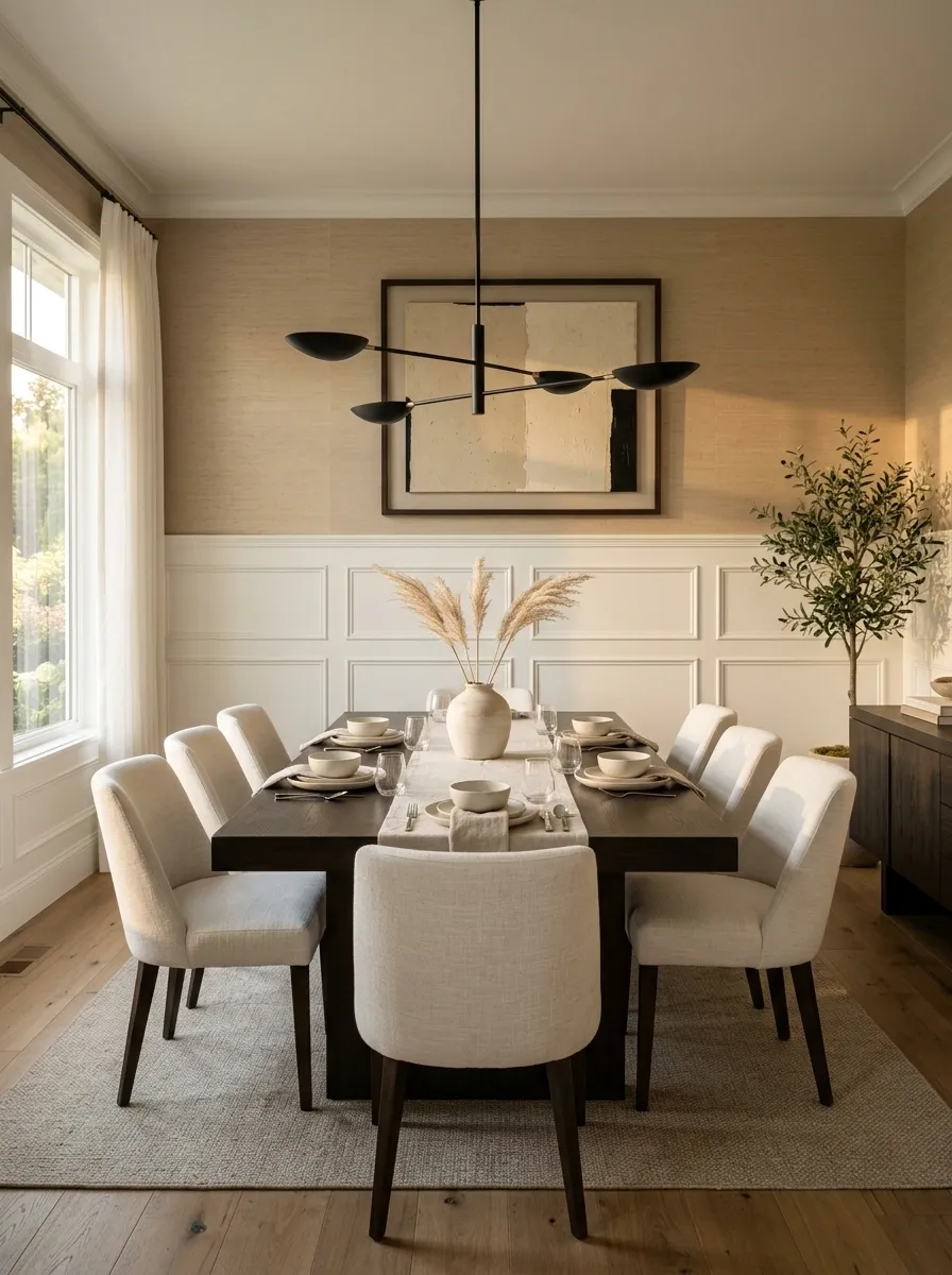
This dining room pairs crisp white recessed paneling with a tactile upper wall, creating contrast through texture rather than a loud paint color. The lower section stays smooth and structured, while the upper wall uses subtle grasscloth-look wallpaper in a warm neutral.
A dark wood dining table anchors the room, upholstered chairs soften the edges, and one sculptural pendant gives the ceiling some visual weight. The artwork is minimal because the wall texture is already contributing plenty.
This combination works especially well when a room needs interest but doesn’t need another strong color. Smooth paneling below and tactile wallpaper above create enough variation on their own. More patterns would probably be where the comment section starts typing.
Curved Wainscoting Around a Rounded Corner
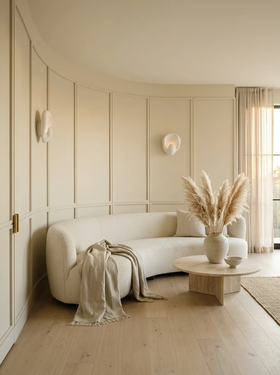
Curved architecture changes the entire language of this sitting area. Instead of forcing straight rectangular panels around a rounded wall, the wainscoting follows the curve with shallow divisions that continue naturally through the corner.
A rounded sofa, circular coffee table, plaster lighting, and pale oak floor reinforce the softened geometry, but none of them copies the curve too literally. The repetition is subtle enough to feel intentional rather than themed.
This treatment is strongest when the architecture already offers something unusual to work with. The paneling follows what exists instead of manufacturing more shapes for the sake of it. One good curve deserves some restraint around it. Otherwise the room starts looking like geometry homework with throw pillows.
Wainscoting Beneath an Open Staircase
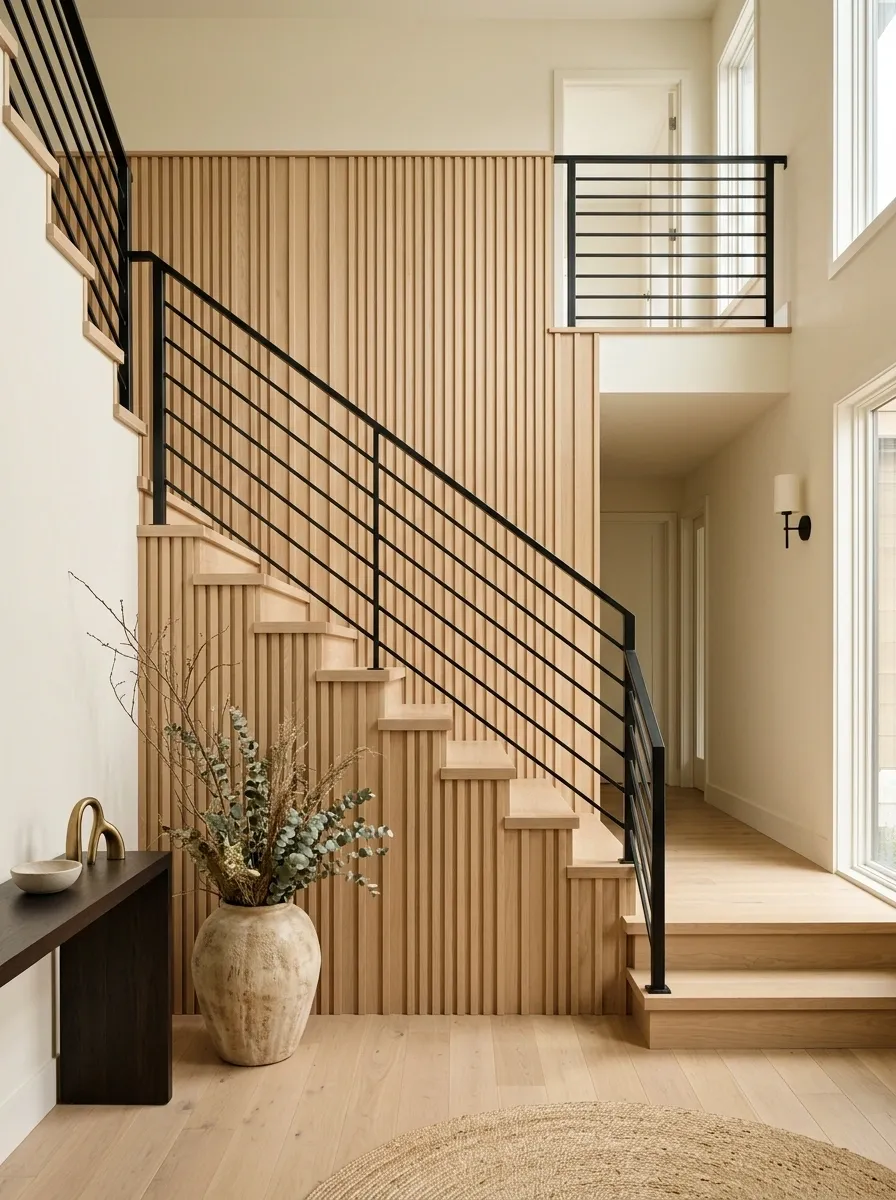
An open staircase already creates a large architectural plane, and this design uses that plane instead of leaving it blank. Simple vertical paneling runs beneath and alongside the stairs, visually linking the lower wall with the staircase above.
Pale oak treads bring warmth, while a slim black railing adds a sharper modern contrast. At floor level, a narrow console and one oversized ceramic planter give the entry enough furniture to feel finished without blocking the wall.
The strongest part is the connection between the stair and the wainscoting. The paneling doesn’t stop abruptly at the staircase. It becomes part of the same vertical composition, making the entire entry feel planned from floor to ceiling. Apparently the wall got the architecture memo.
Soft White Wainscoting in a Modern Nursery
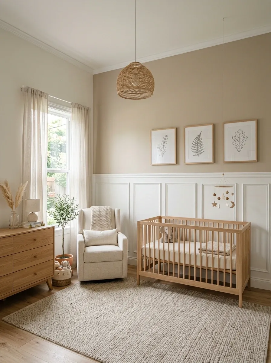
This nursery keeps the architectural treatment simple and lets the room grow around it. Soft white wainscoting covers the lower walls, while a warm beige upper wall creates a gentle contrast without introducing a loud theme.
Light oak furniture, a simple crib, woven lighting, a soft rug, and restrained artwork make the room feel calm and contemporary. The paneling gives the walls enough structure that the rest of the styling can stay intentionally quiet.
That makes the design easier to live with as the room changes. Furniture, artwork, and textiles can evolve while the architectural base stays relevant. The wall isn’t trying to be the cutest thing in the room, which is probably the healthiest relationship any wall can have.
Horizontal Paneling That Makes a Narrow Hall Feel Wider

Instead of emphasizing height, this hallway uses elongated horizontal panels to visually stretch the walls. The lower portion is divided into long, low rectangles, while the upper wall remains warm white and uninterrupted.
Pale flooring continues the light palette, and simple black ceiling fixtures add definition without cluttering the narrow passage. Artwork is kept sparse so the panel geometry remains easy to read.
The proportions are what make this concept work. Shorter, taller panels would pull the eye vertically and make the hallway feel more segmented. These elongated shapes create a calmer side-to-side rhythm. The hallway isn’t technically getting wider, obviously. It just stopped reminding everyone how narrow it is.
Vertical Tongue-and-Groove in a Light Coastal Modern Room
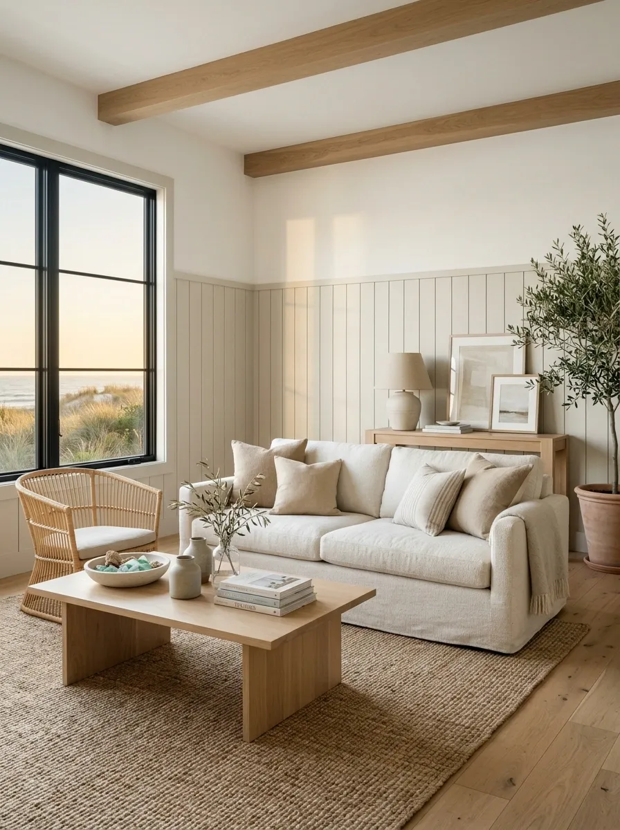
Painted vertical tongue-and-groove gives this sitting room a relaxed coastal character without relying on shells, rope, or anything else that could make the room look like it has a lighthouse membership.
The lower wall uses evenly spaced vertical boards in a soft pale tone, while warm white walls above create a clean transition. Pale oak furniture, linen upholstery, woven accents, and plenty of natural light provide the texture that gives the style its identity.
The important distinction is material rather than theme. Painted wood, natural oak, linen, and woven fibers create a coastal feeling through their surfaces and color relationships. The result feels fresh but still connected to a real home, rather than a vacation-rental mood board.
Gallery-Style White Paneling in a Contemporary Eclectic Room
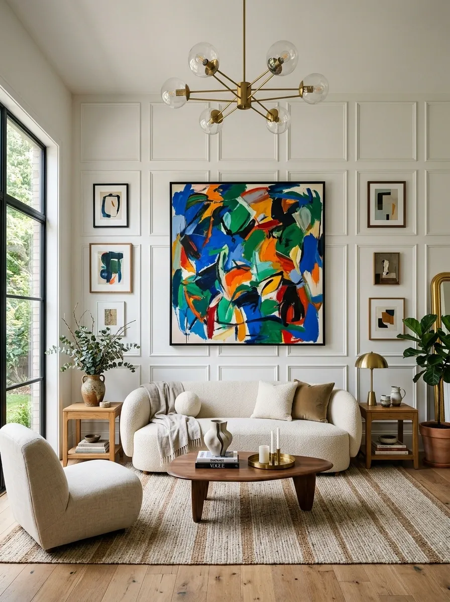
This living room treats the paneled wall almost like a gallery backdrop. White rectangular molding covers the main walls, creating an orderly architectural grid behind oversized abstract artwork, sculptural seating, vintage-inspired tables, and a dramatic light fixture.
The furniture introduces more personality than the wall itself. Curved upholstery softens the geometry, warm wood adds depth, and the artwork brings the strongest color into the composition. The result feels eclectic because the objects aren’t perfectly matched, but the structured wall keeps everything from drifting into visual chaos.
The paneling works here as a quiet framework. It gives the artwork somewhere to live and creates enough repetition to connect unrelated furniture pieces. Basically, the molding is doing crowd control.
Rich Walnut Wainscoting With Travertine and Cream Textiles
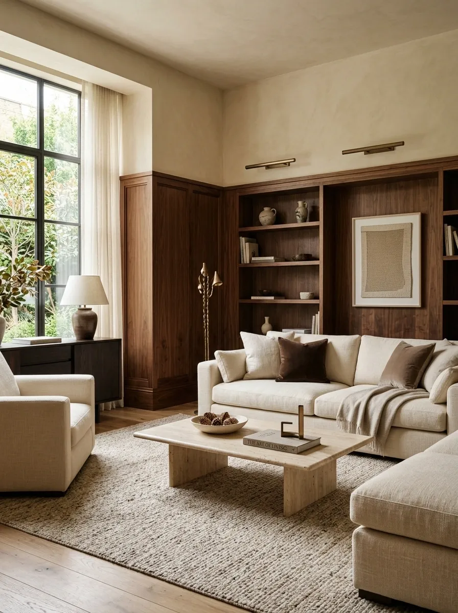
The final room goes all in on material contrast. Rich walnut wainscoting covers the lower walls, bringing deep grain and warmth into a contemporary sitting room with creamy upholstered seating and pale travertine surfaces.
The upper walls use warm plaster rather than another hard material, allowing the walnut to remain the strongest architectural element. A low travertine table, soft cream chairs, restrained bronze lighting, and natural daylight prevent the darker wood from swallowing the room.
This composition works because every major material has a distinct role. Walnut supplies depth, travertine provides visual lightness, plaster softens the background, and cream upholstery gives the eye a larger quiet surface. The room doesn’t need a dozen decorative extras because the materials already brought the personality.
The Part That Actually Matters
Wainscoting looks good when it feels like it belongs to the room from the beginning. The most convincing spaces aren’t simply using attractive molding. They are using the wall treatment to reinforce something else, such as the proportions of the room, the shape of a staircase, the position of a fireplace, the softness of a bedroom, or the geometry of a dining area.
Before choosing a panel profile, look at everything the wall has to live beside. Doors, windows, furniture, artwork, flooring, lighting, and circulation all affect whether the final composition feels calm or crowded.
The easiest mistake is treating the wall as a separate project.
Treat it as part of the room instead, and the entire design becomes much easier to control. Save the rooms that make you stop scrolling, then use those references to decide which proportions, materials, colors, and architectural relationships actually belong in your space.