
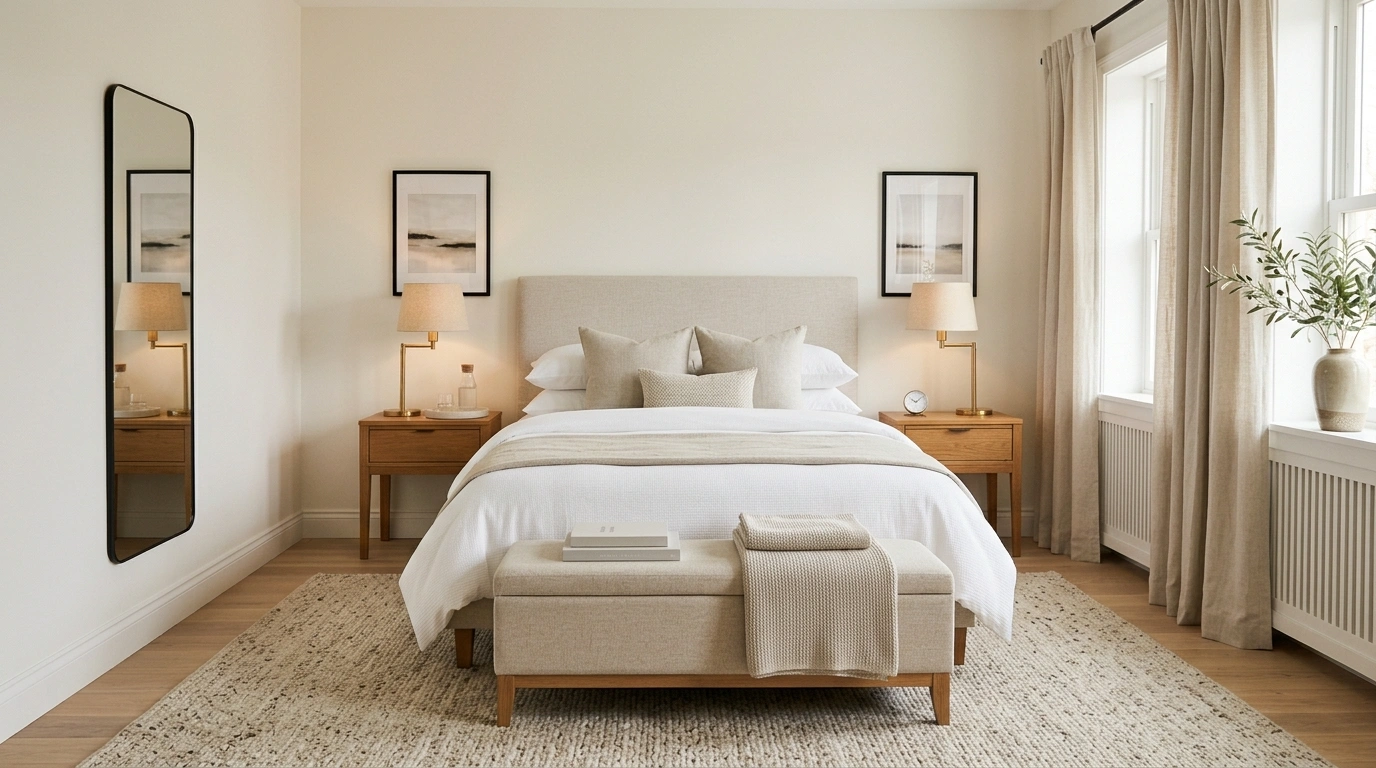
A bedroom can have nice furniture, decent bedding, and still look strangely cheap. Usually, the problem isn’t the price tag. It’s the way everything is arranged.
A bed shoved against the wrong wall, curtains that stop too early, three different wood tones, and a nightstand carrying half the contents of a bathroom can ruin the whole thing.
Hotels understand something most bedrooms don’t: people notice composition before they notice individual objects.
The bed needs presence. Lighting needs layers. Fabrics need depth. Large pieces need enough breathing room around them. Even cheap furniture starts looking more considered when those basics are handled properly.
Before Buying Anything, Pass the Hotel Room Test
Hotels don’t usually win people over with a room stuffed full of decorations. They win with restraint. The bed is clear. The lighting is warm. The surfaces have breathing room. Everything appears to belong together.
Use this quick visual audit before spending a single rupee, dollar, or questionable amount of money on another decorative object.
Hotel-Like Bedroom Ideas
Build a White, Layered Bed With One Luxe-Looking Throw
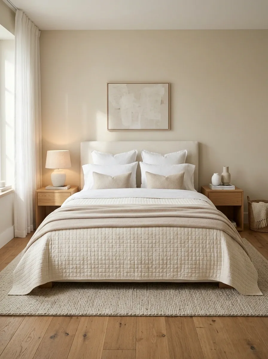
The bed should look like the room’s main event, not a place where laundry goes to retire.
Start with crisp white or warm ivory bedding. Then add one quilt or coverlet and finish with a single folded throw across the lower third. That layering creates depth without turning the bed into a pillow showroom.
Keep the colors quiet and let texture do the work.
Use Two Matching Nightstands, Even Cheap Ones
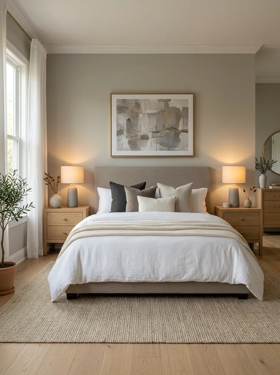
Symmetry does something sneaky. It makes ordinary furniture look coordinated.
Two basic nightstands from the same range will usually look more expensive than two prettier pieces that don’t belong together. Keep their heights close to the mattress and repeat at least one detail, such as wood tone, drawer finish, or hardware.
The room doesn’t need matching everything. It needs a balanced frame around the bed.
Put Warm Lamps on Both Sides of the Bed
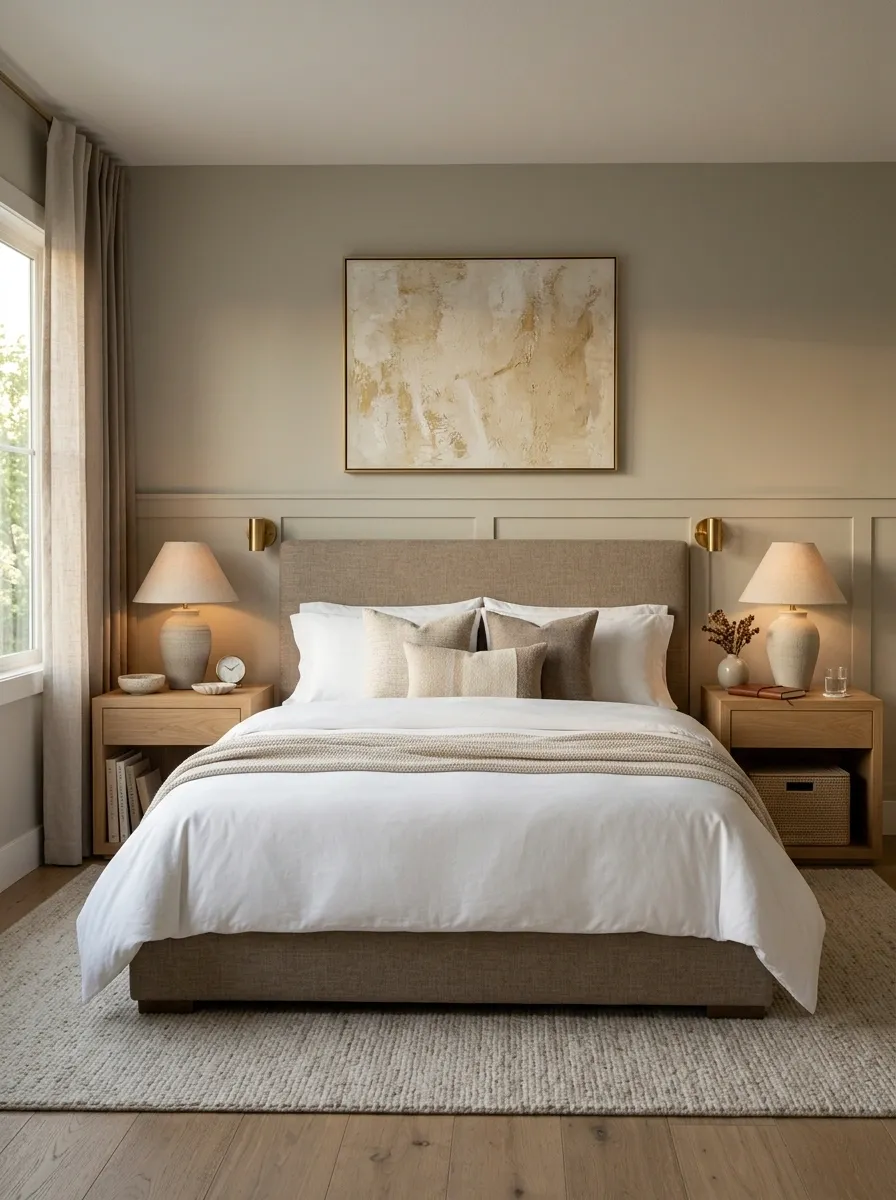
A bedroom feels cheaper when every light comes from one fixture in the ceiling.
Add a small lamp on each bedside surface and use matching shades or similar shapes. The light should land softly around the bed rather than blasting the whole room.
Even inexpensive lamps look intentional when they’re balanced.
Hang Curtains Higher and Wider Than the Window
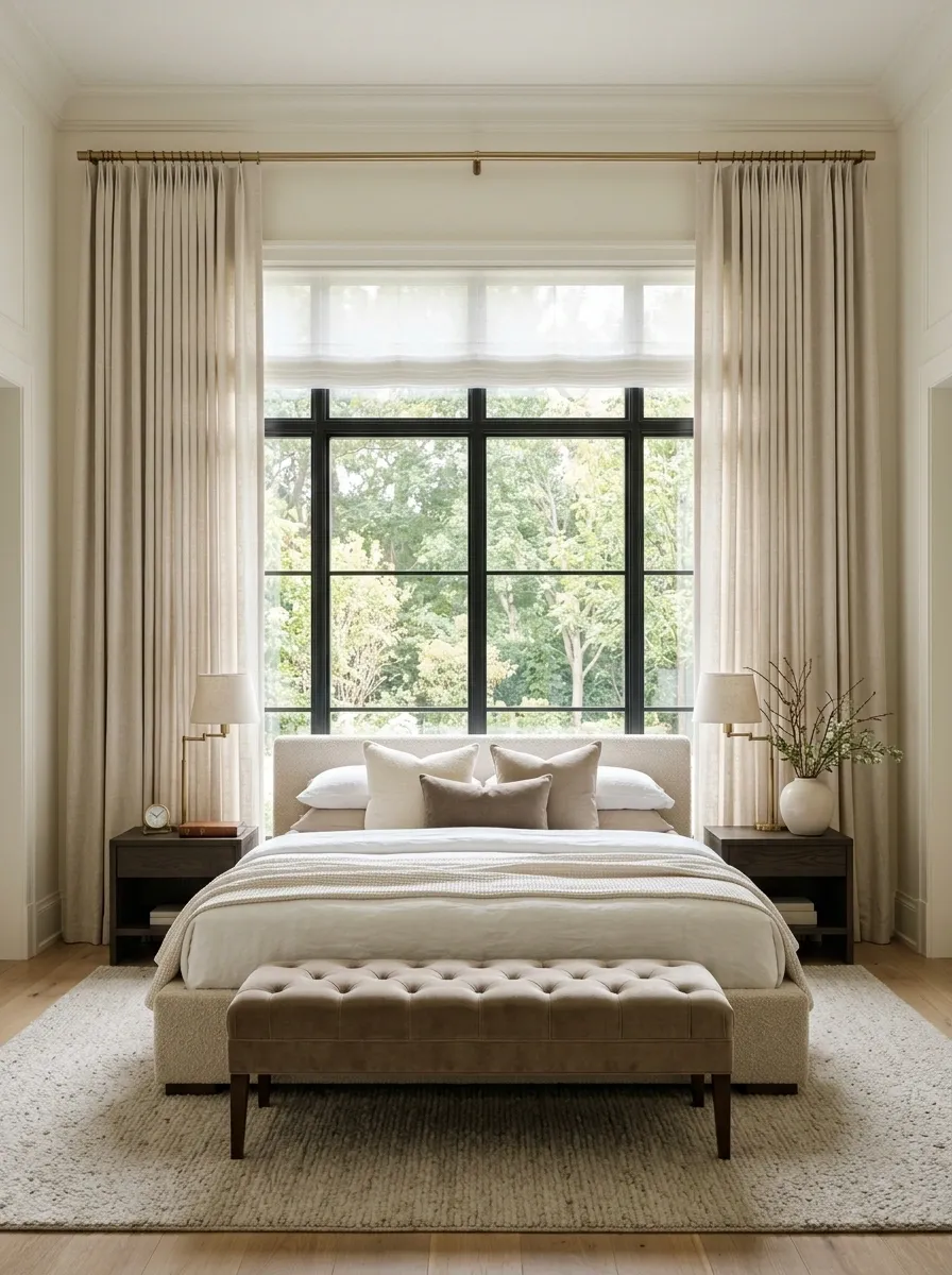
Short curtains can make a decent bedroom look oddly unfinished.
Mount the curtain rod closer to the ceiling than the top of the window and let the fabric extend well beyond both sides. Floor-length panels then frame the wall instead of merely covering glass.
Choose a simple fabric in a soft neutral. The goal is generous vertical lines, not dramatic theater drapes.
Add a Large Rug That Extends Beyond the Bed
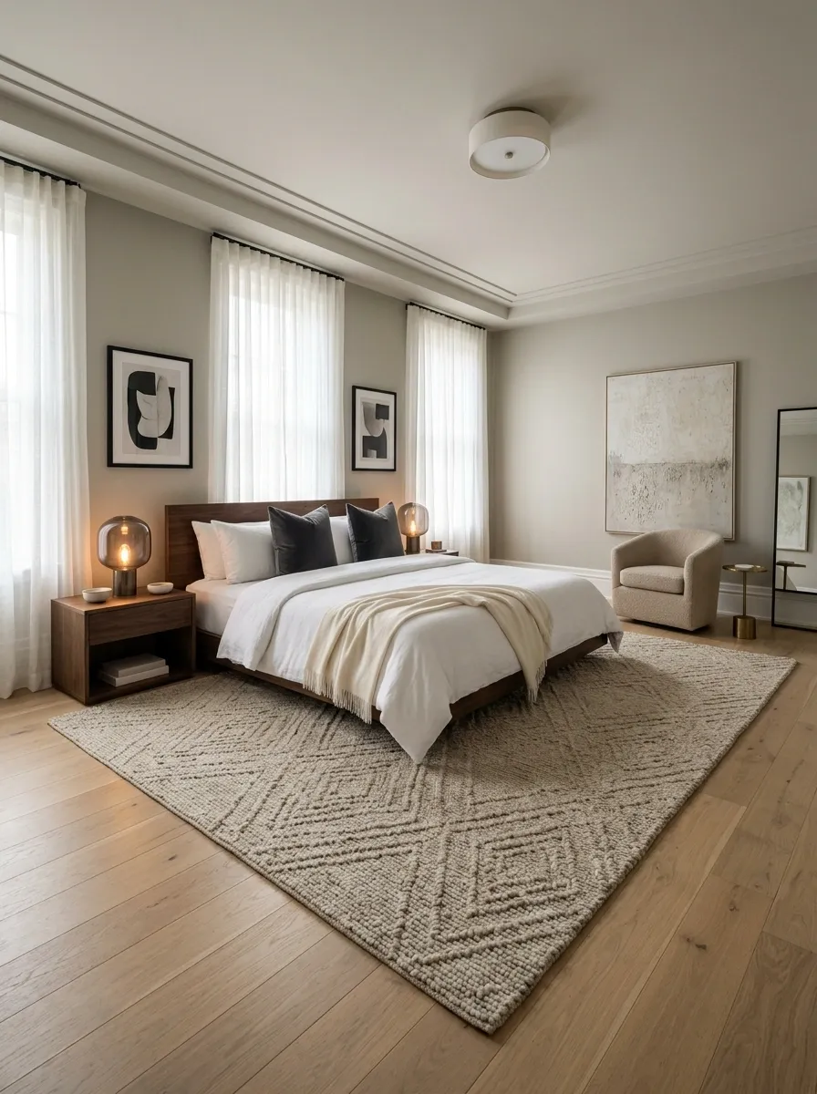
A tiny rug floating beside the bed makes the furniture look disconnected.
Choose the largest practical rug that reaches beyond the sides and lower edge of the bed. It should visually anchor the whole sleeping zone instead of sitting there like a lonely bath mat.
Set it up in this order:
Stack Pillows Like a Boutique Hotel, Not a Pillow Warehouse
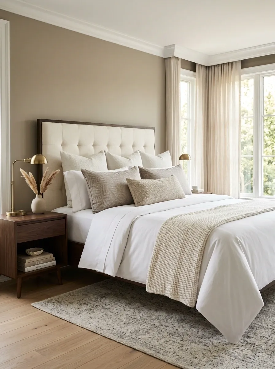
Pillows should make the bed look inviting from across the room. They shouldn’t require an engineering degree to move before bedtime.
Start with sleeping pillows at the back, then add larger decorative pillows in front. Finish with one smaller lumbar or accent pillow. Keep the covers within the same color family so the arrangement looks layered rather than randomly collected.
The secret is size and order, not quantity.
Hide Everyday Clutter Inside One Bedside Basket
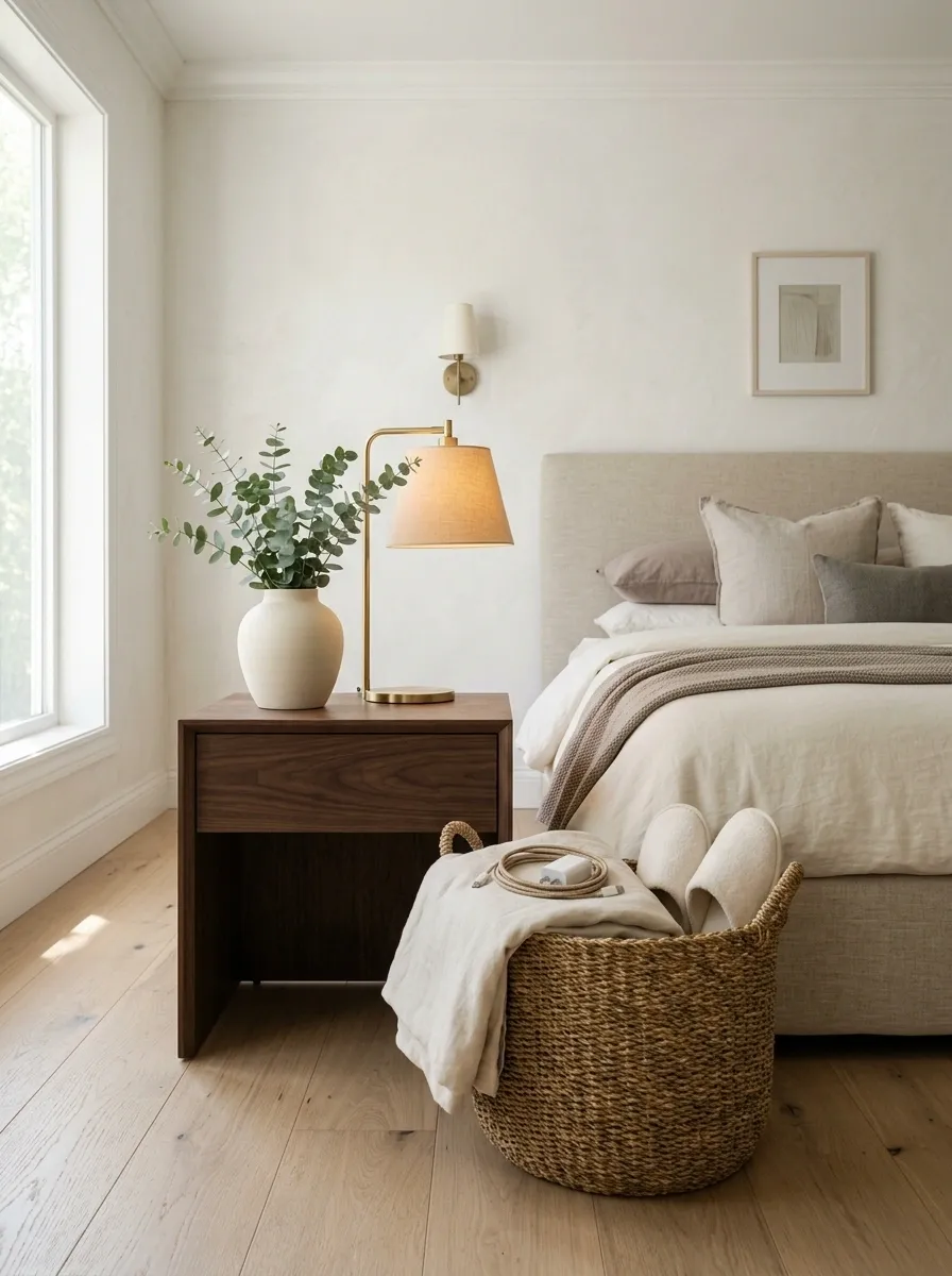
Hotel rooms feel calm because chargers, tissues, cables, slippers, and random little objects aren’t visually screaming for attention.
Place one basket under or beside each nightstand and use it for the things that normally end up scattered around the room. Keep the basket simple and close in color to the furniture.
Choose Oversized Artwork Instead of Several Tiny Frames
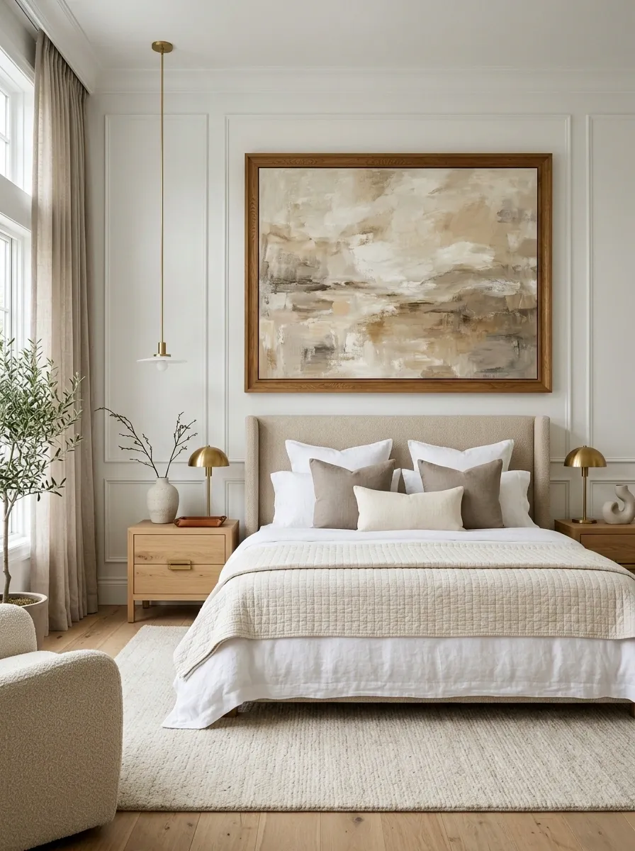
A cluster of tiny pictures can make a bedroom wall feel busy before the furniture even gets a chance to shine.
One large artwork piece above the bed creates a stronger focal point and gives the wall visual weight. Abstract prints, soft landscapes, simple photography, and restrained line art all work well when the colors connect with the bedding.
And no, the artwork doesn’t need to cost a fortune. A simple large print in a substantial frame will usually have more impact than several tiny frames fighting for attention.
Swap Harsh Ceiling Light for Layered Lighting
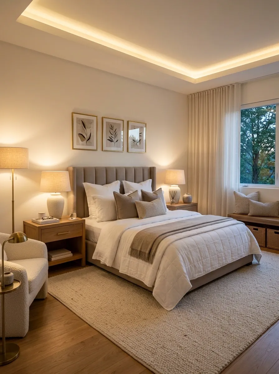
A bedroom shouldn’t depend on one light source. That’s how every corner gets interrogated at once.
Use three layers instead: general light from the ceiling, bedside lighting for the sleeping zone, and a smaller ambient source such as a floor lamp or subtle accent lamp. The result feels softer because the eye isn’t hit with the same brightness everywhere.
| Lighting layer | Job | Budget move |
|---|---|---|
| Ceiling light | Overall visibility | Keep the existing fixture |
| Bedside lamps | Reading and evening light | Add matching table lamps |
| Ambient lamp | Soft background glow | Use one floor or corner lamp |
The trick isn’t owning more lamps. It’s giving each lamp a different job.
Make the Bed the Same Color Family as the Curtains
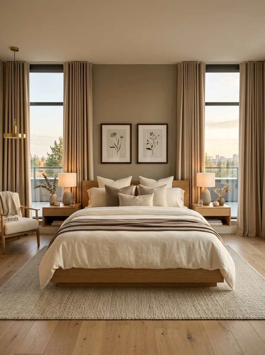
A room starts looking more expensive when large surfaces feel connected.
Match the curtain family to the bed instead of choosing both separately. Cream bedding with warm beige curtains, soft taupe with stone, or ivory with muted brown creates continuity without making the room look overly matched.
Keep the exact shades slightly different. Identical fabric colors can flatten the room, while related tones create depth.
Use Crisp White Sheets as the Base
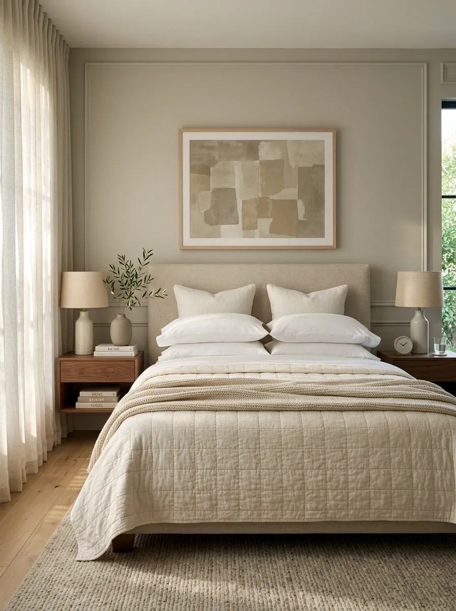
White bedding gets unfairly blamed for looking boring. The real problem is usually flat fabric, poor layering, or a bed that hasn’t been properly made.
A crisp white base gives everything else room to look intentional. Add texture through a quilt, coverlet, or throw rather than introducing another loud color.
Think of the sheets as the clean backdrop that makes the rest of the room look sharper.
THE SIMPLE RULE
Start with white or warm ivory sheets, then build outward with texture.
- White base
- Soft neutral quilt
- One textured throw
- Restrained pillow arrangement
The result looks cleaner because the bed has a clear visual hierarchy. No color circus required.
Add One Upholstered Bench at the Foot of the Bed
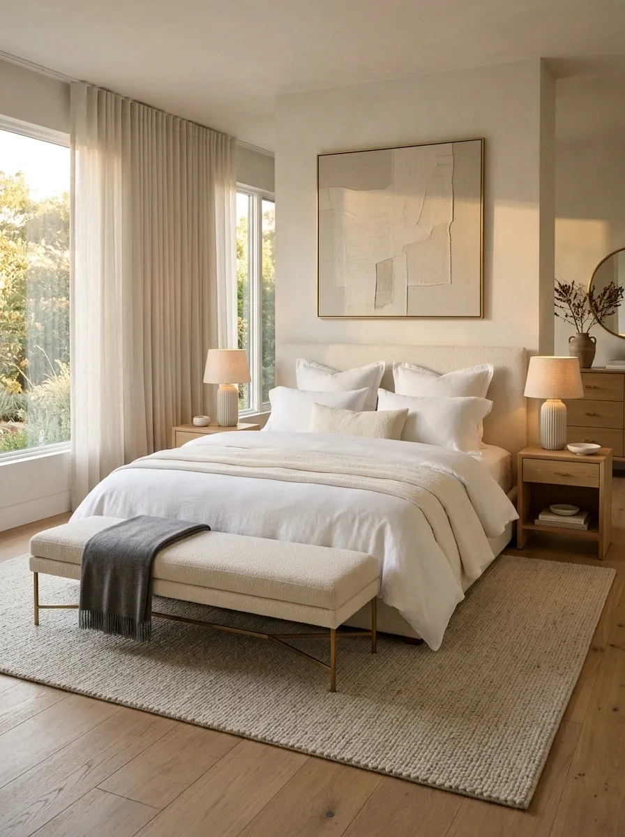
The foot of the bed is often dead space, and dead space isn’t doing much for the room.
A slim upholstered bench gives that area a finished look while adding another layer of fabric. Choose something with a simple shape and a seat width that leaves a little breathing room at either side.
It doesn’t need to be expensive. It just needs enough visual weight to balance the bed.
Style the Nightstand With Only Three Things
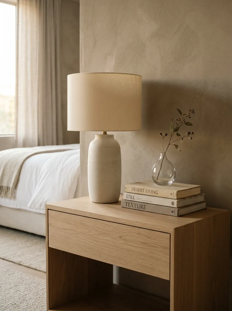
A hotel bedside table usually has a lamp, something useful, and maybe one decorative detail. That’s it.
Use a lamp as the tallest element, add a small tray or book for a lower layer, then finish with one small object such as a bud vase, candle, or simple alarm clock. Keep the rest tucked away.
The empty space is part of the composition.
Use Floor-Length Curtains for a Taller-Looking Room
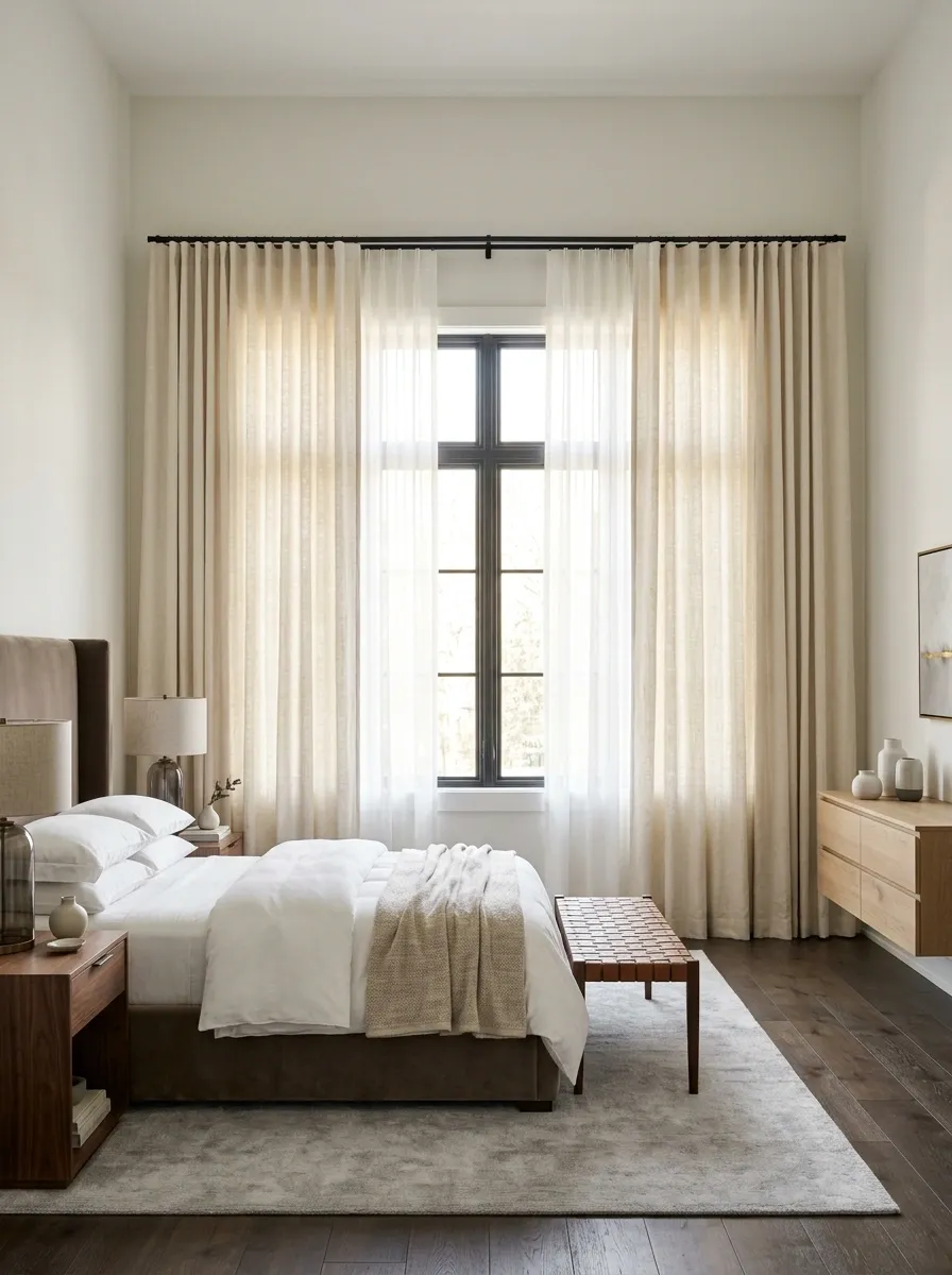
The curtain rod can be perfectly placed and still look wrong if the fabric ends too high.
Take the curtains all the way down to the floor. The long vertical panels create a cleaner line and make the wall feel more connected from ceiling to floor. Choose enough width for the fabric to hang in soft folds rather than looking stretched tight.
Here’s the setup:
Pick One Wood Tone and Repeat It
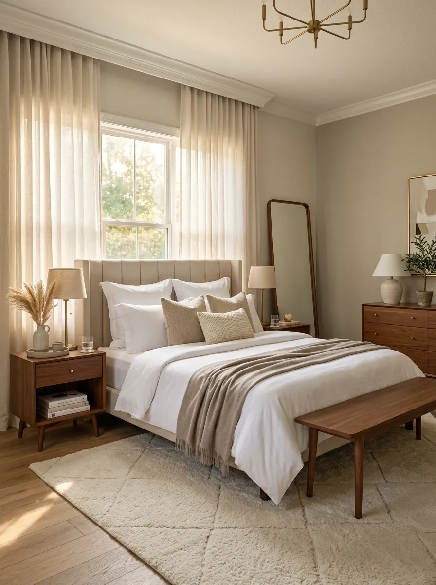
A bedroom can have inexpensive furniture and still look pulled together. What makes it look messy is often five different wood finishes competing across one room.
Pick one dominant wood tone for the nightstands, bench, mirror frame, or dresser. Other materials can vary, but the wood should feel related.
Design rule: repeat the same wood finish at least twice where it’s visible.
That repetition creates rhythm. The room starts reading as one composition instead of a collection of furniture acquired during unrelated financial emergencies.
Give the Headboard More Visual Weight
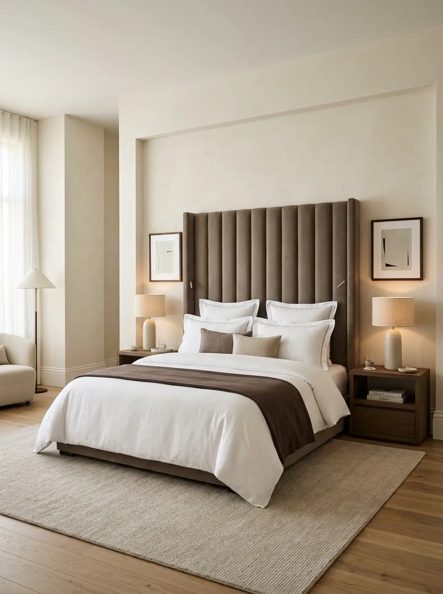
If the bed frame disappears into the wall, the whole bedroom can feel flat.
A taller upholstered headboard gives the bed a stronger silhouette and immediately makes the sleeping area feel more substantial. A simple fabric headboard can work beautifully without designer pricing, especially in beige, taupe, cream, or muted brown.
Don’t overload it with decoration. Let the headboard do the architectural work.
Hide Cords Around Lamps and Electronics
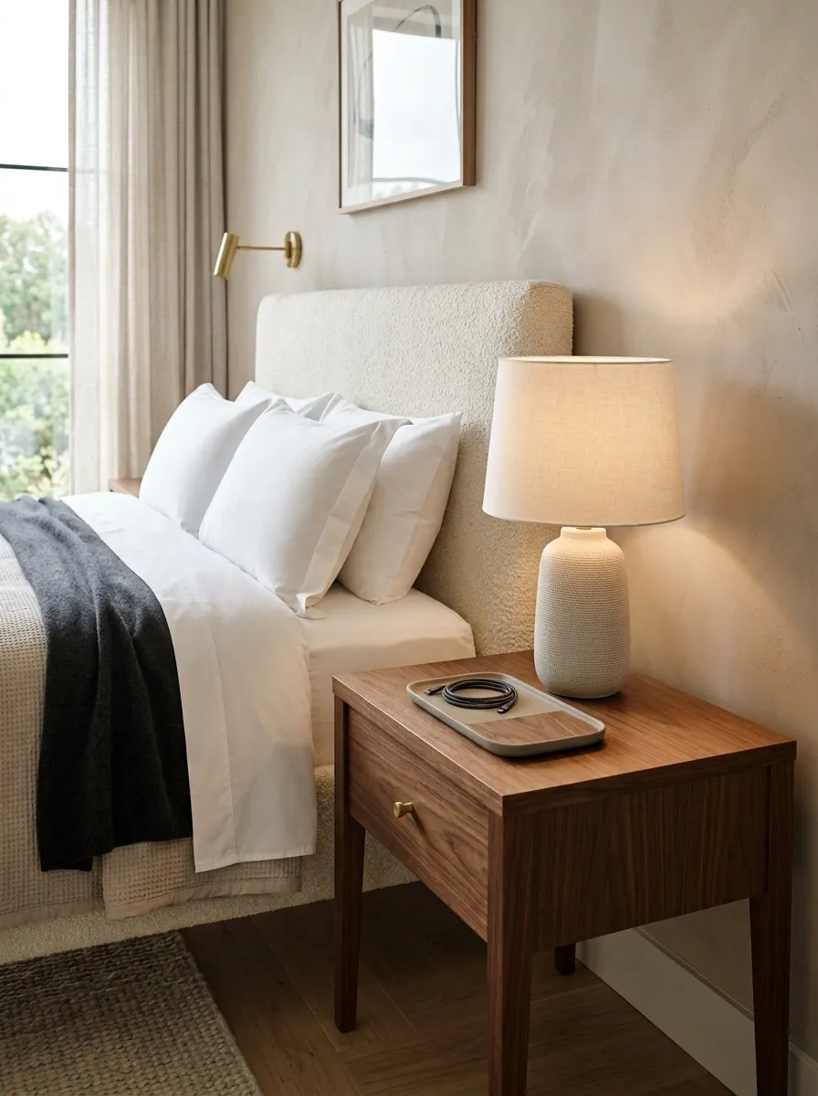
Nothing says “very sophisticated hotel room” quite like a charger cable dangling across the nightstand.
Run cords behind furniture, use discreet cable clips, and keep charging devices gathered in one controlled spot. Choose organizers close to the furniture color so they disappear visually.
The less obvious hardware sitting in plain sight, the cleaner the room feels.
| Problem | Better fix |
|---|---|
| Lamp cable hanging across the tabletop | Route it behind the nightstand |
| Charging cable across the bed | Keep a short cable near the bedside edge |
| Extension cord visible on the floor | Tuck it behind furniture |
| Multiple cables in one pile | Gather them with one simple organizer |
The luxury effect often comes from removing the tiny things that make a room feel unfinished.
Add a Small Sitting Spot Without Buying a Full Chair Set
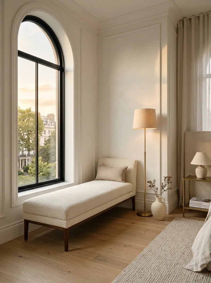
Not every bedroom needs a giant reading chair.
A compact upholstered stool, narrow bench, or simple accent chair can create a secondary zone near a window or empty corner. Keep the silhouette light so it doesn’t compete with the bed.
Add one small cushion if needed. That’s enough.
A compact corner needs only three ingredients:
- A seat with a clean shape.
- A small surface for a book, drink, or lamp.
- Clear floor space around it.
Don’t fill the corner simply because there’s room. Empty space is what makes the sitting area look intentional instead of squeezed in as an afterthought.
Keep the Dresser Top Mostly Empty
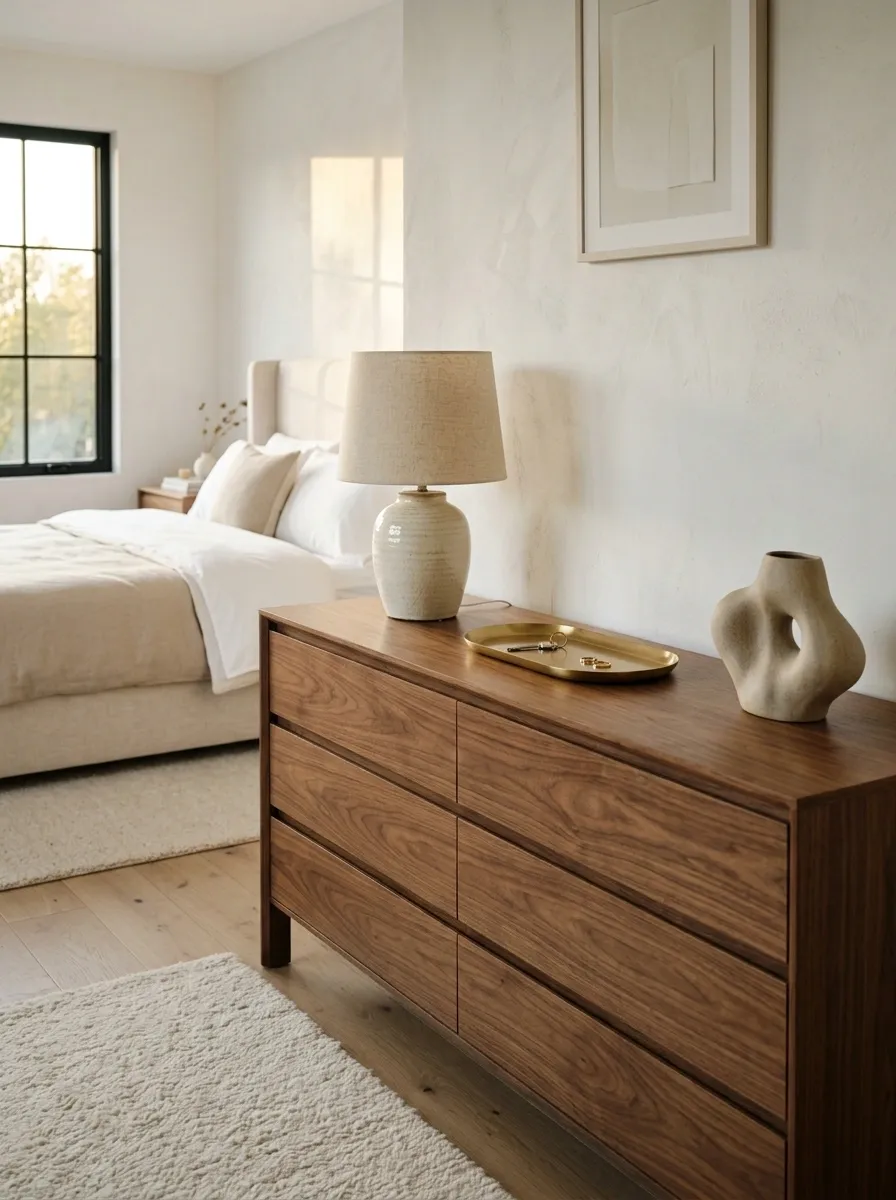
A dresser doesn’t look luxurious because it can hold seventeen decorative objects. It looks better when the surface has somewhere for the eye to rest.
Keep the top mostly clear and group the few things that actually belong there. A lamp, one tray, and a single decorative piece are enough for most bedrooms.
The trick is restraint. Empty surface isn’t wasted space. It’s part of the design.
Add Hotel-Style Reading Lights Near the Bed
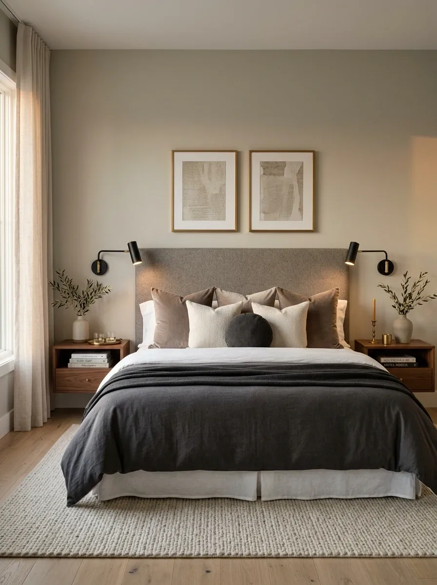
A bedside lamp looks pretty. A dedicated reading light looks like someone actually thought about how the room gets used.
Wall-mounted lights are ideal when possible, but slim plug-in sconces or directional lamps work too. Position them so the light reaches the reading area without flooding the entire bedroom.
Choose matching fixtures on both sides for a cleaner composition.
Upgrade the Door and Cabinet Hardware

Hardware is tiny, but tiny doesn’t mean invisible.
Bright plastic pulls or worn mismatched handles can make otherwise decent furniture look dated. Replacing them with simple metal, black, brass, or brushed finishes takes very little effort and gives wardrobes, dressers, and doors a more cohesive finish.
Pick one metal family and repeat it around the room.
QUICK HARDWARE CHECK
☐ Dresser pulls
☐ Wardrobe handles
☐ Door handle
☐ Small cabinet knobs
☐ Visible hooks
Don’t mix five finishes just because the hardware aisle made every option look exciting. Repetition looks richer.
Create a Calm Neutral Color Formula
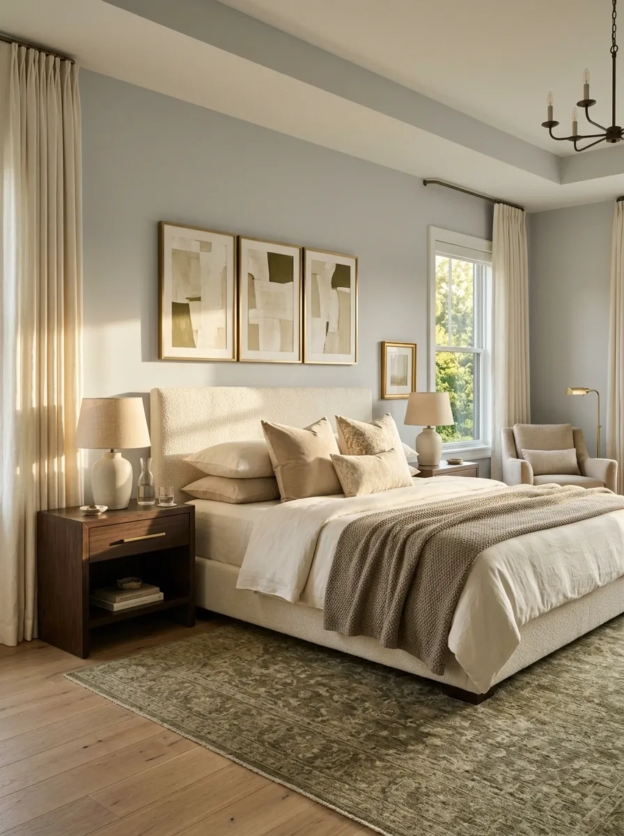
The most convincing hotel bedrooms rarely use ten unrelated colors.
Build the room around a small group of connected neutrals, then introduce one darker material or accent to give everything some visual depth. Cream, beige, taupe, soft brown, warm gray, and muted olive can all work when the proportions are controlled.
The goal isn’t to make every surface beige. It’s to make the colors stop arguing.
Put a Full-Length Mirror Where It Actually Helps
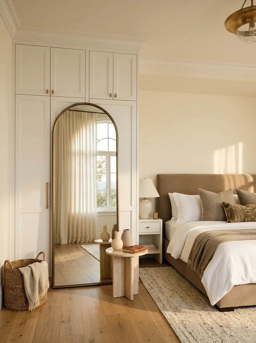
A full-length mirror shouldn’t be wedged behind a door simply because that’s the only empty patch of wall.
Place it where it can reflect light, reinforce the room’s architecture, or sit naturally near the wardrobe. A simple framed mirror can become a strong vertical feature without competing with the bed.
Use the reflection strategically. A mirror facing a blank wall adds very little. A mirror catching a window or attractive section of the room can make the space feel brighter and more layered.
MIRROR LOCATION TEST
Best: beside the wardrobe, near natural light, or opposite a visually pleasant part of the room.
Weak: facing clutter, a messy desk, or a wall that has absolutely nothing going for it.
The mirror isn’t just for checking an outfit. It’s another composition tool, so give it a job.
Fold Blankets Instead of Draping Them Everywhere
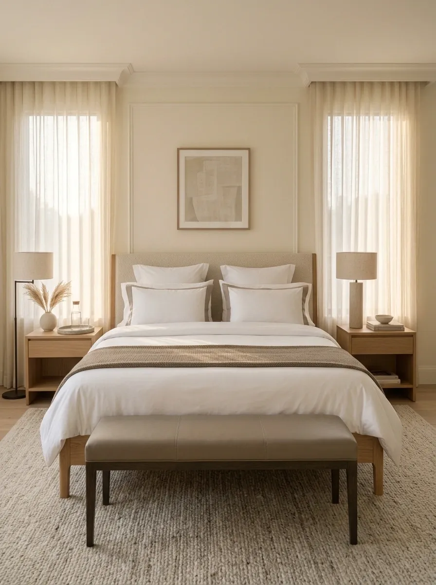
A throw blanket should look placed, not abandoned.
Fold one neatly across the lower portion of the bed or over a bench. Keep the fold broad enough to create a visible horizontal line, then let the rest of the bedding stay clean and smooth.
Randomly throwing blankets over chairs, corners, and the floor doesn’t make a bedroom feel relaxed. It makes it look like the room is losing a battle with laundry.
THE BLANKET RULE
Use one intentional fold.
Keep the fabric substantial and textured, but don’t add several throws just because an empty corner exists. One deliberate layer creates interest. Five accidental layers create visual noise.
Best placement: across the foot of the bed or neatly over a bench.
Use One Large Tray to Corral Small Items
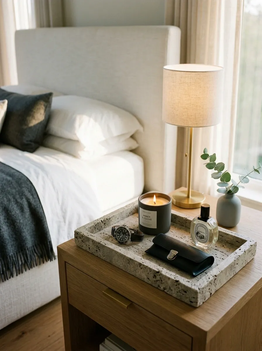
Small objects are where bedroom surfaces quietly go off the rails.
A single tray can gather perfume, a candle, a watch, reading glasses, or other daily items into one defined zone. That grouping makes the surface look styled instead of scattered.
Choose a tray with enough visual weight to hold everything without becoming another oversized accessory.
Make the Bathroom-Style Details Work in the Bedroom
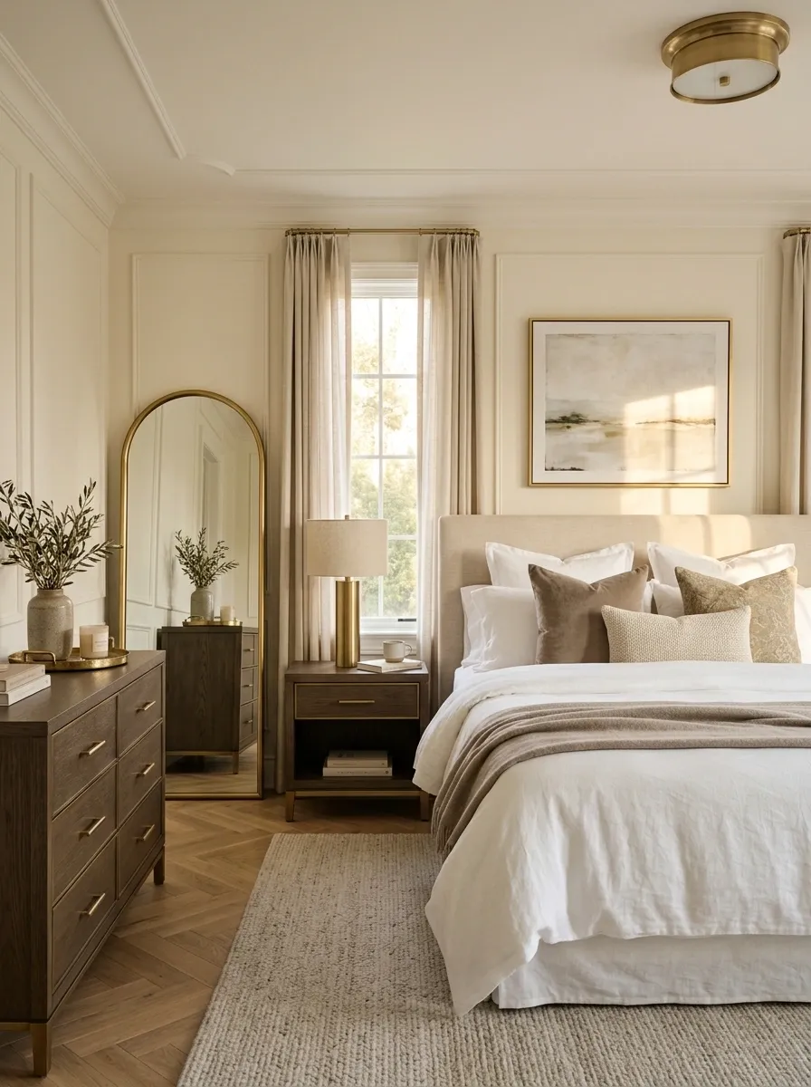
Hotels repeat small material details across a room, and that repetition is one reason the space feels coherent.
Bring the same idea into the bedroom. Repeat a finish such as brushed brass, matte black, warm wood, or polished chrome across a lamp, mirror frame, drawer pull, and small accessory.
Don’t buy four new things just to accomplish this. Replace or restyle what already exists.
Easy repetition points
- Lamp base
- Mirror frame
- Dresser hardware
- Small tray
- Curtain rod
When the same finish appears in several places, the eye connects them automatically. That’s a cheap way to make unrelated pieces behave like a set.