
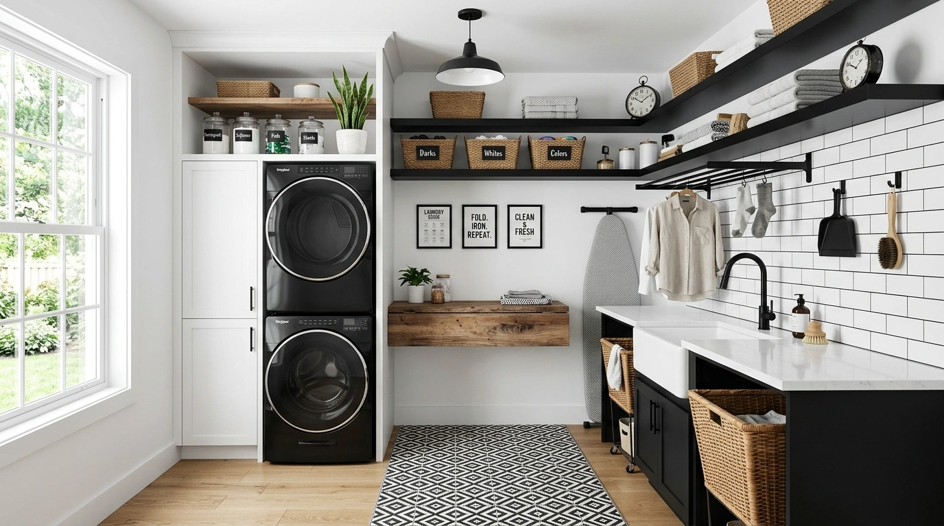
The laundry room is usually where good design goes to die quietly behind a basket of unmatched socks. White cabinets, a black handle here, a black light there, and suddenly the room is supposed to look intentional. Sometimes it does.
Other times it looks like someone decorated with two paint samples and called it a day.
Black and white can be incredibly striking, but the finished room depends on how those two tones are distributed across the entire space.
Cabinetry, flooring, walls, counters, appliances, windows, lighting, and storage all affect the result. A beautiful black-and-white floor can look completely wrong beside the wrong cabinets. A dramatic black wall can make a tiny utility room feel oppressive. Even the shade of white matters more than people expect.
The Black + White Reality Check
Looks complicated.
Black and White Laundry Room Designs
Bold Patterned Wallpaper and Herringbone Floors
This space leans all the way into graphic impact with high-contrast geometric wallpaper wrapping the walls and a dark herringbone floor grounding the room. Crisp white counters and upper cabinets keep the busy patterns from completely taking over the zip code.
Warm wood shelving and brass hardware introduce a much-needed metallic note, breaking up the monochrome madness with a touch of gold. The washer and dryer hide in plain sight against the white millwork, looking far too sophisticated to actually wash muddy socks.
Natural light filtering down the hallway makes this bold choice pay off completely. When you commit to a pattern this loud, you either own it entirely or stay home. This room clearly bought the whole building.
Classic White Cabinetry With a Dramatic Black Checkerboard Floor
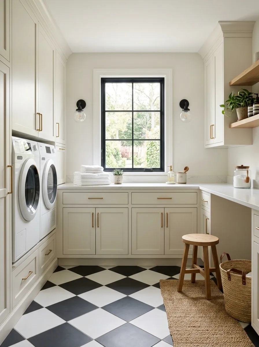
The whole room stays light above the floor, with crisp white shaker cabinets, a white quartz folding counter, and white appliances tucked neatly into the cabinetry. Then the checkerboard floor walks in and takes over the conversation.
That contrast gives the room an old-school architectural feel without forcing it into full farmhouse territory. Black wall sconces, slim cabinet pulls, and a small wood stool repeat the darker accents without competing with the floor. The walls stay quiet so the pattern has room to breathe.
This composition works especially well in a laundry room with decent natural light. A busy backsplash would be overkill here. The floor already understood the assignment.
DO THE TALKING.
Moody Black Cabinets and Warm Wood
This laundry room takes the dark cabinetry trend and runs a marathon with it. Floor-to-ceiling matte black millwork surrounds the appliances, while integrated under-cabinet lighting casts a warm glow across the veined marble backsplash and rich wooden counters.
Every surface feels meticulously considered, from the sleek black faucet to the neatly rolled towels sitting ready for action. The dark tones make the entire setup feel less like a utilitarian chore space and more like a high-end hotel spa that happens to spin clothes.
Balancing dark lower surfaces with a bright countertop keeps the room grounded without feeling like a cave. It proves that going to the dark side comes with serious design rewards, provided your lighting game is equally strong.
Matte Black Lower Cabinets With White Upper Storage
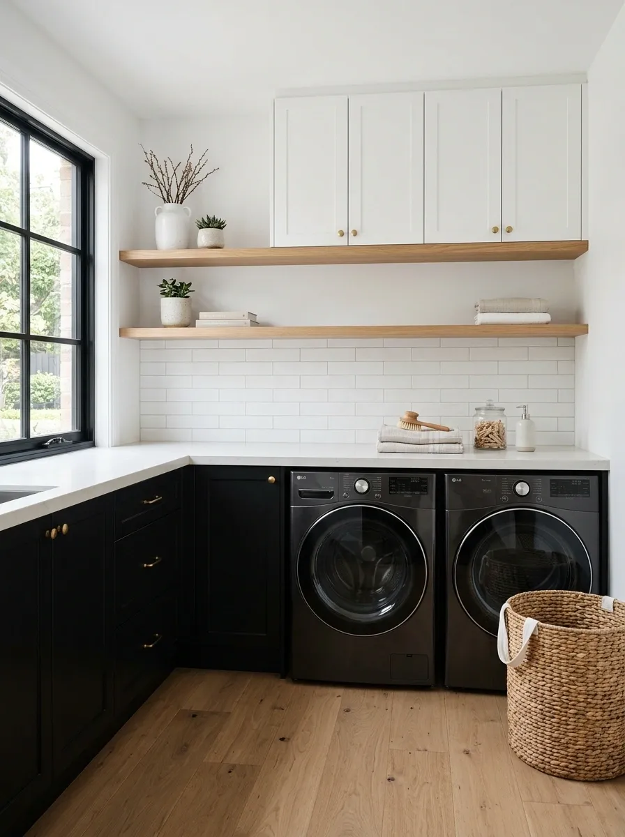
This layout flips the usual laundry room formula. Matte black cabinetry anchors the lower half of the room, while white wall cabinets keep everything above the counter bright and open. The result has stronger architectural weight without making the room feel enclosed.
A pale counter separates the two tones and creates one clean working surface for folding clothes. A timber shelf adds a small hit of warmth, while the washer and dryer stay visually integrated instead of looking like two appliances that wandered into the room by accident.
Natural light makes this version particularly convincing. In a darker room, the upper white cabinetry becomes even more important. The black belongs below because that’s where the composition can handle the visual weight.
Vintage Gothic Laundry Retreat
This room looks like it was plucked straight out of a moody Victorian novel and given a very polite washing machine. Dark, ornately carved black cabinetry pairs with an antique oval mirror, creating an unapologetically dramatic vanity moment right next to the laundry cycle.
A delicate, floor-length lace curtain adds a layer of unexpected softness against the heavy dark wood and gothic mirrors. Fresh florals and a woven basket finish the space, proving that doing chores can feel delightfully cinematic.
This aesthetic requires a high tolerance for atmosphere, and it delivers in spades. The washing machine almost looks out of place being so modern, but honestly, even ghosts need clean linens eventually.
Organic Black and White Laundry Room With Warm Oak
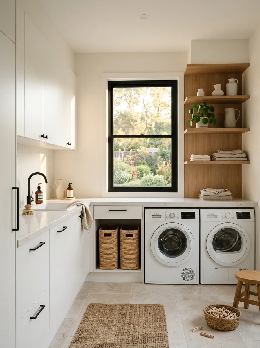
This version keeps the black and white palette from becoming too sharp by bringing warm oak into the composition. White flat-front cabinetry forms the main backdrop, while a softly veined stone counter runs beneath the upper storage. Black window trim and small fixtures add structure.
The oak appears in open shelving rather than everywhere at once. That matters. Too much wood would shift the room into a different color story, while this smaller dose simply warms the cooler surfaces. Woven hampers and a pale stone-look floor add another layer of texture.
The result is calm, modern, and surprisingly forgiving. It proves that monochrome doesn’t have to mean cold. Sometimes the room just needs one material with enough warmth to stop everybody from feeling emotionally unavailable.
Three different jobs.
Floor-to-Ceiling Black Millwork With a White Folding Counter
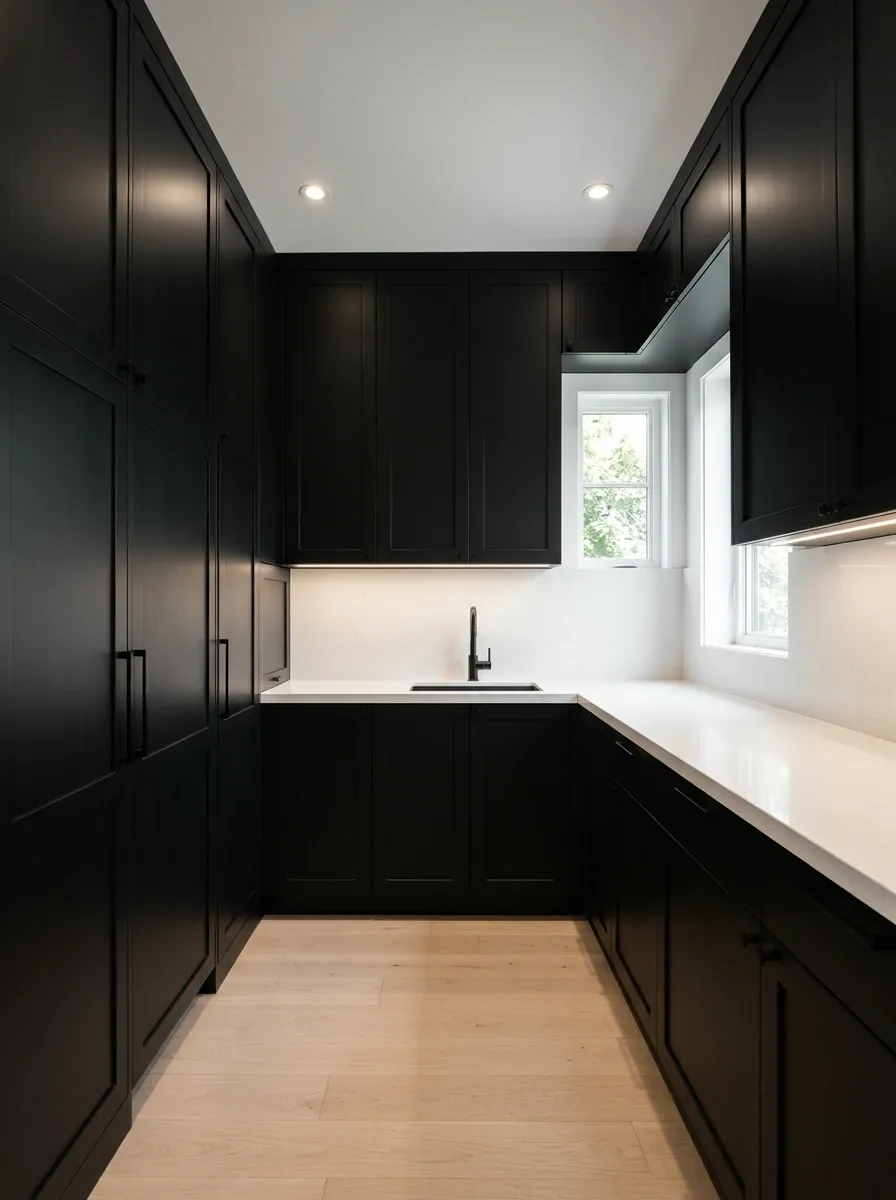
A compact laundry room can handle a surprisingly dark composition when the cabinetry is treated as one continuous architectural wall. Here, matte black storage climbs from floor to ceiling, surrounding the appliances and making the entire room feel intentional.
The key interruption is a broad white folding counter. It cuts across the black cabinetry like a bright horizontal line, giving the eye somewhere to rest. Recessed lighting keeps the tall storage from becoming visually oppressive, while the floor stays pale and quiet.
This is a confident choice for a room with limited decorative space. The cabinetry becomes the architecture, so extra shelves, signs, art, and baskets aren’t needed. There simply isn’t anywhere for the usual clutter to hide. Tragic for clutter. Excellent for the room.
Soft Farmhouse Laundry Room With Black Windows and White Shiplap
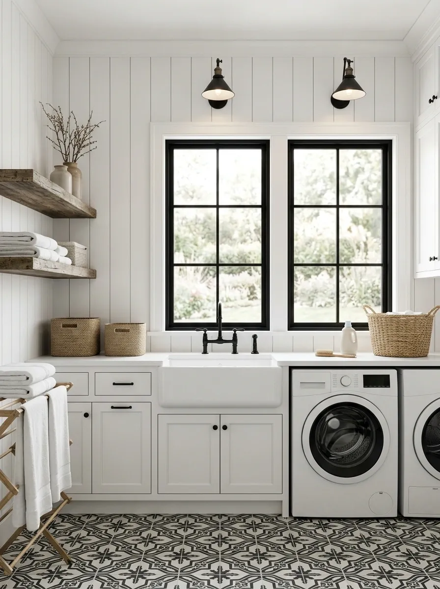
Vertical white shiplap gives this laundry room its strongest architectural texture, while black-framed windows create a clean graphic outline against the walls. White cabinetry continues the lighter palette, and a farmhouse sink makes the room feel rooted in an older, more traditional vocabulary.
The floor introduces a restrained black-and-white pattern, while an aged wood shelf keeps all that painted white from becoming painfully precious. Traditional wall lighting and simple woven storage finish the composition without covering every available surface in farmhouse decor.
That restraint is what keeps the room convincing. There’s enough texture to give it character, but not enough random “rustic” accessories to make it look like a farmhouse gift shop exploded.
Accessories second.
Narrow Galley Laundry Room With One Continuous Black Counter
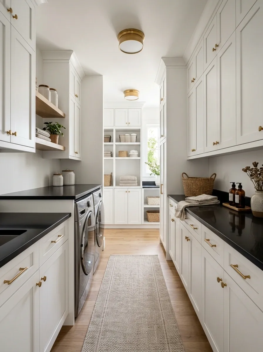
Narrow laundry rooms can look awkward fast. This one uses the corridor shape instead of fighting it. White cabinetry runs along both sides, with appliances tucked beneath a continuous black counter that visually connects the room from one end to the other. Tall storage closes the far wall, while a slim runner keeps the walkway feeling deliberate.
The black surface gives the long room a strong horizontal line, which helps the space feel organized rather than accidentally stretched. Lighting stays simple and evenly spaced overhead. Nothing is sticking out into the circulation path, which is important when a laundry basket already thinks it owns the hallway.
EMPTY ON PURPOSE.
Contemporary Laundry Room With Slab Doors and Sculptural Lighting
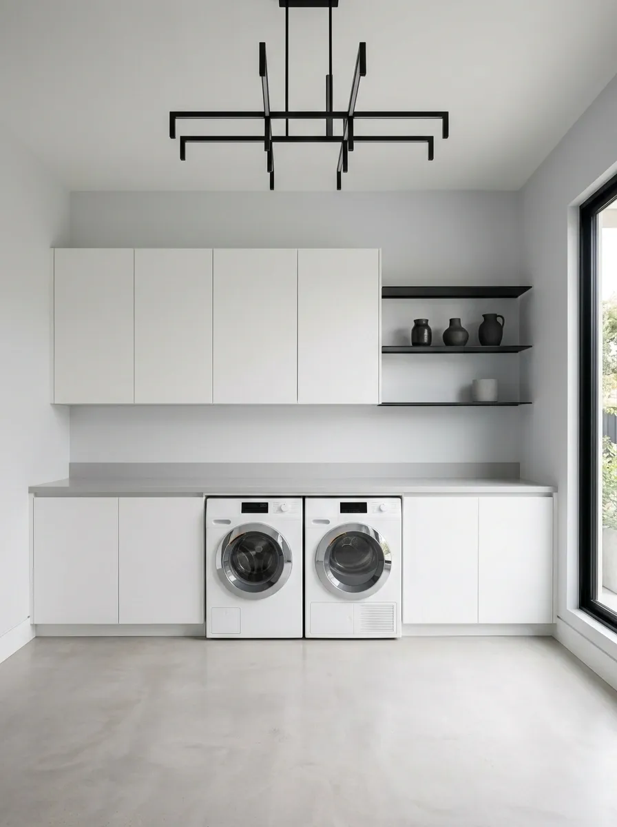
Everything here is clean-lined, but not boring. Handleless white slab cabinetry creates a quiet wall around the appliances, while a pale concrete-look floor keeps the room modern without adding another strong color. Black appears in slim shelving, window framing, and a sculptural ceiling fixture.
The important move is repetition. Cabinet lines, appliance edges, shelves, and lighting all speak the same geometric language. That makes the room feel designed as one composition instead of assembled from unrelated purchases.
Keep the counter almost empty. Once five containers, three signs, and a decorative basket appear, the minimalist fantasy will be over before the first load finishes.
Black Herringbone Floor With Quiet White Cabinetry
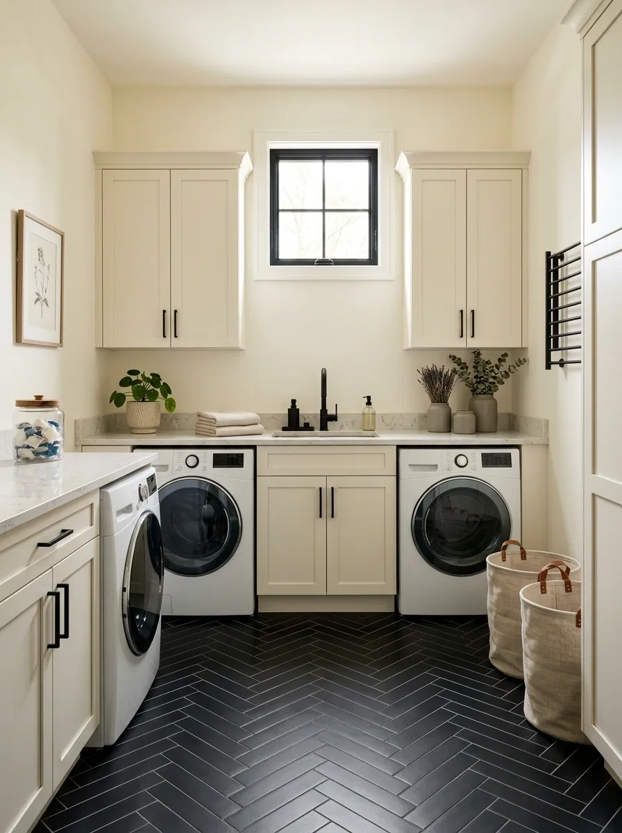
The floor gets the personality here. White cabinetry, white appliances, and a pale counter form an intentionally restrained backdrop for a black herringbone floor that carries the pattern.
That decision keeps the room from becoming visually crowded. The walls don’t need patterned tile because the floor already provides movement. A few black fixtures connect back to the flooring, while everything else stays soft and simple.
This is a useful approach when the room needs character without a dozen decorative decisions competing for attention. One strong surface can do plenty of work. Adding three more because the first one looked lonely is how a laundry room ends up visually shouting.
EVERYTHING ELSE QUIET.
Moody Charcoal Laundry Room With White Stone and Brass
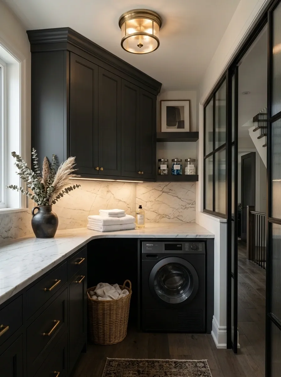
Deep charcoal cabinetry gives this laundry room a moodier personality, but a bright stone counter and matching backsplash keep the room from sinking into darkness. Black-framed glass adds another layer of depth, while warm brass hardware brings a small amount of glow against the cooler cabinetry.
Lighting matters more here than in the brighter designs. A combination of ceiling light and focused task lighting keeps the counter usable and brings out the variation in the stone.
The room feels richer because the finishes have different temperatures and textures. That’s the trick. Dark cabinets alone aren’t sophisticated. Dark cabinets plus stone, glass, warm metal, and good lighting have actually entered the chat.
Bright Scandinavian Laundry Room With Black Accents
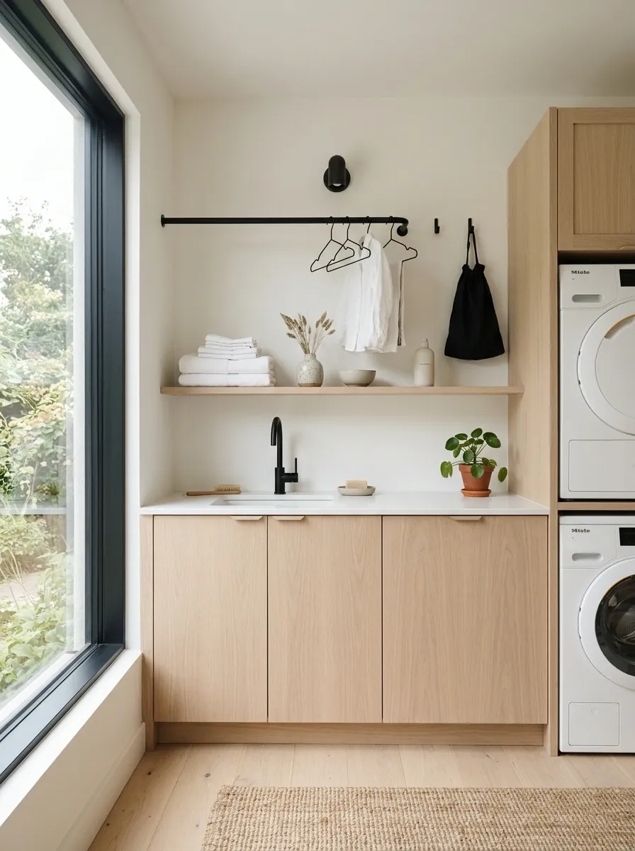
Pale oak, warm white walls, and simple cabinetry create the foundation here. The black elements are deliberately scarce: a slim rail, a few hooks, understated lighting, and dark window framing. They give the room definition without turning the palette into a high-contrast graphic exercise.
Storage is mostly concealed, with just enough open shelving for folded linens and a few everyday pieces. The floor stays pale and visually quiet so the room keeps its airy Scandinavian character.
The smartest part is what isn’t competing for attention. There’s no giant feature wall, no overloaded shelf, and no decorative pileup pretending to be styling. The room knows when to stop, which is a surprisingly rare talent.
BEST AS PUNCTUATION.
Arched Doorway Laundry Room With Painted Black Trim
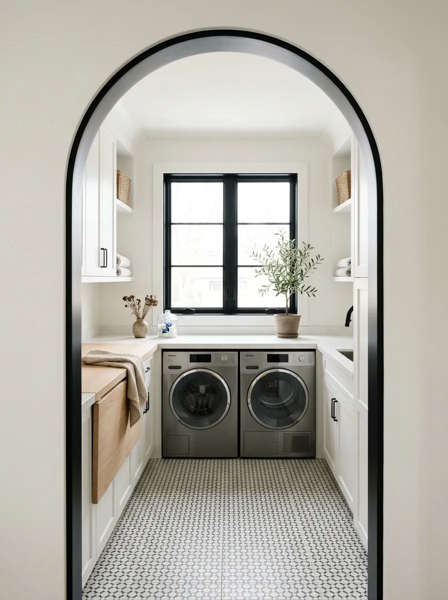
The architecture does most of the styling here. A soft arch frames the entrance, while crisp black trim traces the opening and nearby windows. Inside, white cabinetry and a pale oak folding surface keep the laundry area bright, and a black-and-white patterned floor adds just enough visual movement.
The arch gives the room an older architectural character without needing a pile of vintage accessories. That’s important because once a room starts collecting faux-vintage signs, baskets, and random antiques, the laundry starts looking like it has a side hustle at an antique mall.
Keep the surrounding walls simple so the doorway remains the memorable feature.
IS THE DECOR.
Black-and-White Laundry Room With Full-Height Subway Tile
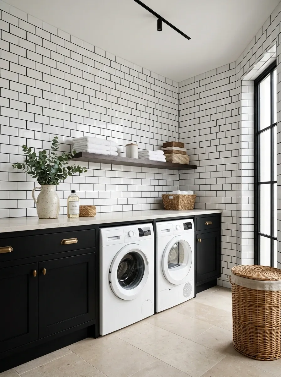
White subway tile rises from the counter all the way to the ceiling, giving the room a clean architectural backdrop. Black lower cabinetry creates a strong base, while a pale stone floor keeps the room from becoming too visually dense.
The tile is the star, but its job isn’t to scream for attention. Its repeated lines create rhythm across the wall while the black cabinetry gives that rhythm a solid endpoint. White appliances disappear into the lighter composition instead of becoming giant rectangles in the middle of everything.
Black grout adds definition without turning the wall into a graphic mural. The overall look is crisp, practical, and just traditional enough to avoid looking like a showroom trying desperately to be contemporary.
Small Apartment Laundry Room Hidden Behind Black Doors
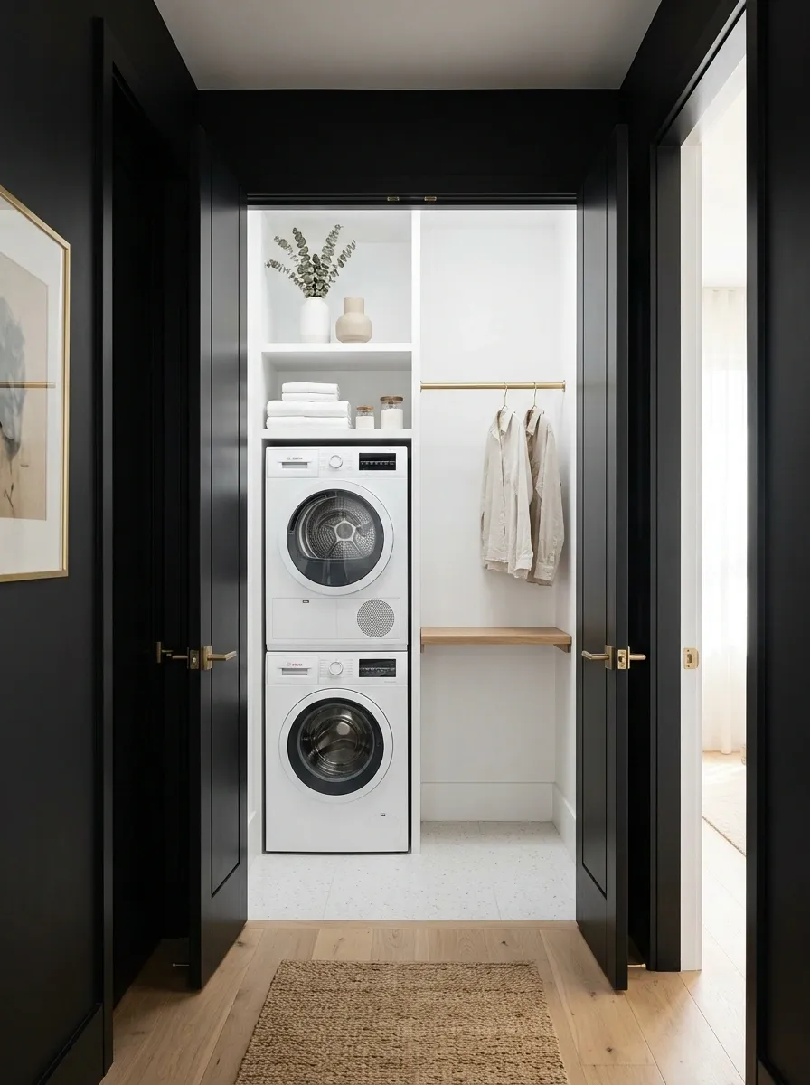
From the outside, this laundry area looks almost like another piece of cabinetry. Tall black paneled doors conceal a stacked washer and dryer, slim shelving, a narrow folding ledge, and a compact hanging rail.
Inside, everything is white and bright. That contrast is what makes the setup clever. The dark exterior gives the apartment a polished uninterrupted wall, while the lighter interior makes the utility zone feel larger when the doors are open.
This arrangement makes sense when laundry has to share space with a hallway, kitchen, bathroom, or living area. The goal isn’t to make the machines disappear forever. It’s to make them disappear when they’re not being used, which is probably the closest thing household appliances have to good manners.
Traditional Laundry Room With Black Baseboards and White Cabinetry
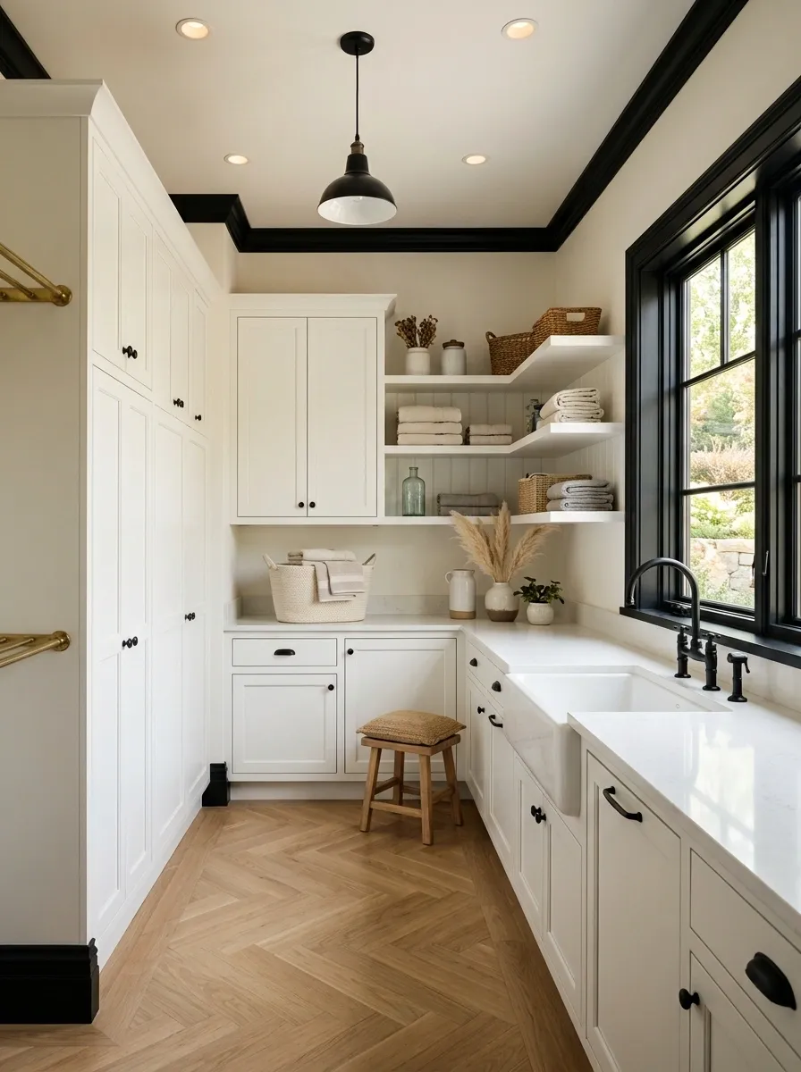
This room leans traditional without becoming overly formal. White cabinetry fills the walls, a farmhouse-style sink sits beneath a generous counter, and black baseboards create a surprisingly strong architectural outline around the pale room.
Black window trim and understated fixtures repeat that dark edge, while the flooring introduces a subtle pattern. Because the contrast is spread across the architecture, the room feels cohesive rather than decorated around a single statement piece.
The warmer traditional details also give the appliances somewhere to disappear visually. They sit inside the cabinetry rather than becoming the design. Honestly, the machines have already done enough work. They don’t need to be the celebrities.
THE ROOM’S EDGES.
Concrete and White Laundry Room With Black Metal Shelving
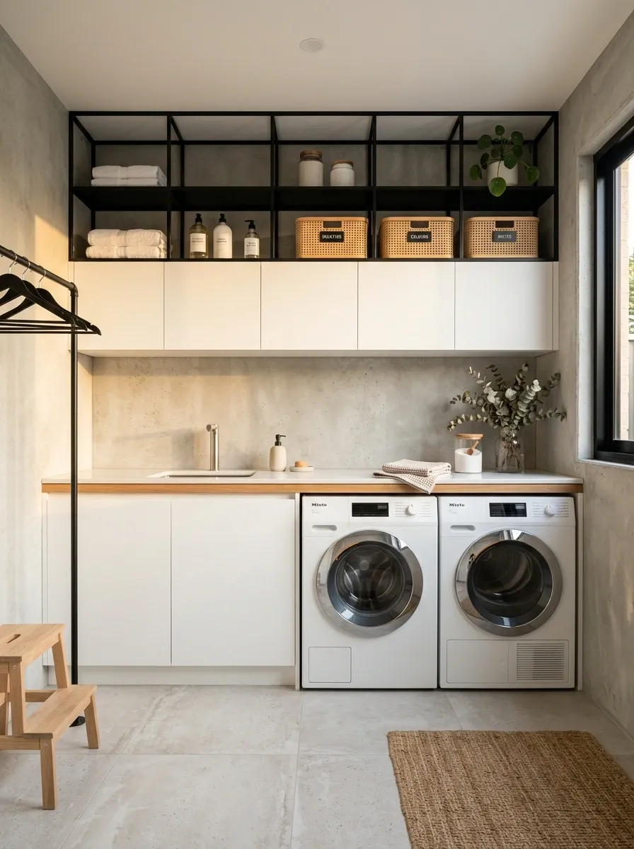
Pale concrete-look flooring and backsplash give this laundry room a slightly industrial foundation, while white cabinetry keeps the overall space bright. Open black metal shelving adds structure and makes everyday laundry supplies easy to reach.
Natural wood baskets and a small timber detail on the counter soften the harder finishes. That contrast between smooth painted surfaces, stone-like texture, metal, and woven storage is what keeps the room interesting.
The design works best when the open shelves stay edited. A few useful items can look intentional. Fifteen mismatched bottles lined up in a row are not a styling choice. They are evidence.
a softer interruption.
Window-Filled Laundry Room With Black Framing and White Surfaces
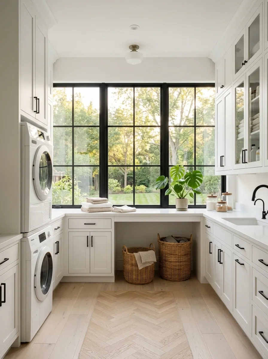
Large black-framed windows become the focal point in this bright laundry room, with white cabinetry arranged around the natural light rather than competing with it. A long white counter provides plenty of folding space, while pale flooring keeps the entire composition light from top to bottom.
A few woven baskets and simple linen pieces bring softness without changing the black and white identity. Even the plants stay restrained, because this isn’t the place to recreate a jungle. The windows already bring enough life into the room.
This layout works particularly well when the laundry room has a strong exterior view or receives generous daylight. The architecture does the heavy lifting, so the styling can stay quiet.
THE BEST VIEW.
Dramatic Black Ceiling Over an Otherwise White Laundry Room
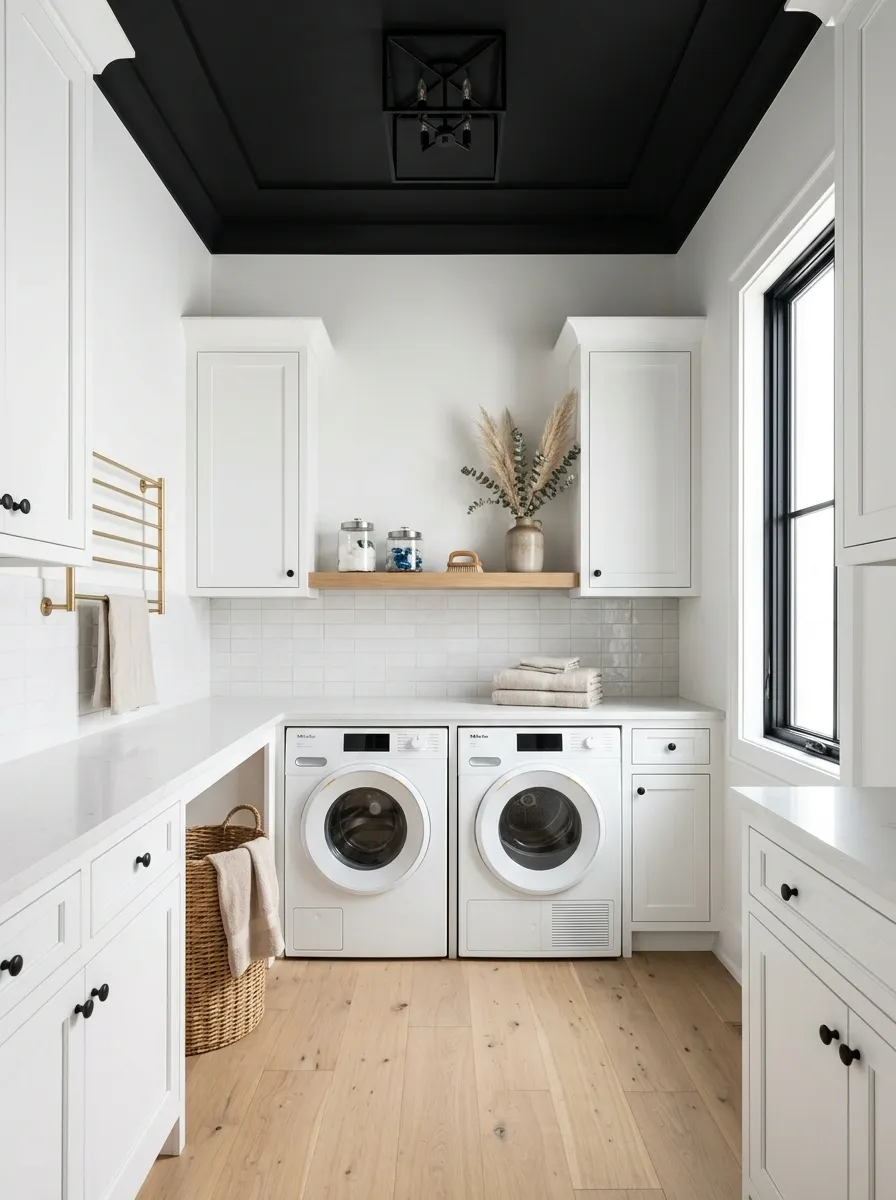
Almost every surface in this laundry room stays pale, from the cabinets and backsplash to the flooring and appliances. Then the ceiling goes completely black.
That single decision changes the entire mood. Black lighting and a few dark fixtures pull the ceiling color downward, making the dark tone feel intentional rather than random. The walls remain white enough to reflect available light, so the room still feels open despite the dramatic overhead surface.
It’s an especially good direction for a room with enough height to support a bold ceiling treatment. The fifth wall finally gets some attention, and honestly, it was starting to feel ignored.
ABOVE THE EYE LINE.
Black Cabinetry and Vertical White Tile in a Compact Utility Room
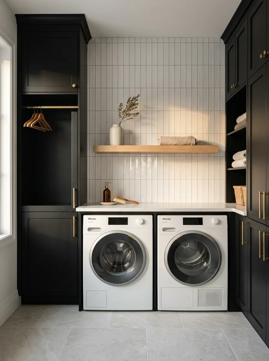
Tall black cabinetry takes over one wall, giving this compact room a strong built-in appearance. Behind the washer and dryer, narrow white tile runs vertically from counter to ceiling, creating a subtle upward pull that suits the limited footprint.
A white folding counter breaks up the dark cabinetry, while one pale wood shelf keeps the room from feeling too severe. The floor stays simple because the walls already have enough visual rhythm.
The vertical tile is doing more than covering a backsplash. It creates a sense of height without resorting to visual tricks that make the room look like a magic act gone wrong. Everything remains believable and usable.
THE EYE MOVING UP.
Vintage-Inspired Laundry Room With Black Cabinetry and Hex Tile
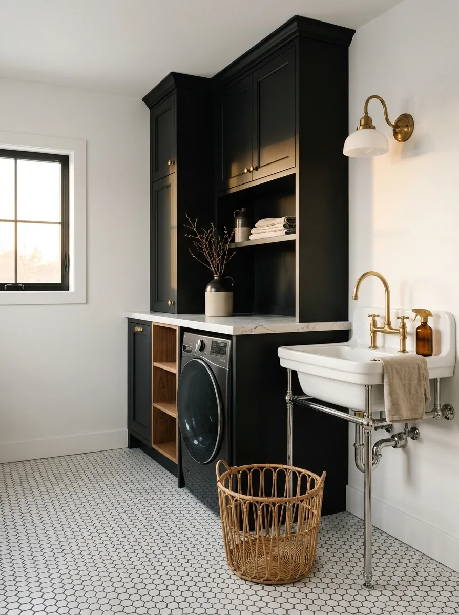
This room takes its cues from older utility spaces without turning the whole place into a costume set. Deep black cabinetry anchors the composition, while small white hex tiles create a classic patterned floor. Traditional wall lighting and a compact utility sink reinforce the period-inspired character.
The walls remain simple, which keeps the flooring and cabinetry from competing. A few warm details make the room feel established rather than freshly assembled.
The vintage look comes from the relationship between the major elements, not from covering every surface with nostalgic objects. No sign reading “Wash” is required. The washing machine already knows its job.
SET THE ERA.
Luxe Laundry Room With Waterfall White Stone Countertops
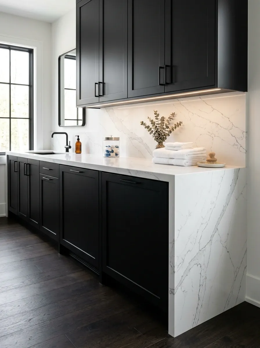
This one borrows the visual language of a high-end kitchen. Matte black cabinetry creates a dark architectural base, while a thick white stone counter continues over the side in a waterfall edge. The washer and dryer sit neatly within the cabinetry, making the appliances part of the composition instead of the main attraction.
A matching pale stone backsplash gives the wall a continuous surface, while carefully placed lighting brings out the variation in the stone. Dark flooring grounds the room without introducing another strong pattern.
The waterfall edge is the detail that makes this concept memorable, but it works because everything around it stays disciplined. The room doesn’t need twelve luxury details screaming for attention. One expensive-looking decision can carry quite a lot of weight.
THREE VISIBLE PLANES.
Black-and-White Laundry Room With a Dedicated Folding Island
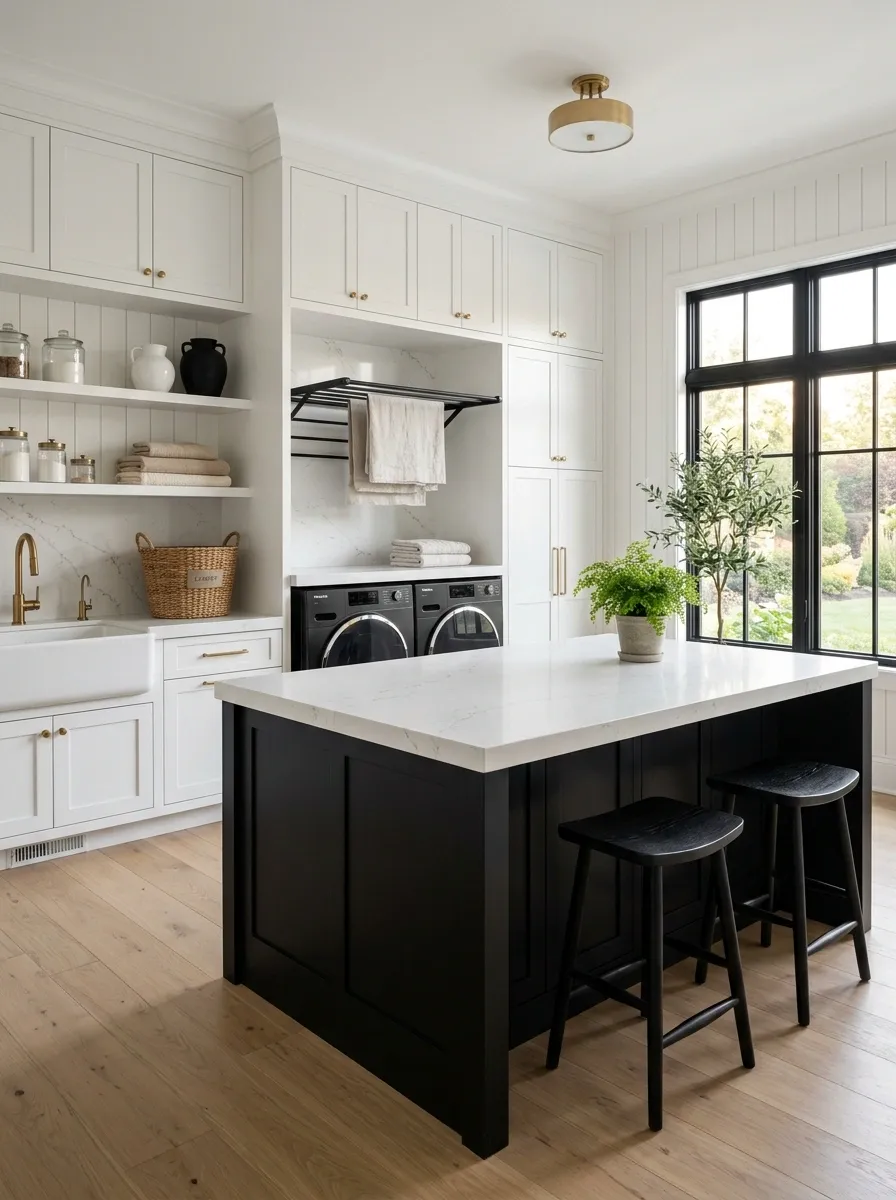
A larger laundry room has enough breathing room for a central island, so the layout actually uses it. White cabinetry and integrated appliances line the main wall, while a black-based island topped with white stone becomes the room’s visual anchor.
The island isn’t there just because large laundry rooms apparently feel incomplete without one. It creates a dedicated place to fold, sort, and temporarily stack clean clothes without taking over the appliance counter. Two simple stools tuck underneath when the room needs a little extra seating.
The contrast works because the island repeats the room’s black-and-white language while changing its orientation. The perimeter runs horizontally, the island sits across the center, and suddenly the whole room has a much stronger sense of structure.
DON’T CROSS THE ROOM.
Black Grid Windows With Warm White Cabinetry and Checkerboard Tile
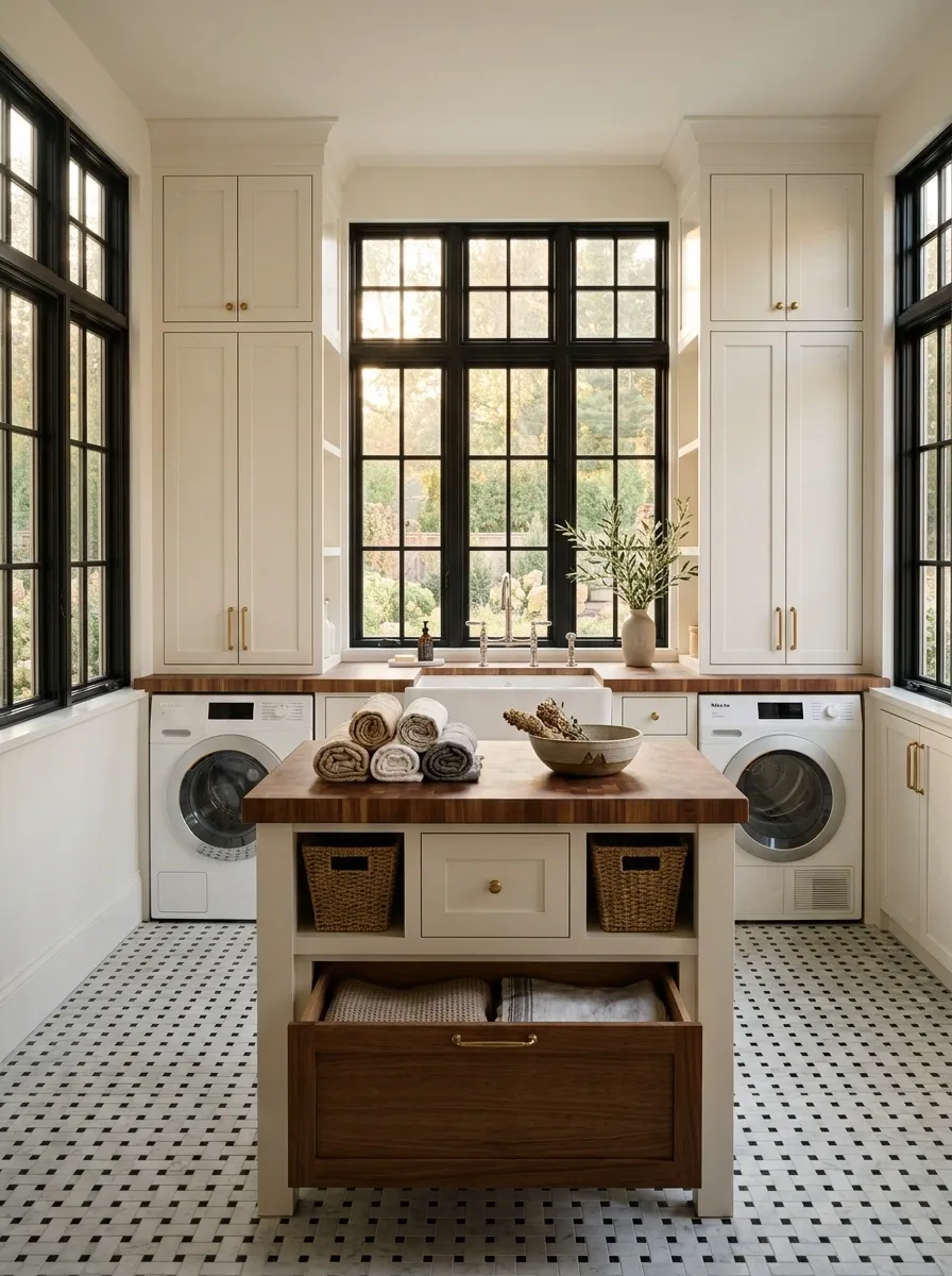
This version softens the usual stark black-and-white contrast by using warm white cabinetry instead of a bright, icy white. Black grid windows frame the room, while a small checkerboard floor introduces pattern without dominating the architecture.
A butcher-block folding surface brings just enough natural warmth to connect the warmer cabinets with the dark window frames. Traditional fixtures reinforce the slightly classic feel, but the clean cabinetry keeps the room from looking dated.
The warmer white is doing more work than it gets credit for. Against black framing and wood, pure white could make the composition feel harsher. This shade gives everything a softer edge, proving that “white” has apparently decided to have personalities now.
CAN FEEL COMPLETELY DIFFERENT.
Sharper contrast
Softer with wood + black
Minimal Black-and-White Laundry Room With Floating Storage
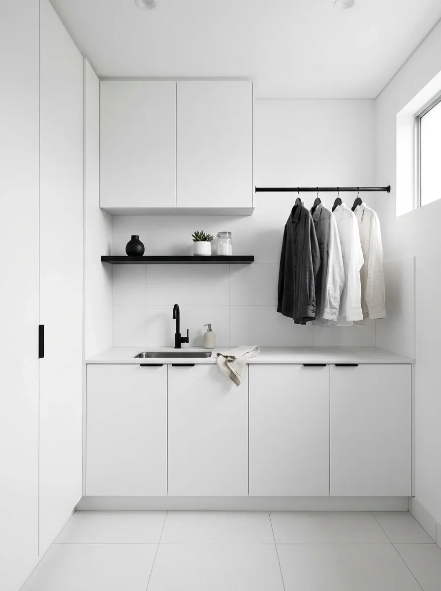
The room is deliberately stripped back. White flat-front cabinetry hides the machines and most of the storage, leaving one slim black floating shelf to create a clean horizontal line across the wall.
A single wall-mounted hanging rail keeps frequently used pieces accessible, while the floor and backsplash remain quiet. There are no decorative stacks competing with the appliances, and that’s precisely why the room feels polished.
The contrast is restrained rather than dramatic. Black gives the white room structure, while the floating elements create a little visual breathing space between the heavier cabinetry and the wall. It’s the kind of minimalist room that works because somebody actually remembered that empty space is allowed to exist.
VISIBLE. HIDE THE REST.
CLOSED: appliances, bulk supplies, everyday visual clutter
Black-and-White Utility Room With a Built-In Pet Wash Zone
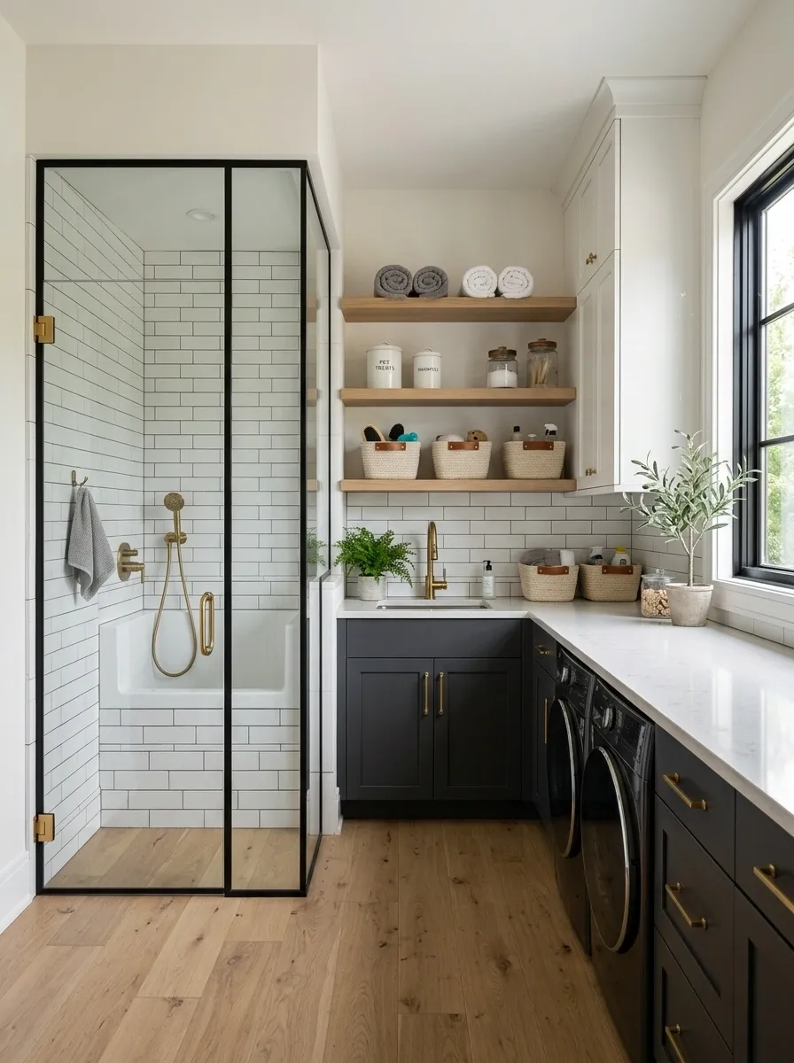
This room combines laundry and pet care without making either function feel like an afterthought. White cabinetry and a long pale counter occupy the main wall, while a low pet-washing station sits beside the appliances behind black-framed glass.
The floor continues through both zones, which visually ties the functions together. Towels and pet supplies have dedicated storage rather than taking over every open shelf in sight. A dark lower section anchors the utility area while the rest of the room stays light.
The design works because the pet zone feels built in rather than pasted on. It belongs to the room’s architecture. And yes, the dog probably still gets better service than everyone else.
CONNECT THE LOOK.
Black Window Seat and White Cabinetry in a Light-Filled Laundry Room
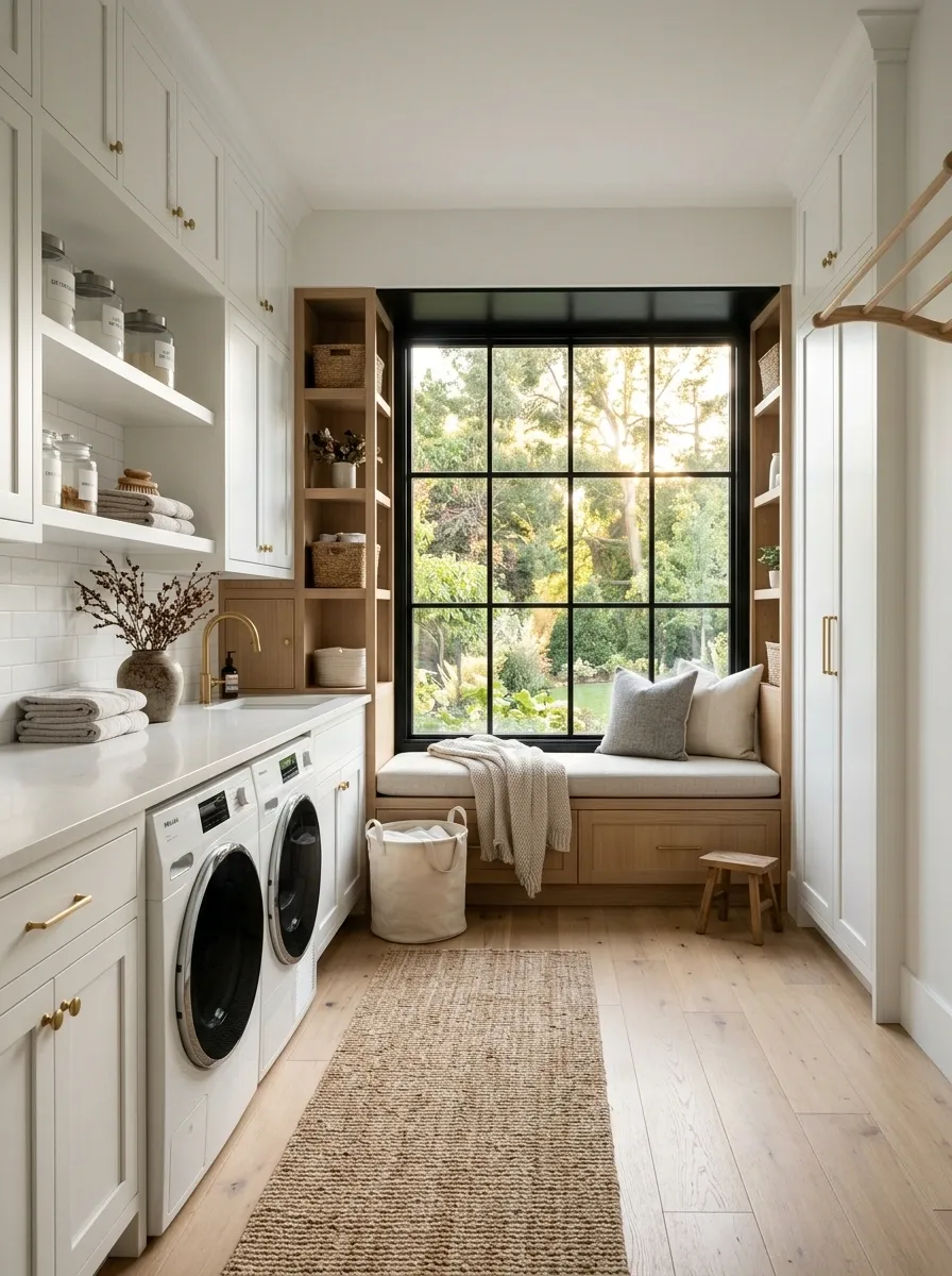
A deep black-framed window seat gives this bright laundry room an unexpected focal point. One wall holds tall white cabinetry, integrated appliances, and a long folding surface, while the opposite side becomes a quieter place to sit, sort clothes, or simply stare out the window and question why laundry multiplies when nobody invited it.
Warm pale wood appears beneath the seat and in a few small details, giving the room enough softness to balance the hard black framing. The rest of the furnishings stay low and simple so the architecture remains the star.
This composition works when the room already has a good window. Rather than filling that area with more cabinets, the design lets natural light and a useful seating zone become part of the finished plan.
THE SECOND LOOK.
Small Black Laundry Closet With Full White Interior
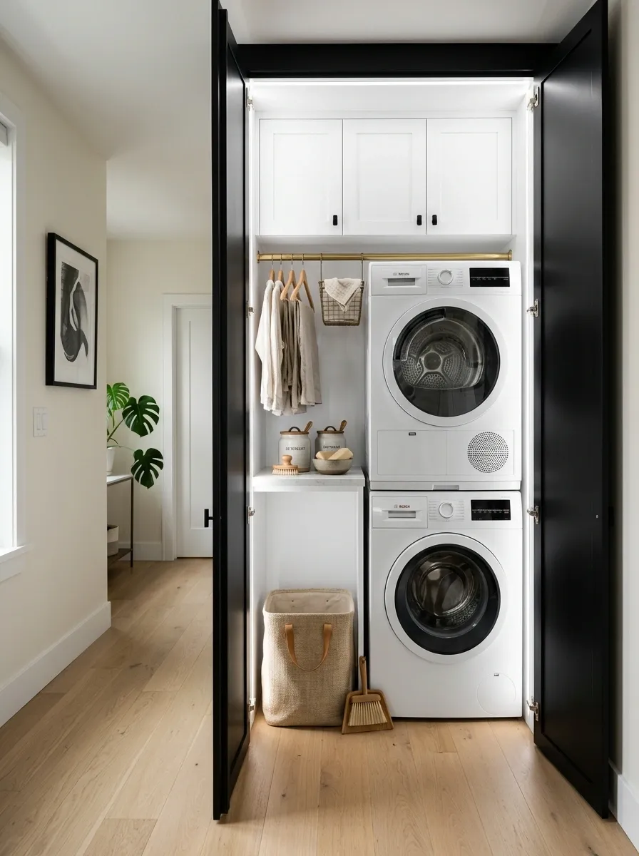
The outside of this compact laundry closet is intentionally dark and quiet. Open the doors, though, and the entire interior switches to white, making the narrow space feel much less enclosed. Stacked appliances use the height efficiently, while a slim hanging rail, pull-out hampers, and upper storage fill the remaining vertical space.
There’s no wasted floor area and no attempt to squeeze a full folding station into a closet that clearly did not consent to that arrangement. A small ledge handles the essentials while the taller storage does the rest.
This is a strong solution for apartments, hallways, and homes where laundry has to share space with everything else. The black exterior hides the utility zone; the white interior keeps it practical.
IS THE PROBLEM, GO UP.
Black-and-White Laundry Room With Soft Limestone Texture
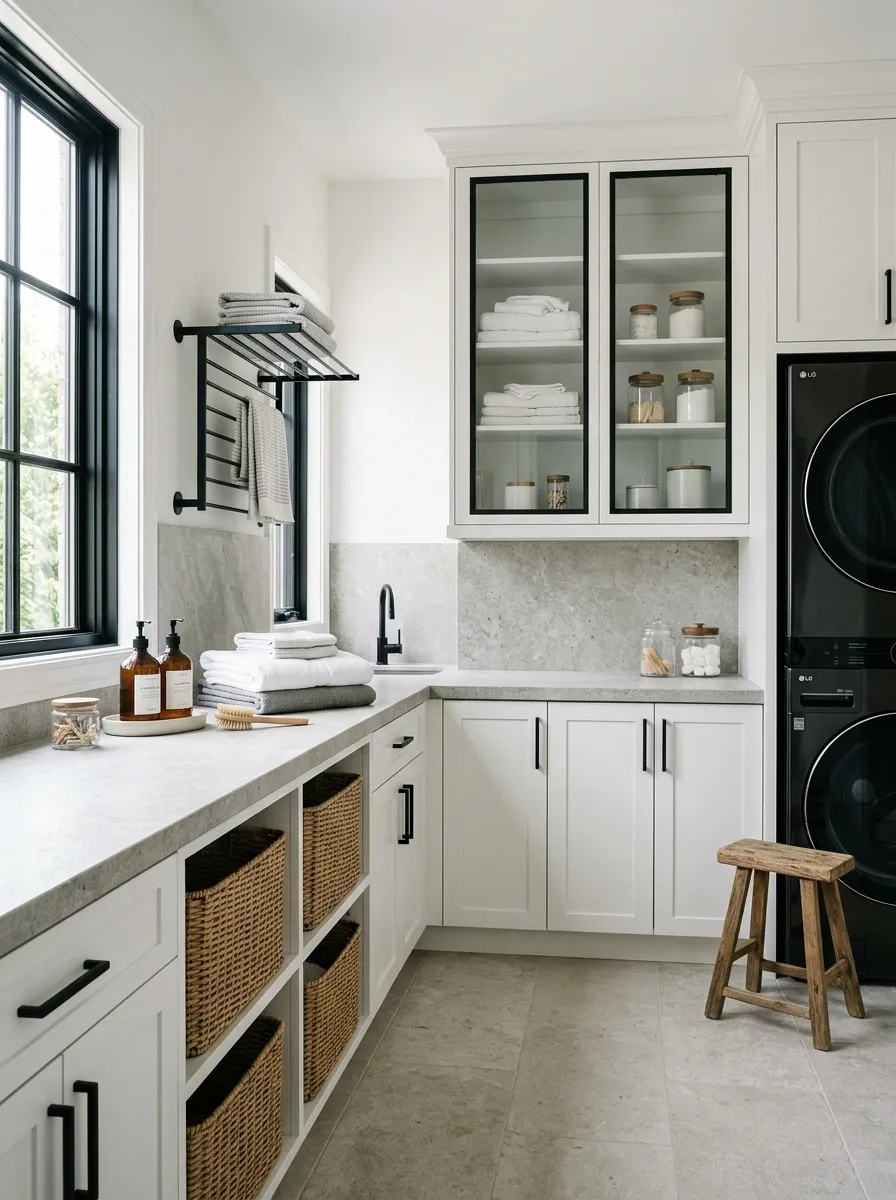
This design takes the edge off the monochrome palette with softly textured limestone-look surfaces. White cabinetry stays simple and clean, while black-framed doors and dark fixtures provide structure. The floor and backsplash share a similar stone family, creating a quiet visual connection between the different planes.
Woven baskets introduce another tactile layer, and natural lighting brings out subtle shifts across the stone surfaces. Nothing is overly glossy, patterned, or decorative. The interest comes from texture rather than extra color.
It’s a softer interpretation of black and white, especially useful for anyone who likes contrast but doesn’t want the room to feel graphic or severe. Apparently black and white can calm down and behave themselves after all.
DIFFERENT SURFACES.
High-Contrast Modern Laundry Room With Black Appliances
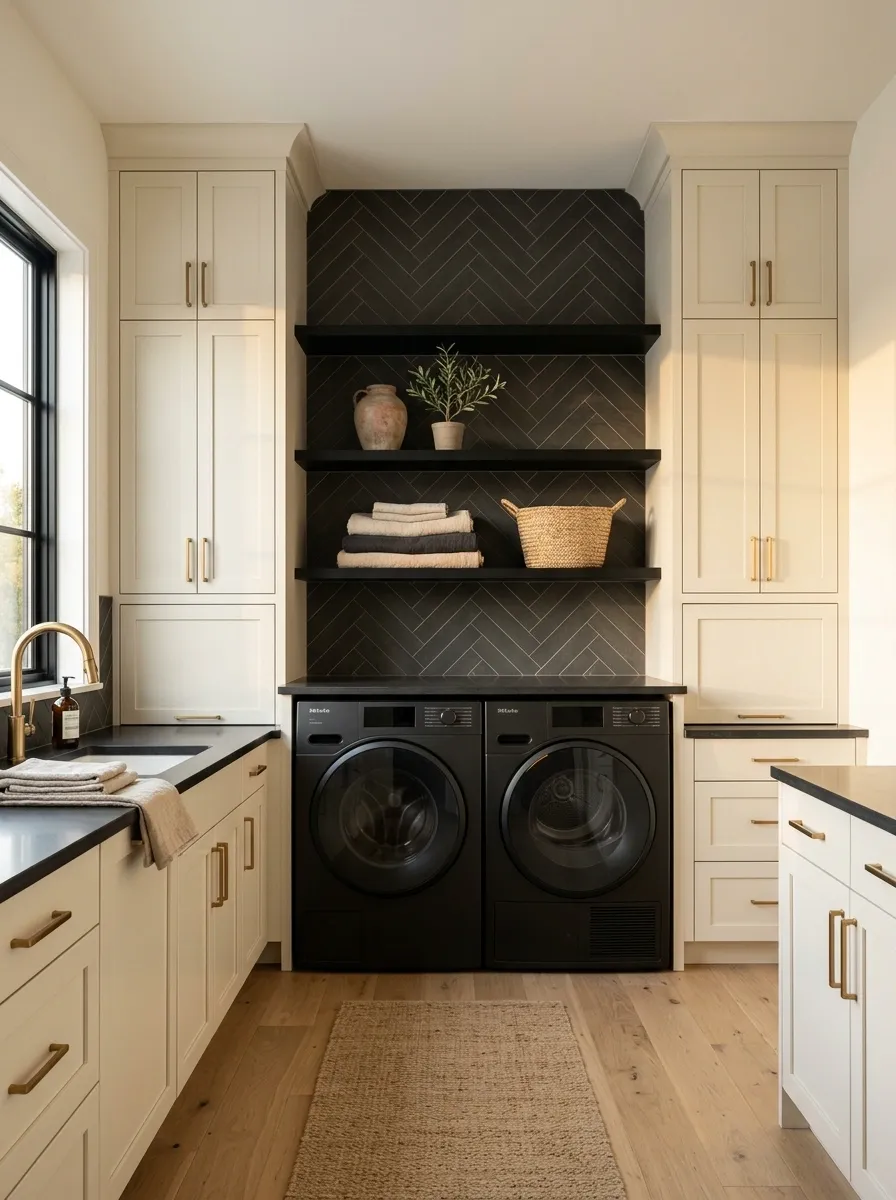
The appliances become the architectural centerpiece in this high-contrast room. Black washer and dryer units sit inside a wall of bright white cabinetry, framed by a dark backsplash and slim black shelving. Instead of trying to disguise the machines, the design makes their dark finish part of the composition.
The surrounding cabinetry stays extremely clean, with almost no open storage to interrupt the strong rectangular forms. A pale floor prevents the lower half from becoming too heavy.
The result is graphic and contemporary without relying on complicated materials. The appliances aren’t floating against a white wall anymore. They’re framed. Suddenly the two biggest objects in the room look intentional instead of unavoidable.
GIVE IT A FRAME.
Cozy Traditional Laundry Room With Black-and-White Botanical Tile
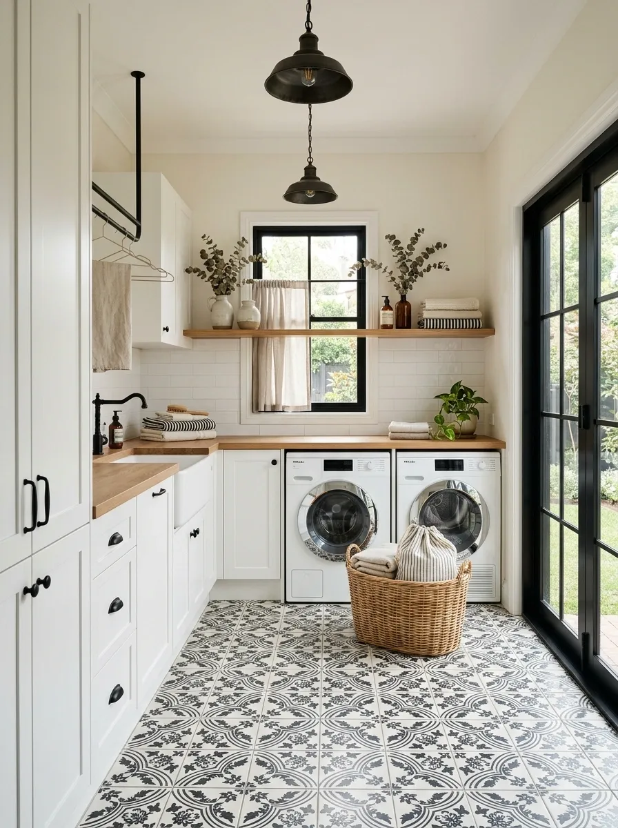
A botanical black-and-white tile gives this traditional laundry room most of its personality. The cabinetry remains white and classic, while black-framed glass doors and traditional lighting echo the darker portions of the pattern.
A warm wood counter softens the room, keeping the botanical design from feeling overly formal. Because the walls and cabinetry stay relatively quiet, the patterned floor reads as an intentional foundation rather than another competing feature.
This is the room for readers who want more decoration than a minimalist space allows, but still want the palette to feel controlled. Let one pattern carry the personality. Otherwise the floor, walls, cabinets, and accessories will all start auditioning for the same lead role.
OWN THE PATTERN.
QUIET: cabinetry, walls, counter
REPEAT: black window frames + lighting
Sophisticated Black-and-White Laundry Room With a Full Utility Pantry Wall
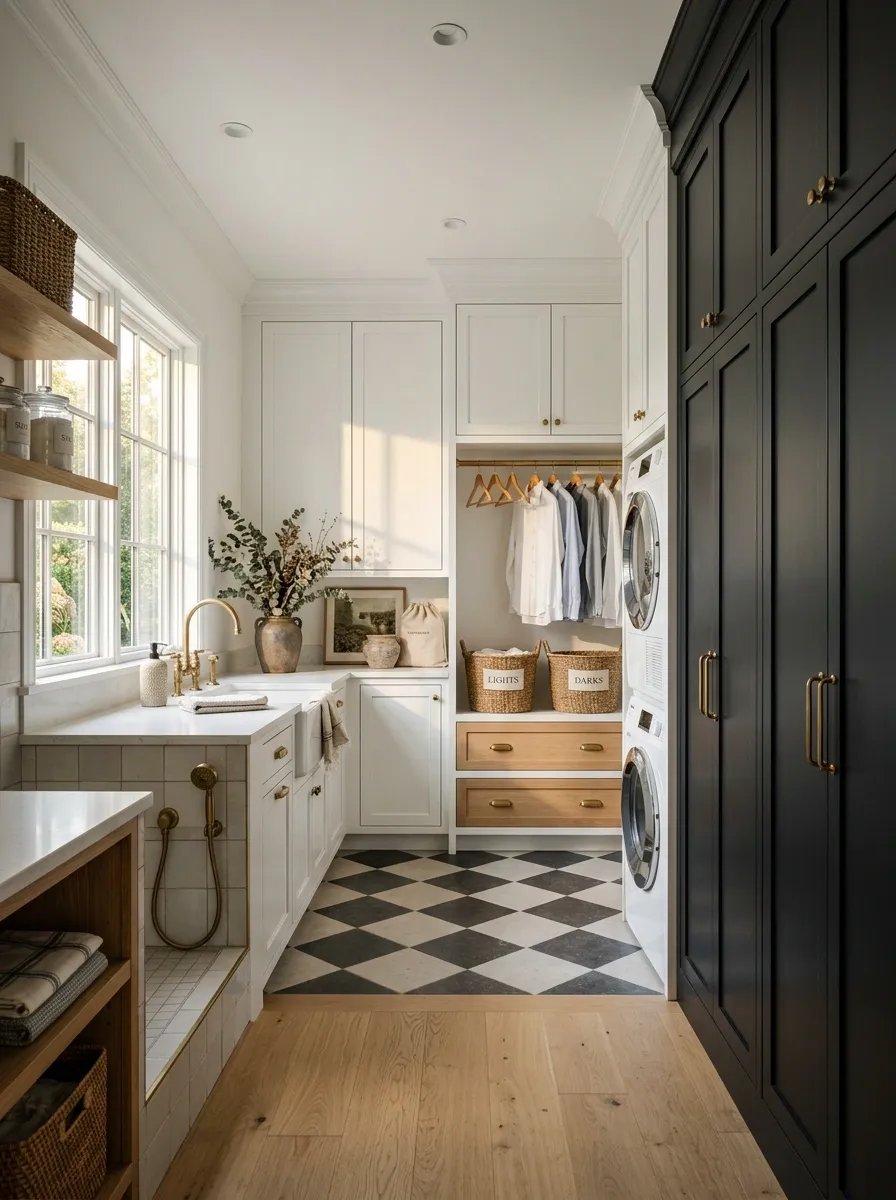
This final design turns the laundry room into a complete household workroom. White cabinetry and long folding counters handle the laundry side, while a floor-to-ceiling black pantry wall provides enclosed storage for cleaning supplies, linens, bulk products, and other things that don’t need to sit on display.
A concealed hanging zone keeps freshly dried clothes off the counter, and integrated storage preserves the room’s clean architectural lines. The black wall becomes the visual anchor, while the white work areas keep the room practical and bright.
The result feels substantial because the room was designed around everything that actually happens there, not just where the machines go. That’s the difference between a laundry room with cabinets and a proper utility space.
A PLACE TO LIVE.
DRY
FOLD
LINENS
BULK ITEMS
Make the Whole Room the Inspiration
The difference between a laundry room that looks finished and one that simply contains laundry machines usually comes down to the whole composition. Black cabinets mean very little on their own. Neither does a checkerboard floor, a stone counter, a farmhouse sink, or a nice light fixture. What matters is how those choices sit beside one another.
Some of these rooms are deliberately bright. Others use black as the dominant architectural weight. Some rely on pattern, while others get their personality from oak, limestone, windows, millwork, or an unusual layout. That range is useful because the right design direction depends on the room itself, including its size, natural light, storage needs, and existing architecture.
Start with the finished look that feels closest to home, then work backward. Save the complete scene, identify what makes the composition work, and choose finishes that support that same relationship. Shopping piece by piece is how perfectly decent rooms end up looking like several different Pinterest boards had a custody battle.