
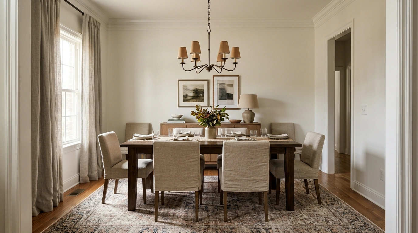
An ordinary dining room usually doesn’t look bad. That’s almost the problem.
The table works. The chairs work. There’s probably a light hanging overhead and a rug somewhere underneath it all. Yet the room still gives off that unmistakable “this is where random household stuff temporarily lives” energy.
A stack of mail lands on the sideboard. A tiny rug makes the table look stranded. The ceiling light is doing absolutely everything. Then someone adds three decorative vases and wonders why the room still doesn’t feel formal.
Formality isn’t about making the dining room precious or stuffing it with expensive furniture. It’s about visual decisions that feel deliberate. The furniture needs the right scale. The lighting needs a focal point. The walls need enough weight. The table needs breathing room. Even the empty space matters.
The Formal Dining Room Reality Check
More intention.
Start With Structure, Not Decorations
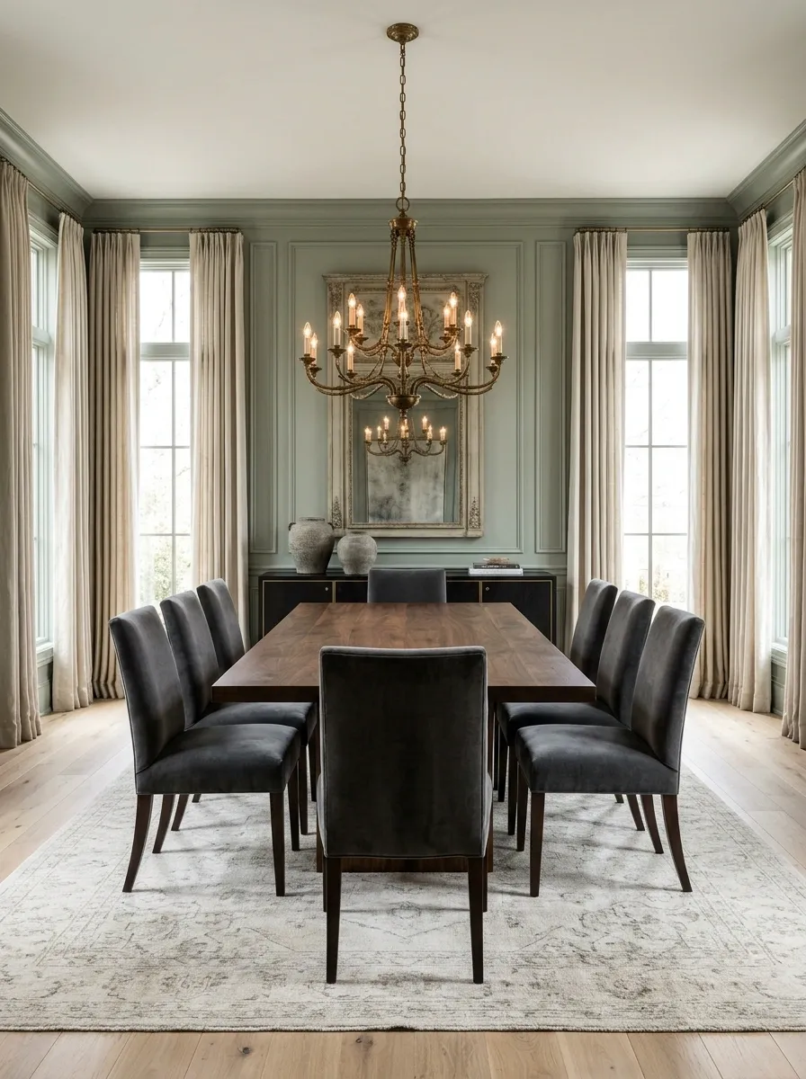
The fastest way to make a dining room look formal is to fix the furniture arrangement before buying anything.
The table should have a clear relationship with the room, chairs should sit evenly, and the main pieces should feel connected instead of scattered.
A good formal layout usually has one obvious focal point and enough breathing room around it. That’s why a beautifully decorated room can still look cheap when the table is jammed against a wall.
Fix these first:
- Center the table where the room allows it.
- Keep chair spacing visually even.
- Give the chandelier a direct relationship to the tabletop.
- Keep major furniture pieces aligned.
The room should look calm before the accessories even show up.
Casual Clutter Is Doing More Damage Than You Think
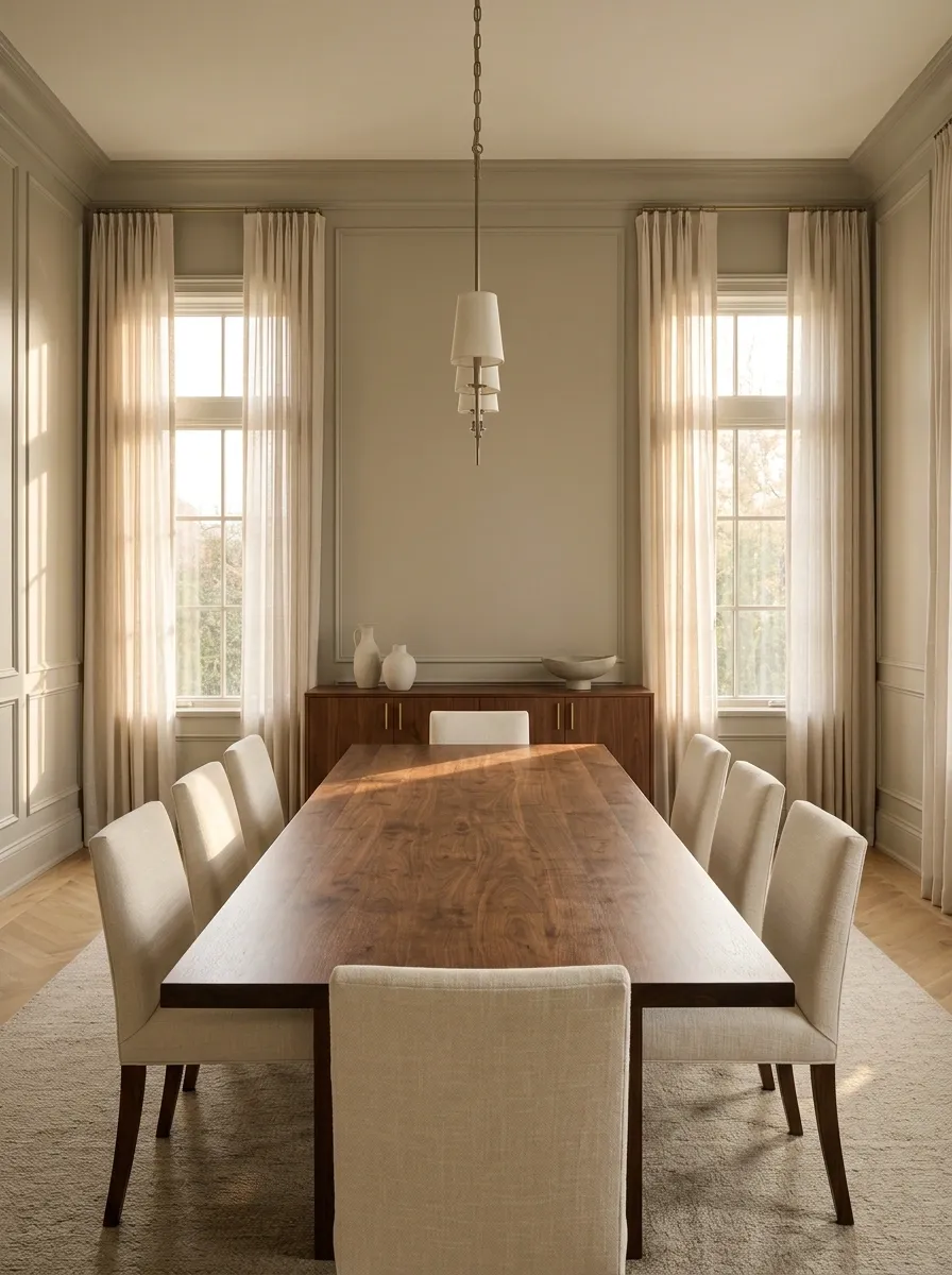
Formal rooms aren’t necessarily fuller. They’re usually better edited.
A stack of unopened mail, exposed chargers, random toys, grocery bags, and decorative pieces from five unrelated styles all send the same message: daily life won, design lost.
That doesn’t mean the room needs to become precious or untouchable. It means useful items need somewhere else to live.
The biggest offenders are usually the things nobody notices anymore because they’ve been sitting there for months.
That bowl isn’t “functional decor.” It’s the junk drawer with better lighting.
Pick One Design Language and Stick to It
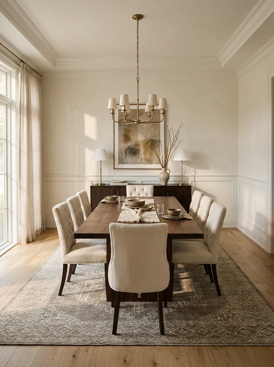
Traditional, transitional, modern, and relaxed formal dining rooms can all work. The mistake is mixing every look because each individual piece seemed nice in the store.
Pick a visual direction and repeat its cues through the room.
A traditional room can lean into warm wood, classic upholstery, brass, and framed artwork. A modern version needs cleaner silhouettes, fewer accessories, and stronger negative space. Transitional rooms sit comfortably between the two.
Consistency creates formality. The room doesn’t need more stuff. It needs fewer arguments between the stuff already there.
Formal Dining Room Ideas That Make an Ordinary Room Look Intentional
Center the Dining Table Like You Actually Planned the Room
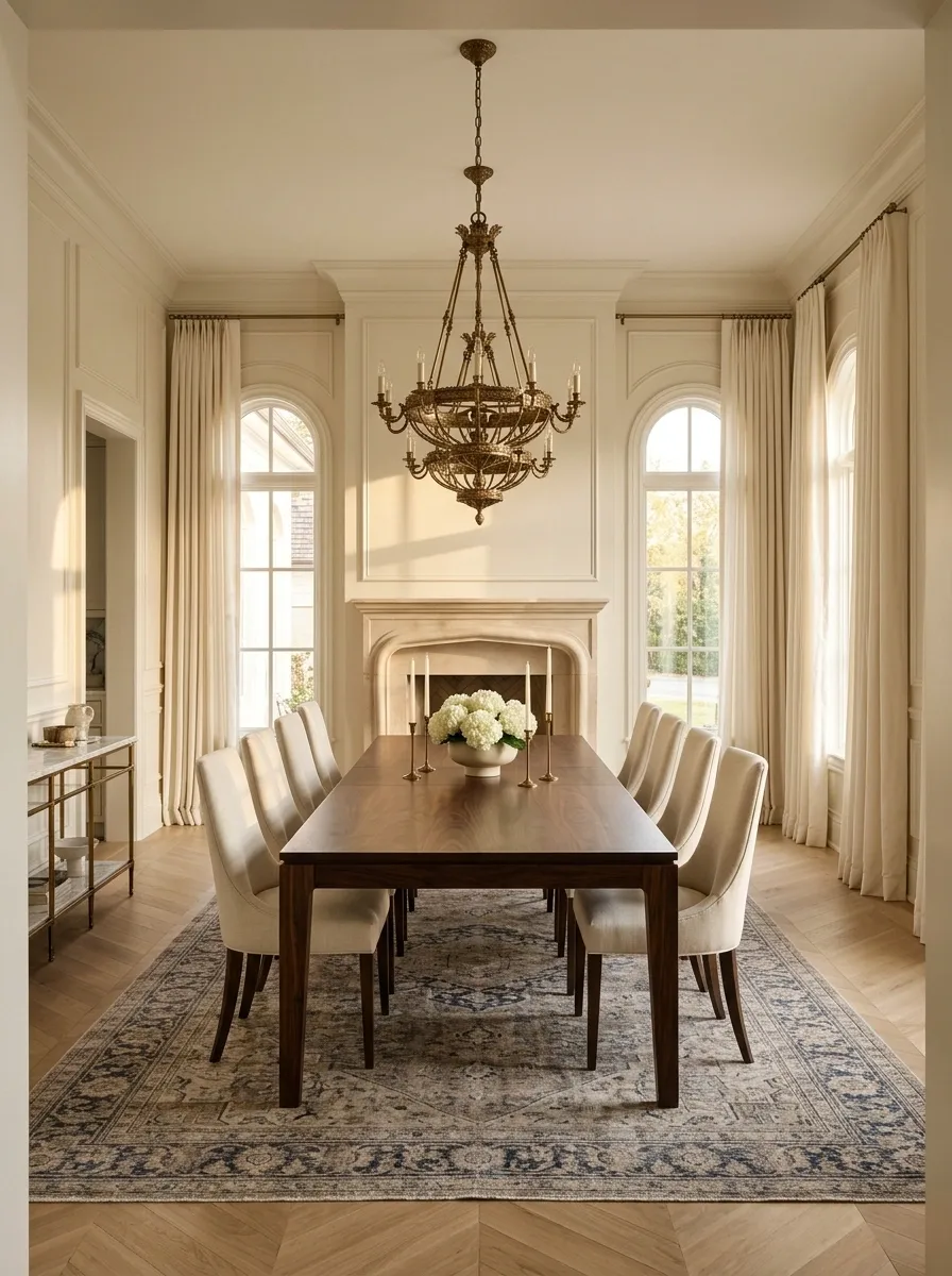
A dining table pushed too far toward one side makes even a large room feel awkward. Formal rooms depend on visual balance, and the table is the anchor.
Start by lining the table up with the strongest architectural feature available, such as a window, doorway, chandelier, or fireplace. Don’t automatically center it by math if the room’s architecture clearly favors another axis.
Think in sightlines, not measurements alone.
The goal: when someone enters, the eye should land naturally on the dining area instead of wandering around wondering where the furniture came from.
↓
LIGHT
Ditch the Flimsy Chairs That Make Dinner Feel Like a Cafeteria
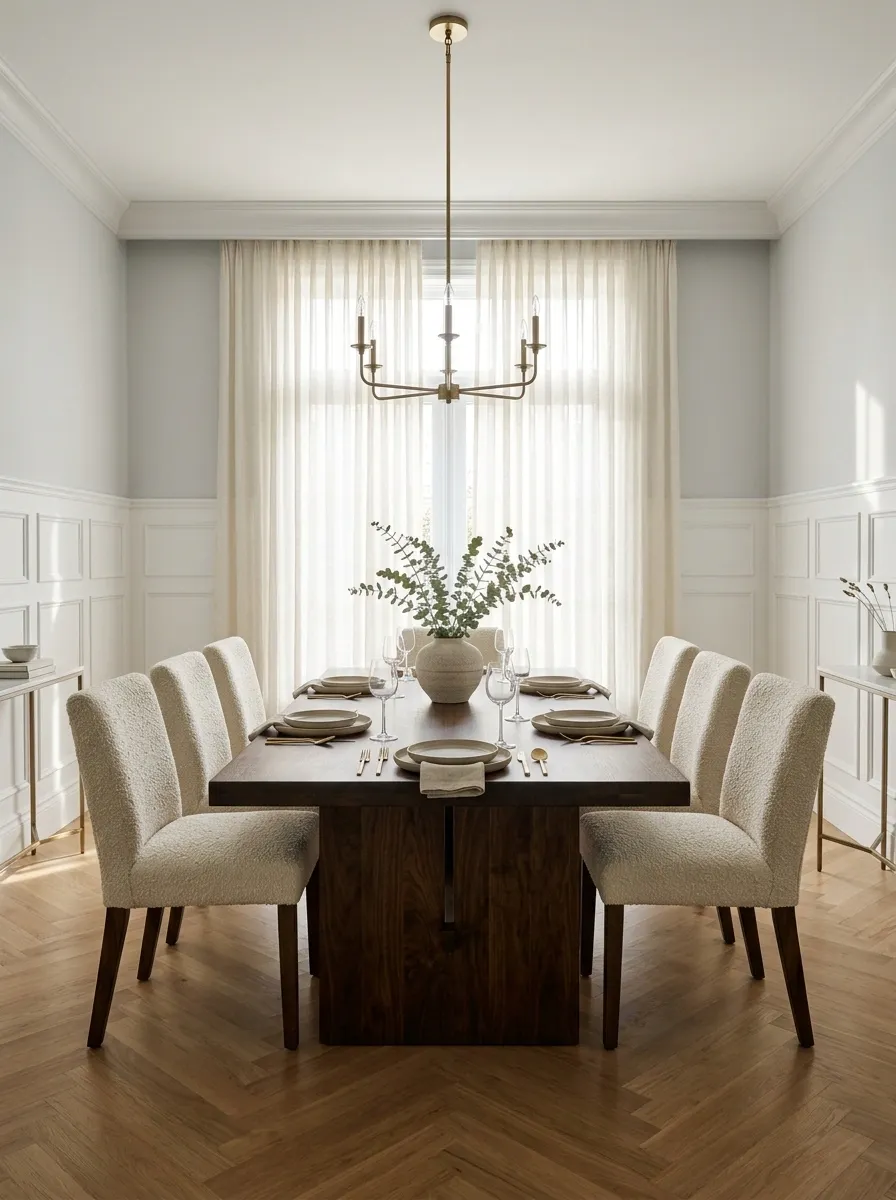
The chairs often reveal whether a dining room is formal or just wearing formal clothes for the weekend.
Swap visibly lightweight, mismatched seating for chairs with stronger backs, fuller proportions, or upholstered seats. They don’t need ornate carving. They need enough visual weight to hold their own beside the table.
A simple upholstered chair in a textured fabric can look far more expensive than a fussy chair with decorative details everywhere.
Look for:
- A substantial backrest
- Consistent chair shapes
- Upholstered or textured seating
- A finish that relates to the table
The chairs should look like they belong to the table, not like they were invited separately.
Stop Using a Tiny Rug Under a Huge Dining Table
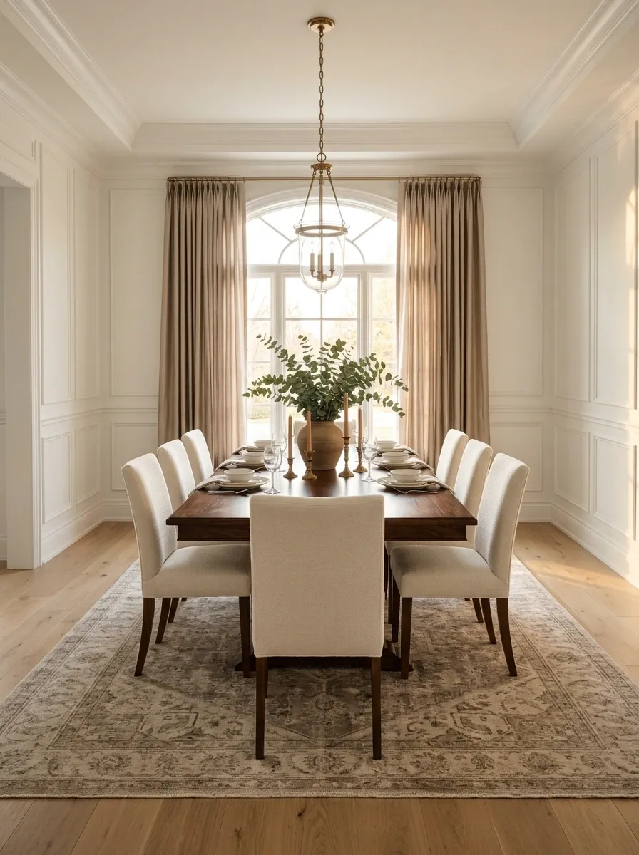
Nothing exposes an undersized rug faster than dining chairs.
When chairs slide backward during dinner, their back legs shouldn’t immediately fall off the rug. Otherwise the whole setup starts looking squeezed together, even when the room itself isn’t small.
Go large enough that the table and chairs can operate as one visual zone.
A useful test: pull the chairs outward as though someone has just sat down. If the rug suddenly becomes useless, it’s too small.
A generous rug also creates a clean boundary around the dining area, which makes the room feel more deliberate.
Give the Ceiling Light a Main-Character Moment
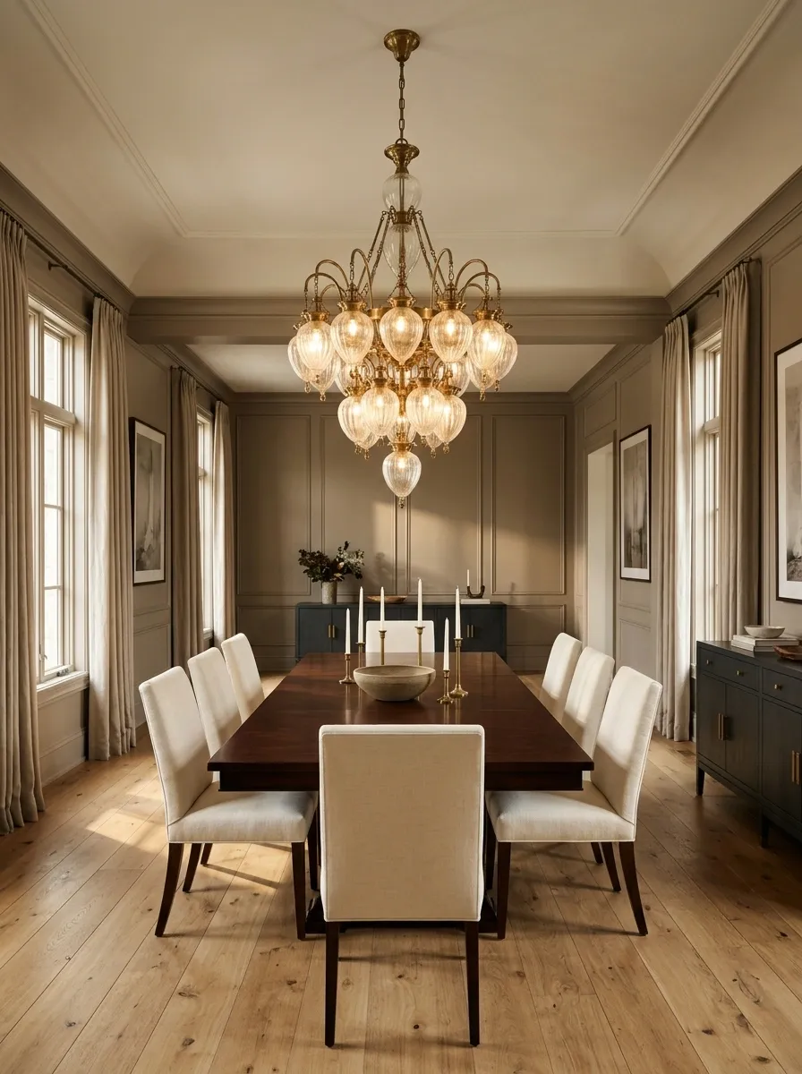
A formal dining room needs one lighting fixture that looks intentional from across the room.
Hang a chandelier or large pendant directly over the dining table rather than somewhere that merely happens to be near it. The fixture should feel connected to the table’s shape and scale.
Don’t choose the smallest fixture because the ceiling already feels “busy.” That usually creates the opposite problem. A tiny light floating over a substantial table looks timid.
Placement order:
- Center the fixture over the tabletop.
- Check that it visually matches the table’s width.
- Keep the hanging height comfortable for conversation.
- Use warm light rather than harsh cool light.
The chandelier shouldn’t compete with the dining table. It should make the table look like the star.
Weak pairing: large table + tiny ceiling light wondering what went wrong.
Make the Windows Look Taller Without Rebuilding Them
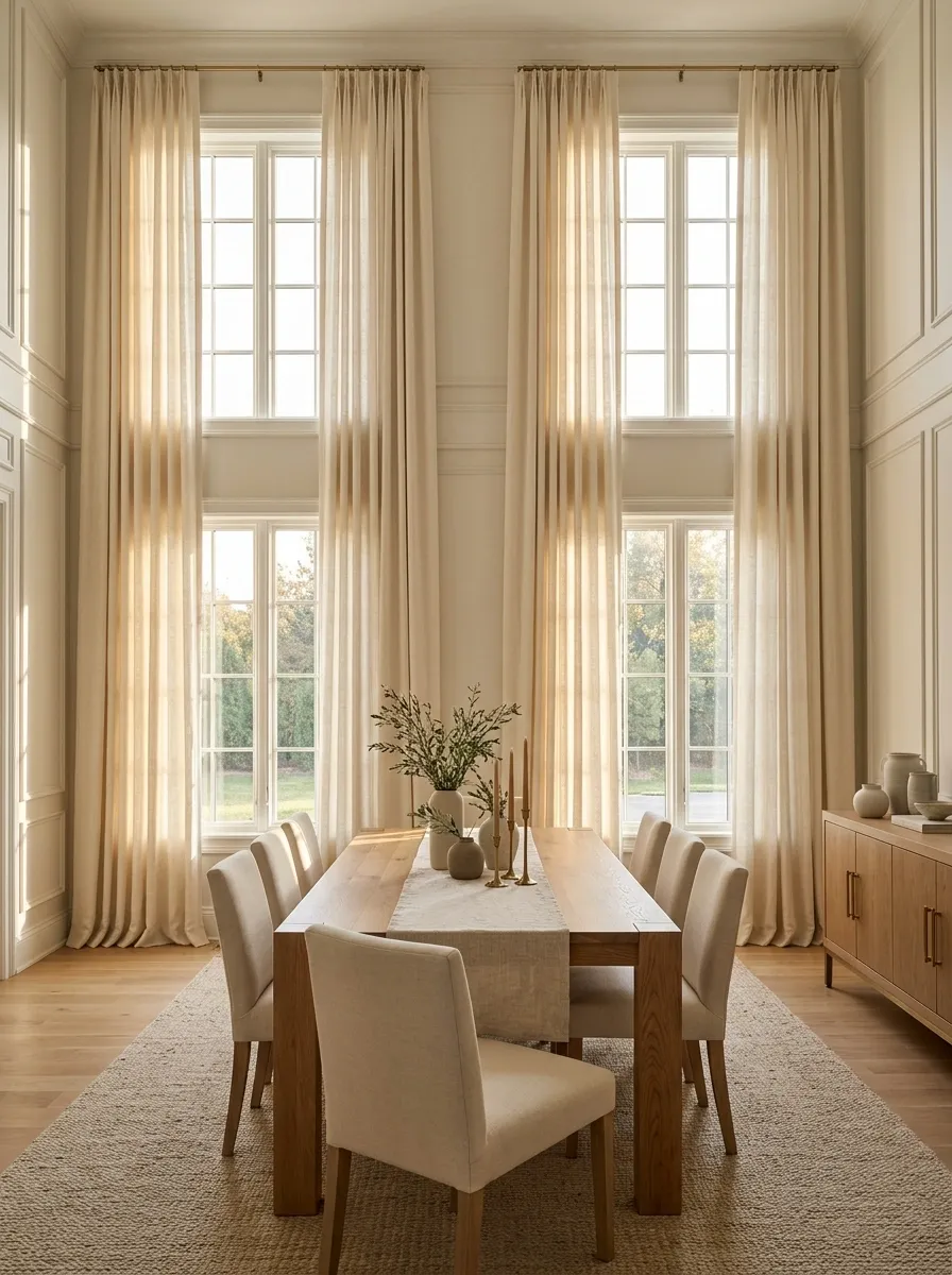
Curtains can make an ordinary dining room look dramatically more finished, but only when they’re hung with some confidence.
Mount the curtain rod higher than the window frame and extend it wider than the window so the fabric frames the opening instead of covering half the glass.
Choose one fabric and repeat its tone somewhere else in the room, such as the chair upholstery, runner, or rug.
Skip stiff, short panels that stop awkwardly around the sill. Floor-length fabric gives the room a stronger vertical line and makes the walls feel more finished.
The trick isn’t more fabric. It’s better placement.
Give the Table One Strong Centerpiece, Not a Tiny Parade of Objects
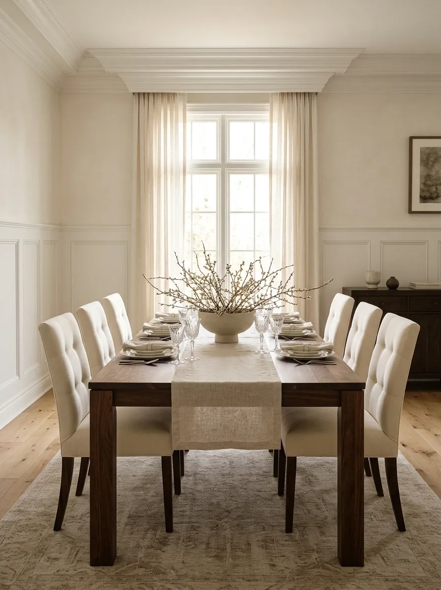
A formal dining table needs a focal point, not an archaeological dig of decorative clutter.
Choose one substantial centerpiece and let it breathe. A low ceramic bowl, a stone vessel, a long branch arrangement, or a simple floral composition can anchor the table without blocking conversation.
The key is visual weight. The centerpiece should look intentional from the doorway, not disappear once everyone sits down.
Keep the rest of the tabletop quiet. Matching place settings, a runner, and a centerpiece are enough.
Tip: Let the centerpiece occupy the visual center.

KEEP
One substantial vessel
Low branches
A controlled floral arrangement

SKIP
Tiny objects scattered everywhere
Tall pieces blocking faces
Random seasonal clutter
Put the Mirror Where It Can Reflect Something Worth Seeing
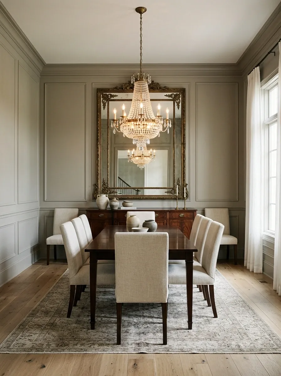
A mirror isn’t formal just because it’s large and expensive-looking.
Hang it where it reflects a chandelier, artwork, a window, or another strong part of the room. That’s what gives it a purpose beyond filling an empty wall.
A mirror directly across from a blank wall just doubles the blank wall. Congratulations, now there’s twice as much nothing.
For a more polished look, choose a frame that connects with the room’s finishes. Dark wood works beautifully with traditional spaces, while aged metal can sharpen a transitional room.
The best mirror placement gives the dining area more light and more depth without making the wall feel busy.
☀️ Window light
🖼️ Strong artwork
Keep the Color Palette Tight Enough That the Room Can Breathe
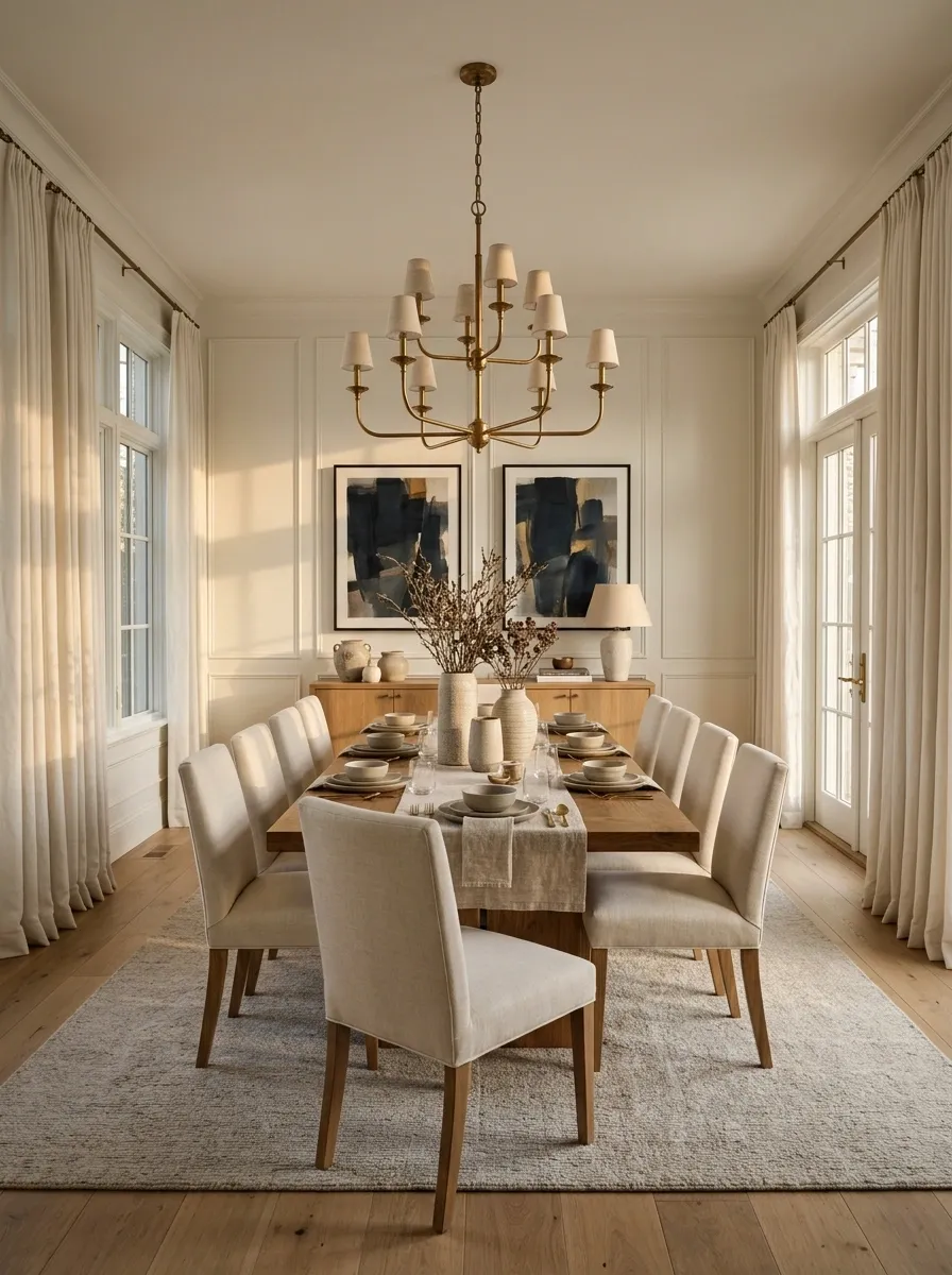
Formal rooms rarely need six competing colors fighting for attention.
Pick a restrained base and repeat it across the walls, rug, chairs, curtains, and accessories. That repetition creates the visual order that makes the room feel expensive even when the individual pieces aren’t extravagant.
A warm wood table can work with creamy walls, muted upholstery, aged brass, and one deeper accent. A darker room can take the same approach with lighter linens and artwork.
Use repetition instead of variety. The room should have a few recognizable colors appearing in different places.
Ditch Everyday Plates and Give the Table a Proper Setting
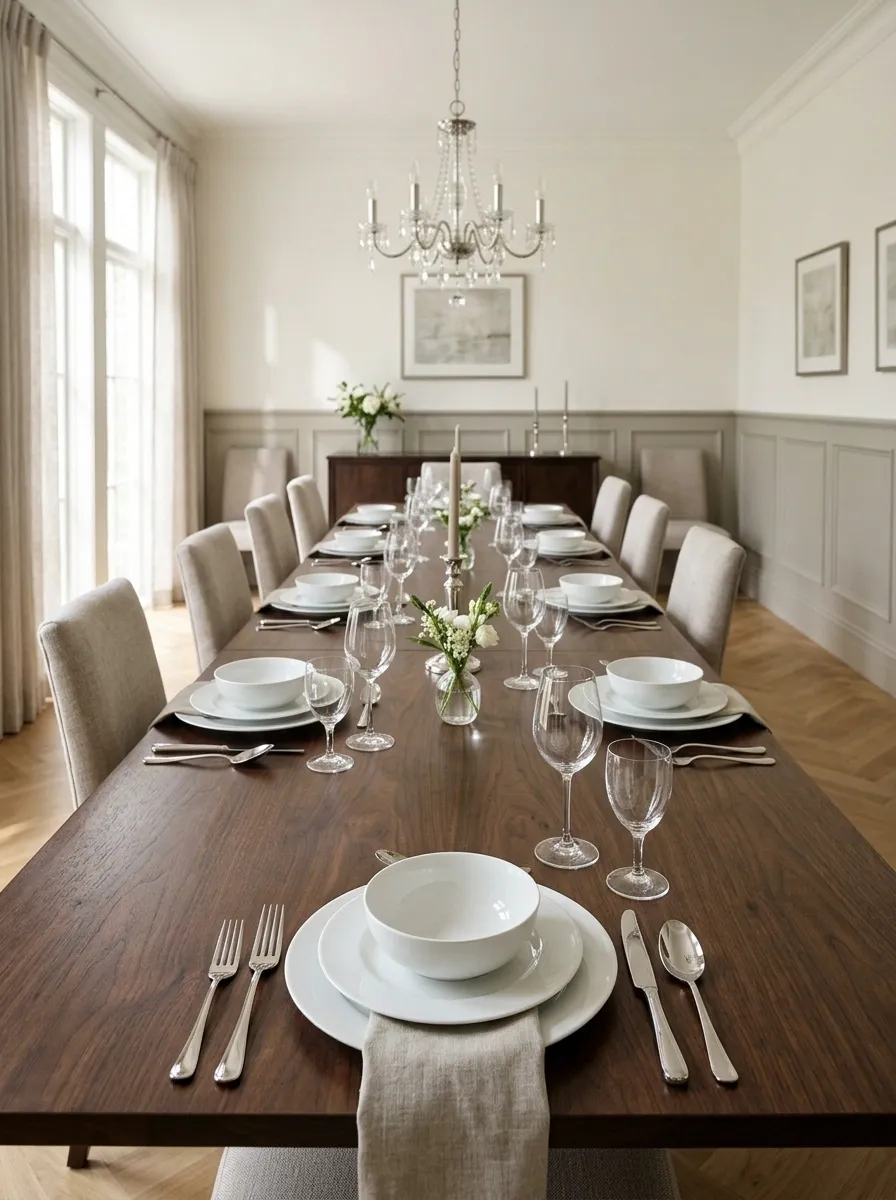
The dining table can look dramatically more formal without changing the table itself.
Coordinated dinnerware, cloth napkins, restrained glassware, and consistent cutlery create a stronger visual rhythm than a collection of whatever survived the kitchen cupboard.
The setting doesn’t need to be elaborate. It needs to repeat.
Build each place setting in this order:
- Dinner plate as the visual anchor.
- Smaller dish or bowl where needed.
- Cutlery aligned cleanly.
- Glassware grouped neatly above.
- Cloth napkin folded or placed with restraint.
The trick is consistency. Uneven settings instantly make the table look casual, even when everything on it was expensive.
Give the Longest Clear Wall a Proper Sideboard
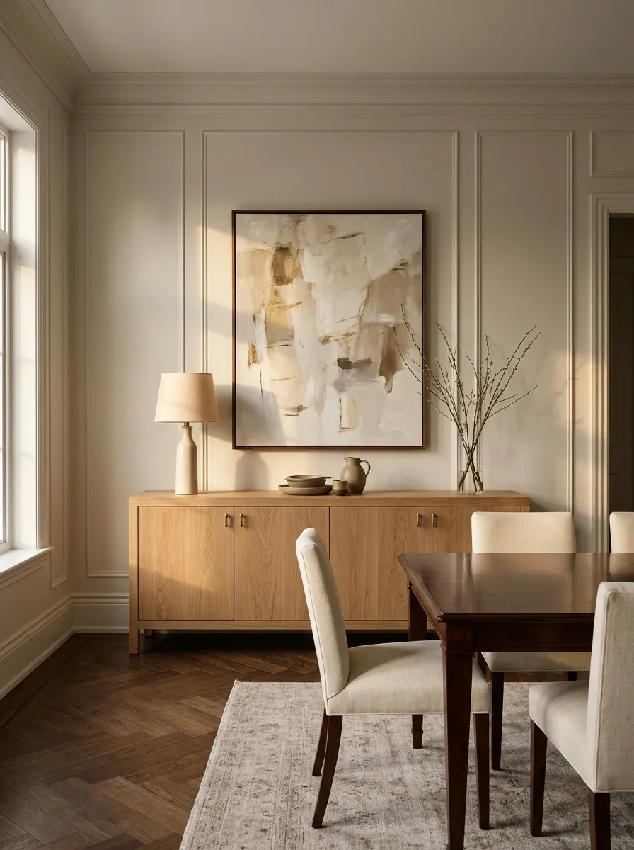
A sideboard does two jobs at once. It makes the room look finished and gives all the little dining-room necessities somewhere to disappear.
Place it against the longest uninterrupted wall whenever possible. That creates a strong horizontal line that balances the dining table and gives the room another substantial furniture anchor.
Use closed storage for things that are useful but visually boring. Leave only a few pieces visible on top, such as lamps, artwork, serving pieces, or a restrained arrangement.
A sideboard shouldn’t become a second clutter zone.
| Better placement | Why it works |
|---|---|
| Long clear wall | Creates visual balance |
| Centered beneath artwork | Builds a clear composition |
| Across from the table | Gives the room two strong anchors |
| Near the dining area | Keeps serving items practical |
The goal is furniture with a job, not furniture performing decorative unemployment.
Let the Runner Show Off the Table Instead of Covering It
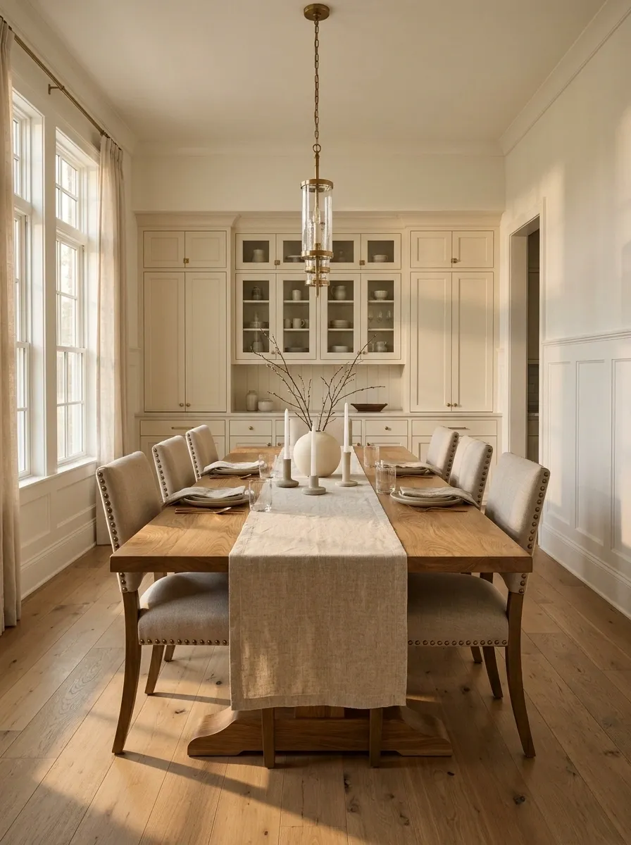
A dining table doesn’t need to be buried under fabric to look dressed.
Choose a runner that leaves plenty of the tabletop visible on both sides. The contrast between the fabric and the table surface gives the setting some structure, especially when the table has attractive wood grain.
Keep the runner visually quiet if the chairs or curtains already have a pattern. A textured linen runner works beautifully with wood, while a smoother fabric suits a cleaner transitional room.
The rule is simple: the runner should frame the table setting, not become the table setting.
Put Two Lamps on the Sideboard and Kill the Harsh Evening Light

Once dinner starts after sunset, the chandelier shouldn’t have to do all the work.
Two matching table lamps on a sideboard add a softer layer of light and make the dining room feel much more finished. Matching pairs also create symmetry, which formal rooms handle exceptionally well.
Use lamps with enough height to hold their own against the artwork or mirror above the sideboard. Keep the shades similar in shape and scale.
Sideboard lighting checklist:
- Two lamps for a balanced composition
- Warm light for evening meals
- Shades that aren’t dwarfed by the furniture
- Enough space between each lamp and the center decor
- Cords tucked away
Nobody wants “fluorescent interrogation room” energy with dinner.
Styling rule: Let the chandelier illuminate the table. Let the sideboard lamps make the rest of the room feel alive.
Create Symmetry With Pairs Instead of Filling Every Surface
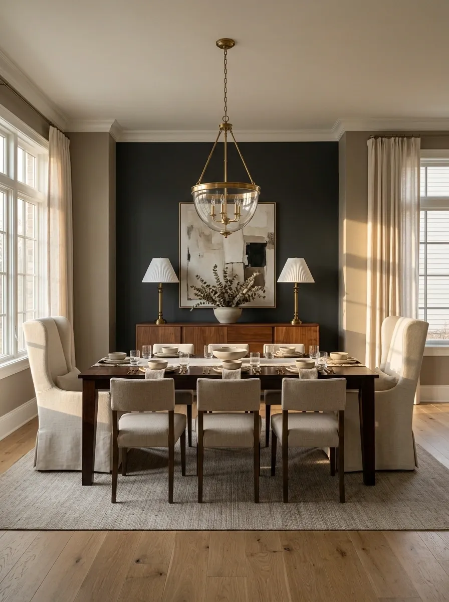
Symmetry makes a dining room look organized almost instantly.
Place matching lamps on a sideboard, matching chairs at the ends of the table, or paired artwork around a central focal point. The important part isn’t buying matching everything. It’s creating a few moments where the eye can recognize balance.
This works especially well in an ordinary room because symmetry gives unrelated furniture a stronger sense of connection.
Don’t turn the entire room into a mirror image. One or two symmetrical zones are enough.
Frame the Table With Artwork Large Enough to Matter
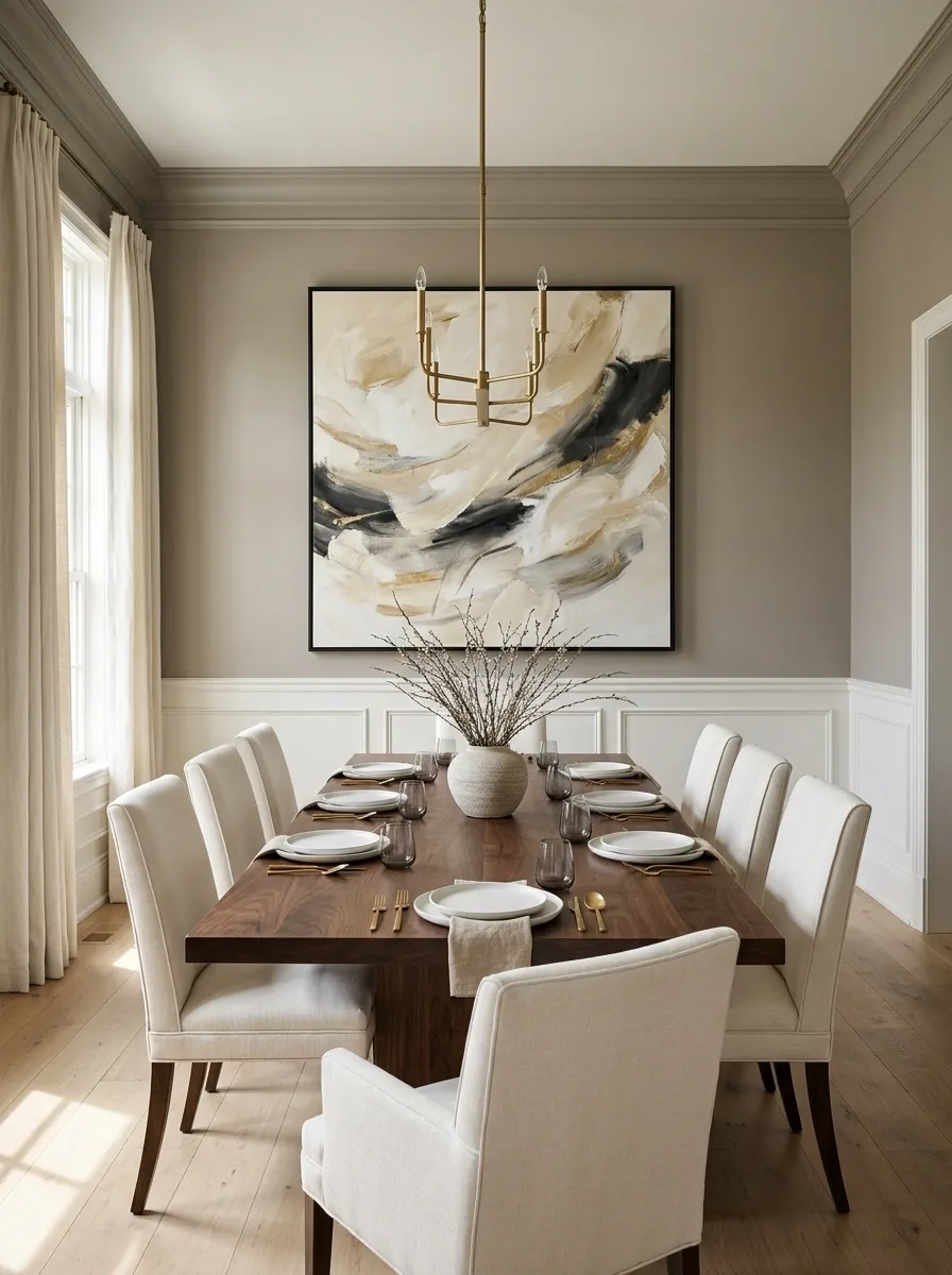
Tiny artwork above a dining table creates a strange little gap that makes the furniture feel oversized.
Choose artwork with enough visual weight to hold the wall. A large framed print, painting, textile, or even a pair of coordinated pieces works far better than a collection of unrelated small frames.
Keep the artwork connected to the dining room palette. It doesn’t need to match the curtains exactly, but repeating one or two tones ties the composition together.
For a cleaner formal look:
- Go larger rather than smaller.
- Keep frames consistent when using multiple pieces.
- Center the composition with the dining table.
- Give the artwork enough breathing room around it.
The wall should look anchored, not decorated as an afterthought.
Paint the Walls a Deeper Color and Let the Dining Room Have Some Backbone
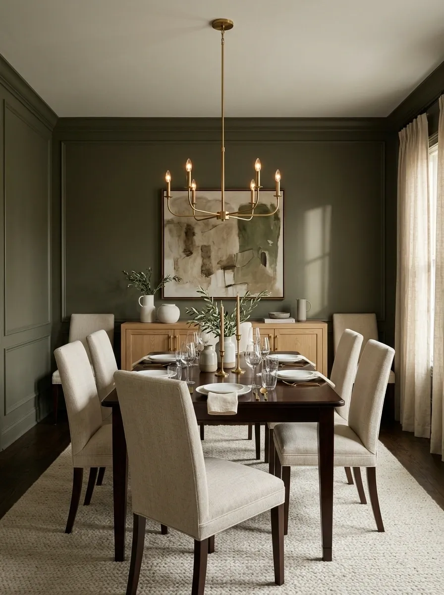
White walls aren’t automatically sophisticated. Sometimes they’re just white walls quietly refusing to participate.
A deeper wall color can give an ordinary dining room more visual weight, especially when the furniture is light or the room lacks strong architectural features.
Think warm taupe, muted olive, deep blue, charcoal, earthy brown, or another grounded shade that works with the existing wood and upholstery.
The trick is coordination. Repeat a small amount of the wall color in artwork, textiles, or accessories so the room feels connected rather than randomly painted.
Keep the finish calm. The formal look comes from depth and consistency, not from picking the loudest color sample in the store.
Add Simple Molding and Make the Walls Look More Expensive
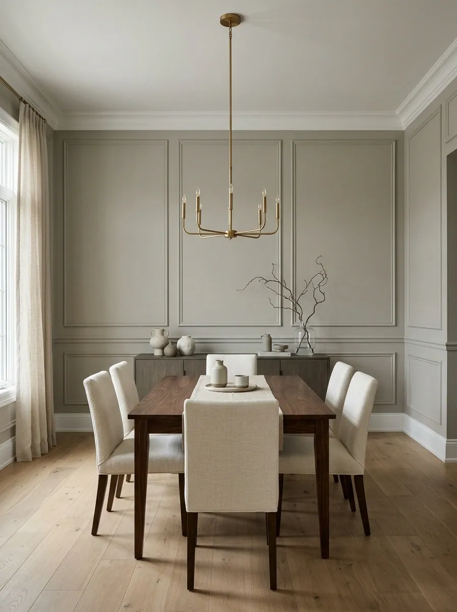
Formal dining rooms get a lot of mileage from architecture, but that doesn’t mean the room needs a contractor and a dramatic renovation montage.
A simple picture rail, narrow molding strip, or clean panel detail can give flat walls more structure. The key is repetition. Keep the lines even and let the molding follow the room’s existing architecture.
Don’t cover every inch with trim. One strong wall treatment often looks more sophisticated than turning the entire room into a trim showroom.
Best places to start:
- The wall behind the dining table
- A long uninterrupted wall
- A wall already framed by doorways or windows
Give the Table Linens One Consistent Fabric Story
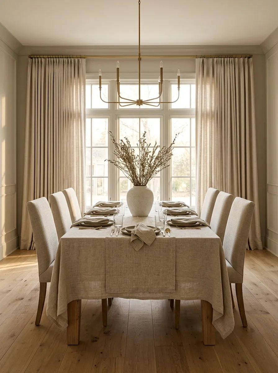
The tablecloth, napkins, runner, and curtains don’t need to match exactly. They do need to stop looking like four separate shopping decisions.
Pick one fabric character and repeat it. Linen can make a traditional room feel relaxed without looking sloppy. A heavier woven fabric gives a transitional room more weight. Smooth cotton works when the rest of the dining room is already clean and tailored.
Texture matters just as much as color.
Keep the fabric story consistent: natural with natural, tailored with tailored, textured with textured.
That tiny bit of repetition makes the whole room feel calmer.
THREAD
Get Kitchen Overflow Off the Dining Room Furniture
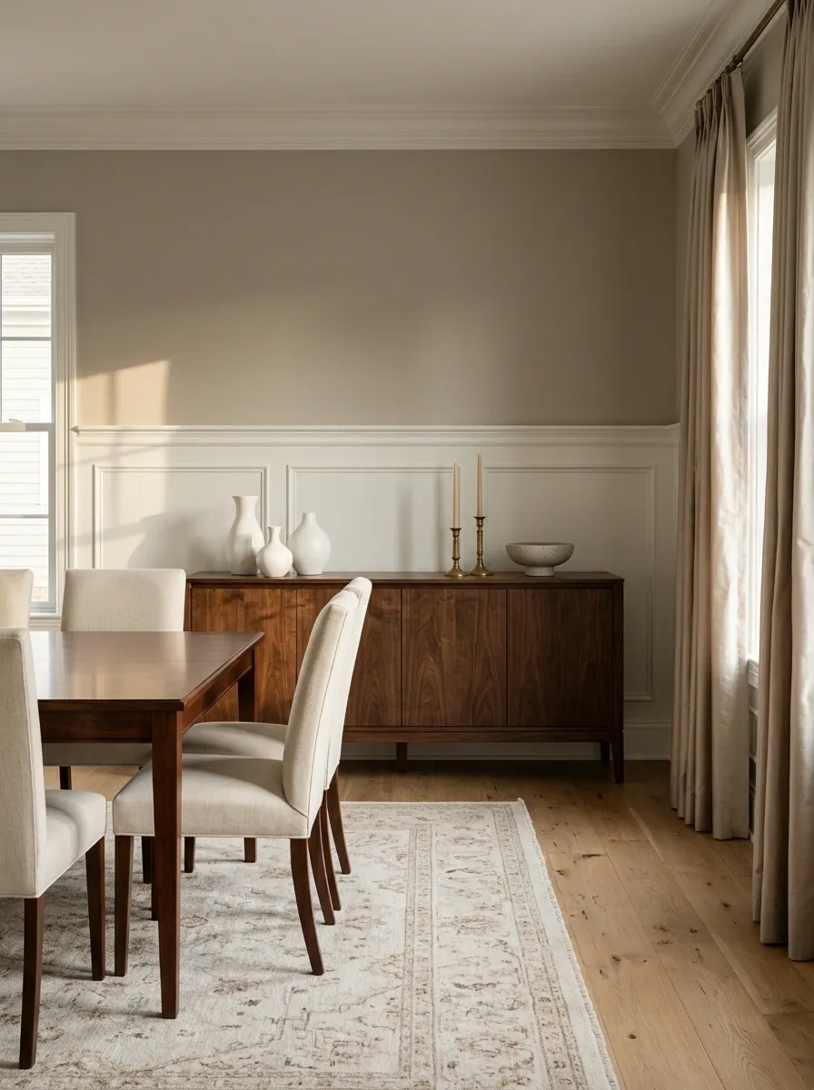
Formal styling gets nowhere when the sideboard is storing cereal boxes, receipts, appliance manuals, and that one shopping bag nobody has admitted belongs to them.
The dining room needs a clear visual boundary. Serving pieces can stay. Everyday household overflow can’t.
Do one ruthless sweep before adding anything new.
Move it to a dedicated drop zone.
Hide them in closed storage.
Return them to their actual home.
Put it back where it belongs.
Pick the Table Shape That Makes the Room Feel Balanced
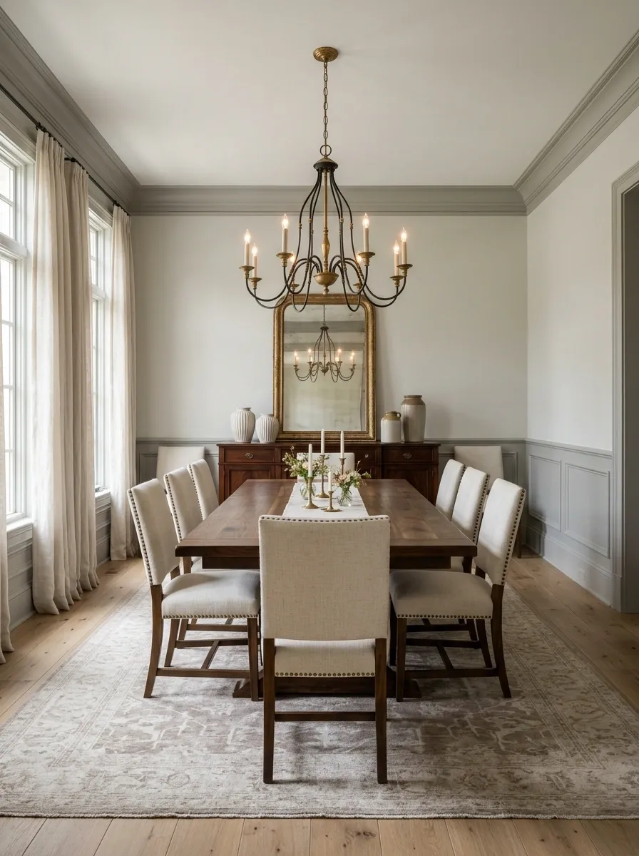
The dining table shouldn’t fight the architecture.
Long rectangular tables naturally suit elongated rooms. Round tables can make a tighter dining area feel easier to move around. Oval tables give you some of the softness of a round table while keeping more seating capacity along the length.
Choose based on the room’s shape first, then the style.
A beautiful table with the wrong proportions will always look wrong. It’s the furniture equivalent of wearing shoes two sizes too small because they looked cute online.
Add a Bar Cabinet That Actually Has a Job
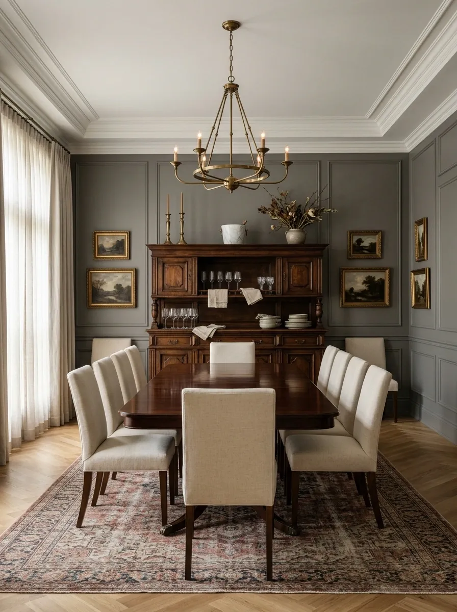
A formal dining room benefits from one substantial storage piece, especially when it doubles as a serving station.
A bar cabinet, china cabinet, or closed serving console can hold glasses, linens, dishes, and entertaining pieces while keeping the room visually clean.
Choose one that relates to the dining table in either finish, shape, or proportion. It doesn’t need to be a matching set. In fact, overly matched furniture can make the room feel more like a showroom.
Give it three jobs:
- Store the useful stuff.
- Display a small number of attractive pieces.
- Provide a surface for one lamp or centerpiece.
That’s enough. The cabinet doesn’t need a second career as a junk drawer with legs.
Repeat One Metal Finish So the Room Stops Looking Random
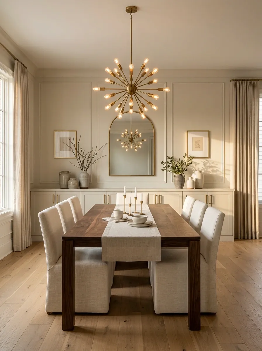
Mixed metals can work, but accidental mixed metals are a different species.
Choose one dominant finish for the dining room and repeat it through the chandelier, cabinet hardware, picture frames, mirror frame, or candleholders. Aged brass can warm up wood furniture. Black metal can give a traditional room a cleaner edge. Bronze works well when the room already leans earthy.
The finish doesn’t need to appear everywhere. It just needs to show up often enough to look intentional.
Use one finish as the anchor, then let other metals stay quiet.
Give Every Dining Chair Enough Breathing Room
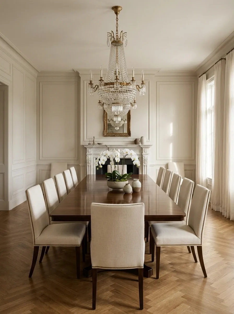
Crowded chairs make even an expensive dining set look uncomfortable.
Leave enough space between chairs that guests aren’t bumping elbows before the food arrives. Keep the end chairs visually separated from nearby walls or furniture too.
This matters especially in a formal room because symmetry becomes obvious. A table with evenly spaced chairs looks composed. The same table with chairs crammed together looks like every seat had to be booked in advance.
Check the room while the chairs are pulled back, not pushed under the table. That’s how the dining area actually functions.
Use a Low Floral Arrangement So Dinner Guests Can Actually See Each Other
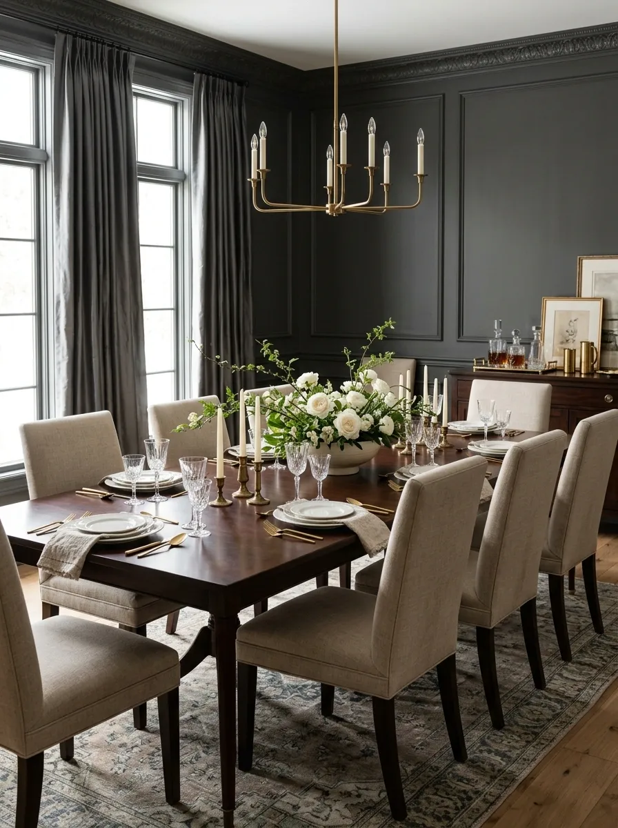
Tall centerpieces have a certain talent for turning dinner conversation into a game of hide-and-seek.
Use a low arrangement across the center of the table instead. Fresh flowers, clipped branches, seasonal greenery, or a shallow bowl can provide enough height to feel substantial without becoming a wall between two people.
Keep the container wide enough to hold the arrangement visually. A tiny vase stuffed with one enormous branch usually looks more accidental than elegant.
Aim for a centerpiece that reads from the doorway but disappears from the sightline when people sit down.
Turn the Blank Wall Into a Deliberate Gallery Moment
An empty wall isn’t always minimal. Sometimes it just looks like the decorating budget ended abruptly.
Build a controlled artwork arrangement instead of hanging random frames wherever there happens to be space. Use related colors, similar frame finishes, or one clear visual theme to make several pieces read as one composition.
The dining table should still remain the main anchor. Artwork supports it.
A simple formula works well:
- One large central piece
- Two coordinated pieces beside it
- A tight group of smaller matching frames
Leave enough wall around the arrangement so it doesn’t look stuffed.
Give the Ceiling Some Attention When the Walls Already Work Hard
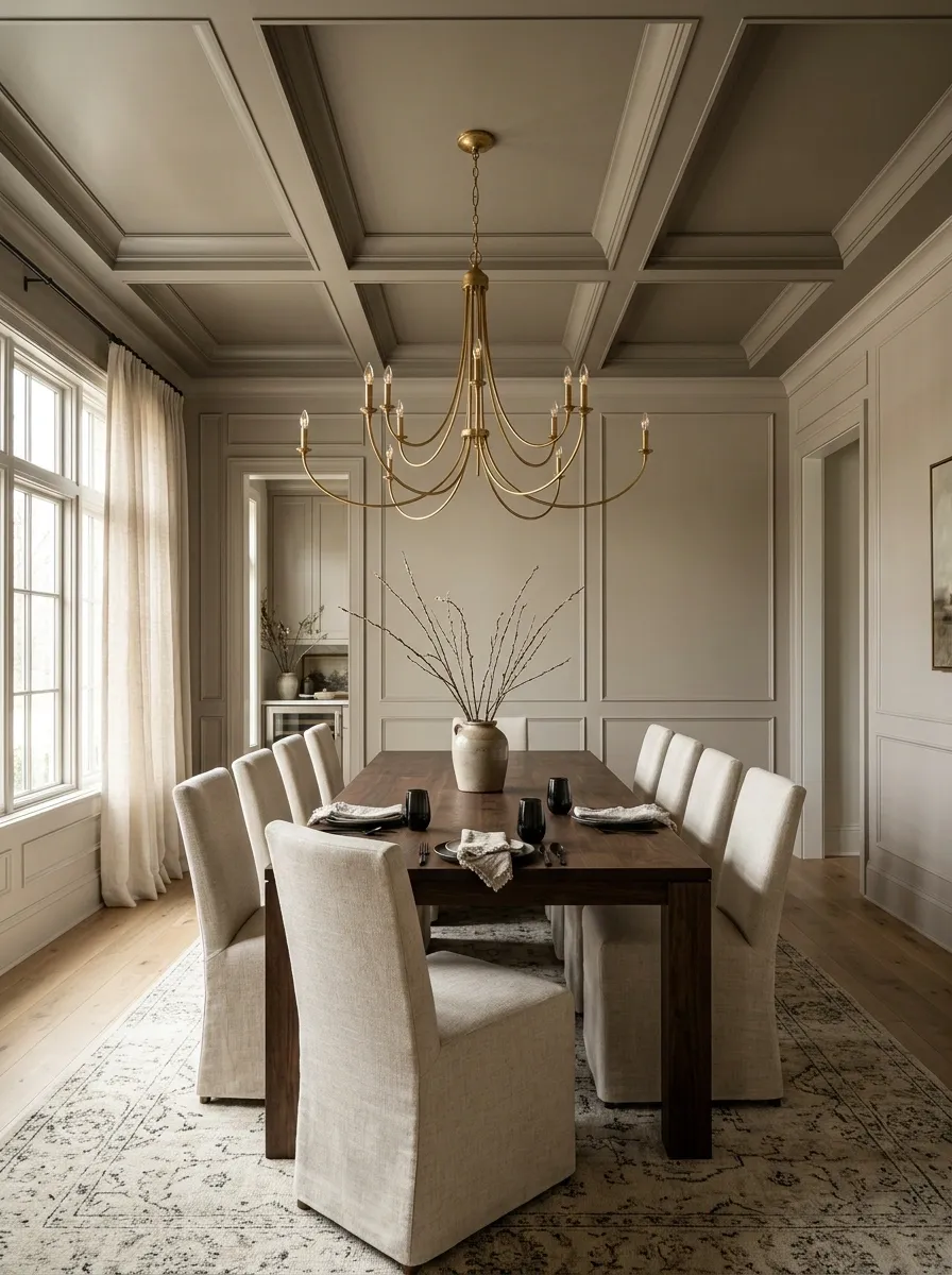
A ceiling is the forgotten fifth wall, mostly because everyone has agreed to ignore it.
A subtle ceiling treatment can make a dining room feel more architectural without changing the room’s footprint. Try a slightly deeper paint color, wallpaper, shallow paneling, beams, or a defined trim border when the room’s architecture supports it.
Don’t pile every treatment onto one ceiling. One clean move is enough.
A ceiling treatment works especially well when the dining table and chandelier already have strong proportions because it pulls the eye upward and completes the composition.
Think of it as finishing the room from the top down, not decorating another surface for the sake of it.
Make the Lighting Layers Work Beyond the Chandelier
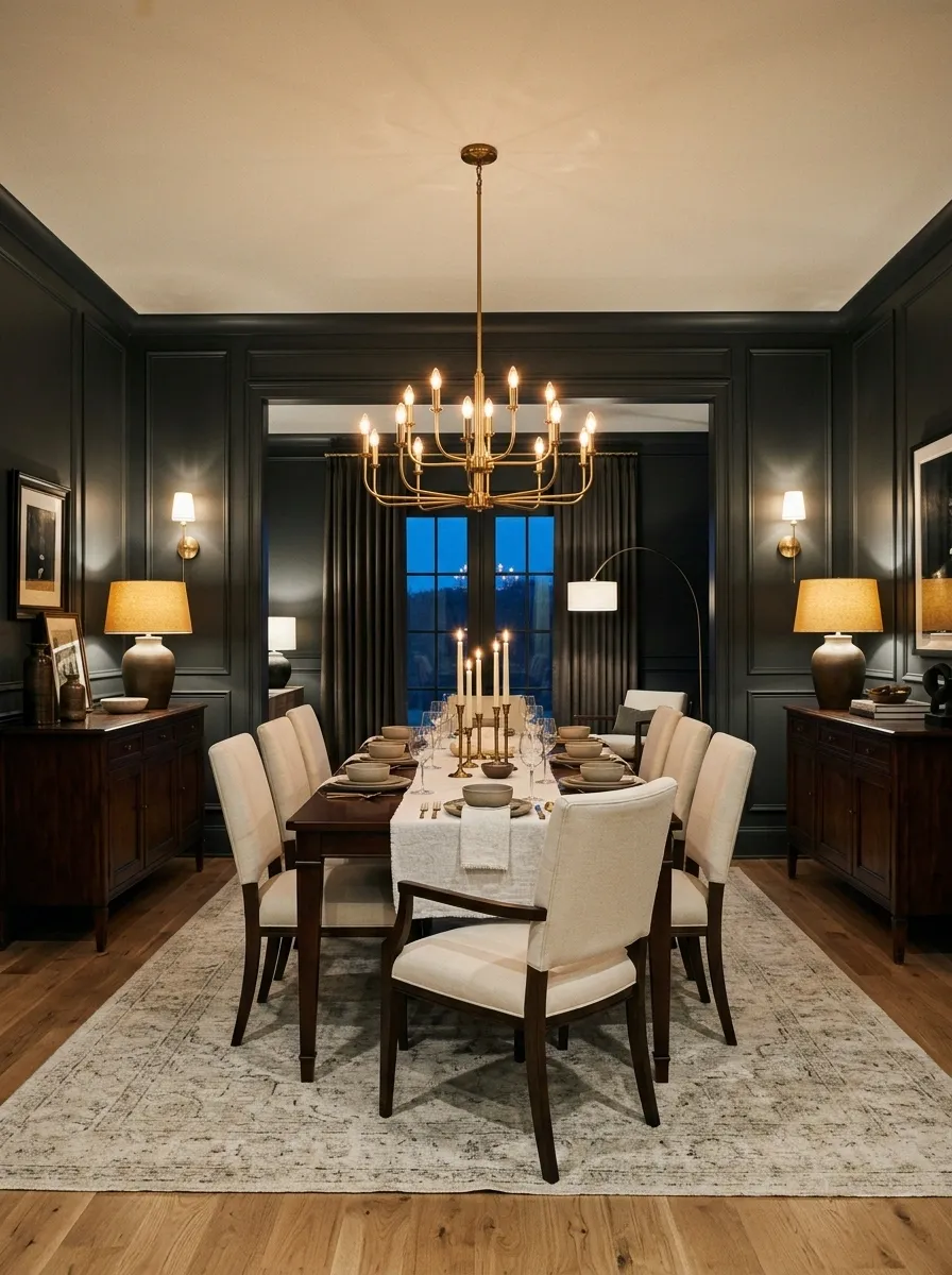
The chandelier handles the table. It shouldn’t be responsible for making the entire room visible.
Add a second layer of light through sideboard lamps, wall sconces, nearby floor lamps, or strategically placed accent lighting. This gives the dining room depth at night instead of flattening everything under one bright fixture.
The easiest upgrade is usually simple: keep the chandelier warm and add softer light farther around the room.
Fake an Architectural Upgrade With Decorative Wall Molding
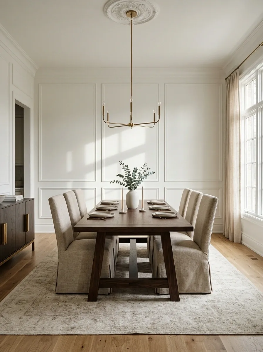
Flat walls can make an otherwise beautiful dining room feel unfinished. Decorative molding fixes that by adding shadows, lines, and proportion without changing the room’s footprint.
Box molding works especially well behind the dining table because it creates an architectural frame around the furniture. Keep the panels evenly spaced and aligned with the room’s existing doors, windows, and trim.
Don’t make the boxes tiny. Small, fussy rectangles can make the wall look busier instead of more refined.
The goal is rhythm, not wallpaper made of geometry.
Style the Sideboard With Three Levels, Not Twelve Little Things
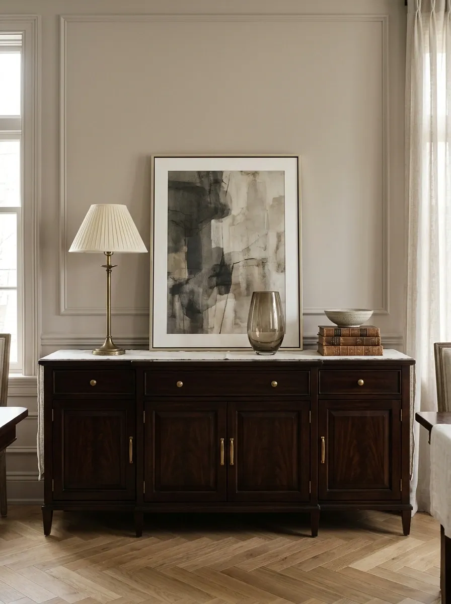
A sideboard looks polished when the eye can understand it quickly.
Create three visual heights: one tall element, one medium element, and several low pieces that connect everything together. A lamp can provide the height. A framed piece or vessel can fill the middle. A shallow bowl or small stack of books can handle the low layer.
That’s enough visual variety without turning the cabinet into a flea market display.
Think high, medium, low.
Hide the Everyday Essentials Behind Closed Storage
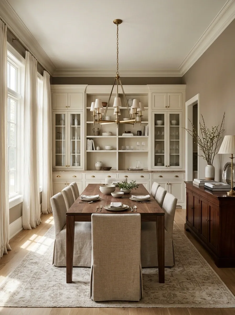
Formal dining rooms don’t need to look unused. They need to keep ordinary visual noise under control.
Use closed cabinets, drawers, baskets behind doors, or a proper serving console to hide things that don’t belong in the room’s finished composition.
Keep visible surfaces reserved for pieces that support the design: servingware, books, lamps, artwork, or a small arrangement.
A room feels dramatically calmer when the eye sees furniture first and storage second.
Artwork
Table linens
Paperwork
Household overflow
Finish the Room With One Detail That Doesn’t Look Like Everyone Else’s
The final layer shouldn’t be another generic vase, another framed quote, or another object that came bundled with the dining set.
Choose one personal detail with enough presence to make the room feel lived in. It could be a beautiful antique serving piece, a distinctive piece of art, a collected ceramic, an inherited table accessory, or a material with a story behind it.
The trick is restraint. One memorable detail beats a shelf full of forgettable ones.
Before calling the room finished, use this final edit:
The Room Doesn’t Need More Stuff. It Needs Better Decisions.
A dining room starts looking formal long before the expensive pieces arrive.
Center the table. Fix the rug. Give the chandelier something worth hanging over. Make the curtains taller, the artwork larger, and the sideboard quieter. Hide the everyday clutter. Repeat a few materials and colors until the room starts speaking the same visual language.
That’s what makes the difference. Not a room packed with decorative objects, but a room where every major piece seems to know exactly why it’s there.
And honestly, that’s the whole trick behind a convincing formal dining room. It should feel polished without looking frightened of fingerprints.
Save this list for the next dining-room reset, especially before buying another decor piece that looked much better in the store.