
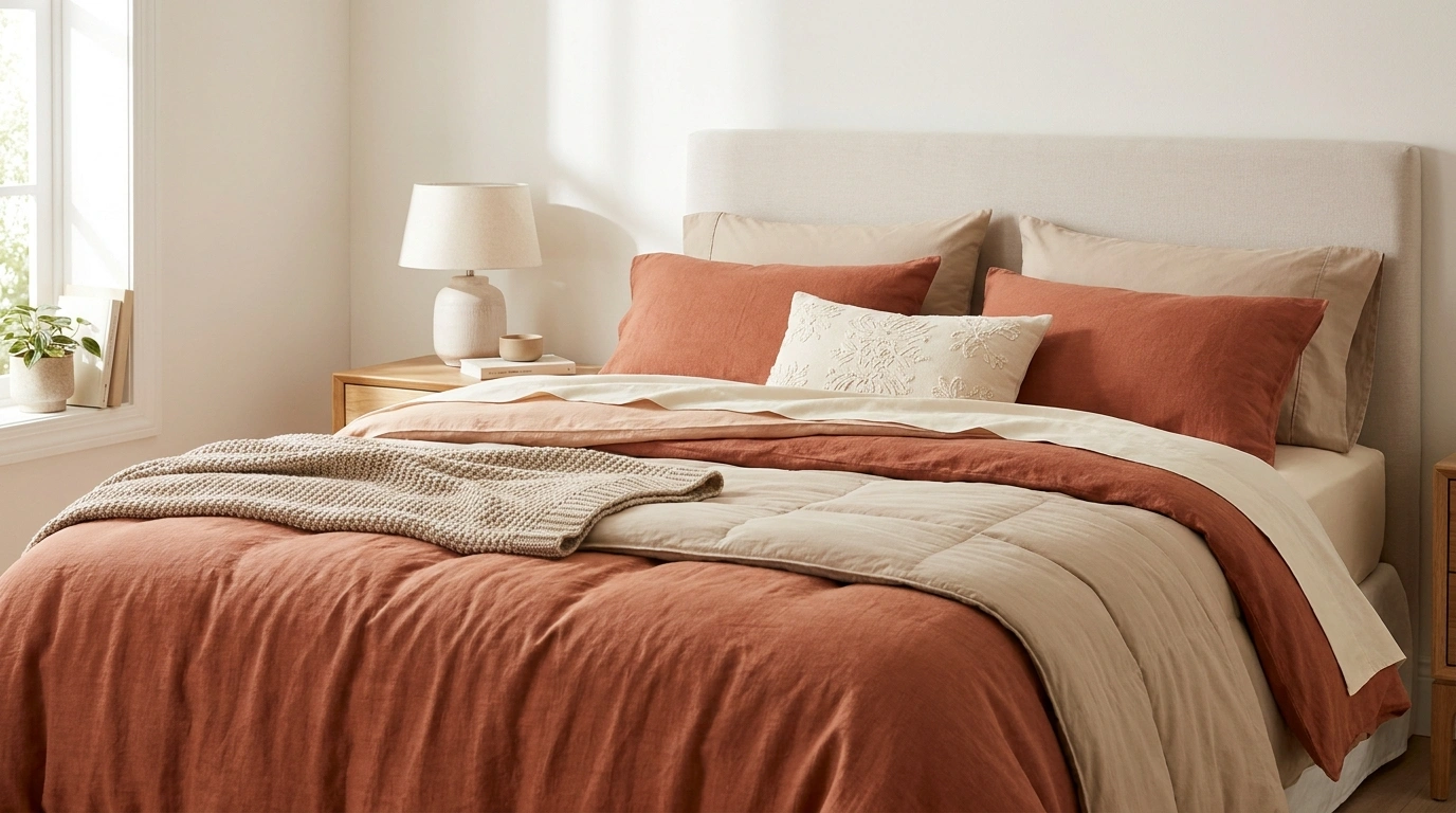
A bedroom can have expensive sheets, a beautiful duvet, and enough decorative pillows to fill a small sofa, yet the bed still looks strangely unfinished.
Usually, the problem isn’t a lack of accessories. It’s that the colors, patterns, fabrics, and furniture aren’t working together.
The duvet is warm white, the sheets are icy white, the accent pillows have introduced three unrelated colors, and the throw looks like it wandered in from another bedroom. Something has gone wrong, and buying another cushion isn’t going to fix it.
A FRIENDLY BEDROOM INTERVENTION
Your bed doesn’t need more pillows. It needs a plot.
A floral duvet, striped sheets, six accent cushions, and a completely unrelated throw? The bedding group chat is concerned.
THE FORMULA THAT ACTUALLY WORKS
One main character
Let the duvet, quilt, or strongest color lead. The bed needs a focal point, not a committee.
A supporting cast
Choose quieter fabrics and textures that help the main layer make sense.
Some breathing room
Repeat a few colors, leave some plain fabric visible, and let the bed look like an actual bed.
Good bedding has a color story. It doesn’t need a plot twist on every pillow.
Bedding Ideas for Distinct, Finished Bedroom Looks
Layered Oatmeal Linen With Soft Ivory Accents
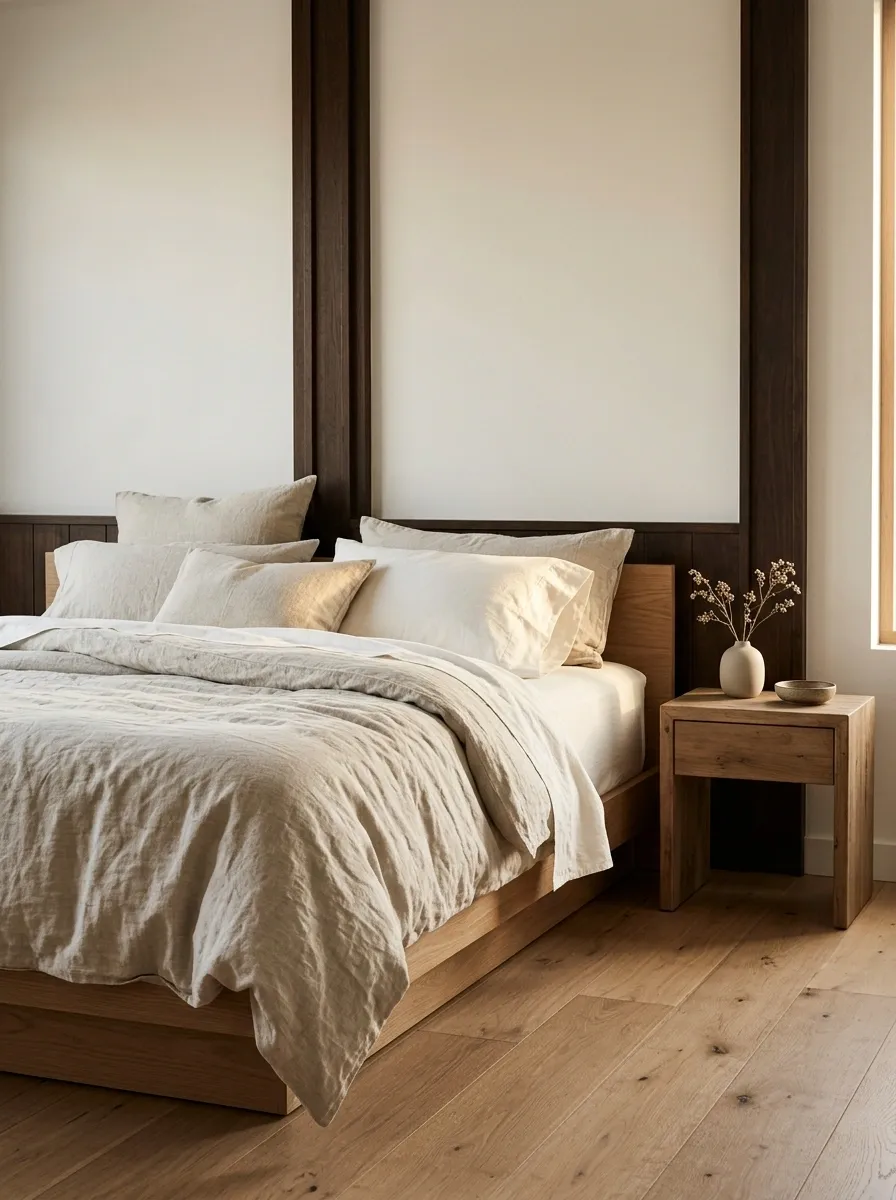
Oatmeal linen, ivory sheets, and a naturally textured duvet create a bedroom that feels relaxed without looking unfinished. A low oak bed, pale walls, and simple timber bedside tables provide a warm foundation. The bedding can sit loosely rather than being tucked into sharp, hotel-style folds, allowing the fabric texture to become part of the design.
The important distinction is between warm neutral shades, not simply buying everything labeled beige. Oatmeal carries a deeper, earthy quality, while ivory brings lightness and contrast. Natural wood bridges the two. Keep the decorative accents quiet so the materials remain the focus. Wrinkles belong with linen, but a completely shapeless pile of bedding isn’t a design style. The line between relaxed and neglected is thinner than it looks.
THE NEUTRAL COLOR STORY
Three quiet shades. Zero color chaos.
Oatmeal
The warm, grounding base.
Ivory
The lighter breathing space.
Dark wood
The visual anchor.
Neutral doesn’t mean every fabric must match. That is how a bedroom ends up looking like a paint sample aisle.
Pale Sage Bedding in a Minimal Oak Bedroom
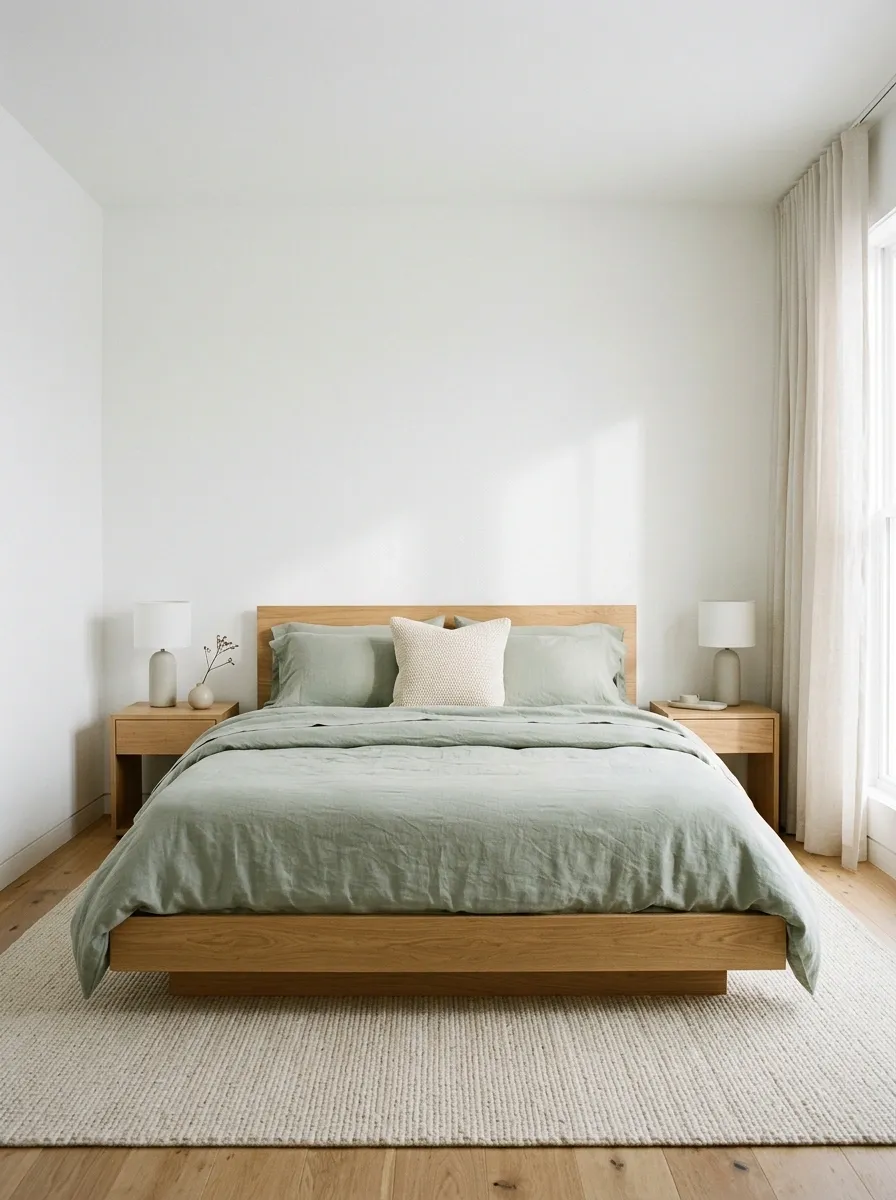
Muted sage bedding brings a little color into a minimal bedroom without stealing the calm, uncluttered feel. A sage duvet and matching sheets sit on a simple oak platform bed, with white walls, understated bedside tables, and clean-lined lamps completing the composition. The bed becomes the focal point while the surrounding furniture stays quiet.
This combination works because the green has enough softness to sit beside natural wood rather than fight it. A single textured accent cushion can add depth, but several competing green shades may muddy the look. Keep the pillow arrangement simple and let the larger bedding surfaces carry the color. The room doesn’t need botanical prints, green pottery, and a forest’s worth of accessories to establish a connection with nature.
WHERE THE COLOR GOES
A calm bedroom works best when one surface carries most of the color and the rest knows when to log off.
Main bedding
Sage carries the strongest color statement across the bed.
Walls and sheets
Soft neutrals give the green room to stand out.
Furniture and accents
Oak adds natural warmth without introducing another strong color.
Tailored White Bedding With Navy Piping
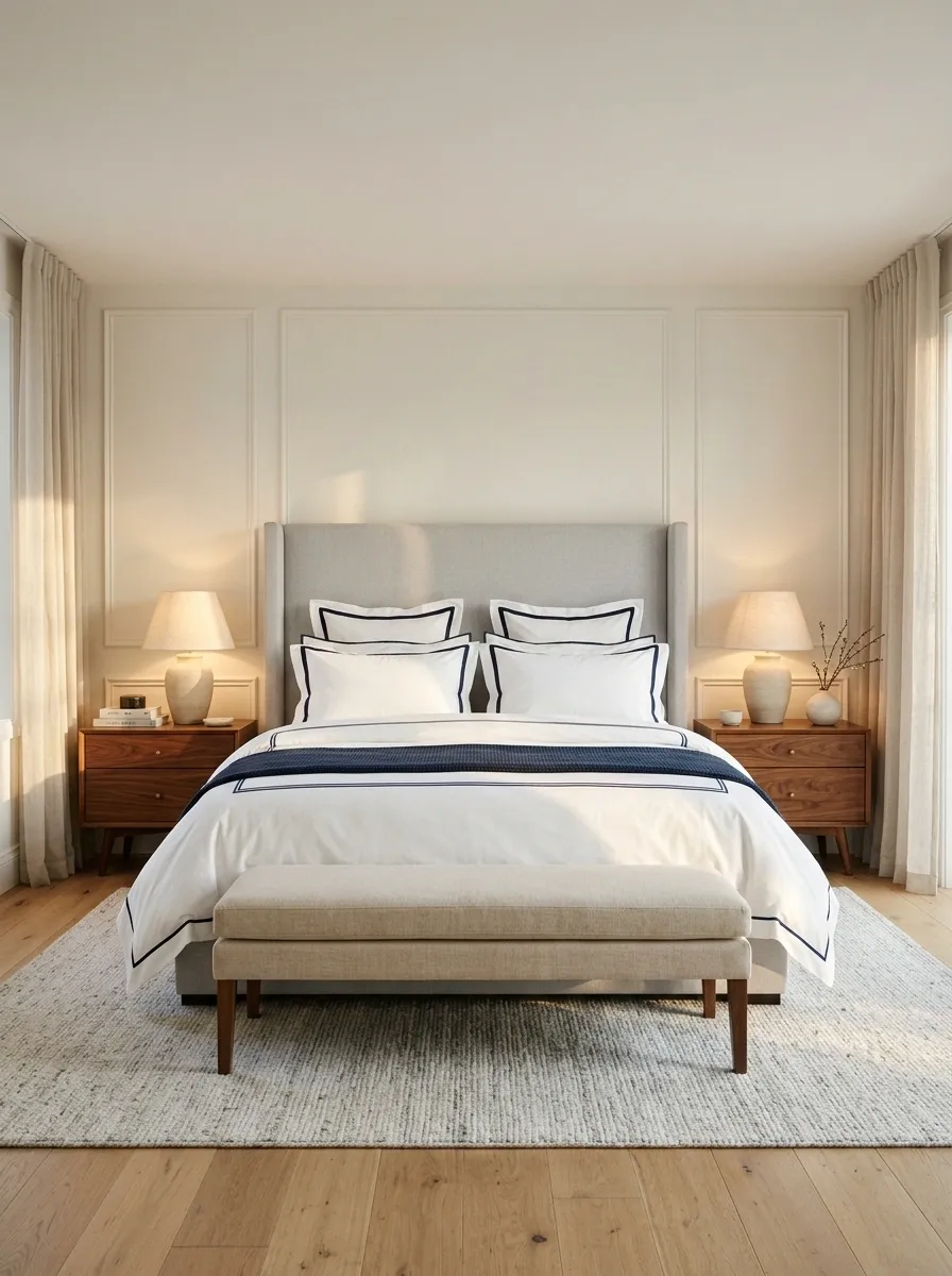
White bedding with navy piping gives a bedroom a tailored, almost architectural finish. The dark edging outlines the duvet and pillowcases, making the bed look crisp even when the rest of the styling stays simple. A substantial upholstered headboard, walnut bedside tables, and classic lamps add enough warmth to keep the scheme from feeling overly formal.
The key is repetition. When navy appears along the bedding edges, a small amount elsewhere in the room can make the combination feel connected. The rest should remain relatively quiet, with white sheets and restrained surfaces doing the supporting work. Too many additional patterns would compete with the precise lines. This look is for anyone who wants polished bedding but isn’t interested in turning the bed into a full-time decorative display.
THE POWER OF A CLEAN EDGE
Piping is a small detail with a very specific job: it gives plain bedding a defined outline.
Clean fabric
The quiet center of the composition
A contrasting edge defines the shape
Repeat: Use the same dark accent on more than one bedding edge.
Restrain: Keep other patterns minimal so the outline stays visible.
Cream Matelassé Bedding With Quiet Quilted Texture
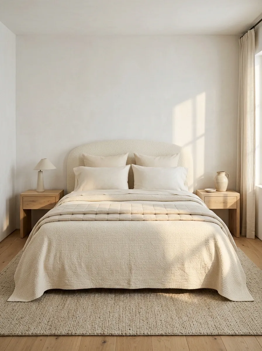
Cream matelassé bedding creates depth through fabric rather than color. A subtly raised coverlet sits over smooth sheets, while a lightly quilted layer adds structure without making the bed look bulky. A curved upholstered headboard, pale wood flooring, and uncomplicated bedside furniture keep the entire bedroom in a soft, restrained palette.
This design is especially effective when a room already has interesting architecture or furniture that deserves attention. The bedding contributes texture without competing for the spotlight. The trick is to vary the surfaces enough that the layers remain visible. When every fabric has the same finish, the bed can appear flat even when several pieces are stacked together. Add a little contrast through weaving and quilting, not another pile of cushions searching for a purpose.
TEXTURE DOES THE TALKING
A tonal bed needs more than one surface.
Smooth cotton
Creates a clean, quiet foundation against the skin and beneath the layers.
Raised woven coverlet
Adds a subtle pattern that becomes visible when light moves across the surface.
Light quilting
Gives the bed a little structure without hiding the softer layers underneath.
Same color family. Different textures. Finally, some personality.
Olive Linen and Rust Accents With Walnut Furniture
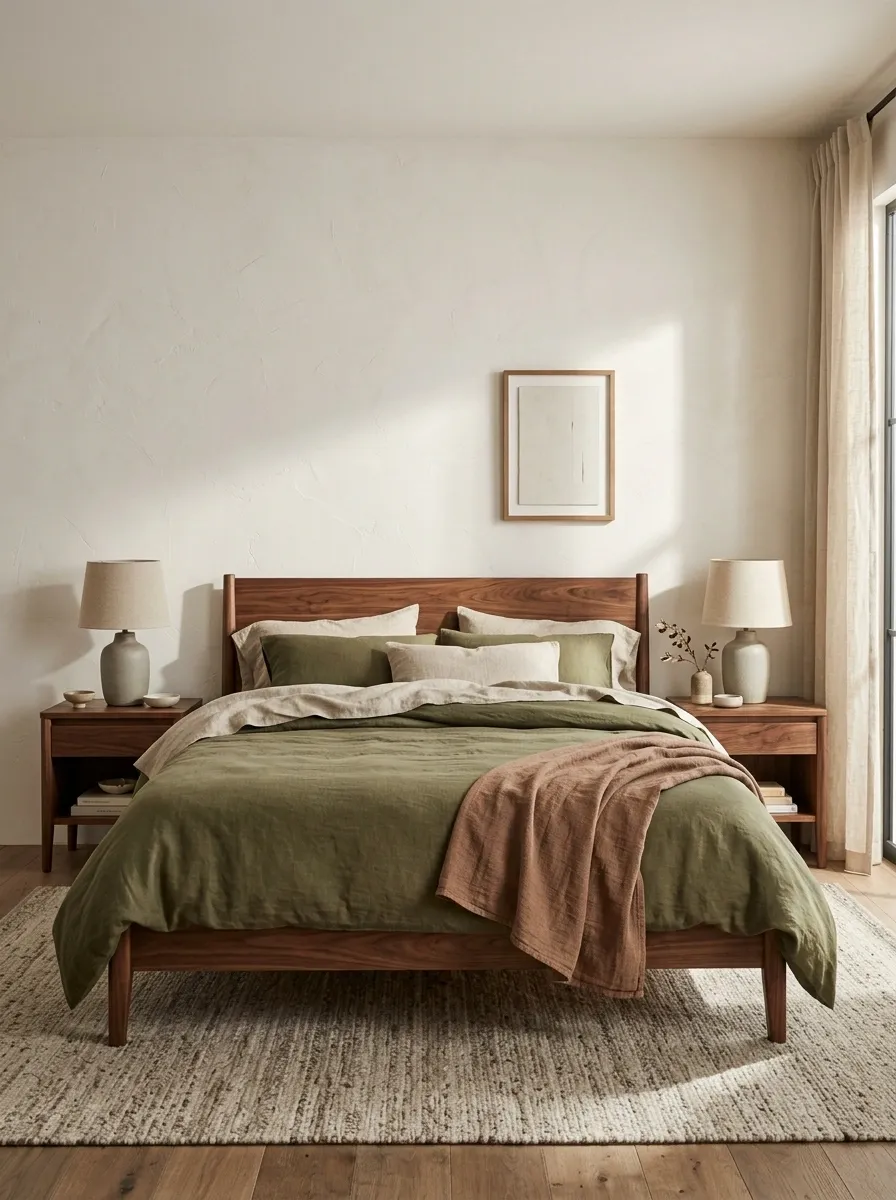
Olive-green bedding, flax-colored sheets, and a muted rust throw bring an earthy bedroom together without making it look like a pumpkin spice advertisement. A walnut bed frame, warm plaster walls, and understated ceramic lamps give the darker green a natural backdrop. The combination feels rich because each shade has a different job: olive anchors the bed, flax softens it, and rust adds a little heat.
Keep the rust accent concentrated in one or two places rather than scattering it across every cushion, vase, and artwork. Walnut already brings plenty of warmth. Too many reddish tones can make the room feel muddy, especially under yellow lighting. This palette suits bedrooms with natural wood, warm neutral walls, and enough daylight to reveal the fabric textures.
THE EARTHY COLOR EQUATION
Let olive cover the largest area.
The duvet establishes the mood, while flax-colored sheets soften the contrast.
Use rust as the interruption.
A folded throw supplies warmth without competing with the main bedding.
Walnut furniture connects the shades. No matching terracotta accessories required. The room has done enough.
Forest Green Bedding Against Dark Timber
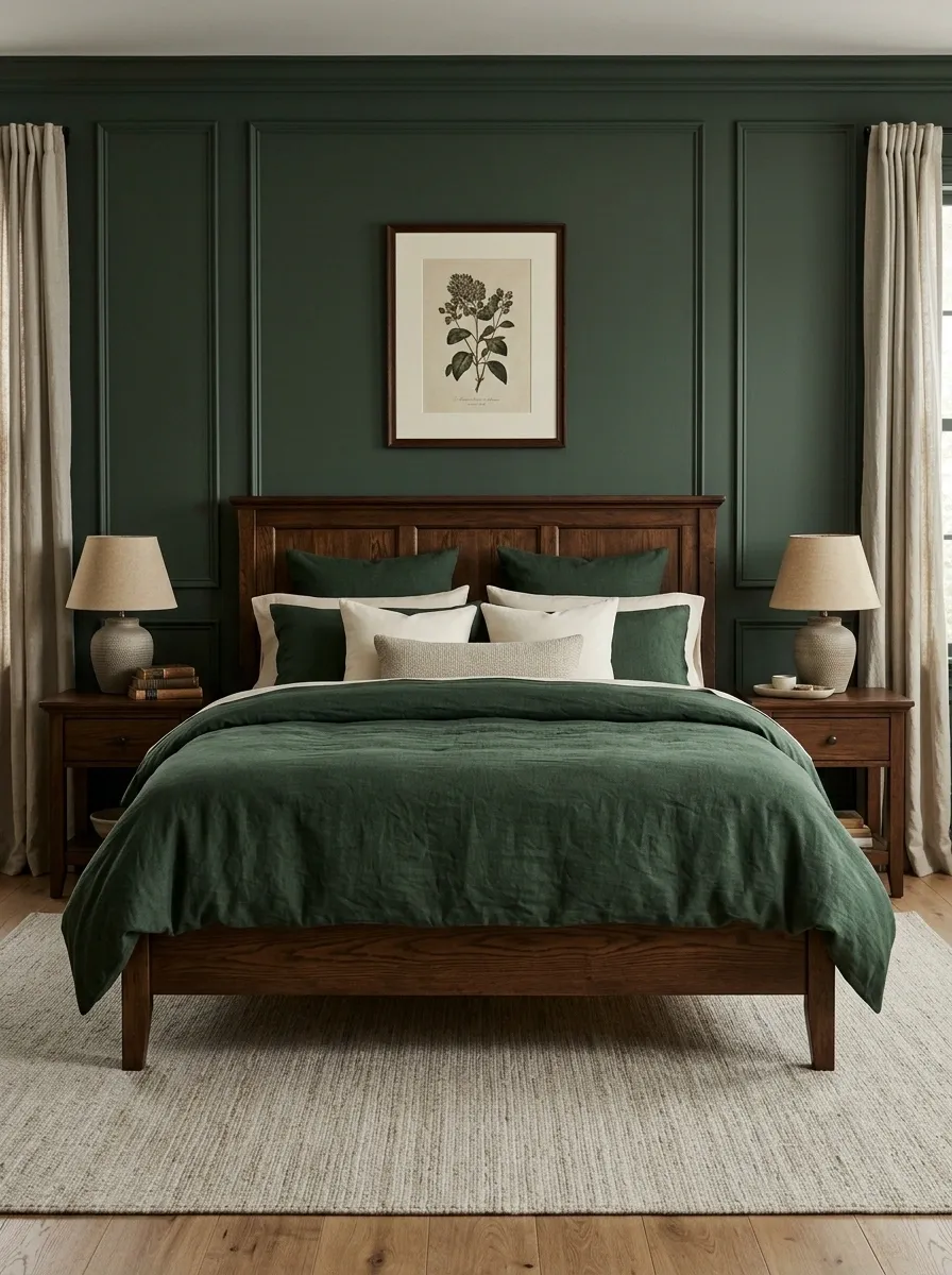
Deep forest-green bedding turns a traditional wooden bed into the main event. Dark timber, rich green fabric, and warm bedside lighting create a dramatic setting, while cream pillows and a lighter rug prevent the whole arrangement from disappearing into one dark mass. Framed botanical artwork or a restrained vintage print can add character without making the bedroom feel themed.
The balance comes from contrast rather than adding more colors. Green and dark wood already have plenty of visual weight, so cream provides the relief that keeps the bed readable. Lighting matters here, too. Warm lamps flatter the earthy palette, but the room still needs enough general light to show the difference between the bedding and the furniture. The result should feel atmospheric, not like the bed has been parked inside a shadow.
Botanical Print Bedding With Natural Oak and Woven Textures
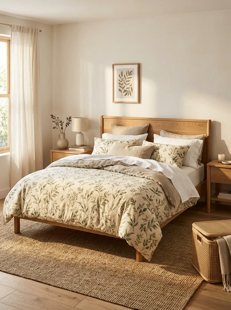
A botanical duvet with leafy green motifs on a warm cream background brings pattern into the bedroom without making the entire space feel busy. Natural oak furniture, a woven rug, and simple white or flax sheets create a supporting backdrop. The print becomes the focal point, while the solid fabrics give the eye somewhere to rest.
The most convincing botanical rooms repeat a few colors from the bedding instead of matching every detail exactly. Green can appear in one smaller accent, while oak and woven textures bring in a natural warmth. Avoid adding several unrelated floral prints, leafy curtains, and patterned cushions just because the duvet already features plants. That’s less botanical retreat and more an extremely competitive garden center. Let one major pattern lead, then make the remaining layers quieter.
THE PRINT NEEDS A SUPPORTING CAST
THE LEADING PATTERN
Leafy green on warm cream
The large print carries most of the visual interest.
Leaf green
A small supporting accent.
Natural oak
Warmth from the furniture.
Plain linen
A visual pause between patterns.
One strong print, a few repeated colors, and room to breathe. The duvet has the job covered.
Chocolate Brown Bedding With Caramel and Tan Layers
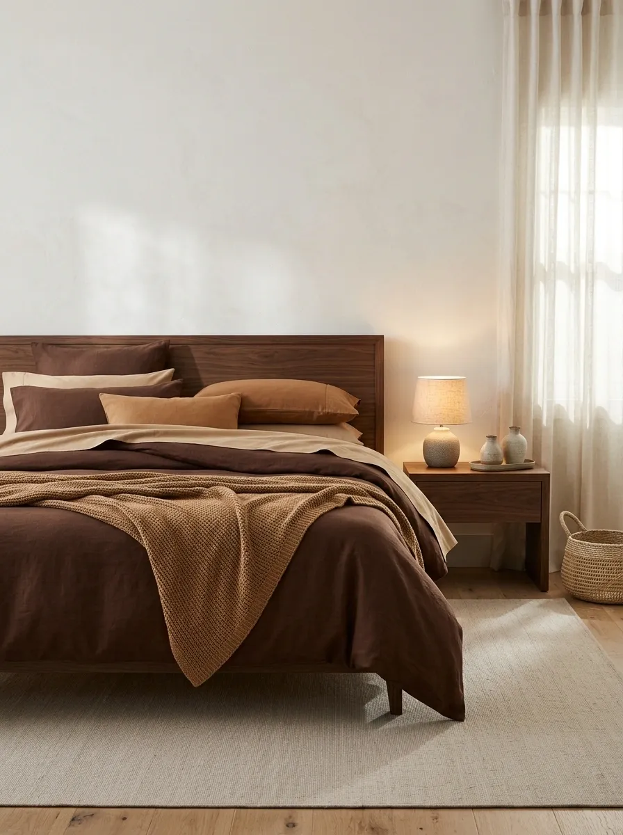
Chocolate-brown bedding creates a rich, grounded bedroom when paired with caramel accents, tan sheets, and dark timber furniture. Rather than relying on a strong contrast between light and dark, this composition builds depth through neighboring shades. A pale rug, textured wall finish, and warm bedside lamps stop the deeper colors from overwhelming the room.
Texture is especially important in an almost monochromatic bed. A smooth brown duvet against a textured throw and softer tan sheets looks layered even without multiple patterns. The lighter fabric should remain visible enough to define the bedding arrangement. Choose brown shades with related warm undertones so the layers look connected instead of accidentally assembled during a furniture delivery mix-up. The finished bedroom feels rich without needing metallic accents on every available surface.
A TONAL BEDROOM, DONE RIGHT
Build depth without adding another color.
The shades stay related, but every layer remains visible. Monochromatic does not mean one giant brown blob.
Green Gingham Bedding in a Relaxed Cottage Bedroom
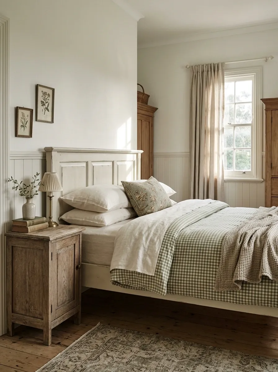
Green gingham bedding brings classic cottage character without requiring a bedroom full of antique knickknacks. A small-check duvet in muted green and cream sits on a painted bed, with plain ivory sheets and a restrained floral accent pillow softening the pattern. Vintage timber, pale walls, and daylight from the window give the entire scene a relaxed, collected feel.
The secret is keeping the patterns at different visual scales. Gingham provides the main structure, while a small floral motif adds personality without starting a rivalry. Plain sheets give the eye a break, and the furniture can stay simple. This look works particularly well in rooms with traditional details, painted woodwork, or a slightly mismatched collection of furniture. The bedroom should feel collected over time, not like a cottage-themed gift shop exploded.
THE COTTAGE PATTERN RULE
Three patterns can get along. They just need boundaries.
LEAD PATTERN
Green gingham
The duvet establishes the repeated check and sets the bedroom’s rhythm.
Floral accent
One smaller motif adds a softer, more collected note.
Plain ivory
Solid sheets stop the patterns from fighting for attention.
The floral pillow is an accent, not an invitation to add four more prints.
Faded Rose Floral Bedding With Antique Wood
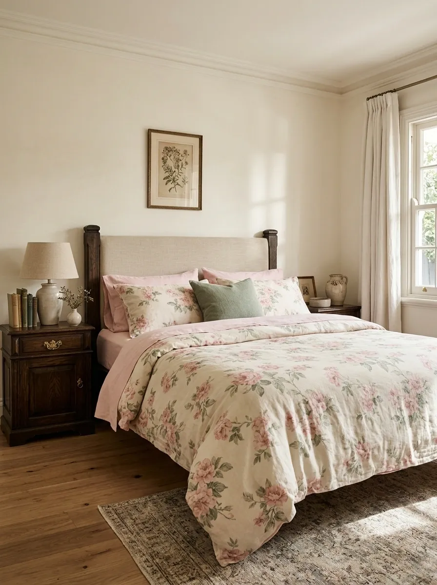
Faded rose flowers against an ivory background give this bedroom a romantic look without turning it into a room-sized wedding invitation. The bedding pairs soft pink florals with muted green leaves, while antique timber furniture and a simple upholstered or painted headboard add age and character. Pale walls let the pattern remain visible instead of disappearing into a crowded background.
Keep the supporting fabrics within the colors already found in the floral print. Soft pink sheets or a muted green cushion can connect the layers, but adding another large floral pattern usually makes the composition feel unsettled. Dark antique wood provides a useful contrast against the lighter bedding, giving the room some visual weight. The result suits traditional bedrooms and vintage-inspired spaces where a little imperfection makes the design feel more believable.
INSIDE THE FLORAL PRINT
Borrow colors from the flowers. Don’t introduce a whole new garden.
Faded rose
Echo the flowers with a restrained pink layer.
Muted green
Repeat the foliage color in one small accent.
Warm ivory
Leave breathing room around the floral pattern.
Antique wood adds contrast that keeps all that softness from turning sugary.
Blue Ticking Stripes With Plain White Pillowcases
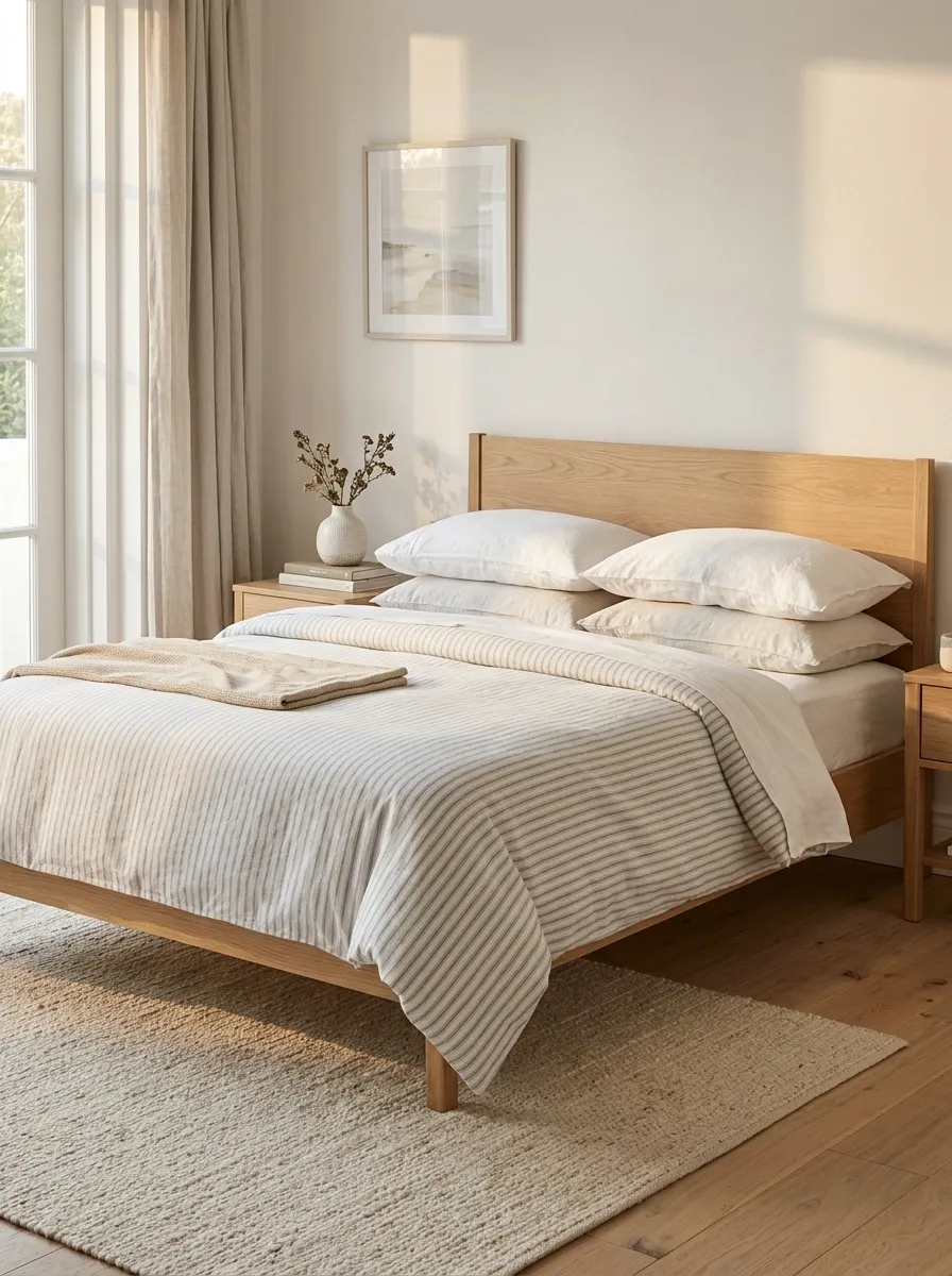
Fine blue stripes bring order to a bedroom without making the bedding feel overly formal. A striped duvet or quilt sits against plain white pillowcases, with a natural oak bed frame, a pale woven rug, and straightforward bedside furniture completing the arrangement. The pattern is noticeable but quiet, especially when the blue is softened rather than saturated.
Plain white pillowcases matter because the stripes already establish a clear direction across the bed. Adding several other geometric prints can make the composition feel unnecessarily busy. A natural timber headboard or simple upholstered frame balances the graphic lines with a softer surface. This design suits classic bedrooms, relaxed coastal interiors, and guest rooms that need some character without locking themselves into a very specific color theme. The stripes do the talking. Everything else can lower its voice.
WHY THE STRIPES WORK
Fine blue stripes
The repeating lines become the main pattern.
Plain white
Breaks up the pattern and sharpens the bed’s outline.
Natural oak
Adds warmth to the cool blue palette.
Keep the stripe direction consistent across the main bedding. The room already has a visual pattern, not a geometry exam.
Charcoal Plaid Bedding in a Moody Traditional Bedroom
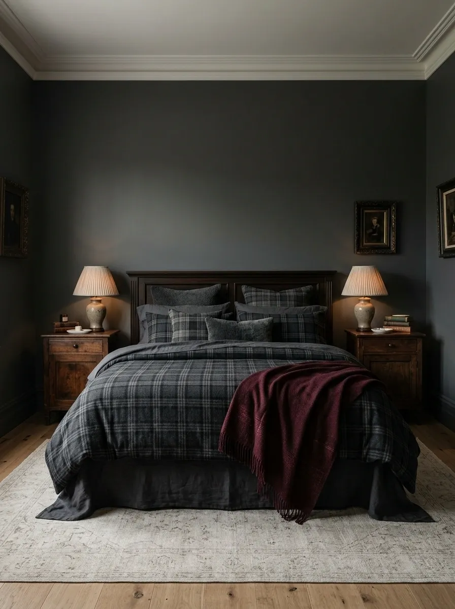
Charcoal plaid bedding gives a traditional bedroom a darker, more atmospheric character. The bed combines a dark check pattern with plain charcoal or deep gray sheets, a restrained burgundy throw, and dark timber furniture. Warm table lamps bring out the wood grain, while a lighter rug or a few pale details stop the room from becoming visually dense.
The plaid should be the leading pattern. Smaller accents can borrow one of its colors, but adding competing checks or elaborate wall patterns risks making the bedroom feel crowded. Burgundy adds warmth without fighting the gray, especially when it appears in just one visible layer. This arrangement works well with traditional furniture, darker paint colors, and rooms that suit a more intimate mood. Dark bedding can be dramatic; it doesn’t need to look like the room has unfollowed daylight.
A DARK PALETTE NEEDS CONTRAST
Give every deep shade a reason to be there.
The balance
Charcoal owns the bed, burgundy provides a small warm accent, and pale surfaces separate the dark furniture from the bedding.
One plaid, one accent color, and a lighter surface. Moody, not visually bankrupt.
Sky Blue and White Bedding in a Light Coastal Bedroom
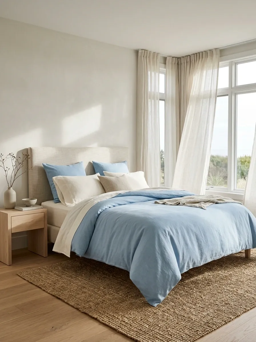
Sky blue bedding, crisp white cotton, pale oak furniture, and breezy linen curtains give this bedroom its coastal character without a single decorative anchor in the shape of an oversized seashell. A light upholstered headboard and woven rug add texture, while the blue duvet brings just enough color to keep the bed from disappearing against the pale walls.
The combination works because the blue stays soft and the surrounding materials stay natural. A few blue accents can repeat the bedding color elsewhere, but matching every accessory is unnecessary. Let the wood, woven surfaces, and white fabric do their own thing. The result feels airy without looking empty, which is a much better outcome than a bedroom that resembles a cloud with a mortgage.
THE COASTAL COLOR BALANCE
Blue brings the breeze. Natural textures bring the warmth.
Sky blue
The duvet supplies the main color statement.
Warm white
Sheets and walls keep the composition light.
Natural oak
Furniture and woven details stop the palette feeling chilly.
Keep the blue muted and the materials natural. The beach theme doesn’t need a seashell committee.
Blue Stripes and White Bedding With Rustic Mediterranean Timber
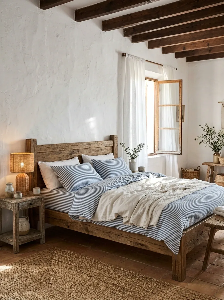
Blue-and-white striped bedding creates a fresh contrast against rustic timber, whitewashed walls, and warm terracotta flooring. A substantial wooden bed gives the room weight, while simple white pillowcases and a relaxed duvet keep the pattern from feeling too formal. Woven bedside lighting or a natural rug adds texture without introducing another loud motif.
The appeal is the contrast between cool bedding and warm architectural finishes. The stripes look crisp against the wood, and the terracotta stops the room from becoming a sea of blue and white. Keep the stripe pattern concentrated on the main bedding and allow the furniture to show its grain. Multiple nautical accessories would push the look toward a themed rental apartment, and nobody needs an anchor-shaped cushion explaining the concept.
COOL FABRIC, WARM ARCHITECTURE
The contrast is the whole point.
Keep the temperature balanced.
Blue and white bring freshness, while wood and terracotta add visual warmth. Plain sheets keep the striped bedding readable.
A Mediterranean bedroom, not a souvenir shop with a bed in the corner.
Sand and Sea-Glass Bedding With Weathered Wood
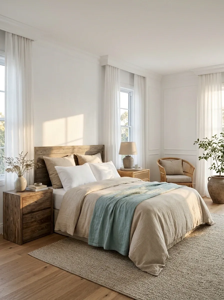
Sandy beige bedding and a muted sea-glass accent create a gentle coastal scheme around weathered timber furniture. The duvet stays close to the color of natural linen, while pale aqua sheets or a folded accent layer introduce a cooler note. White walls, a woven bedside table, and simple curtains complete the room without turning the entire design into a beach-themed costume party.
This combination is quieter than a blue-and-white coastal bedroom, relying on subtle temperature changes rather than strong contrast. The wood gives the pale palette some texture, while the sea-glass shade prevents the beige from becoming monotonous. Keep the aqua soft and slightly muted. Bright turquoise would change the mood completely, and matching it across every accessory would make the bedroom feel more coordinated than it needs to be.
A QUIETER COASTAL PALETTE
Sand leads
Neutral bedding makes up the largest visual area.
Sea glass interrupts
A smaller aqua layer adds freshness without taking over.
Weathered wood supplies the darker edge. No neon turquoise required.
Tropical Botanical Bedding With Rattan and Dark Wood
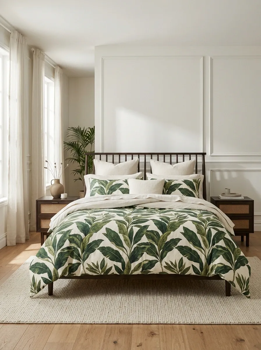
Large leafy prints bring instant personality to a tropical-inspired bedroom. A palm or broad-leaf duvet in green and ivory sits against dark timber furniture, with rattan details and simple cream sheets keeping the arrangement grounded. A few real plants can reinforce the botanical theme, but they aren’t the only way to make the design work. The print already carries plenty of visual energy.
The strongest version keeps the bedding pattern in charge. Natural textures add depth, while dark wood gives the lighter botanical fabric a more substantial backdrop. Avoid layering several unrelated leaf prints across the duvet, curtains, and pillows. Too much matching foliage can make the room look like a resort gift shop has taken over. Use plain sheets, restrained bedside decor, and enough open surface around the bed to let the main pattern read clearly.
THE TROPICAL BEDDING HIERARCHY
One leafy statement beats six competing leaf prints.
THE MAIN EVENT
Large botanical bedding
Green and ivory foliage establishes the entire direction of the room.
Rattan
Introduces a woven natural texture.
Dark timber
Adds visual weight and contrast.
Plain cream
Keeps the print from overwhelming the bed.
Let the duvet provide the foliage. The rest of the room can stop photosynthesizing.
White Quilted Bedding With a Loose Pale Blue Layer
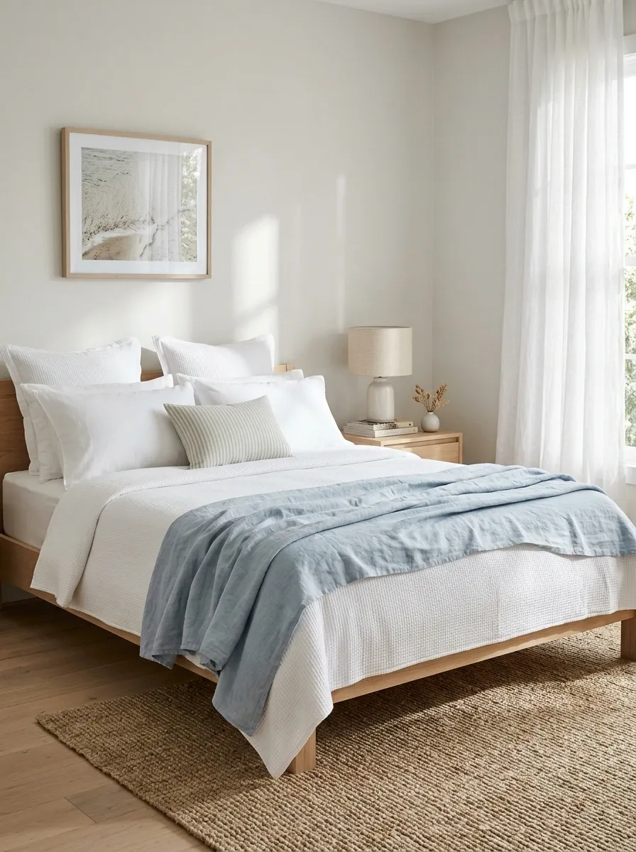
A white quilt, a casually folded pale blue linen layer, and a small striped accent create a relaxed coastal bedroom that still feels finished. The bed has a clean foundation, but the blue fabric softens the arrangement and adds a little movement across the foot of the mattress. Pale wood furniture, light walls, and a woven rug complete the scene without drawing attention away from the bed.
The appeal lies in the way the layers sit together. A quilt gives the bed structure, while the folded linen introduces a lighter, less formal finish. The accent pillow ties the blue into the upper half of the composition without requiring a full set of matching accessories. Make sure the folded layer is wide enough to read as intentional, not like a towel that lost its way. A little looseness works. Random fabric abandonment does not.
THE LAYER PLACEMENT PLAN
Relaxed bedding still benefits from a little strategy.
Upper bed
White pillows and a clean quilted surface.
Foot of the bed
A folded pale blue layer adds color and softness.
Surrounding room
Pale timber and woven texture keep the look grounded.
The folded layer needs to look placed, not dropped during a minor laundry emergency.
Charcoal and Black Bedding in a Minimal Architectural Bedroom
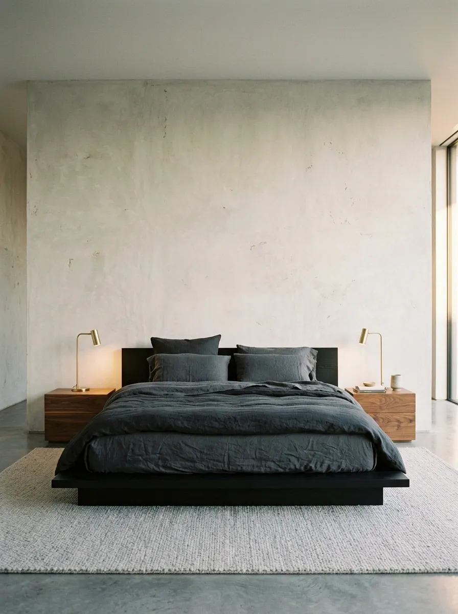
Charcoal bedding and black accents give this bedroom a strong architectural look without relying on decorative clutter. A low dark platform bed sits against pale concrete or plaster walls, with graphite sheets, a fuller charcoal duvet, and a few deliberately placed pillows. Walnut bedside tables and warm lamps introduce contrast, keeping the darker palette from feeling cold or flat.
The secret is separating the dark surfaces through texture and tone. Charcoal fabric should remain distinguishable from a black bed frame, while the lighter wall behind the bed gives the whole composition room to breathe. A pale rug can soften the floor without interrupting the mood. Keep patterns minimal and let the materials provide the detail. The bedroom doesn’t need twelve black accessories to prove it’s committed to the color scheme.
THE DARK BEDROOM FORMULA
Keep the dark tones distinct, not identical.
Give each surface its own texture
Matte fabric, visible wood grain, and plaster walls prevent the dark palette from looking flat.
Keep a lighter surface visible
Pale walls or a light rug help define the bed against the room.
Moody is the brief. One giant shadow is not.
Burgundy Bedding With Cream Upholstery and Walnut
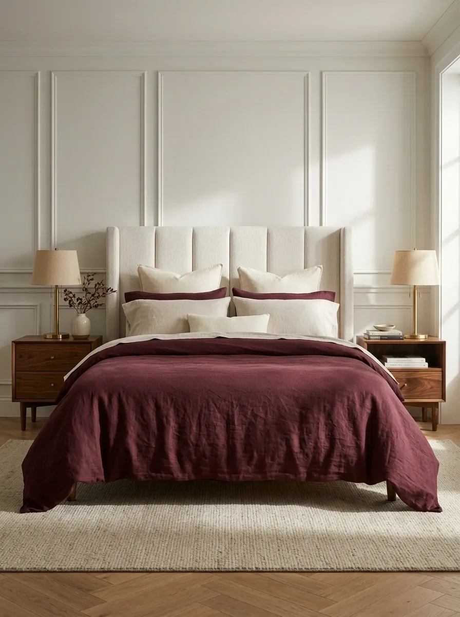
Deep burgundy bedding brings color and weight to a bedroom without needing a complicated pattern. A wine-toned duvet sits against a pale upholstered headboard, while walnut bedside tables and warm metal lamps add richness around the bed. Cream pillows soften the transition between the dark bedding and lighter headboard, keeping the composition dramatic but balanced.
Fabric finish makes a real difference here. Matte cotton or washed linen gives burgundy a relaxed depth, while a subtle sheen on one layer can introduce a more polished note. Covering the entire bed in shiny fabric would tip the design toward an outdated hotel suite. Keep the contrast controlled, and let walnut connect the warmer parts of the palette. The color already brings enough drama to the room. There is no need to give every cushion a starring role.
BURGUNDY, WITHOUT THE THEATRICS
Let the color make the statement. Let texture finish the sentence.
THE LEADING SHADE
Deep burgundy
Use it across the main duvet for a strong, uninterrupted color statement.
Cream upholstery
Softens the contrast behind the pillows.
Walnut
Links the deep bedding to warmer wood tones.
A matte duvet and one subtle fabric contrast will do more than an entire collection of shiny cushions.
Dusty Blue-Gray Bedding With Pale Oak and Soft White
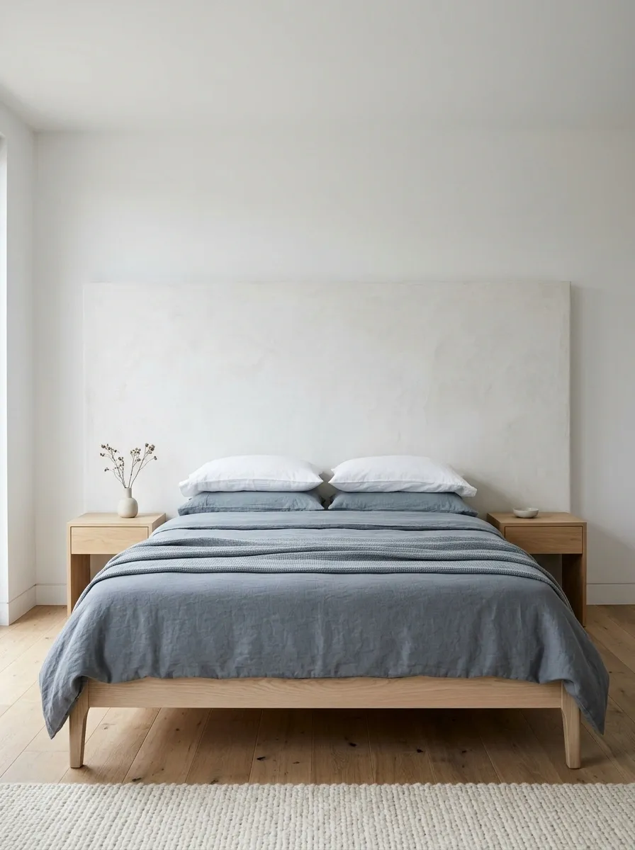
Dusty blue-gray bedding creates a cool, understated bedroom that still feels grounded. The bed combines muted blue-gray sheets and a soft duvet with a pale oak frame, white walls, and understated bedside furniture. A simple upholstered headboard or textured wall finish adds another layer without pulling attention away from the muted color palette.
The choice of gray matters. A blue-based gray feels crisp beside white and pale timber, while a warmer gray creates a different mood entirely. Keeping the bedding within the same cool family helps the arrangement feel connected, and oak provides the warmth that the cooler tones lack. Avoid adding too many unrelated blues, especially highly saturated ones. The finished look should feel quiet and considered, not like three different paint departments were asked to collaborate.
THE UNDERTONE CHECK
Gray is not automatically neutral in every room.
Blue-gray
A cool, crisp pairing with white bedding and pale oak.
Warm gray
A softer direction that leans toward beige and stone.
The finishing move
Use pale oak to bring natural warmth into the cooler blue-gray and white palette.
Choose the undertone first. Otherwise, the bedding and walls may spend the whole day disagreeing.
Clay-Colored Bedding in a Compact Modern Bedroom
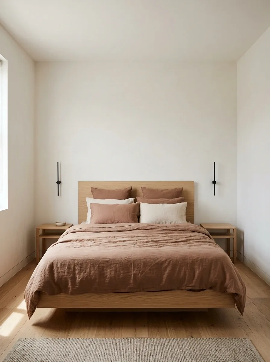
A compact bedroom benefits from bedding that creates a clear focal point without adding visual clutter. Muted clay-colored sheets and a matching duvet give the bed a warm, deliberate appearance, while a low platform frame, light oak headboard, and simple wall-mounted reading lights keep the surrounding layout open. Pale walls and a restrained bedside surface complete the modern composition.
This look is as much about proportion as color. A lower bed profile can make the room feel less crowded, while a limited pillow arrangement leaves more of the bedding visible. Wall-mounted lights also free up space on narrow bedside tables, although their placement must still work for reading and everyday use. Avoid a thick pile of throws and cushions that spills onto the floor. A small room already has enough negotiations over walking space.
THE SMALL-BEDROOM EDIT
Keep the bed visually warm, not physically enormous.
Low profile
A lower bed and simple headboard keep the visual mass close to the floor.
Clear surfaces
Wall-mounted lighting leaves narrow bedside tables more usable.
THE COLOR PLAN
A narrow walkway does not need to become a decorative pillow obstacle course.
Sculptural Taupe Bedding With a Curved Upholstered Bed
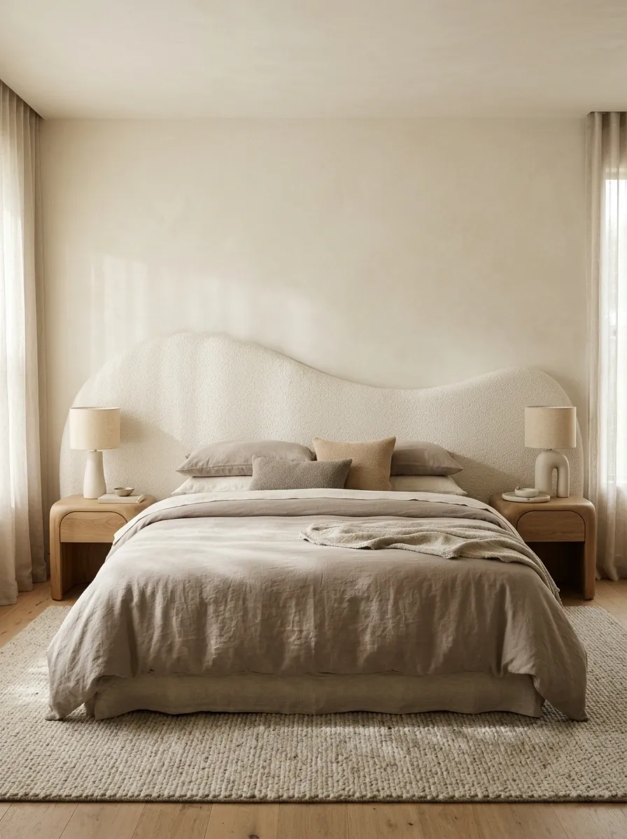
Sculptural furniture takes the lead in this bedroom, so taupe and cream bedding can stay simple. A curved upholstered headboard, softly rounded bedside tables, and sculptural lamps create the main shapes, while a tonal duvet and textured cushions provide subtle depth. The palette stays close to cream, mushroom, and taupe, allowing the furniture’s silhouettes to stand out.
The design succeeds because the interest comes from form rather than competing patterns. A bouclé or softly textured headboard looks distinct against smoother bedding, and a rounded bedside table echoes the bed without matching it too literally. Keep the decorative layers restrained, especially if the headboard already has a strong shape. Adding geometric prints and several contrasting colors would distract from the architecture. Not every bedroom needs another pattern audition. Sometimes the curves are already doing all the work.
FORM OVER PATTERN
When the furniture has curves, the bedding can take a breath.
Curved headboard
The main architectural shape.
Tonal bedding
Quiet fabrics reveal the furniture’s silhouette.
Where texture comes in
Pair textured upholstery with smoother cotton or linen, then repeat the rounded shapes in a bedside table or lamp.
The furniture already brought the drama. The duvet does not need a competing storyline.
Undyed Linen Bedding in a Japandi Bedroom
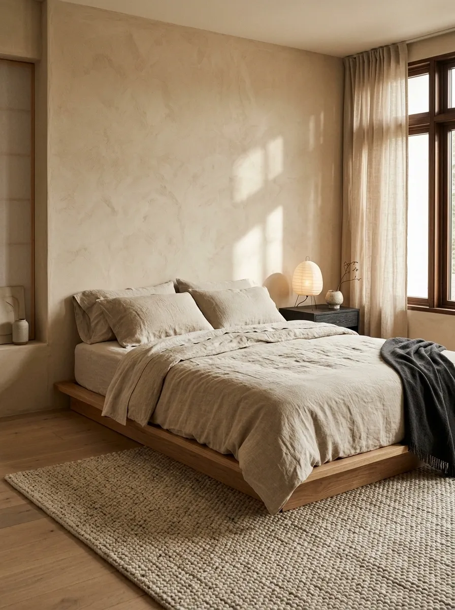
Natural flax bedding, a low oak bed, and warm plaster walls give this bedroom its understated Japandi character. A simple paper lantern, carefully chosen dark wood details, and a muted woven rug provide contrast without disturbing the calm palette. The bed looks relaxed rather than perfectly pressed, but the surrounding room remains deliberate and uncluttered.
The appeal comes from differences in texture, not a long list of colors. Raw linen looks distinctive against smooth timber, while plaster adds a softly irregular surface behind the bed. Keep the styling focused on a few tactile materials and useful furniture. Glossy accessories and elaborate patterns would weaken the simplicity. The room should feel considered without looking as if nobody is allowed to sit on anything.
TEXTURE OVER EXTRA COLOR
A quiet palette still needs something to look at.
Natural linen
Soft creases and a relaxed weave.
Light oak
A smooth, warm furniture finish.
Plaster
A soft backdrop with subtle surface variation.
Three materials with different textures can do more than adding another color that nobody asked for.
Rust and Ochre Bedding With a Patterned Bohemian Quilt
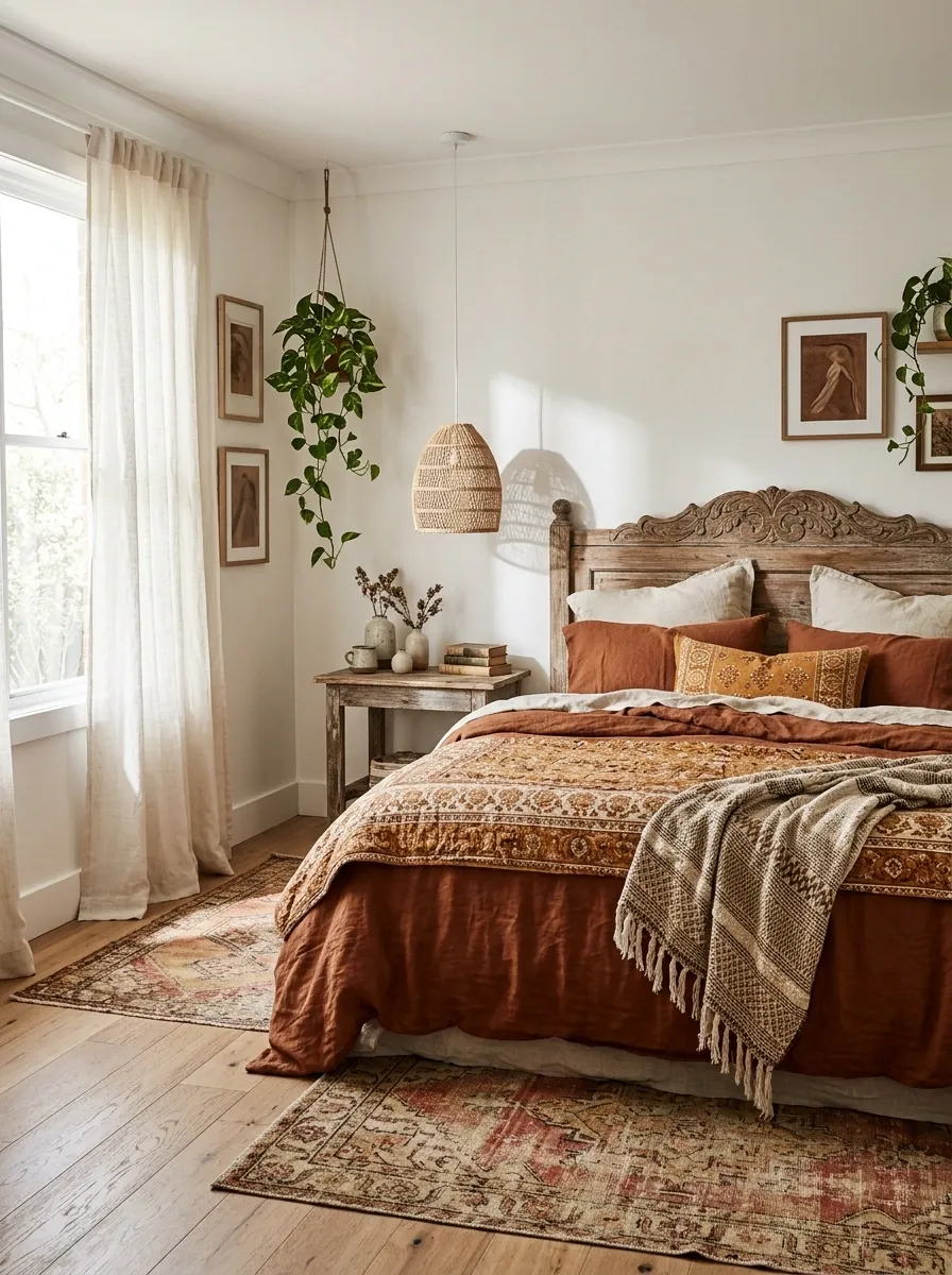
A rust-toned duvet and ochre quilt establish a warm foundation, while a patterned blanket, carved timber, and layered rugs introduce a relaxed bohemian character. Cream sheets provide a break between the stronger colors, and woven lighting adds texture around the bed without demanding attention.
This combination works because the warm shades repeat across different surfaces rather than appearing as isolated splashes. The quilt can carry a more intricate motif, while the duvet stays relatively simple. That relationship keeps the room expressive without making it look crowded. Keep the pattern colors connected to the rust and ochre palette, and avoid adding too many unrelated accent shades. Bohemian style can welcome an eclectic mix. It still benefits from a plan.
THE WARM COLOR REPEAT
Let the quilt introduce pattern. Let the room repeat its colors.
Keep the duvet simple
Solid fabric gives the patterned quilt space to stand out.
Repeat warm accents
Carry rust and ochre into small nearby details.
The room can be eclectic without every fabric trying to become the lead singer.
Soft Lavender Bedding With Pale Gray and White
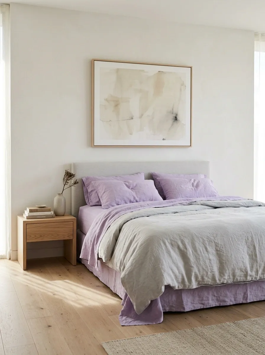
Lavender sheets and a softly colored duvet bring a gentle pastel note to a bedroom with pale gray upholstery, white walls, and light oak furniture. A simple headboard and restrained artwork help the bedding color remain visible without turning the room sugary. The wood gives the pale palette enough warmth to feel balanced.
The main trick is letting lavender occupy a clear area of the bed while the rest of the room stays quiet. Pale gray adds structure, white keeps the palette fresh, and light timber bridges the cool and warm tones. Avoid pairing the lavender with too many competing pastels unless the room is deliberately designed around a multicolor palette. A little color can make a room feel considered without turning it into a cupcake display.
PASTEL, WITH SOME DISCIPLINE
Lavender can lead without making the whole room sweet.
Lavender
The defining bedding shade.
Pale gray
A quieter color for the headboard.
White
The clean backdrop that keeps the colors light.
One pastel focal point is a design choice. Every pastel at once is an entirely different conversation.
Winter Cream Bedding With a Chunky Knit Throw
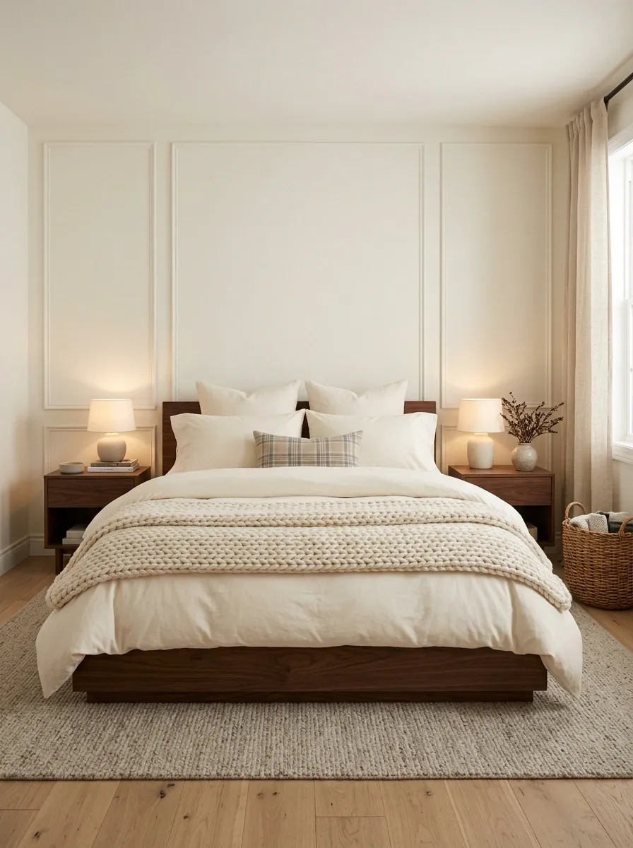
Cream bedding and a substantial knit throw add tactile weight to a bedroom with walnut furniture and warm bedside lighting. A soft duvet establishes the base, while a textured blanket folded across the foot of the bed introduces a seasonal layer. A small plaid accent can connect the bed to a more traditional interior without taking over the scene.
The design relies on a mix of thickness and texture rather than a large color contrast. Keep the sheets relatively smooth, the duvet softly full, and the throw as the most visibly textured layer. That way, each material has a purpose. A room already filled with bulky bedding doesn’t need multiple oversized blankets piled on top. Warmth is useful. A bed that looks like it has been upholstered in winter coats is another matter.
THE WINTER LAYER PLAN
Warmth needs layers, not a fabric avalanche.
Soft base
Comfortable cream sheets give the bed a clean foundation.
Full duvet
A soft, substantial layer adds body to the arrangement.
Chunky knit throw
One textured blanket provides the seasonal finish.
Let the knit be the texture star. The bed is not applying for a job as a blanket warehouse.
White Bedding With a Mustard Quilt and Rust Accent
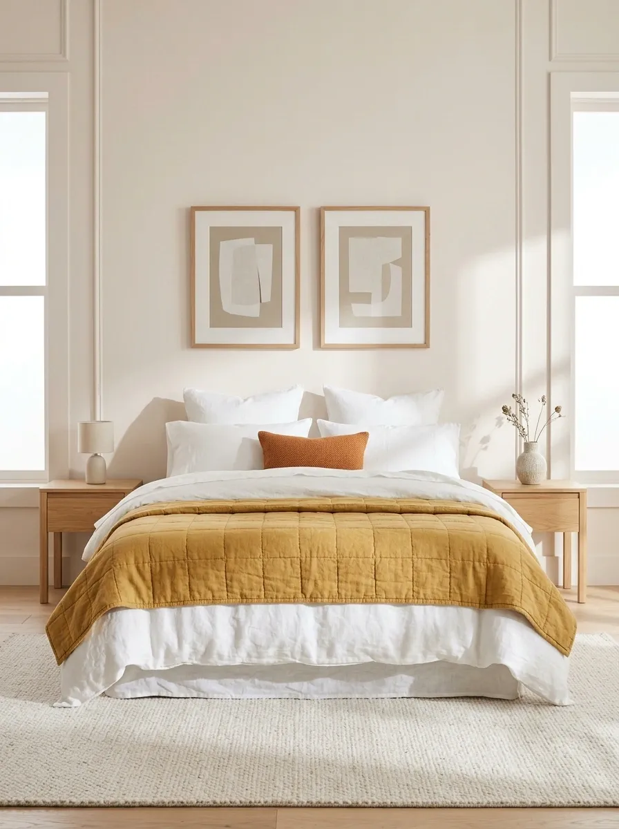
Crisp white sheets give a mustard quilt and small rust accent pillow a clear place to stand out. Light oak furniture, simple artwork, and pale walls keep the stronger colors from overpowering the bedroom. The design feels cheerful and fresh without relying on a large collection of patterned fabrics.
The secret is using mustard and rust as accents against the white foundation. The quilt carries most of the warm color, while the rust pillow adds a small connection between the bedding and the room’s other details. Keep surrounding furniture natural or neutral so the bed remains the focal point. Adding mustard curtains, several rust cushions, and colorful wall art would dilute the effect. Two strong accents are more memorable than a room where every object is demanding attention.
THE ACCENT-COLOR RULE
Let two warm accents stand out against a quiet foundation.
Let the quilt carry the color.
The white base gives mustard room to stand out, and a small rust accent creates a visual link to warmer finishes.
A limited accent palette looks deliberate. Matching every accessory is just overachieving in the wrong direction.
Romantic Cream Bedding With Sheer Canopy Curtains
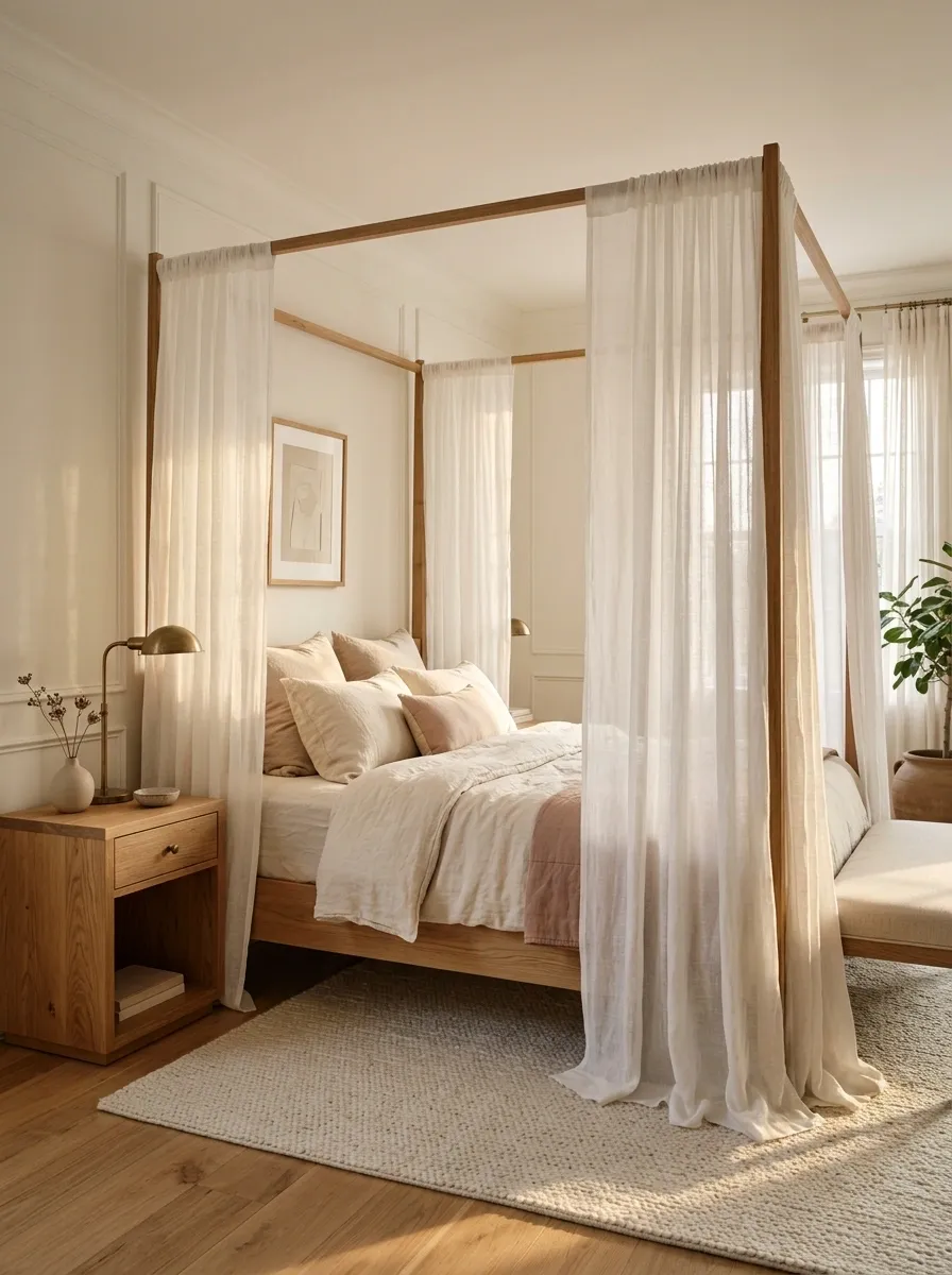
Cream linen bedding and a muted blush coverlet sit beneath a delicate canopy frame with sheer curtains. Antique brass details and warm wood keep the softness from feeling overly precious, while the curtains add height and a sense of enclosure around the bed. Pale walls allow the bed and canopy to define the room without a heavy color scheme.
The fabric layers need different levels of visual weight. The linen supplies the solid foundation, the blush coverlet provides a quiet accent, and the sheer curtains create a lighter frame around the furniture. Keep the canopy fabric translucent enough to preserve the room’s openness, especially in a smaller bedroom. Heavy curtains and ornate accessories could make the setup feel crowded. Romantic does not have to mean every surface is covered in ruffles and rose-colored fabric.
THE ROMANTIC LAYERING EFFECT
Keep the bed solid. Let the canopy soften the edges.
Cream linen
The substantial, grounded bedding base.
Muted blush
A restrained color across the coverlet.
Sheer fabric
A lighter frame around the bed.
The contrast between solid bedding and translucent curtains creates the softness. No ruffle takeover required.
Burnt Orange Bedding With Mid-Century Walnut Furniture
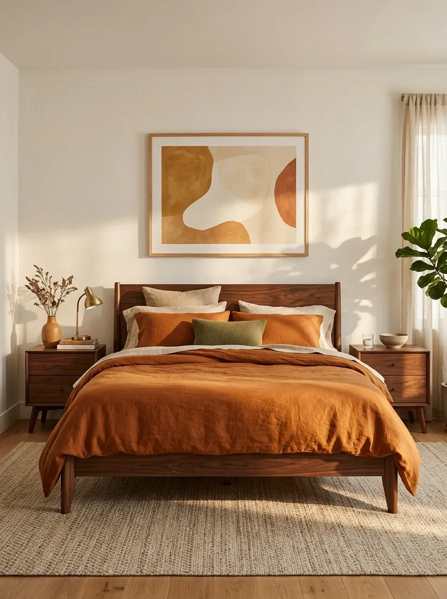
Burnt-orange bedding brings warmth to a low walnut platform bed, while olive accents and simple abstract artwork nod to mid-century interiors. The furniture’s tapered legs and clean lines provide a strong architectural outline, allowing the saturated bedding to supply most of the color. A warm neutral rug softens the darker wood without diluting the palette.
Orange and olive work well together when the tones are muted and the surrounding timber acts as a bridge. Let burnt orange cover the larger bedding surface, with olive appearing in a smaller pillow or nearby accent. Avoid adding multiple competing patterns, because the color pairing already gives the bed plenty of personality. The room should feel collected and graphic, not like every retro object in the house has been summoned for a reunion.
THE RETRO COLOR PAIRING
Burnt orange and olive need a quiet bridge.
Large color area
Orange carries the strongest statement across the bed.
Smaller contrast
Olive adds depth, while walnut brings the palette together.
Retro character, yes. A museum exhibit of every color from the seventies, no.
Graphic Black-and-White Bedding in a Clean Modern Bedroom
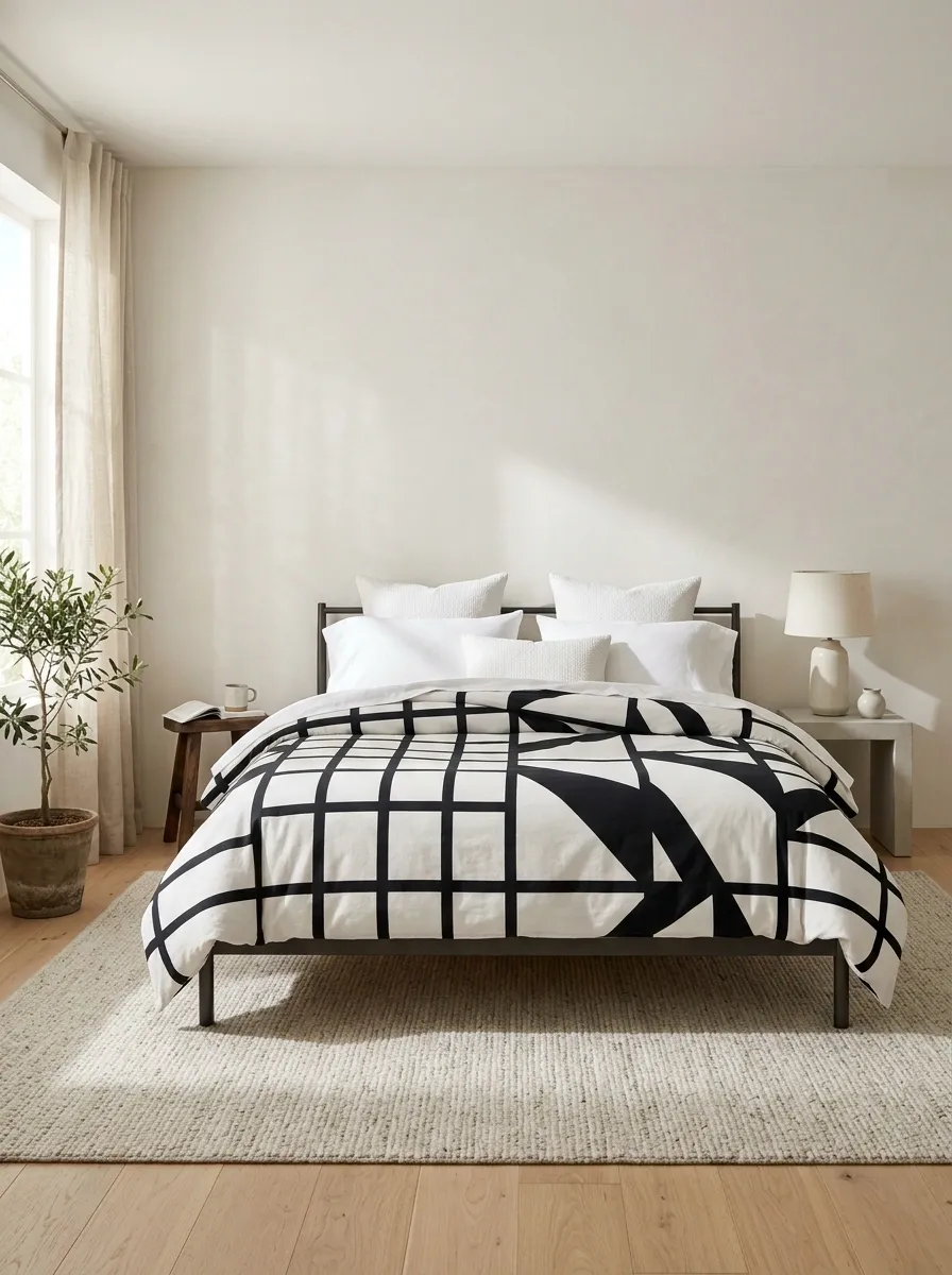
A bold black-and-white geometric duvet sits within a streamlined bedroom with pale walls, a simple dark bed frame, and minimal bedside furniture. The pattern provides the main visual statement, while white pillowcases and an uncluttered backdrop keep the geometry easy to read. The overall composition feels modern and graphic rather than soft or traditional.
The strongest version gives the pattern plenty of space. A highly detailed duvet already creates contrast, so additional printed cushions or patterned curtains would dilute its impact. Keep the rest of the bedroom simple and vary the materials instead, such as smooth cotton, matte metal, and a pale rug. Black-and-white bedding can look sharp without becoming harsh when the room includes a few warmer textures. One strong graphic is enough to carry the scene.
THE GRAPHIC BEDDING BALANCE
Give a strong pattern enough room to be understood.
One leading pattern
Let the duvet carry the geometry.
Plain sheets
Create breathing room around the pattern.
Simple furniture
Keeps the room from competing with the bed.
A graphic duvet already has a strong personality. It doesn’t need a second print to validate it.
Vintage Patchwork Bedding in a Collected Bedroom
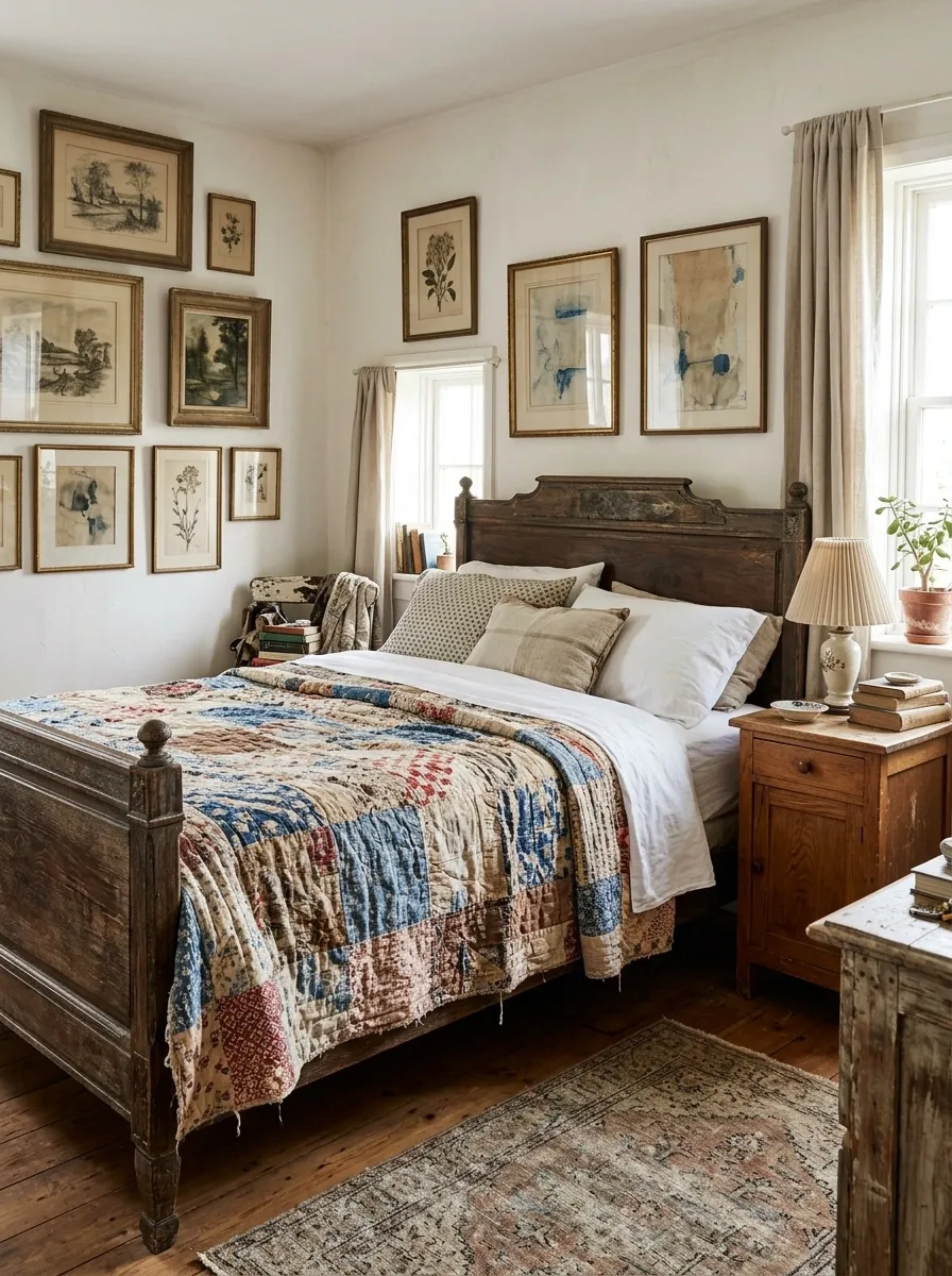
A patchwork quilt mixes faded blues, reds, creams, and earthy browns across an antique-style bed. Mismatched timber furniture and layered artwork give the bedroom a collected character, while plain sheets provide a clean edge around the varied fabric pieces. The look is expressive but grounded, with the quilt clearly taking the lead.
The most convincing version repeats a few muted colors around the room instead of trying to match every patch. A blue detail in the artwork or a warm timber bedside table is enough to make the composition feel connected. Keep the surrounding textiles simpler so the patchwork remains easy to appreciate. The charm comes from the quilt’s varied pieces, not from filling every corner with another vintage find. Collected should look personal, not like the room is preparing for an antique auction.
A QUILT WITH A COLOR STORY
Different patches, related colors.
What connects the patchwork?
Muted blues, warm reds, creams, and earthy browns keep the individual pieces related even when their patterns differ.
Let the quilt be the collection. The whole room doesn’t need to audition for the same role.
Airy White Bedding in a Sloped-Ceiling Attic Bedroom
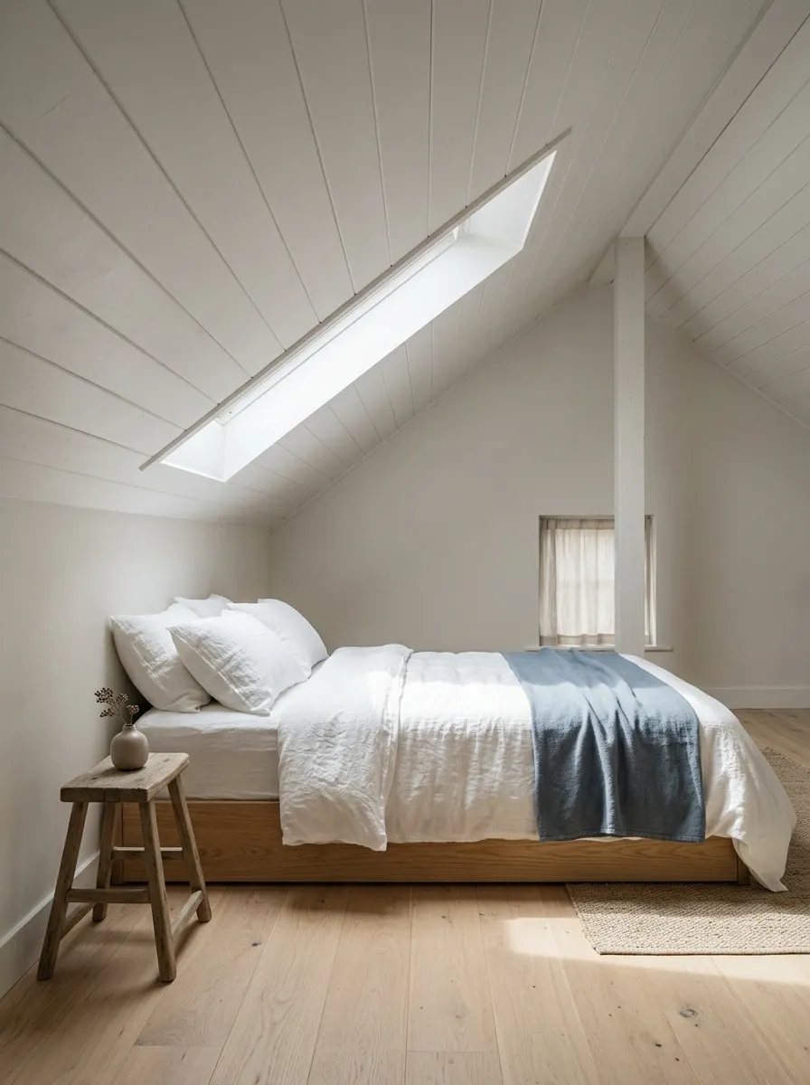
White textured bedding and a muted blue layer sit on a low bed tucked beneath a sloping ceiling. Pale flooring, a simple bedside stool, and light from a skylight give the unusual architecture room to breathe. The bedding provides a clean, quiet surface beneath the roofline rather than competing with the shape of the room.
A lower bed profile can help preserve the feeling of openness in a compact attic, particularly where the ceiling slopes close to the sleeping area. Keep bedside furniture small enough for the available clearance, and avoid bulky layers that make the mattress look even larger. The pale blue accent adds a little definition without introducing a dramatic color change. The architecture already gives the room character, so the bedding can afford to be understated.
THE ATTIC BEDROOM EDIT
Let the roofline have its moment.
Quiet layers
White texture and one muted accent keep the bed light.
Clear surroundings
Small bedside pieces preserve usable space beneath the roofline.
The ceiling has already brought the architectural drama. The duvet can relax.
A Bedroom That Looks Put Together Without Trying Too Hard
The strongest bedding arrangement isn’t necessarily the one with the most layers, the fanciest fabric, or the largest pile of decorative pillows. It’s the one where the colors make sense together, the textures have a purpose, and the bed feels connected to the furniture and architecture around it.
Start by choosing the overall direction, then build the bedding around a clear focal point. A patterned duvet usually needs quieter supporting layers, while a plain duvet can benefit from contrast through texture or a restrained accent color. Before buying anything else, look at the pieces already in the room. The right combination may need one thoughtful change, not an entire shopping cart