
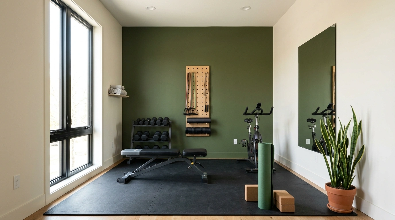
Some home gyms have great equipment, expensive flooring, and the personality of a fluorescent-lit storage closet. The treadmill is wedged against one wall, the dumbbells have colonized the floor, and the paint color looks like it was chosen during a five-minute trip to the hardware store.
The trick is to stop choosing colors in isolation. A shade that looks gorgeous on a paint chip can become gloomy in a windowless basement or strangely yellow under artificial lighting. The most successful paint color ideas for a home gym account for the actual room, the equipment already there, and the way the space needs to function.
Because the weights aren’t moving themselves, and the walls might as well look good while you’re negotiating with them.
The Home Gym Color Audit
Your gym’s walls aren’t boring. They’re underdressed.
Before choosing a shade, look at the room you’re actually working with. Daylight, black equipment, and questionable basement lighting have entered the chat.
Use this editorial feature to help readers recognize their biggest design challenge before exploring the finished rooms.
Before choosing a paint color, look at the room you’re actually working with. Daylight, black equipment, and questionable basement lighting have entered the chat.
Start with a warm neutral or balanced mid-tone and plan good lighting. Paint can help a dark room feel considered. It cannot manifest a window.
Break up black racks and dark flooring with warm timber, lighter walls, or a contrasting finish. The weights can be intimidating without the walls joining in.
Use a focused accent wall, thoughtful mirror placement, and compact storage. A small gym can have character without painting every surface a dramatic shade.
Test sample colors beside the actual flooring and equipment under the room’s usual lighting. That tiny paint chip at the store has never met your basement at 8 p.m. Don’t let it make executive decisions.
Paint Color Ideas for a Home Gym
Warm Rust Home Gym
Rich rust-toned walls bring an enveloping, grounded energy to a home gym without relying on standard neutrals. Pair the warm backdrop with a heavy-duty black strength rack, pale wood flooring, and tall arched windows that let natural daylight bounce across the space.
The curved architectural ceiling and modern pendant lighting create a sculptural quality that feels more like a boutique studio than a converted spare room. Keep accessories minimal, letting the saturated wall color and industrial equipment do the heavy lifting.
This shade of terracotta offers a sophisticated warmth that keeps early morning workouts feeling inviting rather than clinical. Balance the intensity of the walls with clean white or light grey floors so the room retains an open, breathable atmosphere.
All Black Strength Space
Monochromatic black walls and ceilings create an immersive, distraction-free environment for serious lifting and conditioning. Pair the moody backdrop with light oak flooring and full-height mirrors to keep the room grounded and visually expansive.
Group dumbbells, kettlebells, and heavy racks cleanly against the dark perimeter so the equipment acts as part of the architecture. Recessed spot lighting highlights the textures of the weights and the warmth of the wood floor beneath.
This saturated palette demands commitment, but the reward is a sleek, hyper-focused training zone. The contrast between matte black surfaces and natural timber prevents the space from feeling heavy or uninspired.
Midnight Navy Boxing and Conditioning Room
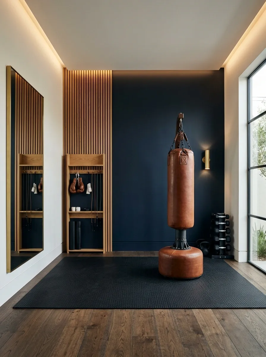
Midnight navy gives a boxing or conditioning room a focused, high-contrast identity without defaulting to the usual black walls. Pair it with dark flooring, a freestanding punching bag, compact equipment storage, and a few warm timber accents.
A navy feature wall behind the main training equipment can anchor the room, while lighter adjoining walls prevent the whole space from feeling enclosed. Position mirrors where they help with movement and form, rather than covering every available surface simply because gym mirrors seem mandatory.
This palette works especially well when the equipment is already dark. The blue undertone adds depth, and warm light prevents the finish from looking flat. Avoid adding several competing accent colors. The room already has enough going on once the ropes, weights, and boxing gear arrive.
The navy lighting plan
HALF THE STORY.
A dark wall looks richer when the room has visible light sources, balanced contrast, and enough separation between equipment and the background.
Olive Green Wellness Studio
Deep olive green walls wrap a training space in an organic, grounding hue that connects effortlessly with nature. Combine the rich pigment with warm cork or timber flooring, a classic wooden rowing machine, and a scattering of weighted equipment.
An overhead porthole window and a multi-pane glass wall flood the room with daylight, illuminating the textured walls and highlighting the natural wood grain of the cardio gear. Keep decor sparse to let the striking wall color take center stage.
This muted green works brilliantly alongside heavy iron and polished steel, striking the ideal balance between raw utility and refined interior design. It creates a serene yet energizing atmosphere that makes daily movement something to genuinely look forward to.
Forest Green Weight Room With Natural Wood
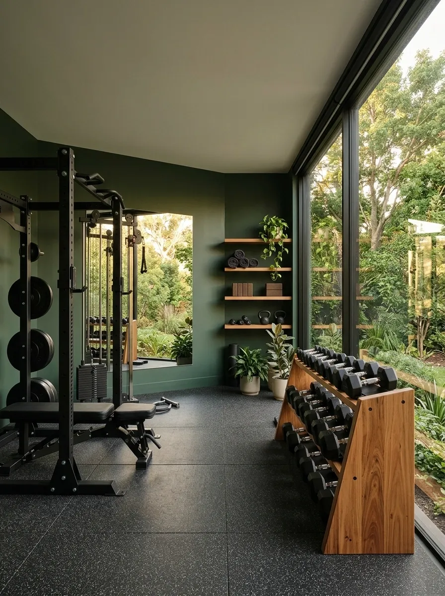
Forest green brings a strong connection to the outdoors while still looking substantial beside black weights and strength equipment. Use the color across the main walls, then introduce oak shelving, a timber dumbbell rack, and a large window that frames any available greenery.
This design has more depth than a standard pale green gym, but it doesn’t rely on a cave-like palette. Natural light and mid-toned wood provide contrast, while simple black fixtures keep the materials from competing. A single large mirror is often more useful than several smaller ones scattered across the walls.
The important distinction is the shade of green. A rich, slightly muted forest tone works with timber and charcoal flooring, while an overly bright green can start to look more like a sports locker room. Keep the accessories restrained and let the wood grain do its job.
A green and timber palette study
MEETS GRAIN.
High Energy Pink Garage
A high-gloss pink marbled epoxy floor instantly transforms a utilitarian garage into a bold, personality-filled workout zone. Pair the vibrant pink surface with matching pink-accented weight plates and sleek black commercial gym equipment.
LED neon wall signage and full-length mirrored panels bounce light around the compact footprint, making the garage feel intentional and designed. Keep equipment neatly organized along the perimeter to maintain clean lines across the vibrant floor.
This vibrant palette proves that a home gym doesn’t have to take itself too seriously to be effective. The punchy color scheme injects a dose of pure fun into every set while keeping the space deeply customized.
Earthy Terracotta Yoga and Mobility Studio
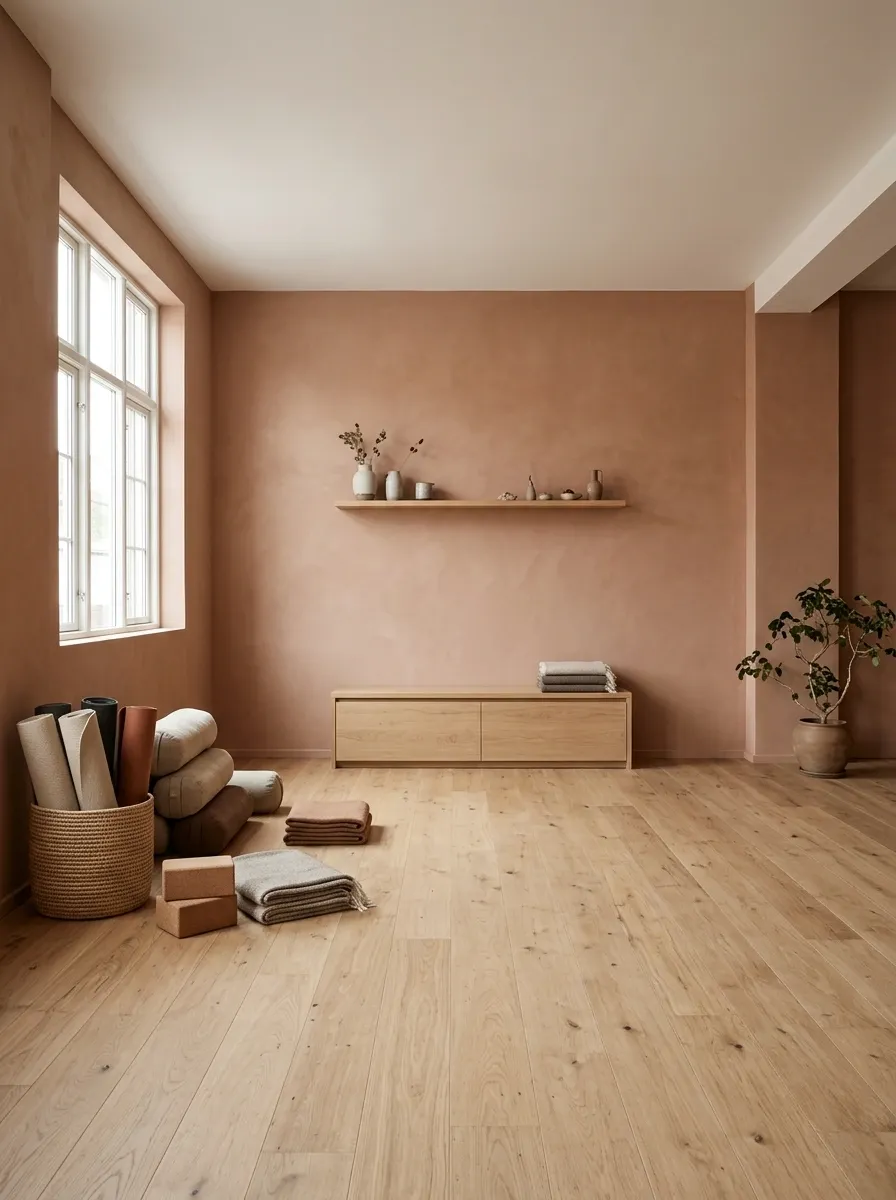
Terracotta gives a yoga and mobility room warmth without relying on beige from floor to ceiling. Use a muted clay shade on the walls, natural wood or cork flooring, a low storage bench, and neatly arranged mats and bolsters. Soft daylight helps reveal the color’s earthy undertones.
The furniture should stay low and the center of the room should remain open. That open floor area is part of the design, not an invitation to fill the room with decorative baskets and seventeen plants. A simple wall shelf can hold accessories without cutting into the space needed for stretching.
Choose a dusty or clay-based terracotta rather than an intense orange-red. The softer pigment works better with natural textures and feels more residential than a high-energy training room. The result has character without looking like a restaurant that happens to offer yoga on Tuesdays.
The movement studio’s texture palette
OPEN FLOOR.
FLOOR
Keep mats, bolsters, and small accessories grouped near one wall. The open floor is what makes this design work.
Soft Sage Convertible Guest Room Gym
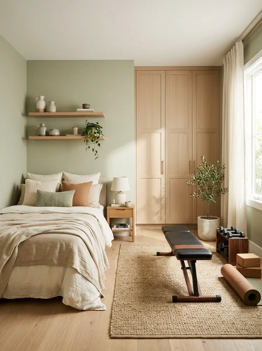
A soft sage wall color lets a spare bedroom function as a workout room without advertising its second job to every overnight guest. Pair sage walls with pale oak, warm-white bedding, a foldable bench, and compact equipment that can be stored neatly when the room switches back to sleeping duty.
The layout matters as much as the paint. Keep the bed along one side, position the exercise equipment where it won’t block drawers or wardrobe doors, and preserve a clear route through the room. Closed storage hides smaller items that otherwise make the bedroom look like a fitness shop after inventory day.
Muted sage connects naturally with wood and neutral fabrics, so the room doesn’t need a separate decorating scheme for each activity. Choose a shade with enough warmth to work beside the bedding, and avoid a bright mint that makes the two functions feel disconnected.
One room, two uses
GYM BY DAY.
Bed, calm textiles, clear access to drawers.
Foldable bench, compact weights, clear mat area.
Slate Blue Basement Cardio Room
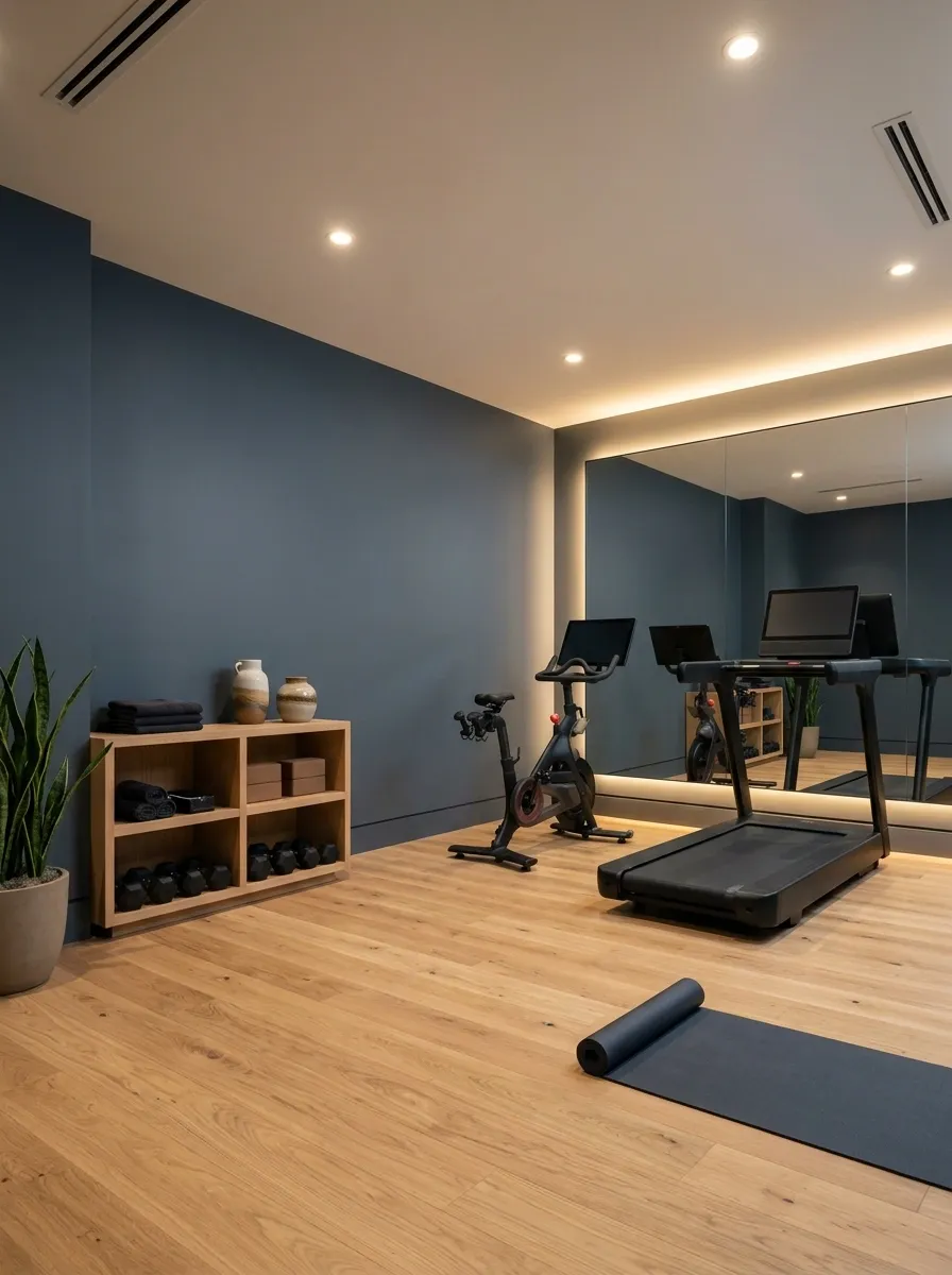
Slate blue is a strong choice for a basement gym that needs color without turning every wall into a dramatic statement. The muted blue-gray shade brings depth to a room with a treadmill, stationary bike, dark resilient flooring, and a compact equipment shelf. Add warm-white ceiling lights and a large mirror to help distribute the available light visually.
Keep the arrangement practical. Place the cardio machines where there’s enough room to mount and dismount safely, and avoid squeezing equipment against every wall just because the basement has an awkward corner. A narrow walkway is still a narrow walkway, even when the treadmill cost more than the sofa.
Slate blue works particularly well with black equipment and light oak accents. Choose a shade that doesn’t become too dark under artificial lighting, and test it at different times of day before committing.
The basement color and lighting relationship
WARM LIGHT.
Warm White Garage Gym With Black Equipment
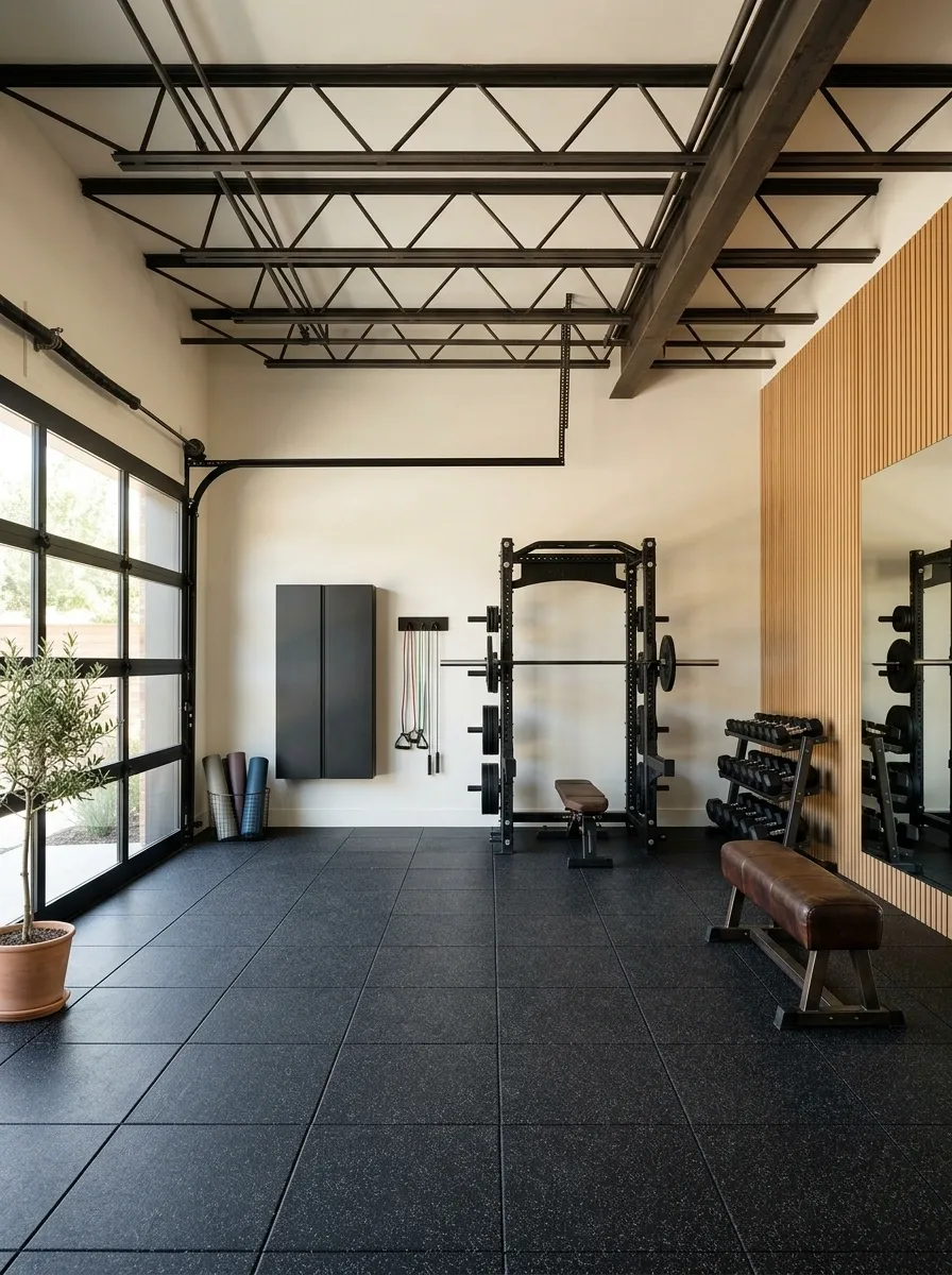
A converted garage doesn’t need to look like a warehouse to function as a serious workout space. Warm-white walls, black rubber flooring, organized weight storage, and a sturdy bench give the room a clean foundation without introducing a cold, clinical atmosphere.
The warmer undertone matters here. Bright, icy white can emphasize the exposed surfaces and uneven lighting common in garages, while warm white creates a gentler background for black racks, metal fixtures, and storage cabinets. Keep the garage door, structural elements, and practical storage visible in the design rather than pretending the room was secretly a penthouse studio all along.
Use wall-mounted racks where appropriate, but preserve clearance around the equipment and the route through the garage. Finish the arrangement with a small amount of timber or muted green to break up the hard surfaces.
The garage finish specification
NO FAKE PENTHOUSE.
Mushroom Walls in a Boutique Pilates Room
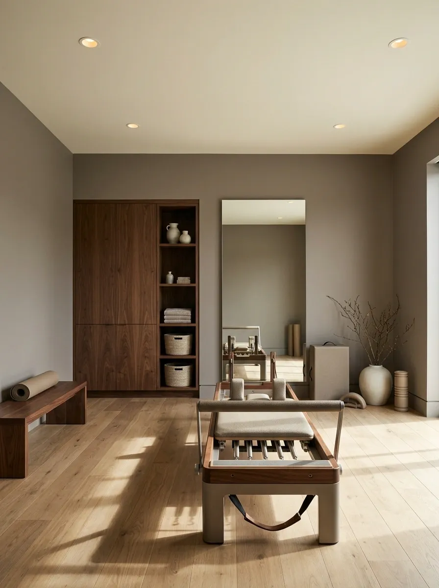
Mushroom paint gives a Pilates room a refined, understated look that works beautifully with walnut cabinetry, neutral upholstery, and warm lighting. Instead of relying on bright colors to make the room feel designed, this palette uses subtle differences in tone and texture.
Pair the walls with a reformer, a large mirror, and closed storage for smaller accessories. A walnut cabinet or bench introduces a deeper brown element, while a pale ceiling prevents the space from feeling too enclosed. Keep the equipment layout clear, with enough room to move around the reformer and access its moving parts safely.
Mushroom is particularly useful when the room needs to feel connected to the rest of the home rather than like a commercial fitness studio. The secret is choosing a paint color with the right undertone for the wood and flooring. Otherwise, the whole room can end up looking like several shades of beige having a very long meeting.
The undertone check
ONE SINGLE COLOR.
Mushroom paint changes character beside different flooring, cabinetry, and upholstery. Compare the undertones before choosing the final shade.
Dusty Rose Barre and Mat Studio
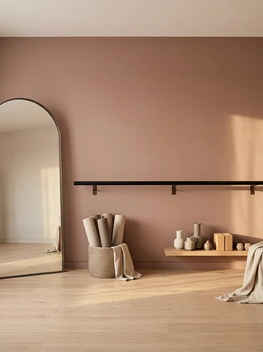
Dusty rose offers a softer alternative to the usual gray-and-black gym palette. The muted pink works with pale oak flooring, slim dark hardware, a wall-mounted barre, and neatly stored mats. A tall mirror can help the room feel more open without making it look like a dance studio decorated entirely around its reflection.
The trick is keeping the rose dusty rather than sugary. A shade with a muted, earthy undertone feels more sophisticated beside natural wood and neutral textiles. Keep bulky storage out of the main movement area, and avoid mixing several unrelated pinks across the walls, mats, and accessories.
This design works particularly well in a dedicated barre room or a small home studio used for stretching and low-impact workouts. It has personality without shouting for attention, which is more than can be said for some gym equipment in neon lime.
The dusty rose contrast plan
SHARP DETAILS.
Let the wall color provide softness, use timber for warmth, and reserve darker details for definition. No need to turn the room into a pink highlighter collection.
Butter Yellow Morning Cardio Room
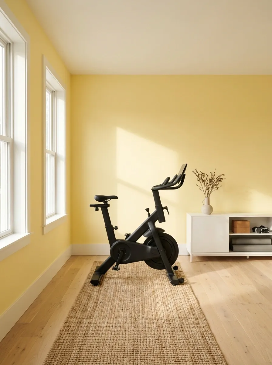
Butter yellow makes a sunlit cardio room feel cheerful without the intensity of a highlighter-yellow wall. Combine the soft yellow with warm-white trim, pale flooring, and a streamlined stationary bike or treadmill. A modest storage cabinet keeps smaller items organized without competing with the color.
This paint choice depends heavily on light. In a room with generous daylight, a buttery shade can feel warm and lively. Under dim or overly cool lighting, the same yellow may look dull or unusually intense. Sample it on a large section of the wall and check it throughout the day before painting the entire room.
Keep other finishes restrained so the yellow remains the main visual feature. Pale wood works particularly well, while black equipment provides enough contrast to ground the composition. The aim is a room with morning energy, not a gym that looks like it lost a fight with a jar of mustard.
Yellow paint under different lighting
DIFFERENT MOOD.
Lighting changes how warm and saturated a yellow appears. Test the shade in the actual room instead of trusting the showroom lighting.
Blackened Teal Indoor Cycling Studio
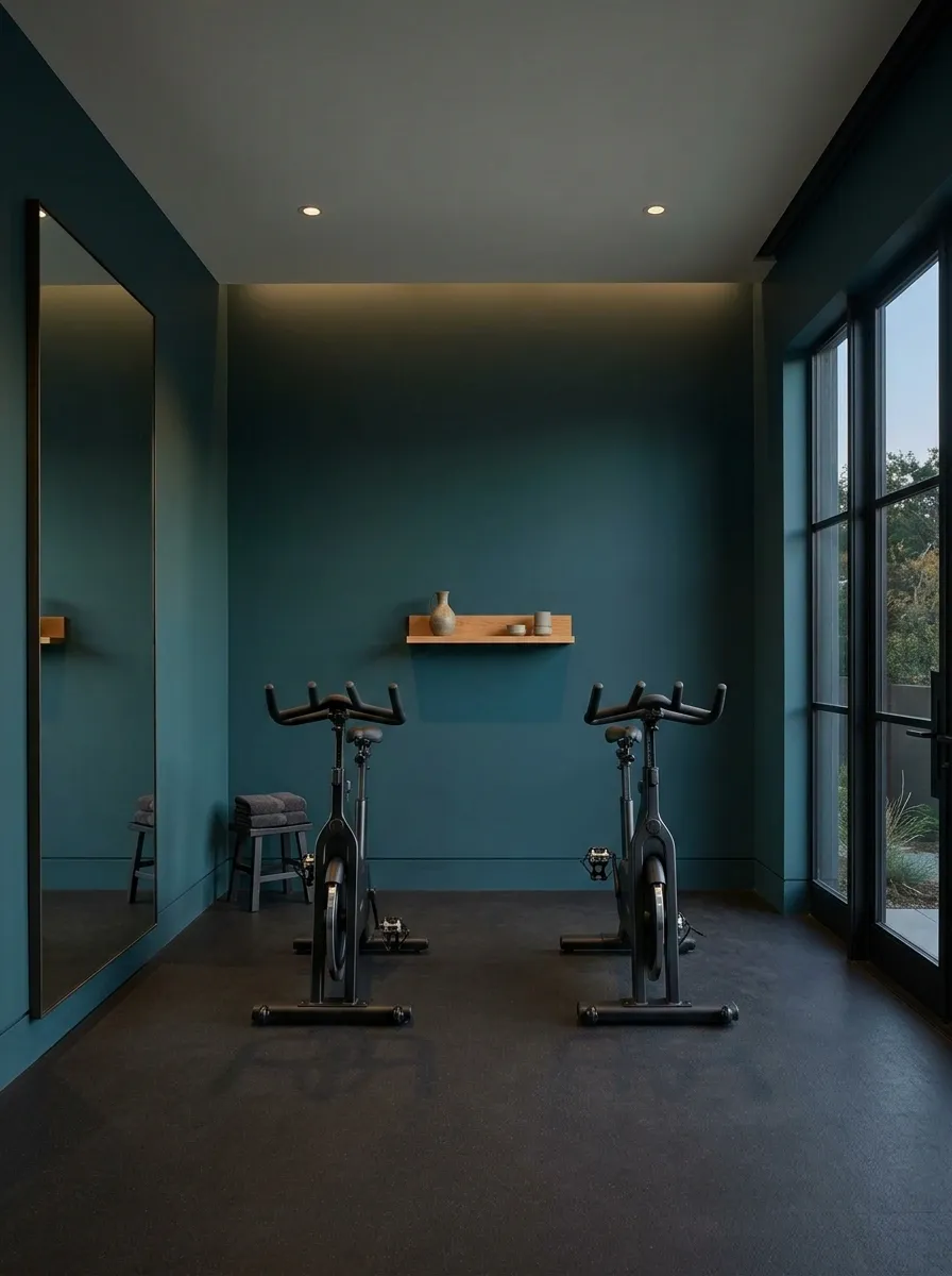
Blackened teal gives an indoor cycling room a moody, almost cinematic character without relying on the predictable black walls and neon strips combination. Use the deep green-blue shade across the main walls, then add dark rubber flooring, two stationary bikes, a full-height mirror, and discreet warm lighting. The result feels focused and intentional rather than like a nightclub that discovered exercise equipment.
A mirror can make the room feel deeper, but its placement matters more than covering every wall with reflective glass. Keep enough clearance around each bike and position the lighting so it doesn’t create distracting glare during workouts. A small oak shelf or cabinet can introduce warmth without disrupting the darker palette.
The shade works best when it has enough blue and green undertones to remain visibly distinct from black under artificial lighting. Otherwise, all that paint money goes toward a room that looks black anyway. Excellent budgeting strategy, questionable color selection.
The cycling studio’s color hierarchy
CONTROLLED LIGHT.
Aubergine Strength and Recovery Room
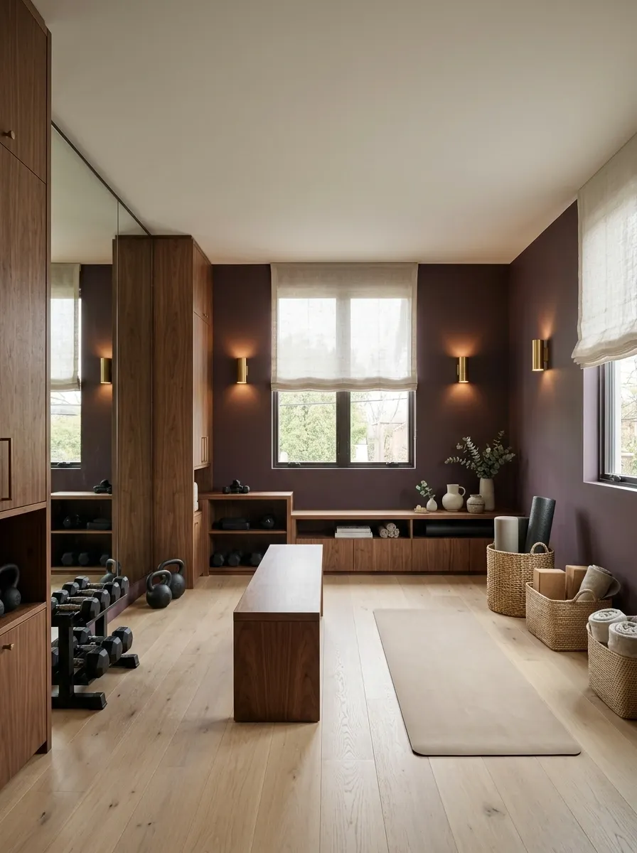
Aubergine brings an unexpected richness to a home gym, especially when the usual palette of gray, black, and white has started to feel like a corporate office with kettlebells. The muted purple-brown shade works well with black free weights, walnut cabinetry, warm lighting, and a separate mat area for stretching.
Keep the deeper paint concentrated on the main walls and introduce a lighter floor finish or pale ceiling to maintain visual separation. A walnut bench can connect the strength-training area to the recovery corner, while closed storage prevents smaller equipment from taking over the room.
This concept suits a dedicated gym that needs to accommodate both lifting and mobility work. Choose a muted aubergine rather than a vivid purple, and inspect the sample under the room’s actual lighting. Deep colors can become much heavier in poorly lit rooms, and the goal is a sophisticated training space, not a medieval dungeon with a monthly membership fee.
Balancing the aubergine palette
A LOT OF BALANCE.
Use the deeper shade for atmosphere, wood for warmth, and lighter surfaces to preserve visual separation. The recovery zone should feel connected to the gym, not swallowed by it.
Cobalt Blue Functional Training Room
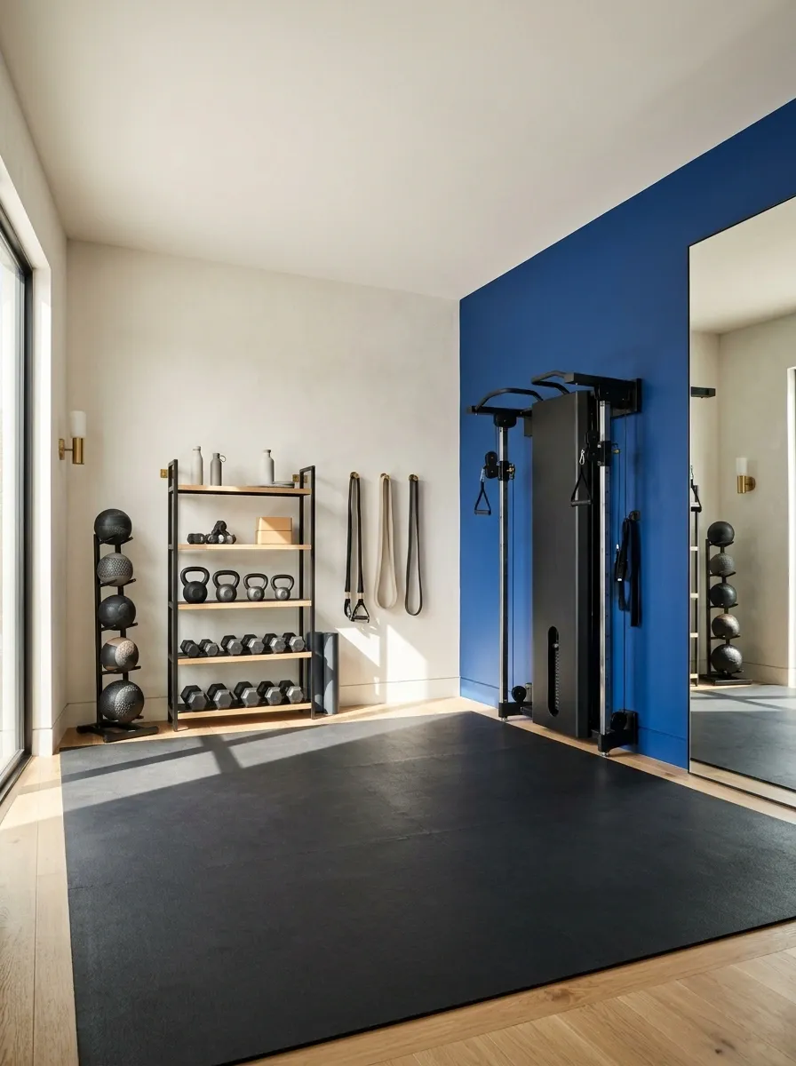
Cobalt blue gives a functional training room an unapologetically energetic focal point. Rather than covering every wall in saturated color, place cobalt behind a resistance-training station or along the main equipment wall. Keep the adjacent surfaces warm white or a quiet gray, then introduce black rubber flooring, a medicine-ball rack, resistance bands, and open storage.
The result has more personality than an all-gray workout space without introducing a dozen colors that compete for attention. A large mirror can sit beside the painted wall, while floor space remains open for bodyweight exercises and mobility drills.
A clean accent wall is particularly effective when the room serves several training styles. The color helps anchor the equipment without requiring permanent partitions or elaborate decor. Just keep the supporting finishes disciplined. The resistance bands already come in enough colors to host their own festival.
Where the cobalt belongs
ROOM TO MOVE.
Two-Tone Gym With a Dark Lower Wall
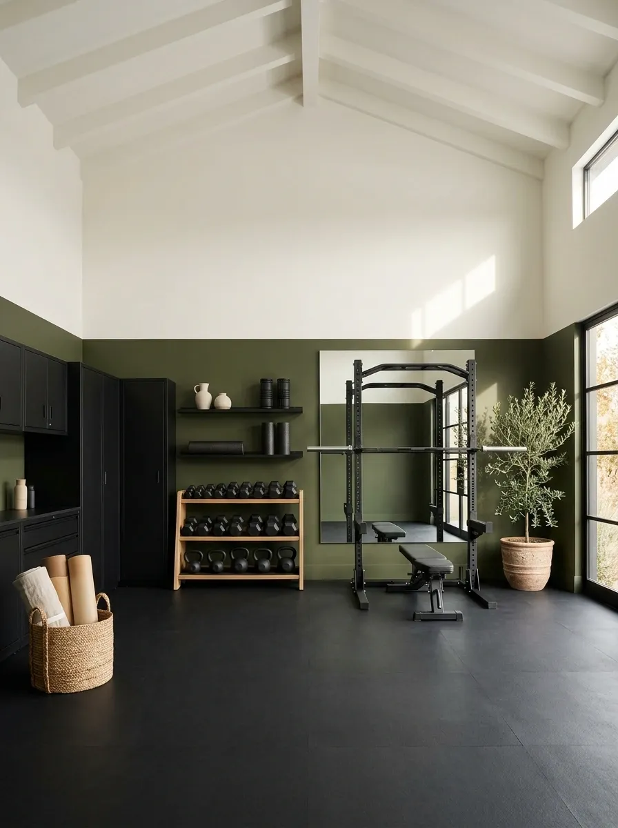
A two-tone paint scheme adds architectural interest without requiring expensive wall panels or custom-built features. Use a deep olive, charcoal, or muted blue across the lower portion of the walls, with warm white or pale greige above. Black flooring and streamlined storage connect the two paint sections.
The horizontal division can follow an existing architectural line or sit at a height that relates naturally to the room’s equipment and proportions. A very low stripe can look accidental, while a division that cuts awkwardly through shelves or mirrors may make the room feel disjointed. Plan the boundary before painting, rather than letting a roll of masking tape make creative decisions.
This treatment works in spare rooms, basements, and converted garages where a single dark shade across every wall might feel too heavy. It provides visual definition while retaining a lighter upper section. Think tailored sportswear rather than a wall that couldn’t decide what it wanted to be.
The two-tone wall elevation
A LIGHTER TOP.
Color-Blocked Multi-Zone Family Gym
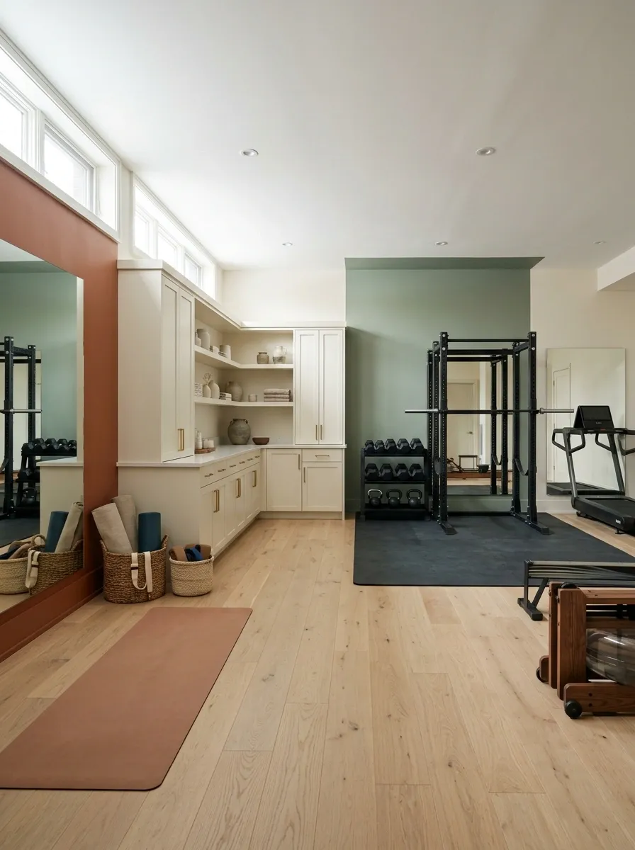
A family gym often needs to accommodate strength training, cardio, stretching, and equipment storage without making the whole room feel like a sports shop. Color blocking can give those activities separate visual identities while keeping them connected through consistent flooring, lighting, and storage finishes.
Start with a warm neutral across most walls, then use muted green near the strength equipment and a clay accent around the mobility area. These colors should feel related rather than competing. The cardio section can remain neutral, allowing the equipment itself to define the zone without adding a third painted statement.
This concept works particularly well in a larger basement or shared recreation room. The paint helps organize the composition, but it shouldn’t replace sensible spacing, safe equipment placement, or adequate clearance. Color can establish a zone. It cannot negotiate with a rowing machine that’s blocking the only walkway.
The room’s color zoning plan
THREE CLEAR PURPOSES.
Cinnamon Color-Drenched Compact Workout Room
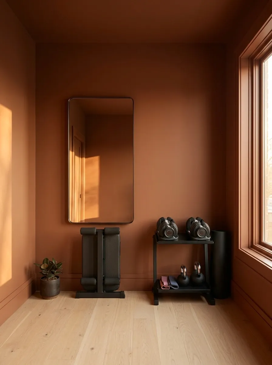
Cinnamon walls, matching painted trim, and a restrained ceiling treatment give a compact home gym a strong identity without sacrificing an inch to unnecessary decor. The warm reddish-brown palette works particularly well with black adjustable weights, a foldable bench, a wall-mounted mirror, and pale flooring that introduces contrast at ground level.
Color drenching works here because the smaller room feels deliberately enveloped rather than decorated in disconnected pieces. Keep the major painted surfaces within the same color family, then let the mirror and lighter floor break up the visual weight. Slim equipment storage keeps the layout practical, especially when the gym occupies a spare room or converted study.
The key is choosing a cinnamon shade with enough brown in it to avoid looking aggressively orange. Otherwise, the workout room starts giving spicy pumpkin latte with a personal training certification.
How to make color drenching work
MORE VISUAL DEPTH.
Keep the walls and trim related in tone, then use mirrors, pale flooring, and dark equipment to prevent the room from becoming one uninterrupted block of brown.
Muted Ochre Ceiling With Pale Neutral Walls
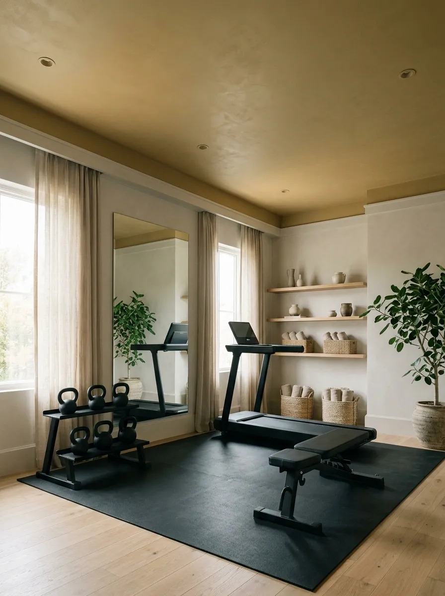
A muted ochre ceiling gives an otherwise restrained home gym an unexpected design feature. Warm-white or pale greige walls keep the room light, while the colored ceiling draws attention to the architecture instead of demanding another accent wall. Pale flooring, black exercise equipment, and simple oak shelving complete the composition.
This approach works well in a spare bedroom or a rectangular workout room where the walls need to remain relatively quiet. The ceiling adds warmth without taking up usable wall space, and the lighter surrounding surfaces prevent the ochre from making the room feel too enclosed.
Choose a dusty, earthy yellow rather than a bright golden shade. The ceiling should complement the room, not compete with the equipment or make everyone wonder whether the paint was mixed with turmeric. Check the color under the actual ceiling lights, especially in rooms that receive little daylight.
The ceiling becomes the focal point
THE CEILING HAS A JOB.
Choose an earthy yellow with a controlled undertone. A highly saturated ceiling can dominate a low room much faster than expected.
Olive Green Gym With an Oak Equipment Wall
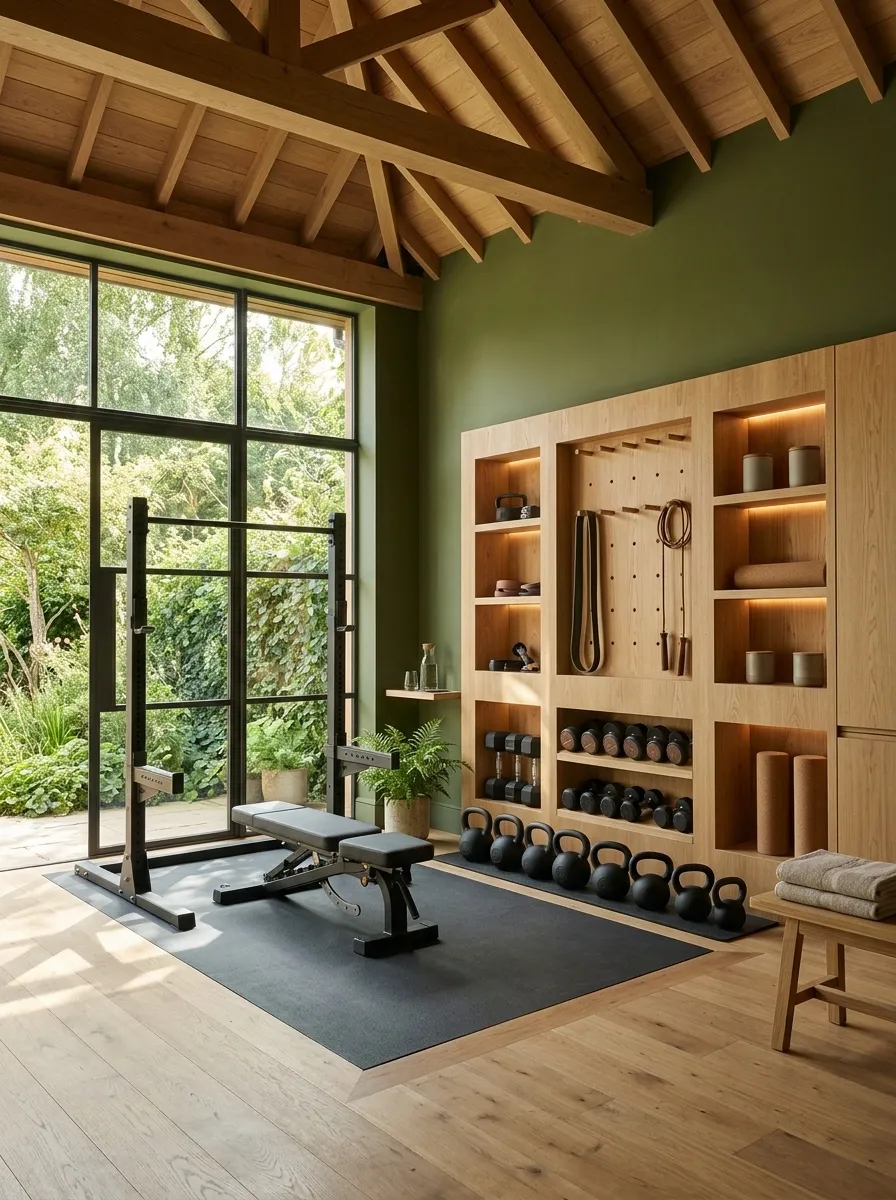
An olive-green gym with a full oak equipment wall feels grounded, architectural, and connected to the garden outside. This concept works especially well in a converted garden room or a modest backyard outbuilding with large windows, black strength equipment, and enough floor space for a dedicated training area.
The timber wall does more than provide decoration. It can organize dumbbells, resistance bands, and smaller accessories in one visually consistent location. Olive paint on the remaining walls creates a quiet background, while the outdoor greenery adds another layer of color through the windows.
Keep the oak finish relatively consistent and the storage layout disciplined. A wall filled with mismatched hooks, open bins, and stray equipment can undermine even the most expensive-looking paint choice. This room should feel like a carefully planned home gym, not a garden shed that accidentally developed excellent taste.
The oak wall as an organizing feature
OAK AT THE CENTER.
Cocoa Brown Premium Dumbbell Room
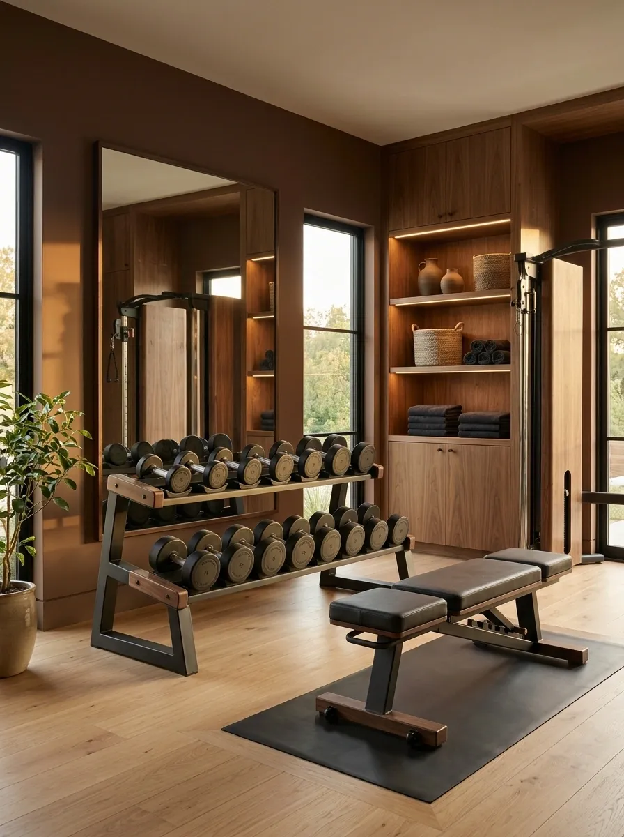
Cocoa-brown walls, walnut cabinetry, carefully organized dumbbells, and warm layered lighting create a home gym that feels tailored rather than industrial. This design puts equipment storage at the center of the composition, treating the dumbbell collection as part of the room’s architecture rather than something that needs to be hidden in a corner.
Use brown paint with enough warmth to distinguish it from the deeper walnut finishes. A lighter neutral floor provides separation underfoot, while dark metal equipment keeps the room grounded. Built-in cabinets can conceal small accessories, leaving the weights and main training bench as the most visible elements.
The result feels especially cohesive in a dedicated strength room with controlled lighting and a relatively simple layout. The main thing to avoid is stacking similar dark browns everywhere without checking their undertones. Rich brown can look sophisticated, but brown-on-brown-on-brown can also resemble a very expensive chocolate box with no instructions.
Separating the three brown finishes
A LITTLE DISCIPLINE.
Use cocoa paint for the background, walnut for depth, and a lighter flooring finish to separate the major surfaces. Consistent equipment storage keeps the premium look from becoming visual clutter.
Pale Sky Blue Mobility Studio
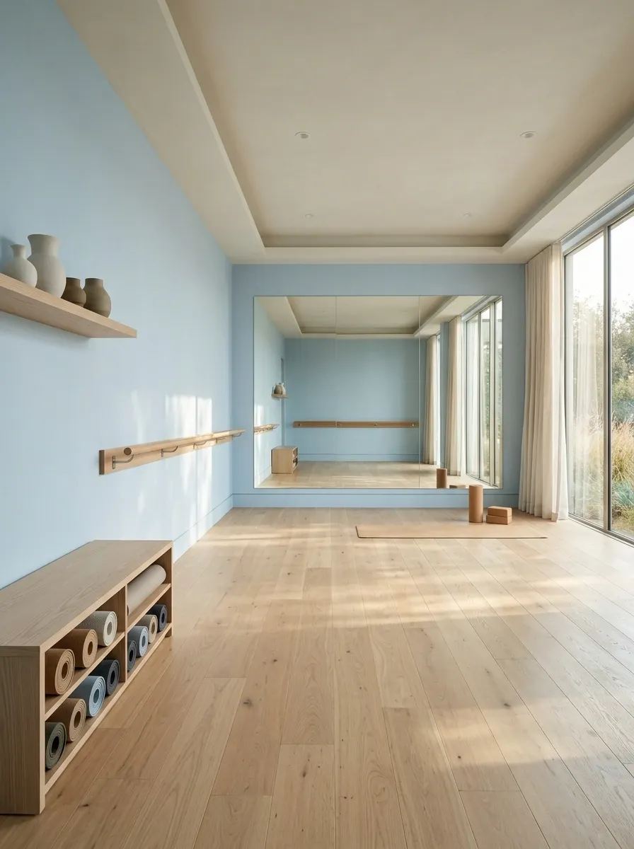
Pale sky blue gives a dedicated mobility room a fresh, open character without resorting to stark white walls. Combine the light blue with ash or pale oak flooring, a wall-mounted mobility bar, neatly arranged mats, and a low storage bench. Generous open floor space becomes the defining feature of the composition.
Unlike a machine-filled gym, this room is organized around movement on the floor. Equipment should remain close to the perimeter, leaving a clear central area for stretching, warm-ups, and mobility exercises. A large window and a full-height mirror can help the room feel spacious, provided the mirror placement doesn’t create glare or interfere with the layout.
Choose a gentle blue with a slightly softened undertone rather than a saturated nursery blue. Natural timber adds warmth and keeps the design from feeling cold. The final effect is calm without being bland, which is a welcome change from gyms that look like every available surface was painted to motivate someone through leg day.
The open-floor design principle
PART OF THE DESIGN.
Coral HIIT Room With Warm Neutral Surrounds
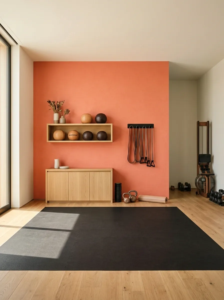
Coral brings a lively hit of color to a high-intensity workout room without forcing every wall to participate in the enthusiasm. Use a saturated coral shade on the main training wall, then keep the surrounding surfaces warm white or pale greige. Black exercise equipment, rubber flooring, and a slim rack for resistance bands create enough contrast to ground the brighter paint.
A medicine-ball shelf and compact storage cabinet can sit along the accent wall, leaving the middle of the room open for jumping, circuit training, and floor exercises. The color provides a clear focal point without needing neon strips or motivational quotes that sound like they were written by a protein shaker.
Choose a coral with a slightly earthy undertone rather than an overly pink or fluorescent shade. This makes it easier to coordinate with wood and neutral finishes, particularly in a residential room that doubles as a general exercise space.
The coral accent wall strategy
KEEP THE BALANCE.
Lavender Recovery and Stretching Room
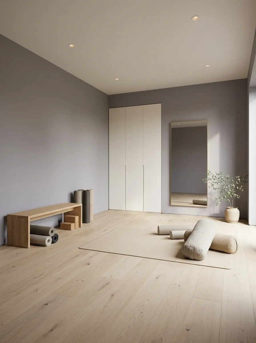
Muted lavender gives a dedicated recovery room a softer identity than the usual gray fitness palette. Pair it with pale oak flooring, a low wooden bench, neutral bolsters, and a neatly organized collection of mats. Diffused daylight and simple ceiling lighting bring out the wall color without introducing unnecessary visual distractions.
The layout should revolve around floor movement rather than equipment storage. Keep the center open for stretching, foam rolling, and mobility sessions, with accessories grouped along one wall. A tall mirror can help with movement checks, while a closed cabinet hides the smaller items that tend to multiply in any room dedicated to exercise.
Choose a gray-based lavender rather than a candy-colored purple. The muted undertone pairs more easily with natural wood and warm whites, giving the room character without turning it into a bedroom that accidentally received a yoga certification.
A quiet palette with a clear purpose
CLEARER SPACE.
Greige Gym With a Painted Arch Around the Mirror
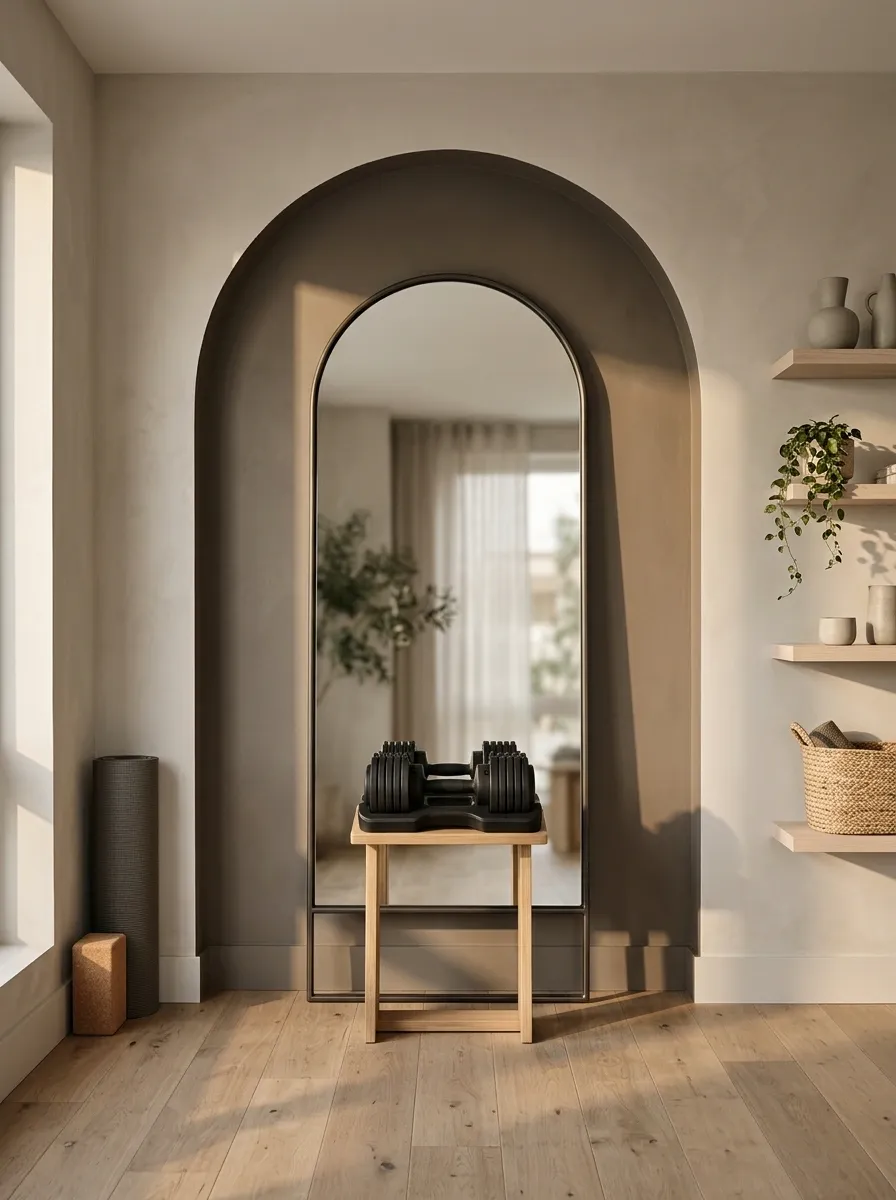
A painted arch in a deeper greige shade creates an architectural focal point without adding bulky wall panels or custom joinery. In a compact apartment gym, the arch can frame a tall mirror above a slim dumbbell stand, with warm neutral walls, pale wood shelving, and black adjustable weights completing the scene.
The shape gives the workout corner a clear identity, which is especially useful when the gym shares a bedroom, office, or multipurpose room. Keep the arch proportional to the mirror and the available wall space. An oversized shape can dominate a small room, while one that barely extends beyond the mirror may look like a painting mishap that nobody wanted to admit.
Choose two related neutrals so the arch remains distinctive without competing with the equipment. A darker mushroom or taupe against a lighter greige wall creates definition, while the mirror adds useful depth. No renovation crew required, just a steady hand and a level-headed approach to masking tape.
Planning the painted arch
NO CONSTRUCTION DUST.
MIRROR
Burnt Orange Stripe in a Long Cardio Room
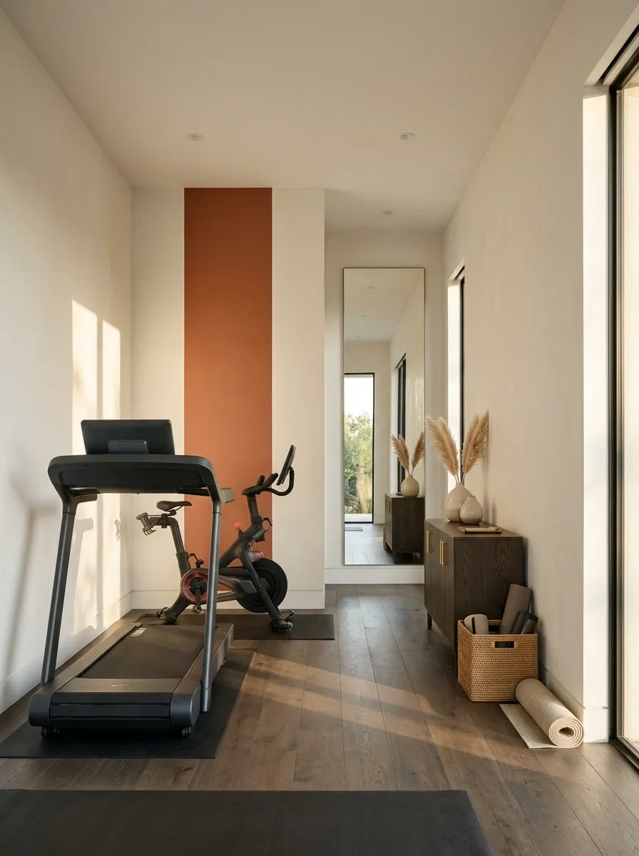
A long cardio room can feel visually stretched when every wall is the same color and the equipment lines up in a single row. A burnt-orange stripe introduces direction and warmth, giving the space a stronger visual identity without taking over the entire room.
Use warm-white walls as the main backdrop, with a single orange band positioned behind or alongside the treadmill and stationary bike area. Dark flooring, compact storage, and a long mirror help keep the arrangement practical. The stripe should relate to the room’s geometry, following a deliberate vertical or horizontal line rather than wrapping around corners without a clear reason.
This design is particularly useful in a narrow converted room where furniture placement can’t change much. Paint creates visual interest while the layout remains simple. Keep the orange earthy and muted, because fluorescent tangerine plus a treadmill at full speed is a lot of enthusiasm for one household to manage.
The stripe and the room’s proportions
A CLEAR DIRECTION.
Creamy Neutral Gym With Built-In Storage
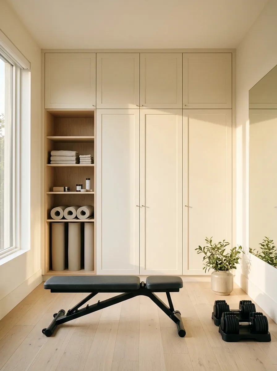
Creamy walls and floor-to-ceiling built-in storage make a compact gym feel organized before the first dumbbell is even lifted. This design suits a condo workout room or a dedicated corner where bulky equipment already takes up much of the visual space. Matching the storage fronts to the walls allows the larger surfaces to recede, leaving the exercise equipment as the main contrast.
Choose a warm cream rather than a stark white, then pair it with pale flooring, black adjustable dumbbells, and a foldable bench. Closed cabinets hide bands, mats, towels, and smaller accessories, while a dedicated open section can hold the equipment used most often. Keep door swings, drawers, and exercise clearances in mind when planning the built-ins.
The result is minimal without feeling empty. The storage does the heavy lifting visually, which is fortunate because the dumbbells have their own job. Avoid adding lots of contrasting handles, baskets, and decorative objects. The whole point is to make the room feel calmer, not to turn the cabinet wall into a home organization influencer’s greatest hits.
The storage and wall continuity plan
MORE ROOM TO MOVE.
Hide small accessories and keep frequently used equipment accessible.
Mineral Gray Apartment Gym With Warm Timber
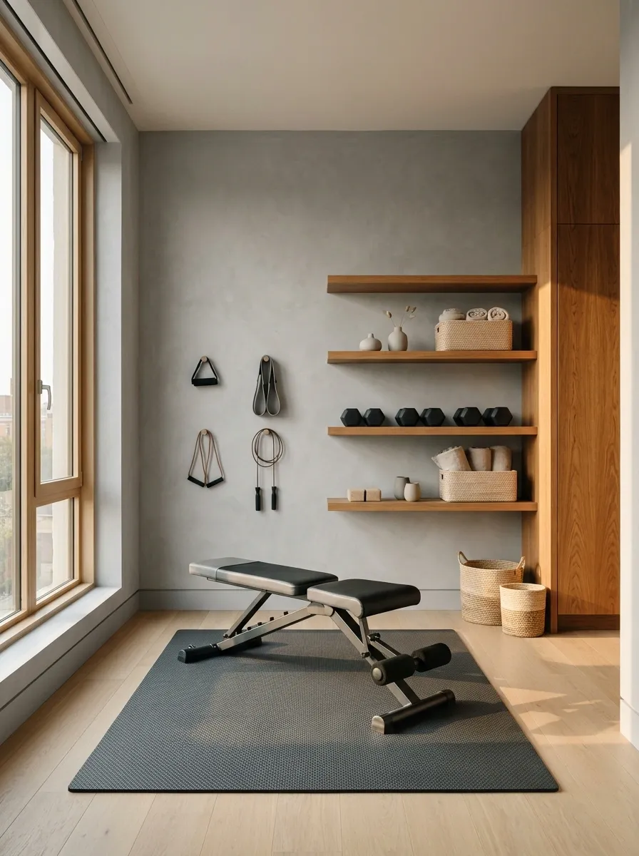
Mineral gray creates a modern apartment gym that feels polished without making the workout corner look like an extension of the office. Pair soft gray walls with warm timber shelving, black compact equipment, a foldable bench, and a large window. The contrast between cool walls and warmer wood keeps the palette from feeling flat.
This setup works particularly well in a spare room where the gym needs to coexist with the rest of the home. Keep the storage narrow, mount smaller accessories neatly, and choose equipment that can be folded away when the room serves another purpose. Pale flooring can make the arrangement feel lighter, while dark rubber mats provide a dedicated training surface.
The secret is avoiding a blue-gray shade that clashes with the timber. Gray already gets accused of being boring. Don’t make it look cold and then blame the furniture.
Balancing cool gray with warm finishes
WARM WOOD.
Muted Chartreuse Workout Nook With Warm White
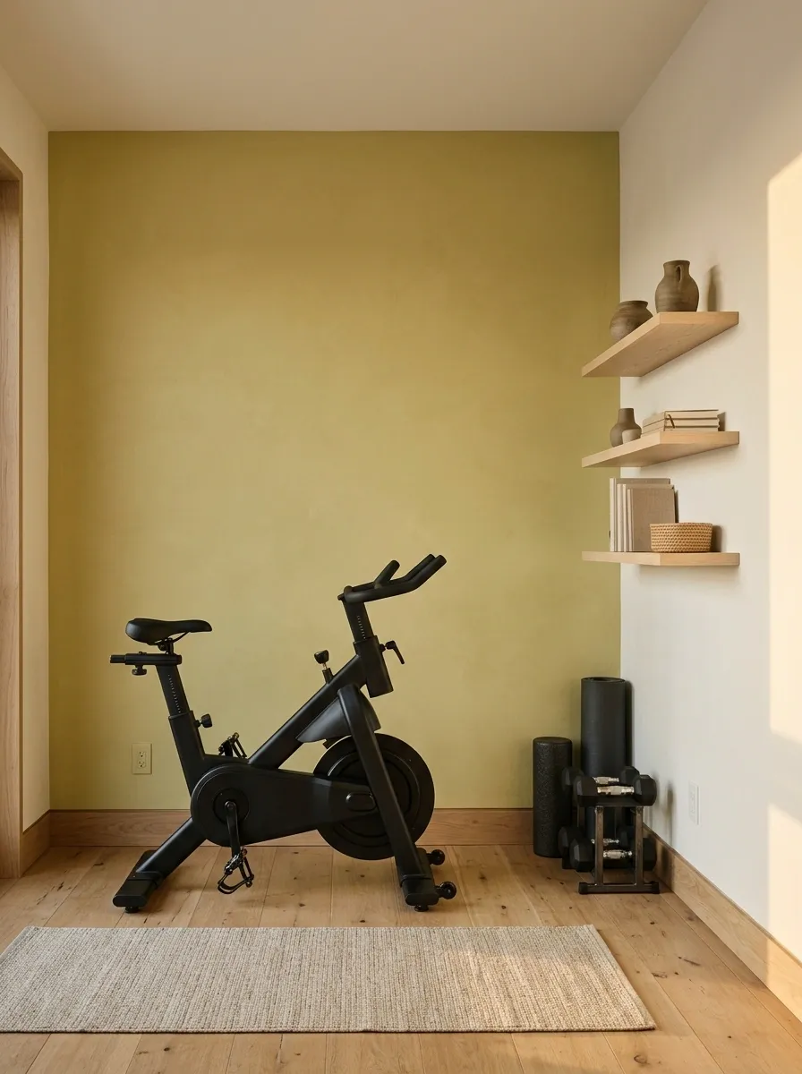
Muted chartreuse brings a distinctive dose of color to a compact home gym without requiring a full room makeover. Use the shade on one wall behind a stationary bike or adjustable weight stand, then surround it with warm-white walls, pale wood shelving, and dark equipment.
The appeal lies in the balance between an unusual color and an otherwise restrained setup. The accent wall identifies the workout corner, while the lighter surfaces keep the room connected to the rest of the home. This is particularly useful in apartments where exercise equipment shares space with a desk, bedroom, or living area.
Choose a dusty yellow-green rather than an electric lime. The latter can make even well-designed furniture look like it has been sponsored by a highlighter manufacturer. Test the shade in natural and artificial light, because chartreuse can shift dramatically depending on its surroundings.
Finding the right chartreuse balance
RESTRAINED COMPANY.
Sand-Toned Attic Gym With Dark Trim
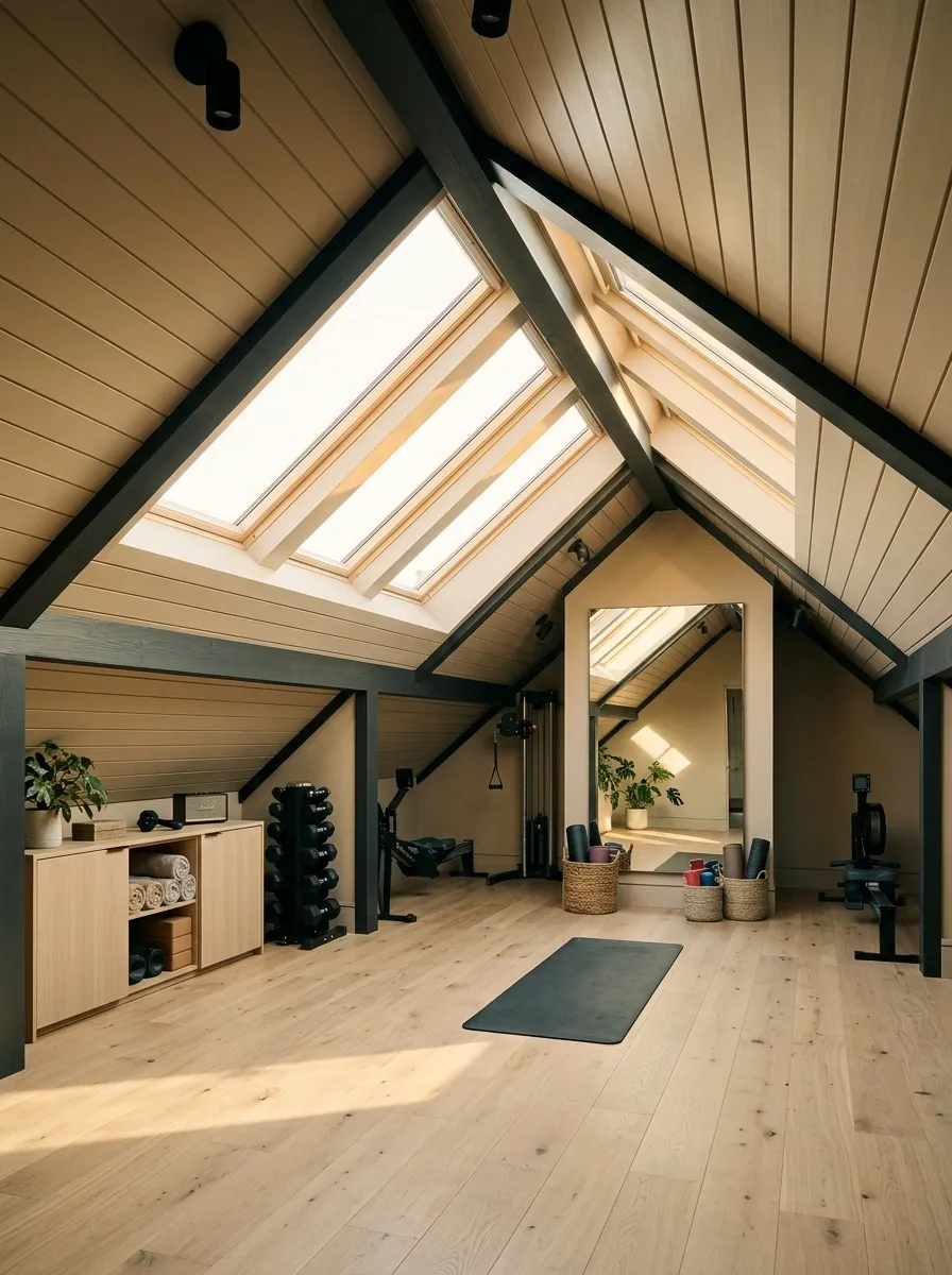
A sand-toned attic gym makes sloped ceilings feel like part of the design instead of an architectural inconvenience. Warm sandy walls soften the angled surfaces, while dark trim outlines the roofline and gives the room a more deliberate structure. Add a roof window, compact weights, a low storage cabinet, and resilient flooring to complete the setup.
The low ceiling shapes the equipment choices and layout. Compact strength equipment and floor-based exercises make more sense beneath the lowest parts of the roof, while taller machines belong where the ceiling provides sufficient clearance. A roof window can bring in daylight, and the darker trim can visually define the architecture without turning the entire room into a dark box.
Keep the sand color warm but not overly yellow. Pale wood works naturally with the palette, while black equipment adds definition. The sloped ceiling already brings enough drama. There is no need to decorate every awkward angle as if it were auditioning for an architecture documentary.
Painting around attic geometry
ROOFLINE.
Plan the layout around real ceiling heights before positioning tall equipment. The paint can make the angles look intentional, but it won’t create extra headroom.
Brick Red Boxing Room With Warm Wood Details
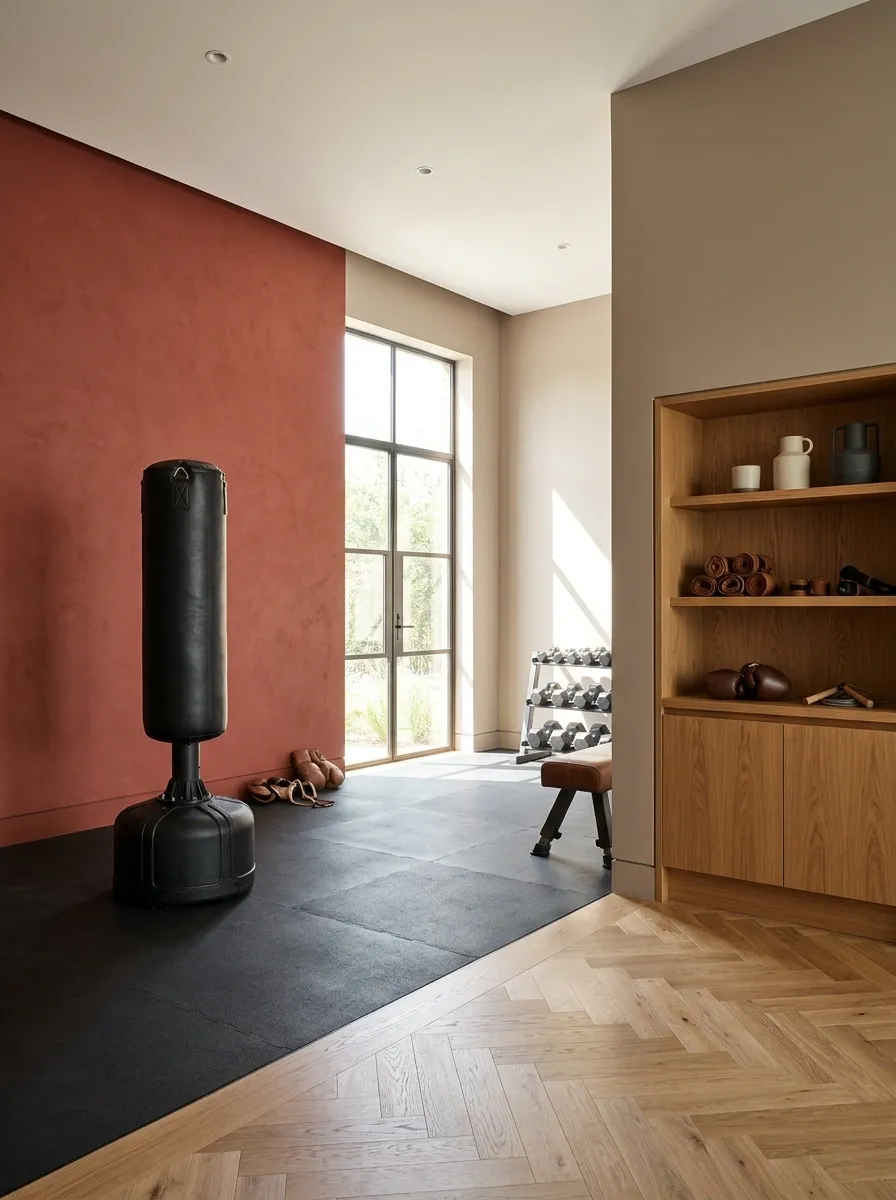
Brick red gives a boxing gym a strong, grounded identity without resorting to bright red walls and aggressive neon lighting. Combine the earthy red with black training equipment, a freestanding punching bag, warm oak storage, and resilient flooring. A lighter neutral on one adjoining wall can keep the room from feeling enclosed.
The color works especially well in a dedicated boxing or strength room where the equipment naturally provides dark contrast. Use the main red wall behind the punching bag or along the primary training area, leaving enough open space for footwork and movement. Oak shelving introduces warmth and helps organize gloves, wraps, and smaller accessories.
Choose a muted brick or red-brown rather than a highly saturated primary red. The earthier shade has more depth and works comfortably with timber. Keep the layout clean, because the room already has a heavy bag. It doesn’t also need walls that look like they’re yelling at everyone to do burpees.
A grounded red and timber finish plan
STRONG CONTRAST.
Let the brick-red paint anchor the main training zone. Use oak for warmth, black for definition, and a neutral adjoining wall when the space needs more visual breathing room.
Choosing the Right Paint Color for Your Home Gym
The best shade depends on the room’s natural light, flooring, equipment, and intended use. Deep charcoal, navy, and aubergine create a dramatic training environment. Sage, pale blue, and warm neutrals work well in multipurpose rooms that need to feel connected to the home. Coral, chartreuse, and brick red bring stronger personality through concentrated color.
Before committing, test paint samples beside the actual flooring and equipment. Check them under the lighting you’ll use during workouts, and consider how the color will look when the room is being used for something other than exercise. A color that works beautifully in a sunlit studio may feel completely different in a windowless basement.
Pay attention to the whole composition, not just the wall. Warm timber can soften a dark palette, mirrors can create a greater sense of depth, and coordinated storage can keep equipment from overwhelming the room. The strongest design choices work together instead of competing for attention.