
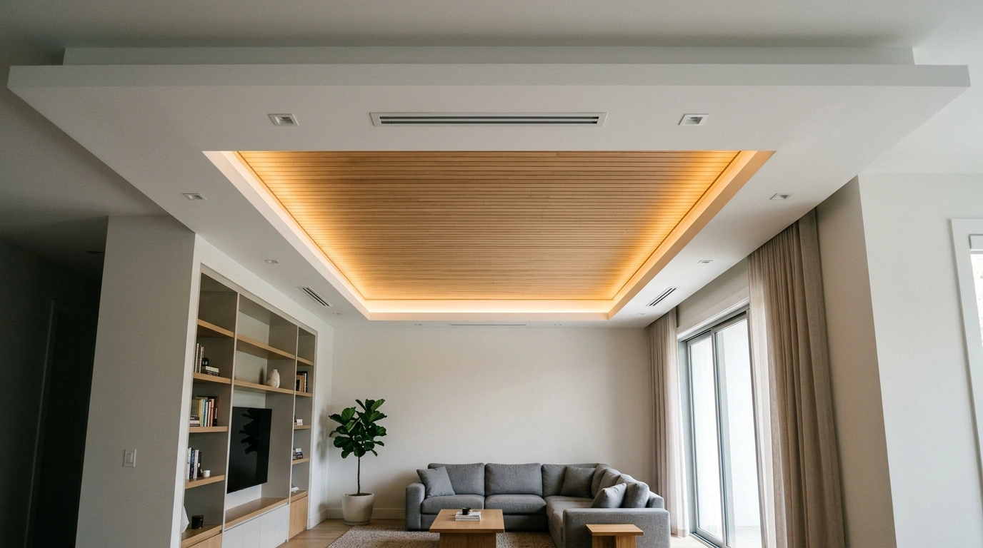
A dated drop ceiling has a special talent for making an otherwise lovely room look like it belongs to a dentist’s waiting room. Yellowed panels, mismatched tiles, a grid that dominates every photograph, and fluorescent lighting that could expose secrets from three generations ago can drag down the entire space.
The fix isn’t always a complete renovation. Sometimes, the existing ceiling needs a consistent finish and better lighting. Other rooms benefit from warmer materials, a deliberate color scheme, or a grid that finally looks like part of the design instead of an unfortunate construction detail.
The trick is to stop treating the ceiling as an isolated problem. Its color, texture, lighting, and proportions need to work with the walls, flooring, furniture, and layout. A beautiful ceiling that clashes with everything underneath it is still a design failure, just with better overhead lighting.
A very necessary intervention
HAS ENTERED
THE GROUP CHAT.
The panels are yellow.
The lighting is suspicious.
The grid has main-character syndrome.
A grid that clashes with everything else looks accidental. Match the panels, or make the contrast look deliberate.
Stains, mismatched replacements, and dated textures are doing absolutely nothing for the room’s reputation.
Choose lighting for the room’s actual purpose. A family lounge doesn’t need to feel like a tax audit.
Modern Drop Ceiling Ideas
Black Grid With White Panels in a Modern Home Office
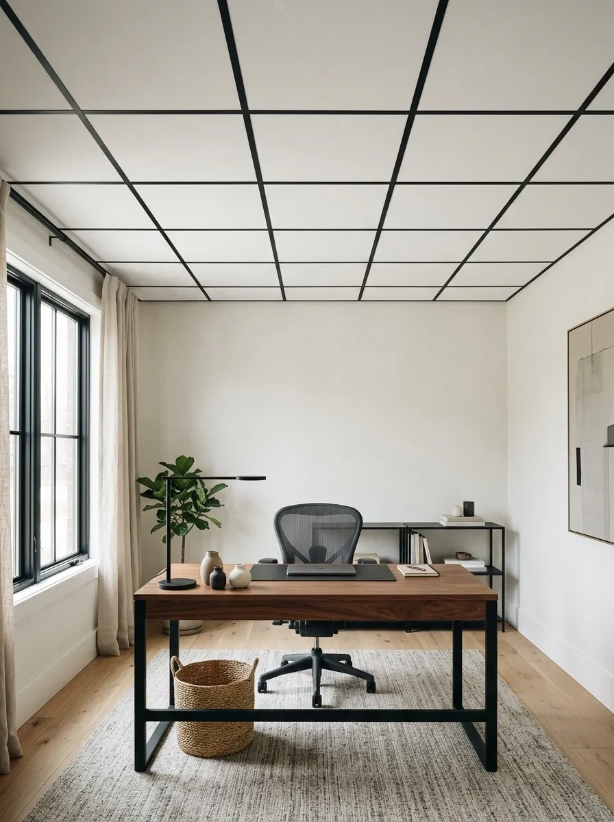
Instead of trying to hide every line, this design turns the grid into a graphic feature. White ceiling panels sit inside a slim black framework, echoed by a dark desk frame, a black task lamp, and a few carefully chosen accessories. A walnut desktop adds warmth, while light walls stop the darker details from swallowing the room.
The important distinction is that the grid needs company. A black ceiling framework floating above an all-white room can look like the ceiling made a styling decision without consulting anyone else.
Repeat the darker finish in a few places, then stop. The desk should remain comfortable to work at, storage should stay accessible, and the lighting needs to avoid glare on computer screens. This is a more convincing way to use contrast than randomly painting everything black and calling it modern.
Warm Wood-Look Ceiling With a Contemporary Living Room
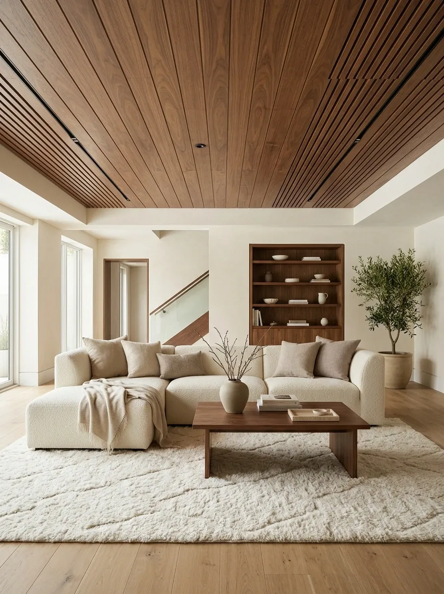
A wood-look suspended ceiling brings warmth into a basement without requiring an elaborate architectural rebuild. Medium oak or walnut-look panels pair well with creamy upholstery, a textured rug, and a simple coffee table. Matching the undertone of the ceiling to one or two timber accents elsewhere makes the room feel connected.
The balance matters more than the wood effect itself. If the ceiling, floor, cabinets, and furniture all have competing wood tones, the room can start looking like a lumber showroom. Keep the largest surfaces calm and let the ceiling provide the stronger grain pattern.
Choose ceiling products specifically intended for the existing system, and check their fire rating, weight, and installation requirements. A decorative panel isn’t automatically suitable just because it fits the opening. The finished design should look warm and relaxed, not like a renovation experiment with questionable paperwork.
Don’t make it fight.
Wood-look ceiling panels establish the warmest, most noticeable timber surface.
Echo the tone in a coffee table or cabinet. Use textiles and pale walls to give the grain room to breathe.
Use one dominant timber tone, a related accent, and a light neutral field.
Soft Ivory Ceiling With a Quiet Transitional Finish
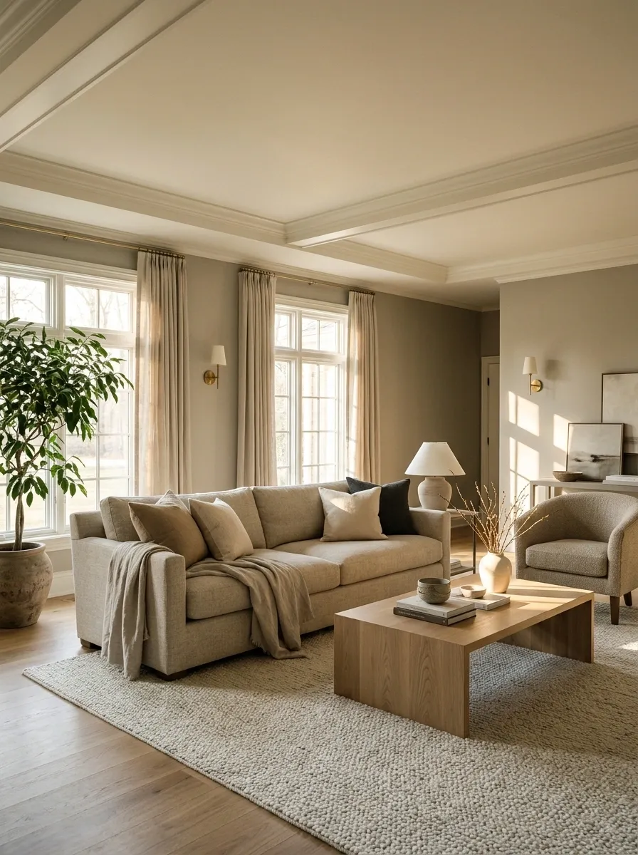
Not every modern room needs a dramatic ceiling. A soft ivory finish offers a warmer alternative to stark white, especially when the walls are greige, sand, or a muted beige. Add upholstered seating, a pale rug, simple trim, and warm metal details to create a room that feels polished without becoming formal.
The trick is keeping the shades related without making them identical. The ceiling can be the lightest surface, the walls can carry slightly more depth, and the furniture can provide the contrast. That small tonal shift makes the room feel layered rather than coated in one enormous bucket of beige.
This approach suits homes where the existing ceiling is functional but visually dated. It also works well when the rest of the room already contains traditional features that would look out of place beside an aggressively industrial grid.
Zero beige meltdown.
The result depends on undertones. Test finish samples beside the actual wall paint and flooring before committing.
Charcoal Drop Ceiling in a Moody Media Lounge
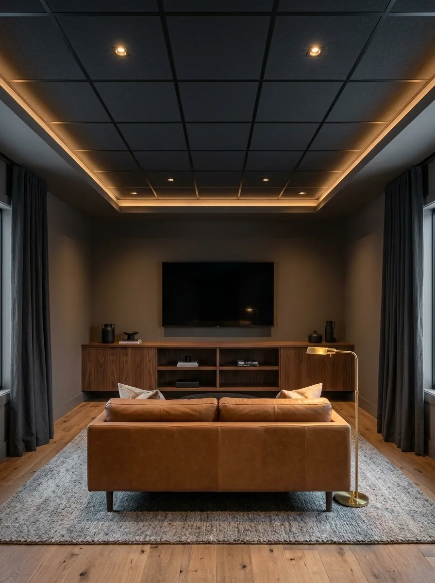
A dark suspended ceiling can look striking when the room is designed around it instead of treating it as an isolated paint job. Charcoal panels and a coordinated dark grid form a strong overhead plane. Below, a caramel or tobacco-colored sofa, walnut cabinetry, and restrained wall colors bring enough warmth to balance the darker surface.
Lighting is what keeps this composition from turning gloomy. Use suitable, well-positioned light fixtures and softer supplementary lighting near seating areas. A television wall can stay relatively simple, allowing the ceiling and furnishings to carry the visual weight.
This concept has a clear advantage in a dedicated media room because the darker surroundings can reduce visual distractions. But the room still needs to feel usable when the television is off. A single overhead light blasting through the darkness like a police interview room is not the atmosphere.
Warm below.
Decorative Embossed Ceiling Panels in a Classic Reading Room
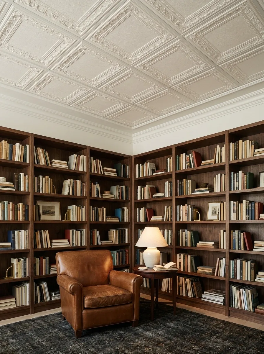
A reading room gives decorative ceiling panels an actual purpose beyond looking fancy for the sake of looking fancy. Embossed white or ivory tiles introduce subtle pattern overhead, while tall walnut bookshelves, a leather armchair, and a deep-toned rug create a grounded, library-like atmosphere. Warm table lamps and understated brass details complete the composition.
The key is choosing a ceiling pattern that complements the room’s traditional elements. Intricate panels work best when the furniture and wall treatments aren’t also competing for attention. Otherwise, the space starts looking like every decorative option in the catalog got approved by the same committee.
This design suits a basement library, a study, or a quiet reading corner. Use replacement panels approved for the ceiling system, and check that their weight and fire rating meet the manufacturer’s requirements before installation.
Zero visual chaos.
Coffered-Look Ceiling in a Tailored Contemporary Sitting Room
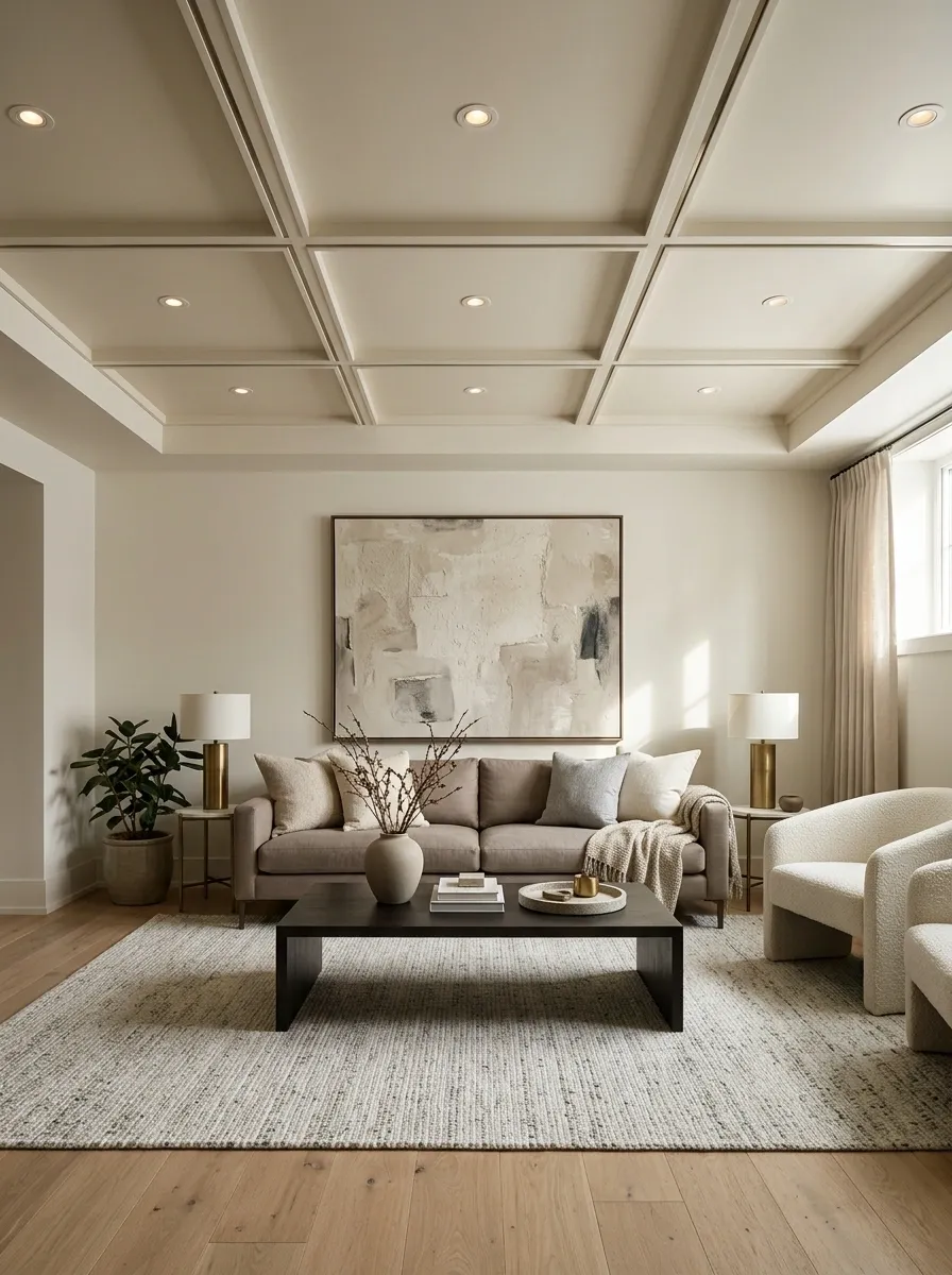
A coffered-look ceiling can give a plain suspended ceiling more architectural presence. Compatible decorative inserts or lightweight ceiling treatments create a series of defined sections, while slim trim and a consistent pale finish keep the geometry polished. Below, a taupe sofa, a simple coffee table, and restrained wall art provide a modern setting without competing with the ceiling’s structure.
The most convincing versions respect the existing ceiling grid rather than pretending it doesn’t exist. Panel divisions should feel balanced with the room’s proportions, and the furniture arrangement should support the ceiling’s geometry instead of cutting across it awkwardly.
This approach suits a finished basement sitting room that needs more character but doesn’t call for elaborate decoration. Before adding trim or inserts, confirm that the system can support them and that required access to wiring, plumbing, and other services remains available. A fancy ceiling is less exciting when a basic repair turns into a demolition episode.
a design job.
Use restrained trim and a consistent finish so the ceiling reads as architecture.
Don’t permanently block removable panels or important access points.
Textured Taupe Ceiling in an Organic Modern Family Room
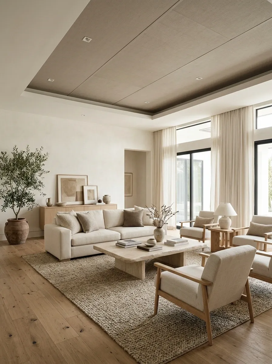
For a room that feels warm without leaning into rustic clichés, textured taupe panels offer a useful middle ground. The ceiling brings subtle surface detail, while pale oak furniture, a linen sofa, and a stone coffee table give the rest of the room a mixture of natural textures. Warm white walls keep the palette open, and a large woven rug adds depth below.
This design works because the interest comes from the materials rather than a pile of decorations. The ceiling has texture, the furniture has visible grain, and the upholstery brings softness. Add a busy ceiling pattern or several competing accent colors, however, and the room quickly loses its calm.
Choose panels with a finish suited to the room’s needs, especially if the basement has humidity concerns. Acoustic performance, cleanability, and compatibility with the grid matter just as much as the sample looking expensive under showroom lighting.
when finishes differ.
The design principle: change the texture, not every color. A varied surface mix gives the room depth without making the palette feel chaotic.
Beadboard-Look Ceiling in a Modern Cottage Room
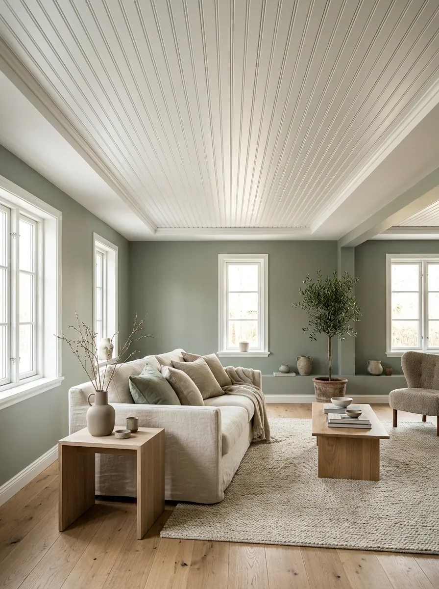
Beadboard-style ceiling panels bring a familiar cottage detail into a room that still feels current. Narrow linear grooves introduce direction overhead, while muted sage walls, light oak furniture, and loosely textured fabrics give the space a warm residential feel. A simple sofa, a timber side table, and understated lamps keep the room from drifting into themed holiday-rental territory.
The direction of the ceiling lines deserves attention. Running the pattern along the room’s longer dimension can reinforce its shape, while the wrong orientation can make a narrow space feel visually chopped up. The surrounding wall treatments should also stay fairly quiet so the ceiling’s fine lines remain legible.
Look for replacement panels designed for suspended ceiling use rather than assuming ordinary beadboard boards can be fitted into the grid. The material, weight, and fire performance must suit the system. Cottage charm is lovely. An improvised overhead construction project is considerably less charming.
the eye, not confuse it.
Sage, soft white, pale oak, and textured neutrals keep the linear ceiling from feeling too sharp.
Confirm the panel system, installation method, weight limits, and access requirements.
Bronze-Toned Grid With Cream Panels in a Modern Dining Room
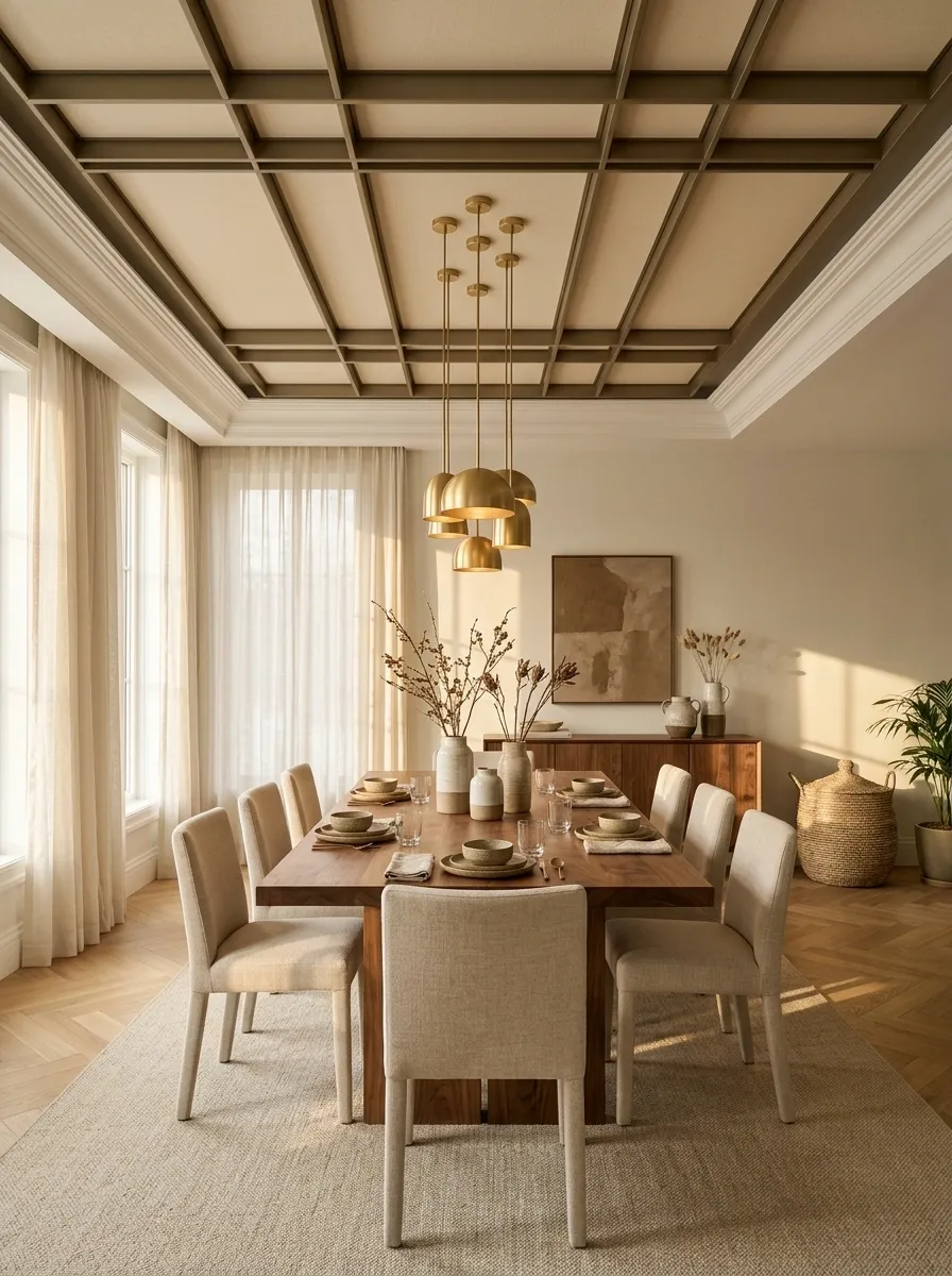
A bronze-toned grid can make a suspended ceiling feel deliberately coordinated with a dining room’s richer finishes. Cream panels soften the contrast, while a walnut dining table, upholstered chairs, and warm pendants create a cohesive palette. The bronze doesn’t need to appear everywhere. A few carefully matched accents are enough to connect the ceiling with the rest of the space.
The trick is to keep the grid refined rather than overly shiny. A muted bronze finish reads as a quiet architectural detail, while highly reflective metallic surfaces can attract attention away from the dining area. Pair it with warm whites, medium wood tones, and fabrics that introduce softness.
This idea suits a basement dining nook or a separate dining room where the suspended ceiling needs to feel connected to more formal furniture. Check the availability of compatible grid finishes and panels before building the scheme around a particular metallic tone. A beautiful mock-up is of limited value if the required finish doesn’t exist for the system.
Calm surfaces.
Repeat the metal finish sparingly. The grid, pendants, and a small hardware detail can be enough.
Verify that the ceiling grid and panel finishes are compatible and available as a coordinated system.
Muted Sage Drop Ceiling in a Creative Home Studio
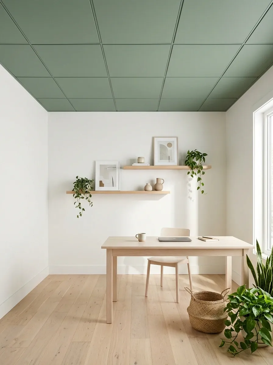
A sage ceiling brings color into a room without turning the entire space into an aggressive paint sample. Muted green panels sit beautifully above warm white walls, a pale birch desk, and simple shelving. A few leafy plants and restrained artwork connect the ceiling color to the room below, making the choice feel intentional rather than random.
The secret is keeping the green soft and slightly earthy. An overly saturated shade can make a low basement ceiling feel heavy, especially when the room doesn’t receive much daylight. Light furniture, clear work surfaces, and balanced lighting keep this version fresh.
This direction works particularly well in a home studio, craft room, or creative office. Use compatible replacement panels in the chosen finish rather than assuming ordinary ceiling paint will work with the existing tiles. The goal is a distinctive room, not a DIY plot twist involving damaged panels.
goes overhead.
Birch furniture and a few leafy accents connect the ceiling to the workspace. Keep the remaining colors quiet so the green doesn’t have to fight for attention.
Dusty Navy Ceiling in a Modern Hobby Room
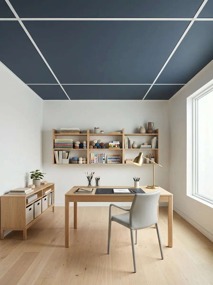
A dusty navy ceiling gives a hobby room a stronger identity than another predictable all-white makeover. The muted blue adds depth overhead, while light walls and blond wood furniture keep the space from feeling closed in. Open shelves display art supplies, books, or collected objects, giving the room color at eye level rather than packing every visual detail into the ceiling.
The finish looks most convincing when the navy is softened rather than almost black. A white or suitably coordinated light grid helps define the ceiling without creating excessive contrast. If the room already has low ceilings or very little natural light, reserve the darker color for part of the design instead of covering every overhead surface.
This is a useful direction for a sewing room, hobby studio, or creative workspace that deserves more personality. Keep task lighting focused on the actual work surface. Looking dramatic is excellent. Trying to thread a needle in cinematic darkness is less excellent.
Plenty of daylight energy.
Design check: the darker the ceiling, the more attention the room needs to pay to wall brightness, task lighting, and usable overhead clearance. Drama is good. A cave with a desk is still a cave.
Geometric Ceiling Panels in a Contemporary Dining Nook
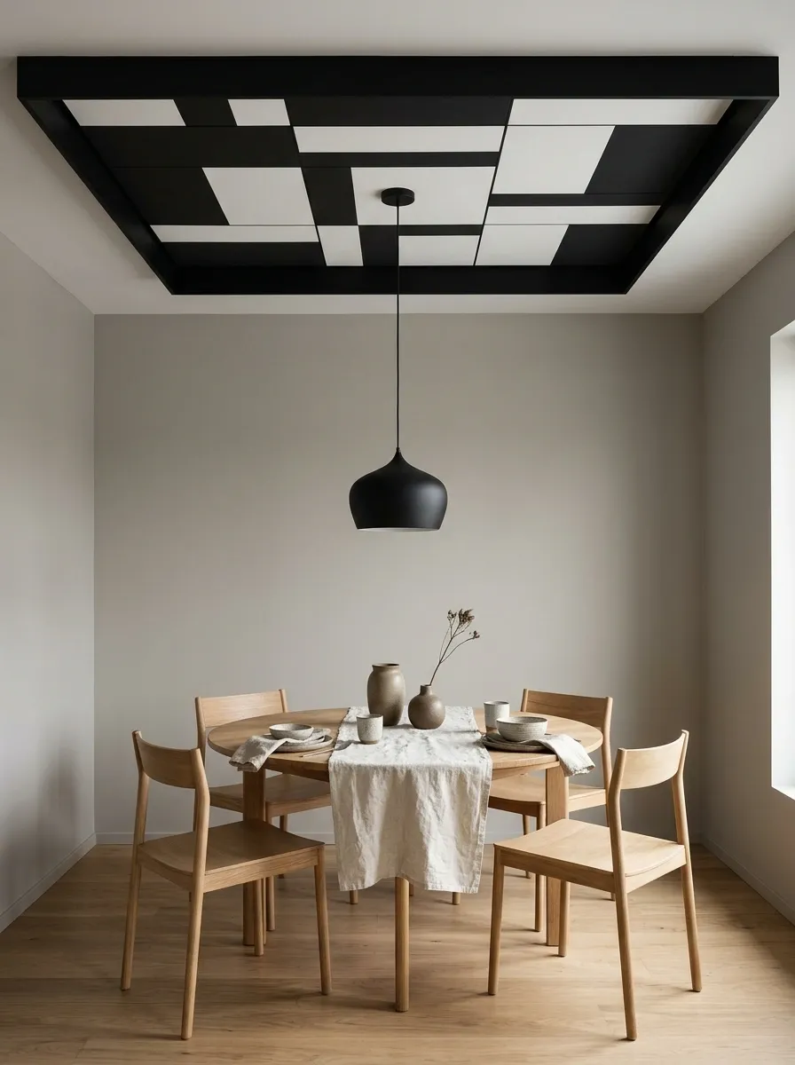
Geometric ceiling panels can give an ordinary dining nook a crisp architectural feature. A controlled black-and-white pattern creates rhythm overhead, while a round oak table and uncomplicated chairs bring the composition back down to earth. Muted wall colors prevent the pattern from competing with artwork, tableware, and lighting.
Scale is the deciding factor. A pattern that looks subtle on a small sample can become visually noisy across an entire ceiling. Larger, simpler shapes are often easier to read from the dining table, especially in a compact room where the ceiling is close to eye level.
Choose one strong geometric treatment and let the other finishes support it. A sculptural pendant can add another focal point, but it should have a quiet shape and a suitable size. The ceiling already has a pattern. It doesn’t need a second one, a third one, and a surprise checkerboard rug joining the discussion.
one clear statement.
Fewer, more legible shapes create a deliberate pattern.
Small repeats can become visually restless across a large ceiling.
Terracotta Ceiling in a Warm, Creative Workspace
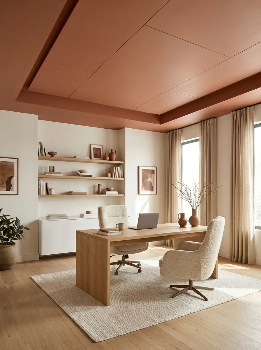
Terracotta overhead gives a creative workspace a warmer, more individual look than standard white ceiling panels. A softened clay shade works with warm white walls, blond wood furniture, and cream seating. A few clay-colored accessories can repeat the ceiling tone lower in the room, creating a visual connection without turning every surface orange.
The shade makes all the difference. Deep burnt orange can feel heavy in a low basement, while a dusty terracotta or muted cinnamon finish gives the room warmth without overwhelming it. Keep the main furniture and large wall surfaces relatively light, and avoid adding too many competing accent colors.
This direction suits a design studio, home office, or hobby room that needs a little personality. Check ceiling panel suitability and color availability before planning the final scheme. The most expensive-looking result usually comes from choosing a precise, restrained palette rather than attempting to match every object in the room.
Light everywhere else.
A few related accessories are enough to connect the room. Matching every item to the ceiling is how a smart color choice becomes an accidental themed restaurant.
Soft Blush Ceiling in a Refined Dressing Room
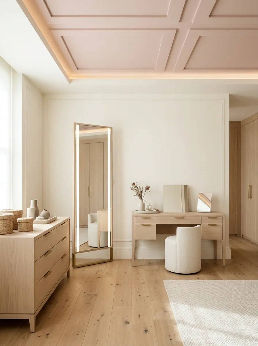
A pale blush ceiling adds color without forcing a dressing room into an overly sweet or theatrical style. Soft pink panels sit above creamy walls, an oak vanity, a padded stool, and restrained brass details. A full-height mirror and practical lighting make the space functional, while textiles in related neutral tones help the ceiling feel connected to the rest of the room.
The most elegant versions use blush as a background color rather than the entire personality of the space. Dusty rose and muted pink feel more controlled than highly saturated bubblegum shades, especially when the room has limited daylight. Pale cabinetry and simple shapes prevent the smaller space from becoming visually crowded.
A dressing room also needs practical planning. Mirror lighting should illuminate the face evenly, drawers need enough room to open, and the ceiling finish must be compatible with the existing system. A pretty room still needs to let someone get dressed without performing furniture gymnastics.
Clarity at the mirror.
A soft colored ceiling plane.
Warm surfaces that keep the room grounded.
Even mirror illumination for everyday use.
Plan mirror lighting, drawer clearance, and accessible storage first. The ceiling gets to look pretty without making the morning routine harder.
Pale Blue Drop Ceiling in a Relaxed Guest Bedroom
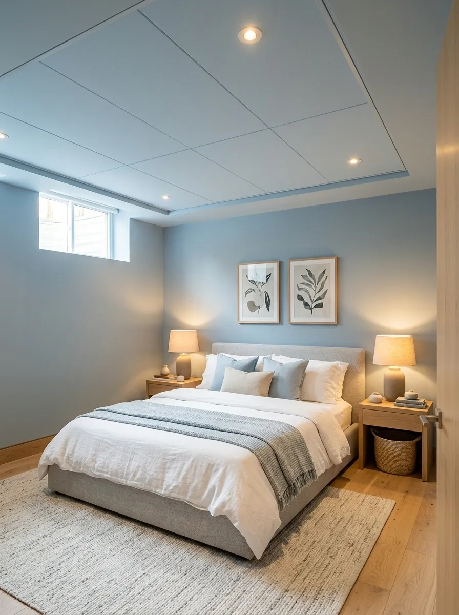
A basement guest room doesn’t need hotel-style marble and a chandelier the size of a small vehicle to feel considered. Pale blue ceiling panels create a gentle focal point above a simple upholstered bed, white bedding, and light oak bedside tables. Blue-gray walls connect the ceiling to the rest of the room, while warm bedside lamps keep the palette from feeling too cool.
The shade should stay soft enough to work with the room’s lighting. A dusty blue or pale powder blue usually feels more relaxed than a saturated primary blue, especially where the ceiling sits close to the bed. Keep the bedding mostly neutral and introduce a little blue through cushions or artwork.
The result feels coordinated without looking like the room was decorated using one paint chip and a concerning amount of enthusiasm. Check panel compatibility before changing the finish, and keep the overhead lighting appropriate for a bedroom.
A warmer welcome.
Linear Ceiling Lighting in a Modern Entertainment Room
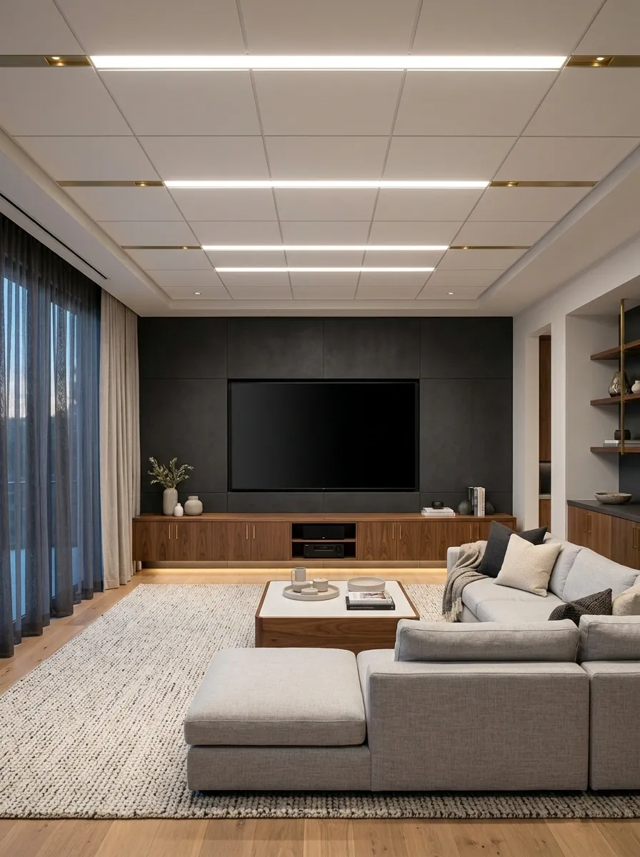
In an entertainment room, the ceiling and lighting should work together instead of competing with the television. A white suspended ceiling with a clean grid creates a neat overhead plane, while broad, evenly distributed light panels illuminate the room when the screen is off. A low walnut media console, a substantial sectional, and a darker feature wall give the space definition.
The lighting layout matters more than adding extra fixtures just because there are empty ceiling openings. Avoid placing bright lights where they create glare on the screen, and use separate lighting controls where possible so movie nights don’t require turning the entire room into a cave.
A well-planned ceiling keeps the space practical for games, reading, and family gatherings as well as films. Choose light fixtures designed for the ceiling system and maintain access to any wiring or services above it. The room deserves better than an expensive television surrounded by lighting that behaves like an angry stadium.
One coordinated ceiling.
Confirm light positions, switching, and screen reflections before finalizing the grid. Reworking a finished ceiling because a lamp shines directly into the television is a very avoidable sequel.
Clean White Drop Ceiling in a Modern Laundry Room
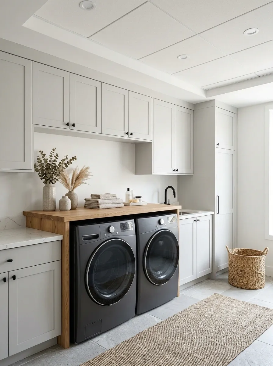
Laundry rooms are often treated as storage closets with a washing machine problem. A consistent white ceiling, clean lighting, and coordinated cabinetry can make the space feel like a real part of the home rather than the room nobody photographs unless something breaks.
Smooth, light-colored panels pair well with pale gray cabinets and a wood folding counter. Dark appliances provide contrast, while closed storage keeps detergent bottles and household supplies from becoming the main decorative feature. Lighting should reach the folding surface and appliance controls without creating awkward shadows.
Practicality comes first in this room. Check the manufacturer’s moisture guidance for both ceiling panels and electrical fixtures, particularly where humidity or leaks are a concern. Keep removable sections accessible if valves, pipes, or wiring run above the ceiling.
The aim is a bright, easy-to-maintain utility room. Nobody needs laundry to become a luxury experience, but the ceiling can at least stop looking like it has been neglected since the previous washing machine.
Good-working is better.
Choose a panel and fixture system suitable for the room’s humidity conditions.
Light the washer, dryer controls, and folding surface evenly.
Keep required service points reachable. A removable ceiling panel should not become a permanent hostage situation.
Streamlined Drop Ceiling in a Small Basement Kitchenette
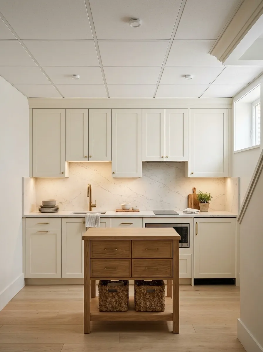
A small basement kitchenette benefits from a ceiling that feels organized rather than decorative. White panels and a matching grid create a continuous surface above the cabinetry, while a stone-look backsplash, pale cabinets, and a compact wood island introduce enough variation below. The composition feels contemporary because the lines are simple and the materials have a clear hierarchy.
The ceiling should relate to the top edges of the cabinets and the main kitchen work zones. A busy panel design can compete with the backsplash, while a strong contrast between grid and ceiling can break up an already small room. Keeping the overhead finish quiet helps the cabinetry and countertop read as one coordinated arrangement.
Lighting needs to support food preparation, not just make the kitchen look bright in photographs. Position appropriate fixtures for the actual work surfaces and confirm the required clearances around any cooking equipment. A polished kitchenette is useful only when someone can prepare a snack without working in their own shadow.
out of the way.
Keep the ceiling understated so the cabinetry and countertop establish the kitchen’s structure.
Plan fixtures around preparation areas and cooking requirements, not empty spaces in the grid.
Bright Functional Ceiling in a Compact Home Gym
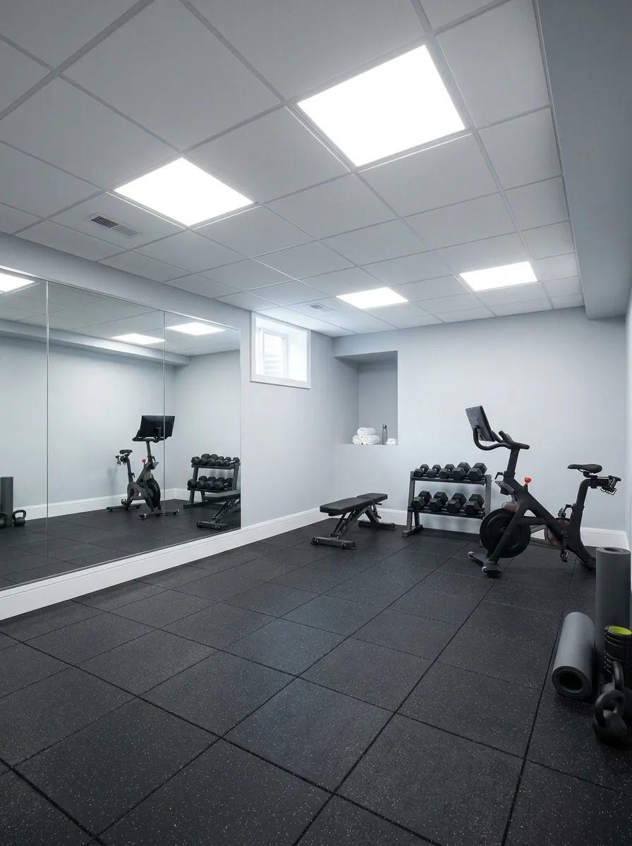
A basement gym needs a ceiling that supports movement, visibility, and equipment clearance. Clean white panels make the room feel lighter, while pale gray walls, rubber flooring, and a large mirror create a practical training environment. Dark exercise equipment supplies contrast without overwhelming the room, and the uncomplicated ceiling keeps attention on the usable floor area.
A bright ceiling is especially useful when the room has limited natural light. Even lighting helps make the space comfortable for workouts, but fixtures must be positioned safely away from equipment movement and any activities that could bring objects close to the ceiling. Check the room’s actual height before choosing tall machines or planning overhead exercises.
The design should also account for access to ventilation, wiring, and other services above the grid. A gym is already full of ways to discover a personal limit. Having to disassemble a ceiling just to reach an ordinary service point shouldn’t be one of them.
is part of the workout plan.
Organized Craft Room With a Clean, Bright Drop Ceiling
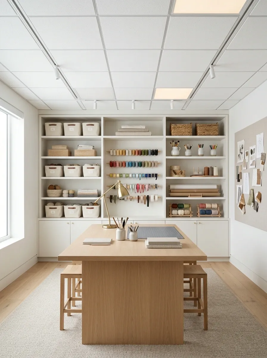
A craft room already has enough visual activity without a ceiling adding its own unsolicited performance. Clean white panels create a quiet background for colorful materials, while pale wood worktables and well-organized shelving make the space feel practical rather than improvised. Pinboards, labeled storage, and shallow wall shelves keep frequently used supplies visible without letting every project take over the room.
Lighting deserves special attention here. A broad, even overhead source should work alongside task lighting at the main table, where detailed projects actually happen. The ceiling stays simple so the work surfaces and materials can provide the color.
This concept works for sewing rooms, art studios, gift-wrapping stations, and multipurpose hobby spaces. Keep service access clear and choose compatible ceiling panels. The scissors, glitter, and glue already provide enough opportunities for chaos.
bring the color.
Consistent white panels keep the ceiling from competing with the supplies.
Pale timber, sufficient table space, and well-positioned task lighting.
Ceiling first as a quiet background, worktable second as the main zone, and colorful supplies last as the changing display. The unfinished crochet collection can have its moment elsewhere.
Rustic-Modern Basement Den With Dark Timber-Look Ceiling Panels
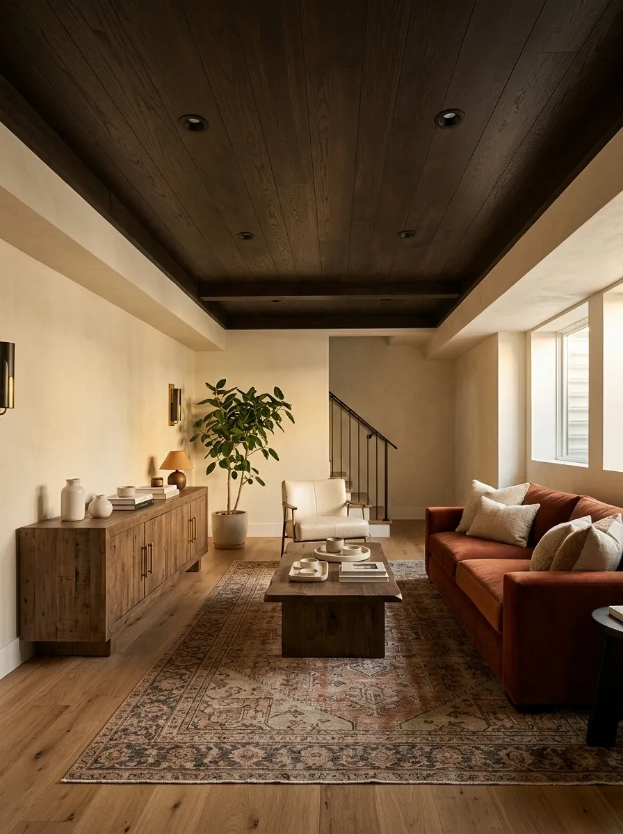
A dark wood-look ceiling gives a basement den a stronger architectural identity than plain white panels. Deep timber tones sit above a rust or tobacco-colored sofa, warm cream walls, and a patterned rug with muted earth colors. A low media console or substantial timber sideboard reinforces the ceiling without making every surface compete for attention.
The contrast between dark overhead finishes and lighter walls is what keeps the room balanced. Repeating the darkest color across the floor, furniture, and walls can make a low basement feel compressed. Instead, use the rug and upholstery to introduce warmth while leaving enough lighter surface area around the room.
This design suits a relaxed lounge, a reading den, or a television room with enough height to accommodate the darker ceiling. Choose ceiling-rated panels intended for the existing grid. Ordinary wood boards aren’t automatically suitable replacements, regardless of how convincing they look in a photograph.
Don’t darken everything.
The balancing act: keep the vertical surfaces and main seating lighter than the ceiling. A dark finish should frame the room, not make the whole basement feel like a wooden storage box.
Art Deco-Inspired Dining Room With Muted Metallic Ceiling Panels
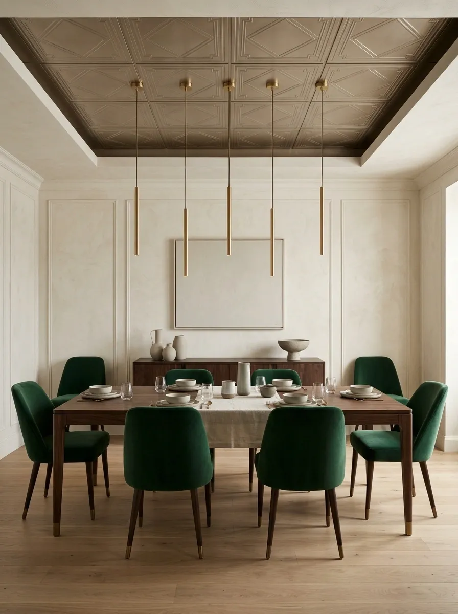
An Art Deco-inspired dining room gives decorative ceiling panels a more glamorous role without requiring the entire space to sparkle like a jewelry counter. Muted champagne or bronze-toned panels sit above a walnut dining table, velvet chairs, and warm pendant lighting. Cream walls and restrained geometry keep the metallic surface from overwhelming the room.
The strongest version uses contrast strategically. Dark wood provides depth, upholstery softens the furniture silhouettes, and the metallic finish becomes a controlled highlight overhead. Avoid combining a highly patterned ceiling with elaborate wallpaper, shiny furniture, and multiple competing metals. Luxury can survive without every object screaming that it costs money.
This concept suits a formal basement dining area or a dedicated entertaining room. Check that the chosen panels are appropriate for suspended ceiling installation and that their finish works with the available grid. The final palette should coordinate across actual products, not just a collection of attractive online swatches.
Two grounding elements.
Continuous Pale Ceiling in a Narrow Basement Hallway
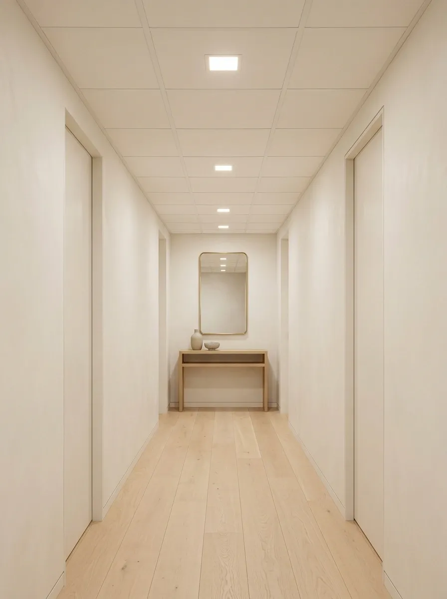
Narrow basement hallways can make a dated drop ceiling especially obvious because the grid repeats across a long, uninterrupted strip. A continuous pale finish softens that effect. Matching white panels with a light grid creates a quieter overhead surface, while pale walls and uncomplicated flooring reinforce the hallway’s length without adding visual clutter.
A slim oak console, if the passage has enough clearance, brings warmth near the entrance or at the end of the hall. A mirror can help reflect available light, but it should never sit where it obstructs movement or catches the full glare of an overhead fixture.
The lighting layout matters as much as the panel finish. Avoid a harsh series of bright spots that visually chops up the ceiling. Choose suitable fixtures with even distribution and plan their placement around the hallway’s actual dimensions. A hallway should connect the rooms, not look like the building’s forgotten loading corridor.
beats visual clutter.
Pale and visually consistent
One slim timber console
Unified Drop Ceiling Across an Open-Plan Basement
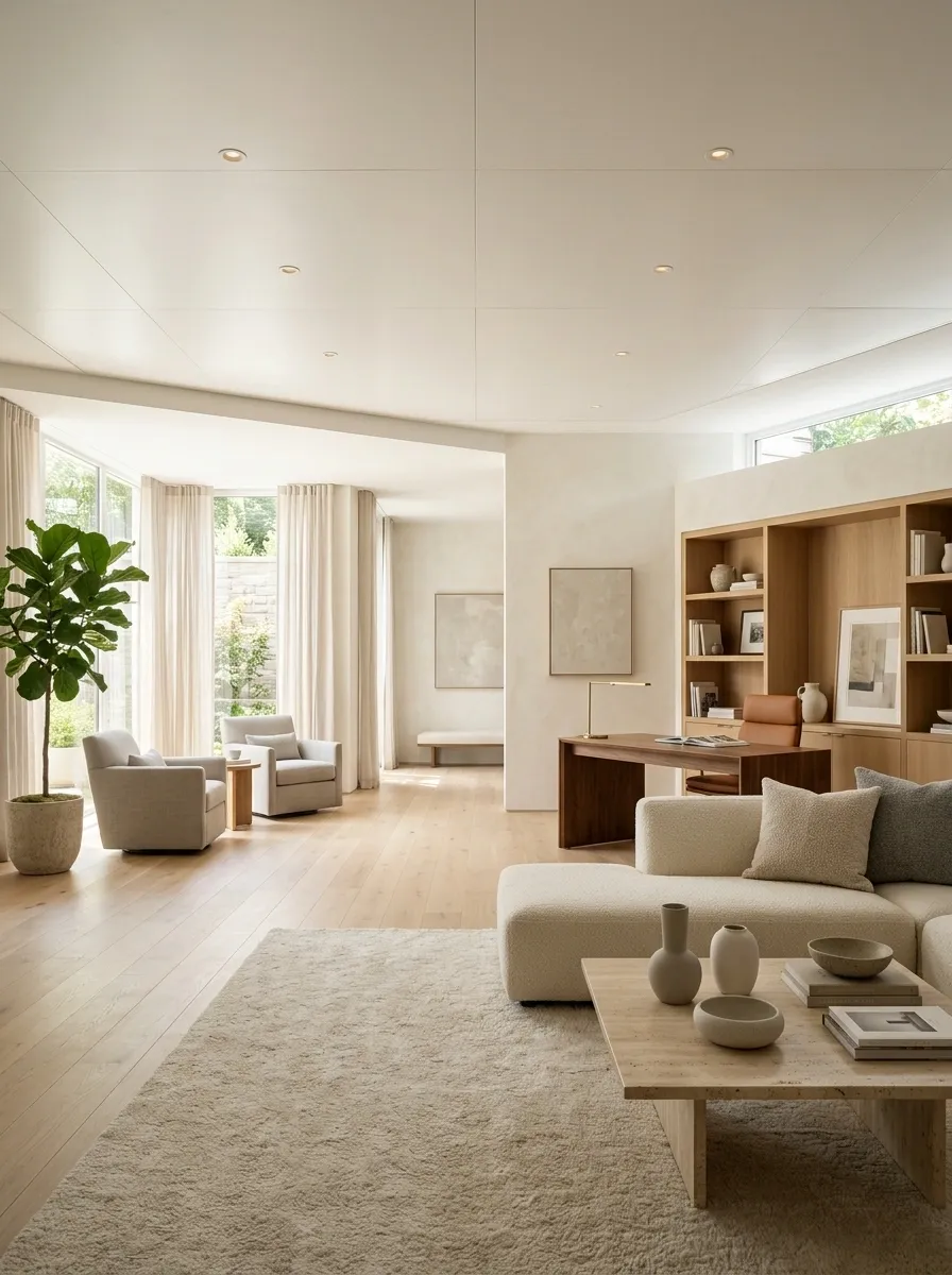
An open-plan basement can contain several uses without needing a different ceiling treatment over every zone. A consistent finish across the entire suspended ceiling gives the space a visual thread. Furniture groupings, rugs, cabinetry, and lighting establish the lounge, workspace, and gathering areas below, so the room feels connected without becoming one enormous undifferentiated rectangle.
The ceiling should stay relatively quiet when the basement already has several strong furniture layouts. Matching panels and grid tones reduce visual interruptions, while appropriately placed lighting identifies the activities taking place underneath. The lounge can have softer ambient light, the desk can receive focused task lighting, and the circulation areas can remain evenly illuminated.
This strategy works particularly well in larger basement renovations where separate rooms aren’t practical. The important part is planning the furniture layout before deciding on the fixture positions. Otherwise, the ceiling ends up telling a different story from the furniture, and the entire floor plan starts giving group-project energy.
Define it below.
Rug, sofa, softer ambient lighting
Desk, storage, task lighting
Flexible seating and open circulation
Minimalist Warm White Drop Ceiling With Low-Contrast Grid Lines
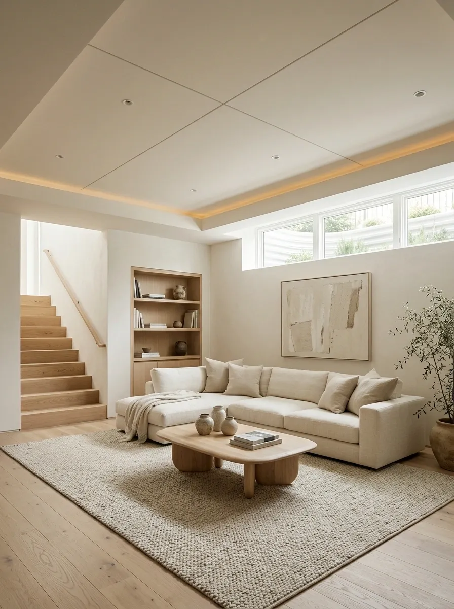
Minimalism works best when the finishes are doing their jobs without constantly demanding attention. Matching warm white ceiling panels and a coordinated grid create a quiet overhead surface, while pale walls, light oak furniture, and a low-profile sofa establish a clean, uncluttered room. Subtle differences in texture keep the space from becoming one giant white rectangle.
This design depends on proportion more than decoration. Furniture should leave comfortable walking paths, wall art should have breathing room, and the lighting should feel even rather than clinical. A textured rug or timber coffee table can supply enough contrast without introducing another elaborate focal point.
The result suits a contemporary basement living room where visual calm matters more than decorative drama. Choose panels with a consistent finish and inspect the existing grid before replacement. Minimalism looks expensive when the details are right, not when the room has been emptied until it resembles an unfurnished rental listing.
More attention to detail.
Use linen, wood grain, and a tactile rug to distinguish surfaces without adding unnecessary colors.
Let the furniture breathe. Minimalism isn’t an invitation to buy seventeen decorative objects in beige.
Framed Drop Ceiling With a Timber Perimeter Detail
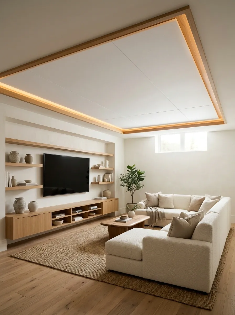
A timber perimeter can give an ordinary suspended ceiling the appearance of a more deliberate architectural feature. The central field stays light and relatively simple, while a warm wood-toned border connects the ceiling to nearby cabinetry, a media console, or other timber furnishings. The effect is restrained, with the border providing definition instead of a busy ceiling pattern.
Proportion is crucial. An overly thick or dark border can make a low ceiling feel even lower, especially in a narrow basement. A subtle perimeter finish usually works better when it follows the room’s shape and doesn’t compete with existing beams, bulkheads, or changes in ceiling height.
This concept suits a finished family room or a larger basement lounge with enough visual space for a defined ceiling edge. Any decorative trim must be compatible with the ceiling system and mustn’t compromise support, fire requirements, or access to hidden services. Decorative framing should never be mistaken for structural reinforcement.
Don’t crowd the ceiling.
A restrained timber outline defines the ceiling without making its perimeter feel heavy.
Connect the finish to a console or cabinetry instead of introducing another unrelated wood tone.
Two-Tone Drop Ceiling With Warm White and Soft Gray Panels
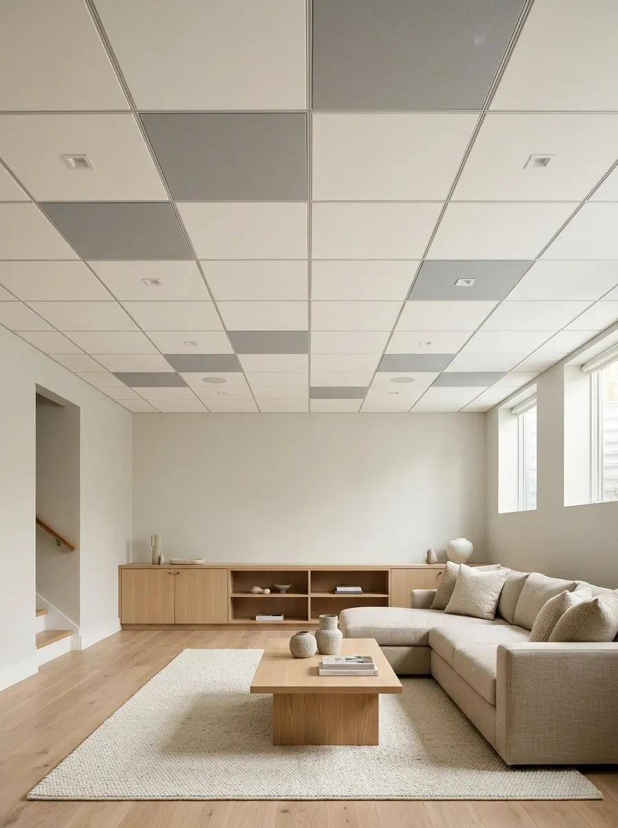
A two-tone ceiling introduces a pattern without relying on elaborate decorative tiles. Warm white panels remain dominant, while selected soft gray panels create a measured rhythm across the ceiling. Below, pale walls, light wood furniture, and understated storage maintain a contemporary look, allowing the ceiling pattern to read as a planned composition.
The distribution matters more than the number of colors. A controlled arrangement can establish subtle zones or reinforce the room’s geometry, while scattered gray panels may resemble replacement tiles that happened to arrive in different packaging. Keep the pattern aligned with the room’s actual dimensions, lighting positions, and existing grid.
This approach suits a studio, multipurpose basement, or contemporary family room where a little graphic interest would be welcome. Before selecting the layout, confirm panel availability, grid compatibility, and the effect of the pattern under the room’s lighting. The goal is purposeful rhythm, not a ceiling playing an accidental game of checkers.
some actual discipline.
Warm white preserves a brighter overall ceiling field.
Soft gray provides the pattern without overwhelming the room.
Deep Taupe Acoustic Ceiling in a Dedicated Listening Room
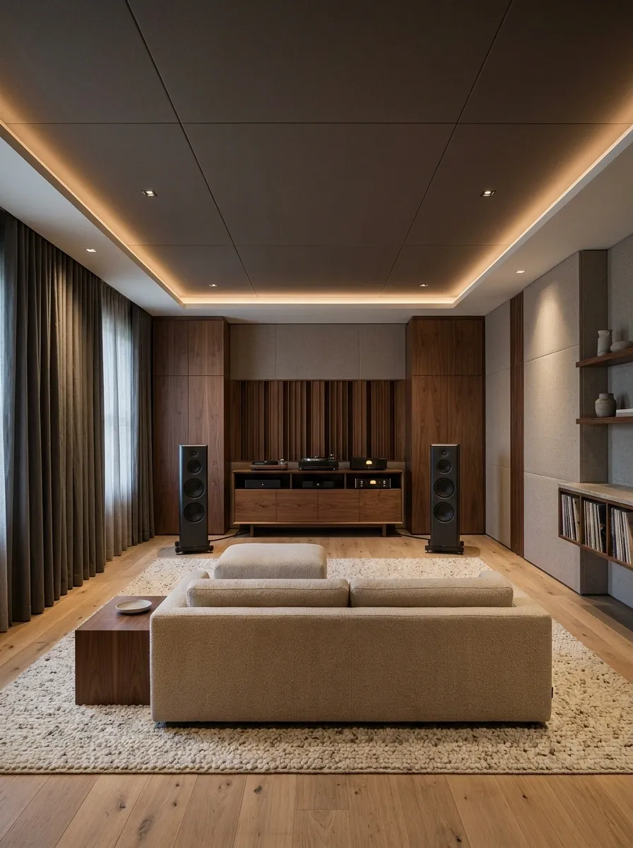
A listening room benefits from a calmer visual environment that supports the equipment and seating rather than competing with them. Deep taupe panels introduce a subdued ceiling finish, while walnut cabinetry and warm neutral upholstery add depth. Carefully positioned lighting creates a comfortable atmosphere without sending bright reflections directly into the listener’s line of sight.
The room should feel more like a private listening lounge than a miniature recording studio assembled from random black foam. Keep equipment organized, leave enough space around speakers as their placement requires, and arrange seating for comfortable listening. Acoustic performance depends on the full room, including its surfaces, furnishings, and speaker placement, not merely the color of the ceiling panels.
The selected panels must be suitable for the suspension system and the room’s fire-safety requirements. Decorative acoustic-looking tiles don’t automatically provide meaningful sound absorption. Treat appearance and measured acoustic performance as separate decisions, or the room may look like a recording studio while sounding like an ordinary basement.
Then address the acoustics.
Assess speaker placement, room reflections, and suitable acoustic treatment separately from ceiling color. A dark tile doesn’t magically turn every echo into a Grammy-winning mix.
Fresh Replacement Panels With a Consistent Modern Grid
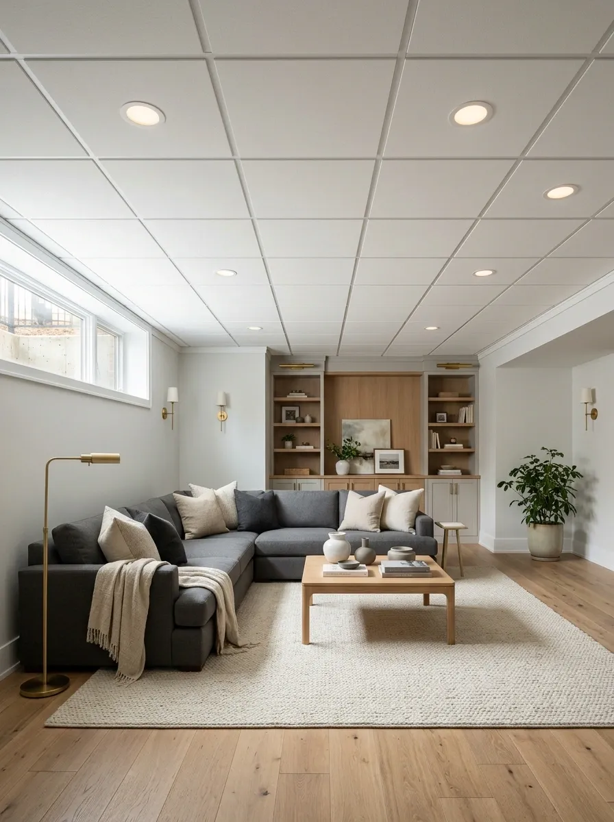
Sometimes the ceiling doesn’t need a dramatic redesign. It needs its stained, sagging, mismatched, or visibly aged panels replaced with a consistent set that suits the existing grid. Fresh panels and clean lighting can make the entire room feel more maintained, especially when the walls and floor receive a coordinated refresh at the same time.
This concept is intentionally practical. A neutral ceiling works with contemporary furniture, pale walls, and a straightforward layout. The visual improvement comes from removing inconsistencies rather than introducing a new decorative language. That makes it useful for a basement family room, utility area, or rental property where a full renovation isn’t the plan.
Start by checking why the old panels deteriorated. Water stains may point to a leak, while sagging can signal a damaged panel or grid. Resolve underlying problems before replacement, and check whether older panels need specialist handling. Covering damage with new tiles isn’t a makeover. It’s the interior-design equivalent of putting a nice hat on a plumbing problem.
Check what caused it.
Look for moisture, sagging, damaged grid parts, and unsafe wiring.
Choose compatible panels with suitable dimensions, weight, and fire rating.
Refresh visible walls and lighting so the replacement panels feel intentional.
Mid-Century Modern Basement Lounge With a Walnut Feature Wall
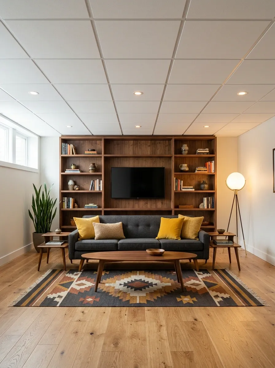
A mid-century modern lounge gives a plain suspended ceiling a useful supporting role while the furniture brings the personality. White panels and a coordinated grid keep the overhead surface calm, while a walnut media wall, a low-profile sofa, and tapered timber furniture establish the room’s character. Mustard cushions and a geometric rug introduce color without making the basement feel like a time capsule from a questionable furniture showroom.
Lighting should feel sculptural rather than overly decorative. A simple globe floor lamp and discreet ceiling fixtures provide different types of illumination, while open shelving keeps the walnut wall from becoming too heavy. The ceiling stays pale so the darker timber remains the main architectural feature.
This direction works particularly well in a basement den or family room with enough space for low-profile furniture. Keep walking routes clear around the sofa, and avoid oversized furniture that blocks the room’s natural flow.
carry the personality.
A consistent ceiling finish leaves the strongest visual attention for the room’s furniture and timber surfaces.
Keep the ceiling simple and the furniture silhouettes distinctive. There’s no need to make every surface retro. One carefully designed walnut feature wall does more than a dozen random decorative objects.
Modern Biophilic Basement With a Natural-Looking Ceiling
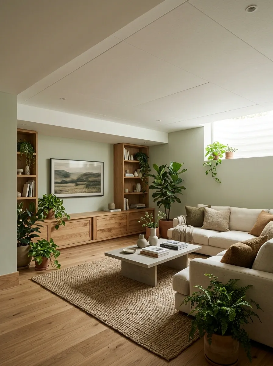
A basement can feel connected to nature without pretending it has suddenly acquired a glass roof and a tropical climate. Light ceiling panels with a subtle texture, soft green walls, natural oak furniture, and carefully arranged plants create a gentle biophilic direction. A neutral sofa, woven rug, and stone-look coffee table give the room a grounded finish.
The ceiling’s role is to support the natural palette rather than imitate an outdoor environment. Avoid overly glossy panels or strong artificial wood patterns that compete with the real timber and foliage. Keep plants in positions where they receive suitable light, and choose species that match the room’s actual conditions rather than relying on a photograph’s imaginary sunlight.
This concept suits a family lounge or a relaxed reading room. It works especially well when the rest of the basement already has natural materials that can be repeated overhead or along the walls. The result feels fresh without requiring a jungle to move into the house.
Not nature-themed.
A few healthy plants, wood grain, and tactile textiles are enough. Check the room’s actual light and humidity before choosing greenery or ceiling materials. Nature-inspired doesn’t mean maintenance-free.
Contemporary Playroom With a Bright Ceiling and Color-Blocked Walls
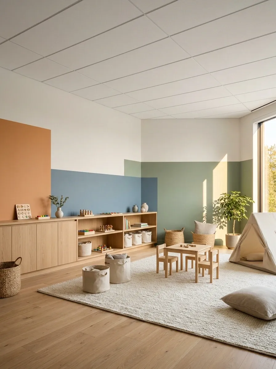
A playroom can feel imaginative without requiring cartoon characters on every wall and primary colors on every surface. White ceiling panels keep the room bright, while selected areas of muted orange, dusty blue, or sage give the walls a playful structure. Low storage, a generous open floor area, and soft furnishings make the layout practical for changing activities.
The design works because the strongest colors sit below a relatively quiet ceiling. The ceiling grid can match the panels, allowing the wall treatment and storage to establish the room’s identity. Closed cabinets hide less attractive supplies, while open shelves keep frequently used toys accessible.
Practical planning should lead the decisions. Secure tall storage appropriately, keep exits and walking routes clear, and choose durable finishes that can handle frequent cleaning. A playroom doesn’t need to look like a toy store exploded to be fun. In fact, leaving some visual breathing room can make the colorful details feel more intentional.
at child level.
Consistent white panels let the room’s changing artwork and toys provide the color.
Use reachable storage, washable surfaces, and clear floor space for play.
Warm Modern Yoga Studio With a Soft Neutral Ceiling
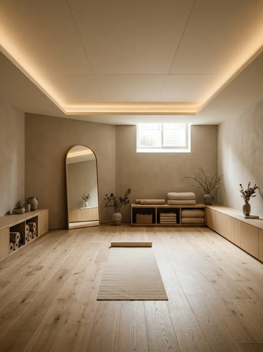
A home yoga studio benefits from a design that feels calm without becoming visually empty. A warm ivory drop ceiling, muted clay or sand-colored walls, and natural-looking flooring establish a softer atmosphere. Low timber storage holds mats and accessories, while a simple mirror and indirect supplementary lighting keep the room functional without overwhelming the composition.
The ceiling should remain visually quiet because the floor needs to accommodate movement. Avoid hanging decorations, bulky overhead fixtures, or furniture that breaks up the main practice area. Lighting should be comfortable for both active sessions and slower stretches, and the room needs enough unobstructed space for the activities planned.
This concept works in a converted basement room or a flexible wellness space. Before choosing materials, check the room’s ventilation, moisture conditions, and clearance. A calm-looking studio still needs adequate airflow, suitable lighting, and a floor that feels stable underfoot. Peace and quiet are easier to achieve when the practical decisions have already been handled.
Give the floor room.
Vintage-Inspired Game Room With Warm Patterned Ceiling Panels
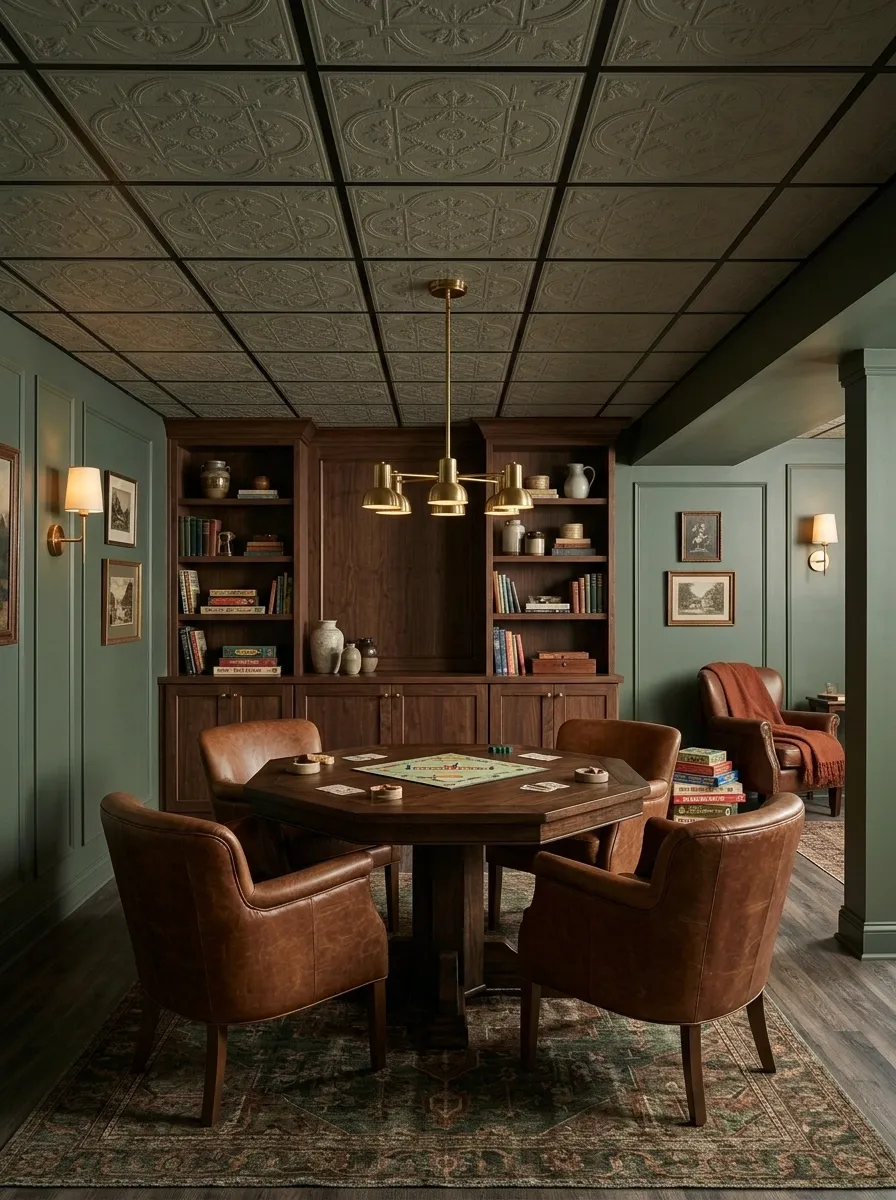
A vintage-inspired game room offers a different way to modernize a suspended ceiling without relying on minimalist white panels. A subtle repeating pattern overhead connects with a wood game table, classic cabinetry, and a muted rug. The room can take its color cues from deep green, warm brown, or subdued rust, while the ceiling pattern adds detail without competing with the table and furniture.
The important distinction is scale. Choose a restrained motif that can be appreciated across the whole ceiling rather than a tiny, high-contrast repeat that becomes visual noise. Keep the walls simpler and use task lighting over the game table, with softer supplementary light around the seating.
This look suits a basement recreation room, board-game space, or a small entertaining area with a clear focal point. Choose compatible ceiling panels with suitable fire performance and service access. A vintage-inspired room should feel collected and welcoming, not like a museum display where touching the furniture is apparently a criminal offense.
Focus at the table.
Illustrative color rhythm only. Actual ceiling panels may have different textures and pattern proportions.
Let the game table remain the focal point. Use a restrained ceiling pattern, warm lighting, and simple surrounding walls rather than giving every surface its own vintage storyline.
Industrial-Inspired Basement Workshop With a Graphite Drop Ceiling
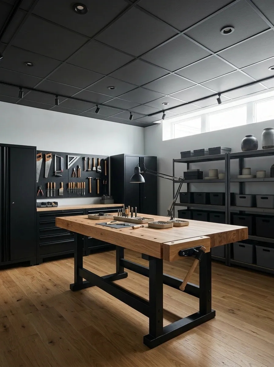
A workshop can look modern without leaving every pipe and ceiling component exposed. Graphite panels and a coordinated dark grid create a deliberate overhead finish, while a thick timber workbench and steel storage cabinets introduce the practical character of an industrial workspace. Pale gray walls and focused task lighting prevent the darker ceiling from swallowing the room.
The strongest feature is the material contrast. Dark overhead surfaces connect with metal shelving, while the natural wood gives the room warmth. Keep tools and equipment organized so the finished space feels like a functional workshop rather than a garage sale with better lighting.
This concept works for a home workshop, model-making studio, or repair area. Before using dark ceiling finishes, assess the available light and actual ceiling height. Confirm that replacement panels meet the system’s fire and service requirements, especially where electrical equipment or workshop machinery will be used.
Nothing accidentally unfinished.
Modern Farmhouse Basement With White Woodgrain Ceiling Panels
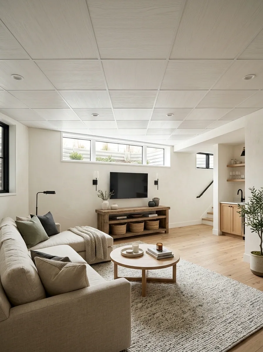
A modern farmhouse room needs warmth and texture, but it doesn’t require actual barn boards nailed across every surface. White woodgrain-look ceiling panels offer a more restrained way to introduce that character into a finished basement. Pair them with warm white walls, a substantial timber console, natural-fiber textiles, and simple black metal details.
The woodgrain should be subtle enough that the ceiling remains part of the background. Strongly patterned panels can compete with floorboards, rustic furniture, and wall decor, leaving the room feeling overly themed. Neutral upholstery and uncomplicated silhouettes help keep the style contemporary.
This direction works well in a family room or casual entertaining space where the rest of the home already includes warm wood and farmhouse-inspired details. Choose panels intended for suspended ceilings rather than ordinary decorative boards, and verify compatibility with the existing grid. The goal is a convincing material relationship without turning the ceiling into a fake timber cabin.
Without the fake barn.
Refined Basement Bar With Deep Green Ceiling Panels
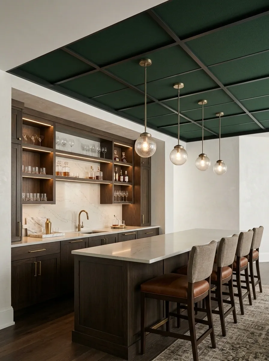
A basement bar can use a darker ceiling to create a more intimate setting without making the whole space feel closed in. Deep forest-green panels establish the main color overhead, while dark timber cabinets and a stone-look counter ground the design. Warm metal hardware and carefully positioned pendants bring a little visual sparkle, but the finishes stay restrained.
The green should feel rich rather than excessively bright. Pairing it with lighter walls or a lighter counter keeps enough contrast in the room, while upholstery in camel, tobacco, or warm taupe adds a welcoming note. The ceiling’s grid should either coordinate with the panels or use a deliberately selected contrast.
This design works best when the bar has a clear focal point and enough space for people to move comfortably around the counter. Plan lighting above the work surface and seating separately, and check any special ventilation, moisture, or electrical requirements. A stylish bar is still a working space, not simply a dark room with expensive bottles in it.
A warmer place to gather.
Contemporary Guest Suite With a Two-Level Lighting Scheme
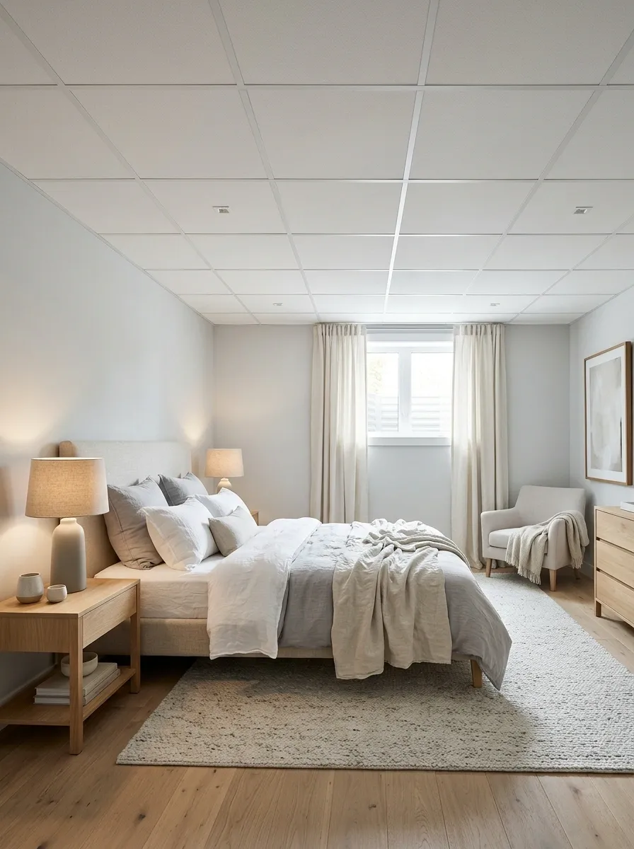
A guest suite can feel more polished when its ceiling lighting is planned around the room’s different uses. Consistent white panels and a matching grid provide an uncomplicated base, while broad ambient lighting covers the room and warm bedside lamps create a more restful mood around the bed. Pale upholstered furniture, simple curtains, and light timber furnishings complete the residential look.
The advantage isn’t a complicated ceiling design. It’s having more than one kind of useful lighting. A bedroom needs enough light for dressing, finding belongings, and cleaning, but it also benefits from quieter illumination at night. Separating those functions makes the room feel more considered than relying on a single row of bright fixtures overhead.
This approach is especially useful for basement guest rooms where daylight is limited. Confirm the suitability of ceiling fixtures and ensure electrical work follows local requirements. Keep the grid accessible and avoid adding decorative elements that interfere with necessary clearances. Visitors should notice the comfortable room, not spend the first evening wondering why the ceiling resembles an office corridor.
Different lighting needs.
Provides comfortable, even visibility throughout the room for dressing and everyday tasks.
Creates a calmer pool of light for reading, resting, and settling in at night.
Keep switches accessible from the entrance and bed where practical.
Matching panels and grid allow the furniture, textiles, and lighting to carry the room’s character.
Modern Apartment Basement With a Warm Neutral Ceiling and Flexible Furniture
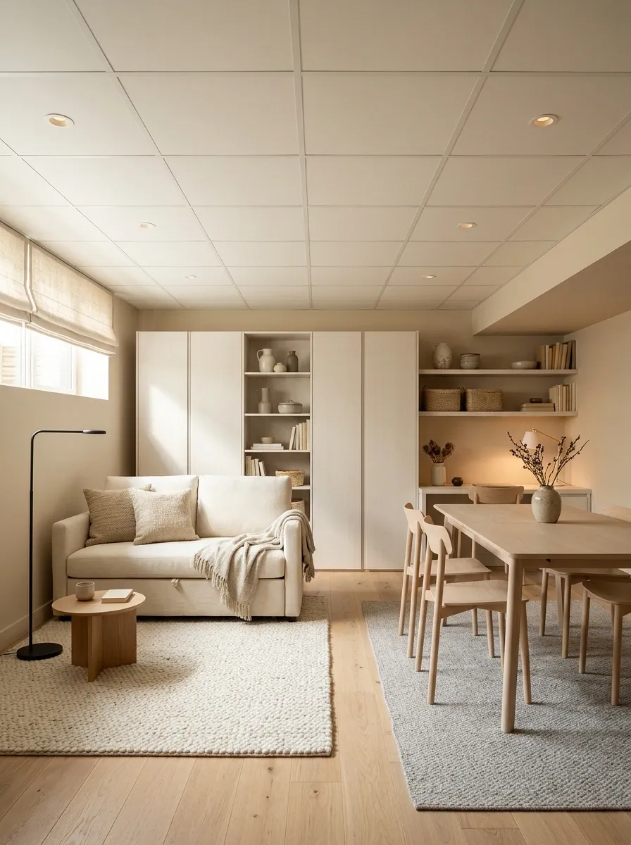
A finished basement used as a compact apartment needs the ceiling to work with every part of daily life. A warm white panel finish keeps the overhead area unobtrusive, while the furniture below handles several functions. A compact sofa bed creates a sitting area by day, an extendable table provides flexible dining or desk space, and pale cabinetry offers storage without visually overwhelming the room.
Keeping the grid and panels close in color makes the ceiling feel consistent across the different functional zones. Rugs and lighting distinguish the lounge from the work or dining area, so the room stays organized without needing a different ceiling design over each activity.
This direction is particularly useful where the basement has limited square footage and a fixed ceiling height. Check clearances around furniture that opens or extends, maintain access to services, and plan electrical outlets and lighting before arranging the final layout. The space should accommodate everyday routines, not just look spacious in a listing photograph.
Room to do more.
Give the Ceiling a Job, Not Just a New Color
A modern drop ceiling doesn’t need to be the most dramatic feature in the room. It needs to make sense alongside the furniture, walls, flooring, and lighting. A consistent pale finish can make a dated ceiling recede, while carefully chosen color, texture, or contrast can turn it into a deliberate part of the design.
Before buying panels or changing the grid, inspect the existing system, measure the room, and resolve any moisture or structural problems. Compare material samples against the actual flooring and wall finishes, and check compatibility, fire performance, weight, and service access before installation.
Choose the complete room direction first, then select the ceiling finishes that support it. That’s how the makeover feels cohesive rather than like a series of unrelated purchases.
Save your favorite drop ceiling designs to Pinterest before planning the room. Your future self, standing under the old yellow tiles in a hardware store, will appreciate having a plan.