
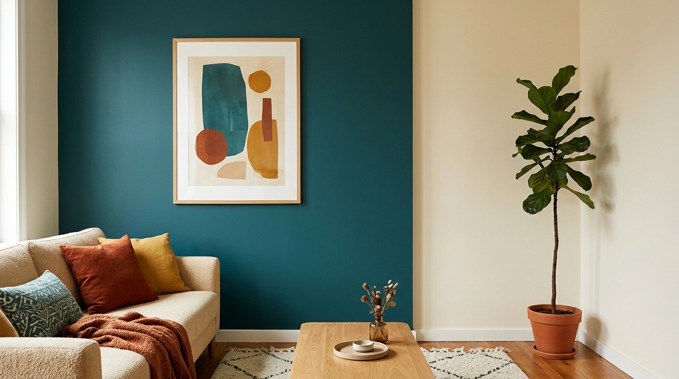
Teal looks incredible on a paint swatch. Then it meets the sofa, the flooring, the curtains, and that accent chair bought on a completely different Tuesday. Suddenly, the room has a lot of opinions and absolutely no group-chat administrator.
The trick with colors that go with teal isn’t finding another pretty shade. It’s finding a color that makes sense beside teal once the entire room comes together. Camel leather can warm it up. Dusty pink can soften it. Mustard can make it feel energetic, while cream gives the eye somewhere to rest.
Each pairing creates a different personality, even when the teal stays exactly the same.
Materials matter just as much. Warm oak doesn’t behave like black metal, even when both sit beside the same blue-green wall. A pale rug can change the balance of a dark living room, and the wrong shade of gray can make a bathroom look unexpectedly cold. The color swatches are only the beginning.
The room is the actual assignment. These combinations show how teal works with furniture, finishes, lighting, and textiles, with practical details and a few brutally honest decorating opinions along the way.
Teal Has Entered the Group Chat
THE COLOR GROUP CHAT
Teal has entered the group chat.
Some colors understood the assignment. Others need to log off.
Five pairings. Five personalities. No beige-on-beige witness protection program required.
Warm ivory
The emotionally stable bestie.
Keeps teal fresh without bleaching the personality out of the room.
Camel
Quiet luxury, loud results.
Brings warmth through leather, timber, and furniture that looks like it pays rent on time.
Dusty blush
Soft, not sickly sweet.
Takes the edge off deep teal without turning the room into a cupcake.
Mustard yellow
Main character energy.
Adds punch beside teal. Keep the other finishes calm before the room starts yelling.
Terracotta
The plot twist that actually works.
Earthy and grounded. Teal gets the contrast, terracotta gets the personality.
THE VERDICT
The goal isn’t finding a color that tolerates teal. It’s finding one that gives the whole room a personality.
Teal Color Pallet Ideas
Teal and Walnut Cozy Den
Teal and rich walnut wood prove that a moody color palette can feel completely inviting rather than like a cave.
A deep teal accent wall sets a sophisticated stage, while a mid-century modern walnut media console and matching coffee table introduce warmth and timeless grain. A cream-colored boucle armchair breaks up the darker tones, and a neutral patterned rug anchors the seating arrangement without fighting for attention.
The real secret lies in balancing the deep, saturated walls with plenty of natural light and softer textures like linen curtains and sheer panels. This approach keeps the room feeling grounded and curated, ensuring the space remains a comfortable spot to unwind at the end of the day.
Teal and Soft Gold Living Room
Teal and soft gold accents bring a touch of understated elegance to a living room without tipping into overly flashy territory.
A classic neutral sofa provides a versatile base, while a bold teal velvet armchair introduces a rich pop of color that immediately draws the eye. A marble-topped coffee table with gold framing adds a subtle gleam, and a large abstract art piece ties the whole palette together.
Layering textures is essential here, from the crisp pleated window treatments to the lush indoor fiddle-leaf fig in a metallic pot. Keeping the larger furniture pieces light and airy allows the teal accents to shine as intentional focal points rather than overwhelming the space.
Teal and Camel Leather Living Room
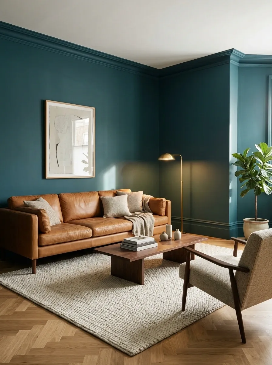
Teal and camel leather are an excellent match when a room needs richness without looking like a furniture showroom that forgot people live there.
Deep teal walls create a saturated backdrop for a cognac leather sofa. A walnut coffee table deepens the palette, while an ivory rug keeps the darker pieces from becoming one enormous block of brown and blue-green. A warm floor lamp adds a little glow after sunset.
The magic is in the temperature contrast. Teal feels cool and grounded, while camel leather brings an earthy warmth that makes the whole arrangement feel intentional. This pairing suits contemporary, mid-century, and classic interiors alike.
The only trap is adding too many competing wood finishes. Keep the main timber tones related, and let the leather provide the warmer counterpoint.
The material relationship
MATERIAL STUDY / 02
Cool backdrop. Warm company.
Teal
The architectural backdrop
Camel leather
Warmth and tactile contrast
Dark walnut
A grounded, substantial finish
Keep the rug light enough to separate the sofa from the floor. Dark furniture needs boundaries, not an identity crisis.
Teal and Rust Copper Bedroom
Teal and rust copper create a striking bedroom atmosphere that feels both modern and deeply comforting.
A dramatic geometric wall paneling system acts as a stunning backdrop, painted in a warm copper tone that immediately warms up the cool teal textiles on the bed. A leather-upholstered headboard and matching bench introduce tactile luxury, while warm bedside lighting casts a soft glow over the entire setup.
The trick to this bold combination is letting the rich copper tones harmonize with the deep blue-green hues through carefully chosen accent pillows and throws. Keeping the surrounding decor relatively simple allows the intricate wall architecture and rich color pairing to take center stage without visual clutter.
Teal and Blush Pink Layered Bedroom
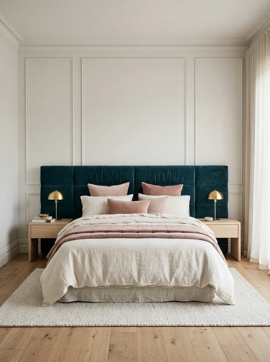
Teal and blush pink prove that a room can have personality without decorating like a birthday cake.
A deep teal upholstered headboard anchors the bedroom, with dusty blush cushions and a folded pink quilt bringing a softer note. Ivory bedding keeps the combination airy, and pale oak bedside tables stop the cooler teal from dominating every corner. Small brass lamps introduce warmth without requiring another major color.
The trick is choosing a muted blush rather than a candy pink. Dusty pink has enough softness to balance saturated teal, but it doesn’t demand equal attention. The result feels layered rather than sugary.
This combination works especially well when the bed is the main focal point. Keep the larger textile surfaces relatively simple, then let the contrast happen around the headboard and cushions. The bedroom doesn’t need seven competing floral prints to prove it’s interesting.
The tonal relationship
BEDROOM PALETTE
Softness without the sugar rush.
Keep blush in the softer layers.
Bedding and cushions bring in pink without forcing the entire room to compete with the headboard.
Palette note: pale oak and warm metal finishes bridge the cool and warm colors.
Teal and Ochre Statement Corner
Teal and rich ochre yellow demonstrate how a simple corner arrangement can pack a serious design punch.
A deep teal backdrop creates an enveloping mood, while a vibrant ochre velvet sofa introduces a burst of sunshine and warmth. A delicate brass and glass side table holds a lush fern, adding a fresh organic element that bridges the two bold colors.
This pairing works brilliantly because the coolness of the teal wall offsets the intense warmth of the ochre upholstery, creating a natural visual balance. Adding a neutral patterned pillow softens the transition between the vibrant fabrics, ensuring the vignette feels curated and intentional rather than chaotic.
Teal and Mustard Yellow Dining Room
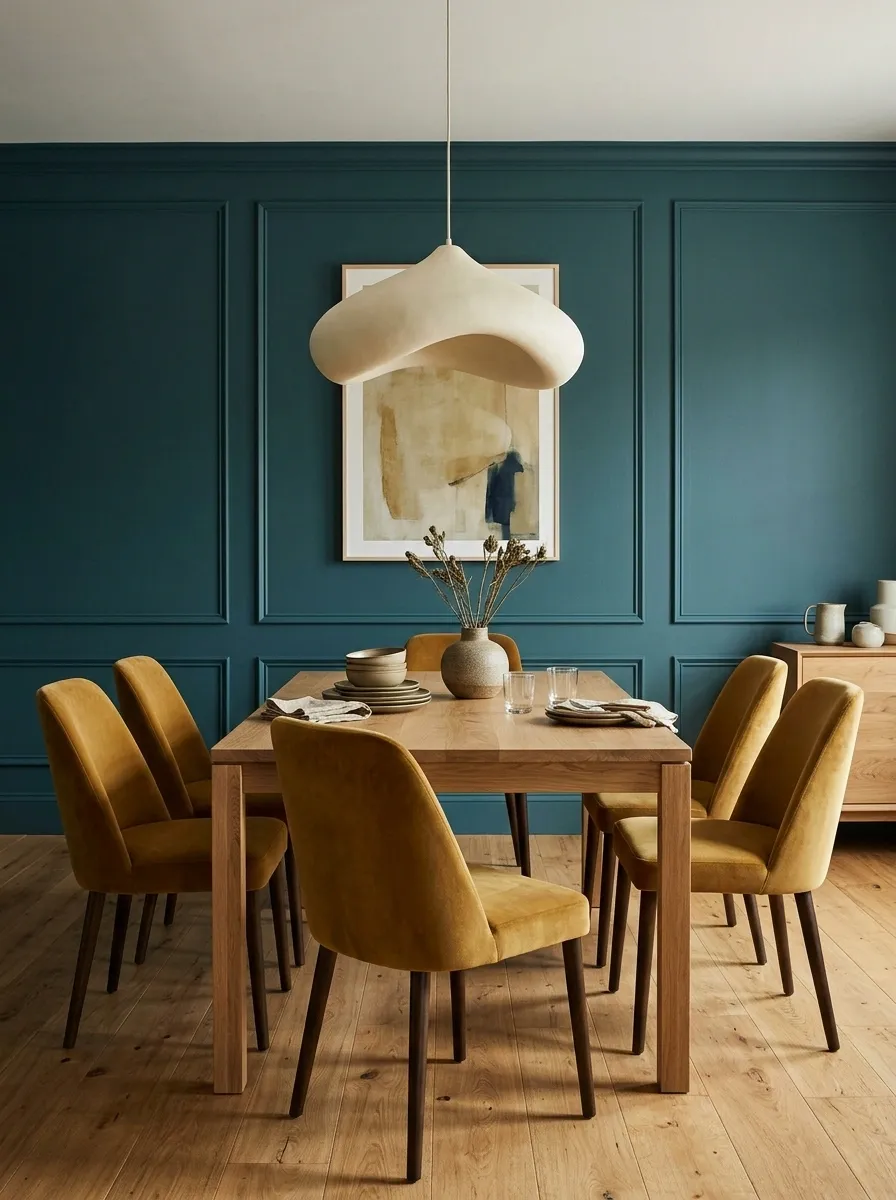
Mustard yellow and teal do not do subtle particularly well. Thankfully, the room doesn’t need to.
Deep teal walls establish the backdrop, while mustard dining chairs bring the contrast. An oak dining table adds a natural middle ground, and a cream pendant prevents the upper part of the room from feeling too dark. The table styling stays simple, because the chairs already have enough to say.
This pairing is lively and confident. It suits dining rooms where color is part of the experience rather than an afterthought. Mustard also looks more sophisticated when it leans earthy or golden, instead of becoming a bright lemon shade.
The rule is to give each color a job. Teal anchors the room, mustard supplies the punch, and natural wood helps everything settle down. Adding equally strong red, cobalt, and purple would turn dinner into a color debate nobody asked for.
The color hierarchy
THE DINING ROOM EDIT
Two strong colors. Clear boundaries.
Teal
Walls provide the continuous color backdrop.
Mustard
Dining chairs bring the main contrast.
Natural oak
The bridge between cool and warm.
The roast: the walls and chairs already have a plot. Let the tableware stay out of the drama.
Teal and Terracotta Welcoming Entryway
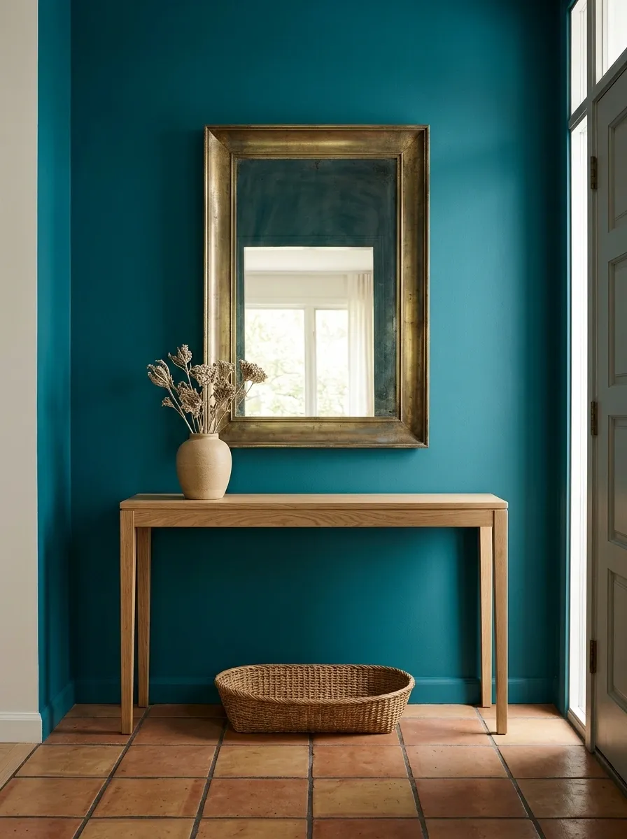
Teal and terracotta make an entryway feel considered before anyone has even taken their shoes off.
The walls are painted a rich teal, grounded by terracotta floor tiles that introduce a warm, earthy contrast. A slim oak console keeps the floor visible, while an aged mirror reflects light and makes the entry feel less enclosed. A handmade ceramic vase and woven basket finish the scene without creating a traffic obstacle course.
What makes the combination work is the placement of the colors. Teal occupies the vertical surfaces, while terracotta anchors the room beneath them. Oak creates a visual bridge between the two. The composition feels connected because each material has a clear place in the room.
In a narrow entryway, choose a shallow console and keep the floor area clear. No decorative basket is worth turning the front door into an obstacle course.
The architectural color relationship
ENTRYWAY MATERIAL STUDY
Ground the color. Literally.
Walls / Teal
The vertical anchor that defines the entry.
Console / Natural oak
Floor / Terracotta
A warm, substantial base for the cooler wall color.
Small entryway rule
Keep the console narrow, the mirror high enough to use, and the walking path clear. The design can be dramatic without blocking the front door.
Teal and Charcoal Contemporary Media Room
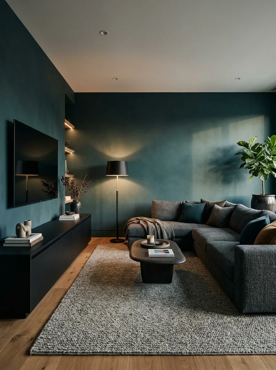
Teal and charcoal are for anyone who thinks a living room should have a little mystery and absolutely no motivational quote cushions.
Deep teal walls give the room its color, while a charcoal sectional and low black media console create a darker, quieter composition. Oak flooring introduces enough warmth to keep the space from looking like a luxury cave. A textured gray-beige rug breaks up the large dark surfaces, and a shaded floor lamp provides a softer pool of light beside the sofa.
The secret is separating the dark colors through texture and value. Matte walls, woven upholstery, and smooth cabinetry don’t reflect light in the same way, which gives the room depth even when the palette stays restrained.
This look suits media rooms and larger living spaces with thoughtful lighting. In a small room with limited daylight, keep the ceiling and at least some surrounding surfaces lighter. Moody is a design choice. Walking into a wall because everything is the same shade of darkness is not.
The dark-room contrast study
DARK ROOM, SMART LAYERS
Moody, not muddy.
Teal
Colored wall surfaces
Charcoal
Upholstery and seating
Black
Small, crisp outlines
Warm oak
A lighter visual break
The rule: dark finishes need differences in texture, lighting, or tone. Otherwise, the entire room becomes one giant charcoal blur.
Teal and Sage Green Botanical Sunroom
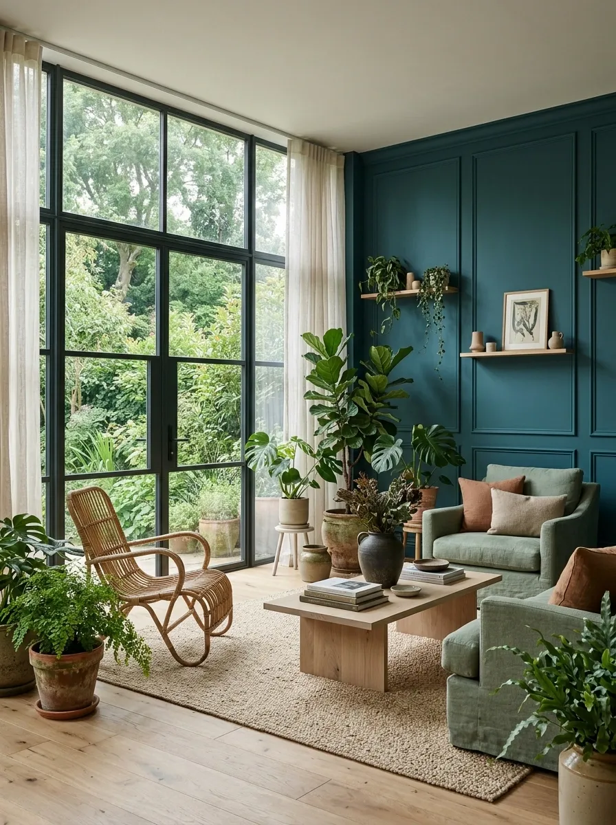
Teal and sage green work together without requiring the room to audition for a jungle documentary.
A teal feature wall anchors the sunroom, while sage upholstery introduces a softer, grayer green. Large windows connect the palette to the garden, and pale oak furniture and woven rattan keep the setting from feeling overly polished. A few substantial plants are more effective here than a hundred tiny pots fighting for shelf space.
The distinction between the greens is what makes the design successful. Teal has more depth and a stronger blue influence, while sage is quieter and more muted. That difference lets them sit together without becoming an indistinguishable mass of green.
This combination is especially effective in rooms with garden views or generous daylight. Choose plant containers in terracotta, stone, or natural woven finishes to reinforce the organic palette. Matching every green exactly would remove the very variation that gives this room its character.
The green-on-green breakdown
BOTANICAL COLOR STUDY
Same family. Different personalities.
Deep teal
The anchor
Works on a feature wall or as a strong furniture color.
Soft sage
The softer layer
Works on upholstery, cushions, and quieter surrounding surfaces.
Bridge materials: pale oak, rattan, and terracotta help connect the two greens to the rest of the room.
Teal and Pale Gray Contemporary Bathroom
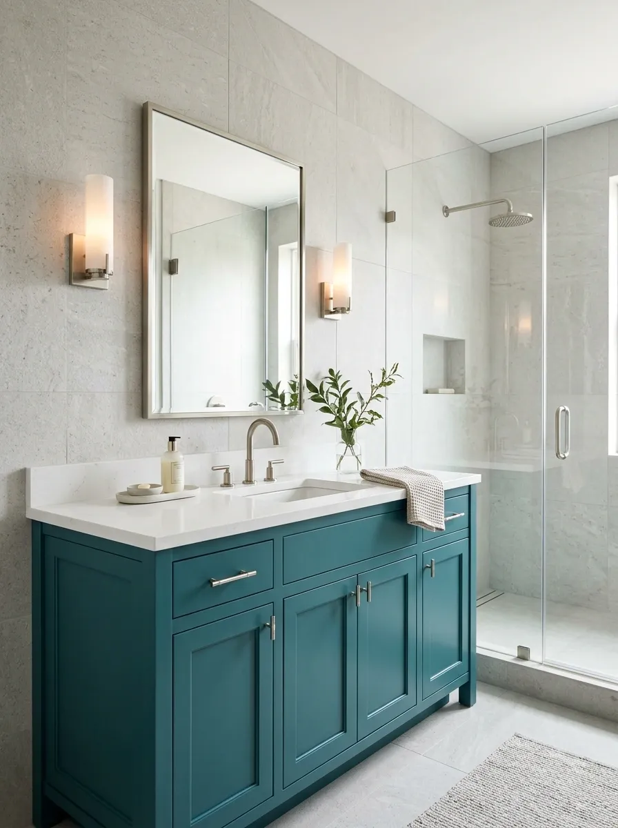
Pale gray gives teal a cleaner, more architectural personality. The pairing looks especially good in a bathroom, where stone, glass, and metal already provide plenty of visual interest.
A teal vanity brings the color, while pale gray stone tiles keep the surrounding surfaces understated. A white countertop and basin provide a clear break between the cabinet color and the wall finishes. Brushed nickel fixtures connect naturally with the cooler palette, and a frameless glass shower preserves the visual openness of the room.
The key is choosing a gray with the right undertone. A slightly warm gray can stop teal from feeling icy, particularly under artificial lighting. A distinctly blue-gray finish will create a cooler, sharper result. Neither is automatically better, but they produce noticeably different rooms.
This combination suits contemporary bathrooms that need color without visual clutter. Repeat the teal in the cabinetry or a small niche rather than covering every surface. The vanity can be the star without turning the shower into its understudy.
The bathroom finish guide
BATHROOM FINISH NOTES
Let the materials do their jobs.
CABINETRY
Teal
The main focal point
WALLS
Pale gray
A quiet stone backdrop
COUNTERTOP
White
A clean dividing surface
FIXTURES
Nickel
A cool, understated finish
Before choosing a gray tile, view a sample beside the actual teal finish and countertop. Bathroom lighting can make a supposedly neutral gray look surprisingly blue or green.
Teal and Walnut Traditional Home Office
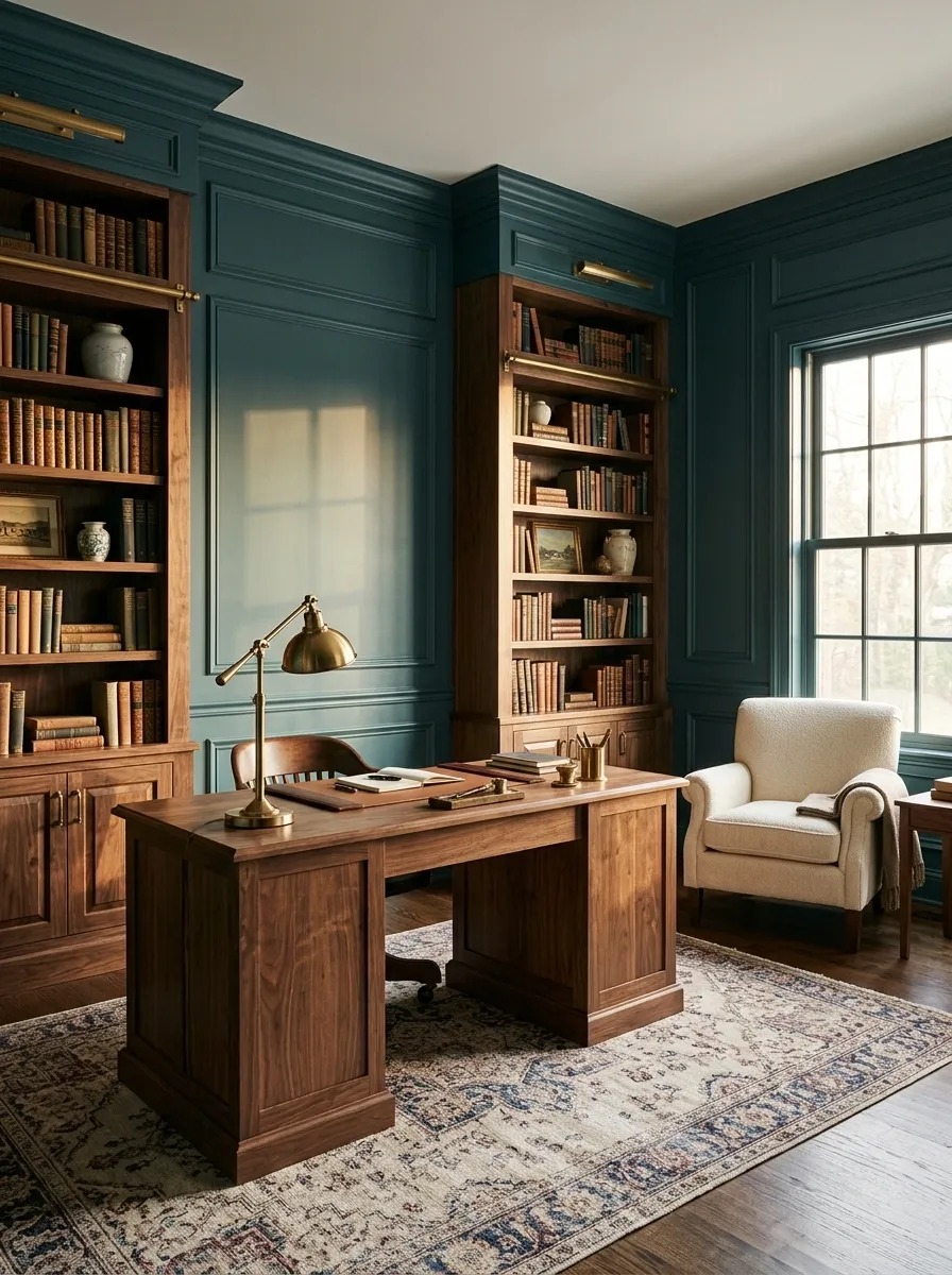
A teal and walnut office looks like the person who works there has excellent taste and absolutely no interest in motivational wall art.
Deep teal walls frame substantial walnut bookcases and a traditional writing desk. A cream upholstered chair introduces a lighter note, while a brass desk lamp provides a warm accent against the dark wood. A muted patterned rug ties the furniture together without making the floor another focal point.
The combination works because teal and walnut share a certain visual weight. Neither looks flimsy beside the other. Cream upholstery and warm metal details stop the room from becoming a solid block of dark surfaces, while the grain of the walnut gives the composition texture.
This palette suits traditional studies, reading rooms, and home offices with enough space for full-size furniture. In a smaller office, leave some shelving open and avoid matching dark wood on every available surface. The goal is a thoughtful library, not a very expensive wooden box.
The office material hierarchy
THE HOME OFFICE EDIT
A little gravitas. No corporate misery.
BACKGROUND
Deep teal
Walls and paneling establish the mood.
Walnut
Desk and bookcases supply the substance.
Cream
Light upholstery
Brass
Focused highlights
The balancing act: when both the walls and the furniture are dark, introduce a lighter seat, rug, or lampshade. Even a serious office needs a little breathing room.
Teal and Coral Expressive Guest Bedroom
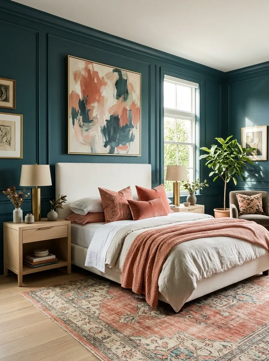
Teal and coral are the loud friends who somehow make every group photo better. The trick is not letting them both grab the microphone at the same time.
Deep teal walls provide the main color statement, while coral appears in the bedding, cushions, and artwork. An ivory bed frame and pale oak bedside tables introduce calmer surfaces, giving the stronger colors room to stand out. The finished bedroom feels expressive without looking like every paint sample in the shop made the final cut.
Coral has an orange undertone that creates a lively contrast against teal’s cooler blue-green character. A softened coral or salmon shade keeps the room more relaxed, while a bright, saturated coral makes the result more graphic. Choose according to the atmosphere the bedroom needs.
For guest rooms, keep the main bedding neutral and use coral in pieces that are easy to change. That way, the color combination remains distinctive without requiring a complete redesign whenever the mood changes.
The saturation test
COLOR PERSONALITY TEST
How loud should coral be?
The shade changes the mood. The placement changes how much attention it gets.
Soft coral
Quiet and relaxed
Bright coral
Playful and punchy
Deep coral
Rich and dramatic
The guest-bedroom formula
Let teal anchor the room, use ivory for the main bedding, and introduce coral through two or three connected accents.
Translation: the room can have a personality without shouting its entire biography.
Teal and Navy Blue Library Lounge
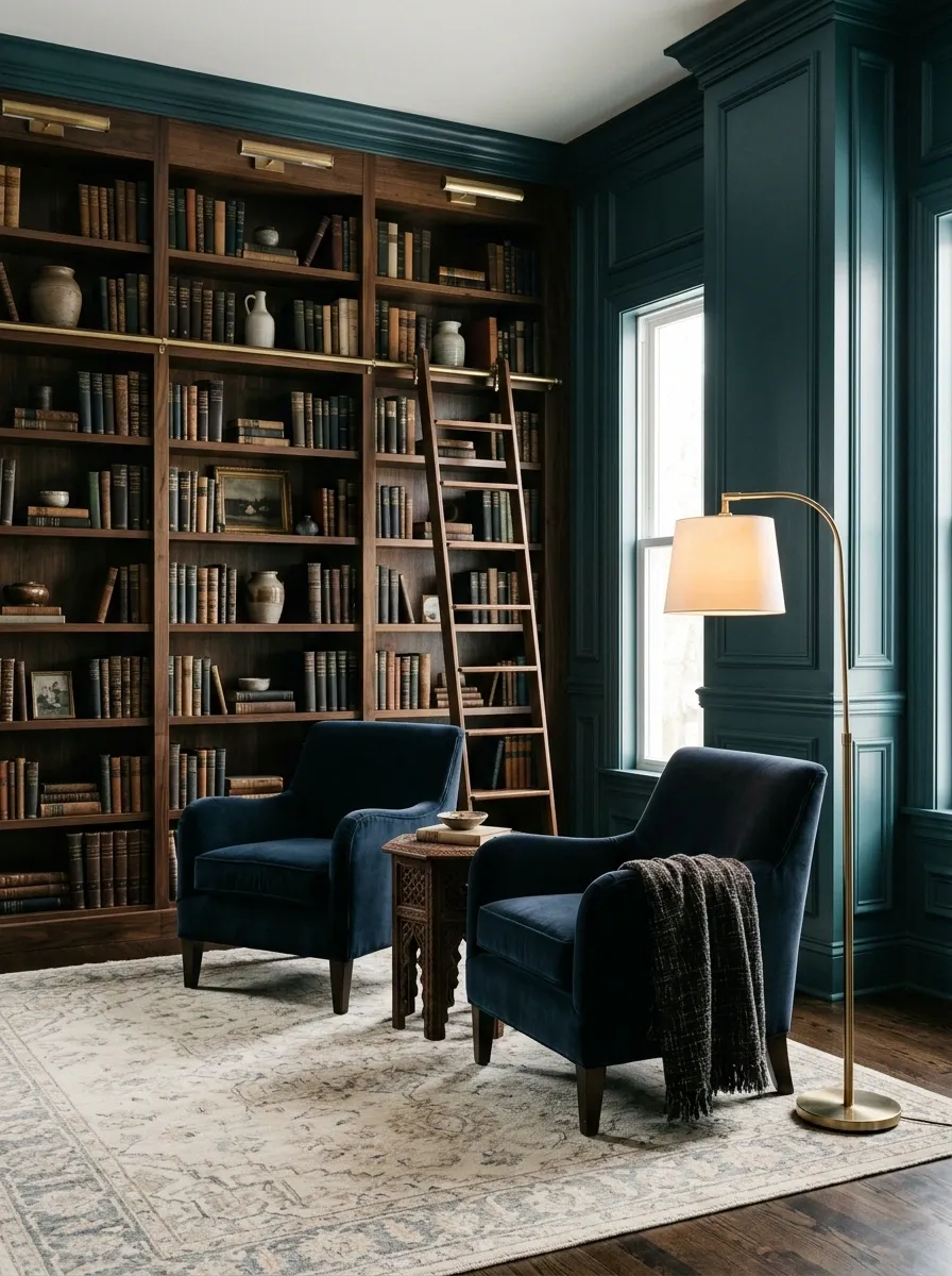
Teal and navy blue are proof that two colors don’t need to be opposites to make a room interesting. They just need to stop pretending they’re twins.
Deep teal paneling creates the backdrop for navy velvet armchairs, dark walnut bookshelves, and a pale patterned rug. Warm brass reading lamps introduce a little glow, while a wooden side table breaks up the upholstered seating. The room feels layered, collected, and just a little dramatic, as any respectable library should.
The trick is choosing teal and navy shades with enough difference in depth to remain distinct. Use the lighter or greener shade on the walls and reserve the deeper blue for furniture. Texture matters, too. Velvet absorbs light differently from painted wood, so closely related colors can still create clear visual separation.
This pairing suits reading rooms, studies, and traditional living rooms. A cream rug or pale curtains will stop the darker colors from swallowing every available surface.
The blue-on-blue distinction
THE LIBRARY COLOR EDIT
Different blues. Different jobs.
Keep the wall color and upholstery distinct enough to read as separate layers, even in low light.
Deep teal
WALLS AND PANELING
The architectural backdrop with a green-blue character.
Navy
UPHOLSTERY
A darker blue layer with a calmer, more traditional feel.
Keep nearby: walnut, warm brass, and a pale rug. The room needs a visual exit from all that blue.
Teal and Butter Yellow Breakfast Nook
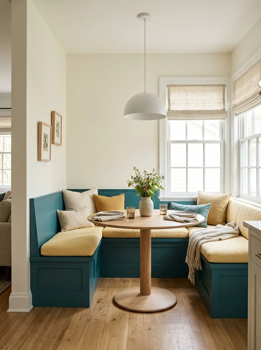
Butter yellow and teal are a cheerful pairing that doesn’t require the kitchen to look like a children’s television set.
A built-in teal banquette anchors a small breakfast nook, with soft yellow cushions bringing warmth to the seating. A round oak table makes the space easier to move around, while creamy walls and a simple pendant keep the arrangement visually light. The table setting stays understated so breakfast can remain about breakfast.
Butter yellow is gentler than a saturated primary yellow. It adds a warm lift beside teal without making the contrast feel aggressive. That makes this combination especially useful in compact dining corners, where a few strong elements can establish the whole room’s personality.
A round pedestal table is a practical choice because it reduces awkward corners around the banquette. Keep the seating depth and table clearance suitable for everyday use. A gorgeous nook that requires everyone to perform a furniture-removal ritual before sitting down has missed the assignment.
A small-space color plan
SMALL SPACE / BIG PERSONALITY
Give every color a place.
Teal
Built-in seat
Butter
Cushions
Warm
White
The furniture decision matters, too.
A round table, a built-in bench, and a clear walking path make a compact dining corner feel more usable. No one needs to shimmy past a table leg every morning.
Teal and Lilac Soft Modern Bedroom
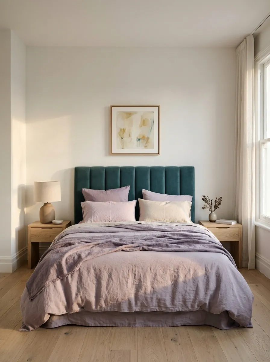
Lilac and teal are an unexpected combination that works best when both colors keep their composure.
A deep teal upholstered headboard provides the anchor, while muted lilac bedding introduces a cooler, softer contrast. Pale oak bedside tables and warm white walls keep the room from feeling too icy. A simple table lamp and one understated piece of artwork complete the composition without introducing a third saturated color just for the sake of it.
Lilac brings a hint of purple that makes teal feel more distinctive. The result can look contemporary, playful, or quietly sophisticated depending on the depth of each shade. A dusty lavender is easier to live with than an intensely bright purple when the aim is a restful bedroom.
Keep lilac primarily in replaceable textiles, especially if teal is already built into a headboard or wall finish. If the two main colors are strong, let the bedding pattern stay simple. The room isn’t applying for a job in the circus.
The cool-color balance
THE BEDROOM COLOR STUDY
Cool colors, softer landing.
Teal
Depth
Lilac
Softness
Warm
White
A useful styling distinction
Let teal anchor the bed and use lilac in the softer layers. Pale oak and warm white introduce visual relief without changing the palette’s quiet character.
The verdict: unexpected color pairing, excellent bedroom manners.
Teal and Olive Green Conservatory
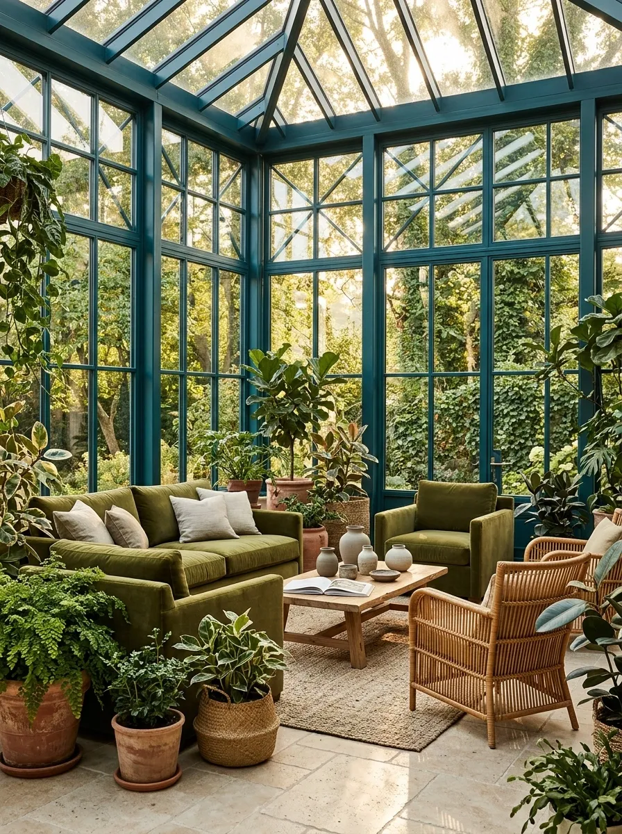
Teal and olive green are what happens when two greens stop competing and start minding their own business.
Teal window frames give this conservatory a strong architectural outline, while olive green upholstery adds a muted, earthy layer. Rattan furniture, terracotta planters, and a pale stone floor connect the room to the garden outside. The plants feel like part of the composition rather than a last-minute attempt to make the room look organic.
The secret is mixing different types of green rather than matching everything. Teal has a stronger blue influence, while olive leans yellow and earthy. Their difference creates depth without introducing a completely unrelated accent color.
This palette works especially well beside garden views, large windows, and natural materials. Choose a few plants with different leaf shapes and heights, then leave enough space around the furniture for circulation. A conservatory shouldn’t require a machete and an expedition permit to reach the sofa.
The botanical color map
BOTANICAL INTERIOR STUDY
Green on green, with actual depth.
Teal
Architecture
Olive
Upholstery
Clay
Planters
Cool and defined
Teal frames and substantial color surfaces.
Warm and organic
Olive upholstery and natural plant textures.
Finish with rattan, pale stone, and terracotta. The plants already supply enough green, so there’s no need to turn every accessory into a leaf.
Teal and Rust Mid-Century Living Room
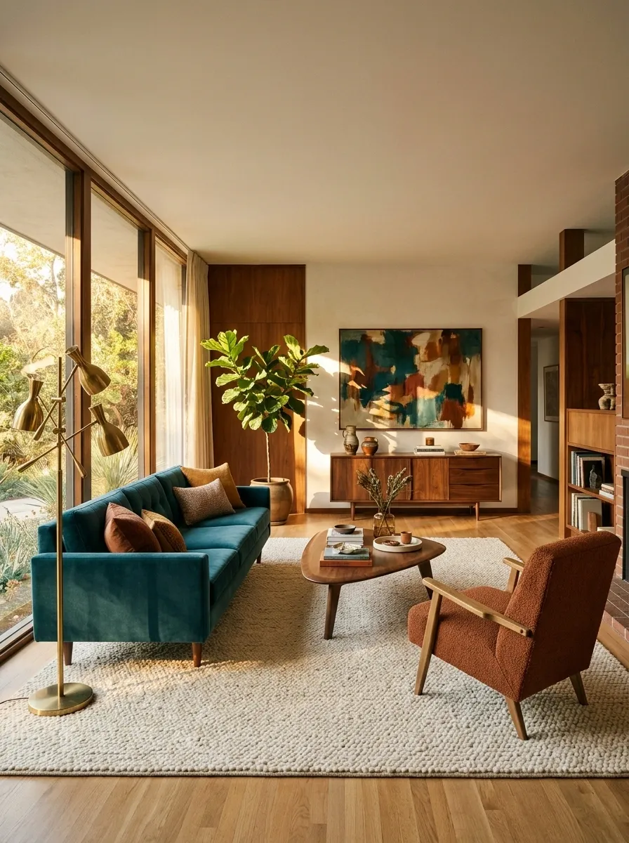
Teal and rust have excellent chemistry. One is cool and saturated, the other is earthy and warm. Together, they make a room look designed rather than simply furnished.
A deep teal sofa anchors this mid-century living room, while a rust-colored accent chair brings the contrasting warmth. Walnut furniture, a cream textured rug, and a sculptural floor lamp reinforce the retro-inspired character without making the space feel like a time capsule. Abstract artwork connects the colors without repeating them everywhere.
Rust works particularly well because its earthy orange undertone gives teal a clear counterpoint. The wood adds another warm layer, but its grain and texture keep it distinct from the solid color of the upholstery.
The furniture arrangement matters just as much as the palette. Let the sofa establish the main seating zone, angle the accent chair slightly toward it, and keep the coffee table within comfortable reach. The room should invite conversation, not force guests to communicate across a small furniture canyon.
The upholstery pairing study
MID-CENTURY COLOR NOTES
Cool sofa. Warm chair. No awkward introductions.
Contrasting upholstery gives each seating piece a distinct role while the timber connects them.
Deep teal
MAIN SOFA
The main visual anchor and the largest upholstery surface.
Rust
ACCENT CHAIR
A warm counterpoint that draws attention without dominating the room.
Walnut furniture
Natural oak accents
Cream rug
Designer verdict: one strong rust chair delivers more impact than scattering orange accessories around the room like confetti.
Teal and Beige Minimalist Apartment
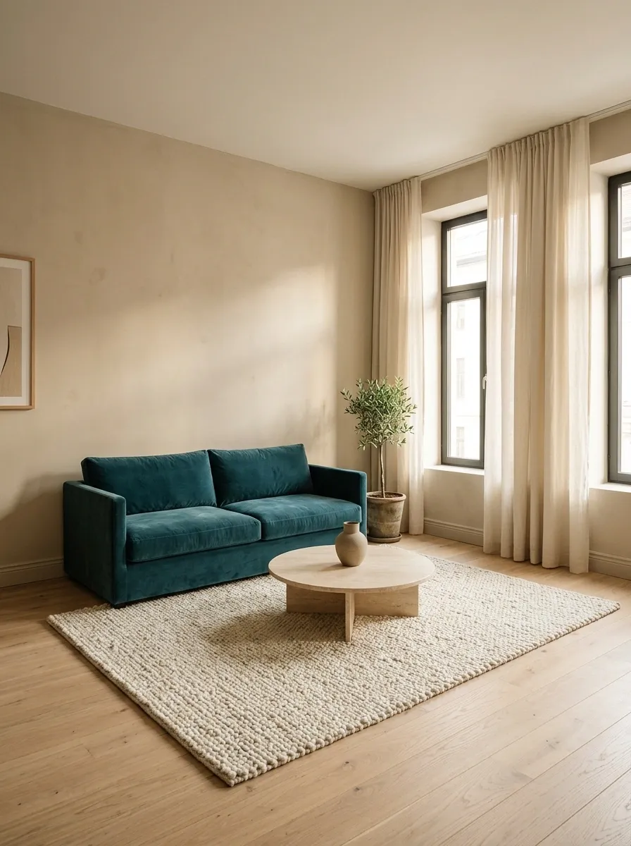
Teal and beige are a reminder that a room doesn’t need twelve decorative objects and a complicated backstory to look good.
A low teal sofa sits against warm beige walls, with pale oak flooring, linen curtains, and a simple stone coffee table keeping the composition grounded. A textured cream rug adds softness without introducing another strong color. The furniture stays low and relatively simple, allowing the room’s proportions and materials to do the work.
Beige takes the edge off teal without making it disappear. Unlike a stark white, a warm beige creates a softer transition between colored upholstery and pale architectural surfaces. It’s particularly useful in smaller apartments, where a darker sofa can provide a focal point without requiring dark walls.
Keep walkways open and choose furniture that fits the room, rather than the fantasy version of the room with twice the square footage. Minimalism looks much less convincing when the coffee table is blocking the only route to the kitchen.
The small-apartment spatial edit
SMALL APARTMENT STUDY
Less furniture. Better breathing room.
Main anchor
Keep
A defined seating zone, warm surfaces, and a visible route through the room.
Skip
Oversized tables, excessive accent furniture, and bulky pieces that crowd the sofa.
A neutral palette can’t rescue a bad furniture layout. Leave room to move, and the whole design immediately feels more considered.
Teal, Black, and White Graphic Home Office
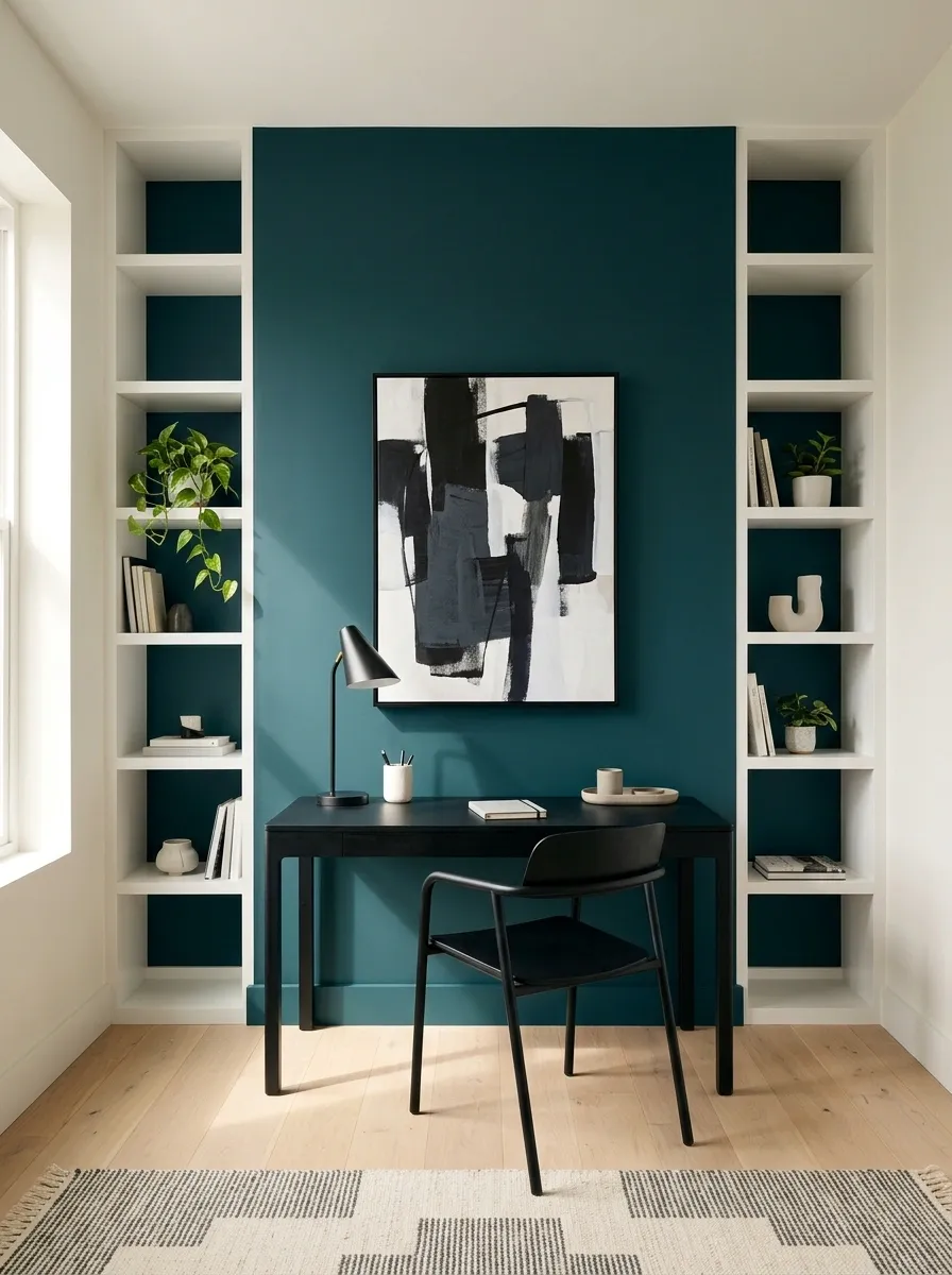
Teal, black, and white are for anyone who likes a clean interior but finds an entirely neutral room a little too committed to being sensible.
A saturated teal accent wall gives the office a clear focal point. A black desk and black-framed artwork create crisp outlines, while white shelving keeps the overall composition open. Pale wood flooring supplies just enough warmth to stop the space from feeling clinical.
The combination works because each color has a different visual job. Teal provides depth, black defines edges, and white separates the strong elements. The wood floor softens the hard contrast without adding another competing color.
This is a useful palette for compact workspaces, especially when storage and desk organization need to remain visually quiet. Keep the desktop relatively uncluttered and choose artwork that repeats the black-and-white relationship. A collection of colorful stationery, rainbow cables, and seventeen novelty mugs would like a word with the color scheme.
The graphic contrast study
THE WORKSPACE PALETTE
Three colors. Very clear boundaries.
White
Shelving and visual separation
Pale wood
Flooring and warmth
Use black for definition, not for every object in sight. Teal already gives the office personality. The stapler doesn’t need a personal brand.
Teal and Copper Industrial Loft Kitchen
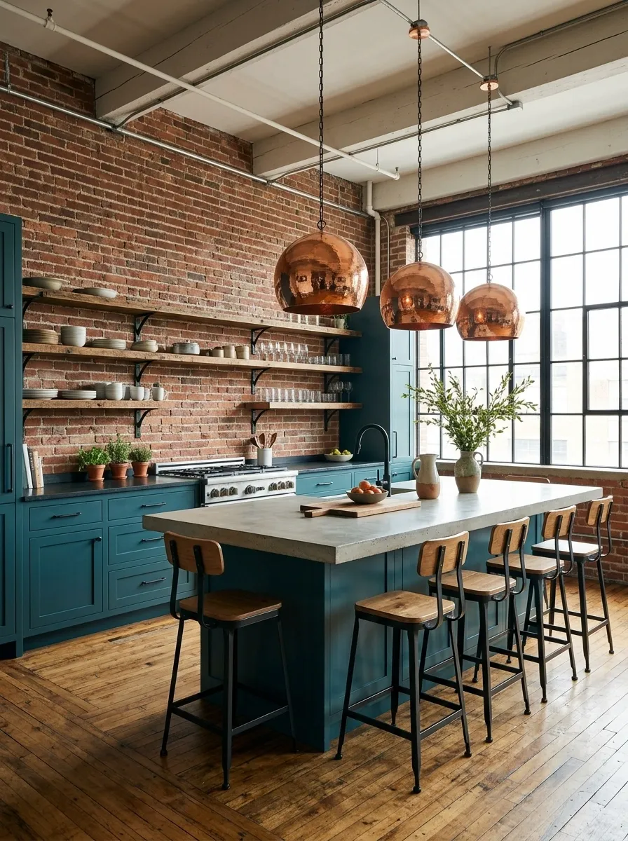
Teal and copper are a strong match when the goal is an industrial kitchen with warmth, rather than a cold collection of concrete, metal, and unfinished surfaces.
Deep teal lower cabinets ground the room, while copper pendant lights add a reflective, reddish warmth above the island or worktop. A brick backsplash and reclaimed timber shelves introduce texture, and pale concrete counters keep the composition from becoming too dark. Black metal details connect the industrial elements without needing to dominate the palette.
Copper works because it has both warmth and a metallic surface. It catches light differently from the matte cabinetry and rough brick, so the room gains visual interest through material contrast rather than additional colors.
The practical details matter here. Open shelves should hold items used regularly, and worktop space needs to remain clear enough for actual cooking. A kitchen is still a kitchen, even when the pendant lights are preparing for their magazine cover.
The material interaction study
INDUSTRIAL KITCHEN / MATERIAL NOTES
Smooth, rough, reflective, warm.
Why these finishes cooperate
Matte teal supplies the color. Copper reflects light. Concrete brings a quieter surface, and timber adds visible grain. Each material contributes something different instead of repeating the same effect.
Kitchen reality check: protect usable prep space and choose finishes that can withstand the cleaning and moisture the room requires. Good looks don’t wash dishes.
Teal and Burgundy Formal Dining Room
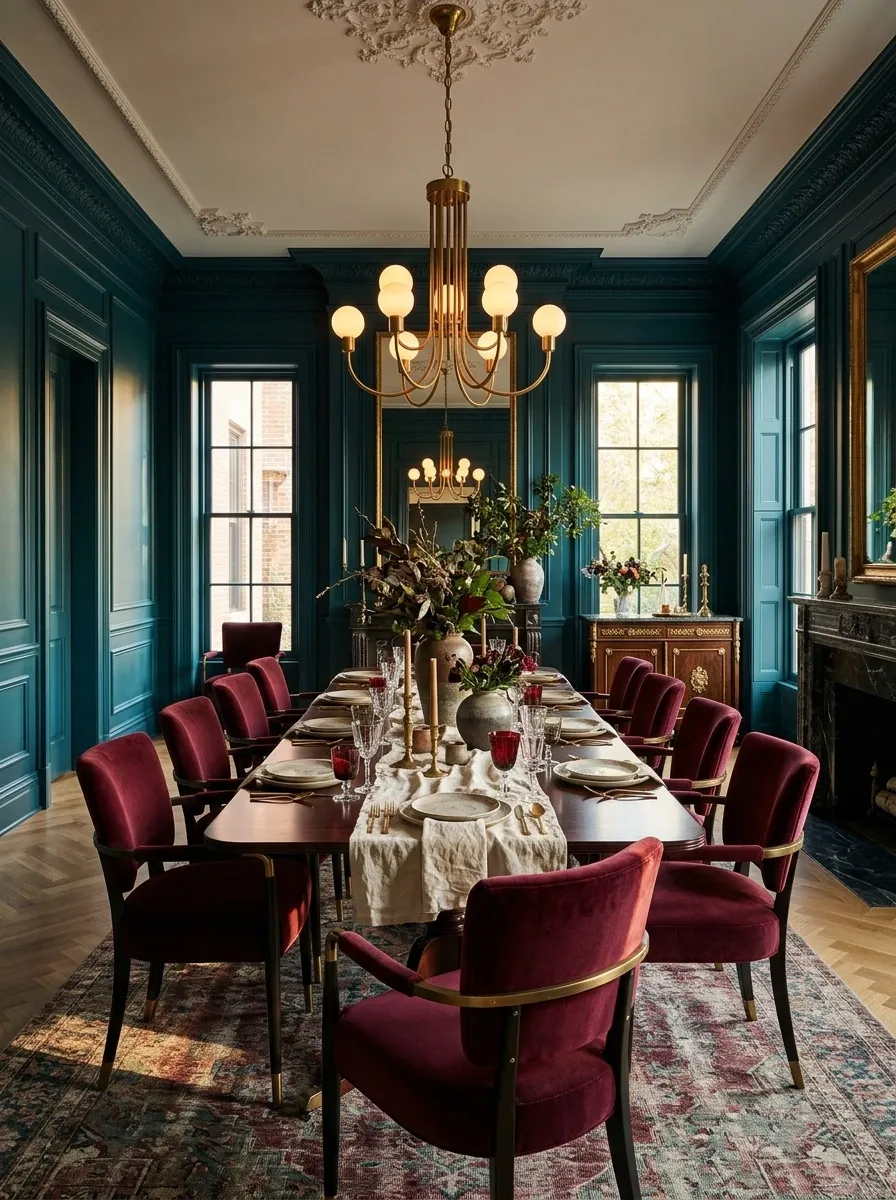
Teal and burgundy are not here to create a light, breezy little room. They’re here to make dinner feel like an occasion, even when the menu is leftovers.
Deep teal paneled walls create a saturated backdrop for burgundy velvet dining chairs and a dark mahogany table. Cream linen introduces a lighter surface across the table, while a brass chandelier adds warmth overhead. The room’s character comes from the richness of the colors and the contrast between velvet, polished timber, and reflective metal.
The pairing works best when the undertones feel intentional. A red-based burgundy brings warmth against the cooler teal, while cream and brass prevent the darkest surfaces from merging visually. The result feels formal without requiring elaborate ornament on every wall.
This palette suits dining rooms with good layered lighting and furniture with clear proportions. In a smaller room, use burgundy on the chairs rather than introducing another dark wall color. Rich is the goal. A room that resembles the inside of a velvet jewelry box is optional.
The evening-room composition
FORMAL DINING / COLOR STUDY
Rich color, lighter touch.
The darker surfaces establish the mood. Small areas of cream and warm metal keep the room legible.
The finishing note: warm brass
Use warm metal in the chandelier or wall lights to soften the darker palette. One well-placed reflective finish does more than a dozen decorative objects.
Dining room verdict: dramatic enough for a dinner party, practical enough to eat at a table without treating every meal like a state banquet.
Teal and Sky Blue Coastal Bedroom
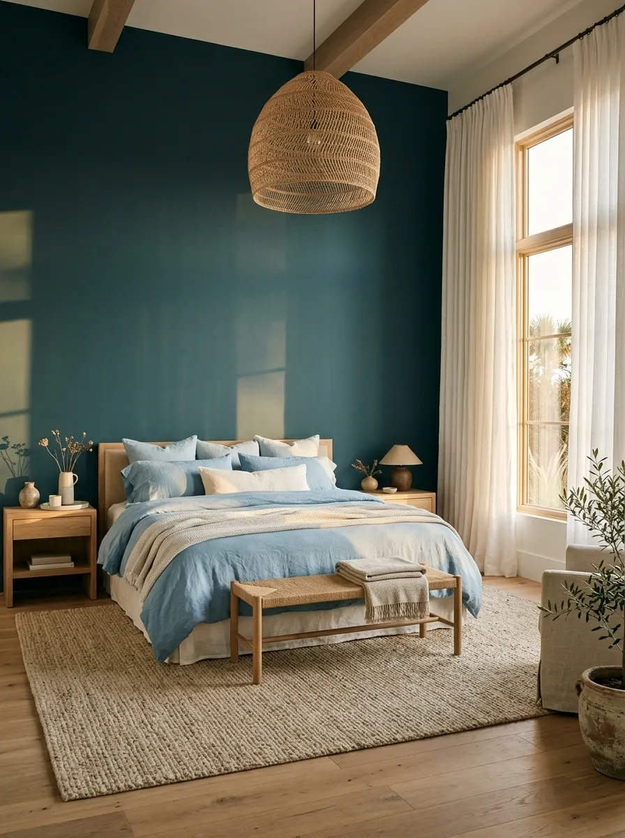
Teal and sky blue bring coastal color into a bedroom without requiring a single decorative anchor, seashell collection, or aggressively nautical cushion.
A deep teal wall behind the bed anchors a lighter scheme of sky blue and white bedding. Natural oak furniture adds warmth, while a sandy beige rug connects the cooler blues to the floor. A woven pendant and airy linen curtains introduce texture, keeping the room relaxed rather than overly polished.
The contrast between the two blues is the important detail. Teal provides depth and definition, while sky blue reflects a lighter, more open mood. White helps separate the shades, and the sandy neutral prevents the entire composition from feeling cold.
This pairing works particularly well in sunlit bedrooms and spaces with light wood flooring. Keep the accessories natural and restrained. A few woven textures and simple artwork are enough to suggest a coastal influence without turning the bedroom into a souvenir shop.
The coastal color progression
COASTAL BEDROOM / COLOR STORY
Deep water to pale shoreline.
Move from a strong blue-green focal point into lighter blues, white, and warm sand tones.
Deep teal
The headboard wall
Sky blue
Bedding and soft layers
Warm white
Sheets and curtains
Sandy beige
Flooring and natural textures
The coastal rule: create the atmosphere with color, natural materials, and daylight. The room doesn’t need a miniature boat on every shelf to make its point.
Teal and Cream Kitchen With Pale Wood
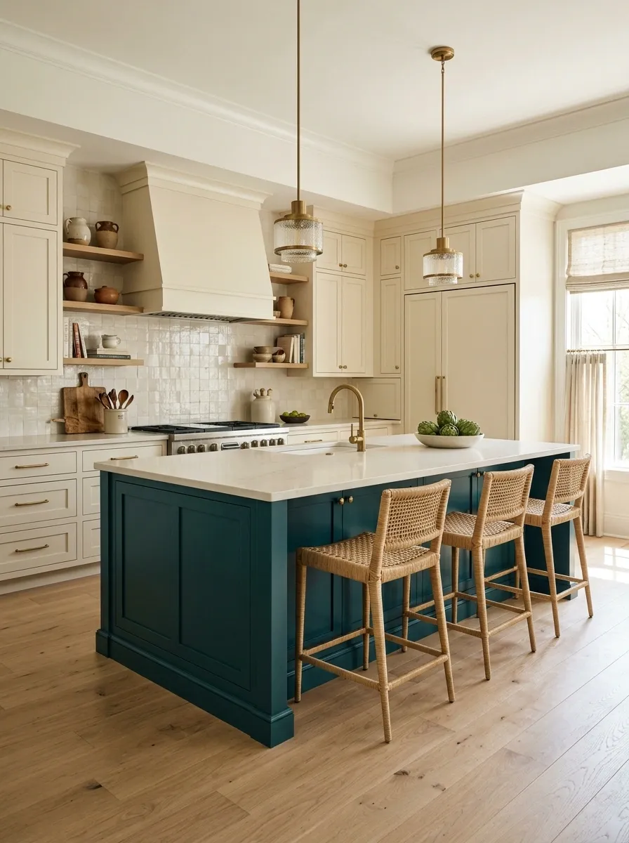
Teal kitchen islands are an excellent way to bring color into a kitchen without committing every cabinet to the same shade. The room gets a focal point, the cream cabinetry keeps things light, and the wood makes the whole arrangement feel warmer.
A deep teal island sits at the center of this kitchen, surrounded by warm cream cabinets and pale oak flooring. An ivory countertop gives the island a clean outline, while woven stools and understated brass hardware bring in texture and warmth. The arrangement feels deliberate because the strongest color stays concentrated in one architectural feature.
Cream is especially useful here because it softens the contrast between saturated teal and a pale countertop. Pale oak then bridges the cool cabinet color and the warmer wall finishes. The result feels contemporary without becoming sterile.
This combination suits kitchens where the island acts as the main working and gathering zone. Make sure the island allows adequate clearance around drawers, appliances, and walkways before settling on its size. Pretty cabinets are a joy. A dishwasher that cannot open properly is a daily villain.
The kitchen zoning study
KITCHEN COLOR PLAN
One island steals the show.
The cabinets and flooring are supporting characters. There is no need for an ensemble cast of competing colors.
Check the real-life clearances.
Allow room for appliance doors, drawers, stools, and everyday movement. The island must function as a work surface before it qualifies as a photo backdrop.
Teal and Dusty Pink Nursery
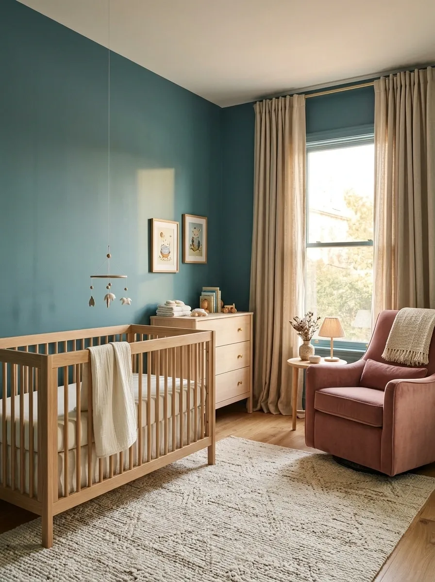
Teal and dusty pink create a nursery with personality without relying on the usual pastel-pink-everywhere arrangement.
Muted teal walls provide a calm, defined backdrop. A dusty rose nursing chair brings a softer color into the room, while a natural oak crib, ivory bedding, and a woven rug keep the overall look warm. A shaded lamp and simple curtains add texture without crowding the walls with decorative extras.
The important detail is the difference in color strength. Teal supplies the depth, dusty pink softens the composition, and ivory keeps the larger surfaces light. Pale wood connects these elements, making the palette feel balanced rather than divided into separate color camps.
This pairing can work in a shared nursery, too, because it avoids relying on a single traditional color theme. Keep furniture placement practical, secure heavy furnishings appropriately, and choose sleep products that follow current safe-sleep guidance. A nursery needs to be lovely, but safety gets the final vote.
The nursery color placement
NURSERY PALETTE
Soft color. Sensible decisions.
Walls
Pink
Ivory
Where each color works
Teal sets the background, dusty pink brings softness through upholstery, and ivory keeps the textiles light. Pale oak joins the colors without adding another strong hue.
Practical note: keep the cot free of loose bedding, pillows, and soft toys during infant sleep, and secure furniture against tipping.
Teal and Plum Evening Lounge
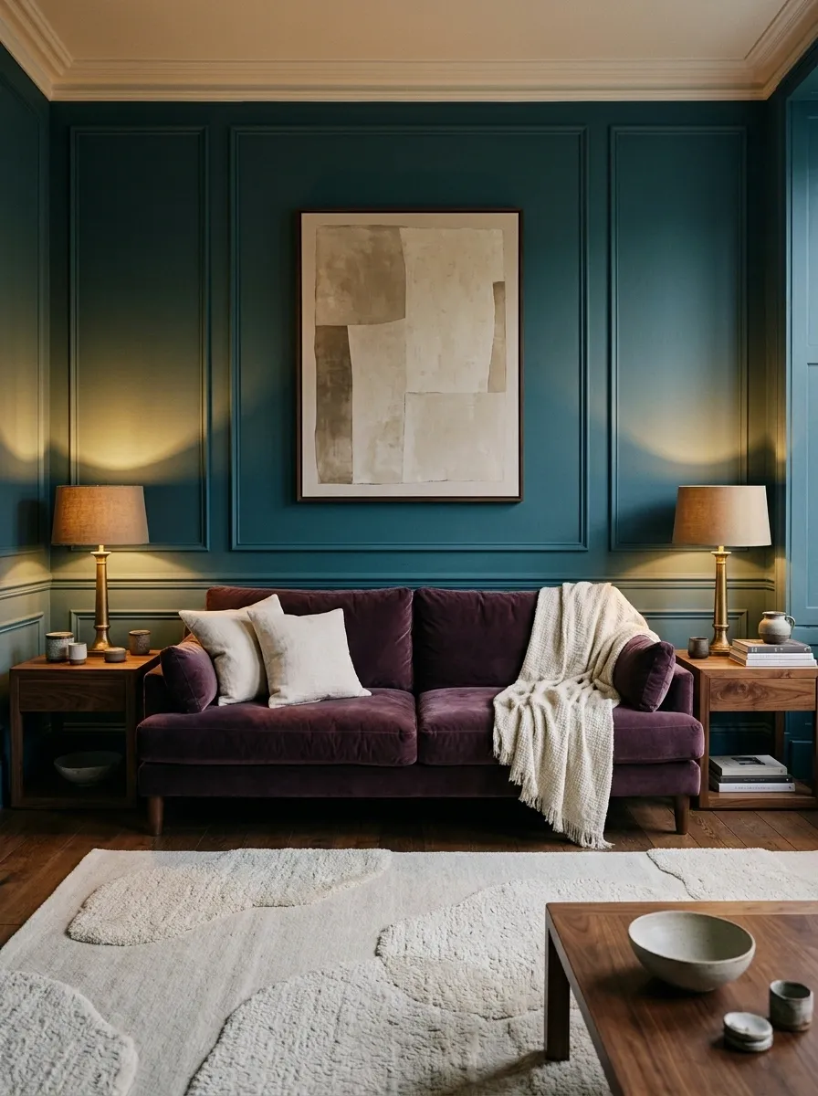
Teal and plum are for rooms that have absolutely no interest in looking like a waiting room.
Deep teal walls frame a plum velvet sofa, while walnut side tables and warm shaded lamps create a more intimate atmosphere. A pale sculptural rug breaks up the darker colors, and restrained artwork keeps the wall treatment from becoming visually crowded. The result feels rich and expressive without relying on shiny finishes or excessive decoration.
Plum introduces a red-purple undertone that contrasts with teal’s blue-green character. Both colors can be quite deep, so their relationship needs a little breathing room. Cream textiles, a lighter floor covering, or a pale lampshade can provide that relief.
This combination suits evening lounges, formal sitting rooms, and larger bedrooms where a more enveloping palette makes sense. For a smaller room, use plum on the sofa and keep the walls lighter. A dramatic interior is a design choice. Accidentally making a room feel half its size is not part of the package.
The dark-color balance study
THE EVENING LOUNGE EDIT
Rich color needs a little breathing room.
Where the balance comes from
Keep teal and plum on separate major surfaces. Use cream textiles to create a clear break, then let walnut and warm lamps add depth without adding another dominant color.
The verdict: moody and sophisticated, not the set of a vampire’s tax audit.
Teal and Sand Stone Organic Modern Living Room
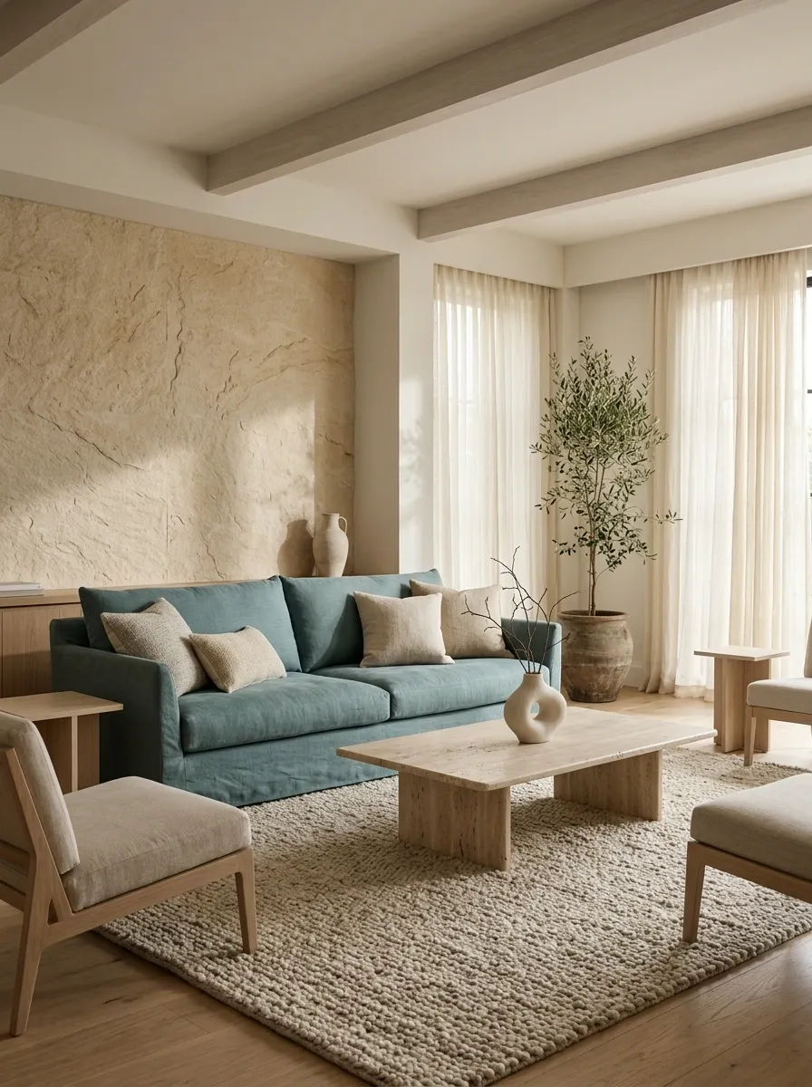
Teal doesn’t always need a dramatic contrast to look interesting. Sometimes, the best partner is a collection of warm, natural surfaces that quietly let the color do its thing.
A muted teal linen sofa sits against sandy stone walls, with a travertine coffee table and pale oak furniture establishing the organic modern look. A thick beige rug introduces softness underfoot, while cream curtains filter the daylight. A few sculptural ceramic pieces provide shape and texture without cluttering the surfaces.
The pairing works because stone and sand tones are visually gentle. They have warmth without competing with the green-blue undertone of teal. Linen, stone, and wood also have different textures, so the room doesn’t need several bright accent colors to feel complete.
This direction suits homes with natural flooring, warm plaster finishes, or a preference for understated furniture. Choose a teal with a slightly muted finish rather than an intensely jewel-toned shade if the desired result is calm and earthy.
And please let the stone have some room. Covering every surface in candles and decorative objects is how a thoughtful living room becomes a clearance aisle.
The texture-led design study
ORGANIC MODERN / MATERIAL STUDY
Texture is doing the heavy lifting.
Keep the colors quiet and let the differences between upholstery, stone, and timber give the room its character.
The finishing principle
Mix matte, grainy, soft, and subtly reflective surfaces. Related colors don’t have to look flat when their materials are doing something different.
No bonus points are awarded for buying seventeen matching ceramic vases. One or two well-placed pieces will do.
Teal and Cherry Red Contemporary Den
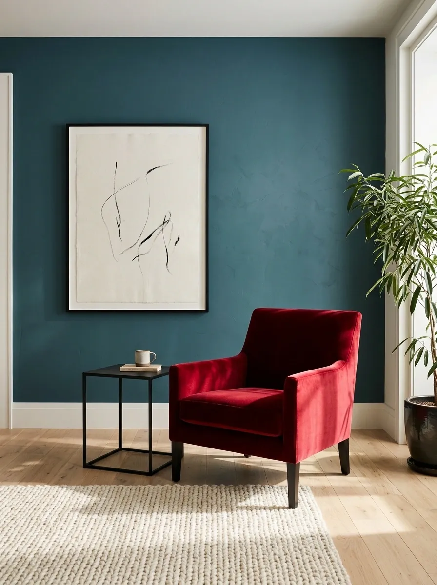
Cherry red beside teal is a bold move. Done well, it feels graphic and deliberate. Done badly, it looks like the furniture department lost a bet.
A deep teal wall anchors the room, while a single cherry red accent chair takes the spotlight. Pale oak flooring and an ivory rug provide a calmer base, and black furniture gives the composition a few sharp edges. Minimal artwork keeps the wall from competing with the chair.
The contrast works because the red is concentrated in one substantial piece. Teal provides the background, cherry red supplies the high-energy accent, and the neutrals create space between them. That balance lets the eye move around the room instead of being hit with a different strong color at every turn.
This palette suits contemporary interiors with clean silhouettes and a confident approach to color. Use the red in a chair, ottoman, or artwork rather than spreading it across every cushion and accessory. A little red can make a room memorable. Red on absolutely everything becomes a very loud personality trait.
The accent-color proportion study
THE BOLD ACCENT EDIT
Red is the guest, not the landlord.
Let the room’s quieter colors establish the composition before introducing one confident red accent.
Teal
Wall color or main upholstery.
Ivory
Rug and other visual breathing room.
Cherry red
One statement chair or a strong artwork detail.
Black
A few crisp architectural outlines.
Style rule: keep the red concentrated. Repeating it in every accessory makes the contrast less special and the room much harder to visually settle into.
Teal and Forest Green Color-Drenched Powder Room
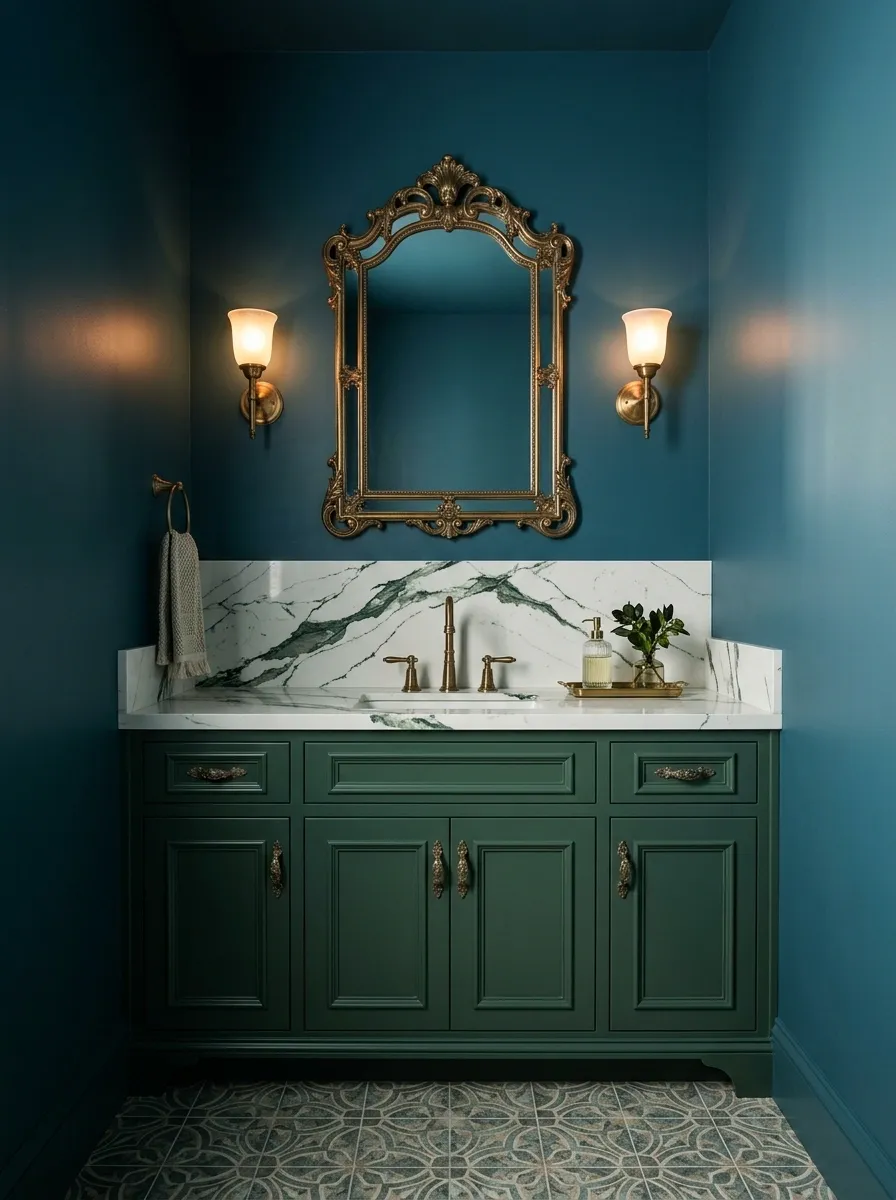
Teal and forest green create a dramatic little room with the confidence of a much larger one. Apparently, the walls and vanity decided subtlety was somebody else’s department.
Deep teal walls surround a forest green vanity, while green-veined stone adds movement through the countertop or backsplash. Antique brass mirrors and wall sconces introduce warmer reflections, and a patterned stone floor provides an architectural finish beneath the saturated colors. The whole composition feels enveloping rather than random because the greens are related without being identical.
The difference between the two shades matters. Teal has a stronger blue influence, while forest green tends to look deeper and more distinctly green. Separate them through surface finish, stone veining, and lighting, rather than expecting a tiny shade difference to do all the work.
This pairing suits powder rooms, where a more dramatic treatment can make a compact space feel intentional. For practical cleaning, select suitable finishes for the moisture and wear each surface will experience. A gorgeous vanity finish that hates water is a terrible relationship.
The deep-green finish study
POWDER ROOM / SHADE STUDY
Keep the greens related, not identical.
Separate the large surfaces through shade, texture, and reflective details.
Deep teal
Blue-green backdrop
Forest green
Deeper green contrast
Finish the composition
Introduce green-veined stone and brass details. Stone adds variation, while brass picks up light and outlines the mirror and vanity area.
Design verdict: dark, dramatic, and fully aware that a powder room is allowed to have a personality.
Teal and Peach Sunlit Sitting Room
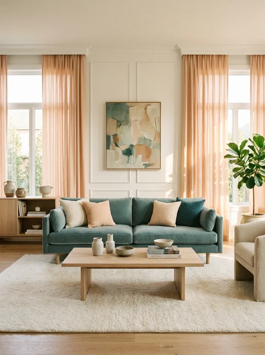
Teal and peach are an excellent match for a sunny sitting room because the warm and cool colors create contrast without the intensity of a bright red or mustard pairing.
A muted teal sofa anchors the seating area, while peach linen curtains soften the windows and warm the incoming daylight. A pale oak coffee table, ivory rug, and restrained artwork give the colors room to settle. The furniture stays simple, allowing the relationship between the curtains and upholstery to do most of the talking.
Peach has a warm, slightly orange undertone that complements the blue-green influence of teal. A muted peach creates a relaxed atmosphere, while a more saturated shade makes the room feel more expressive. In either case, ivory and oak help prevent the composition from becoming too sweet.
This palette works especially well in sitting rooms with substantial natural light. Choose curtain fabric that suits the window’s actual light and privacy needs, and check peach samples in both direct sunlight and evening lighting. A color that looks soft at noon can become noticeably warmer at sunset.
The daylight color relationship
SUNLIT SITTING ROOM
Warm window light. Cool anchor.
Peach and teal provide the contrast. Ivory and oak keep the combination grounded.
Sofa
Curtains
Rug
Sample the curtains beside the sofa.
Natural and artificial light can change how warm peach looks. Check fabric swatches in the actual room before committing to a large curtain installation.
Teal and Warm Greige Transitional Kitchen
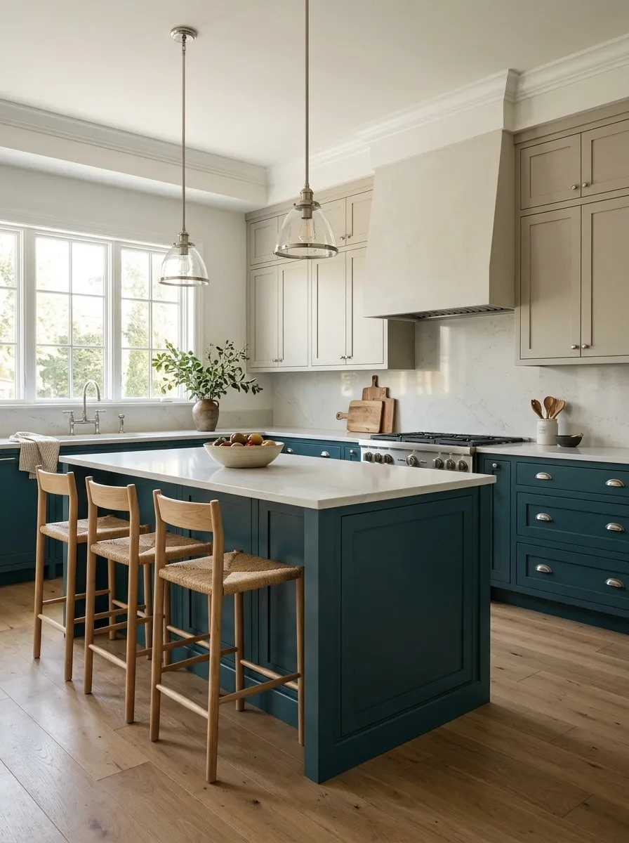
Teal and warm greige are for kitchens that want color without going fully rustic, fully modern, or completely beige about the whole situation.
Teal lower cabinets anchor the room, while warm greige upper cabinetry creates a softer transition to the walls. A light quartz backsplash reflects available light, and oak stools introduce a natural finish at the island. Brushed nickel hardware keeps the details understated, allowing the cabinetry to carry the main color story.
Greige is useful because it sits between gray and beige, often providing a more balanced transition between cool teal and warm timber. The exact undertone matters, however. A cooler gray-based greige creates a sharper feel, while a warmer beige-based one makes the kitchen feel softer.
This combination suits transitional kitchens with a mix of classic cabinet shapes and modern surfaces. Using different colors on upper and lower cabinetry also establishes visual separation without needing black-and-white contrast.
Before choosing the paint, compare it with the actual countertop, floor, and cabinet finish. Kitchen lighting changes throughout the day, and a greige that looks warm on a sample card can appear much cooler beside a blue-green cabinet.
The cabinet zoning study
TRANSITIONAL KITCHEN / CABINET PLAN
Dark below. Soft above.
Use the cabinet colors to distinguish the work zones while keeping the overall composition connected.
Light quartz
Backsplash
Natural oak
Stools and details
Important: compare cabinet, countertop, and greige samples together under actual kitchen lighting. Undertones love causing unnecessary drama.
Teal and Antique Gold Formal Foyer
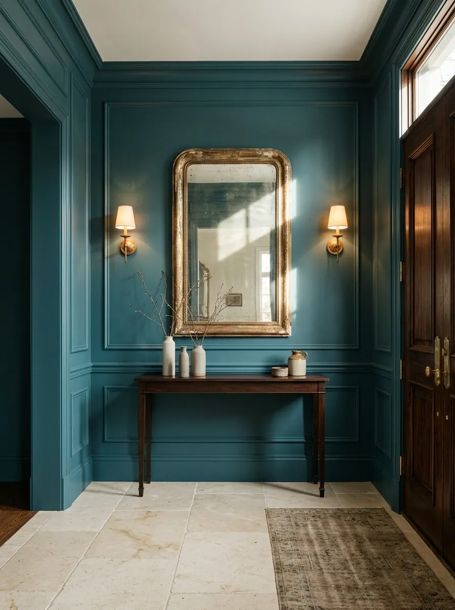
Teal and antique gold make an entryway look as though it has its life together, even when the shoes behind the front door suggest otherwise.
Deep teal walls establish a rich architectural backdrop for an antique gold mirror, a slim console, and warm wall sconces. A cream stone floor adds a lighter foundation, while a dark timber front door gives the composition definition. The gold details reflect available light and introduce warmth without forcing the room into an overly shiny finish.
The pairing works because antique gold has a softer, warmer appearance than bright polished yellow metal. Against teal, it creates contrast that feels classic and deliberate. The cream floor stops the darker wall color from enclosing the space, while the mirror gives the entryway an extra sense of openness.
This direction suits traditional foyers and contemporary entrances that need a stronger focal point. Keep the console narrow enough for comfortable passage and use the mirror to reflect a useful view or source of light. A foyer should welcome people inside, not require a side-step around a decorative table.
The foyer finish hierarchy
THE FOYER FINISH STUDY
A strong backdrop. A few golden moments.
Teal carries the architecture, gold catches the eye, and pale stone keeps the entry from feeling closed in.
Keep it practical: make sure the console and mirror suit the wall proportions and leave an unobstructed route through the foyer. The first impression shouldn’t involve bumping into furniture.
Choosing the Teal Combination That Works for Your Home
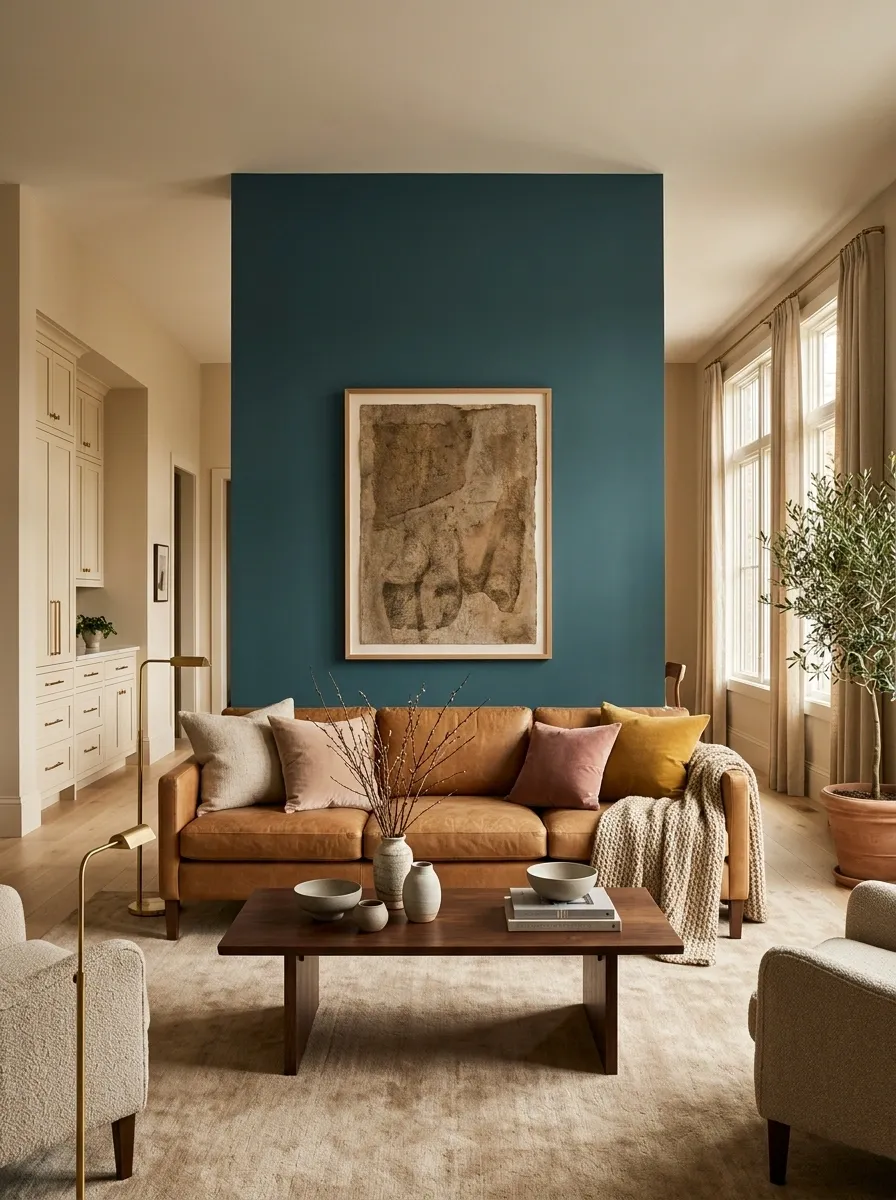
Teal doesn’t need a completely new set of rules for every room. It needs a clear role and colors that make sense around it.
For a brighter, more relaxed interior, start with warm white, beige, pale oak, or sand. For a room with more depth, consider camel leather, walnut, charcoal, navy, or burgundy. If a stronger personality is the goal, dusty pink, coral, mustard, rust, and cherry red can all create distinctive contrasts when their placement is deliberate.
Before buying paint or committing to a large piece of furniture, put the actual samples together. Check them beside your flooring, countertop, upholstery, and other permanent finishes, then view them in the room’s daylight and evening lighting. Colors that look compatible on separate screens can behave very differently beside each other in real life.