
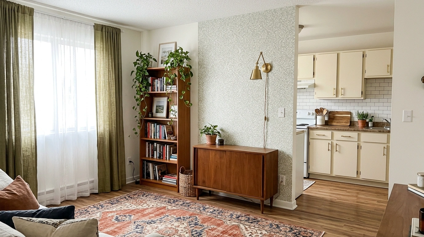
Rental apartments can have decent furniture, perfectly usable rooms, and still somehow look like nobody has finished moving in. The lighting is harsh, the walls are painfully blank, and the kitchen cabinets look as though beige was the only color available when the property was built.
The solution isn’t buying every cute thing that appears on Pinterest. A collection of unrelated lamps, baskets, cushions, and decorative trays can make a room feel more crowded without making it look better. Congratulations, the clutter now has an aesthetic.
The strongest renter-friendly upgrades work together. Better lighting changes how a room feels after dark. Properly hung curtains improve the proportions of a window. Thoughtful storage makes a tiny kitchen easier to use, while a consistent palette connects rooms that would otherwise look like separate rental listings.
Leave it easy to undo.
A rental can have excellent style without a renovation montage, a drill collection, or an awkward conversation about the deposit.
Confirm lease terms, product compatibility, and any permission requirements before changing a surface.
Deal with flat lighting, awkward furniture placement, or exposed clutter before buying decorative extras.
Photograph existing damage, retain original hardware, and document approved changes.
The goal is a home that looks intentional, not a before-and-after reveal followed by an itemized damage invoice.
Renter Upgrades That Make a Real Difference
Layered Lighting for a Living Room With No Overhead Fixture
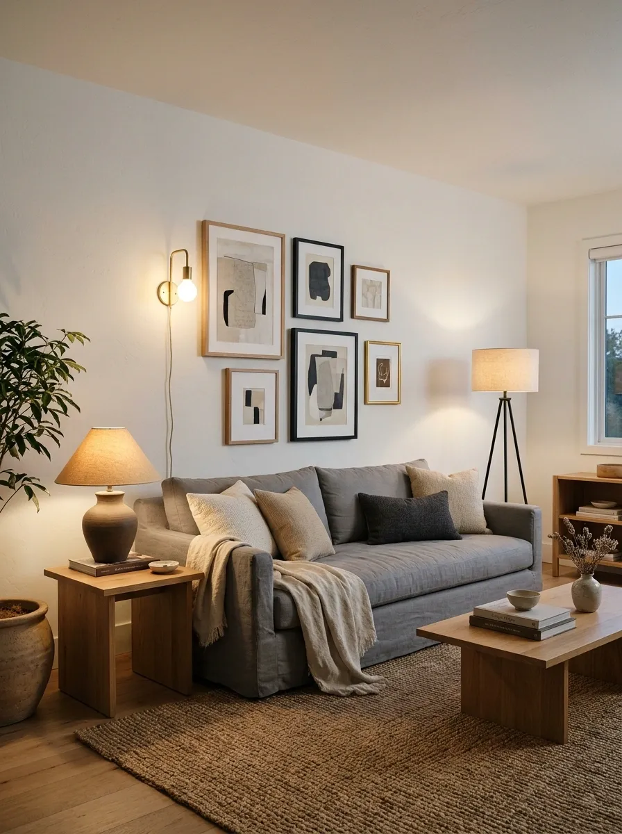
A single harsh ceiling light can make even good furniture look like it’s waiting for interrogation. A better arrangement uses several softer light sources at different heights.
Place a floor lamp beside the sofa, a table lamp on a side table, and a plug-in wall light near artwork or a reading chair. Warm white bulbs help keep the room visually consistent.
The finished look works because each area has its own purpose, but the light sources still feel connected. Linen shades, warm timber, and muted upholstery create a considered composition without needing to touch the wiring.
Keep cords away from walkways, use compatible bulbs, and choose stable lamps. Nobody needs a relaxing living room that comes with an accidental trip hazard.
Give each light a job instead of making one bulb do all the emotional labor.
Soft general lighting around the seating area.
Focused light for reading and everyday activities.
Extra depth around artwork or a reading corner.
A Removable Wallpaper Wall That Connects the Whole Living Room
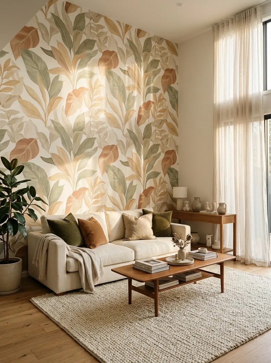
Removable wallpaper earns its place when it gives a room a clear visual anchor. A muted botanical print behind the sofa, for example, can connect a cream rug, warm timber furniture, and olive or rust-colored cushions.
The remaining walls should stay relatively quiet so the pattern has room to breathe. A tiny, busy print can make a small room feel restless, while an oversized pattern may compete with furniture and artwork.
Choose the wallpaper after considering the sofa, curtains, and existing floor color. The finished room should have a coherent palette, not six separate ideas fighting for the same wall.
Before committing to an entire wall, check the manufacturer’s requirements and test the product only as directed. Adhesives can damage paint or fail on textured, damp, or unsuitable surfaces. Renter-friendly doesn’t automatically mean damage-free.
The pattern leads. Everything else knows when to stop talking.
Quiet everywhere else.
Full-Length Curtains That Give a Rental Room Better Proportions
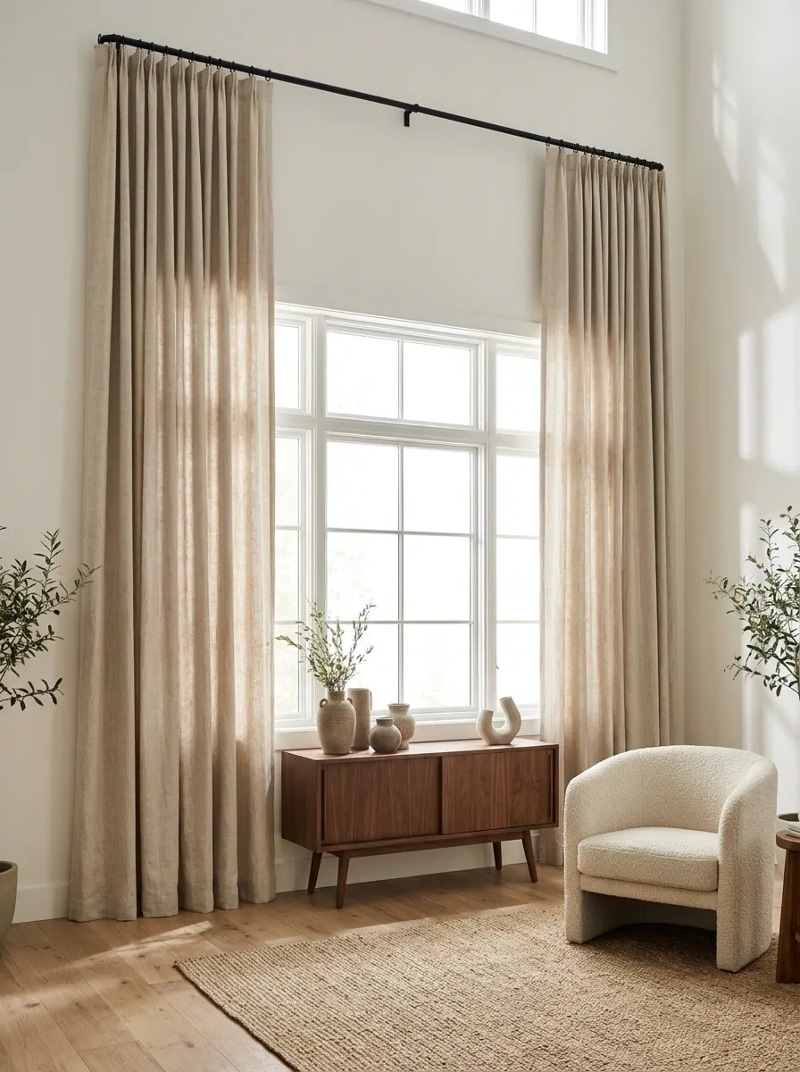
Short curtains hung directly above a window can make the whole wall look oddly compressed. Full-length curtains hung higher, where the architecture and lease allow, draw the eye upward and give the window a more deliberate frame.
Soft linen-look panels in ivory, oatmeal, or muted taupe work with plenty of interior styles without competing with the furniture. The rod should extend far enough beyond the window for the panels to sit mostly clear of the glass when open.
The hem should finish close to the floor without dragging, and the curtain fullness should suit the window’s width. These details make a surprisingly big difference to the finished arrangement.
Where drilling isn’t permitted, a properly rated no-drill system may work depending on the window and curtains. Check its weight limits and fit rather than assuming every solution works everywhere.
Where permitted, position the rod closer to the ceiling than the window frame.
Let the panels sit outside most of the glass when open.
Keep fabric clear of heaters, damp floors, and walking paths.
A Properly Scaled Gallery Wall Above the Sofa
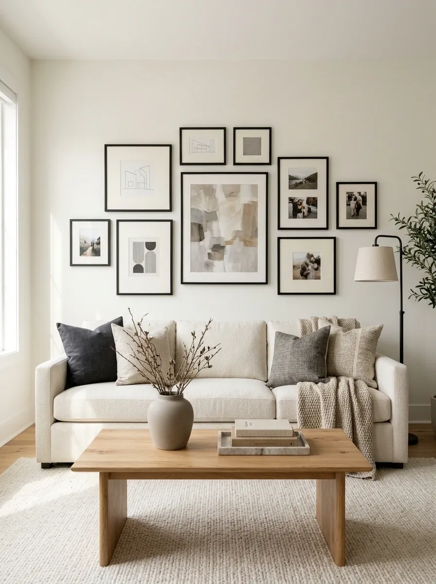
A gallery wall can make a rental feel personal without requiring an expensive collection of original art. A mix of abstract prints, architectural sketches, and personal photographs creates character when the frames share a common finish or the artwork follows a restrained palette.
Black frames feel crisp and graphic. Light wood gives the arrangement a softer, more natural character. A single large piece paired with smaller works can feel collected over time, while a tighter grid looks more formal.
The full grouping should relate to the sofa below rather than floating awkwardly in the middle of a large wall. Plan the complete arrangement before hanging anything.
Use approved hanging methods that suit the wall surface and support the combined weight. Lightweight frames may work with compatible removable hooks, but heavier artwork needs a properly rated mounting solution. A damaged wall is a terrible price for a poster of a beige blob.
drawing
Repeat a frame finish, color family, or visual theme.
Plan the artwork grouping against the sofa width before hanging anything.
A Reworked Living Room Layout With Clear Walking Space
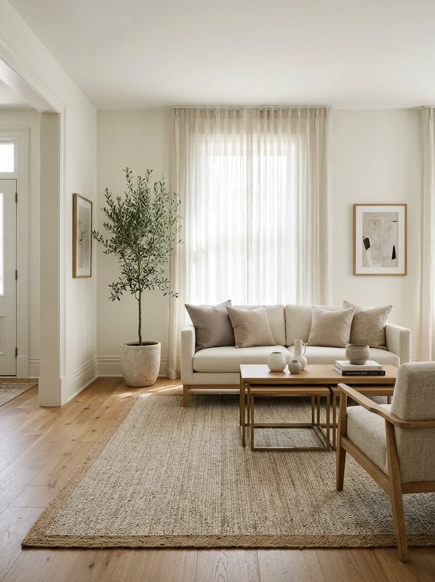
Sometimes a living room doesn’t need more decor. It needs the furniture to stop behaving like it arrived in separate moving trucks and refused to speak afterward.
A compact sofa, a properly sized area rug, and nesting tables can create a defined seating zone without consuming every usable inch. When space allows, moving the sofa slightly away from the wall can make the arrangement feel more intentional.
In a particularly narrow room, preserving a clear walkway matters more than following a styling trend. Choose a rug large enough to connect the major seating pieces visually, while leaving space for doors and drawers to open.
The best layout makes the room easier to use while looking like everything belongs together. Revolutionary concept, apparently.
An illustrative top view of a compact seating zone.
Illustrative layout only. Measure the room, doors, furniture, and walking routes before rearranging.
A Rental Kitchen With a Coordinated Countertop Styling
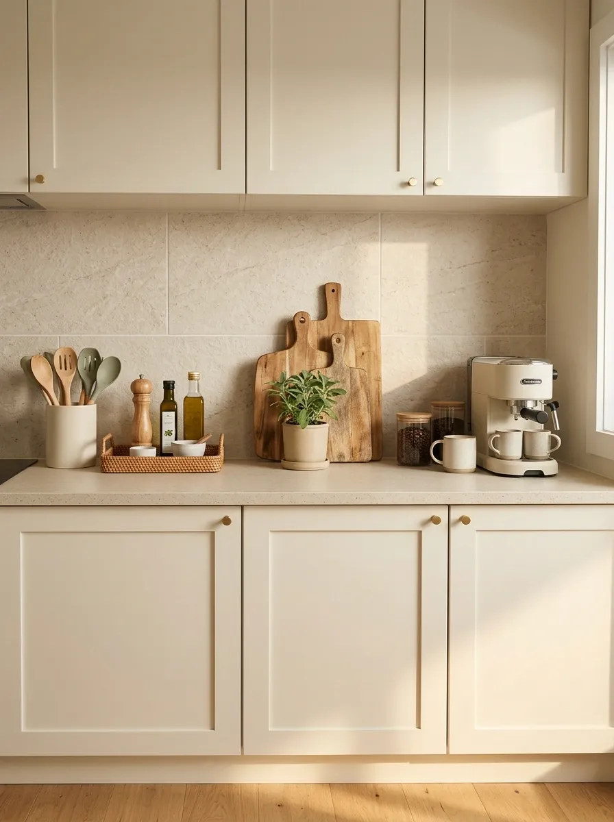
Rental kitchens can have perfectly functional cabinets and countertops while still looking like the landlord selected every finish during a five-minute lunch break. A compatible backsplash and coordinated countertop arrangement can make the space feel more intentional without replacing the existing kitchen.
A subtle stone-look backsplash, warm wooden accessories, and a small coffee station create a natural starting point. Keep the backsplash pattern connected to the countertop rather than introducing another competing finish.
A wooden chopping board, a ceramic utensil holder, and a restrained collection of everyday items give the counter some personality without turning it into a storage unit with delusions of grandeur.
The trick is choosing materials that suit the actual surface and conditions. Peel-and-stick products aren’t automatically suitable near a stove, sink, or damp wall. Check heat restrictions, moisture exposure, cleaning requirements, and the manufacturer’s installation instructions.
Let the main finishes do the work. The countertop doesn’t need seventeen decorative objects holding a meeting.
utensil crock
chopping board
ceramics
Items used daily, useful accessories, and a clear preparation surface.
Duplicate utensils, rarely used appliances, packaging, and anything crowding the work area.
A Color-Coordinated Kitchen Cabinet Refresh
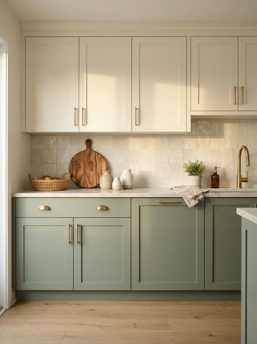
Changing the appearance of tired cabinets can make a rental kitchen feel noticeably different, especially when the existing layout is perfectly usable. Muted sage, a pale countertop, and warm timber accessories create a softer look than a kitchen filled with mismatched colors and competing finishes.
The finished design should still respect the original kitchen. Existing white cabinets may work better with warmer accessories than with a dramatic color change, while darker cabinets can benefit from lighter textiles and a brighter countertop arrangement.
The surrounding finishes determine which direction makes sense. Compare potential colors with the countertop, flooring, backsplash, and fixed appliances before committing.
Removable cabinet film requires particular care. Adhesive can lift paint, damage delicate finishes, or leave residue even when a product is marketed as renter-friendly. Check the lease, manufacturer guidance, and testing requirements before installation.
A pretty color cannot negotiate with peeling paint, incompatible adhesive, or landlord restrictions.
Muted sage, warm ivory, and natural oak create a coordinated palette.
A Small Kitchen Organized Around a Dedicated Prep Zone
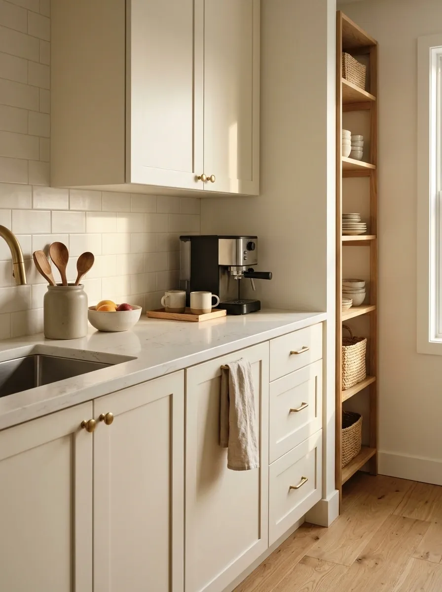
A kitchen doesn’t need more cupboards to function better. Sometimes the problem is that the toaster, coffee machine, utensil jar, fruit bowl, and miscellaneous items have collectively claimed every available inch of counter space.
A well-organized compact kitchen gives each activity a defined place. Keep a clear surface for food preparation, group cooking utensils close to the cooking area, and create a small coffee station where appliances can stay together.
A narrow freestanding shelf can hold items that don’t need to occupy the counter, provided it doesn’t obstruct access or create a safety hazard. Wood, ceramic, and a restrained color palette keep the storage practical without making the room look like a supply cupboard with good lighting.
The design feels finished because the organization follows how the kitchen is actually used.
The counter reset begins with moving items to the places where they’re actually used.
A Coordinated Bathroom Built Around Matching Textiles and Accessories
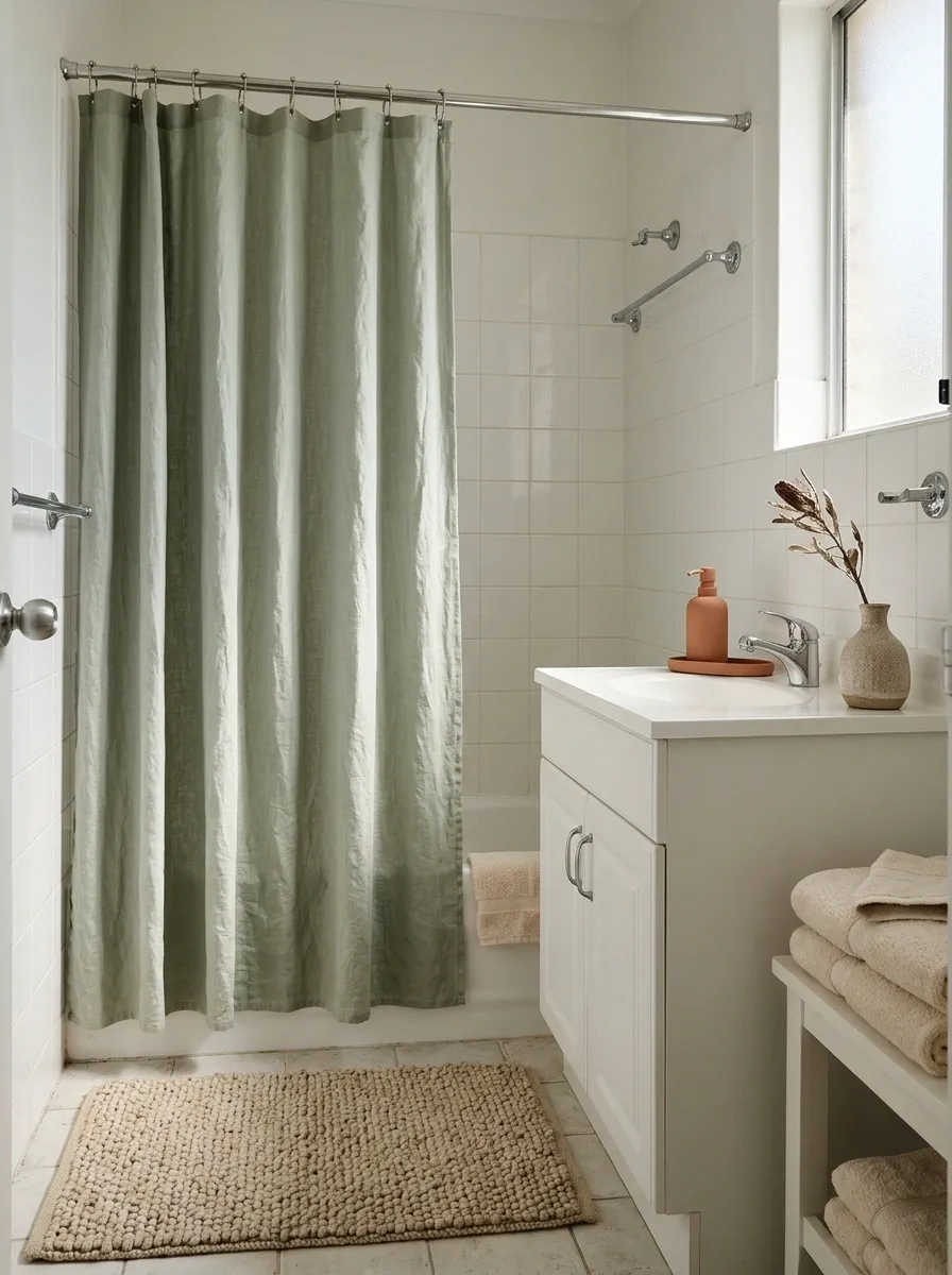
Rental bathrooms often arrive with fixed finishes that aren’t going anywhere. White tiles, a basic vanity, and an uninspiring mirror may not be especially exciting, but they provide a neutral foundation for a more considered look.
A coordinated shower curtain, matching towels, a textured bath mat, and a few simple countertop accessories can make the room feel connected. Soft sage and ivory work well with white fixtures, while terracotta and sand tones can bring out the warmth in beige tiles.
The key is repeating a small set of colors instead of buying every accessory in a different shade because it looked good in isolation. Keep everyday products contained and leave the vanity sufficiently clear for actual use.
Bathroom accessories also need to tolerate humidity and regular cleaning. Materials matter as much as appearance, because a pretty basket that falls apart in damp conditions isn’t doing anyone a favor.
sage
Choose one leading textile color, one quiet neutral, and one smaller accent. The bathroom doesn’t need an entirely new personality every time a hand towel goes on sale.
A Small Bathroom With Vertical Storage and Clear Counter Space
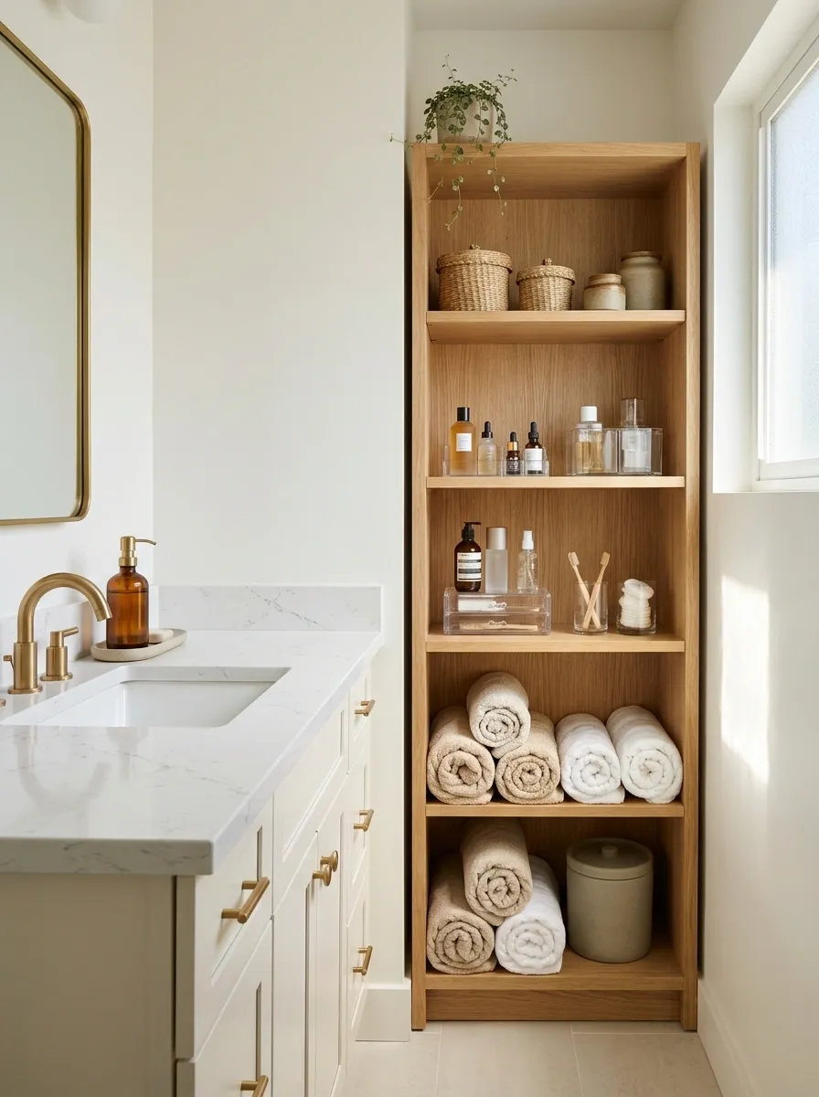
A small bathroom can feel cluttered long before it runs out of storage. Toothbrushes, skincare products, hair tools, spare toilet paper, and cleaning supplies tend to occupy whatever surface happens to be available.
The resulting countertop looks less like a bathroom and more like an abandoned cosmetics department. A better arrangement combines a clear vanity with vertical or freestanding storage.
A narrow shelving unit, compact baskets, and a dedicated place for towels can make the room easier to maintain. Daily essentials should remain accessible, while backups and occasional-use products belong in less prominent storage.
Measure before adding furniture. Check door swings, plumbing access, ventilation, and the stability of tall shelves. Storage should make the room easier to navigate, not introduce a new obstacle beside the toilet.
Put frequently used products within reach and move backups out of the way.
Otherwise, the new shelf becomes another place for clutter to acquire a mortgage.
A Finished Bedroom Built Around a Freestanding Upholstered Headboard
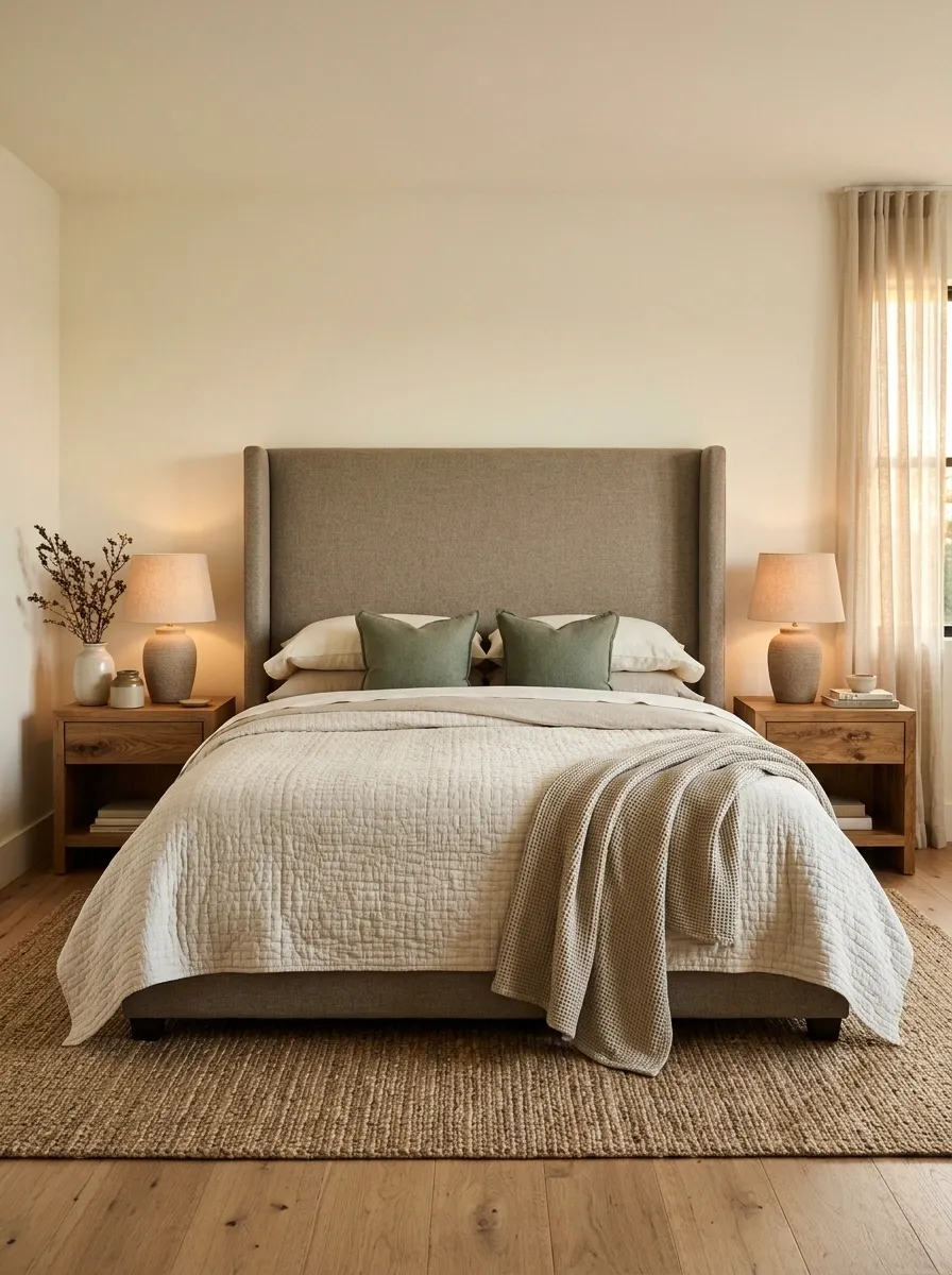
A bedroom can have perfectly decent furniture and still look unfinished when the bed, lighting, curtains, and bedding all seem to belong to different households. An upholstered headboard gives the composition a clear focal point without requiring permanent changes to the wall.
A warm beige or muted taupe headboard works well with ivory bedding, timber bedside tables, and soft lampshades. Layering a quilt over crisp sheets adds texture, while a restrained accent color in the cushions ties the arrangement together.
Matching bedside tables create symmetry, but a single table paired with a floor lamp can feel more natural in a smaller room. The headboard should suit the width of the bed and leave enough space for comfortable movement.
Freestanding designs can be particularly useful in rentals, provided they remain stable and don’t interfere with doors or bedside access. No need to sacrifice half the walking space for a headboard with main character syndrome.
Give the bed a focal point, then let the surrounding pieces support it.
A Bedroom With a Soft Patterned Feature Wall
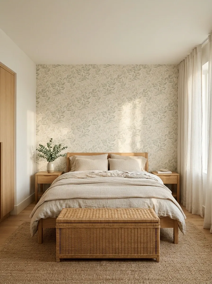
A bedroom feature wall works best when the pattern adds character without making the bed feel like it’s competing in a design talent show. A muted botanical print, subtle geometric design, or restrained vintage pattern can give the bed wall more depth while leaving the other walls relatively quiet.
Combine the patterned surface with plain bedding, natural timber furniture, and simple curtains. If the wallpaper contains sage green, repeat that color in one or two smaller accessories rather than matching every object in the room.
The finished design should feel connected to the existing floor color and natural light. Removable wallpaper may suit some rental walls, but surface compatibility and removal risks still need checking before installation. A beautifully patterned wall that takes the paint with it is a fairly expensive plot twist.
Busy wall, quieter bedding. Fine pattern, simple furniture. Let the materials complement each other instead of fighting for attention.
A Compact Home Office With a Defined Work Zone
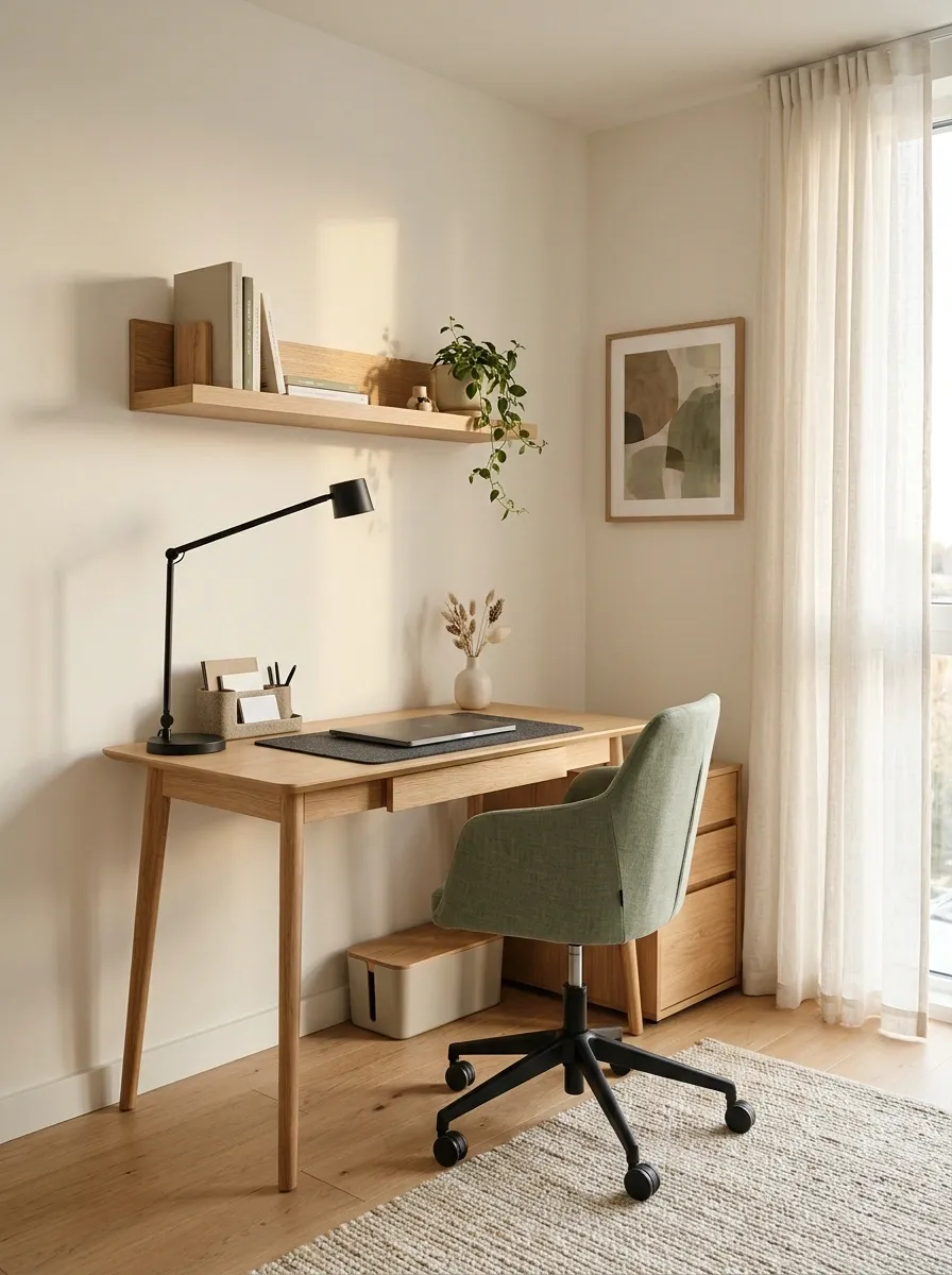
A desk wedged into a spare corner doesn’t automatically qualify as a home office. If cables cover the floor, paperwork occupies the chair, and the desk lamp is hiding behind a pile of chargers, the setup needs an actual layout.
A compact desk near a window can form the center of a functional workspace. Pair it with a supportive chair, task lighting, a slim shelf or drawer unit, and a small cable-management solution.
A consistent palette of light wood, warm white, and muted green keeps the workspace visually connected to the rest of the apartment. Keep frequently used equipment within reach, store occasional-use items elsewhere, and make sure the chair can move freely.
The room doesn’t need a corporate headquarters makeover. It just needs somewhere to complete a task without first relocating six unrelated objects.
Organize the workspace around how the equipment is used, not how many accessories fit in an online shopping cart.
An Entryway That Combines a Landing Spot With Shoe Storage
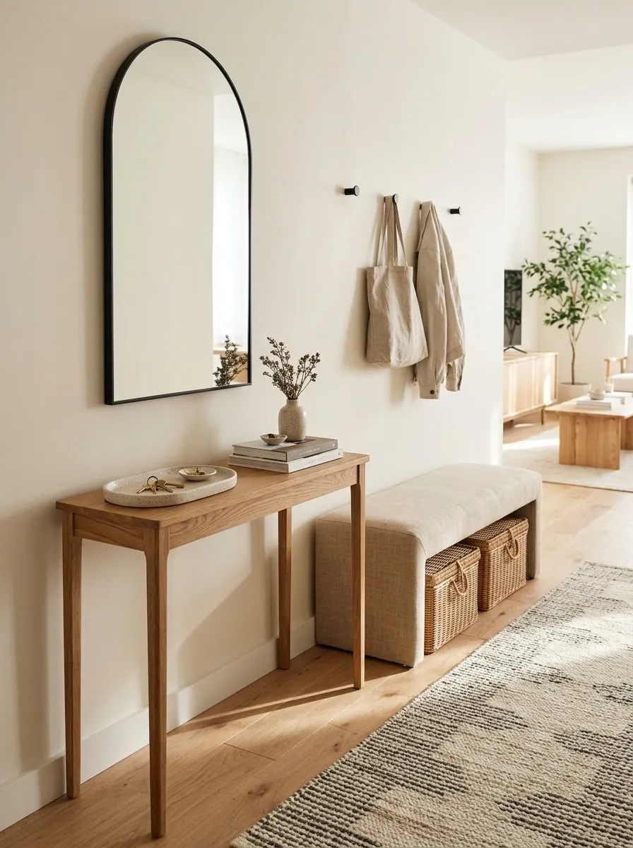
A small entrance has to handle a surprising amount of daily chaos. Keys, bags, shoes, mail, umbrellas, and jackets all need somewhere to go, preferably somewhere other than the nearest chair.
A narrow console table or slim bench can establish a practical landing area. Add a mirror to reflect light, a small tray for keys, and contained shoe storage beneath or beside the furniture.
A runner can visually connect the entrance with the adjoining space, while a consistent wood finish and restrained accessories keep the arrangement from feeling cramped. The result should be welcoming without sacrificing space.
Measure the entry before selecting furniture. Door swings, cupboard access, and the route into the living area must remain clear. In a tight hallway, a compact freestanding alternative may be safer than wall-mounted pieces requiring permission and suitable fixings.
Keep furniture and shoes out of the walking path. Tripping over a decorative basket is not the entrance experience anyone requested.
A Defined Dining Nook With Its Own Lighting and Color Palette
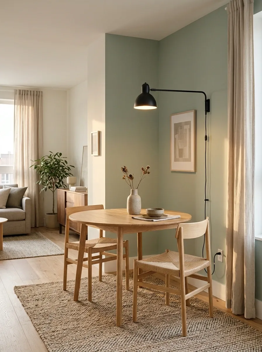
A dining table pushed against a wall can feel like an afterthought, especially in an open-plan apartment where the living room, kitchen, and dining area are competing for attention. A coherent dining nook gives the table its own identity without requiring a partition or renovation.
A compact round table softens a tight corner, while a rectangular table can make better use of a narrow room. Pair it with chairs that fit comfortably beneath the tabletop, a simple centerpiece, and a suitable plug-in lamp or approved lighting solution.
A rug can help define the area when there’s enough clearance to move chairs without catching the edges. Materials that relate to the adjoining space, such as timber that repeats the living room furniture, keep the rooms connected.
The dining area should feel like part of the home, not like an entirely different apartment rented the same address.
A dining setup needs room for furniture and the people using it.
table
Useful in compact corners where avoiding sharp corners helps with movement.
Useful along a wall or in a narrow dining space with a longer footprint.
Illustrative plan, not to scale. Measure chair pullback, nearby doors, and circulation space before choosing furniture.
A Rental Living Room With a Freestanding Art and Plant Arrangement
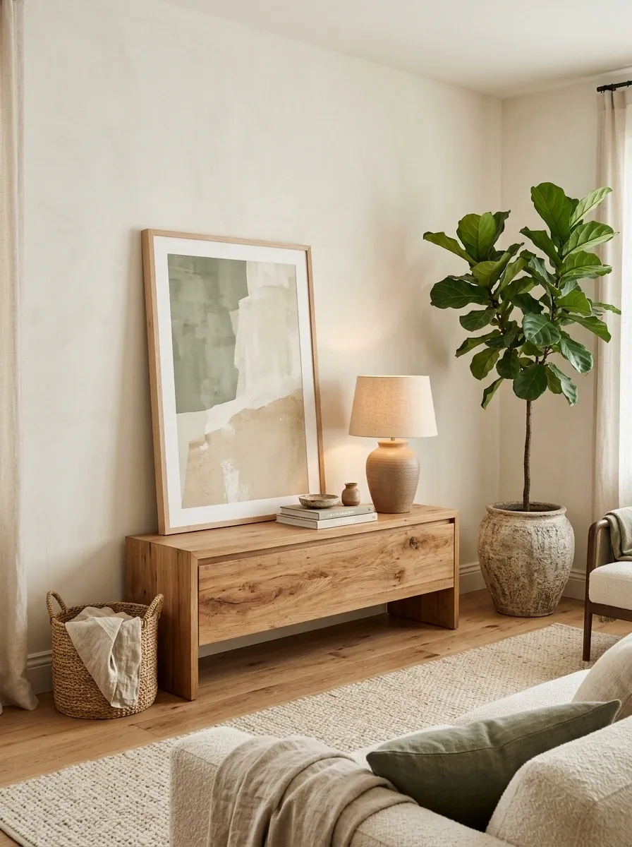
Bare walls have a way of making a furnished living room feel strangely temporary. A freestanding artwork arrangement and a well-placed plant can give the space a focal point without turning the walls into a landlord permission negotiation.
A large framed print leaning securely on a low console, a leafy floor plant, and a warm table lamp create a layered composition with very little visual clutter. Natural timber, cream upholstery, and a muted green accent tie the arrangement together.
Scale matters here. Small frames scattered across a large wall can look lost, while an oversized piece can overwhelm a narrow console. Choose a stable display arrangement, secure tall furniture or artwork against tipping where necessary, and keep the plant clear of walkways.
A leaning frame should look intentional, not like it narrowly survived moving day.
The pieces should feel connected in scale without becoming a matching set.
Keep leaning frames stable and out of walking routes. Freestanding does not mean immune to gravity.
A Studio Apartment With Clearly Defined Living and Dining Areas
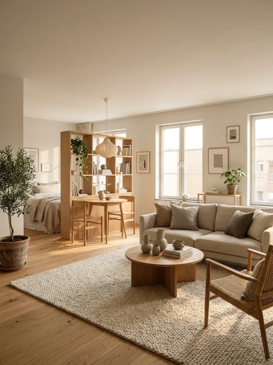
Studio apartments have one recurring design problem: the bed, sofa, dining table, and work area can end up looking like they all applied for the same square footage.
Without some visual structure, the entire apartment becomes one big room with several unrelated furniture decisions. A large area rug can anchor the seating zone, while a compact dining table establishes a separate area nearby.
A suitably sized open bookcase can provide additional separation without blocking all the light, provided it is stable and positioned safely. Repeating timber finishes and a restrained color palette keeps the zones connected even though they serve different purposes.
Preserve clear routes between the entrance, kitchen, sleeping area, and windows. A studio should feel like several useful areas sharing a room, not a furniture obstacle course with rent attached.
Use furniture groupings to establish boundaries without building walls.
ZONE
ZONE
Illustrative plan only. Actual furniture sizes, doors, windows, and circulation routes determine the final arrangement.
An Unused Corner Turned Into a Reading Nook
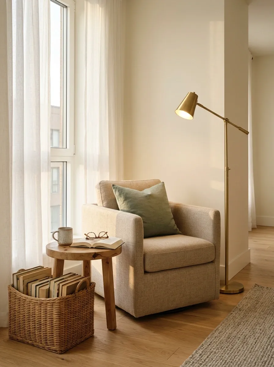
That empty corner beside the window doesn’t need another decorative object whose only job is to collect dust. With the right proportions, it can become a proper reading nook with a comfortable chair, a small side table, useful lighting, and somewhere to store a few books.
A compact upholstered chair in a warm neutral fabric works well with a timber side table and an adjustable floor lamp. Add a small bookshelf if the footprint allows, or use a single basket for the books currently being read.
A muted green cushion or textured throw can connect the nook to the surrounding room without making it look like a separate decorating project. The chair should fit without blocking curtains, drawers, or the natural route through the room.
Reading light needs to reach the page without shining directly into the reader’s eyes. Otherwise, the only thing getting read is the electricity bill.
A book, reading glasses, and a drink on a stable surface.
The walkway, window access, curtains, and the space around the chair.
A Laundry Area With Freestanding Storage and a Sorting Station
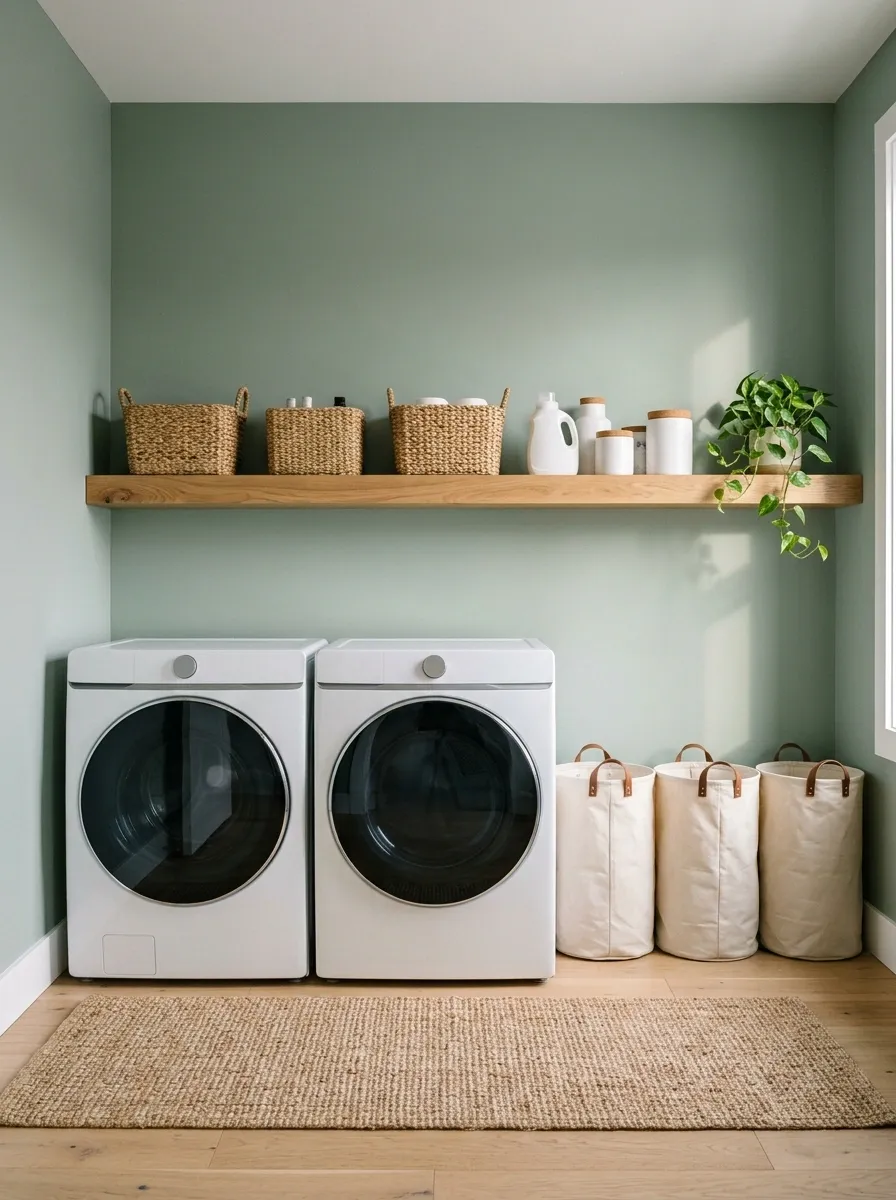
Laundry areas rarely get much design attention, which is understandable until detergent bottles, overflowing hampers, and clean clothes begin competing for the same square foot. A compact storage arrangement can make the space look better while also making laundry less chaotic.
A freestanding shelf above or beside the machines, where safe and permitted, can hold detergent and cleaning supplies in contained baskets. Separate hampers for lights, darks, or delicate items make sorting easier, while a folding surface can help if there is enough clearance.
Keep appliance controls, lint filters, ventilation openings, and service access unobstructed. A limited palette of white, natural wood, and muted sage makes assorted laundry supplies look less visually noisy.
Matching containers can help, but decanting products is not essential. The real upgrade is giving everything a sensible place rather than purchasing seventeen labels and calling it an organizational system.
Arrange the area around the order in which the work happens.
A Rental Balcony Arranged as a Compact Outdoor Lounge
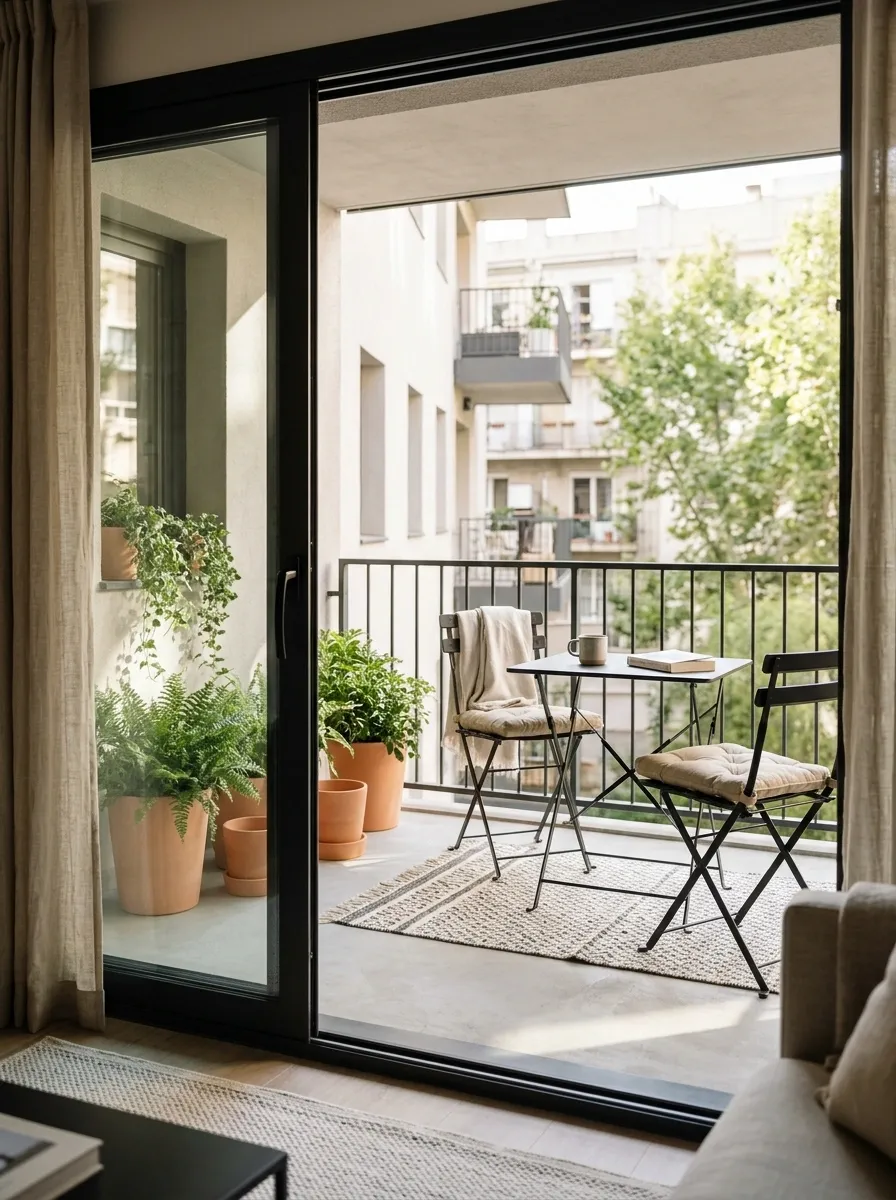
A rental balcony can become a genuinely useful extension of the apartment, even when there’s barely room for two chairs. The trick is choosing outdoor furniture that fits the available footprint rather than treating the balcony as a showroom for everything that looked good online.
A compact bistro table and two folding chairs create a place for morning coffee or an evening break. Weather-resistant cushions, a small outdoor rug where suitable, and a few appropriately sized pots bring texture into the arrangement.
Repeating one or two colors from the interior helps the balcony feel connected to the home. The seating should still leave the door, drainage, and walking route unobstructed.
Measure the floor area and door clearance before shopping. Respect building rules, avoid attaching planters or lighting to railings without approval, and secure lightweight items against wind. The goal is an inviting balcony, not a chair that makes an unscheduled departure.
A simple layout keeps seating usable and access unobstructed.
CHAIR
CHAIR
Illustrative arrangement, not to scale. Check building rules, wind exposure, drainage, and furniture dimensions before placing items.
A Bright Rental Living Room With More Window Privacy
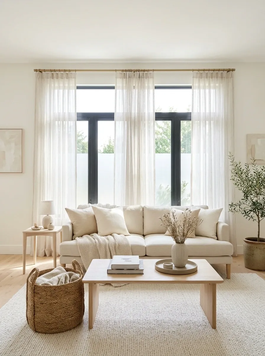
Large windows can make a small apartment feel open and bright, but they can also leave the sofa, dining table, and entire evening routine on display for anyone passing outside. Privacy doesn’t have to mean permanently closing heavy curtains and living in perpetual indoor sunset.
A combination of light-filtering curtains and compatible removable privacy film can provide different levels of coverage. Sheer panels soften the window during the day, while suitable privacy film can obscure the view through compatible glazing.
Keep the rest of the room light with neutral upholstery, pale timber, and a restrained palette that doesn’t compete with the daylight. The result feels open without leaving the entire living room on display.
Privacy films vary considerably. Some provide limited daytime obscurity, while others offer different levels of light transmission. Reflective films should not be treated as reliable nighttime privacy when the interior is brighter than the exterior. Check glazing compatibility and the lease before application.
Different window treatments solve different problems. Combining them can provide more flexibility.
Soften daylight and reduce direct views when the panels are closed.
Can obscure suitable glazing, depending on the film and lighting conditions.
When lights are on indoors, suitable opaque window coverings may still be needed. Daytime privacy film does not necessarily provide the same coverage after dark.
A Rental Interior Unified by Matching Small-Scale Finishes
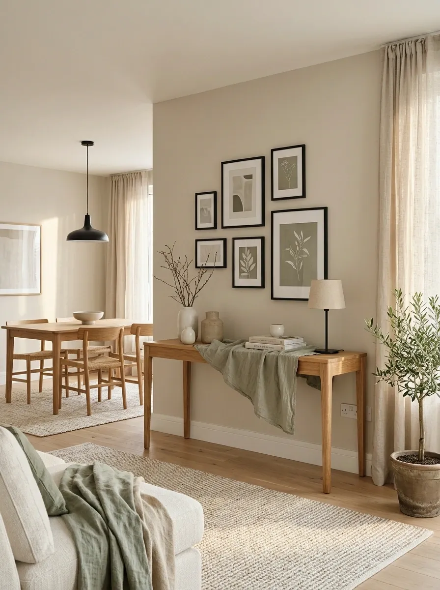
Sometimes a rental looks mismatched not because anything is especially ugly, but because every room contains a different collection of metal finishes, wood tones, and accessory colors. One silver lamp, a gold tray, black frames, orange-toned furniture, and three unrelated shades of beige can make the whole place feel disconnected.
A more coherent approach is to repeat a small selection of finishes across different areas. Warm timber might appear in the living room console, dining chairs, and bedroom bedside tables. Matte black details can connect picture frames and lamp bases, while ivory and muted sage recur in textiles.
This repetition helps the rooms feel related without requiring all the furniture to match. The fixed finishes can remain as they are while smaller movable items create a consistent visual language.
No need to replace every handle in the apartment just because one kitchen drawer is having an identity crisis.
A few shared finishes can connect rooms with very different functions.
Repeats warmth across large furniture pieces.
Connects frames, lamp bases, and small accents.
Carries a consistent color into textiles and accessories.
An Awkward Alcove Used for Freestanding Storage and Display
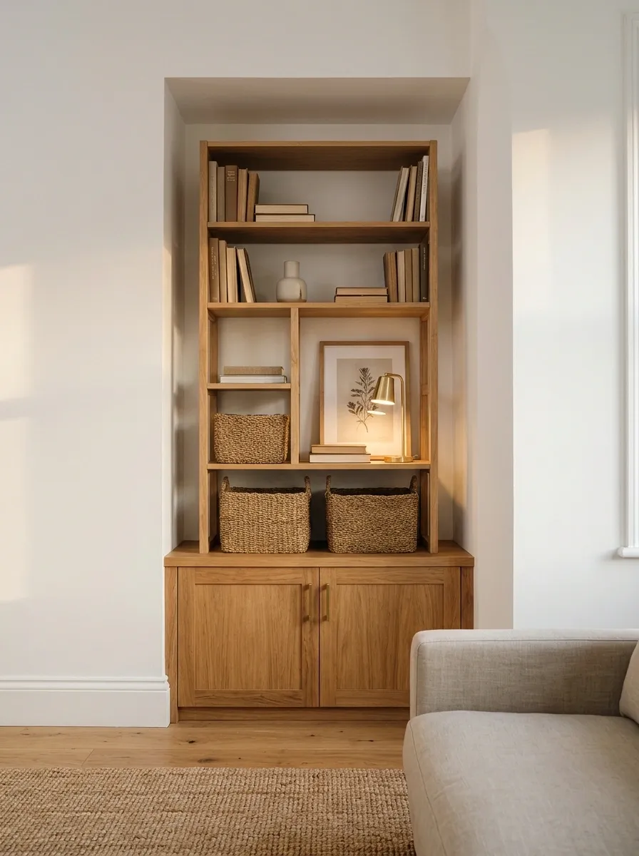
Odd alcoves can be frustrating because they’re often too shallow for standard furniture and too visible to ignore. Leaving one empty may waste useful space, but filling it with a random collection of small objects doesn’t exactly improve the architecture.
A low cabinet or appropriately sized freestanding shelf can turn the alcove into a useful storage and display area. Combine closed baskets for everyday clutter with a limited selection of books, framed artwork, or a small lamp.
Timber and warm neutral finishes work well when the surrounding room already contains similar materials. A darker cabinet can give a deep recess a more deliberate focal point.
Measure the alcove at several points because older walls and corners aren’t always perfectly square. Check skirting boards, outlets, doors, ventilation, and access to services before choosing furniture. Tall units should be secured appropriately where required, with landlord permission and suitable fixings.
The most useful alcove arrangement starts with the dimensions, not the accessories.
A Whole-Rental Refresh With One Consistent Color and Material Story
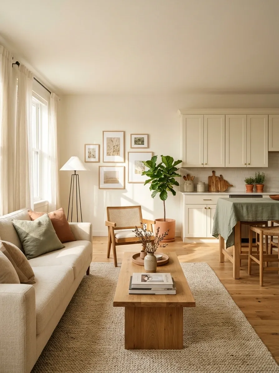
A rental starts to feel genuinely finished when its rooms relate to one another, even if the furniture was collected gradually and the existing finishes cannot be changed. A consistent material and color story can connect the living room, bedroom, kitchen, and entryway without making the entire apartment look like a matching furniture set.
A warm ivory base, natural timber, muted sage, and restrained terracotta accents create a flexible palette. Timber can repeat across side tables and dining chairs, while sage appears in cushions, towels, or small accessories.
Different rooms can still have their own identities through patterns, textures, and furniture arrangements. The important thing is to repeat a few choices consistently rather than force every room into exactly the same look.
Start with the largest existing finish that cannot be changed, such as the flooring, countertop, or kitchen cabinets. Build around that instead of buying new accessories and hoping they negotiate a peace treaty with the rest of the room.
A repeatable palette makes separate spaces feel related without making them identical.
Flooring, countertops, fixed cabinetry, and existing fixtures establish the starting point. Textiles, movable lighting, artwork, and accessories bring the remaining rooms together.
Make the Rental Feel Finished Without Overcomplicating It
A rental doesn’t need a dramatic renovation to feel personal. Often, the biggest improvements come from solving a few everyday problems and making the rest of the room work around those changes.
Start with the area that feels least functional or looks most unfinished. Measure the space, work with the finishes already there, and check the lease before making changes that could affect the property.
Choose upgrades that suit everyday life, not just the camera angle. A comfortable home should look good in photographs and still function when dinner is cooking, laundry is waiting, and the keys have once again disappeared.