
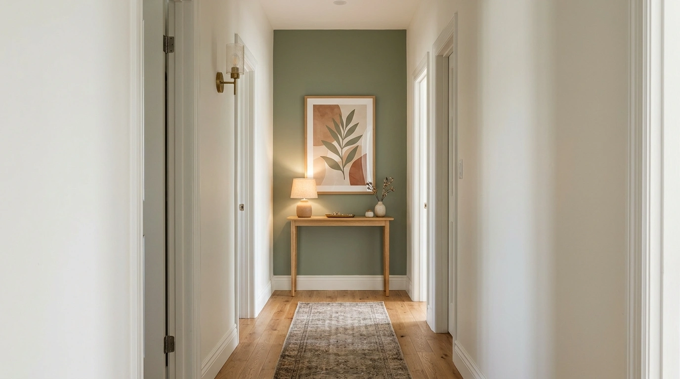
That hallway can have gorgeous floors, good lighting, and paint colors that deserve their own fan club, yet the blank wall at the very end still manages to ruin the whole thing. It’s giving unfinished rental listing, even when the rest of the house looks expensive.
Some hallways need personality. Others need storage, better lighting, or a focal point that makes the entrance feel complete. The designs below cover all those situations, from collected gallery walls to contemporary architectural features.
Because a blank wall shouldn’t have the power to make an entire hallway look like the decorating budget mysteriously disappeared.
End of Hallway Wall Ideas
A Moody Accent Wall With Playful Accents
Deep olive walls bring instant drama to the end of a narrow hallway, creating a cozy cocoon effect that makes the space feel intentional rather than forgotten. A trio of black-and-white framed prints stacked vertically draws the eye upward, while a sleek brass wall sconce adds a refined layer of ambient light.
Grounding the arrangement with a rustic wooden bench creates a charming vignette without crowding the pathway. A ceramic vase filled with delicate greenery and a woven basket tucked underneath keep the styling functional and effortlessly curated for daily coming and going.
Playful elements like sculptural balloon art introduce a touch of whimsy to the moody backdrop, proving that sophisticated design doesn’t take itself too seriously. The result is a memorable transition space that completely transforms an otherwise ordinary dead end into a delightful architectural feature.
A Warmly Lit Hallway Vignette
A thoughtful lighting strategy turns a straightforward hallway run into an inviting passage filled with warmth and depth. Warm beige walls paired with classic wainscoting provide a soft, neutral envelope, allowing the rich wooden console tables and framed botanical prints to truly shine.
Classic brass wall sconces positioned along the corridor cast a gentle glow that emphasizes the textured runner rug below. The vintage-inspired runner anchors the long walkway, adding a layer of softness underfoot while subtly guiding the eye toward the arched mirror stationed at the far end.
Every decorative element serves a purpose, from the slender table holding a glowing lamp to the lush potted olive tree softening the corner. It is a masterclass in balance, ensuring the journey through the home feels just as considered as the destination rooms.
A Bold Botanical Wallpaper Feature
A vibrant botanical wallpaper bursting with pinks and greens turns a tricky hallway corner into a stunning visual moment. The lush floral pattern brings organic energy right to the end of the passage, perfectly complemented by a sleek black-framed mirror that reflects the light from adjacent spaces.
Layering trailing greenery over the wallpapered surface blurs the line between indoor decor and a secret garden. A contrasting two-tone wall treatment in mustard yellow and crisp white frames the patterned focal point, adding architectural definition and a cheerful color block effect to the stairway approach.
Graphic black-and-white floor tiles complete the look with a dose of pattern play that grounds the exuberant floral walls. It proves that small transitional zones are the absolute best places to take a bold design risk and have a little fun.
A Tall Arched Mirror in a Narrow Hallway
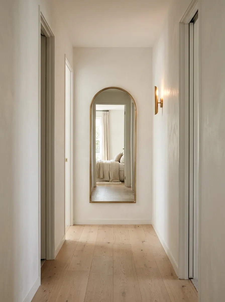
A tall arched mirror softens the hard lines of a narrow hallway while making the end wall feel less flat. Choose a slim black frame for a contemporary interior or warm brass for a traditional setting. A simple wall sconce nearby adds depth, while pale walls and light wood flooring keep the passage visually open.
The reflection matters just as much as the mirror itself. Position it to capture a window, an attractive doorway, or an appealing view into another room. Reflecting a laundry basket and a pile of shoes is technically functional, but perhaps not the reveal the hallway deserves.
Skip the deep console underneath if walking space is already limited. The mirror has enough presence to carry the design without recruiting an entire furniture collection.
Aim the mirror toward a view worth repeating. Keep the frame narrow and the floor area clear.
Arched glass + pale walls + warm wood
A Classic Paneled Hallway Accent
Crisp white wainscoting paired with soft neutral upper walls brings timeless character to a long hallway, giving the transitional space an immediate architectural pedigree. A grand arched mirror positioned at the very end captures light and reflects the classic gallery arrangements lining both sides of the corridor.
A slender dark wood console table topped with glowing pillar candles creates a welcoming focal point that feels both elegant and understated. A potted fern resting on the tabletop introduces a touch of organic texture, keeping the vignette fresh and inviting.
The balanced symmetry of the framed artwork and the clean lines of the white paneling work together to elongate the perspective. It is a sophisticated approach that turns a simple hallway journey into a masterclass in classic, understated design.
A Traditional Picture-Frame Moulding Feature
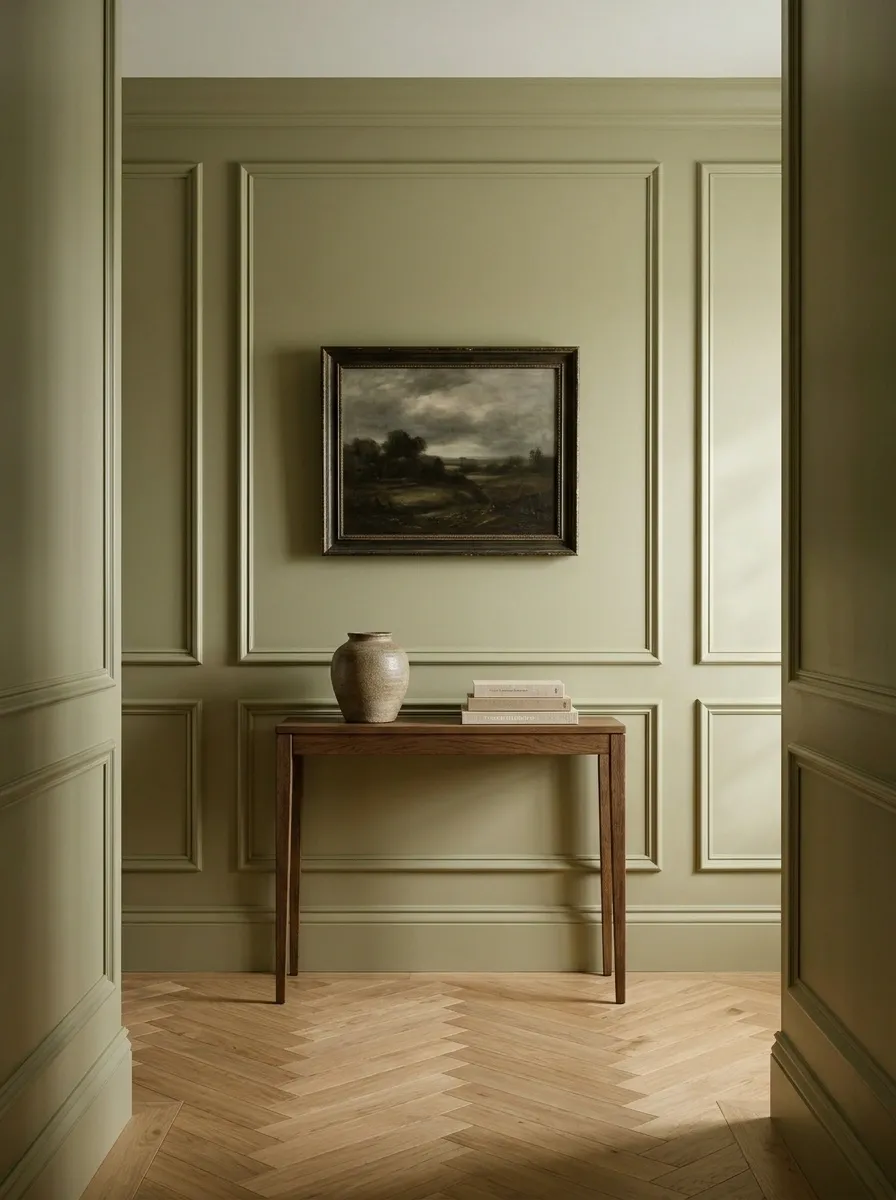
Wall moulding gives an ordinary hallway end the kind of architectural character that doesn’t depend on buying fifteen decorative objects. Rectangular picture-frame panels in muted mushroom, warm greige, or soft olive create depth, while a framed landscape provides the focal point.
The panel layout should relate to the wall’s actual dimensions. A large central panel can hold the artwork, with smaller panels or matching moulding extending the design toward the edges. Keep the trim and wall color closely related for a subtle effect, or introduce gentle contrast for a more defined finish.
The key is restraint. Ornate moulding, dramatic wallpaper, an elaborate mirror, and several sconces don’t all need to compete. Let the architecture do its job.
Creates a home for the artwork.
Carry the architectural rhythm outward.
Keeps the detailing elegant, not noisy.
A Dramatic Jewel-Toned Gallery Hallway
Deep jewel tones wrap this hallway in effortless luxury, featuring rich navy and plum walls that create an intensely moody and sophisticated atmosphere. A tall window at the far end floods the space with natural light, filtered gently through emerald green velvet curtains that puddle gracefully on the floor.
Opposing console tables anchor the passage, layered with statement lamps, vibrant floral arrangements, and eclectic art pieces including a striking abstract canvas in bold pink and teal. The contrasting furniture styles add an element of collected charm to the dramatic backdrop.
Stacked vintage runner rugs in earthy reds and blues soften the rich hardwood floors while visually extending the length of the dramatic corridor. It is an unapologetically bold design choice that proves hallways deserve just as much personality and theatrical flair as the primary living spaces.
A Slim Console Table With Layered Artwork
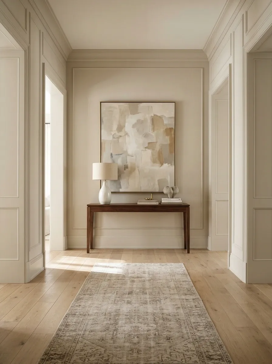
A slim console turns the end of a wider hallway into a proper little vignette. A light oak or walnut table sits beneath a substantial framed painting, with a ceramic lamp on one side and a low stack of books or a small sculptural vessel on the other. Warm walls and restrained accessories connect the arrangement to the adjoining rooms.
Asymmetry keeps the tabletop from looking like a furniture catalogue display. The lamp provides height, the artwork anchors the wall, and the smaller objects create a sense of scale. Every piece has a role, which is more than can be said for the decorative orb that has been moved around the house six times.
Choose a shallow console and check the remaining walkway before committing. The final wall should feel welcoming, not like a surprise obstacle course.
One substantial artwork On top
One tall object, one low object Below
Clear floor and easy passage
A Soft Botanical Mural Across the End Wall
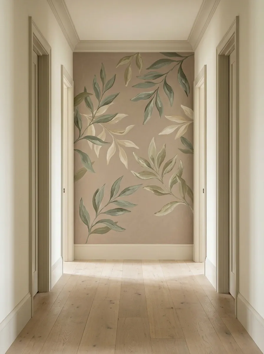
A botanical mural gives the hallway a focal point that feels more like a piece of architecture than another item hung on the wall. Oversized leafy branches in dusty green, muted olive, and warm cream create movement across the back wall, while pale oak flooring and simple trim keep the pattern from taking over.
The strongest versions use large-scale foliage with plenty of breathing room. Tiny repeating leaves can make a narrow corridor feel visually busy, which is not exactly the relaxing first impression most homes are after.
Keep the adjoining walls quiet, especially if the hallway already has patterned flooring or several doorways. The mural should be the main event, not the latest contestant in a decorating competition.
A Color-Drenched Hallway With a Contrasting End Wall
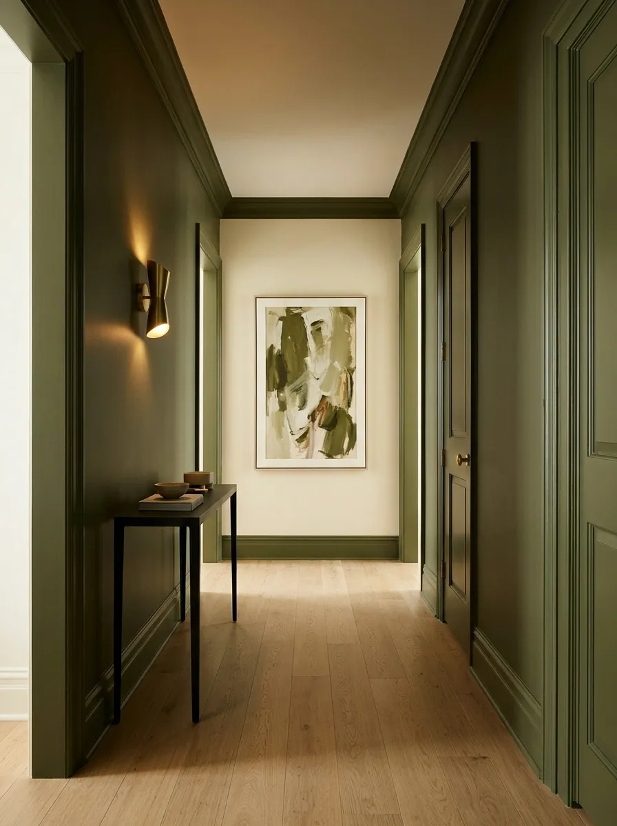
A color-drenched hallway makes the back wall feel like a deliberate destination. Deep olive, smoky teal, or muted burgundy can run along the side walls and trim, while the end wall shifts to a related lighter shade. A framed artwork or sculptural wall light supplies the finishing detail without breaking up the color scheme.
Olive with warm cream feels grounded and traditional. Smoky teal with a dusty blue end wall has a moodier, more contemporary character. Burgundy paired with pale rose creates a richer, more unexpected result.
The trick is treating the colors as one connected composition. Randomly painting the back wall a completely unrelated shade can look less like a design decision and more like a leftover paint emergency.
A Built-In Bookcase at the End of the Hall
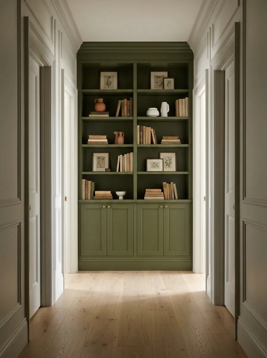
A built-in bookcase turns the end wall into something useful without sacrificing its visual impact. Picture fitted cabinetry painted in deep olive, warm gray, or creamy white, with books arranged beside a few sculptural ceramics and framed prints. A closed cupboard at the bottom hides less photogenic essentials, because not every household possession needs to become part of the decor.
The shelving should suit the hallway rather than borrow the proportions of a grand library. Shallow shelves work well for paperbacks and small display objects, while deeper shelving needs enough remaining floor space to keep the passage comfortable.
Painted cabinetry that matches the surrounding walls creates a seamless architectural effect. Contrasting timber shelves bring warmth. Either direction works, provided the shelves don’t protrude so far that walking past them becomes an extreme sport.
Books and selected objects
Artwork and ceramics
The household clutter department
An Architectural Wall Niche With Integrated Lighting
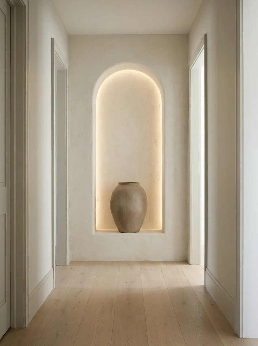
A recessed wall niche makes the hallway feel considered from the moment someone enters it. The opening can be a clean rectangle or a soft arch, finished in textured plaster, stone-look material, or a contrasting paint color. One ceramic sculpture or carefully shaped vessel sits inside, highlighted by discreet integrated lighting.
This design is especially effective when the niche is incorporated into the wall during a renovation. It provides depth without bringing furniture into the walkway. In an existing home, a shallow decorative recess can sometimes achieve a similar effect, depending on the wall construction and available space.
Lighting deserves proper attention here. Concealed illumination should reveal the object’s texture rather than blast it with harsh light. One sculptural object with good lighting has more impact than a collection of tiny knickknacks fighting for their lives on the same shelf.
Creates shadow and architectural depth.
Reveals the object’s outline and texture.
Keeps the niche from becoming a storage shelf in disguise.
A Vintage Landscape With an Antique Console
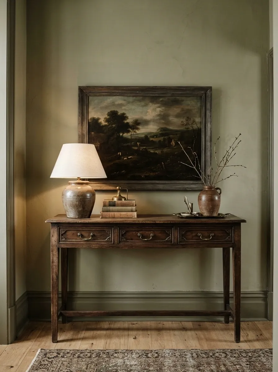
An antique landscape painting above a weathered wooden console gives a hallway a sense of history without turning it into a museum gift shop. A dark timber frame, muted landscape colors, and gently aged wood bring character to warm cream or olive walls. A traditional table lamp and a few old books complete the composition.
The painting should feel substantial enough to anchor the console, while the table itself needs visible wear or grain that adds texture rather than visual mess. A restrained arrangement works best here because the furniture and artwork already have plenty of personality.
This look particularly suits traditional homes, older properties, and interiors with detailed woodwork. New furniture can still work, but choose pieces with honest-looking materials and character. Fake distressing that looks like it survived a minor apocalypse is not required.
A Sculptural Pendant That Draws Attention to the End Wall
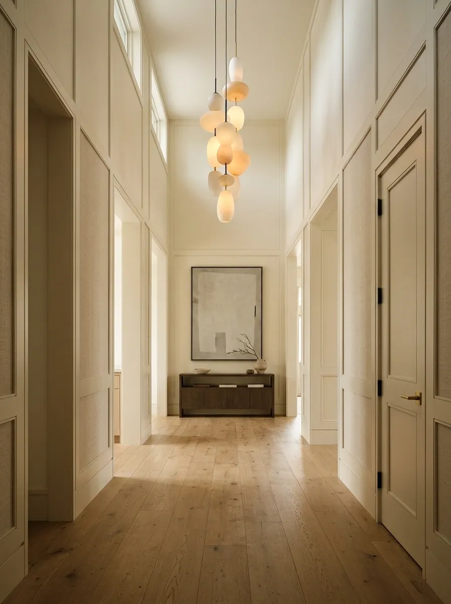
An eye-catching pendant can make a taller hallway feel designed from floor to ceiling. A sculptural opal-glass fixture, a dark metal pendant with a distinctive silhouette, or a softly curved contemporary light draws attention toward the back wall. Pair it with restrained artwork or a textured finish so the lighting and wall read as one composition.
This arrangement works particularly well in a hallway with enough ceiling height to accommodate a pendant without obstructing movement or sightlines. In a low corridor, a close-to-ceiling fixture can create a similar focal point without making everyone duck.
The light should suit the space’s overall style and provide useful illumination, not merely look dramatic in photographs. A gorgeous pendant that leaves the hallway gloomy is basically an expensive way to avoid installing a proper light.
Use the ceiling height to establish a visual focal point.
Check fixture height and the view through the hallway before installing it.
A Textured Limewash Wall With One Minimalist Artwork
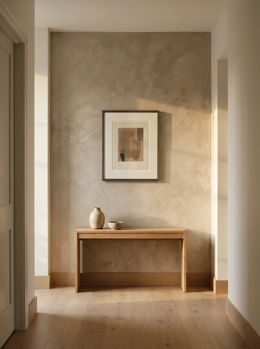
Sometimes the end wall doesn’t need more objects. It needs a better surface. A limewash finish in warm taupe, chalky beige, or muted clay adds subtle tonal variation that changes with the light. One restrained artwork, a slim dark frame, and natural flooring complete the composition without competing with the wall’s texture.
This is a strong direction for contemporary interiors that already have interesting materials or furniture nearby. The finish provides visual depth without introducing a loud pattern, while the artwork gives the eye a clear place to settle.
The texture should be visible but not so pronounced that the wall looks damaged from a distance. There’s a difference between intentional plaster variation and a wall that seems to be requesting professional help. Choose samples under the hallway’s actual lighting before committing to the finish.
A Framed Textile as the Hallway’s Main Feature
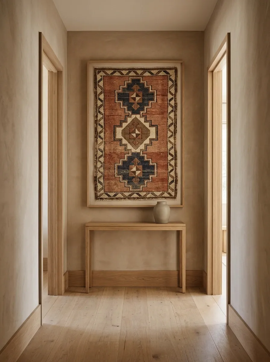
A framed textile brings pattern and texture to an end wall without relying on another painting. A woven geometric piece, embroidered fabric, or vintage textile in muted rust, indigo, cream, and earthy brown can become the focal point against warm plaster walls. A simple natural wood or dark frame provides structure, while understated flooring keeps the composition balanced.
The fabric should have enough visual weight to hold its own from the entrance of the hallway. Delicate details that disappear from a distance won’t do much for the overall design. Choose a textile with a clear pattern or interesting weave, and make sure the mounting protects it from dust and direct sunlight.
This approach adds character without requiring a collection of decorative objects. The textile is already doing the heavy lifting. No need to give it a supporting cast of seventeen accessories.
Choose a textile with visible pattern, tactile depth, and colors that already appear elsewhere in the home.
Wall: Warm ivory or clay
Care: Avoid prolonged direct sunlight
A Modern Triptych With Strong Geometric Composition
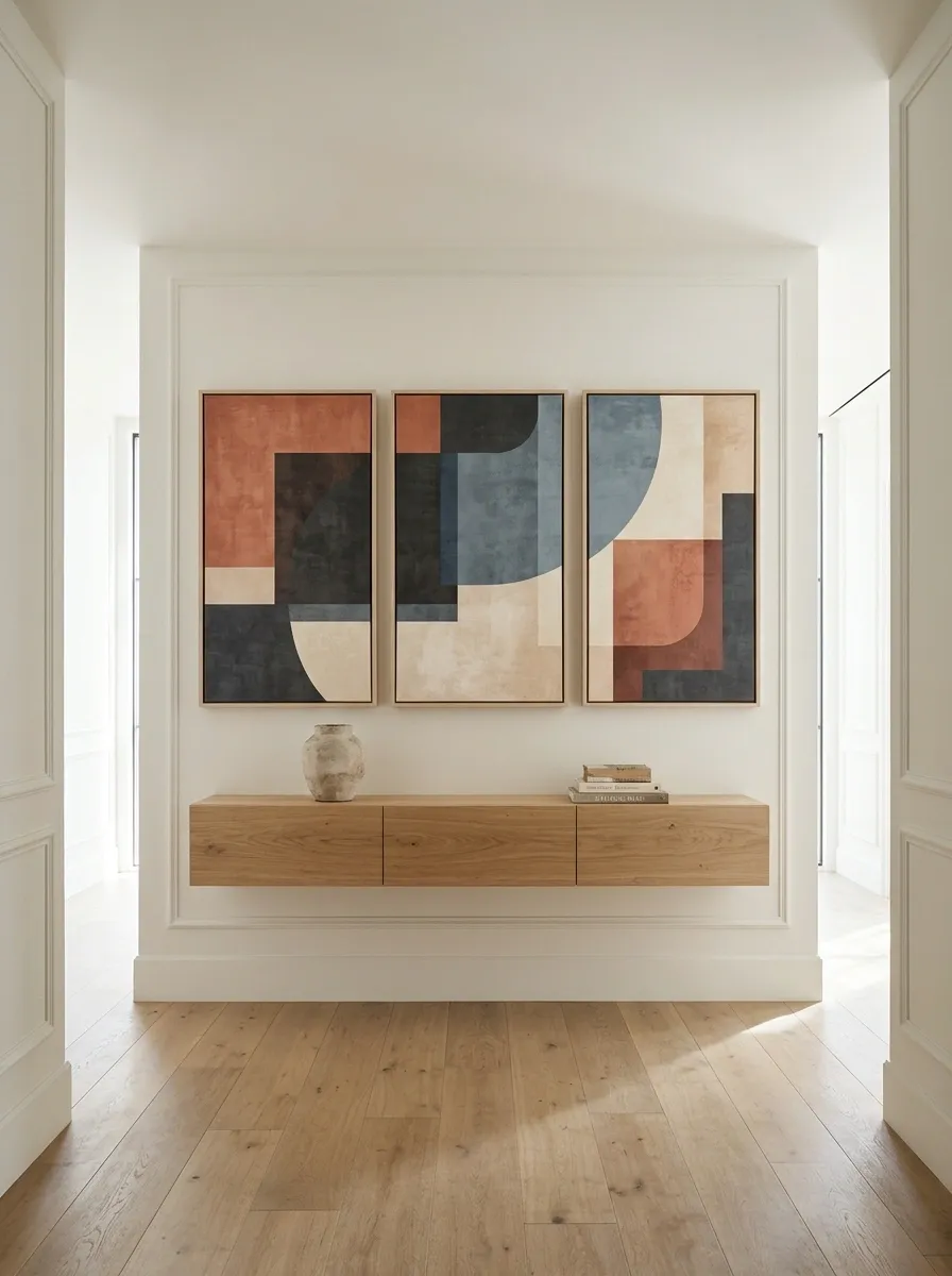
Three coordinated artworks can create a more architectural focal point than a single framed print. A triptych featuring abstract shapes, layered color fields, or connected geometric forms makes the end wall feel wider and more deliberate. Think muted terracotta, charcoal, dusty blue, and warm cream repeated across all three panels.
The panels should share a visual language without being identical copies. Their combined width matters more than the size of any individual piece, so consider the wall as one composition rather than three unrelated frames.
This works especially well on a broad hallway end wall with enough surrounding space to let each panel breathe. On a narrow wall, oversized triptychs can quickly resemble a corporate lobby that accidentally wandered into a house.
A Vintage Map With a Refined Library-Inspired Hallway
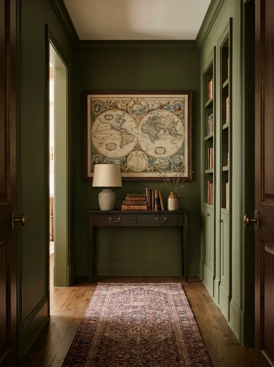
A vintage map brings a little curiosity to the end of a hallway, especially in a home with traditional woodwork, rich paint colors, or a library-inspired interior. Frame an antique-style map in dark walnut or black and place it against deep olive, warm beige, or muted blue walls. A narrow wooden console and a simple lamp can complete the arrangement when space allows.
The map should have enough detail to remain interesting without feeling visually overwhelming. A muted reproduction often works better than a brightly colored modern map if the surrounding interior relies on warm, historical finishes.
This design suits people who enjoy travel, geography, or collected objects with a story. Choose a map that means something rather than selecting one simply because the frame matches the furniture. Otherwise, it’s just cartography doing unpaid decorative labor.
Use a meaningful map, a dark frame, and restrained furnishings to create a focal point with a sense of history.
Wall: Olive, beige, or muted blue
Accent: Warm brass or aged bronze
A Full-Length Mirror With a Slim Floating Shelf
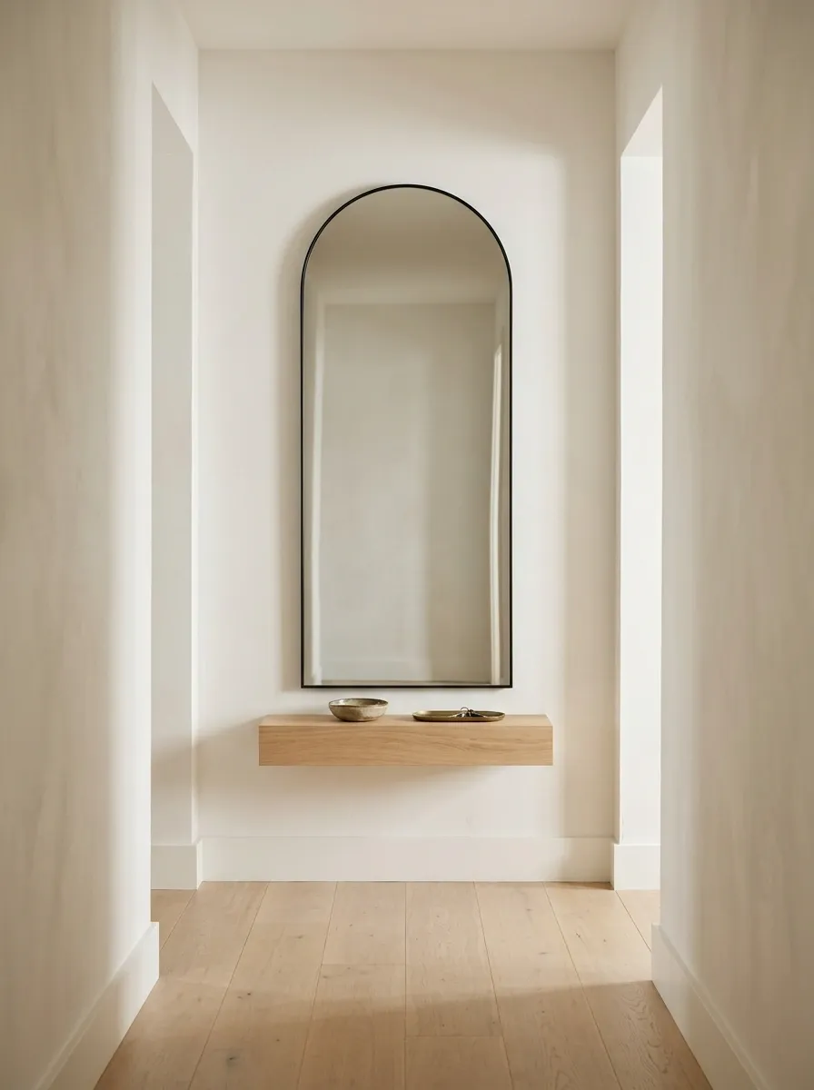
A full-length mirror paired with a slim floating shelf provides a useful focal point without requiring a console table. The mirror brings vertical emphasis to the back wall, while the shelf provides a landing spot for keys, a small ceramic dish, or one compact decorative object. Warm white walls, light oak flooring, and a narrow black or walnut mirror frame keep the composition understated.
This setup works especially well in a hallway that doubles as an everyday exit route. The mirror offers a last outfit check, and the shelf keeps a few essentials accessible without turning the space into a drop zone for everyone’s entire life.
Keep the shelf shallow and check nearby door swings before installation. The point is to create a streamlined arrangement, not build a tiny obstacle between the kitchen and the front door.
Shelf: Shallow and securely mounted
Objects: Keep only the daily essentials
A Painted Arch Framing a Small Artwork
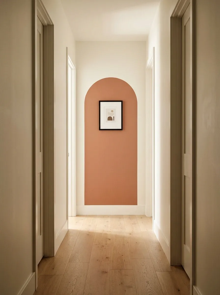
A painted arch gives the end of a hallway a little architectural drama without requiring carpentry, expensive materials, or a renovation that somehow lasts until next Christmas. Choose muted terracotta, dusty sage, or warm caramel for the arch, then center a small framed artwork inside it. Cream walls and light oak flooring keep the color feature from feeling too heavy.
The arch should be wide enough to frame the artwork comfortably, with the curve extending beyond the frame rather than hugging it like an overprotective parent. A simple print or abstract painting works best because the painted shape is already doing plenty of visual work.
This is an especially useful option for renters who can repaint later or anyone looking for a distinctive focal point without adding furniture to the hallway.
A broad arch creates a backdrop for the artwork, while the open wall around it keeps the composition from feeling cramped.
Artwork: Simple, contrasting print
Surroundings: Quiet neutral finishes
A Floor Vase and Branch Arrangement Against Textured Plaster
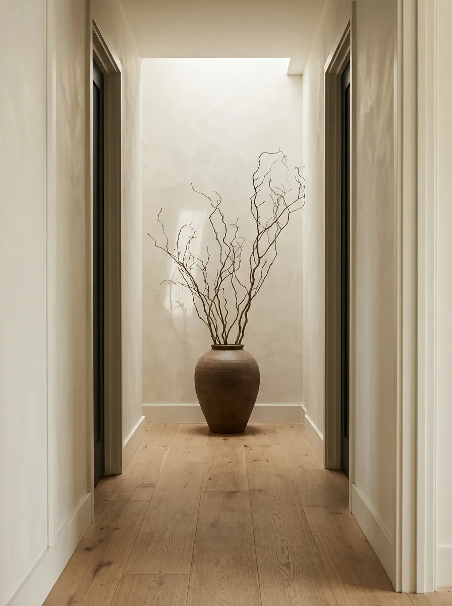
A large ceramic floor vase paired with a few sculptural branches gives the end of a hallway presence without adding another framed picture. Choose a substantial vessel in charcoal, chalky cream, earthy brown, or olive, then use branches with an interesting silhouette rather than a dense arrangement that swallows the wall.
A softly textured plaster finish makes the composition feel more complete, while natural wood flooring adds warmth. The branches should spread enough to create a pleasing outline but remain proportionate to the hallway. Nobody needs a botanical obstacle course on the way to the bathroom.
This arrangement suits a hallway where a console would feel bulky and the wall needs a little visual weight at floor level. Secure the vase if it could be knocked over, and preserve clear passage around the arrangement.
Let the silhouette do the work. A sculptural vessel and an open branch arrangement create height without requiring a table, shelves, or a wall full of objects.
Branches: Open, irregular silhouette
Floor: Leave a clear walking route
A Two-Tone Wall With a Strong Horizontal Division
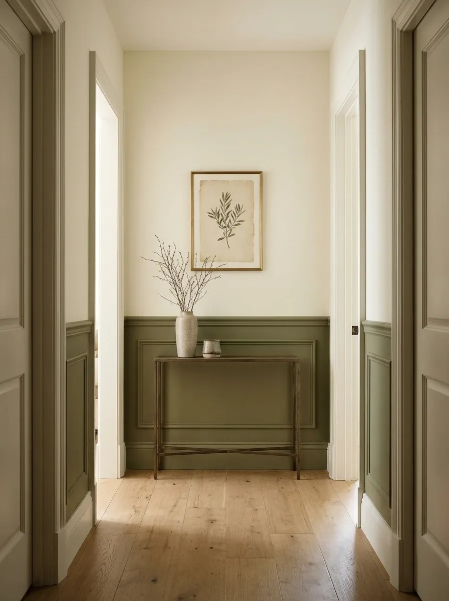
A two-tone end wall adds structure through color alone. A deeper shade covers the lower portion, while a lighter color continues above it. Think olive beneath warm ivory, smoky blue beneath pale gray, or muted clay beneath creamy beige. A simple framed print can sit within the upper section, connecting the two colors without adding unnecessary decoration.
The division should relate to the wall’s proportions and any nearby architectural details. Existing trim, door frames, and artwork placement can help determine where the colors meet. A thoughtfully positioned line looks intentional. A random stripe across the wall looks like the painter ran out of one color and decided to improvise.
This approach suits both traditional and modern hallways, especially when the surrounding walls echo one of the two shades.
Use the lower shade to give the wall visual weight and the lighter upper section to keep the composition open.
Lower wall: Muted olive
Focal point: Simple framed artwork
A Decorative Wall Clock in a Traditional Hallway
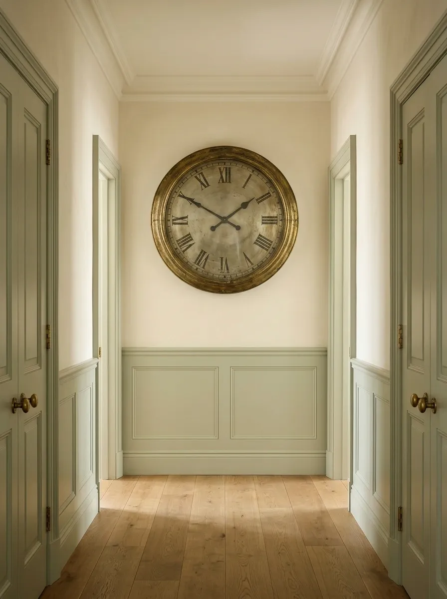
A decorative wall clock gives the end of a hallway a focal point with a practical purpose. A generously sized clock with a dark metal frame, warm wood detailing, or an aged brass finish can sit against cream, sage, or muted blue walls. Traditional moulding and timber flooring give the setting extra character without requiring much additional decor.
The clock should feel proportionate to the wall. A broad clock can anchor a spacious hallway, while a slimmer design suits a narrower passage. Choose a face that’s easy to read from a distance and a finish that connects to nearby lighting or door hardware.
Keep the surrounding wall relatively simple. The clock already has a job, a face, and moving parts. It doesn’t need a gallery wall holding its hand.
A statement clock supplies scale and purpose. A restrained wall treatment lets its shape and finish remain the main attraction.
Clock: Readable face, substantial frame
Extra decor: Keep it minimal
A Built-In Bench With Wall Hooks and an Upper Display
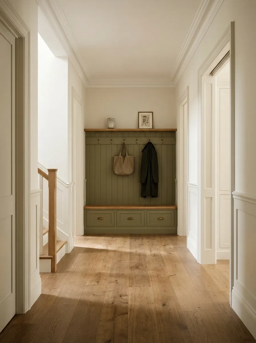
When the end of a hallway also serves as a transition zone, a built-in bench can make the wall work harder. A compact seat, a few well-spaced hooks, and a small upper shelf or framed print create a practical arrangement for bags, coats, and everyday essentials. Painted cabinetry in warm white, olive, or muted blue helps the setup feel integrated rather than assembled from random hallway furniture.
A timber bench seat adds warmth, while closed storage underneath can hide shoes and smaller items. Keep the hooks arranged with enough room between them so coats don’t become one enormous fabric creature.
This layout needs adequate width and a sensible relationship to the hallway’s walking route. It’s especially useful near an entrance, but even a well-designed bench won’t rescue a passage that’s too narrow to accommodate it comfortably.
Give the End Wall a Job Worth Looking At
The strongest end-of-hallway wall designs start with the way the space actually works. A dramatic painting suits a wall that needs personality, concealed cabinetry helps when storage is the real problem, and a mirror can bring useful reflection into a narrow passage.
Before buying anything, look at the wall from the hallway entrance and decide what deserves attention. Check the available width, existing finishes, lighting, and walking clearance. Then commit to one clear design direction instead of combining every saved Pinterest idea into a single decorating incident.
A hallway doesn’t need a dozen accessories to look finished. It needs a focal point that makes sense for the space, materials that belong together, and enough restraint to let the design breathe.
Save the designs that suit the home now, before that blank wall gets another six months of doing absolutely nothing.