
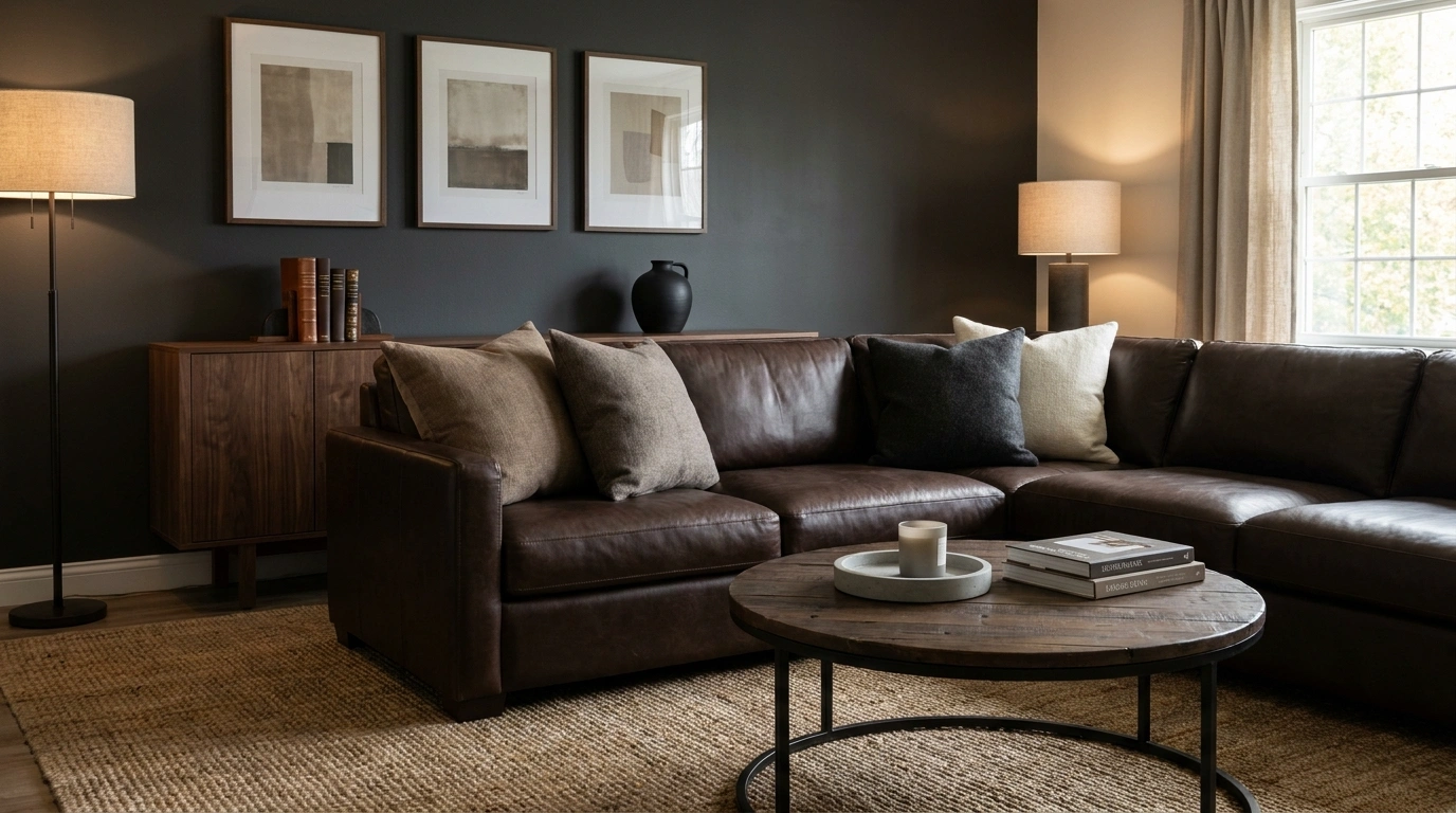
A masculine home looks best when the design feels intentional, the materials have character, and the furniture actually fits the room. It doesn’t need black walls, oversized leather sofas, or metal signs announcing that someone lives there. Those aren’t design principles. They’re a shopping list with an identity crisis.
The difference comes down to proportion, texture, lighting, and restraint. A solid walnut desk can establish more character than an entire wall of industrial decor. A well-chosen rug can make a living room feel grounded without covering every surface in charcoal. Even a simple bedroom can feel sophisticated with tailored bedding, warm wood, and a few carefully chosen details.
The best part? These changes don’t require a designer’s budget or a complete renovation. Many come down to removing unnecessary clutter, choosing finishes that work together, and being more deliberate about the pieces that stay.
What Actually Makes a Home Feel Masculine?
Strong Shapes Beat Random Dark Furniture
Furniture with a clear outline gives a room structure. Think a sofa with defined arms, a substantial wood coffee table, or a bed with a solid headboard rather than a pile of bulky pieces competing for attention.
Proportion matters more than weight. A well-sized wooden desk can look more grounded than an enormous black desk that leaves barely enough room to pull out a chair.
The trick is to give the room a few strong shapes and let the rest breathe. A space shouldn’t require a side-step maneuver every time someone walks past the coffee table.
Natural Materials Keep Masculine Rooms From Feeling Cold
Dark paint and black metal can look sharp, but too much of both leaves a room feeling flat. Natural materials introduce the changes in texture that make the space interesting even when the color palette stays restrained.
Wood brings warmth, leather offers a smooth surface, wool softens hard edges, and stone adds a solid visual presence. These materials don’t need to match exactly. They need to work together.
A rough wood table beside a soft rug and a brushed metal lamp gives the eye something to explore. A room full of identical finishes just looks like everything arrived in one shipment.
Practical Design Beats Bachelor Pad Stereotypes
A masculine interior should work on an ordinary Tuesday, not just look impressive in a carefully staged photograph. Storage needs to handle everyday clutter, lighting needs to suit actual activities, and furniture shouldn’t block the route between the sofa and the kitchen.
Personality belongs in the room, too. Books, artwork, collected objects, and meaningful pieces say more than generic signs announcing the room’s supposed theme.
A useful rule: every large piece should serve a clear purpose, and every decorative object should earn the space it occupies. Sentimental value counts. Random clutter pretending to be industrial decor doesn’t get the same free pass.
How to Make Your Home More Masculine
Start With Furniture That Has Presence, Not Unnecessary Bulk
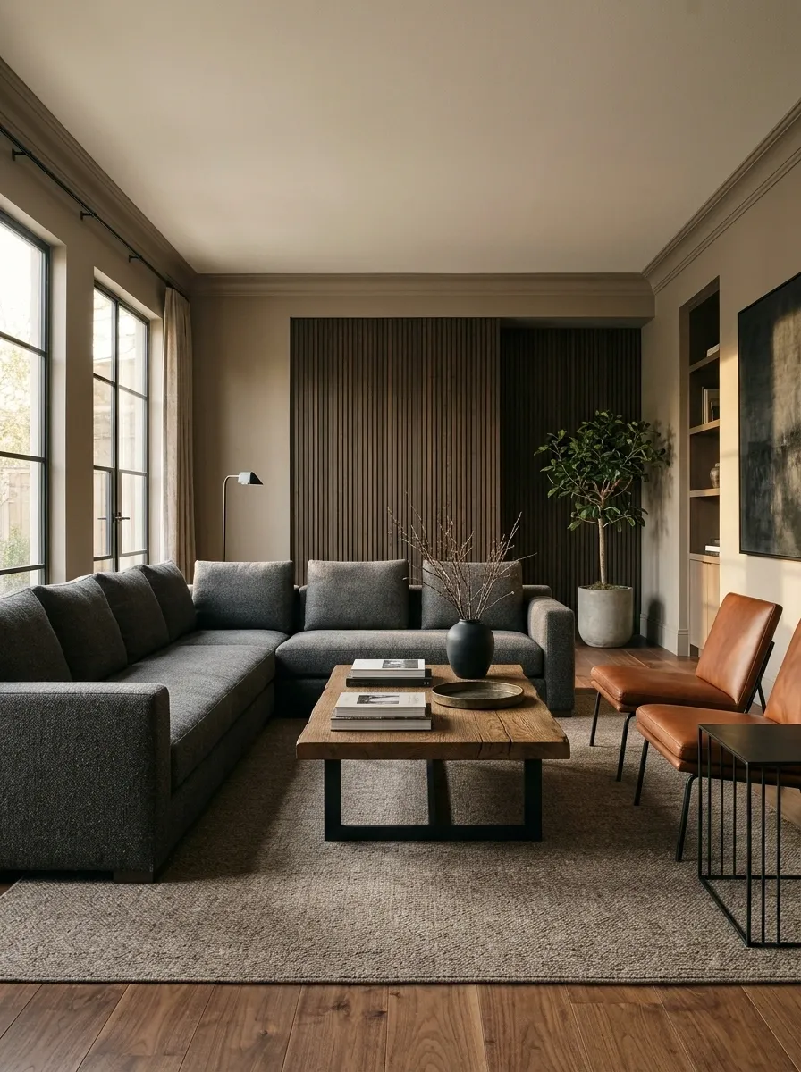
Furniture can feel masculine without being oversized. Choose pieces with clear outlines and enough visual weight to anchor a room: a sofa with a firm silhouette, a coffee table with a thick top, or a bed frame with a solid headboard.
When every piece is bulky, the room stops looking confident and starts looking like the furniture won a hostile takeover.
Keep the largest shapes simple, then let texture and small details carry the interest. Before buying anything, measure the walking paths around the furniture. A chair that blocks the route to the kitchen isn’t a statement piece. It’s an obstacle with a receipt.
Weight, balance, breathing room.
Choose one substantial piece, such as a defined sofa or a solid dining table, to establish the room’s visual weight.
Use lighter side tables, compact chairs, and streamlined lamps to keep the main furniture from dominating everything.
Protect clear walkways and visible floor space. Empty space is part of the layout, not a furniture emergency.
A room feels considered when the furniture has presence without demanding every square inch of attention.
Build a Grounded Palette With Olive, Charcoal, Tobacco, and Stone
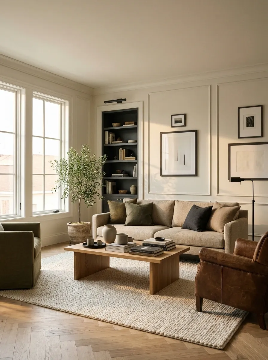
A room doesn’t need every wall painted charcoal to feel grounded. Start with a warm neutral base, then bring in olive, tobacco brown, or charcoal where the eye naturally lands. This keeps the room dimensional instead of turning it into one giant black hoodie.
Use this palette check before committing to paint, upholstery, or curtains. Lay the swatches beside the actual flooring and check them in morning and evening light.
Colors can look completely different beside cool grey tile than they do beside honey oak. Paint samples apparently enjoy lying for sport, so the floor gets a vote.
Build contrast, not a blackout room.
Use one grounded shade as an accent, keep the larger surfaces balanced, and test every color beside the room’s permanent finishes.
Walls, large rugs, and bedding.
Accent upholstery, cushions, or paint.
Leather, wood accents, and details.
Frames, hardware, or a controlled accent.
Before buying: check the samples against flooring, existing furniture, and natural light. A color that works online can look completely different in the actual room.
Mix Wood, Leather, Wool, and Metal Instead of Relying on Black
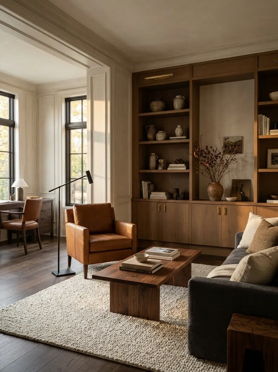
Black metal and dark paint can’t carry an entire room. Without softer or more varied materials, the result can feel flat, echoey, and a little too close to a furniture catalog that sells only one mood.
Give each material a job. Wood brings warmth, leather adds a smooth and durable surface, wool softens the room, and metal sharpens the outline. Keep the finishes distinct enough to notice, but repeat a material somewhere else so the combination feels intentional.
A walnut table beside a wool rug and a matte metal lamp has more depth than five matching black accessories lined up like suspects.
Contrast is what gives the room depth.
The room needs contrast between surfaces, not a matching set of everything sold in the same aisle.
Choose One Main Metal Finish for a More Intentional Look
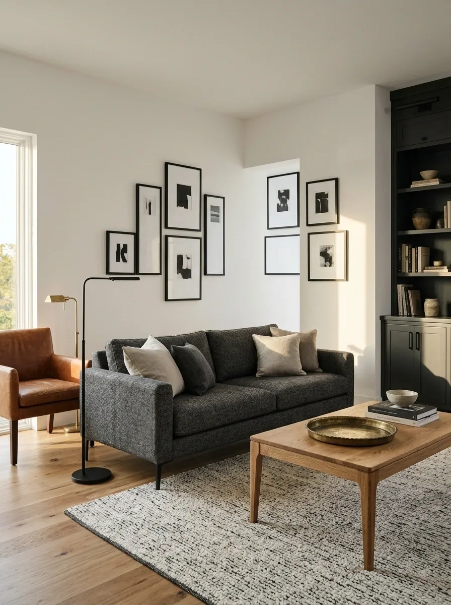
Too many competing metal finishes make a room feel accidental. Brushed black, aged brass, chrome, and polished gold can all work, but when each appears once and never connects to anything else, the room loses its visual rhythm.
Choose one dominant finish for visible hardware and lighting, then introduce a second finish sparingly when it adds contrast. Matte black feels crisp, aged brass brings warmth, and brushed stainless steel reads cooler and cleaner.
Check cabinet pulls, lamp stems, curtain rods, and furniture legs together before replacing anything. Everything doesn’t need to match. It just needs to look like someone made a decision.
Pick a lead finish. Let the second play a supporting role.
Use it for cabinet handles, picture frames, lamp stems, and clean architectural lines.
Bring warmth to a reading lamp, a cabinet pull, or a carefully chosen decorative detail.
Choose it for a restrained, cooler finish on practical fittings and modern lighting.
Quick check: Photograph the visible finishes in the room together. If one finish looks completely unrelated to the others, replace it or repeat it somewhere that makes sense.
Layer Lighting So Overhead Fixtures Aren’t Doing All the Work
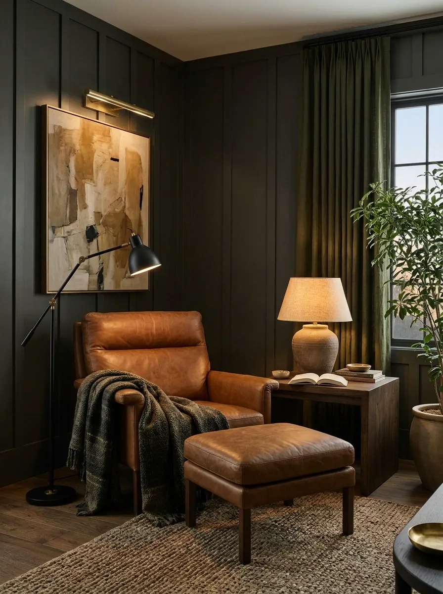
One ceiling fixture is rarely enough to make a room feel finished. It lights the floor, sure, but it can leave faces flat, corners gloomy, and a reading chair looking like it’s waiting for an interrogation.
Build lighting in layers. Use a ceiling fixture for general light, a floor or table lamp where people sit, and a smaller accent light to bring out artwork or texture. Warm bulbs usually suit wood, olive, and tobacco tones better than harsh blue-white light.
Keep switches accessible, too. The prettiest lamp in the world is useless if its cord stretches across the walking path.
Give every light source a job.
A layered room combines general illumination with useful task lighting and smaller pools of light that reveal texture.
Ceiling fixtures or diffused lamps provide general light so the room doesn’t have dark, awkward patches.
A reading lamp, desk light, or bedside light puts illumination where an actual activity takes place.
A small spotlight or discreet lamp draws attention to artwork, a textured wall, or a meaningful object.
Placement matters: keep lamp cords out of walkways and position task lights to reduce glare on books, screens, and work surfaces.
Set Up Lighting in the Right Order for Each Room
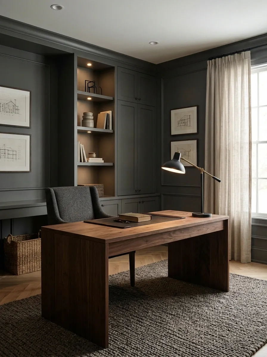
Buying attractive lamps before deciding what a room needs is how a perfectly good budget disappears into decorative lighting that barely lights anything.
Start with the activity, then choose the fixture. A desk needs focused light that doesn’t create screen glare. A bedside table needs a reachable lamp for reading. A living room needs enough general illumination to function, plus softer pools of light for evenings.
Use this order whenever a room feels either too harsh or strangely gloomy:
- Fix the general lighting first.
- Add task lighting where work or reading happens.
- Finish with accent lighting for artwork, shelving, or texture.
The room should work before the lamps start posing for photographs.
Get the function right before fussing over the fixture.
Make sure the room is usable without relying on one dark corner or a bright ceiling glare.
Place reading lamps, desk lights, and bedside lights where the activity actually happens.
Highlight selected artwork, shelves, or architectural details without lighting every object in sight.
A good-looking lamp that leaves the desk unusable is just an expensive ornament.
Match Furniture Scale to the Size of Your Room
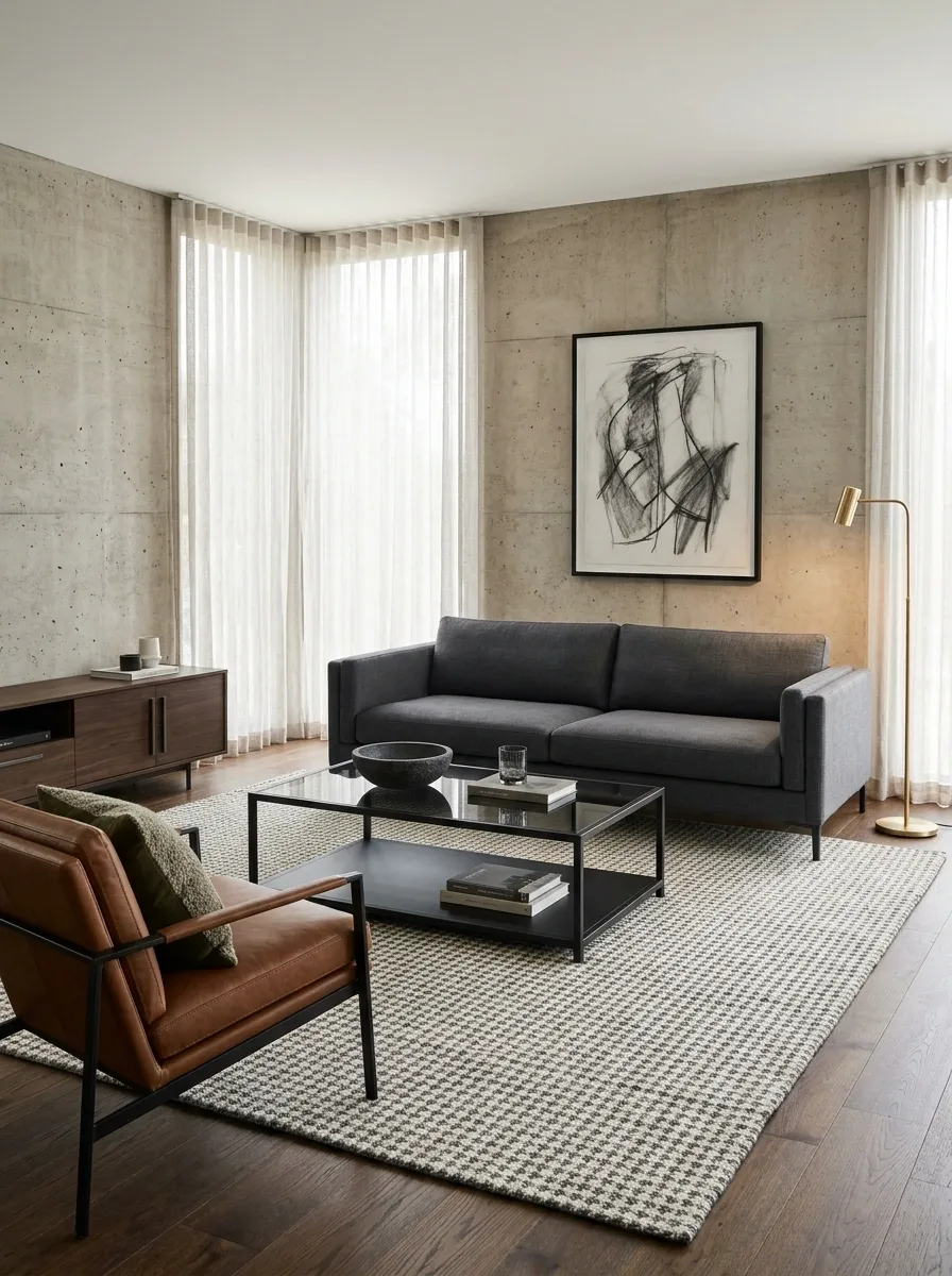
A large room can handle substantial furniture. A small room usually needs pieces that provide structure without taking over every available inch. The mistake is buying furniture based on how impressive it looks in a shop, where the surrounding space is practically a warehouse.
Measure the room, the furniture, and the paths people need to walk through. Leave enough clearance for drawers and doors to open without rearranging half the room.
Keep this distinction in mind: a strong silhouette creates visual presence. Excessive bulk creates a space problem.
A compact sofa with defined arms and a solid coffee table often looks more intentional than an oversized sectional squeezed into a narrow living room.
Choose pieces that fit the room, not the showroom.
Use these visual comparisons as a starting point. Actual dimensions and required clearances depend on the room and furniture design.
A streamlined sofa, a proportionate coffee table, and visible floor space maintain a clear layout.
A larger sofa or heavier table can establish a focal point when the room has space to support it.
Mark the furniture footprint on the floor with painter’s tape. Walk around it and test access to doors, windows, and storage before spending the money.
Hang Full-Length Curtains With Clean, Tailored Lines
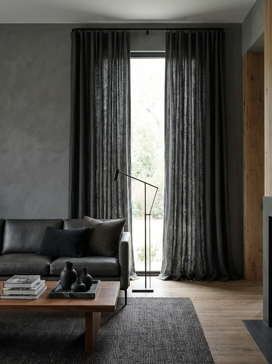
Short curtains can make a room feel visually chopped up, especially when they stop awkwardly above the floor. Full-length panels give windows a cleaner outline and make the wall feel more complete.
Choose a fabric that suits the room. Linen-look curtains soften timber and stone, while heavier textured panels bring more visual weight to a large bedroom or living room. A simple solid fabric usually works harder than a loud pattern competing with the furniture.
Before ordering, measure the window width, the desired rod position, and the distance to the floor. Curtains that drag excessively or hover several inches above the floor rarely look intentional.
Quick measurement checklist
- Measure the window and the full curtain-rod span.
- Decide whether the panels should just meet the floor or have a slight break.
- Check that the open curtains won’t block too much glass.
Clean lines start before the fabric arrives.
Rod width: account for the open space needed beside the window so the panels can stack without covering too much glass.
Rod height: position it to suit the window and ceiling rather than automatically placing it right above the frame.
Finished length: measure from the actual hanging point down to the floor, allowing for the curtain heading and hardware.
Fabric weight: check how much light and privacy the room needs before choosing a sheer, lined, or heavier panel.
A clean curtain line can make a room look finished. A bad measurement can make expensive fabric look like an apology.
Combine Textured Fabrics Without Making the Room Look Busy
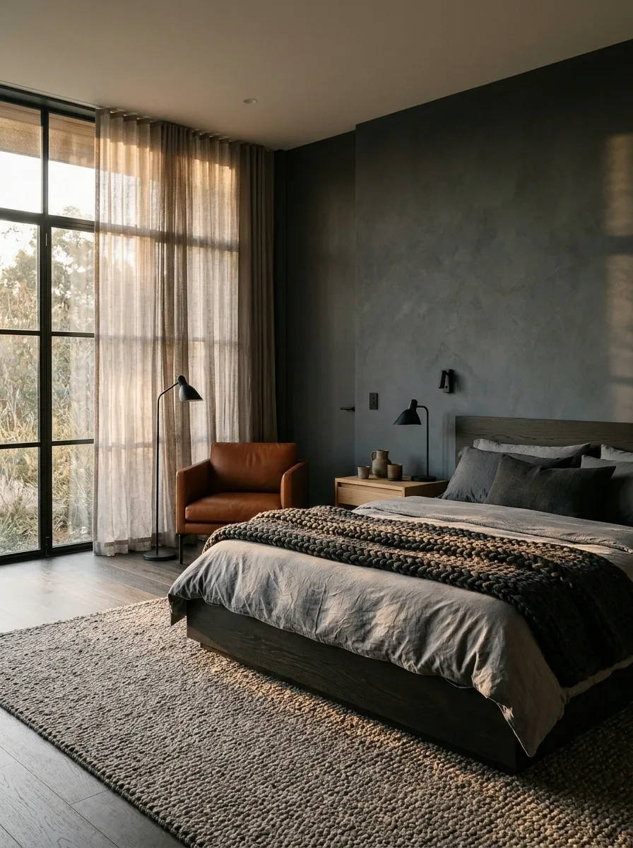
A masculine room doesn’t have to be full of smooth, hard surfaces. Texture is what stops restrained colors from looking lifeless. The catch is that every fabric can’t demand attention at the same time.
Choose one noticeable texture, such as a chunky wool throw or a nubby upholstered chair, then support it with simpler materials. Keep the palette related so the room feels layered instead of visually noisy.
Use contrast in the surfaces rather than piling on patterns. A woven rug, smooth leather, and plain cotton bedding already provide variation without turning the room into a fabric department after closing time.
Choose one texture to lead. Let the others support it.
Keep the palette connected and vary the feel of the surfaces. The room gets depth without every fabric competing for the starring role.
The balance: one noticeable texture, one smooth material, and one quiet background fabric.
Give the Bed a Tailored Look With Simple Bedding and Structure
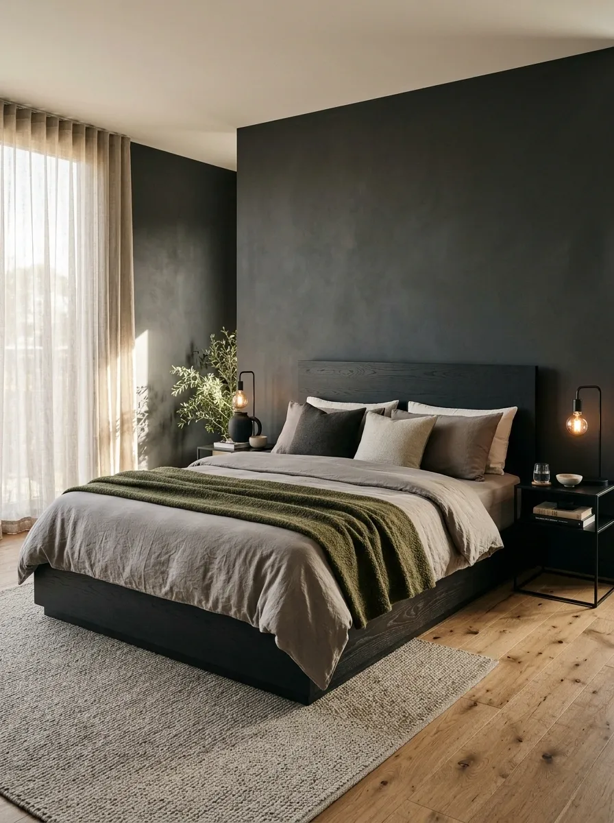
The bed usually occupies a large portion of the bedroom, so its shape and bedding have an outsized effect on the entire room. An overstuffed pile of mismatched pillows and shiny bedding can make even good furniture look messy.
Start with plain sheets and a duvet cover in cream, stone, olive, or charcoal. Add a textured throw folded neatly across the foot of the bed, then keep decorative pillows limited to a useful, manageable arrangement.
Keep the setup simple:
- Choose one main bedding color.
- Add one contrasting texture, such as a woven throw.
- Use a headboard with a clear shape and proportionate height.
- Leave enough visible bedding for the bed to look deliberate, not buried.
The bed should look inviting without needing its own pillow management department.
A tailored bed needs fewer distractions.
Use solid-color sheets and a duvet cover that work with the room’s flooring, walls, and headboard.
Fold a woven throw or textured blanket across the foot of the bed instead of layering several unrelated fabrics.
Keep the pillows needed for sleeping and a small decorative arrangement. Clear the rest off the bed.
Choose a headboard that suits the room’s proportions, whether upholstered, timber, or a simple frame.
A neatly made bed does more for the room than a mountain of decorative cushions ever will.
Arrange Living Room Seating Around a Clear Focal Point
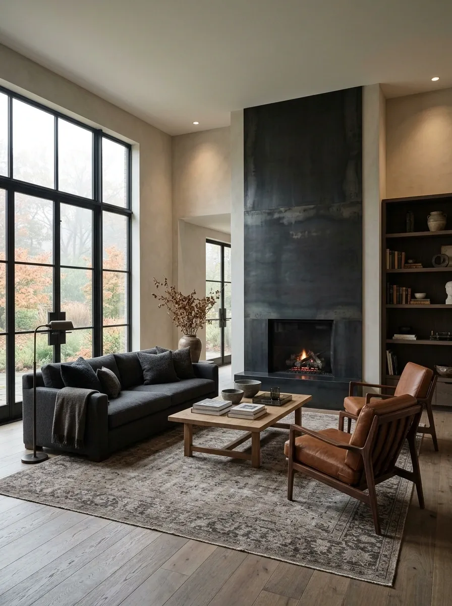
A living room feels awkward when every piece of furniture faces a different direction and the coffee table sits in the middle like an abandoned island. Give the seating a clear focal point, whether that’s a fireplace, a television, a large artwork, or a window with a strong view.
Position the sofa first, then arrange chairs so conversation feels natural. Keep the coffee table within comfortable reach and leave clear paths around the seating group. Not every chair needs to stare directly at the television like it’s awaiting instructions.
The aim is a room that feels connected without forcing everyone to squeeze past furniture.
Build the seating group around one clear anchor.
This top-down concept shows how the main seats, table, and focal point can work together. Adapt the arrangement to the room’s doors, windows, and dimensions.
Layout rule: allow enough clearance for people to walk through without moving the coffee table every five minutes.
Edit Open Shelves Instead of Filling Them With Random Objects
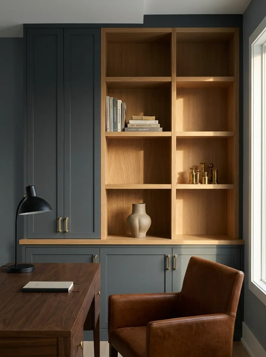
Open shelving looks intentional when each object has space around it. Fill every shelf with tiny souvenirs, tangled cables, books, and decorative objects bought during unrelated shopping trips, and the whole thing becomes visual paperwork.
Start by removing everything. Return the books and objects that genuinely belong there, then group a few related pieces instead of spreading them evenly across every shelf.
Leave some sections empty. Vary the height of displayed objects and keep everyday items that look messy in closed storage. Shelves should reveal personality, not provide a public audit of every impulse purchase.
A quick shelf reset:
- Keep books and meaningful objects.
- Group small pieces instead of scattering them.
- Mix vertical books with a few horizontal stacks.
- Leave visible gaps between groups.
- Move chargers, packaging, and loose paperwork elsewhere.
Keep the interesting objects. Remove the visual noise.
- Books with varied heights
- One grouped collection
- A few meaningful objects
- Empty space between groups
- Unrelated tiny ornaments
- Loose cables and packaging
- Objects with no clear place
- Repeated items crowding a shelf
The shelf doesn’t need to prove that shopping happened. It needs to show what deserves attention.
Hang Larger Artwork With Frames That Suit the Room
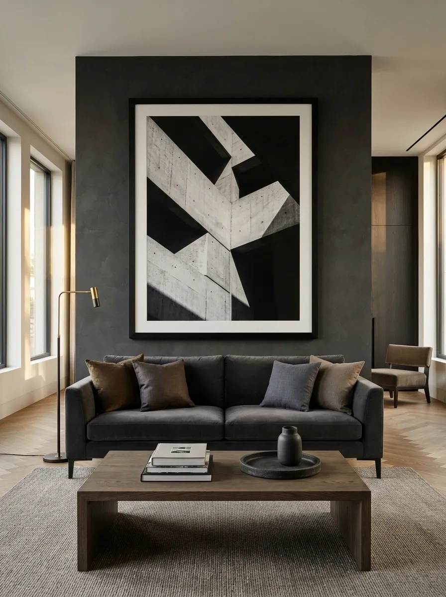
Tiny artwork floating over a large sofa often looks like the wall ran out of budget halfway through the project. Scale matters. A larger piece, a balanced pair, or a carefully arranged gallery can anchor the furniture and give the room a finished look.
Choose artwork that connects to the room through color, subject, or tone. Abstract prints, architectural photography, landscapes, and graphic compositions can all suit a masculine interior without relying on predictable sports cars or motivational slogans.
Before drilling holes, tape paper outlines onto the wall. Check the composition from the sofa and the doorway. The right position should relate to the furniture underneath it, not merely the nearest convenient nail.
Let the artwork hold its own against the furniture.
These simplified layouts illustrate relative scale, not exact installation measurements. The artwork should feel connected to the furniture, with enough surrounding space to remain distinct.
Choose a substantial print above a sofa, bed, or console when the wall needs one clear anchor.
Pair prints with related colors or subjects for a measured look above a bed or wider console.
Use a few related works with consistent spacing when one frame doesn’t fill the wall comfortably.
Use paper templates to test the size and spacing. Relating the grouping to the furniture below usually works better than centering each piece on the entire wall.
Choose Rugs With Texture and Subtle Pattern Instead of Loud Themes
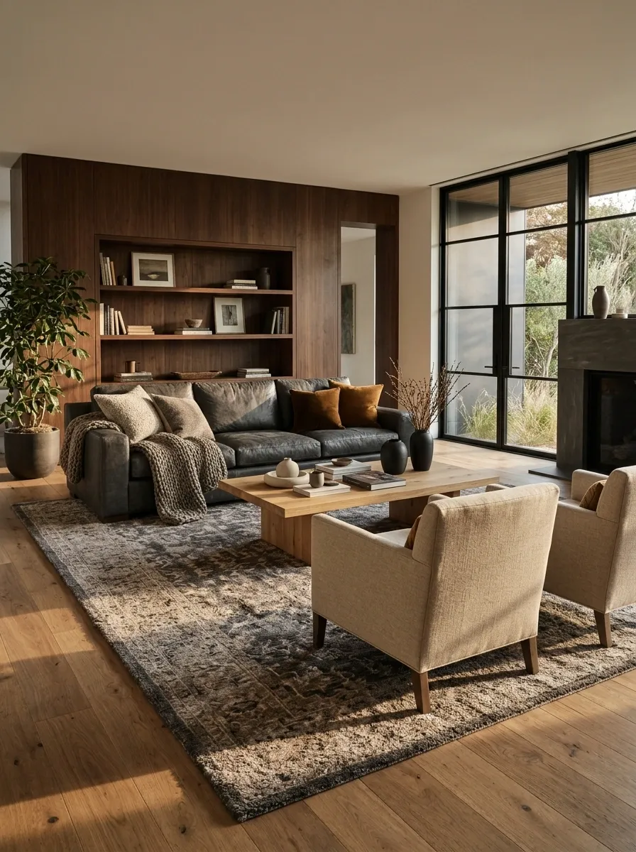
A rug can ground the entire room, but the wrong one can compete with every other surface. Oversized graphics, high-contrast patterns, and novelty designs often become the only thing anyone notices.
For a more masculine interior, start with texture, muted geometry, restrained stripes, or an abstract pattern with colors already present in the room. A rug should connect the sofa, chairs, and coffee table visually rather than sit beneath them like an unrelated decorative island.
Check the dimensions before buying. The rug should relate to the seating group, and the furniture arrangement shouldn’t look as though it was assembled around a doormat.
Pick a pattern that supports the furniture.
| Rug style | Best use | Watch out for |
|---|---|---|
| Solid textured | Rooms with detailed furniture or artwork. | A texture that sheds or is hard to maintain. |
| Subtle geometric | Simple rooms that need a little structure. | Patterns that fight with striped upholstery. |
| Restrained stripe | Long rooms or linear furniture arrangements. | A strong direction that clashes with the layout. |
| Muted abstract | Adding movement without a literal theme. | Too many competing accent colors. |
Sizing test: mark the intended rug outline on the floor. Check that the seating group feels connected and the doorways remain easy to use.
Use Closed Storage to Keep Everyday Clutter Out of Sight
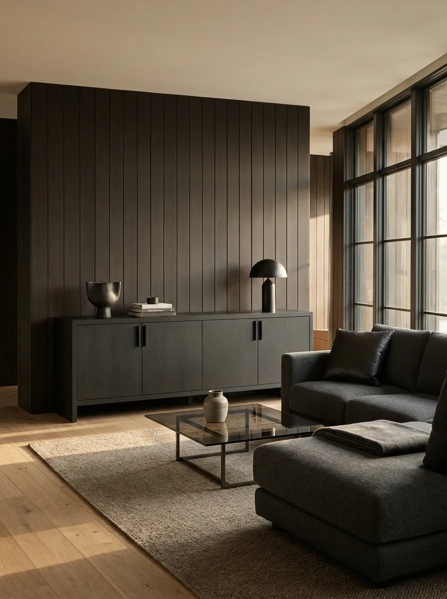
Even a well-designed room can look chaotic when chargers, remote controls, paperwork, spare cables, and miscellaneous small objects cover every surface. The solution isn’t to decorate around the mess. It’s to give the mess a proper home.
Use a sideboard for items used in the living room, drawers for office supplies, and closed bedside storage for charging accessories and personal essentials. Keep frequently used items reachable, but don’t give every object a permanent place on top of a table.
Choose storage with simple fronts and hardware that suits the rest of the room. A solid cabinet can bring visual weight while quietly handling the everyday stuff nobody wants in the photograph.
Give everyday objects a place to disappear.
Match each storage zone to what gets used there. A cabinet works best when the contents have a clear destination, not when everything gets shoved inside during an unexpected visit.
Store remotes, spare batteries, games, coasters, and small accessories used in the seating area.
Keep stationery, paperwork, charging accessories, and spare cables near the place they are used.
Move glasses, books, chargers, and nighttime essentials off the bedside surface.
Contain keys, sunglasses, mail, small bags, and other items that otherwise land on the nearest flat surface.
Keep frequently used items accessible, but leave enough visible space on tables and consoles for the furniture and materials to stand out.
Create an Entryway Drop Zone for Everyday Essentials
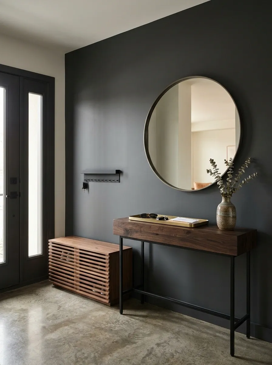
The entryway is where keys, shoes, bags, sunglasses, and random receipts go to form a small administrative department. Leaving everything in a pile by the door makes the entire home feel less organized, even when the living room looks excellent.
Give everyday essentials a defined landing spot. A slim console, a wall-mounted key rack, a shoe cabinet, and a small tray can handle most of the mess without crowding a narrow hallway.
Keep the setup proportional to the available space. A large entryway can support a substantial timber console, while a small apartment may need nothing more than a few wall hooks and a narrow shelf.
Entryway essentials checklist
Give everything a landing spot.
Choose only the pieces the entryway can comfortably handle. The goal is an organized arrival, not a miniature furniture showroom beside the front door.
The front door shouldn’t open onto a pile of objects waiting for an adult to make a decision.
Build a Home Office Around a Solid Desk and Hidden Cables
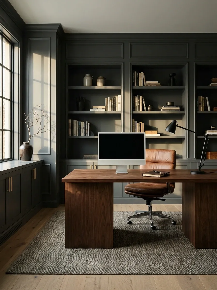
A home office can ruin an otherwise well-designed room when tangled cables, mismatched accessories, and an undersized desk take over the space. A gaming-level collection of gadgets isn’t the problem. The problem is letting the equipment dictate the entire design.
Start with a sturdy desk in wood or a restrained finish, then choose a comfortable chair and a lamp that provides useful task lighting. Position the monitor at a comfortable viewing height and keep the main work surface clear enough for actual work.
Hide power strips beneath the desk, secure cables with clips, and route them along the rear legs. The goal isn’t a desk with nothing on it. It’s a desk where every visible object has a reason to be there.
A solid desk. A clear surface. Zero cable jungle.
Organize the office by function, keeping the equipment visible where it’s useful and the mess hidden where it’s distracting.
Keep the screen centered and at a comfortable viewing height.
Keep the lamp, notebook, and frequently used tools within reach.
Move spare cables, paperwork, and accessories into drawers or organizers.
Attach a cable tray underneath the desk, secure loose wires, and keep the power strip accessible without leaving it sprawled on the floor.
A clean workspace looks more professional without pretending that nobody actually works there.
Balance Dark Bathroom Accents With Lighter Surfaces
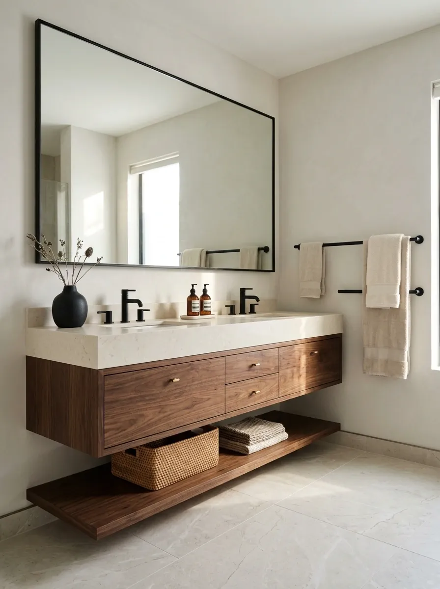
Dark bathroom hardware can look sharp, but covering every surface in charcoal tile can make a small bathroom feel even smaller. The better approach is contrast: darker accents against lighter walls, warm timber, or stone-look surfaces.
Consider matte black faucets, a framed mirror, a dark towel rail, or a vanity with a deep wood finish. Let the larger surfaces stay lighter if the room has limited natural light. In a spacious bathroom with good illumination, darker walls can work without swallowing the whole space.
Pay attention to maintenance, too. Dark glossy surfaces can show water spots and fingerprints, while textured finishes may require more effort to clean.
Use dark accents where they make the strongest impression.
Maintenance note: check how the finish handles water spots, fingerprints, and cleaning products before committing to every fixture in the room.
Add Architectural Character With Paneling, Trim, or a Feature Wall
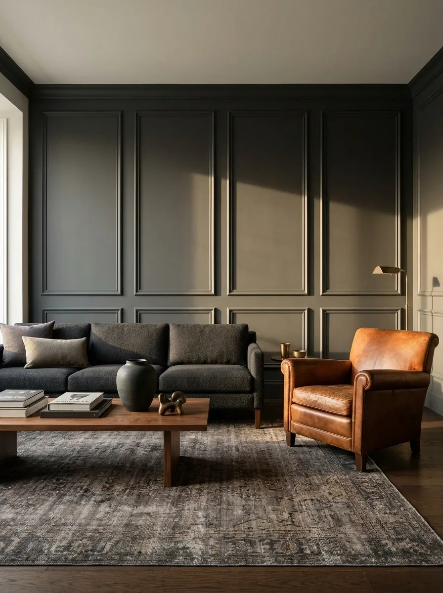
A room doesn’t need an industrial sign or a giant decorative prop to develop character. Architectural details can create depth more naturally, especially when the existing walls and furniture feel plain.
Simple wall paneling, narrow vertical battens, a restrained picture-frame molding layout, or a painted feature wall can give a bedroom or living room a stronger visual structure. The detail should suit the building and the room’s proportions. Ornate molding in a minimalist apartment can feel just as out of place as rough industrial cladding in a formal sitting room.
Choose one architectural treatment and let it anchor the space. More trim doesn’t automatically mean more style. Sometimes it just means more holes to fill later.
Give plain walls a deliberate structure.
Choose the treatment that suits the wall, the building, and the furniture. These simplified visual studies show the character of each option.
Adds orderly geometry to a bedroom, dining room, or formal living room without relying on busy decoration.
Create a clean linear feature behind a bed or desk, especially when the rest of the room uses simple furniture.
Adds depth with minimal construction, making it useful for rented or budget-conscious interiors where permitted.
Check wall dimensions, existing trim, and furniture placement. Use a paper or tape mockup to test the proportions before cutting or fixing materials.
Give Wood Tones a Deliberate Contrast Instead of an Accidental Mix
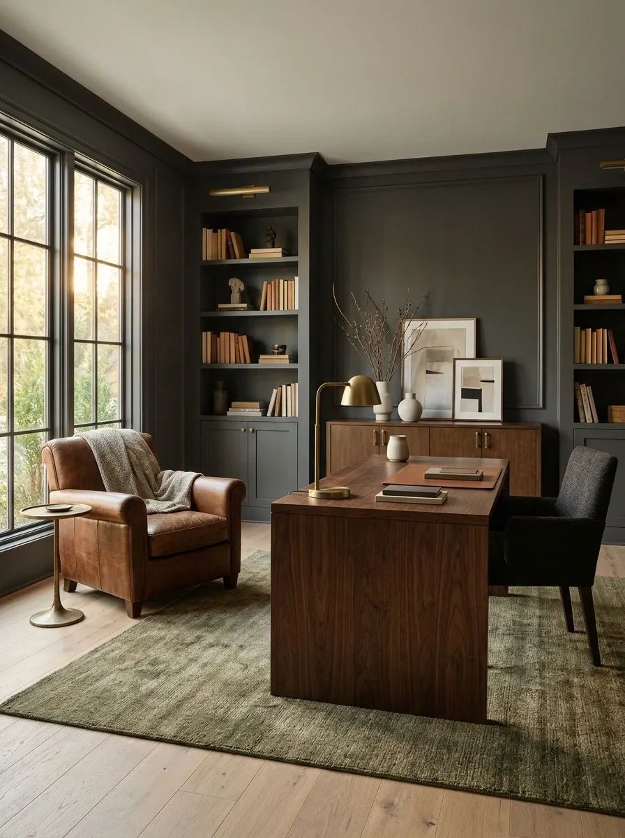
A room can contain several wood tones and still look cohesive. The problem starts when every finish is close in color but not quite the same, leaving the furniture looking as though it was purchased during three separate renovations.
Instead of forcing an exact match, create a clear relationship between the wood finishes. Pair a darker walnut desk with a lighter oak floor, or combine a medium-brown console with a timber frame that shares its warmth. Repeat one tone elsewhere so the mix feels connected.
Pay attention to undertones. Reddish wood, yellow honey oak, and cool grey finishes can clash when placed together without a unifying color or material.
Contrast with intention, then repeat a tone.
| Wood tone | Useful companions | Potential clash |
|---|---|---|
| Dark walnut | Cream, olive, warm grey, aged brass | Multiple unrelated reddish finishes |
| Natural oak | Charcoal, muted green, stone, black metal | Strong orange or red undertones nearby |
| Medium brown | Tobacco leather, cream, olive | Several almost-matching brown finishes |
| Weathered grey | Charcoal, black metal, cooler stone | Strong yellow or orange wood tones |
Simple test: place physical wood samples beside the flooring, upholstery, and other furniture in the same light. Repeat one tone elsewhere to connect the finishes.
Use Leather as an Accent Instead of Making It the Entire Theme
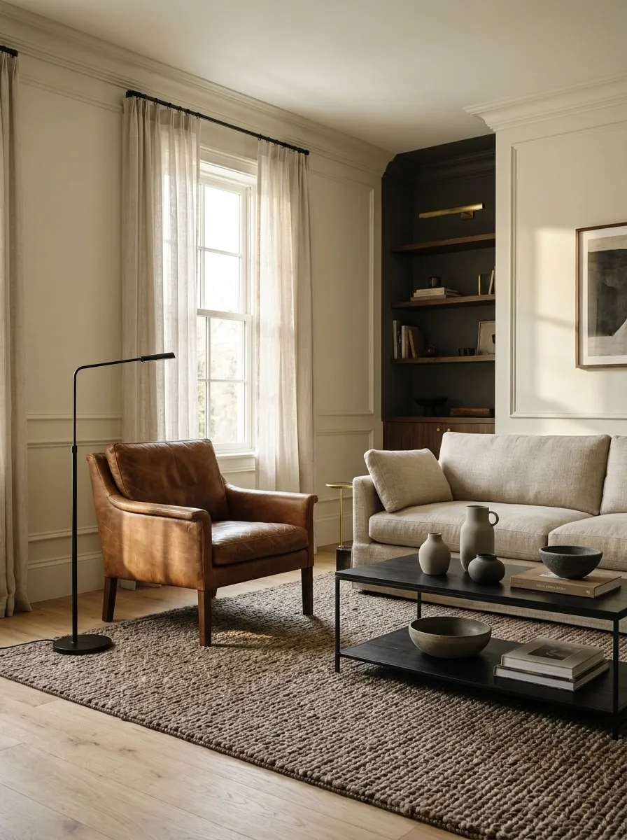
Leather brings depth and character to a room, especially in tobacco, cognac, and dark brown tones. The mistake is treating it as a mandatory uniform for every seat, cushion, and decorative accessory.
A leather accent chair beside a fabric sofa gives the room contrast without turning it into a furniture showroom from a different decade. A leather desk pad or a small upholstered bench can introduce the material without taking over the space.
Pay attention to the finish, too. Matte, worn, and lightly textured leather often feels more relaxed than highly glossy surfaces. One well-chosen piece beats an entire room trying to audition for a vintage cigar lounge.
One strong accent beats a room full of matching leather.
Use leather to introduce a warm, tactile contrast. Let upholstery, wood, wool, and metal keep the rest of the room balanced.
Pair leather with softer upholstery, natural wood, and woven textures. If every major surface is leather, the room loses the contrast that makes the material stand out.
Display Personal Objects That Tell a Story
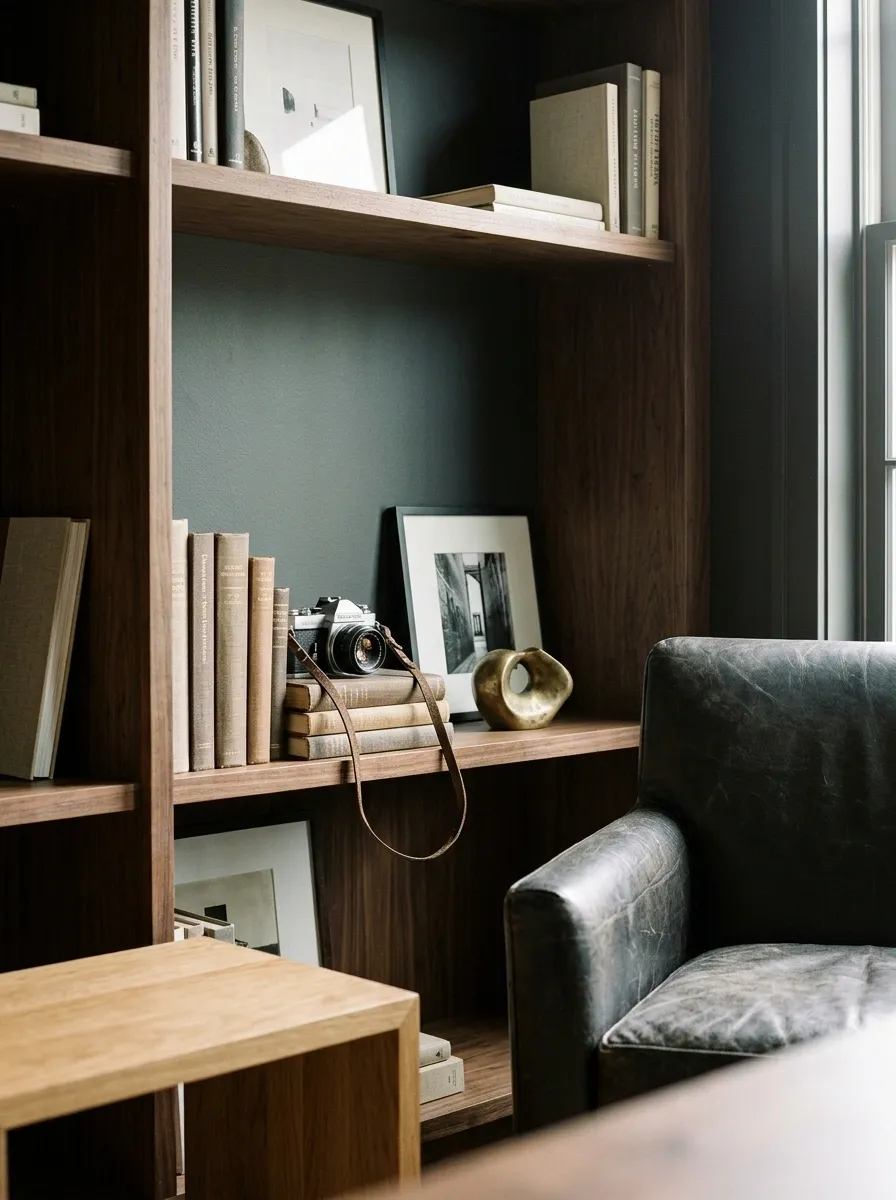
A room feels more individual when it contains objects connected to genuine interests, experiences, or memories. Books that get read, a framed architectural photograph, a vintage camera, or a meaningful travel find can give a space character without relying on mass-produced decor.
The important part is editing the collection. Display a few objects together, vary their heights, and let each piece have enough room to register. A shelf shouldn’t need a detailed explanation of every item just to make the arrangement feel intentional.
Keep the pieces that mean something and store the rest until there’s a suitable place for them. Personal style isn’t measured by the number of objects on display.
Show what matters. Leave the rest in storage.
A thoughtful display combines meaningful pieces with varied shapes, related colors, and enough empty space to keep the arrangement readable.
A photograph, print, or image with personal meaning.
A camera, sculptural object, or travel find that has a story.
Books or magazines that connect to actual interests.
Display a small group, leave visible gaps, and rotate objects when the collection grows. A meaningful piece doesn’t become more meaningful when it’s buried under fifteen other things.
Use Stripes, Checks, and Geometric Patterns With Restraint
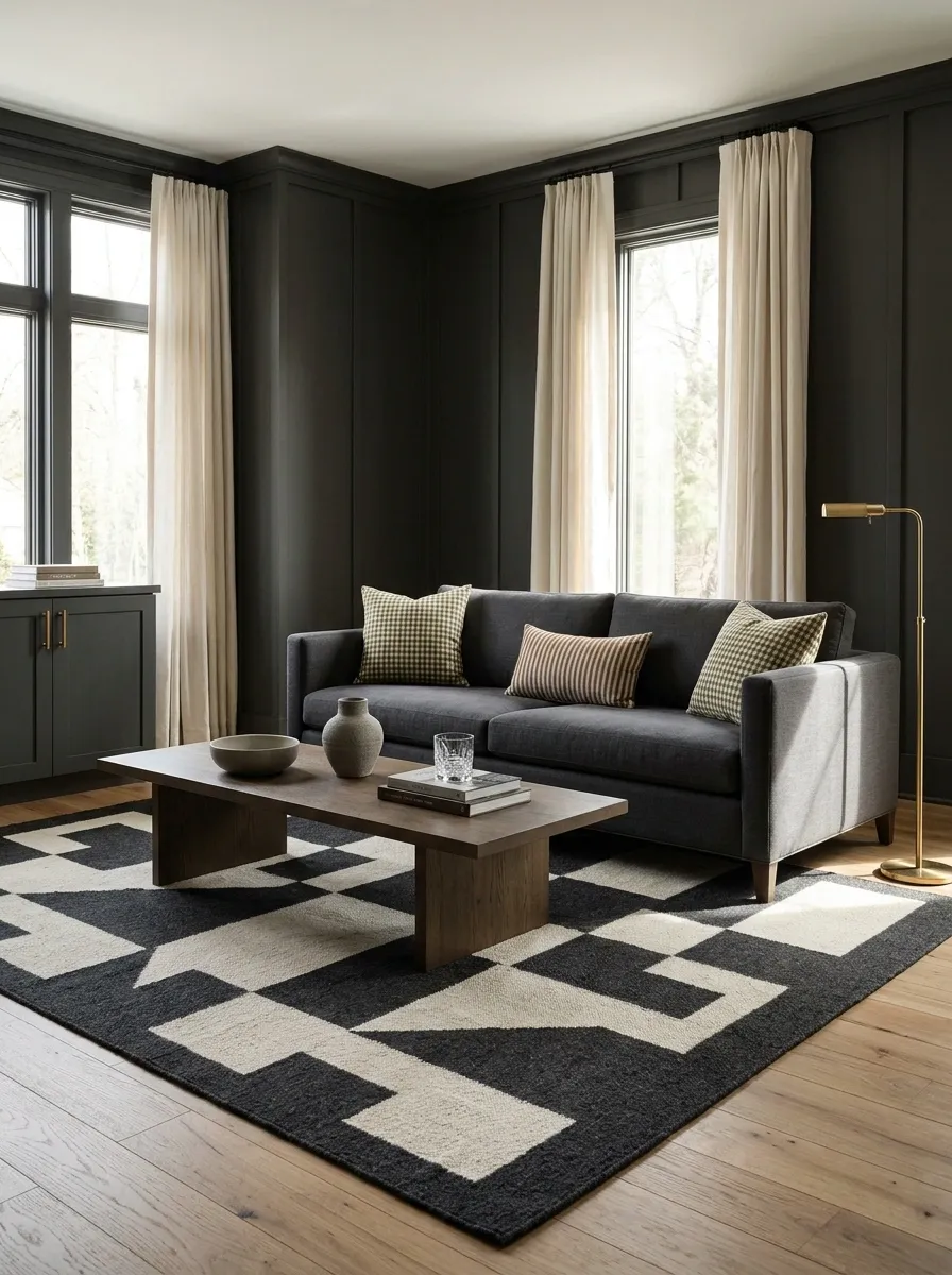
Patterns can bring movement into a masculine interior, but they need a little discipline. Combine a bold geometric rug, striped curtains, checked cushions, and graphic artwork without a plan, and the room starts looking like several different design opinions got locked in a meeting.
Choose one pattern to lead and keep the others quieter. A striped cushion can work beside a plain textured rug, while a geometric rug may need solid upholstery and uncomplicated curtains.
Keep the colors connected even when the patterns differ. Repeating olive, charcoal, cream, or tobacco across the room helps the design feel deliberate rather than accidentally coordinated.
Pattern pairing checklist
- Pick one noticeable pattern as the focal point.
- Support it with plain or subtly textured surfaces.
- Vary the scale when combining patterns.
- Repeat at least one color to connect the pieces.
- Check the overall effect from the doorway, not just up close.
One pattern leads. The rest know their place.
Mix pattern types only when their scale, contrast, and palette work together. These combinations offer a restrained starting point.
Use on a cushion or curtain panel.
Pair with a solid rugUse on the rug or one main textile.
Pair with plain upholsteryUse on a cushion or compact accent.
Pair with larger plain areasFinal check: step back and look at the room as a whole. If the patterns compete for attention, remove one rather than adding another accessory to fix the problem.
Finish With One Distinctive Detail Instead of Masculine Decor Clichés
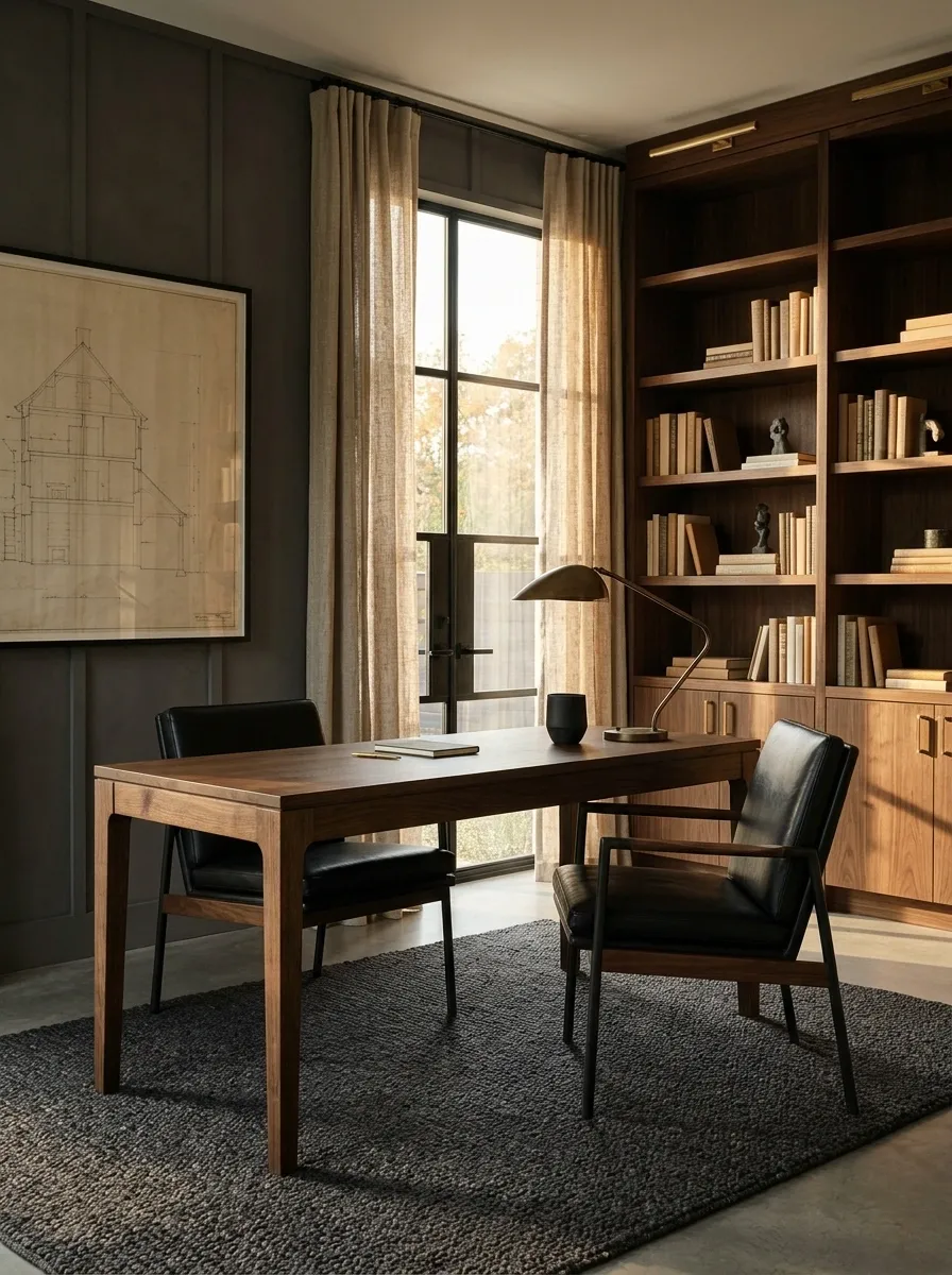
The final layer is where restraint makes the biggest difference. A room with solid furniture, considered materials, and good lighting doesn’t need a giant metal sign announcing its personality. It needs one or two details that feel connected to the person who lives there.
Choose a sculptural lamp, an interesting vintage object, a framed architectural print, or a distinctive piece of furniture. Give it enough space to stand out, and let the rest of the room support it.
Before buying another accessory, look at what’s already present. Removing an unnecessary object can make a room feel more finished than adding three new ones.
The final edit: keep what serves a purpose, what carries meaning, or what genuinely improves the composition. Everything else is just taking up rent-free space.
One distinctive detail. No decorative identity crisis.
Choose a focal detail that connects to the room’s materials, proportions, or the owner’s actual interests. Then leave enough space around it to do its job.
Provides useful light and adds a strong shape to a desk, side table, or console.
Adds character through subject, scale, or color without spelling out an entire theme.
Introduces a personal story, a distinct silhouette, or an unexpected material.
Does it serve a purpose? Does it mean something? Does it improve the room’s composition?
If the answer to all three is no, the checkout button can survive without being pressed.
Make the Room Feel Finished Without Buying More Stuff
A well-designed masculine home isn’t built by following a shopping checklist. It’s built by making better decisions about proportion, material, lighting, storage, and the objects that deserve to stay visible.
Start with the room’s biggest problems. Fix furniture placement, choose a coherent color palette, improve the lighting, and deal with the everyday clutter. Add distinctive details only after those fundamentals work.
There’s no need to replace everything at once. A better rug, a tailored set of curtains, or a thoughtfully positioned lamp can change the feel of a room without draining the budget.