
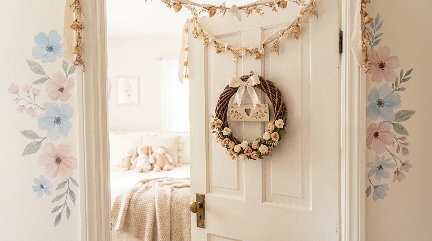
Some bedroom doors are doing absolutely nothing for the room behind them. Gorgeous bedding, lovely lighting, carefully chosen colors, and then an entrance that looks like it came free with the apartment. The disrespect.
A door doesn’t need an expensive makeover to have personality. A cluster of paper flowers, a dreamy painted arch, or a clever mix of botanical prints can make the entrance feel like part of the bedroom instead of a completely unrelated piece of furniture.
Cute Bedroom Door Decor Ideas
Sweet Drip Accent Door
A crisp white door crowned with a playful pink drip accent brings a touch of bakery-inspired whimsy to the bedroom entrance. The sweet detail sits neatly along the top edge, leaving the rest of the panel clean and completely functional.
Matching pink walls and coordinated room accessories tie the whole look together without turning the space into a giant pastry shop. The design feels light and cheerful while keeping plenty of breathing room below.
Keep the drip motif confined to the upper corner so it frames the doorway nicely. A good design knows when to stop before the sugar rush sets in.
The visual plan Let the accent anchor the top edge, leaving the lower half open for everyday use and a simple hanging tote.
Pastel Flower Garden Door With a Fresh White Frame
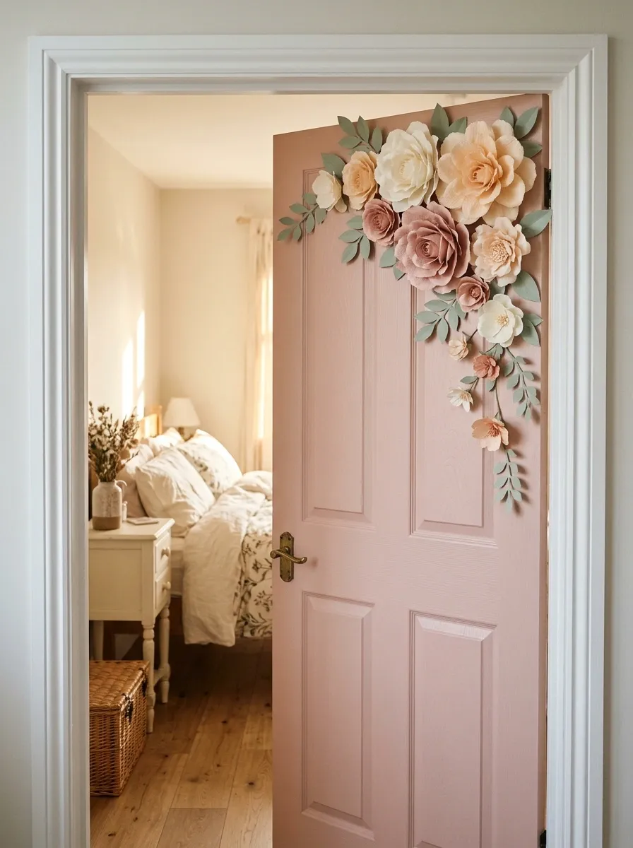
A blush-pink door decorated with paper flowers brings the charm of a little flower garden indoors. Cream, peach, and dusty-pink blooms form a generous cluster in one upper corner, with smaller flowers trailing down the side.
The white frame gives the arrangement a crisp outline, while pale bedding and understated floral accents connect the entrance to the bedroom. The whole composition feels romantic without needing a flower attached to every available surface.
The secret is leaving enough of the door visible to appreciate the design. Covering every inch with flowers can turn a sweet idea into a floral traffic jam.
The visual plan
Let the flowers follow a clear path, with a fuller cluster at the top and smaller blooms gradually trailing down the edge.
THE FLOWER PLACEMENT RULE
Cluster, then let it breathe.
Start with a fuller cluster in the upper corner. Let smaller blooms trail down the edge instead of scattering flowers everywhere.
● Peach highlights
● Soft sage leaves
Charming Vintage Sign Door
A warm dusty-rose paneled door decorated with a sweet embroidered sign brings a classic, heirloom-inspired feel to the nursery entrance. The delicate fabric plaque hangs gracefully from a timeless brass doorknob, framed by soft linen ribbons that add instant polish.
Matching trim and botanical wallpaper extend the cozy color palette into the room, creating a seamless and comforting transition. The refined textile details provide texture and charm without overwhelming the clean lines of the woodwork.
Keep the hanging sign centered and secure so it moves naturally with the door. A gentle welcome should feel intentional, not like an accidental laundry tag.
The visual plan Pair a single fabric accent with classic hardware to let the tactile textures do all the talking.
Dreamy Cloud Door With a Powder-Blue Finish
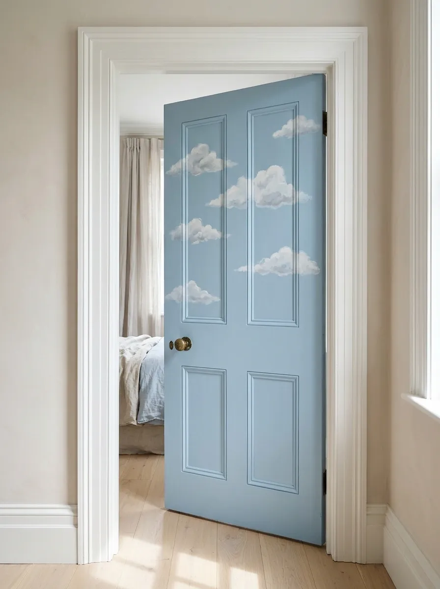
A powder-blue door scattered with fluffy white clouds brings a dreamy, sky-inspired look to the bedroom entrance. The cloud shapes sit mostly across the upper half, leaving the lower section open and uncluttered.
White trim makes the blue feel crisp, while pale bedding carries the color into the room. The result is playful without looking like a preschool classroom accidentally acquired a bedroom.
Keep the cloud shapes soft and the spacing relaxed. A hundred tiny clouds in five different styles will not improve the forecast.
The visual plan
Use a quiet color progression and give the cloud shapes enough breathing room.
A LITTLE SKY THEORY
Blue does the talking.
Keep the background calm. Let the white clouds become the only decorative shapes demanding attention.
Powder blue
The backdrop
Soft white
The clouds
Cloud grey
Optional accents
Playful Custom Lettered Doors
A pair of sage green and buttery cream doors featuring custom lettered name plaques brings a personalized, boutique hotel vibe to a shared hallway. Each door uses scalloped block letters in cheerful tones to clearly mark the space while adding a pop of color to neutral walls.
Matching door hardware and nearby floating book ledges tie the entryway together with effortless charm. The playful typography makes each entrance feel unique without cluttering the panels with extra trinkets.
Space the letters evenly across the upper panels and keep the rest of the door unobstructed. Custom signage works best when it gets the spotlight all to itself.
The visual plan Anchor the names near the top of each door to create a balanced look that guides the eye naturally from room to room.
Fairy-Tale Cottage Door With Mushroom and Woodland Details
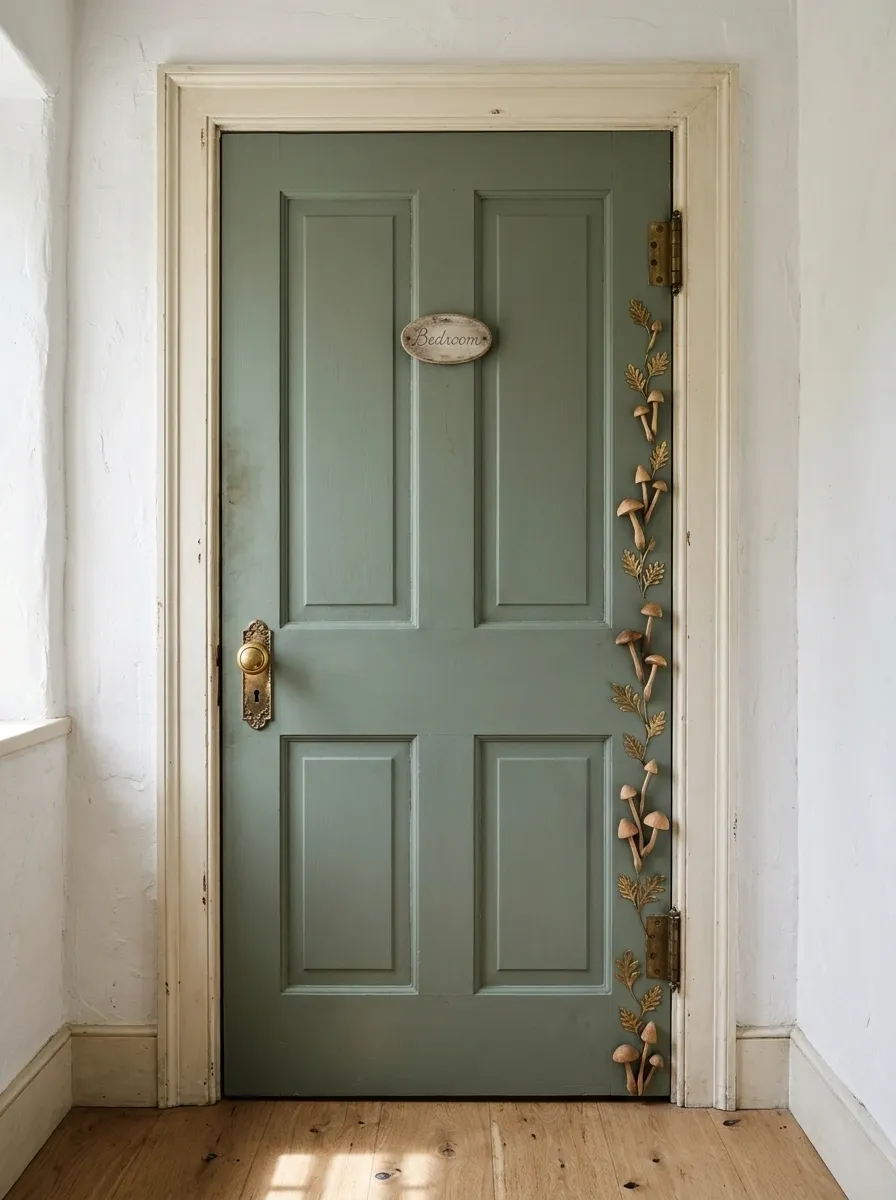
A muted sage door with tiny mushrooms, little leaves, and a wooden plaque gives the bedroom a storybook entrance without turning it into a forest-themed amusement park. Cream trim keeps the greenery fresh, while warm wood and natural textiles add cottage charm.
The decorative details should feel like little illustrations discovered along a woodland path. Repeat a few mushroom shapes and leaf motifs, then leave the rest of the door alone.
That open space is what separates a considered design from a collection of cute things competing for attention. The tiny forest does not need a population crisis.
The visual plan
Build the design around three natural finishes and a small family of repeating motifs.
A WOODLAND PALETTE
Small details. Storybook energy.
THE CANOPY
Sage paint and a few leafy shapes establish the woodland setting.
THE FOREST FLOOR
Warm wood and mushroom illustrations introduce storybook details.
THE CLEARING
Cream trim and open space keep the entrance from feeling crowded.
Motif rule: mushrooms, leaves, and restraint. The miniature forest does not need its own population crisis.
Butterfly Door With a Soft Lavender-to-Lilac Palette
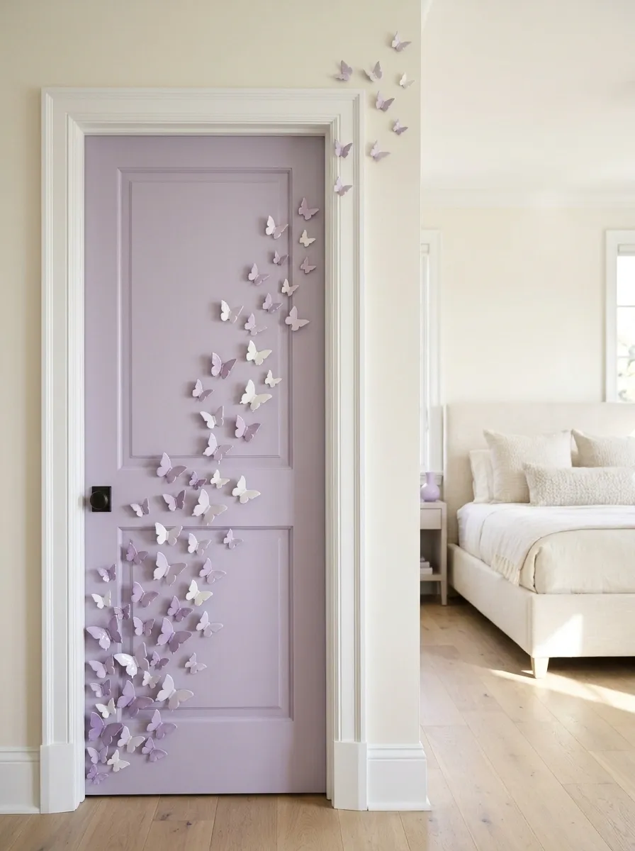
A flight of delicate butterflies gives a lavender bedroom door movement without requiring a busy pattern. The arrangement begins with a fuller group near one corner and gradually rises toward the opposite side, using smaller butterflies to create a sense of distance.
White trim and lilac accessories connect the entrance to the bedroom. The diagonal layout also makes the design feel more dynamic than evenly spaced butterflies lined up for a school photograph.
Vary the sizes, leave visible gaps, and give the arrangement a clear direction. The butterflies should look like they’re taking flight, not waiting for instructions.
The visual plan
A loose upward path gives the butterflies movement, with smaller shapes guiding the eye rather than creating a second focal point.
THE FLIGHT PATH
Follow the curve.
THE START
A fuller group creates the visual anchor.
THE MOVEMENT
Vary size and spacing along the diagonal.
THE FINISH
Let smaller butterflies fade into open space.
Cottagecore Door With Dried Flowers and Natural Linen
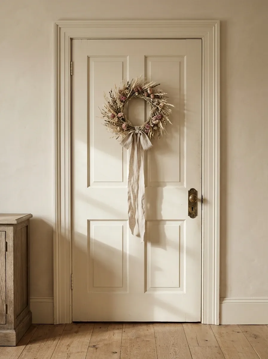
An ivory paneled door with a dried-flower wreath and natural linen ribbon feels relaxed, romantic, and pleasantly grown-up. Pale grasses, tiny dried blooms, and muted blush accents bring texture to the entrance, while aged brass hardware and oak furniture connect the design to the bedroom.
The charm comes from texture rather than quantity. Rough stems, soft ribbon, painted wood, and metal each have a different surface, so the door doesn’t need another twelve decorations to feel finished.
Keep the wreath compact and secure it properly. The look should feel like a thoughtful cottage entrance, not a tumbleweed that acquired a Pinterest account.
The visual plan
Four materials do the work here. Their differences create interest without introducing unnecessary clutter.
THE COTTAGECORE MATERIAL EDIT
Soft, rough, smooth, worn.
DRIED FLOWERS
Irregular stems bring natural shape and a rustic finish.
LINEN RIBBON
Soft folds offset the roughness of the dried stems.
IVORY PAINT
A calm background keeps the wreath easy to appreciate.
AGED BRASS
A warm metal detail adds definition without another pattern.
Keep the palette soft, but vary the textures. Four shades of identical beige are not a personality.
Smiley-Face Pop Door With a Sunshine-Yellow Accent Wall
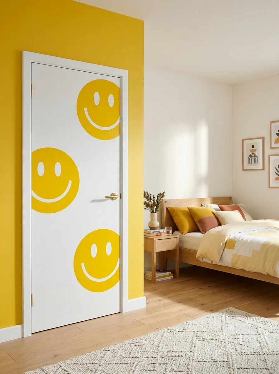
A white door with bold yellow smiley faces brings instant personality to a bedroom entrance. Oversized graphics provide the focal point, while a sunny yellow wall accent and simple geometric bedding connect the colors to the rest of the room.
The secret is scale. One or two large smileys make a stronger statement than a hundred tiny ones marching across the door like an army of cartoon stickers.
Leave some white space and keep the graphics away from the handle. This design is especially good for playful bedrooms with colorful cushions, graphic prints, and contemporary furniture.
The visual plan
The smileys need room to breathe. A small number of oversized graphics will read clearly from across the room.
THE HAPPY ACCIDENT PREVENTION PLAN
Big smiles. Less visual chaos.
The formula: a few large decals, one sunny accent color, and plenty of empty space. The door is cheerful, not running for class president.
Rainbow Arch Door With a Soft, Muted Color Scheme
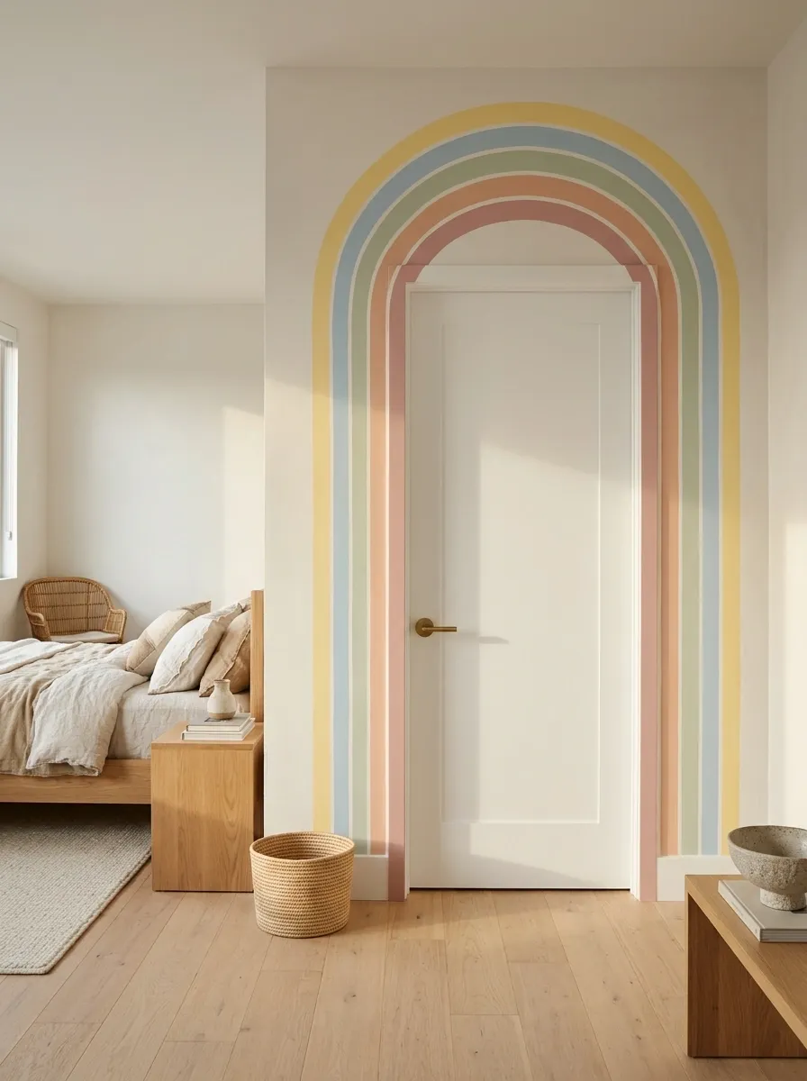
A broad rainbow arch turns an ordinary bedroom door into a playful focal point. Muted peach, dusty pink, sage, powder blue, and butter yellow provide color without making the entrance look like a birthday party that refuses to end.
The rounded bands create a strong silhouette, while simple bedding and natural wood furniture give the rest of the room breathing room. The key is choosing shades that already appear somewhere in the bedroom rather than introducing every color in the paint aisle.
For a rental, removable vinyl or a wall-mounted mural can recreate the look without permanently changing the door. If painting directly onto the surface, plan the full shape before picking up a brush.
The visual plan
The rainbow should read as one clear shape. Consistent curves and a deliberate palette make the difference.
THE RAINBOW EDIT
Five shades. One clear shape.
The arch provides the structure. The colors simply fill it in.
DUSTY PINK
The outer statement.
MUTED PEACH
A warm transition.
SOFT SAGE
A natural counterpoint.
POWDER BLUE
The cooler finishing shade.
Tape out the shape before painting. Regretting a crooked rainbow while holding a paintbrush is an avoidable character-building exercise.
Personalized Name Door With Painted Floral Corners
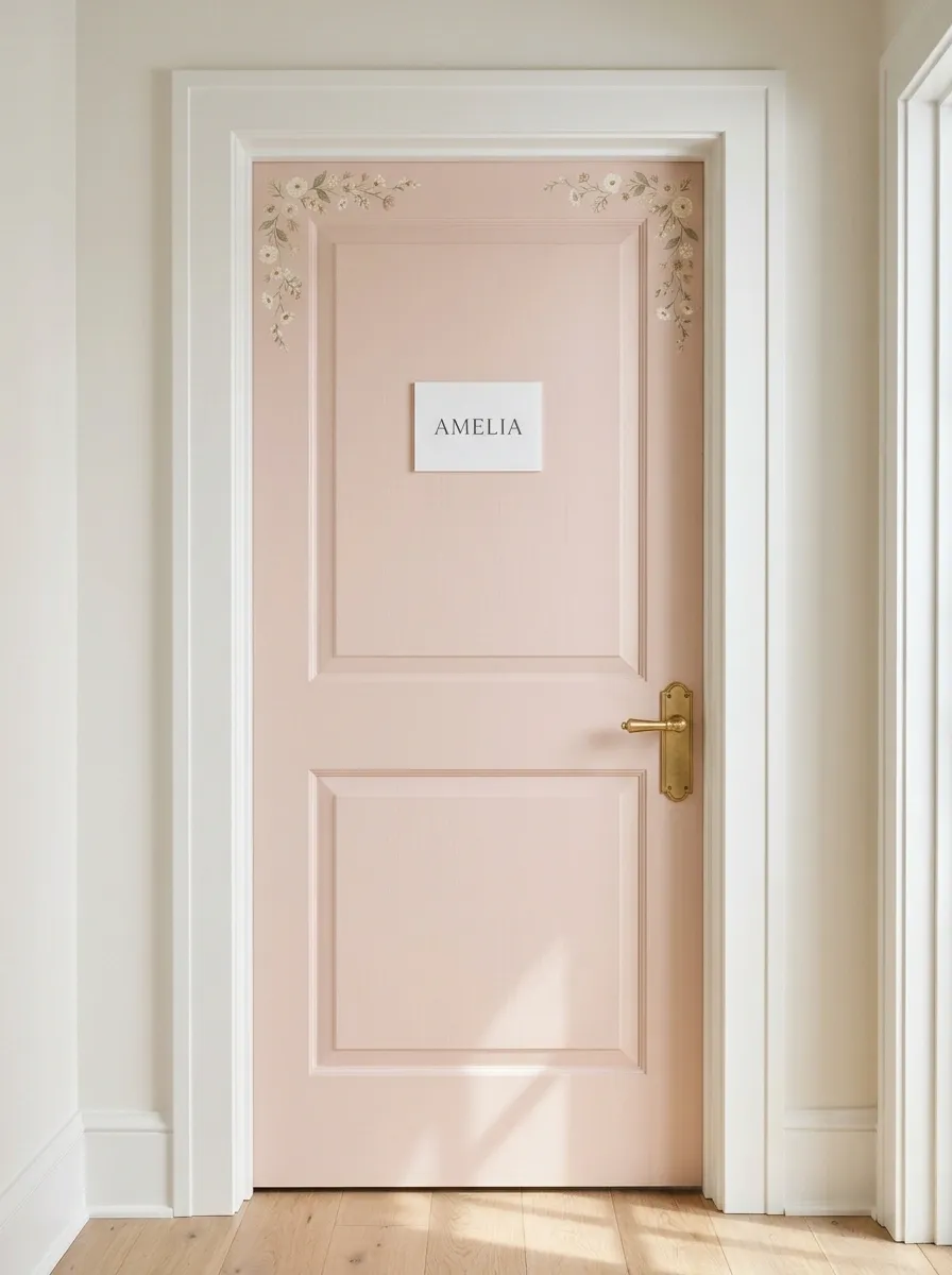
A personalized door feels thoughtful without requiring an elaborate mural. A blush background, a centered name plaque, and small floral details in the upper corners create a composition that looks intentional from the hallway.
The lettering deserves the main spotlight. Choose a readable script or simple serif style, then give the name enough space around it. Flowers should frame the lettering, not wander across it like they’re trying to steal the credit.
A removable wooden plaque or lightweight acrylic sign works well for rental rooms and shared bedrooms. A nickname or tiny illustrated emblem can offer the same personal touch.
The visual plan
Keep the message legible and the decorative details secondary. Personalization works best when it looks designed, not improvised.
THE PERSONAL TOUCH
WELCOME TO
Your Name
A LITTLE WORLD OF YOUR OWN
LEGIBILITY
Choose lettering that reads clearly from the hallway.
BREATHING ROOM
Leave open space around the name.
FLORALS
Use small corner details, not a full flower invasion.
Celestial Night-Sky Door With Stars and a Crescent Moon
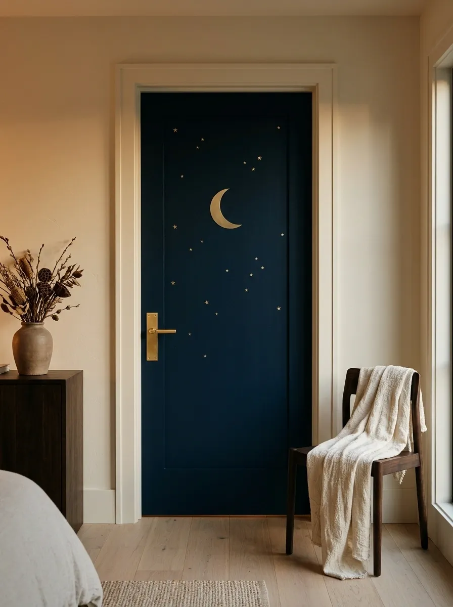
A deep navy door with a gold crescent moon and scattered stars gives the bedroom a little midnight drama. The dark surface makes the metallic details stand out, while warm ivory walls, brass hardware, and amber lighting keep the composition from feeling cold.
The moon should be the main event. Place it slightly off-center and arrange a handful of stars around it with varied spacing. An evenly sprinkled pattern can make the door look like wrapping paper, and nobody needs their entrance to resemble a birthday gift.
Removable metallic decals can produce the effect without repainting the door. The rest of the bedroom should use a few dark accents, warm wood, and simple furnishings.
The visual plan
A dark backdrop needs contrast, not clutter. Let one large celestial shape anchor the arrangement.
AFTER DARK
A little moonlight goes a long way.
Midnight navy
The dramatic backdrop
Muted gold
The celestial highlight
Warm ivory
The balancing neutral
One moon, a few stars, and a dark background. The entire solar system has not been invited.
Polka-Dot Door With a Playful Retro Palette
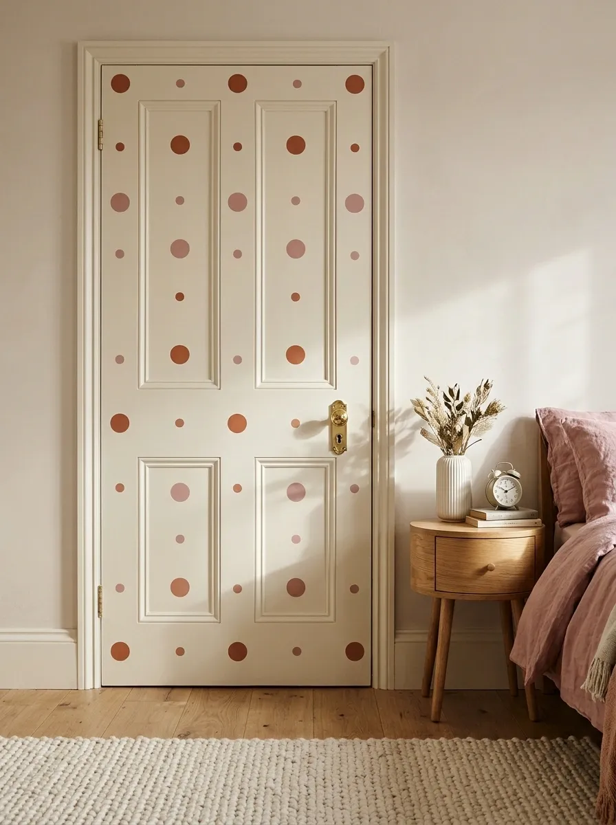
A cream door with terracotta and dusty-rose polka dots brings a playful retro look without committing the entire bedroom to a theme. Two dot sizes create rhythm, while warm oak furniture and a few pink accessories connect the pattern to the surrounding room.
Spacing is the difference between a polished pattern and a door that looks like it caught a case of decorative spots. Keep the dots apart enough for the background to show through, and adjust their placement around raised panels or hardware.
The look pairs well with rounded furniture, vintage-inspired accessories, and warm neutrals. Removable dots are useful when the room needs an update without a permanent paint job.
The visual plan
Two dot sizes create rhythm. A limited palette keeps the playful look from becoming chaotic.
THE RETRO DOT STUDY
Pattern with a pulse.
Two sizes.
Two accent colors.
Terracotta
The visual anchor
Dusty rose
The softer repeat
Leave visible gaps between the dots. Negative space is doing unpaid labor here, so let it work.
Minimal Scandinavian Door With a Small Wooden Hanging
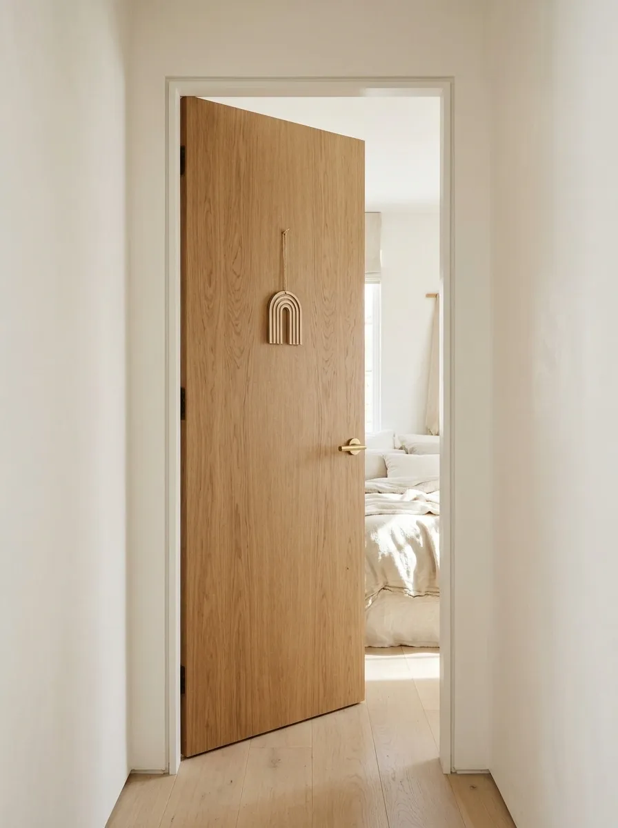
Not every cute bedroom door needs flowers, rainbows, or enough stickers to qualify as a public art installation. Sometimes the prettiest entrance is a natural oak door with one handmade wooden hanging, crisp white walls, and soft linen textures.
The wood grain becomes the main feature, while a small geometric ornament adds personality without interrupting the clean lines. Pale flooring and cream bedding keep the room connected to the entrance.
Choose a lightweight hanging with an uncomplicated shape, such as a wooden arch or a small sun. Keep the surrounding decor restrained so the natural materials can do their job.
The visual plan
The composition depends on material contrast rather than decorative quantity.
THE SCANDINAVIAN EDIT
Less decoration. Better materials.
NATURAL OAK
Visible grain supplies warmth and becomes the dominant surface.
WARM WHITE
Open, light surfaces give the wood enough space to stand out.
SOFT LINEN
A subtle fabric texture keeps the room from feeling too polished.
The assignment is restraint. Adding six more ornaments because the door looks empty is how minimalism files for divorce.
Gingham Door With a Pastel Picnic Theme
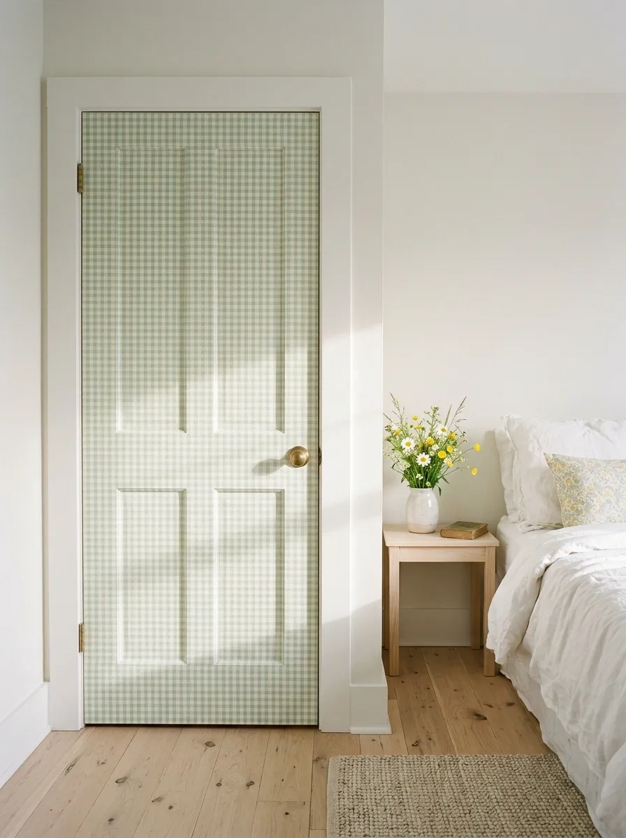
A mint-and-cream gingham door brings the charm of a summer picnic into the bedroom. The small checked pattern feels cheerful and nostalgic, especially when paired with white trim, floral bedding, and pale wood furniture.
Scale matters here. Tiny checks create a delicate, fabric-like appearance, while larger squares feel bolder and more graphic. Align the pattern with the door panels so it looks intentional rather than accidentally crooked.
Keep the surrounding room simple. Combining gingham, large florals, stripes, and polka dots can turn the bedroom into a picnic blanket that has lost its way.
The visual plan
One repeating check establishes the structure. A small secondary floral print is enough to connect the doorway with the bedroom.
THE PICNIC PATTERN STUDY
Checks need a little breathing room.
Small gingham
A delicate look that suits smaller door surfaces.
Larger gingham
A bolder statement that stays visible from across the room.
THE PRINT PAIRING
Let gingham handle the big pattern. Add one small floral print or keep the remaining textiles plain.
Art Gallery Door With a Mix of Small Framed Illustrations
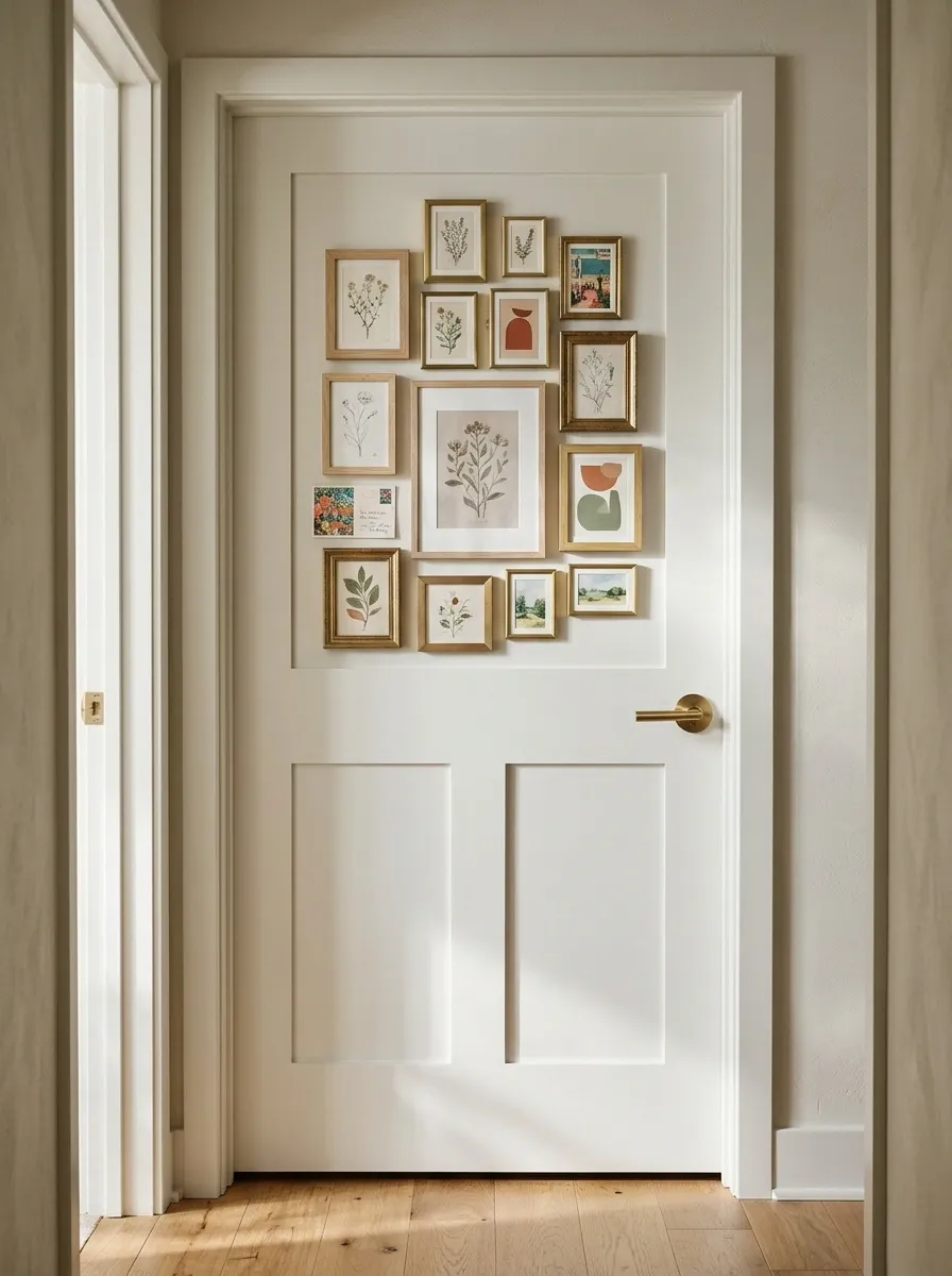
For anyone who cannot choose just one artwork, a mini gallery door offers a creative compromise. Small illustrated prints, colorful postcards, and lightweight frames form a compact arrangement against a white background.
The images can mix botanical sketches, abstract shapes, tiny landscapes, and playful drawings, as long as the colors have something in common. A defined outer shape makes the collection feel intentional rather than like random papers attached to a door.
Start with one larger print, arrange smaller pieces around it, and keep the gaps reasonably consistent. Use lightweight, secure attachments that won’t interfere with the handle or door movement.
The visual plan
The gallery needs an anchor and a defined boundary. Artwork can vary in size without looking scattered.
THE MINI GALLERY
An art wall, minus the wall.
THE ANCHOR
Use one slightly larger print to establish the arrangement.
THE RHYTHM
Repeat a few colors and maintain comfortable spacing.
Lightweight frames only. A heavy frame flying off the door during a dramatic exit is a plot twist nobody requested.
Macramé and Woven Texture Door With Bohemian Warmth
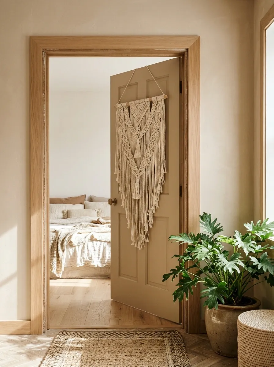
Soft woven textures give this bedroom entrance a relaxed bohemian character without relying on bright colors. A warm beige door, cream macramé hanging, natural tassels, and timber accents create a layered look, while cream textiles and a leafy plant carry the palette into the room.
Texture is what makes the composition interesting. Knotted cotton contrasts with the smooth door, and rattan introduces another natural pattern.
Choose a compact macramé piece and secure it properly. Keep loose cords clear of handles and hinges so the doorway doesn’t become a yarn obstacle course.
The visual plan
Three different textures create depth. The placement stays simple so the materials receive the attention.
THE TEXTURE REPORT
Touch is part of the design.
KNOTTED COTTON
Soft, irregular detail provides the main decorative focus.
WOVEN FIBERS
A stronger pattern adds depth without introducing another color.
NATURAL WOOD
Warm structure balances the softness of the hanging.
One textured focal point is enough. The macramé does not need twelve cousins hanging beside it.
Checkerboard Door With a Contemporary Peach and Cream Palette
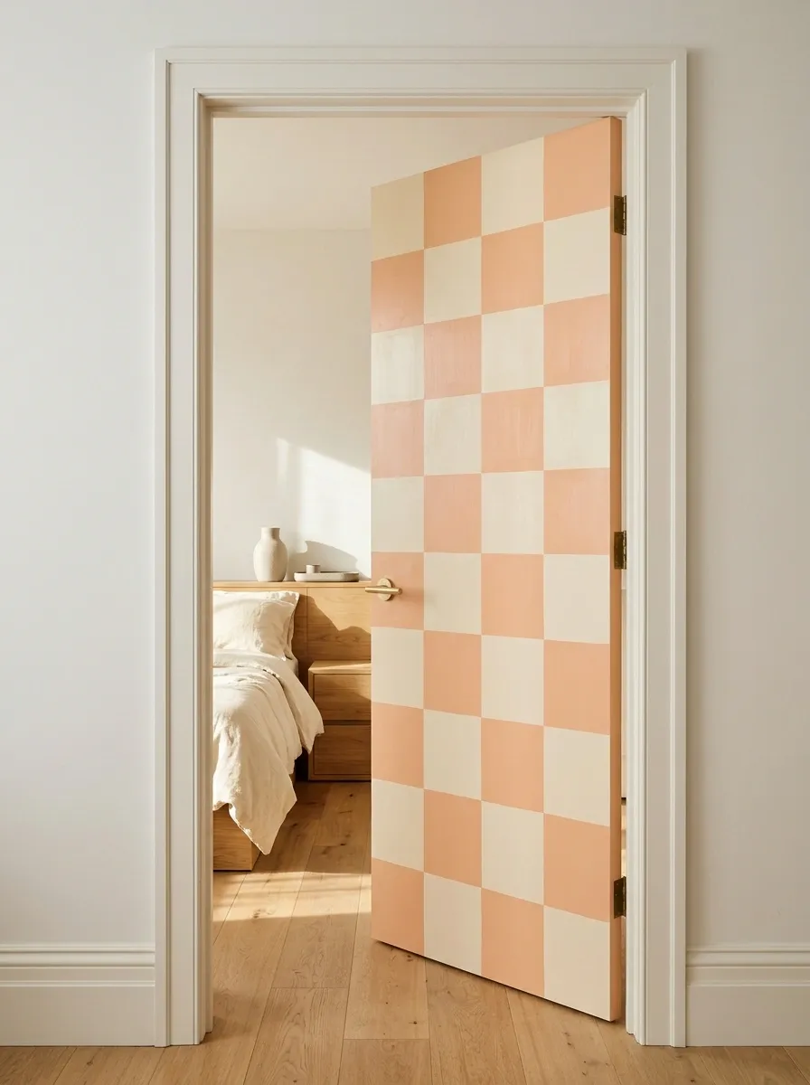
A peach-and-cream checkerboard door makes a playful entrance without needing additional decorations. The regular grid gives the door a strong graphic identity, while warm oak furniture and plain bedding connect the pattern to the room.
The scale of the squares determines the mood. Larger checks feel bold and graphic, while smaller checks create a busier, more decorative finish.
Plan the grid around the door’s edges and panels before painting or applying decals. The surrounding walls should remain relatively quiet because this pattern already has plenty to say.
The visual plan
A two-color grid creates the impact. Let the geometry carry the look instead of adding more patterns.
THE CHECKERBOARD STUDY
Let the geometry speak.
Peach gives the door warmth. Cream breaks up the pattern and keeps the entrance light.
PEACH
Warmth and graphic contrast.
CREAM
Visual breathing room.
Pick the square size before committing to the pattern. Improvising a grid halfway through is a bold choice, just not a good one.
Vintage Rose Door With Antique-Inspired Details
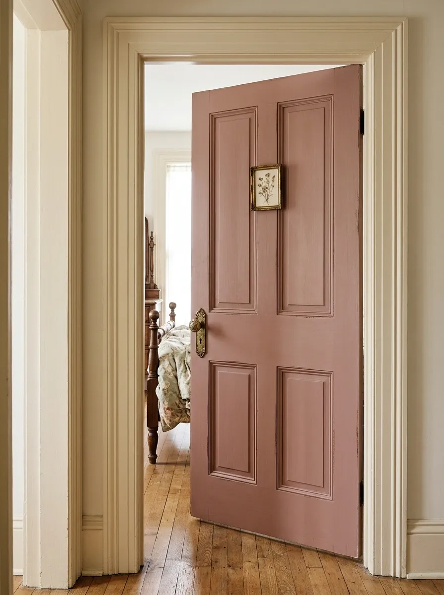
Dusty rose paint, traditional paneling, and aged brass hardware give this entrance a romantic vintage character. A small botanical illustration adds a delicate finishing detail, while warm wood furniture and faded floral bedding bring the same old-fashioned charm into the bedroom.
The trick is choosing details that look related. Ornate lettering, three different floral patterns, distressed paint, and a giant bow competing on the same door can make the design feel like a costume party for furniture.
Keep the paneling and hardware prominent, then let one small illustration provide the personality. The result suits bedrooms with traditional furniture, warm lighting, and vintage textiles.
The visual plan
The door’s personality comes from the relationship between the painted surface, traditional paneling, and warm metal.
THE VINTAGE FINISH EDIT
Romantic, not relic-worthy.
THE ANCHOR
Dusty rose paint and paneled construction establish the vintage character.
THE DETAIL
Aged brass and one botanical print add warmth without crowding the surface.
THE BALANCE
Cream trim keeps the darker wood and rose tones from feeling too heavy.
Vintage charm does not require making every object look like it survived three centuries and a family dispute.
Ocean-Inspired Door With Sea-Glass Colors and Shell Art
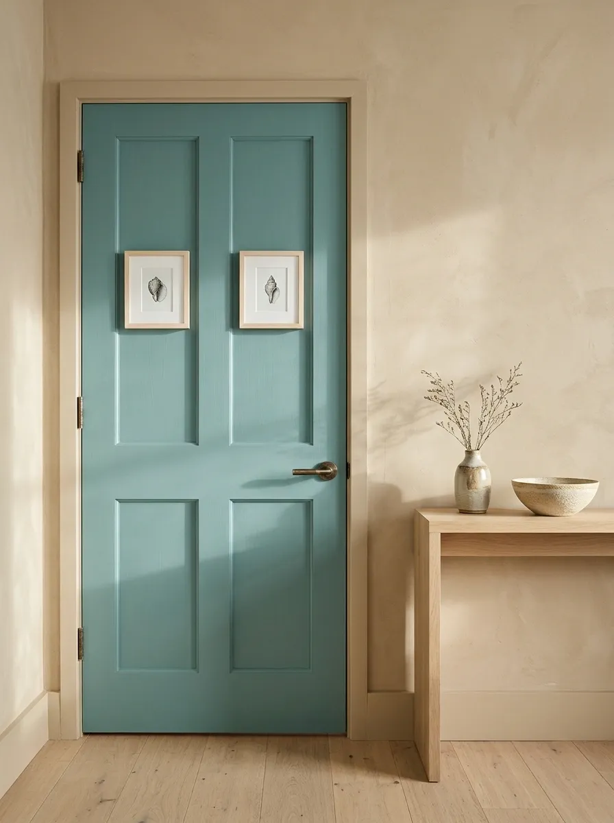
A sea-glass teal door brings a coastal feel to the bedroom without the usual overload of anchors, ropes, and decorative objects that have no business living together. A few small shell illustrations provide the theme, while warm sand-colored walls and pale oak furniture keep the entrance grounded.
Teal provides the main color, pale aqua softens it, and cream introduces warmth. Keep the shell artwork simple and widely spaced so the door doesn’t resemble a collection of holiday souvenirs.
This style works particularly well with natural fabrics, muted colors, and plenty of daylight. Warm neutrals also help the design feel inviting in bedrooms that aren’t especially bright.
The visual plan
A layered coastal palette needs both cool water tones and warm sandy neutrals.
THE SEA-GLASS PALETTE
Coastal without the souvenir shop.
SEA-GLASS TEAL
The dominant color gives the door its coastal identity.
PALE AQUA
A lighter echo creates a softer transition.
WARM SAND
Natural warmth balances the cooler blue-green shades.
CREAM
An open neutral keeps the whole entrance feeling light.
A few shell illustrations establish the theme. The full marine biology department does not need to attend.
Rainbow Bead Curtain Doorway With a Playful Retro Feel
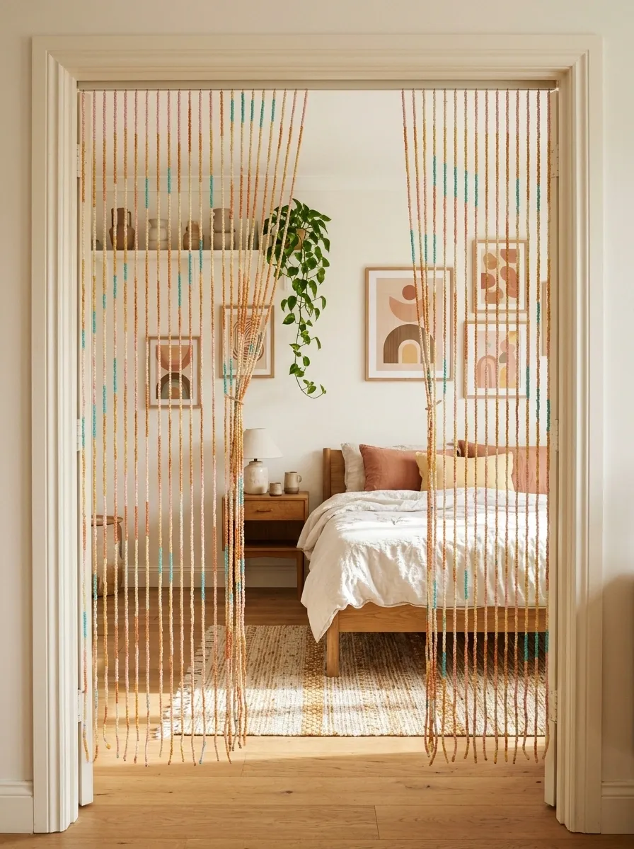
A rainbow bead curtain creates a different kind of bedroom entrance by adding movement instead of decorating a flat door. Soft pink, orange, yellow, turquoise, and cream beads hang across an open doorway, with the bedroom visible beyond.
Retro artwork, simple bedding, and a restrained repeat of the curtain colors make the entrance feel playful rather than chaotic. It’s a distinctive option for a suitable open doorway or non-private partition.
This isn’t a replacement for a regular bedroom door when privacy or sound separation matters. The strands must stay clear of the walking path and should never interfere with a door’s operation.
The visual plan
The curtain introduces color, movement, and a visual transition between spaces.
THE RETRO THRESHOLD
Color that moves with you.
THE VISUAL EFFECT
Vertical strands add rhythm and a gentle sense of separation.
THE PRACTICAL CHECK
Maintain clear passage and use the curtain only where an open entrance is appropriate.
Very groovy. Less groovy if the beads keep catching on everything you own.
Handmade Paper Pennant Door With Soft Boho Colors
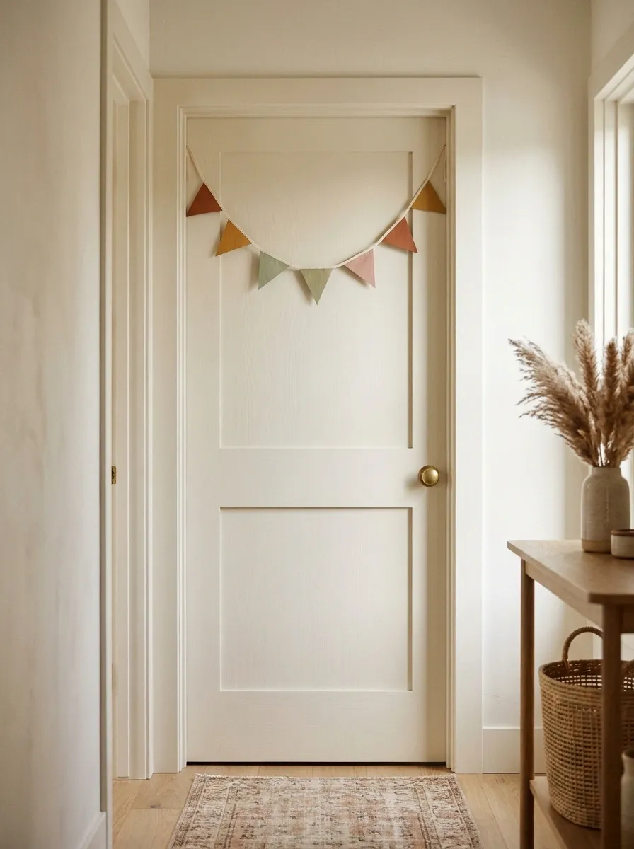
A handmade pennant garland gives the bedroom entrance a crafty, personal feel without turning it into a permanent party venue. Small triangles in terracotta, mustard, sage, and dusty pink stretch across the upper portion of a cream door.
The trick is keeping the garland short enough to feel decorative rather than theatrical. Choose a few coordinated colors, repeat them in a relaxed sequence, and leave the lower portion of the door mostly open.
This design works well in creative bedrooms, bohemian interiors, and spaces with handmade accessories. Lightweight paper or fabric decorations also make the look easy to update when the room’s color scheme changes.
The visual plan
The garland gets its personality from the rhythm of its shapes and colors.
THE PENNANT EDIT
A little handmade happiness.
Repeat the palette, vary the colors, and let the shapes do the decorating.
COLOR RHYTHM
Alternate warm and cool shades instead of repeating one color in a long block.
VISUAL SPACE
Keep the garland toward the top and leave the door’s lower area clear.
Handmade is charming. Twenty-seven unrelated craft supplies attached to one door is a cry for organizational help.
Soft Pink Door With a Sculptural Ribbon Bow
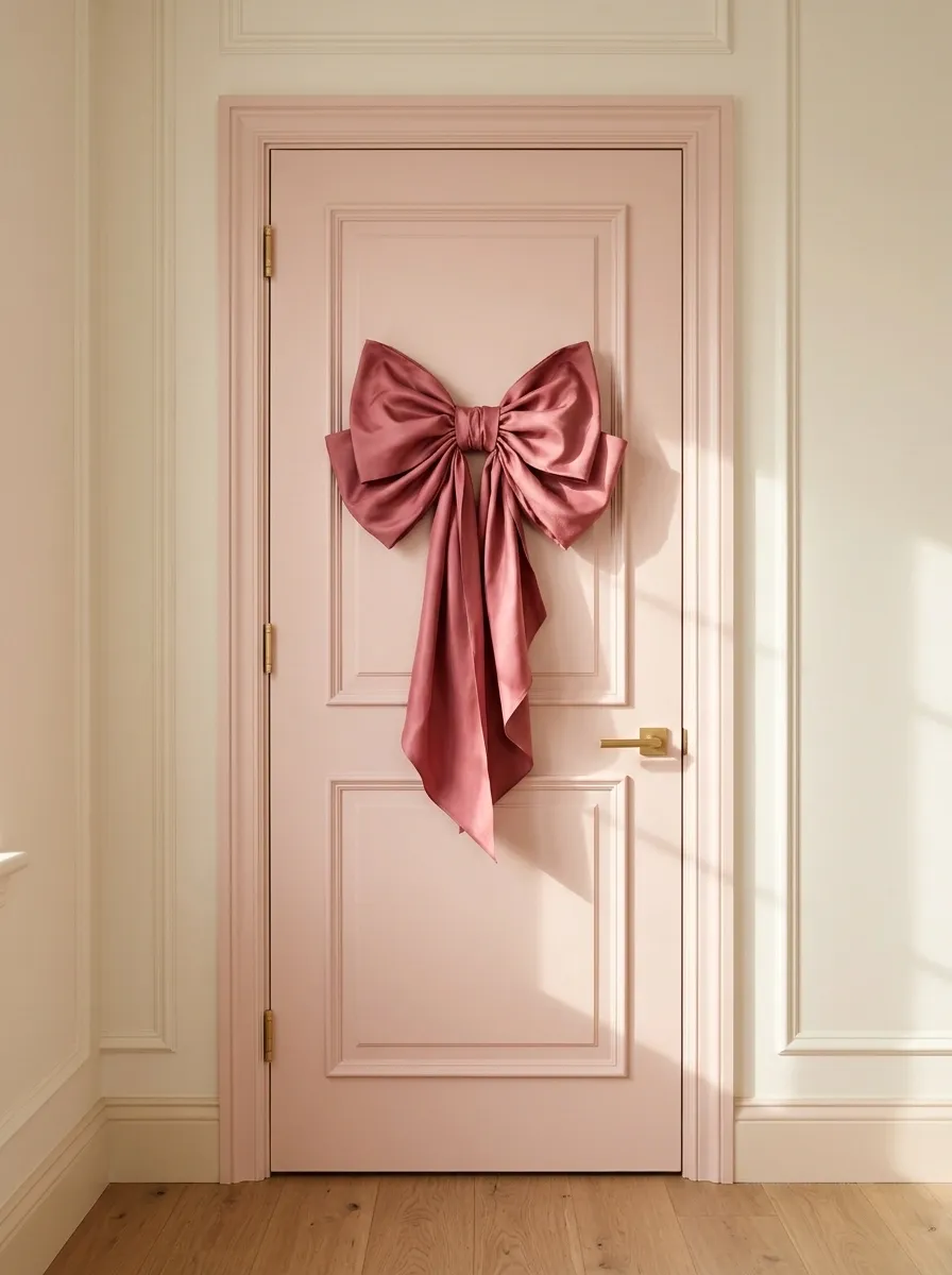
One oversized ribbon bow can give a plain pink bedroom door all the personality it needs. The soft blush background, deeper rose ribbon, and clean cream surroundings create a romantic design that feels more editorial than last-minute DIY.
Proportion makes this look work. A bow that’s too small can disappear against the door, while one that’s too large can swallow the paneling and overwhelm the entrance.
Choose a shape that complements the door’s width, with fabric folds that add texture without creating unnecessary bulk. Keep everything else simple enough to let the ribbon be the main character.
The visual plan
The bow’s scale and fabric are the focus. Keep everything else simple enough to let the silhouette stand out.
THE RIBBON STUDY
One bow. Excellent manners.
THE RIGHT SCALE
A broad bow creates a clear focal point without hiding the door’s entire surface.
THE RIGHT TEXTURE
Soft fabric folds bring depth to the smooth painted background.
Keep the handle and hinges clear, secure the bow properly, and resist the urge to add matching ribbons to the entire bedroom.
Monochrome Doodle Door With a Personalized Sketchbook Theme
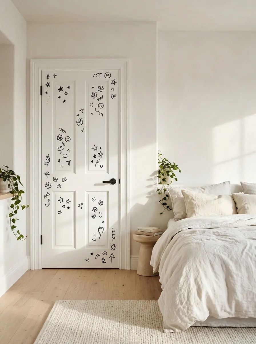
A white door covered in black doodles turns the bedroom entrance into a giant sketchbook. Tiny stars, outlined flowers, smiley faces, abstract squiggles, and personal symbols create a relaxed, creative look.
Keeping everything in black and white lets the different illustrations work together, while pale wood and neutral bedding give the surrounding room some breathing space.
Let the doodles vary in shape and size, but leave gaps between clusters. A completely filled surface can lose the charm of individual drawings and start looking like a notebook that survived a very stressful mathematics exam.
Removable black decals are practical for rentals. For a permanent design, suitable paint markers can work on a properly prepared surface.
The visual plan
The contrast between black linework and white space is the whole point.
THE SKETCHBOOK STUDY
Organized chaos. Emphasis on organized.
♡
✦
〰
✿
✧
⌁
VARY THE SHAPES
Mix small symbols with a few larger drawings so nothing feels mechanically repeated.
PROTECT THE WHITE SPACE
Leave open patches between doodle groups to keep the design readable.
The door can have personality without looking like every pen in the house was tested on it.
Greenhouse Door With Leaves, Vines, and Botanical Prints
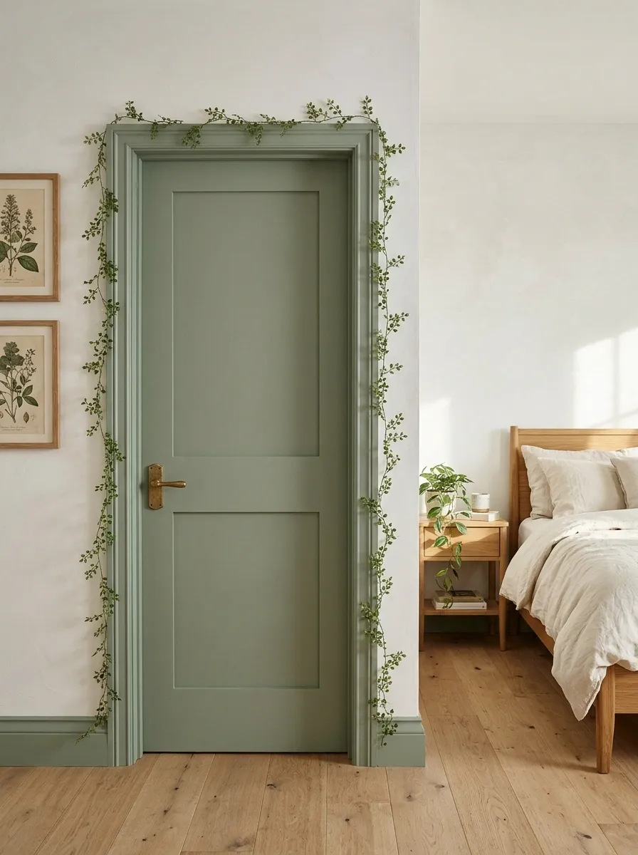
A muted sage door framed with delicate vines makes the entrance feel connected to the greenery inside the bedroom. Small leaves climb along the edges, botanical prints provide structure, and a carefully placed houseplant reinforces the theme.
Cream bedding and warm oak furniture prevent all that green from becoming a botanical takeover. Repeating a few leaf shapes creates continuity, while slight variations in size make the arrangement feel more natural.
Let the vines follow the outer edges instead of covering the middle of the door. The handle, panels, and open space should remain easy to see.
The visual plan
The perimeter carries the botanical details, while the center remains relatively open.
THE BOTANICAL PLACEMENT STUDY
Let the leaves frame the scene.
♧
❧
❧
♧
THE DESIGN LOGIC
Edge details establish the botanical theme. An open center keeps the door from feeling crowded, and a few real plants connect the design to the surrounding room.
A botanical bedroom is the goal. A doorway auditioning for a jungle documentary is not.
Bold Geometric Door With Color-Blocked Shapes
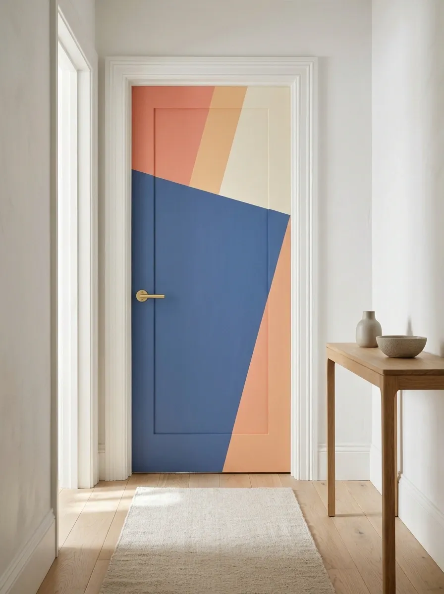
Geometric color blocking gives a bedroom door a bold, contemporary personality. Muted cobalt, coral, peach, and warm ivory form a composition of angled blocks and broad shapes.
Unlike polka dots or butterflies, this design depends on the relationship between large shapes. One dominant color should lead, with the others playing supporting roles. Asymmetrical boundaries add energy, but the overall arrangement still needs to feel balanced.
Plan the shapes before painting or applying vinyl. Existing panels, knobs, and edges affect where the lines should end.
The visual plan
The color areas need a clear hierarchy. One large block anchors the design, while smaller accents create movement.
THE COLOR-BLOCK STUDY
Big shapes. Clear hierarchy.
Give one color the lead role. Four equally loud colors are not a design hierarchy. They’re a committee meeting.
Cozy Reading-Nook Door With a Small Literary Theme
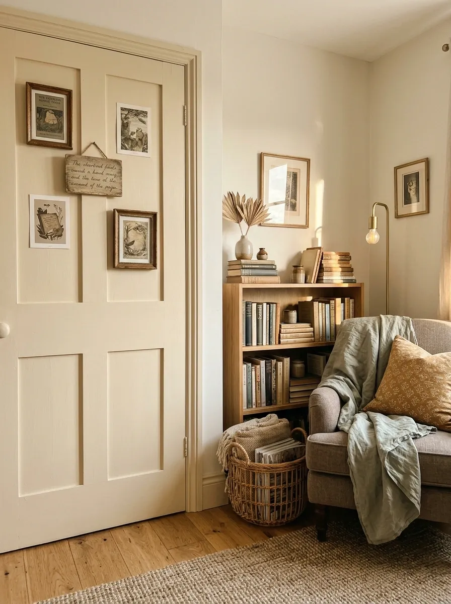
For a book lover, the bedroom entrance can hint at the little reading world waiting inside. A warm cream door displays small book-inspired prints and a simple wooden plaque, while a compact bookshelf and soft lighting make the theme feel connected to a real reading corner.
The connection between the door and the room is what makes this design work. Repeat one or two colors from the prints in the reading nook, and keep the artwork arranged within a clear boundary.
Too many book covers and quotes can make the door resemble a bookstore noticeboard during exam season. A few carefully chosen prints are enough to make the entrance personal.
The visual plan
The door art and reading nook should feel like two parts of one composition.
THE BOOK LOVER’S ENTRANCE
A good story starts at the door.
DOOR ART
Small prints repeat the room’s colors.
READING CORNER
A real bookshelf makes the theme feel personal.
Repeat the palette between the entrance and the reading corner. Buying every book-themed accessory on the internet is not character development.
Soft Neutral Door With a Handmade Seasonal Wreath
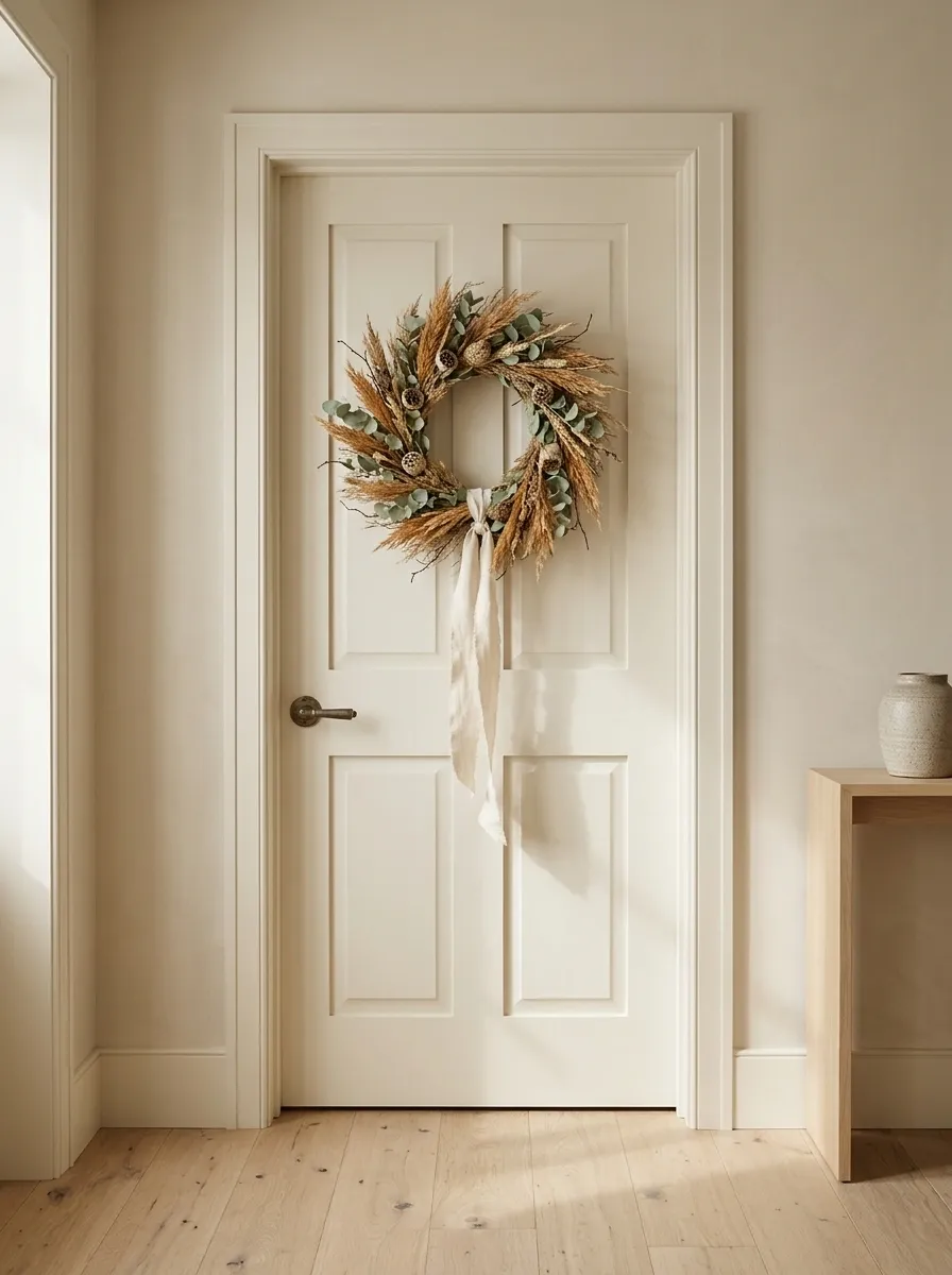
A warm ivory door and a handmade neutral wreath create a quieter finish for bedrooms that don’t need another burst of bright color. Dried grasses, natural seed pods, muted foliage, and a soft cream ribbon provide texture against the painted panels.
The wreath supplies the focal point without hiding the door’s structure. The natural materials introduce enough variation to keep the arrangement interesting, while the surrounding colors allow the entrance to feel restful rather than bland.
The wreath can change with the seasons. Spring can bring delicate blossoms, summer can use greenery, and autumn can introduce dried grasses, all while the neutral base stays the same.
The visual plan
A neutral base can support seasonal changes without redesigning the entire entrance each time.
THE SEASONAL WREATH EDIT
One calm base. Different moods.
THE PERMANENT PIECES
Ivory paint, a neutral wreath base, and soft natural textures stay consistent throughout the year.
SPRING
Pale blossoms and delicate new greenery.
SUMMER
Soft leafy stems and fresh green accents.
AUTUMN
Dried grasses and muted caramel tones.
WINTER
Evergreen sprigs and soft cream ribbon.
A seasonal refresh should involve changing the wreath, not starting an entirely new home improvement saga.
Give the bedroom door its own personality
The best design is the one that looks connected to the bedroom, not the one that requires the most craft supplies. A painted rainbow, a botanical border, and a simple wreath can all work beautifully when the colors, materials, and proportions make sense together.
Before buying anything, look at the door alongside the existing furniture, bedding, and wall colors. Pick a focal point, check how the door opens, and choose decorations that can handle everyday use without falling off or getting in the way.
And remember, the door doesn’t need to match every single thing in the room. It just needs to look like it belongs there.