
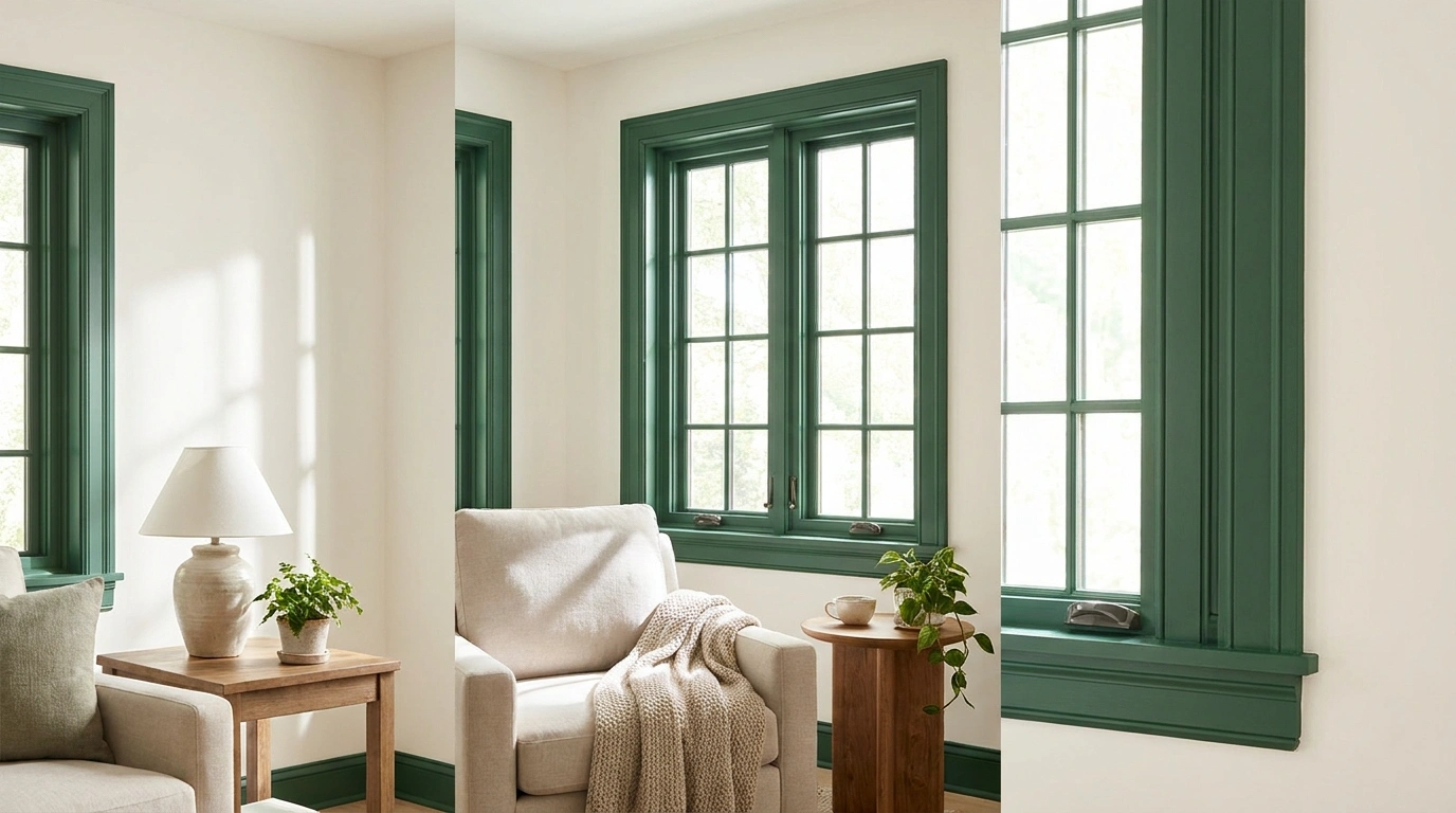
Black window frames get recommended with the confidence usually reserved for drinking water and paying taxes. Apparently every room, building, and view is improved by a dark outline. Convenient advice. Not especially good advice.
A frame color changes how a window sits within the room. It can sharpen the view, soften an awkward opening, connect mismatched architecture, or make a small wall feel unnecessarily busy. White isn’t automatically timid, and dark paint isn’t automatically sophisticated. Sometimes it’s simply dark paint around a window that already had plenty going on.
The useful question is what the frame should do beside your walls, flooring, furniture, and outdoor view. These interior window frame colors are presented as complete room combinations so the choice has some context beyond a fashionable swatch.
You can keep the frame quiet or make it a deliberate feature. Just choose that role before buying paint. The window is attached to a room, despite what the close-up photographs tend to imply.
A Paint Choice Is Also a Material Choice
Check what the frame is made from and what finish or system is permitted. Timber, metal, and manufactured window products can have different preparation, coating, warranty, and operating requirements.
Keep seals, drainage paths, hardware, and moving joints clear. Use the appropriate coating guidance for the actual product. Painting over a functioning detail does not count as improving it.
Frame Colors With a Room Around Them
Soft Black Frames in a Warm White Living Room
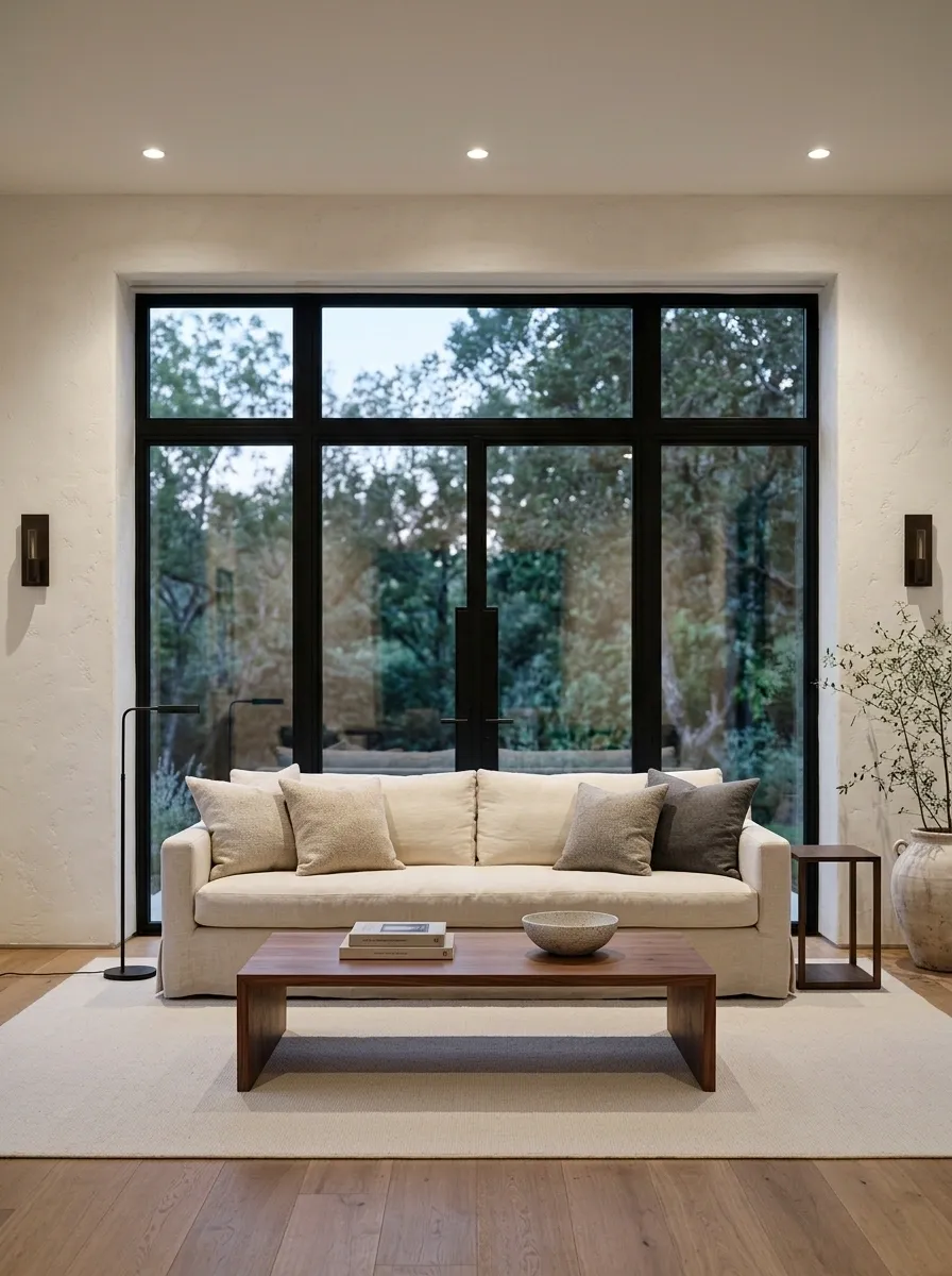
Use softened black frames beside warm white walls, a pale sofa, and medium-toned timber furniture. A plain rug keeps the floor quiet, while restrained dark lighting connects the window outline to useful objects in the room.
This pairing works when the view and opening deserve definition. Keep the black away from every accessory; the window already supplies a substantial outline. Harsh cool white walls can make the contrast feel more severe than intended. Test the frame shade against the wall in daylight and after dark before committing to the full perimeter.
Warm white wall around it.
Compare the frame and wall together. Either can make the other look cooler.
Warm White Frames With Pale Oak and Linen
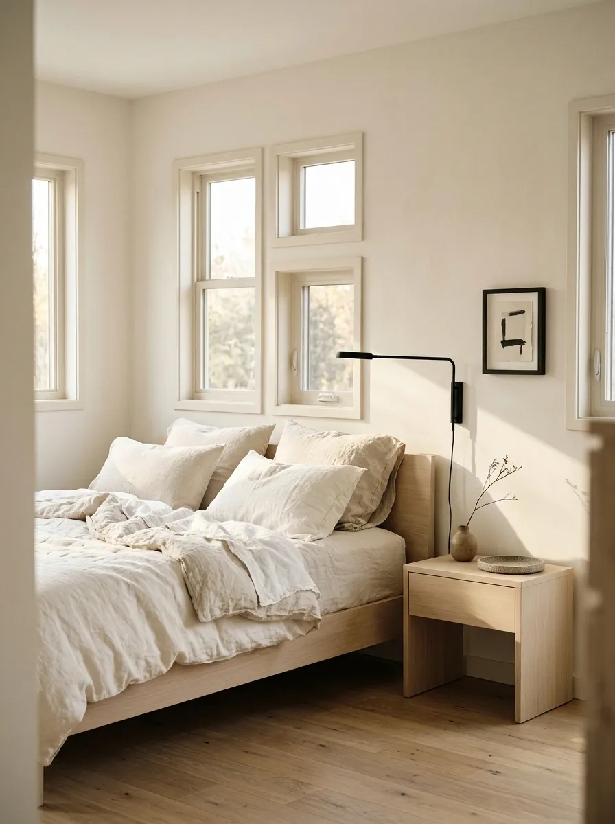
Warm white frames keep a bedroom gentle beside pale oak furniture and linen bedding. Use a related wall color, then introduce a darker reading lamp or small artwork so the room still has definition.
The frame doesn’t have to perform as a focal point. Matching its warmth to the walls can make an irregular window arrangement less distracting. Avoid choosing several almost-white finishes independently and hoping they’ll get along. Put the actual paint, curtain, and furniture samples together. White-on-white is simple only after someone has done the annoying comparison work.
Wall, frame, ceiling, and curtain fabric can reveal different undertones when they meet.
Olive Frames in a Cream Kitchen
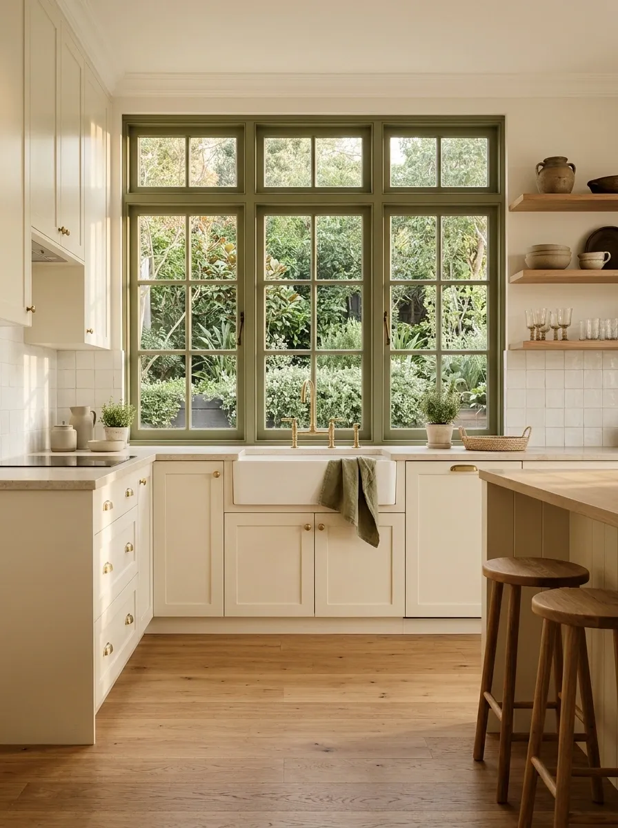
Olive frames connect a cream kitchen to timber stools and a planted outdoor view. Keep the splashback plain and choose simple cabinet hardware so the window color feels integrated rather than like a separate decorating campaign.
Repeat olive in a small useful textile if needed, but don’t repaint the toaster to prove commitment. The frame can be the main color feature while cabinets stay quiet. Check the green against foliage outside; seasonal changes will affect the relationship. A muted shade usually gives the room more flexibility than a bright color chosen from a screen.
Cream cabinetry and plain tile leave enough space for the frame to establish color without another large accent.
Mushroom Frames With Stone Walls and Walnut Furniture

Mushroom-colored frames soften the boundary between warm stone-toned walls and a walnut console. Add plain cream upholstery and a low-texture rug so the room’s interest stays in material differences rather than competing patterns.
The frame should be distinct enough from the wall to look deliberate, or close enough to genuinely blend. The awkward middle ground is a near-match that looks like a touch-up error. Sample both finishes on adjacent vertical surfaces. Mushroom can lean pink, green, or yellow depending on the shade; the name tells you almost nothing useful about its actual behavior.
Blend clearly or contrast clearly.
A near-match needs more scrutiny than an obvious color difference.
Deep Blue Frames in a White Dining Room
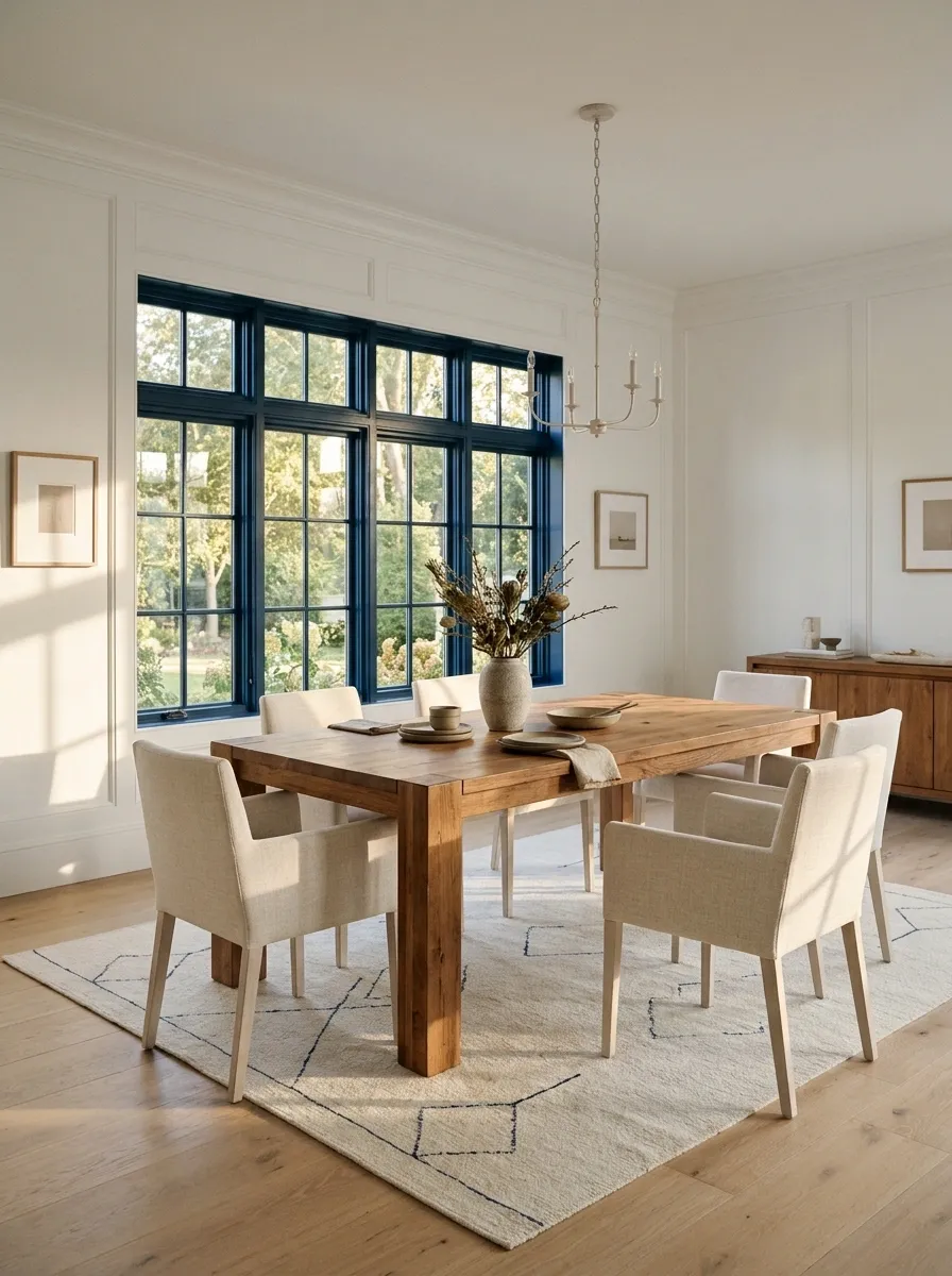
Deep blue frames give a white dining room a defined view, with a timber table and pale upholstered chairs keeping the center warm. A small blue detail in the rug connects the frame to the room without taking over the walls.
Blue can feel gentler than black while still giving the opening a strong edge. Choose its depth against the actual outdoor light, especially if the window is large. Keep neighboring picture frames simple so the wall doesn’t turn into a collection of competing dark rectangles. The dining table should remain part of the room’s visual conversation.
Main blue statement.
A small connection, not a complete blue takeover.
Burgundy Frames With Putty Walls and Dark Oak
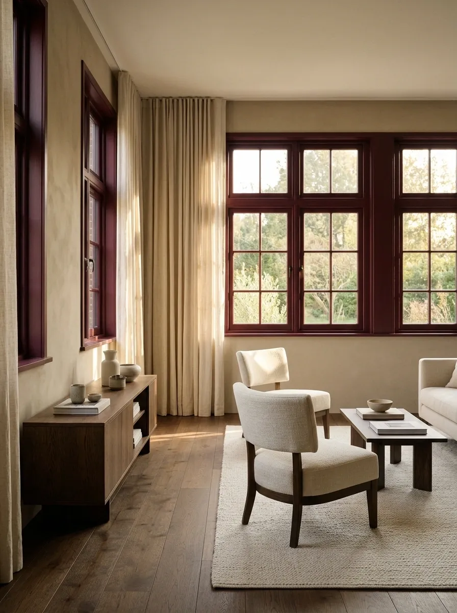
Burgundy frames bring depth to putty walls, dark oak furniture, and cream upholstery. Keep the main curtains plain and close to the wall color so the red remains a deliberate architectural accent.
This is a stronger commitment than a red cushion, which is exactly why it needs sampling at full frame width. Burgundy can look brown in low light and much redder beside daylight. Both versions need to suit the room. Keep the sheen controlled according to the appropriate coating system; a glossy red outline can feel considerably louder than a muted sample suggests.
A small dot of burgundy won’t show how much visual weight the full perimeter adds.
Pale Gray Frames in a Blue-and-White Bedroom
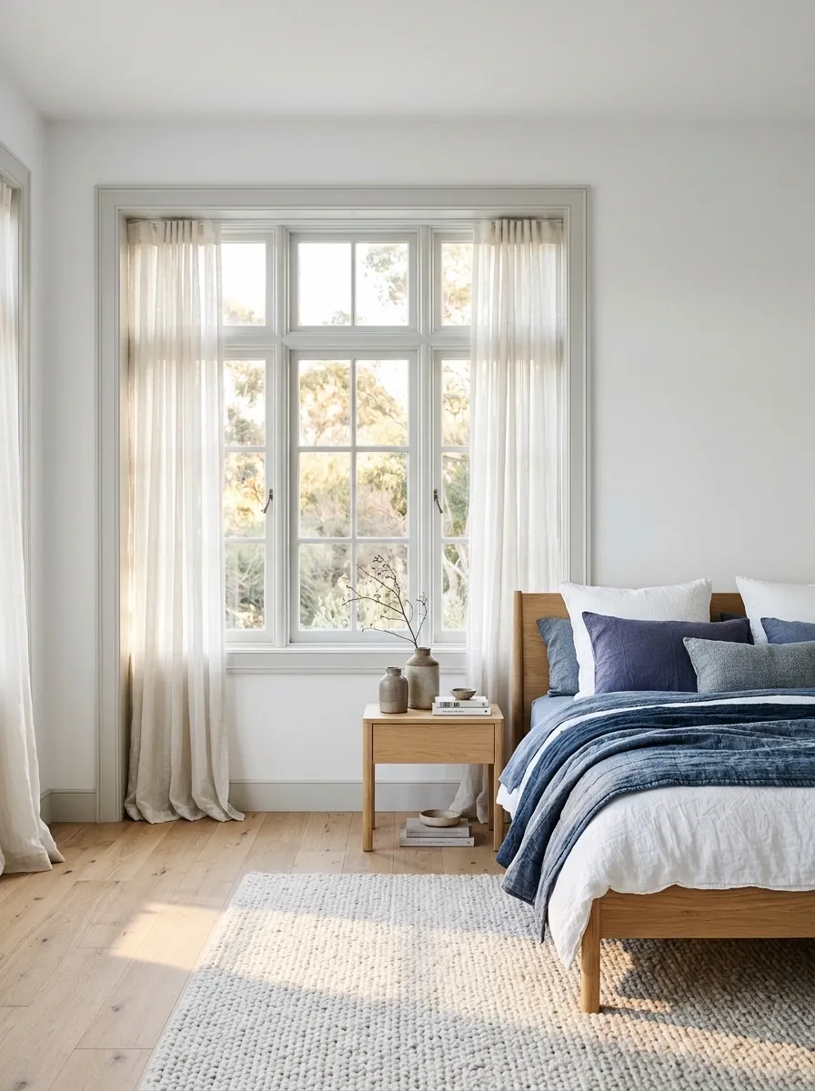
Pale gray frames can sit quietly between white walls and blue bedding, especially when the bedroom has light timber furniture. A soft rug and simple curtains keep the cooler palette comfortable.
Choose gray against the wall and wood together. A cold gray can make creamy whites look yellow, while a warmer one may soften the whole arrangement. Neither effect is a moral failing; it just needs to be intentional. Keep the blue on a meaningful textile surface rather than scattering several tiny accents around the room and calling it a plan.
Does the white suddenly look yellow?
Compare a warmer gray before repainting the rest of the room. The contrast may be causing the effect.
Dark Brown Frames With Cream Walls and Rust Textiles
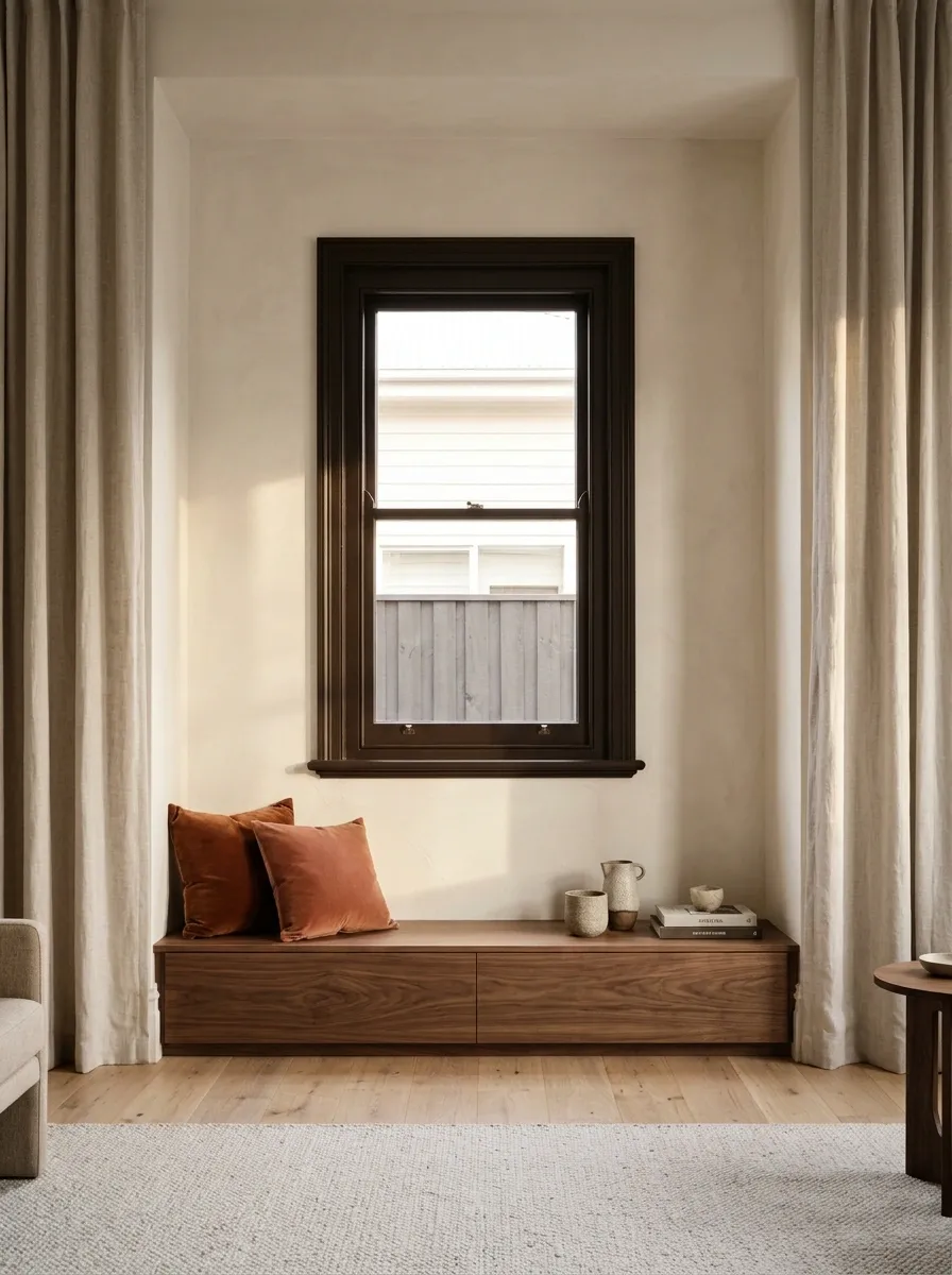
Dark brown frames give cream walls a grounded edge, with rust cushions and walnut furniture linking the window to the rest of the living room. Use a pale rug to keep the lower half light and plain curtains to soften the opening.
Brown is useful when black feels too sharp beside warm materials. The shade should still have enough depth to distinguish itself from midtone wood furniture. Avoid collecting several unrelated brown paints around the room. Timber grain already introduces variation; painted surfaces can provide a calmer structure instead of adding more competing undertones.
Warm stone, cream upholstery, and red-toned wood may need a softer dark outline.
Sage Frames With Chalk Walls and Painted Furniture
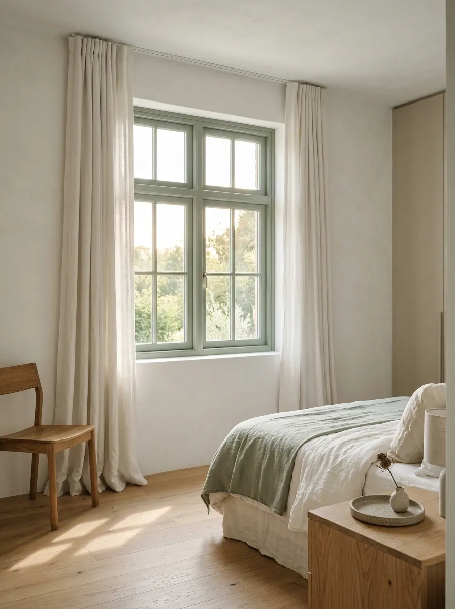
Sage frames give a pale guest room a quiet color feature, with painted storage and natural linen keeping the room light. A timber chair or bedside table adds warmth without making the palette busy.
The window color can repeat in a small bedding detail, but the furniture doesn’t need to be painted to match. Let the green stand against chalk walls rather than covering every visible edge. This works especially well when the opening has attractive proportions but doesn’t need a dramatic outline. The room gets character without requiring the curtains to become another event.
Quiet architectural color.
Keep the surrounding surfaces gentle.
Terracotta Frames in a Warm White Studio
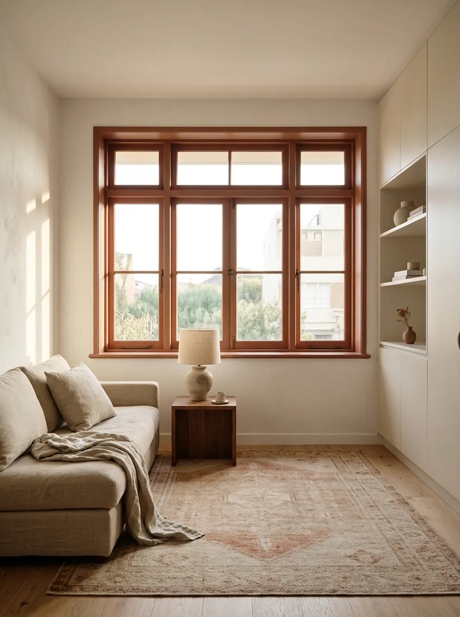
Terracotta frames bring a warm focal point to a studio with white walls, pale storage, and a simple neutral sofa. Repeat the warmth in a rug or pottery lamp rather than painting another large surface the same color.
A small apartment benefits from giving the accent a clear location. The window can supply it without adding furniture that occupies precious floor space. Keep the exact shade muted enough to live comfortably beside the room’s timber. Bright orange trim is a different proposition, and the word terracotta doesn’t automatically make every orange tasteful.
A colored frame can establish the room’s warm note while the main furniture stays neutral.
Graphite Frames With Concrete Tones and Leather Seating
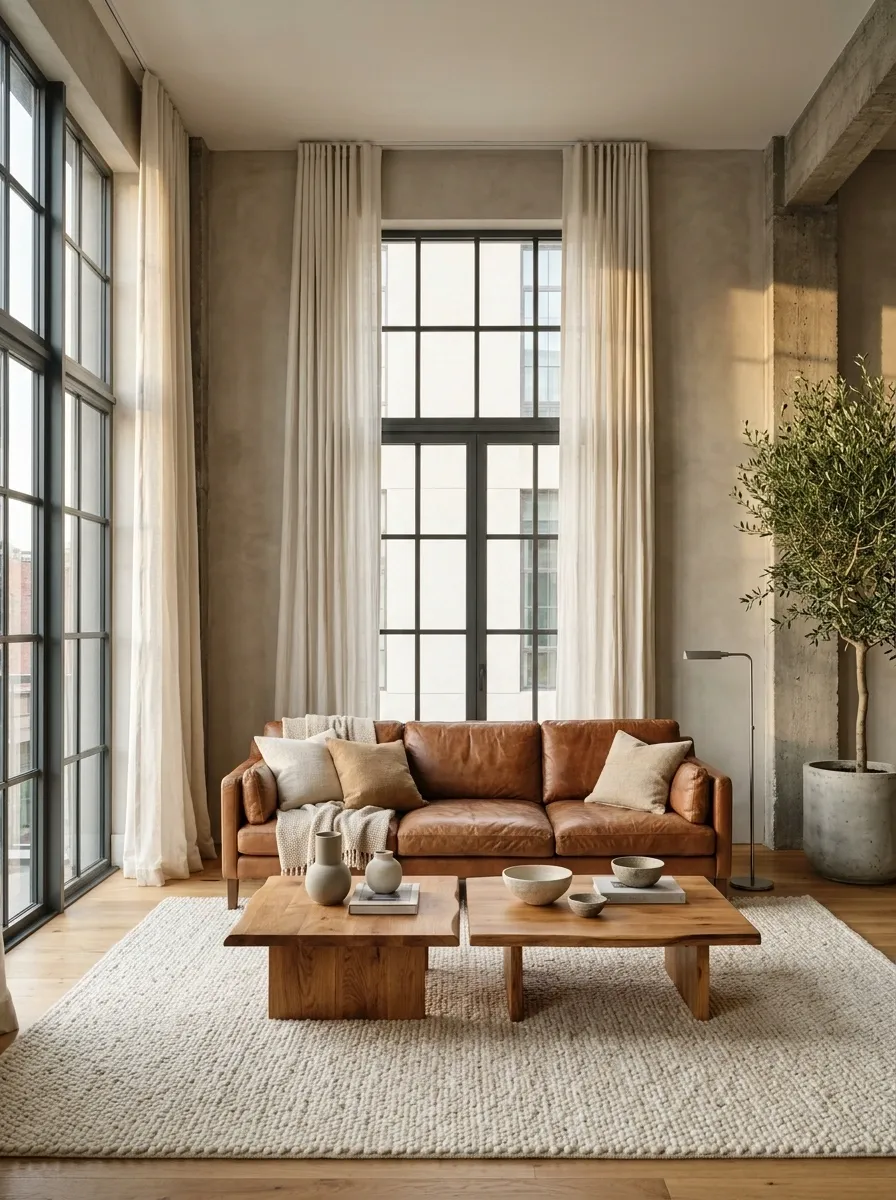
Graphite frames suit a living room with concrete-toned walls, leather seating, and warm timber tables. Keep the rug soft and the curtains plain so the harder materials don’t make the room feel like a waiting area with better furniture.
Graphite can connect cool surfaces without delivering the starkness of pure black. Compare it against the leather as well as the wall. The warm seating needs enough fabric and light around it to feel comfortable. Industrial references work better when someone has remembered that actual people will sit in the room.
Add softness where people touch.
Rug, upholstery, and curtains balance the graphite and concrete surfaces without weakening their clear shapes.
Ivory Frames With Blush Walls and Cherry Furniture
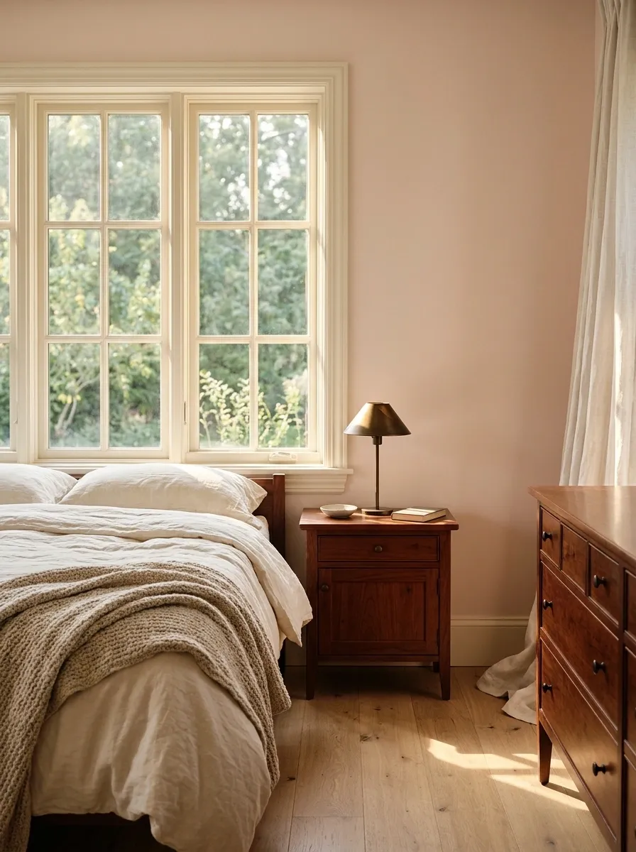
Ivory frames give blush walls a clean but gentle boundary, while cherry furniture and plain cream bedding make a warm bedroom palette. A small darker lamp introduces definition without making the frame the room’s main feature.
The ivory needs to sit comfortably beside both the paint and the red-brown timber. A yellow-heavy version may make blush feel more peach than planned. Test the finishes together rather than relying on names that sound compatible. The window can remain quiet while the furniture provides character; it doesn’t need to announce itself merely because paint is available.
Place ivory directly beside blush. Then bring the sample group to the cherry furniture.
Muted Teal Frames in a Warm Neutral Study
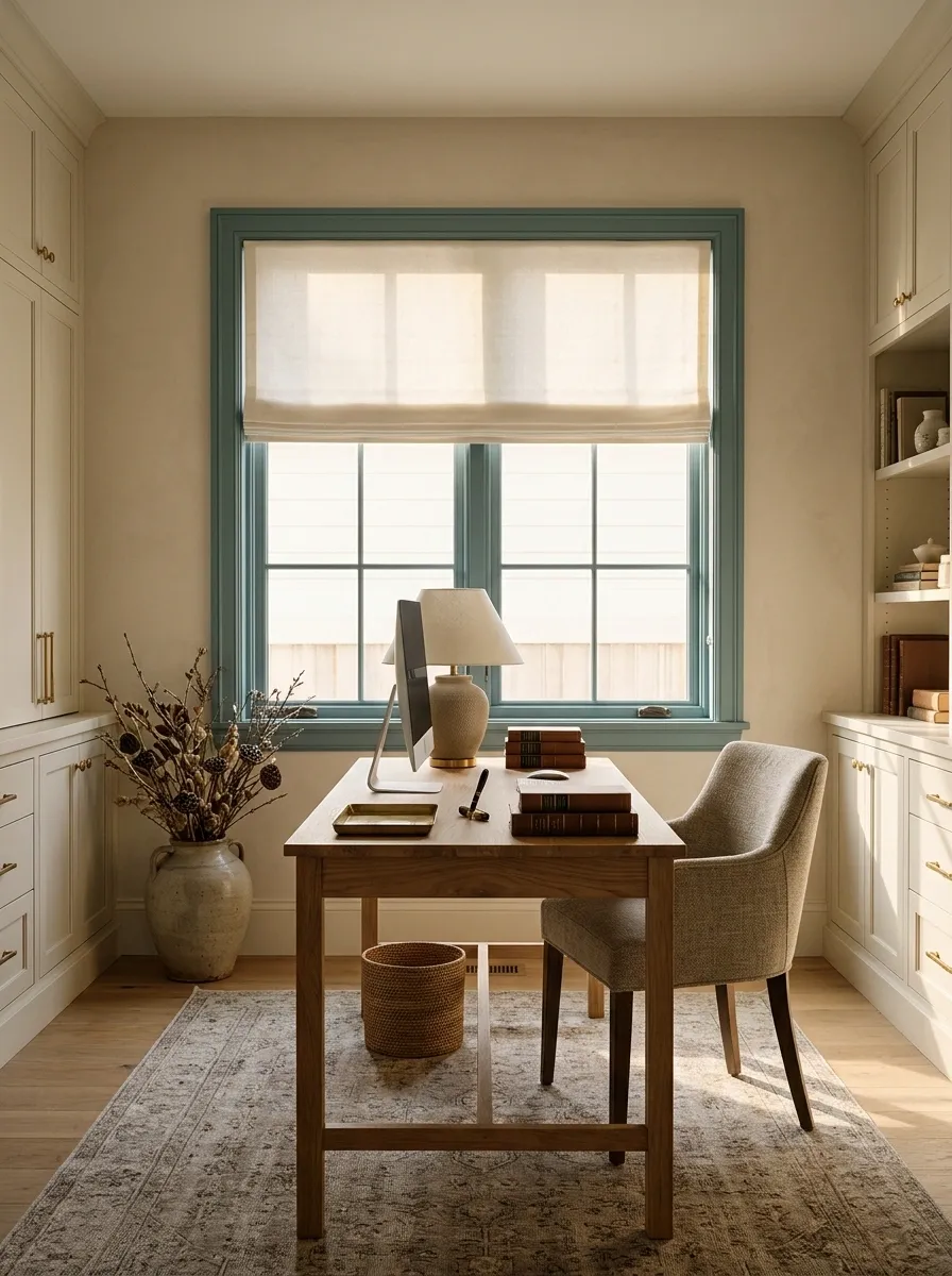
Muted teal frames give a neutral study a color anchor, with a timber desk and closed cream storage keeping the workspace calm. A plain blind can handle glare without introducing another pattern around the screen.
The color should make the window feel connected to the room, not become a bright distraction behind the monitor. Keep teal softened with gray and repeat it only if the room needs a small link elsewhere. Prioritize the desk position around daylight and reflections. A carefully chosen frame color cannot compensate for spending every afternoon looking at a screen-shaped mirror.
Check screen reflections at working hours. Color is the finishing decision, not the glare solution.
Deep Green Frames With Botanical Wallpaper
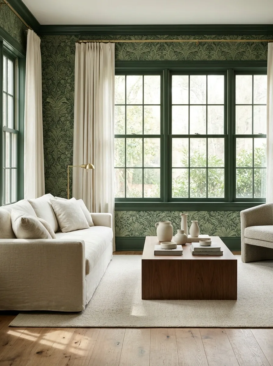
Deep green frames can anchor botanical wallpaper, with a plain sofa and timber floor keeping the rest of the room controlled. Choose a green already related to the print rather than introducing an unrelated new tone.
The frame becomes the firm edge around a busy surface, so ornate curtains usually add more than the room needs. Use plain fabric and a simple heading. If the wallpaper has many greens, compare several frame samples against the darkest and most frequent tones. Pulling one tiny leaf color at random is technically matching, but only in the least useful sense.
The frame should organize the wallpaper, not pick a fight with an obscure detail.
Dusty Blue Frames With White Tile and Oak Cabinetry
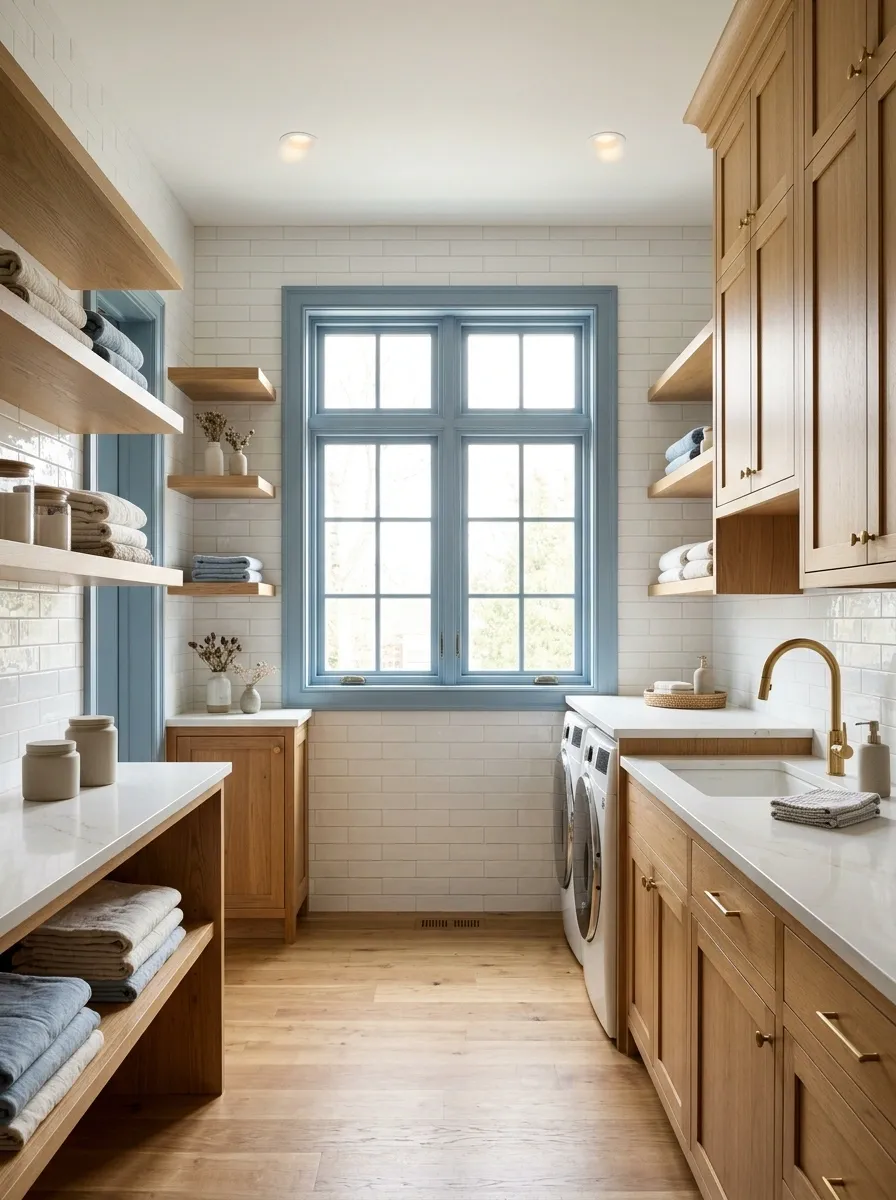
Dusty blue frames give a bathroom or utility room a softer edge beside white tile and oak cabinetry. Keep the wall finish warm and the accessories restrained so the blue feels like part of the architecture.
Choose the coating system for moisture exposure and the actual frame material, and keep ventilation effective. The blue can link cool tile and warm timber without repeating across every towel and container. Check the color under the room’s own lighting; small service rooms often rely heavily on artificial light, which can change a promising pale blue into something unexpectedly gray.
Confirm preparation, moisture suitability, and material compatibility before committing to the decorative color.
Mustard Frames With Cream Walls and Dark Timber
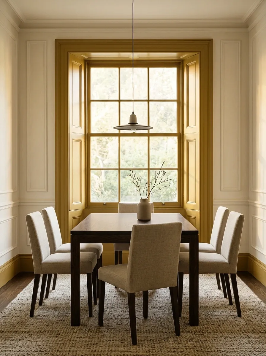
A muted mustard frame gives a small dining room warmth beside cream walls and a dark timber table. Keep upholstery plain and let a quiet rug collect the wall and wood tones.
This works when the window is the intended accent, not when the room already contains several competing strong colors. Use mustard with some brown depth rather than a bright yellow. Compare it against the outdoor view as well as the room. A frame is a permanent border around changing daylight; the shade needs to be comfortable across more than one flattering afternoon.
One accent position.
Room to register.
Aubergine Frames With Plaster Pink and Linen
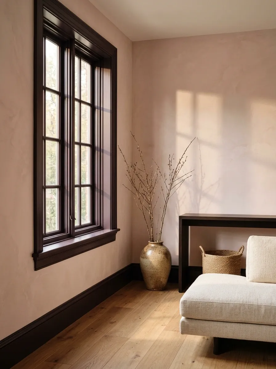
Aubergine frames add a deeper edge to plaster-pink walls, with natural linen and dark timber making the room feel adult rather than sugary. Keep the window treatment plain and let the furniture shapes stay simple.
The purple-brown tone should be tested in shadow because it may read almost black away from the light. That isn’t necessarily a problem, provided the room still feels coherent. Avoid adding purple decorative objects just to explain the frame. A deliberate architectural color can stand on its own without an accompanying gift-shop display of matching items.
The inside edge of a frame often receives less light than a paint sample on the wall.
Off-White Frames in a Colorful Children’s Room
Off-white frames give a colorful bedroom a quiet boundary, with bright bedding, painted storage, and a plain floor doing the expressive work. Keep the curtains simple enough that the window remains easy to use and the room doesn’t become a catalog of competing prints.
The frame color can outlast changing interests, which is useful when the current favorite color has the life expectancy of a ripe banana. Choose a white that suits the fixed wall and furniture tones. Follow appropriate safety guidance for window coverings and furniture near openings, rather than treating the sill as an automatic display shelf.
Let bedding and art carry changing color preferences while frames stay compatible with several palettes.
Clay Pink Frames With Gray Stone and Pale Wood
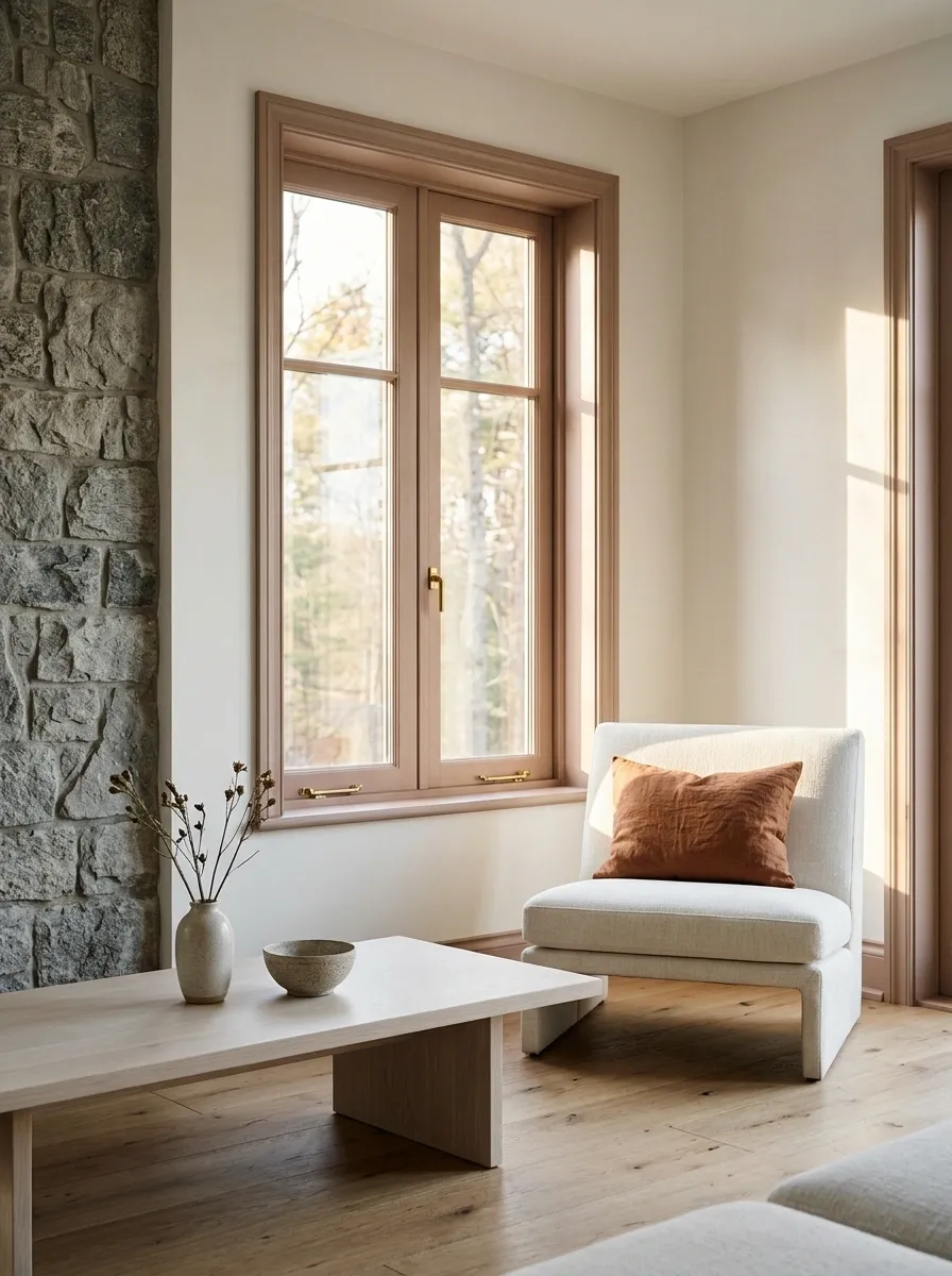
Clay-pink frames soften a room with gray stone surfaces and pale wood furniture. Warm white walls and simple upholstery keep the color restrained, while a small rust accent can connect the frame to the seating area.
The shade needs enough muted brown to sit comfortably beside stone. A bright rosy pink creates a different, much sharper contrast. Keep the color concentrated around the window if the room already has strong natural texture. Stone variation and timber grain count as visual activity; they don’t need an entire supporting cast of patterns to prove the room has personality.
Color can soften texture.
Use the clay frame as the warm link between cool stone and pale furniture, then keep the major fabrics plain.
Charcoal Frames With Exposed Brick and Pale Seating
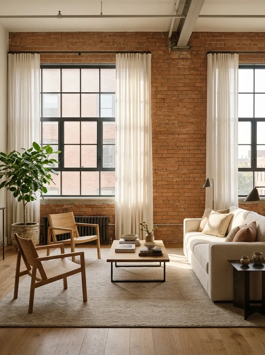
Charcoal frames sit comfortably beside brick when the room also has pale seating and simple timber furniture. A soft rug and plain curtains prevent the hard surfaces from making the living area feel all edge and no comfort.
Choose charcoal against the brick’s mortar and darker tones rather than matching a single red face. The frame can organize a busy wall without becoming the darkest thing in every direction. Keep the curtain hardware restrained. Brick, dark frames, and ornate metal poles can quickly become a committee of industrial references, none willing to let anyone else speak.
The lighter joints influence the wall as much as the brick color does.
Cream Frames With Deep Blue Walls and Walnut
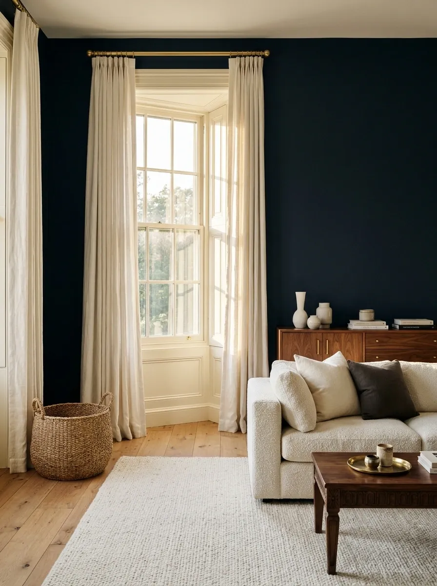
Cream frames bring a bright boundary to deep blue walls, with walnut furniture and warm white upholstery balancing the contrast. Keep curtains close to cream if you want the window to remain a lighter zone.
The frame doesn’t need to match the ceiling exactly, but both should belong to the same warm or cool direction. Test them together before the blue surrounds them. Contrast makes small differences more obvious. This palette can feel crisp and settled, provided you haven’t accidentally assembled a family of whites that would prefer never to meet at the same corner.
Include the ceiling white in the sample group.
Pewter Frames With Olive Walls and Light Upholstery
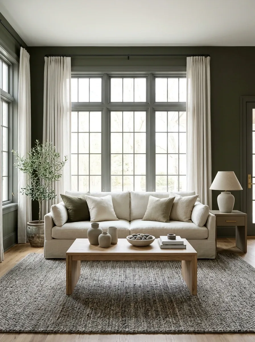
Pewter-colored frames give olive walls a cooler edge, with pale upholstery and natural timber preventing the room from becoming too muted. A simple woven rug can connect gray and warm brown tones across the floor.
The pewter should be a painted or specified finish appropriate to the frame, not an assumed metallic effect. Sample its actual sheen. Reflective gray behaves differently from a flat swatch and can look brighter beside daylight. Keep the surrounding hardware simple so the window finish feels deliberate. You want a coherent room, not several unrelated metals applying for the same job.
A metallic or reflective coating can’t be judged accurately from a flat printed color.
Red-Brown Frames With Pale Peach Walls and Cream Furniture
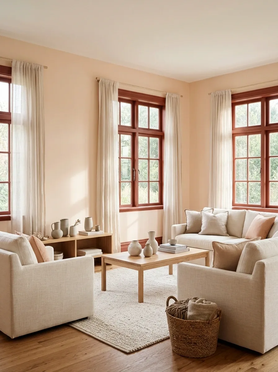
Red-brown frames give pale peach walls a grounded outline, with cream upholstery and a simple timber table keeping the room warm. Plain curtains soften the window without hiding the color choice.
This is useful when the room already contains red-toned wood or warm flooring. The frame can connect those materials rather than introducing a new contrast. Keep the peach light enough that the perimeter remains distinct. Too many similar midtones can make the room look oddly blurred, as if the decorating plan was selected through frosted glass. A clear light surface keeps the arrangement readable.
- Dark enough
- Frame separates from the peach wall.
- Light enough
- Cream furniture gives the warm palette breathing room.
A Wall-Matched Frame Around an Awkward Window Arrangement
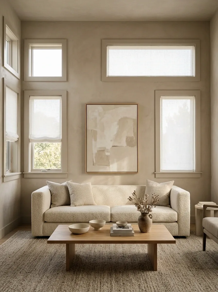
When several differently sized windows interrupt a small room, match frames closely to the wall and let furniture establish the main order. A comfortable sofa, one substantial artwork, and a coherent rug can do more than accentuating every irregular opening.
The frame color should reduce visual fragmentation, not draw attention to each mismatch. Keep any blinds consistent where practical, and avoid forcing identical curtains onto openings with different constraints. Sometimes the confident choice is to let the architecture quiet down. Not every quirk needs a spotlight and a special paint color to announce its presence.
If the openings are irregular, furniture and textiles can provide the visual structure while frames stay quiet.
Judge the Perimeter, Not the Paint Card
Paint a sample wide enough to resemble the frame and put it beside the actual wall. Check it from the doorway, from your normal seat, and with the evening lamps on. Those views will tell you more than a confident color name.
Keep the finish compatible with the window product and its working details. Then choose whether the frame should recede, connect materials, or define the view. All are valid jobs. “Everyone is painting them black” is not a job.
Save the combination closest to your room, and bring the wall and furniture samples into the decision before the paint tin comes home.