
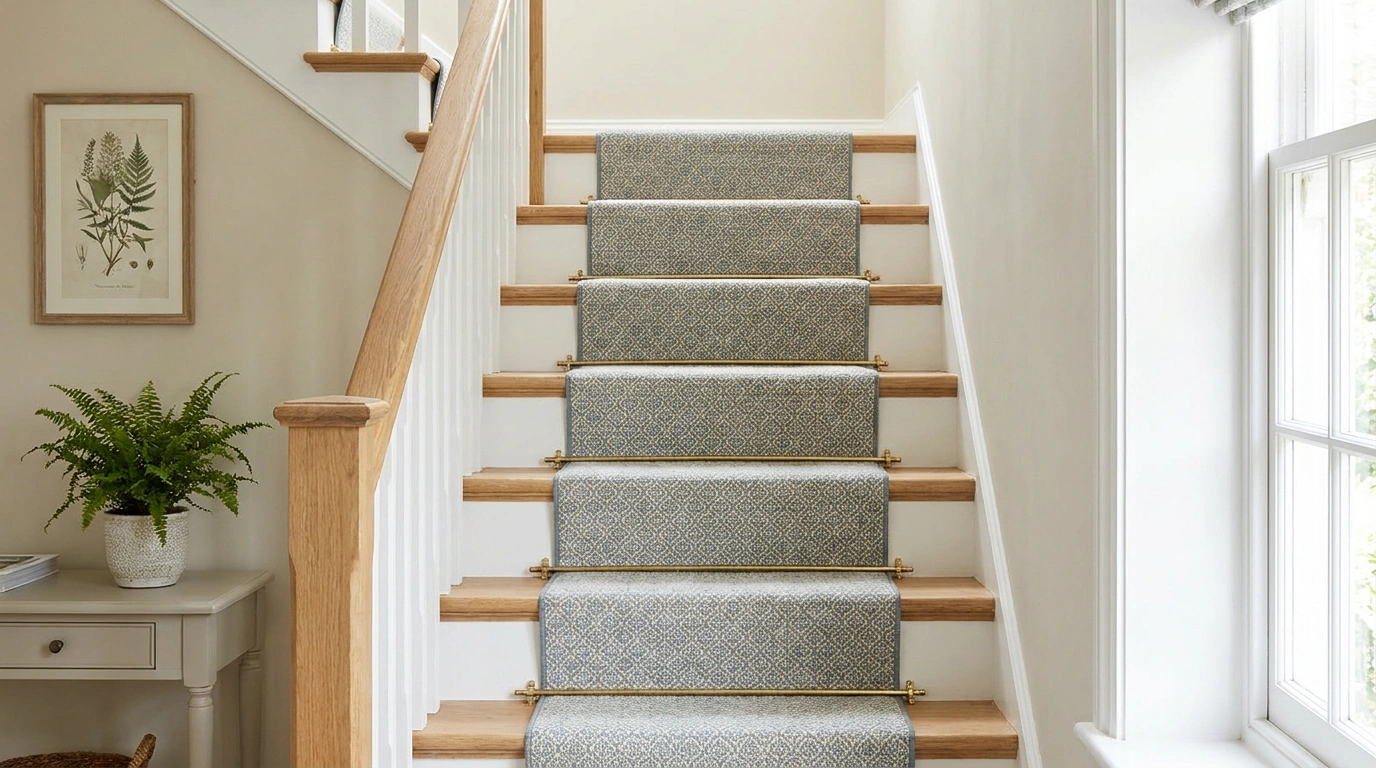
The runner is one of the few decorating choices you walk on, look up at, and see from several rooms at once. No pressure, then. Just choose a pattern that works vertically, horizontally, around a turn, beside the rail, and under the family dog.
That explains why a harmless-looking sample can become surprisingly bossy when repeated up an entire flight. A strong border turns into a continuous line. A small motif becomes a rhythm. A stripe can emphasize the rise or make a crooked installation painfully obvious.
Good staircase runner ideas start with that repetition. The runner should suit the stair shape and connect the hall to the landing, while leaving the timber or painted edges looking intentional. Color matters, but so do the weave, binding, pattern placement, and way the design resolves at the top.
Start with the stairs you have. Then choose something worth seeing repeatedly. You are buying a route through the house, not a decorative scarf for the banister.
Settle the Installation Before Falling for the Pattern
Use a carpet or runner product intended for stairs, with appropriate fitting, underlay, and edge treatment. Have turns, winders, transitions, and fixing details assessed for the actual staircase.
Decorative rods aren’t a substitute for secure installation. Loose rugs draped over steps belong in neither a finished hallway nor an exciting household experiment.
Runner Designs With a Clear Direction
Red-Trimmed Neutral Runner With Painted Blue Stairs
A neutral runner outlined with a bold red stripe gives a playful pop to soft blue painted stairs and a matching balustrade. Keep the surrounding hallway walls in a crisp, quiet white so the colorful staircase remains the main architectural focal point.
The contrasting red border adds instant definition without overwhelming the space with a loud, full-coverage pattern. Tie the color choice back to small accessories or nearby furniture pieces to create a cohesive flow throughout the entry zone.
Precise installation is essential when working with borders that track along the edges of risers and treads. A clean alignment ensures the geometry feels intentional and sharp, proving that classic neutrals can handle a little extra graphic personality.
Oatmeal Flatweave With a Dark Bound Edge on Oak Stairs
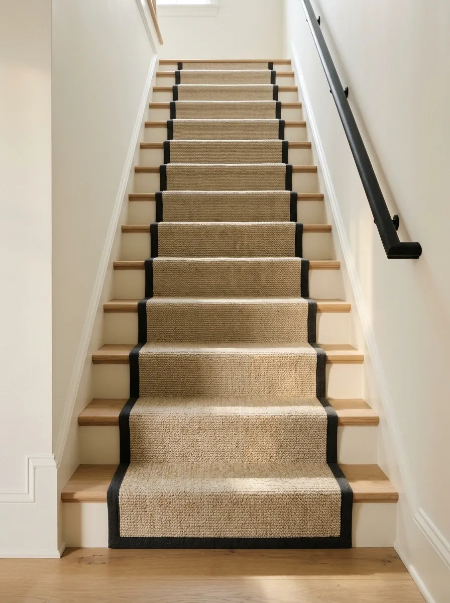
An oatmeal stair-rated flatweave gives oak treads a quieter center, with dark binding drawing a clean line up the flight. Keep the hallway walls warm white and the rail simple so the runner feels connected to the architecture.
The binding provides enough definition without adding a busy pattern. Choose a tone related to the rail or door hardware, and check the weave’s suitability and care needs rather than assuming all natural-looking fibers behave alike. Beige can have a point of view. It just needs more ambition than disappearing politely into the floor.
Use the binding to connect: rail, doors, or nearby dark hardware. The graphic is a pattern concept, not a fitting plan.
Classic Blue Medallion Print on Traditional Stairs
An intricate blue and white medallion pattern brings timeless European charm to a grand traditional staircase with classic white risers. Keep the adjacent architectural walls simple and understated to let the detailed motif anchor the grand entrance.
The repeating pattern adds rich visual texture without creating unnecessary clutter in a busy hallway. Choose a low-pile wool blend designed specifically for heavy foot traffic rather than sacrificing durability for delicate decorative style.
Proper alignment across each step is critical so the symmetry reads clearly as you ascend the flight. Let the pattern introduce a sophisticated color story that effortlessly bridges the lower level with the landing above.
Narrow Pinstripes on Painted White Stairs
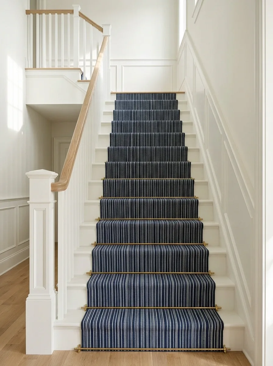
Fine lengthwise stripes give painted white stairs a deliberate route, with a plain wall and restrained rail keeping the hall clear. Use a stripe palette that connects the lower floor and upper landing rather than introducing every color in the house.
Pinstripes reward accurate fitting. Even small misalignment becomes easier to notice when the eye follows a line over several steps. Check how the pattern resolves on turns before ordering. A sample that behaves beautifully on a flat table has not yet demonstrated its ability to cope with your staircase.
Ask how the pattern will be centered and resolved on winders or a landing before choosing it.
Structured Earthy Stripes With Warm Wood Accents
Warm earthy stripes bring a tailored, classic rhythm to a narrow stairwell paired with painted wainscoting and natural wood details. Keep the surrounding decor restrained so the vertical lines draw the eye smoothly upward without visual distraction.
The measured stripe layout adds structure and personality while keeping the overall palette grounded and sophisticated. Select a tightly woven texture that can withstand daily use while maintaining its crisp, clean color definition over time.
Accurate installation is non-negotiable when dealing with linear patterns on ascending steps. Every single line needs to track true to keep the staircase looking polished rather than restless, turning a utilitarian transition into a design feature.
Muted Vintage Pattern With a Dark Timber Rail
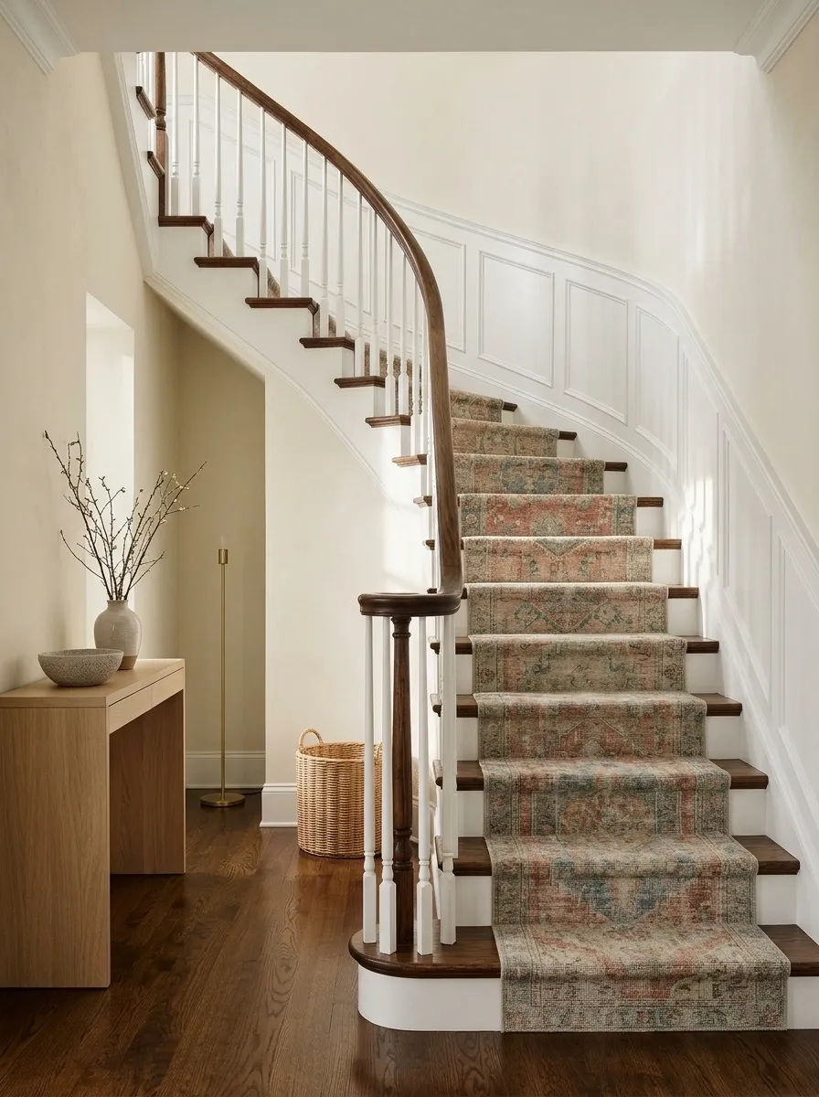
A muted vintage-style pattern brings layered color to a staircase with a dark timber rail and pale walls. Keep the hall furniture simple and let the runner connect warm wood to one accent color used upstairs.
The pattern should have enough softness that repetition doesn’t become visual noise. Choose a product designed for stair use rather than repurposing a loose decorative rug without a proper plan. The appeal is age-like variation and a settled palette, not the possibility of discovering a loose edge with your foot. Keep installation and pattern placement equally deliberate.
A worn-looking motif can be decorative. Worn edges and loose fitting are maintenance problems.
Pristine Ivory Runner With Polished Brass Rods
A crisp ivory runner secured with gleaming brass stair rods creates an effortlessly elegant contrast against soft sage green walls and checkered marble floors. Keep the surrounding paneling calm and cohesive to let the metallic hardware shine.
The polished brass adds a touch of traditional luxury that elevates a simple neutral carpet into a striking statement. Choose a durable, stain-resistant fiber blend to keep your light-colored treads looking immaculate despite heavy daily foot traffic.
Properly spaced stair rods require careful measuring to ensure the hardware aligns symmetrically across every single step. This timeless combination proves that understated luxury relies just as much on impeccable detailing as it does on bold color choices.
Deep Green Runner With Pale Timber Borders
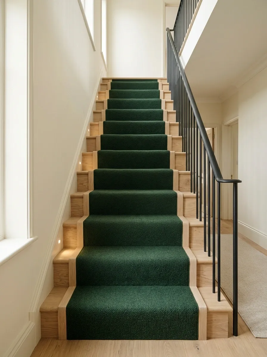
Deep green creates a substantial center against pale timber treads, with cream walls and a restrained dark rail keeping the staircase balanced. A plain landing rug in a related neutral can soften the transition upstairs without cloning the runner.
The green needs enough light around it to remain distinct from the rail. Check the shade in the stairwell itself, where daylight may be uneven. Avoid assuming a darker runner will make every mark invisible; lint and pale dust may become more obvious. The laws of cleaning remain annoyingly independent of decorating optimism.
View under stair lighting.
Compare visible lint and dust on the sample.
Herringbone Runner With Plain Painted Risers
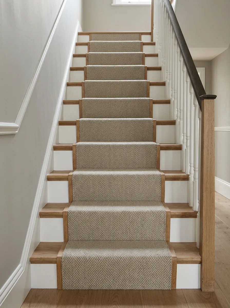
A small herringbone weave adds movement above plain painted risers, with warm timber edges and a simple handrail giving the pattern structure. Keep the hall walls quiet so the stair doesn’t compete with another large geometric surface.
Choose a scale that remains readable across a tread without looking restless over the whole flight. The fitting should keep the pattern centered and consistent. Herringbone already has directional activity; it doesn’t need contrasting zigzag binding to make absolutely sure nobody misses it. Let the weave supply interest and keep the edge treatment controlled.
Judge a flight, not a fragment.
View several repeats together before choosing the scale. A tiny sample can understate how active the full runner feels.
Broad Cream Borders Around a Charcoal Center
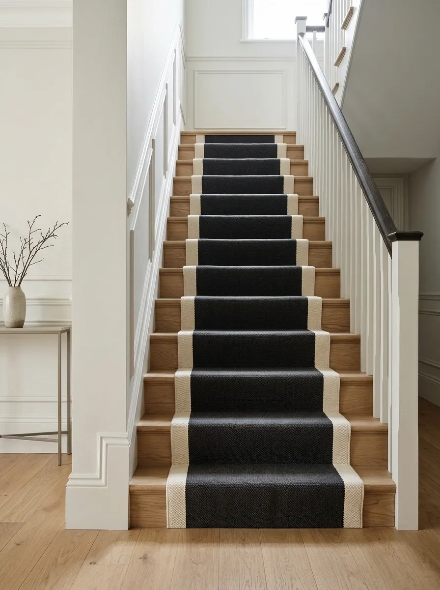
A charcoal runner with broad cream borders gives a straight staircase a strong central line. Pair it with pale walls and simple timber details, keeping nearby rugs quieter so the hall doesn’t acquire several competing graphic routes.
The light border makes the runner edge explicit, which can look beautifully ordered when the installation is accurate. It also deserves a realistic cleaning discussion because edges see contact too. Check the balance on the actual stair width. A border that looks restrained on a wide sample can consume much of a narrower runner.
Soft Plaid Through a Cottage Hallway
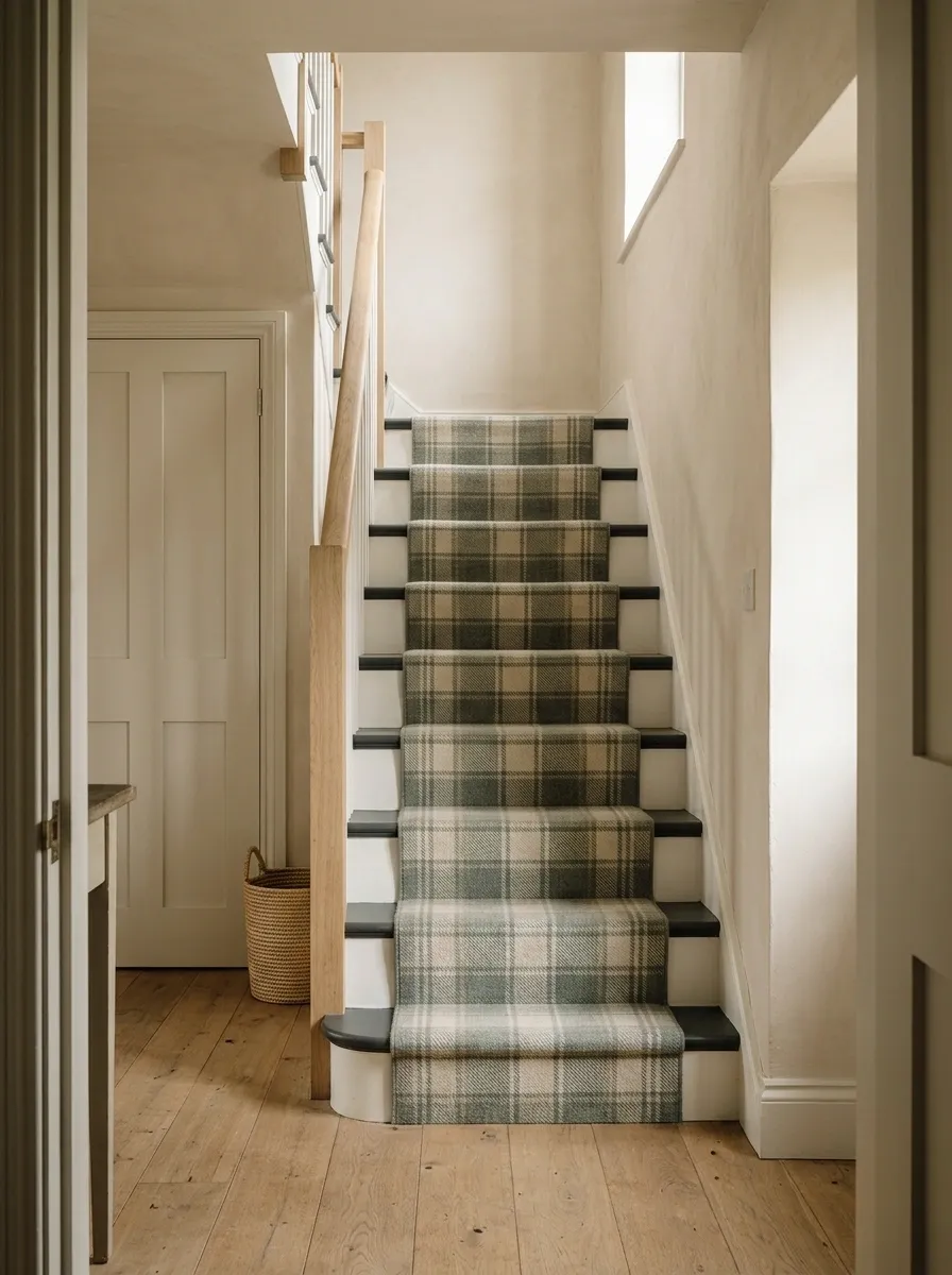
A soft plaid runner works with painted stairs, a timber rail, and a simple cottage hallway. Use a restrained palette already related to the doors or floor, then keep the walls mostly plain.
Plaid needs careful pattern planning where the staircase turns. Ask how horizontal and vertical lines will meet at each change rather than assuming the installer can perform geometry by goodwill. Keep surrounding textiles small-scale or solid. The runner can provide the main pattern without the hallway curtains demanding a separate performance every time someone goes upstairs.
Plaid alignment needs planning on treads, risers, winders, and landing joins.
Rust Runner With a Cream Hall and Dark Doors
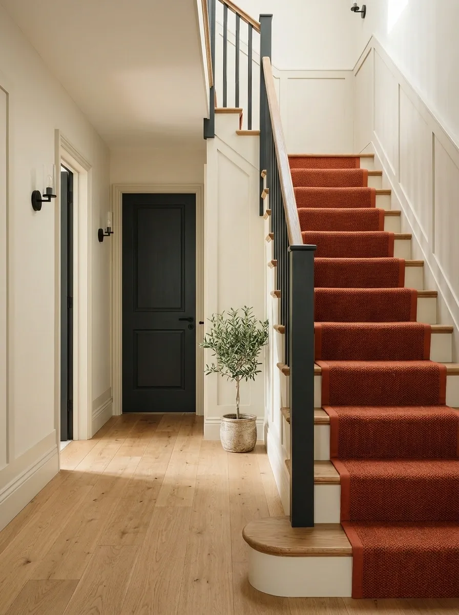
A rust runner warms a cream hallway, connecting dark doors with natural timber treads. Keep the binding close to the field color and choose simple wall lighting so the stair remains the main warm feature.
Rust can make the whole route feel connected without matching every neighboring rug. Repeat a related warm tone in a small upstairs textile if the transition needs help. Check the sample beside the floor at the bottom of the stairs; that’s where the runner first has to make sense. A beautiful upstairs palette won’t excuse an awkward handshake downstairs.
Compare runner, hall floor, stair timber, and door color in one sample group.
Small Geometric Pattern on a Narrow Staircase
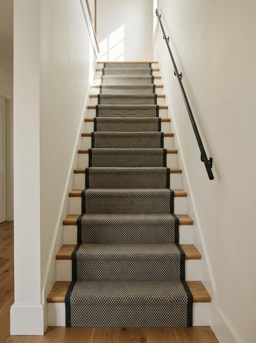
A compact geometric motif gives narrow stairs detail without relying on a broad border. Pair it with plain walls and a simple rail, keeping the exposed tread edges visually consistent.
Choose a pattern that remains legible across the usable runner width. Very large motifs can look accidentally chopped on each step, while tiny high-contrast patterns may become visually busy. View the sample from standing distance and from the hall entrance. The runner should define the route without turning the staircase into an optical challenge nobody requested.
Does the motif feel chopped or restless?
Compare a smaller repeat or lower contrast before changing the whole palette.
Tonal Wool-Look Runner in a Quiet Hall
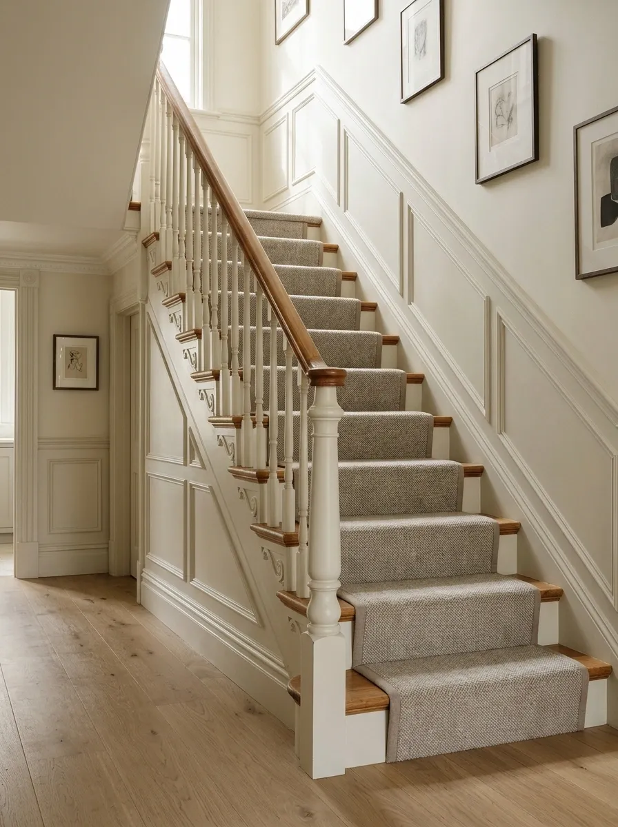
A tonal stair-rated runner gives a pale hall texture without a strong print. Choose a softly varied neutral field, simple binding, and warm timber edges, then let lighting and wall art provide the other detail.
The subtle variation can be more forgiving visually than a perfectly flat pale surface, but check product care and wear suitability rather than assuming texture solves everything. This is a good direction when the architecture already has decorative balusters or strong paneling. The stairs don’t need to compete with themselves just because the carpet shop had several enthusiastic pattern books.
Paneling, turned balusters, and patterned glass already contribute detail to the route.
A Bordered Runner That Continues Across the Half-Landing
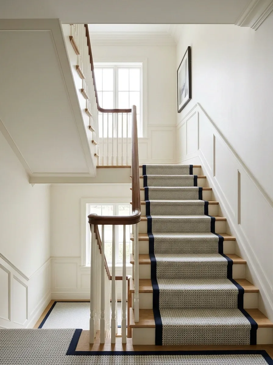
Carry a bordered runner across a half-landing to connect separate flights as one route. Keep the border treatment consistent and use a plain wall around the turn so the change in direction feels deliberate.
The landing is where the design has to resolve, not where surplus carpet should be improvised into submission. Ask for a fitting plan showing joins, borders, and the turn. The chosen product and pattern may affect what is practical. Keep the landing surface secure and the route visually clear, with no loose rug added as an afterthought.
A Plain Runner for a Staircase With Winders
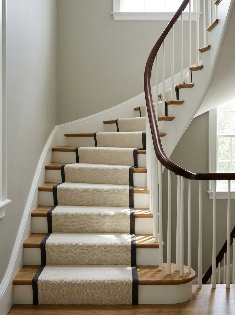
A plain or softly textured runner gives winder stairs a calm surface, with the surrounding wood and rail doing the decorative work. Use a restrained binding and plain wall color so the changing step shapes remain easy to read.
Complex patterns can become awkward as they meet tapered treads. Have a specialist plan the actual fitting rather than assuming a straight-flight example will translate. A quiet runner isn’t a compromise when the stair geometry is already active. It’s a useful decision that saves the pattern from performing several increasingly uncomfortable acrobatics around the corner.
Winders need a fitting plan for the exact staircase. A plain field reduces pattern conflicts but doesn’t remove the installation work.
Navy Runner With a Thin Red Binding
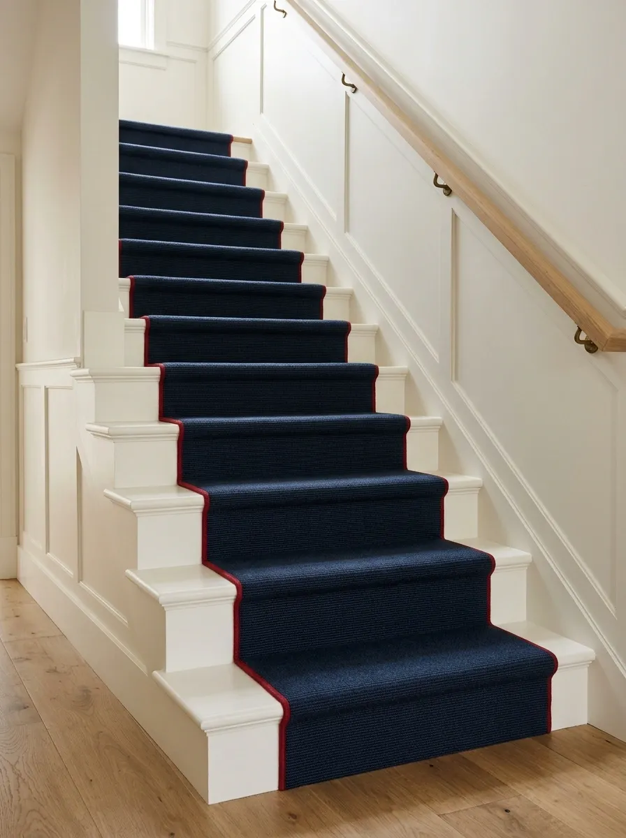
A navy field with restrained red binding gives a painted staircase a clear, tailored edge. Use warm white walls and a simple timber handrail, keeping nearby artwork and textiles quiet enough for the binding to remain a small accent.
The red should appear as a deliberate line, not a wide competing stripe unless that stronger look is the intention. Check the binding sample against the navy in the hall light. A small accent can do a surprising amount of work when repeated up a whole flight; it doesn’t need matching red objects waiting on every landing.
Judge the accent edge over several steps before deciding it needs to be wider or brighter.
A Speckled Runner for a Busy Family Stair
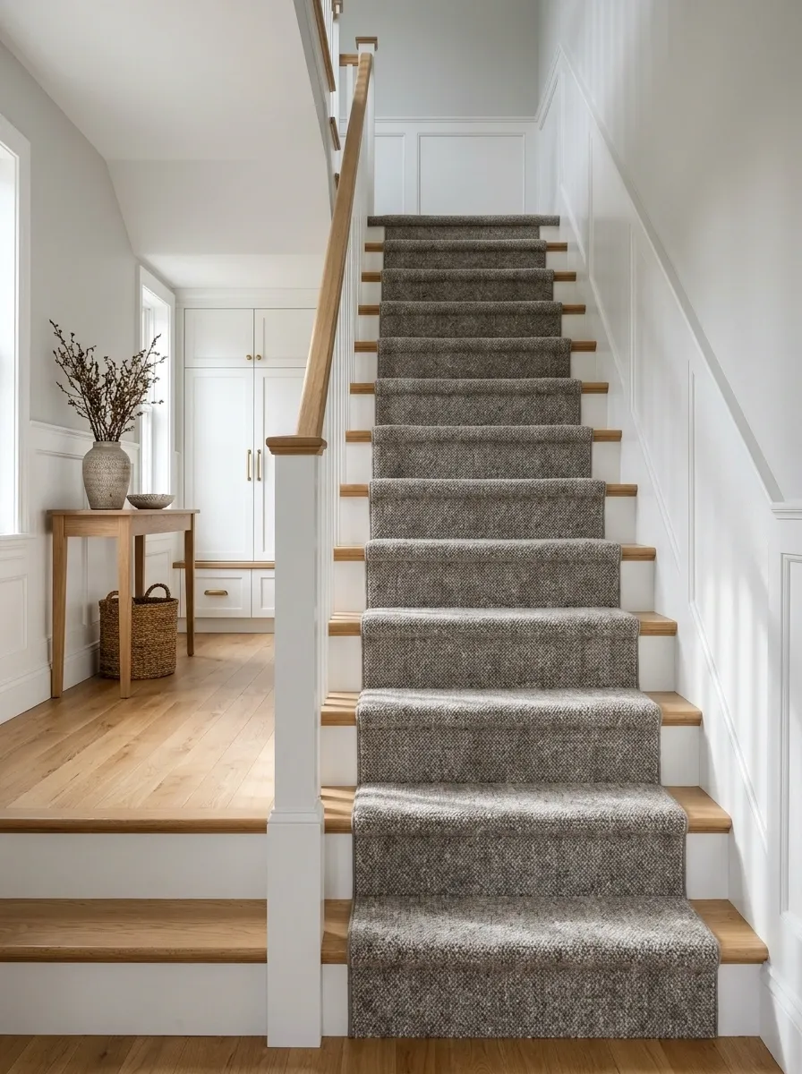
A softly speckled runner can make a busy staircase feel less fussy than a flat light color. Pair it with plain painted risers, durable surrounding finishes, and closed hall storage so the route stays clear.
Choose the fiber and construction around actual stair use, cleaning needs, and household traffic. A mottled appearance may disguise some visual variation, but it isn’t an exemption from care. Keep the pattern contrast modest enough that the steps remain easy to read. The ideal family runner should not require everyone to levitate over it after coming home.
Softly varied field.
Stair use, secure fitting, and appropriate cleaning.
A Plain Runner Beside Decorative Stair Brackets
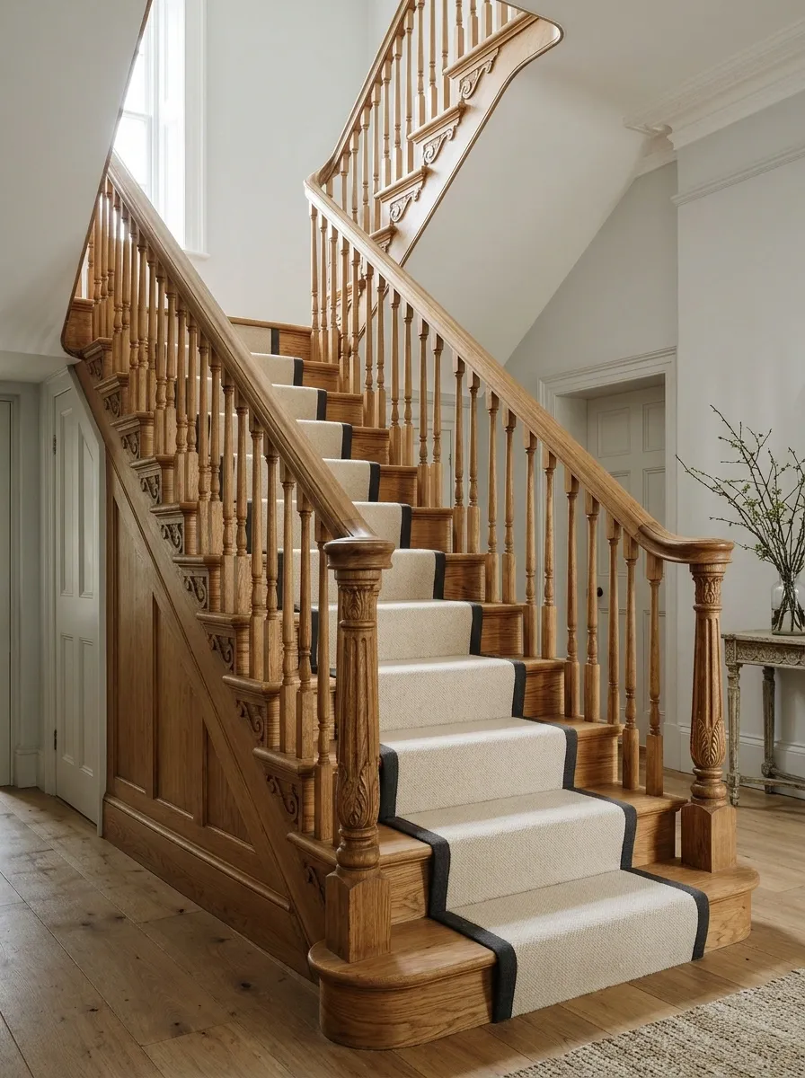
Keep the runner plain when a staircase already has decorative brackets, turned spindles, or carved timber details. A warm neutral field with simple binding leaves the craft visible, while pale walls stop the hall feeling heavy.
The exposed stair edges become part of the design, so their finish deserves attention. Repair and prepare them appropriately before the runner goes down. Don’t choose a width solely to conceal awkward marks without considering the whole staircase. The runner should look intentionally proportioned, not like a very elegant bandage applied to avoid a proper repair.
Tread edges, risers, and visible finish lines become more noticeable beside a neat runner.
Wide Stripes on a Broad Straight Flight
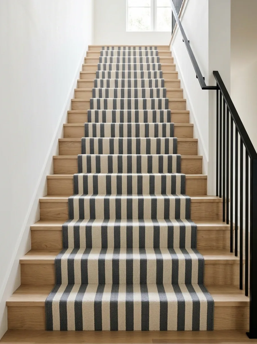
A broad straight staircase can carry wider lengthwise stripes, with a plain wall and simple rail giving the pattern room. Choose a restrained color family so the stripes establish rhythm without making the stair feel louder than the surrounding rooms.
The width and placement of each stripe need checking against the runner’s actual finished dimensions. A strong center line can look ordered, while an accidental sliver at the edge looks less intentional. Have the fitting layout resolved before ordering. Bold pattern benefits from planning; confidence and approximation are not the same decorating technique.
Soft Blue Runner Between White Risers and a Walnut Rail
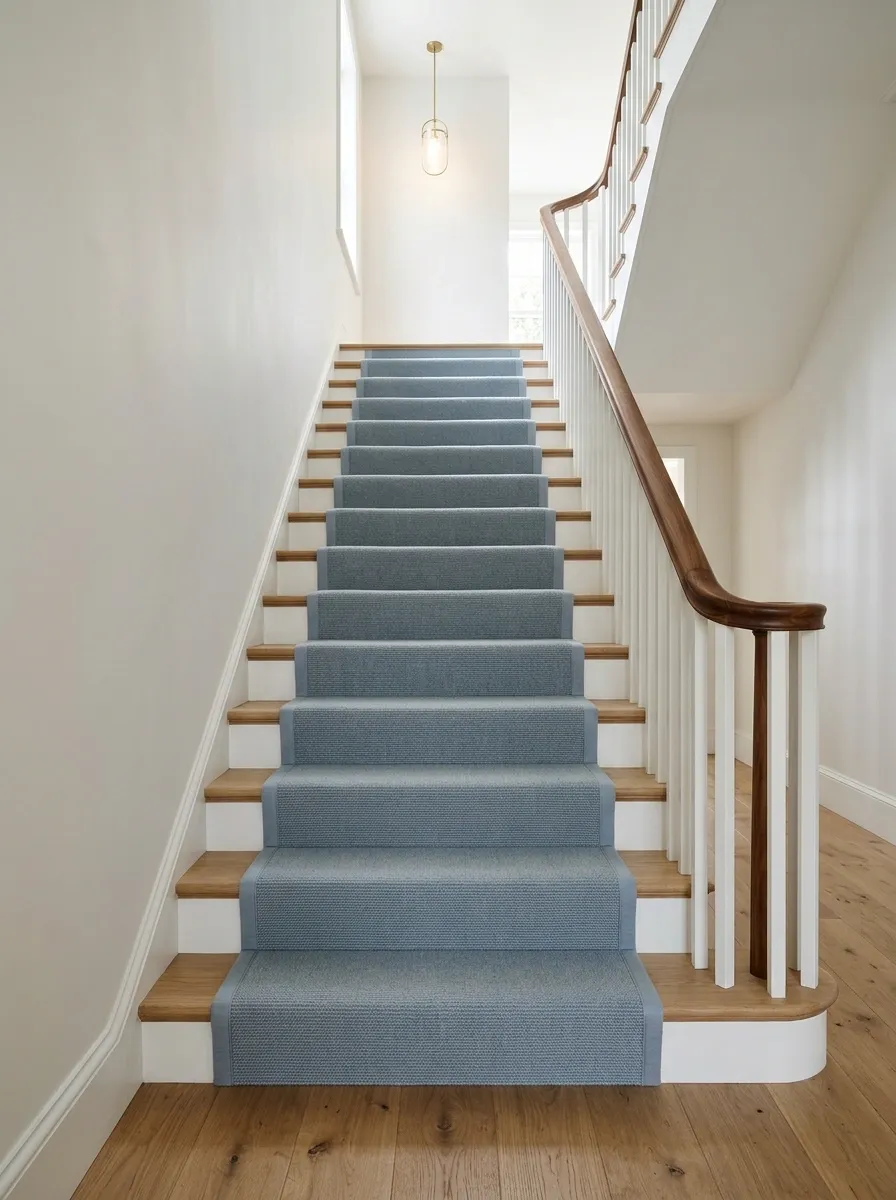
Soft blue connects white painted risers to a warm walnut rail, with plain walls and a simple landing light keeping the route clear. Use a close-toned binding if the intention is calm rather than a graphic outline.
The blue needs enough depth to remain visible against the white without looking icy beside the timber. Compare the sample at both the bottom and top, where lighting can differ. Keep the landing connection simple. A runner doesn’t need to match every upstairs room; it needs a convincing transition to the next surface without an abrupt visual argument.
View the same sample beside the hall floor and the upper landing finish before approving the blue.
A Subtle Animal-Inspired Pattern in a Plain Hall
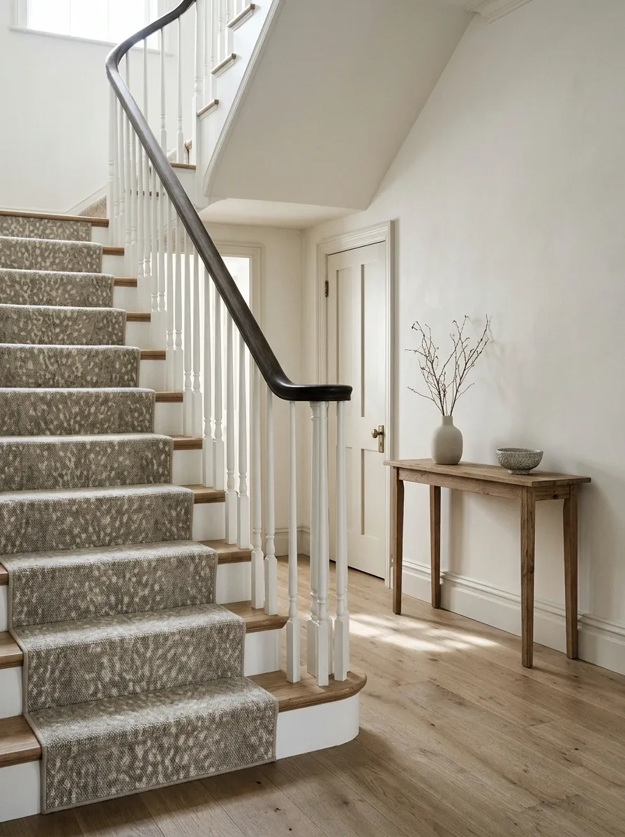
A restrained animal-inspired motif can give a plain hallway personality, especially beside simple stairs and uncomplicated doors. Keep the palette muted and the binding quiet so the runner feels like a textile decision rather than a theme.
The pattern should remain readable and comfortable over repeated steps. Avoid adding more animal prints nearby unless the house is genuinely auditioning for a safari gift shop. Plain walls and a simple console give the runner room to have a point of view. The result can be playful without turning the entire entrance into a punchline.
Plain walls, simple binding, and restrained nearby textiles keep the motif intentional.
A Runner With Binding Matched to the Stair Paint
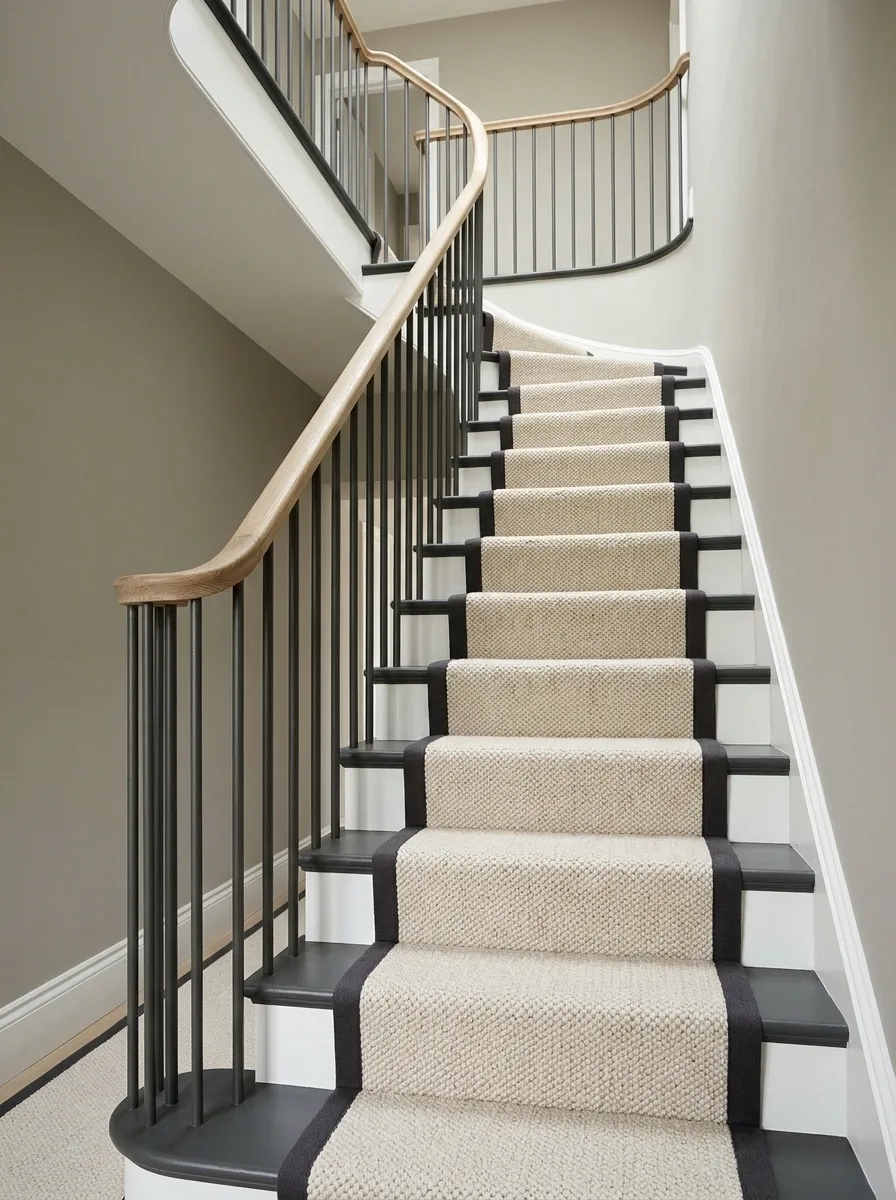
Match the binding closely to painted stair edges, allowing the runner’s field texture to take the lead. A soft neutral carpet, related wall color, and simple timber rail give the hallway a connected, understated direction.
This works when you want the runner to feel integrated rather than framed. Check the binding and paint together because different materials can alter the apparent match. The field still needs enough separation from the painted edges to look deliberate. Quiet doesn’t mean indistinguishable; a little tonal difference can preserve the runner’s outline without introducing a new accent color.
- Binding
- Related to the painted stair edge.
- Field
- Distinct through tone or texture.
A Runner That Ends Cleanly Before a Patterned Landing Floor
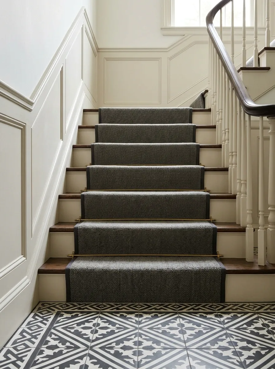
Keep a runner relatively quiet when it meets a patterned landing floor. A plain field or small motif, simple bound edge, and restrained hall walls give the two surfaces a clear relationship without making the transition feel crowded.
Plan the termination with the fitter and floor installer so it is secure and visually resolved. Don’t add a loose mat to disguise an awkward meeting. Match one color between the surfaces if useful, but avoid forcing identical patterns at different scales. The landing is allowed its own identity; it doesn’t need to repeat the staircase word for word.
Discuss the final edge, fixing, level change, and adjacent floor pattern together.
A Looped-Texture Look With a Plain Hall Palette
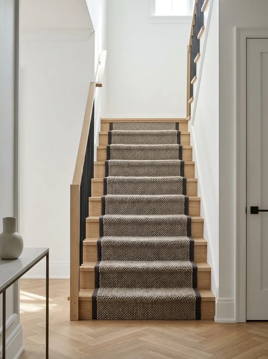
A stair-suitable textured runner can bring depth to a hallway with plain doors, walls, and rail. Choose a muted field and restrained binding so the texture does the decorative work without a competing motif.
Confirm the specific construction is appropriate for the staircase and household. Pets, snagging risks, and cleaning habits may affect the choice, so don’t select a looped appearance on looks alone. Use the sample as a practical material, not a precious square you only admire under good lighting. The runner will encounter feet, bags, and daily life. It should be briefed accordingly.
Confirm stair suitability, snagging considerations, care instructions, and compatibility with your household.
Dark Binding Around a Pale Runner in a Paneled Hall
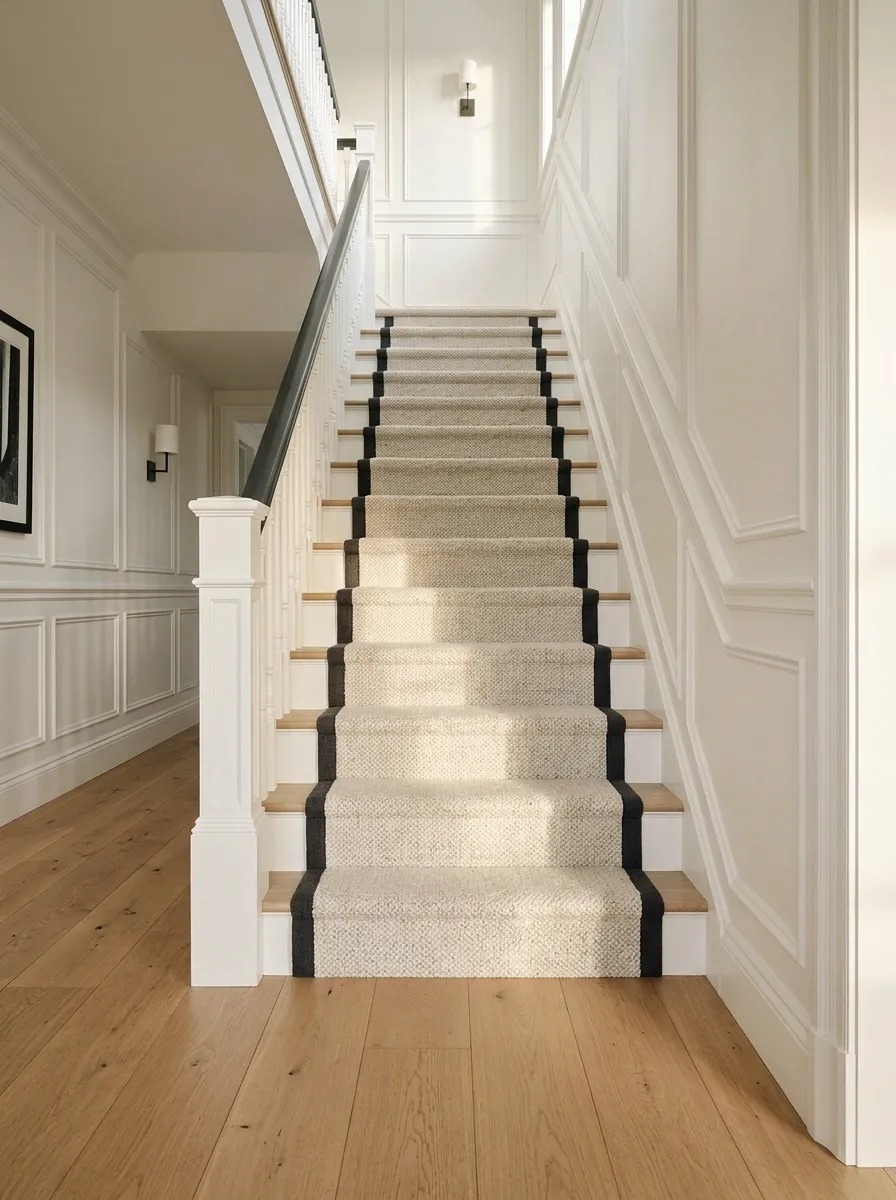
A pale runner with dark binding can connect timber or painted wall paneling to the stair route. Keep the field plain enough to sit beside the panel rhythm, and use the binding color in the rail or a nearby door.
The repeated edge will be very visible, so inspect how it behaves at the first step and landing. Let the paneling and runner share a sense of order without matching every proportion. A hallway can have several architectural lines without becoming a diagram of itself. Keep decorative accessories minimal where the joinery already supplies enough structure.
Connect one dark detail.
Binding can relate to the rail or a door. It doesn’t need to match every panel edge.
A Warm Neutral Runner on Dark Painted Treads
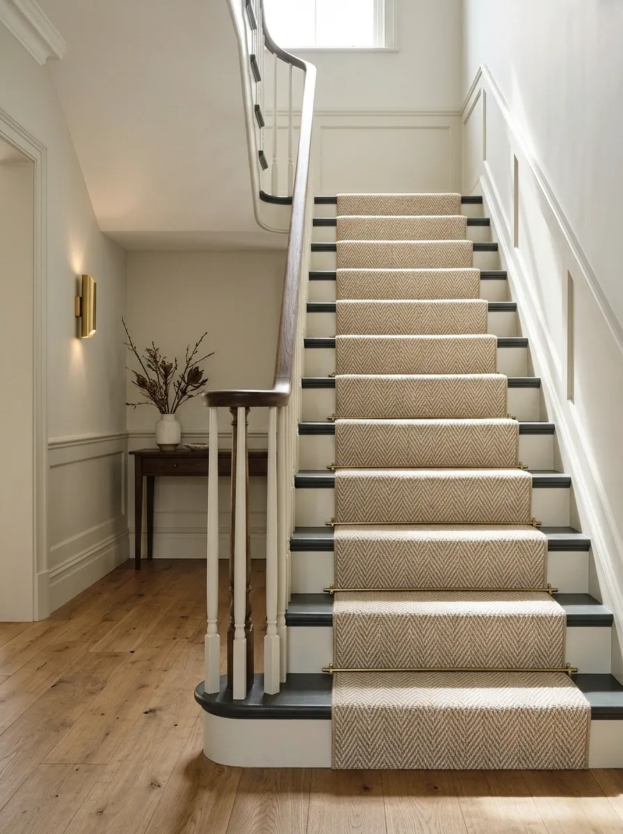
Warm neutral carpet stands clearly against dark painted stair edges, with a pale wall keeping the hall from becoming too enclosed. A simple timber or dark rail completes the outline without adding another pattern.
The runner’s warmth should connect to the hall floor or nearby furniture. Check paint durability and finish suitability for the exposed stair surfaces, and coordinate preparation before fitting. The dark edges will show marks differently from the carpet, so plan upkeep for both. A runner is not a force field protecting every visible bit of the staircase from ordinary wear.
Check carpet care and exposed tread-finish maintenance before choosing the combination.
A Muted Floral Runner With Plain Doors and Modern Lighting
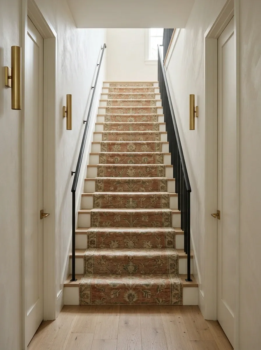
A muted floral runner brings softer movement to a staircase beside plain doors and contemporary wall lights. Keep the rail simple and choose a border that doesn’t compete with the motif.
Florals work best when their scale survives the tread dimensions. Ask how the main shapes will repeat across the steps and resolve at turns. The room doesn’t need floral wallpaper to validate the choice. A traditional textile can sit comfortably beside modern fittings when the palette is coherent and the surrounding shapes stay clear. Style labels aren’t border control.
A flower that looks balanced on a roll may be cut awkwardly by repeated step edges.
A Quiet Runner With a Strong Landing Wall Color
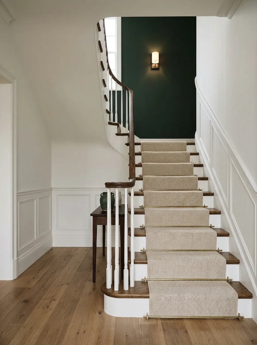
Let a deep painted landing wall supply the color while the runner stays neutral and textured. Keep the stair edges simple, choose clear wall lighting, and connect the landing color to one small detail below.
This is useful when you want personality without committing to a strongly colored carpet. Paint can establish the upper destination while the runner provides continuity. Check the view from the bottom of the flight: the landing wall may occupy more visual space than expected. Give it room, and don’t add a competing runner pattern simply because a sample was persuasive in the shop.
Take the Sample to the Staircase
Lay the shortlisted sample where it meets the hall floor and view it from the entrance. Check it again beside the upper landing. Then ask for the fitting plan, including turns and final edges, before falling in love with the pattern.
The right runner should make sense over the whole route, not just in a flattering square. Choose a stair-suitable material, have it fitted properly, and let either the pattern, the binding, or the surrounding architecture lead. They don’t all need to shout at once. Save the design you can imagine enjoying on an ordinary trip upstairs carrying laundry.