

There is nothing wrong with a white door. There is also nothing in the property deeds requiring every door to remain white until the end of civilization.
A colored interior door offers a useful amount of change. It can give a hallway structure, warm a bedroom, or help an awkward cupboard opening recede.
Choose for the entire view: door, frame, floor, surrounding wall, and the room beyond. The paint chip has no idea what your hallway is going through.
Settle the Frame and Door-Edge Plan
Choose whether the frame remains light, matches the door, or takes the wall color. Check the door open and closed from both rooms.
Use coatings appropriate to the material and respect curing instructions before closing painted surfaces together. Keep hinges, latches, seals, ventilation, and any specialized door components functional.
Colors Worth Bringing Through the Doorway
Forest Green With Warm White Walls
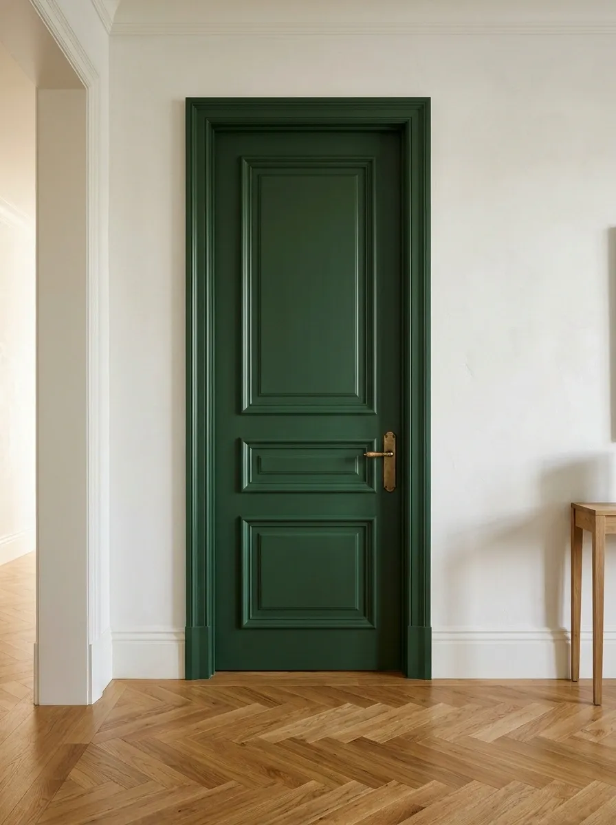
Forest green gives a hallway or bedroom door a substantial presence beside warm white walls and timber flooring.
Test it beside existing handles before replacing hardware. Brass adds warmth, while brushed metal feels quieter. Deep greens can appear almost black in a dim hall, so use a large sample. Discovering that shift early is preferable to giving every door an unexpectedly dramatic evening personality.
Muted Blue on a Bedroom Door
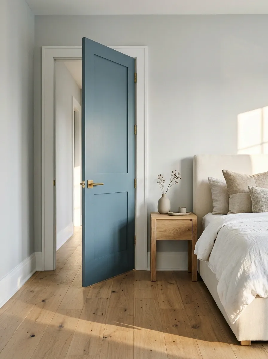
A softened blue adds character without another accent wall. Pair it with cream, warm neutrals, or compatible pale gray.
Check the hallway-facing view as carefully as the bedroom. Blue beside white bedding may behave differently beside a yellow landing. If each face gets a separate color, plan the edges. Doors are inconveniently three-dimensional objects and insist on demonstrating this whenever someone opens them.
Deep Brown Beside Pale Stone Walls
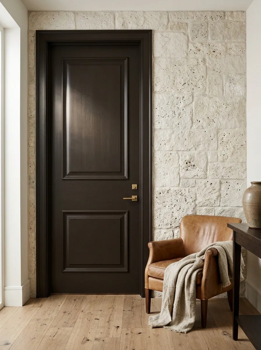
Deep brown provides warm contrast beside pale stone walls, leather, and natural textiles.
Choose the undertone against the actual floor. Red-based brown and cool brown flooring can pull in different directions. Keep trim restrained if the door has prominent panels. Its existing detail already catches the light, leaving little need for ornate hardware and an additional committee of distressed accessories.
Dusty Rose in a Quiet Dressing Area
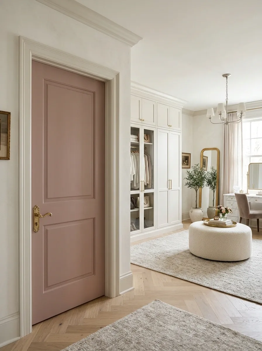
Dusty rose warms a bedroom or dressing area beside off-white walls and pale timber. Choose enough depth for the contrast to look intentional.
Keep neighboring textiles varied in texture rather than buying a pink set. Check the color under evening lighting, when some roses become peachier or grayer. A comfortable dressing area does not need to become a beauty counter with its own coordinated merchandise range.
Off-white walls, pale wood, and restrained textiles.
Charcoal for a Plain Contemporary Door
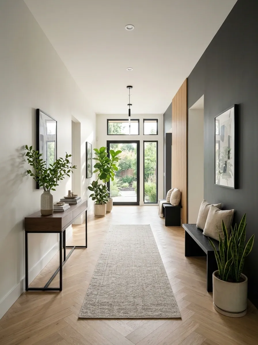
Charcoal turns a flat door into a clear architectural element. It suits simple furniture and restrained hardware.
Repair the surface before painting and choose sheen according to product suitability and the condition underneath. Reflective finishes can emphasize dents and uneven patches. The result should look deliberately dark, rather than like the door is attempting to conceal evidence of several household incidents.
Soft Sage With Creamy Trim
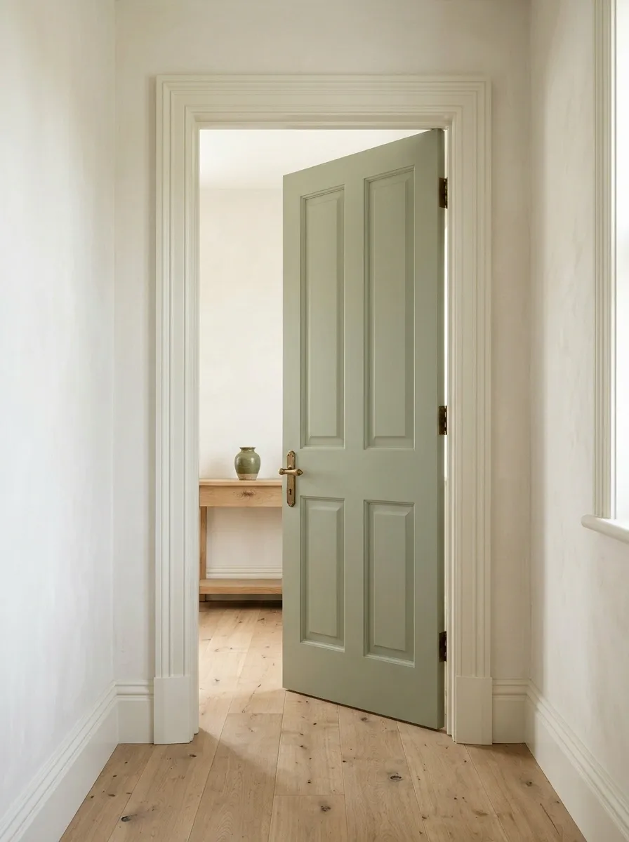
Sage introduces gentle color into a cottage-style room or light hallway. Creamy trim can connect it with warm flooring and traditional panels.
Test the green against the existing whites. A little difference can be appealing when it looks chosen. Repeat green in one nearby detail if helpful, but avoid distributing sage accessories throughout the house as evidence that the door was part of a strategy.
Oxblood in an Otherwise Neutral Hall
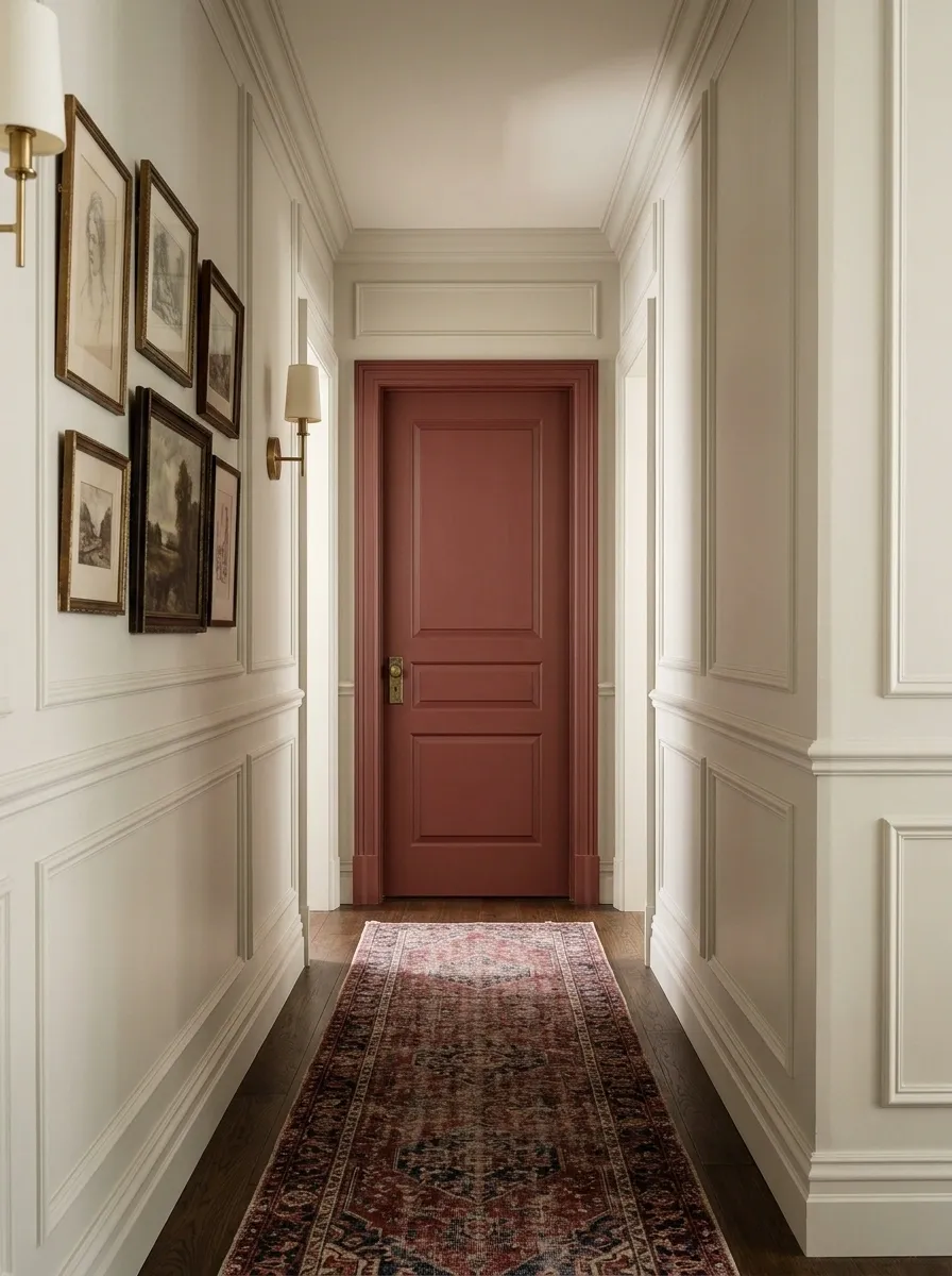
A muted deep red door brings richness to a quiet hallway. Brownish reds usually feel less signal-like than bright versions.
Give the color space by limiting other strong accents. One door may be sufficient; repetition depends on how many openings share the view. Photograph the hall before painting the entire run. Several red doors create a different rhythm from one handsome focal point.
One accent and several repeated doors create different effects.
Warm Putty for a Subtle Change
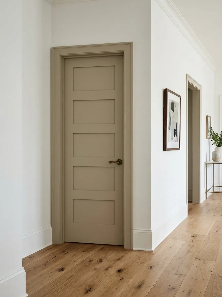
Putty, mushroom, and soft taupe distinguish a door from white walls without a saturated accent. They suit rooms with patterned floors or wallpaper.
Inspect undertones beside the trim and flooring. Some lean pink, others green, and either can become assertive across a whole door. A neutral is still a color; it has simply hired a more discreet publicist.
Navy With a Pale Blue Room Beyond
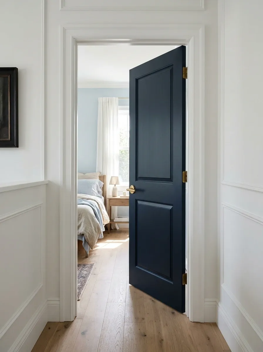
Navy at an opening can connect with a pale blue bedroom or study. The deeper tone gives the entrance definition.
Keep the frame light for a crisp outline or paint it navy for a fuller statement. Mock up both. Check the shade at night, because some navies become nearly black. That distinction matters when the plan depends on a blue relationship rather than simply a dark rectangle.
Muted Yellow for a Utility-Room Entrance
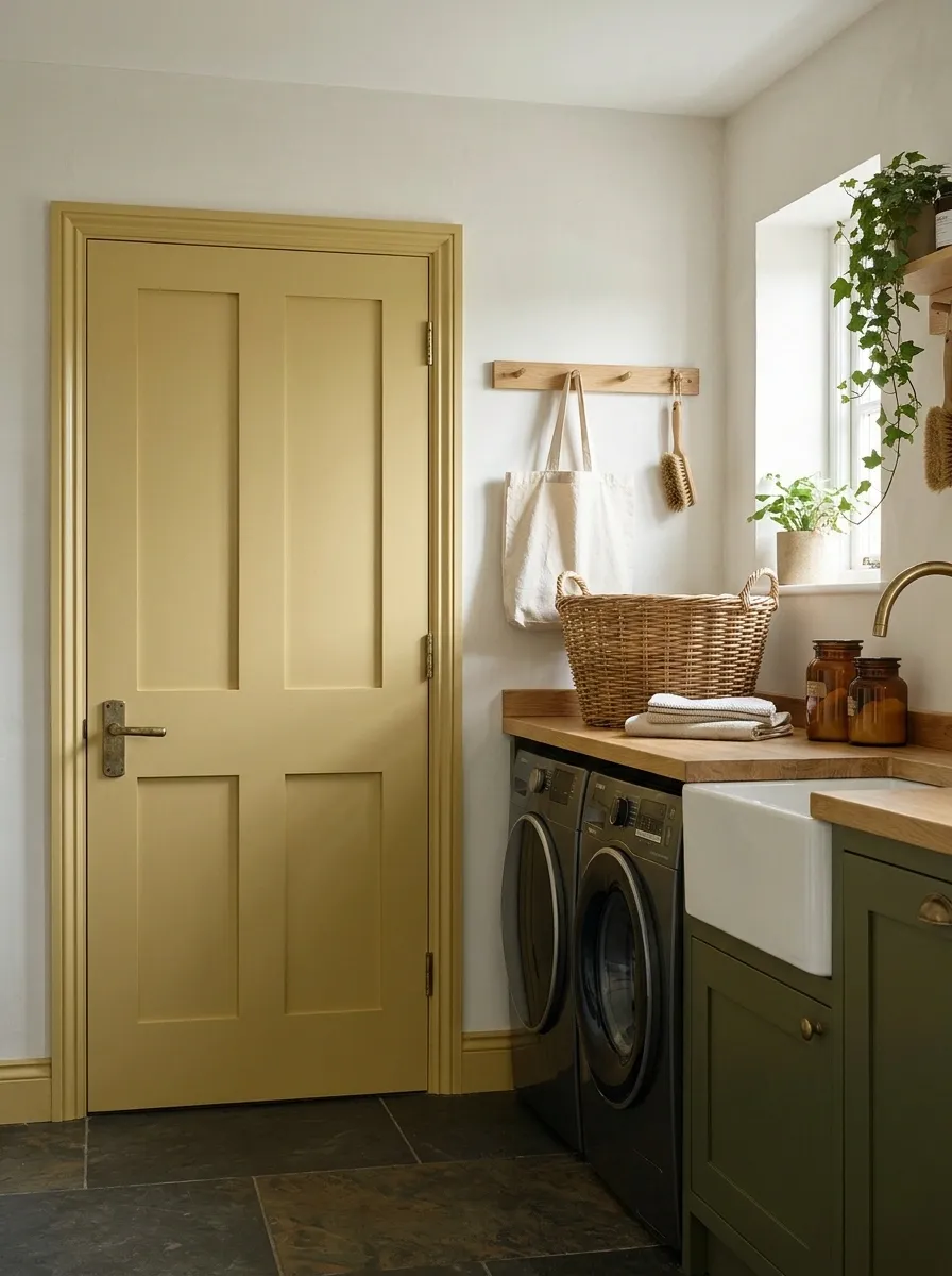
A subdued yellow can brighten a laundry or utility-room entrance. Ochre and buttery tones offer different levels of warmth.
Check them beside appliances and flooring. A little depth can look more intentional than a pale yellow that appears accidentally stained. The door can handle the cheerful part of laundry while the washing machine continues negotiating with the socks.
The Wall Color on an Awkward Cupboard Door
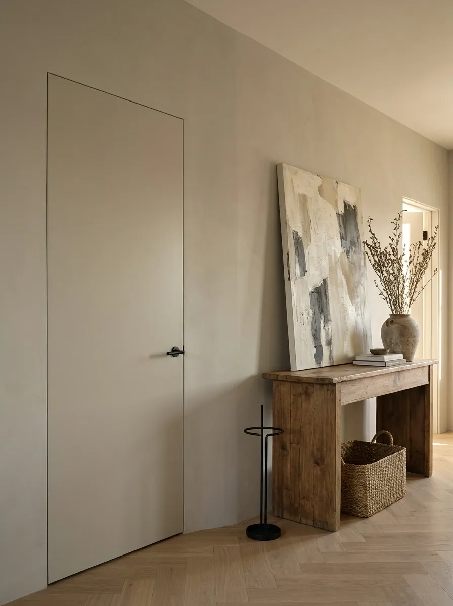
An awkward storage opening can recede when it shares the surrounding wall color. This lets furniture or artwork lead the view.
Use a door-appropriate coating even when the shade matches the wall. Keep handles, ventilation, and required access clear. A quieter appearance is useful, but you should still be able to find the cupboard when the vacuum cleaner has an appointment with the hall.
Keep the opening functional.
A Colored Frame Around a Light Door
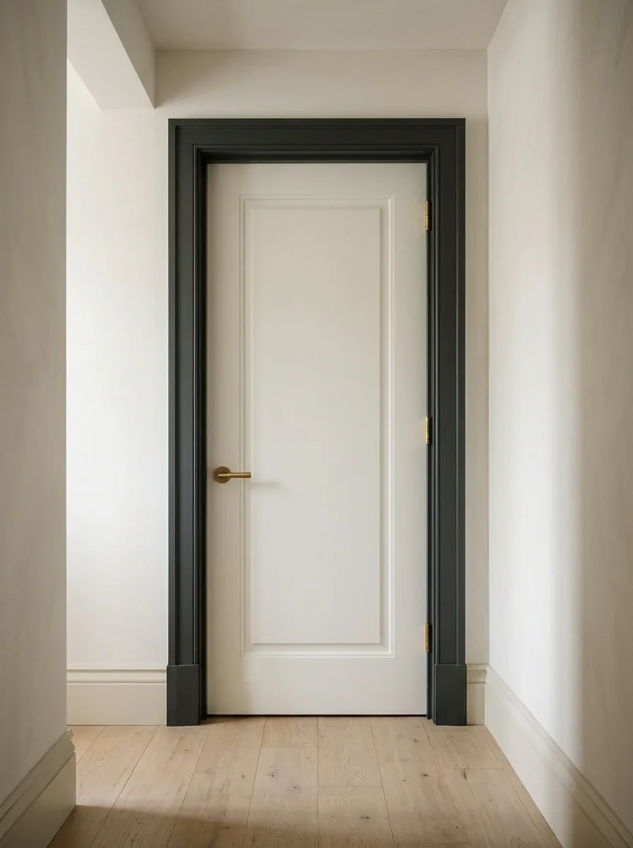
Reverse the usual arrangement by painting the frame deeper while keeping the door light. This emphasizes the outline of the opening.
Choose a frame color connected to an existing finish and decide how it meets the skirting. Resolve those junctions before painting. Several unrelated trim decisions meeting in one corner can resemble a group project where nobody shared the document.
Muted Clay Beside Natural Linen and Oak
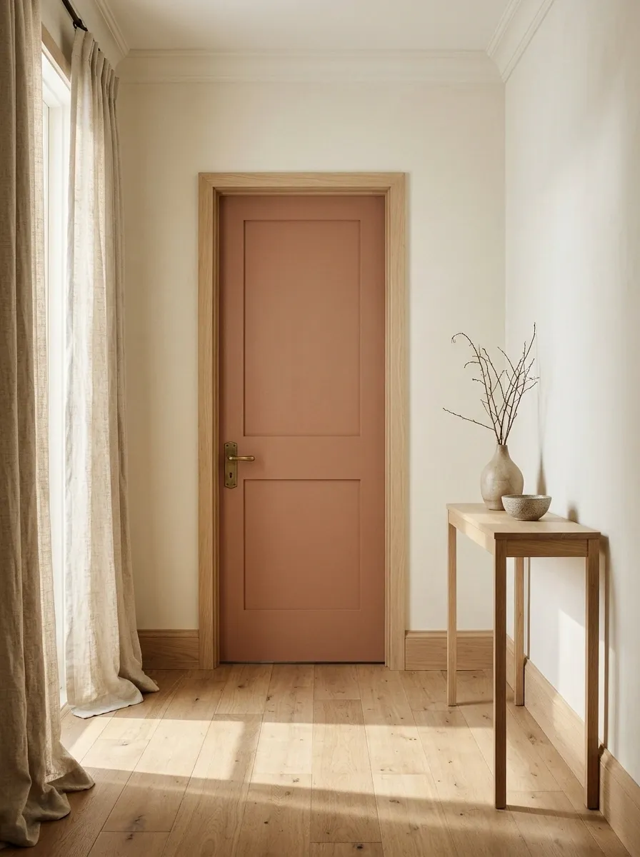
Clay brings warmth to pale walls, linen, and oak. A dusty version often feels more relaxed than a vivid orange.
Sample it beside the actual timber, especially if the wood is strongly orange. Let texture provide some variation rather than recruiting every terracotta accessory available. A small, coherent combination can feel warmer than an entire room trying to demonstrate its commitment to earth tones.
One Repeated Door Color Along a Landing
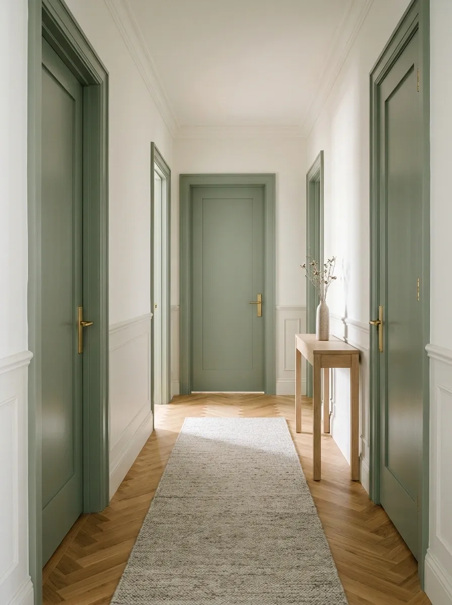
Repeating a medium green, warm gray, or subdued blue can organize a landing with several openings.
Test a large sample in its darkest section, then consider the full repeated view. Consistent frames and hardware help where practical. Resolve individual door requirements before pursuing visual uniformity. A coordinated landing still needs every opening to do its actual job.
A Quiet Color on a Detailed Period Door
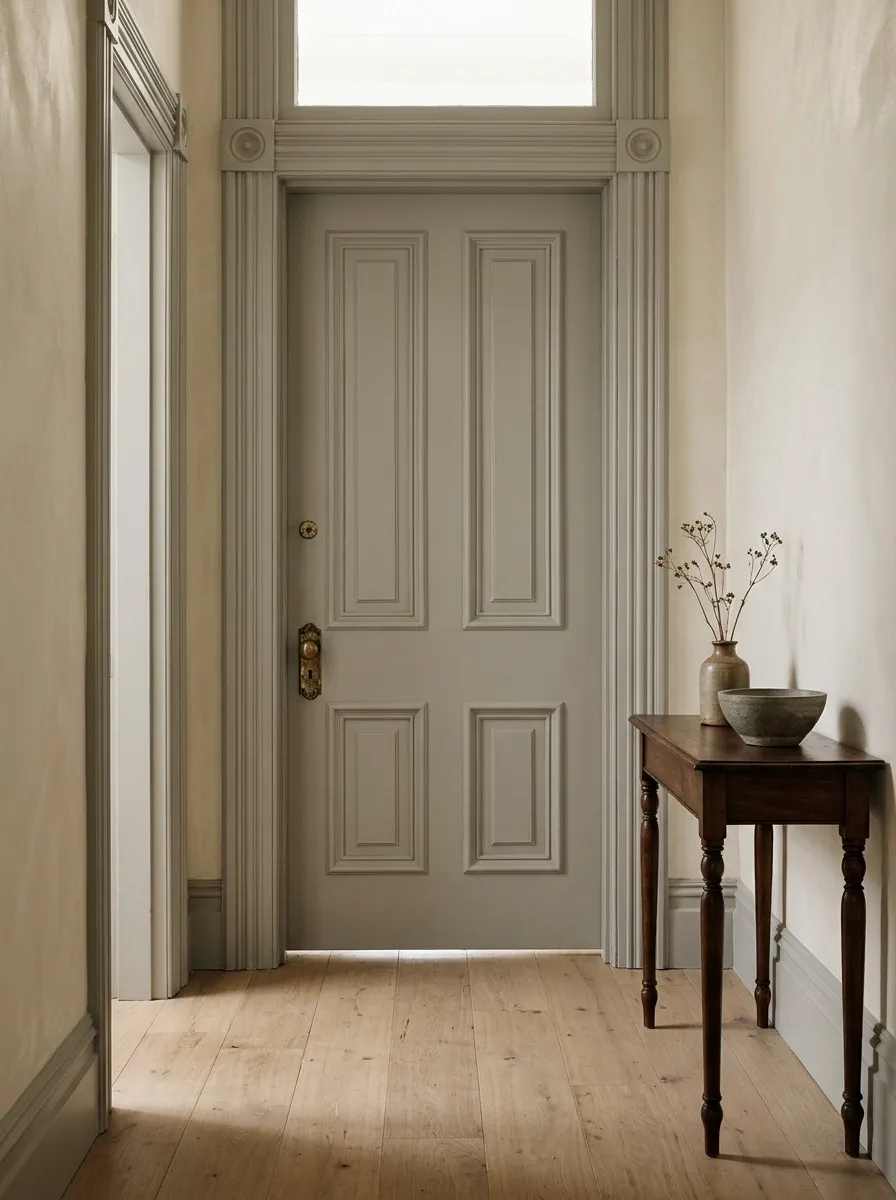
Stone, pale gray-green, or warm ivory can reveal an older door’s molding through light and shadow.
Assess old finishes before preparation and use a compatible coating system. Avoid burying details and moving clearances beneath excessive paint. Period character does not automatically require stripping everything. Sometimes careful repair and a quieter finish allow the existing craftsmanship to receive attention without an accompanying restoration drama.
Pale Lilac Beside Warm White Walls
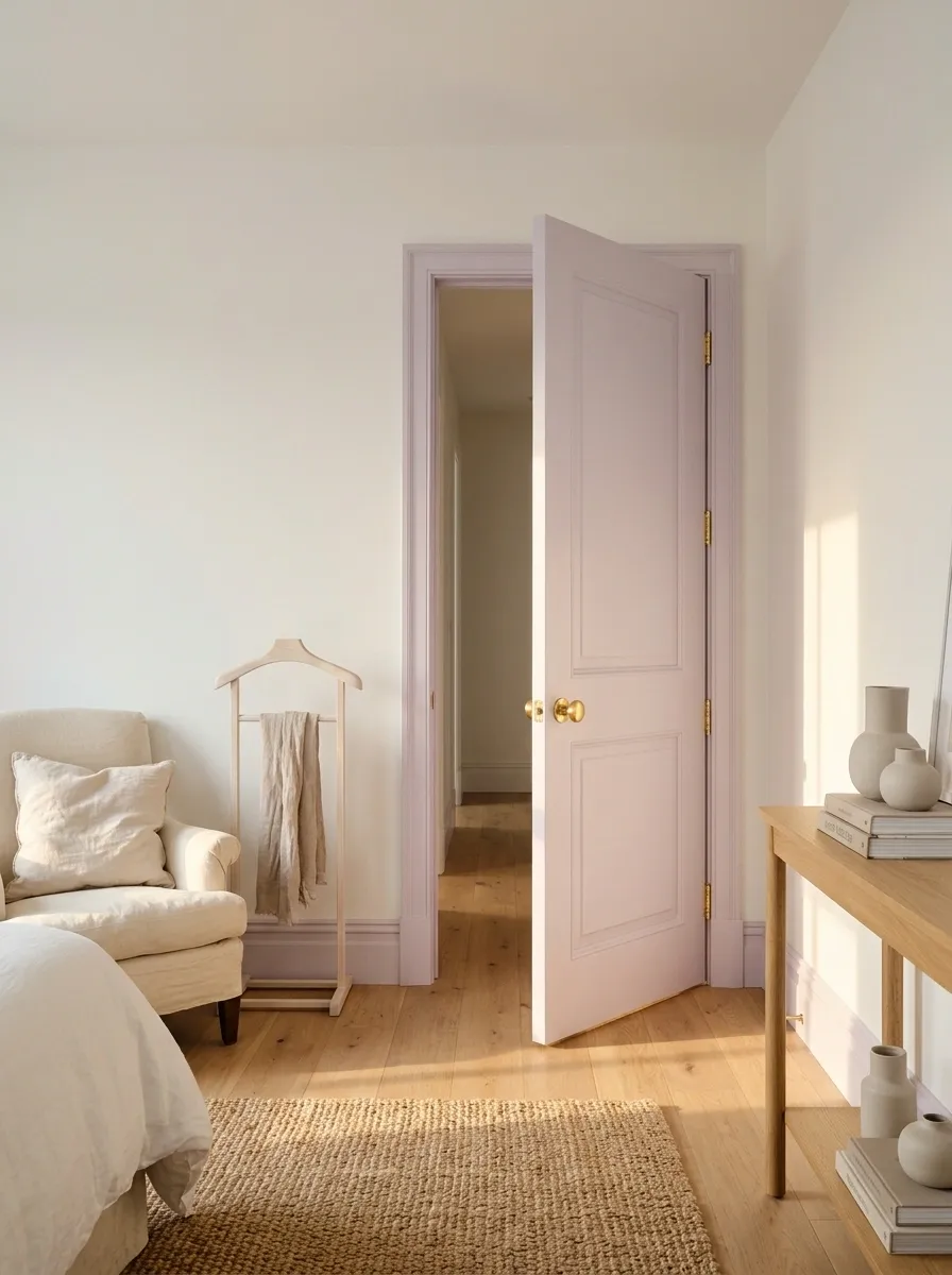
Soft lilac makes a bedroom or dressing-room door distinctive without a dark accent. Warm white and natural timber keep it from feeling cold.
Check the floor and hallway lighting because lilac can shift toward gray or pink. Include the open door in the test. The palette should not depend on everyone keeping it firmly shut to preserve your decorative argument.
Deep Teal With a Quiet Stone Floor
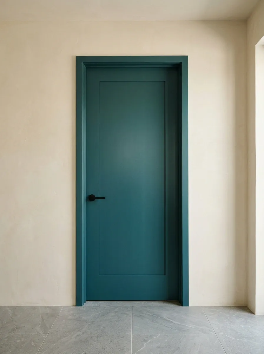
Deep teal provides color beside restrained stone flooring and neutral walls. Simple hardware allows the paint to remain the feature.
Check the blue-green balance throughout the day. Decide whether the frame joins the color or stays with the wall. A teal door does not need matching decorative bottles arranged nearby like a welcoming committee with unusually strict membership requirements.
Check the blue-green shift in different lighting.
Soft Peach for a Light-Filled Bedroom
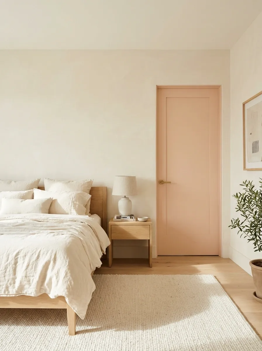
Muted peach can warm a bedroom with pale bedding and simple oak furniture. Choose a clear but gentle contrast against the wall.
Compare the sample with fixed creams, pinks, and orange-toned surfaces. Check the hall-facing view too. The color should remain comfortable during ordinary use instead of performing beautifully only during a flattering patch of morning sunshine.
Bottle Green on Double Doors
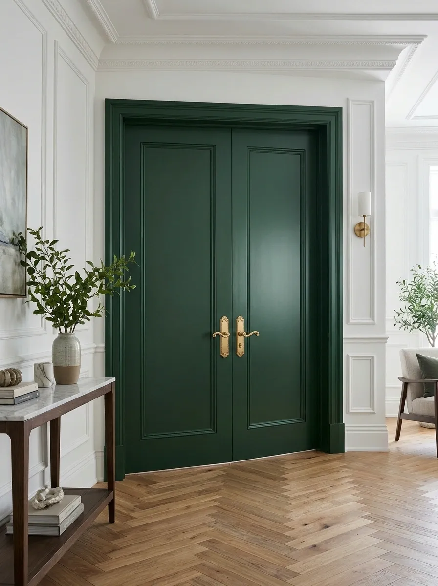
Bottle green turns paired doors into a substantial feature. A matching frame can make the opening feel coherent.
Assess both leaves together and with one open. If glazing is present, protect it and preserve seals and operating components. The pair already creates a strong rhythm, leaving little need for equally dramatic decoration immediately beside it.
A Deep Ink Door Against Patterned Wallpaper
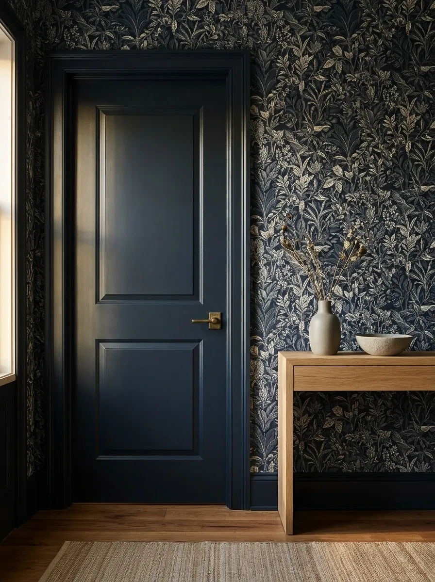
An ink-colored door provides a solid pause beside wallpaper. Borrow a deep tone from the print or choose a deliberate related contrast.
Compare physical samples together. An almost-match may look accidental where the materials meet. Keep hardware quiet if the wallpaper is detailed. The door can organize the view while the surrounding print continues its busy social calendar.
Use physical samples to judge the relationship.
Warm Gray on Utility Cupboard Doors
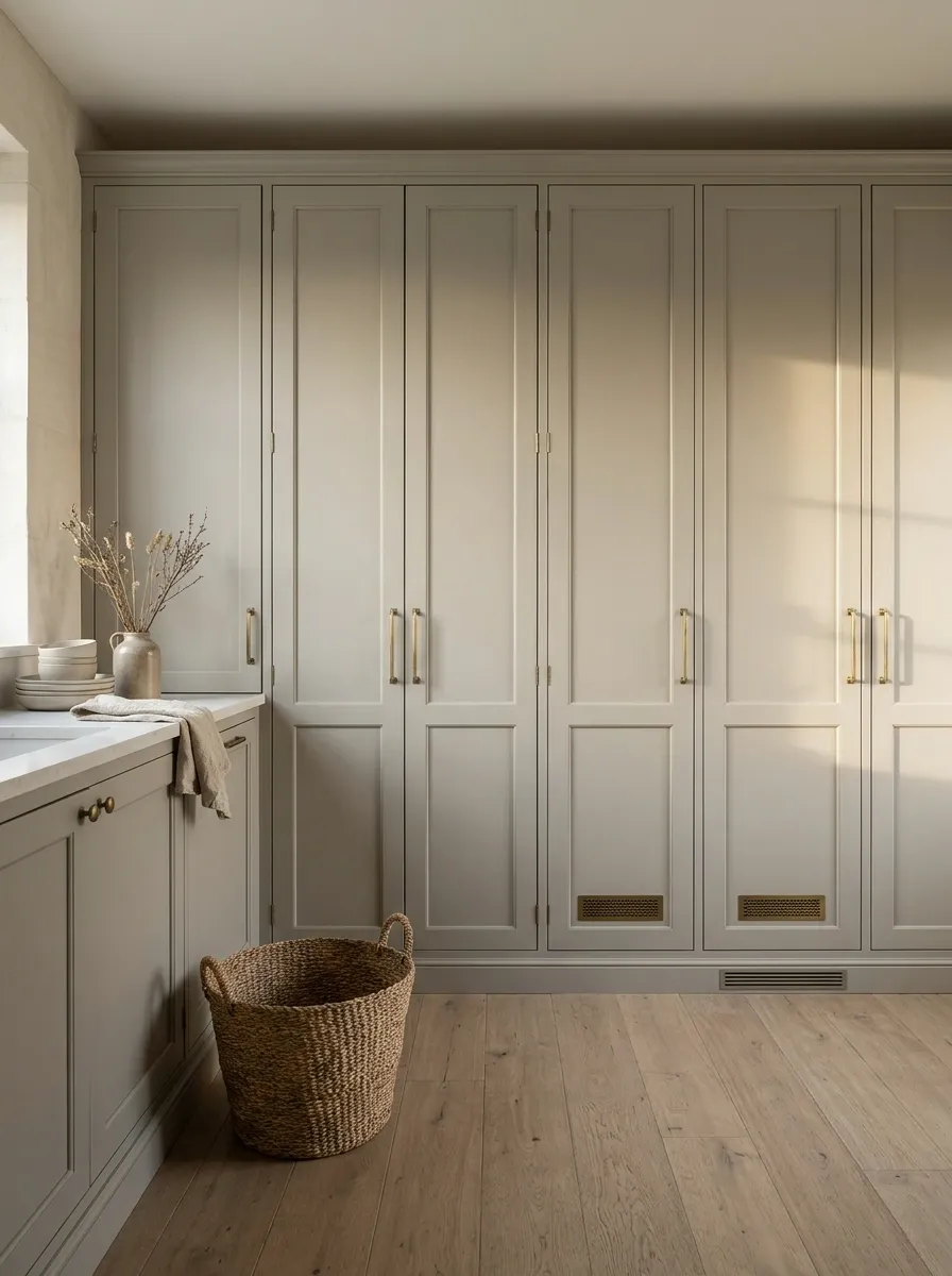
Warm gray can organize a run of utility doors without making each opening a feature. Connect it with nearby timber, stone, or neutral walls.
Use suitable coatings and preserve grilles and service access. Treat visible fittings coherently where possible. Several little doors can become a calm background instead of each presenting a separate argument about why it deserves attention.
A Rust-Colored Door With Pale Plaster Tones
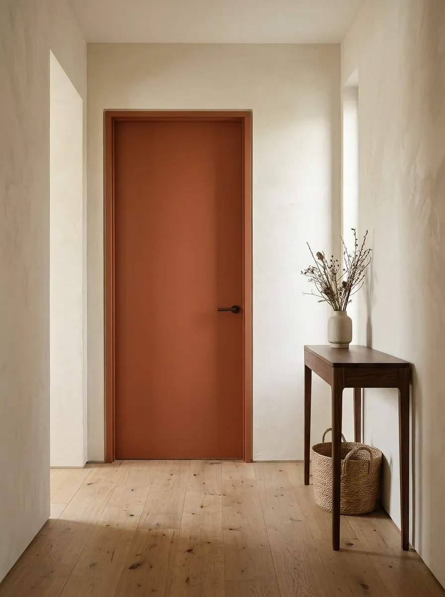
Rust or burnt orange adds warmth beside pale plaster-like walls. Muted versions often sit more comfortably with existing timber.
Try a generous sample because a small orange chip can seem mild until it becomes a full door. Keep neighboring textiles quieter. Personality does not require introducing every earthy shade until the hallway resembles the contents of a spice drawer.
A Pale Aqua Door in a Small Bathroom
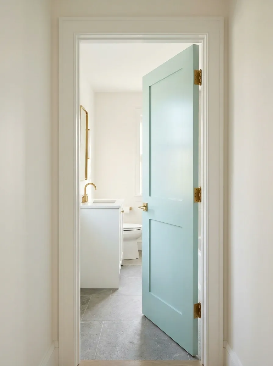
Pale aqua introduces color beside white fixtures and a restrained floor. Keep it soft enough to suit the available light.
Choose a suitable coating and preserve door hardware and seals. Check the hallway view, particularly beside warmer rooms. A little freshness does not require a complete nautical theme; you can stop before acquiring a rope mirror and a sign explaining bathing.
A Dark Door With a Matching Skirting Detail
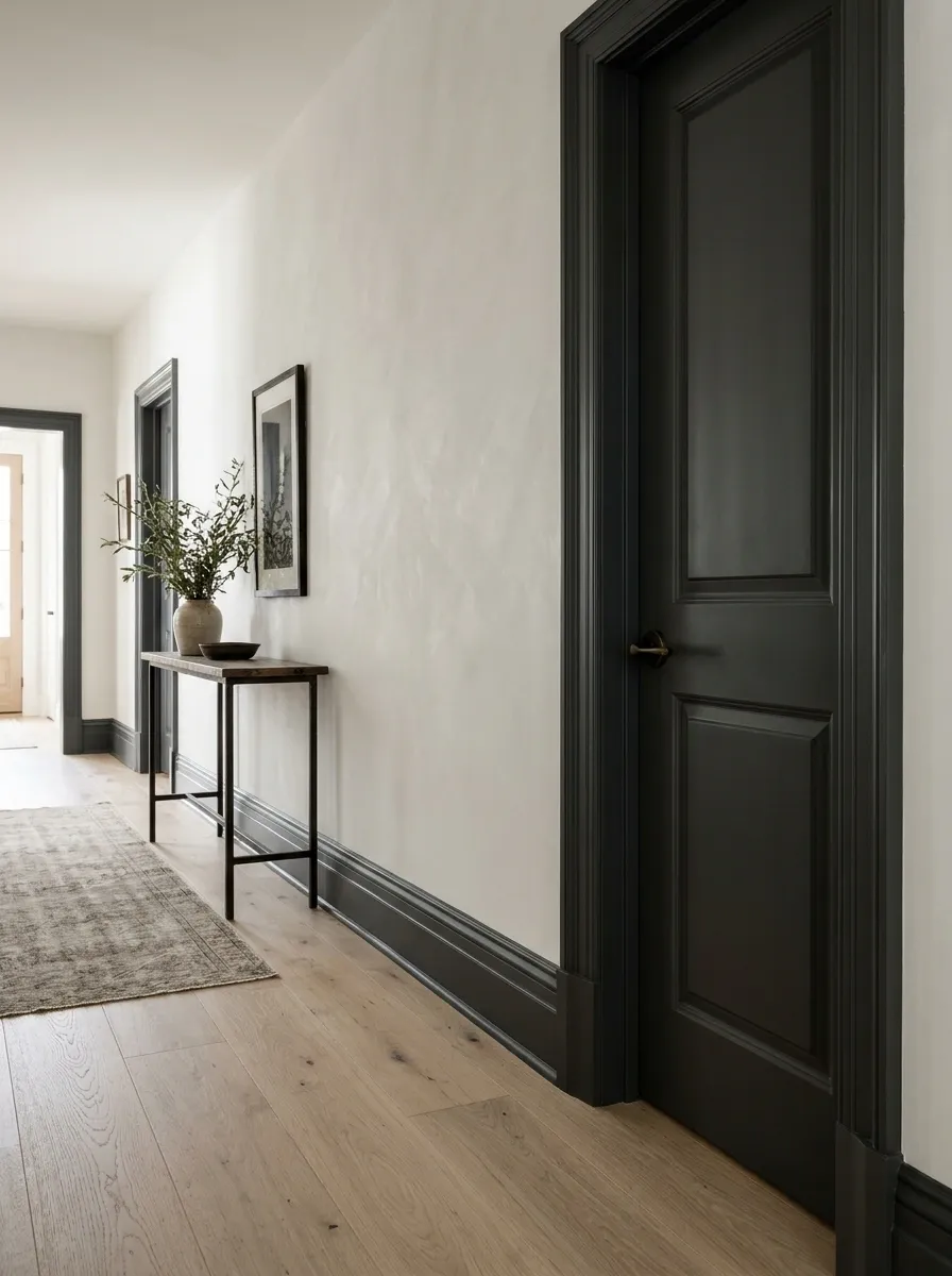
Repeating a dark door color on selected trim can connect the opening to the wider room. Plan the treatment across the complete wall.
Sketch frame-to-skirting junctions and inspect visible openings together. Dark trim emphasizes edges, including imperfect ones. Careful preparation and clear transitions do more for the result than introducing additional colors to disguise uncertainty.
Connect the frame and skirting intentionally.
A Different Color on the Room-Facing Side
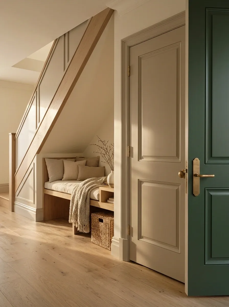
One face can belong to a quiet landing while the other follows a stronger bedroom or study palette.
Plan the visible edges and keep coating thickness compatible with normal operation. Respect curing instructions before closing painted surfaces together. The half-open view matters too; it should not reveal an edge suggesting that the painting team concluded the job during an unresolved disagreement.
Open It Before Calling It Finished
Check the door fully open, half open, and closed. Test the handle and latch, and allow the coating to cure as instructed.
Then inspect it from the neighboring room. A successful door color survives real life, including people touching the handle.