
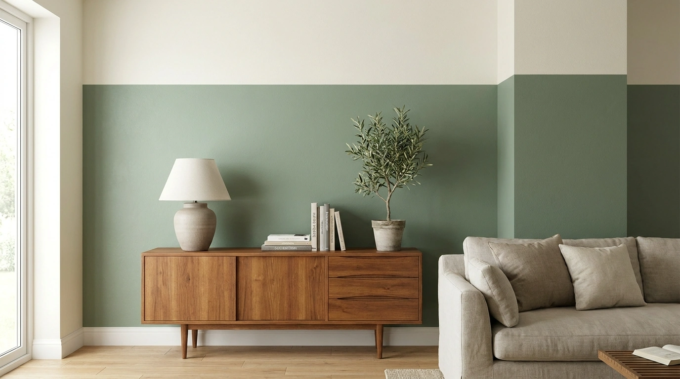
You buy two colors, paint a line between them, and discover the line meets every light switch at the worst possible height. Congratulations: the room has developed a plot.
Two-tone walls work better when the division responds to something real. That might be a headboard, a picture rail, a dining bench, or the way adjoining spaces connect.
The colors matter. Where they meet can change the entire result.
Decide Where the Colors Meet Before Choosing Both
Mark the division temporarily or draw it on a photograph. Look from the doorway and from your usual seat.
Include switches, radiators, furniture, and trim in the test. Check large paint samples in the room’s changing light. Follow the coating system’s preparation and curing instructions, and assess unknown older finishes before disturbing them.
Color Pairings With a Reason for Their Layout
Olive Below, Warm White Above
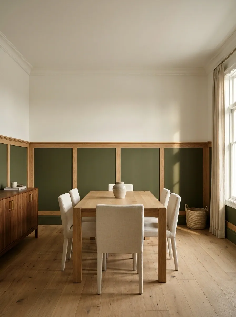
Olive on the lower wall brings depth to an entry or dining room while warm white keeps the upper section quieter. Relate the division to furniture rather than automatically splitting the wall halfway.
Check the green beside the floor and timber. Keep accessories restrained. The room can enjoy a green wall without acquiring an entire green merchandise collection to prove the decision was deliberate.
Dusty Blue and Chalky Cream in a Bedroom
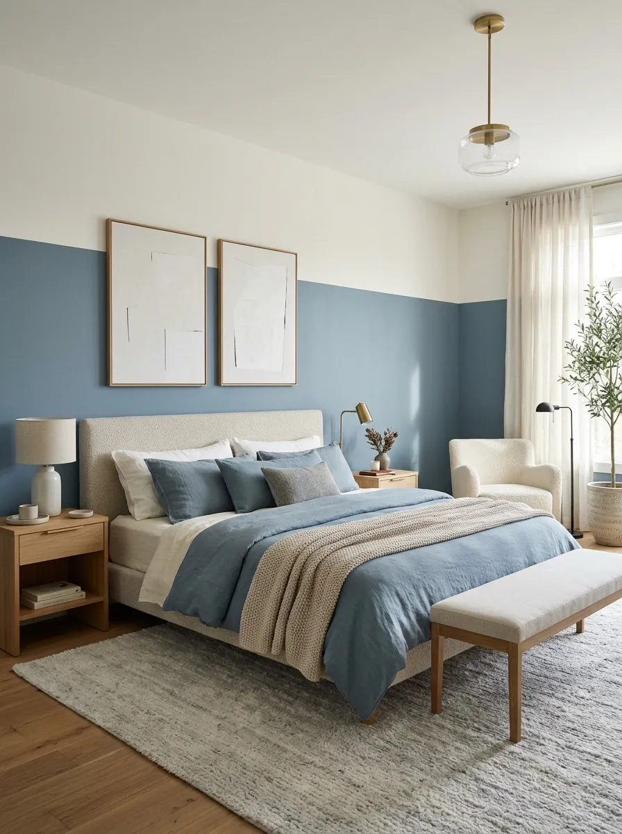
A dusty blue lower wall can sit behind a bed, with cream above softening the composition. Position the line clearly above or below the headboard’s top.
Avoid an almost-alignment that resembles a measuring error. Plain bedding and timber furniture keep the pairing relaxed. Check the blue after dark; the duvet should not spend its life compensating for a wall color that turns unexpectedly chilly.
Deep Brown and Pale Oat in a Living Room
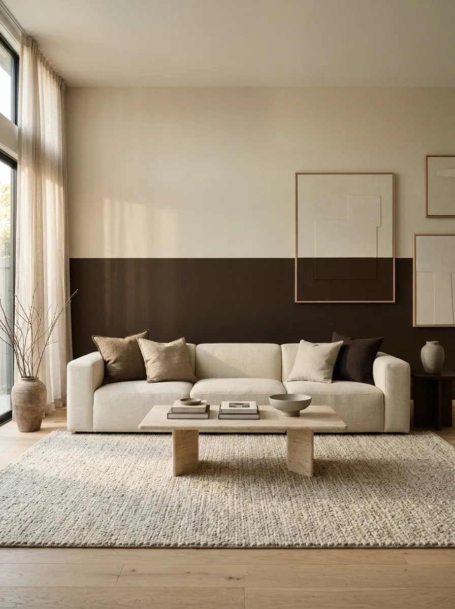
Deep brown below pale oat gives light furniture a substantial backdrop without making every wall dark.
Compare both paints with the sofa, floor, and curtains. Different brown undertones can pull apart when placed together. Position artwork deliberately around the division instead of letting the line cut through every frame. Rich paint supplies plenty of character without a ceremonial collection of brass objects arranged to explain the mood.
Terracotta and Soft Pink for a Dining Corner
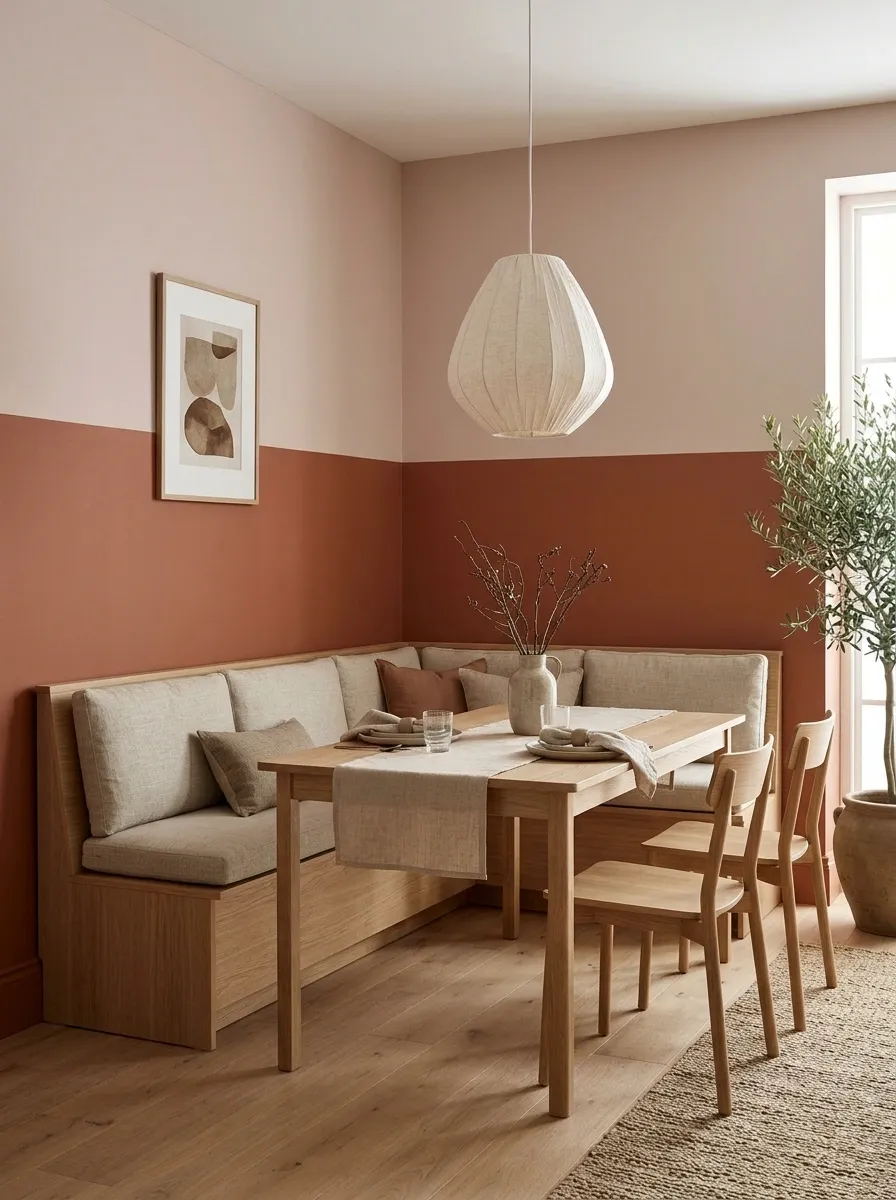
Terracotta and muted pink create warmth around a bench or dining table. Use earthy versions of both to avoid competing brightness.
Plain wood and simple ceramics give the combination room to work. Test the colors under evening lighting, when meals happen. A dining corner should feel inviting at dinner rather than exclusively during the brief morning period when its sample photograph looks excellent.
Two Related Greens With a Low Division
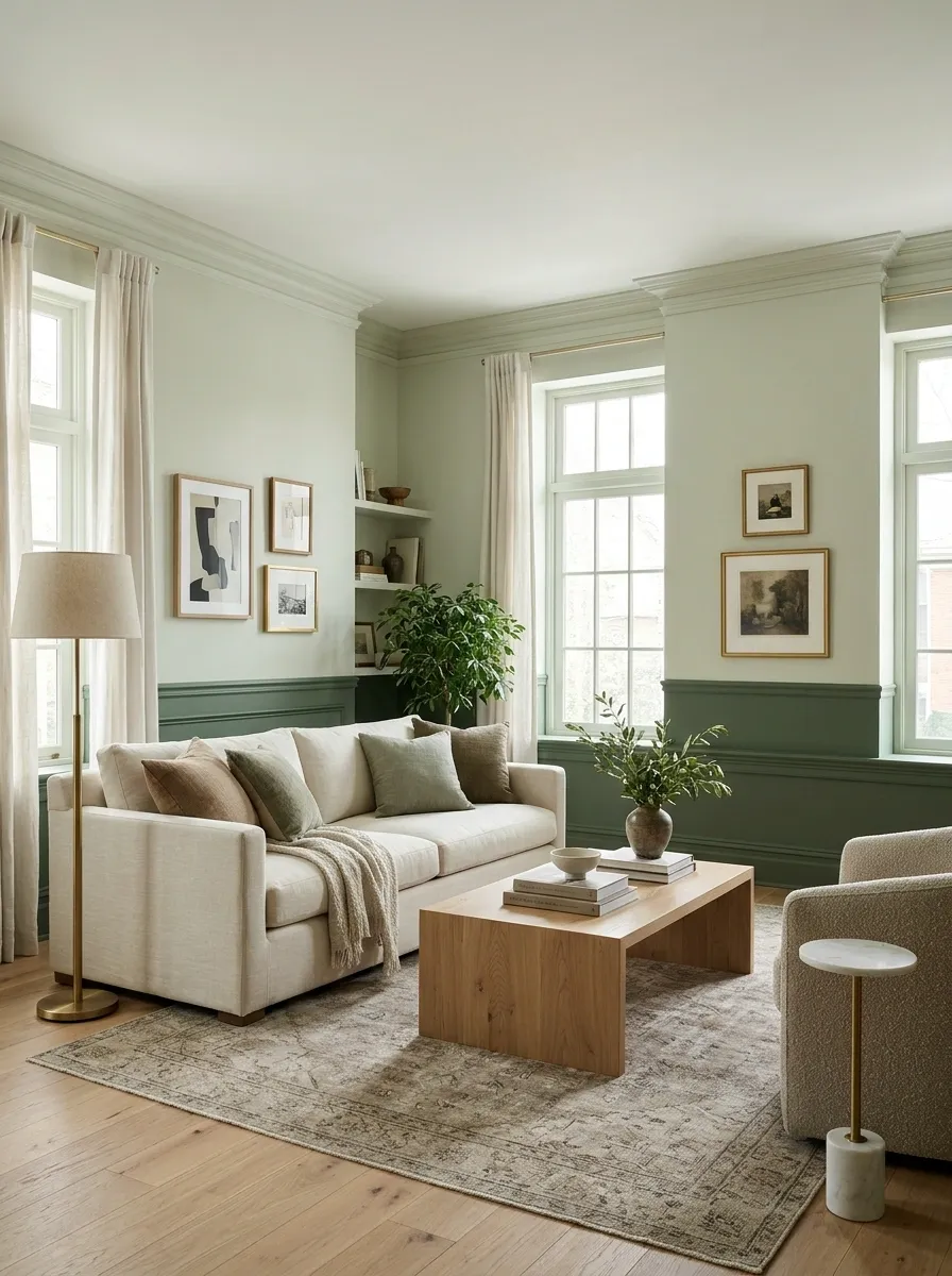
A darker green below a paler related green creates depth with less abrupt contrast. A low division can keep most of the room light.
Use physical samples side by side and inspect their undertones. Two paints with “sage” in their names may still behave like relatives introduced during a tense family occasion. Check the band beside skirting, furniture legs, and existing molding.
A Dark Lower Wall in a Narrow Hallway
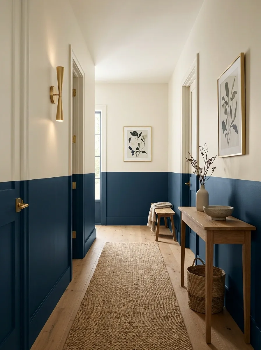
Ink, forest green, or charcoal below a lighter upper wall gives a hallway definition. Choose a suitable durable finish where bags and coats brush the wall.
Carry the line consistently through corners. Decide how doors and frames join the composition before painting. Making those choices early is more pleasant than improvising around the third doorway with a tired brush and rapidly declining optimism.
Include corners, doors, frames, and the lower-wall line.
A Vertical Split That Defines a Desk Area
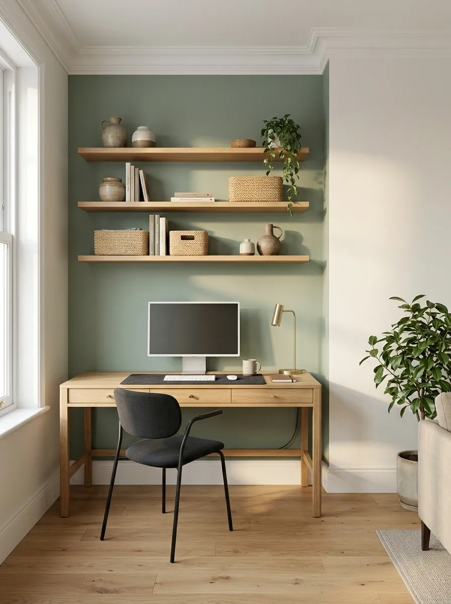
A vertical division can identify a desk corner inside a bedroom or living room. Extend the colored area generously enough to contain the working arrangement.
Use a corner or wall break as the boundary where possible. Include shelves and cable routes in the composition. The wall should make the workspace feel placed, rather than announce that a desk has been squeezed inside an unrelated decorative rectangle.
A Color Block Behind the Whole Bed Arrangement
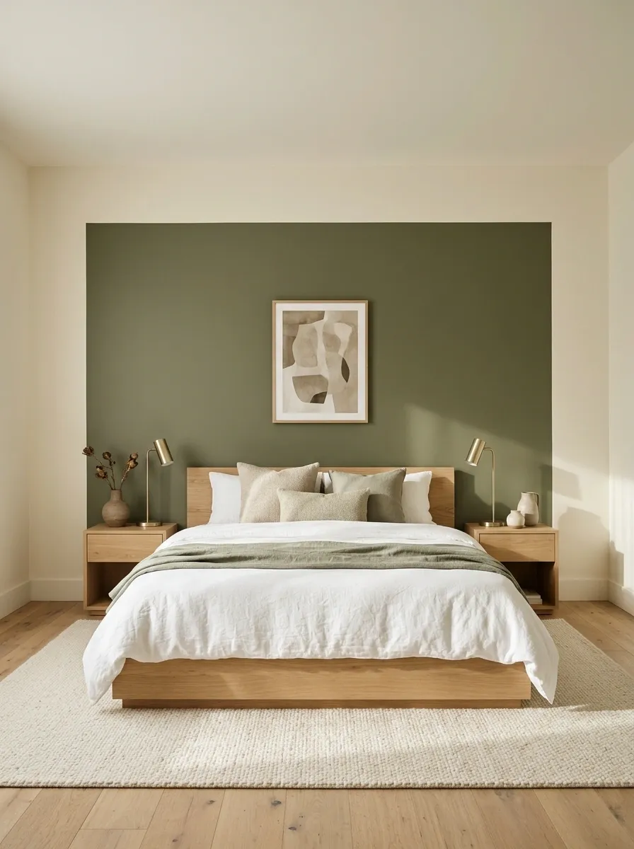
Paint a generous block around the bed and bedside furniture, keeping the surrounding wall lighter. This gives a plain room a clear sleeping area.
Measure lamps, tables, and intended artwork as part of the group. A block barely wider than the mattress can look pinched. Give it deliberate margins so the bed feels supported by the composition rather than accused of escaping its designated painted box.
Give the whole group a backdrop.
Cream Walls With a Deep Red Window Reveal
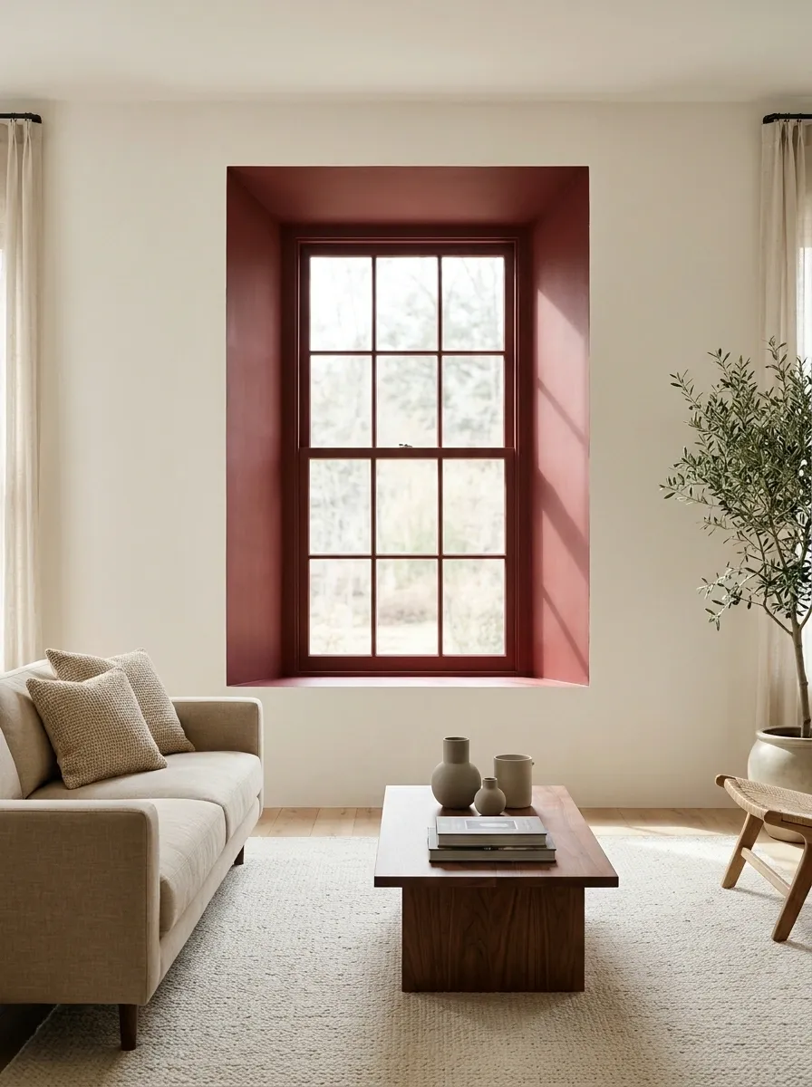
A colored reveal introduces a second tone without dividing every wall. Muted brick or oxblood against cream draws attention to the window opening.
Test the red beside the frame and in the recess’s shadow. Paint only suitable surfaces and preserve moving parts. The detail does not need red cushions, red rugs, and red lamps positioned nearby to provide witness statements about the palette.
A Painted Ceiling That Supplies the Second Tone
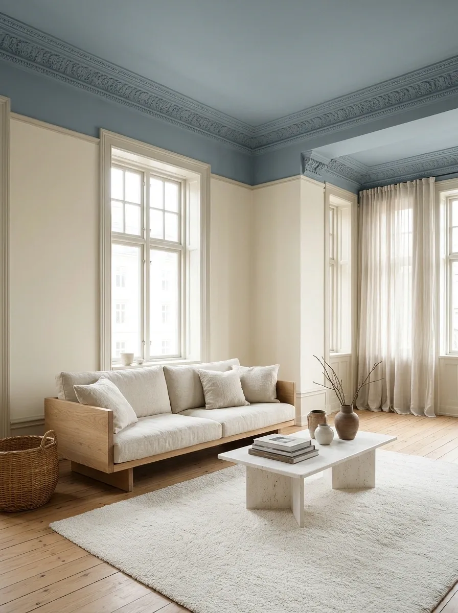
Keep walls pale and move the second color overhead. Muted blue, soft clay, or pale green can suit a room where a wall division would collide with furniture.
Test the ceiling color in position because it receives light differently. Decide whether it includes the cornice or stops at the ceiling edge. The overhead color is already a clear gesture; the walls can relax.
Quiet walls keep the ceiling color readable.
A Tonal Split Across Existing Paneling
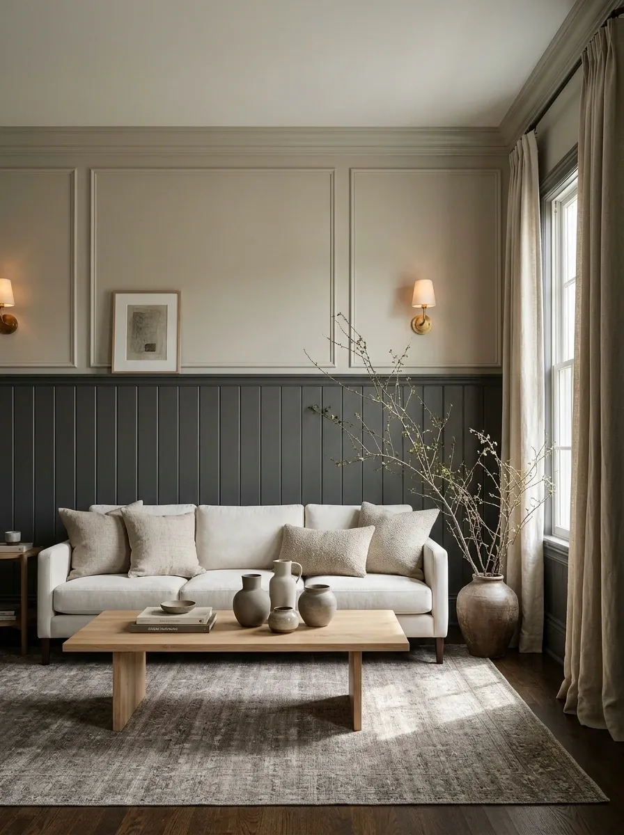
Existing paneling provides a natural color boundary. Use a deeper tone below and a related lighter shade above for a composed result.
Respect its proportions instead of inventing another line just beyond the molding. The different surfaces may need different preparation and coatings, even when the colors relate. Matching the appearance does not require ignoring what the materials need underneath.
Pale Peach and Warm White Around a Breakfast Bench
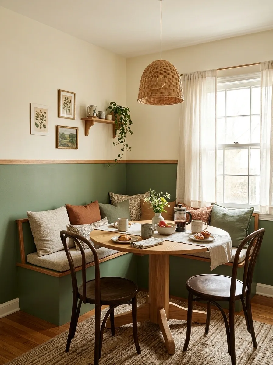
Pale peach around a breakfast bench gives warmth without a heavy dark band. Warm white above keeps the composition light.
Carry the line around the seating and choose deliberate stopping points. In an open kitchen, a corner or change of plane usually gives a clearer finish than an arbitrary cutoff. Keep seat fabrics practical; breakfast will eventually introduce jam to the design process.
Charcoal and Warm Gray in a Home Office
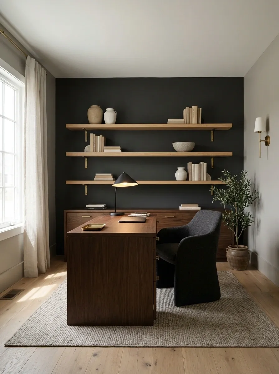
Charcoal behind a desk anchors furniture and shelving, while warm gray softens the surrounding room.
Check both against the floor and screen position. Paint will not solve glare caused by poor desk orientation. Keep task lighting useful and shelf displays restrained. A serious wall color does not require every object nearby to begin behaving like an award presented at a corporate conference.
A Strong Color Beside an Open Doorway
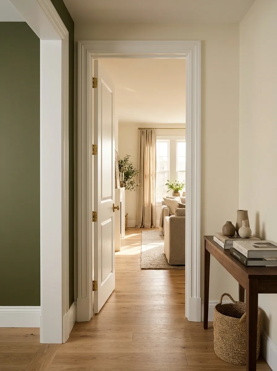
A colored wall plane beside an opening can connect neighboring rooms. Borrow a tone from the room beyond without repeating every finish.
Stand on both sides before committing. Include the frame and door swing in the plan. Households regularly view walls from directions other than the flattering angle chosen for the mood board, which is an irritating but important practical consideration.
A connecting color should work from either room.
A Gentle Off-White Pair for an Uneven Older Room
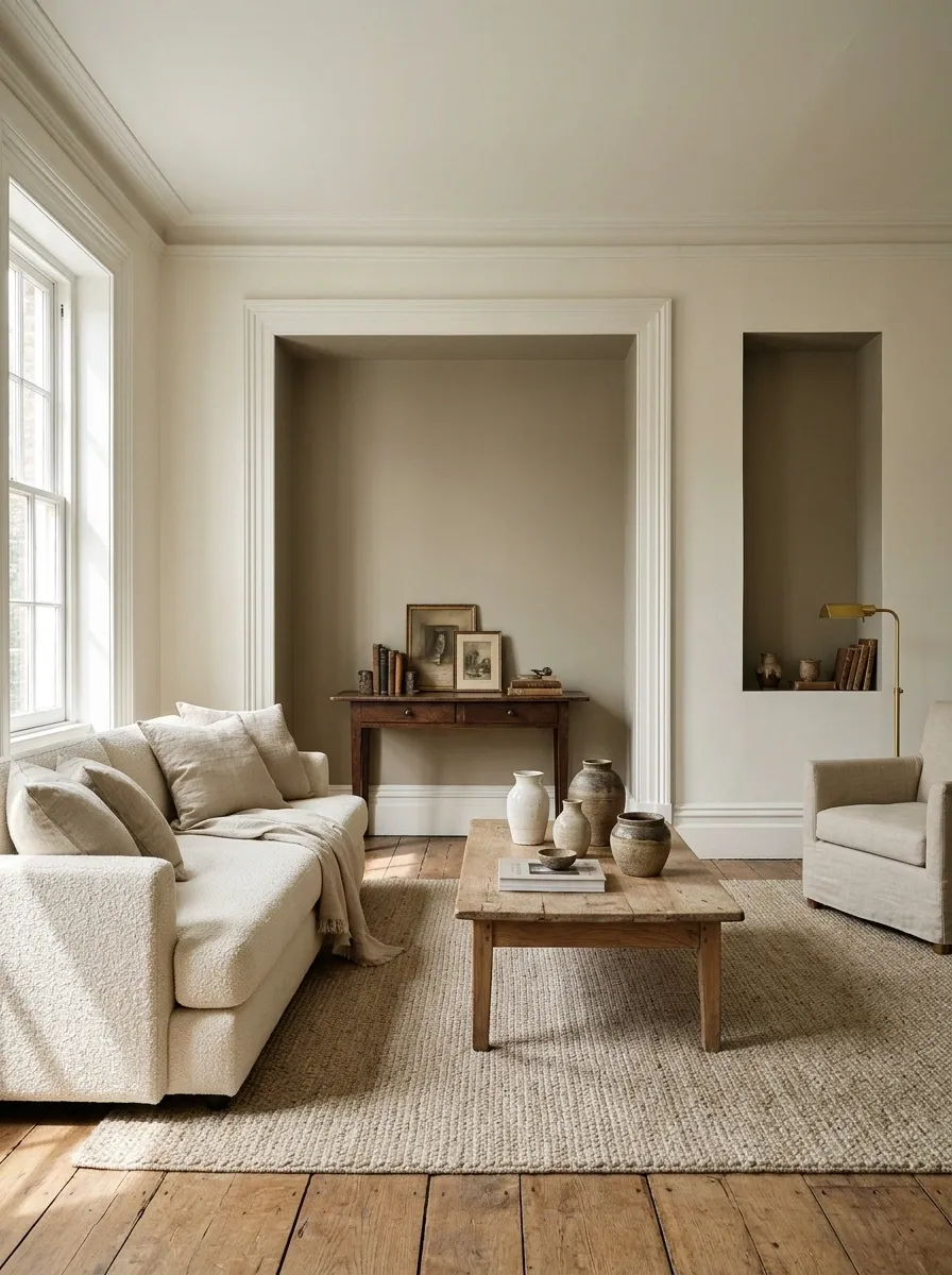
Two related off-whites add depth quietly. Put one on the main walls and another on an existing recess or architectural element.
Large samples matter here. Small differences can look deliberate or suggest that the paint ran out and someone made a brave administrative decision. Use a genuine boundary to support the distinction and inspect both colors beside the existing trim.
Mustard and Ivory Across Separate Stairwell Planes
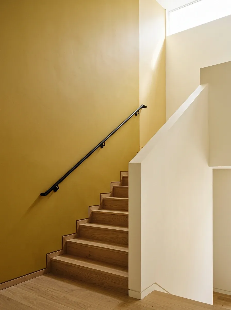
Muted mustard on one full stairwell wall creates warmth while ivory quiets the adjoining plane. The architectural corner supplies the division.
Check the view from both levels and plan safe painting access. High stairwells may suit a professional. A confident color choice does not require an improvised ladder arrangement; let the wall provide the adventurous part of the project.
Muted Blue and Sage on Adjoining Living-Room Walls
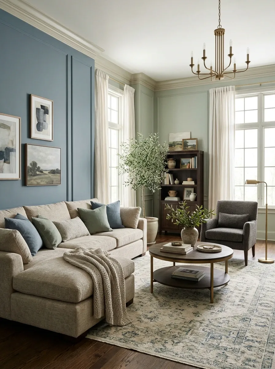
Muted blue behind a sofa and sage beside timber storage can give separate parts of a living room their own character.
Keep the colors similarly softened so neither makes the other look harsh. Connect them through plain textiles or a compatible rug. Two-tone decorating does not demand a horizontal stripe, which is useful when the furniture already supplies more than enough horizontal lines.
Aubergine and Muted Pink in a Cozy Bedroom
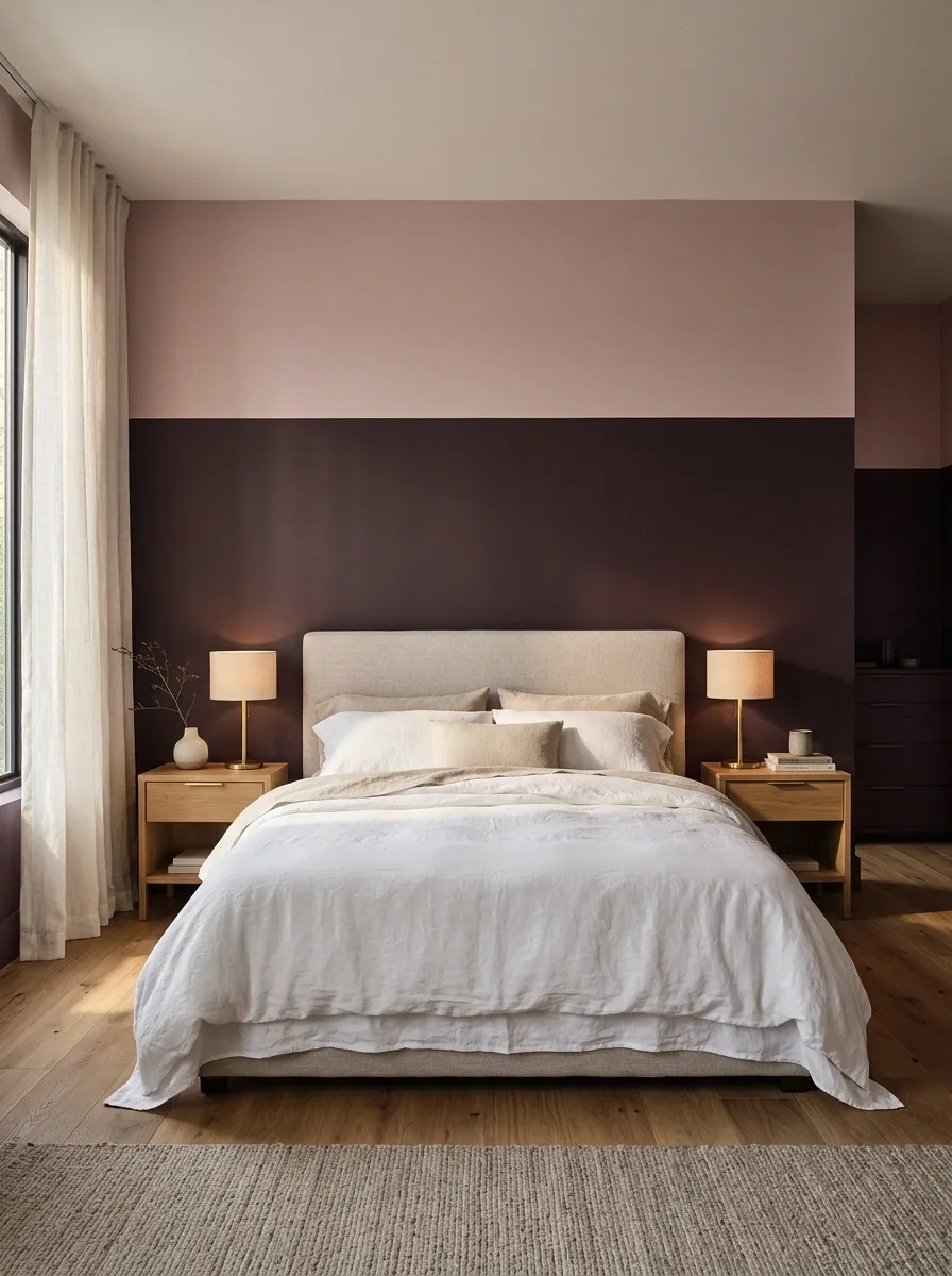
Aubergine below muted pink gives a bedroom depth without multiple decorative patterns. Relate the division to the bed and bedside arrangement.
Sample the deeper shade in the darkest corner. Some versions read brown, others purple, under evening light. Add restrained timber or metal details. The pairing already has personality and does not need matching velvet objects stationed around the room to explain its intentions.
Black and Ivory in a Bathroom’s Dry Area
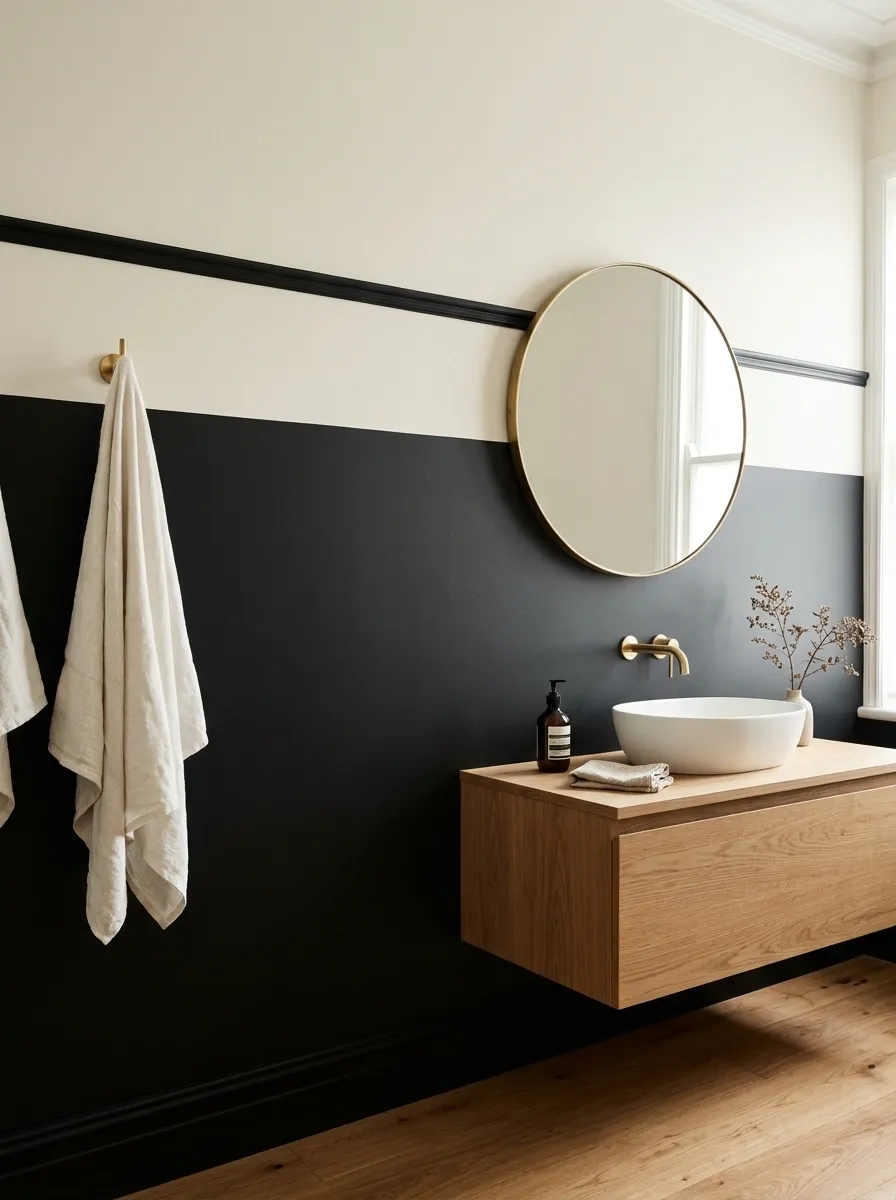
Black and ivory create a graphic bathroom backdrop when the surfaces and coatings suit the location. Place the boundary around an existing feature rather than awkwardly behind fittings.
Keep waterproofing and wet-area construction separate from the color decision. Simple towels and a restrained mirror allow the contrast to read clearly. Every accessory does not need to join the black-and-white uniform.
Paint does not replace required wet-area protection.
Teal and Sand in a Room With Light Timber
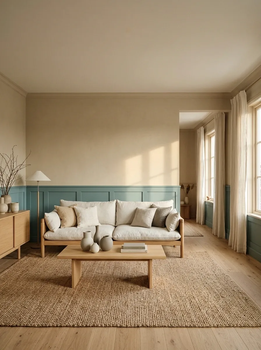
Muted teal and sand work well around light timber. Put the stronger shade where furniture needs emphasis and let sand occupy the larger supporting surface.
Check the teal beside the floor and consider the adjoining room. Keep curtains simple. The combination should belong to the house instead of arriving like a holiday brochure that has misunderstood its delivery address.
Wide Vertical Bands in a Small Dressing Area
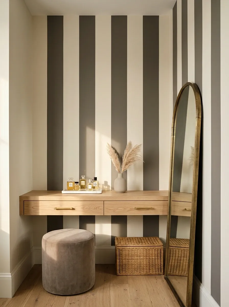
Broad vertical bands create rhythm without introducing wallpaper. Plan the complete sequence before painting.
Check the widths beside corners, mirrors, sockets, and furniture so the last band does not become an accidental sliver. Tonal colors give a quieter result; strong contrast feels more graphic. Limit other patterns unless you want the room to resemble an unusually committed shopping bag.
A Painted Arch in a Plain Reading Corner
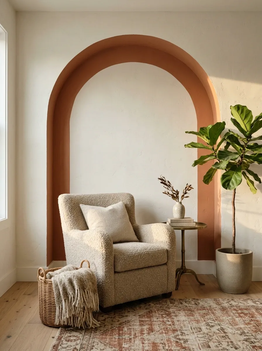
An arch gives a reading chair a backdrop where the wall lacks architectural interest. Borrow the color from upholstery or an existing textile.
Make the shape generous enough to contain the chair and table visually. Test the curve before painting and keep other objects from interrupting it accidentally. The seating should feel grounded rather than positioned beneath a decorative departure gate.
A Colored Alcove Inside a Lighter Room
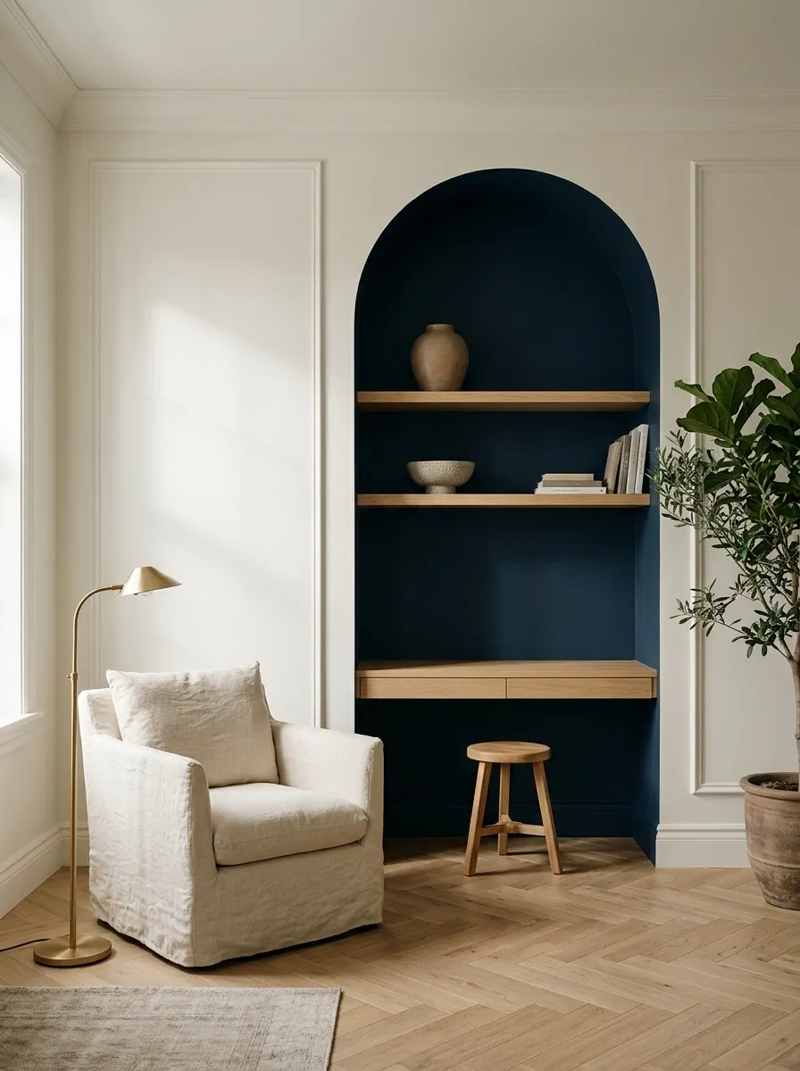
Paint an existing alcove’s back and sides deeper than the main walls. The recess gives the color a natural boundary around shelves or a small desk.
Test how shadow affects the shade. A deep color can either display or obscure the contents, depending on lighting and contrast. Keep the foreground restrained; the architecture already supplies depth without requiring a supporting collection of tiny ornaments.
A Deliberate Diagonal Across a Plain Feature Wall
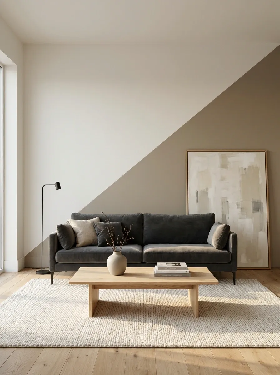
A diagonal division can energize a plain wall with few interruptions. Use two related colors and sketch the angle against the furniture first.
Check where it reaches corners and switches. Keep the treatment on a defined wall plane if wrapping it further becomes confusing. Reduce nearby patterns so the angle looks intentional rather than suggesting the tape lost confidence halfway across.
A Two-Wall Color Wrap Around a Dining Bench
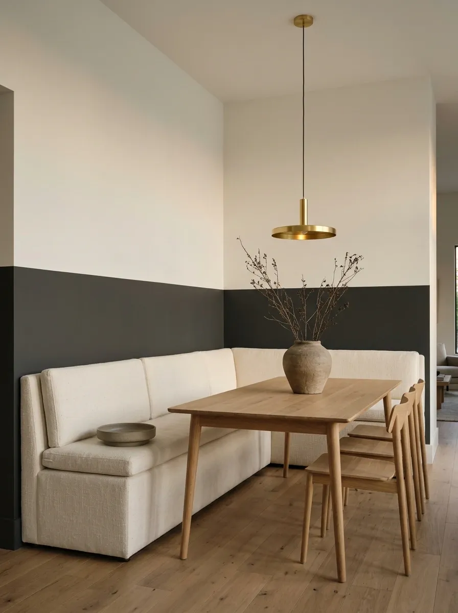
A deeper color around both walls behind a dining bench defines the seating within an open room. Keep a lighter tone above.
Set the division around the bench back and cushions, carrying it level through the corner. Choose clear stopping points on both sides. Plain upholstery lets the paint establish the area without requiring a partition or a decorative sign announcing the arrival of dinner.
Level line, clear endpoints, and room for the bench cushions.
Leave the Samples Up Overnight
Look again with lamps on, curtains closed, and furniture in position. Notice the meeting line as carefully as the colors.
Move any awkward boundary now. Two appealing paints deserve an arrangement that looks planned rather than negotiated during the final ten minutes.