
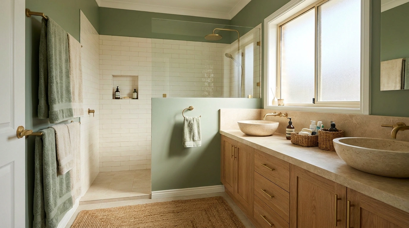
An olive vanity below ivory walls. A pale-blue room with a chocolate cabinet. A band of burgundy tile that makes the pink above it feel unexpectedly grown-up.
Two colors can give a bathroom a clear identity without filling it with patterns. Decide which color occupies the larger area and where the change happens: at the vanity, across the walls, inside the shower, or between the floor and upper surfaces.
Use finishes suitable for their bathroom location, and compare physical samples beside the fixtures you are keeping. A palette is a visual plan; it does not replace waterproofing, ventilation, or the correct specification for a wet area.
Two-Tone Bathroom Ideas
Classic White and Bold Black
Combine crisp white subway tiles with striking black hardware for a timeless graphic impact. The contrasting tones create clean lines that define the space without feeling chaotic.
Anchor the room with a two-tone shower curtain that bridges the vertical shift between dark and light. Let the simple white tub and bright lighting keep the overall atmosphere feeling open and airy.
Keep accessories minimal to let the geometric color-blocking do the talking. A subtle pink rug adds just enough warmth to soften the high-contrast palette.
Ivory Walls and an Olive Vanity
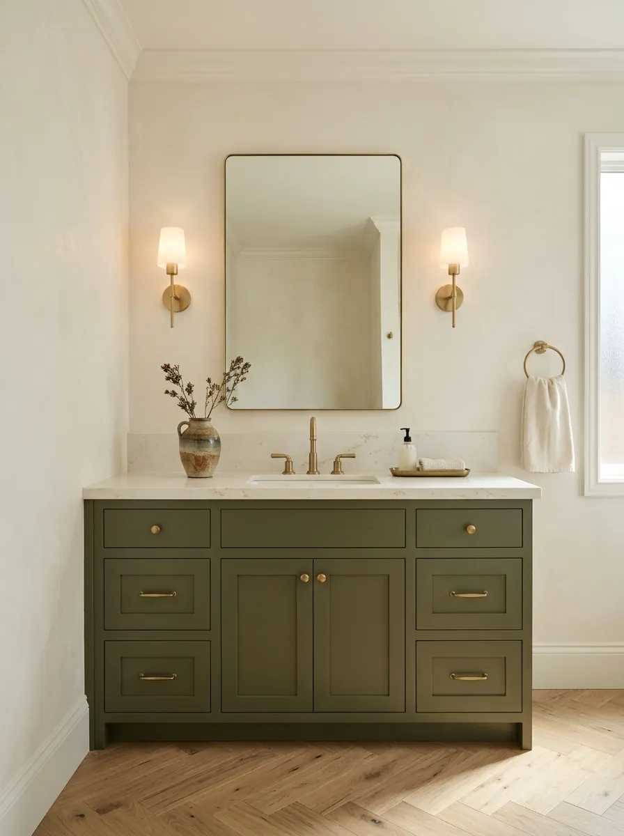
Let ivory carry the larger surfaces and olive ground the vanity. The combination feels warm without requiring every finish to be beige.
Choose an ivory that sits comfortably beside the basin and toilet. Existing white fixtures do not all share the same undertone. Keep the olive concentrated in the cabinetry so the room has a clear focal point, with towels or a small detail providing only a quiet echo.
Light above, grounded below
Rose Wood and Cream Tones
Pair rich rose-colored wainscoting with creamy upper walls for an inviting, tailored atmosphere. The vertical paneling introduces subtle texture while keeping the lower half grounded.
Select a natural wooden vanity that complements the warm undertones of the wall color. A vessel sink placed neatly on top adds a modern, sculptural touch to the setup.
Embrace playful botanical details like a floral-shaped rug and fresh greenery in simple pots. These thoughtful additions enhance the cheerful, welcoming vibe of the entire room.
Warm White and Soft Black
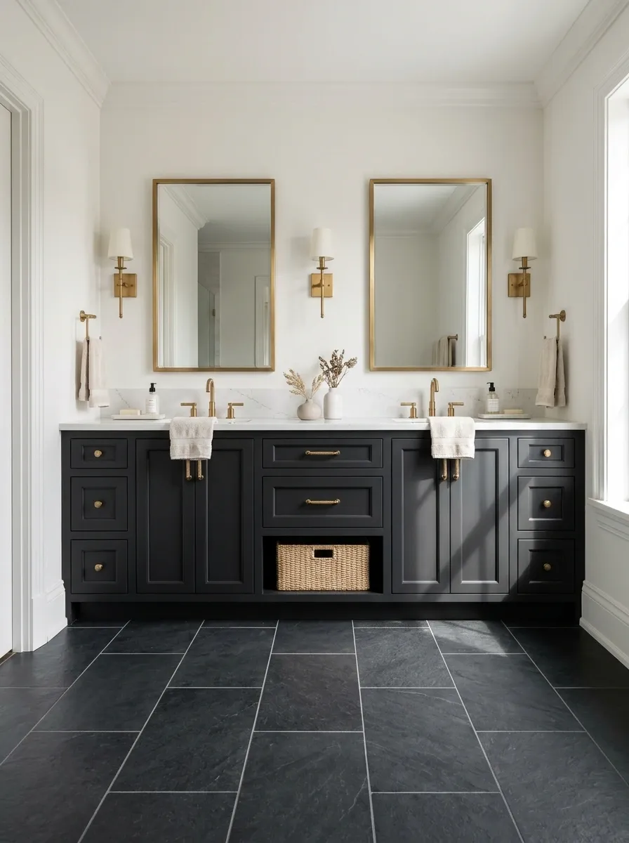
Use a softened black on one substantial element rather than scattering black accessories over an otherwise white room.
A black floor with warm-white walls, or a dark vanity under pale tile, gives the palette a stronger structure. Keep grout decisions deliberate: contrasting grout adds another pattern, even when the colors remain the same. A little restraint makes this combination feel less showroom-like.
| Dark element | Pale supporting area |
|---|---|
| Floor | Walls and vanity |
| Vanity | Walls and main tile field |
| One tiled wall | Remaining room surfaces |
Rich Plum and Marble Detail
Ground the bathroom in a deep plum hue using vertical paneling on the lower walls and matching upper tones. This creates an immersive, cocoon-like effect that feels inherently sophisticated.
Introduce a dramatic marble washbasin to break up the dark color palette with natural veining and pattern. The stone texture adds a layer of luxury against the matte walls.
Opt for sleek gold fixtures and a softly lit scalloped mirror to elevate the moody atmosphere. A classic checkered floor tiles the space together with a nod to traditional elegance.
Blush Above Burgundy Tile
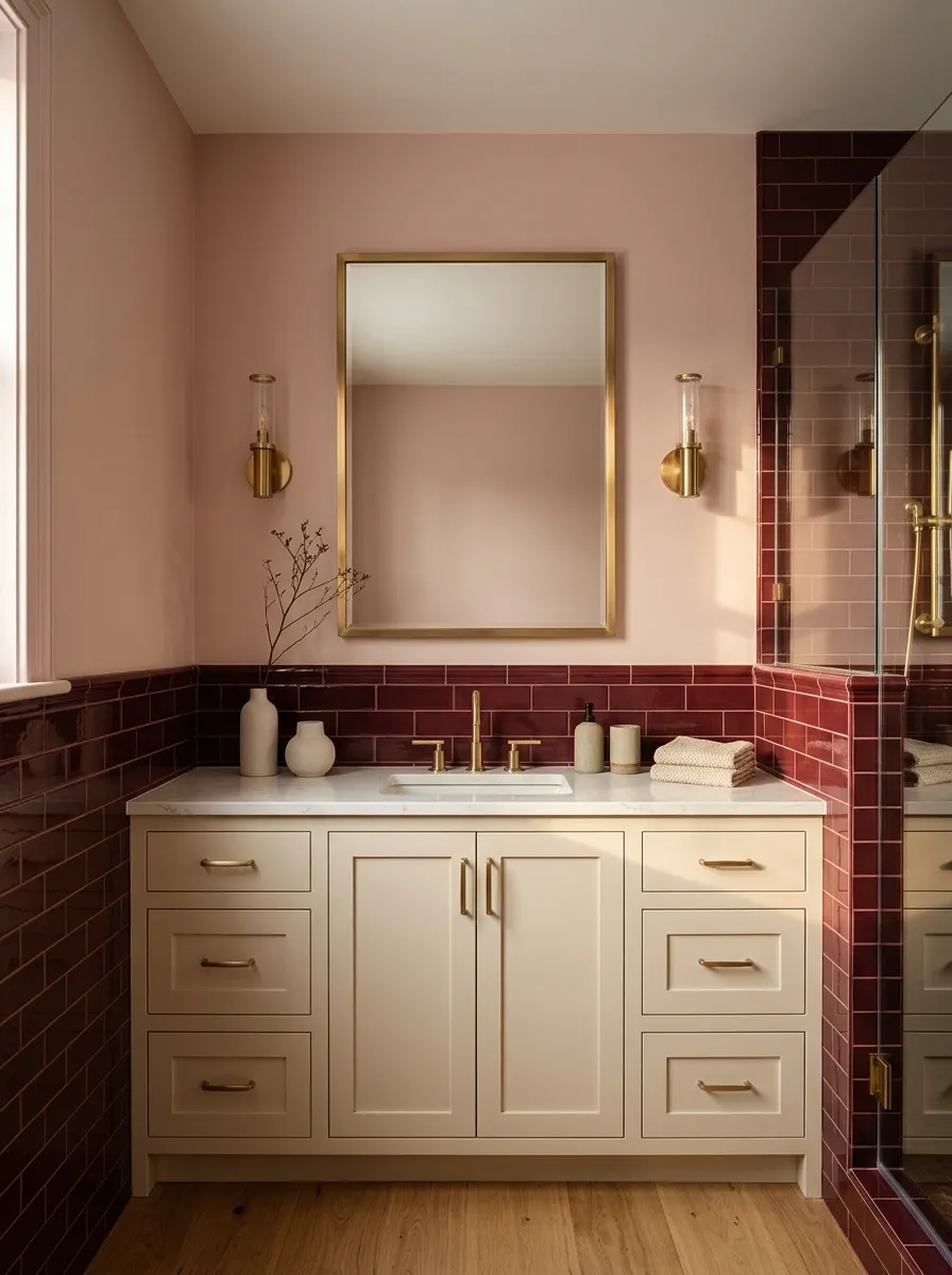
Burgundy gives blush a deeper architectural edge.
Use the darker color in a lower tiled area and let the pink occupy the wall above. Plan the horizontal change around the room’s features rather than stopping randomly through a mirror or outlet. The result can feel intimate and quite tailored. Skip the matching pink novelty accessories; the wall has already handled the assignment.
Let the darker color form the base
Align the transition with the room’s practical layout.
Vibrant Orange and Terrazzo Splash
Drench the ceiling and accent zones in a lively orange hue to completely transform the mood of the room. It brings an instant burst of energy that feels remarkably modern.
Let speckled terrazzo tiles cover the walls and floors for a cohesive, artistic foundation. The multicolored chips tie the bright ceiling color into the rest of the space effortlessly.
Incorporate lush potted plants to contrast the warm tones with vibrant living green. A glowing illuminated mirror completes the look, casting a warm ambiance over the minimalist floating sink.
Navy Cabinetry and Cream Surroundings
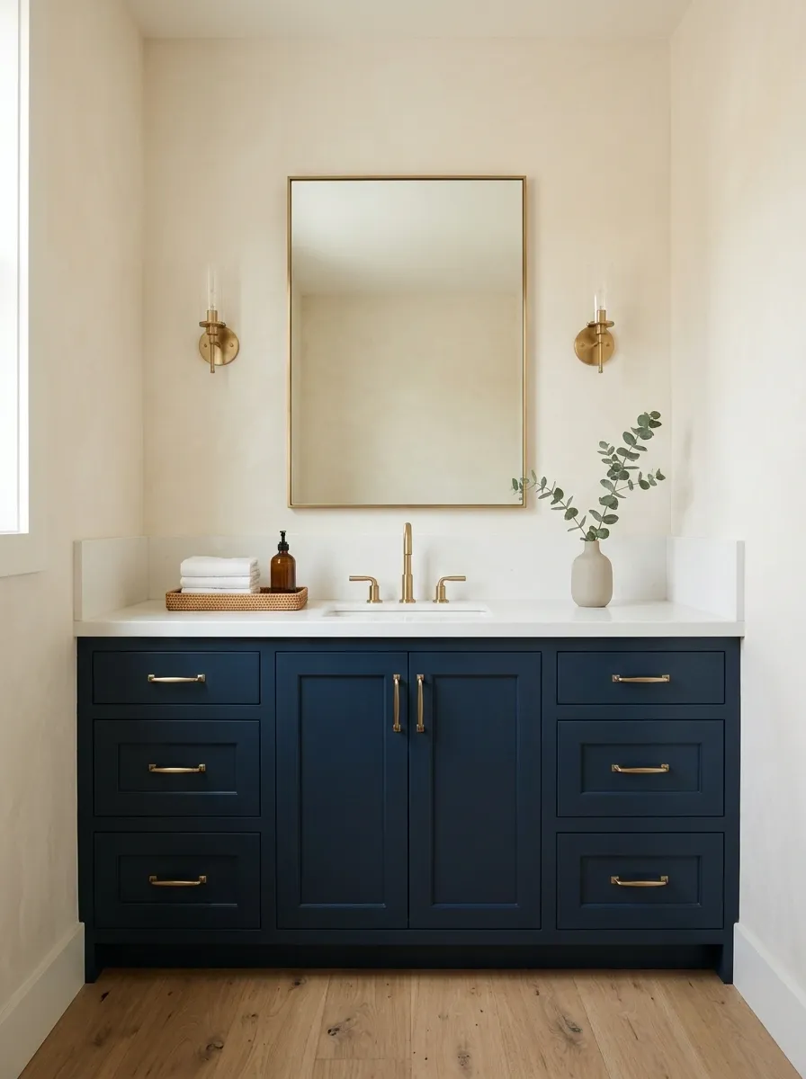
Navy cabinetry can look substantial without making the whole bathroom dark.
Give it cream walls or a pale tiled background, then keep the countertop visually simple. A heavily patterned counter can make this clear pairing feel less settled. Look at the navy sample under the actual lighting; some versions read almost black, while others remain distinctly blue.
Useful balance: a generous pale background and one uninterrupted navy cabinet front.
Terracotta and Sand

Sand-colored walls and terracotta floor tile can make a bathroom feel earthy without becoming rustic.
Choose the sand against the tile’s actual variation, not an idealized color chip. If the floor contains a lot of movement, keep the walls plain. The change in material supplies enough detail; there is no need to add several other warm shades just because they look friendly together on a sample board.
A plain wall above a textured floor
Sage and Warm Gray
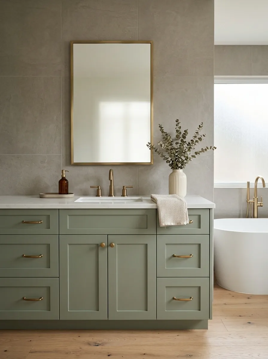
Sage and warm gray suit a bathroom where you want a gentler difference between the main surfaces.
Give one color a little more depth so the room does not become visually vague. A sage vanity against warm-gray tile is an easy starting point. Check that the gray is not so cool that it makes the green feel disconnected.
| Keep distinct | Keep related |
|---|---|
| Depth of the two colors | Their softness |
| Painted and tiled textures | The overall undertone |
Powder Blue and Cocoa
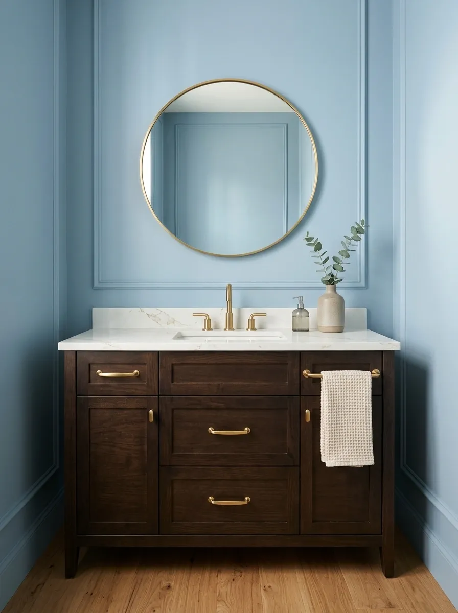
Powder blue becomes more substantial beside cocoa brown. This is particularly useful in a bathroom with an existing dark vanity you want to keep.
Use blue above or around the cabinet and keep the larger shapes simple. The brown does not need to appear in lots of accessories; a clear wood or painted cabinet front is enough to establish it.
Let the cabinet supply the depth
Deep Teal and Limestone Beige
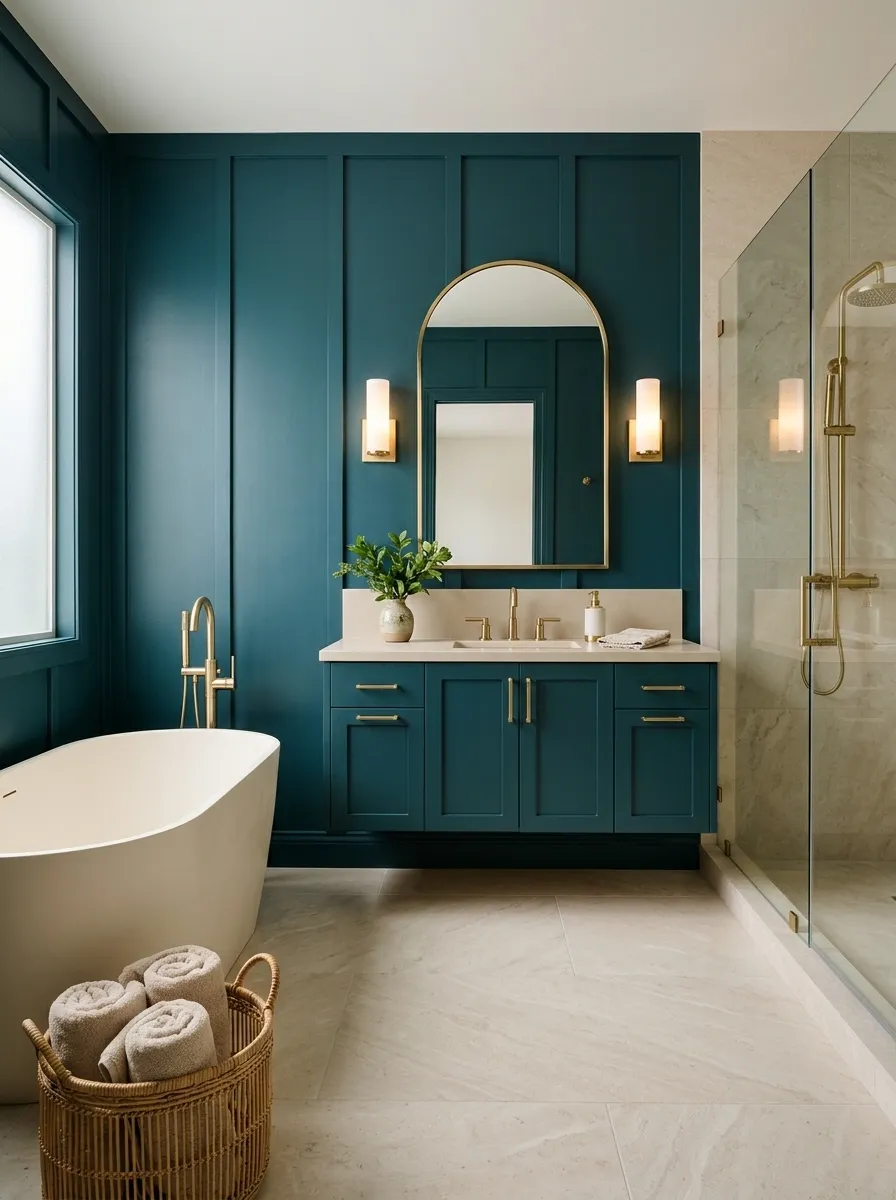
Pair teal with a pale mineral beige for a bathroom that feels rich but not overly decorative.
The beige can come through an appropriate stone-look tile, while teal occupies cabinetry or a dry painted wall. Keep the tile pattern relatively restrained if the teal is saturated. A strong color and a wildly veined surface can both be beautiful, but they may not be interested in sharing the lead.
Choose the beige first if it is coming from a fixed material.
Dusty Rose and Mushroom
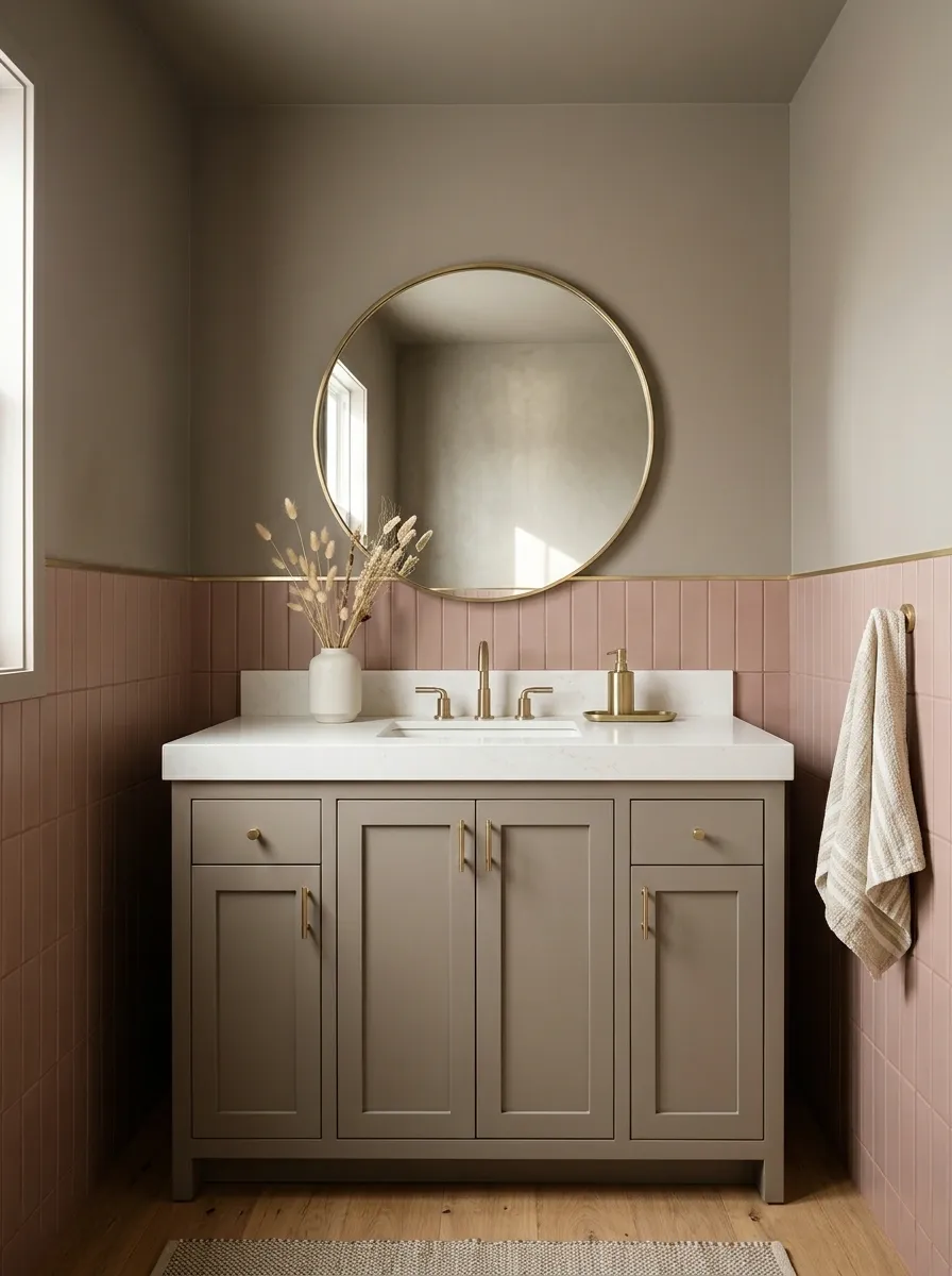
Mushroom makes dusty rose feel quieter and easier to live with across a whole room.
Try mushroom on the vanity with rose walls, or use rose tile against a mushroom-painted upper area. Let the material change reinforce the color change. The pairing gains interest through differences in texture rather than a dramatic contrast in brightness.
Soft colors need distinct surfaces
Butter Yellow and Warm White
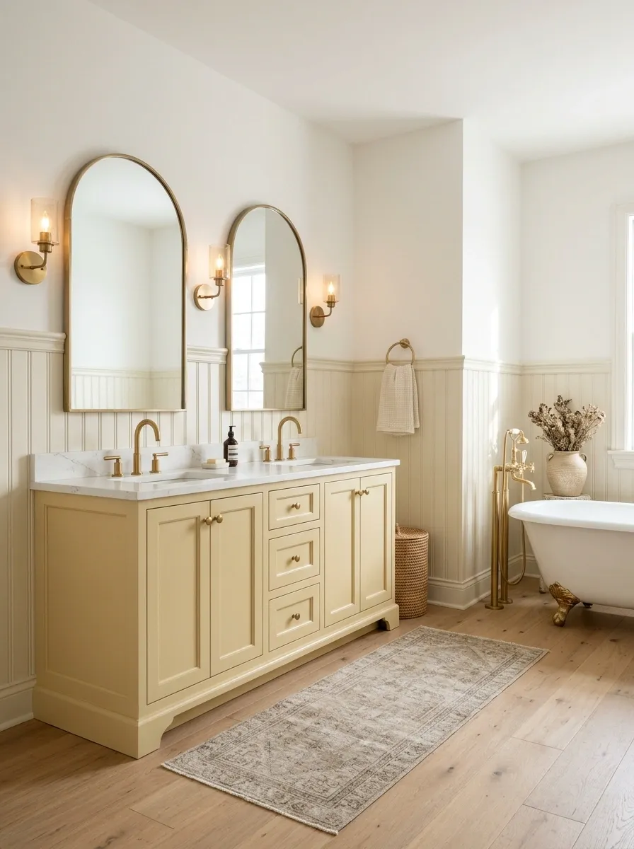
Butter yellow can soften a white bathroom without making it look loudly sunny.
Use yellow in a vanity, dry upper wall, or another generous area rather than only through small accessories. Keep the white warm enough to relate. Compare the combination after dark as well as in daylight; the room’s lighting can make a pale yellow feel much stronger.
Best supporting move: keep the shapes straightforward so the soft color does not become overly sweet.
Rust and Pale Gray
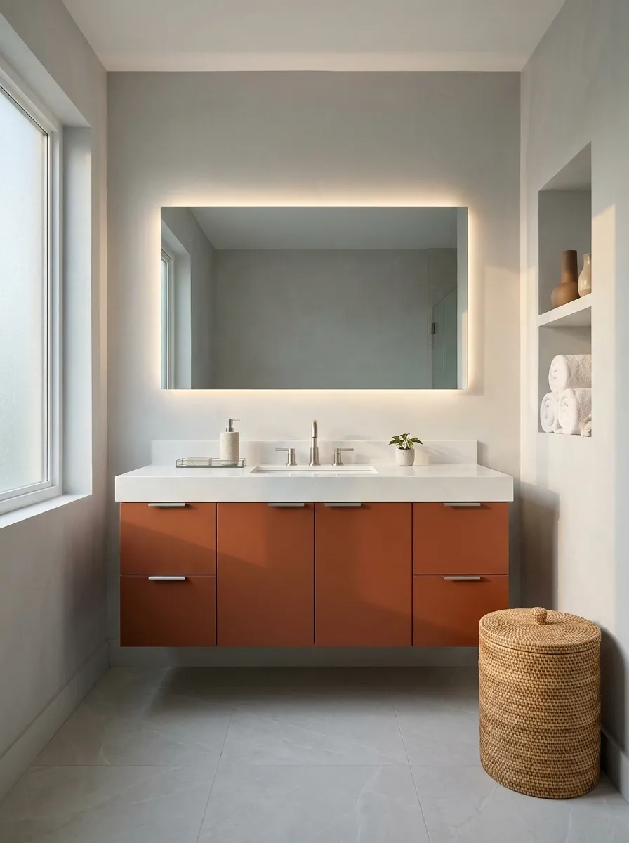
Rust can warm up an existing gray bathroom, particularly when the gray surfaces are otherwise quite plain.
Use rust in a meaningful area, such as suitable floor tile or a cabinet finish, and let the pale gray remain the larger background. Check the balance beside any silver-toned fittings. The goal is to connect the existing room, not disguise it beneath a new color story.
Add warmth at one clear location
Forest Green and Pale Pink
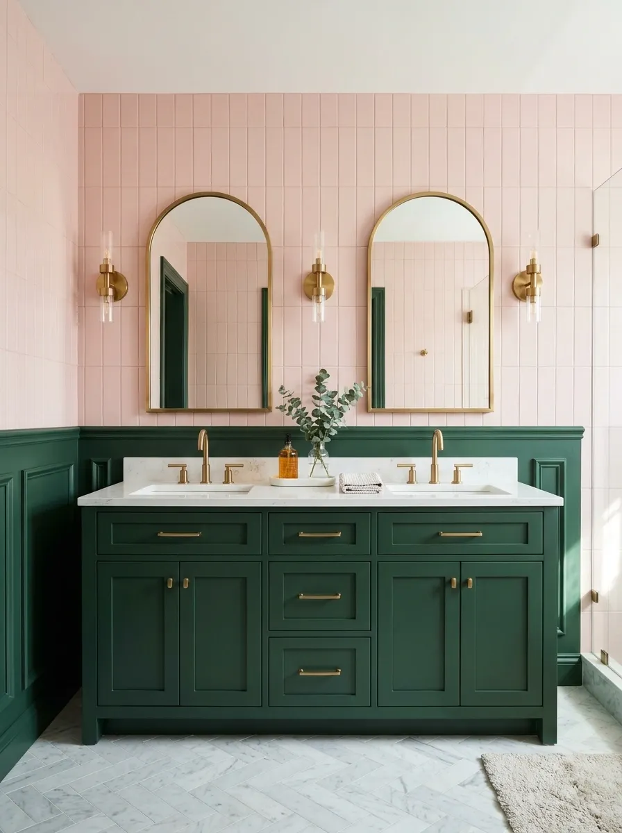
Forest green can give pale pink a stronger frame. Pink, in return, softens the green.
A green lower wall with pink above is one option; a green vanity against pink tile is another. Choose one arrangement and keep the color boundary clear. You do not need to alternate the two colors repeatedly around the room for the pairing to register.
| Green carries | Pink carries |
|---|---|
| Cabinetry or lower wall | Upper wall or background tile |
| Depth and structure | A softer surrounding field |
Plum and Ivory
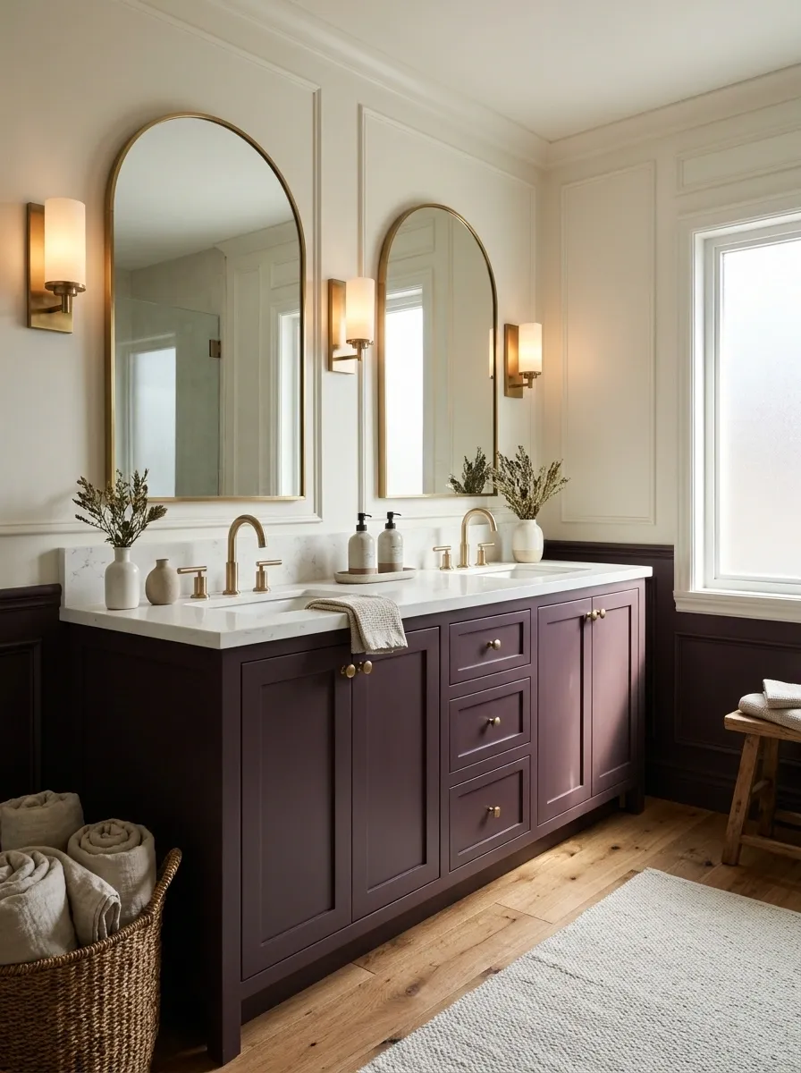
Plum is a good candidate for a bathroom that should feel intimate rather than bright and brisk.
Use it on the vanity or a suitable dry wall, with ivory carrying the larger lighter surfaces. Keep a visible contrast between the cabinet and the floor so the lower part of the room remains legible. The darker color does not need to cover every surface to create atmosphere.
A rich cabinet inside an ivory setting
Denim Blue and Flax
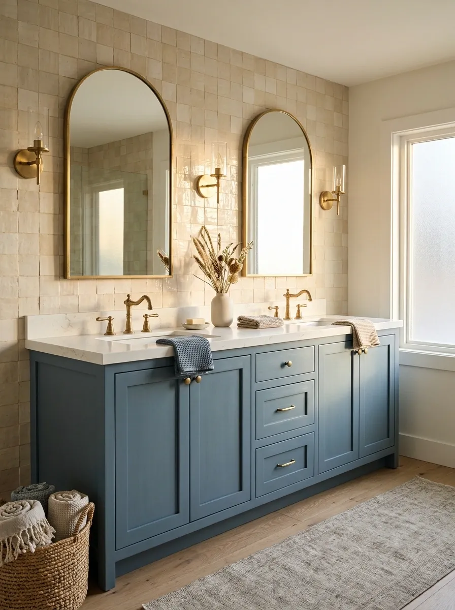
Denim blue and flax create a relaxed bathroom palette that suits simple joinery and tactile finishes.
Keep the blue softened rather than brilliant. Flax-colored walls or appropriate tiles provide a warmer counterpoint. If you add patterned towels, let them stay within the palette so the fixed surfaces still read clearly.
Material direction: brushed-looking color, a visible weave in dry textiles, and clean, uncomplicated cabinet fronts.
Pale Mint and Charcoal
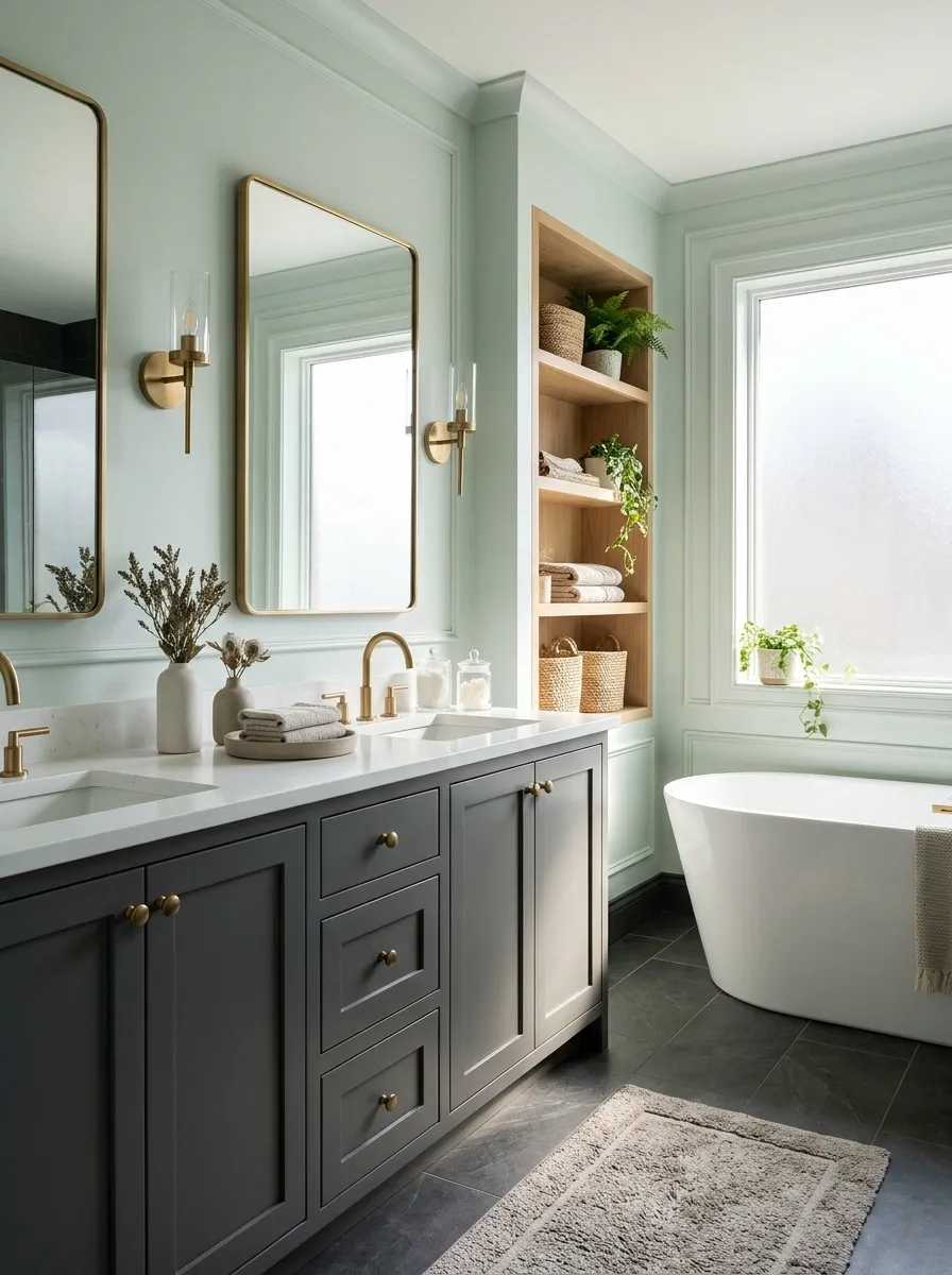
Mint benefits from a darker companion that stops it looking too delicate.
Use charcoal in the vanity or main floor, with mint on a larger wall area. Keep the mint subtle enough to work with existing white fixtures. Avoid relying on tiny charcoal accessories alone; the color needs a meaningful surface to balance the pale green.
Give the pale green a firm base
Muted Coral and Warm White
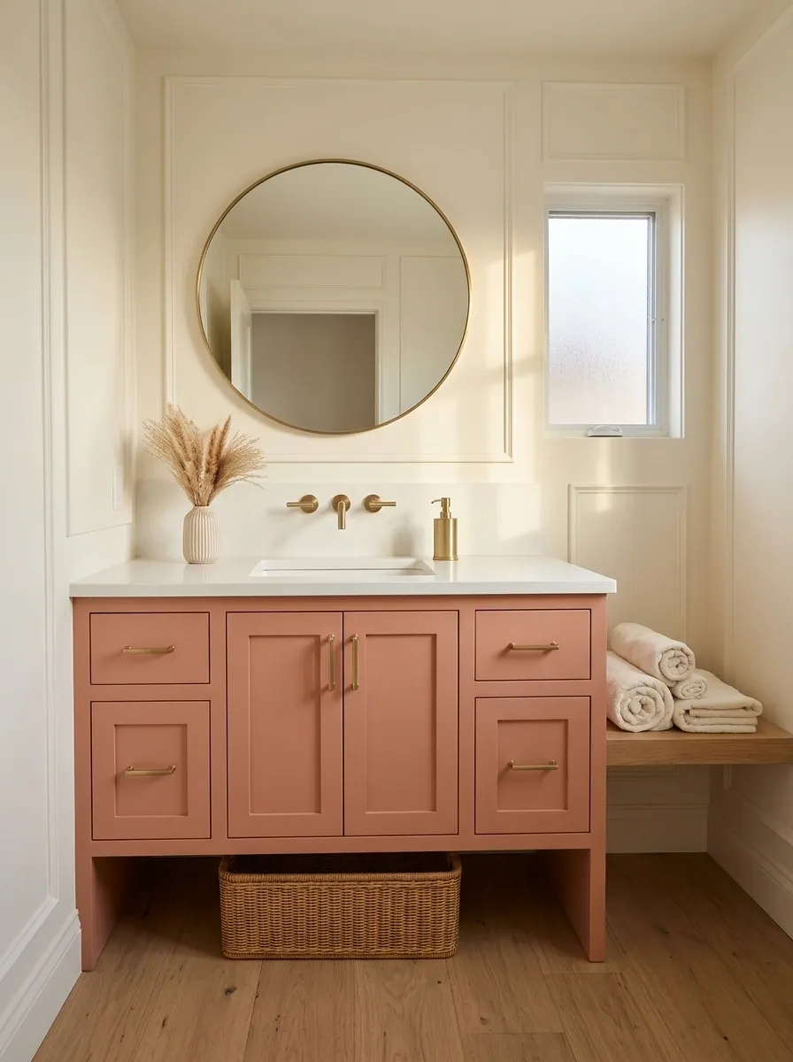
Coral can make a bathroom feel lively without requiring a bright, saturated scheme.
Choose a softened version and concentrate it on cabinetry or a defined wall area. Keep the white warm and the decorative shapes simple. A small bathroom can carry this pairing well when the coral has a clear boundary rather than appearing in several unrelated patches.
Edit before adding: remove competing small accents so the coral reads as the intentional color.
Peacock Blue and Taupe
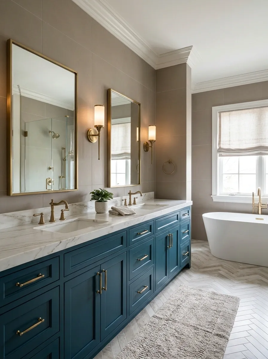
Peacock blue and taupe suit a bathroom where you want richer color beside a practical neutral.
Use taupe on the larger tile field and blue on the vanity or a defined shower wall specified for that location. Choose the blue against the actual taupe, since some versions lean greener than others. Let the pairing be strong enough that you do not need an elaborate countertop to make the room interesting.
One saturated surface beside a quiet field
Red Ochre and Pale Clay
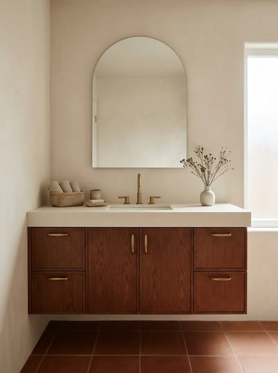
Red ochre and pale clay create a more earthy kind of two-tone contrast.
Keep one color noticeably lighter, especially if the room receives limited daylight. Ochre floor tile below pale clay walls can feel grounded, while a red-brown cabinet against pale tile creates a more contained emphasis. Do not assume every earthy finish will match; bring the actual materials together.
Good restraint: one pronounced texture, with the other main surface visually calmer.
Ice Blue and Deep Blue
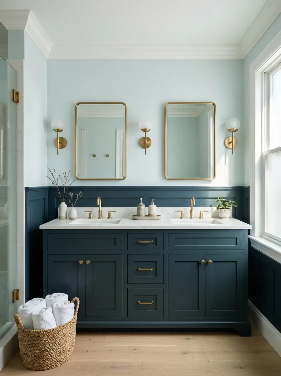
A light-and-dark blue pairing can make the bathroom feel coherent without being monochrome in effect.
Use the lighter blue generously and the deeper one on a cabinet, lower wall, or defined tiled section. Choose blues that relate rather than merely sharing the same color name. A green-leaning navy beside a violet-leaning pale blue may look less connected than expected.
Keep the undertone connected
Graphite and Silver Gray
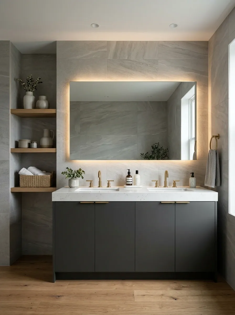
Graphite and silver gray can feel architectural when texture distinguishes the surfaces.
Try a graphite vanity against a pale-gray tile with subtle movement. Keep enough contrast to define the cabinetry rather than letting everything merge into the same midtone. The restrained palette makes the quality of the edges, handles, and lighting especially noticeable.
| Darker area | Lighter area |
|---|---|
| Smooth graphite cabinet | Softly varied silver-gray tile |
| Clear outline | A continuous background |
Greige and Espresso
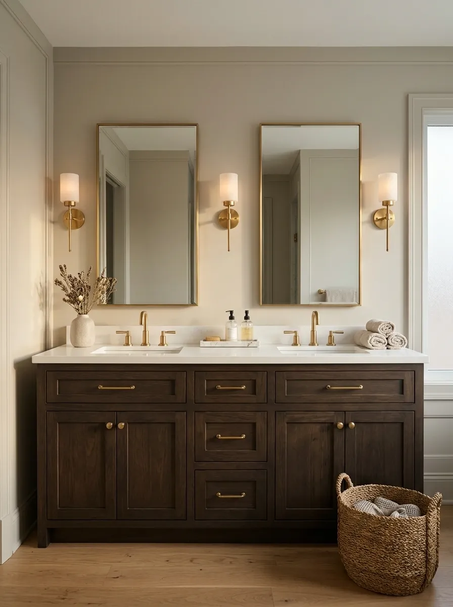
Espresso gives greige a stronger foundation without introducing a completely different color family.
Use espresso below the basin or in an appropriately specified tiled area. Let greige hold the larger field and compare it with the existing floor. This pairing works best when the lighter color has enough warmth to sit comfortably beside the deep brown.
Avoid the near-match: choose a visible difference between espresso cabinetry and a dark existing floor.
Soft Peach and Eucalyptus
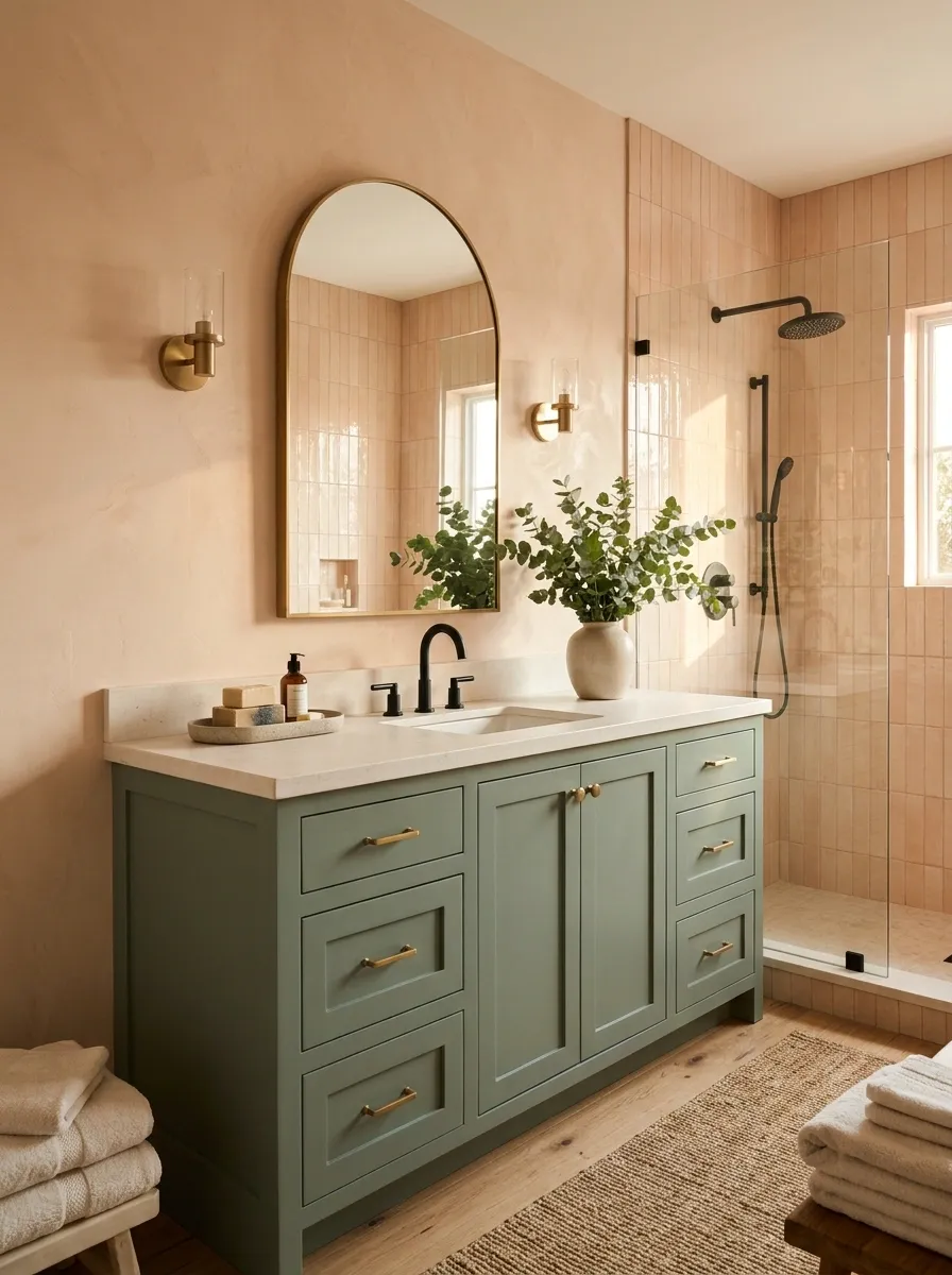
Peach and eucalyptus offer a fresh two-color scheme with a warm edge.
Let one lead: eucalyptus cabinetry beneath peach walls, or peach tile beside a restrained green vanity. Keep the saturation similarly softened so neither color seems to belong to a different room. Simple fixtures allow the pairing to remain the main decorative choice.
Warm background, leafy anchor
Chocolate Brown and Butter Yellow
Chocolate and butter yellow create warmth without leaning on a familiar beige-and-white scheme.
Use the pale yellow across a larger dry wall or suitable tile field, with chocolate cabinetry anchoring the room. Keep the yellow creamy rather than vivid. The brown should look intentional beside it, so choose a broad cabinet surface rather than relying on a collection of small brown accessories.
Final sample check: view the colors together beside the basin, countertop, and floor, with the bathroom lights on.
Choose the color boundary as carefully as the colors themselves. A clear shift at a wall, cabinet, or tile line gives the pairing its structure; the rest can stay relatively simple.