
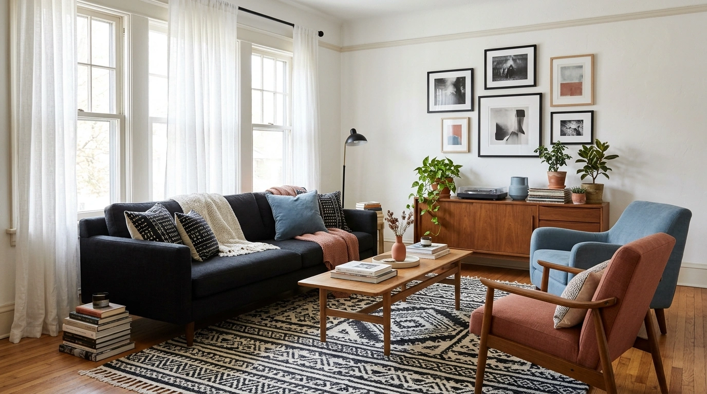
A black-and-white room can take a surprisingly strong accent. The question is where that color lives and how much attention it receives.
A green cabinet is not the same visual decision as a green cushion. A narrow black bed frame does not carry the same weight as a black wall. Before choosing an accent, identify which surfaces already dominate the room.
The balances below are original design starting points, not scientific formulas or measurements of floor area. Read them as the relative visual emphasis among white, black, and the accent. Texture, shape, light, and existing materials will change the result. Test physical samples and adjust the proportions around the actual room.
Colors That Go With Black and White
Terracotta for a Bedroom With a Black Bed
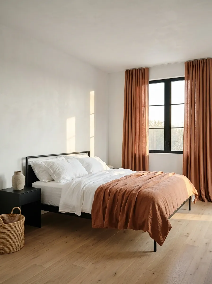
Terracotta can give white bedding and a black frame a warmer companion.
Use it in a coverlet, generous cushion, or suitable curtain rather than several small ornaments. Keep the white as the larger field and let the black frame remain visible. Choose the terracotta beside the room’s actual floor so the warm tones connect rather than quietly disagree.
Terracotta in the bedroom
Let white carry the bedding and walls, black define the bed, and terracotta occupy one substantial textile.
Olive for a Black-and-White Home Office
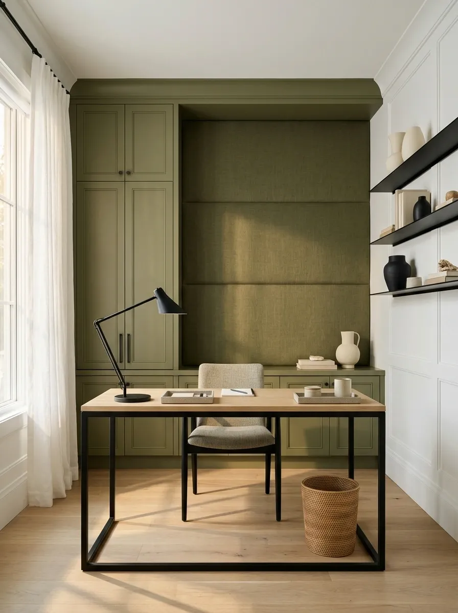
Olive can soften a graphic office without making it visually vague.
Try a painted cabinet or a generous fabric surface while the desk and shelving retain black outlines. Keep useful work lighting and equipment access clear. The accent should have a defined role, not appear as a collection of office supplies bought in approximately the same green.
Starting balance: white 60%, black 20%, olive 20%.
| Olive role | Black role |
|---|---|
| Cabinet or fabric emphasis | Desk or shelf structure |
Cobalt for a Predominantly White Kitchen
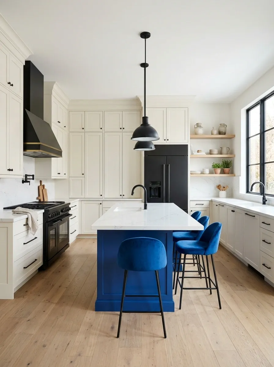
Cobalt can be especially effective when the kitchen already contains white cabinetry and black handles or appliances.
Use it in a clear, limited place: a suitable painted section, seating, or a substantial textile outside wet and heat-prone positions. Keep the color concentrated enough to feel deliberate. A few useful blue objects can work, but scattered tiny accents may simply make the counters busier.
Cobalt in a white-led kitchen
Use white as the main cabinetry field, black for existing structure, and cobalt in one controlled feature.
Blush for a Living Room With Strong Black Furniture
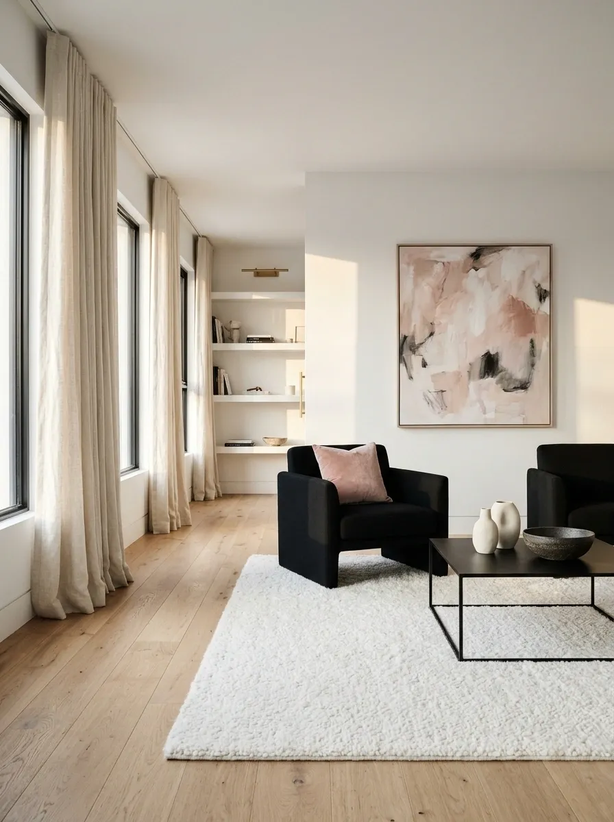
Blush can soften black-and-white contrast without changing the room’s basic identity.
Keep it in a small but visible area, such as an artwork or a suitable cushion. Choose the blush beside the actual upholstery; very peachy and very cool pinks produce different results. The room should still read as black and white, with the pink providing a softer note.
Starting balance: white 60%, black 35%, blush 5%.
Keep the accent visible: a clear small shape works better than several nearly invisible pale objects.
Ochre for an Entryway
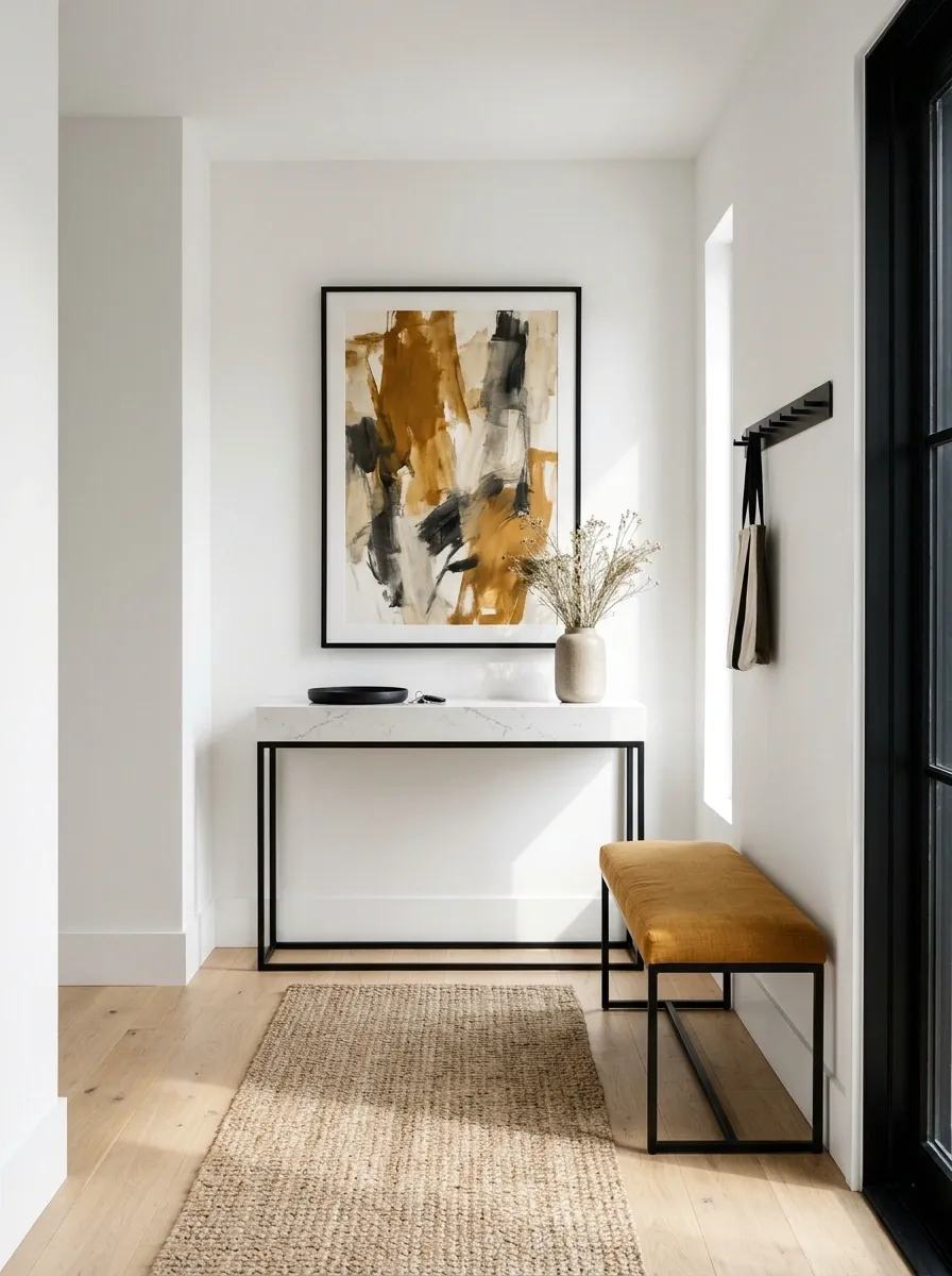
Ochre can make a black-and-white entry feel warmer without requiring a large upholstered piece.
Try a suitable bench cushion, artwork, or painted storage front. Keep the route and landing surfaces useful. The accent needs to belong to the entry routine, rather than occupy the one place someone needs to put a bag.
Ochre in an entryway
Let white provide the background, black define the storage or frame, and ochre mark one useful feature.
Burgundy for a Dining Room
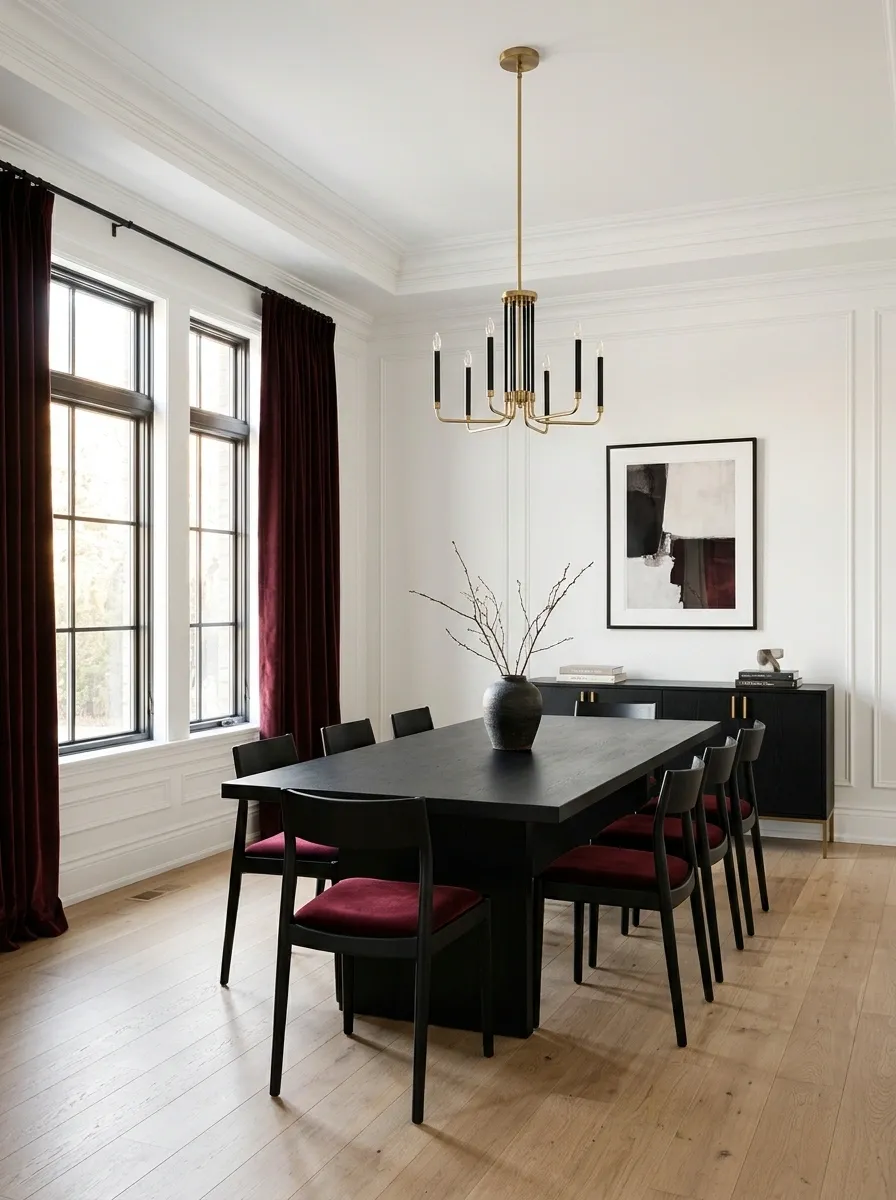
Burgundy adds depth beside white walls and black dining furniture.
Use it in upholstery, curtains, or a substantial artwork. Keep the table setting relatively simple so the room’s color relationship remains clear. A small amount of burgundy can feel rich when it occupies a generous vertical or upholstered surface rather than a line of tiny accessories.
Starting balance: white 50%, black 35%, burgundy 15%.
| Larger dark element | Accent surface |
|---|---|
| Dining table or cabinetry | Curtains or upholstery |
Sage for a Black-and-White Bathroom
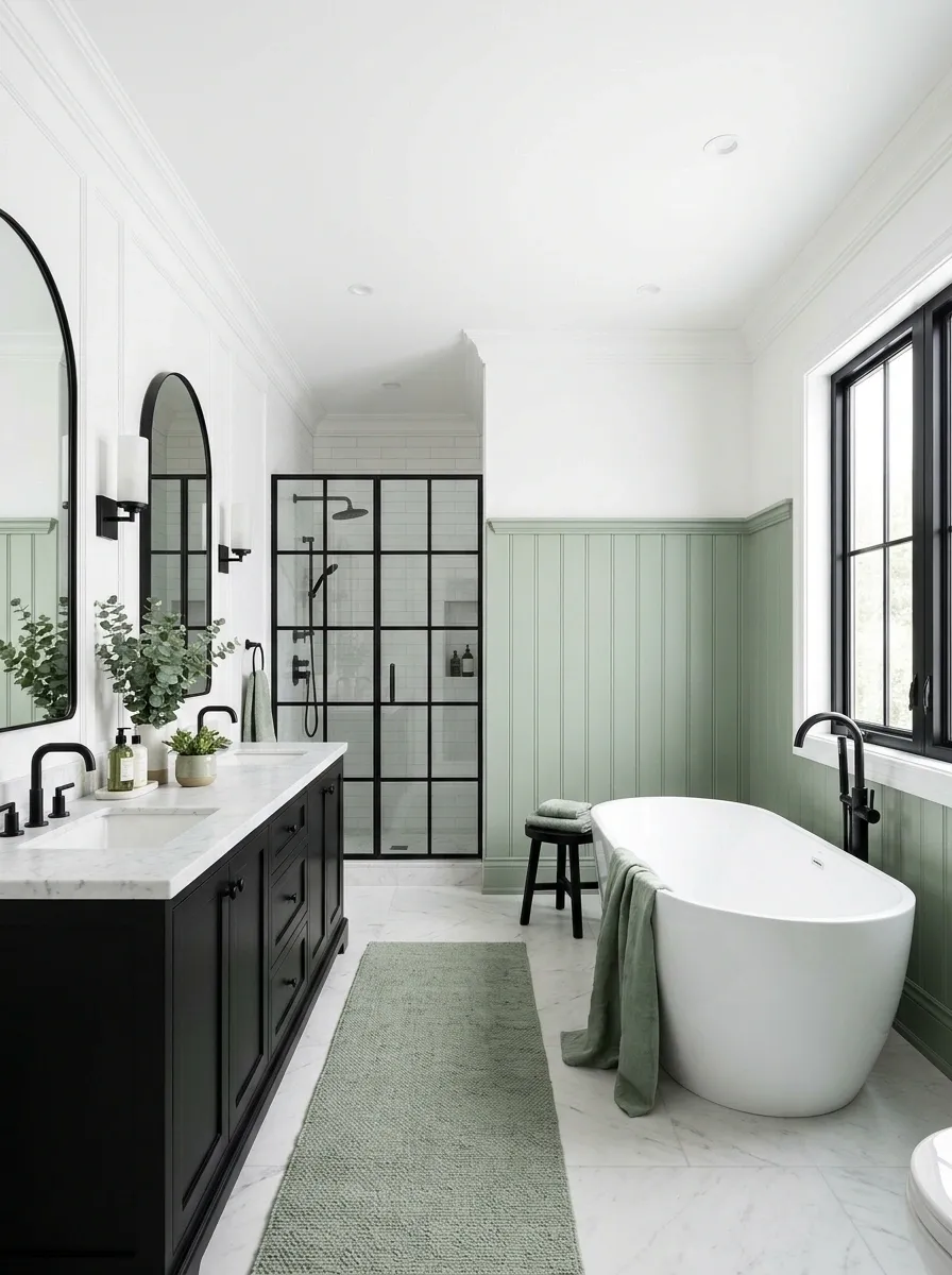
Sage can offer a gentle accent where the fixtures and tile already create a clear black-and-white framework.
Use a suitable vanity finish or dry-area textile, keeping materials appropriate to the bathroom. Choose the green against the existing whites and grout. The softer accent works best when the fixed surfaces remain legible rather than disappearing beneath a collection of green bottles and containers.
Sage in a bathroom
Keep white as the main fixed field, black in the defined fittings or floor, and sage in one suitable surface.
Powder Blue for a Guest Bedroom
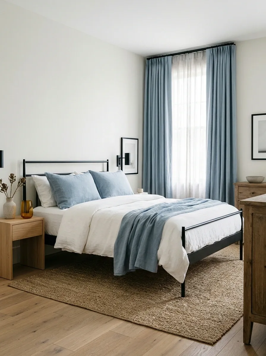
Powder blue can bring a fresh note to a room with a black bed and pale walls.
Use it in bedding or curtains, with enough fabric to register clearly. Check the color in the room’s evening lighting as well as daylight. A practical, comfortable bed matters more than coordinating every object, so let the accent stay focused on textiles you actually use.
Starting balance: white 70%, black 15%, powder blue 15%.
Simple room map: pale surroundings, a visible dark frame, and one broad blue textile.
Caramel for a Living Room With White Walls
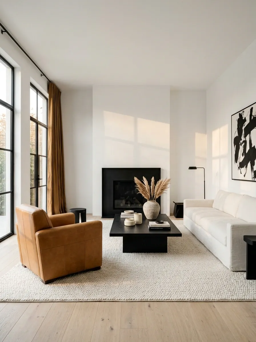
Caramel can come through a leather chair, suitable upholstery, or another substantial warm surface.
Let the black remain a clear structural element and use white around the larger background. Keep the caramel finish visually substantial enough to connect the seating. A small tan object may look isolated where a warm chair or curtain would give the room a convincing third role.
Caramel in a white-led living room
Use a meaningful warm furniture piece rather than many small tan accents.
Teal for a Darker Study
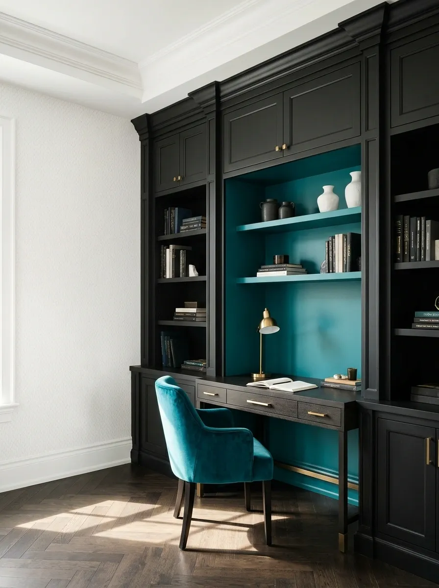
Teal can sit beside a more substantial black element while white keeps some separation.
Try teal upholstery or a defined cabinet interior near black shelving. Keep the white visible in the walls, paper, or a broader textile. This balance is more enclosed than a white-led scheme, so test the whole room rather than choosing from a small isolated swatch.
Starting balance: white 45%, black 40%, teal 15%.
| Black carries | Teal contributes |
|---|---|
| The deeper surrounding structure | A defined colored surface |
Plum for a Black-Led Bedroom
Plum can enrich a dark bedroom when the white surfaces provide a clear break.
Use it in a bedcover, upholstered piece, or suitable curtain, and keep white bedding or wall areas visible. The room does not need every surface to be dark to feel intimate. Choose the plum against the actual black, since warm off-black and cooler black finishes can behave differently beside purple.
Plum in a black-led bedroom
Keep white visible as separation, let black establish depth, and use plum in one generous fabric.
Rust for a Dining Nook
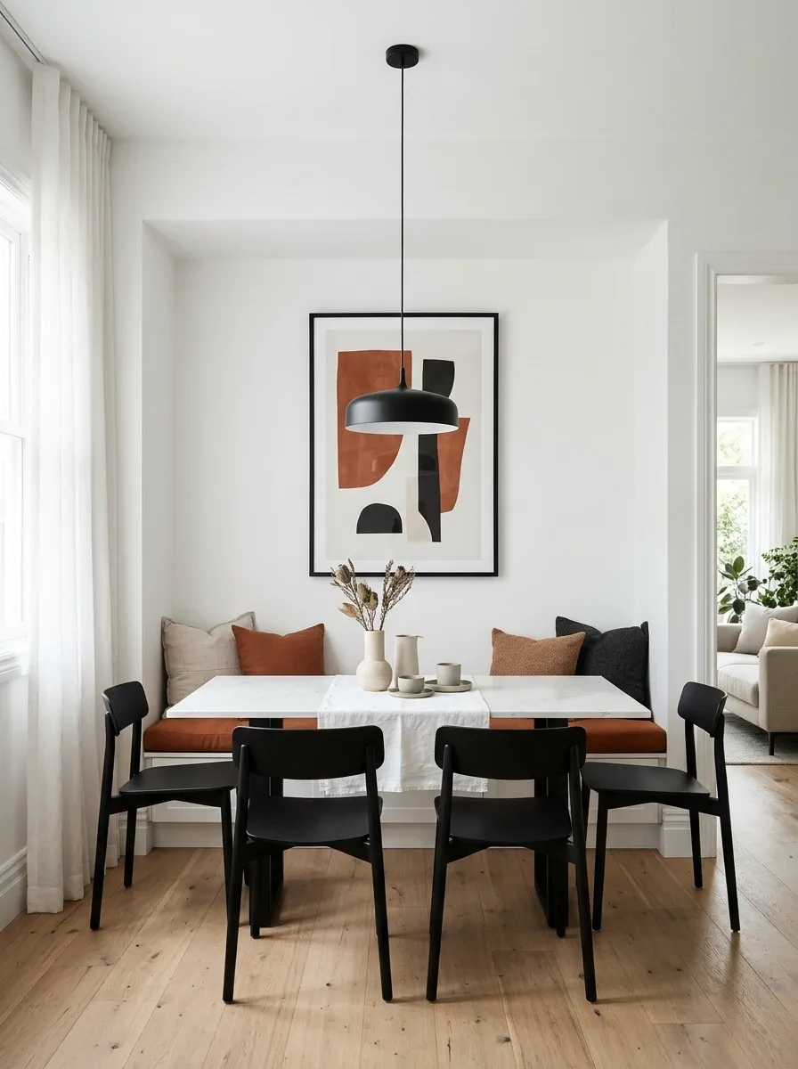
Rust can make a white dining nook with black furniture feel less stark.
Try a suitable seat cushion, curtain, or artwork, allowing the color to occupy one coherent area. Keep patterned table linens restrained if the rust already comes through a strong textile. The nook should feel connected to the rest of the room, not dressed as a separate seasonal display.
Starting balance: white 65%, black 20%, rust 15%.
Use the accent where the nook has a clear boundary: a seat, window, or wall piece.
Coral for a Small Powder Room
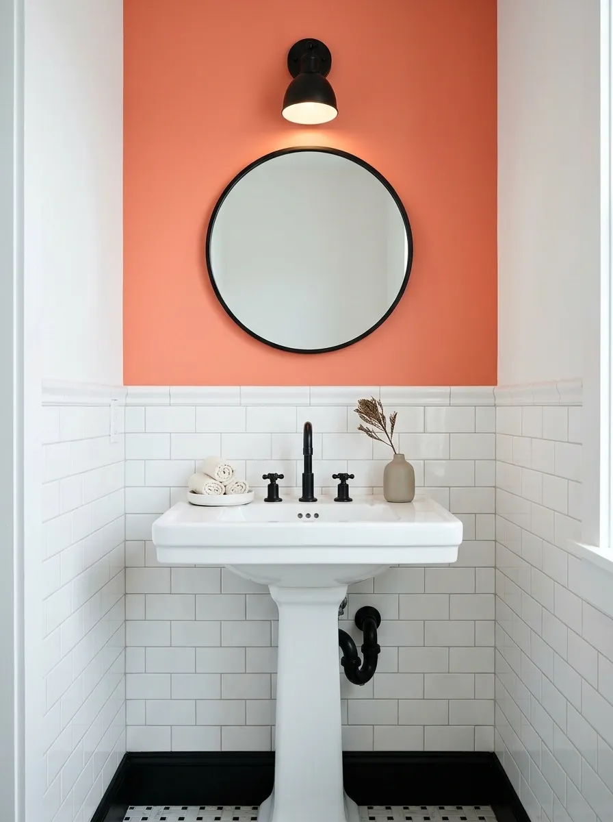
Coral can add personality to a compact room without replacing its black-and-white fixtures.
Use a suitable dry-wall treatment or clearly defined object and keep the background simple. Check the coral beside the existing basin and tile before choosing paint. The limited space makes undertone differences easier to notice, especially where several whites meet.
Coral in a powder room
Keep the fixed black-and-white scheme clear and let coral occupy a single appropriate accent area.
Lavender for a Home Workspace
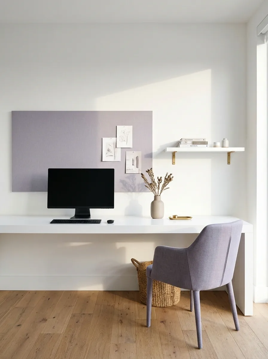
Lavender can soften a graphic desk setup without making it look overly sweet.
Use a clear, slightly gray violet in a chair, large pinboard background, or suitable wall section. Keep the black equipment and white surface as part of the plan rather than trying to hide every practical object. The accent should improve the room you use, not require a different set of electronics.
Starting balance: white 60%, black 20%, lavender 20%.
| Keep visible | Add deliberately |
|---|---|
| Useful black-and-white equipment | One lavender furniture or wall surface |
Turquoise for a Bright Sitting Area
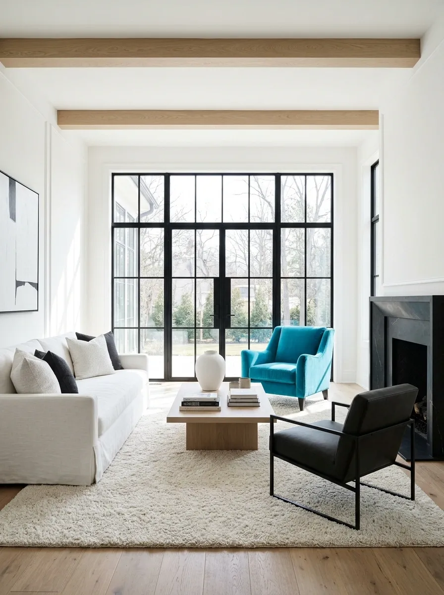
Turquoise can bring energy to a black-and-white sitting space.
Use it in one useful piece or broad textile, with the room’s existing natural materials helping the palette feel grounded. Keep the turquoise clear if that brightness is what you enjoy. It does not need to become dusty blue to qualify as a sensible interior choice.
Turquoise in a bright sitting area
Let the accent be clear and concentrated rather than scattered across the room.
Emerald for a More Substantial Living-Room Accent
Emerald can carry a larger piece of furniture beside black and white.
Try a chair or sofa where the green has enough presence to become part of the room’s identity. Keep surrounding patterns calmer if the upholstery is rich. The black should still have a clear role rather than appearing only as accidental hardware.
Starting balance: white 50%, black 35%, emerald 15%.
Choose the furniture’s function first: the green piece needs a comfortable, useful place in the layout.
Mustard for a Reading Corner
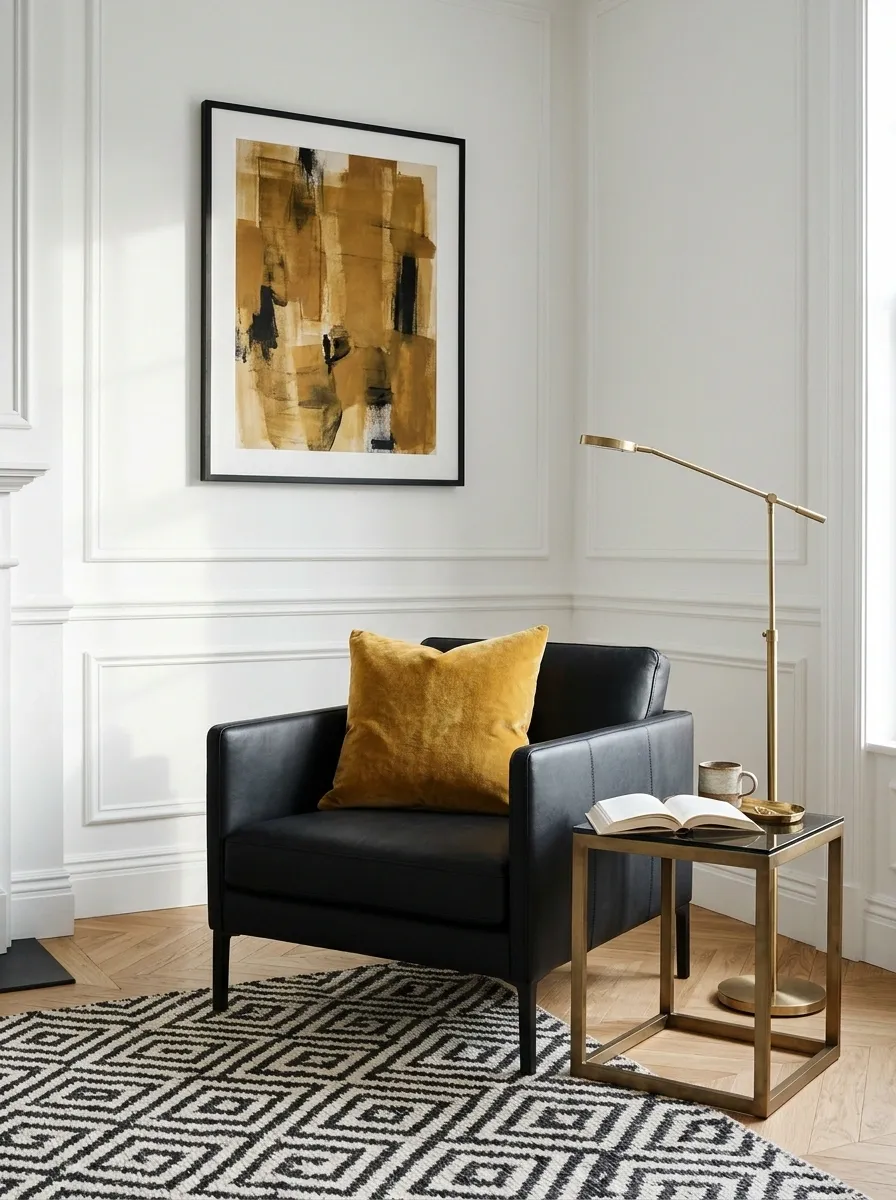
Mustard can make a black chair or black-framed seating area feel warmer.
Use it in a suitable chair companion, substantial cushion, or artwork. Keep white visible around the corner so the accent does not become visually heavy. The table and light should support reading; the color is the enjoyable extra, not the entire purpose of the setup.
Mustard in a reading corner
Use the accent close to the seat while white and black keep the corner connected to the room.
Chocolate Brown for a Bedroom With White Bedding
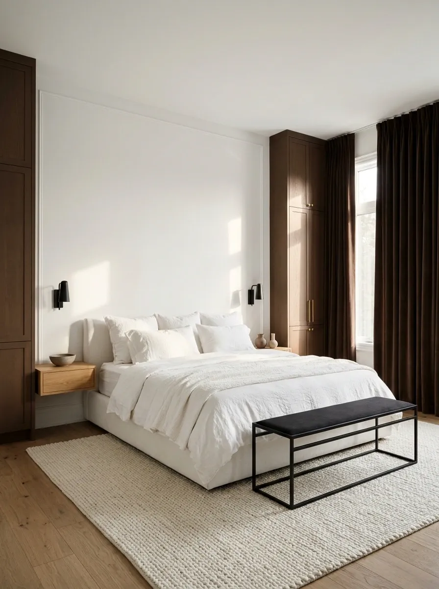
Chocolate can act as a warm third color without making the room noticeably colorful.
Use it in appropriate cabinetry, curtains, or a substantial upholstered element. Keep the black distinguishable from the brown so the pairing looks intentional. White bedding or wall space provides the separation that makes the deeper tones easier to read.
Starting balance: white 60%, black 20%, chocolate 20%.
| White provides | Deeper tones provide |
|---|---|
| Clear separation | Structure and warmth |
| A lighter bed surface | A more grounded perimeter |
Chartreuse for a Hallway Accent
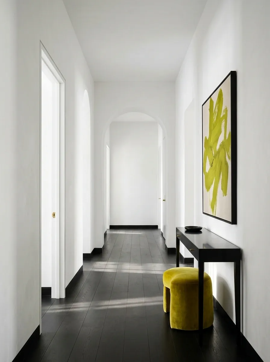
Chartreuse can give a restrained black-and-white hallway a sharp, memorable detail.
Use a small but clear shape: an artwork, a suitable painted element, or a useful stool where space permits. Keep the route open and the supporting surfaces quiet. A strong accent works well when the object is visible enough that it does not need repeating along the entire corridor.
Chartreuse as a small hallway interruption
A little vivid color can be enough when the background stays clear.
Peach for a Family Sitting Corner
Peach can soften a black-and-white corner without removing its contrast.
Use a warm textile or a defined wall surface, keeping practical care needs in mind. Choose a peach that sits comfortably beside the room’s white rather than assuming every warm pale color will coordinate. Keep the black as a clean outline in the furniture or fittings.
Starting balance: white 70%, black 15%, peach 15%.
Keep the material practical: comfortable, maintainable fabric will serve the room better than a delicate match.
Denim Blue for a Casual Living Room
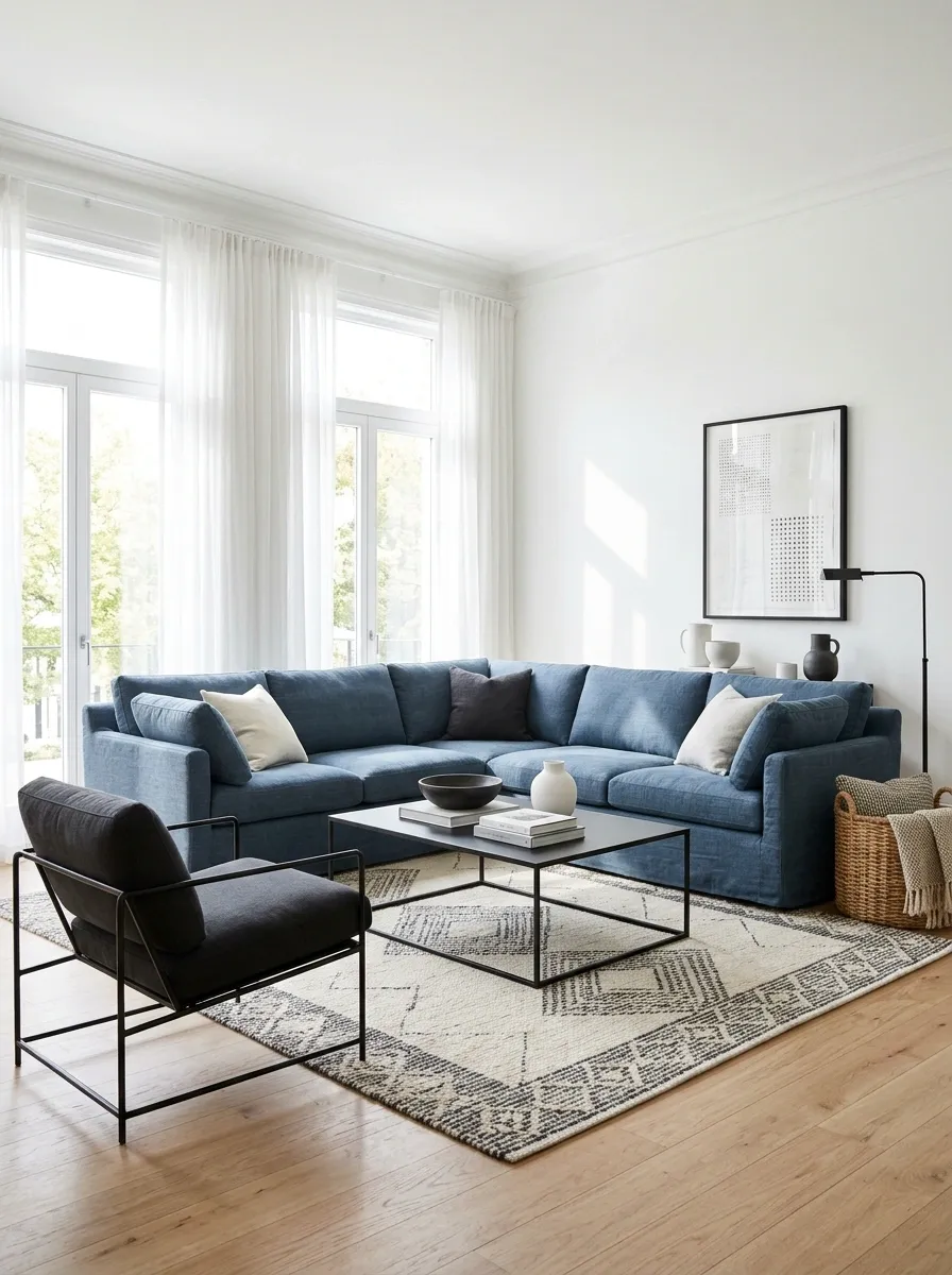
Denim blue can connect relaxed upholstery with a more graphic black-and-white background.
Use a softened blue in a generous fabric, then let the existing black and white remain visible around it. A restrained pattern can bridge the colors if needed, but the room does not require matching blue accessories on every surface.
Denim blue in an everyday living room
Keep the blue in a useful textile and let the base remain legible.
Forest Green for a Bedroom With Dark Furniture
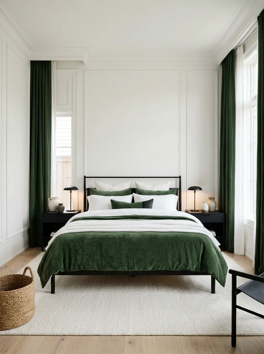
Forest green gives black furniture a richer companion while white keeps the room from merging into one dark field.
Choose a meaningful green surface, such as curtains or a bedcover. Keep it distinct from the black under the actual lighting. A green so dark that it looks identical from across the room may not supply the color relationship you expected.
Starting balance: white 60%, black 20%, forest green 20%.
| Check in daylight | Check after dark |
|---|---|
| The green’s actual hue | Separation from the black |
Butter Yellow for a Black-and-White Kitchen
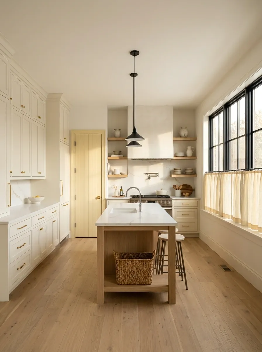
Butter yellow can soften a kitchen’s graphic contrast without becoming a dominant feature.
Use it in a suitable painted or textile area, keeping the yellow creamy rather than sharp. Compare it beside the actual white cabinetry and worktop. Small undertone differences become more noticeable when the surfaces sit directly together.
Butter yellow in a white-led kitchen
Let the accent soften one defined area while the fixed base stays clear.
Aubergine for a Dining Room With Black Furniture
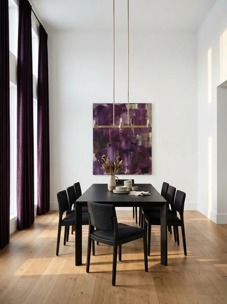
Aubergine can add another layer of depth without making the room brightly colored.
Use it in a generous curtain, upholstery, or artwork, keeping the white background visible. Choose a purple that remains distinguishable from the black furniture. The accent should add a recognizable note rather than behave like an almost-matching replacement for black.
Starting balance: white 55%, black 35%, aubergine 10%.
Test the largest fabric sample you can: depth and texture matter more than a tiny perfect-looking chip.
Taupe for a Softer Black-and-White Sitting Room

Taupe can supply warmth and surface variation when you prefer a neutral accent.
Use it in upholstery, curtains, or a rug, keeping enough difference from the white to register. Let black provide a defined table, chair, or frame. Texture becomes especially important here because the palette relies on depth and material rather than strong hue.
Taupe as a warm neutral accent
Use a substantial textured surface so the third tone has a clear role.
Choose the accent, assign it a place, and then adjust the balance in the actual room. The chart is a starting conversation with the space—not a percentage target that requires measuring every cushion.