
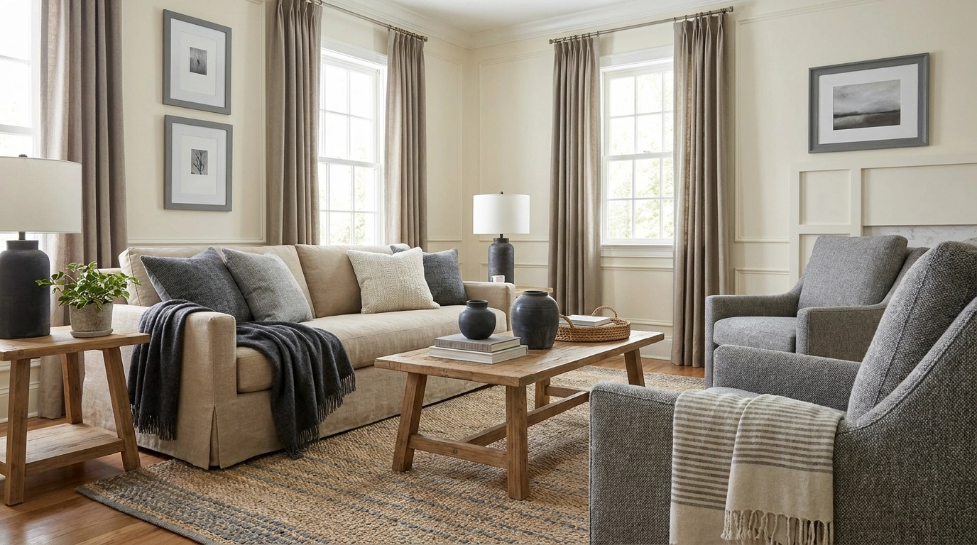
The gray sofa looked neutral in the shop. So did the cream rug. Together, they now appear to be disagreeing about the weather.
Neutrals carry color. A beige can lean yellow, pink, or green; a gray may lean blue, violet, or green. Sherwin-Williams describes both warm and cool neutral families, rather than treating neutral as one universal category.
You do not need every finish to share a temperature. You need to see the undertones, decide which pieces lead, and give the differences enough context to look intentional. That is particularly useful in a real home where the floor, sofa, and favorite inherited chair were not purchased as a coordinated package.
Ways to Bring Warm and Cool Neutrals Into a Coherent Room
Start With the Surface You Are Keeping
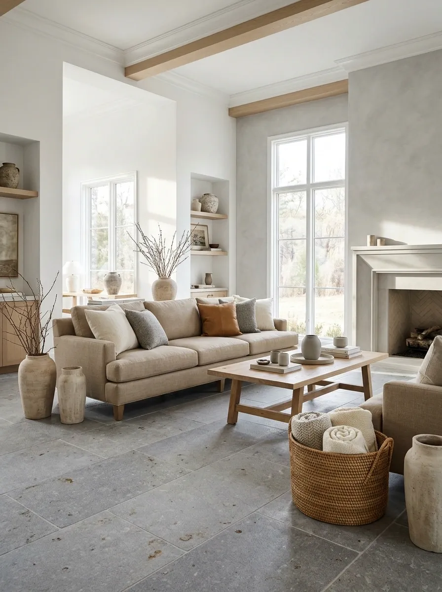
Choose the largest fixed or expensive element as your starting point: flooring, stone, cabinetry, or a sofa you are not replacing. Bring samples to it rather than building a palette around an imaginary fresh start.
Look for the colors already visible within the material. A gray tile with brown flecks may offer a useful connection to warmer furniture.
Write down what is staying before shopping:
- The actual floor or countertop.
- Large furniture you will keep.
- Fixed white finishes such as windows or cabinetry.
It is surprisingly easy to design a beautiful room for a floor you do not own, particularly while scrolling with optimism and no measurements.
Compare Neutrals Against a Plain White Reference
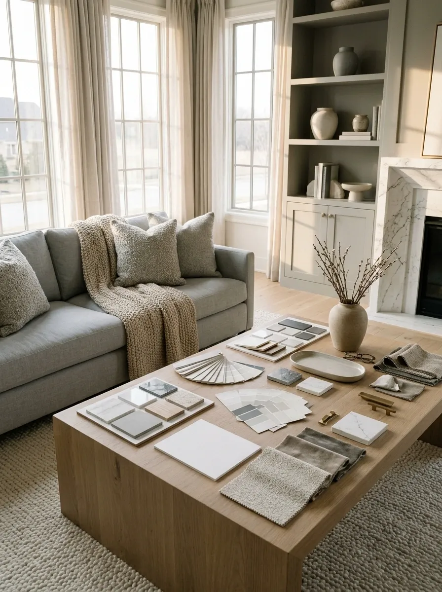
Place a plain white card beside fabrics or painted samples to make subtle color differences easier to notice. Then compare the candidates directly with one another.
The card is a reference, not a scientific test or a requirement to choose the whitest option. The useful question is whether the gray looks blue, the beige pink, or the cream more yellow than expected.
Return to the actual room before deciding. A sample that appears balanced under shop lighting can behave differently beside your flooring and curtains, which rather inconveniently will not be moving to the shop.
Compare together: Floor, upholstery, wall sample, and white reference in the same light.
Let One Temperature Lead the Larger Surfaces
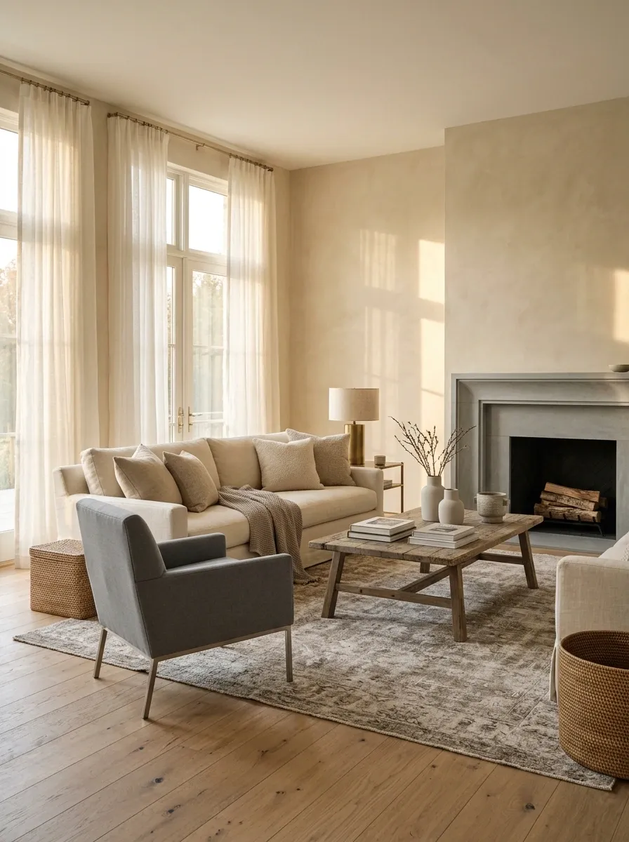
A warm-led room can include a cool gray chair; a cool-led room can include a substantial oak table. Give one family a clearer presence across the largest surfaces so the room has a readable direction.
This is visual guidance, not a percentage calculation. Notice what dominates when you stand in the doorway.
If the room feels unsettled, adjust one broad element before buying more small accessories. A rug or curtain can change the balance more effectively than several decorative objects attempting to mediate from a shelf.
Use a Rug That Contains Both Families
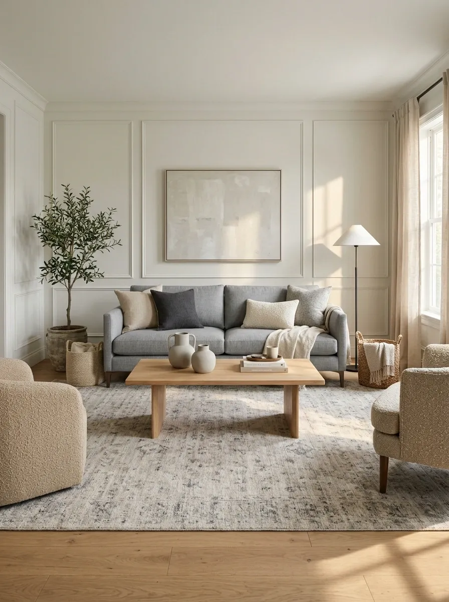
A rug with oatmeal, stone, charcoal, or muted gray can connect a cool sofa to warmer flooring. Look at the whole pattern rather than selecting it from a close-up of one matching thread.
Make sure the rug is a useful size for the furniture arrangement. A tiny connecting color sample stranded between large pieces will have limited influence.
Bring fabric and flooring references when shopping. The goal is a rug that gives both temperature families a reason to be in the room, not one that introduces another unrelated beige requiring its own negotiations.
| Existing pieces | Look for in the rug |
|---|---|
| Cool gray sofa | A related gray or charcoal |
| Warm timber floor | Oatmeal, tan, or brown notes |
| Pale walls | Enough contrast to define the seating area |
Repeat the Cooler Neutral Beyond One Object
A lone blue-gray chair can look accidental in a room of cream and tan. Repeat a related cool note in art, a cushion, or a small ceramic so the chair belongs to a wider conversation.
Keep the repeats different in material and scale. An exact matching set can feel less natural than a family resemblance.
You do not need to distribute the color evenly around every wall. A couple of visible connections from the main seat can be enough to make the cooler element feel chosen rather than temporarily borrowed.
Repeat the Warm Neutral Around a Gray Room
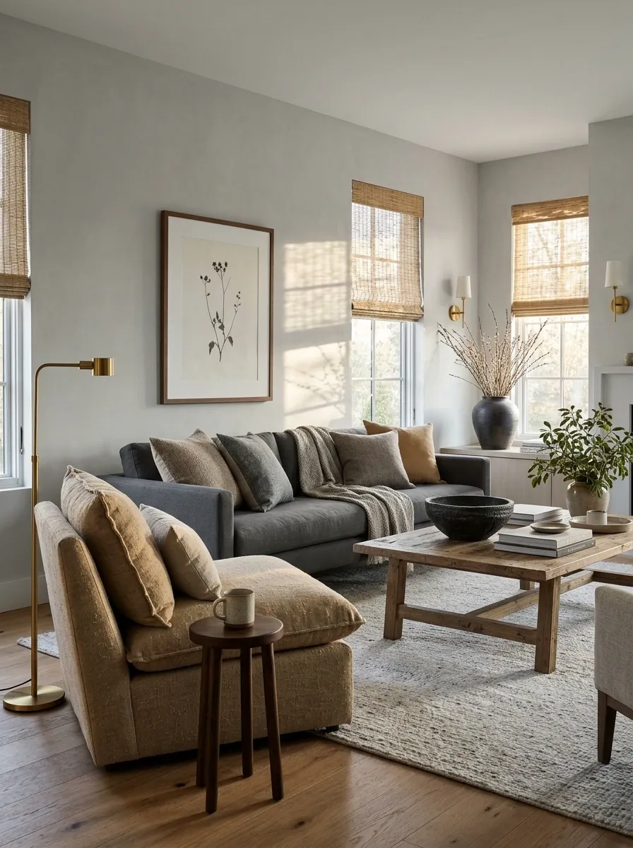
If a gray room has one tan chair, give its warmth a little company through wood, a woven shade, or a brown-toned picture frame. This can make the chair look integrated without repainting the room.
Choose warm repeats that suit the existing undertones. Pinkish tan and yellow oak can feel quite different together, even though both might be called warm.
Let the largest new repeat have some presence. A single tiny wooden bowl may be too small to connect a substantial chair to an otherwise cool room.
See the connection from the doorway: Repeats need enough scale to register where you normally view the room.
Introduce a Dark Anchor
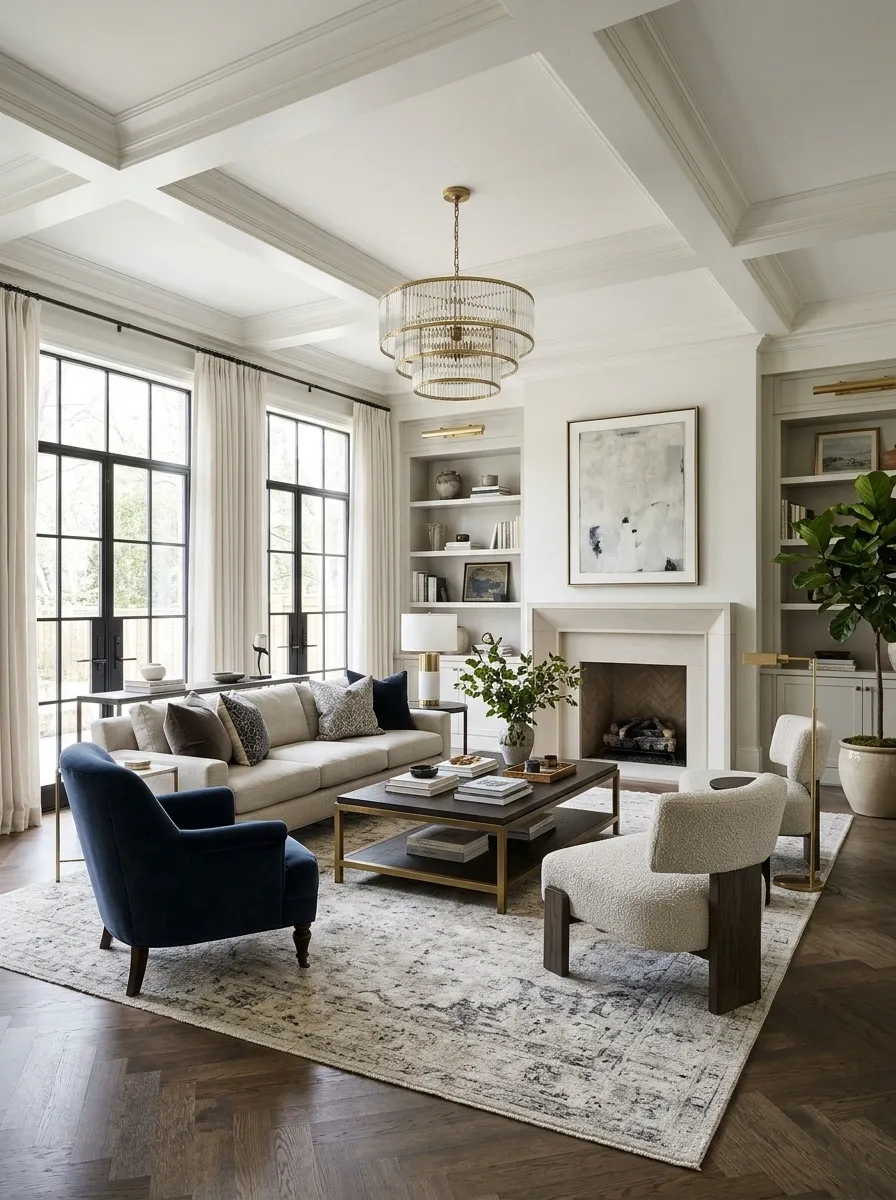
Charcoal, deep brown, or a restrained near-black can give a pale mixed-neutral room definition. Use it in a coffee table, mirror frame, or cabinet where the shape is clear.
Choose the dark tone beside the existing materials. Some blacks lean blue or brown, and that distinction can matter against warm whites.
A few connected dark edges can organize the lighter surfaces without taking over the room. Keep the contrast concentrated enough to feel intentional rather than outlining every object as though the furniture needs subtitles.
| Dark anchor | Useful effect |
|---|---|
| Coffee table | Defines the seating center |
| Mirror frame | Gives a pale wall a clear shape |
| Small cabinet | Adds depth at furniture height |
Use Natural Wood as One Material in the Mix
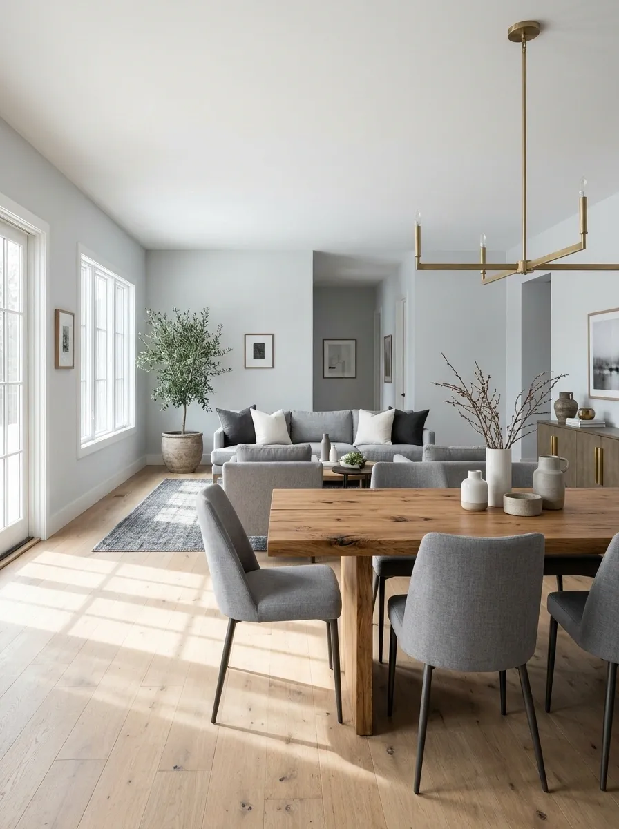
Wood can bring warmth to a cooler room, but inspect the actual finish. Golden oak, reddish cherry, and gray-washed timber do not create the same relationship.
Choose a tone connected to something already present, or make the contrast clearly intentional. Avoid collecting several almost-matching woods without seeing them together.
A substantial timber table can carry the warm role while the walls and upholstery remain cooler. You do not then need warm paint on every wall; the room may already have enough warmth through its furniture.
Let Pattern Carry a Difficult Transition
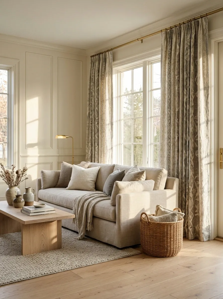
A cushion or curtain pattern containing cream, gray, and brown can make different solids feel related. Choose the pattern after identifying the existing colors you need to connect.
Check the balance of the whole fabric. A tiny gray detail in a mainly pink pattern may introduce more pink than your room needs.
Use pattern where it has enough surface area to matter. Curtains can have a stronger effect than one small cushion, while a cushion is a useful low-commitment trial. Start at the scale that suits the uncertainty.
Read the whole fabric: The background color often matters more than the smallest matching motif.
Choose Wall White Beside the Existing Trim
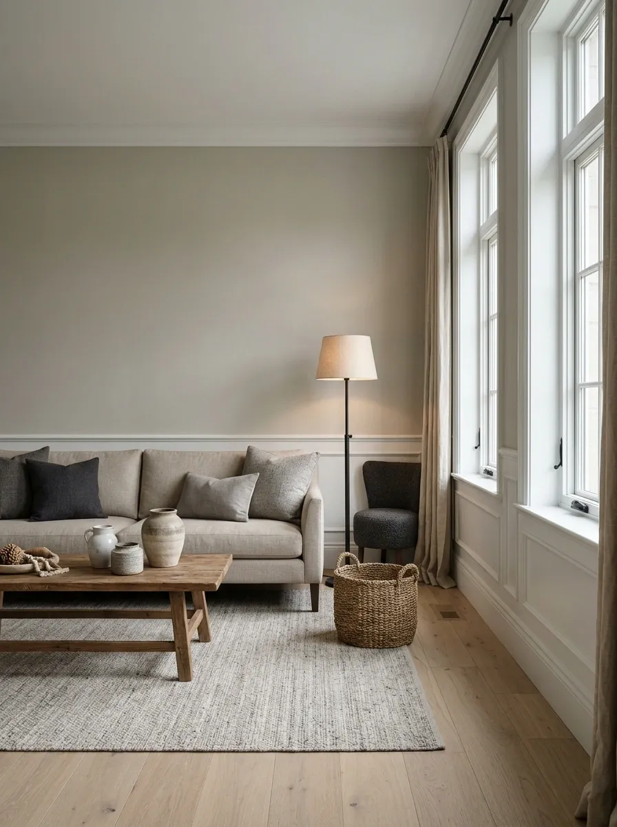
Wall white needs to work with doors, skirting, windows, and cabinetry that will remain. A warm white beside a cool factory-finished window can make the difference look stronger than expected.
Sample directly at those junctions, not only in the middle of an empty wall. Test with the room’s usual lighting.
If the fixed whites differ already, choose a wall color that makes the relationship deliberate rather than chasing an impossible universal match. A gentle greige or stone wall may provide clearer separation than another nearly identical white.
Keep the Ceiling Decision in the Same Conversation
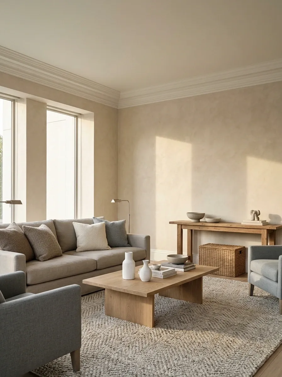
A stark ceiling can feel disconnected from warm walls and cool upholstery if it is chosen as an afterthought. Compare the ceiling white with the wall color before decorating.
Use a horizontal sample where possible because the surface receives light differently from a wall. Include coving or existing trim in the comparison.
The ceiling need not match the walls. A deliberate difference can look crisp, while a very similar but incompatible white can look accidental. Choose the relationship rather than automatically using whatever tin happens to be left in the cupboard.
| Surface meeting | Compare directly |
|---|---|
| Ceiling and wall | White undertone and contrast |
| Coving and ceiling | Whether they read as one element |
| Wall and trim | Deliberate separation or continuity |
Use Greige Only If Its Undertone Works
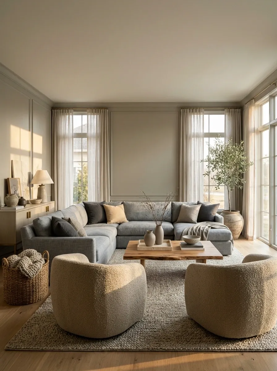
Greige can connect beige and gray, but the category name does not guarantee compatibility. Some versions lean green, pink, or violet.
Try a generous sample against the warm and cool pieces you want to bridge. Look for a color that sits comfortably beside both rather than matching one and fighting the other.
If no sample works, use a different connecting material instead. A rug or patterned textile may handle the transition better than paint. There is no prize for forcing a product labeled “greige” to solve a problem it has visibly declined.
Vary Texture Without Adding More Colors
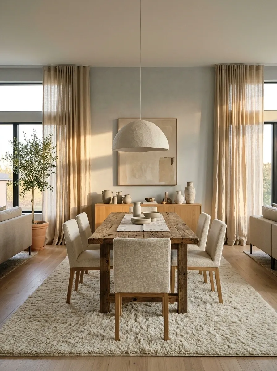
A linen-like curtain, smooth painted wall, woolly rug, and timber table can create depth within a restrained mixed-neutral palette. Texture gives the room interest without requiring another undertone decision.
Keep the colors related enough that the materials remain readable. Several nearly identical fuzzy fabrics may blend together rather than feel layered.
Choose textures suited to use and maintenance. A delicate pale weave on a heavily used chair can create more anxiety than atmosphere. The most appealing room is still one people can inhabit without consulting a fabric protection treaty.
Try a texture edit: Remove one redundant color and introduce interest through weave, grain, or a different surface finish.
Treat Metal Finishes as Part of the Palette
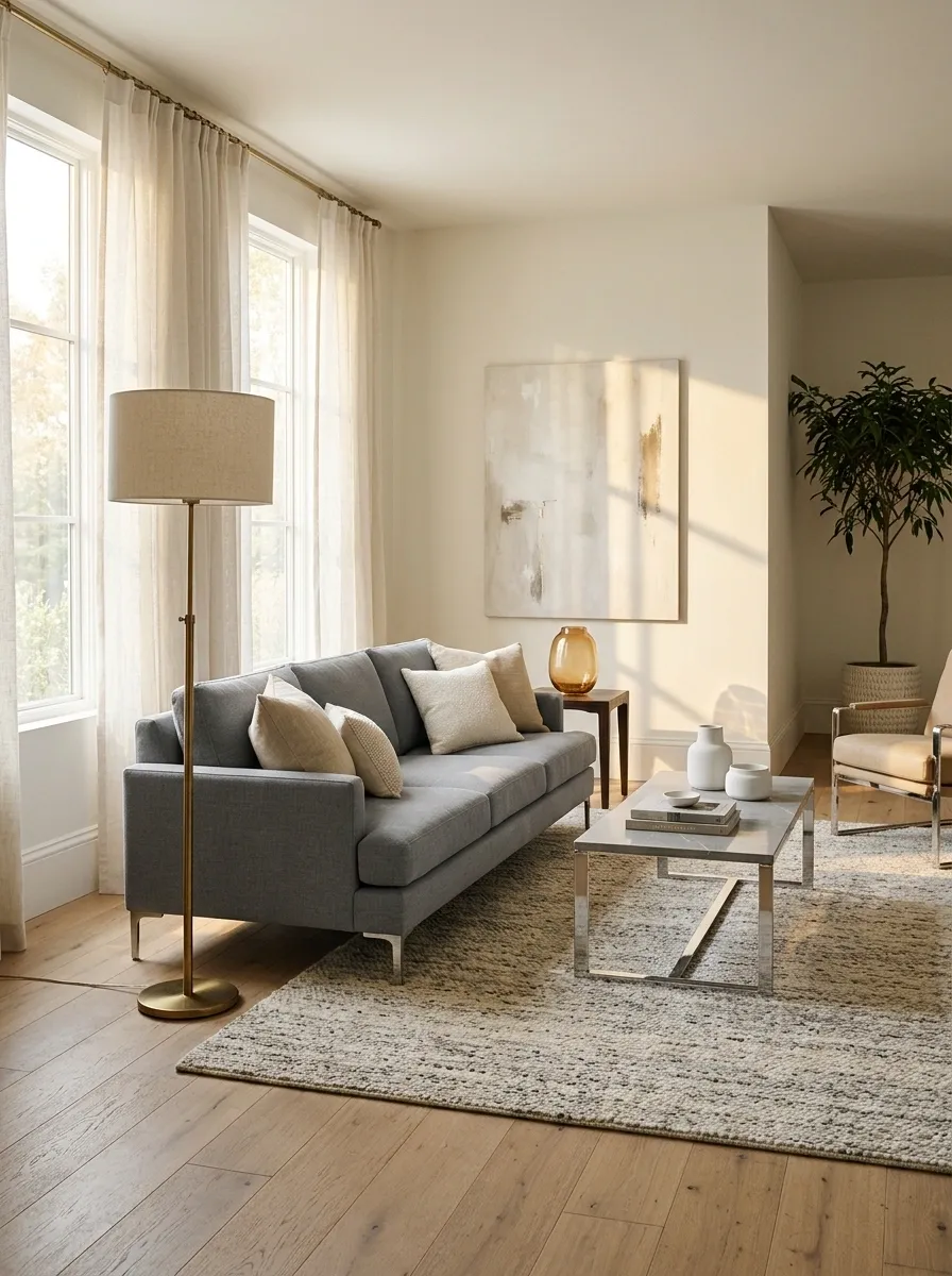
Brass can add warmth while chrome or nickel may reinforce a cooler direction. Compare the actual finishes; aged, polished, brushed, and lacquered versions can look very different.
Let one metal lead through the most visible fixtures, then introduce another in a clear supporting role if you like the mix.
Avoid buying more accessories simply to distribute both finishes evenly. A brass lamp near a cool gray sofa can create an intentional contrast without requiring a second lamp to settle the score on the opposite side of the room.
Use Artwork to Make the Palette Visible
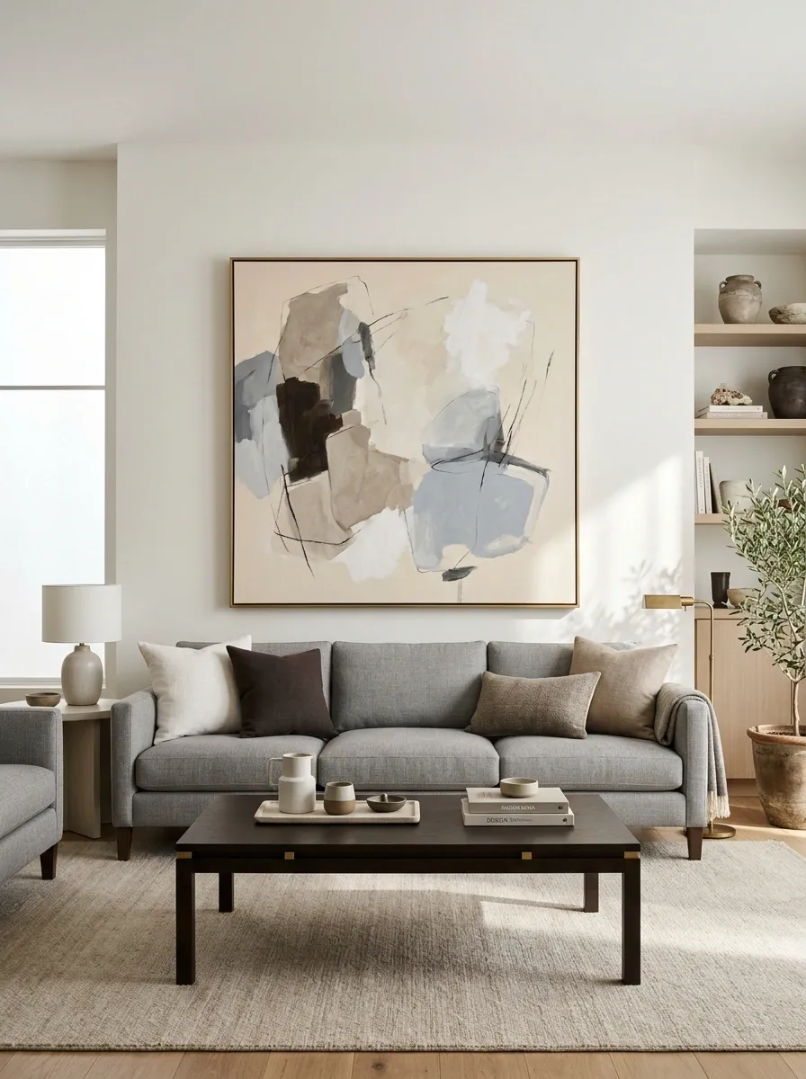
A painting or print that includes warm stone, cool gray, brown, and off-white can show the room’s color relationship in one place. Choose art you actually like rather than treating it as an expensive swatch sheet.
Hang it where it relates to the main furniture grouping. The frame can repeat a timber or metal already present.
Keep surrounding accessories quieter if the artwork contains plenty of variation. It can connect the palette without every cushion repeating every color in it, which would be a rather demanding job for a cushion.
| Art detail | Room connection |
|---|---|
| Warm pale background | Wall or rug |
| Cool gray forms | Upholstery |
| Dark line or frame | Furniture hardware or table |
Check Warm and Cool Samples at Night
View the full sample group under the lighting you use after dark. Daylight and artificial light can reveal different color relationships, so an afternoon decision may not tell the whole story.
Keep your normal lamps on during the comparison. Changing every bulb and every fabric simultaneously makes it harder to identify what improved the room.
If the room is mainly used in the evening, give that viewing condition real weight. A scheme that looks excellent during the ten minutes you are never home is not necessarily the most useful one.
Make Curtain Color a Broad Connecting Surface
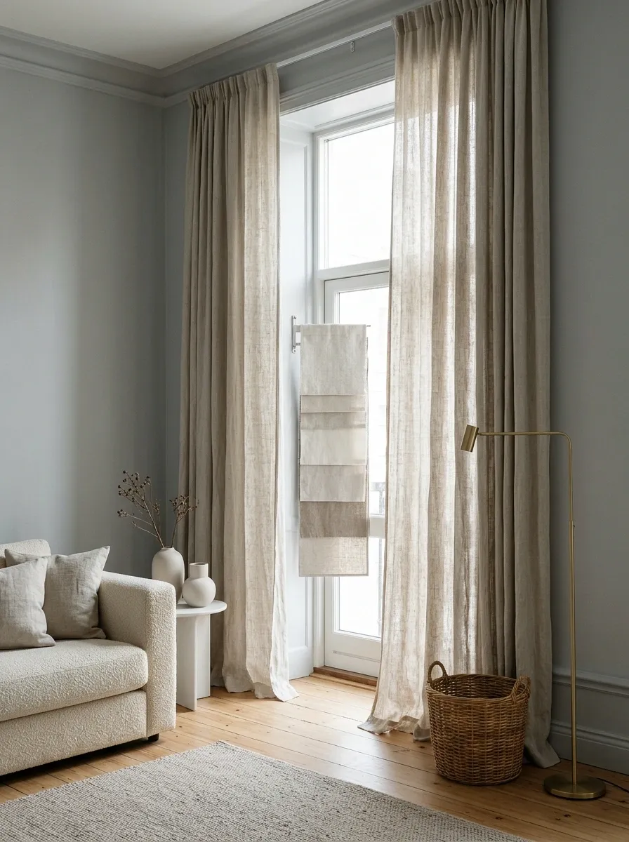
Curtains occupy enough area to connect cool walls and warm furniture. A muted stone or oatmeal fabric may work where a very yellow cream would exaggerate the contrast.
Hang a sizeable sample vertically by the window. Light passing through fabric can change how it reads compared with a folded swatch.
Choose opacity and lining for privacy and daylight needs as well as color. Beautifully coordinated curtains that fail at the one task you bought them for are an impressive example of decorative overachievement and practical underperformance.
Window test: View the fabric both with daylight behind it and with the curtains closed at night.
Make the Sofa Throw a Deliberate Middle Layer
A throw can connect a cool sofa to warm cushions or a warm rug. Use a color or pattern that includes a relationship to both, and give it enough visible area to matter.
Drape it where it will actually be used rather than arranging a fragile sculpture across the seating. If the household prefers folded throws, choose a basket or arm position that keeps the color visible.
This is an inexpensive trial before changing larger upholstery. Live with it for a few days and see whether the room feels more coherent from normal viewing positions.
Group Mixed Neutrals by Zone in an Open Room
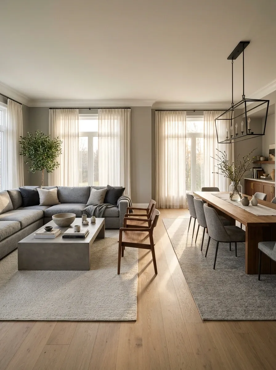
An open-plan room can have warmer dining furniture and cooler living-room upholstery while sharing a few linking materials. A common wall color or related timber can make the zones feel connected.
Give each area a clear furniture arrangement rather than scattering alternating warm and cool items everywhere. Rugs can help define the useful zones.
Check the view across both areas before buying another large piece. The room needs a family resemblance, not identical outfits. Variation can be part of the plan when the connecting elements are visible and repeated with purpose.
| Zone | Possible lead | Shared connection |
|---|---|---|
| Living area | Cool gray upholstery | Warm timber details |
| Dining area | Warm timber table | Related gray textile |
| Across both | Quiet wall color | Consistent dark outline |
Use Stone Variation as a Palette Clue
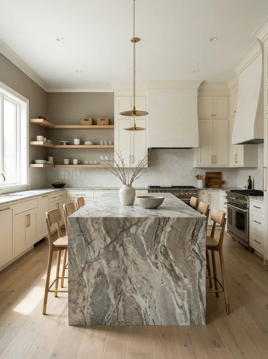
A stone or stone-look surface may contain both warm and cool notes. Select supporting colors from its quieter areas rather than only the most dramatic vein.
View a representative section of the actual material. A small sample may omit the color that dominates the installed countertop or floor.
Choose one main connecting note instead of attempting to repeat every fleck. Materials with natural-looking variation can support a mixed palette, but they are not a requirement to introduce six competing wall colors into the same kitchen.
Keep Adjacent Room Transitions Deliberate
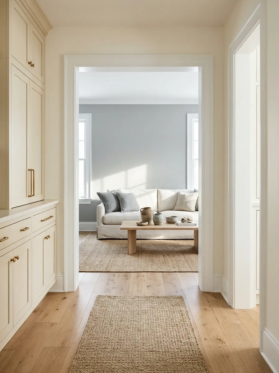
A warm hallway opening into a cool living room can work when the doorway provides a clear transition. Compare the colors from the point where both rooms are visible.
A shared trim finish or a repeated neutral can create continuity. The wall colors do not have to match exactly.
Avoid choosing each room in complete isolation if the doors stay open. A beautiful shade can still feel abrupt beside its neighbor. A small sample board held at the doorway often reveals the relationship more honestly than separate photographs on a phone.
Doorway check: Stand where both rooms are visible and compare large samples in that exact view.
Remove One Undertone That Has No Other Connection
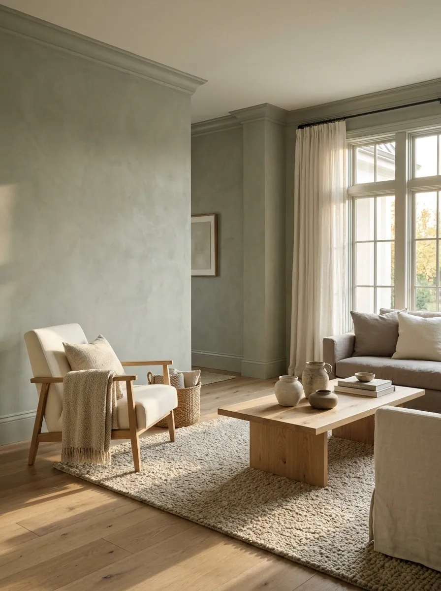
When a room feels unresolved, look for a single outlier: a pinkish rug among green-gray fabrics, a yellow lampshade beside cool whites, or a violet-gray cushion with no related note elsewhere.
Temporarily remove it before buying replacements. The room may need less rather than more.
If you love the piece, give its undertone an intentional connection or move it to a better setting. The point is to identify the actual friction, not to ban a color family from the property for crimes committed by one lampshade.
Test the Whole Scheme in a Small Physical Group
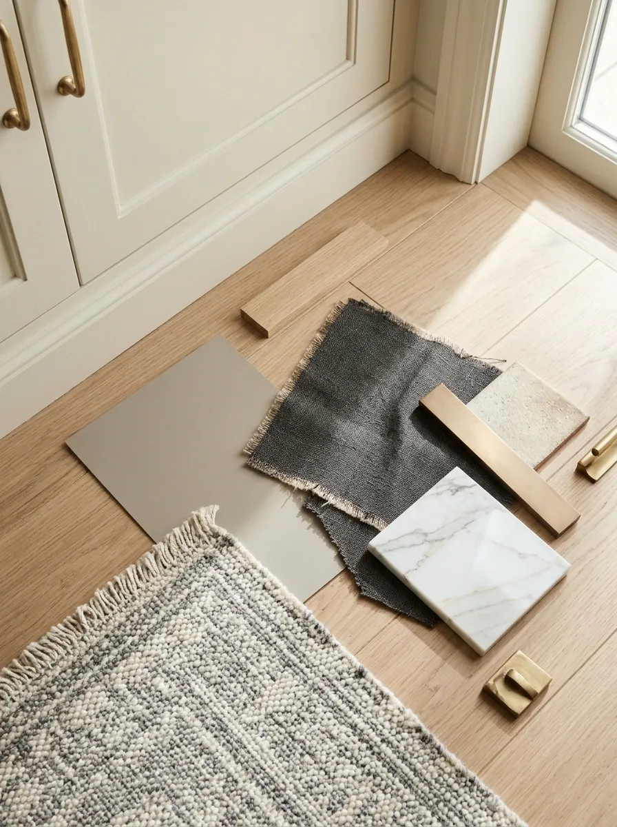
Gather wall samples, upholstery fabric, a rug sample, and a timber or metal reference. Place them together near the largest fixed finish and view them under different lighting conditions.
Let samples overlap so you can see which surfaces will meet. A flat lineup does not always reveal a difficult junction.
Photographs can help you remember the arrangement, but make the final color judgment in person. Screens adjust color and exposure, and their enthusiasm for smoothing over a questionable beige is not the same thing as compatibility.
| Include | Keep the comparison honest |
|---|---|
| Large wall sample | View against the floor |
| Main fabric | Use a representative piece |
| Wood and metal | Compare actual finishes |
| Existing white fixture or trim | Check the meeting edges |