

Choosing wedding colors can feel overwhelming when Pinterest shows you a million different palettes and everyone has an opinion. The truth is, the best color schemes are the ones that feel cohesive, intentional, and genuinely reflect your style—not just whatever’s trending this season.
These color combinations prove that going beyond the basic blush-and-gold or navy-and-white can create something memorable and beautiful. From soft and romantic to bold and dramatic, here are color schemes that actually work in real life.
Champagne & Dusty Rose
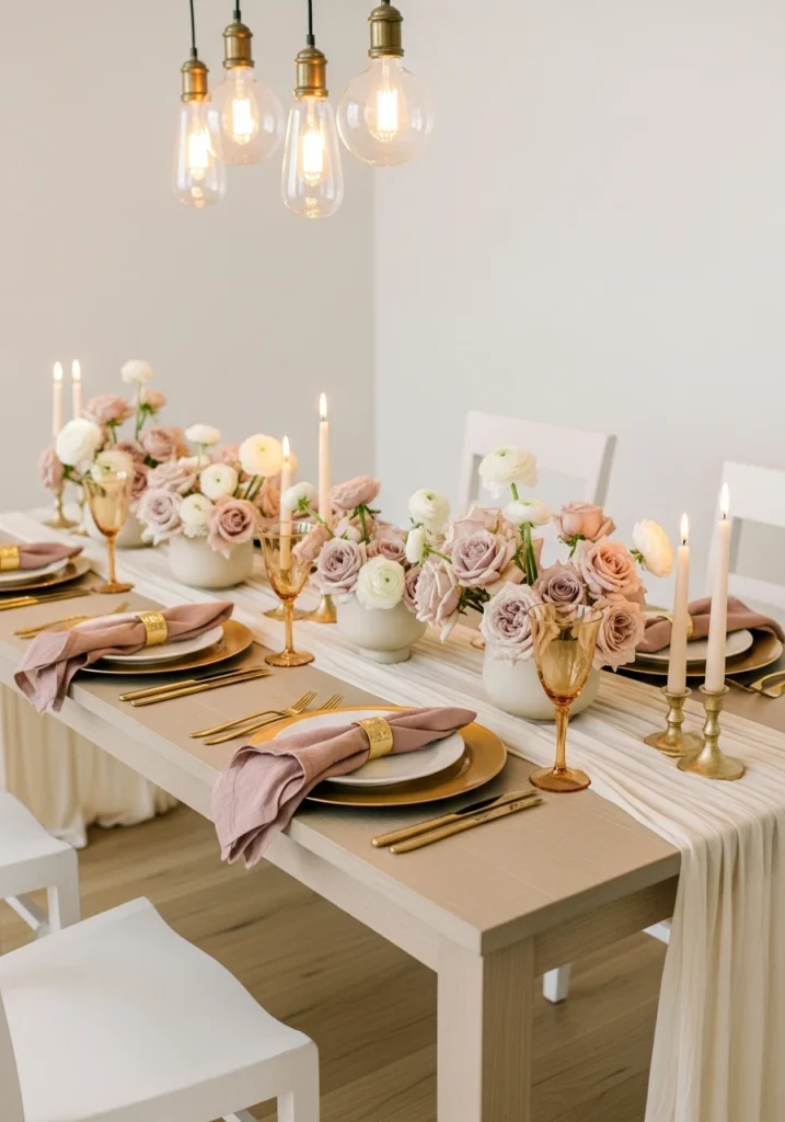
This long pale-ash oak table gets dressed with a champagne silk runner and low clusters of dusty-rose garden roses and white ranunculus in matte-ivory vases. Brushed-gold chargers and champagne-hued glassware keep the metallic elements soft rather than brassy.
Linen napkins in muted rose with gold napkin rings tie everything together, while warm pendant lighting and tapered candlelight create a soft glow. The three-quarter across-table shot shows how gentle and romantic this palette feels without being overly sweet.
This is perfect for couples who want romantic and elegant without going full princess pink.
Emerald & Onyx
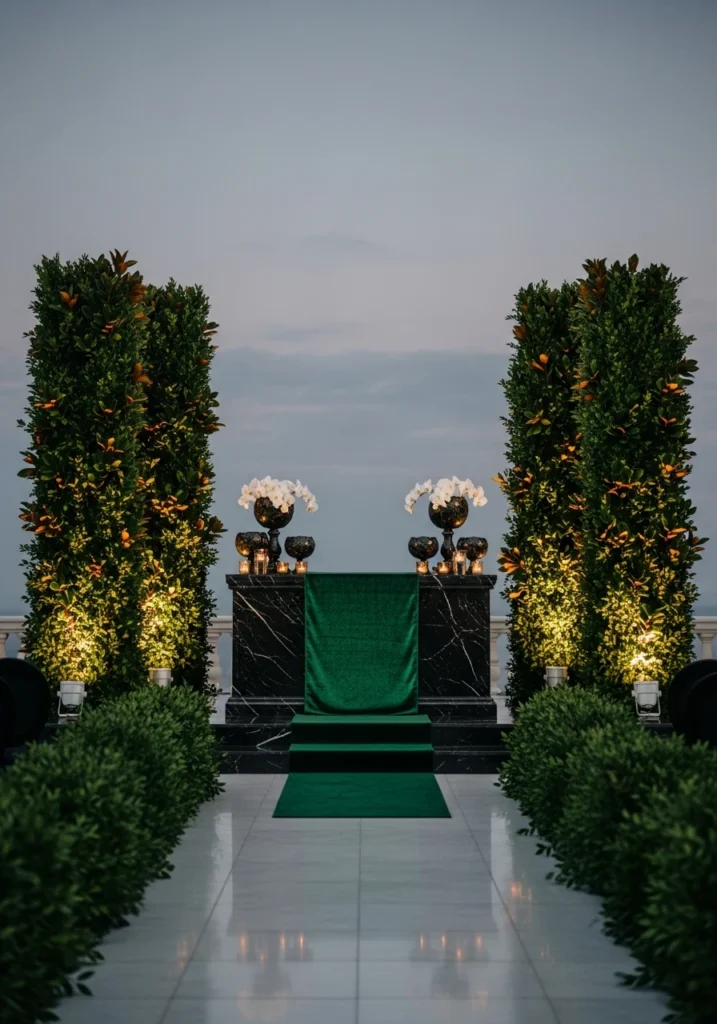
A low black-marble altar plinth with an emerald velvet runner creates this stunning contrast. Towering emerald foliage pillars made from boxwood and magnolia leaves flank the altar, while onyx votive bowls hold single white orchids.
The smoke-gray dusk sky provides natural backlight, with warm amber uplights at the base creating drama. A polished stone aisle completes the look. The head-on wide shot captures that cinematic contrast and jewel-tone richness.
This is for couples who aren’t afraid to go bold and dramatic—definitely an evening affair color scheme.
Midnight Blue & Gold

Round tables draped in midnight-blue satin set the foundation for this formal ballroom look. Low gold-filigree vases hold deep-blue delphinium and gold-dusted protea, while crystal stemware and gold flatware add elegance.
Oversized aged-brass chandeliers cast warm pools of light, and navy velvet banquettes around the perimeter provide comfortable seating. Polished parquet flooring reflects all that sparkle. The wide-angle shot captures the luxe formal density and shimmer.
This is old-school glamour done right—sophisticated, formal, unapologetically fancy.
Oyster Gray & Sage

A concrete ceremony platform with a soft oyster-gray linen aisle runner creates a clean, modern base. Low sage-green potted olive trees line the path, while minimalist concrete benches with sage cushions provide seating.
Small white peony posies tied to seats add delicate detail, and cool natural daylight balanced with subtle warm accent uplighting creates dimensional light. The eye-level shot reads calm and modern with that greenery-forward palette.
This is for couples who want organic and natural without going full rustic farmhouse.
Aubergine & Blush

Deep-aubergine velvet napery layered under blush-linen overlays creates this rich, textural base. Low bouquets of blush roses and aubergine ranunculus sit in black-glazed vessels, while polished black chargers and rose-gold flatware add metallic warmth.
Warm amber votives and dimmed spotlights create moody luminescence. The slightly lowered composition emphasizes those layered textiles and rich contrast—this is depth and sophistication in color form.
Perfect for fall or winter events where you want drama without going full dark and moody.
Burnt Sienna & Cream

A raw-walnut table with cream linen runner gets topped with clusters of burnt-sienna dahlias, cream spray roses, and dried-grain accents. Matte-cream porcelain plates and hammered-bronze flatware keep things refined.
Warm candlelight and low pendant lights in aged brass create intimate lighting. Natural stone flooring grounds everything. The wide across-table shot shows that warm autumnal depth without any rustic clichés.
This is fall wedding colors for people who don’t want pumpkins and burlap everywhere.
Slate & Copper
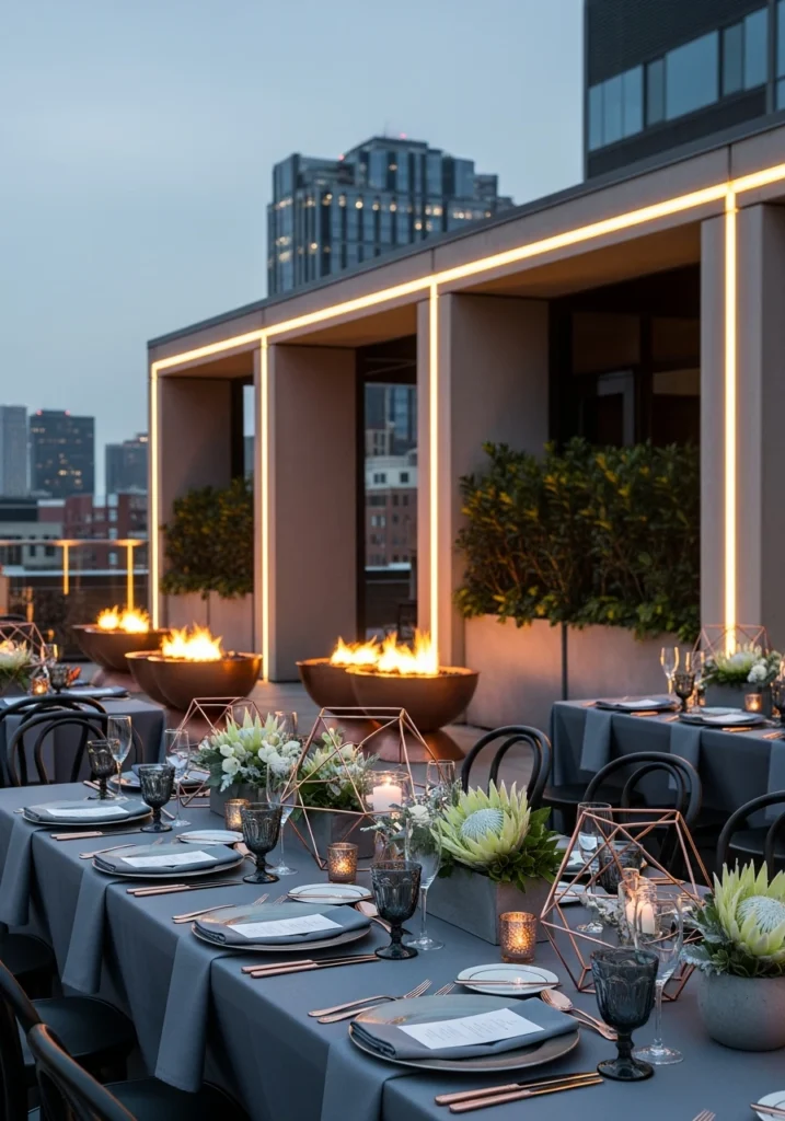
This rooftop reception uses slate-gray linens and concrete planters as the neutral base. Copper geometric centerpieces hold low white protea and slate foliage, while smoked glassware and copper-rimmed chargers add metallic warmth.
Copper fire bowls and linear warm uplighting provide heat and ambiance as dusk falls. The skyline backdrop completes the urban setting. The wide-angle dusk shot balances that urban edge with refined metal warmth.
This is city sophistication—modern, sleek, and a little bit industrial in the best way.
Icy Blue & Silver
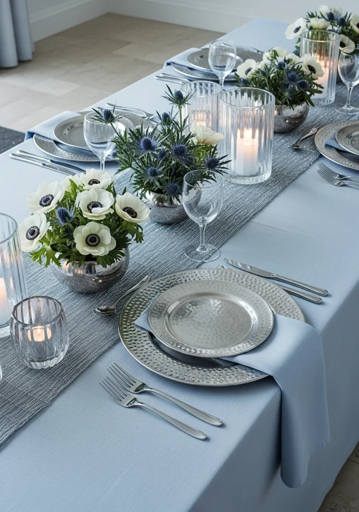
Frosted pale-blue linens with a silver-thread table runner create this cool, crisp foundation. Low arrangements of white anemones and icy blue thistle sit in nickel bowls, while hammered-silver chargers catch the light.
Clear blown-glass votives with cool LED glow balanced by subtle warm candlelight prevent the whole thing from feeling too cold. Polished stone flooring reflects everything beautifully. The slightly elevated view reads crisp and modern-chic.
This is winter wedding done elegant and refined rather than heavy and dark.
Plum & Pewter

A plum-velvet banquette wraps around a dark-wood table for this intimate dining setup. Pewter-rimmed plates and slate napkins keep the palette sophisticated, while low smoky-glass vases hold dark plum roses and dusty eucalyptus.
Soft warm wall washers and a single overhead pendant with satin brass interior create flattering light. The tight three-quarter crop focuses on that sumptuous texture and depth—this is rich, moody, and unapologetically luxurious.
Perfect for intimate dinners or smaller gatherings where you want maximum impact.
Moss & Mustard
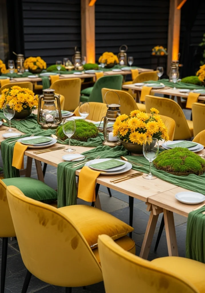
Moss-green table runners over natural-wood trestles get paired with mustard velvet chairs for this bold combination. Low bowls of saffron chrysanthemums and moss cushions reinforce the color story, while antique brass lanterns add warmth.
Natural slate underfoot and warm uplighting complete the look. The three-quarter across-table shot shows these bold, modernized heritage colors without any rustic undertones—this is heritage reimagined for now.
This is for couples who want color that makes a statement and don’t mind standing out.
Pearl Gray & Soft Gold
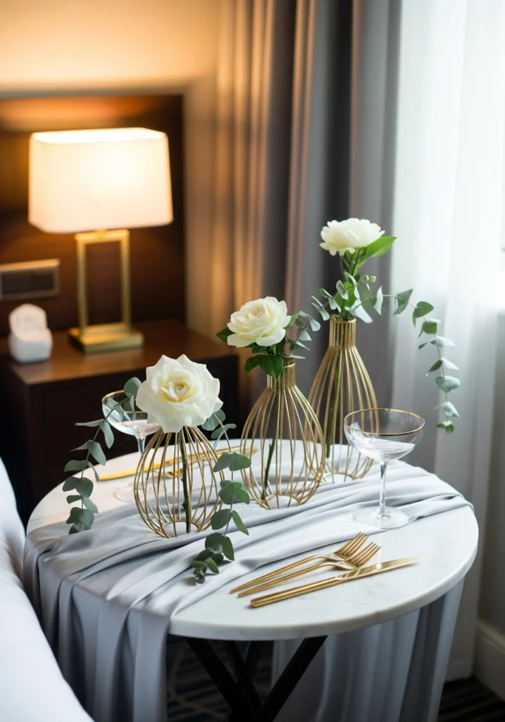
A small round marble table with pearl-gray silk overlay creates an elegant base for this intimate setup. Soft-gold wire vases hold single cream gardenias with trailing gray eucalyptus—minimal and refined.
Gold-rimmed coupe glasses and minimal gold flatware keep the metallic elements delicate, while warm bedside lamps balanced with cool window light create dimensional illumination. The intimate vertical crop is perfect for small-scale luxe moments.
This is quiet sophistication—subtle, refined, effortlessly elegant.
Berry & Graphite
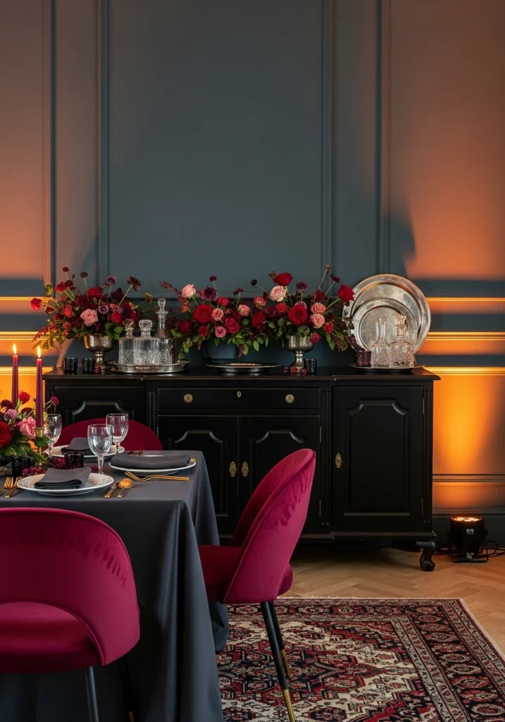
A graphite-painted wall with a low berry-toned floral garland (cranberry, pomegranate, deep-rose) creates dramatic contrast. A black-enameled sideboard stages crystal decanters and pewter platters, while deep-berry velvet dining chairs and charcoal linens complete the look.
Warm amber spotlighting creates rich contrast and makes those berry tones pop. The three-quarter view demonstrates bold seasonal flair with a modern edge—this is winter or late fall done dramatically.
For couples who want seasonal without being predictable about it.
Cream, Linen & Antique Brass
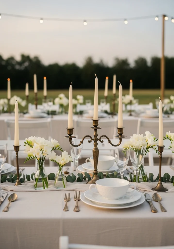
Natural-cream linen tablecloths create a soft foundation for low antique-brass candelabra holding cream tapers. Delicate clusters of white freesia and seeded eucalyptus add organic elements, while bone-white porcelain and antique-brass flatware keep things refined.
Soft golden-hour light with subtle bistro string lighting for twilight creates perfect illumination. The wide-angle shot captures this airy, elegant, wearable palette—this is for couples who want timeless and classic without being boring.
Sometimes the most beautiful color schemes are the ones that let the light, setting, and people shine.
Dusty Blue with Blush and Gold Accents

u/Zelandey created this stunning outdoor tablescape mixing dusty blue with soft blush and gold tones. That sheer dusty-blue table runner creates beautiful texture down the center, paired with white linens and black modern chairs for contrast.
The tall blue tapered candles in gold holders add height, while mixed florals in blush, white, and cream keep things romantic. Those blue textured goblets pick up the runner color perfectly, and gold flatware adds warm metallic shimmer.
The outdoor setting with natural grass underneath keeps everything feeling fresh and organic. This color combination works beautifully for spring or summer events—romantic without being too sweet.
Emerald Green with Copper and White
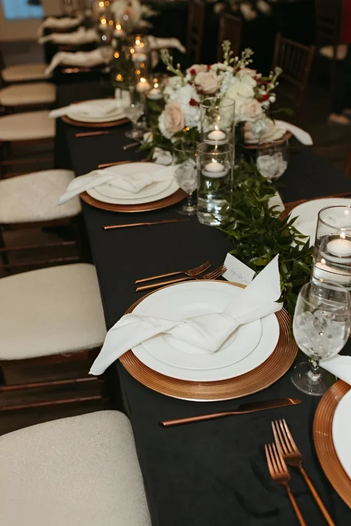
u/lkat17 shows how emerald (or deep forest green) paired with copper metallics creates instant sophistication. The black table linens provide dramatic contrast, while copper chargers and flatware add warmth.
White plates and napkins keep things elegant and provide breathing room in the color scheme, while floating candles in cylinder vases with greenery submerged create visual interest down the center. The lush white and blush floral arrangement provides a soft focal point.
Candlelight reflecting off those copper elements creates this warm, intimate glow. This palette works year-round but especially shines for fall and winter events—rich, warm, and effortlessly elegant.
The best wedding color schemes aren’t about following trends or choosing colors because they’re “in” this season. They’re about finding combinations that feel authentic to you, work with your venue and season, and create the mood you’re going for.
Start with one color you love, add a neutral to ground it, bring in a metallic for warmth or coolness, and consider one accent color for depth. Test your palette in different lighting (natural daylight, candlelight, evening) to make sure it works throughout your event. And remember—the colors are just the foundation. The textures, materials, and lighting are what bring them to life.