
You have a perfectly fine terracotta pot. It is doing its job. It is also boring you to death.
The good news is that a pot is one of the most forgiving surfaces you will ever paint on. It is curved, which means your imperfections disappear around the back. It is porous, which means paint grips it without primer if you let it dry properly. And it is cheap, which means if you hate the result, you buy another one.
The bad news is that most painted pot ideas you find online are either so beginner-simple they feel like a waste of time, or so technically intimidating you close the tab and go back to the plain terracotta.
This is neither of those things.
Choosing Paint Before You Pick Up a Single Brush
This is the step people skip. They buy whatever acrylic was on sale, paint a pot, and watch it peel within a season. Then they blame their skills.
It is not your skills. It is the paint.
Outdoor vs Indoor — The Decision That Actually Matters
If the pot lives outside, you need exterior-grade acrylic or, ideally, chalk paint sealed with a weatherproof outdoor varnish. Standard craft acrylics will fade, crack, and peel in rain and direct sun within months.
If the pot lives indoors, standard acrylic works perfectly. No primer needed on raw terracotta. Two base coats, let each dry fully, then add your design.
Pots at pottery studios — the ceramic bisque type — are glazed after painting, which solves the weatherproofing problem entirely. The bee and honey drip pot in a studio setting is the perfect example of this: the glaze finish gives depth and permanence that no home craft project can match without effort. If you have access to a pottery painting studio, use it for your most ambitious designs.
The Sealing Step Nobody Wants to Do
Seal everything. Always.
An outdoor matte sealant spray takes two minutes and adds years to the life of painted terracotta. Do it after every project, even the quick ones. Apply two thin coats. Do it outside. Let the pot cure for 24 hours before it touches water or soil.
The Design Decisions That Separate Good from Generic
Most people decide on a motif before they decide on a concept. They think: I want to paint cherries. They don’t think: I want this pot to look like a specific aesthetic from a specific era and the cherries are the vehicle for that.
The difference shows.
Colour First, Motif Second
The teal hibiscus pot works because the colour was chosen first. A flat teal base — saturated, even, covering every inch including the rim — was committed to before a single petal was painted. The hibiscus in white and black is secondary. It is decoration on a designed object, not a drawing stuck onto a pot.
Pick your base colour with intention. Ask what the pot will sit next to. Ask what the plant you’re growing is going to look like. A white pot with tulips reads fresh and botanical. A cobalt blue pot with a scallop border reads graphic and considered. A purple pot with night-sky clouds reads maximalist and joyful.
They are all valid. None of them happen by accident.
The Rim as a Design Feature
Most people paint the body of the pot and ignore the rim. The rim is where you double your design budget for free.
A painted rim in a contrasting or complementary colour changes the whole reading of the pot. The cobalt blue and white scallop pot uses this brilliantly — the entire upper half in deep navy, the scallop edge as the dividing line, and a row of small pink dots below it as the only additional element. That’s the whole design. It takes thirty minutes and looks expensive.
The face pots with the detailed floral rim are another example. The body of each pot is a single flat colour. The rim carries a dense hand-painted floral pattern in multiple colours. Two decisions. Zero complexity in execution once you’re sitting down with a fine brush and enough patience.
When to Leave the Base Colour Visible
The abstract geometric pots — three of them with organic colour blocks and white line botanical overlays — are built on a principle of strategic negative space. The raw terracotta or pale base colour isn’t covered entirely. Large colour shapes are blocked in, leaving visible ground between and around them. Then a single white line botanical motif threads across everything, tying the composition together.
This is the technique that looks most difficult and is actually quite forgiving. The shapes don’t need to be precise. The botanical line drawing can be loose. The visual interest comes from the collision of colours, which you arrange rather than paint freehand.
The One Skill Worth Practising Before You Start a Pot
It is not blending. It is not shading. It is making a consistent line with a fine brush on a curved surface.
That’s it.
Every design that reads as intentional — the bee’s flight path, the tulip stems, the window frames on the fairy house pot — is built on the ability to make a calm, consistent line. You don’t need a steady hand. You need a rested arm, a good quality liner brush, and the willingness to practise on paper for ten minutes before touching the pot.
Prop your elbow on the table. Move the brush by turning the pot, not by moving your arm. This alone will change the quality of every line you paint.
Flower Pot Painting Ideas Worth Actually Trying
The Teal Hibiscus Pot with Graphic Line Work
Start with a flat teal base — apply two coats, allowing full drying time between each. Paint the entire pot including the rim. Use a medium-toned teal rather than aqua or turquoise; this is the decision that gives the pot a grown-up quality rather than a children’s craft feel.
Once dry, sketch the hibiscus lightly in pencil. Paint the petals in flat white with no shading — solid fill, clean edges. Then outline the whole flower in black with a fine liner brush, adding the detail lines radiating from the centre and the small floating dots above to suggest pollen or movement. For the remaining leaves scattered around the pot, leave them as teal silhouettes with a black outline — same colour as the base but visible because of the outline. The restraint of using only white, black, and the base colour is what makes this pot design hold together.
The Night Sky Clouds Pot
Prime in a medium lavender — not pastel, not deep purple, but the mid-tone that sits between them. Cover the entire pot including rim.
Block in the clouds first using hot pink, magenta, and deep blue, working wet into wet so the colours blend at the edges. Use a flat brush and let the strokes show. Each cloud should be roughly the same size but placed at varying heights around the body of the pot.
Once dry, add a white crescent moon on one side. Keep it small — the moon should be a quiet element, not a focal point. Add white star and cross shapes scattered sparsely across the pot, some on the clouds and some on the plain background. These are painted with a fine brush using single or double intersecting strokes, not drawn stars. Three dots in a loose cluster complete the sky feel. Finish with a clear satin or gloss varnish.
The Fairy House Pot with Planted Roof
This design works because it commits to the metaphor completely. The pot is not a pot that looks a little bit like a house. It is a house that happens to be a pot.
Paint the body in warm cream or very pale buff — the colour of a rendered cottage wall. Mark out a door position on the front face and paint it in warm timber brown, adding horizontal plank lines in a slightly darker shade and a small round doorknob in white. Add circular windows on each side in pale grey-blue, with cross-pane lines in dark brown.
At the base of the door and windows, paint a row of small green grass strokes with the tip of a flat brush to suggest ground level planting. Tiny red dots become berries or flowers.
Now the rim. Paint the entire rim in medium green, then stipple dark green and light green over it while wet to create a leafy, hedge-like texture. Add tiny red and yellow dots while the stippled green is still tacky for the impression of flowering foliage. Plant the pot with a snake plant, succulent, or anything with strong upright form so the foliage above reads as the crown of a cottage garden.
The Sleepy Face Pots with Floral Collar
These work as a set. They fail as a single pot. Make at least three.
Choose a different flat colour for each pot body — the series reads best when you use analogous or evenly spaced colours around the wheel: teal, lilac, periwinkle, sage green, coral, warm pink. Paint the body and the interior top edge in the chosen colour. Leave the terracotta rim bare because the design goes there.
On the rim, paint a dense all-over floral pattern — small five-petal flowers in white, blue, pink, magenta, and yellow, with simple leaf shapes between them in two or three greens. This doesn’t need to be precise. The density carries it. Cover the entire rim surface so no terracotta shows through.
On the body, centre two small curved lines for sleeping eyes — simple arched strokes with subtle lash marks at the ends. Below them, a small red heart in the position of a mouth. That’s the whole face. The minimalism of the face against the busyness of the rim collar is the entire design logic.
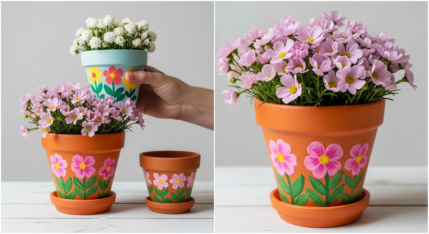
The Cherry Scatter Pot
White base coat, two coats, fully dry. This is a design that lives and dies on how clean your white ground is.
The cherries are painted in a scatter pattern across the entire surface — body, rim, and inside the rim lip. They are not arranged in rows or clusters. They are scattered as if they fell. Some are single cherries facing slightly different directions. Most are the classic double-cherry pair connected by a Y-shaped stem.
Paint the cherry body first: a round or slightly heart-shaped form in bright red. Add a highlight dot in pale pink or white while the red is still slightly tacky — this gives the dimensional, glossy-fruit quality. Paint the stem in bright green using a fine brush in a single stroke. Add a small leaf at the stem fork if your brush control allows.
The key to the scatter reading as intentional rather than random is to place pairs of different sizes — larger double cherries lower on the pot, smaller single cherries higher and on the rim — to create a natural visual hierarchy without symmetry.
The Abstract Shape with Botanical Line Overlay
This is the most technically forgiving design in this list. It will look more sophisticated than everything else you’ve made.
Paint a pale base — warm white, soft peach, or pale cream. Allow to dry completely. Then block in two or three large organic shapes in bold colours — a deep magenta, a sky blue, a coral orange. These shapes don’t need names. They are not leaves or clouds or petals. They are shapes. Use a flat brush and don’t smooth the edges. Let them be slightly textured.
Once dry, take a fine liner brush loaded with white paint. Draw botanical line work across the entire pot, moving freely over both the background and the colour shapes. These lines — simple branch-and-leaf forms, abstract vine trails, scattered single leaves — are your unifying element. They don’t need to be botanically accurate. They need to be confident.
The finished pot looks like something from a contemporary ceramics studio. The trick is that the colour shapes do the heavy lifting and the line work does the unifying.
The Bee and Honey Drip Pot
Paint the saucer first in solid amber-gold. Set aside to dry.
Paint the pot body in clean white — two solid coats. Once fully dry, create the honey drip effect: load a medium brush heavily with amber-gold paint thinned slightly with water. Starting from the rim edge, pull downward strokes of varying lengths around the upper third of the pot. They should be uneven — some longer, some shorter, some with a slight bulge at the tip where the paint collects. The drips continue onto the saucer visually, though painted separately.
For the bee on the rim, paint a small oval in amber-gold. Divide it with two or three horizontal black bands. Add two small black antennae above and two white almond-shaped wings to the sides. A tiny black dot for the face. A dashed flight path in black extending from the bee around the rim.
The whole design earns its charm from the contrast: the loose painterly drip against the precise little bee. One element does the drama. The other does the character.
The Ice Cream Cone Pot
Leave the lower two-thirds of the terracotta pot unpainted. The natural terracotta colour is your ice cream cone. Over it, paint a diagonal grid of dark brown crosshatch lines to create the waffle cone pattern.
For the upper third and rim, paint in white — this is your ice cream scoop. The boundary between the white and the terracotta should be a loose, slightly wavy painted edge rather than a perfectly straight line. This mimics the rounded scoop edge where it meets the cone.
Outline the scoop edge in black using a fine brush to define the boundary with a clean dark line. Then add multicoloured sprinkles across the white — small dash-stroke marks in rainbow colours scattered randomly across the scoop area and the rim. These go on with the tip of a fine brush in single quick strokes. Don’t try to make them identical.
Plant with carnations or any small-headed dense flower in pink or red. The flowers will look exactly like the cherry on top that the design is already implying.
The Pink Tulip Bowl Pot
Choose a wide, low, bowl-shaped pot rather than a standard terracotta. The rounder form makes the tulips read as a ring of blooms going around the pot’s waist rather than a strip on a cylinder.
Paint the entire exterior in flat white — two coats. The interior rim can be left as natural terracotta or also painted white.
For the tulips, work in a ring around the pot’s widest point. Paint each tulip head first: a simple cup shape in medium pink with a slightly darker pink curved line defining the cup’s upper edge. Three petal shapes emerging from the cup, each a slightly rounder ovoid. Add a deeper rose pink for shadow between the petals with a single curved stroke.
Paint the stems in two greens — mid-green for the main stem, a slightly bluer green for the leaf that grows from it. The leaf is a long pointed oval, slightly tilted. Keep the spacing between tulips even. Keep the arrangement at the same height all the way around — this gives the pot the look of a decorative ceramic band.
The Cobalt Scallop and Dot Pot
Half-and-half is the concept. The upper half of the pot — including the full rim — in deep cobalt navy. The lower half in clean white.
The dividing line between the two halves is painted as a scallop edge rather than a straight line. Use a round object to trace curved scallop shapes across the pot before painting — coins, bottle caps, or a dedicated circle template all work. Paint the cobalt above the scallop line, carefully cutting around the curves. Clean up the edge with a small detail brush.
Below the scallop edge on the white section, add a single row of small dots in dusty pink or blush — evenly spaced, at a consistent distance below the scallop. These are made with the end of a brush handle dipped in paint. That’s the entire detail element of the lower half.
Plant with something dense and green — thyme, baby’s tears, moss — so the deep navy rim and the lush green foliage create a high-contrast composition that photographs well from above.
The Upside-Down Fairy Village
This is the design that requires a second pot or saucer to complete, because the magic is in the combination.
Take two pots of the same size. One will be right-side up as the base. One will be inverted to become the roof.
Paint the upright base pot in a chosen colour — blue, pink, orange, lavender — with a painted door in timber brown on the front face, round or arched windows on the sides, small painted flowers and insects at ground level.
Paint the inverted roof pot in a contrasting colour — the red polka-dot mushroom roof uses a bright red with large white circle spots. A scallop-edged rim around the base becomes the decorative mushroom cap edge.
Stack the inverted pot upside down on top of the base pot. Plant succulents or pansies into the upward-facing drainage hole of the inverted roof pot. Arrange several of these together in a garden setting using different colour combinations — each becomes a different fairy house. The village effect comes from variety in the set, not complexity in each individual piece.
The Abstract Maximalist Art Pots
Three pots, each different but clearly part of the same family.
Choose three different background colours — one warm, one cool, one neutral. For each pot, paint the background colour in a way that leaves some areas thinner and some areas denser, so the natural terracotta shows through subtly in places.
Then block in large organic shapes on each pot — circles, ovals, irregular blobs — in colours that overlap between all three pots. Every pot uses orange, every pot uses a blue or teal, every pot uses at least one dark anchor colour like deep green or deep purple. This shared palette is what makes the set read as intentional.
Finally, draw white botanical line work over each pot using a fine liner brush — simple leaf and branch forms, confident and loose. These lines appear on all three pots in the same style, which is the final element that unifies the set.
Placed together on a step, ledge, or shelf, the three pots look like a collected commission rather than an afternoon craft project.
The Gift That Outperforms Every Candle
A painted pot with a plant already in it is the gift that people talk about for years. It shows effort, skill, and thought. It is genuinely useful. And it costs almost nothing.
The key is matching the design to the person. The bee pot for the beekeeper neighbour. The cherry scatter pot for the person whose kitchen is already full of cherry motifs. The sleepy face set for someone who just had a baby and hasn’t slept.
The design that references the recipient is always the one they keep.
Everything else about a good painted pot is just paint.