
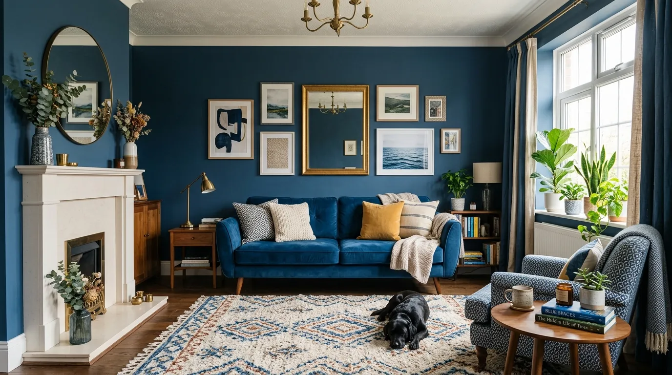
Blue has an image problem. Ask most people to picture a blue living room and they’ll describe something cold — a waiting room, a corporate lobby, a room that photographs well and feels like nothing.
The rooms that actually pull blue off understand something the beige-forever crowd doesn’t: color isn’t the risky choice. An unconsidered room is the risky choice. Blue, chosen with intention, is one of the most forgiving colors in the entire spectrum.
What People Get Wrong About Blue
Most of the resistance to blue living rooms comes from a handful of assumptions that don’t hold up once you actually look at rooms that do it well.
Why Blue Gets Called Cold When It’s Actually Warm
Blue only reads cold when it’s paired with cold materials — chrome, glass, stark white trim, fluorescent lighting. Pair the exact same paint color with brass, aged leather, walnut, and warm bulb lighting, and the room flips entirely. It reads rich instead of clinical.
Look at any of the moody navy or teal rooms in this list with a lit fireplace and warm lamps. The wall color has a whole layer of heat sitting directly under it thanks to material choices, and that heat is doing more work than the paint.
The rooms that feel cold aren’t cold because of blue. They’re cold because someone stopped at the paint color and never added the warmth that was supposed to sit on top of it.
The Undertone Nobody Checks Before Painting
Every blue has a secret second color hiding underneath it — green, grey, or violet — and that undertone determines almost everything about how the room will feel at different times of day. A blue with a green undertone can read teal in afternoon light. A blue with a grey undertone can look almost black at night.
Most disappointing blue rooms trace back to someone choosing a paint chip under store lighting and never testing it at home, in both daylight and lamp light, before committing.
The fix costs nothing: paint a large swatch, live with it for 48 hours, and watch what it does morning, noon, and night before it goes on four walls.
How Much Blue Is Too Much Blue
There’s no single correct amount of blue. Some of the best rooms here use it on every surface, ceiling included. Others use it only as a single accent chair in an otherwise neutral room. Both work, because both were decided on purpose rather than by accident.
The failure mode isn’t “too much blue” or “too little blue.” It’s an in-between amount that feels indecisive — one blue pillow on a beige sofa, with no other blue anywhere else in the room to justify its presence. Commit to a percentage and follow through on it.
Blue Living Room Ideas
Navy Velvet Brass Accents
Choose deep navy velvet for every major seating piece in the room, including the ottoman, so the fabric itself becomes the room’s dominant texture rather than a single accent. Velvet’s light-catching quality is what keeps an all-navy seating arrangement from reading flat.
Paint the walls the same navy as the furniture, floor to ceiling, with no contrasting trim. Full saturation is what makes this room feel intentional instead of half-committed.
Add brass in every fixture: a floor lamp, wall sconces, a round coffee table frame. Brass against navy reads as warm and jewel-toned rather than cold, especially under low, warm lighting. Finish with a patterned dark rug that echoes the wall color rather than contrasting it.
Navy Library Wall Fireplace
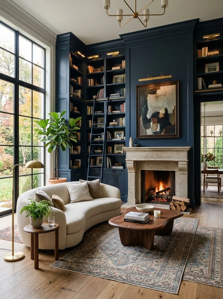
Build floor-to-ceiling navy built-in bookshelves along one full wall, complete with a rolling ladder for the top shelves. The scale and function of real library shelving does more to establish luxury here than any single decorative object could.
Pair the dark shelving with a curved, boucle sofa in warm ivory, so the soft neutral furniture keeps the deep navy walls from feeling heavy or overly formal.
Center a stone fireplace on the same wall as the shelving, and add a sculptural walnut coffee table with an organic, irregular shape to soften all the straight lines the built-ins introduce.
Navy White Chandelier Mix
Paint the walls a deep navy and pair them with crisp white upholstered furniture, piped in navy to tie the two together. The contrast between dark walls and bright furniture is the entire foundation of this look.
Hang a genuinely ornate crystal chandelier as the room’s central light source. Against navy walls, even a traditional, formal fixture reads fresh rather than dated.
Layer in blue and white patterned pillows, a wide-striped bench, and blue and white ceramics on the coffee table. Every pattern should stay within the same two-color family so the busy mix reads as cohesive rather than chaotic.
Cobalt Velvet Sofa
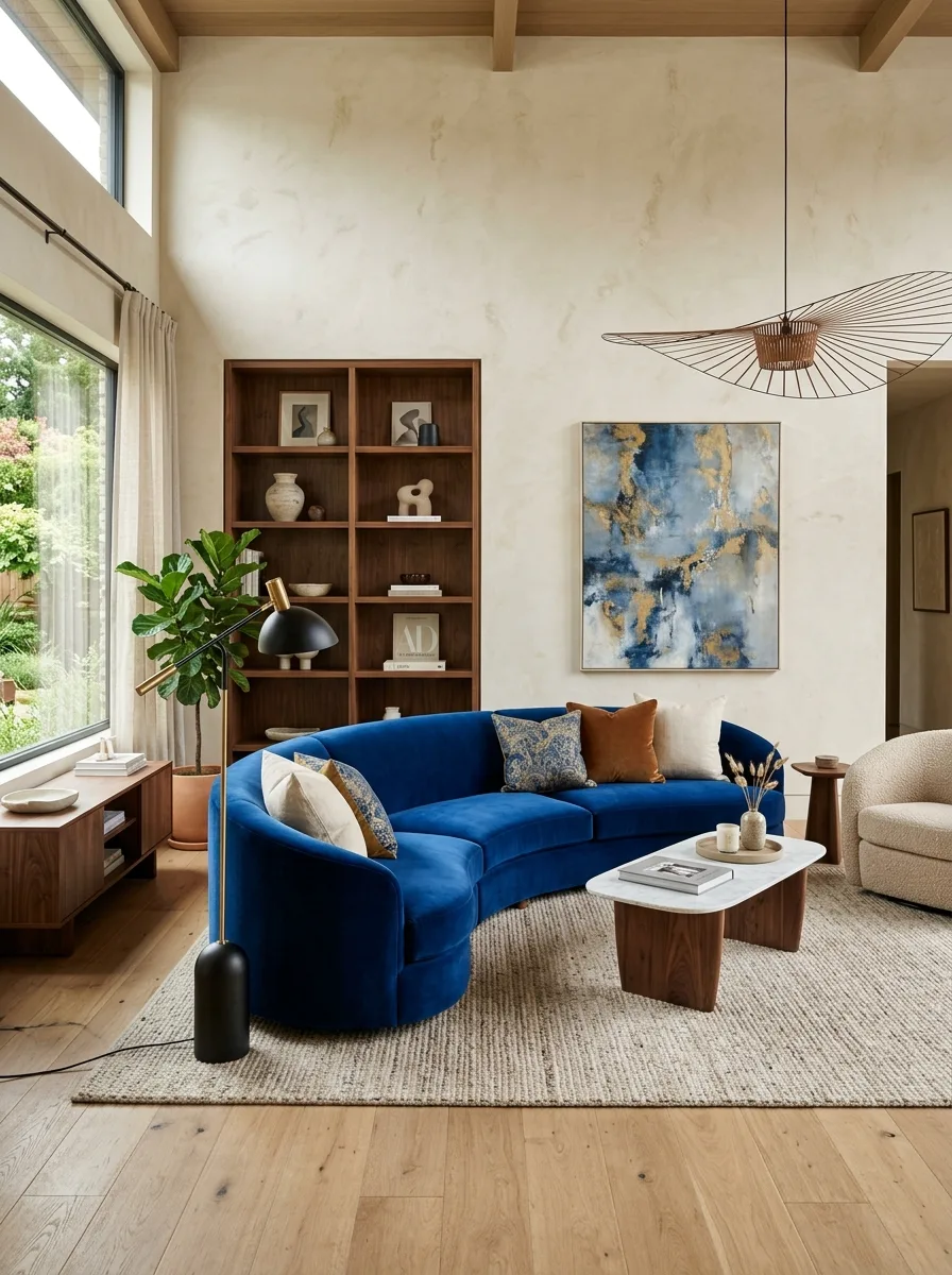
Choose a dramatically curved sofa in saturated cobalt velvet as the room’s sole loud element, and let every wall around it stay a warm, textured plaster in a quiet neutral. The sofa’s shape does as much visual work as its color.
Pair it with walnut furniture in equally sculptural, rounded forms, a curved coffee table base or an organically shaped side table, so the room’s furniture language stays consistent even as materials shift.
Hang one abstract painting with gold and blue tones directly above the credenza to echo the sofa’s color without repeating it exactly, and add a sculptural pendant light overhead as the room’s other clear focal point.
High Gloss Lacquer Paneling
Have the wall paneling and ceiling lacquered in a deep teal, not just painted matte. The reflective sheen is what separates this look from ordinary paint — it catches light and adds dimension that a flat finish never will.
Center the room around a painted fireplace mantle in the same lacquered teal, flanked by brass sconces, so the fireplace wall becomes the glossiest, most dramatic point in the room.
Introduce a patterned upholstered chair in a blue and cream print for textural contrast against all that shine, and keep the rug relatively simple and plaid so it doesn’t compete with the glossy walls.
Navy Ceiling Color Block
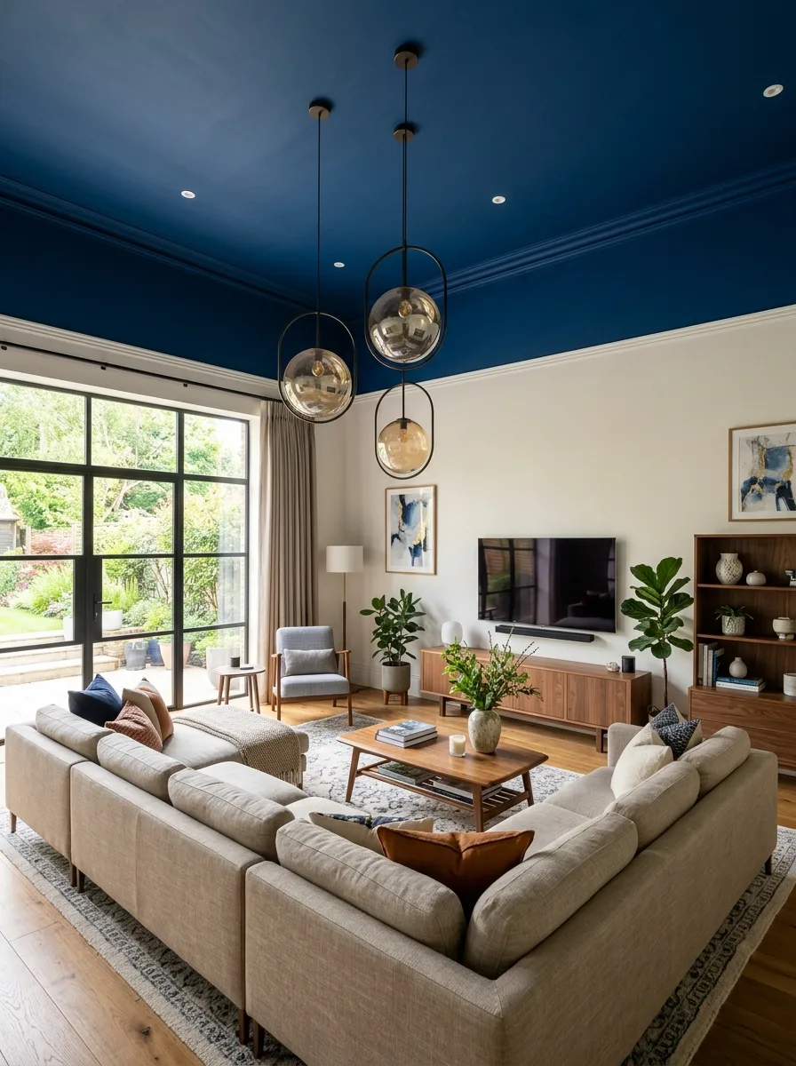
Paint the ceiling a deep navy and stop the color precisely at the crown molding line, leaving the walls below in a warm, unpainted cream. The color-blocked ceiling instantly draws the eye up and makes the room feel taller than its actual dimensions.
Hang two or three glass globe pendants at staggered heights directly beneath the navy ceiling, so the fixtures read as part of the ceiling treatment rather than separate decor.
Keep the furniture below in warm neutral tones, a large sectional in soft grey-beige, walnut furniture pieces, so all the visual drama stays confined to the ceiling plane and doesn’t compete with itself at eye level.
Cobalt Walls Black Velvet
Paint the walls a saturated, almost electric cobalt blue and pair them with black velvet curtains and black velvet seating. The near-black furniture against the vivid wall color creates the kind of contrast that photographs like a nightclub, in the best way.
Add a black faux fur rug layered over an even darker shag base for a floor that feels as indulgent as the walls.
Finish with gold accents used sparingly, a pair of sculptural bookends, a gold-rimmed vase — and one large arrangement of blue roses on the coffee table to tie the flowers directly back to the wall color.
Fluted Blue TV Backdrop
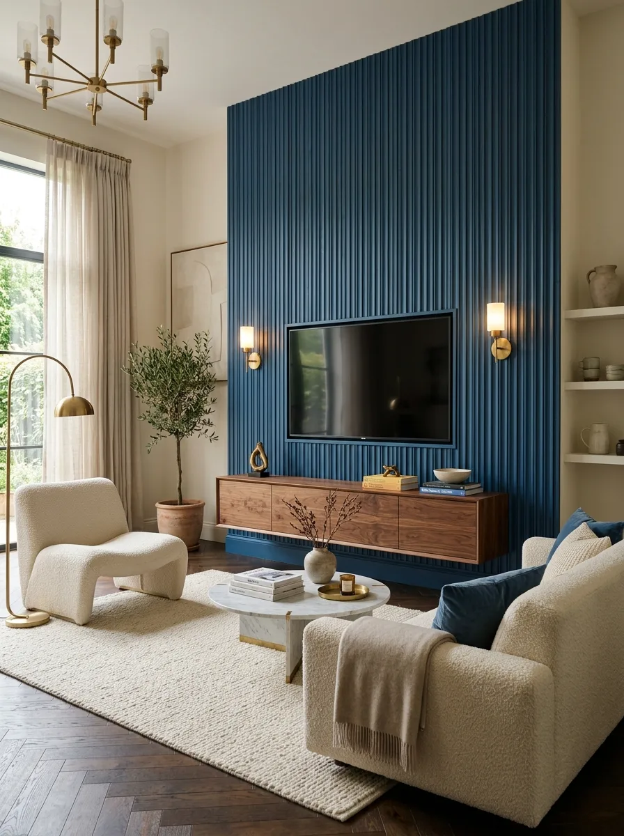
Build a fluted, vertically ribbed accent wall in a deep slate blue behind the television, floating a walnut media console in front of it rather than mounting storage directly onto the fluted surface. The ribbed texture reads as sculptural rather than purely functional.
Flank the television with a pair of matching brass wall sconces at equal height, adding warm light without needing table lamps on the console itself.
Pair the bold accent wall with boucle furniture in soft cream throughout the rest of the room, and add one potted olive tree near the window so the room’s only truly saturated color stays contained to that single dramatic wall.
LED Backlit Blue Glow
Install blue LED strip lighting behind the television wall and underneath the furniture rather than relying on lamps as the primary light source. The glow itself becomes the room’s main color statement, more than any paint or fabric choice.
Keep the furniture in dark charcoal or black upholstery so the LED glow has maximum contrast to bounce off of, and add a few cobalt throw pillows and a patterned area rug in matching blue-grey tones to reinforce the palette in daylight hours too.
This look depends entirely on the lighting staying on after dark — plan for it to be the room’s evening identity, distinct from how it reads during the day.
Chinoiserie Ceiling Checkerboard
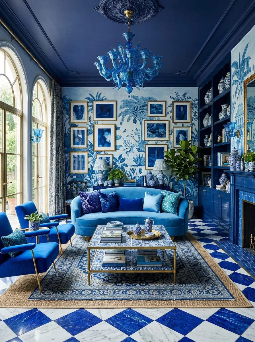
Paint the ceiling and upper trim a rich, saturated blue and pair it with a large-scale chinoiserie wallpaper mural on the walls below. The painted ceiling and patterned walls need to share the same blue family or the whole room falls apart visually.
Lay a checkerboard marble floor in blue and white to continue the pattern language down to ground level, and hang a colored glass chandelier as the room’s central sculptural moment.
Fill built-in shelving with blue and white ceramics, layering different scales and shapes rather than a matched set, and add a tightly clustered gallery of small framed prints on the one open wall to keep the density consistent throughout the room.
Dusty Blue Coastal Linen
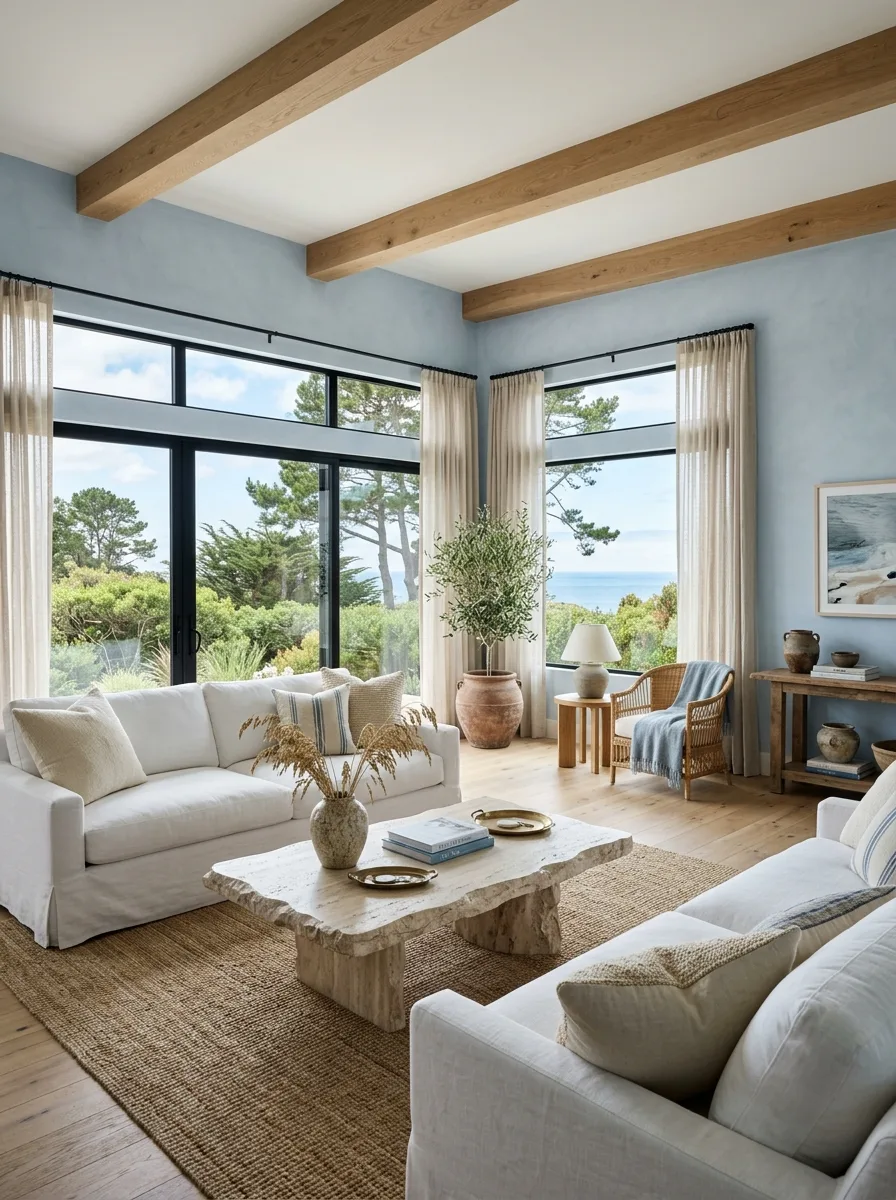
Paint the walls a pale, chalky dusty blue rather than a saturated navy, and pair them with white slipcovered linen sofas throughout. This lighter, more washed-out blue reads as coastal and relaxed rather than formal.
Choose a rough-hewn stone coffee table with visible natural texture as the room’s grounding element, and expose real wood ceiling beams overhead to keep the palette from feeling too polished.
Add a woven rattan accent chair and a large potted olive tree near the window, and let the window treatments stay minimal, sheer linen only, so the room’s actual view stays the visual priority.
Blue Paneled Walls Gold Mirror
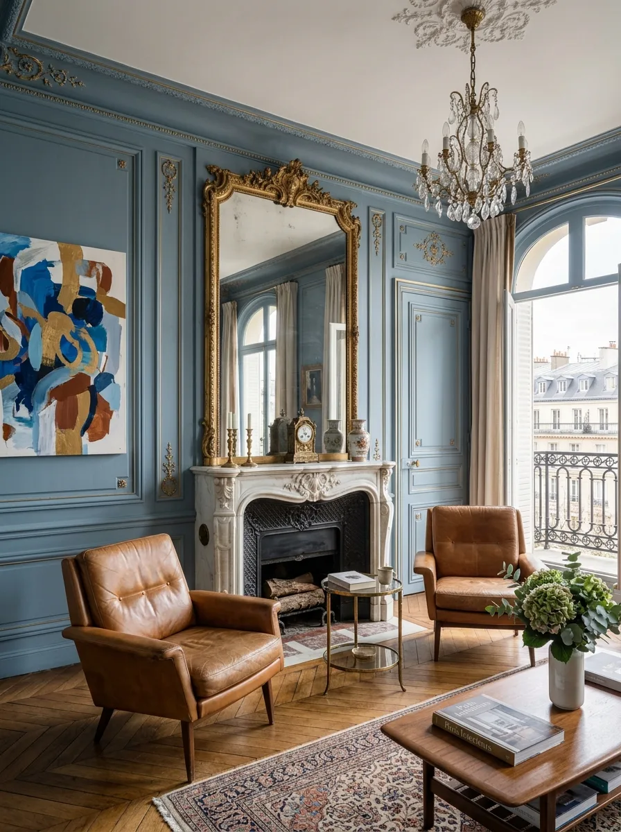
Paint traditional wall paneling in a soft slate blue and keep the color consistent up into the crown molding detail. The architectural paneling is what makes the color feel tailored rather than flat, so don’t skip the molding work to save time.
Hang an oversized, ornately gilded mirror above a marble fireplace as the room’s central reflective and decorative anchor. The gold frame against blue walls is the core relationship the whole room is built around.
Add warm cognac leather mid-century chairs for contrast, and hang one bold, colorful abstract painting nearby to keep the traditional paneling from feeling like a museum room instead of a lived-in one.
Built In Shelves Plaid Chairs
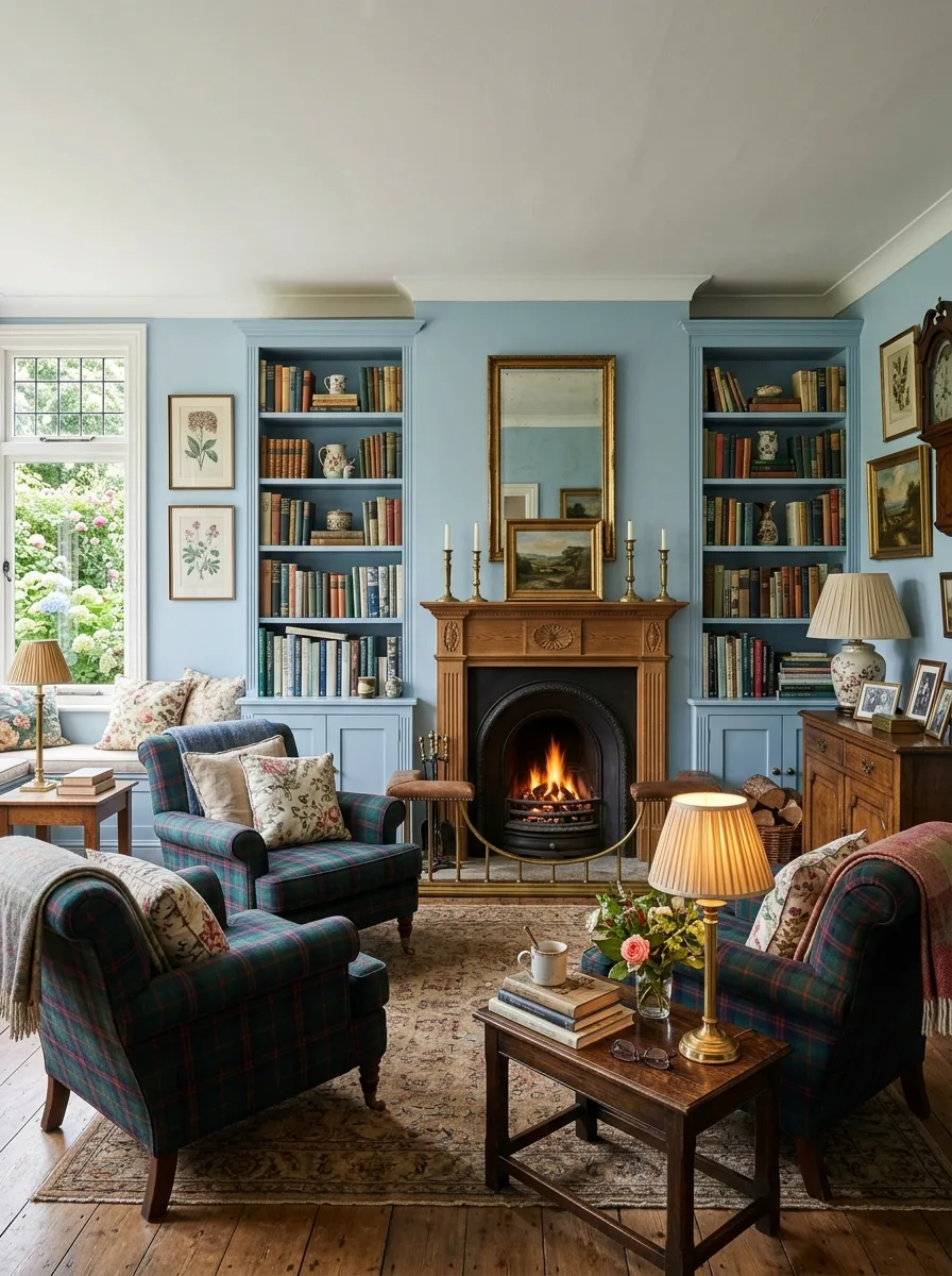
Flank a working fireplace with matching built-in bookshelves painted the same dusty blue as the walls, filled densely with real books and small collected objects rather than styled sparingly.
Choose plaid wool armchairs in blue and burgundy tones as the primary seating, layering in floral throw pillows that pull the same color family without matching exactly.
Keep the fireplace itself traditional and cast iron, with brass fire tools and candlesticks on the mantle, and add a gently worn Persian-style rug underfoot to complete the gathered-over-decades feeling this room depends on.
Patchwork Wallpaper Art Panels
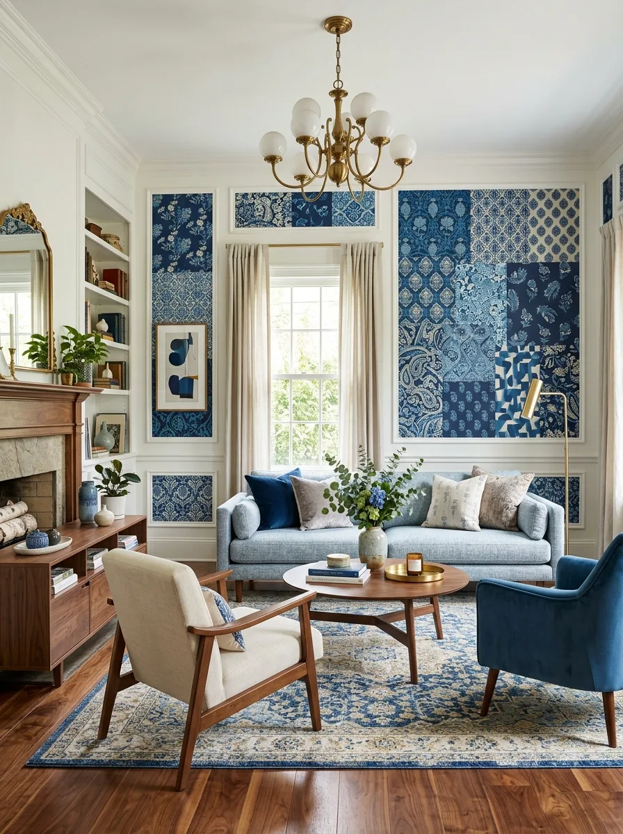
Frame several different blue-toned wallpaper patterns within individual wall panels using simple picture-frame molding, treating each patterned rectangle like a piece of art rather than wallpapering the whole wall. The variation in pattern scale within a single unified color story is the entire trick.
Keep the furniture below simple and solid, a soft light blue sofa, a warm wood round coffee table, so the patchwork wall stays the undisputed focal point.
Hang a brass chandelier with round glass globes to add a soft, warm light source, and finish with a traditional medallion-pattern rug in matching blue and cream tones to ground the room without introducing a third competing pattern.
Navy Gallery Rust Sofa
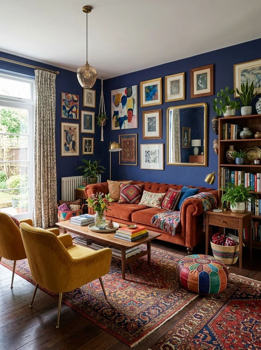
Paint the walls a deep navy and build a dense, floor-to-ceiling gallery wall across the largest expanse, mixing abstract art, mirrors, textiles, and small sculptural objects rather than a neat grid of matching frames.
Anchor the seating with a rust or burnt-orange velvet chesterfield sofa directly against the gallery wall. The warm rust against navy is the single most important color relationship in the entire room.
Add mustard velvet accent chairs and a Moroccan leather pouf for additional color variety, and layer two Persian-style rugs slightly offset from each other to build the same density on the floor that the gallery wall establishes overhead.
Backlit Stone Fireplace Wall
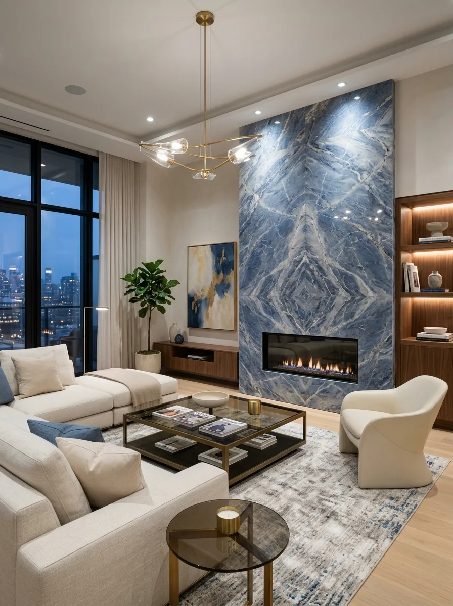
Install a full-height, bookmatched blue-grey stone slab as the fireplace surround, running it floor to ceiling rather than stopping at a standard mantle height. The mirrored veining pattern where the two slabs meet is what makes this feel custom rather than off-the-shelf.
Add integrated lighting along the stone’s edges to highlight the veining after dark, and keep the fireplace itself a simple linear insert rather than anything ornate, letting the stone carry all the visual weight.
Furnish the rest of the room in soft ivory boucle and let floor-to-ceiling windows with a city view provide the room’s only other major visual competition.
Teal Panels Leather Chairs
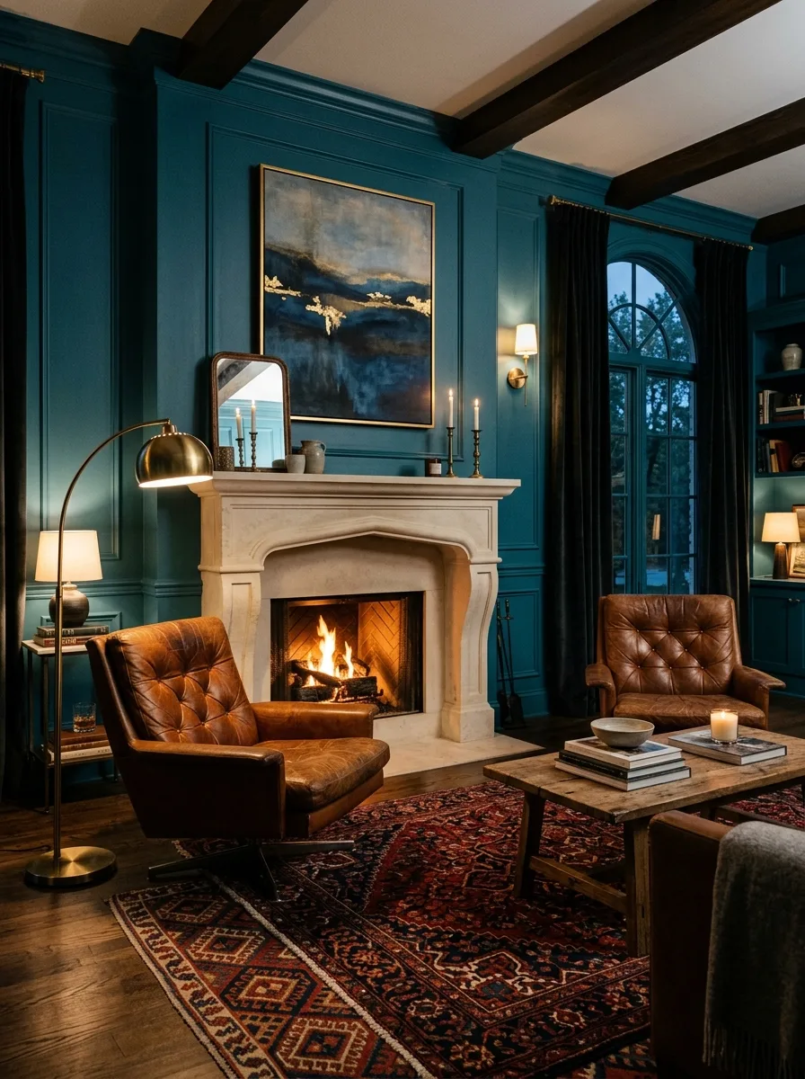
Paint traditional wall paneling in a deep teal and pair it with warm cognac leather tufted chairs positioned close to the fireplace. Leather against teal reads as clubby and collected rather than corporate, especially with worn, broken-in leather rather than anything too polished.
Hang one large abstract painting with gold leaf detailing above the mantle, and add a brass arc floor lamp for reading light positioned beside one of the chairs.
Choose a traditional Persian-style rug in warm reds and blues to bridge the cool wall color with the warm leather furniture, and keep every light source warm-toned rather than cool white.
Steel Windows Navy Drapes
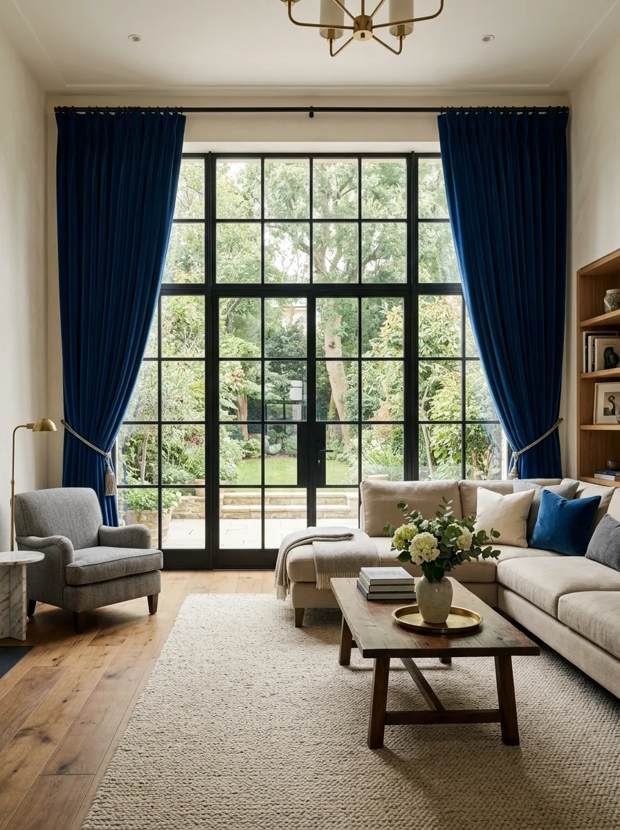
Install black steel-framed windows or French doors as the room’s architectural centerpiece, and hang floor-to-ceiling navy velvet curtains on either side, pulled back to fully expose the glass during the day. The curtains should be dramatically oversized relative to the window itself.
Keep the furniture in soft, neutral linen so the steel windows and navy drapery remain the only saturated elements in the room.
Add a reclaimed wood coffee table with visible grain and imperfections to warm up all that black metal, and let a jute or wool rug in a matching neutral tone stay quiet underfoot.
Circular Blue Swivel Chairs
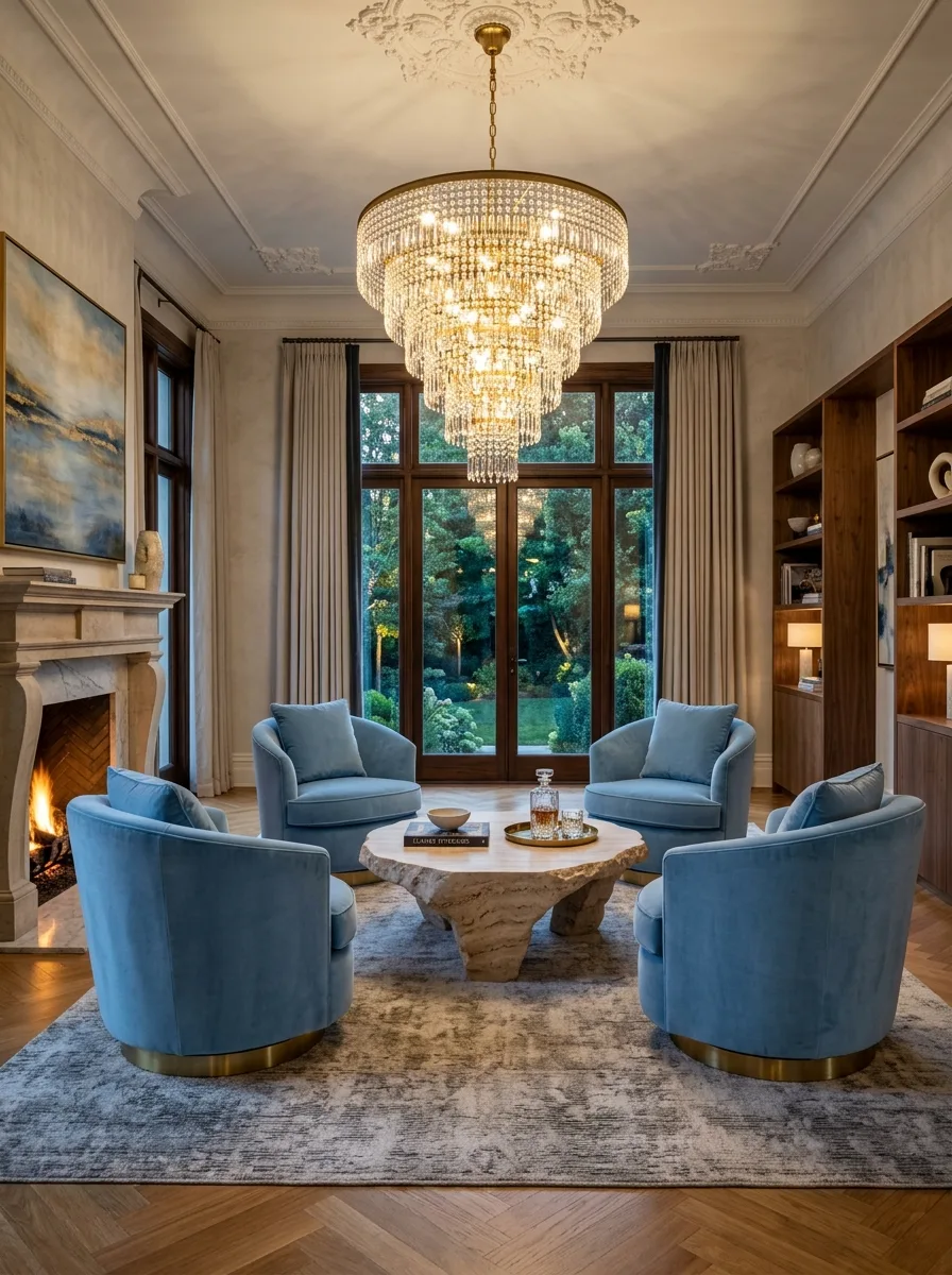
Arrange four powder blue swivel chairs in a tight circle around a raw, organically shaped stone coffee table, rather than a traditional sofa-and-chairs layout facing a single direction. The circular arrangement signals conversation over television-watching.
Hang an oversized, multi-tiered crystal chandelier directly above the circle, sized generously enough to feel like the room’s true centerpiece rather than an afterthought.
Keep the walls a soft, warm neutral so the blue chairs read as the room’s clear color statement, and add a traditional marble fireplace nearby with a stack of firewood left visibly in place.
Navy Trim Cream Walls
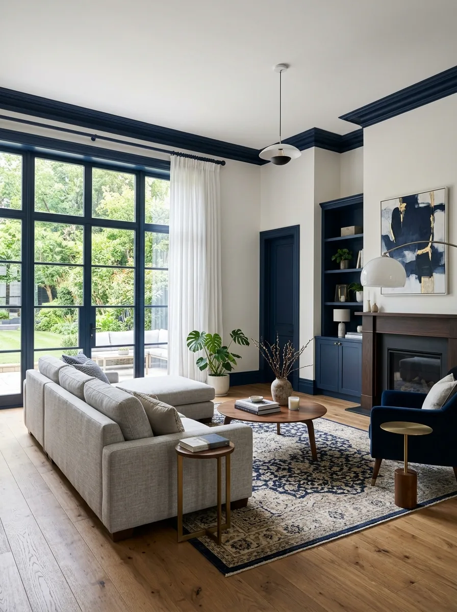
Paint all trim, millwork, and built-in cabinetry in a deep navy while leaving the wall fields themselves a warm cream. This inversion of the usual white-trim convention is what gives the room its distinct, considered character.
Choose floor-to-ceiling black steel windows and doors to match the weight of the navy trim, and hang sheer white curtains that let maximum light through while still framing the windows.
Add one abstract painting in navy and gold tones above the fireplace to echo the trim color, and keep the furniture itself in soft neutral tones with a single navy accent chair as the room’s other clear color note.
Final Thoughts
Every one of these twenty rooms made a different bet about how much blue to use, and where to put it, and every single one of those bets paid off because it was actually a decision rather than a default.
That’s the real difference between these rooms and the beige living room down the street. It’s not that blue is inherently more sophisticated than neutral. It’s that choosing blue forces a level of intentionality that beige lets you skip entirely.
Cold rooms aren’t cold because of their color. They’re cold because nobody finished the thought — no warm metal, no textured wood, no lamp light to counter the paint. Blue was never the risk. An unfinished room always was.
Pick your undertone, decide your percentage, and commit the way every room on this list did.