
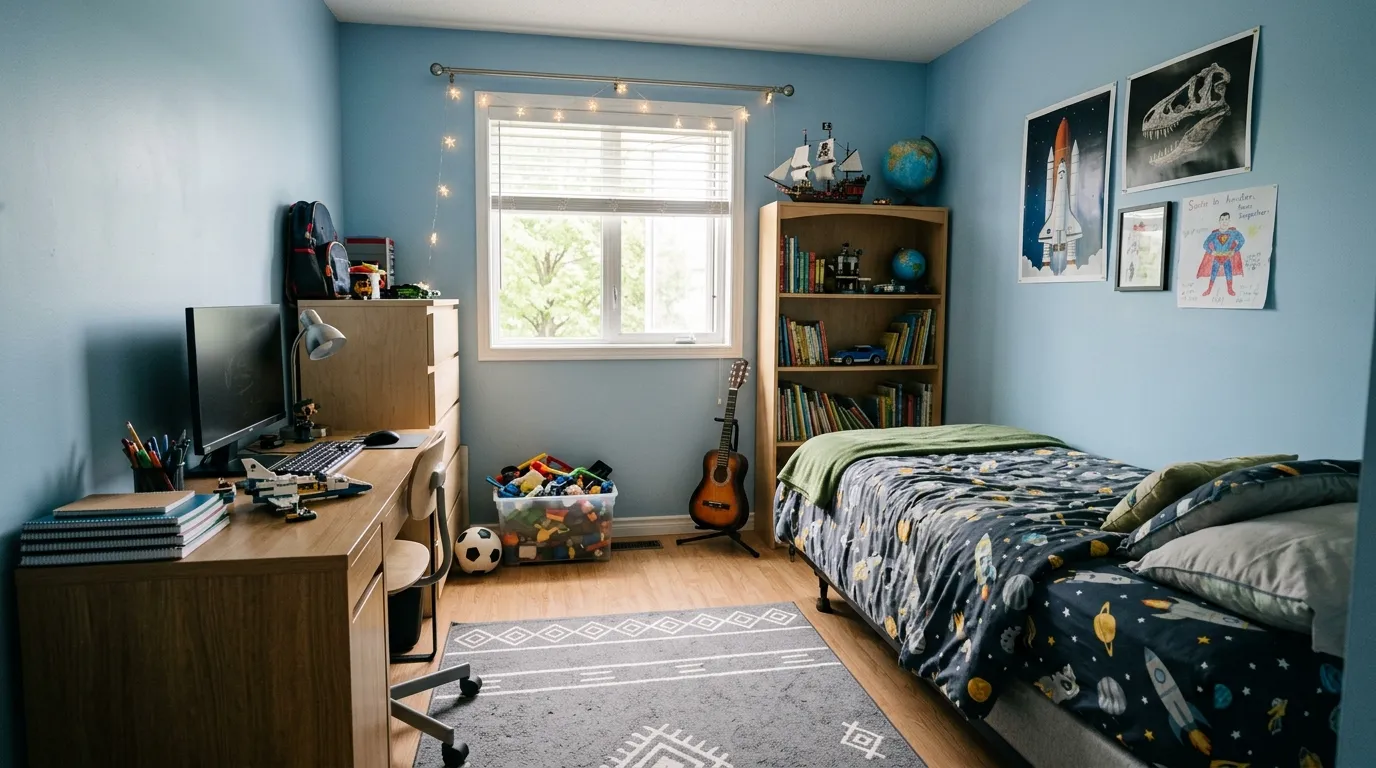
Somewhere along the way, boys bedrooms got assigned one color and nobody questioned it. Blue walls, blue bedding, maybe a truck on the curtains. Done.
That’s not a color scheme. That’s a default setting nobody bothered to change.
The rooms worth copying treat color as a decision with actual reasoning behind it — mood, age, how the light hits the walls at 7am, whether this kid is nine or nineteen. None of that gets solved by defaulting to navy and calling it a day.
Why Most Boys Rooms Get the Color Wrong
One Shade Gets Stretched Too Far
Walls, bedding, rug, curtains, all the same blue. It reads as safe rather than intentional, and safe is forgettable.
Color needs a partner to look deliberate. A single dominant hue paired with one or two supporting tones does more work than that same hue repeated on every surface in the room.
The rooms that succeed here almost always pick a dominant color and then commit a smaller, sharper dose of a second color against it — not five different blues pretending to be a palette.
The Room Doesn’t Account for Age
A color scheme built for a six-year-old and a color scheme built for a fourteen-year-old are not the same project, but plenty of rooms try to serve both with primary-color bedding and hope.
Saturated, playful color works for younger kids. Older boys generally want depth — charcoal, forest green, navy, rust — colors that read more like an adult’s intentional choice than a nursery holdover.
Building a room that can’t grow with the kid means repainting in three years. Building one pitched at the right age from the start saves that trouble entirely.
Dark Color Gets Treated as Risky Instead of Cozy
Parents avoid dark walls in a kid’s room out of instinct, assuming it’ll feel like a cave. Done with the right lighting, dark color does the opposite — it makes a room feel grounded and calm rather than gloomy.
The trick is layering in warm light sources instead of relying on one overhead fixture. Sconces, table lamps, even LED strip lighting tucked behind a headboard all soften a dark wall considerably.
Skip that layering and yes, the room reads flat and heavy. Add it, and dark walls become the coziest option in this entire list.
Boys Bedroom Color Ideas
Black Walls With a Warm Brick Accent
Paint the walls and ceiling a deep matte black, then let one exposed brick wall stay in its natural warm tone as the room’s only break from the dark palette, uplit from below with small recessed fixtures to bring out its texture.
Layer in brown and rust bedding rather than anything stark white, so the transition from black wall to bedding stays tonally warm instead of jarring. A low platform bed keeps the whole room feeling grounded rather than towering.
Add a single warm-toned floor lamp and a fiddle leaf fig in the corner for a touch of green against all that black and brick. This is a scheme built for a teenager, not a toddler — commit to that audience and don’t soften it with playful accents.
Charcoal Plaster Walls With Warm Wood Furniture
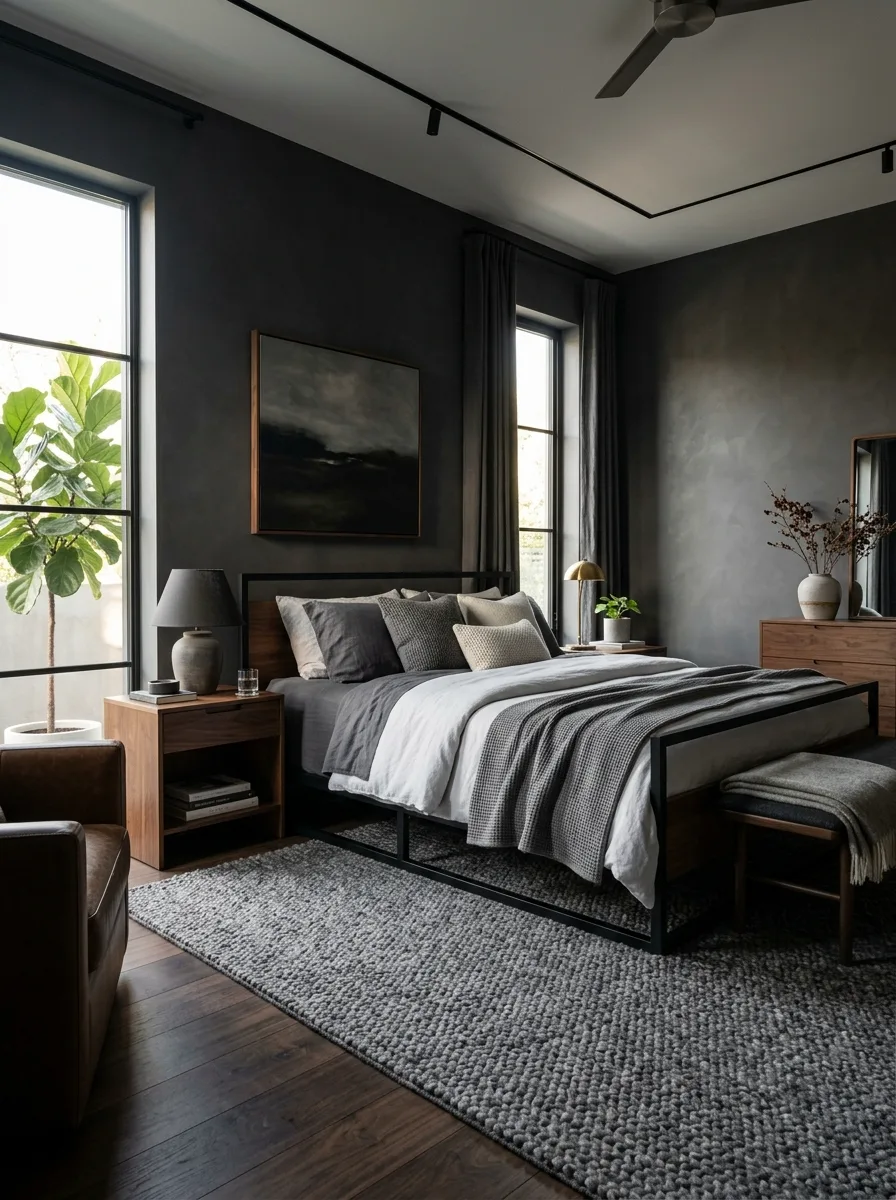
Finish the walls in a textured charcoal plaster rather than flat paint, letting the subtle texture catch light differently throughout the day and keep the dark color from feeling one-dimensional.
Pair the dark walls with warm walnut furniture — a nightstand, a dresser — so the wood tone breaks up all that grey with something the eye can warm up to. A leather armchair in the corner adds another warm material against the cool plaster.
Add sculptural ceramic lamps in a soft grey-green and a large fiddle leaf fig for a living, textural element. This is a scheme for a teenager who wants a room that feels moody and considered rather than childish, without going full black-out.
Color-Blocked Geometric Wall Mural
Commission or hand-paint a large-scale geometric mural across one wall, mixing navy, mustard yellow, teal, and white in bold interlocking shapes, then let it act as the room’s entire personality statement.
Keep everything else in the room simple and solid-colored — plain white bed frames, solid navy and mustard bedding, a striped rug that echoes the mural’s palette without competing with its shapes. The mural needs breathing room to read clearly.
Add open wood shelving on either side to display books and toys in matching tones. This look is bold enough to carry a shared kids’ room and flexible enough to keep working as the toy collection changes over time.
Matte Black Accent Wall With Light Oak
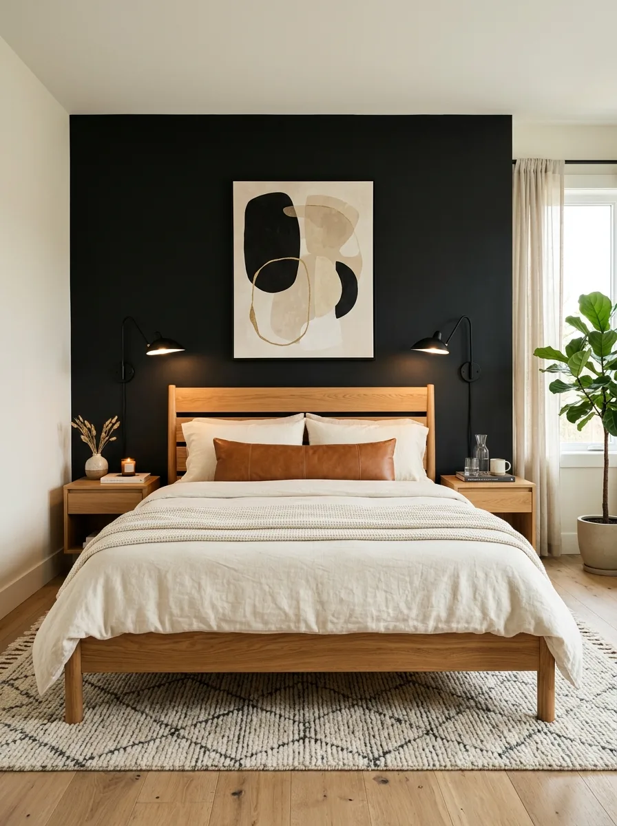
Paint a single wall matte black and leave the remaining three walls white, so the dark color reads as a deliberate accent rather than an attempt to darken the whole room.
Choose a light oak bed frame to sit directly against the black wall — the contrast between the pale wood and the dark paint is what makes this combination work as well as it does. Black wall-mounted swing-arm lamps on either side of the headboard continue the accent color in a smaller dose.
Add a warm leather lumbar pillow and a large potted plant in the corner to keep the room from feeling too stark. This is one of the easiest bold looks to execute in a rental, since only one wall requires paint.
Navy and Cream Stripe With Brass Accents
Wallpaper the room in a crisp navy and cream vertical stripe, then anchor two matching canopy-style beds against it in a solid navy-painted wood frame, so the stripe reads as backdrop rather than competing pattern.
Add brass wall-mounted reading sconces above each headboard and a slim wood nightstand with a woven leather shelf between the beds. Brass hardware throughout — on the nightstand pulls, the light fixtures — keeps the whole scheme feeling classic rather than nautical-cliché.
Finish with cognac leather ottomans at the foot of each bed for a warm material break from all that navy and cream. This palette works especially well in a shared room where symmetry is part of the design.
Mustard Yellow Accent Wall With Graphic Rug
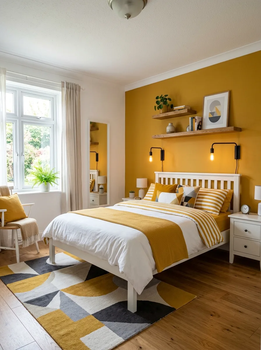
Paint one wall a bold, saturated mustard yellow and keep the remaining walls crisp white, letting the accent wall carry the room’s entire color statement on its own.
Choose a simple white bed frame so nothing competes with the yellow, then add a geometric black, white, and mustard rug underfoot to echo the wall color at floor level. Yellow and white striped bedding ties the two ends of the room together.
Keep hardware in matte black throughout — lamps, clock, accents — for definition against all that warm yellow. This is a genuinely cheerful scheme without tipping into anything overly juvenile, which makes it a good pick for a room that needs to still feel fun at age ten, not just age five.
Grey Walls With a Neon Orange Accent Piece
Paint the walls a cool mid-grey, then introduce one genuinely bold accent — a neon orange open shelving unit doubling as a coat rack — as the room’s single loud color statement against an otherwise muted backdrop.
Echo that orange in a checkerboard shag rug and a few graphic throw pillows on the bed, but keep the bedding itself in black, white, and warm rust tones so the neon piece stays the focal point rather than getting lost.
Pick a black wire arch headboard to keep the room’s frame elements dark and graphic, matching the black-and-white abstract art above the bed. This is the move for a room that needs to feel like the kid’s own space, loud in exactly one spot and calm everywhere else.
Hunter Green Paneling With Brass and Ivory
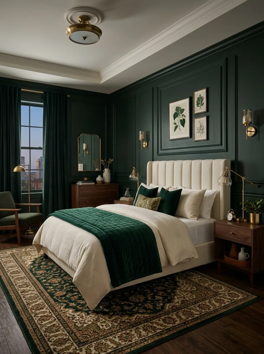
Paint full wall paneling in a deep hunter green with raised trim detail, then anchor it against a channel-tufted ivory boucle headboard so the room’s two main colors sit in high, formal contrast.
Add brass wall sconces and a brass flush-mount ceiling fixture to warm up the green, plus a traditional patterned rug in cream, green, and rust that pulls every color in the room together underfoot. Walnut furniture throughout keeps the wood tone consistent.
This is a formal, almost hotel-suite palette, best suited to an older teenager who wants a room that reads sophisticated rather than sporty. It’s a significant paint and furniture commitment, so it works best as a room meant to last well into adulthood.
Dusty Blue Plaid With Warm Wood Tones
Wallpaper the room in a soft dusty blue plaid, then pair it with a tan gingham upholstered headboard so two different checked patterns share the wall without clashing, since they’re kept in the same muted color family.
Add a brass four-light chandelier and matching blue-painted nightstands with brass pulls to warm up the cool wall color. Keep the bedding in a mix of solid dusty blue and white rather than adding a third pattern into the mix.
This palette works especially well for a younger boy’s room that still needs to feel sophisticated enough not to repaint in two years — the plaid does the personality work while the color palette itself stays quiet and adult.
Olive Wainscoting With Plaid Wallpaper
Paint a wainscoting panel in a deep olive green up to chair-rail height, then let a subtle plaid wallpaper take over above it in cream and grey, so the room gets two textures in one restrained color family.
Choose black spindle bed frames to anchor the scheme in something darker than the walls, paired with warm brown leather lumbar pillows and sage green striped ones for a palette that reads outdoorsy without tipping into full hunting-lodge cliché.
Add black wall-mounted swing-arm lamps in an antique brass finish for reading light. This combination — olive, cream plaid, black frames, leather accents — ages extremely well from elementary school through the teenage years.
Sage and Cream Color-Blocked Wall
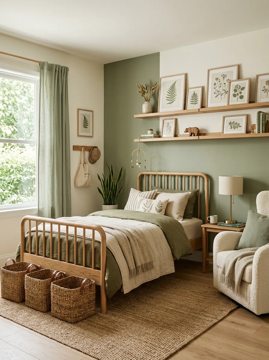
Paint one section of the wall sage green and the adjoining section cream, letting the two colors meet in a hard vertical line rather than blending, so the color block itself becomes the room’s main graphic element.
Hang a grid of small botanical prints across both color zones to visually stitch the two halves together, then choose a natural oak spindle bed frame so the wood tone reads neutral against either wall color.
Add woven jute baskets and a boucle accent chair in cream for texture without introducing a third color. This scheme is particularly good for a nature-loving younger kid — it reads fresh and organic without relying on cartoon motifs to get there.
Deep Forest Green With Rustic Wood Accents
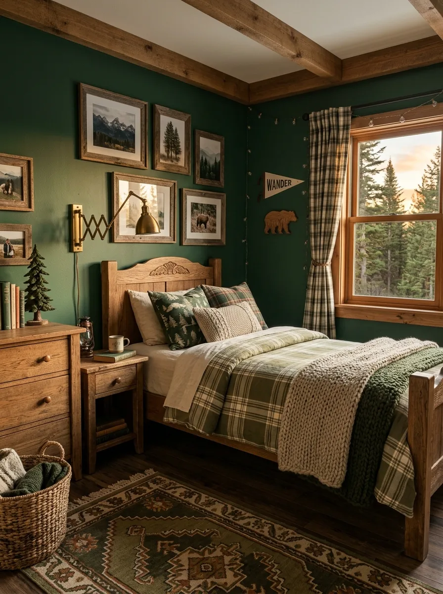
Paint the walls a rich forest green and lean all the way into it — dark enough to feel like a cabin at dusk, warmed up by exposed wood ceiling beams and a solid wood bed frame in a matching rustic finish.
Layer in plaid bedding in green, cream, and rust, plus a vintage-style patterned rug in the same warm tones, so the green wall doesn’t feel isolated from the rest of the room’s palette.
Add a brass extendable wall lamp and a scattering of nature-themed wall art — mountains, trees, wildlife — to lean into the cabin mood fully. This is a full-commitment scheme; a halfway version with pale green and no wood warmth won’t land the same way.
Coastal Blue With Woven Natural Textures
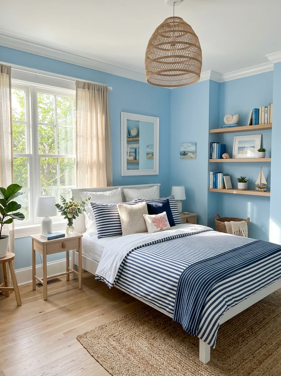
Paint the walls a clear, medium coastal blue, then balance the saturation with plenty of natural wood tones — a light oak bed frame, a woven rattan pendant light, jute rugs underfoot.
Choose navy and white striped bedding as the room’s main pattern, keeping every other textile solid or simply textured so the stripe doesn’t have to compete with a second pattern. A scattering of nautical objects on open shelving — a small sailboat, shells, a coral-toned pillow — finishes the theme without tipping into costume territory.
This palette is bright and family-friendly rather than moody, and it works particularly well in a room with strong natural light, since the blue can handle that brightness without washing out.
Warm Greige With Black Hardware Accents
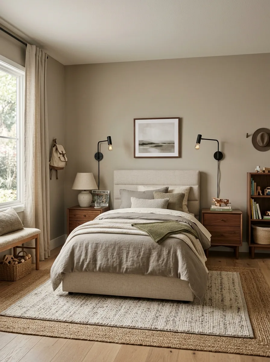
Paint the walls a warm greige that sits between beige and grey, then keep every metal fixture — wall sconces, lamp hardware — in a consistent matte black to add definition against the soft wall color.
Choose a linen upholstered headboard in a slightly lighter neutral than the walls, so the bed reads as a soft focal point rather than disappearing into the backdrop. Walnut nightstands add warmth without introducing a new color into the mix.
This is the scheme to copy if you want a room that reads calm and grown-up immediately, with no risk of looking dated in five years. Neutral doesn’t have to mean boring when the layering is this considered.
Soft Blue With a Built-In Window Seat
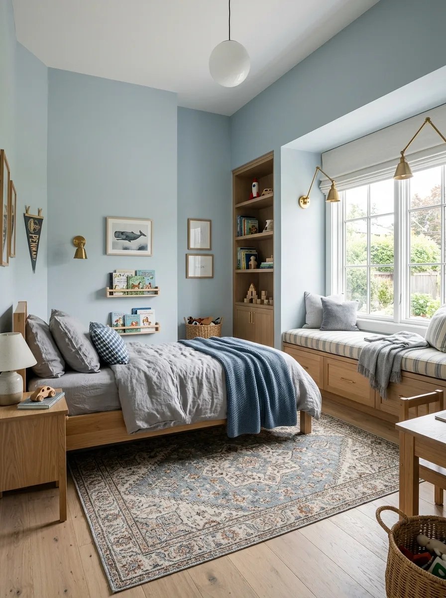
Paint the walls a pale, chalky blue and extend the color across a built-in window seat and bookshelf nook, so the color wraps the whole reading corner rather than stopping at a single flat wall.
Add brass wall-mounted lamps above the window seat cushions and keep the bedding in soft greys and blues with one graphic check throw blanket for texture. A vintage-patterned rug in matching blue tones grounds the room without introducing a competing color.
This palette suits a slightly older kid who’s outgrown a nursery-blue room but isn’t ready for anything too dark yet — it’s a bridge color, sophisticated enough to last several years past the whale prints on the wall.
Warm Tan With Woven Natural Textures
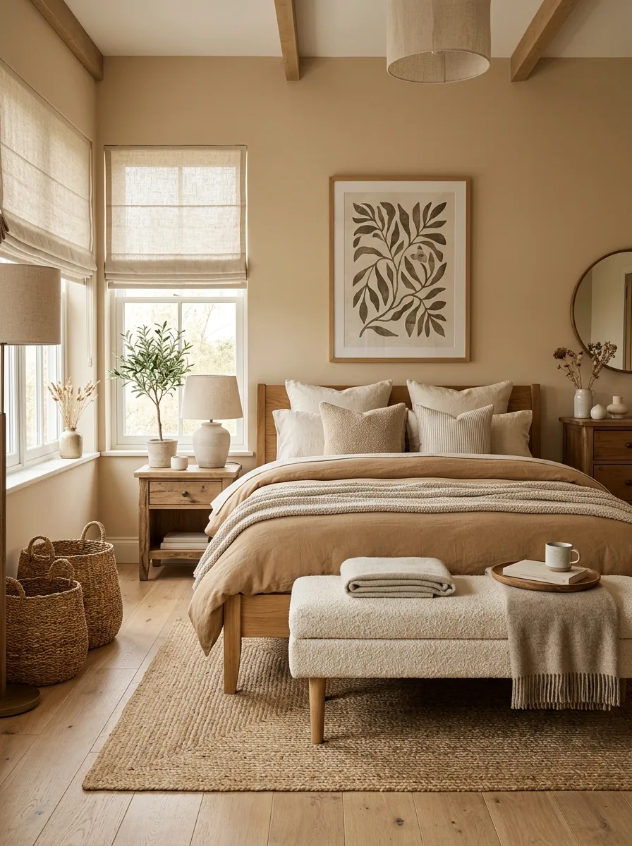
Paint the walls a warm, sandy tan and lean fully into natural materials — a light oak bed frame, woven rattan lamp shades, chunky jute baskets on the floor, a linen roman shade at the window.
Keep the bedding in layered neutral tones, camel and cream and warm white, rather than introducing any bright accent color. A single botanical print above the bed and a scattering of dried pampas grass are the only decorative flourishes this room needs.
This is the lowest-risk palette on the whole list, warm enough to feel inviting and neutral enough to grow with a kid from single digits into his teenage years without a single repaint.
Denim Blue With Graphic Black Accents
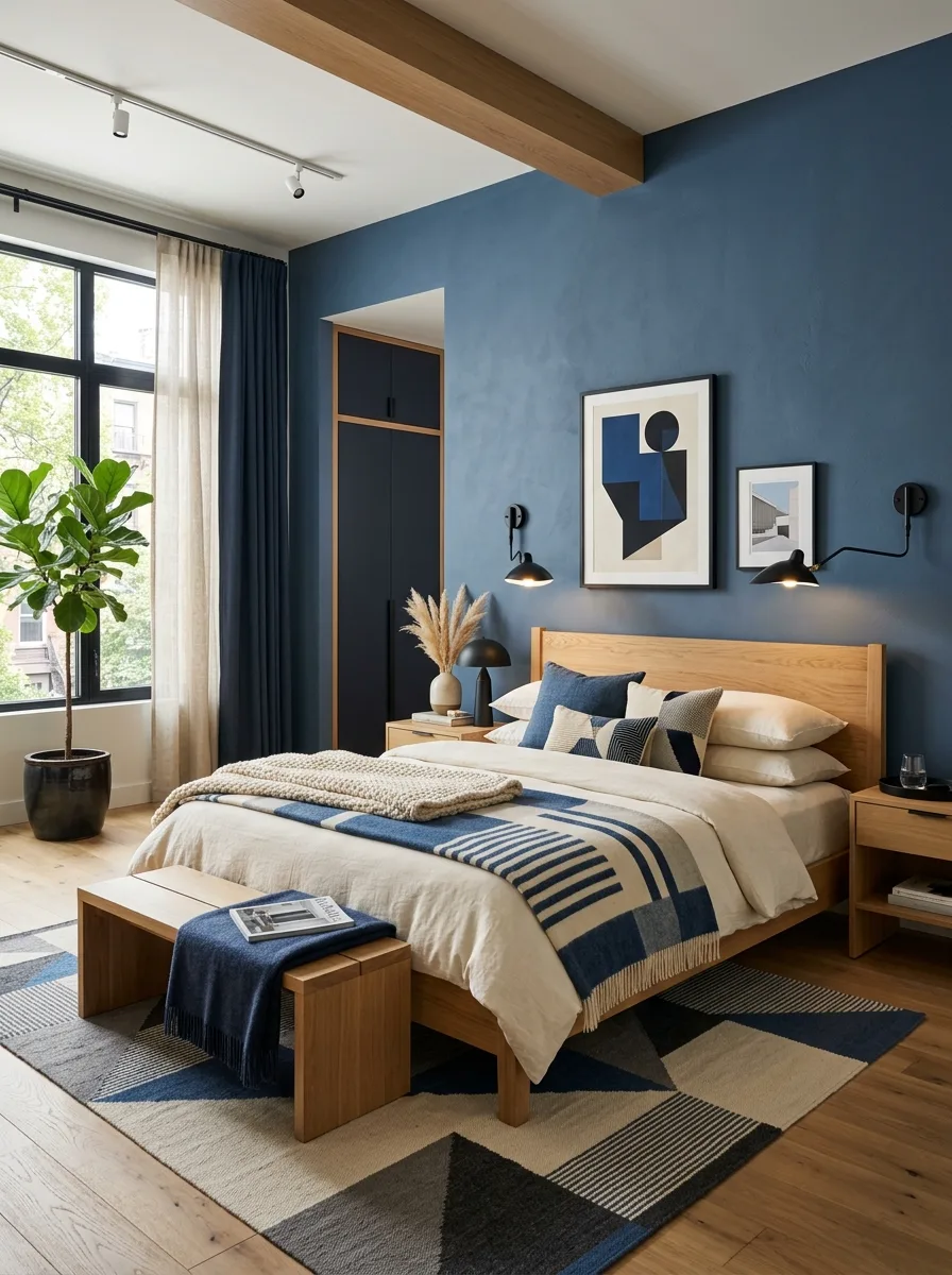
Paint the walls a deep, slightly dusty denim blue and pair it with a matte black built-in wardrobe, so the room’s two dominant colors sit in clear, confident contrast rather than blending into each other.
Choose a warm oak bed frame to soften the blue-and-black pairing with a third, lighter material, then layer in a geometric rug mixing navy, cream, and charcoal to tie the palette together at floor level.
Add black swing-arm wall lamps and abstract graphic art in matching blues and blacks. This scheme reads modern and slightly architectural — a strong pick for a teenager who wants something that looks more like a boutique hotel room than a kid’s bedroom.
Warm Mocha With Integrated Ambient Lighting
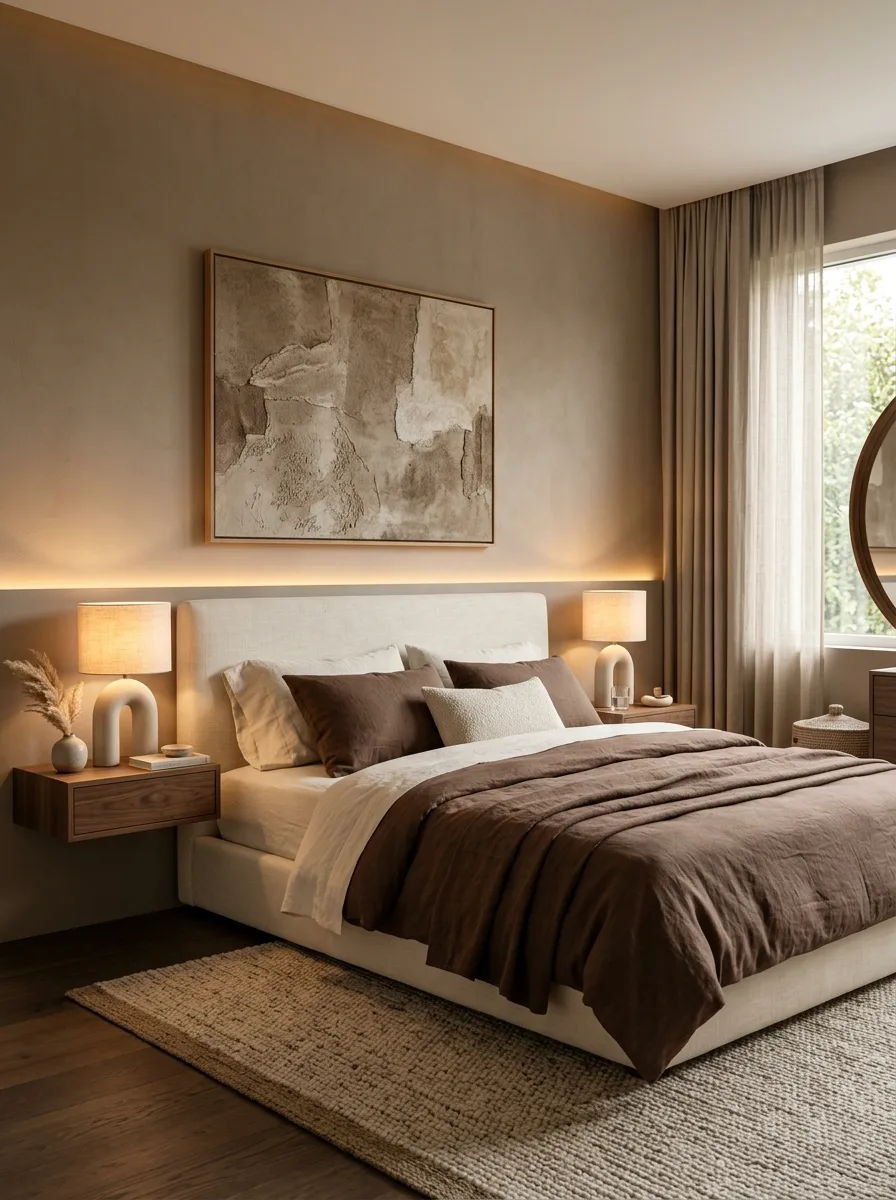
Paint the walls a warm mocha brown and run a hidden LED light strip along the wall behind the headboard, so the color gets a soft glow at night rather than relying entirely on lamps.
Pair the wall color with a cream upholstered bed frame and brown linen bedding, so the palette stays in one warm tonal family from wall to headboard to duvet. Arch-shaped ceramic table lamps on floating walnut nightstands add a sculptural note without introducing a new color.
This is a spa-like, adult-leaning palette best suited to an older teen’s room, especially one where the LED strip lighting doubles as a low, calming night light. The warmth of the brown keeps it from ever feeling like a hotel-generic neutral.
Navy Shiplap With a Built-In Study Nook
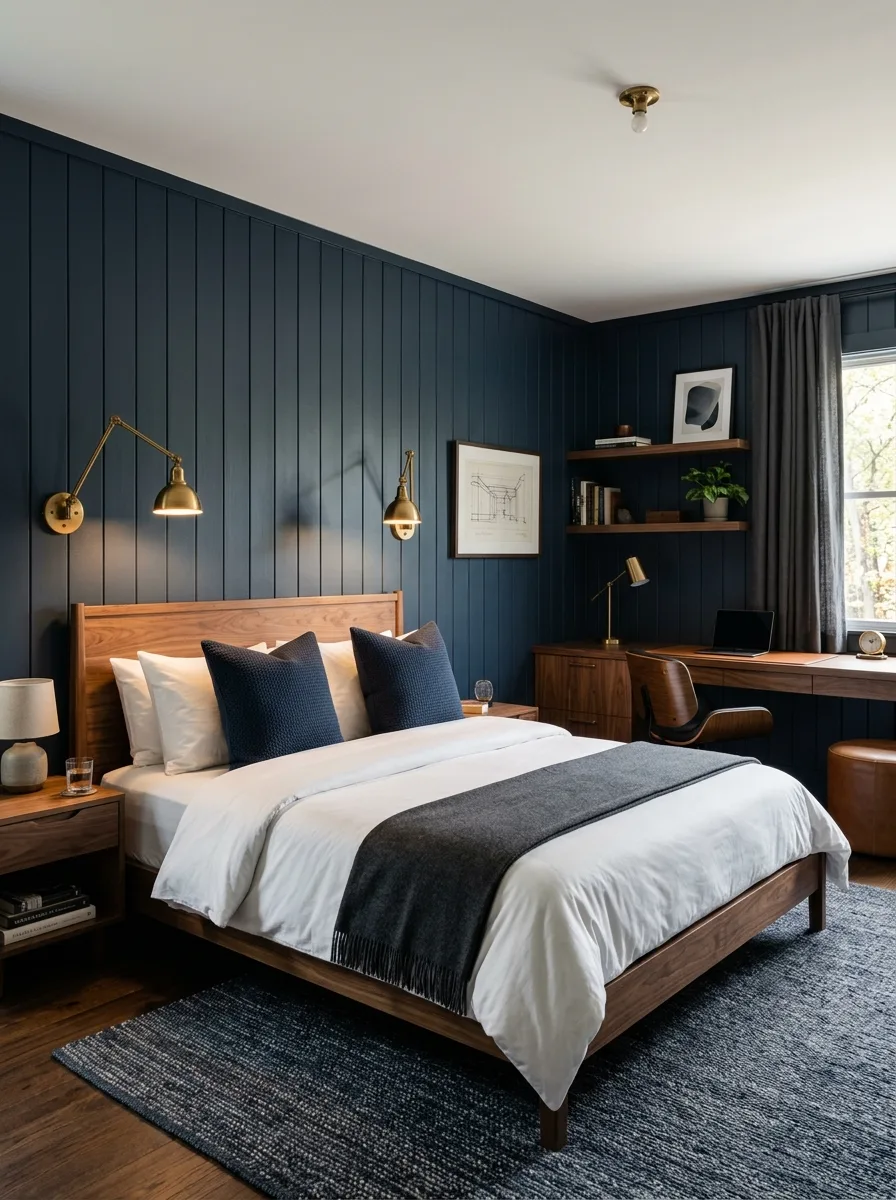
Paint vertical shiplap paneling in a deep navy across the entire wall, extending the color into a built-in desk nook so the study area and the sleeping area share one continuous color story.
Choose a warm walnut bed frame and desk to break up all that navy with wood tone, then add brass swing-arm reading lamps for warmth against the cool wall color. A charcoal woven rug and simple white bedding keep the rest of the palette quiet.
This is a strong pick for an older boy who needs a dedicated homework space within the bedroom — the navy ties the two zones together so the desk doesn’t feel like a separate, bolted-on afterthought.
Final Thoughts
The best of these rooms never treated color as decoration slapped on at the end. It was the first decision, and everything else — the wood tone, the metal finish, the pattern on the rug — got chosen to support it.
That’s really the whole difference between a boys room that feels intentional and one that feels like whatever was on sale at the home store. Color first, everything else in service of it.
Age matters more than most people plan for going in. A palette picked for a six-year-old rarely survives contact with a fourteen-year-old, so building in some room to grow, or being honest that a repaint is coming, saves a lot of frustration down the line.
None of these twenty rooms needed a theme to feel like a kid’s room. They needed a color decision made with actual conviction, and a handful of materials chosen to back it up.