
Somebody told you pink wouldn’t resell.
Maybe it was a real estate agent, maybe it was your mother, maybe it was a contractor who’d clearly never seen a kitchen outside of a model home. Whoever it was, they were working from a single, terrified shade of pink — the bubblegum one, the one that belongs in a child’s bedroom in 1998 — and they let that one shade ruin an entire color family for you.
Pink is not one color. It’s dozens, and most of them behave nothing like bubblegum. Dusty rose reads like a neutral. Terracotta-pink reads like Tuscany. Deep raspberry reads like a wine bar that knows exactly what it’s doing.
Twenty kitchens below never got talked out of it. None of them look like a nursery.
Pink Kitchen Ideas
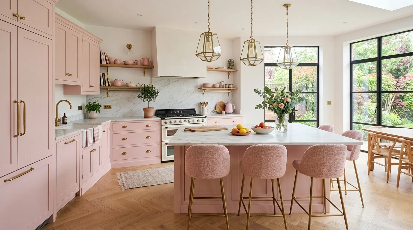
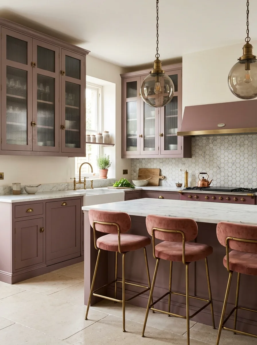
Dusty Rose Shaker Cabinets
Paint full shaker-style cabinetry in a muted, grayed-down dusty rose — not a true pink, something closer to clay with gray mixed in — across both upper and lower runs so the color reads as a backdrop neutral rather than a statement.
Pair it with classic white subway tile in a simple running-bond pattern. The contrast between the muted pink and crisp white tile is what keeps the cabinet color from tipping into anything precious.
Hang substantial brass pendant lighting, dome-shaped with a visible cord, directly over the island, and carry the same warm brass through the faucet and cabinet hardware. Brass is doing the work of making a soft pink feel grown-up instead of girlish.
Lay the floor in a herringbone pattern using a warm honey-toned wood. The directional pattern adds enough visual movement that the cabinet color can stay completely flat and quiet.
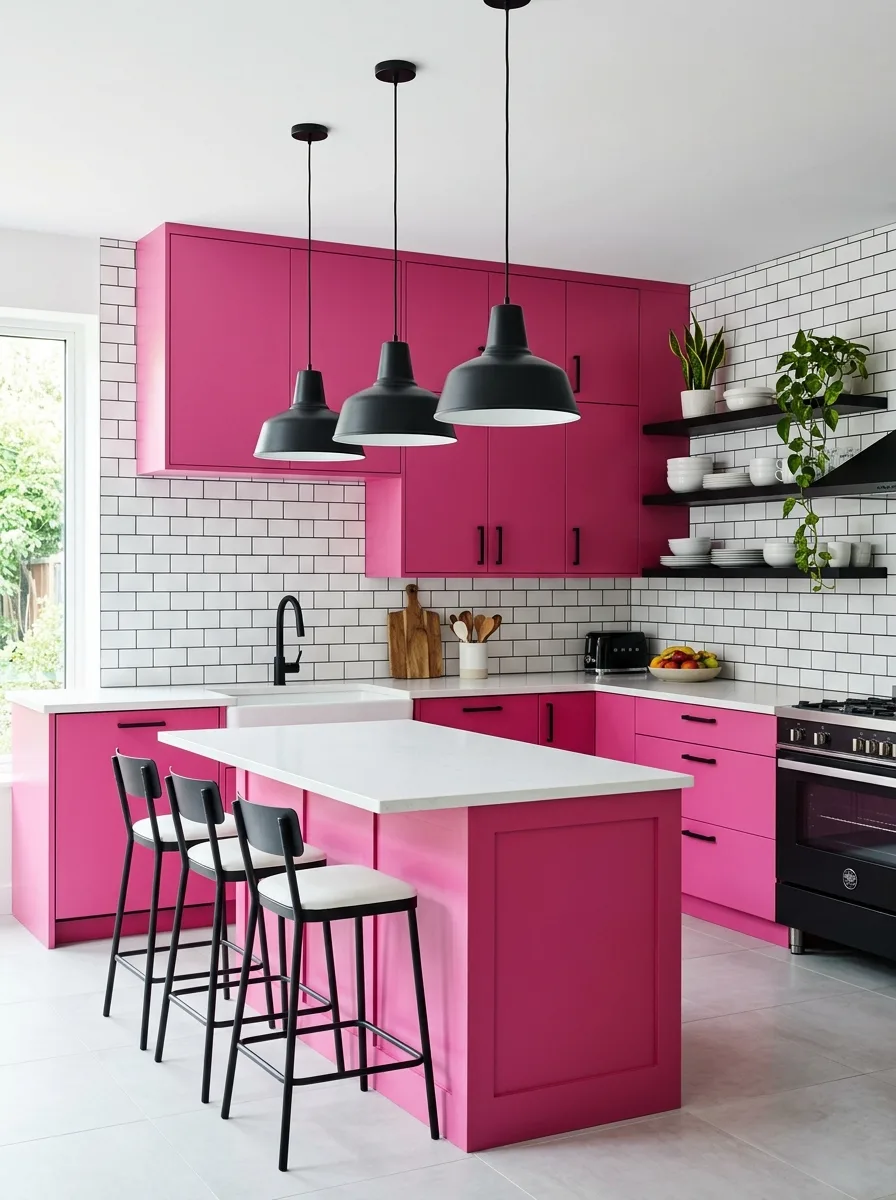
Magenta Cabinets Brass Domes
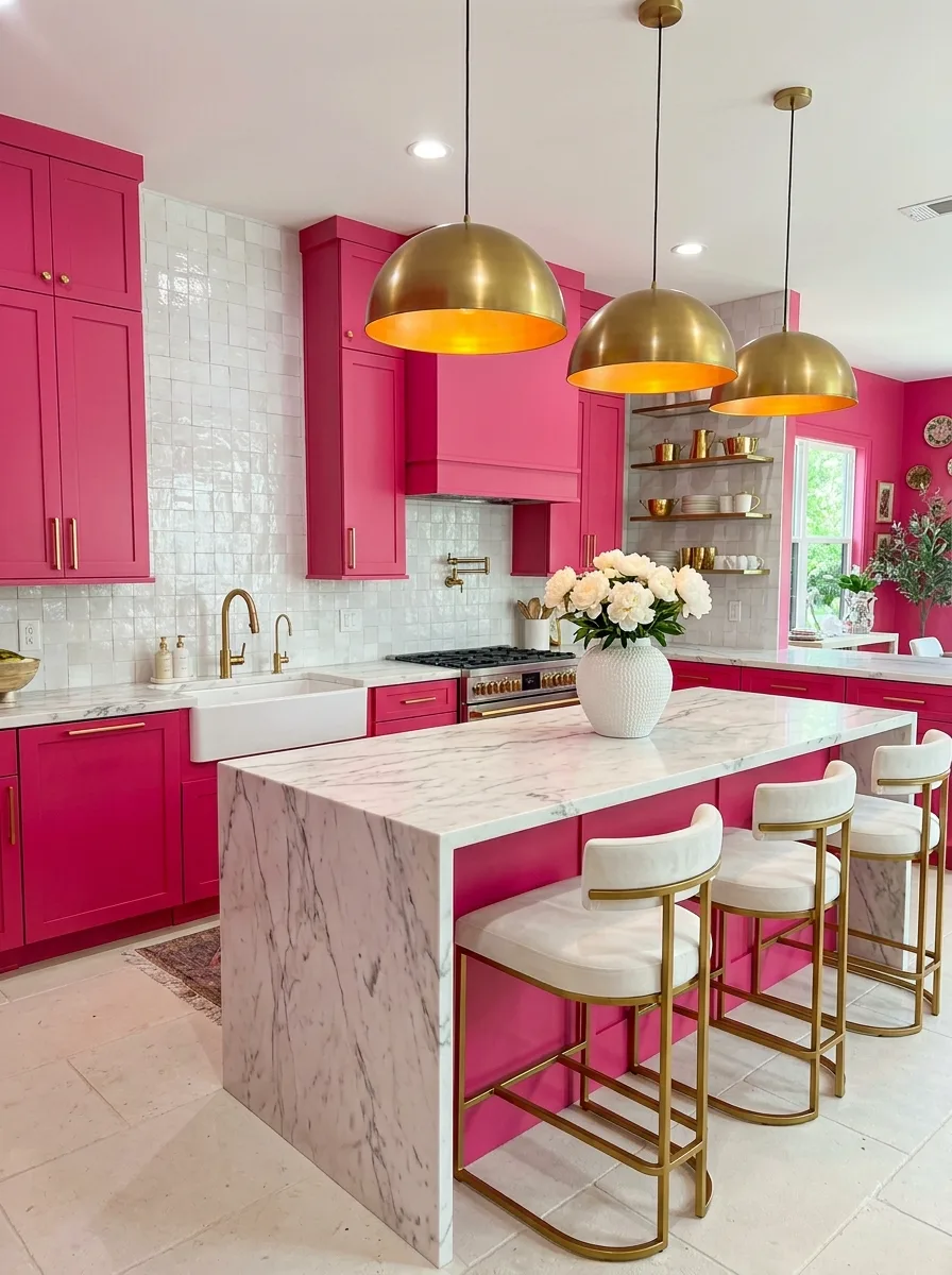
Choose a fully saturated magenta, not dusty, not muted, for every cabinet front in the room, upper and lower, with no breaks in color to soften it.
Back it with a textured white tile in a small square format, ideally a slightly irregular glazed finish rather than flat ceramic. The texture keeps the white from looking sterile next to a color this loud.
Install oversized brass dome pendants, the kind with real visual weight, directly over a waterfall marble island. The scale of the lighting needs to match the scale of the color commitment, or the room will feel unbalanced.
Keep the floor in a pale, warm stone with minimal veining. A patterned or dark floor on top of magenta cabinets and brass lighting is one decision too many; this room needs exactly one neutral surface to rest on.
Fluted Blush Pink Cabinets
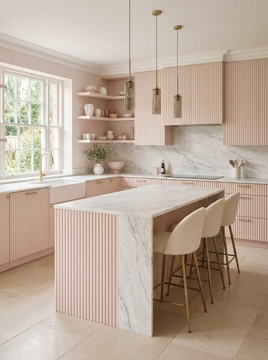
Specify fluted or reeded cabinet fronts rather than flat slab doors, in a pale, warm blush. The vertical grooves catch shadow all day, which gives a pale color the depth it would otherwise be missing entirely.
Run a full slab of veined white marble up the backsplash wall behind the range, treating it as a single dramatic gesture rather than breaking it into smaller tiled sections.
Choose slim brass hardware and a brass faucet, finer and more delicate than you’d use with a bolder pink. A pale, fluted finish wants understated metal, not anything chunky enough to compete with the texture already built into the cabinet fronts.
Furnish with boucle-upholstered stools in cream rather than a patterned or colored fabric. The fluting and the marble are already providing texture; the seating needs to stay quiet.
Raspberry Cabinets Black Industrial
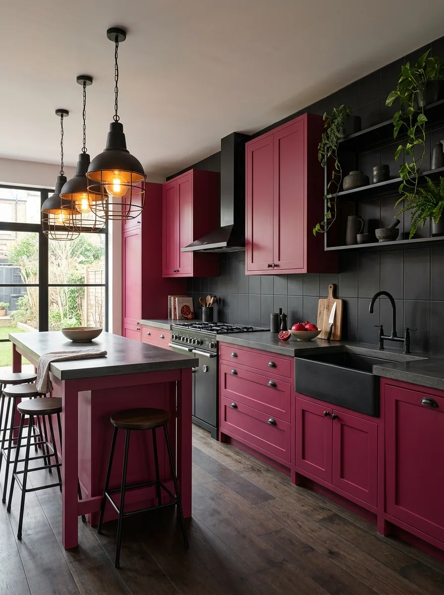
Pick a deep, almost wine-toned raspberry for the cabinetry, dark enough that it reads as a moody neutral rather than a pastel. This shade only works at full saturation; a lighter version of the same hue loses the entire effect.
Tile the backsplash wall in matte black, floor to cabinet, in a simple square format. The black absorbs light rather than reflecting it, which is what lets the raspberry cabinets read as the brightest thing in the room despite being a dark color themselves.
Hang black industrial cage pendants with exposed bulbs over the island, and finish all hardware in matte black rather than brass. Warm metal here would soften a look that’s supposed to stay sharp and a little moody.
Top the island in poured concrete instead of stone. The slightly imperfect, matte surface keeps the whole room feeling worked rather than precious, which is the entire point of pairing a rich color like this with industrial materials.
Blush Pink Shiplap Ceiling
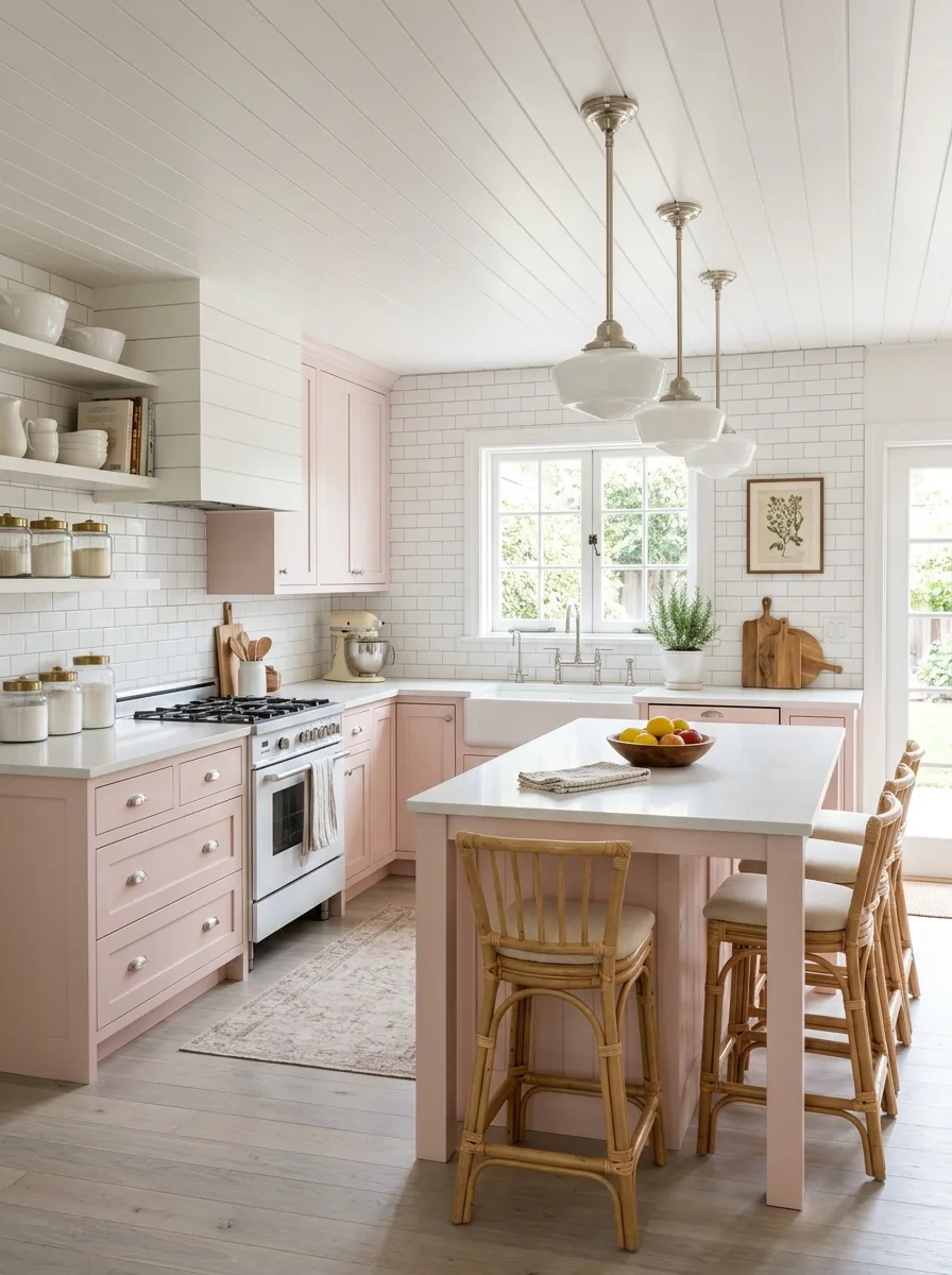
Paint lower cabinetry in a soft, cottage-friendly blush, and leave the upper walls and ceiling in crisp white shiplap. Letting the ceiling carry texture instead of color is what keeps a pale pink kitchen from feeling flat overhead.
Run white subway tile up the full backsplash in a classic grid, then continue a matching painted hood directly above the range in the same blush as the lower cabinets, tying the two pink elements together across the room.
Hang glass schoolhouse pendants in a warm nickel or brass finish, sized generously enough to anchor the ceiling now that it’s mostly white. Without strong lighting, an all-white ceiling this busy with shiplap lines can read as empty rather than architectural.
Finish the floor in pale, wide-board wood and keep the rug underfoot soft and faded rather than bold. This is a quiet, cottage-leaning pink, and every other surface needs to agree to stay soft with it.
Pink Navy Two-Tone Split
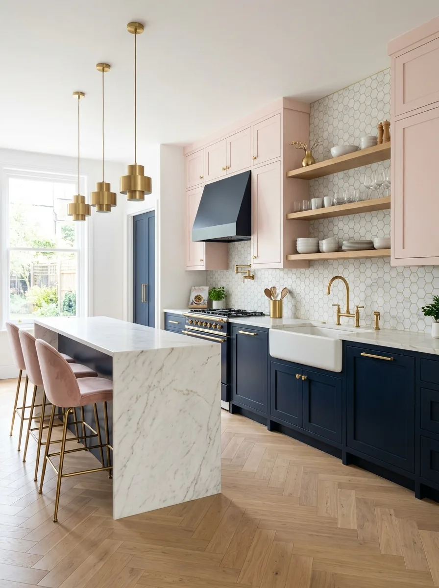
Split the cabinetry by height: pale pink on every upper cabinet, deep navy on every lower cabinet and the range hood. The horizontal break needs to happen at one consistent line around the entire room, not vary cabinet to cabinet.
Tile the backsplash in a small white hexagon, which gives the wall enough texture to bridge two such different colors without either one fighting for dominance.
Bring in brass for every fixture — faucet, hardware, pendant light — since brass is warm enough to flatter both the pink above and the navy below at once. A cooler metal like chrome would side with the navy and leave the pink looking stranded.
Upholster the island stools in dusty pink velvet rather than navy or a neutral. Pulling the upper cabinet color down into the seating is what makes the two-tone split feel like one cohesive idea instead of two kitchens stitched together.
Monochrome Peach Plaster Arch
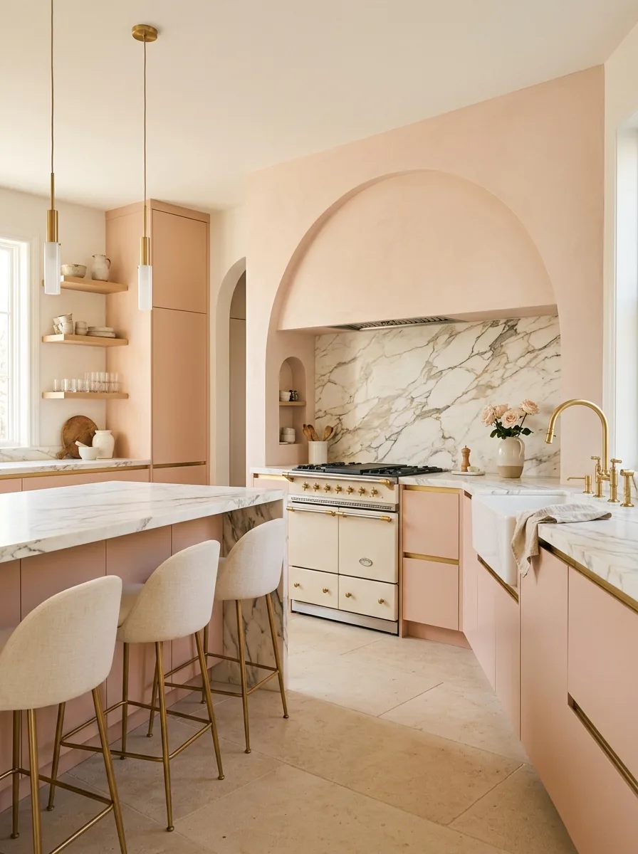
Commit to a single warm, peachy pink across literally every surface — cabinets, walls, and a plastered arched hood built directly into the wall above the range — so the entire room reads as one continuous material rather than cabinets sitting inside a differently colored box.
Have the arch hand-troweled in the same pink plaster as the walls, rather than installing a standard metal hood. The soft, rounded shape and the slightly textured finish are what keep a monochrome room from feeling flat or clinical.
Behind the range, run a single dramatic slab of veined marble rather than tile. It’s the one moment of pattern in an otherwise solid-color room, and it needs to read as a deliberate exception, not a competing decision.
Finish every fixture in brass and the floor in a warm, pale travertine. Monochrome rooms live or die on whether every remaining material agrees on warmth, and anything cooler than brass or a grayer stone would throw the whole palette off.
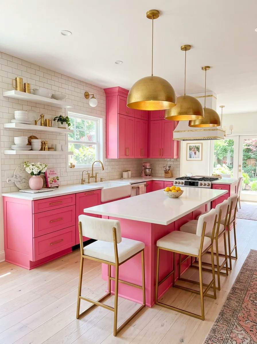
Fuchsia Cabinets Black Grout
Paint cabinetry in a clean, saturated fuchsia, brighter and cooler than a dusty rose, closer to true pink-purple, and keep the cabinet shape simple and flat-fronted so the color does all the talking.
Tile the backsplash in white subway, but grout it in black instead of white or gray. The black grout turns an ordinary tile into a graphic grid, which gives the wall enough presence to stand up to a cabinet color this loud.
Hang simple black dome pendants and use black hardware throughout, skipping brass or chrome entirely. A cooler, graphic black is what keeps this combination feeling modern rather than candy-colored.
Lay a large-format gray tile on the floor rather than anything patterned. The fuchsia and the black grid are already carrying the visual interest; the floor’s only job is to stay out of the way.
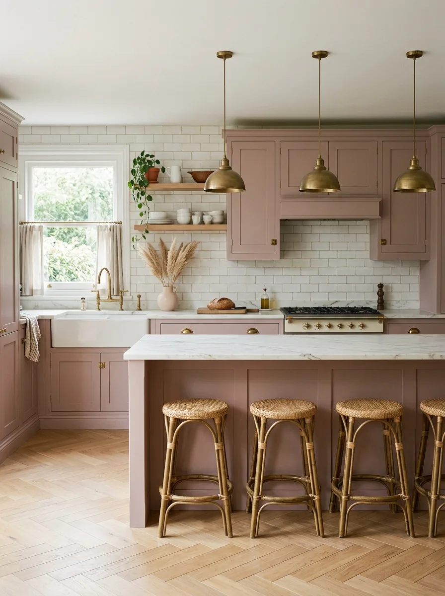
Terracotta Pink Plate Rack
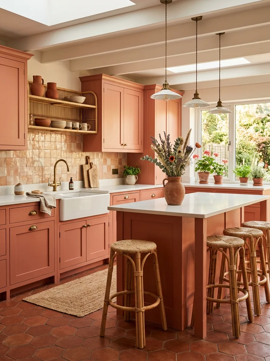
Choose a warm, earthy terracotta-pink rather than anything cool or dusty. This shade should read closer to clay or sunburnt brick than to true pink, and it should cover all cabinetry, including a built-in open shelving unit.
Install a woven rattan plate rack directly into the open shelving rather than flat wood shelves. The texture of the weave against the smooth painted cabinetry is what keeps this look from reading as a single flat block of color.
Tile the backsplash in a patchwork of small zellige squares in close, related warm tones — blush, rust, sand — rather than a single uniform color. The slight variation reads as sun-faded rather than mismatched.
Floor the room in terracotta tile to match the cabinet tone almost exactly, and let a skylight or large window flood the space with natural light. This palette depends on warm daylight to read as sunbaked rather than simply orange.
Blush Pink Black Trim
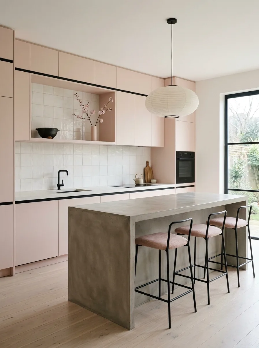
Specify flat, handle-less cabinet fronts in a pale, cool-toned blush, then run a thin black reveal line along the underside and edges of the upper cabinetry instead of traditional hardware.
The black line is doing more work than it looks like it should. It outlines the cabinetry the way a frame outlines a painting, which keeps a very pale, minimal pink from disappearing into the wall behind it.
Pair it with a poured concrete waterfall island and a single black pendant light, skipping brass or warm metal entirely. This is a cooler, more architectural take on pink, and warm metal would pull it back toward cottage territory.
Choose black-framed windows if the budget allows. The black trim, the black pendant, and the black window frames all need to repeat the same exact value of black, or the room starts to feel like several different ideas layered on top of each other.
Coral Pink Brass Island
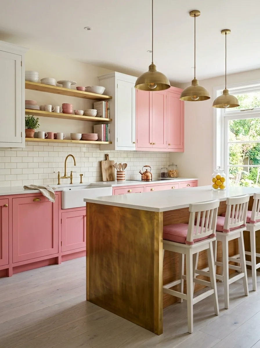
Paint only the lower cabinetry in a warm coral pink, leaving the upper cabinets a soft, creamy white. Splitting the palette this way keeps a saturated color from overwhelming a smaller kitchen.
Build the island in a different material entirely, an aged, slightly mottled brass panel rather than painted wood, so it reads as a piece of furniture set into the room rather than another cabinet run.
Run white subway tile behind the range, and install simple wood open shelving above the sink rather than more cabinetry. The wood tone bridges the cream uppers and the coral lowers without introducing a third color.
Fill a glass jar on the island with whole lemons rather than anything muted. A coral kitchen this warm can handle one genuinely bright pop of color on the counter without it reading as too much.
Mauve Reeded Glass Cabinets
Choose a deep, dusty mauve, closer to plum than to pink, for the full cabinet run, then specify reeded glass fronts on the upper cabinetry instead of solid wood doors.
The textured glass is the detail that elevates this from a simple painted kitchen to something that reads as custom millwork. It obscures the contents just enough to keep open shelving from looking cluttered, while still catching and refracting light all day.
Tile the backsplash in a small hexagon mosaic and finish the range, hood, and fixtures in brass, including a freestanding range with brass trim rather than a built-in cooktop. The warmth of the brass keeps a color this dark from feeling somber.
Upholster the island stools in a dusty pink velvet a few shades lighter than the cabinets, rather than matching them exactly. The slight contrast between the two related tones is what makes the room feel layered instead of monochrome.
Rose Gold Metallic Kitchen
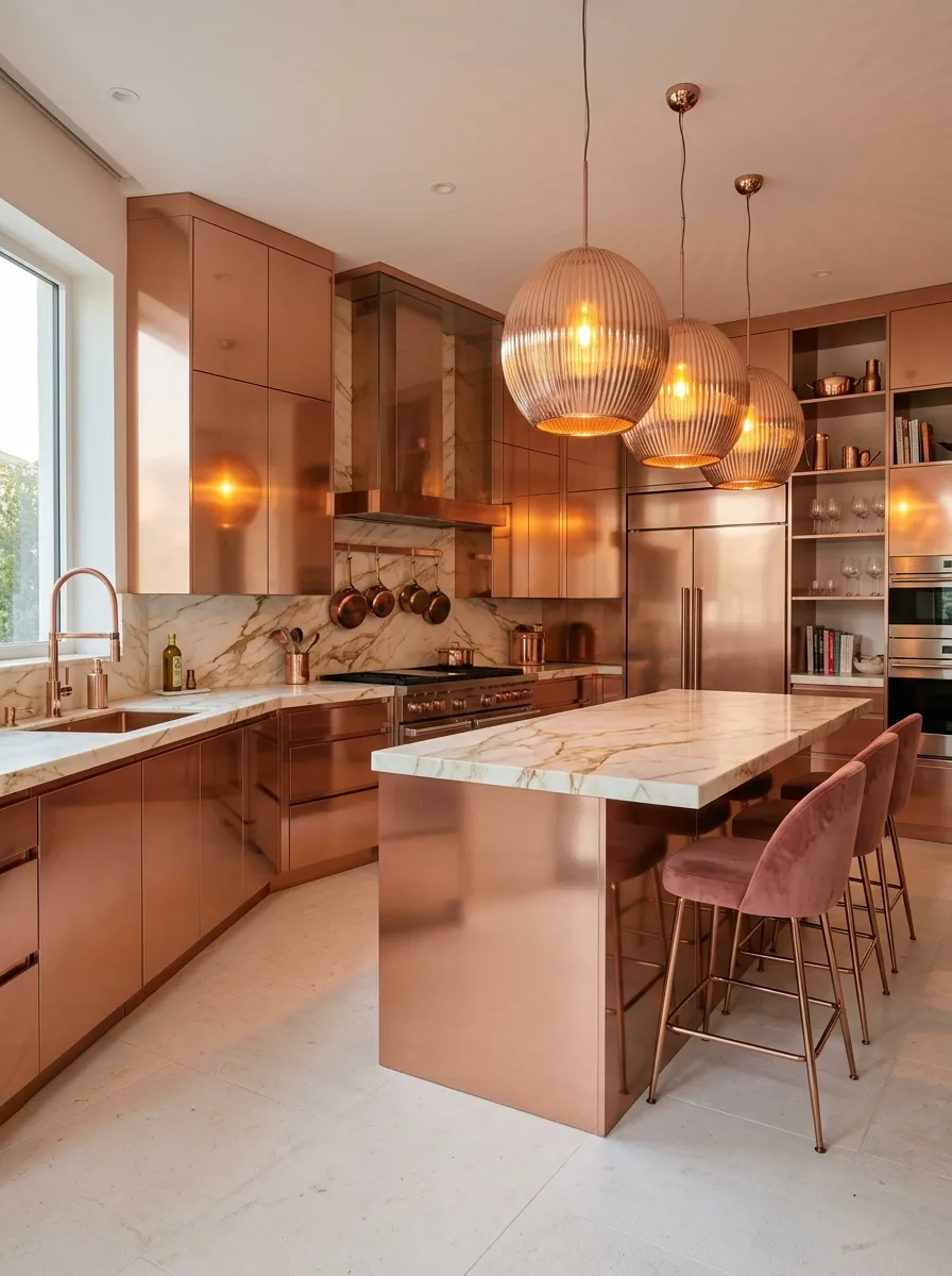
Specify a high-gloss, metallic rose-gold lacquer or laminate for every cabinet surface in the kitchen, treating the finish itself as the statement rather than relying on a painted matte color.
This is a finish, not a paint color, and it needs to be sourced from a specialist who works in metallic or lacquered cabinetry. A standard painted cabinet door will never achieve the same reflective depth.
Pair it with a single large marble slab behind the range and ribbed glass globe pendants in a matching warm tone, so the room has exactly one other reflective material to play off the cabinetry instead of competing patterns.
Keep major appliances in stainless steel rather than panel-matched to the cabinetry. The contrast between the warm metallic cabinets and the cooler stainless steel is what keeps the kitchen from reading as one overwhelming block of rose gold.
Retro Pink Checkerboard Floor
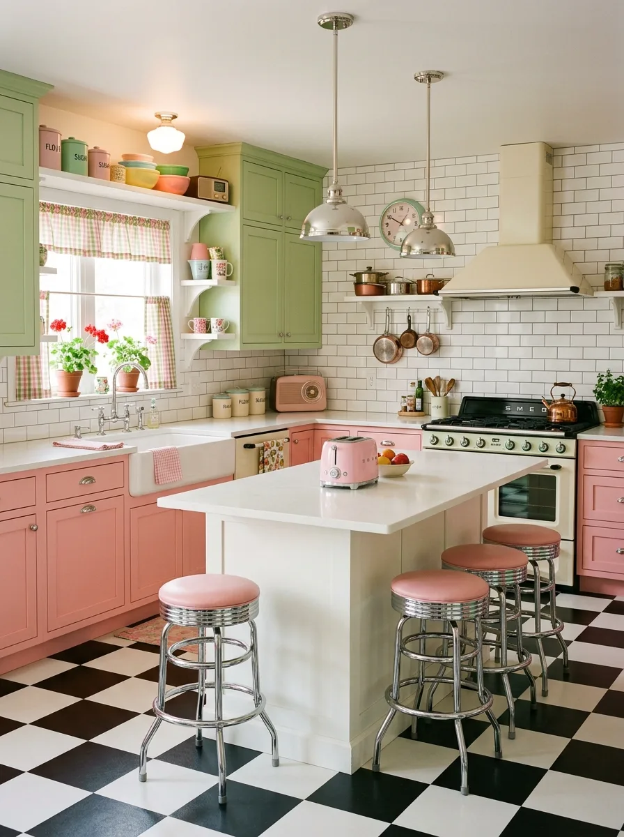
Lay a black-and-white checkerboard floor first, since it sets the entire retro tone the rest of the kitchen needs to follow. Everything else in this look takes its cue from that floor.
Paint lower cabinetry in a soft vintage pink and upper cabinetry in a muted sage green, rather than choosing one color for the whole room. The two-tone split is what reads as genuinely mid-century instead of simply pastel.
Furnish with chrome-legged stools topped in pink vinyl, and source small vintage-style appliances, a toaster, a radio, in matching pastel shades to scatter across the counters. These small object choices do as much work as the cabinetry in selling the era.
Hang gingham curtains at the window in a coordinating pink check. The pattern softens what could otherwise feel like a theme park version of the look, grounding it as a real, lived-in kitchen instead of a stage set.
Ornate Pink Floral Tile
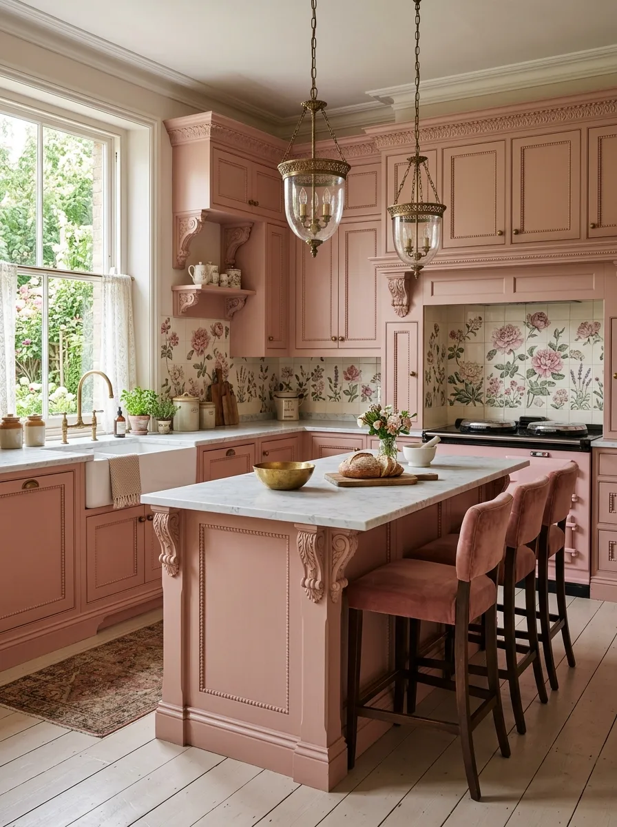
Choose furniture-grade, raised-panel cabinetry with applied moulding and decorative corbels, painted in a dusty rose rather than the more common cream or sage used in traditional kitchens. The ornate millwork is what allows a pink this soft to carry real architectural weight.
Source a hand-painted floral tile mural for the area directly behind the range, in colors that echo the cabinet pink alongside greens and creams. This is the one place pattern is allowed to take over completely.
Hang lantern-style pendant lights with brass detailing and visible glass, choosing fixtures ornate enough to match the level of detail already built into the cabinetry. A plain modern pendant would look out of place against this much millwork.
Upholster dining or island seating in a dusty rose velvet a shade or two deeper than the cabinets. Traditional, layered rooms like this one depend on the same color reappearing in multiple materials rather than staying confined to paint.
Wine Mauve Amber Globes
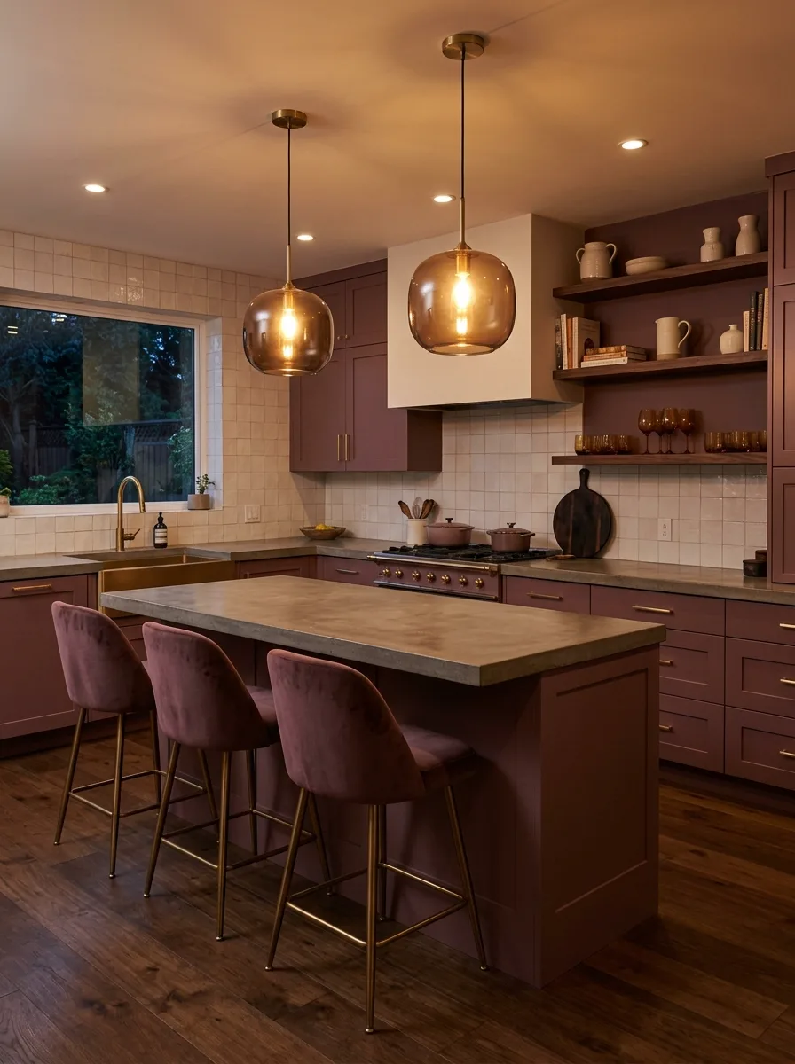
Paint cabinetry in a deep, wine-adjacent mauve, dark enough to photograph almost brown in low light, across both upper and lower runs, treating the color as a backdrop for warm lighting rather than something meant to read crisp and bright.
Tile the backsplash in a warm, sandy zellige square rather than anything cool-toned or white. The slight glaze variation in the tile picks up the gold tones in the room’s lighting instead of fighting them.
Hang amber glass globe pendants over the island and let the room’s lighting run warm rather than neutral or cool-white. This look depends on the lighting almost as much as the cabinet color; the same mauve under cool white bulbs would read flat and a little drab.
Finish the island top in poured concrete and the floor in dark, worn wood. Both materials absorb light rather than bouncing it, which keeps the room feeling intimate and a little moody rather than bright and gallery-lit.
Neon Pink Accent Wall
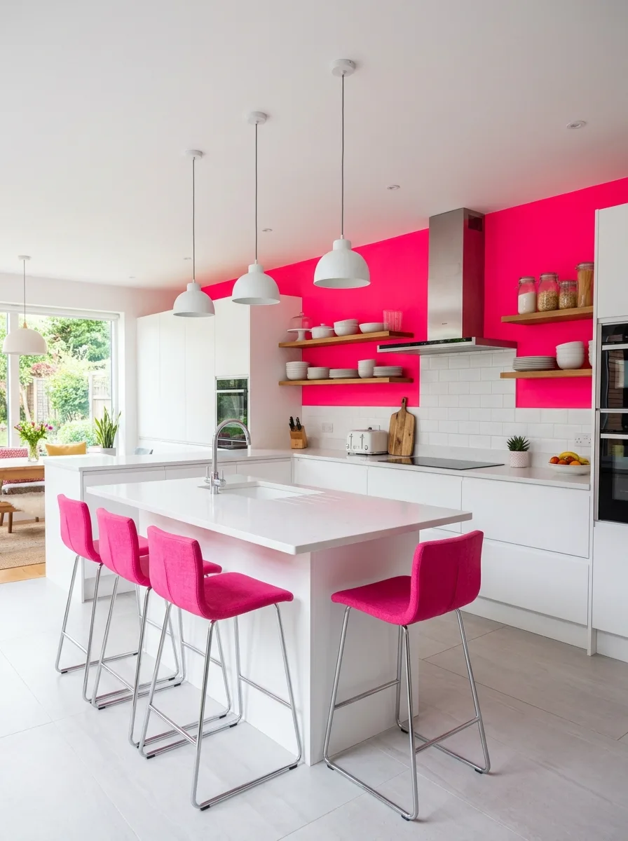
Keep every cabinet in the kitchen a clean, simple white, and reserve pink for a single accent wall instead of the cabinetry itself. This is the version of a pink kitchen for someone who wants the color without committing their cabinets to it.
Choose a genuinely saturated, almost neon pink for that one wall. A muted or dusty version would lose the punch this approach depends on, since the whole point is maximum contrast against an otherwise neutral room.
Run plain white subway tile and simple wood open shelving on either side of the range, so the pink wall has clean, quiet surfaces to interrupt rather than competing patterns.
Hang plain white pendant lights rather than anything in a metal finish that would pull focus toward the ceiling. This look depends on one wall doing one job; everything else in the room needs to actively recede.
Curved Pink Cabinet Corners
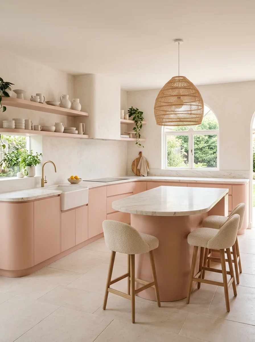
Specify cabinetry with rounded, curved corners rather than standard square edges, particularly where the lower cabinets meet at a corner or wrap into an island. The curve is the entire design move here; a flat, square version of this same pink would read as a fairly ordinary kitchen.
Build the island as a freestanding, cylindrical pedestal rather than a rectangular box, in the same soft terracotta-pink as the surrounding cabinetry. The continuity of color across a non-rectangular shape is what makes the curve feel intentional rather than a quirky add-on.
Furnish with boucle-upholstered, wood-legged stools and a woven rattan pendant overhead, leaning into organic, natural materials throughout rather than anything sharp-edged or metallic.
If the architecture allows, echo the curve in an arched window or doorway nearby. A single rounded element can look accidental; a room with two or three curves repeating throughout reads as a considered design language.
Coral Pink Hammered Brass
Paint cabinetry in a clear, warm coral-pink, leaning brighter and less dusty than a true blush, and keep the cabinet style simple and traditional rather than ornate.
Source pendant lighting in a hammered, textured brass rather than a smooth polished finish. The dimpled surface catches light unevenly across the dome, adding a handmade quality that a flat brass fixture wouldn’t.
Run classic white subway tile behind the range and stick to simple wood open shelving rather than upper cabinets, keeping the rest of the room quiet enough that the coral and the hammered brass can carry the look together.
Layer in a vintage, faded rug underfoot rather than anything new or geometric. The worn pattern softens a bright color palette and keeps the room feeling collected over time instead of recently decorated.
Pink Sage Scallop Tile
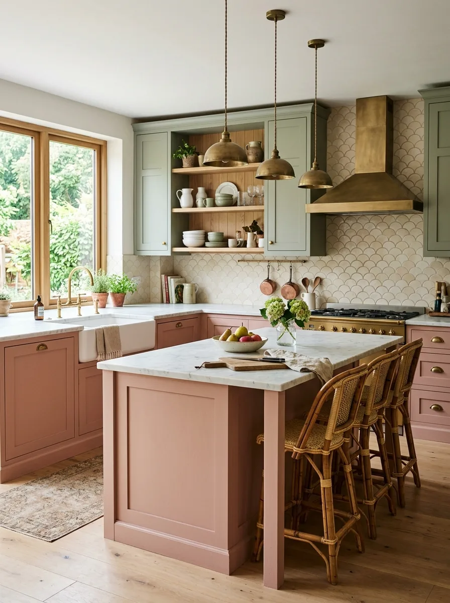
Split the palette by cabinet height again, but this time pair dusty pink lowers with sage green uppers rather than navy, landing on a softer, more garden-toned combination.
Tile the backsplash in a scalloped, fan-shaped tile rather than a square or hexagon. The curved repeat of the scallop pattern echoes the softness of both cabinet colors in a way a straight-edged tile wouldn’t.
Finish the range hood in brass and run brass fixtures throughout, including the faucet and cabinet pulls. Brass is the connective tissue between the pink and the green, warm enough to flatter both without favoring either one.
Furnish with woven rattan counter stools and keep the open shelving styled with simple stoneware rather than colorful pieces. Two strong cabinet colors and a patterned tile are already plenty; the smaller details need to stay calm.
Final Thoughts
Every kitchen on this list shares one quality that has nothing to do with the specific shade of pink involved: total lack of hesitation.
None of them hedge. Nobody here painted one cabinet pink to test the waters, or chose the most muted, defensible version of the color out of fear that the bolder one might be a mistake. They picked a pink, decided what it would be paired with, and built the whole room around that decision.
That’s really the only thing that separates a pink kitchen that feels stylish from one that feels like a mistake waiting to be repainted. It was never about whether pink “works.” It’s about whether the person choosing it actually believed it would.
So if someone talked you out of it once, they were arguing with the wrong shade. Pick yours, pick the metal that flatters it, and stop asking permission.