
You could choose plain white Shaker cabinets. You could also choose to never be remembered.
The cabinet is the largest single design element in your kitchen. It occupies more visual real estate than the countertop, the backsplash, and the flooring combined. When you play it safe with a door profile and a finish that could belong to any kitchen in any house in any decade, you’re not being tasteful. You’re just being forgettable.
The good news: you have more options than you’ve been told. Cabinet design has quietly gotten interesting. Door profiles are doing things that Shaker can’t. Finishes are going places that paint samples don’t cover. The colour conversation has moved past navy-or-sage and into territory that most renovation guides haven’t caught up with yet.
These nineteen kitchens prove it. Every single one of them made a cabinet decision that a more cautious person would have talked themselves out of. None of them regret it.
Why Most Kitchen Cabinet Decisions Go Wrong
The mistakes are predictable. They happen in the same place, to the same people, for the same reasons.
Choosing the Profile Before the Room
A cabinet door profile is not a style category. It is an architectural decision that either fits the proportions, ceiling height, and existing character of your kitchen or it doesn’t.
Shaker works in most rooms because its simplicity doesn’t assert anything strongly enough to clash. But “doesn’t clash” is not the same as “belongs.” Shaker in a kitchen with high ceilings, large windows, and architectural bones looks modest where it could be magnificent. Raised panel in a contemporary open-plan kitchen looks like it wandered in from a different house.
The correct sequence is: understand your room first. Measure the ceiling height. Look at the window profiles, the molding style, the floor material. Identify the room’s visual register — whether it tends formal or casual, traditional or contemporary, restrained or expressive. Then choose a door profile that amplifies what’s already there rather than contradicting it or failing to engage with it.
A room with high ceilings and large windows can support vertical fluted cabinetry that would make a low-ceilinged galley feel oppressive. A kitchen with a farmhouse feel can support beaded inset in a way that a sleek contemporary space cannot. The profile works with the room, or it works against it. There is no neutral.
Treating Colour as the Risky Part
The conventional wisdom is that colour is the risk and everything else is the safe choice. This is backwards. Colour is one of the most reversible decisions you make in a kitchen renovation. A cabinet that’s the wrong profile for the room, or a door detail that doesn’t relate to any other element in the space, is a much harder problem to fix than a colour you grew tired of.
Colour that is specific and committed is far more successful than colour that hedges. A true hunter green, a full-saturation burgundy, a high-gloss cobalt navy — these are resolved. They claim the room. They give everything else something to respond to. A grey-green that couldn’t decide between sage and slate, a navy that reads as grey in half the light conditions, a dusty pink that apologises for itself — these are the colours that age badly, not because they’re wrong colours, but because they were chosen without conviction.
The cabinet colour that makes a room work is always the one someone had to be talked into by the person who knew better.
Under-investing in the Door Detail
The door detail is the thing your eye resolves to at close range. It is the first thing a person standing at your island will notice about your cabinets. It is the element that most directly signals whether your kitchen was designed or just installed.
Plain Shaker is one profile. But there is also fluted — vertical reeds that run the full height of the door, creating a surface that catches light and changes character throughout the day. There is beaded inset — a frame-and-panel construction with a small bead running inside the frame, visible only up close, where it reads as furniture rather than cabinetry. There is arch-detail — a routed motif on the upper panel that gives the door a cathedral quality. There is scalloped — a decorative edge on the island base that has nothing to do with functionality and everything to do with personality.
These are not expensive upgrades. They are decisions. Most people don’t make them because nobody put them in front of them at the right moment in the renovation process.
The Principles That Make Cabinet Decisions Work
Three things determine whether a cabinet decision holds up over time. Get these right and the specific colour or profile becomes secondary.
The Metal Family Has to Be Decided First
Your cabinet hardware, your faucet, your light fixtures, and your appliance handles share a room. If they are not speaking the same metallic language, the kitchen will look assembled rather than designed, regardless of how good the individual components are.
Unlacquered brass, antique brass, and warm gold occupy the same register. They age differently but relate to each other. Polished nickel and chrome are colder and brighter. Matte black is flat and absorbs light rather than reflecting it. Brushed stainless is utilitarian. Oil-rubbed bronze is dark and warm.
Pick one family. Then buy everything that has a metal finish within that family. The faucet is not a separate decision from the pendant light. The cabinet pulls are not a separate decision from the range knobs. They are all one decision, made once, that gives the room its coherence.
The Two-Tone Decision Is About Weight, Not Just Colour
Two-tone cabinetry — where upper and lower cabinets are different colours — is one of the most reliable ways to add visual interest to a kitchen without major structural changes. But the decision is almost universally misunderstood as a colour exercise when it is actually a weight exercise.
The lower cabinets carry the visual weight of the room. They anchor the space to the floor. The upper cabinets occupy the upper wall zone and either recede toward the ceiling or assert themselves depending on their colour and finish. When you put a dark colour on the lowers and a light colour on the uppers, you ground the room and lighten the upper zone — the visual effect is that the ceiling feels higher and the room feels more spacious. When you invert this — dark uppers, light lowers — you create an enveloping effect that can feel dramatic and considered or heavy and oppressive depending on the ceiling height and the light.
The split between upper and lower is never arbitrary. It should always respond to the specific proportions and light of the room.
Open Shelving Is a Display Decision, Not a Storage Decision
The moment you commit to open shelving — or lit glass cabinet fronts, or chicken wire inserts — you are committing to a display. Whatever is visible through that opening will be seen. Every day. By everyone who enters the kitchen.
This means the decision to install open shelving cannot be separated from the decision about what will live on those shelves. If your everyday dishes are a mismatched collection from different decades and different supermarkets, open shelving will display exactly that. If your ceramics are curated — a coherent palette of colours and materials, arranged with some intention — open shelving will display that instead.
The kitchens with open shelving that work are the ones where someone decided what the shelving would hold before the shelving was installed, not after. The display is the point. The storage is incidental.
Kitchen Cabinet Ideas
Gunmetal Grey LED Niche Gloss Backsplash
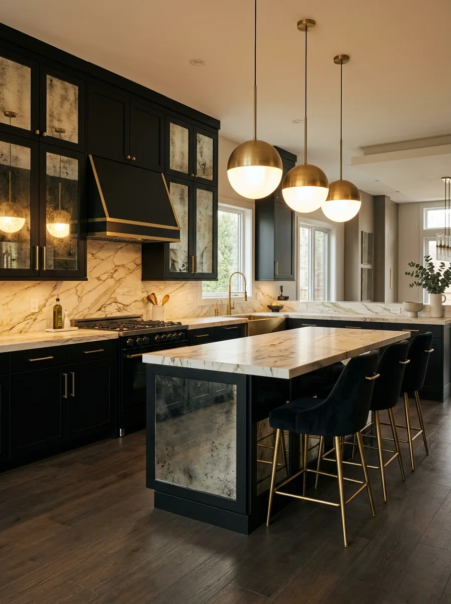
The cabinetry runs in a semi-gloss gunmetal grey — not a warm grey, not a cool grey, but a metallic-adjacent grey that reads differently under different light temperatures. Use flat-front, handleless doors throughout. Into the upper cabinet zone, insert one or two recessed open niches — a gap between two closed cabinet runs that is backed in the same dark grey and lit from inside with warm LED strips. These niches hold the everyday-access items: the coffee machine, a few frequently used bowls, the items that would otherwise sit on the counter and create visual clutter. The backsplash runs in a dark, polished stone that mirrors the cabinetry tone — black marble or a dark quartzite with slight variation. The counter is in the same dark stone. Install under-cabinet LED strips and toe-kick LED strips in the same warm temperature. This kitchen operates in layers of warm amber light against a dark, unified surface.
Fluted Cream Curved Corner Marble
Commission flat-front Shaker doors with a vertical fluted insert — narrow parallel reeds routed into the door face and running its full height. The fluting introduces texture and shadow interest that plain Shaker lacks, while reading as clean and contemporary from a distance. The colour should be warm off-white with a barely-there warm undertone, not pure white. Use simple brass bar pulls or knob hardware with a satin or brushed finish. Where two cabinet runs meet at a corner, curve one of the runs rather than joining them at a hard 90-degree angle — the curved corner cabinet is the detail that makes this kitchen feel bespoke rather than off-the-shelf. Top with full-slab marble on both the counter and the island, with a waterfall edge. Hang ribbed or fluted glass pendant lights in brass fittings above the island — the fluted glass echoes the cabinet texture.
Slate Blue Deconstructed Refrigerator Tower Herb Shelf
Build a dedicated refrigerator tower — a full-height cabinet run designed around the refrigerator, with a tall cabinet column on each side and a cabinet above. Paint all of this in slate blue-grey. On one side of the tower, the cabinet column opens into open shelves with raw oak shelf boards — for herbs, glass jars, and ceramic vessels — rather than closed cabinet doors. Mount this shelf column at the end of the cabinet run so it reads as a transition between kitchen and room rather than a strictly kitchen element. On the open-shelf side of the tower, mount a series of brass wall hooks at varying heights for hanging kitchen textiles and small items. Keep the kitchen cabinets and hardware in the same slate blue with antique brass pulls. Use larger-format ceramic floor tile in a pale grey.
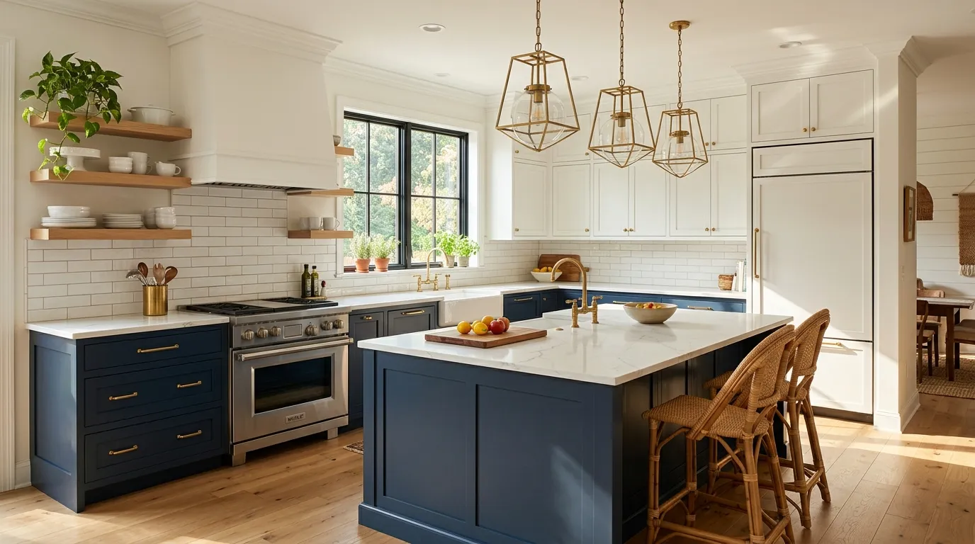
Navy Two-Tone Open Shelf Brass
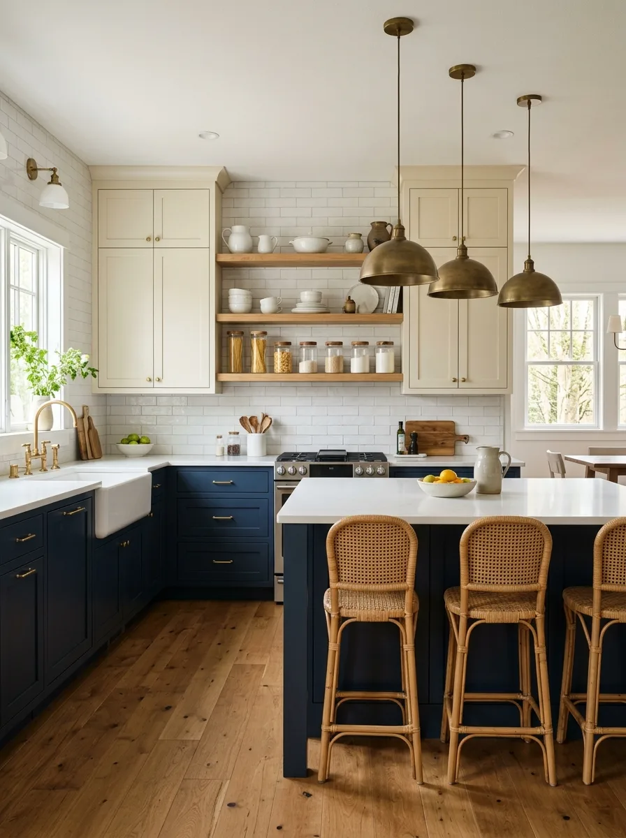
Run the lower cabinets and the island in a deep, rich navy — a navy with enough blue in it to read as genuinely blue rather than grey under different light conditions. Upper cabinets go in a warm off-white or cream with simple brass pulls and knobs matching the lower hardware. Between the upper closed cabinets, install two to three floating shelves in raw oak or warm wood — the shelf brackets should also be in brass or raw metal to tie to the hardware. Hang three aged brass dome pendants above the island, large enough to anchor the space. For bar seating, use rattan-back chairs that echo the warmth of the wood shelves. The white subway backsplash reads as neutral between the two cabinet tones. Style the open shelves exclusively in cream and natural materials — no colour, nothing that competes with the navy below.
Matte Black Flat-Front Walnut Backsplash Wicker
Run all lower cabinets in matte black — handle-less, flat-front, no detail. The counter is solid walnut, live-edge on the visible sides if the budget allows, or standard edge-grain otherwise — installed directly into the cabinet top without a separate sink cut-out, so the farmhouse sink sits in the wood. The backsplash is also walnut, wide-board planks running horizontally across the wall at the same timber depth as the counter. The effect is a continuous wood surface from counter height to the bottom of the floating shelves, creating a warm band of natural material between the black below and the cream wall above. Float two or three open shelves in matching walnut above the backsplash zone. Use a matte black undermount sink and matte black faucet — all metal in the kitchen is black. Source a large wicker pendant for warm light. Use a jute runner rug at the sink.
Teal Ceiling-to-Floor Monochrome Marble
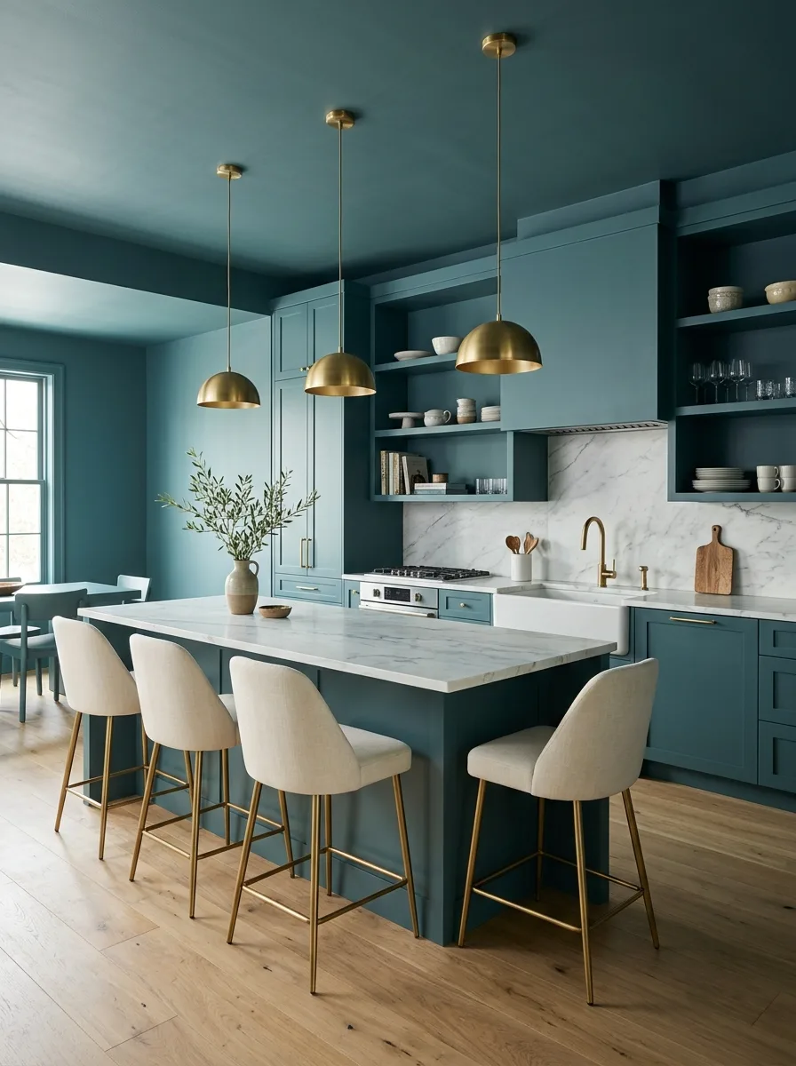
The key decision here is the ceiling. Paint it the same teal as the cabinets and walls — the same colour, the same sheen level. The room becomes a colour box, and the eye stops reading cabinet versus wall versus ceiling as separate surfaces. It reads as a single enveloping space punctuated by the white marble counter and backsplash. Source a teal that has enough blue in it to read as sophisticated — a mid-depth teal with grey in it rather than the brighter turquoise end of the spectrum. Use flat-front cabinets with very slim brass bar pulls. The island top and backsplash should be in a white marble with strong veining — the contrast between the teal and the white marble is the entire visual story. Source upholstered bar chairs in cream or natural linen with gold-tone legs. Hang slim brass dome pendants. One plant — a small olive or fig tree — is enough nature in a room this resolved.
Burgundy All-Over Raised Panel Viola Marble Globe
Paint everything in a deep, wine-dark burgundy — cabinets, hood surround, wall panels, and the upper wall zone above the cabinets. The door profile is a traditional raised panel, scaled generously, with substantial molding detail that reads as architectural millwork rather than cabinet door. Use polished brass bar pulls throughout. The counter and backsplash run in a full-slab stone with dramatic ruby and crimson veining — Viola marble, Red Levanto, or any stone that picks up the burgundy tone of the cabinetry rather than contrasting against it. The stone and the cabinet are in the same colour family. Install a brass pot filler above the range. Hang a cluster of three globe pendants in smoked or amber glass with brass fittings — three different sizes if possible. Style the open shelves or visible glass-front cabinets with glassware and dark ceramics. This kitchen doesn’t ask permission.
White Glass-Front Lit Interior Warmth
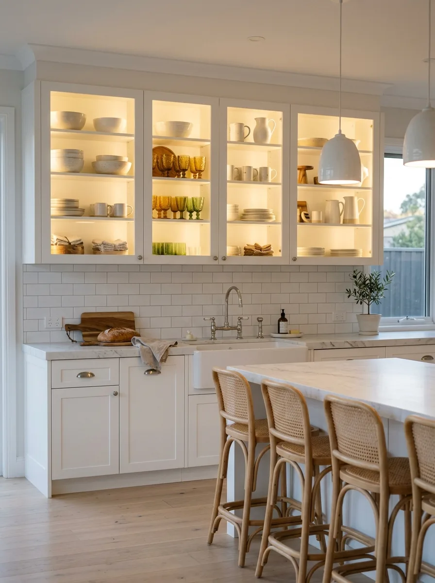
Install upper wall cabinets with full glass fronts — no divided lights, no grilles, just clear glass in a simple frame. Run warm LED strip lighting inside each cabinet, mounted at the top of the interior and aimed down at the shelves. The light temperature should be around 2700K — warm amber, not cool white. The glass cabinet faces glow from inside in the evening and read as display cases in daylight. Use white Shaker lower cabinets below. For the island, keep the form simple with a thick marble top. The payoff is entirely in the lit cabinet display: style the interiors with a deliberate collection — amber glass goblets, green plates, cream stoneware — so the colour story inside the cabinets reads as a composition through the glass. Hang a single large white dome pendant above the island.
Sage Beaded Inset Herringbone Brass
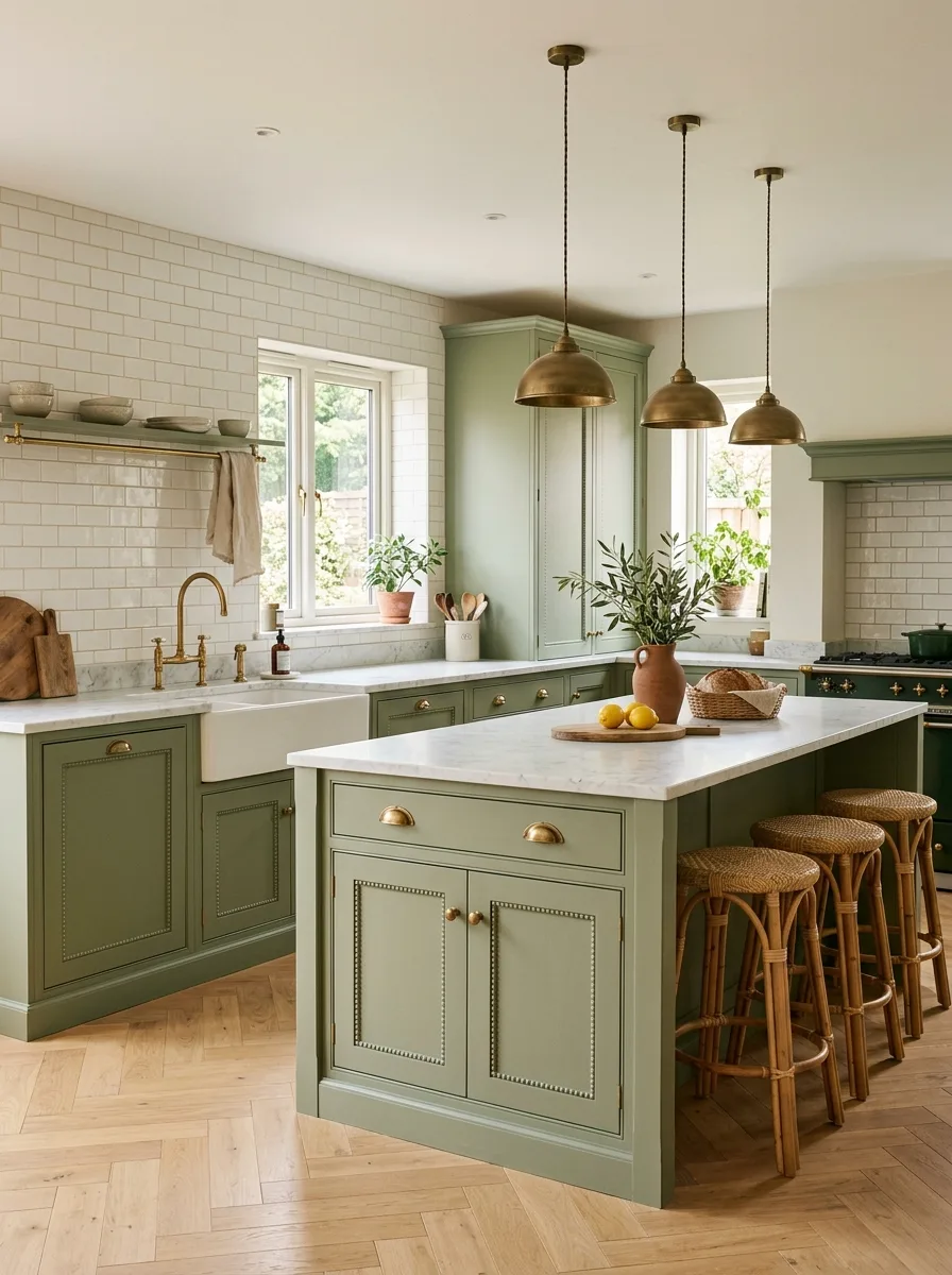
Choose a mid-value, fully resolved sage green — not grey-sage, not olive, but a clear green with warmth in it. The door profile is beaded inset: a traditional frame-and-panel construction with a small bead routed on the interior edge of the frame, visible only when you’re standing close enough to the cabinet to open it. This detail is the difference between a painted cabinet and a piece of furniture. Use brass cup pulls and bail hardware throughout. Set the lower cabinets on legs rather than a toe kick where possible — the visual gap at floor level makes the cabinetry read as freestanding furniture. Install white marble or honed quartz counters. Lay the herringbone wood floor in a pale oak — the directional pattern at ground level adds movement below the steady sage above. Hang three aged brass dome pendants above the island.
Dark Green Zellige Walnut Shelf Concrete
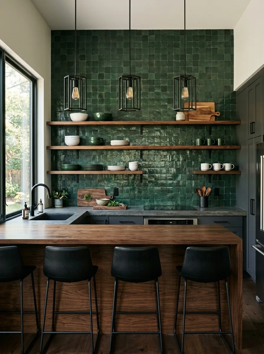
This kitchen runs dark, and it earns its depth through material layering rather than a single bold decision. Paint the cabinets in a near-black forest green — flat-front, no hardware, push-to-open mechanism only. The backsplash wall runs from counter to ceiling in deep green zellige tile — handmade Moroccan tile with its characteristic uneven glaze and varied surface, so the wall reads as alive rather than flat. Against this wall, install two or three thick walnut floating shelves, edge-grain to show the wood’s natural character. Use a poured concrete counter — not a concrete-look quartz, but actual poured concrete, with the inherent variation in tone and texture that comes with the real material. Hang three black geometric cage pendant lights with Edison bulbs. Style the shelves in green, white, and natural wood only. The kitchen has one colour and many textures.
All-Cream Flat-Front Handleless Minimalist
Every surface is cream or off-white. Every profile is flat. Every edge is soft. There are no visible handles — push-to-open hardware or recessed J-pulls only. The wall cabinets run to the ceiling without a break. The island has an integrated counter that wraps the edge with no visible joint. The backsplash is in a matching quartz panel — no tile, no grout lines, just a continuous surface. The whole kitchen reads as a single sculptural volume with functional interruptions — doors, drawers, appliance panels — rather than as an assemblage of separate components. The ceiling-hung range hood disappears into the white. Slim cylindrical pendant lights in matte white hang at varying heights. Two sculptural white stools with hairpin legs at the island. One small plant in a cream ceramic pot. Discipline is the point.
Matte Black Antiqued Mirror Cabinet Velvet
This kitchen is evening-oriented. The cabinets run in a true matte black — not dark grey, not near-black, but fully committed black with a flat, light-absorbing finish. Into the upper cabinet door frames, insert panels of antique mirror: aged glass with foxing and patina, so the reflections are ghostly rather than sharp and the panels read as dark, glimmering surfaces rather than mirrors. The island base gets the same antique mirror treatment on one face — facing the seating side. Use polished brass bar pulls throughout. The backsplash runs in full-slab marble with dramatic gold veining. Hang three globe pendants with brass fittings and frosted or smoked glass diffusers. At the island, use black velvet upholstered bar chairs with brass legs. The candlelight bouncing off the antique mirror panels at night is the whole point of this kitchen.
Blush Arch-Detail Island Scallop Limestone
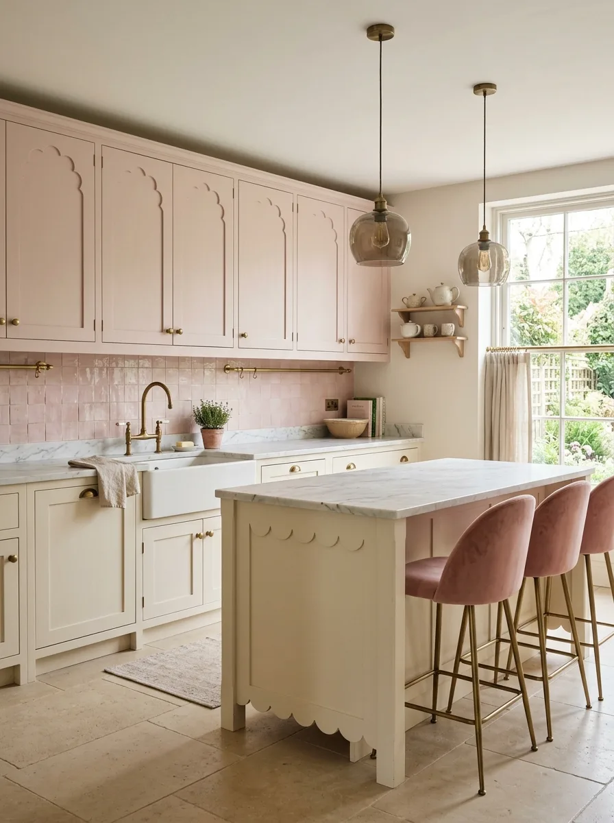
The upper cabinets are in a dusty, warm blush pink — a pink with enough grey to read as sophisticated rather than sweet. The door profile has a routed arch or ogee motif on the upper panel, giving each door a subtle decorative quality visible only when you’re standing in front of it. Lower cabinets go in a warm cream with a scalloped apron on the island base — a decorative edge cut along the bottom of the island that eliminates the standard flat toe kick and replaces it with a gentle wave of curved wood. Use honed limestone or travertine on the floor. The pink zellige or handmade tile backsplash runs in the same dusty rose as the upper cabinets, making the cabinet and the wall behind them read as a single tonal zone. Hang smoked or amber glass globe pendants. Use dusty pink velvet bar chairs with brass legs at the island.
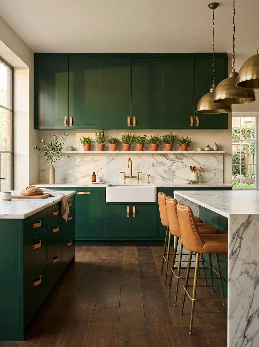
Forest Green Fluted Floor-to-Ceiling Appliance Integration
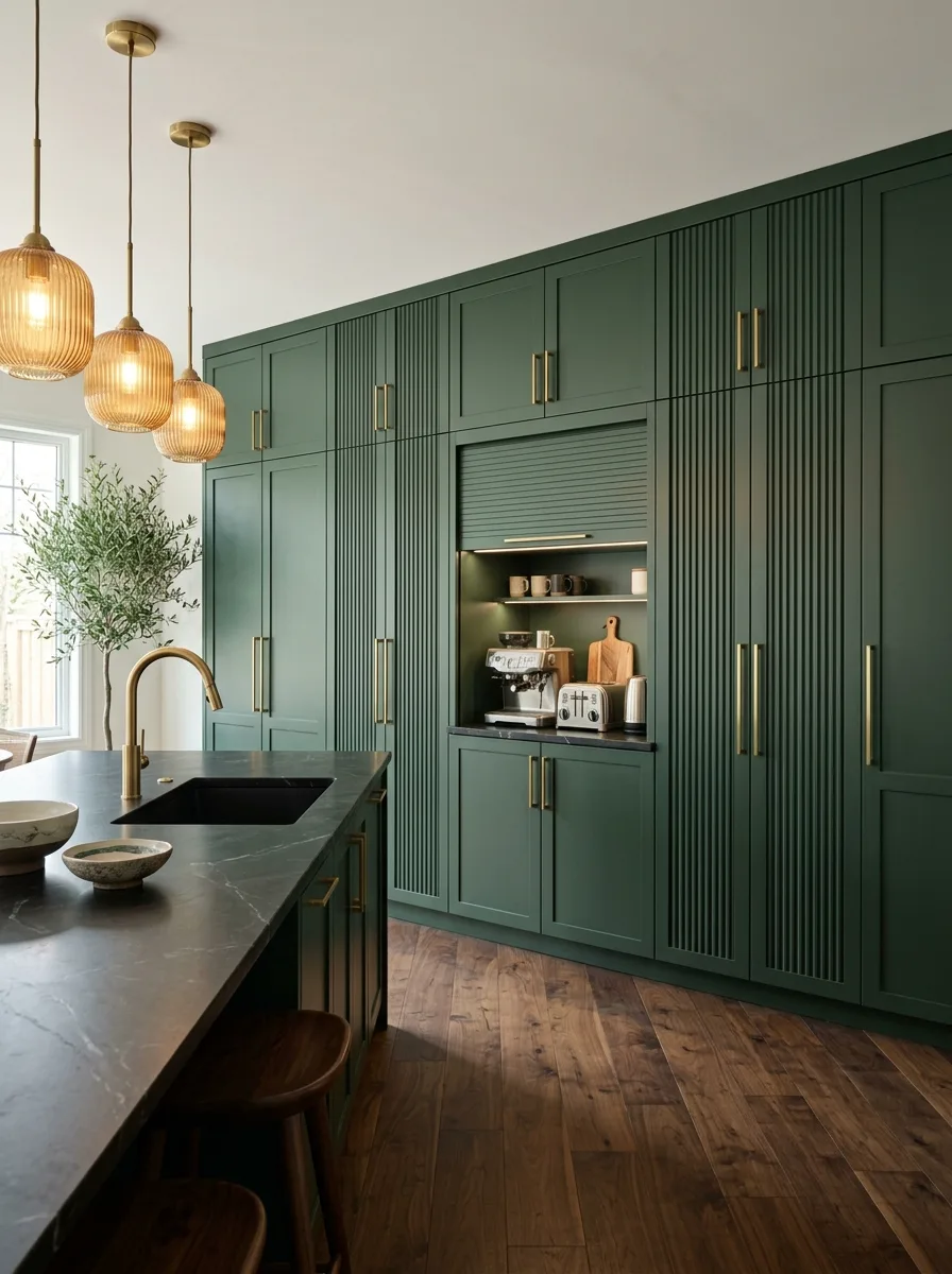
Run a full wall of floor-to-ceiling cabinets in a deep forest green — not olive, not sage, but a full, saturated green that holds its colour under any light. The door faces use a vertical fluted profile, so the wall of cabinetry reads as a textured architectural surface rather than a row of boxes. Integrate a built-in appliance nook into the run — a recessed zone with open shelves on either side and a tambour or lift-up door that conceals the espresso machine, toaster, and small appliances behind a flush door when not in use. Use slim brass bar pulls in a brushed or satin finish throughout. The island counter in a dark black stone provides contrast against the green wall. Hang three rattan or wicker globe pendant lights — the warm natural material against the deep green creates the balance the room needs.
High-Gloss Navy Black Granite Polished Tile
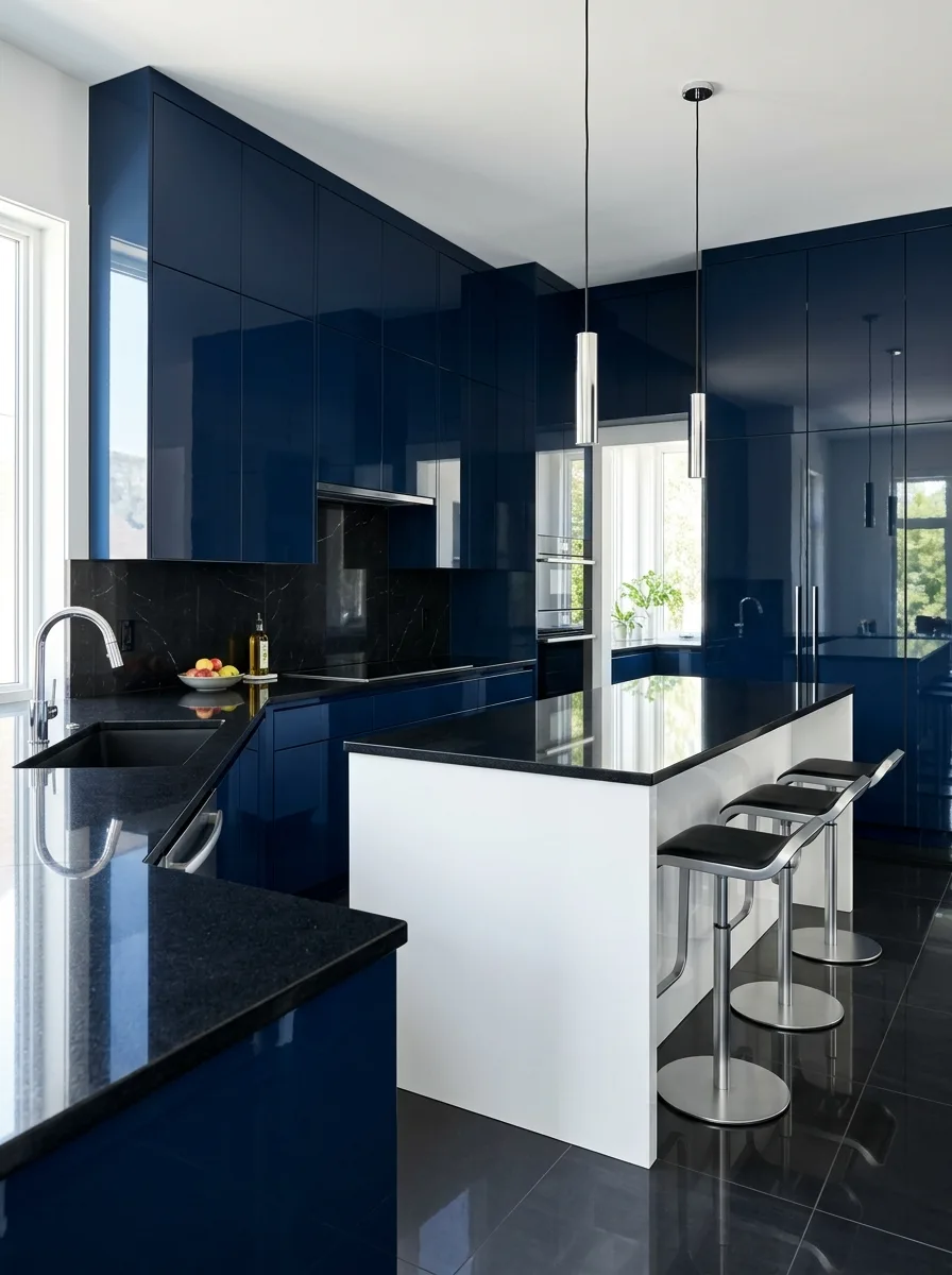
This kitchen is unambiguous. The cabinets are in a high-gloss, fully lacquered navy — the kind of surface that reflects the room back at itself and reads differently depending on where you’re standing. Use a flat-front, handleless profile with integrated finger-pull channels. The counter runs in polished black granite — the most reflective stone option, which doubles the light in the room and makes the space feel larger despite its dark palette. Install black polished porcelain tile on the floor, extending the reflective quality downward. A single white peninsula panel interrupts the navy on the seating side of the island — the only relief in an otherwise totally dark room. Mount slim chrome tube pendants above the island. Source matte black and chrome adjustable bar stools. This kitchen is for someone who decided.
Terracotta Zellige Deconstructed Island Walnut
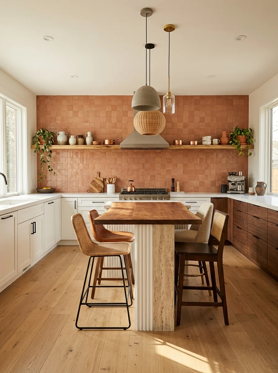
The backsplash is the room’s founding decision. Cover the entire wall above the counter in matte terracotta square tiles — not the glazed version, but the raw, earthy, handmade tile with surface variation and imperfect edges that reads as genuinely artisan rather than mass-produced. The perimeter cabinets stay in flat white with simple matte black hardware. For the island, build it in a genuinely deconstructed form: a walnut butcher block top with visible grain and natural edges, set on a base that combines a fluted travertine or limestone column with a dark wood lower cabinet. The island should look like it was assembled from beautiful components rather than built as a single unit — because it was. Hang a mix of pendant types above it: one rattan globe, one concrete dome, one clear glass cylinder. The mismatched pendants reinforce the deconstructed character. Use a leather-wrapped stool and a simple wood chair at the island.
Vertical Shiplap Upper Cream Dark Stained Lower
Run vertical shiplap panelling on the cabinet doors and the range hood surround — not horizontal, which reads as farmhouse, but vertical, which reads as contemporary and tall. Paint the vertical shiplap upper cabinets in a warm cream. The lower cabinets and island use flat-front doors in a dark espresso or charcoal stain that reveals the wood grain rather than covering it with paint. The two finishes — painted vertical shiplap upper and stained wood-grain lower — look like they came from different design traditions but work because of the vertical line that runs through both. Mount a black bridge faucet and black hardware throughout. Install cream zellige or handmade subway tile for the backsplash to tie to the upper cabinet tone. Hang three black industrial dome pendants with Edison bulbs. Use metal-and-wood bar stools with a black frame and natural timber seat.
Sage Chicken Wire Butcher Block Turned Leg Island
Paint all lower cabinets in a chalky, worn sage green. Upper cabinets go in white with a simple half-round cup pull in antique brass or nickel. For the upper cabinet door panels, replace glass with panels of small-hex galvanised chicken wire — the traditional larder-cupboard insert that provides visible access to the contents without fully exposing them. Line the interior back of these cabinets in natural timber for warmth through the wire. Install white subway tile for the backsplash. Run butcher block counters throughout in a warm oiled finish. For the island, source a freestanding piece with turned legs painted in the same sage green — the furniture-leg detail is what separates this kitchen from a standard renovation. Hang factory pendant lights with an enamel shade in white or cream. Use rush-seat stools.
Forest Green Flat-Front Leather Pull Terracotta Herb Shelf
Use a flat-front door — truly flat, no routed details — in a deep, rich forest green. The hardware is not metal: it is leather tab pulls, each made from a folded strip of natural tan leather stitched at the fold and mounted flush against the door face. The warmth of the tan leather against the deep green is the defining material relationship in the kitchen. Install a marble backsplash and marble counter. Run a continuous marble shelf at the top of the backsplash zone — not a floating shelf above the counters, but a ledge that runs along the full length of the backsplash and holds a row of small terracotta pots with growing herbs. The terracotta pots in a row introduce a warm colour note and a organic rhythm. The brass bridge faucet and aged brass dome pendants tie the warm metal register across the room. Use leather-wrapped bar chairs with brass legs at the island.
Final Thoughts
The kitchen cabinet is not a commodity decision. It is the architectural backbone of the room, and the profile, finish, hardware, and colour you choose will determine the character of the space every single day for the next decade.
The cabinets that age well — the ones that still look considered five or ten years after installation — are the ones where someone made a genuine decision rather than a safe one. A fluted door in a specific sage green with unlacquered brass hardware is a decision. A plain white Shaker with brushed nickel knobs is the absence of one.
Neither is wrong by itself. But only one of them gives the room a reason to exist beyond its function. Only one of them makes cooking in that kitchen feel like being somewhere specific.
That’s what a cabinet decision is actually for.