
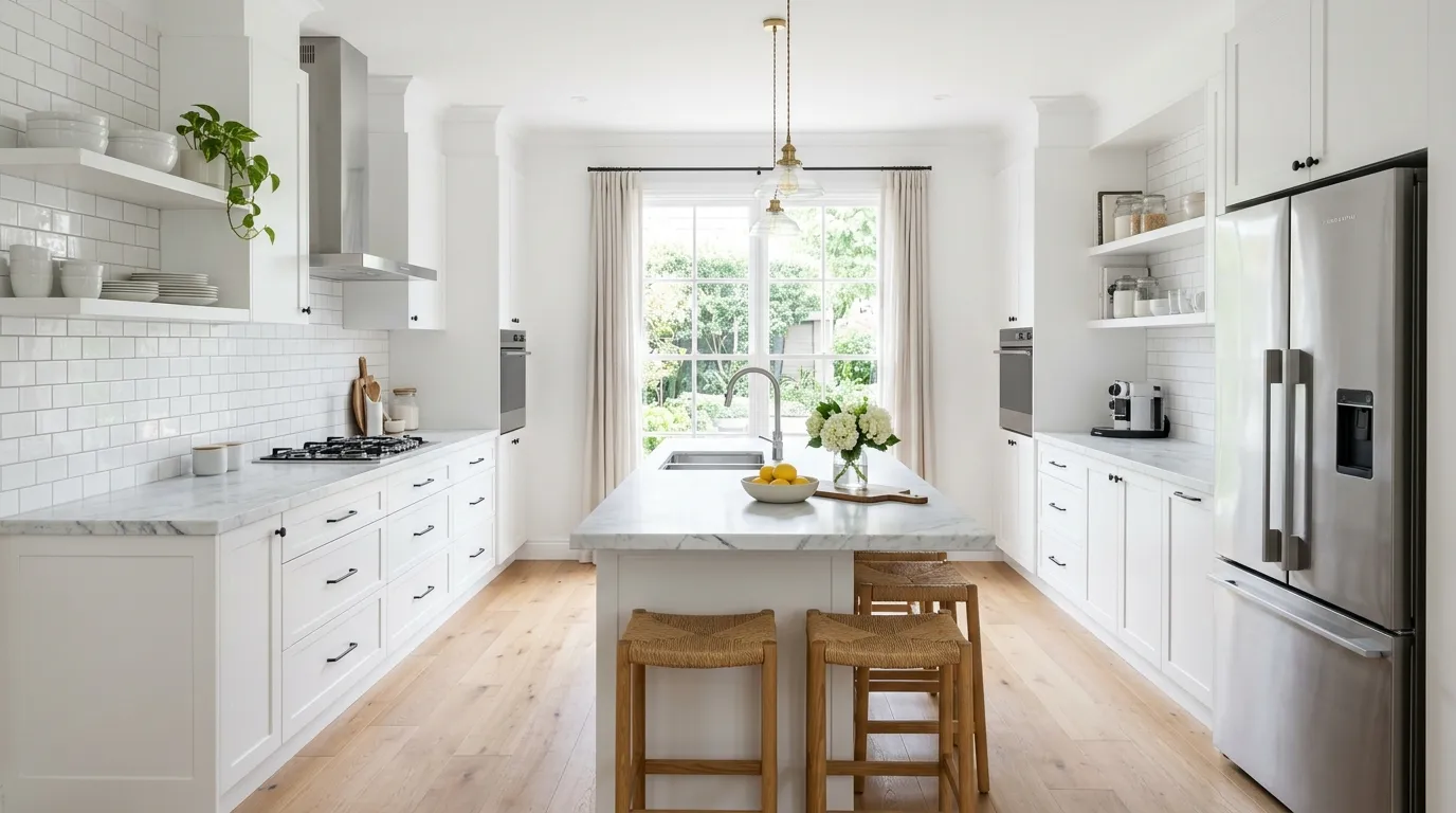
You renovated. You picked white. You’re not sure why it doesn’t look like the kitchen you saved to your phone eighteen months ago.
The problem isn’t the white. White is not the issue. The issue is that you treated white as a decision when it’s actually a starting point. White cabinets with white counters with white tile and white walls is not a design. It’s an absence of decisions dressed up as minimalism.
The kitchens that actually work — the ones that make you stop scrolling — aren’t the whitest rooms in the house. They’re the most resolved. Every material earns its place. Every contrast is intentional. Every element of warmth was chosen, not stumbled into.
This post is not about convincing you to paint your cabinets navy. It’s about understanding what the kitchens that photograph well actually have in common, and how to recreate that logic in your own space.
Why White Kitchens Go Wrong Before a Single Cabinet Gets Installed
The mistakes happen in the planning phase. By the time you’re standing in front of paint swatches, you’ve already made several decisions that will determine whether this kitchen succeeds or fails.
Using True White When You Shouldn’t
There is a difference between white and the particular shade of white that flatters your specific kitchen. Most people learn this lesson on the wall of a room where the paint looks green at noon and blue by evening.
Pure, bright, optical white — the kind that comes out of a tube without mixing — works in exactly one situation: a kitchen with strong, consistent natural light and a modern or contemporary design language that leans into the clean, clinical edge of that brightness. That’s it.
For every other kitchen, white means warm white. It means cream, bone, linen, antique white, or soft off-white. These shades forgive ordinary lighting. They read as white under most conditions but don’t punish you when the afternoon sun shifts.
The most common mistake is pulling pure white Benjamin Moore off a swatch card under bright fluorescent store lighting, then being surprised when the same color looks flat, cold, and exhausted on your north-facing kitchen walls. Test your white on a large piece of poster board in the actual room at different times of day before committing. Anything smaller than A2 paper is a waste of your time.
Choosing Cabinets and Counters Without Considering the Floor
Most people pick cabinets first because cabinets feel like the main event. The floor is an afterthought. This is backwards.
Your floor is the largest continuous surface in the kitchen. Its undertones — whether warm, cool, golden, grey, or red — will radically affect how every cabinet color in the room reads. A cream cabinet against terracotta tile looks completely different from that same cream against bleached oak. Both can be beautiful. Neither is accidental.
Before you commit to a cabinet finish, pull your cabinet sample to the floor and look at it there. Not on the wall. Not on the countertop. On the floor, next to a sample of your actual flooring material. The combination either harmonizes or it fights. You want to see that fight before the cabinets are installed.
Treating the Island as an Afterthought
The kitchen island is not just a work surface. It is the architectural focal point of most modern kitchens. The piece your eye goes to first. The element that either grounds the room or floats in it, unresolved.
Islands that look wrong are usually islands that were specified in the same finish as the perimeter cabinets, sit at the wrong height for the human beings using the space, or lack sufficient visual weight relative to the room around them. An island should feel anchored. Substantial. Like it belongs exactly where it is.
If your island is the same color, the same height, and the same material as every other surface in the kitchen, it disappears. The room reads as one undifferentiated mass of cabinetry. That’s not elegant — it’s just uniform.
White Kitchen Ideas Worth
All-White Gloss Lacquer
Start with flat-front, handle-less cabinets in a high-gloss lacquer finish in true optical white. The key is the lacquer itself — not a painted finish, not laminate trying to imitate lacquer, but the real thing, sprayed in a factory environment and cured to a surface that reads more like glass than paint.
Source this from European cabinet manufacturers who specialize in the finish, or from a local shop with a proper spray booth. The gloss level must be consistent across every door face. Any variation in sheen will read as a defect in the finished kitchen.
Match the countertop in a solid white quartz with no veining, keeping the surface monolithic. For flooring, choose large-format white porcelain tiles with a polished finish to extend the reflective quality downward.
Install two statement pendant lights in crackled glass or blown-glass spheres with chrome fittings — the transparency of the glass maintains the clean look while adding an organic note. Under the upper cabinets, run a continuous LED strip that casts warm white light across the counter. Keep everything else in the room off-white or grey to let this kitchen exist as its own contained world.
Warm Under-Cabinet LED Glow
Build this look around the contrast between two kinds of light: the cool daylight coming through the windows and the warm amber glow that under-cabinet LED strips throw across the countertop and lower cabinets. Start with creamy white Shaker cabinets — not stark white, something in the warm off-white register.
Choose a marble or marble-look stone for the counters and backsplash with pronounced veining in gold or warm grey. The under-cabinet LED strips should be warm white, around 2700K to 3000K — not cool daylight, which will fight the cream cabinet color. Run them on a continuous dimmer circuit.
Add toe-kick lighting at the base of the lower cabinets using the same warm tone — this is the detail that makes the kitchen feel like it glows from inside rather than being lit from above.
For upper cabinets, choose glass-front doors with interior lighting on a separate circuit. The warm glow through the glass creates depth and makes displayed pieces feel considered.
Grand Plaster Range Hood Arch
The hood above your range is the single most architecturally significant element in a kitchen. Treat it accordingly. Build a custom plaster hood surround with a full arched form — not a box, not a rectangle with a rounded top lip, but a genuine semicircular arch that extends from the counter height to near the ceiling, framing the range like a fireplace.
Execute this in a smooth microcement or plaster finish tinted to match your wall color — not white, but the same warm greige or ivory as the surrounding walls, so the hood reads as architectural volume rather than a separate piece.
Use full-slab Calacatta or Statuario marble behind the range, running from the counter to the top of the arch. The drama of the veined stone, framed by the curved plaster form, becomes the focal point of the entire room.
Hang slim fluted glass pendant lights on brass stems on either side of the hood to reinforce the symmetry. Use a brass farmhouse sink on the opposite wall to echo the metal.
Crystal Chandelier Coffered Ceiling
This requires both ceiling height and structural access, but the payoff is a kitchen that operates at a scale most renovations never attempt. Install a coffered ceiling — a grid of recessed panels framed by beams or crown molding — painted in the same warm white as the rest of the room, with the panel depth providing subtle shadow interest.
Hang a full crystal chandelier from the central coffer above the island. Not a mini chandelier, not a chandelier-adjacent pendant cluster, but a real, many-armed, multi-tiered crystal piece that would look at home in a foyer. Position a matching or complementary piece in the dining area visible from the kitchen.
The cabinets should be cream with raised-panel doors, substantial crown molding, and antique brass or satin nickel hardware. Every detail should reinforce the sense of scale. A kitchen this grand should not apologize for it.
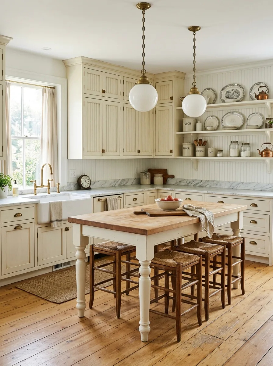
Cream Cabinets Rattan Stools Brass
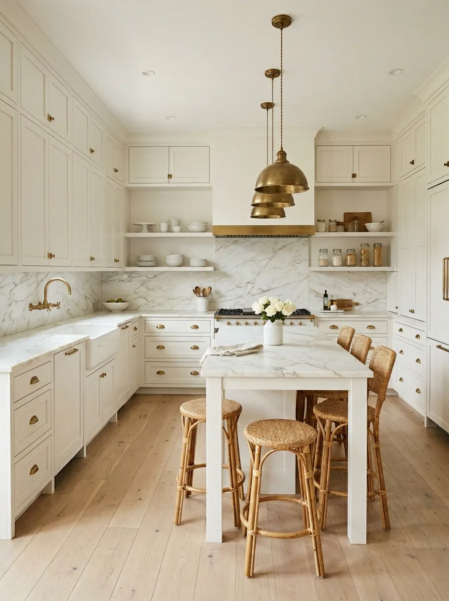
Start with cream rather than white for the cabinetry — choose a shade in the warm, slightly yellow family, something like Benjamin Moore White Dove or Farrow & Ball Steps Stone. This warmth is essential. Pure white cabinets will fight the natural wood elements; cream embraces them.
Pair cream cabinetry with a Carrara or Calacatta marble countertop and full-height marble slab backsplash behind the range. The grey veining in the marble cools the warmth of the cabinets without neutralising it. Mount open shelves above the range rather than upper cabinets on the cooking wall — this keeps the marble readable and gives you space for everyday ceramics.
For the island, use a simple table-style construction with leg detail rather than a boxy base cabinet. This reads as furniture rather than built-in and is more visually appropriate at counter-seating height. Top it with matching marble.
Source rattan or wicker bistro-style bar stools — round seats, bentwood base, natural finish — for the island seating. Look for the classic café style with the horseshoe rung at the base. These introduce a woven texture that sits beautifully against cream paint and marble.
Hang one or two oversized raw brass pendant lights above the island. Not polished, not lacquered — aged, unlacquered brass that develops a patina. A tiered or stacked-dome shade in this finish anchors the space with warmth. Mount your wall-mount faucet and farmhouse sink in matching brass. The metal reads through the room and ties the whole thing together without any single moment feeling overdone.
Concrete Island Oak Shelving Black
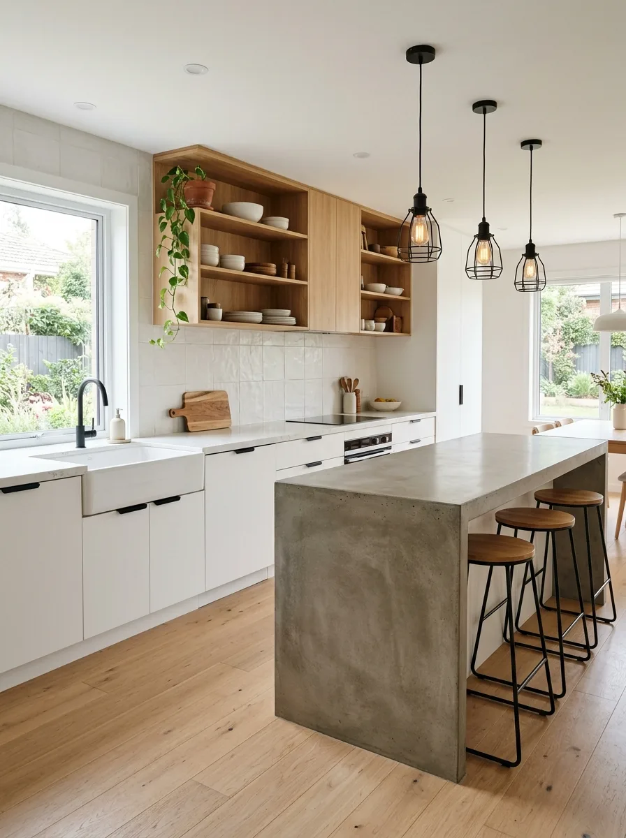
Start with flat-front cabinetry in a cool, clean white — no reveal, no hardware, just a flat surface with a push-to-open or recessed finger-pull mechanism. This is your blank slate. It is not interesting on its own, which is exactly why everything else in the room needs to be.
Specify the island top and waterfall sides in raw or polished concrete. A concrete island in a white kitchen does something that no other material does — it introduces weight and seriousness without colour. The texture is the entire point: the slight variation in surface, the visible aggregate, the way light catches it differently hour to hour. Have it poured and cast rather than using a concrete overlay; the difference in depth and finish is significant.
Frame the upper zone of the cooking wall with open shelving in natural oak, with visible grain and warm honey tones. Build it as a unit rather than floating individual shelves — a cabinet-top structure with open fronts reads more intentional than three separate planks on brackets. Style it with white ceramics and natural wood boards.
For pendant lights, use matte black cage pendants hung in a cluster of three above the island — the kind that expose the filament bulb and have a minimal wire frame. The black hardware on the cabinetry, the black pendants, and the black window frames create a graphic system that holds the room together.
Use timber-topped bar stools with slim black steel bases. The warm wood seat against the cold concrete island base is the detail that makes this room.
All-White Shiplap Wicker Pendants
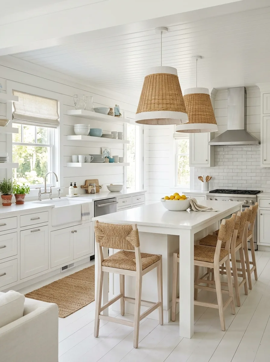
The key to this look is the shiplap. Install it on every wall surface from floor to ceiling — horizontal boards, painted the same bright white as the cabinetry, creating a continuous texture across the whole room. The wall is no longer a flat painted surface. It has direction, grain, and shadow lines, and those qualities do the work that colour would do elsewhere.
Keep the cabinetry simple: clean Shaker profiles in classic white, brushed nickel hardware. No brass, no black. The simplicity of the metal finish is part of what keeps this room from feeling heavy. Specify a farmhouse sink and a bridge-style nickel faucet.
Hang two oversized wicker pendant lights above the island — not rattan, but tightly woven wicker in a cone or dome shade with a white fabric interior liner. The scale matters enormously here. Go larger than feels comfortable: the pendants need to read against all that white wall. A 20–24 inch diameter is a starting point, not a ceiling.
Lay a jute or sisal runner along the sink wall. This is the single warmth anchor in the room. It doesn’t need to be elaborate — a simple rectangular jute rug with a natural edge is fine. Its job is to keep the floor from reading as another white surface.
Style open shelves with white dishware — plates, bowls, pitchers, mugs — keeping the shelves monochromatic. Then introduce one moment of soft colour: a small cluster of terracotta pots on the windowsill or a few pieces of hand-painted blue ceramics, just enough to signal that a human lives here.
Beadboard Cabinets Butcher Block Globe Pendants
The defining feature of this look is the cabinet door profile: full beadboard panels on all upper and lower cabinet fronts. Not beadboard as a backsplash treatment — beadboard as the cabinet door itself, with thin vertical grooves running the full height of each door. This detail is inherently old-fashioned and completely intentional. It reads as furniture that has always been here.
Paint the cabinets in a warm antique cream — not pure white, not yellow, but the colour of old bone. Use Farrow & Ball New White or Benjamin Moore Linen White as a reference point. The undertones matter. This cabinet colour needs to look like it could have been applied twenty years ago.
Source a kitchen island that reads as a freestanding piece rather than a built-in: four turned legs visible at the base, painted to match the cabinets, with a butcher block top. The butcher block should be thick — at least two inches — and left in a natural oiled finish. Over time it will season and darken at the edges. That aging is not a flaw.
Hang a pair of schoolhouse globe pendants in aged brass on chain above the island. The globe shape, the brass fittings, the chain suspension — all of these are period-correct references to an old kitchen.
Fit open shelves on the back wall and style them with a mix of matching transfer-print plates — blue and white antique patterns — alongside ceramic jars labelled FLOUR, SALT, and SUGAR. Install a farmhouse sink and a bridge faucet in matching aged brass. Source a copper kettle and a copper pot for the open shelf: the copper accent against the cream and brass pulls the whole palette together.
Forest Green Island Brass Domes Herringbone
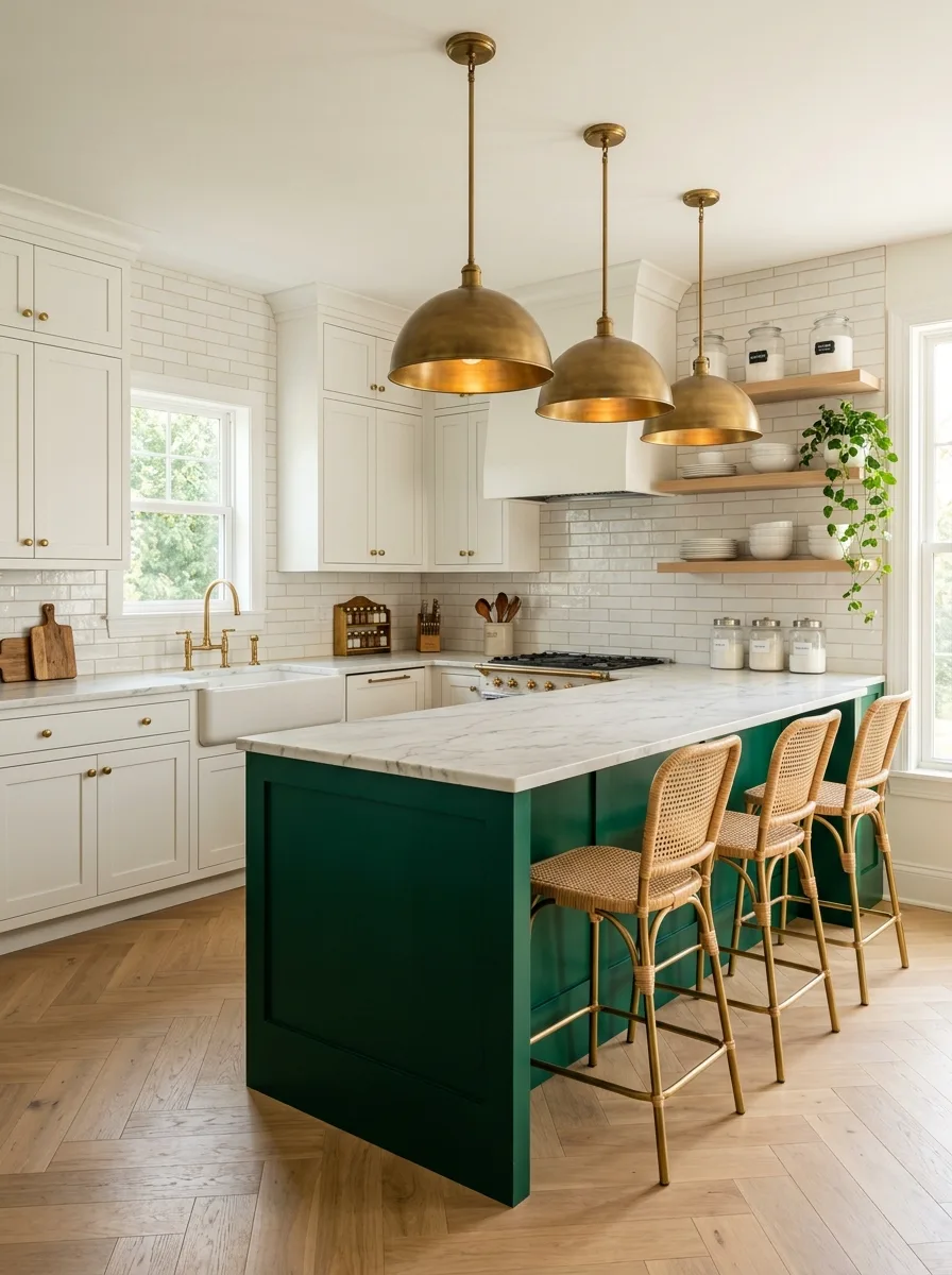
This is the colour-island approach taken to its logical conclusion. Everything about the perimeter is quiet and white: clean Shaker cabinets, white subway tile backsplash, a simple farmhouse sink. All of that neutrality exists to load the gun.
Then paint the island.
Choose a deep, saturated forest green — Benjamin Moore Tarrytown Green, or Farrow & Ball Calke Green, or anything in the same family of dark, slightly cool, botanical green. This is not sage. It is not dusty teal. It is the green of a Victorian conservatory, the green of a hunting jacket, the green that looks expensive and slightly serious.
Paint the island base in that colour and top it in Calacatta marble with heavy gold veining. The veining in the marble picks up the brass hardware on the perimeter cabinetry and makes the connection between the island accent and the rest of the room.
Hang three large dome pendants in unlacquered brass above the island, sized generously — 18 to 20 inches per dome — and spaced evenly. The glowing brass interior of the dome shade will cast warm light onto the island surface and create an atmosphere at evening that the rest of the room, with its white walls and bright natural light, cannot.
Lay herringbone hardwood flooring throughout. The directional pattern of the herringbone gives the floor visual movement without introducing any colour. It also bridges the gap between the all-white perimeter and the green island — the floor belongs to both, neutrally.
Seat the island with bistro-style rattan counter stools with gold-toned metal frames. The woven back and the warm metal base speak to both the brass overhead and the naturalness of the marble top.
White Brick Cage Pendants Green Accents
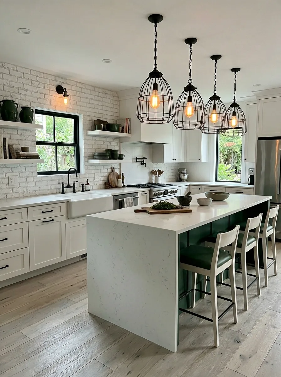
The entire premise of this kitchen is the brick. Install white-painted or white-limewashed brick on the main wall — the cooking wall, ideally, or the wall behind the sink. This is not brick veneer tile. It is actual brick or a convincing facsimile thereof, with real relief and natural variation in the surface. It gives the room a history that everything else is too new to have on its own.
Keep the cabinetry in a warm off-white, paired with matte black hardware throughout. Black pulls, black faucet, black window frames. The black hardware system is what transforms the brick wall from rustic to modern-rustic — it signals that the brick is a choice, not a remnant.
Hang four or five black wire cage pendants above the island in a staggered cluster. Vary the drop height slightly — two or three centimetres difference between pendants — to avoid a regimented row. These lights are as much sculpture as they are function. The exposed Edison-style filament bulbs inside provide warm amber light at evening.
Incorporate forest green accents through the open shelving: a row of deep green ceramic pitchers and bowls, a few green-glazed plates propped against the wall. Green against white brick and black hardware is a combination with staying power. It reads neither rustic nor industrial but somewhere between the two.
Travertine Terracotta Tile Rattan Globe
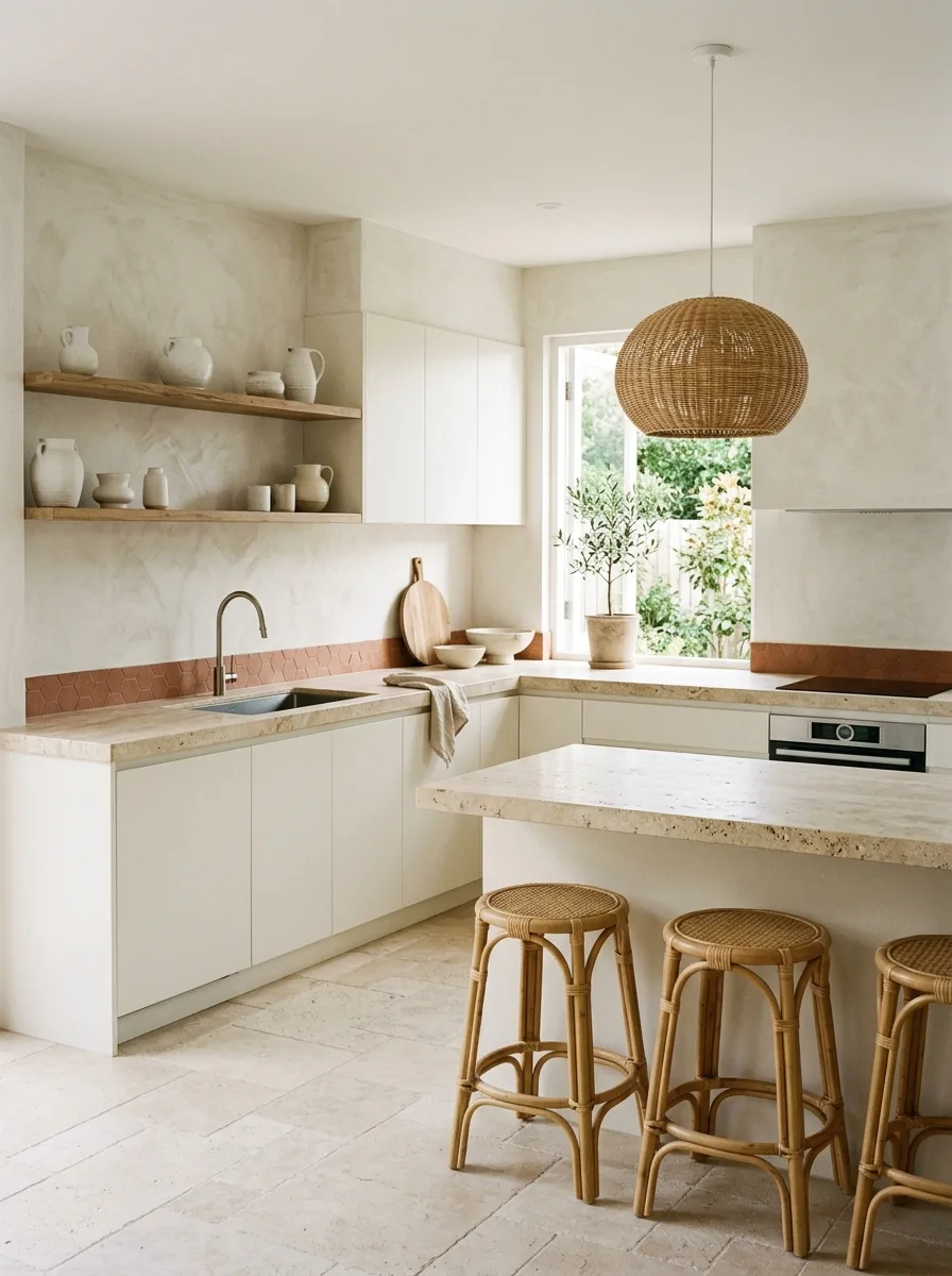
Everything in this kitchen is working together to create the feeling of the Mediterranean, without a single piece of tile in an olive pattern. The restraint is the point.
Specify flat-front cabinetry in a warm white or very light greige — the kind of white that reads as bone in the afternoon light. No hardware at all. Push-to-open mechanism only. This surface needs to be as quiet as possible.
Use a travertine slab for the countertop and peninsula — real travertine, not a lookalike, with the characteristic pitting and fossil inclusions left unfilled. The travertine is warm beige with cream and rust-coloured movement. It is old and beautiful and will only improve with age.
Install a hexagonal terracotta tile as a linear backsplash accent just behind the sink and hob — a single row, perhaps two rows, of small terracotta hex tiles set at counter level. Not the entire backsplash. Just a stripe of colour that runs horizontally through the kitchen and introduces the warmth of the terracotta into the palette.
Hang one large spherical rattan pendant above the peninsula — a simple woven globe, 30 to 40 cm in diameter, natural unfinished rattan, white ceiling canopy. One light. That is all this room needs.
Put two or three rattan café stools at the peninsula bar — the classic round-seated bistro stool with the X-shaped footrest, natural finish, no cushion. Style the open wooden shelves above the sink with white-clay jugs and ceramics. Bring a small olive tree in a terracotta pot to the windowsill. The whole room works because it commits completely to its palette — cream, travertine, terracotta, and rattan — and never apologises for it.
Navy Lower Cabinets Schoolhouse Stripe Stools
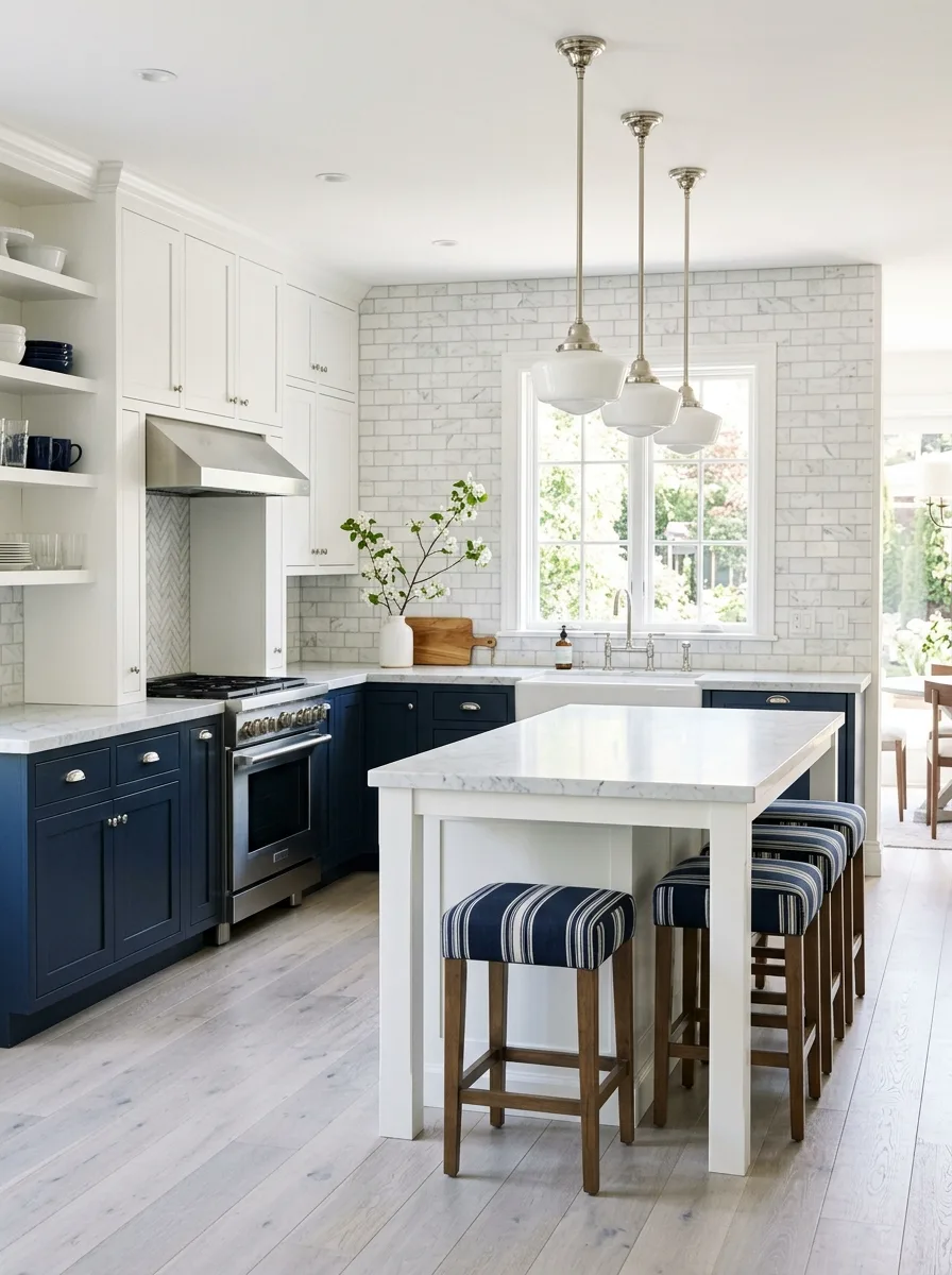
This is a two-tone kitchen, and the key to getting it right is keeping the boundary between the two tones absolute. White upper cabinets, white perimeter above the counter. Navy lower cabinets, navy lower perimeter below the counter. One horizontal line — the countertop edge — separates them. Nothing bleeds into the other zone.
Choose a deeply saturated navy — Benjamin Moore Hale Navy or Farrow & Ball Hague Blue — for the lower cabinets. The colour needs to be dark enough to read as a true navy rather than a medium blue. Install Shaker-style doors with polished nickel hardware — cup pulls on the lower drawers, bar pulls on the doors.
Top the lower perimeter and the island in a marble or quartz with pronounced grey veining on a white background. The veining in the stone will echo the blue of the lower cabinets without matching it. This is how you make a two-tone kitchen feel designed rather than divided.
For the island, keep the base white and top it in matching marble. The island is in the neutral zone — it doesn’t need to choose a side.
Hang three schoolhouse globe pendants in polished nickel above the island — medium scale, 12 to 14 inches, with a white glass globe and a nickel fitter. The silver of the nickel hardware system ties all the metals in the room together.
Source backless bar stools upholstered in a classic navy and white ticking stripe. The stripe references the navy of the lower cabinets while adding a tactile, fabric-covered moment to the island seating. This is the small detail that makes the whole room feel as though it was styled by someone who understood it.
Glass Front Cabinets Cream Rattan Pendants
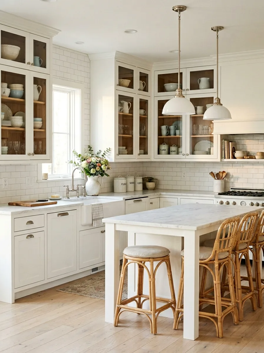
Glass-front cabinets are only successful if what’s inside them is worth seeing. Commit to that before you commit to the glass.
Specify upper cabinets with full glass fronts — not the cabinets over the range or in corners, but the main upper run where you store everyday crockery. Inside the cabinets, line the back wall with the same warm wood as the cabinet boxes — a honey-toned maple or birch ply. The combination of cream cabinet frames, warm wood interior, and well-organised ceramics behind glass creates the effect of a piece of furniture in a Victorian kitchen, not a generic box.
Edit the contents brutally. Every item behind the glass needs to be either beautiful or interesting. Mismatched mugs from years of corporate gifting have no place here. Invest in a matching set of simple white or very pale blue ceramics: plates, bowls, cups, and a few jugs. Arrange them by size and type. The inside of the cabinet is as considered as the outside.
Pair this with a classic white subway tile backsplash — the 3×6 format in a running bond pattern, with bright white grout kept narrow and clean. Simple dome pendants in white-enamelled metal with polished nickel hardware hang above the island. Their cleanliness complements the organisation visible through the glass.
Terracotta Island Dried Botanicals Cane Chairs
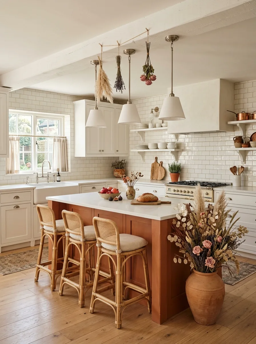
The terracotta island is the room’s entire argument. Everything else in the kitchen is neutral — cream cabinets, white subway tile, light hardwood floor. The island stands alone in a warm, muted terracotta orange, and it earns that isolation completely.
For the island paint colour, look at Farrow & Ball Cinnabar or Benjamin Moore Pueblo. These are warm, earthy reds with enough orange to read as terracotta rather than burgundy. The island base should be a simple box construction with Shaker-style panel detail — the same door profile as the perimeter cabinets, just in the accent colour.
Hang your kitchen lights on a suspended wooden beam or rod mounted between ceiling joists — from this structure, tie bundles of dried botanicals: lavender, pampas grass, dried roses, and wheat stalks. These hang alongside your pendant lights rather than replacing them. A pair of simple cone-shaped white pendants does the job of lighting; the dried botanicals do the job of being interesting. The combination reads as a French farmhouse kitchen brought forward by about two decades.
Complete the island seating with natural cane dining chairs or bar stools — the kind with a padded linen seat and a cane or wicker back. The cane against the terracotta island is one of the warmest combinations in residential kitchen design. Add a large terracotta urn filled with dried stems and eucalyptus on the floor beside the island. This is the room’s full stop.
Curved Island Plaster Walls Sculptural Stools
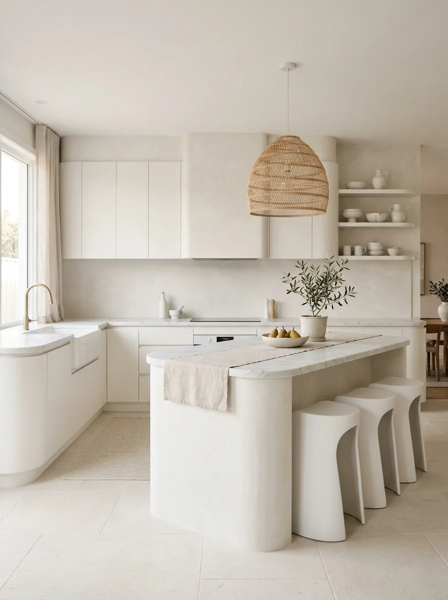
This kitchen begins with a decision: no straight lines in the new construction. The island base is curved at both ends — not a rounded rectangle but a fully organic curve, like a river stone or an oversized soap bar. The base itself is plastered in the same material as the walls, making it feel like it grew from the floor rather than was installed on it.
Plaster the walls and cabinetry surrounds in a trowelled, textural plaster finish in warm white or very pale putty. This is not paint. Venetian plaster or a traditional lime plaster finish creates a surface with depth and movement that no painted wall can replicate. The slight variation in tone across a plastered wall means the room never feels blank, even when the palette is entirely neutral.
Top the curved island in a veined white marble cut to follow the curve. This slab is the single most expensive element of this kitchen, and it justifies every penny. The combination of the organic plastered base and the formal stone top creates a tension between natural and refined that defines this aesthetic.
Specify a single large woven rattan pendant — globe or dome shape, 40 to 50 cm — above the island. No other pendant lights. This is a room that wants simplicity and doesn’t need a row of three lights to prove it has a dining zone.
Seat the island with sculptural moulded stools in warm white — a material like lacquered fibreglass or solid resin, with a gently waisted profile and a minimal footprint. The curve of the stool base echoes the curve of the island. This is intentional.
Black Counters Hood Black Dome Pendants
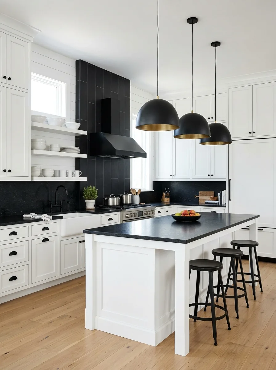
The premise is this: a white room with a black spine. The spine runs through the kitchen from the range hood to the countertops to the island top, all in deep matte black. Everything else is white. The contrast is absolute.
For the range hood surround, tile from counter level to ceiling in a long, narrow format tile — the kind called a brick or a column tile — in matte black or very dark charcoal. This tiled column behind the range reads as an architectural moment, not just a backsplash. It is the focal point of the cooking wall and it earns the attention.
Pair this with black countertops throughout — honed black granite, soapstone, or a black quartz with minimal movement. The black counters on white Shaker cabinets is a combination that has appeared in white kitchens for thirty years because it works. It works because it gives the eye a horizon line.
Hang three oversized dome pendants above the island in matte black with a brass or warm gold interior — the inside of the dome should glow in a warm metal finish when the lights are on. The black exterior recedes against the white ceiling; the interior creates warmth on the island below. This is a pendant light that looks different during the day than it does at night.
Use simple round backless stools in black metal for the island. Nothing upholstered, nothing padded, nothing warm. The warmth in this room comes from the floor alone — and the floor should be wide-plank natural oak with plenty of visible grain.
Sage Island Terracotta Hex Floor Silver Domes
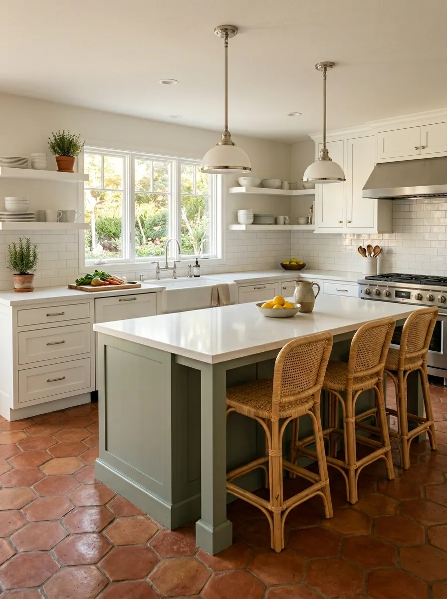
The terracotta hexagon floor tiles are the foundation of this look. They are handmade-looking — slightly uneven in tone, with warm variation between tile and tile — and they are laid in a standard honeycomb grid across the entire kitchen. This floor has age. It has texture. It will only look better as it wears.
Against that floor, specify cream or off-white perimeter cabinetry with brushed silver hardware — simple bar pulls and round knobs, nothing ornate. The cream and silver is a quiet combination that lets the floor and the island do all the work.
Paint the island in a muted sage green — soft, grey-toned, dusty. Benjamin Moore Sage, Farrow & Ball Mizzle, or Sherwin-Williams Liveable Green are all in the right territory. The sage island reads as earthy rather than bold, grounded against the terracotta floor without competing with it.
Top the island in a clean white quartz or a white marble. The pale top keeps the island from getting too heavy and bridges it back to the white of the perimeter.
Hang two polished chrome or brushed nickel dome pendants — solid dome profile, 16 to 18 inches, in a warm silver finish. The silver of the pendants echoes the cabinet hardware and anchors the metal system. Seat the island with natural rattan or cane bar stools — their organic texture softens the formality of the overall scheme.
A terracotta pot of fresh herbs on the open shelving above the counter ties the floor tile to the living world of the kitchen. It is not a prop. It belongs here.
Powder Blue Brick Rattan Stools White Domes
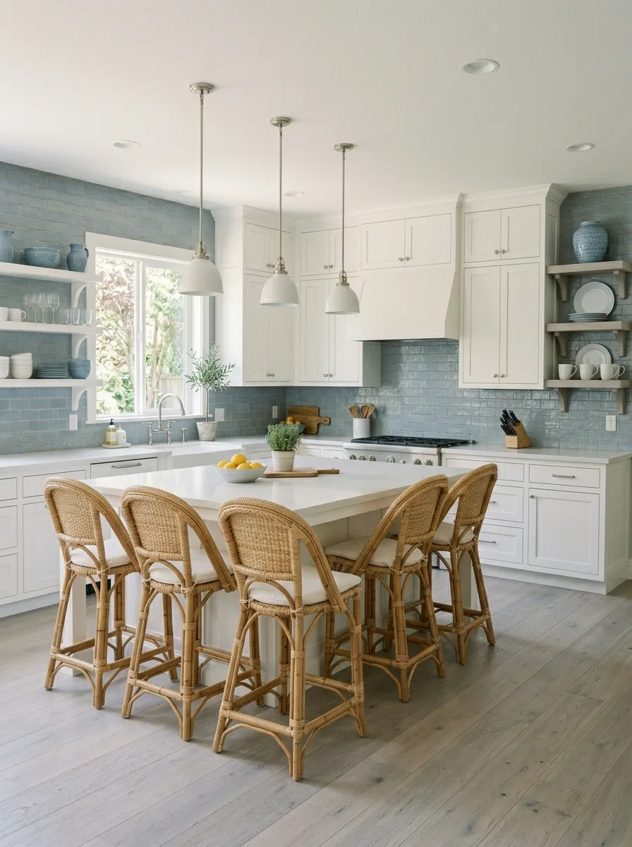
The decision is the backsplash. Install a handmade-style glazed brick tile in a soft powder blue or grey-blue — something with gentle variation in the glaze, so adjacent tiles look slightly different from each other. Run this tile from counter level to the ceiling on all walls, treating it not as a backsplash but as a wall material. The whole kitchen has a sky-blue wainscot that reaches all the way up.
Against that backsplash, everything else is white: painted Shaker cabinetry, white enamel farmhouse sink, white countertops, white island. The contrast between the blue tile and the white furniture makes the kitchen feel like it belongs in a coastal house, even if it doesn’t.
For the island, build a square rather than rectangular footprint — four sides of equal or near-equal length — and use the same white countertop material as the perimeter. Seat it on all four sides with matching rattan bistro stools, the kind with a circular woven seat and curved bentwood back.
Hang white dome pendants in a brushed nickel or chrome finish — not oversized, not dramatic, just three pendants in a row at a consistent height. The white pendants against the white ceiling are nearly invisible. They function without demanding attention.
The natural rattan of the stools against the powder blue tile is the room’s defining moment. It is warm against cool, organic against glazed, old-fashioned against architectural. Neither element needs the other to be beautiful. Together, they are better than either.
Arched Plaster Hood Walnut Island Marble Slab
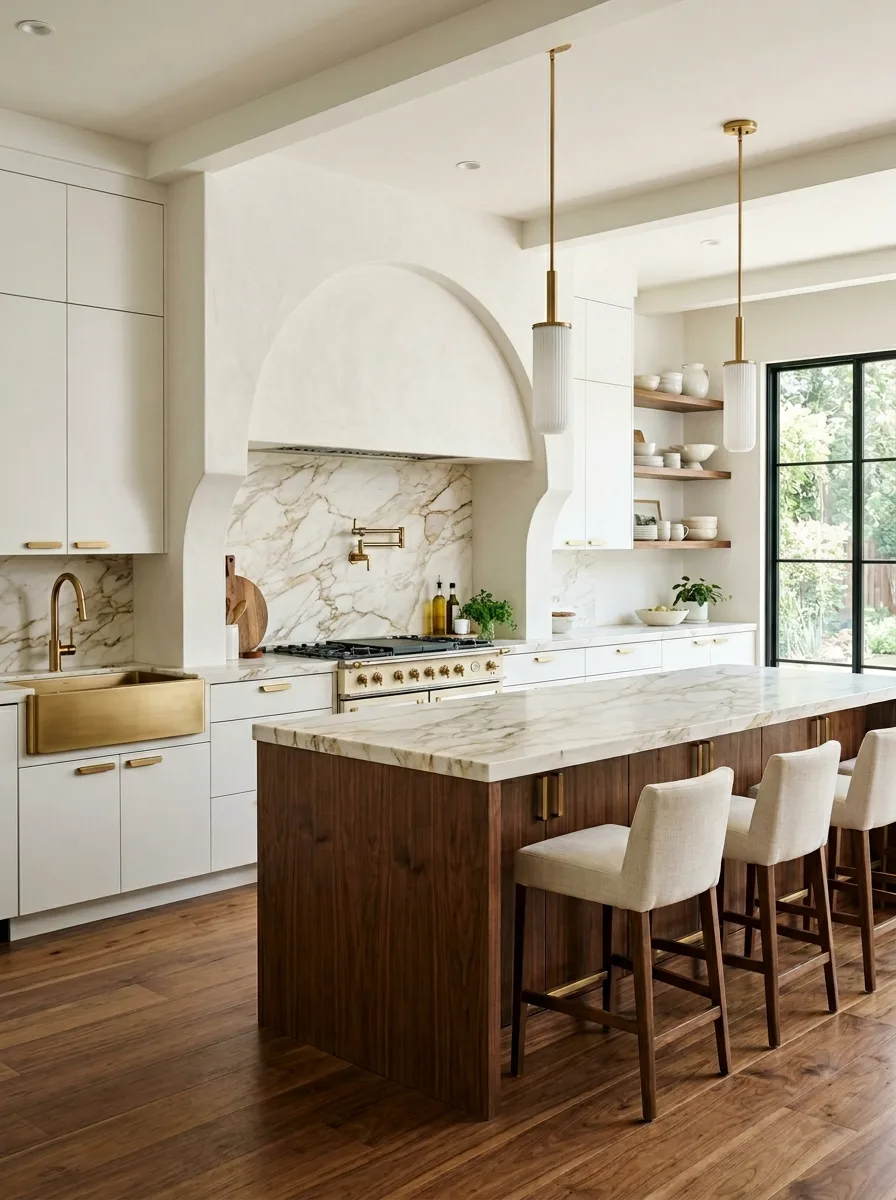
The range hood is the centrepiece of this kitchen. It is not a stainless box. It is not a painted wood surround. It is a full arched plaster structure — built like a fireplace surround, with a smooth trowelled finish in warm white plaster, and an arched profile that frames the cooking zone the way a fireplace arch frames a hearth.
This hood extends from counter level to the ceiling and wraps around the range on three sides. Behind the range, a slab of Calacatta Viola marble — white with dramatic purple, gold, and grey veining — runs from counter to the underside of the arch. This combination of the rough plaster exterior and the polished marble interior is the room’s central drama.
Specify the perimeter cabinetry in flat white — handleless, integrated, receding as much as possible. The job of the perimeter is to disappear. All the design energy is in the hood and the island.
For the island, use solid walnut for the base — actual stained or natural-finish walnut cabinetry, with visible grain and warmth. Top it in a continuation of the Calacatta marble. The walnut base against the white perimeter is the distinction between the working kitchen and the gathering place.
Hang two slender brass-stem pendants with fluted white glass shades — vertical rather than dome, architectural rather than decorative. The brass in the pendant hardware echoes the brass faucet on the farmhouse sink. Mount a pot filler above the range in matching brass.
This kitchen is the most architecturally ambitious of the group. It asks the most of both the budget and the builder. It also, by a considerable margin, looks the most like nothing else you’ve ever seen.
Zellige Wall Tile Brass Hardware Leather Stools
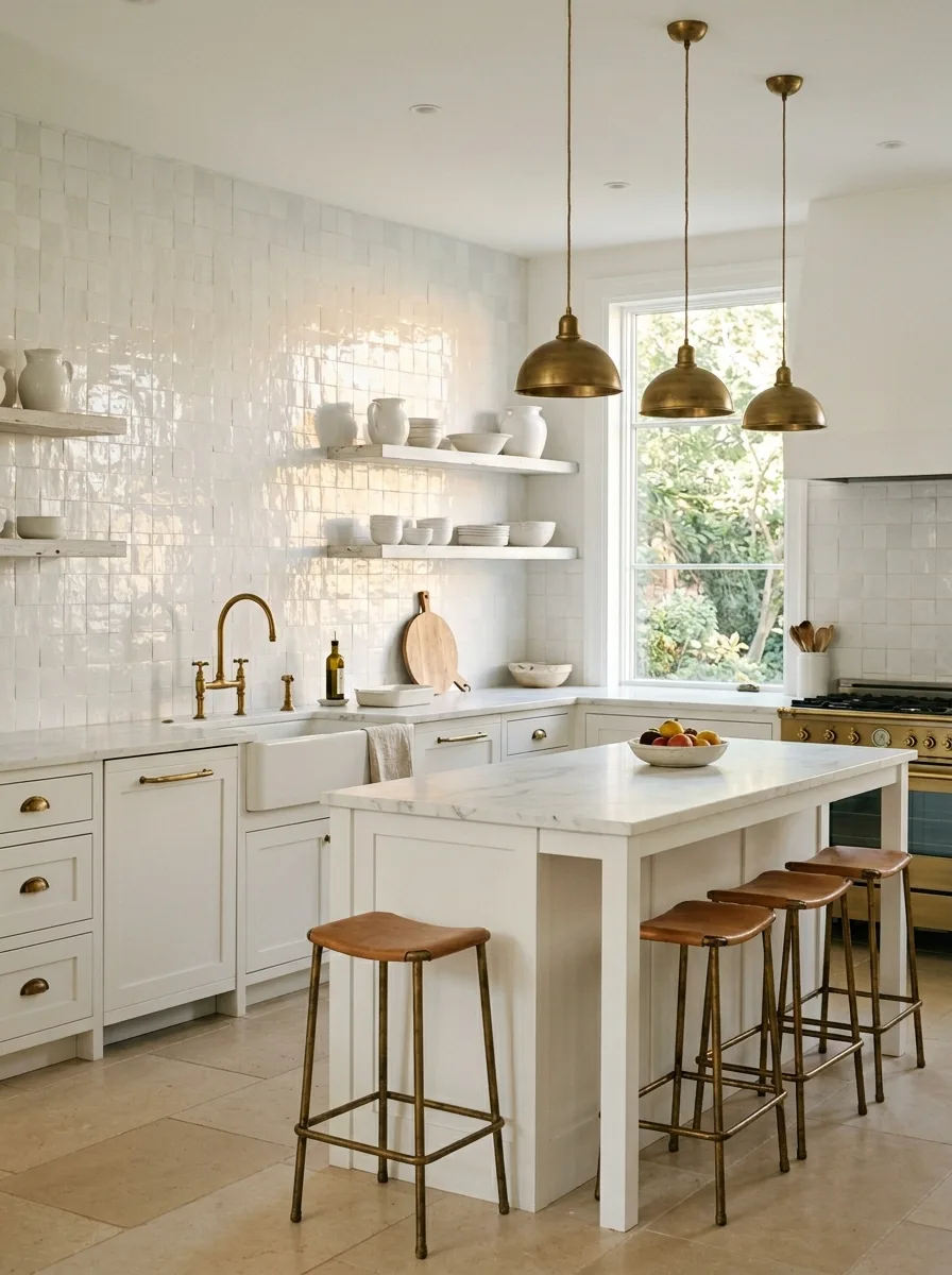
Zellige tile — the North African hand-pressed, hand-glazed ceramic that is irregular, slightly uneven, and entirely irreplaceable as a surface — is the defining material of this kitchen. It runs the full height of the cooking wall and both side walls in a bright, slightly off-white glaze. The effect is not flat and clean but alive and shimmering, catching light from different angles throughout the day.
The floor is limestone or a pale stone tile in a large format, unfussily laid in a running bond. The ceiling is plain plaster. The cabinetry is cream Shaker — the quietest possible presence. The entire purpose of every other element in the room is to provide a context in which the zellige can perform.
Specify unlacquered brass for every piece of metal in the room: cabinet hardware, faucet, pendant shades, and a range in matching brass or cream enamel. Unlacquered brass starts warm and golden and develops a patina over time. Within a year, it will look like it has been in this kitchen for thirty years. That aged quality is appropriate alongside the hand-made character of the zellige.
For the island, a simple table-style construction in cream-painted timber, with brass cup pulls on the base drawers and a white marble countertop. The marble is the one formal note in an otherwise artisan room.
Seat the island with flat-topped backless bar stools in saddle-leather brown, on aged brass tube legs. The leather is thin and tight over the seat pad, and it will darken and mark with use. That is the point. This room wants evidence of being used.
Final Thoughts
Every one of these kitchens starts from the same premise: white is not a background color. It is a surface with properties, undertones, and demands. The moment you treat it as a neutral — a blank canvas waiting for accessories to do the work — the room starts to flatten.
What separates the kitchens that people pin, save, and use as renovation references from the ones that look fine and nothing more is decision-making at a level of specificity that most renovation guides don’t reach. Not “add brass accents” but exactly which brass, in which temperature, on which surfaces, paired with what stone and what wood and what tile.
The other thing they share is confidence. Each of these kitchens committed to something. A color. A material. An architectural gesture. An unusual texture. There is no kitchen on this list that tried to please everyone and ended up pleasing no one. They made a choice and gave it the room to work.
That’s the only real design advice worth giving. Make a choice. Give it room. Get out of its way.