
Nobody actually wants a Tuscan kitchen. They want forty years of someone else’s life, pre-installed.
That’s the part the renovation shows skip. You can buy reclaimed beams. You can buy a hand-thrown pitcher from an import shop. You cannot buy the thing that makes a Tuscan kitchen work, which is the sense that nothing in the room was chosen — it just accumulated.
Most attempts at this style end up looking like a restaurant chain’s idea of Italy. Terracotta tile, a string of fake garlic, a chandelier made of wine bottles. Technically Tuscan. Spiritually a theme park.
This isn’t a list of things to buy. It’s a list of decisions to make, in the right order, so the room earns the look instead of wearing it.
Why Most “Tuscan” Kitchens Read as Costume
The failures are consistent enough to name. Once you see them, you can’t unsee them in every overdesigned farmhouse kitchen on your feed.
Buying the Palette Instead of the Texture
People think Tuscan means a color: terracotta, olive, a particular ochre yellow. So they paint a wall that color and call it done.
Color was never the point. The original rooms got their warmth from raw plaster, stone, and unsealed wood aging in real sunlight for decades. Paint can approximate the hue. It cannot approximate the surface.
A flat-painted wall in terracotta sits there looking like a paint chip. A lime-washed or hand-troweled plaster wall in the same hue moves with the light all day. One is a color choice. The other is a material choice, and only the second one reads as authentic.
If you’re choosing between a better color and a worse surface, choose the surface every time.
Letting Decor Do the Heavy Lifting
The instinct is to fix a flat, builder-grade kitchen with accessories. Hang some herbs. Add a copper pot. Done.
Accessories on top of a generic room just look like accessories on top of a generic room. The bones have to be doing something first — an arched niche, an exposed beam, a stone sink basin — or the dried lavender is just dried lavender in a kitchen that still looks like 2014.
Decide what the room’s one architectural gesture is before you buy a single ceramic jug.
Treating the Ceiling as an Afterthought
Eyes go up in these kitchens more than in almost any other room style, because the beams and vaults are usually the most honest, least faked element available.
A flat drywall ceiling kills the effect immediately, no matter what you do below it. There is no rug, table, or pendant light that compensates for a blank white plane overhead.
If you do nothing else structurally, address the ceiling. It’s doing more work than the floor.
Tuscan Kitchen Ideas
Ceiling-Hung Salumi Display
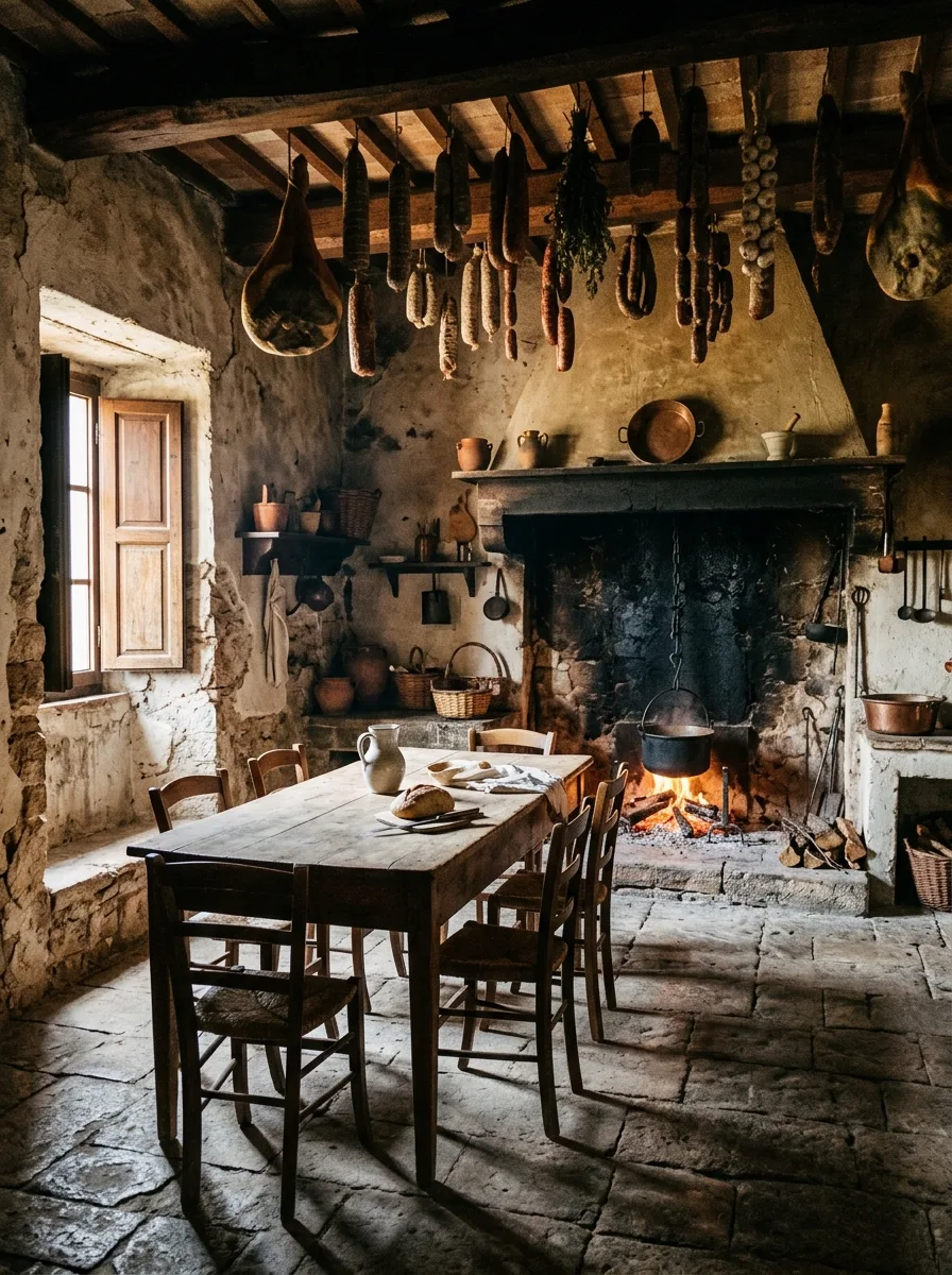
Run a single exposed beam, real or added, across the lowest point of your kitchen ceiling — directly above a dining or prep table, never tucked into a corner.
Source actual butcher’s hooks, the kind with a simple curved end, from a restaurant supply shop rather than a decor retailer. Hang them in an uneven, slightly clustered arrangement rather than a perfectly spaced row.
If you’re not curing your own meat, use this for drying herbs, braided garlic, or even just linen towels — the visual logic is the hanging itself, not strictly what’s on the hook. Keep everything within arm’s reach of where you actually cook.
Avoid hanging anything purely decorative that doesn’t serve a function. An empty hook looks staged. A hook holding something mid-use looks lived-in.
Wine Barrel Dining Table
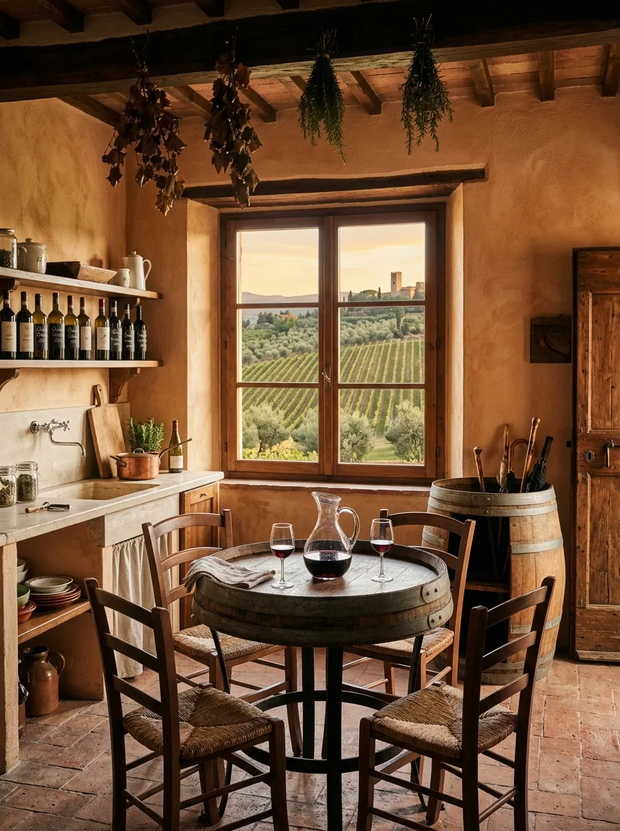
Source a genuine reclaimed oak wine barrel — full size, not a half-barrel novelty piece — and have a local fabricator cut and reinforce the top into a stable round surface with a simple steel base.
The barrel’s existing iron hoops and aged staves should stay visible around the table’s edge. Sanding or refinishing them away defeats the entire point of using a barrel in the first place.
Pair it with mismatched rush-seat chairs rather than a matching set, and position the table near a window with an actual view out, since the whole arrangement depends on natural light hitting the worn wood.
Skip a tablecloth here entirely. The barrel grain is the centerpiece.
Bare Bulb Truffle Table
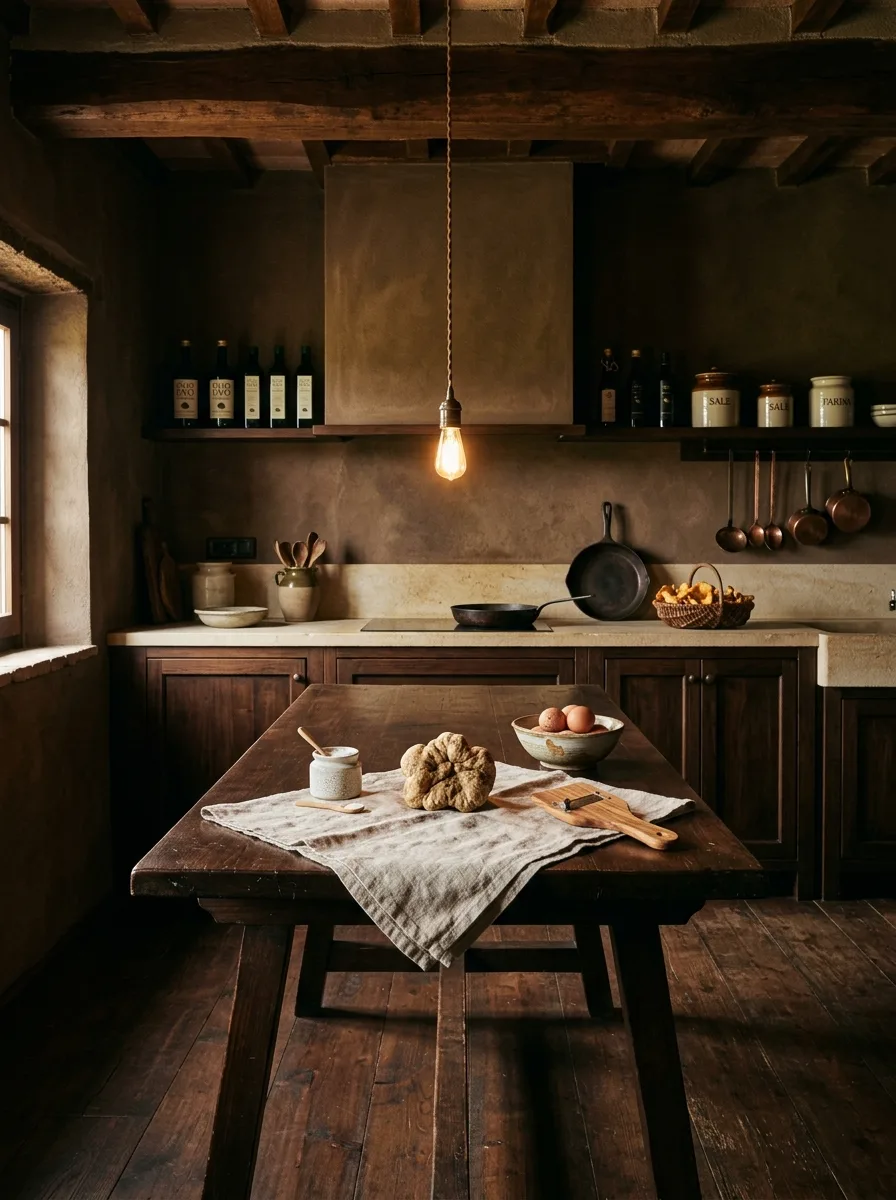
Hang a single pendant fixture with an exposed Edison-style bulb on a visible twisted cloth cord, directly over a dark, heavily worn wooden table — no shade, no diffuser.
The cord length matters more than people expect. It should hang low enough that the bulb sits close to table height, almost in the way, rather than floating safely overhead like standard kitchen lighting.
Style the table itself with a single piece of raw linen and one or two genuinely rustic objects — a wheel of cheese, a basket of eggs, a battered cutting board — rather than a full tablescape.
One bulb only. A cluster of bulbs turns this from rustic into industrial, which is a different room entirely.
Fresco Border Modern Range
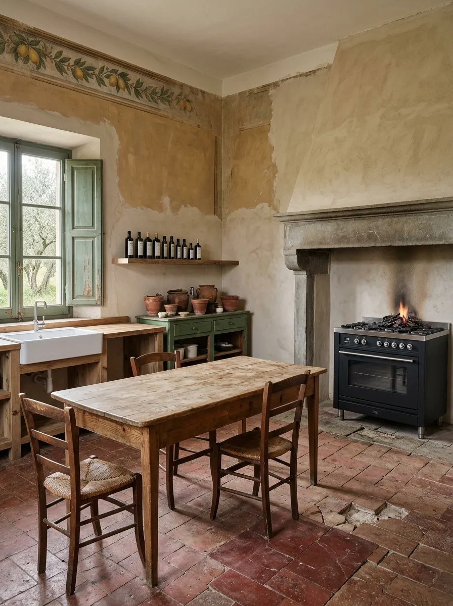
Commission or hand-paint a narrow decorative border — lemons, olive branches, grapevines — along the top edge of your kitchen walls, just below the ceiling line, using a muted, slightly faded palette rather than crisp modern color.
Leave the plaster below it intentionally patchy, showing bare sections next to painted ones, as if the wall has been repaired in stages over time rather than finished all at once.
Set a genuinely modern range — stainless steel, glass-front oven — directly into an old stone fireplace surround rather than building new cabinetry around it. The contrast between ancient hearth and modern appliance is the entire trick.
Don’t try to age the range itself. Let it look obviously new against the obviously old stone. Matching eras here would flatten the effect.
Candlelit Carved Stone Ledge
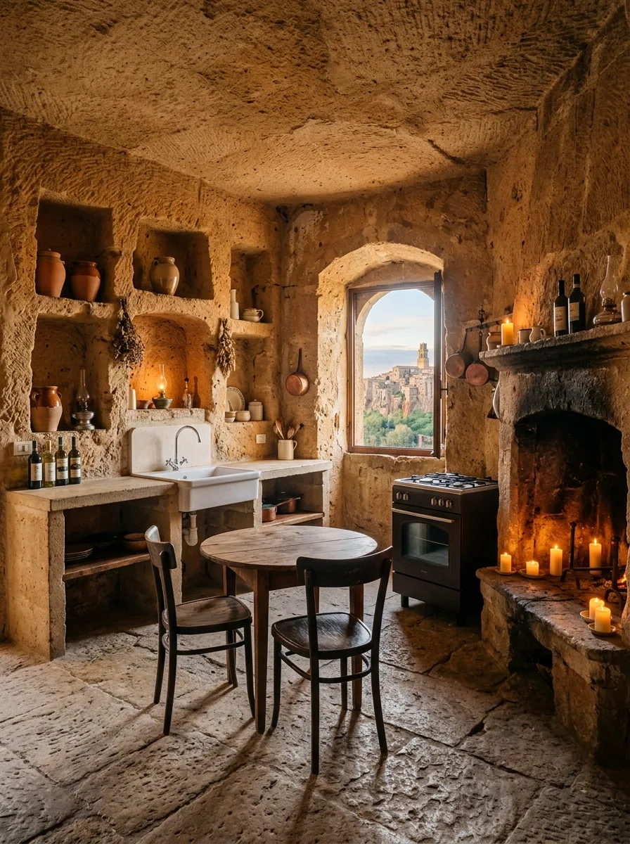
If you have any existing stone or masonry hearth ledge, leave it unpainted and use it to hold a dense cluster of pillar candles in mismatched heights rather than a single tall one.
For a non-cave kitchen, you can approximate this with a deep, rough-hewn stone or concrete shelf set at fireplace height, finished with a tumbled rather than polished surface so it catches candlelight unevenly.
Carve or commission small arched niches into adjacent walls if structurally possible, sized to hold single ceramic jugs or oil lamps. The niches should look load-bearing, not applied — shallow enough to read as carved into the wall, not stuck onto it.
Electric flicker bulbs ruin this instantly. Use real flame or nothing.
Open Shelf Book Display
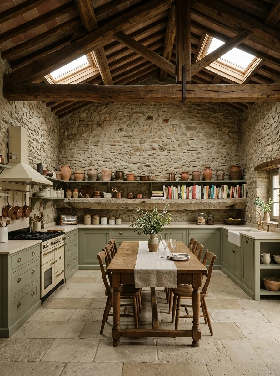
Install heavy, visibly rough-hewn timber shelving directly into stone or heavily textured plaster walls, using exposed iron or timber brackets rather than hidden hardware.
Mix actual cookbooks, spread spine-out and stacked at slightly different heights, with terracotta vessels and crockery along the same shelf run. The books need to look used — broken spines, a few dog-eared corners — not staged as decor.
Vary the depth of objects from front to back rather than lining everything up flush with the shelf edge. A single row of perfectly aligned objects reads as a display case, not a working shelf.
Resist the urge to color-coordinate the book spines. Mismatched and well-read beats curated every time.
Burlap Sack Floor Styling
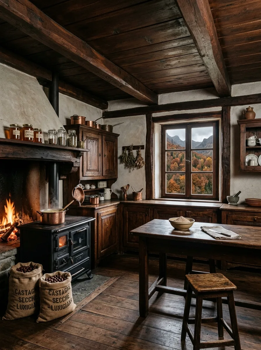
Source genuine burlap or jute grain sacks, ideally with stenciled lettering already on them, from an agricultural supplier or specialty import shop rather than a craft store reproduction.
Fill them with something with real weight and visual texture — dried beans, chestnuts, whole grains — so the sacks hold their shape and slump naturally rather than sitting stiff and obviously empty.
Cluster two or three together at floor level near a stove or hearth, leaning rather than standing perfectly upright, as if they were set down mid-task and never moved.
Keep this to one cluster per room. Scattered sacks throughout the kitchen starts to look like a farmers market display rather than someone’s actual pantry overflow.
Overflowing Flower Bouquet Counter
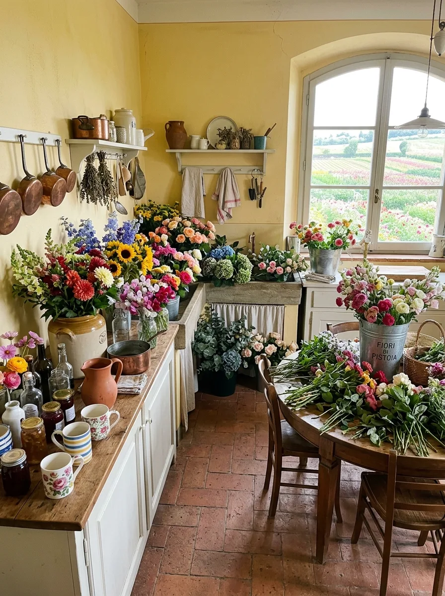
Pick one long counter run and dedicate it entirely to vessels — mismatched ceramic jugs, an old enamel pot, a galvanized bucket — in varying heights, all genuinely vintage or convincingly worn.
Buy flowers in loose, ungroomed bunches rather than pre-arranged bouquets, and let stems cross between vessels rather than keeping each container’s contents separate and tidy. The goal is abundance bordering on chaos, not a florist’s display.
Leave raw stems and greenery loose on the counter itself, not just in water. A few unstyled bunches lying flat, as if mid-arrangement, sells the working-kitchen illusion better than anything fully finished.
This only works with real flowers in real season. Silk arrangements collapse the entire effect immediately.
Labeled Apothecary Spice Wall
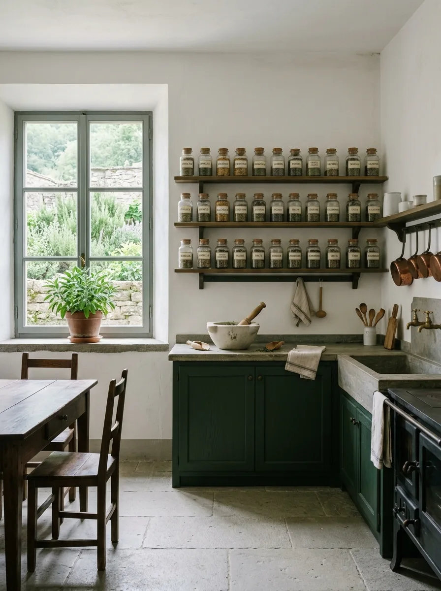
Install two or three long, narrow open shelves at uniform height along a single wall, sized specifically to hold small glass apothecary jars with cork stoppers rather than standard kitchen containers.
Hand-letter or commission simple typeset labels for each jar, using herb or spice names in a consistent font and placement, then fill every single jar to a similar level. Uniformity in the labeling is what makes the randomness of the contents read as a system rather than clutter.
Mount the shelves with visible iron or dark timber brackets, and leave a few inches of negative space at each end of the run rather than packing jars edge to edge.
Skip printed labels that look digitally produced. A slightly uneven, hand-applied label sells the apothecary feeling; a laser-printed one undoes it.
Black Volcanic Stone Counters
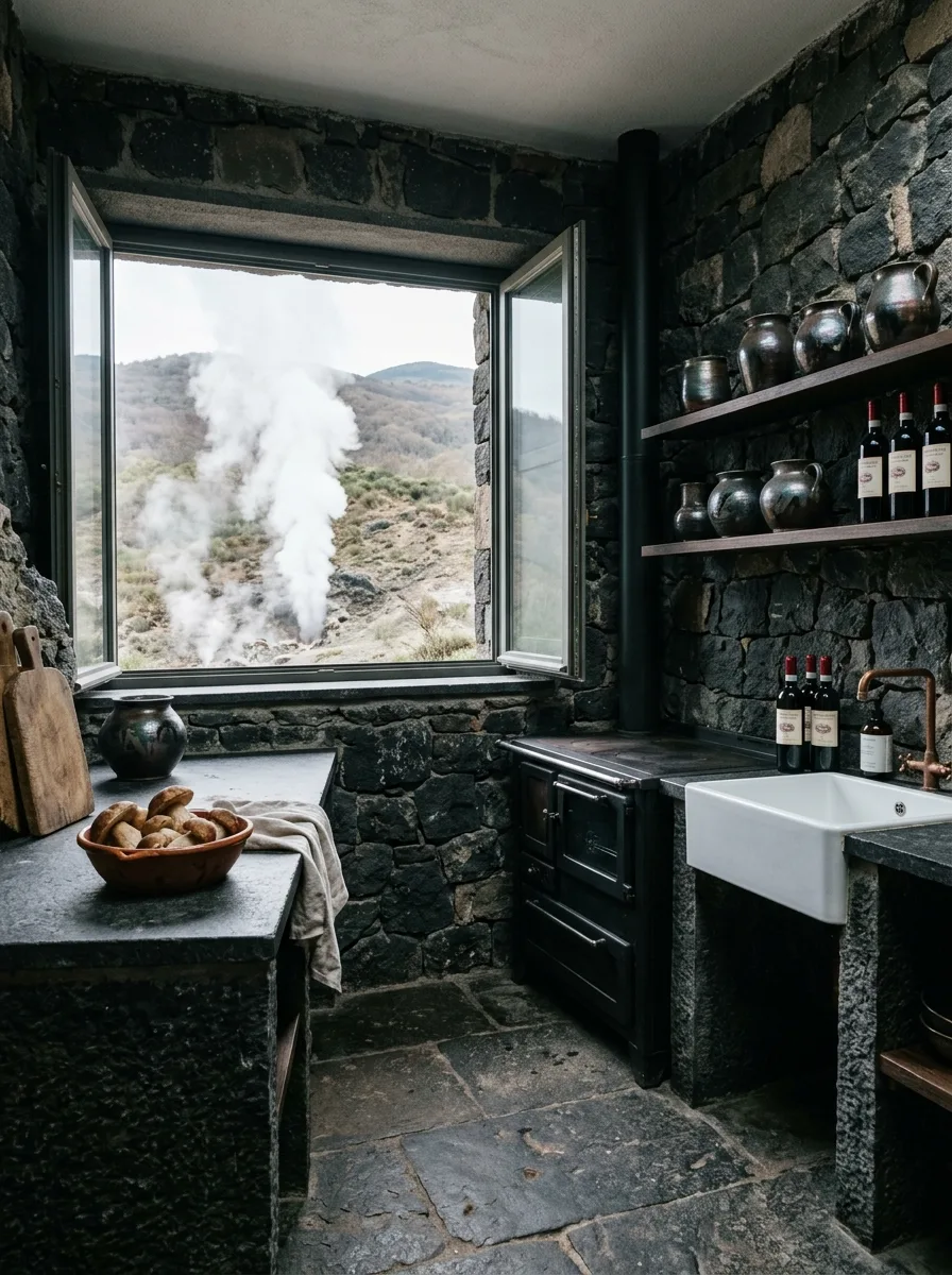
Source a dark, visibly rough-textured volcanic or basalt stone for counters and surrounds rather than a polished black granite or engineered quartz, which will read as modern no matter what else you do.
Pair it with matching dark stone walls, left in their natural rubble or fieldstone state rather than dressed smooth, so the whole room reads as carved from one material rather than assembled from finishes.
Keep fixtures minimal and utilitarian — a single copper tap, unlacquered so it darkens over time, set against the stone with no surrounding trim or transition piece.
Avoid any reflective or glossy element in this palette. Matte and rough is the entire point; one shiny surface breaks the illusion that the room is hewn rather than built.
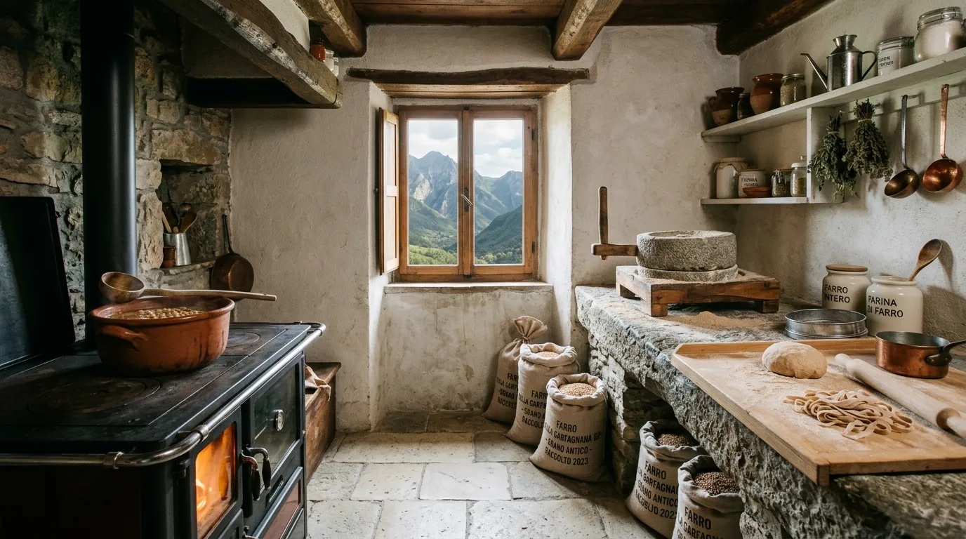
Stenciled Grain Sack Storage
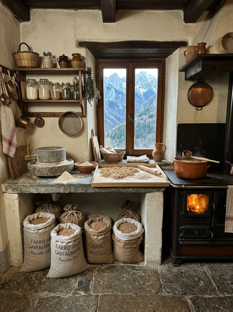
Set heavy burlap sacks of whole grains or legumes directly on the floor beneath an open stone or plaster prep counter, rather than hiding them in a pantry or cabinet.
Have the sack labeling stenciled with a specific regional grain name and a harvest year, treating it like provenance information rather than generic decor text. Specificity is what sells this — a vague “grains” label reads as a prop.
Pair the sacks with a genuine stone hand mill or quern set on the counter directly above them, positioned as if recently used, with a small scatter of flour or meal left visibly around its base.
Don’t sweep the flour scatter away for photos or guests. The slight mess is the evidence that the mill actually works.
Amber Jar Open Hutch
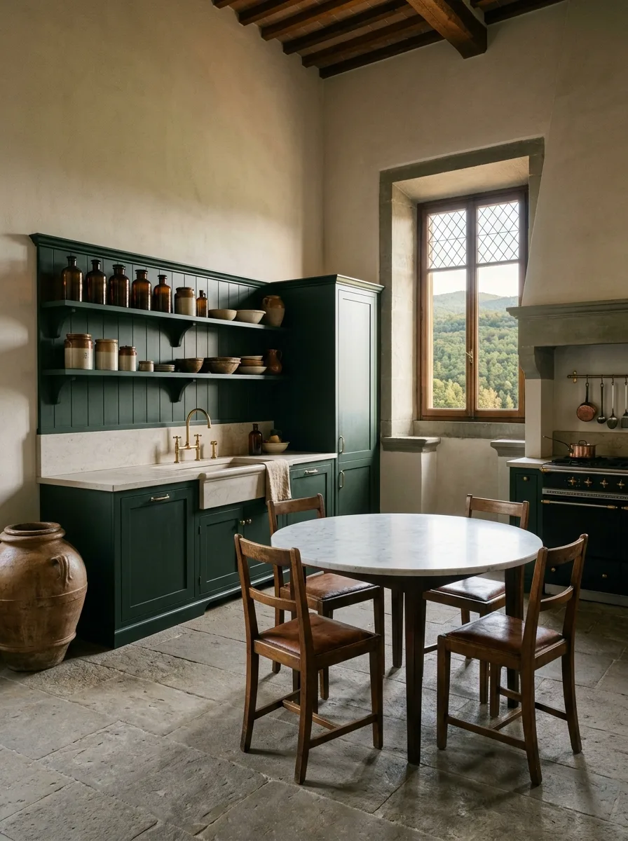
Build or source a tall, freestanding open hutch in a single saturated color — deep green works especially well — rather than a neutral wood finish, and let the paint show genuine wear at the edges and handles.
Fill the open shelves with amber glass apothecary jars in a uniform shape but slightly varying heights, mixed with a smaller number of ceramic bowls and jugs in complementary earth tones.
Pair the hutch with brass or unlacquered bronze hardware throughout the room — taps, handles, hinges — so the warm metal tone echoes the amber glass rather than competing with it.
Keep the lower cabinet doors closed in the styling. The contrast between an open, displayed top and a concealed, practical bottom is what keeps this from tipping into clutter.
Hidden Cellar Floor Trapdoor

If your kitchen sits above any kind of basement, cellar, or crawl space, consider installing an actual iron-ring trapdoor set flush into the floor, finished to match the surrounding stone or wood rather than standing out as a feature.
Use reclaimed iron hardware for the ring pull specifically — a bright modern handle will read as a gimmick the moment anyone notices it.
Position it in a high-traffic but not central spot, near where a table or work surface would historically have needed cellar access for wine or preserves, so its placement has an internal logic.
This isn’t a project for purely decorative trapdoors. If you’re going to install one, it should lead somewhere real — even just unfinished storage.
Herringbone Brick Vaulted Ceiling
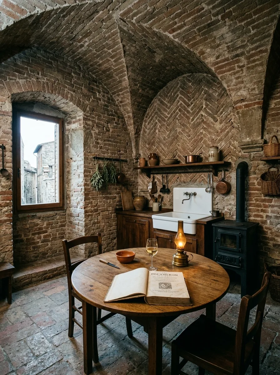
Commission a true brick barrel vault if your structure allows it, with the brick laid in a herringbone pattern along the curve rather than a simple running bond, since the diagonal pattern is what catches light and gives the vault its depth.
Leave the brick unsealed and unpainted, in its natural fired-clay color range, and let mortar lines stay visibly uneven rather than precision-pointed.
Light it from low, warm sources only — an oil lamp, a small table lamp, a single sconce — never with overhead can lighting, which flattens the curve of the vault and kills the shadow play that makes it read as old.
If a full vault isn’t structurally possible, a single arched brick niche in one wall, done with the same herringbone detail, gives you a smaller version of the same effect.
Gingham Cloth Terracotta Walls
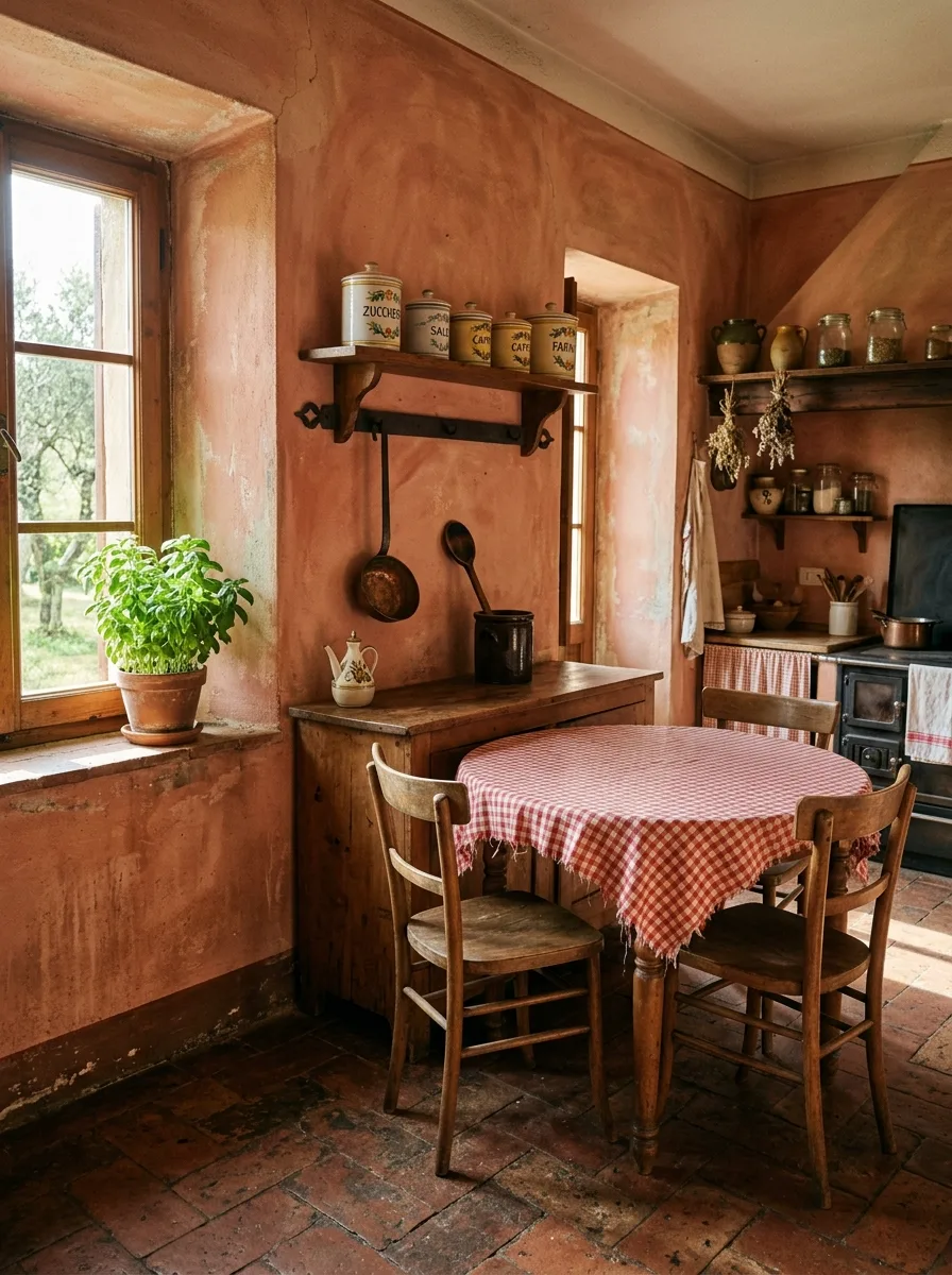
Hand-trowel or sponge-apply a warm terracotta or coral plaster finish directly onto your walls, allowing visible variation in tone from one section to the next rather than a flat, even coat.
Source a genuinely worn red-and-white gingham tablecloth, ideally with frayed or unfinished edges, and let it hang slightly past the table’s edge rather than fitting it precisely.
Mount a single small open shelf above a workspace, holding a row of mismatched vintage canisters with hand-painted labels rather than a matching modern set.
Add one potted herb on a windowsill rather than a full collection. Restraint on the greenery keeps the wall color as the room’s main event.
Sea Glass Bowl Display
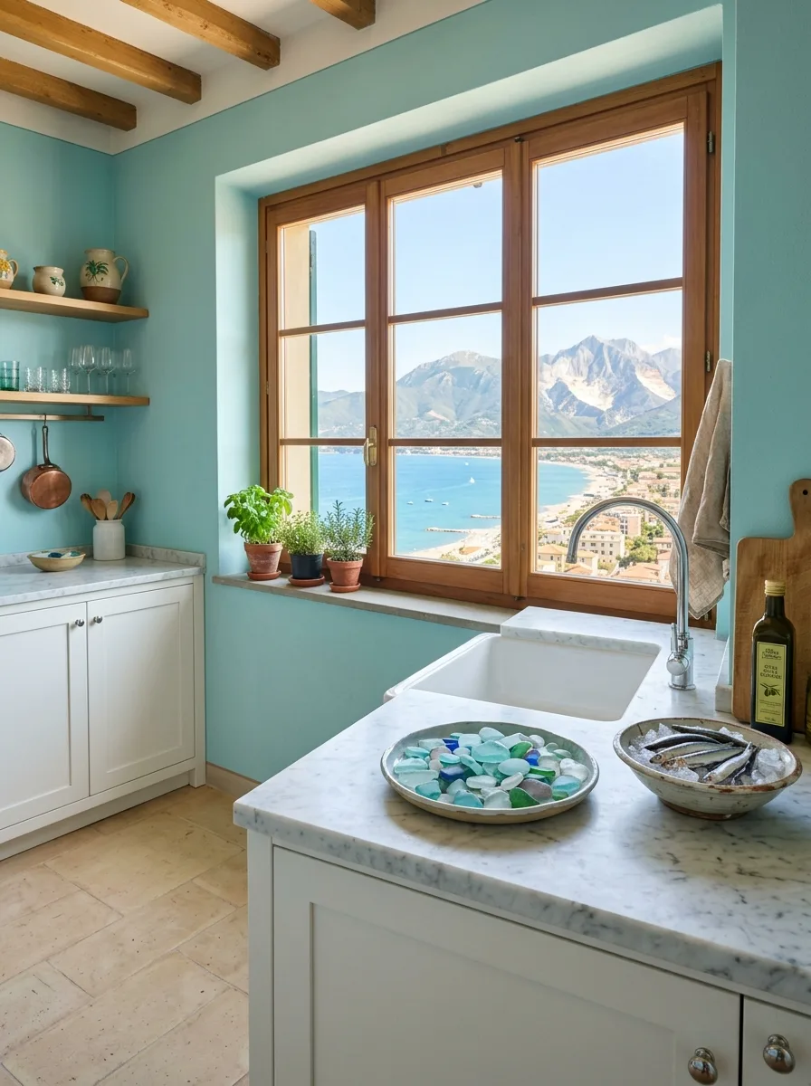
Collect or source genuine sea glass and small beach stones in a mix of blues, greens, and whites, and display them loosely in a low, wide ceramic bowl rather than a glass vase that would compete with the glass itself.
Pair this with a soft aqua or turquoise wall color applied in a matte, slightly chalky finish, and white marble or honed stone counters that keep the palette from tipping too saturated.
Position the display directly on a counter near a window with a genuine water view if you have one, so the collected glass echoes the actual color of what’s outside.
Keep metal finishes simple and cool-toned here — chrome or brushed steel rather than warm brass — to stay consistent with the coastal rather than inland palette.
Glass Roof Stone Box
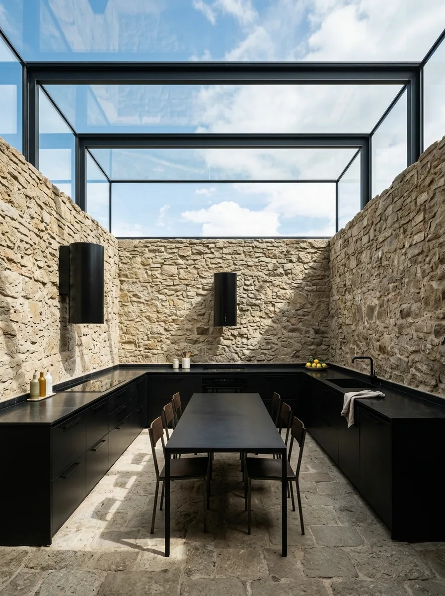
Build the kitchen as an open-air feeling box: rough fieldstone walls left bare on at least two sides, paired with a glazed roof structure that reads more like a greenhouse frame than a conventional ceiling.
Keep cabinetry matte black and completely flat-fronted, with no visible hardware, so the stone walls and sky above remain the only texture in the room. Anything ornate on the cabinets will compete with the architecture and lose.
Run a single long black table down the center, in the same matte finish as the cabinetry, so the furniture disappears into the palette rather than adding a new material to track.
This is the one entry where restraint is the whole instruction. Every additional decorative object you add will fight the architecture instead of supporting it.
Final Thoughts
None of this is really about Tuscany. It’s about what happens when a room is allowed to be built around use instead of built around appearance.
Every example here shares the same underlying habit: a structural decision made first, with the styling arriving afterward to support it, never the other way around. The barrel table works because someone decided where people would actually sit before deciding what the table looked like. The trapdoor works because it leads somewhere.
That’s a slower way to design a kitchen than buying a curated set of “rustic” accessories off one website. It’s also the only way to end up with a room that doesn’t look like it’s trying.
Give the bones the hard decisions. Let the decor show up last, and only if it earns its place.