
Green is the most forgiving color you can put on a kitchen cabinet, and also the easiest one to get wrong in a way nobody can quite name.
Most people pick a paint chip labeled “sage” or “hunter” and assume the hard part is over. It isn’t. Green is a color with an undertone — blue-leaning, yellow-leaning, gray-leaning — and that undertone decides whether every other material in the room reads as intentional or accidental.
The kitchens that actually work aren’t running on a good paint choice alone. They’re running on a whole stack of decisions about metal finish, contrast value, and surface texture that happen to culminate in a green cabinet. The cabinet is the last domino, not the first one.
This is a breakdown of those decisions, followed by twenty specific rooms and exactly what to copy from each one.
Why Most Green Kitchens Feel Slightly Off
These are the recurring problems, the ones that show up across price points and styles alike.
Fighting the Undertone Instead of Reading It
Every green has a temperature underneath it, and most people never identify which one they’re working with before they start adding other colors and finishes around it.
A blue-leaning green wants cool neutrals and silver-toned metal nearby. A yellow-leaning green, the kind closer to olive, wants warm wood and brass. Put a cool blue-green cabinet next to warm oak floors and brass hardware, and the room will feel quietly unresolved even if nobody in it can say why.
Hold your paint sample against your actual floor and hardware finish before committing. If they clash even slightly, the room will read as a near-miss no matter how good the green itself looks in isolation.
Treating Green as the Only Color in the Room
A common instinct is to go all-in: green cabinets, green walls, green tile, green everything, on the theory that commitment equals sophistication.
Without a true neutral to interrupt it, the eye has nowhere to rest, and the whole room collapses into one undifferentiated block of color, however nice that color is on its own.
The strongest green kitchens almost always pair the cabinet color with a hard white, cream, or stone counter and backsplash. The green needs a foil. Give it one.
Picking Hardware Last
Hardware finish gets treated as an afterthought, chosen in the final week of a renovation after the bigger decisions are locked in.
That’s backwards. Brass, unlacquered brass, nickel, and matte black all read as completely different eras and moods against the same green, and that finish touches more visible surface area — knobs, pulls, faucet, pendant fixtures — than almost anything else in the room.
Choose your metal finish at the same time you choose your green, not after. They’re a single decision wearing two different costumes.
Green Kitchen Ideas
Gold Zellige Tile Backsplash
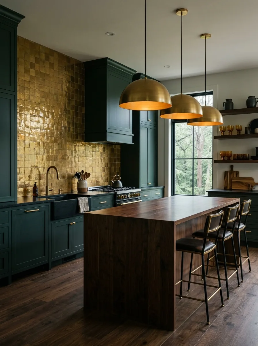
Source genuine handmade zellige tiles in a warm gold or brass tone, with their characteristic uneven surface and slight color variation from tile to tile, rather than a uniform manufactured gold tile.
Run them floor-to-cabinet behind the range only, leaving the rest of the backsplash in a plain painted surface, so the tile reads as a deliberate focal moment rather than a wall-to-wall treatment.
Pair the install with dark, almost-black green cabinetry and unlacquered brass fixtures so the metal tones echo the gold in the tile rather than competing against it.
Avoid grouting the tile in a stark white. A warm gray or tinted grout keeps the handmade irregularity visible instead of flattening it into a grid.
White Subway Tile Pairing
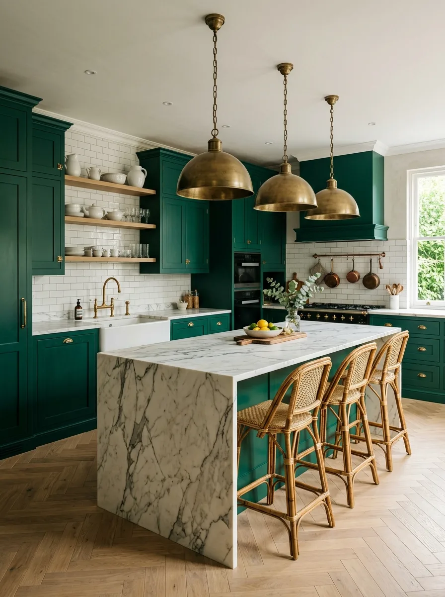
Use a true white subway tile, laid in a classic offset brick pattern, as the entire backsplash behind a deeply saturated emerald cabinet color, letting the tile’s simplicity offset the cabinet’s intensity.
Keep the grout a soft white or pale gray rather than matching it exactly to the tile, so the brick pattern stays legible instead of disappearing into a flat plane.
Add open wood shelving directly into the tile in at least one spot, breaking up what would otherwise be a very long, uninterrupted run of white.
This pairing depends on restraint elsewhere. Skip patterned tile or colored grout if you’re using this combination; let the cabinet color be the only loud decision in the room.
Fluted Cabinet Door Fronts
Source cabinet fronts with a vertical reeded or fluted groove pattern, either from a specialty cabinet maker or as an add-on millwork detail applied to flat-panel doors, rather than a standard shaker profile.
Keep the fluting consistent across both upper and lower cabinets, including any tall pantry or appliance-housing units, so the texture reads as a whole-room material choice rather than an accent on a single piece.
Pair the fluted fronts with a honed, not polished, natural stone counter and backsplash in a warm neutral tone, letting the stone’s softness balance the cabinetry’s strong vertical lines.
This detail gets expensive fast on deep cabinet runs. If budget is tight, apply it only to the island or a single bank of cabinets rather than the whole kitchen.
Two-Tone Painted Island Only
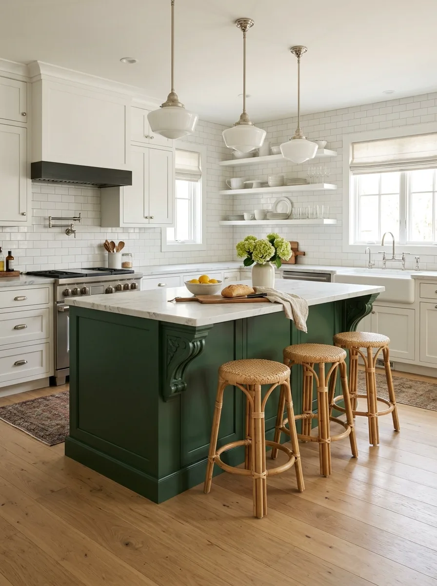
Paint the perimeter cabinetry a soft off-white or cream, and reserve a saturated, slightly darker green exclusively for the island, treating it as a piece of furniture rather than built-in cabinetry.
Add a detail like applied corbels or a furniture-style leg to the island specifically, reinforcing the idea that it’s a separate object dropped into a neutral room rather than a continuation of the perimeter.
Keep the island’s countertop material identical to the perimeter counters. The color shift should be the only variable; matching stone across both keeps the two-tone choice from reading as two unrelated kitchens stitched together.
Don’t extend the green onto any upper cabinetry. The moment green appears above counter height elsewhere in the room, the island stops feeling like a deliberate accent.
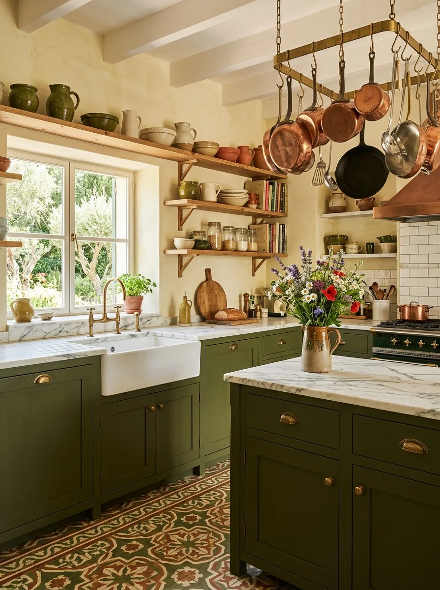
Hanging Plate Rack Display
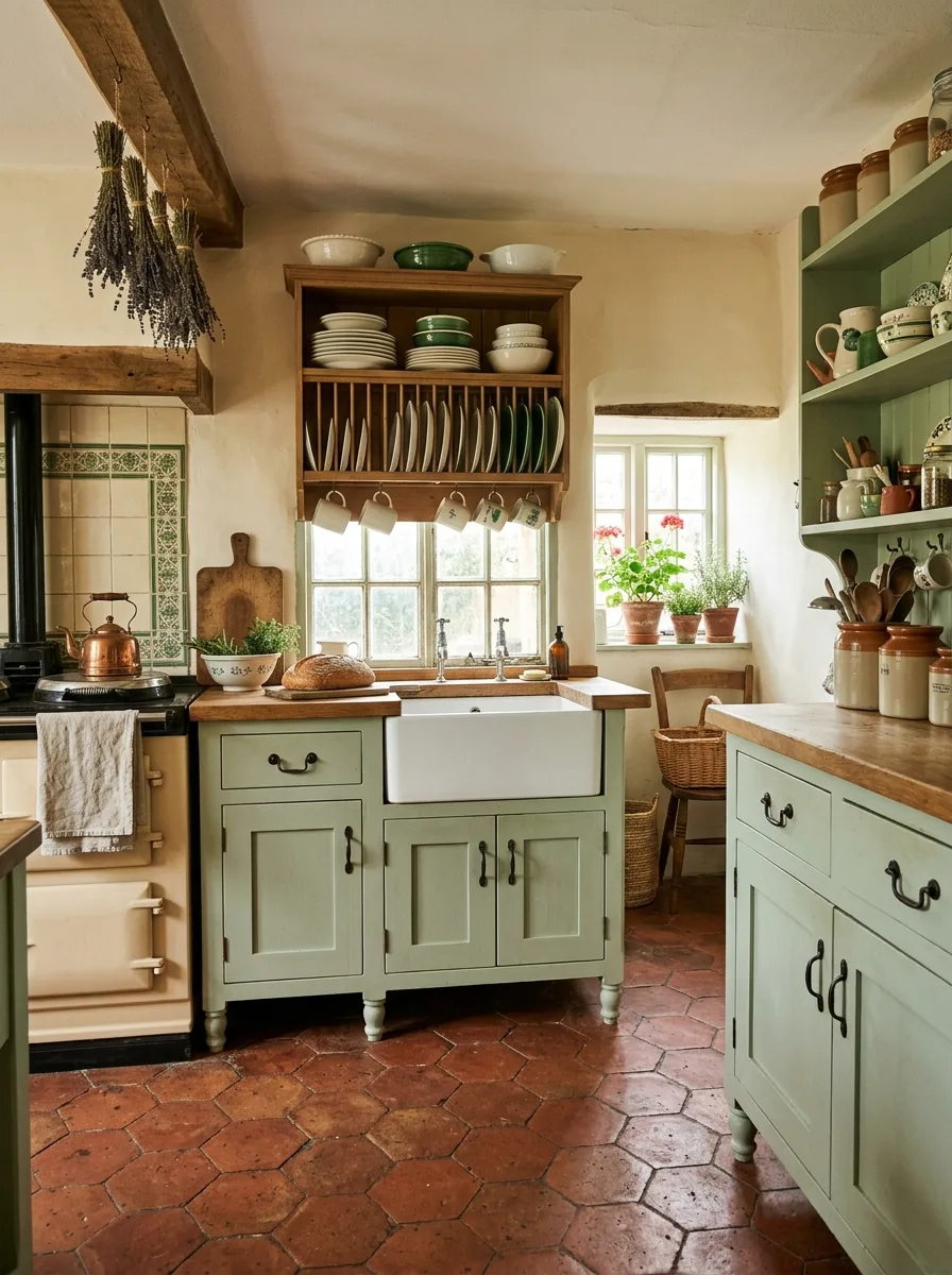
Mount a genuine wall-hung plate rack directly above a farmhouse sink, sized to hold dinner plates vertically with a slatted wood or wire interior, rather than a flat open shelf styled to look like one.
Load it with mismatched vintage-style plates rather than a matching set, varying the pattern and size slightly so the rack reads as a working storage piece rather than a display case.
Hang dried herb or lavender bunches from an exposed beam nearby, using simple twine rather than decorative ribbon, positioned where they’d actually catch rising warmth from a stove below.
Keep the rack’s wood tone close to your open shelving elsewhere in the kitchen. A mismatched wood tone on the rack alone will make it look like an add-on rather than original to the room.
Black Wire Cage Pendants
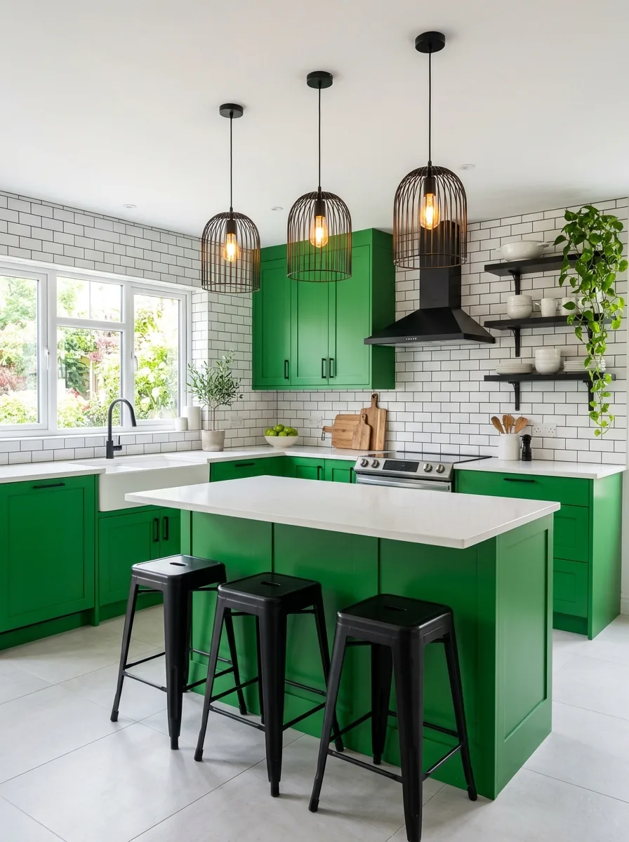
Choose pendant lights with an open wire-cage shade around an exposed filament bulb, in matte black, and hang at least three in a row over an island for the repetition to register as a design choice rather than a single fixture.
Pair them with a bright, saturated grass-green cabinet color rather than a muted sage, since the cage pendants read as slightly playful and need a similarly confident wall color to match their energy.
Keep the surrounding tile simple — a plain white subway in dark grout reads well here — so the black cage fixtures and bold cabinet color remain the two clear focal points.
Avoid mixing in any warm brass elsewhere in this scheme. The cool black-and-white-and-green palette depends on staying in one metal family throughout.
Sculptural Arched Hood Surround
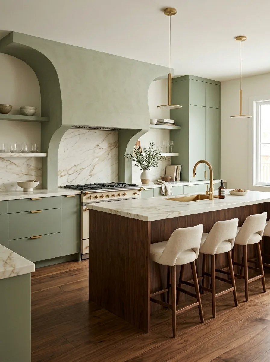
Build out a custom plaster or millwork range hood surround with rounded, arched negative space cut into it on either side, rather than a standard rectangular box hood.
Carry the same material and color down into a matching arched niche elsewhere on the same wall, ideally framing an open shelf, so the arch motif repeats rather than appearing as a one-off shape.
Finish the surround in the same matte sage tone as the surrounding cabinetry, and let a contrasting marble slab backsplash sit inside the arch itself, so the stone reads as inset rather than applied.
This is a structural commission, not a paint job. Work with a plasterer or millworker who can execute a true curved form; an approximated arch in flat panels will look like a cutout rather than sculpture.
Patterned Cement Tile Floor
Source genuine cement tile in a multi-color floral or geometric pattern, in tones of green, terracotta, and cream, and lay it as the entire kitchen floor rather than as a small accent rug-style inset.
Keep the cabinetry in a single solid olive or moss green rather than a pattern or a contrasting bright color, letting the floor carry all the visual complexity in the room.
Pair with open wood shelving and a generous collection of mismatched ceramic vessels in complementary earth tones, so the room feels gathered over time rather than newly installed.
Seal the tile properly and expect some color variation tile to tile. That irregularity is part of what makes cement tile read as authentic rather than printed.
Brass Arched Glass Cabinets
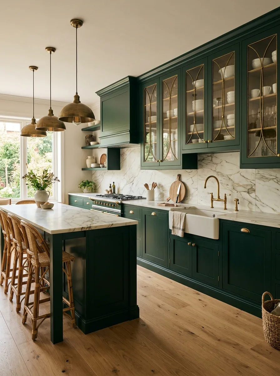
Commission upper cabinets with arched, gothic-style mullions in brass or brass-toned metal, set with clear glass, rather than standard square glass-front doors.
Use this detail selectively — two or three cabinets rather than a full wall — so the arched glasswork reads as a special architectural moment, not a repeated stock element.
Style the interior shelving behind the glass with a tight, color-coordinated collection of white and cream dishware, since the arched brass framing draws the eye in and an overly busy interior will compete with the metalwork itself.
Pair with a marble slab backsplash and matching brass plumbing fixtures so the metal tone reads as consistent throughout the room, not isolated to the cabinet fronts.
Curved Rounded Cabinet Corners
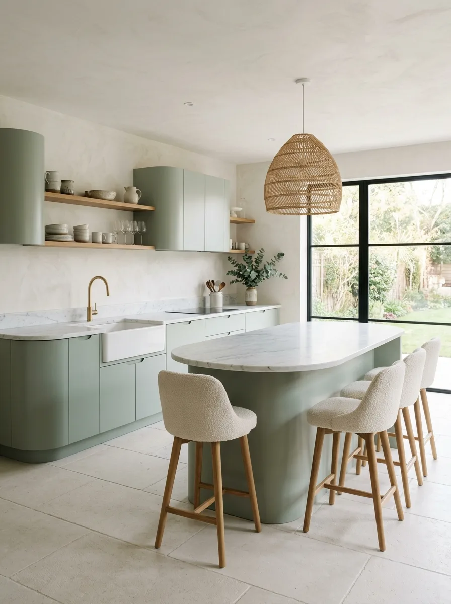
Source or commission cabinetry with genuinely rounded outer corners and curved upper units, rather than cabinets with a faux-curved applied molding, since the difference is immediately visible up close.
Pair the curved cabinetry with a similarly rounded island shape — an oval or stadium-shaped countertop rather than a sharp rectangle — so the soft geometry carries through the whole room instead of stopping at the cabinets.
Use a soft, slightly chalky plaster wall finish behind open shelving, in a tone close to but not identical to the cabinet green, so the wall and cabinetry blend rather than contrast sharply.
Keep hardware minimal or hidden entirely with push-to-open mechanisms. Visible pulls tend to undercut the soft, continuous lines this style depends on.
Six-Pendant Brass Dome Row
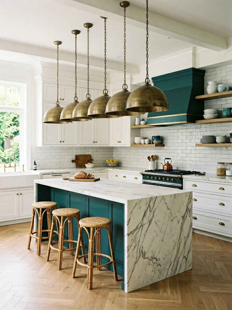
Hang a full row of matching brass dome pendants — five or six, evenly spaced — along the entire length of a large island, rather than the more common cluster of three.
Use aged or unlacquered brass specifically, so the fixtures develop a soft patina over time rather than staying mirror-bright, which would read as too polished against a deep teal or green cabinet color.
Pair with a single, dramatic marble waterfall edge on the island itself, in a stone with strong veining, so the island has enough visual weight to stand up to that many fixtures overhead.
This only works on a genuinely long island. On a standard-size island, three pendants will look more intentional than six crowded too close together.
Mosaic Backsplash Black Counters
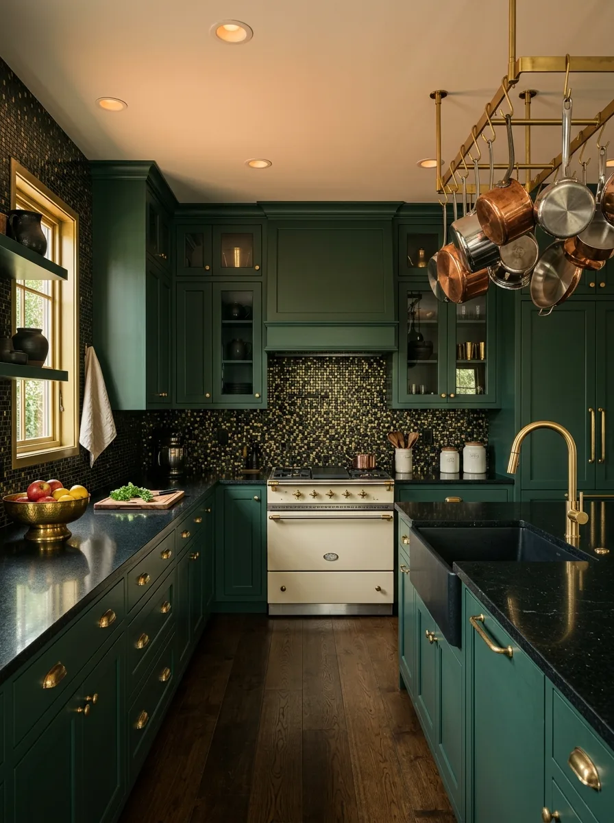
Install a small-format mosaic tile, in a mixed black, gold, and green palette, across the full backsplash from counter to upper cabinet, rather than stopping at a standard four-inch backsplash height.
Pair it with a honed black granite or soapstone counter, so the dark stone and dark mosaic blend into one continuous dark plane, broken only by the cream-colored range and brass hardware.
Add a hanging brass pot rack loaded with copper cookware nearby, letting the warm copper tones provide relief against the otherwise cool, dark palette.
Keep the cabinet green very dark and close in value to the counters and tile. A lighter green here would break the moody, enveloping effect the rest of the palette is going for.
Scalloped Fish-Scale Tile Backsplash
Source a fish-scale or scalloped tile in a soft cream or stone tone, and run it as a full-height backsplash behind the range, choosing a subtle texture over a high-contrast pattern.
Pair it with sage green cabinetry and a matching range hood cover finished in the same painted material as the lower cabinets, so the hood reads as architecture rather than an applied metal box.
Add open wood shelving directly into the scalloped tile field, with the shelf brackets in brass to tie back to the pendant fixtures and faucet finish elsewhere in the room.
Keep the grout close in tone to the tile itself. High-contrast grout on a scalloped pattern can tip the texture into looking busy rather than subtly dimensional.
Retro Checkerboard Tile Backsplash
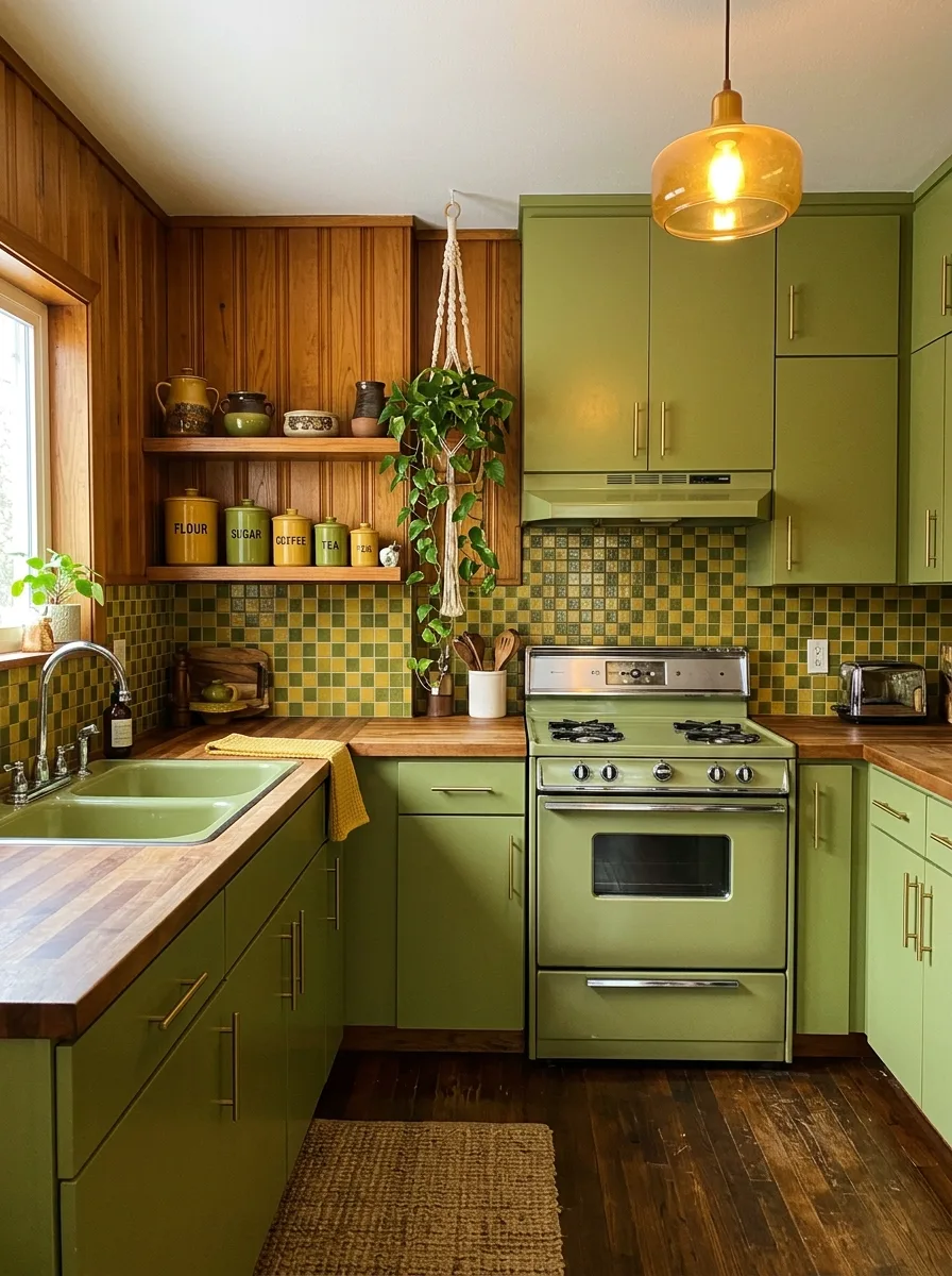
Source small-format square tile in two or three tonal variations of olive and avocado green, and lay it in a loose, slightly randomized checkerboard pattern rather than a strict alternating grid.
Pair with warm wood paneling on an adjacent wall, left in its natural finish rather than painted, so the room reads as a genuine period piece rather than a modern reproduction.
Use butcher block counters in a warm honey tone, and source an actual vintage-style range in a matching green enamel rather than a modern range with a faux-retro finish.
Hang a trailing plant from a macrame hanger near a window. The combination of warm wood, checkerboard tile, and greenery is what sells the decade, more than any single piece alone.
Beadboard Cabinet Door Panels
Source cabinetry with a vertical beadboard panel insert on the door fronts, rather than a flat or simple shaker recess, for a softer, more cottage-specific texture.
Pair with a wall-hung plate rack in the same paint color as the cabinetry, rather than a contrasting wood tone, so the whole upper portion of the wall reads as one continuous built-in.
Use a worn, antique-style runner rug on the floor in front of the sink, and choose a marble counter with soft, minimal veining rather than a dramatic, high-contrast stone, to keep the overall mood gentle rather than bold.
Keep this palette pale — mint or soft sage rather than a deep saturated green. Beadboard detailing reads as fussy if paired with too dark or too bold a color.
Industrial Concrete Wall Pairing
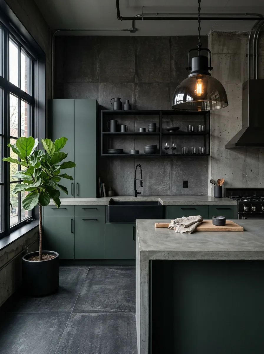
Pair matte, deeply saturated green cabinetry with raw or polished concrete walls and counters, left in their natural gray tone with visible texture and minor imperfections.
Use entirely matte black fixtures and a black farmhouse sink, avoiding any warm metal tones, so the palette stays strictly cool throughout — concrete gray, deep green, matte black.
Add one large, leafy plant, like a fiddle leaf fig, in a simple black pot, as the only soft or organic element in an otherwise hard-surfaced room.
This combination depends on real architectural bones — exposed pipe, factory-style windows, high ceilings. Attempting it in a standard suburban kitchen without those elements will read as a cosplay of a loft rather than an actual one.
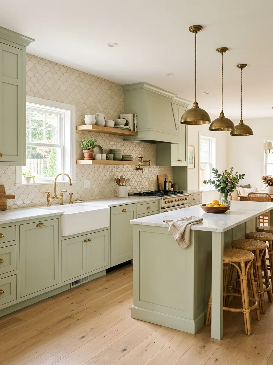
Hexagon Marble Tile Backsplash
Source hexagonal marble mosaic tile, in a soft white-and-gray veined stone, and run it as a full-height backsplash across the entire perimeter, not just behind the range.
Pair with a muted seafoam or dusty sage cabinet color, keeping the green soft enough that it doesn’t compete with the visual texture of the hexagon pattern itself.
Add velvet or upholstered bar stools in a tone close to the cabinet color, with slim brass legs, to introduce a single soft, tactile element into an otherwise hard-surfaced room.
Keep the grout pale and close to the stone’s base tone. Dark grout on a hexagon pattern this detailed will make the backsplash read as busy rather than refined.
Glossy Full-Wall Tile Drama
Source a glossy, square format tile in a deep emerald or bottle green, and run it floor-to-ceiling across one entire wall, rather than stopping at standard backsplash height.
Pair it with a marble-look stone island in a complementary dark green with dramatic gold veining, so the island and the tiled wall read as two expressions of the same material idea.
Add a genuinely oversized lighting moment — a crystal or glass tiered chandelier rather than simple pendants — since a glossy full-wall tile treatment this intense needs a fixture with equal visual weight to avoid being upstaged by its own wall.
This is a maximalist combination on purpose. Keep countertop styling minimal — a single bottle, a bowl of fruit — so the room has one quiet zone for the eye to land on.
Butcher Block Counter Pairing
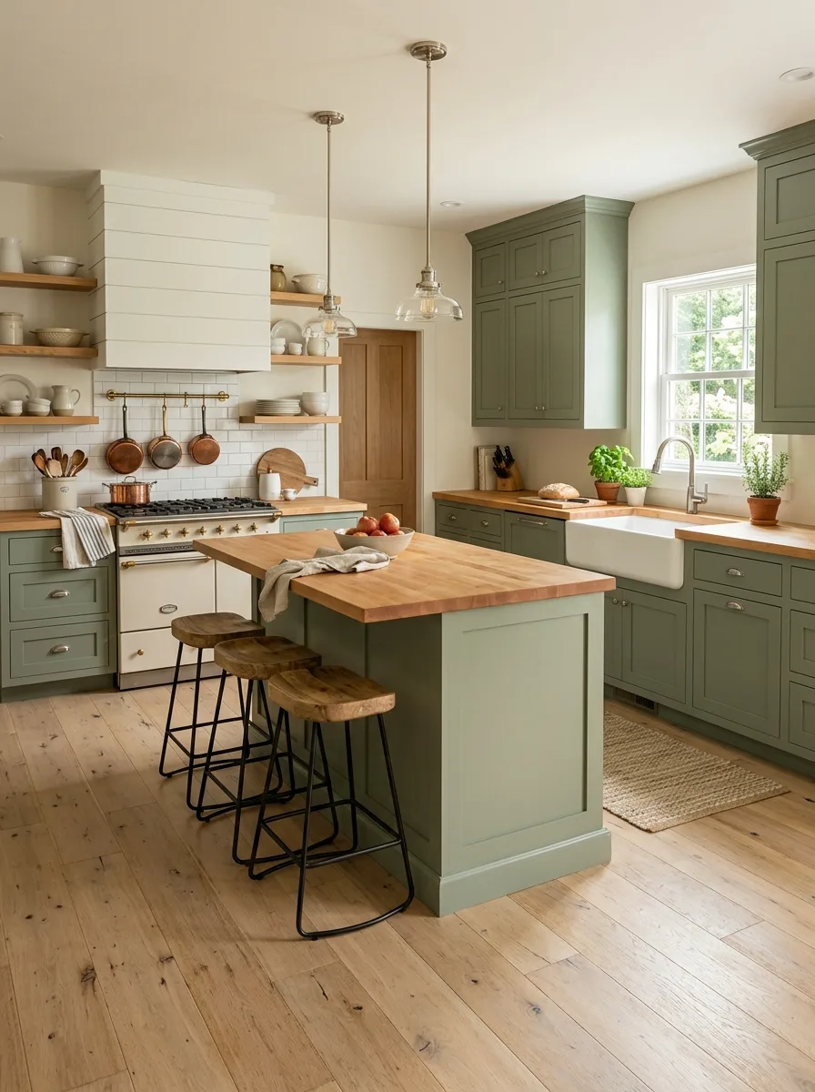
Pair soft olive-green cabinetry with butcher block counters throughout, including on the island, rather than mixing in a stone counter anywhere in the room.
Use a shiplap-paneled range hood painted a contrasting warm white, rather than matching it to the cabinet color, so the hood reads as a distinct architectural feature against the green base cabinets.
Add open shelving in the same wood tone as the counters, styled with simple white dishware and a few terracotta pots, keeping the palette restrained to wood, white, and green only.
Skip any stone or marble accents entirely in this pairing. The warmth of all-wood counters is the point, and a single cold stone surface will undercut the cohesion.
Brass Bracket Open Shelves
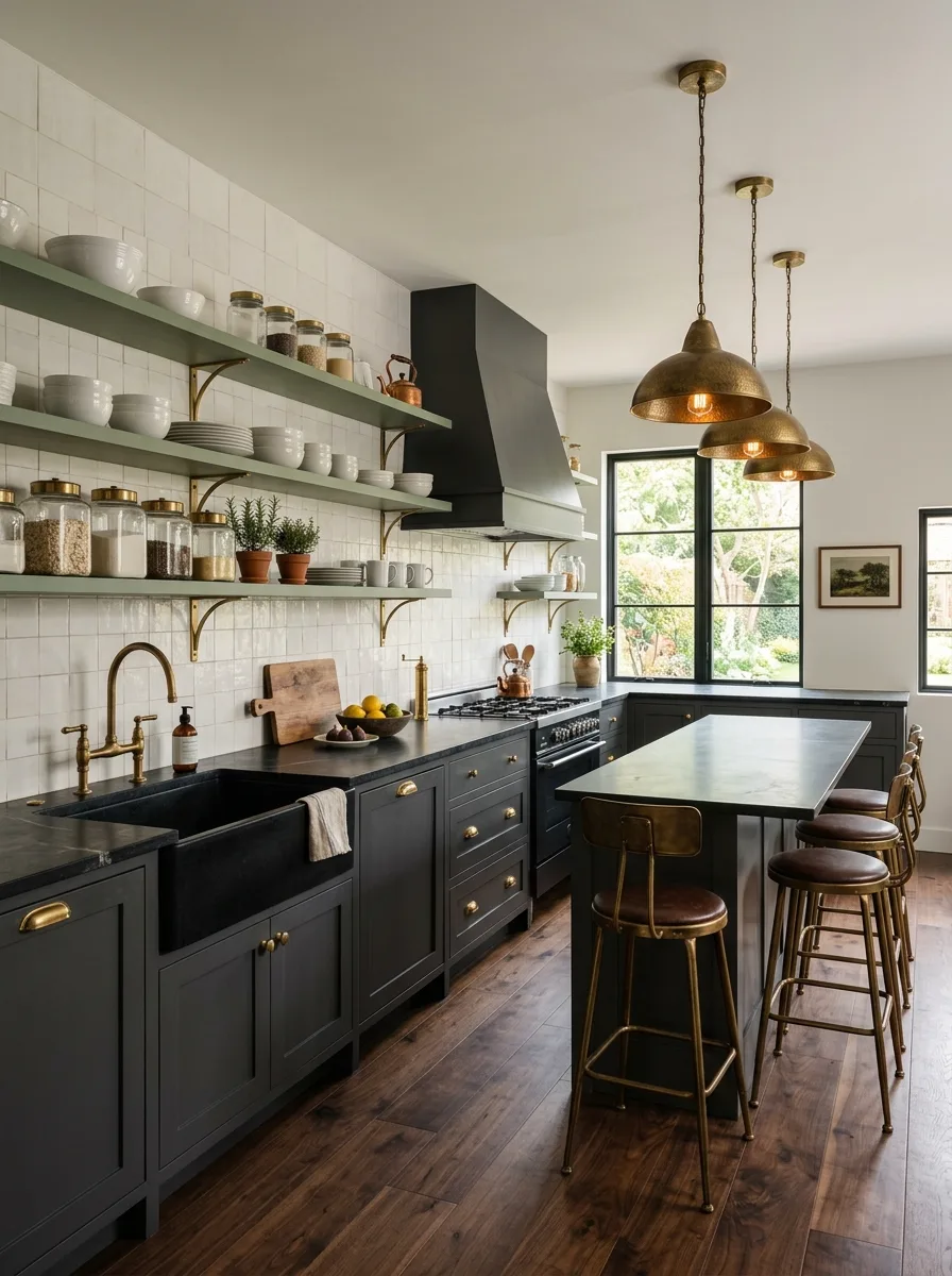
Install open wood shelving with visible, decorative brass brackets, mounted directly over a run of full-height zellige or handmade square tile, rather than hidden modern shelf supports.
Use a deep charcoal-green cabinet color on the lower units specifically, pairing it with black soapstone counters so the green reads almost as a near-neutral against the darker stone.
Style the shelves with a tight edit of white ceramics and labeled glass jars, keeping spacing generous between objects so the brass brackets themselves remain visible as a design element, not just hardware.
Match the bracket finish exactly to your pendant lighting and faucet. Inconsistent brass tones across these three elements is one of the fastest ways to make an otherwise considered room feel unplanned.
Final Thoughts
The thing that separates a green kitchen that feels designed from one that feels decorated isn’t the shade of green at all. It’s everything decided around it before the paint went on.
Every room in this list made its hardest choices early — the undertone, the metal finish, the contrast material — and let the cabinet color be the easy part, the thing that simply confirmed decisions already made elsewhere.
That’s the opposite of how most people approach it, picking the green first and improvising the rest. It’s also why so many otherwise expensive green kitchens still manage to feel unfinished.
Settle the undertone. Settle the metal. Settle the contrast. The green will take care of itself.