
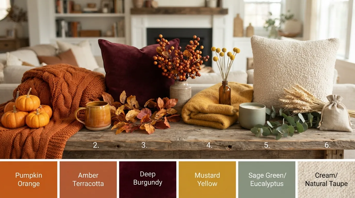
Most autumn decorating looks like a seasonal craft store exploded across the coffee table. You buy cheap synthetic orange pumpkins, rigid plastic leaf garlands, and loud yellow throw pillows, hoping for instant cozy warmth. Instead, your living space feels crowded, chaotic, and outdated within three days.
The real issue isn’t your room layout or lack of square footage. It comes down to picking genuine Fall Color Palettes that actually complement your existing furniture and wall paint. When you balance depth, contrast, and subtle natural undertones, you create a room that feels calm, mature, and intentionally built for the season.
Great interior color schemes don’t scream for attention. They draw you in quietly through layered earth tones, heavy woven fabrics, and deep muted finishes. You don’t need a massive budget or a total remodel to pull off a high-end look that lasts way past November.
Here’s how to ditch the plastic gimmicks, fix your room contrast, and bring deep, grounding warmth into every corner of your home.
Sophisticated Fall Color Palettes for a Cozier Home
Deep Plum, Ochre, and Warm Charcoal
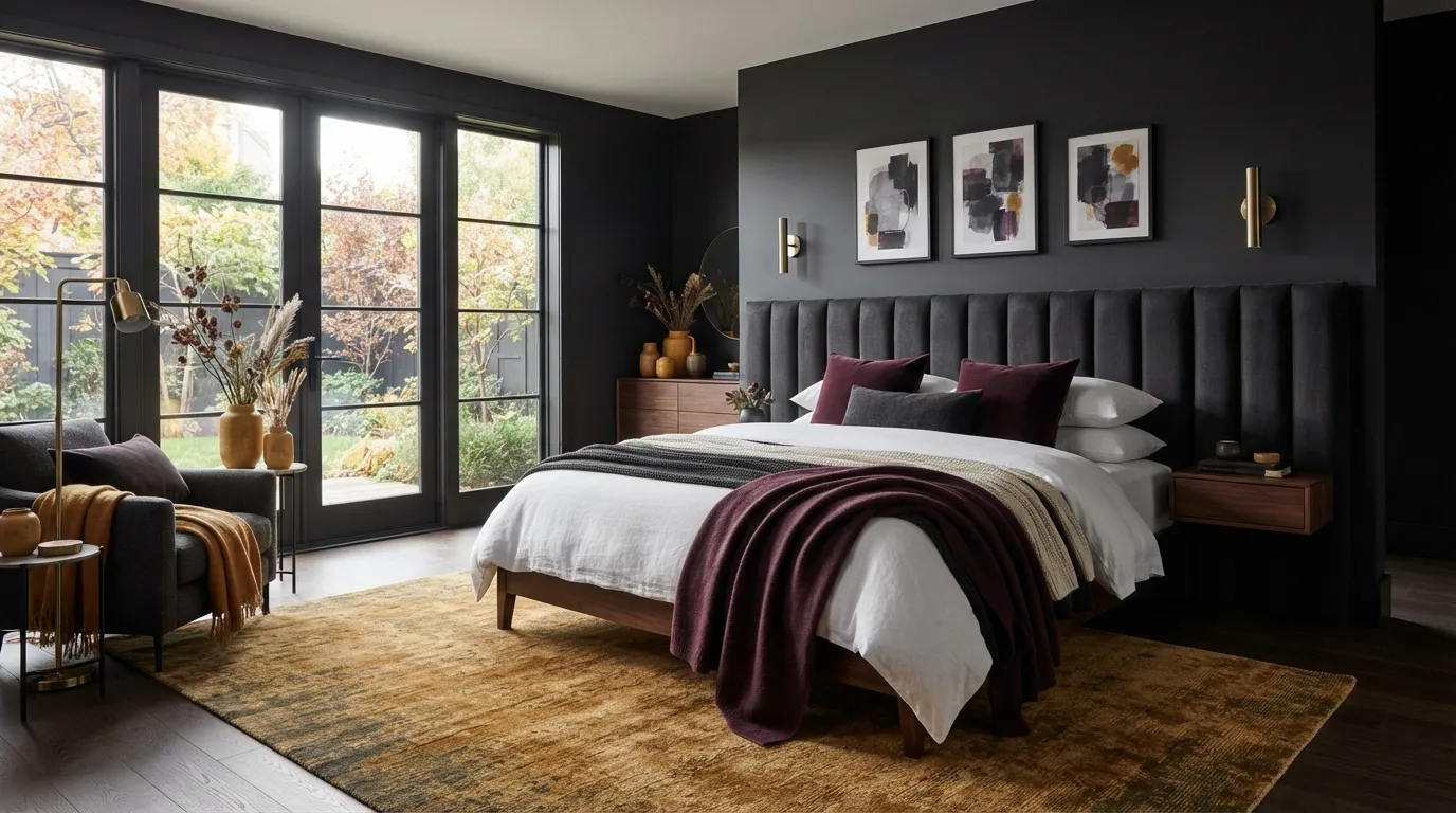
If you think fall colors require red and orange, deep plum will change your mind. It adds moody drama that works exceptionally well in dining rooms and bedrooms.
Combine dark plum with warm charcoal furniture to build depth. Then, inject small splashes of raw ochre to wake up the space. Ochre acts like golden sunlight cutting through shadows.
Don’t buy plum paint until you check your room light. Dark plum absorbs light quickly, so it works best in rooms with large windows or warm floor lamps.
Mustard Yellow, Deep Navy, and Bleached Oak
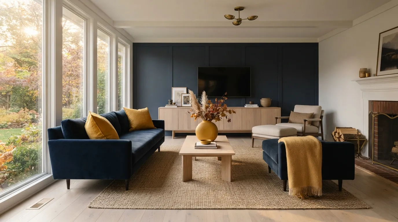
Mustard yellow gets a bad reputation because people pair it with stark white. That contrast feels cold and harsh. Instead, ground yellow against deep navy blue and natural bleached oak wood.
Navy anchors the room, while bleached oak softens the visual transition. Follow this simple balance:
- Use navy blue on major upholstered pieces or accent walls.
- Add bleached oak side tables or wood shelving to introduce light grain.
- Layer mustard yellow knit throws and ceramic pottery across the top.
It’s a classic pairing that feels elevated rather than juvenile.
Sage Green, Rust Orange, and Warm Cream
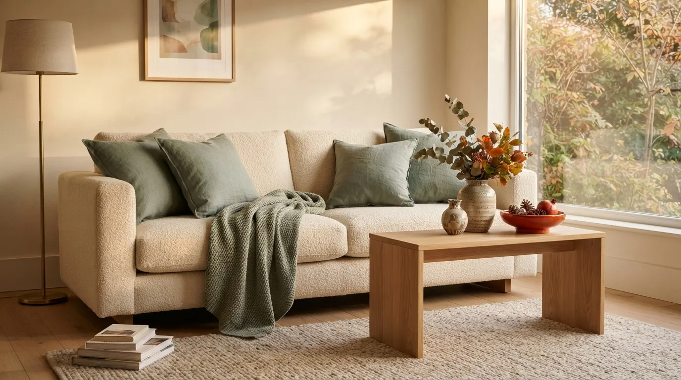
Sage green is the ultimate transitional color because it carries quiet summer freshness into autumn. Adding rust orange instantly shifts the vibe to match fall light.
Warm cream binds these two tones together without creating stark lines. You can make this combination feel natural in three quick steps:
- Use warm cream on your walls, drapery, or large area rug.
- Layer sage green through linen duvet covers or velvet armchairs.
- Introduce rust orange in woven pillows, table runners, or abstract wall art.
That’s all it takes to build a relaxing corner that doesn’t feel overly seasonal.
Muted Pumpkin, Dusty Rose, and Taupe
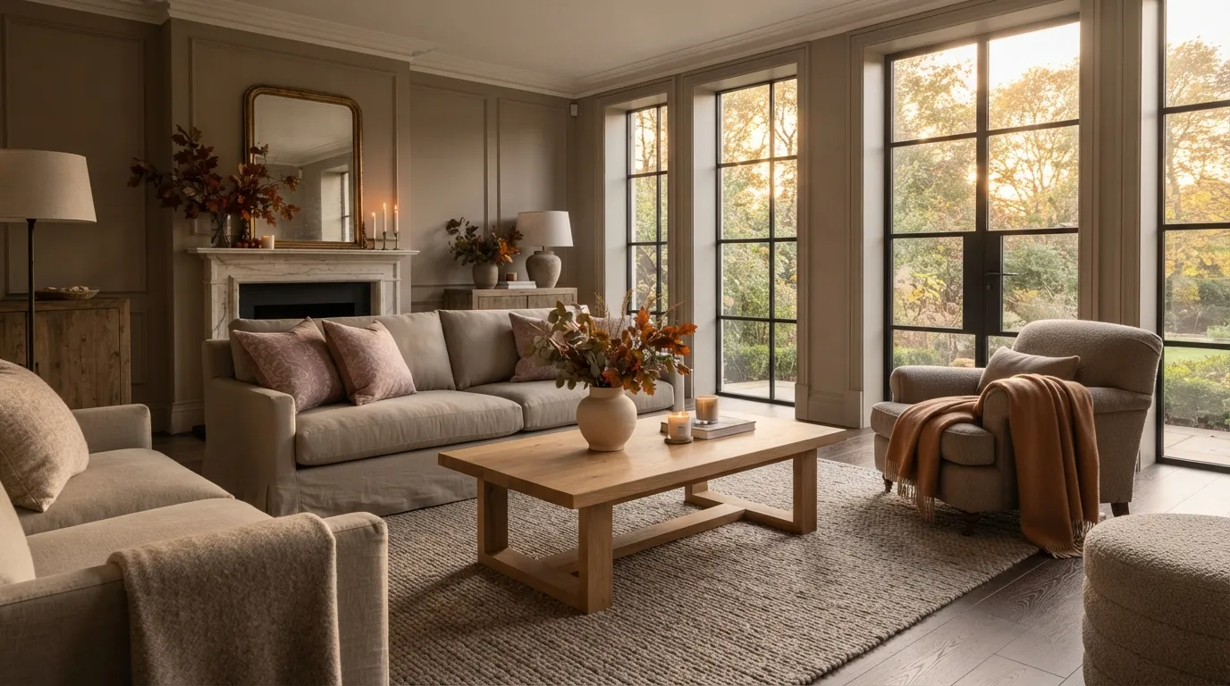
If traditional rust feels too heavy, try blending muted pumpkin with dusty rose. The soft pink undertones temper the orange, making it look sophisticated rather than theatrical.
Taupe acts as your stabilizing neutral. It pulls both shades together without forcing you into stark gray territory.
Apply pumpkin to accent pieces like throw blankets, keep dusty rose in patterned pillows, and let taupe cover large furniture or walls. It’s an unexpected palette that feels warm, feminine, and subtle.
Cinnamon, Camel, and Antique Brass
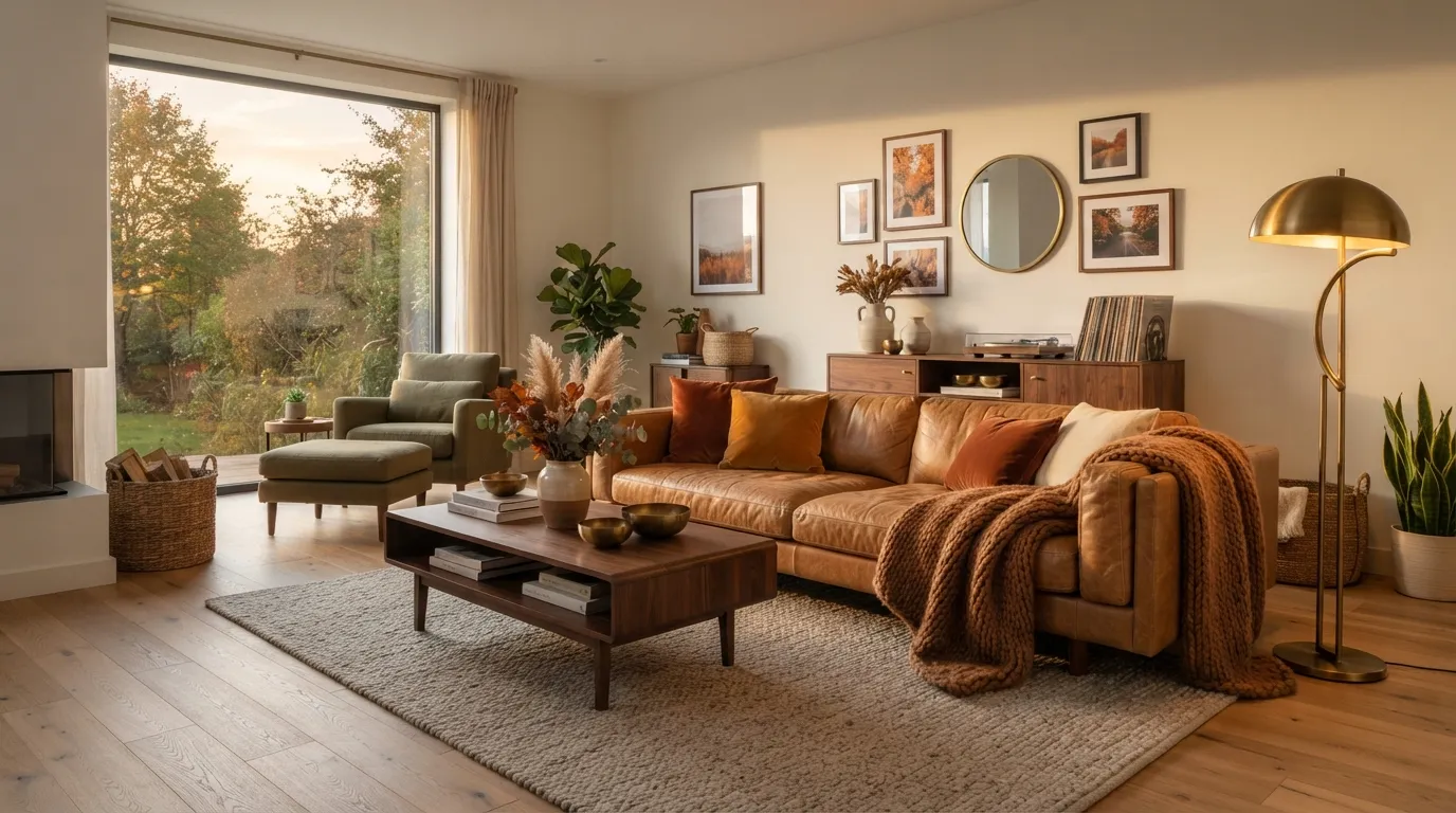
Cinnamon offers a spicier, redder alternative to brown that feels inherently autumn. Combining it with camel wool creates a luxurious layer of warmth.
To complete the look, add antique brass metal accents instead of shiny chrome. Antique brass picks up cinnamon’s reddish undertones, giving your lighting and hardware a warm glow.
Don’t match all wood tones identically. A dark walnut coffee table next to a camel leather sofa lets cinnamon accents pop naturally.
Smoky Teal, Terracotta, and Natural Cane
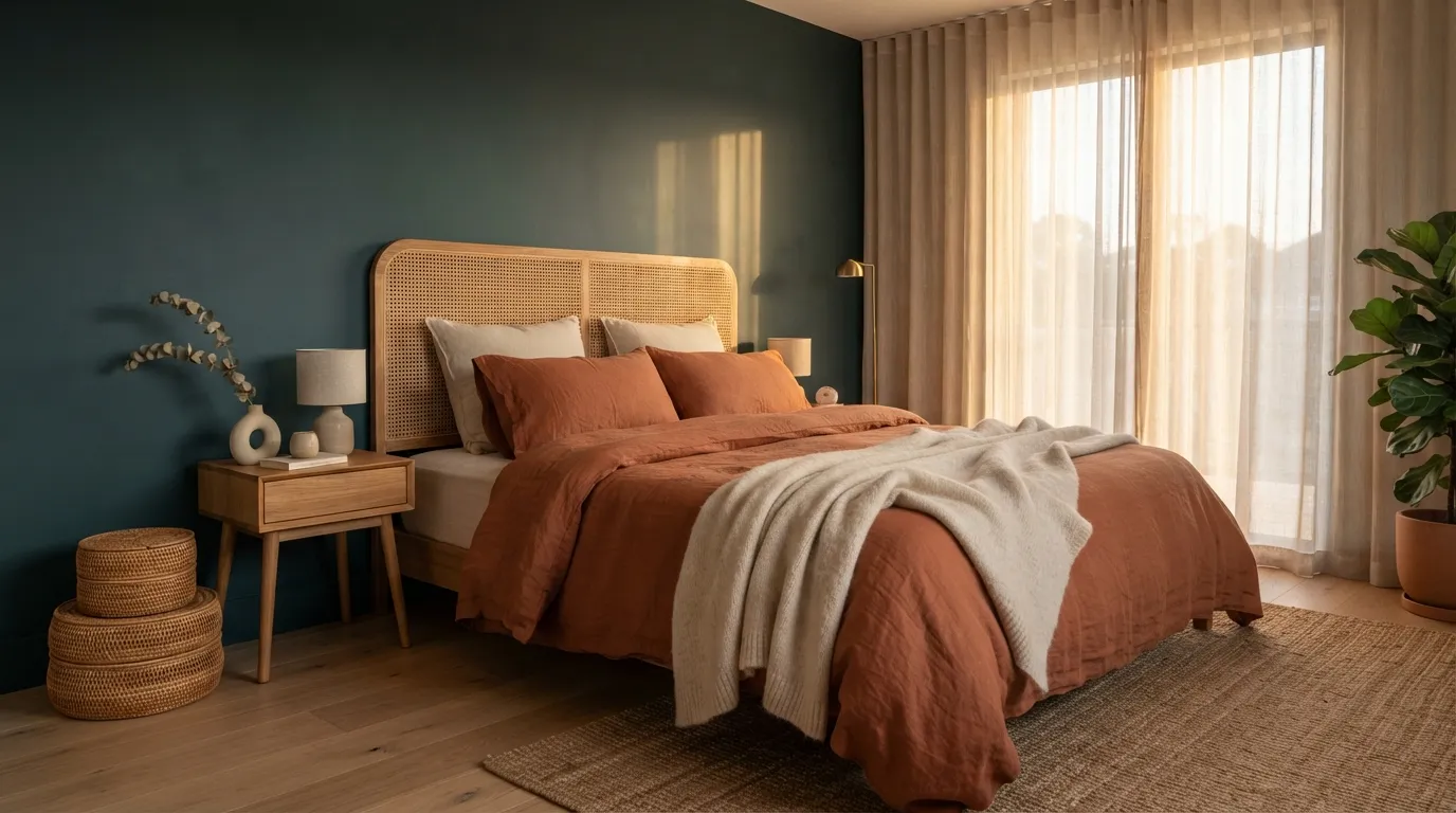
Smoky teal provides an incredible cool counterweight to terracotta. Because they sit opposite each other on the color wheel, they create vibrant energy without needing neon shades.
Natural cane furniture or woven rattan baskets soften the contrast between teal and terracotta. It adds organic wood texture that keeps the room grounded.
Try painting a moody teal accent wall behind a cane headboard, then layering terracotta linen sheets. That’s a high-end look that feels custom built.
Deep Burgundy, Sage, and Honey Gold
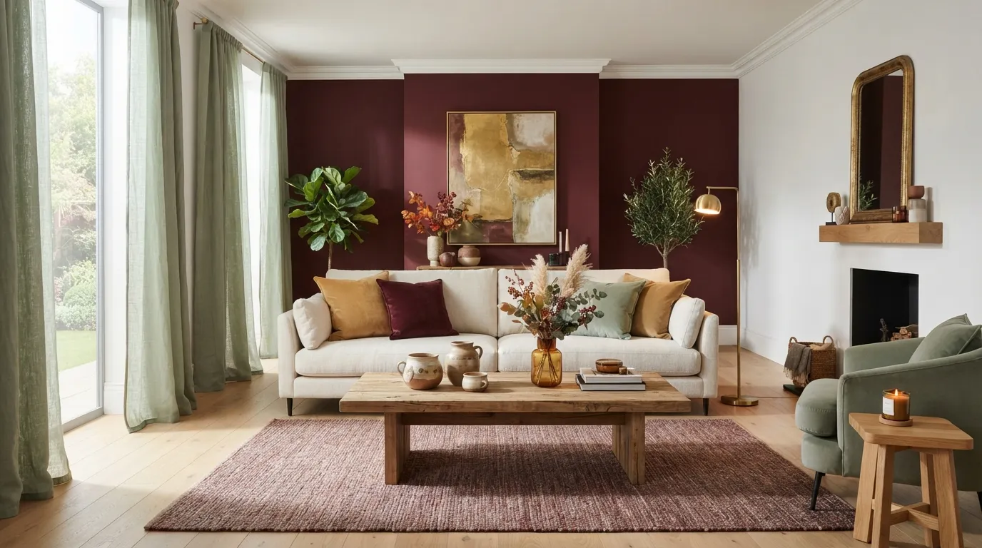
Deep burgundy delivers instant autumn elegance, but it easily overpowers small spaces if you aren’t careful. Counteracting burgundy with soft sage green balances the heavy red notes.
Injecting honey gold through table lamps or velvet cushions adds luminous warm light. It brings out rich undertones in both burgundy and green.
Here’s how to adapt this palette based on your room’s natural sunlight:
| Room Lighting | Burgundy Focus | Sage Focus |
|---|---|---|
| Bright Natural Light | Accent walls, rug base | Drapery, large pillows |
| Low Natural Light | Small cushions, ceramics | Main wall color, bedding |
Cognac Leather, Charcoal, and Warm Ivory
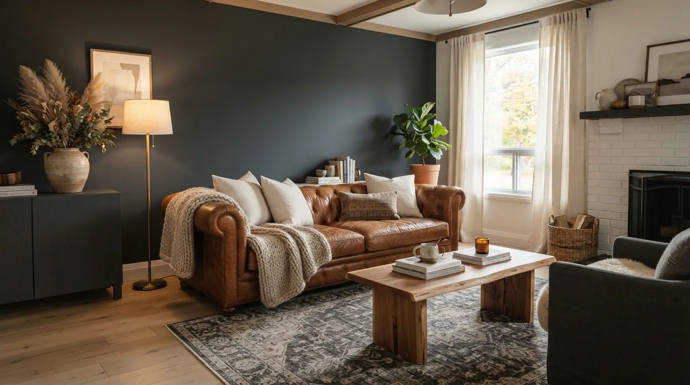
Cognac leather carries a rich warm patina that makes an ordinary room look expensive. If you place it against plain white walls, though, the contrast feels harsh and disjointed.
Bridge the gap using deep charcoal and warm ivory:
- Paint an accent wall or introduce charcoal in solid furniture frames.
- Layer warm ivory through wool area rugs and linen drapes to soften the dark tones.
It’s all about balancing heavy leather with textured light fabrics so your room doesn’t resemble an old executive lounge.
Dried Hydrangea Blue, Rust, and Sand
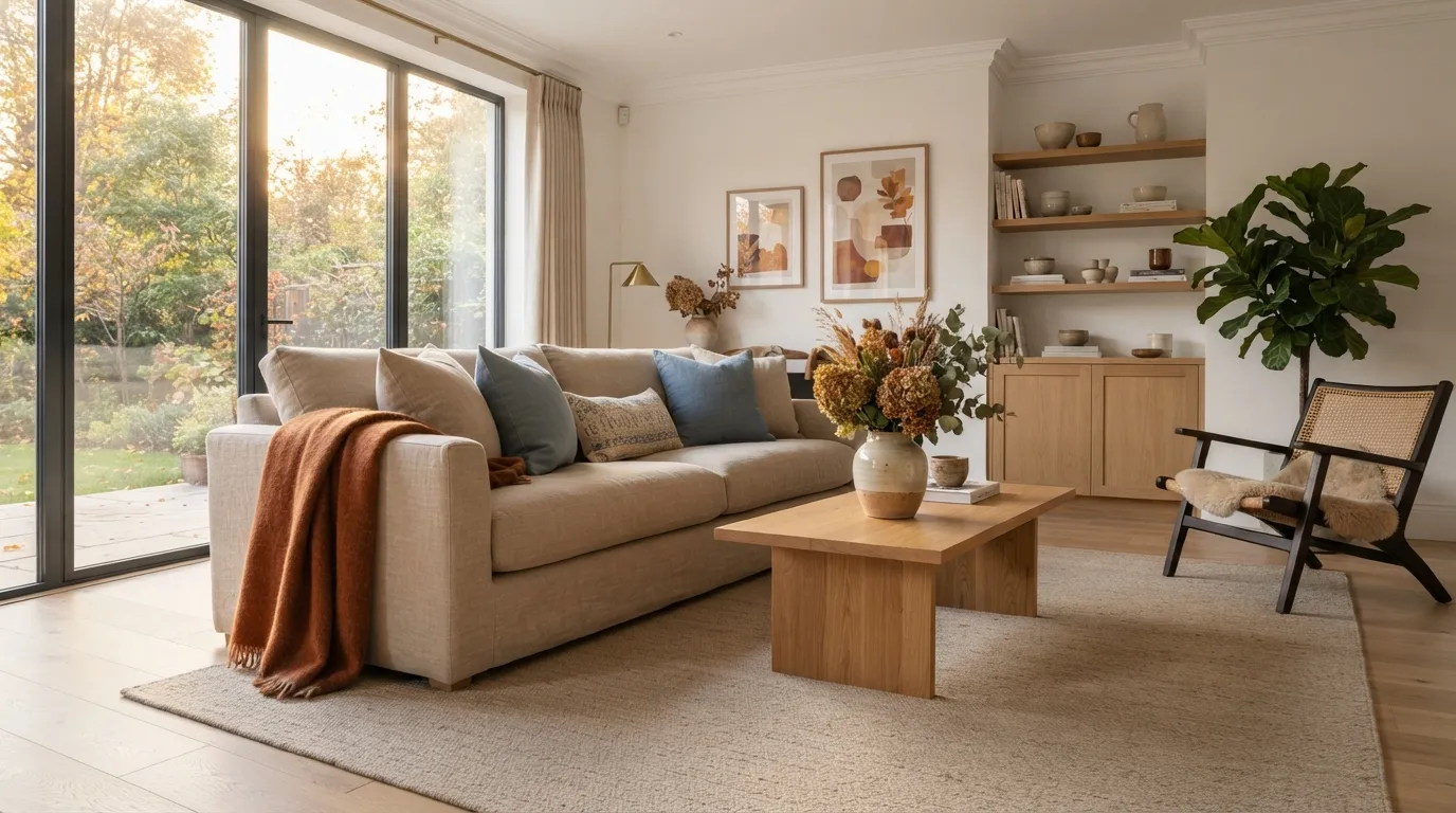
Most people drop blue the second sweater weather hits, assuming it belongs strictly to summer coastal homes. That’s a mistake. Muted, dusty hydrangea blue brings an earthy calm that pairs amazingly well with deep fall rust.
Here’s how to execute this contrast:
- Anchor your seating with sandy neutral upholstery.
- Throw dusty blue velvet cushions over a rust linen sofa blanket.
You’ll get a crisp autumn vibe that feels fresh rather than predictable.
Warm Olive, Chocolate Brown, and Brass
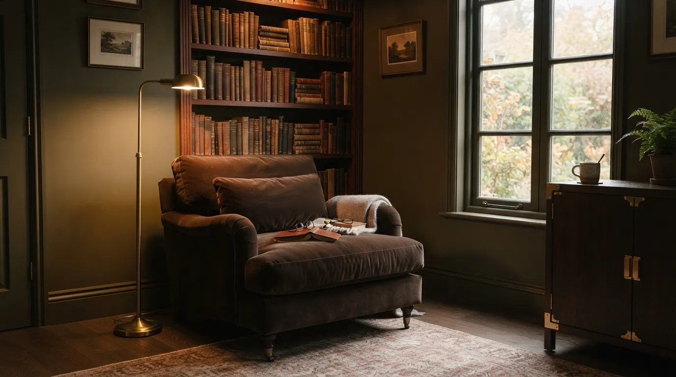
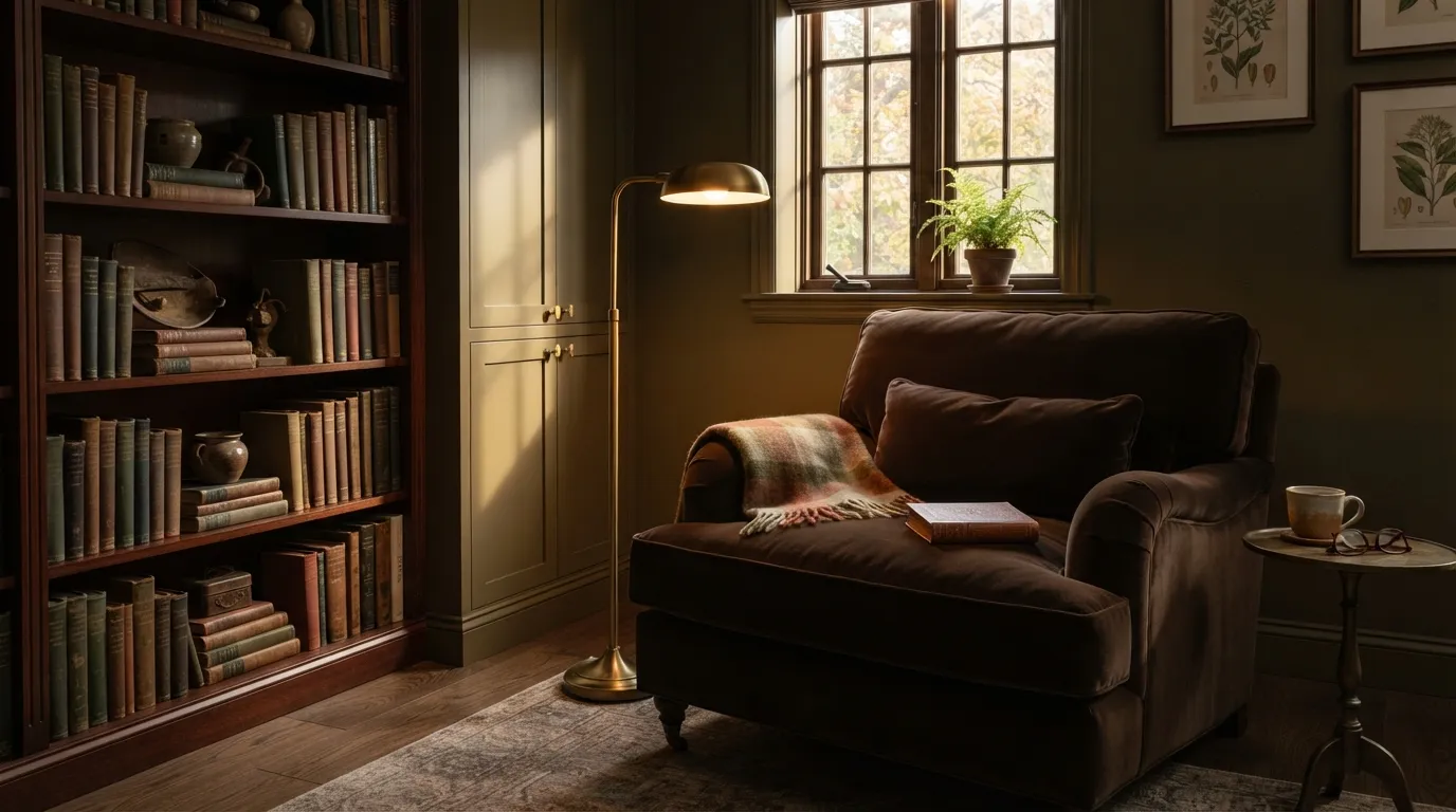
Think of an old library nook bathed in soft light. That cozy depth comes from mixing warm olive, rich chocolate brown, and glowing brass hardware.
Don’t worry about this palette making a room look dark or cramped. When you pair deep olive painted walls with chocolate brown velvet, brass fixtures act as built-in highlights that reflect warm light right back into the space.
It’s rich, moody, and perfect for reading corners or quiet home offices.
Charcoal Gray, Burnt Orange, and Driftwood
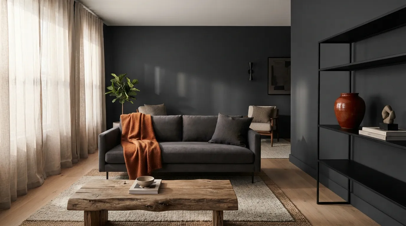
Cool charcoal gray often feels cold and sterile during winter months. Adding burnt orange gives it immediate thermal energy, while driftwood finishes introduce rustic texture to keep things grounded.
Keep your burnt orange accents tightly edited. If you scatter orange everywhere, the room feels frantic. Concentrating burnt orange in two key spots, like a wool throw and a ceramic vase, creates intentional focal points without visual noise.
That single adjustment changes the entire room dynamic.
Oatmeal, Cinnamon, and Aged Copper
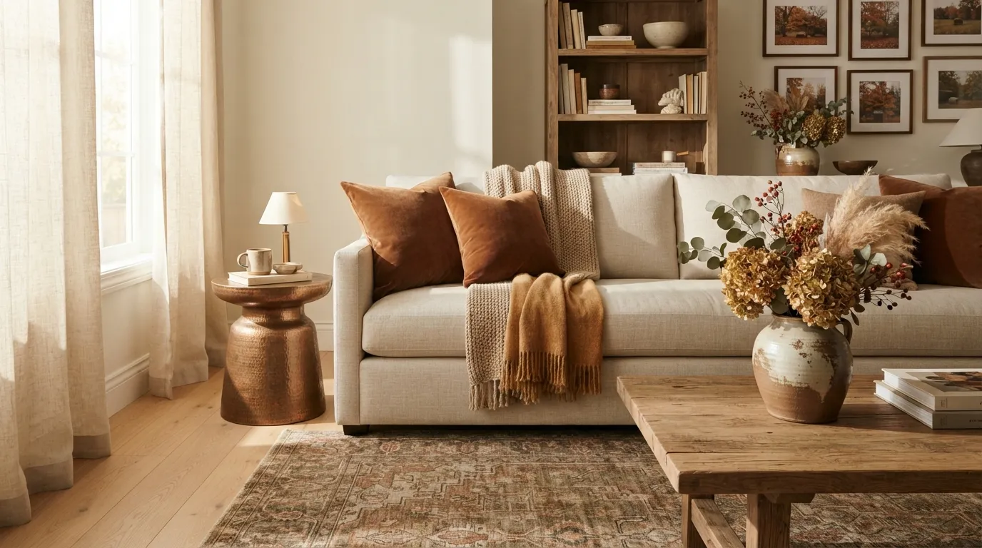
A neutral oatmeal backdrop gives you endless flexibility when seasonal temperatures drop. Layering cinnamon textiles over oatmeal cushions brings instant heat without repainting a single wall.
Aged copper pieces complete the look by adding an unpolished, lived-in warmth. Smooth copper catches afternoon light, while oatmeal knits pull in shadow lines to soften the room’s hard edges.
It’s a low-effort swap that completely refreshes your main living area before the holidays arrive.
Amber, Slate Blue, and Cream
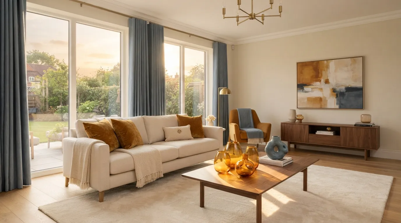
Amber glass and textiles radiate glowing warmth, but too much amber makes a room feel heavy. Slate blue balances amber’s heat without competing for attention.
Ground the look with cream walls or large cream area rugs so the colors breathe freely.
Deep Moss, Wheat Yellow, and Matte Black
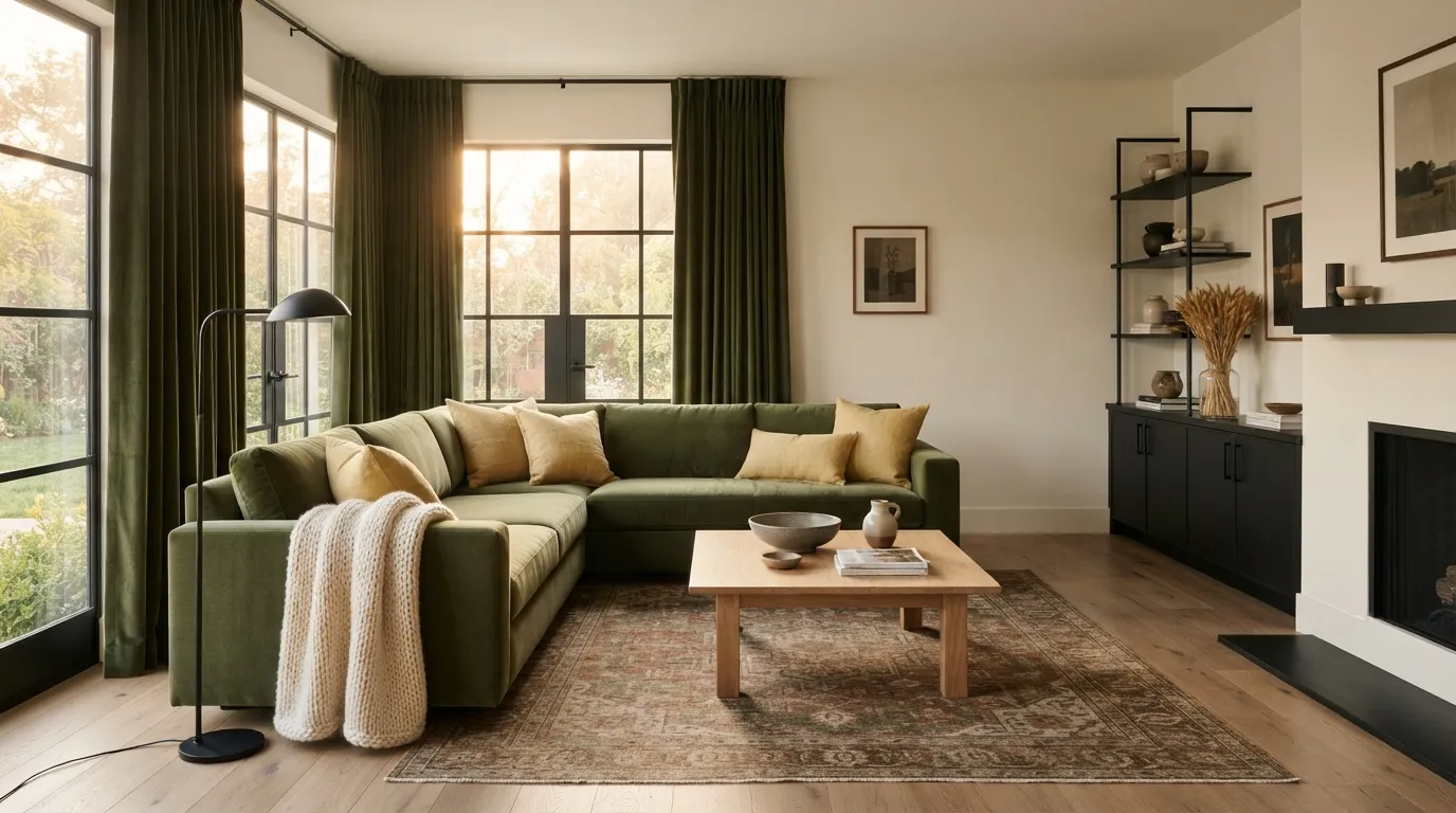
Deep moss green gives you a rich natural base that feels cozy all year round. Adding wheat yellow brings in subtle harvest warmth, while matte black hardware anchors the entire room with a sharp, modern edge.
Here’s how to distribute the weight across your space:
Mulberry, Warm Taupe, and Brushed Gold
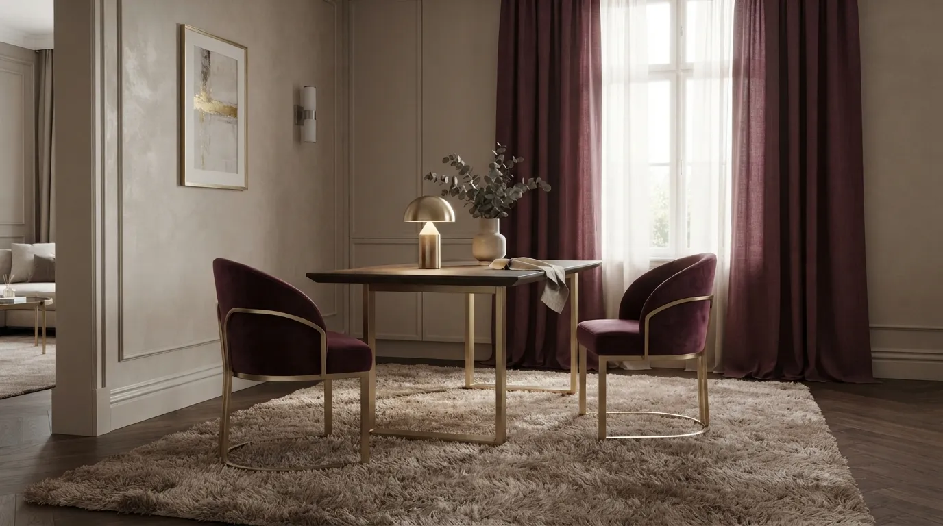
Mulberry offers a luxurious alternative to standard dark red. It feels sophisticated and cozy when paired with warm taupe drapery and brushed gold lighting fixtures.
- Start by laying down a warm taupe area rug as your foundation.
- Bring in mulberry through velvet accent chairs or woven lap blankets.
- Install brushed gold floor lamps to catch rich purple highlights at night.
It’s a straightforward sequence that elevates master bedrooms and formal dining nooks immediately.
Earthy Ochre, Terracotta, and Greige
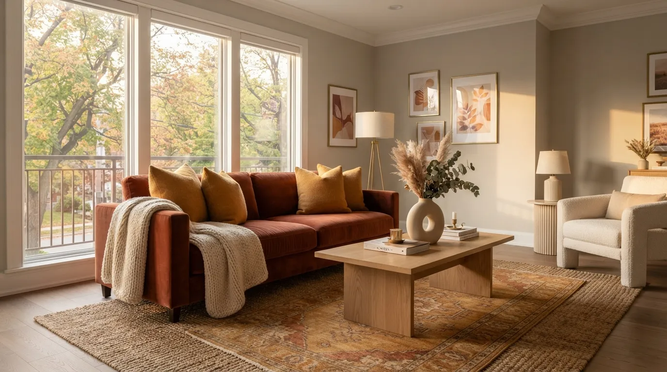
If your living room features greige walls, you don’t need to repaint for autumn. Earthy ochre and terracotta bring intense thermal energy that turns cool greige into a modern, warm backdrop.
Ochre handles lighting reflection, terracotta adds solid physical weight, and greige keeps the overall space feeling open.
Navy Blue, Chestnut Brown, and Vanilla
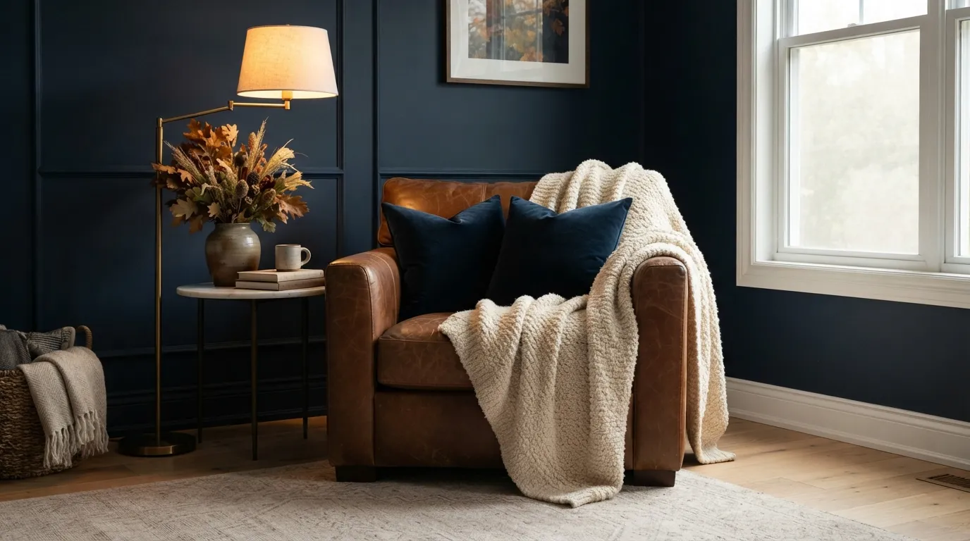
Navy blue creates immediate depth, but it needs warm natural elements so it doesn’t feel like a summer coastal palette. Chestnut brown leather and vanilla textiles pull navy straight into fall.
Try pairing a deep navy wall with a chestnut leather armchair and a textured vanilla knit throw. The contrast feels rich, grounded, and intensely cozy.
Saffron, Espresso, and Warm Alabaster
Saffron yellow is bold and energetic. Pair it with dark espresso wood to tame its intensity, then use warm alabaster to bounce light around the room naturally.
This split balance keeps saffron from overwhelming your eye level:
Eucalyptus, Warm Clay, and Natural Linen
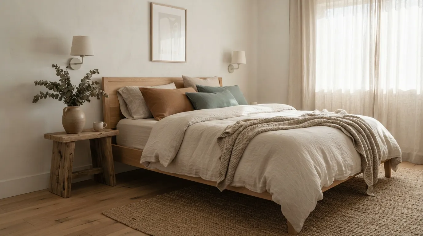
Eucalyptus green brings a muted, spa-like calm into bedrooms. Layering warm clay pillows over a natural linen duvet creates a soft, organic autumn vibe that feels completely effortless.
Avoid shiny fabrics here. Stick to washed linen, matte cotton, and unglazed ceramics to keep the mood relaxed.
Spiced Cider Orange, Charcoal, and Bone White
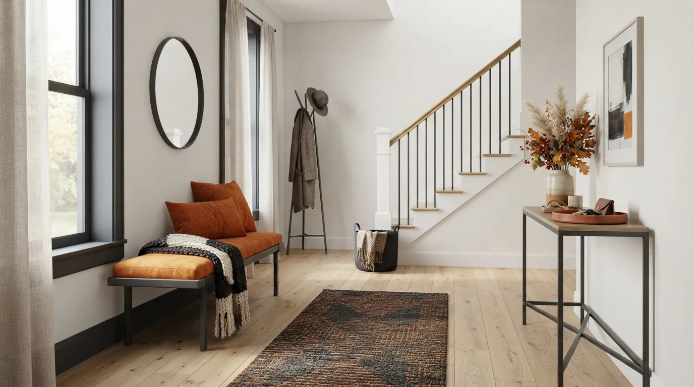
Spiced cider orange is lively and welcoming for entryways and living rooms. Frame it with dark charcoal trim or iron furniture legs, then let bone white walls keep the entryway bright.
Here’s how foundation and accent roles split up across this palette:
Rich Fig, Camel, and Warm Cream
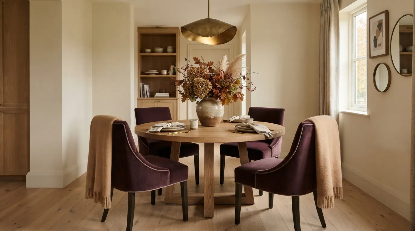
Rich fig brings deep berry undertones that make dining nooks and bedrooms feel luxurious. Pairing it with camel wool and warm cream keeps the mood inviting rather than gloomy.
Keep fig restricted to accent seating or dining chair upholstery, allowing camel and cream to handle larger surface areas.
Terracotta, Forest Green, Mustard, and Walnut
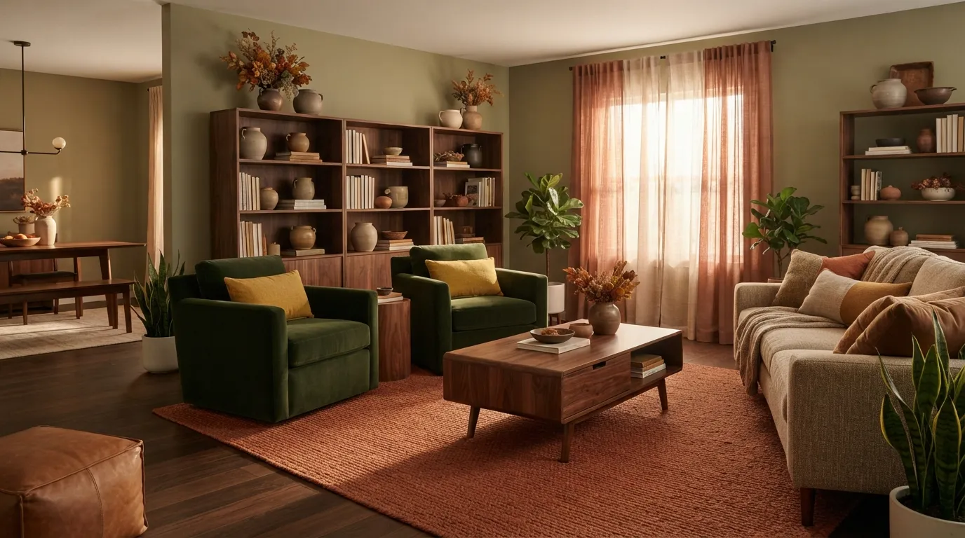
If you love a multi-tonal layered look, combine terracotta, forest green, mustard yellow, and dark walnut wood. The secret is keeping dark walnut as your grounding force so the three colors don’t compete for attention.
Use this master grid to organize all four tones cleanly across a single room:
Conclusion
Creating a cozy autumn home doesn’t require plastic decor or complete room overhauls. By picking the right Fall Color Palettes, you build deep, layered warmth that lasts through the entire season. Focus on rich earth tones, natural wood grains, and matte finishes to keep your space feeling grounded and elegant. Stick to the 60-30-10 rule, balance your light fixtures, and let natural textures do the heavy lifting. Save this list to your favorite Pinterest home decor board so you’re ready whenever you want to refresh your living space.