
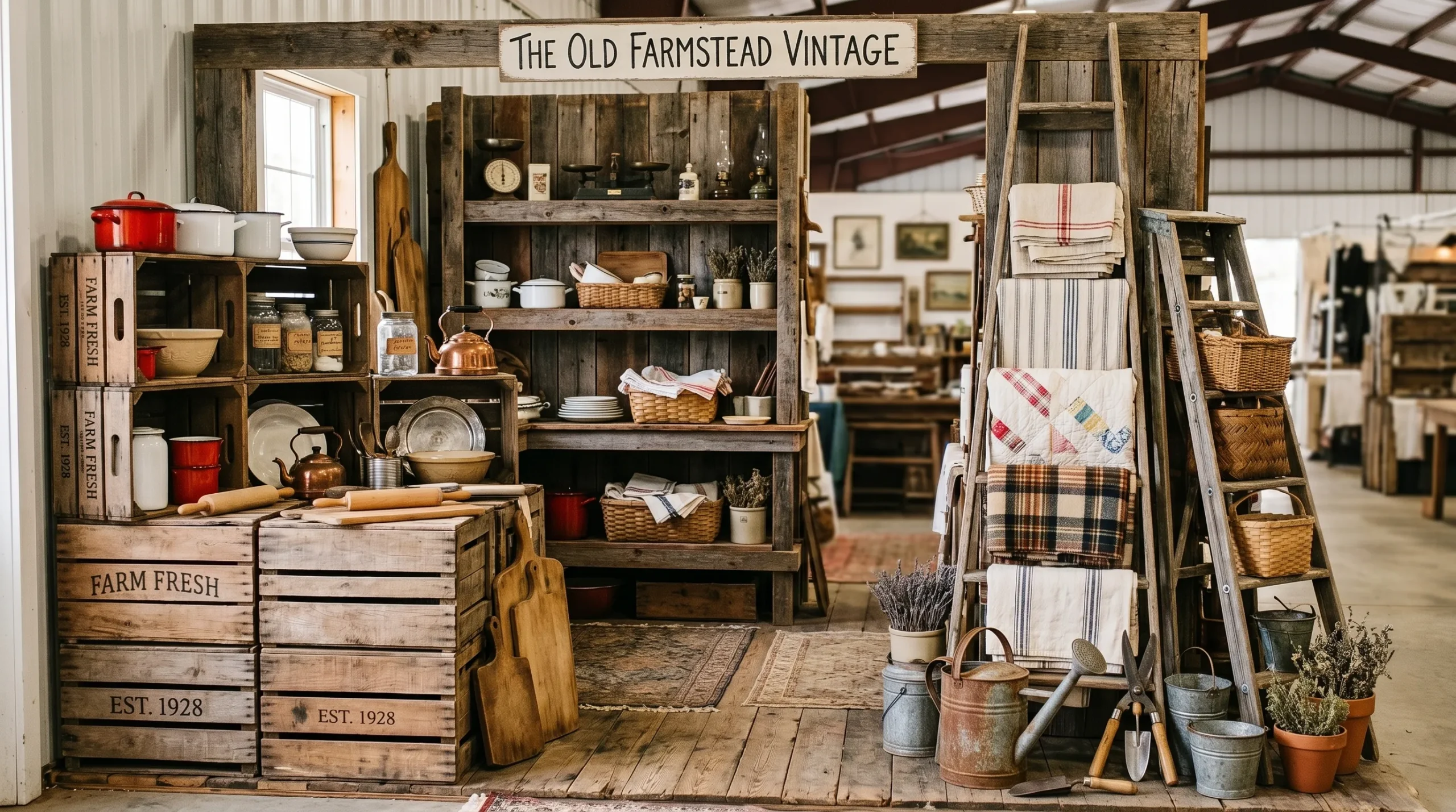
Most antique booths lose the sale before anyone even reads a price tag. Someone drifts past the aisle, their eyes skim a wall of stuff, and nothing tells them where to look first. That’s not bad luck. That’s a booth with no composition.
A pile of good pieces isn’t a display. It’s inventory waiting to be ignored. The booths that actually sell have a point of view. They tell you, in about two seconds, what kind of home this stuff belongs in.
This isn’t a list of things to buy for your booth. You probably already own more inventory than you know what to do with. This is about arrangement. About what happens when you stop treating every shelf as separate real estate and start building complete little scenes.
Antique booth display ideas work when they function like a tiny, finished room. Not a warehouse aisle. A room someone could imagine living in, even for a second.
What Makes a Booth Look Curated Instead of Cluttered
The Sightline Problem
Most booths get judged from six feet away, in about two seconds, by someone who isn’t stopping unless something grabs them first. If every shelf is packed edge to edge at the same height, there’s no resting point for the eye. Nothing reads as important because everything is fighting for the same amount of attention.
Fix the sightline before you fix anything else. Pick one item taller than everything around it. Give it space. Let the eye land there first, then wander.
One Story Per Booth
A booth that mixes a rustic farmhouse dough bowl, a mid-century lamp, and a Victorian mirror isn’t eclectic. It’s confusing. Shoppers aren’t buying random objects. They’re buying a version of a room they can picture in their own house.
Pick one story per section of your booth, even if the whole booth holds several stories side by side. A shopper should be able to look at any three-foot section and understand what world it belongs in.
Antique Booth Layouts Worth Copying
Rusted Zinc and Warm Walnut
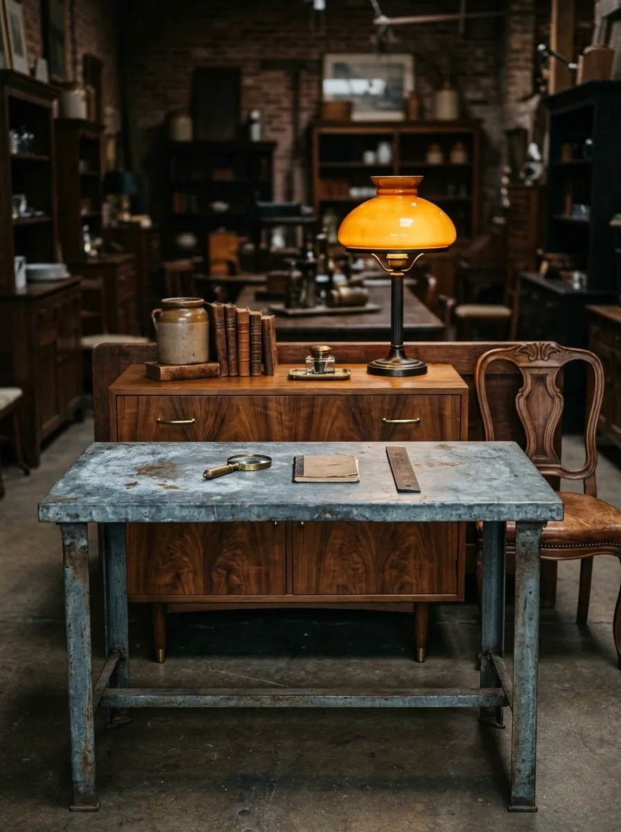
A zinc-topped table anchors this one, its cool gray surface doing the heavy lifting against a cluster of warm walnut furniture behind it. One amber-shaded lamp keeps the whole grouping from feeling like a hardware aisle.
The contrast is the entire point. Zinc reads cold and industrial. Walnut reads warm and domestic. Put them within three feet of each other and the booth suddenly has tension instead of sameness.
Skip the extra decor here. The metal and the wood are already doing the talking.
Ironstone White on Black Shelving
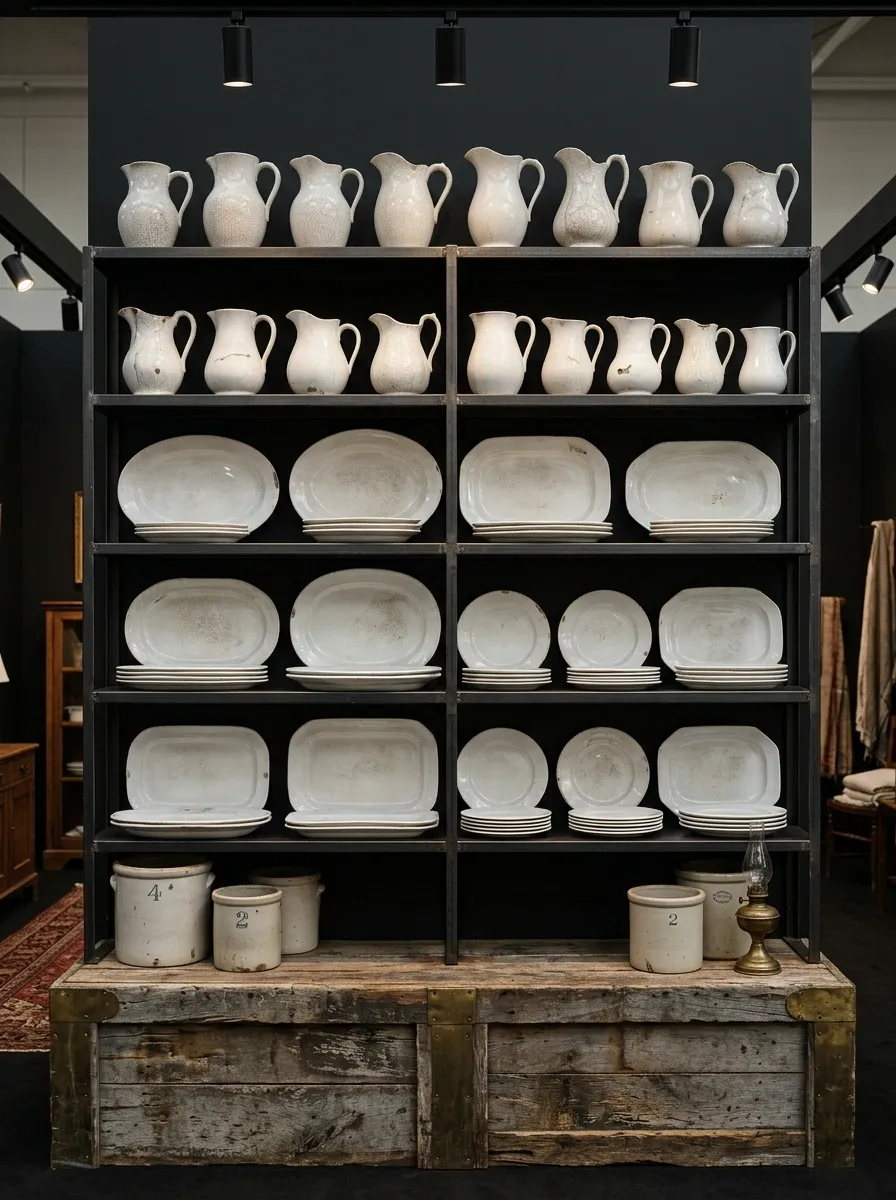
Stacked ironstone pitchers and platters in various worn whites, all lined up on matte black industrial shelving. The black frame gives the white pieces somewhere to actually stand out instead of blending into a beige booth wall.
This works because ironstone is subtle. Chips, crazing, soft glaze variations. None of that reads against a busy background. Against flat black, every texture shows up.
Keep the shelf edges tight and even. This is one composition where a little visual discipline does more than another accessory would.
Grain Sack Textile Wall
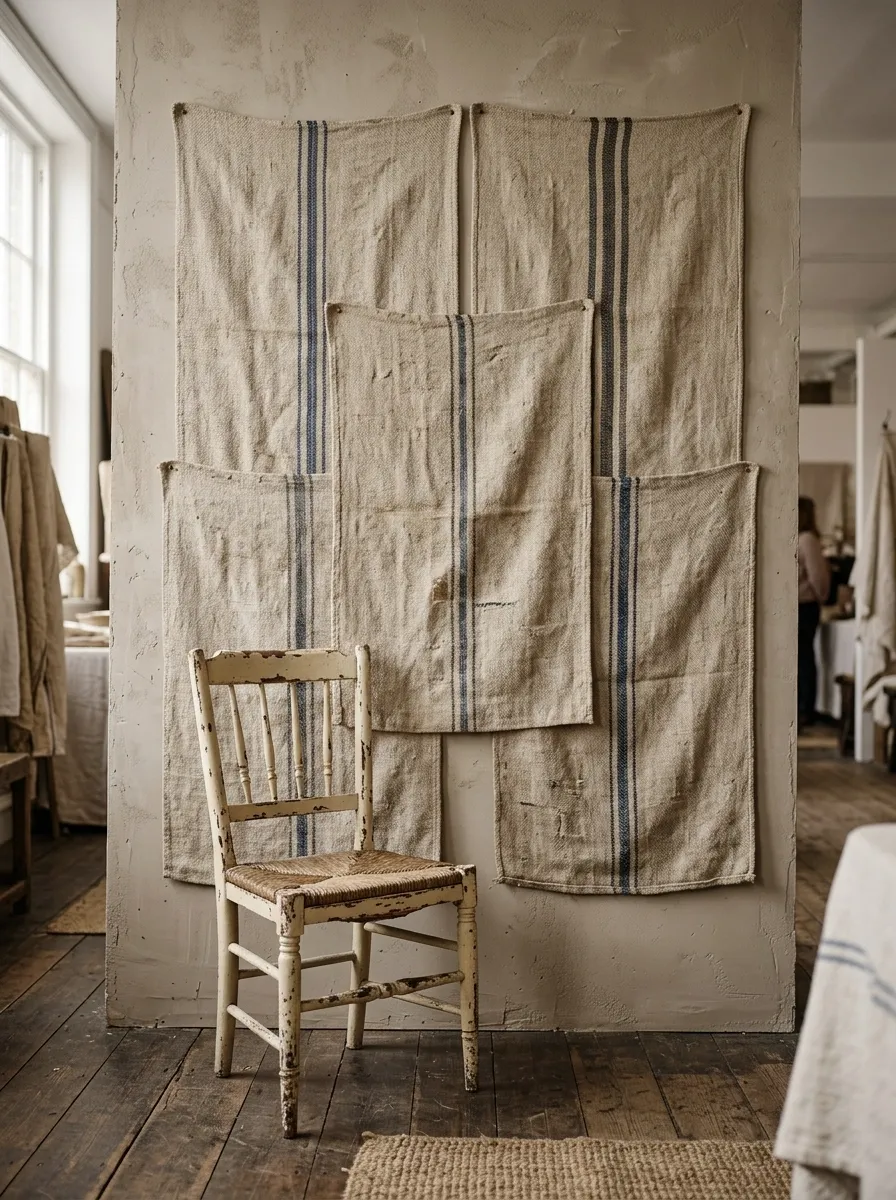
A handful of vintage grain sacks, pinned flat and slightly overlapping, turned into a soft fabric backdrop behind a single painted chair. The stripes give texture without adding another object to dust or price.
Textiles get overlooked in booth design because they’re not “furniture,” but a fabric backdrop changes the entire feel of a booth section instantly. It makes the space feel considered instead of stacked.
One chair in front is enough. Adding a table and lamp here just competes with the wall doing the actual work.
Brass and Bottle Green
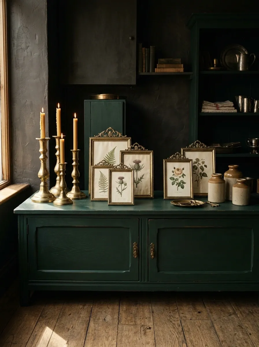
Brass candlesticks and picture frames set against furniture painted a deep, almost black-green. The metal picks up whatever light hits the booth and throws it back, which is exactly what a dark backdrop needs.
Bottle green is a risk most vendors skip because it reads heavy on its own. Paired with brass, it stops looking heavy and starts looking intentional. The metal keeps the eye moving instead of sinking into the dark color.
Don’t scatter the brass evenly. Cluster it in twos and threes so it reads as a decision, not leftover inventory.
Milk Glass Cascade
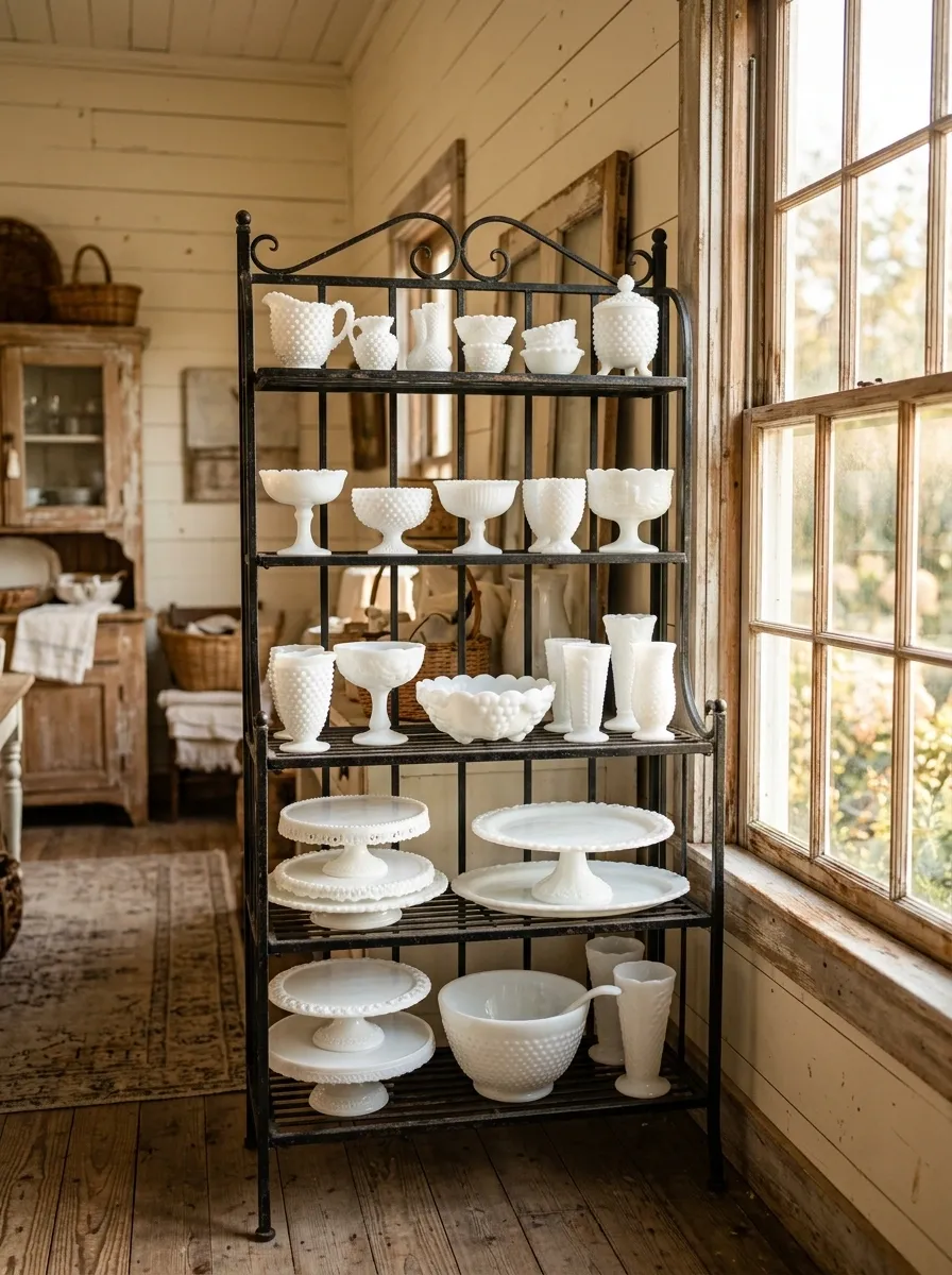
Tiered milk glass, small pieces up top, larger ones lower down, arranged on a vintage bakers rack positioned to catch natural window light. The white glass practically glows when it gets real daylight, which is the entire reason this display works where it does.
Height variation matters more than the glass itself here. A flat row of milk glass reads as inventory. A cascading arrangement, small to large, reads as a collection someone actually cared about.
This concept needs light. Without it, the glass goes flat and the whole point disappears.
Salvaged Architectural Corner
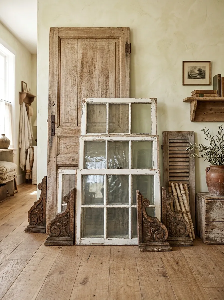
Corbels, a stripped door, and a stack of window sashes leaned together in layers instead of hung flat. The layering is what sells this one. A single architectural salvage piece on a wall looks like a leftover. Three of them leaned in conversation looks like a corner someone styled on purpose.
Height does the work here. Lean the tallest piece, the door, at the back. Let the corbels and sashes step down in front of it. That staggered depth is what separates “architectural salvage bin” from “architectural salvage corner.”
Keep the floor in front of this grouping empty. It needs room to read as intentional, not stacked against a wall out of necessity.
Farmhouse Enamelware Kitchen Wall
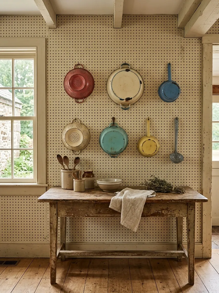
Chipped enamel pots and colanders hung on a pegboard-style vintage wall, spaced with actual gaps between pieces instead of packed edge to edge. The chips and wear are the selling point, not a flaw to hide.
This is a display that benefits from restraint most vendors skip. Enamelware is graphic on its own, strong shapes, bold colors even when faded. Crowd too many pieces together and the shapes cancel each other out.
Give each pot its own hook and its own space. The wall should feel like a kitchen someone actually cooked in, not a bin dump organized vertically.
Vintage Linens on a Clothesline
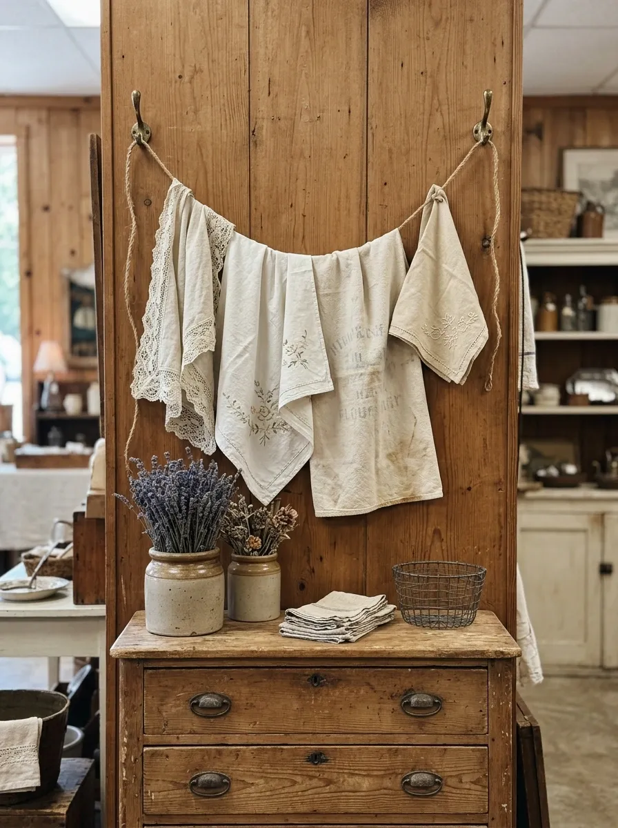
A short length of twine strung between two hooks, vintage tea towels and lace-edged linens draped over it like laundry day, positioned above a dresser. It’s an unexpected way to display flat textiles that usually just sit folded in a stack where nobody touches them.
Folded linens on a shelf are invisible. Hung and slightly overlapping, they show pattern, texture, and condition all at once, which is exactly what a linen buyer is checking for before they pull out their wallet.
Keep the line loose, not taut. A slight sag reads as a real clothesline instead of a display rod trying too hard to look casual.
Apothecary Bottle Wall
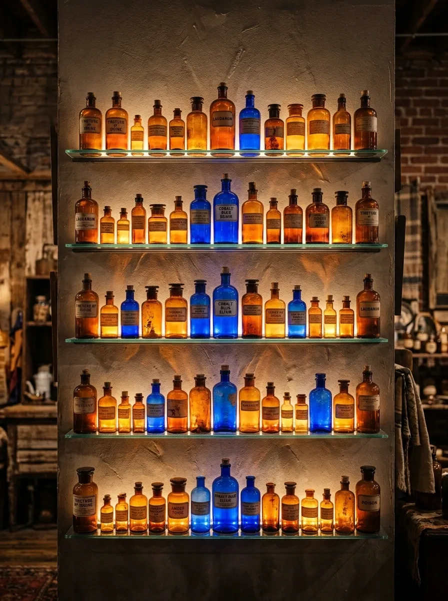
Amber and cobalt glass bottles lined on floating glass shelves, backlit so the color throws across the wall behind them. This is one of the rare booth concepts where the light source is doing as much work as the merchandise.
Without backlighting, this is just a shelf of old bottles. With it, the color becomes the display. That’s the difference between a section shoppers walk past and one they stop for a photo of, which usually means they stop for a purchase too.
A cheap LED strip behind the shelf is enough. You don’t need anything elaborate, just consistent light hitting the glass from behind.
Cast Iron and Leather Study Corner
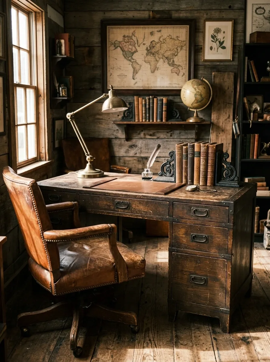
A campaign desk paired with a worn leather chair, a cast iron bookend or two anchoring a short stack of old volumes. This one sells a mood as much as furniture: a study someone actually used, not a staged office display.
The leather and the iron share a quality that most booth pairings miss. They both look better worn. A pristine version of this corner would feel fake. The scuffs and patina are the entire reason it reads as real.
Don’t add a rug unless it’s genuinely worn too. A new rug under aged furniture breaks the illusion instantly.
Painted Furniture Color Story
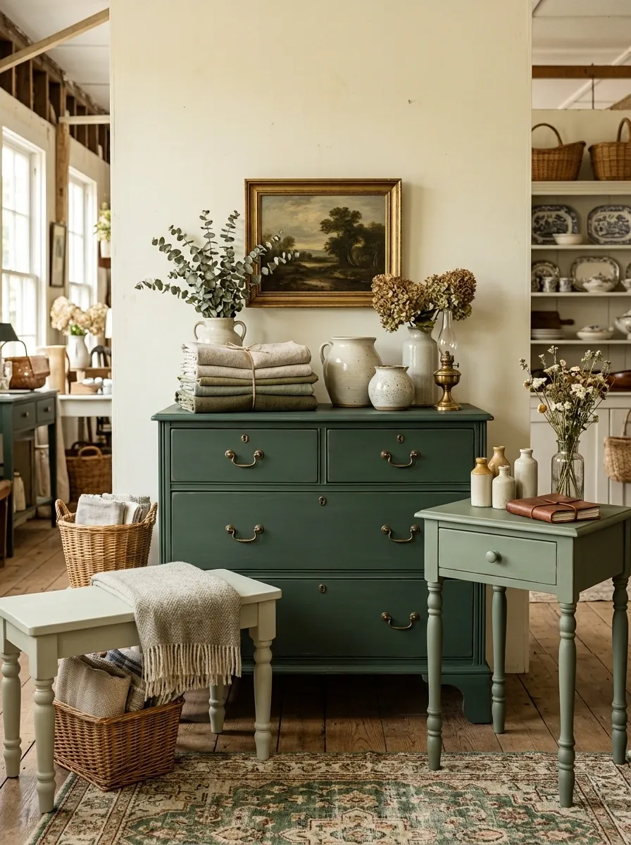
Several chalk-painted pieces, a dresser, a side table, a small bench, all in one tonal family, from pale sage to deep forest, staged together like a mini room instead of separate booth items. This is the concept where color does all the unifying work.
Most booths mix painted furniture in whatever colors came in that week. A blue dresser next to a pink chair next to a yellow shelf just reads as chaos, no matter how nice each piece is on its own. Committing to one color family turns three unrelated pieces into a set.
This takes patience to build. You’re waiting for pieces that fit the palette instead of grabbing whatever’s available. That patience is exactly what makes it look curated instead of accidental.
Vintage Toolbox Jewelry Bar
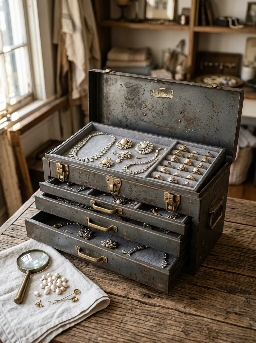
An old machinist’s toolbox with its drawers pulled halfway open, each one lined and used as a display tray for vintage jewelry. The industrial grit of the box against delicate rhinestone and gold pieces is the whole hook.
This solves a real merchandising problem. Jewelry in a flat glass case gets ignored because it looks like every other jewelry case at the mall. A toolbox invites someone to actually pull a drawer and dig, which means they touch the merchandise instead of just glancing at it.
Line the drawers in a neutral felt, not anything patterned. The box itself already has enough visual texture.
Quilt Ladder Focal Point
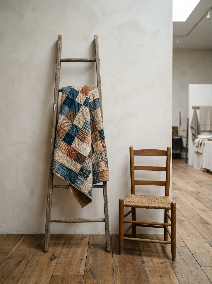
A single old quilt or two, folded and draped over a leaning wooden ladder, positioned beside one simple chair. Nothing else in the immediate frame. This is one of the smallest footprint concepts on this list, and that’s the point.
A quilt draped over a ladder is a familiar image for a reason. It works. The mistake most vendors make is crowding it with extra baskets and signs until the quilt itself gets lost. Here, the emptiness around it is what makes it read as intentional.
This concept is a palate cleanser between busier sections of a booth. Use it to give shoppers’ eyes somewhere to rest.
Industrial Cart and Crate Stack
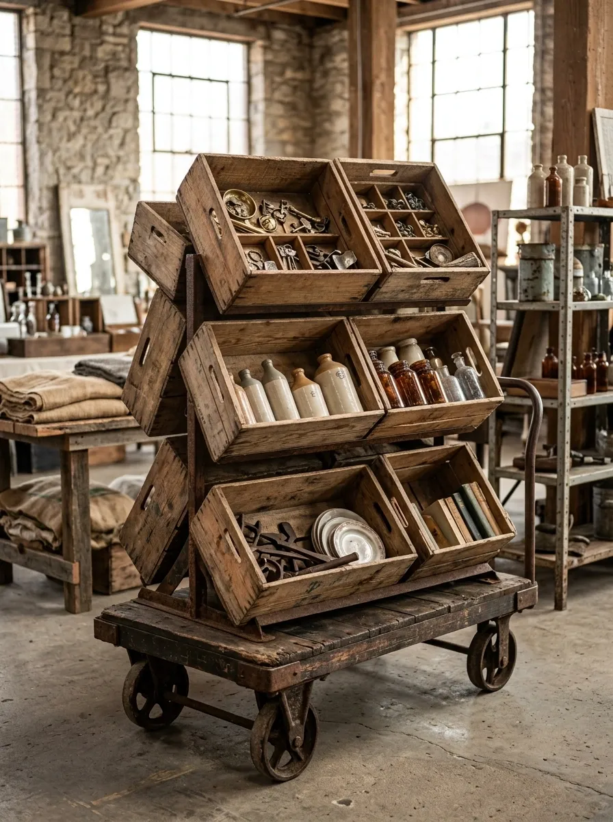
A factory cart with worn casters, stacked with wooden produce crates at slightly mismatched heights, each crate holding a different category of smalls. This one is built for booths that need to move a lot of low-to-mid price inventory without looking like a bargain bin.
The mismatched crate heights do real work. Perfectly even stacking reads as storage. Slightly uneven heights read as a display someone built by hand, which, in a booth setting, is exactly the story you want to tell.
Group similar items within each crate. A crate of mixed random objects undoes the whole effect, no matter how good the cart looks.
Silver and Velvet Jewel Box
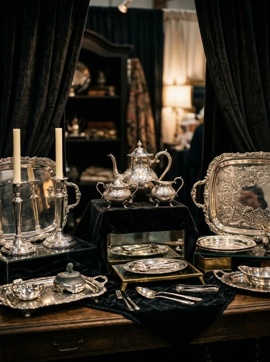
Polished silver pieces, trays, candlesticks, a tea set, set against a dark velvet backdrop with lighting angled low to catch every reflective surface. This is the moodiest concept on the list, and it earns that mood honestly.
Silver disappears against a busy background. It needs contrast and shadow to actually register as valuable instead of just shiny metal clutter. Dark velvet gives it both. The fabric also absorbs light instead of bouncing it, which keeps the silver as the only thing catching your eye.
This isn’t a display for every booth. It works best as one small, deliberately separate section, not spread across a whole wall.
Botanical Garden Salvage Nook
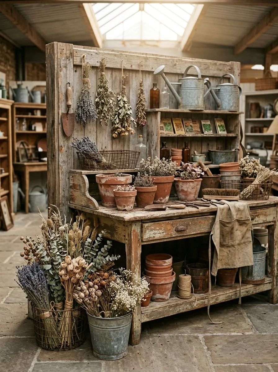
Wire baskets, chipped terracotta pots, and bundles of dried florals grouped in one corner, styled like a potting bench someone just stepped away from. It’s an easy way to bring outdoor character into an indoor booth without anything that actually needs watering.
The dried florals are doing more than decoration here. They soften every hard edge in the grouping, the wire, the metal, the rough terracotta, and keep the whole nook from reading as cold storage bins.
Don’t overfill the baskets. A few half-empty containers read as recently used. Packed-full ones read as inventory waiting to be unpacked.
Vintage Camera and Leather Goods Shelf
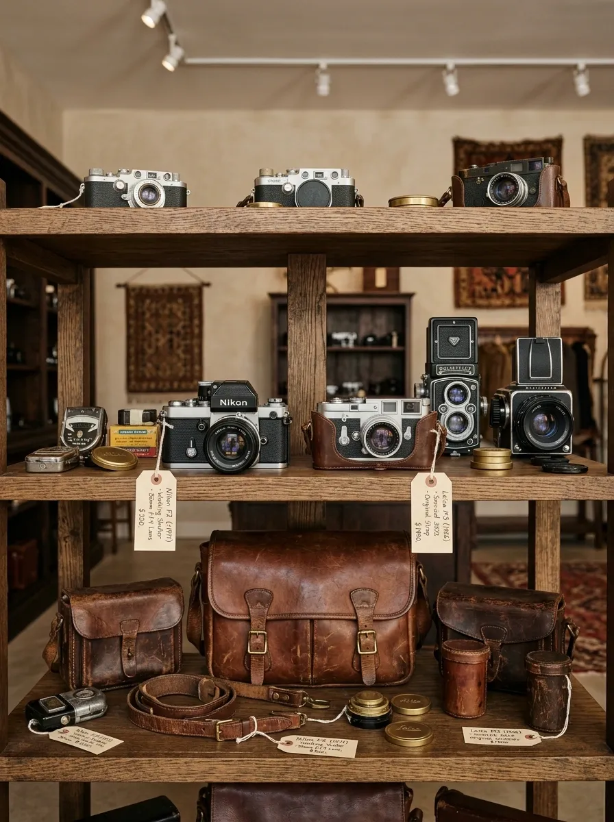
Old cameras, light meters, and worn leather bags arranged on open wood shelving, grouped by function rather than by era. A 1970s camera can sit beside a 1950s one here because the story is “gear,” not “decade.”
This concept sells to a collector mindset, so clarity matters more than styling flourish. Buyers want to see the mechanisms, the leather condition, the lens glass. Keep the shelf lit well and the pieces spaced enough that nothing is hiding behind something else.
Small handwritten tags with a one-line detail, working shutter, original strap, tend to move product faster here than a display trick would.
Copper and Cream Kitchen Display
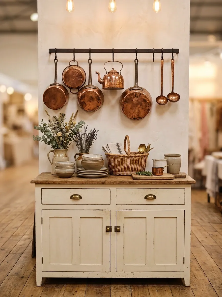
Hammered copper cookware hung above a cream-painted cabinet piece, warm light catching every dent and hammer mark in the metal. Copper is one of the few materials that genuinely looks better with visible wear, and this display leans into that instead of hiding it.
The cream backdrop is doing quiet work. Anything darker would fight the copper’s warmth. Anything whiter would make the metal look dull by comparison. Cream sits in the exact middle where the copper gets to glow.
This pairs well near a checkout or entry point. Copper catches light and eyes from a distance, which makes it useful as a booth’s opening statement.
Full-Room Primitive Americana Booth
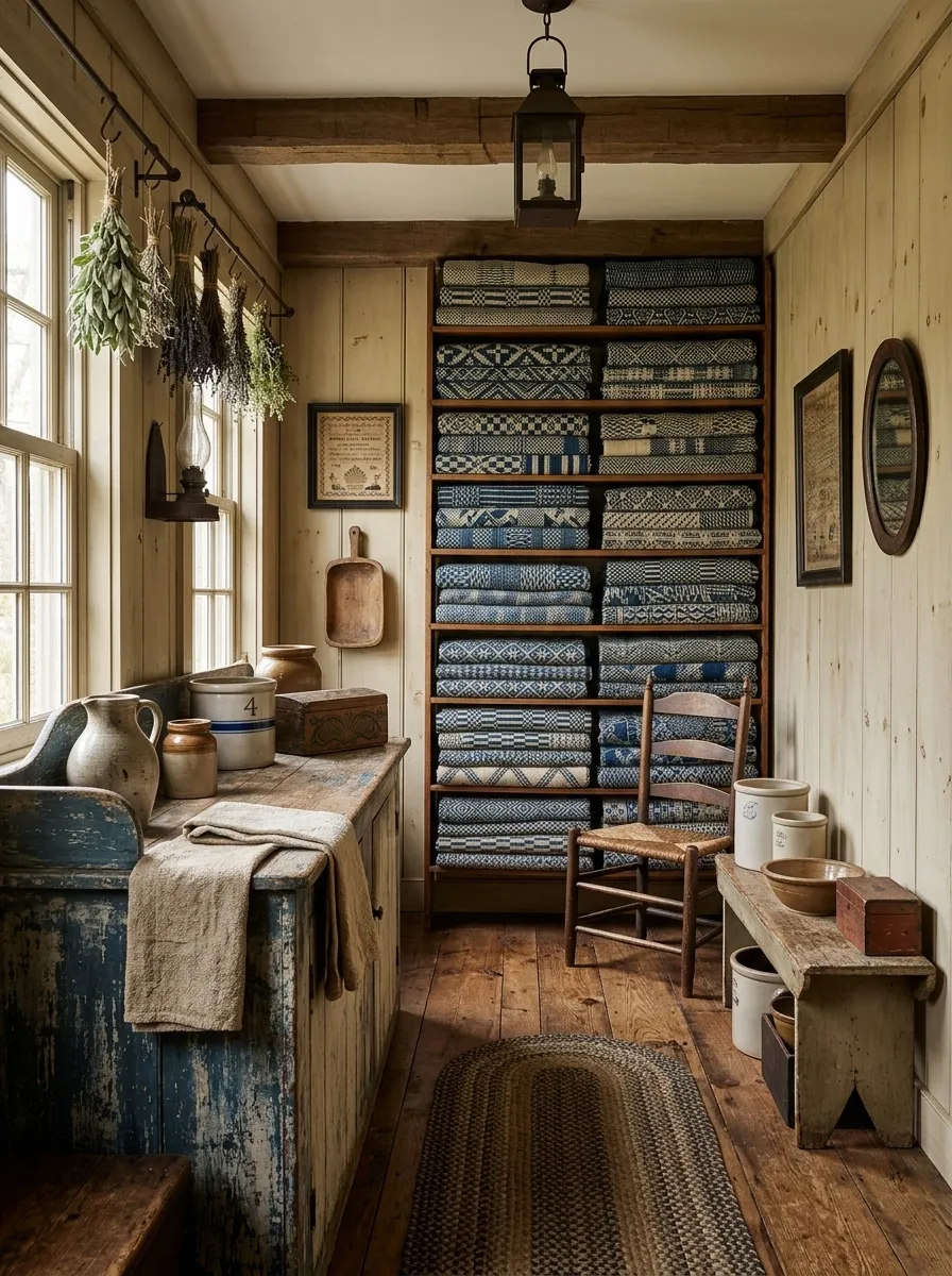
Blue-and-white primitives, crocks, coverlets, painted boxes, staged as a complete keeping room rather than scattered across separate tables. A dry sink anchors one side, a wall of stacked coverlets anchors the other, with smalls filling the gaps between them at varying heights.
This concept asks for the most commitment on this list, and it pays off the most too. Primitive Americana buyers are often collectors furnishing an entire room in real life, so a booth that already looks like a finished keeping room does their imagining for them.
Stick to blue, white, and weathered wood tones throughout. One stray bright color anywhere in this booth breaks the entire illusion.
Nautical Salvage Wall
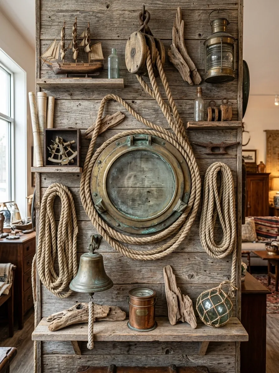
Coiled rope, a brass porthole, and weathered driftwood-toned boards grouped together in a wall composition, textures rough and matte rather than glossy or new. Nautical salvage fails fast when pieces look too clean. This one leans hard into the weathered side on purpose.
The porthole earns its spot as the focal point because it’s the only round shape in a wall of straight lines and coiled circles. That shape contrast is what keeps the eye moving across the grouping instead of settling on one flat plane.
Skip anything obviously reproduction here. A shiny new brass porthole next to real weathered wood reads as fake instantly.
Holiday-Ready Vintage Ornament Display
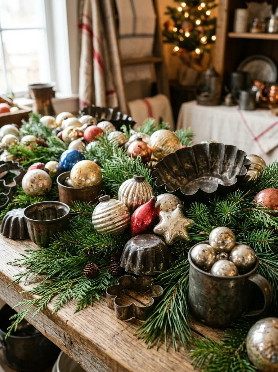
Antique glass ornaments and old tinware nestled into a fresh greenery base, staged as a seasonal pop-up rather than a permanent fixture. This one is meant to rotate. Its whole value is timing, not permanence.
The greenery does more than decorate. It’s what separates this from just looking like ornaments in a bowl. Fresh or high-quality faux greenery gives the vintage glass somewhere to nest, and the texture contrast between soft needles and fragile glass is what makes shoppers slow down.
Complete Booth Formula Breakdown
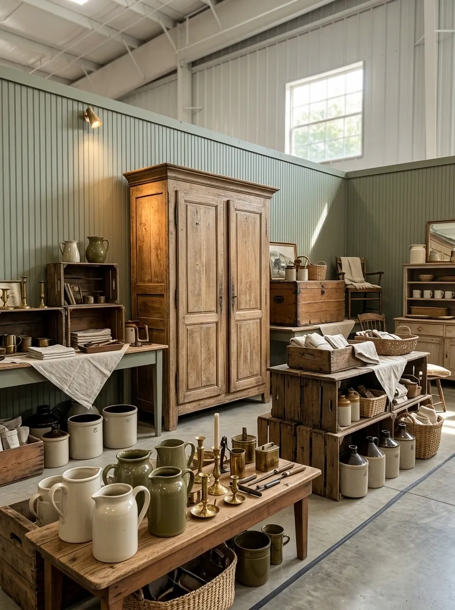
Every design on this list follows the same underlying structure, whether it’s a full room or a single quilt on a ladder. One anchor piece, a height variation, a limited color story, and a clear price-point zone so browsers and buyers both know where to look.
The anchor gives the eye somewhere to land first. The height variation keeps the section from going flat. The color story is what makes a random group of objects read as one decision. And the price zone, cheap smalls near the front, bigger furniture further in, controls how someone moves through the space once they’ve stopped.
Most booths that struggle are missing one of these four, not all of them. Find the missing piece before you add more inventory.
Conclusion
None of these booths sell because of what’s in them. They sell because of what got left out. A booth with a clear story pulls someone in faster than a booth with more inventory ever will. The next time a section feels flat, don’t reach for another object. Look at your sightlines, your color story, and whether the eye actually knows where to land first.
Start with one corner of your booth this week. Pick a single story, pull half the smalls, and see what happens to the section around it.
Save the layouts that actually match your inventory. It’s a lot easier to rework one display shelf than to guess your way through a whole booth redesign later.