
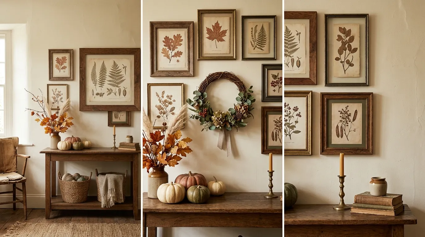
Most autumn decorating advice completely ignores the actual architecture of a home. We are told to tape plastic foliage around mirrors and hang mass-produced wooden signs, turning otherwise thoughtful spaces into retail end-caps. But an authentically earthy, lived-in home does not suddenly transform into a temporary theme park in October. The shift should feel natural, rooted in materials that age beautifully—like natural stone, reclaimed wood, and heavily textured plaster.
Genuine seasonal warmth comes from structural decisions, not scattered objects. It is about deep tonal consistency, layering vintage textiles, and relying on moody, architectural lighting to change the atmosphere. These complete wall layouts focus on collected comfort and tactile finishes, proving that the best seasonal shifts happen when you stop decorating and start designing.
Why Most Seasonal Decor Looks Cluttered (And How to Fix It)
Scale Matters More Than Leaves
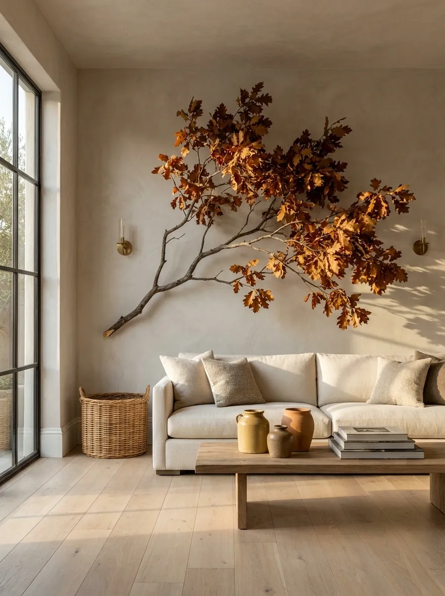
A single massive, six-foot dried oak branch climbing a wall looks architectural. Fifteen tiny faux pumpkins scattered across a shelf look like a mess. When bringing seasonal elements indoors, increase the scale and decrease the quantity.
The Power of Permanent Warm Tones
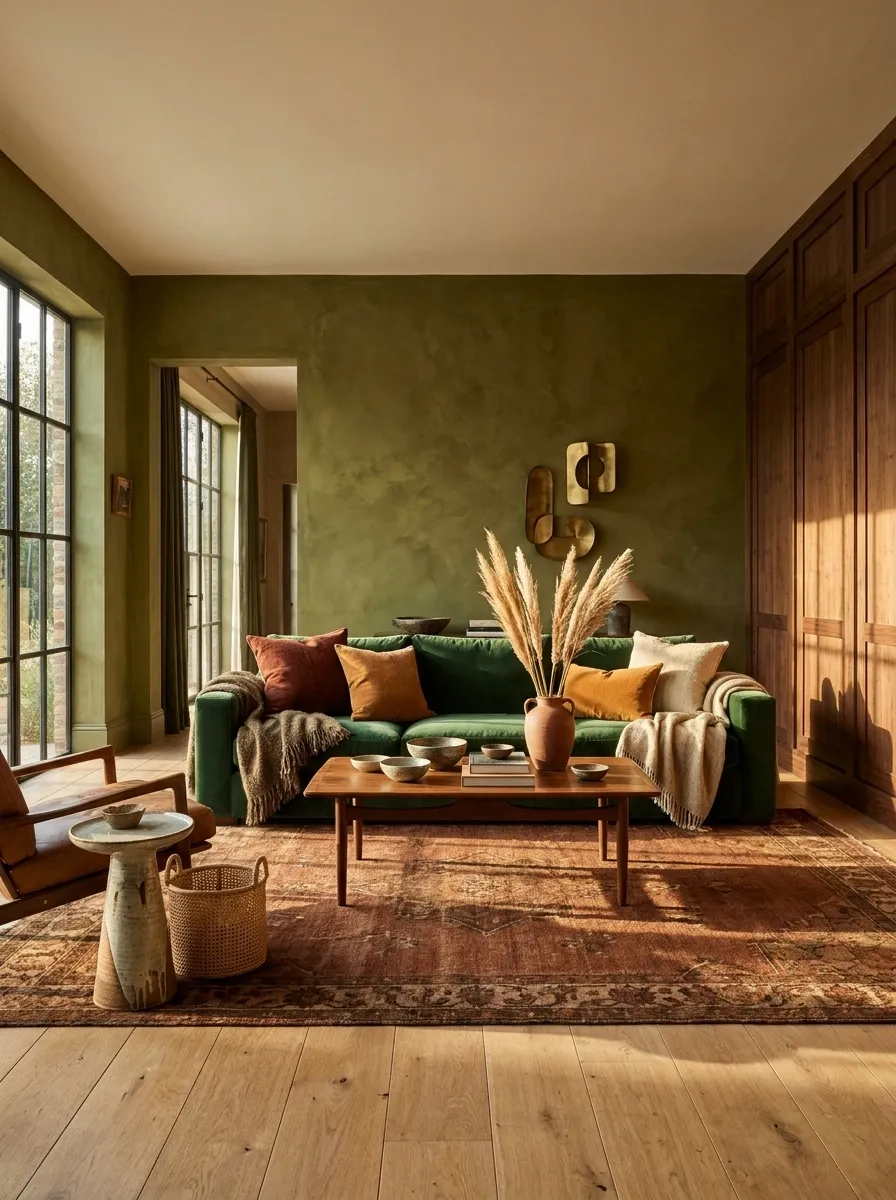
You do not need seasonal decorations if the room is already built on a foundation of warm, tactile materials. A room with rich limewash, heavy velvet, or dark wood paneling inherently feels like autumn year-round.
Integrating Instead of Decorating
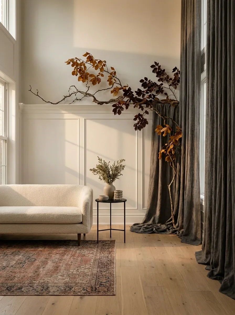
Do not just stick things on the wall. Make the seasonal elements interact with the architecture. Let heavy branches rest on the picture rail. Allow dark drapery to act as the primary wall texture. The design should feel intentional.
Complete Fall Wall Designs
Deep Terracotta Limewash with Floating Walnut Shelves
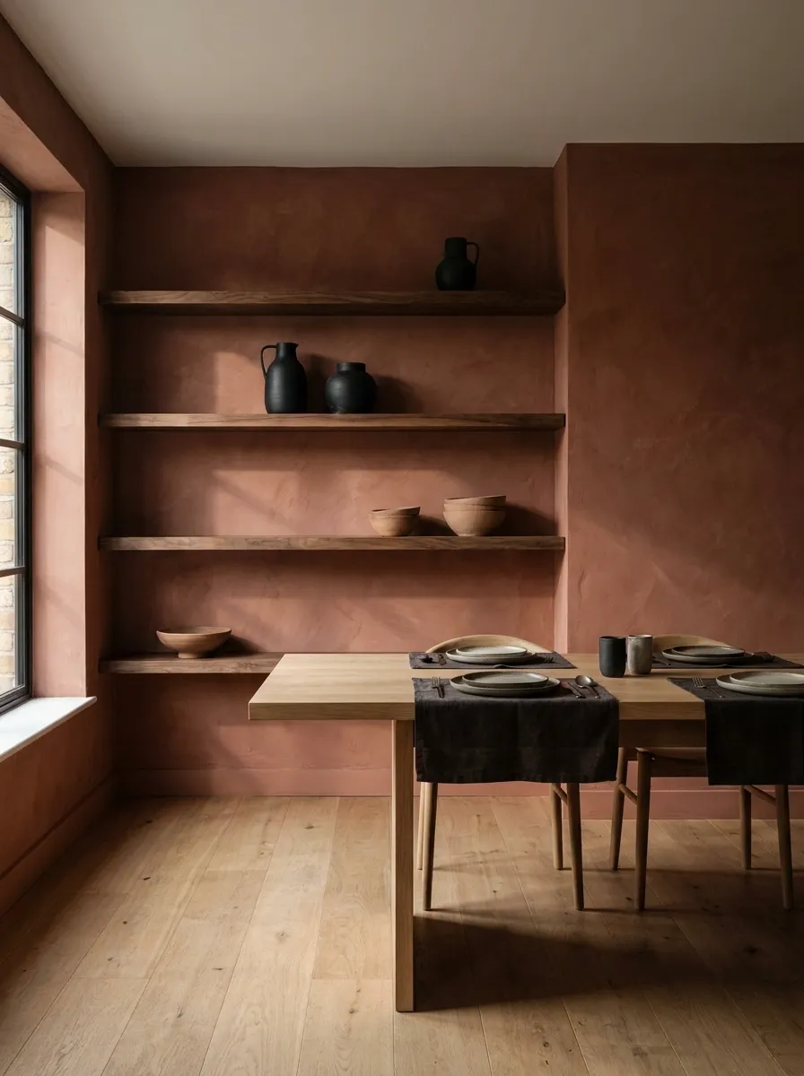
A dining room enveloped entirely in chalky, heavily textured terracotta limewash creates an immediate, permanent autumn mood. Thick, raw walnut floating shelves cut across the wall, holding a sparse collection of matte black pottery and unglazed ceramics.
This works because the wall itself does the heavy lifting. You do not need to add seasonal trinkets when the architecture already feels like a warm fire. The limewash provides a dusty, uneven texture that absorbs light rather than bouncing it. The walnut shelves ground the bright terracotta, preventing the room from feeling like a desert theme. Keep the styling objects dark and structural.
Oversized Asymmetrical Branch Installation over a Stone Fireplace
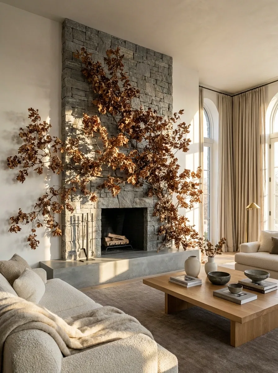
A grand living room anchored by a floor-to-ceiling dry stack stone fireplace demands large-scale vertical thinking. A massive, asymmetrical installation of dried oak branches reaches across the stone and bleeds onto the adjacent plaster wall.
Scale is the only thing that matters here. A small wreath on a massive stone wall looks timid. A sprawling, chaotic branch structure looks like an architectural feature. The dry, brown leaves provide enough warmth to soften the gray stone. The asymmetry keeps the composition feeling modern and slightly wild. Never perfectly center an organic installation like this. Let it crawl naturally.
Moody Plaid Wallpaper in a Small Powder Room
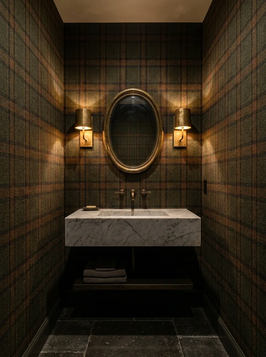
A dark, enclosed powder room wrapped entirely in an olive green and rust-toned plaid wallpaper immediately feels like a tailored tweed jacket. A heavy Carrara marble sink and raw, unlacquered brass sconces sit directly against the dark pattern.
Small, windowless rooms handle dark, heavy patterns beautifully. The plaid introduces a traditional, masculine energy that inherently feels like late October. The unlacquered brass is critical. Shiny chrome would look too sharp and modern against the historic pattern. The brass will tarnish, adding another layer of warmth to the wall over time.
Floor-to-Ceiling Velvet Curtains in Burnt Orange
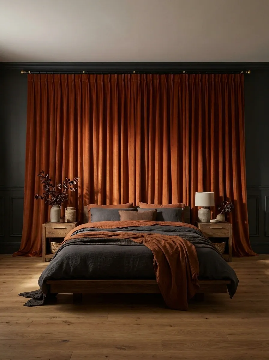
A moody bedroom uses fabric as its primary wall treatment. Wall-to-wall, floor-to-ceiling burnt orange velvet drapes completely cover the window wall, sitting heavily above dark charcoal wainscoting.
People forget that drapery is a wall finish. In autumn, swapping lightweight linen for thick velvet completely changes the acoustic and visual temperature of a room. The burnt orange against the charcoal creates a highly saturated, insulated environment. The velvet absorbs the light, making the walls feel soft and deep. Keep the hardware matte black to maintain the heavy, grounded aesthetic.
Gallery Wall of Antique Sepia and Gold Gilt Frames
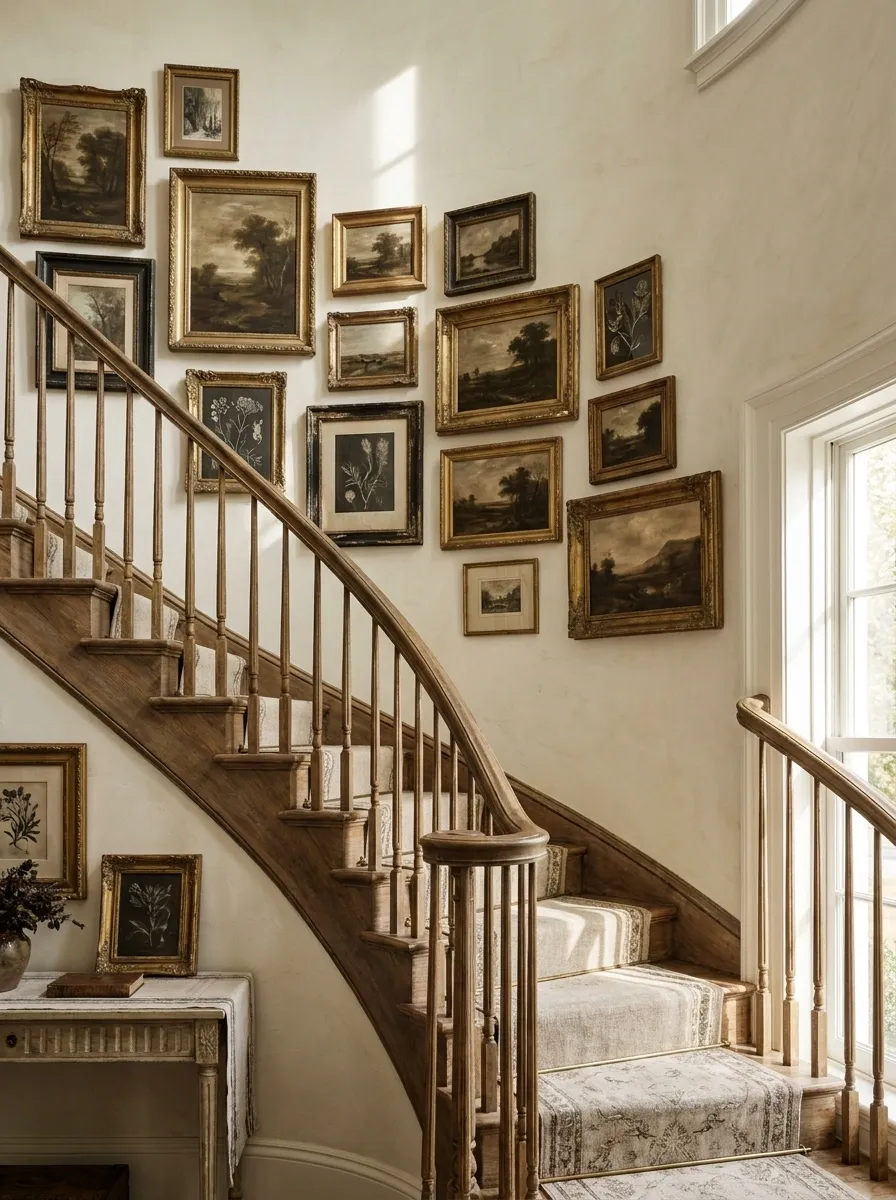
A sweeping staircase wall is filled tightly with vintage, tarnished gold frames housing sepia-toned landscapes and dark botanical prints. The cream plaster wall peeks through, but the visual weight is entirely controlled by the heavy gold and dark artwork.
Art dictates the season faster than paint. Swapping out bright, high-contrast summer photography for moody, tonal landscapes instantly shifts the room. The tarnished gilt frames add necessary warmth and historical weight. The arrangement should feel organic and slightly crowded. A perfectly spaced, symmetrical grid looks too modern and clinical for this kind of historical warmth.
Warm Matte Black Shiplap with Amber Glass Sconces
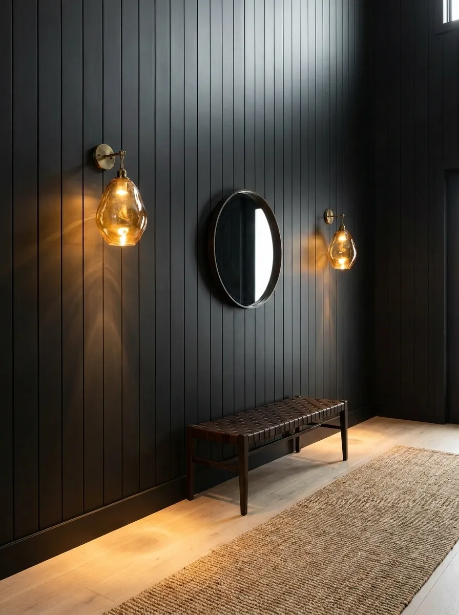
Vertical matte black shiplap lines an entryway, turning what could be a sterile pass-through into a dark, grounding threshold. A pair of blown amber glass sconces mounted directly to the wood cast long, warm pools of honeyed light across the subtle grain.
Dark walls in an entry immediately announce that the space has a specific mood. Vertical orientation elongates the ceiling height, while the amber glass softens the hard, contemporary line of the black planks. When the sconces are lit, the wall glows without needing a single piece of seasonal garland or hanging decor. Keep the flooring light, like a pale tumbled limestone or natural white oak, so the dark vertical wood feels like an intentional architectural choice rather than an abyss.
Dried Wheat and Foraged Grasses Woven into a Living Wall
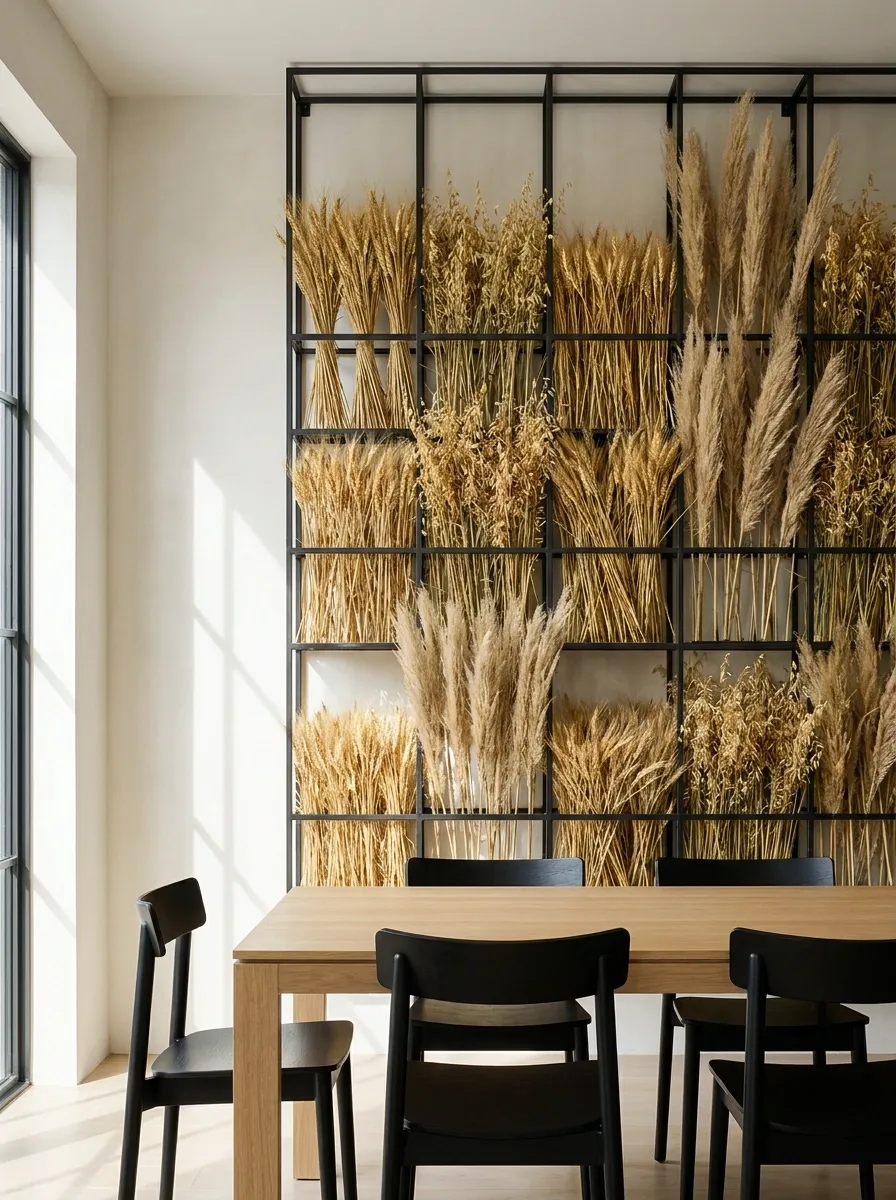
Instead of a temporary wreath, a modern dining room features a floor-to-ceiling blackened steel grid attached to the main plaster wall. The grid holds dense, structured bundles of dried wheat, wild oats, and tall pampas grass woven in sculptural vertical bands.
This treats dried agricultural elements like serious wall art rather than a craft project. The architectural grid provides sharp, disciplined lines that keep the wild, dusty textures of the dried botanicals from looking messy. The warm golden tones of the wheat bounce off the chalky plaster behind it, giving the room visual depth and physical texture. Leave the rest of the wall bare. The grid already provides all the visual weight the space can handle.
Ochre Color-Blocked Archway over a Reading Nook
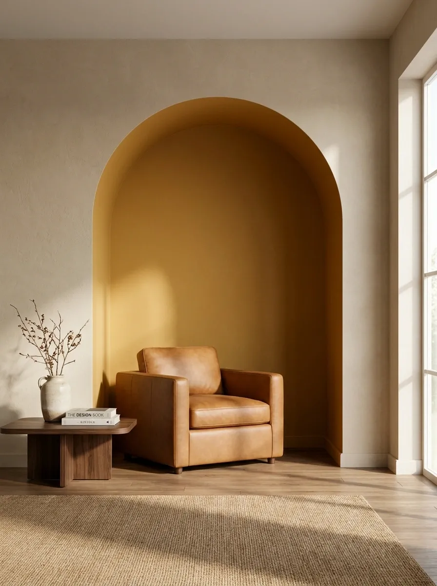
A painted, deeply saturated ochre archway visually carves out a recessed reading nook inside an otherwise plain beige living room. A rich caramel leather armchair and a low walnut side table sit framed within the golden-orange curve.
Color-blocking is the cleanest way to create a seasonal shift without buying a single new piece of furniture. Painting a bold architectural shape onto the wall creates an instant focal point that pulls the eye directly into the nook. Ochre delivers the golden warmth of late afternoon sunlight even on overcast autumn days. The trick is committing to the saturation. A timid, pale yellow looks like a paint swatch mistake, but a rich, egg-yolk ochre establishes real spatial purpose.
Aged Brass Picture Rails with Oversized Moody Landscapes
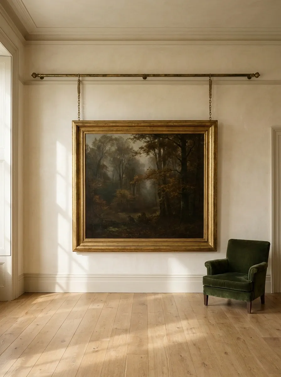
A traditional living room relies on architectural hardware rather than nails. A heavy, solid aged brass picture rail runs horizontally across cream plaster walls, suspending an oversized, moody oil painting of a misty autumn forest by woven brass chains.
Picture rails allow you to change artwork without damaging walls, making them ideal for seasonal shifts. Hanging art from brass chains gives the wall a sense of height and historical rigor. The oversized scale of the painting grounds the room, while the dark forest tones inside the frame bring the outdoors directly into the space. Keep the surrounding wall space completely clear. When artwork is this large and hung with heavy brass hardware, letting the plaster breathe makes the whole composition look more expensive.
2. Art: High-resolution print of an 19th-century oil landscape on textured canvas.
3. Proportions: Frame width should cover at least 60% of the wall section.
Reclaimed Barnwood Accent Wall in Herringbone Pattern
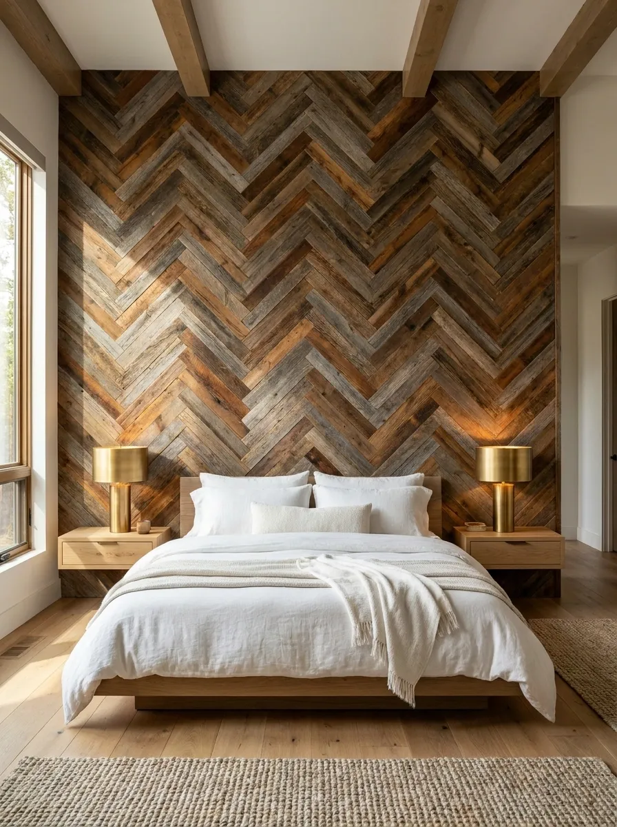
A modern bedroom headboard wall gets a major architectural upgrade with reclaimed barnwood planks laid in a crisp, tight herringbone pattern. Varying shades of chestnut, grey, and deep amber wood interlock across the entire vertical surface.
Reclaimed wood can easily slip into a tired rustic cliche if placed in plain horizontal strips. Laying the weathered boards in a refined herringbone pattern completely changes the energy. It introduces geometric precision while retaining all the tactile, weather-worn warmth of aged timber. The wall serves as a permanent, textured headboard that feels incredibly grounding during cold months. Pair it with crisp white linen sheets and minimal bedside lamps so the wood remains the undisputed star of the bedroom.
- Feels visually flat and predictable
- Can look like a suburban farmhouse set
- Emphasizes length but squashes room height
- Lacks geometric sophistication
- Draws the eye upward, increasing visual height
- Elevates raw materials into custom carpentry
- Creates dynamic shadows across weathered grain
- Balances rustic texture with modern structure
Oxblood Red Wainscoting with William Morris Botanical
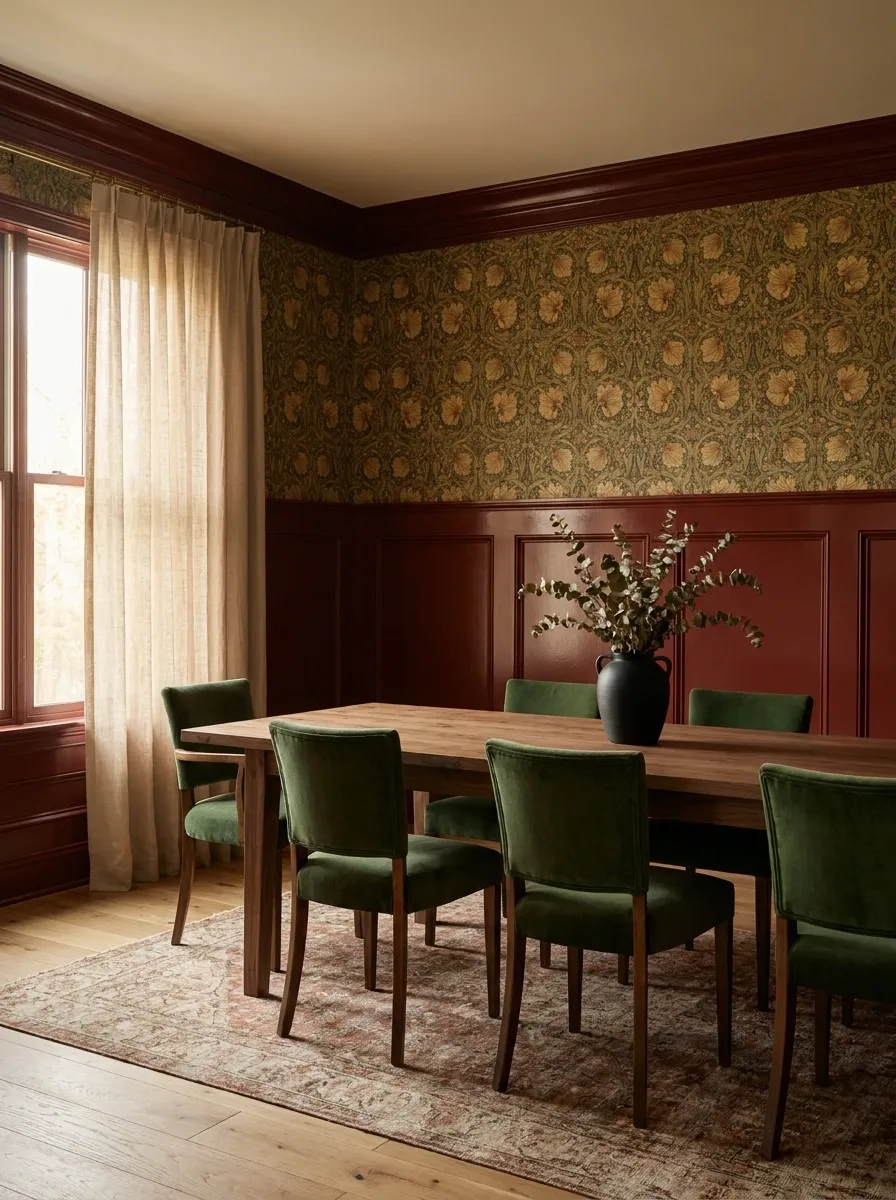
A classic dining room is split horizontally, anchoring the space with rich, glossy oxblood wainscoting on the bottom and a dense, autumnal William Morris floral wallpaper above.
High-gloss dark paint pairs beautifully with intricate historical patterns. The oxblood red grounds the room, while the wallpaper introduces a heavy canopy of mustard, olive, and rust tones. This creates a dining space that feels deeply insulated and traditional.
Wainscoting adds necessary structural rhythm to a room. When you paint it a saturated, dramatic color, it eliminates the need for extra furniture to fill the space. The wallpaper does all the decorative work. Keep the dining table bare, using a heavy oiled oak or raw walnut, to ground the busy wall pattern with a quiet, natural material.
Heavy Linen Wall Hanging in Mustard and Rust
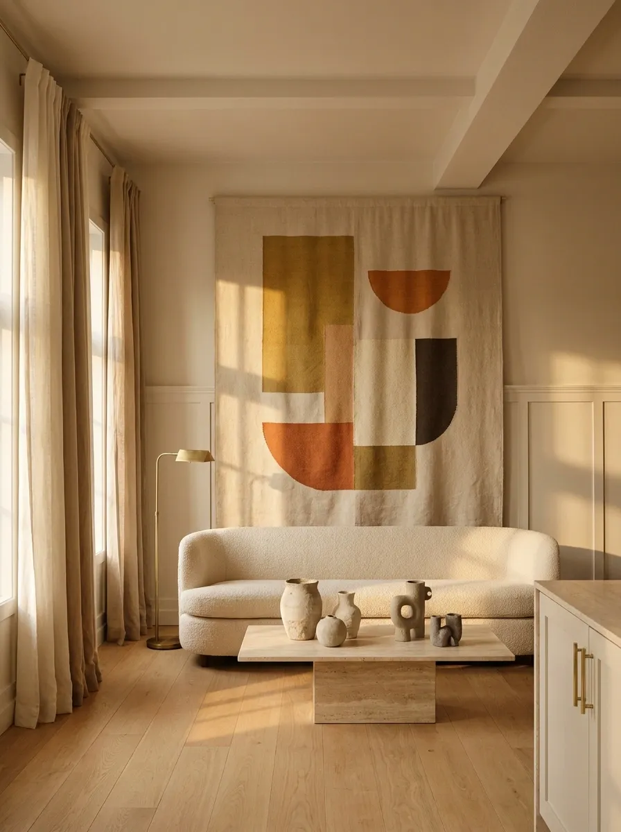
An organic modern living room is anchored by a massive, floor-to-ceiling heavy linen tapestry featuring abstract geometric shapes in muted mustard and rust.
Large-scale textiles soften hard architecture instantly. A massive linen tapestry acts as a flexible wall treatment that brings warmth and acoustic dampening to a sterile room. The muted mustard and rust shapes introduce autumn colors through texture rather than standard framed art.
This is how you handle a large blank wall without buying twenty small frames. One massive piece of heavy fabric feels deliberate and confident. It works perfectly over a low-profile sofa where structural built-ins are not an option. The raw, unbleached linen background keeps the overall composition feeling light rather than oppressive.
Exposed Brick Washed in Warm Amber Uplighting
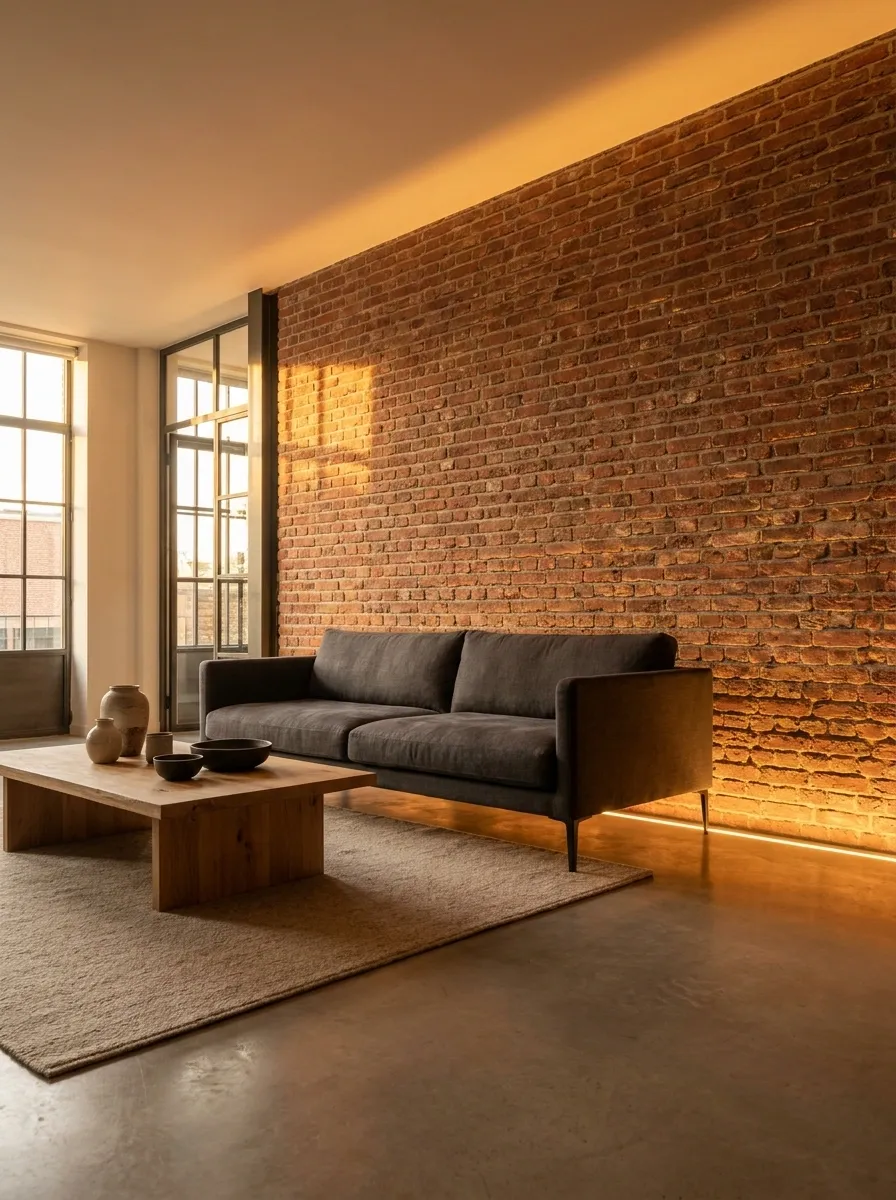
A rugged, red-clay exposed brick wall in an industrial loft space is dramatically highlighted by floor-level amber uplighting, enhancing the texture and warmth of the masonry.
Lighting changes the physical presence of a wall. Placing directional uplights at the base of an exposed brick wall emphasizes every mortar line and rough edge. The amber bulbs wash the red clay in a golden, late-autumn glow.
You do not need to cover beautiful materials. Brick is already an autumnal texture. Raking light across it simply maximizes what is already there. Keep the surrounding furniture pulled a few inches away from the wall. This lets the light travel upward freely without casting awkward shadows on the back of a sofa or credenza.
Olive Green Board and Batten with Brass Picture Lights
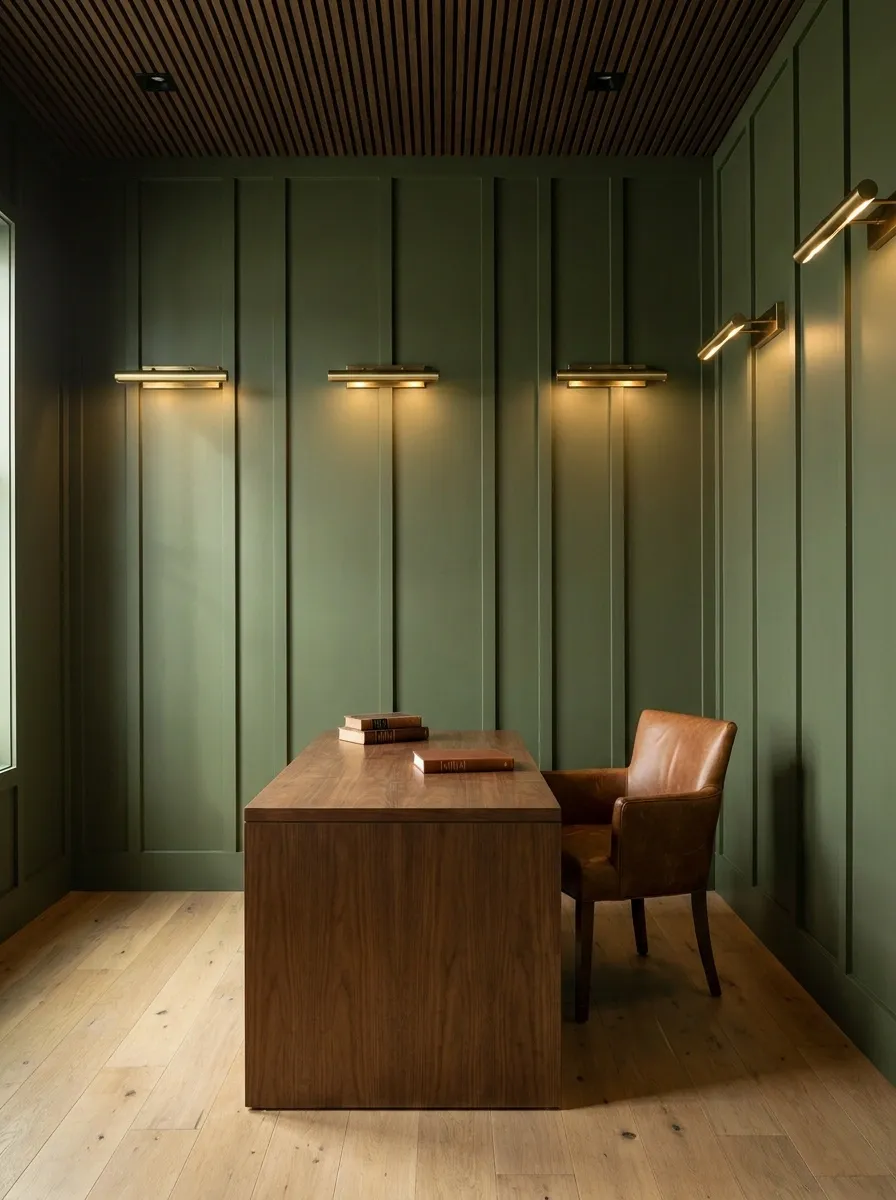
A home office is wrapped entirely in deep olive green board and batten, with sleek brass picture lights casting warm pools of light onto the wall panels.
Board and batten introduces deep shadow lines that give flat drywall immediate structural weight. Painting it a rich olive green turns the entire room into a moody, secluded study. The brass picture lights mounted directly onto the paneling add necessary metallic warmth.
Wood paneling is a permanent architectural upgrade that dictates the atmosphere. Olive green is nature’s ultimate neutral. It pairs perfectly with warm walnut desks, acoustic slat wood ceilings, and worn leather chairs. The picture lights do not even need art beneath them. The architectural wash of light down the colored paneling is a complete visual feature on its own.
Tapestry-Style Removable Mural of a Foggy Autumn Forest
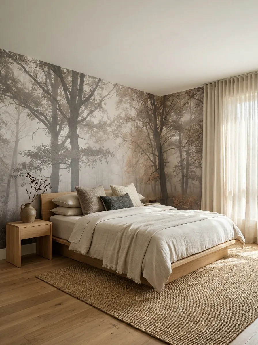
A serene guest room is dominated by a wall-to-wall, desaturated mural of a foggy autumn woodland. The massive scale of the misty trees grounds the space, perfectly paired with wide-plank oak flooring and unbleached linen bedding.
When you want a major seasonal shift without structural work, a large-scale mural is the answer. It eliminates the need to figure out complex gallery arrangements or shelving. The entire wall becomes the art. The key to keeping it sophisticated rather than juvenile is desaturation. A mural with bright, hyper-realistic orange leaves looks like a theme park. A foggy, muted, almost monochromatic woodland scene feels like a historic tapestry.
Let the mural do the talking. Keep the furniture profile low and the surrounding textiles heavily textured but neutral in color.
Floating Bronze Shelves Displaying Copper Cookware
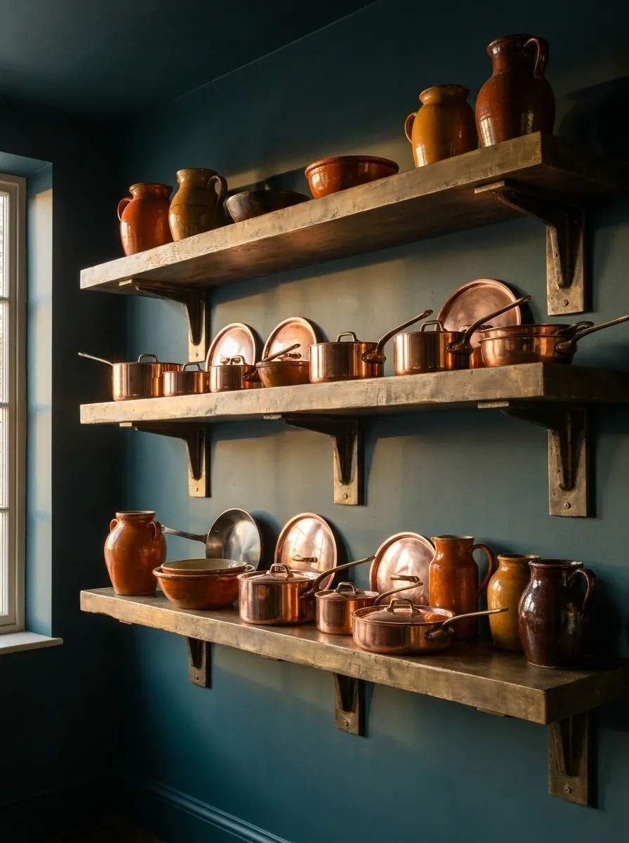
A moody kitchen features dark teal walls intersected by heavy, industrial floating bronze shelves. The shelves are densely stacked with a curated collection of gleaming, warm copper pots and autumnal-toned ceramics.
Kitchens need functional design, not applied holiday decorations. Copper cookware inherently possesses the exact metallic warmth associated with autumn, but it remains a permanent, useful investment. Against a dark teal wall, the copper practically glows. The heavy bronze shelving provides the necessary structural rigidity to hold the visual weight of the metal pots.
Do not stagger a few small pans sparsely across a long shelf. Copper looks best when it is grouped densely, creating a solid block of metallic warmth.
Textured Grasscloth Wallpaper in Warm Hazelnut
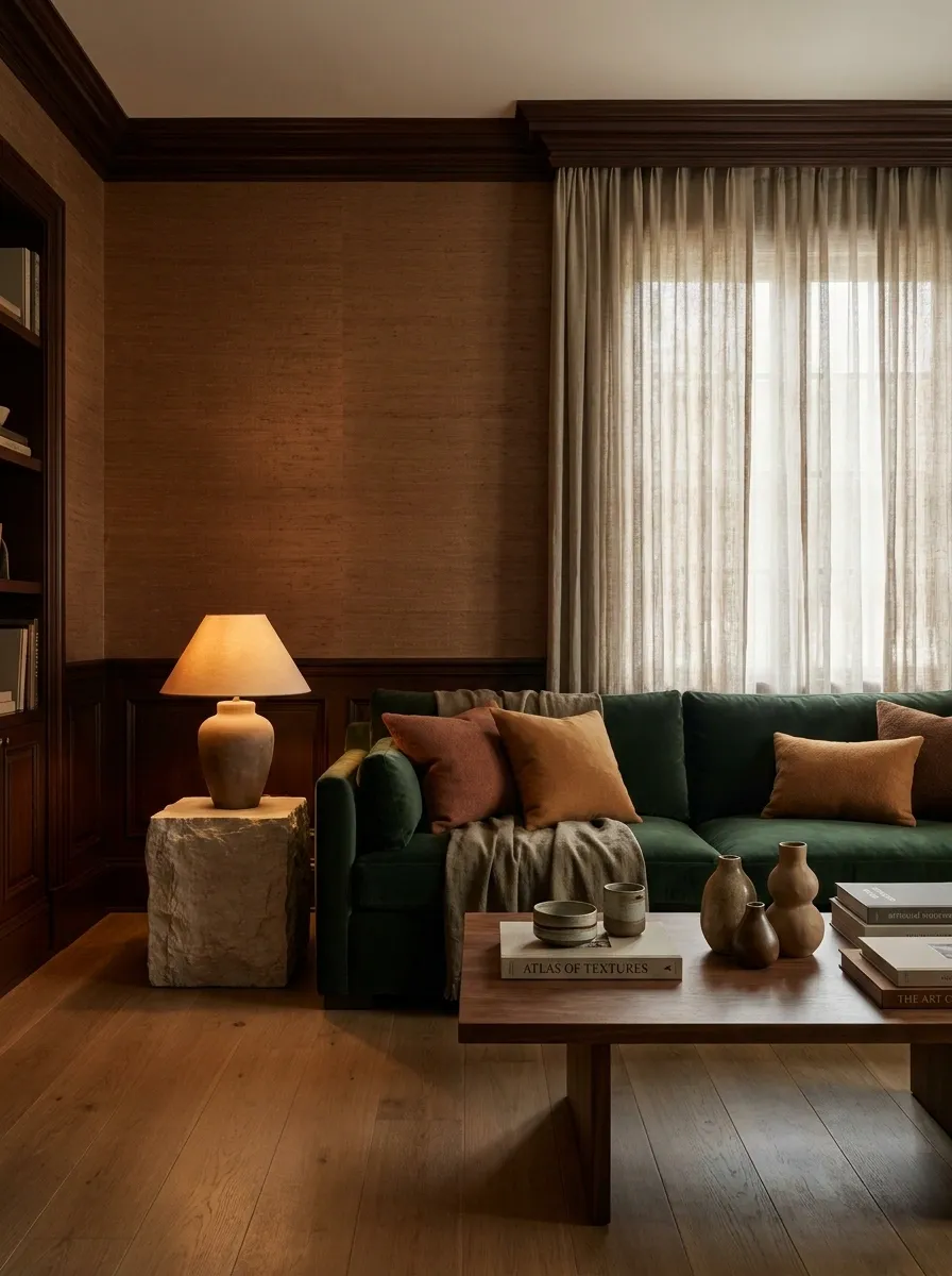
A cozy den is completely enveloped in a rich, hazelnut-toned grasscloth wallpaper. The walls form a highly tactile, woven backdrop for velvet seating and dark mahogany architectural accents.
Grasscloth delivers what flat paint never can: physical texture. The woven natural fibers absorb light, ensuring the room never feels glaring or stark. A warm hazelnut tone instantly insulates the room, making it feel like a private, tailored cigar lounge.
Because the wall itself has so much organic variation, you do not need to hang much art. The subtle grid of the grasscloth seams is an architectural feature in its own right. Keep the styling deliberate. Avoid cheap, mass-produced frames and stick to high-quality materials like heavy stone side tables and solid wood framing.
Floor-to-Ceiling Built-In Bookcases Painted Cinnamon
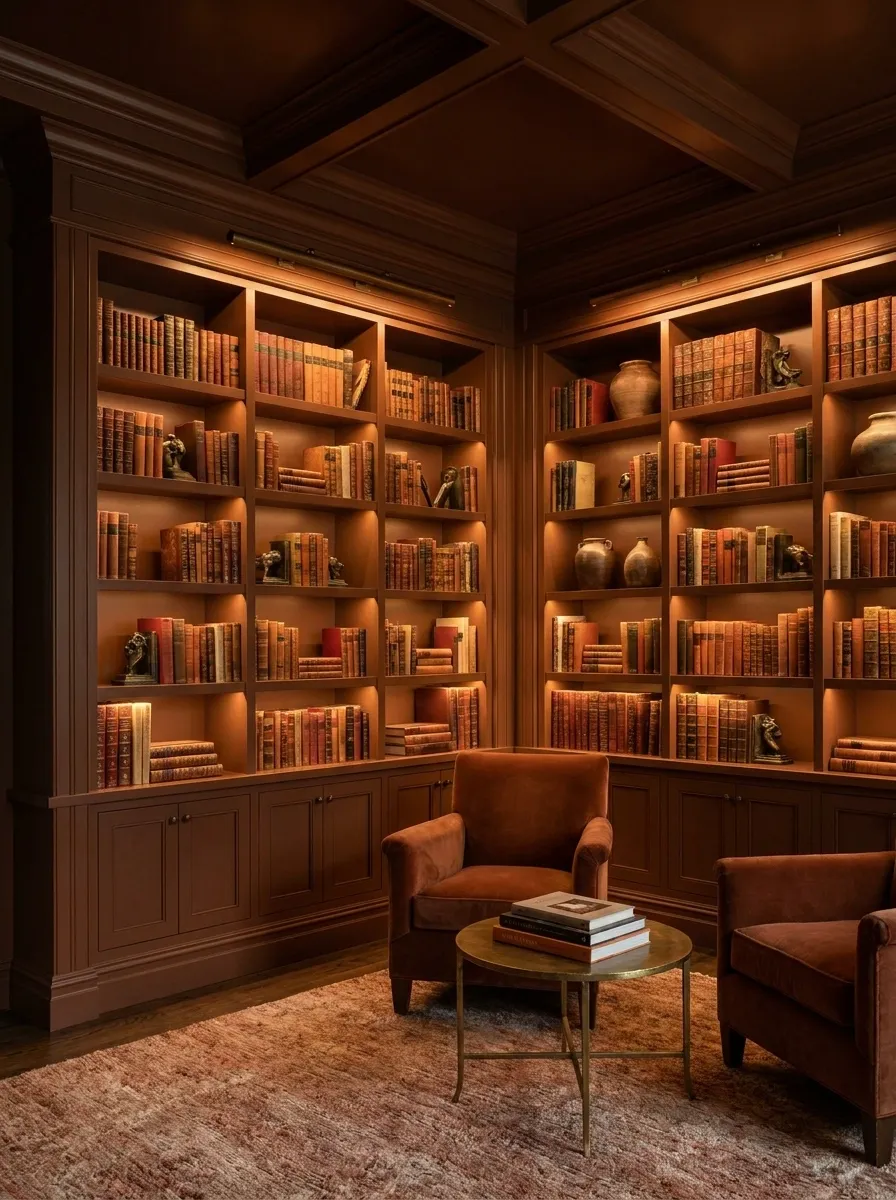
A library space is completely saturated in a custom cinnamon paint, covering the floor-to-ceiling built-in bookcases, the crown molding, and the ceiling. The shelves are tightly packed with books, accented by concealed architectural cove lighting washing down the spines.
Color drenching a room with heavy cabinetry creates an incredibly insulated environment. Floor-to-ceiling built-ins provide the ultimate structural depth. When you paint them a rich, warm cinnamon, the cabinetry ceases to look like storage and becomes the primary architectural identity of the room.
This relies on deliberate planning, not afterthought additions. The cove lighting is non-negotiable here. Hiding LED strips behind the top fascia of the shelves washes warm light down the cinnamon paint, highlighting the structural geometry of the built-ins and making the entire wall glow from within.
Massive Antique French Mirror Reflecting Autumn Foliage
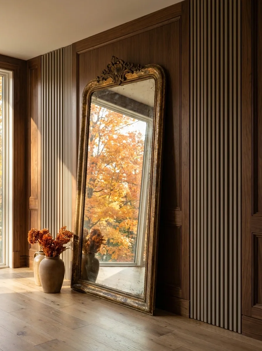
A grand entryway features a carefully planned entry sequence anchored by a towering, floor-standing antique French mirror. Positioned deliberately opposite a large window, the mirror pulls the bright orange outdoor foliage directly onto the interior wall.
A carefully planned entry sequence defines the atmosphere for the entire home. Instead of cluttering the foyer wall with small seasonal signs, use reflection. A massive, heavy mirror with an oxidized, tarnished frame acts as a live-action painting of the season outside.
This works because it honors the architecture of the space. It harnesses natural light and external scenery rather than forcing artificial foliage indoors. Pair the mirror with an acoustic slat wood wall or rich walnut paneling behind it to ground the reflective glass with serious, tactile weight.
Saturated Auburn Painted Ceiling Down to the Picture Rail
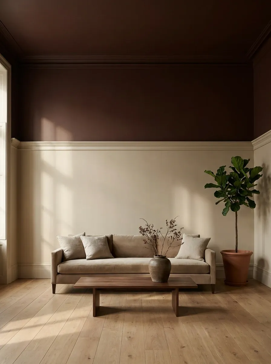
In a tall, historic room, the ceiling and the top two feet of the wall down to a heavy plaster picture rail are painted in a deep, saturated auburn. The lower section of the wall remains a warm, creamy taupe.
This is a structural intervention disguised as a paint job. By pulling the dark auburn color down from the ceiling onto the upper wall, you visually lower the ceiling height, transforming a cavernous space into an insulated, intimate room.
The picture rail acts as a sharp architectural boundary that stops the heavy color from overwhelming the space. The contrast between the auburn canopy and the taupe lower walls delivers the exact tonal consistency of an autumn forest without requiring a single piece of seasonal decor. Keep the lower walls free of clutter; the tension between the dark ceiling and the light walls is the entire design.
Dried Hydrangea and Eucalyptus Swag over a Headboard
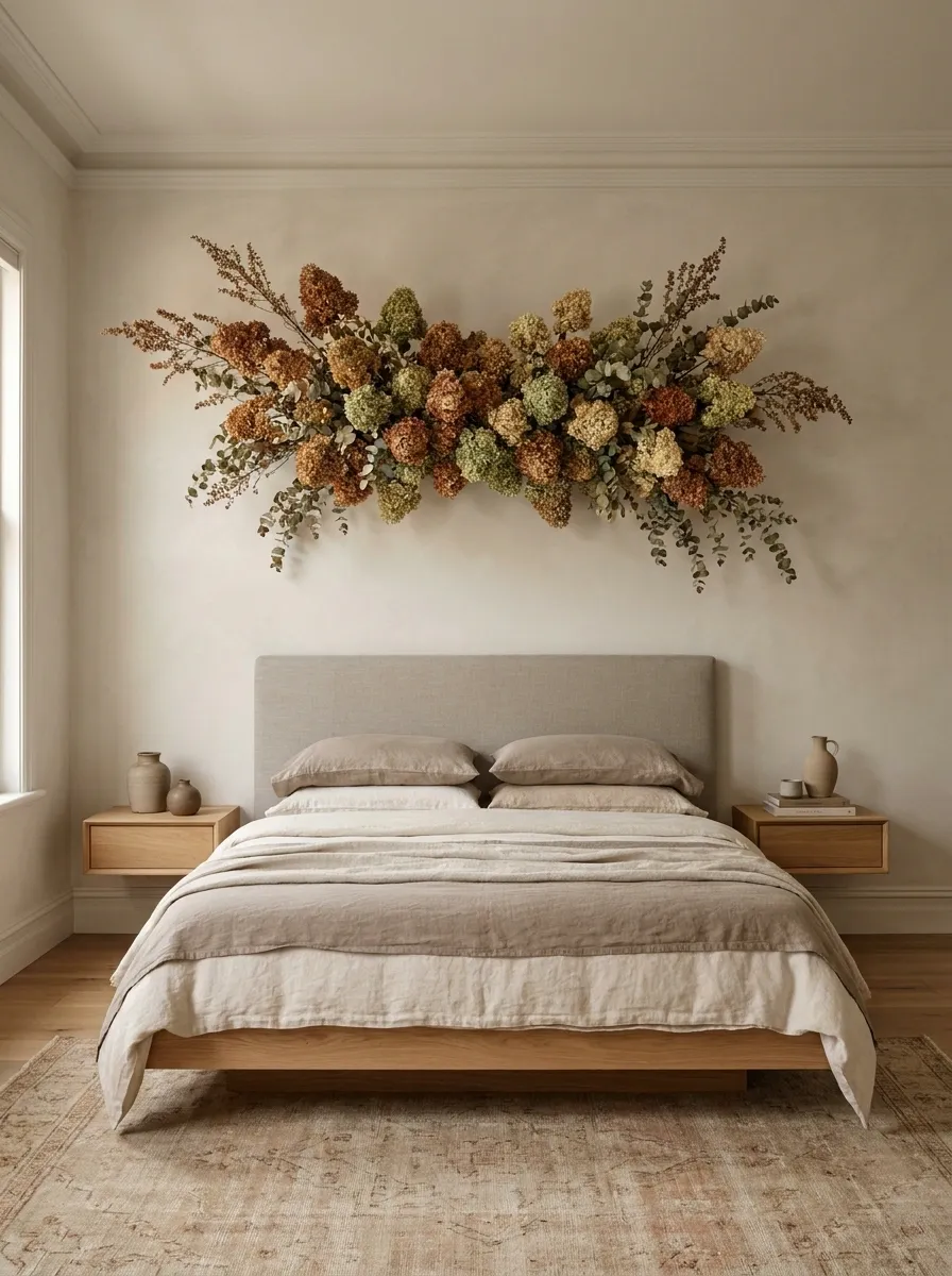
A soft, earthy bedroom features a muted linen headboard crowned by a massive, sculptural swag of dried antique hydrangeas and seeded eucalyptus mounted directly to the plaster wall above it.
This proves that botanical elements can be structural if the scale is aggressive enough. A delicate, spindly wreath above a bed looks like an afterthought. A massive, four-foot horizontal swag of dried florals acts as a living architectural canopy.
The antique hydrangeas provide dusty rust and faded olive tones that feel inherently like autumn. The eucalyptus introduces necessary texture. To keep the aesthetic grounded and authentic, secure the swag using concealed floral wire against a flat plaster or beadboard wall. Do not surround it with other artwork; let the massive organic installation command the entire vertical plane.
Leather Wall Panels in a Rich Cognac Finish
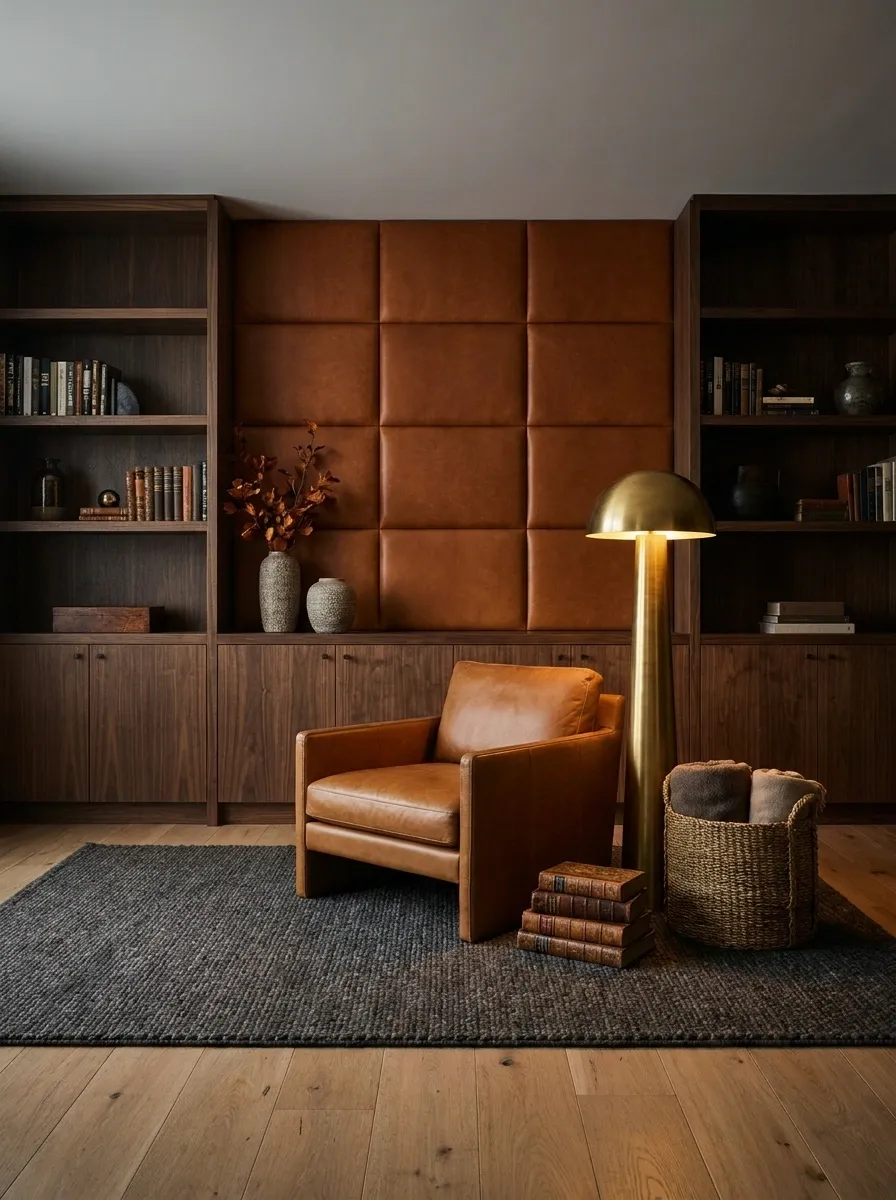
A luxury lounge features a statement wall constructed entirely of padded, rich cognac leather squares, flanked by floor-to-ceiling dark walnut built-ins.
This is the ultimate rejection of generic, mass-produced seasonal items. Leather wall paneling introduces intense physical texture, acoustic dampening, and a permanent, masculine warmth to a room. The cognac finish provides the perfect autumnal orange-brown tone, but it does so through a high-quality material that will age beautifully over time.
This design requires strict discipline. Do not hang art over the leather panels. The grid of the padded squares provides enough visual rhythm. Pair it with heavy, low-slung furniture and moody, layered lighting—like a solid brass floor lamp casting a warm pool over a reading chair.
Matte Charcoal Wall with Symmetrical Dried Floral Sconces
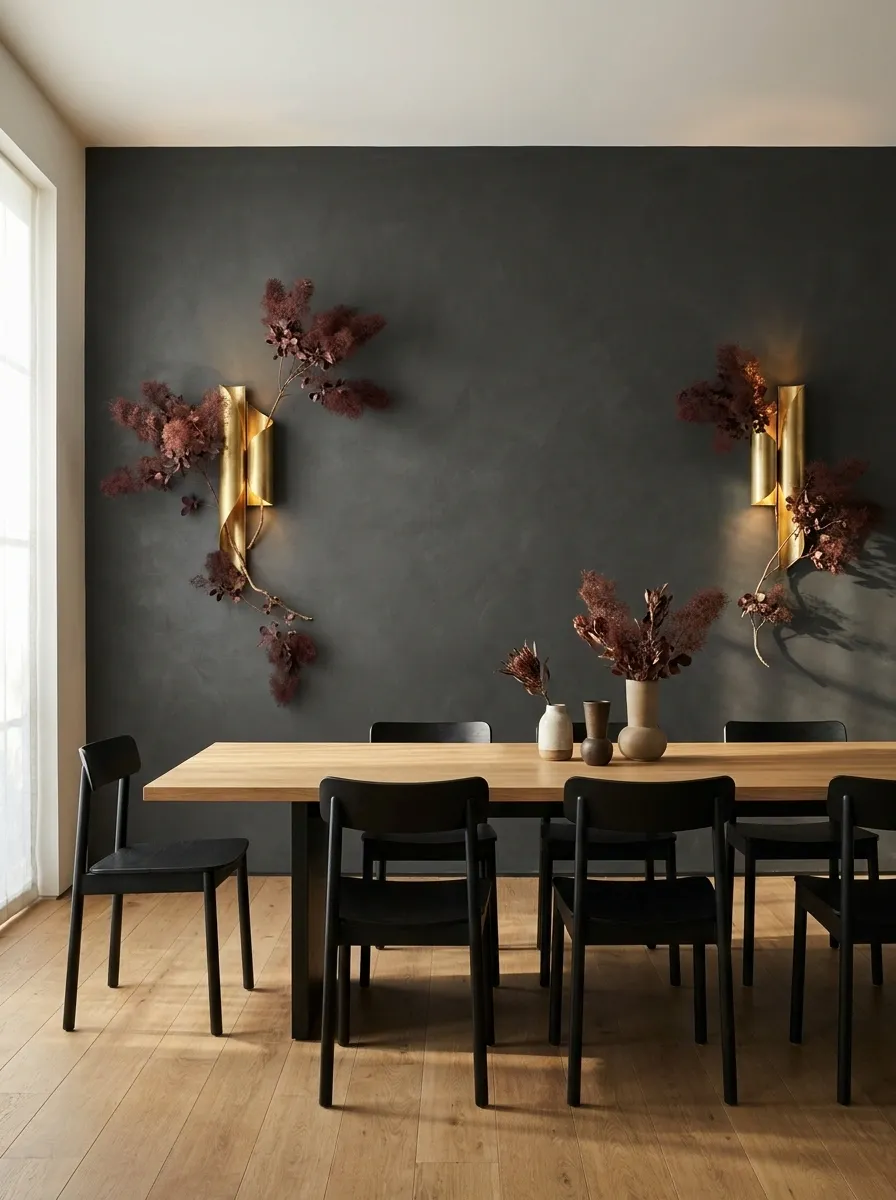
A stark, minimalist dining room features a matte charcoal accent wall, warmed by two symmetrical, architectural brass sconces that have been tightly interwoven with dried, deep red smoke bush.
This design merges hard architectural lighting with delicate, seasonal organics. The matte charcoal wall provides a severe, modern backdrop. The brass sconces offer structured warmth. By deliberately weaving dried smoke bush into the brass armature of the lighting, the florals become part of the fixture itself rather than an isolated wall decoration.
This approach requires restraint. The dried smoke bush must be trimmed tightly against the sconce so it looks intentional, not unkempt. The dark red foliage against the charcoal wall creates a sophisticated, tonal consistency that feels far more permanent than a temporary garland.
Warm Beige Roman Clay Wall with an Oversized Rust Canvas
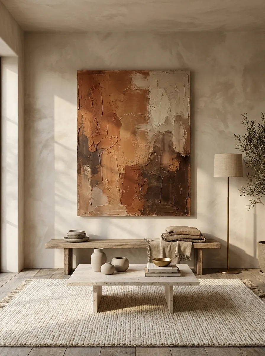
A serene, wabi-sabi inspired living space features heavily textured beige Roman clay walls, interrupted only by a single, massive contemporary canvas painted in heavily impastoed shades of rust, ochre, and deep brown.
This is the antidote to cluttered gallery walls. A single, oversized canvas commands the room with absolute authority. The heavily textured Roman clay provides an earthy, authentic backdrop that feels lived-in and grounded.
The color palette of the painting introduces all the necessary autumnal heat without relying on literal representations of leaves or pumpkins. The impasto texture on the canvas mirrors the rough finish of the clay walls, creating a cohesive dialogue between the art and the architecture. Do not frame the canvas; let the raw edges of the painted linen sit directly against the plaster to maintain the collected, organic feel.
Creating a cohesive autumn aesthetic comes down to trusting your architecture and letting warm, grounded materials speak for themselves. You do not need to fill every empty surface when your walls are working this hard. Whether it is through a moody lighting scheme washing over wood paneling or a massive, structural botanical installation, the goal is always authentic, lived-in comfort rather than catalog-style uniformity. Save the layouts that actually reflect your home’s structural bones. Future planning is always easier when you have a clear, visual cheat sheet to work from.