
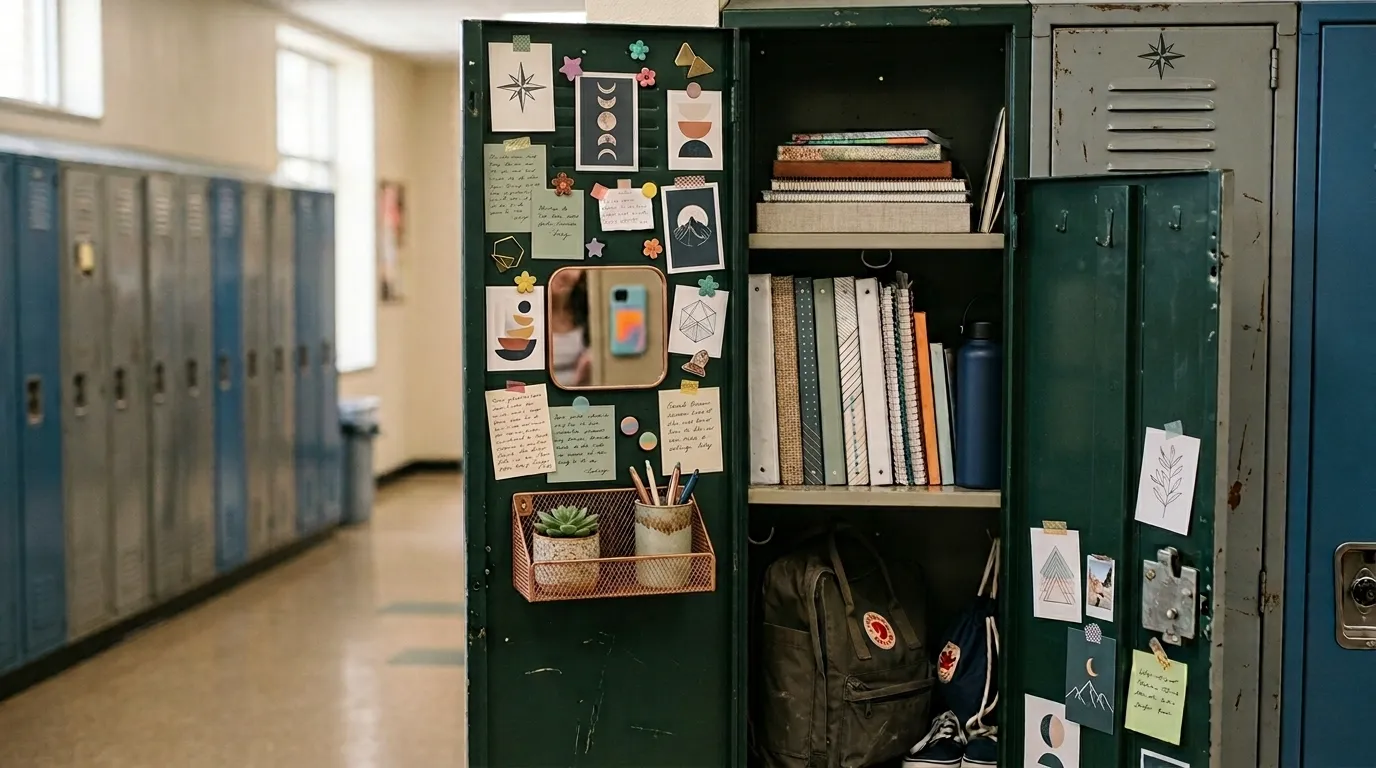
The easiest way to make a locker look bad is to decorate it piece by piece.
A cute magnet goes on the door. Then a colorful pouch gets shoved onto a shelf. Then a photo, a note, a random container, and a few school supplies join the party. None of them are terrible on their own, but together they can make a tiny locker look like a storage bin that lost an argument.
The better approach is to think about the whole space at once. Choose a visual direction, give everyday items a sensible place, and let the colors and materials repeat enough that the locker feels intentional.
That doesn’t mean everything has to match. Some of the best setups are personal, slightly messy, or full of color. They just have a clear point of view.
Complete Locker Setups
Warm Terracotta Study Locker
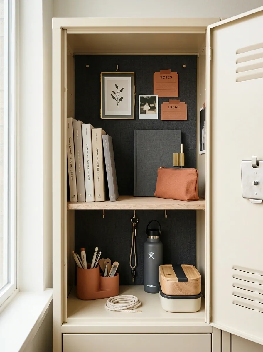
Warm cream, terracotta, pale wood, and charcoal give this locker a grounded academic feel without making it look overly serious. The interior stays mostly light, while the terracotta appears in a few repeat details, such as a pencil pouch, label tabs, and a small personal print.
A slim wood-tone shelf creates two practical levels. Books and a notebook sit above, while smaller daily supplies stay below in compact neutral containers. The lower section remains mostly open so a bottle or lunch container can slide in without wrecking the arrangement.
The smartest part is the restraint. The locker already has enough warmth from the wood and terracotta. Adding more colors would just muddy the composition.
Soft Sage Academic Locker
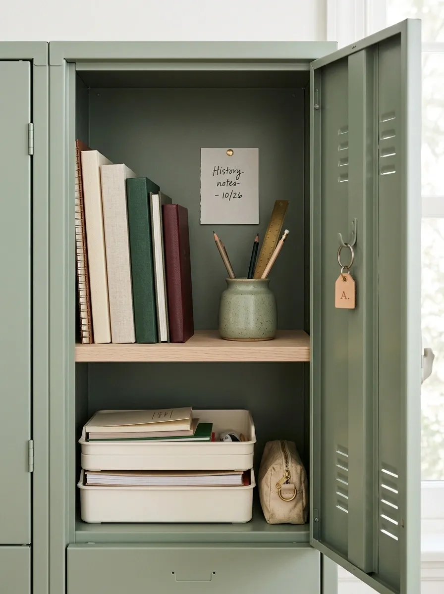
This one goes quieter. Muted sage green covers the visual base, with warm white, pale oak, and soft metal details keeping everything fresh and simple.
A compact shelf separates books from small supplies, while flat containers line the lower section instead of bulky bins that eat up precious room. The palette stays soft enough that handwritten notes, labels, and school papers don’t suddenly become visual noise.
What makes the setup work is the repetition. Sage appears in more than one place, the wood tone appears again below, and the white storage creates a clean thread through the entire locker.
Don’t add five different shades of green here. One green, used repeatedly, is doing enough work already.
Vintage Library Locker
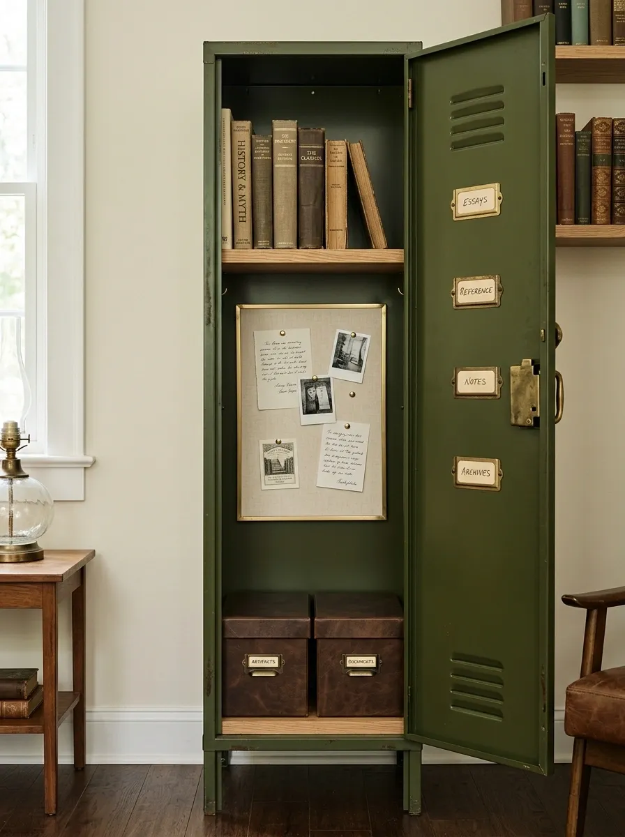
This locker skips the usual bright plastic look and leans into an old-library mood. Deep olive, warm brown, cream paper, and aged-brass details give the tiny space a richer visual identity.
The setup includes a narrow shelf for a few books, a cream note board, structured storage with a leather-look finish, and old-style labels that make everyday supplies feel like part of the composition rather than clutter.
The surrounding color stays quiet, which is important. Vintage styling can get theatrical very quickly. This version works because the references are subtle. It feels like a well-used study space, not a prop department.
I’d keep modern neon colors out of this one. They’d break the entire story in about three seconds.
Bright Color-Block Locker
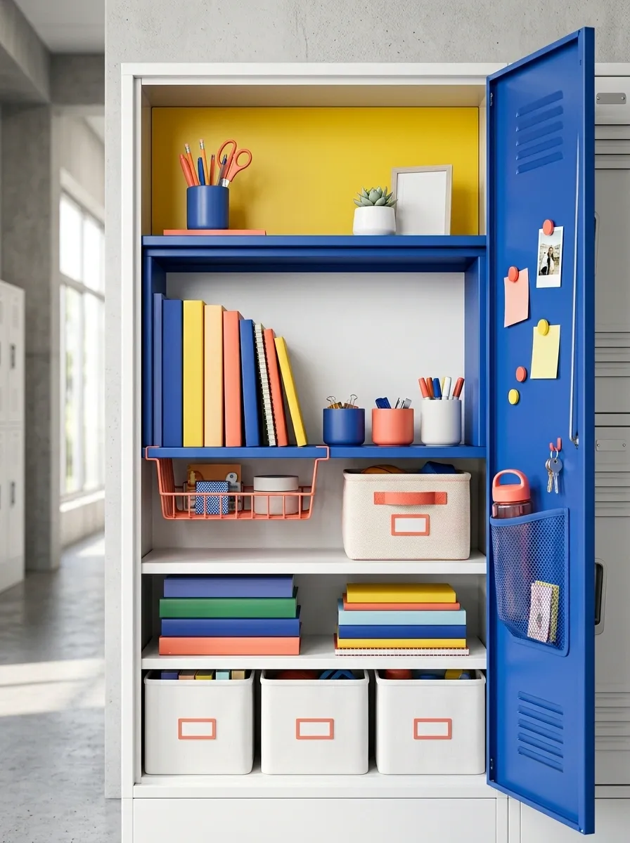
This is the locker for someone who actually likes color and isn’t interested in pretending otherwise. Cobalt blue, sunny yellow, coral, and white create a playful composition, but the colors are organized into clear zones instead of scattered randomly.
A bright central section creates the focal point, while white containers calm the lower portion. Small coral accents repeat in labels and stationery, and yellow appears again near the top so the colors feel connected.
The trick is using large areas of color first and little accessories second. Otherwise, the locker becomes a pile of tiny colorful objects with no visual hierarchy.
This design has personality, but it still has somewhere to put your books.
Clean Scandinavian Locker
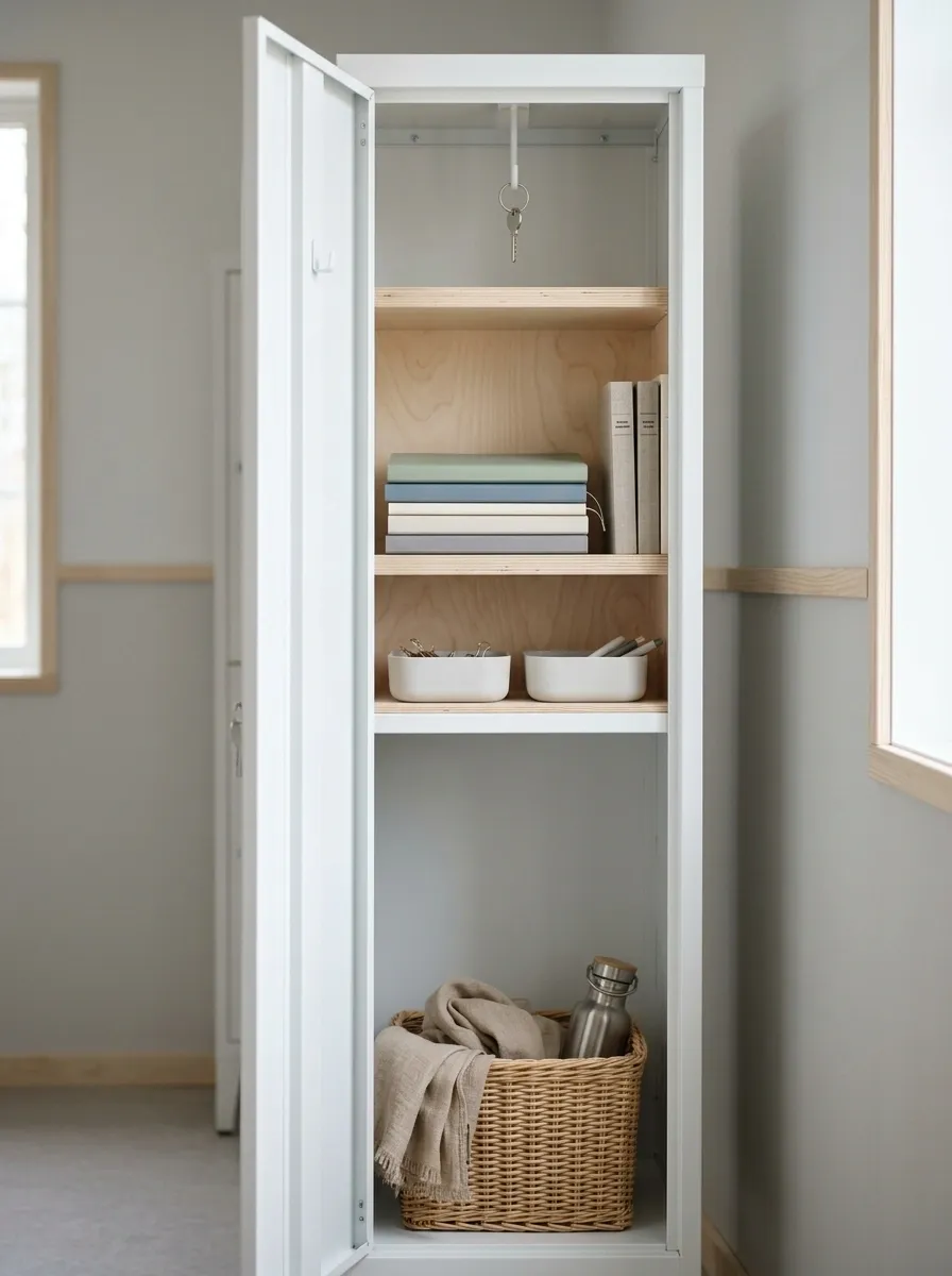
White, pale birch, soft gray, and one muted accent color give this locker a calm, almost desk-like quality. Nothing fights for attention, which is exactly why the few personal details that remain actually stand out.
A slim shelf keeps notebooks and books together, while shallow containers handle the smaller stuff. The lower section stays open for anything bulky that comes and goes during the school day.
The design works because it understands scale. A locker is already a tight box. Covering every inch with patterns and decorations doesn’t make it more interesting. It just makes it harder to see what you own.
I’d keep the graphics simple here. Let the clean geometry carry the look.
Moody Charcoal and Walnut
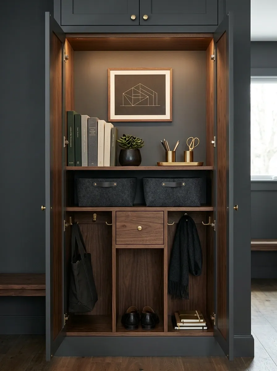
A dark locker can look surprisingly sophisticated when the palette is handled carefully. Charcoal provides the base, warm walnut softens it, and small brass details add just enough contrast to keep the interior from looking flat.
A warm light near the top helps the darker colors feel intentional rather than gloomy. Books and supplies sit inside simple storage containers, while one personal graphic gives the eye a clear focal point.
The balance comes from warmth. Charcoal without another material can feel cold and heavy. Walnut gives it texture and keeps the darker palette from swallowing the whole space.
I’d leave the surrounding accessories quiet. The dark color story is already doing plenty.
Sporty School-Team Locker
This setup has energy, but it isn’t trying to turn the locker into a merchandise wall. One strong team-inspired color pair controls the composition, while a jersey-style graphic gives the upper section a clear focal point.
The lower half is much more functional. There’s a dedicated place for a water bottle, a small zone for athletic accessories, and enough open room for whatever gets tossed in at the end of a long day.
A few matching labels and a simple graphic tie the sections together. That’s enough. Covering the entire locker in logos would make the design feel noisy and younger than it needs to.
The best part is that the athletic identity still leaves room for actual school life.
Industrial Utility Locker
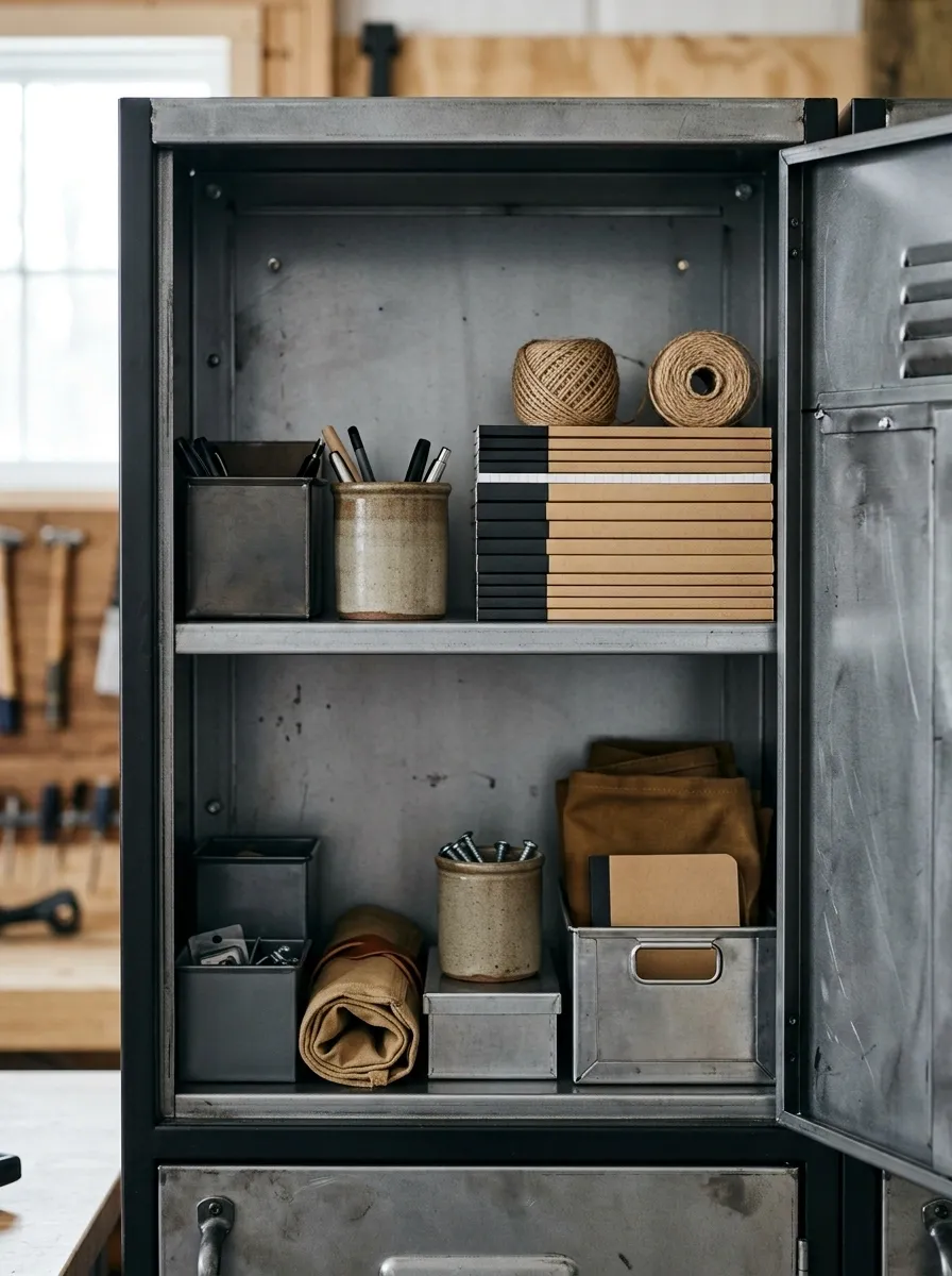
This one forgets cute locker decor almost entirely and leans into practical industrial style. Gunmetal gray, black, warm tan, canvas-like textures, and bold labels give the setup a useful, slightly rugged character.
A structured upper shelf handles notebooks and larger supplies. Small containers below keep loose pieces from spreading everywhere. The labels are deliberately straightforward, which actually helps the whole design feel more finished.
Canvas and kraft-style textures soften the metal-heavy palette without making it precious. Everything looks like it has a job.
That’s the appeal. The locker feels designed because the organization is visible, not because somebody filled it with decorations.
Coastal Blue and Natural Wood
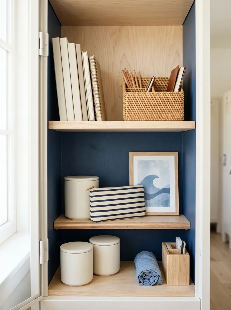
Soft navy, faded blue, cream, and natural wood give this locker a relaxed coastal direction without turning it into a beach souvenir shop.
The upper section holds a few notebooks against a pale wood backing, while the lower area uses simple cream containers for smaller supplies. A striped pencil pouch and a small blue graphic repeat the palette without introducing another competing color.
Texture does some of the work here. Woven details and light wood keep the cooler blues from feeling flat.
The trick is knowing when to stop. Add shells, anchors, signs, rope, and five shades of turquoise, and the whole thing starts looking like a themed café. Keep the references subtle.
Minimal Black and Cream Locker
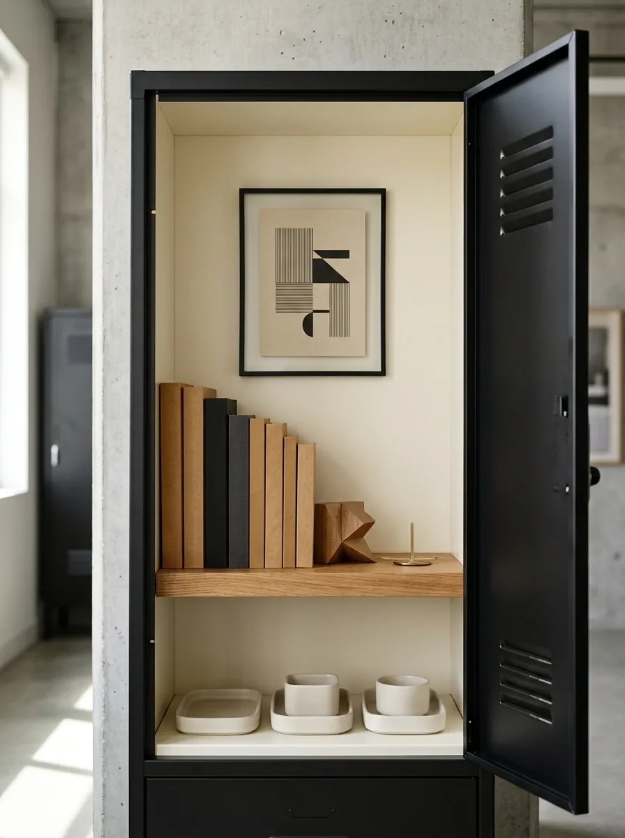
Black and cream make a surprisingly strong pairing in such a small space. The black provides structure, while cream keeps the locker from becoming too severe.
A simple shelf holds books in a clean stack. Flat cream containers sit underneath, and one carefully chosen personal print provides the only major graphic element.
There isn’t much decoration here, and that’s the point. The design depends on spacing, proportion, and a small amount of contrast rather than a pile of accessories.
This is the kind of locker that looks better the more you remove from it.
Retro Checkerboard Locker
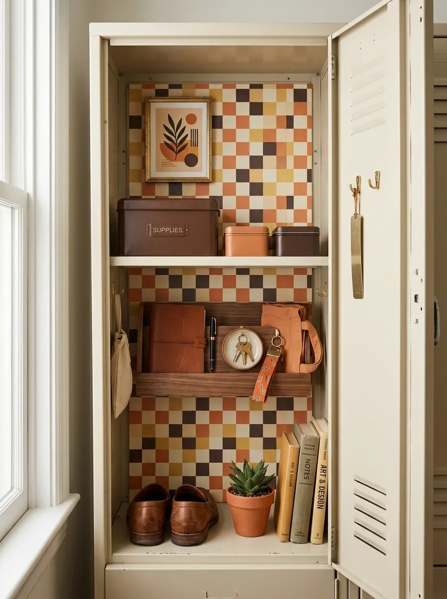
Muted orange, cream, dark brown, and soft yellow create a retro direction that feels playful without looking childish.
The checkerboard appears in one controlled section, perhaps as a backing panel or removable paper detail, while the rest of the locker stays relatively calm. Brown storage containers add warmth, and a vintage-style graphic gives the upper area some personality.
The pattern is doing the heavy lifting, so the rest of the locker doesn’t need to compete. That’s what makes the setup feel finished rather than overly themed.
Use the checkerboard as a focal point, not a wallpaper replacement for every visible surface.
Monochrome Pink Locker
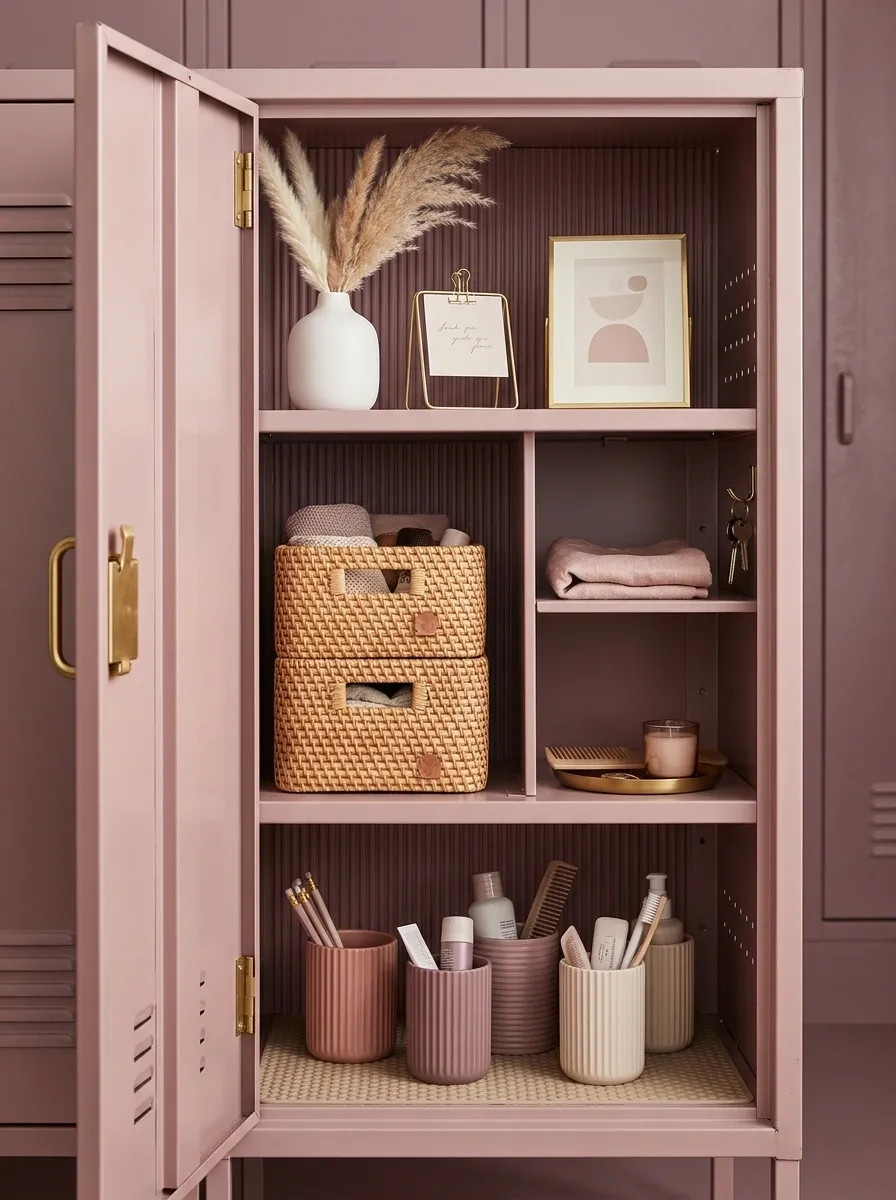
This design proves that pink doesn’t have to mean bright or sugary. Several dusty pink and mauve tones create depth while a warm neutral keeps the locker grounded.
The upper section holds a simple personal display, while the lower portion uses tonal storage containers for everyday supplies. A small amount of white makes the darker pinks easier to read.
Everything belongs to the same color family, but the materials aren’t identical. That’s important. If every surface is the same shade and texture, monochrome can become flat very quickly.
Use tonal variation and texture instead of adding random colors for contrast.
Nature-Inspired Greenhouse Locker
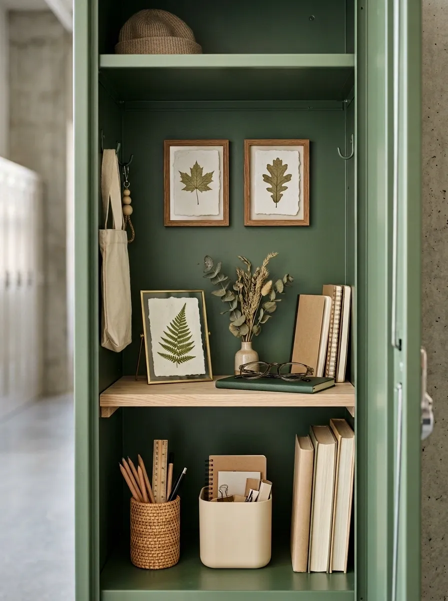
Moss green, warm beige, pale wood, and botanical artwork turn this locker into a small nature-inspired study space. The look feels organic without relying on actual plants, which is probably smarter in a locker that gets opened, closed, bumped, and occasionally forgotten for six hours.
A wood-tone shelf creates the main structure, while cream containers hold smaller supplies below. Botanical prints bring the green upward, and woven pencil storage adds a little texture.
The materials are what make this design convincing. Green gives it identity, wood adds warmth, and natural-looking textures keep the palette from becoming flat.
I’d skip bright artificial greenery. The artwork already tells the story.
Visual identity Pale Wood
Warmth Warm Beige
Visual breathing room Woven Texture
Soft contrast
Tech-Ready Study Locker
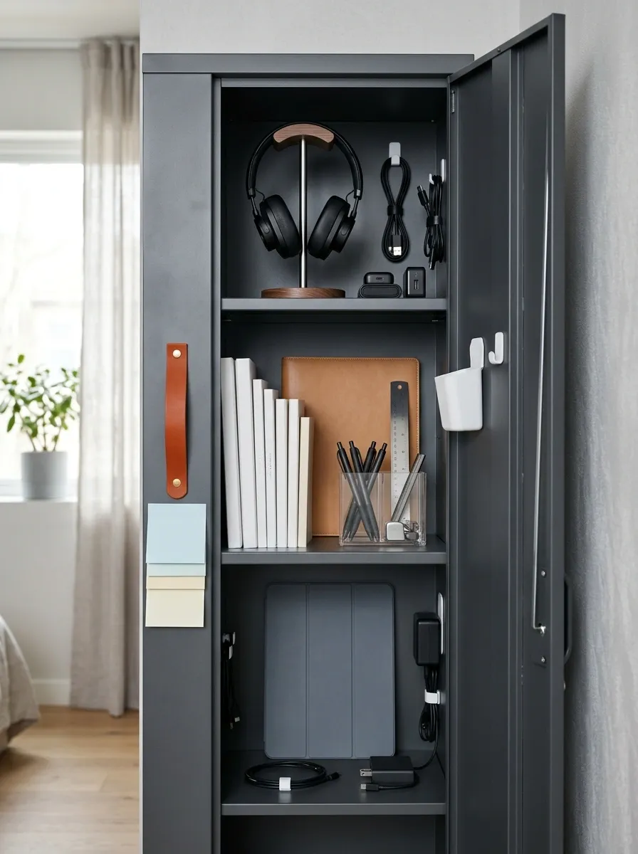
This locker is designed around an actual school-day problem: there are more electronics than pockets.
A dedicated upper section holds headphones and small accessories. The center keeps notebooks and writing supplies easy to reach, while a lower section leaves room for a tablet case or other larger item. The palette stays modern with charcoal, white, pale gray, and one warm accent.
Cable storage and compact containers keep the technology from becoming a nest of wires. That practical structure becomes part of the visual design.
The important distinction is that the locker looks organized because every category has a home. You don’t need decorative clutter when the functional layout is this clear.
Checkerboard and Chrome Y2K Locker
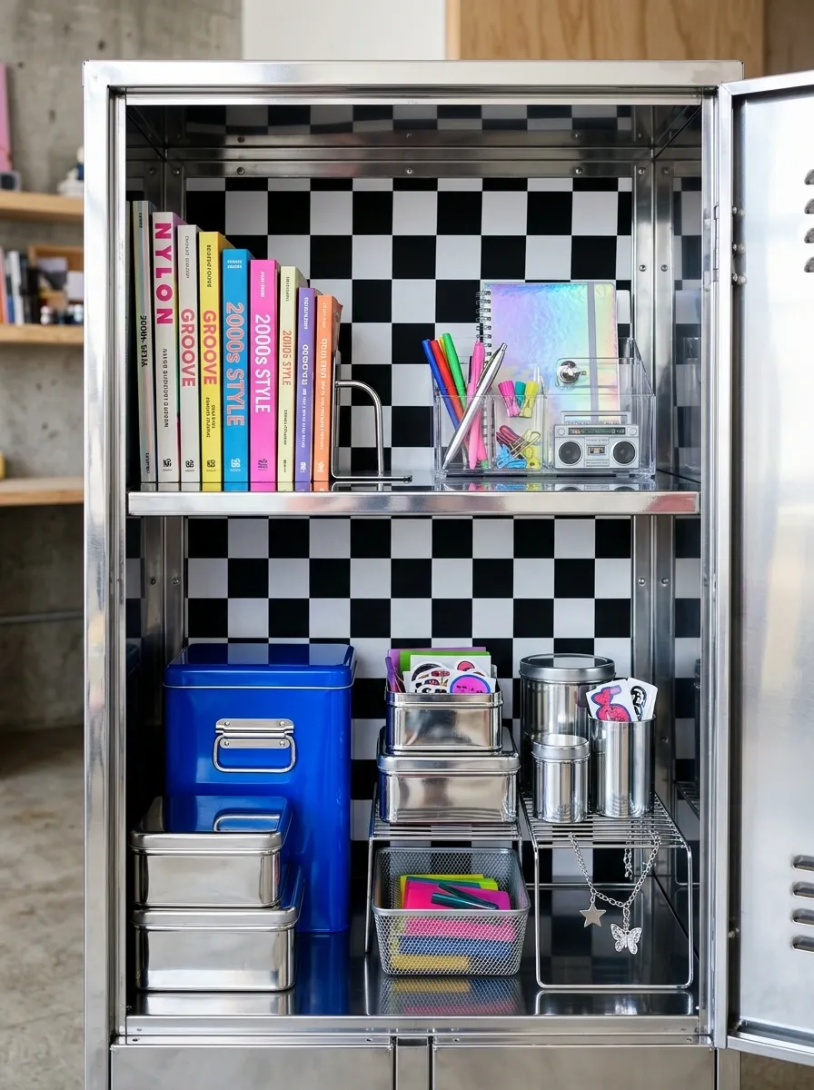
Glossy chrome, black-and-white checkerboard, silver storage pieces, and one saturated accent color make this locker feel unapologetically Y2K.
The pattern creates the visual anchor, while reflective surfaces catch light and make the small space feel more energetic. A compact shelf keeps books and supplies from becoming part of the decoration, while chrome-style containers repeat the metallic finish across the lower area.
What keeps it from becoming costume-like is repetition. The same few finishes keep showing up, so the locker has a coherent visual language rather than a random collection of retro references.
This one can handle drama. It just can’t handle eight more patterns.
Soft Neutral Cozy Locker
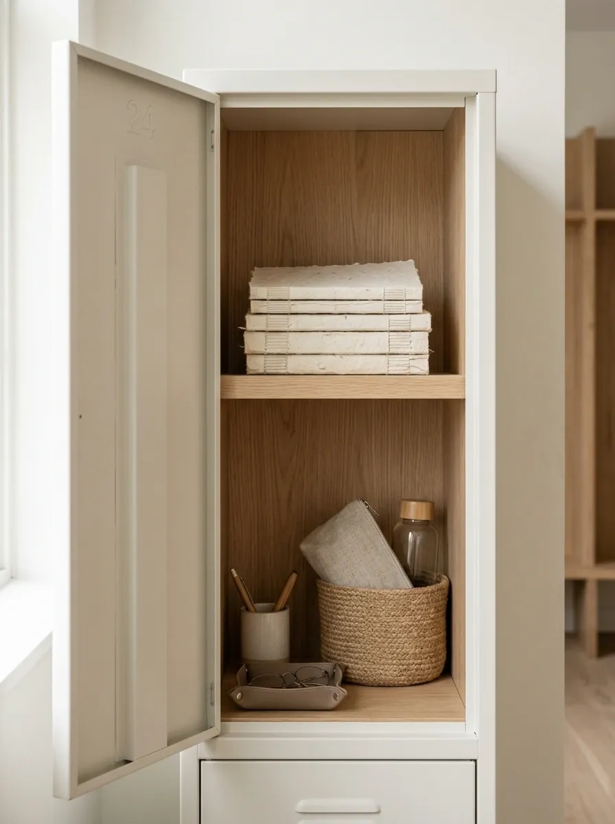
Oatmeal, warm white, taupe, pale wood, and soft fabric textures create one of the calmest designs in the collection.
There isn’t much visual decoration. Instead, the locker gains personality from layered neutrals and different textures. A fabric pencil pouch, woven storage detail, warm paper, and pale wood all sit close in color but differ in surface.
That distinction matters. A neutral locker becomes dull when everything has the same finish. Here, texture takes the place of pattern and keeps the small space interesting without making it busy.
This is a good direction for someone who likes a tidy visual background rather than a locker that announces itself from halfway down the hallway.
Bold Orange and Navy Locker
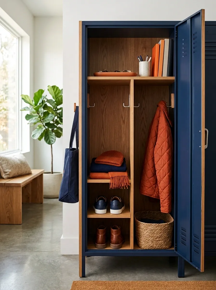
Deep navy gives this locker a strong base, while orange supplies the energy. Warm wood appears between them to soften the contrast and keep the whole composition from feeling like school colors pasted onto a metal box.
The upper section carries the strongest graphic element, while orange repeats through labels, stationery, and a few small accessories. Navy does most of the visual work, which makes the orange feel brighter without requiring a lot of it.
The proportions matter more than the exact shades. Let the dark color dominate, then use the warm accent strategically.
That balance gives the locker personality without making every object shout at once.
Preppy Green and Plaid Locker
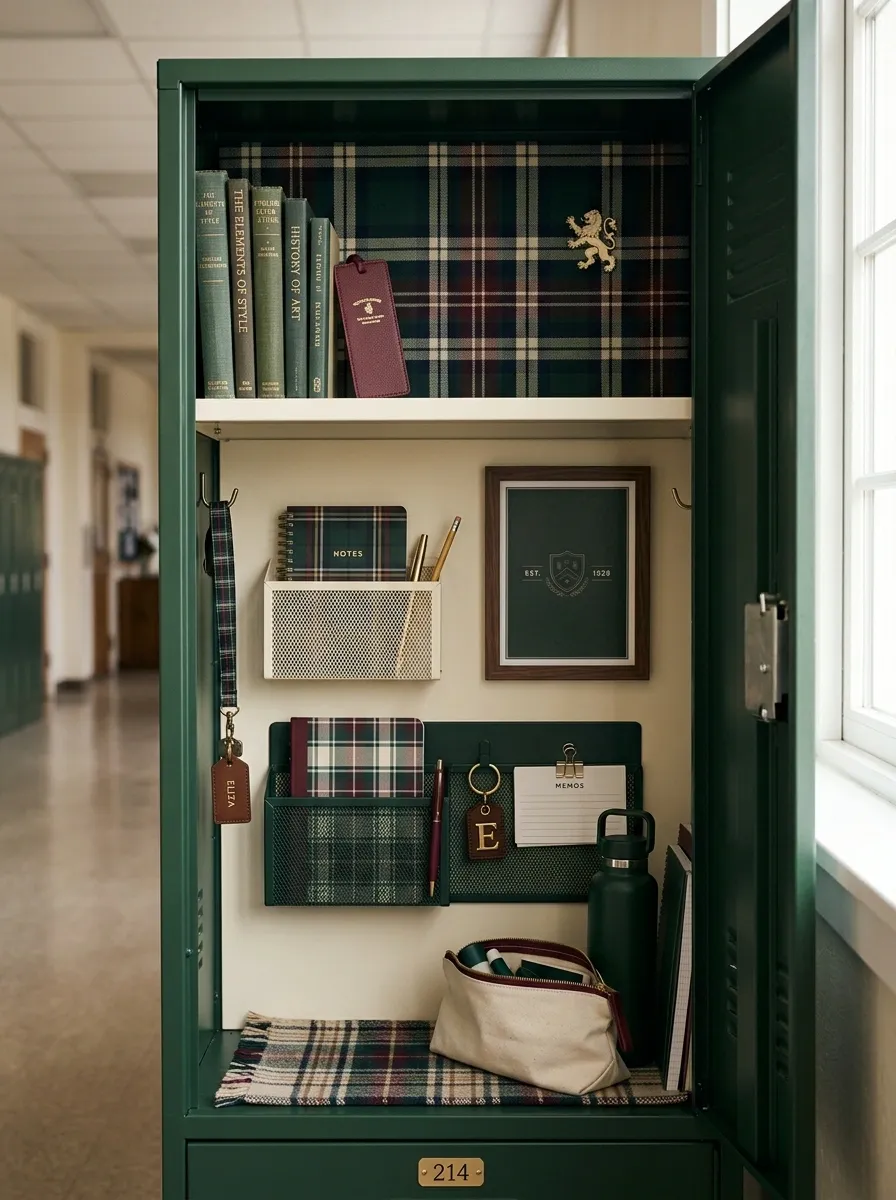
Forest green, cream, burgundy, and restrained plaid give this locker a classic preppy identity without turning it into a costume.
The upper section uses one plaid panel as the main visual feature, while cream storage and dark green stationery keep the lower area organized. A few structured books and a small collegiate-style graphic add personality without covering every surface.
Burgundy appears sparingly, mainly in small details that connect the palette. That little bit of contrast keeps the forest green from feeling too heavy.
The design works because it looks collected rather than themed. There are references to the style, but nothing screams for attention.
Artistic Gallery Locker
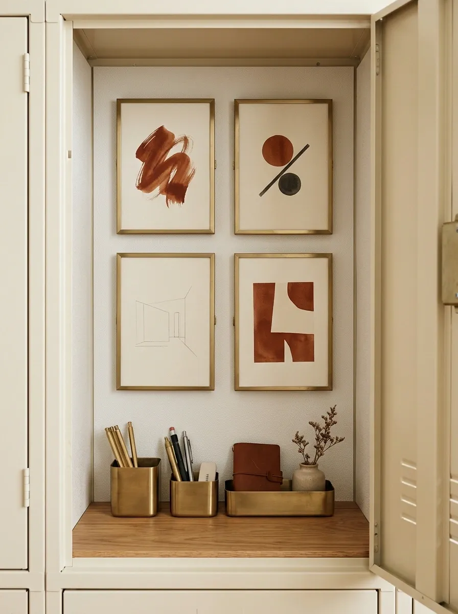
This locker treats personal art as the main event. A warm neutral base gives a few selected prints room to breathe, while one repeated accent color links the artwork to the storage below.
The composition feels closer to a tiny gallery wall than a typical school locker. The top section carries the strongest artwork, while the lower section stays practical with compact containers for pencils, notes, and everyday supplies.
The clever part is the negative space. The artwork doesn’t fill every inch. Each piece gets enough room around it to feel intentional.
That’s what keeps the setup from becoming a bulletin board explosion.
Classic Varsity Locker
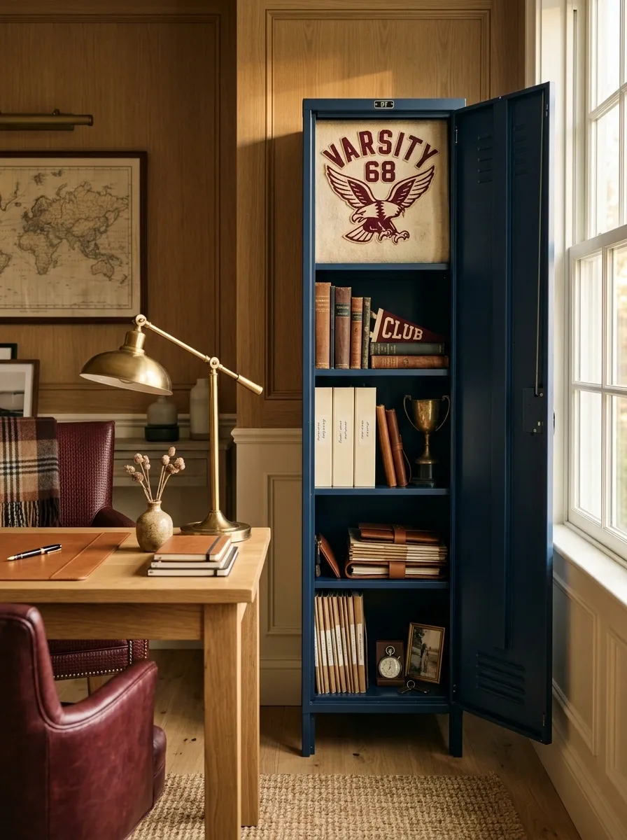
Deep navy, cream, burgundy, and warm brown create a traditional varsity-inspired setup with a little more maturity than the usual sports locker.
A large graphic sits toward the upper portion, while the lower half is organized around books, folders, and personal items. Brown adds warmth to the otherwise school-inspired palette, while cream keeps the composition from becoming too dark.
The visual hierarchy is simple. One graphic gets the spotlight. Everything else supports it.
That’s the reason it works. A locker doesn’t need twenty team references to show school spirit. One strong piece can do the job.
Largest visual element.
Cream keeps the interior open.
Burgundy adds controlled contrast.
Tiny Locker, Big Organization
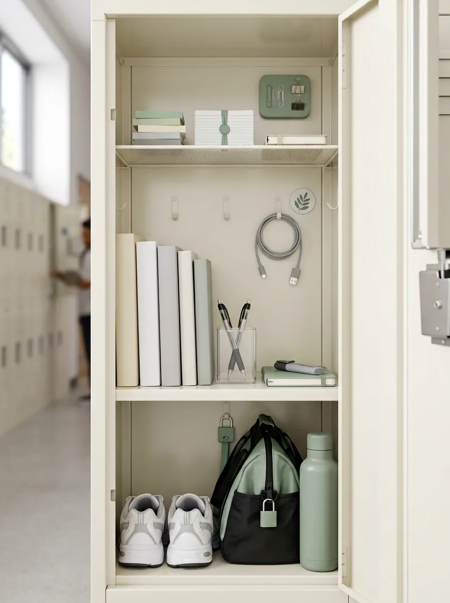
This design is less about decoration and more about making a genuinely small locker work hard.
The vertical layout uses the upper section for lighter supplies, the middle for everyday school items, and the bottom for larger pieces that would otherwise block everything else. Storage remains narrow and easy to see, while the overall palette stays light so the locker doesn’t feel packed.
There is decoration here, but it is deliberately secondary. A small graphic and one repeated accent color provide personality without stealing valuable space.
This is the locker for someone who wants the contents to make sense first. Honestly, that’s often the smartest starting point.
The Best Locker Decor Starts With a Point of View
A locker doesn’t need to look expensive, perfectly matched, or packed with decorations. It just needs a clear visual idea.
Maybe that means warm terracotta and wood. Maybe it’s black, cream, and one sharp accent. Maybe it’s artwork, sports colors, soft neutrals, or a very practical vertical layout. The strongest setups are different from one another, but they have one thing in common: the individual pieces make sense together.
Start with the overall direction before you start buying little things. Decide what should catch the eye, where your daily items will live, and what can stay empty.
Then edit. A few good choices will always beat a locker stuffed with things that were added simply because there was room.
Save the versions that actually look like your kind of space. Having a visual reference in your planning folder is a lot easier than trying to invent the whole look while standing in front of an empty locker.