
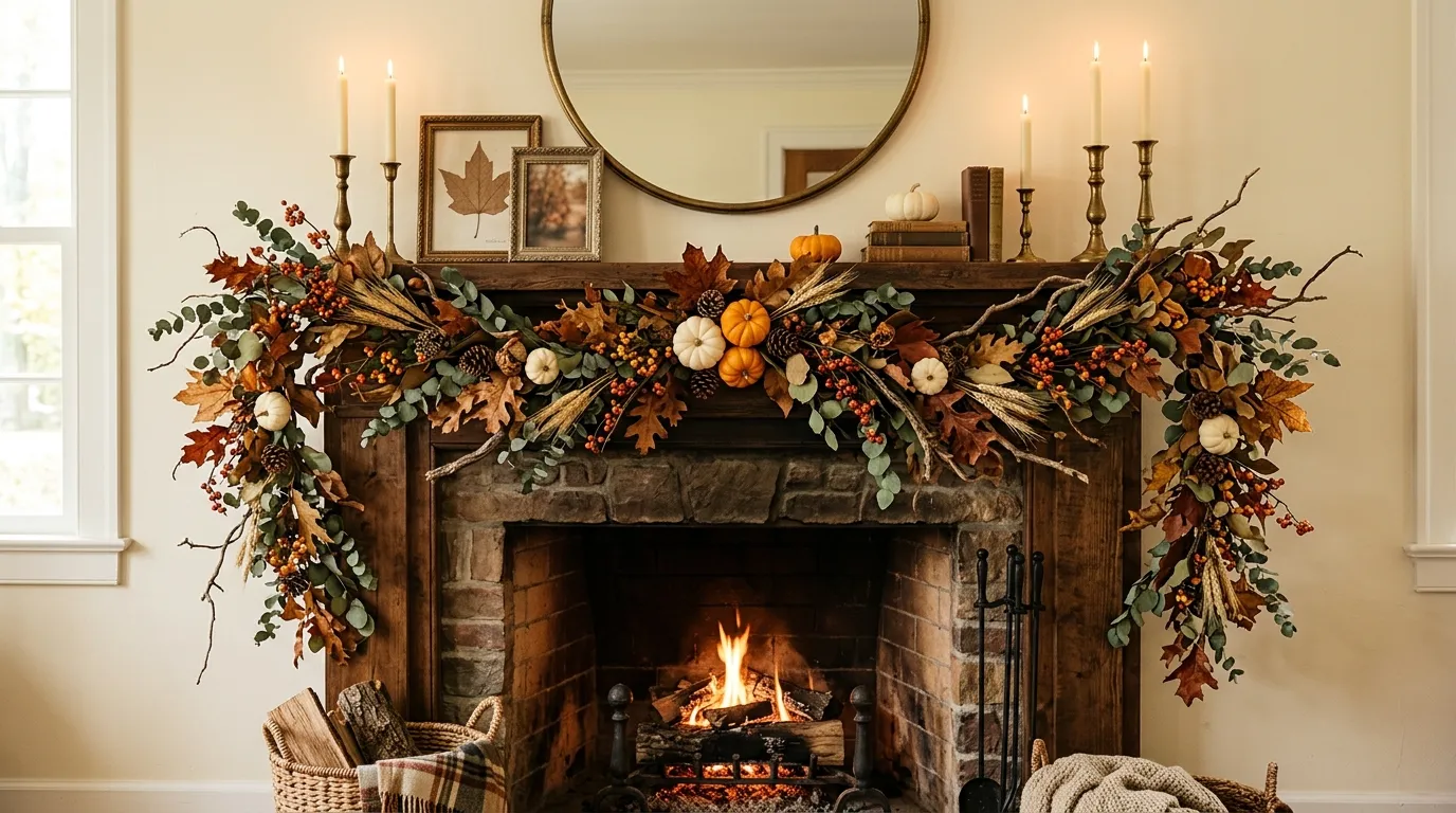
Fall decorating gets awkward when the garland is treated like the entire design. A strand of greenery goes on a mantel, a few pumpkins get pushed underneath it, and suddenly the room is supposed to look finished. Usually it doesn’t.
The problem is scale, color, and context. A garland can be gorgeous on its own and still look completely wrong once it lands in a real room. The fireplace might be too small for it. The staircase may need something looser. A modern kitchen can look cluttered after just a few extra seasonal touches.
The better approach is to start with the finished scene. Look at the architecture, furniture, lighting, materials, and color palette first. Then decide how the greenery should behave inside that composition.
What Makes Fall Garland Look Designed Instead of Just Added?
Let the Architecture Set the Stage
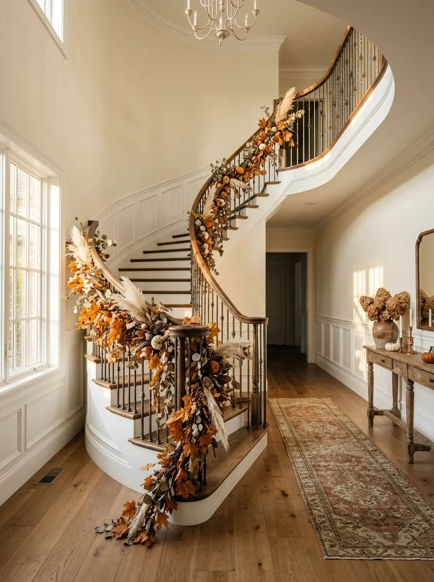
A staircase, mantel, doorway, or built-in shelf already gives the eye a path to follow. Use it. Garland becomes much stronger when it follows the shape of the architecture instead of fighting for attention.
Build the Garland Around a Color Story
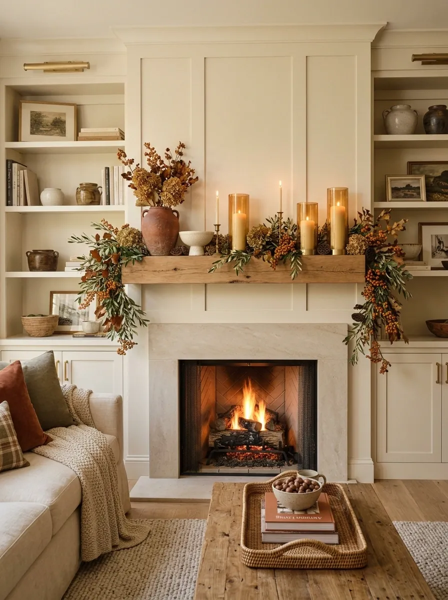
You don’t need every autumn color in one arrangement. Rust with olive feels grounded. Cream with wheat feels softer. Burgundy with dark green feels richer. Pick a direction and let it breathe.
Keep the Rest of the Scene Quiet Enough
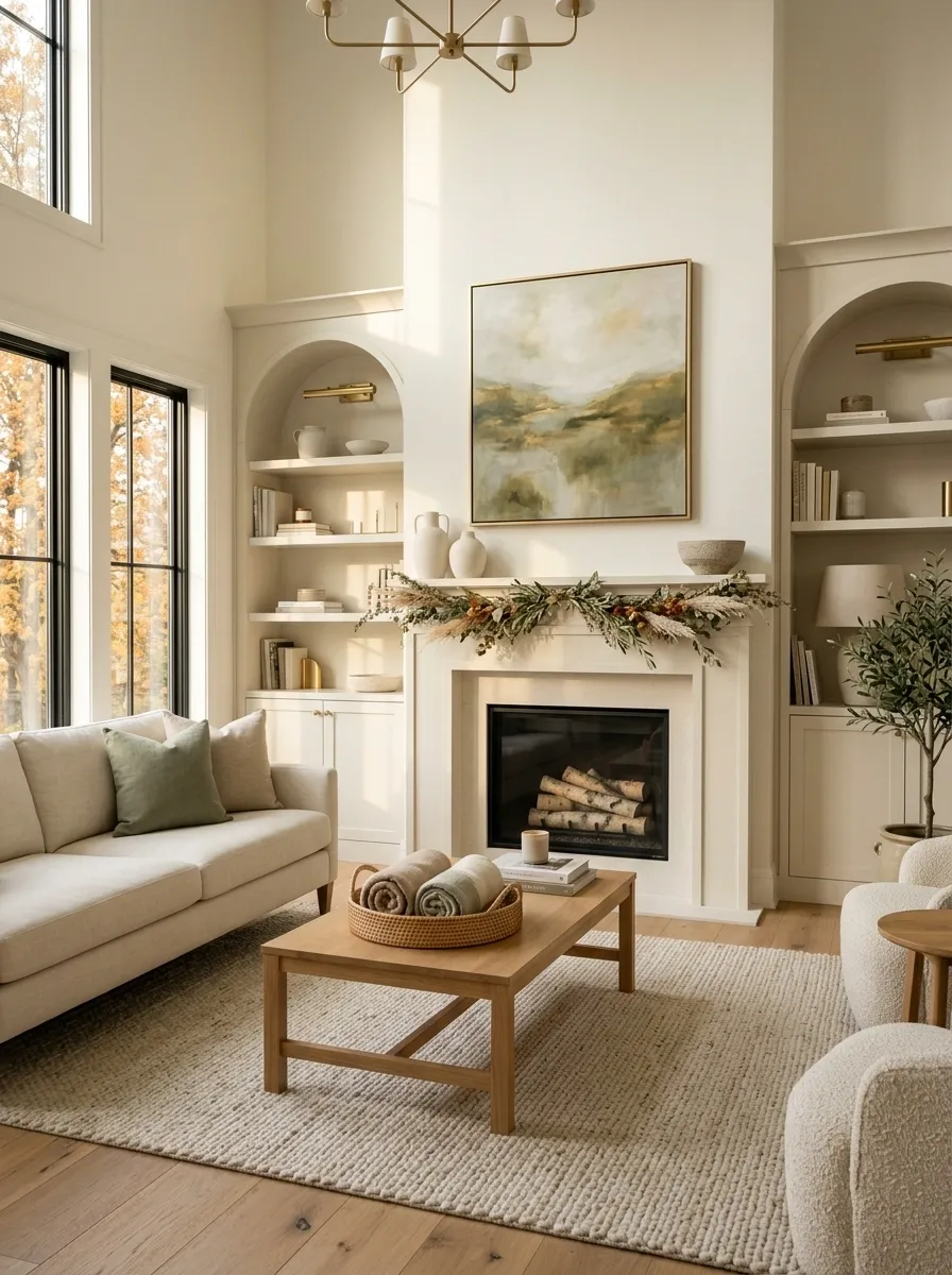
A strong garland doesn’t need ten extra decorations shouting beside it. Give the eye somewhere to rest. The room should still feel like a room, not a seasonal aisle.
Fall Garland Ideas With Complete Finished Looks
Classic Stone Fireplace With Golden Autumn Foliage
This rustic stone fireplace takes a classic approach to autumn by leaning into rich metallic tones and layered textures. A textured stone surround sets the stage for a full, sprawling garland heavy with amber leaves, delicate berries, and twinkling fairy lights that cast a soft glow against the masonry.
The mantel itself is styled with intention, featuring stacked textured vases, framed artwork leaning casually against the wall, and tall glass lanterns holding flickering pillar candles. A large brass urn overflowing with copper branches anchors one corner, balancing the visual weight of the arrangement.
The real magic here is the way the warm lighting catches the metallic finishes and natural elements. Keeping the surrounding decor restrained lets the glowing hearth and rich autumn garland remain the undisputed star of the room.
Rust Velvet Mantel With Olive Foliage
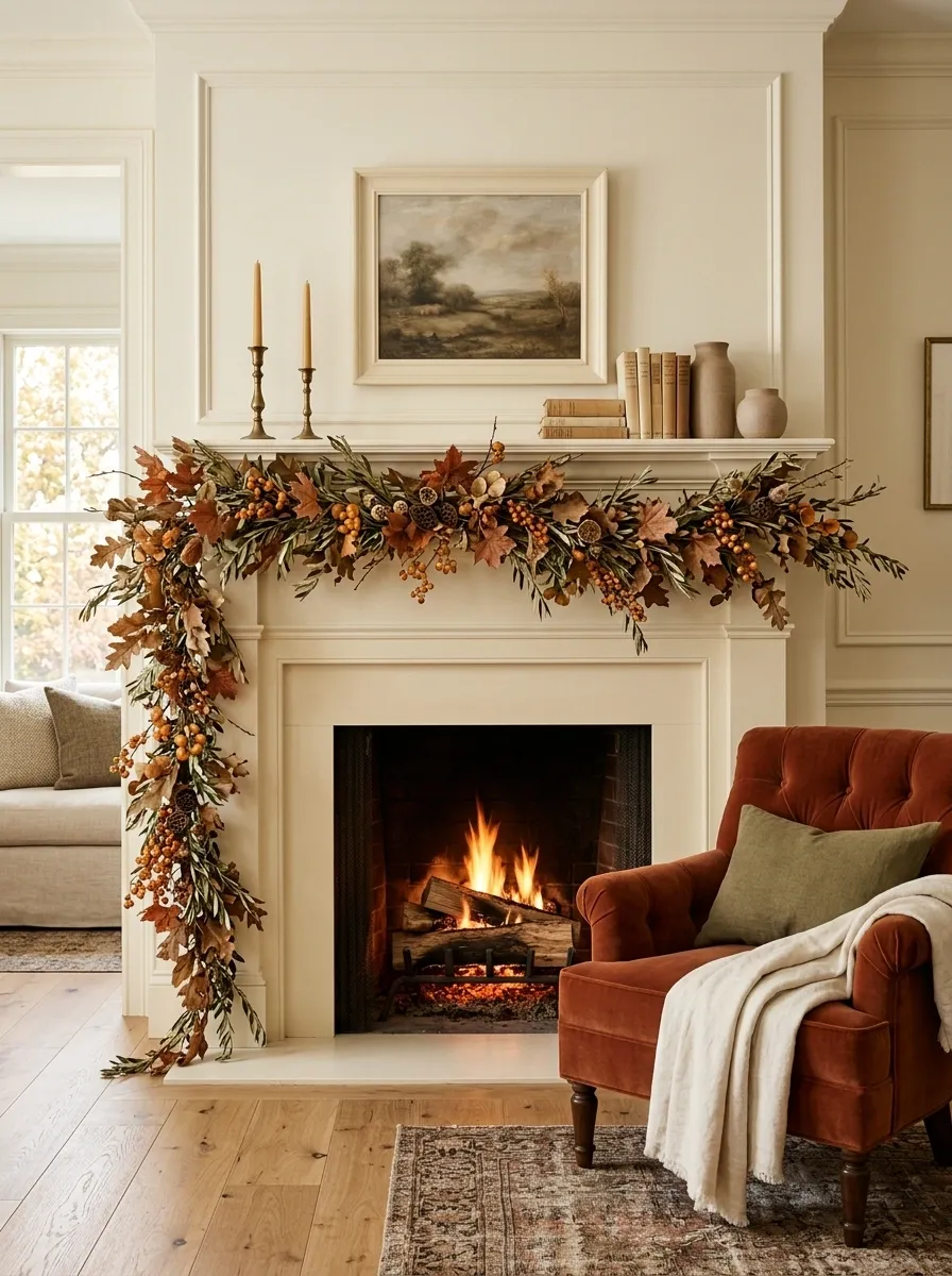
The easiest way to make a fall mantel feel expensive is to stop treating orange as the only color available. This version starts with a traditional fireplace in warm ivory, then layers a full garland of olive foliage, muted rust leaves, and amber berries across the wood mantel.
The surrounding styling stays deliberate: aged brass candlesticks, creamy framed artwork, stacked books, and two warm ceramic vessels. A rust velvet accent chair nearby quietly repeats the garland color without matching it piece for piece.
What makes the room work is the balance between soft and earthy. The olive keeps the rust from becoming loud, while the warm wood keeps all that cream from feeling flat. I’d leave the mantel itself fairly open. The greenery already has enough visual weight.
Hanging Leaf Chandelier With Twinkling Lights
A statement lighting fixture offers an unexpected canvas for autumn decorating, transforming an ordinary ceiling into a cascading canopy. This installation suspends vibrant fall leaves and textured pinecones at varying lengths using delicate invisible lines, interspersed with warm glowing fairy lights that mimic flickering starlight.
The mixture of golden yellow maples, deep rust tones, and rustic botanical accents brings an organic movement directly overhead. Because the piece hangs freely, gentle air currents allow the leaves to sway softly, creating a dynamic focal point in the space.
The surrounding room is kept intentionally dim and cozy, allowing the illuminated foliage to cast enchanting shadows across the walls. It is a brilliant reminder that seasonal decor doesn’t have to live strictly on flat surfaces to make a dramatic impact.
Moody Charcoal Fireplace With Burnt Orange Garland
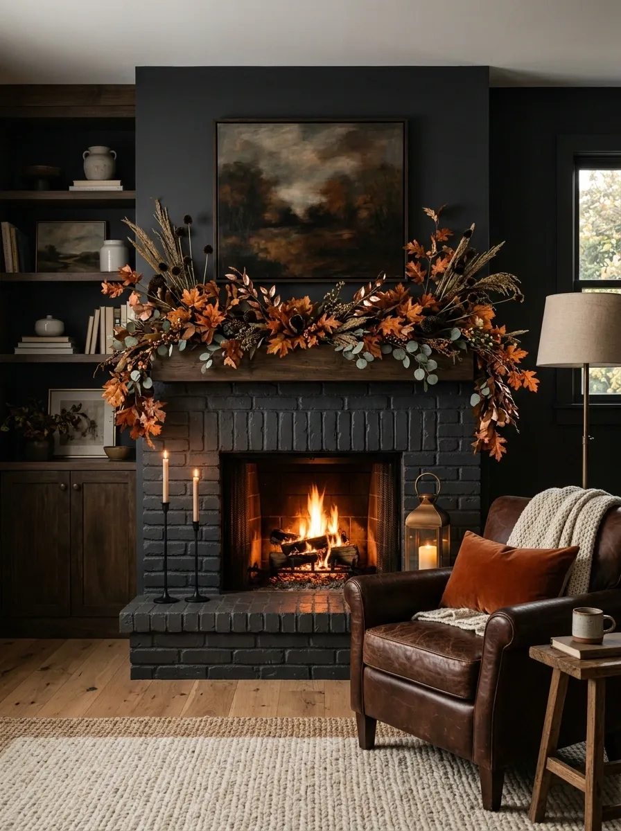
Dark walls can handle autumn color beautifully, and this fireplace doesn’t try to apologize for them. A charcoal-painted surround creates the backdrop for a fuller garland made from burnt orange leaves, coppery stems, dark seed heads, and a little muted greenery.
The rest of the room stays controlled. Black candlesticks, warm bronze lighting, a deep brown leather chair, and a textured neutral rug give the space enough weight to support the fireplace.
The trick is contrast. Against pale walls, these colors would feel obvious. Against charcoal, they become richer and more dimensional. Keep the seasonal pieces concentrated around the fireplace and resist scattering orange objects throughout the room.
Welcoming White Doorway With Traditional Harvest Wreath
A crisp white front door demands a classic autumn wreath that offers an immediate pop of seasonal warmth. This design packs a punch with a dense circle of speckled foliage, frosted eucalyptus, deep burgundy leaves, and miniature orange pumpkins nestled throughout the greenery.
The wreath is hung against a charming arched window transom, drawing the eye upward and framing the entryway with effortless elegance. The colors strike a lovely balance between traditional harvest hues and modern muted tones, preventing the display from feeling dated.
The approach here is all about curb appeal that feels curated rather than cluttered. Let the statement wreath do the heavy lifting, and your front porch will instantly welcome the season in style.
Warm Oak Staircase With Asymmetrical Fall Greenery
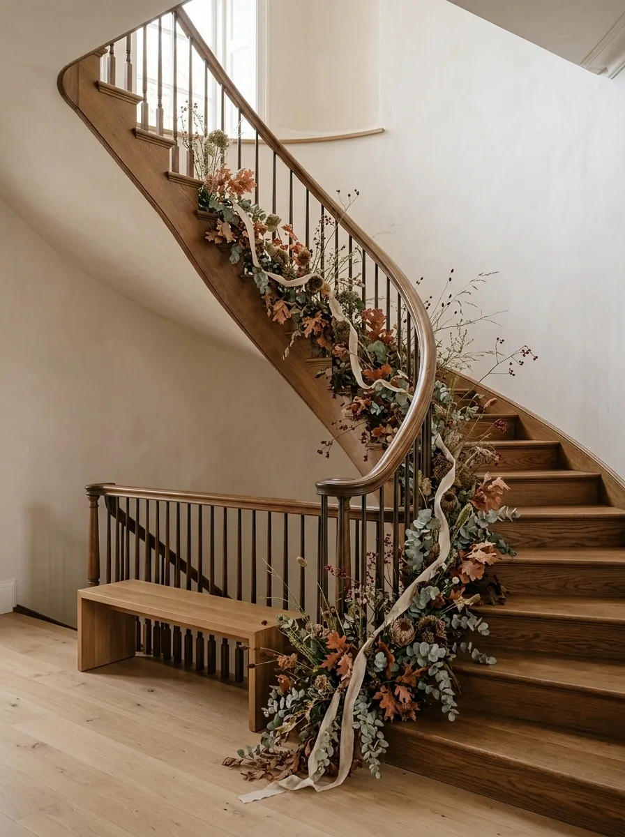
A staircase gives garland something most surfaces don’t have: movement. This design follows a warm oak handrail with a loose, asymmetrical garland that starts fuller near the bottom and thins as it climbs.
The greenery mixes eucalyptus, faded rust leaves, dried seed heads, small berry stems, and a narrow linen ribbon. Nothing is tied into a perfectly even line. A few stems extend beyond the railing, giving the arrangement a slightly wild edge.
The surrounding stairwell stays light with soft plaster-colored walls, pale flooring, and a small oak bench beneath the lower landing. That’s important. The garland is expressive, so the architecture around it remains quiet.
I’d keep the staircase free of extra pumpkins and signs. The curve of the rail is already the feature. Adding more would make the whole composition look busy instead of intentional.
Grand Entrance Archway With Cascading Autumn Foliage
An arched portico provides the ultimate framework for a dramatic, storybook autumn display. This grand entrance features an overflowing archway of woven branches, delicate dried grasses, climbing fall leaves, and large heirloom white pumpkins that anchor the base of the steps.
The installation scales the doorway seamlessly, starting lush at the sides and tapering toward the apex of the arch. Muted orange tones, sage greens, and pale gourds create a sophisticated color palette that complements the dark classic door beneath.
The surrounding architecture remains clean and bright, allowing the wild, organic nature of the garland to shine. It is a masterclass in outdoor styling that feels breathtakingly grand while still entirely rooted in nature.
Cream Entry Console With Oversized Fall Branches
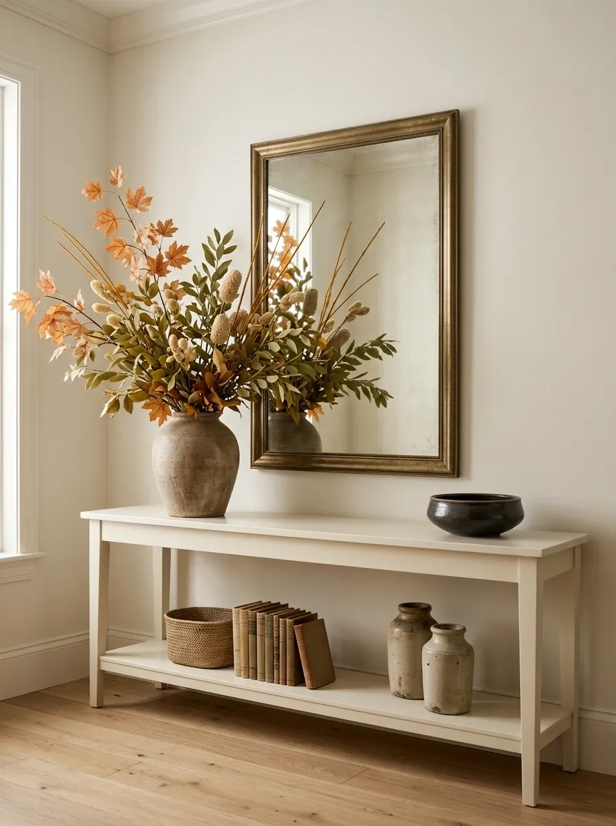
This entryway takes a quieter route. A long cream-painted console sits below a large mirror, while an oversized arrangement of autumn branches leans dramatically to one side.
The branches carry muted orange leaves, olive foliage, pale tan seed heads, and a few amber stems. Beneath them, the console gets only a handful of supporting pieces: two aged ceramic vessels, a woven basket, a small stack of books, and a low bowl.
That asymmetry is doing a lot of work. The branches create height on one side, while the lower objects spread the visual weight back across the console. The mirror catches the foliage and makes the arrangement feel larger without needing more material.
This is a good example of why more garland isn’t always better. One confident gesture beats six small decorations that don’t know where they belong.
Sunlit Window Hanging With Dried Citrus and Spices
A rustic window display takes a charmingly nostalgic turn with a collection of vertical strands featuring dried citrus slices and aromatic cinnamon sticks. Suspended on simple twine, translucent orange wheels catch the natural daylight, glowing like stained glass against the window frame.
Interspersed with dried bay leaves and whole star anise, the strands bring both visual warmth and a subtle, inviting scent to the room. The varying lengths create a playful rhythm that dances in the breeze without overwhelming the view outside.
This simple DIY approach proves that fall decorating can rely on everyday kitchen ingredients to create high-end aesthetic charm. Hang a few strands in a sunny kitchen window and let the natural light do all the heavy lifting.
Collected Vintage Hutch With Cascading Autumn Garland
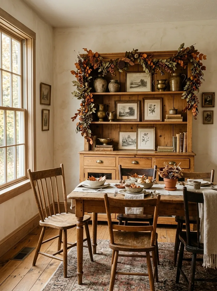
A vintage hutch can handle a much more collected fall look because the furniture already has visual history. Here, a honey-toned wood hutch sits in a dining room with creamy plaster walls, an antique table, and mismatched wooden chairs.
The garland runs across the upper shelf and drops slightly at one end, winding around old pottery, brass vessels, framed sketches, and a few stacked books. The foliage isn’t perfectly symmetrical. Some of it disappears behind the objects, then reappears farther along the shelf.
That layering is what makes the arrangement feel believable. Nothing looks lined up for inspection. The garland belongs among the objects instead of sitting in front of them like a border.
This direction works especially well when you already have vintage pieces. Don’t scrub away the imperfections. The slightly uneven wood, old brass, and worn ceramics give the autumn foliage somewhere interesting to land.
Modern White Kitchen With Sparse Copper Foliage
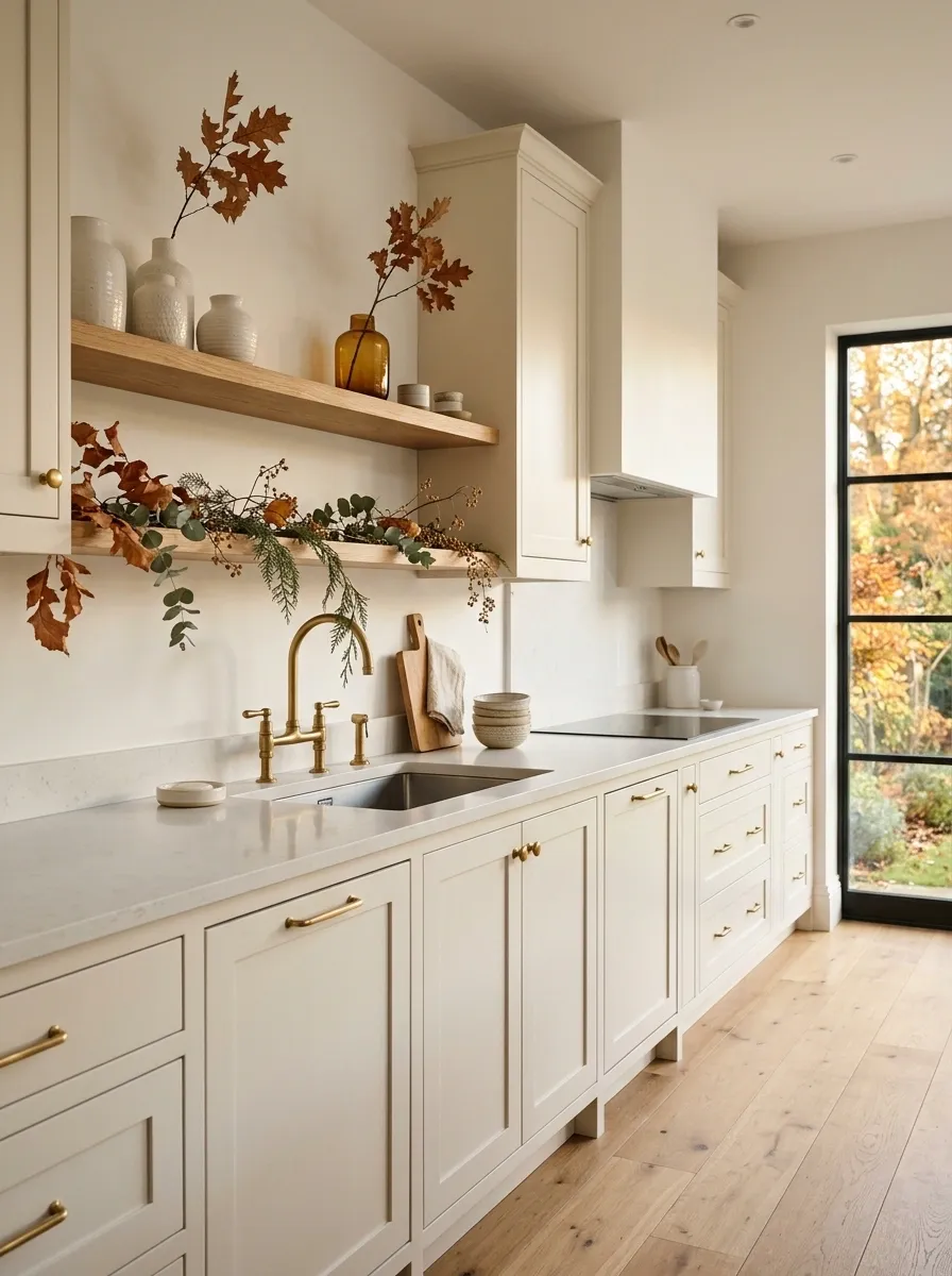
A white kitchen doesn’t need a pile of pumpkins to look seasonal. In this version, the architecture stays crisp and the fall color is deliberately sparse.
Copper-toned foliage runs lightly along one open shelf and continues across a small stretch above the sink. A few cedar stems, handmade cream ceramics, warm oak boards, and one amber glass vessel provide the supporting texture. The cabinetry remains completely white, while brushed metal fixtures and pale stone keep the room clean.
The restraint is the point. There’s enough autumn color to change the mood, but not enough to make the kitchen look redecorated for a holiday photo shoot. I’d skip the miniature signs, extra pumpkins, and obvious seasonal labels here. The kitchen already has strong lines, so the garland should soften them rather than compete with them.
English Cottage Dining Room With Full Mantel Greenery
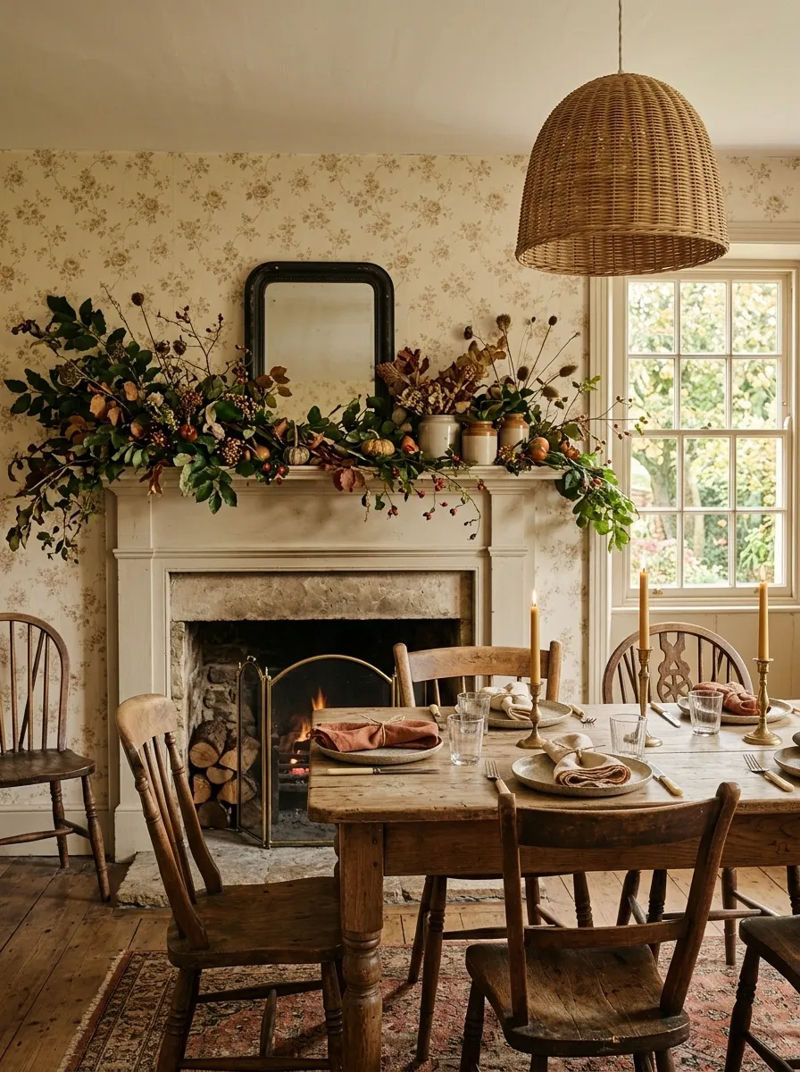
This room leans into autumn instead of trying to make it look subtle. A painted mantel sits beneath a floral-patterned wall, while a thick garland of deep green leaves, faded rust foliage, tiny berries, and dried seed heads stretches across the entire length.
Below it, an old wood dining table carries simple stoneware, linen napkins, and candleholders. Mismatched chairs keep the room from feeling too formal, while a woven pendant adds another natural texture overhead.
The pattern, foliage, and furniture are all fairly expressive, but they work because they share warm, slightly faded colors. Nothing is screaming for attention.
The mistake would be making every surface equally busy. Leave the table mostly functional. The mantel has already taken the lead.
Natural Linen Mantel With Wheat and Dried Citrus
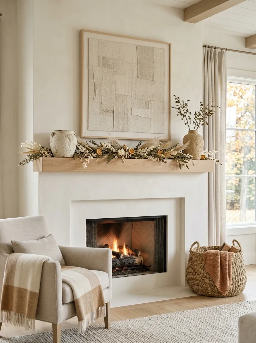
Not every fall room needs orange leaves everywhere. This mantel uses wheat, dried citrus, cream foliage, pale wood, and linen to create a much softer interpretation of the season.
The fireplace itself is finished in a warm chalky white. A low garland runs across the mantel, with wheat stems rising slightly at the center and dried orange slices tucked into the greenery. Two stoneware vessels anchor the ends, while a large woven basket beside the fireplace adds another natural texture.
The palette is intentionally narrow. Cream, tan, muted orange, and pale wood are enough to make the room feel like autumn without turning it brown.
This works especially well in rooms that already rely on neutral furniture. You don’t need to force a dramatic seasonal change. Texture can do the work.
Black Window Frame Wrapped in Amber Foliage
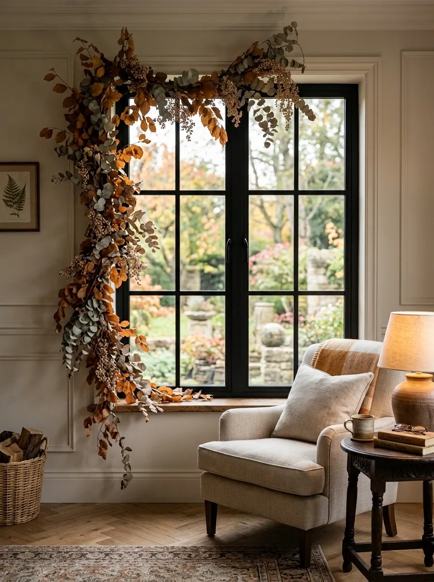
A tall black-framed window gives this arrangement a sharper architectural edge than the usual soft autumn setup. The garland begins above the window and falls loosely down one side, creating an intentional imbalance.
Amber leaves, muted copper branches, eucalyptus, and a few dried berries provide the seasonal color. Beneath the window sits a simple reading chair in oatmeal linen with a dark wood side table and a warm lamp.
The black frame matters because it gives all that delicate foliage something solid to push against. Without it, the arrangement could drift into a much softer country look.
Don’t try to make the garland perfectly symmetrical. The falling side is what makes the composition interesting. The window already provides the strong geometry.
Rustic Kitchen Island With Overhead Garland Moment
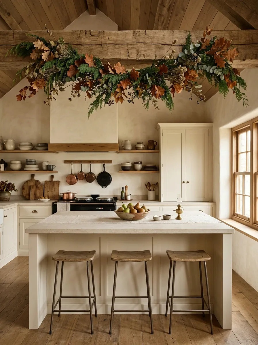
This kitchen uses the ceiling as part of the seasonal composition. A chunky wood beam above the island carries a loose garland of cedar, faded leaves, dried stems, and small berry clusters.
Below it, the island becomes the center of the room with three simple wood stools, a stone countertop, a ceramic bowl of pears, and a folded linen runner. Open shelves in the background hold pottery, cutting boards, and everyday cookware.
The garland works because it reinforces something the kitchen already has: strong horizontal lines. It doesn’t sit awkwardly on a countertop or block a useful surface. It belongs to the architecture.
The seasonal touches stay earthy rather than cute. That’s the difference between a rustic kitchen that feels genuinely autumnal and one that looks like it bought the entire fall aisle.
Antique Mirror and Slim Console in a Dark Hallway
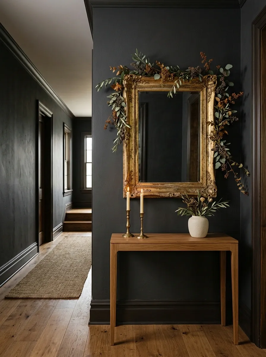
A narrow hallway doesn’t have much room for seasonal clutter, which is exactly why this design works. Deep taupe or charcoal walls frame an antique gilt mirror, while a slim wood console sits beneath it with a delicate garland winding around the mirror and dropping slightly toward one side.
The greenery stays lighter than the previous designs, using olive leaves, muted rust stems, and a few dried berries. A pair of brass candleholders and one small ceramic vessel finish the console.
The mirror remains the star. The garland simply gives the frame a seasonal outline and softens the hard edges of the hallway.
Don’t fill the console with pumpkins and signs. In a space this narrow, restraint looks much richer.
Soft Blue Dining Room With Cinnamon and Cream Garland
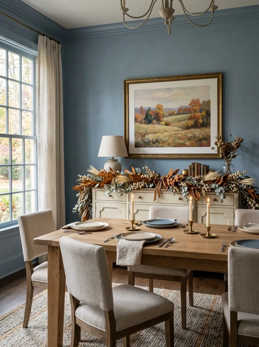
Autumn doesn’t have to mean warm beige walls and orange everything. A dusty blue dining room makes a surprisingly strong backdrop for cinnamon-colored foliage and creamy dried stems.
The garland runs along a painted sideboard beneath a large landscape print. Cinnamon leaves, pale wheat, ivory berries, and a little eucalyptus bring warmth without fighting the blue walls. The dining table stays simple with linen napkins, stoneware plates, and low candleholders.
The contrast works because the colors are opposite enough to create interest but muted enough to stay calm. The blue prevents the cinnamon tones from becoming heavy, while the cream keeps the whole room connected.
I’d skip bright orange accents here. They would break the more sophisticated color relationship.
Open Shelving Wrapped in Loose Harvest Greenery
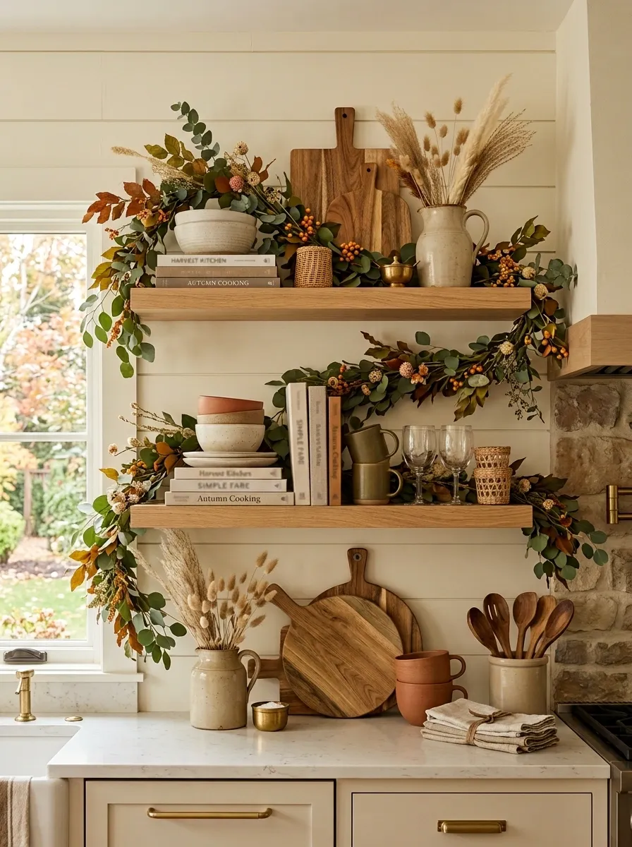
This kitchen keeps its fall styling inside the shelving instead of creating a separate seasonal display. Two long open shelves hold everyday pottery, cookbooks, wooden cutting boards, glassware, and a few woven pieces. A loose garland slips behind and around the objects, disappearing in places and resurfacing farther along.
The foliage uses warm green leaves, faded rust stems, dried grasses, and a few small berry clusters. Because the shelves already have a lot of visual information, the garland is intentionally thinner than the earlier mantel designs.
The key is spacing. Some objects sit alone. Others cluster together. The greenery connects them without forcing every section of the shelves to look identical.
This is the kind of arrangement that feels collected instead of staged.
Grand Stair Landing With Deep Burgundy Foliage
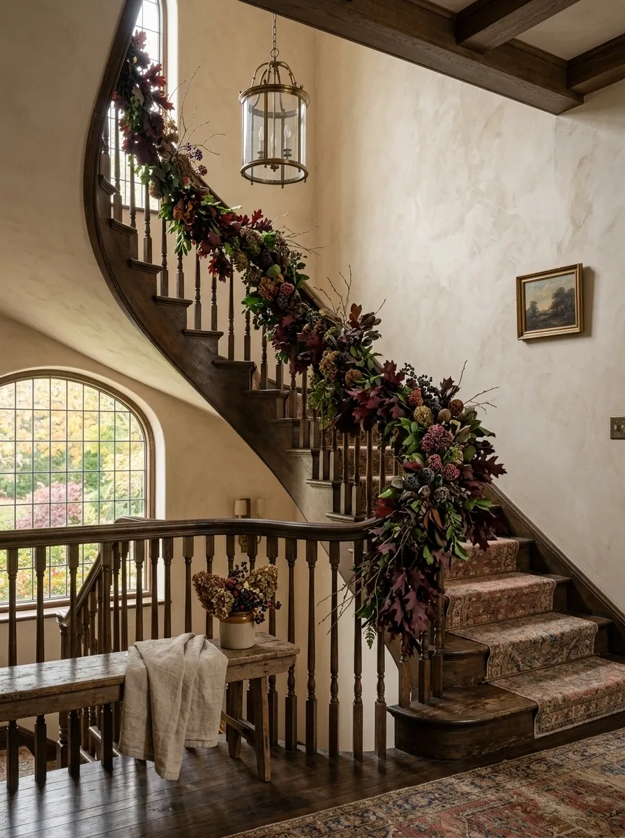
For a larger home with a generous stair landing, small seasonal touches can disappear completely. This concept goes in the opposite direction with a fuller arrangement that matches the scale of the architecture.
Deep burgundy foliage, dark green leaves, dried branches, and muted plum berries follow the staircase railing. The walls stay warm plaster, while an antique brass light fixture and a faded runner ground the landing. A small vintage bench sits beneath the lower section of the stairs, giving the scene something substantial at floor level.
The burgundy creates depth without relying on bright orange. It also works naturally with darker wood and brass.
The important part is scale. A tiny garland would look lost here. The architecture needs something substantial enough to hold its own.
Minimal Mantel With One Strong Garland Sweep
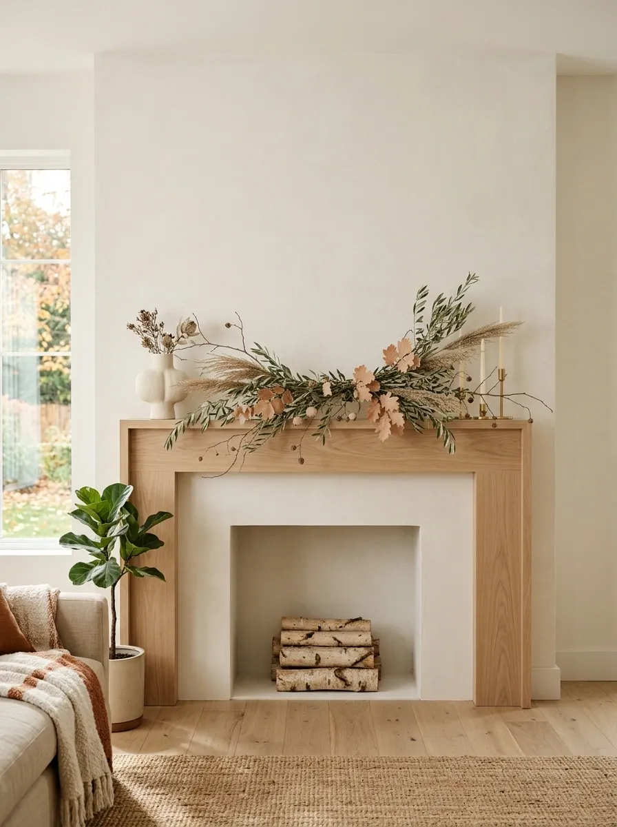
Some fireplaces look worse when they’re decorated too much. This one gets a single sweeping garland and almost nothing else.
The mantel sits beneath a plain warm-white wall with one large framed artwork. A sculptural ceramic vessel sits at one end, while a few taper candles sit low on the other. Between them, a sparse garland of olive branches, dried grasses, pale rust leaves, and a few exposed twigs moves from one side of the mantel toward the center.
The arrangement is intentionally incomplete. You can see the mantel surface. You can see the wall. You can see the artwork.
That breathing room is what gives the design its character. It doesn’t look unfinished. It looks edited.
Farmhouse Buffet With Pumpkin and Eucalyptus Layers
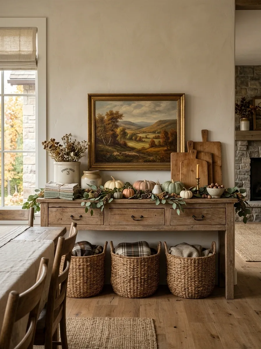
A long farmhouse buffet gives fall styling plenty of room to spread out, and this design uses the full width without turning the surface into a crowded display.
A soft green eucalyptus garland runs along the top, broken by small pumpkins in cream and muted orange. Woven baskets sit underneath, while old crocks, linen napkins, cutting boards, and a large framed landscape fill out the composition.
The wood of the buffet provides enough warmth that the pumpkins don’t need to be aggressively orange. Cream and dusty green keep the palette grounded.
The best detail is the mixture of useful and decorative pieces. Everything looks like it belongs in a dining room, even when it’s seasonal.
Arched Doorway With Olive and Dried Berry Garland

An interior arch already gives a room a strong shape, so the garland should follow that curve rather than flatten it. This design uses loose olive branches, dried berries, faded rust leaves, and a few long stems that extend beyond the sides.
The arch connects a warm dining area to the living room, with pale plaster walls, natural oak flooring, and a simple vintage pendant overhead. A woven bench sits nearby with a folded rust-colored throw.
The foliage is fuller along the upper curve and becomes lighter toward the bottom. That keeps the doorway open and lets the architecture remain visible.
Don’t force the arrangement into perfect symmetry. The slightly uneven ends make the composition feel more natural.
Built-In Bookshelves With Garland Woven Through the Styling
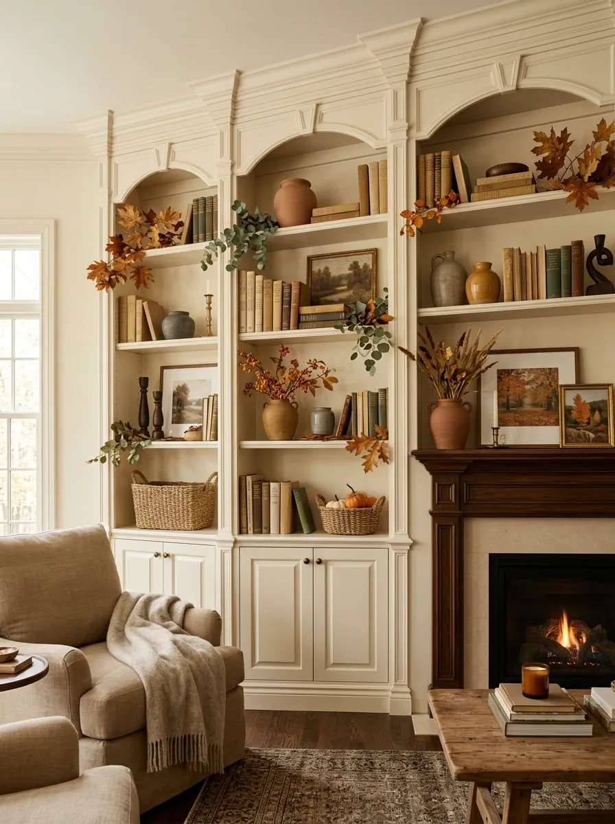
Built-ins can handle fall decoration beautifully, but covering every shelf with greenery usually makes them look smaller and messier. This version uses garland selectively.
The shelves are painted a warm cream and filled with stacked books, ceramic vessels, framed artwork, baskets, and a few dark wood objects. Instead of running one continuous garland across every level, small sections of eucalyptus, dried leaves, and berry stems appear between the objects.
Some greenery sits deep on a shelf. Another section drapes slightly over an edge. A third disappears behind a stack of books.
That variation gives the shelves depth. The eye moves through the styling instead of seeing one solid horizontal line.
The built-in remains the hero. Fall simply gives it another layer.
Layered Fireplace With Plaid, Leather, and Copper
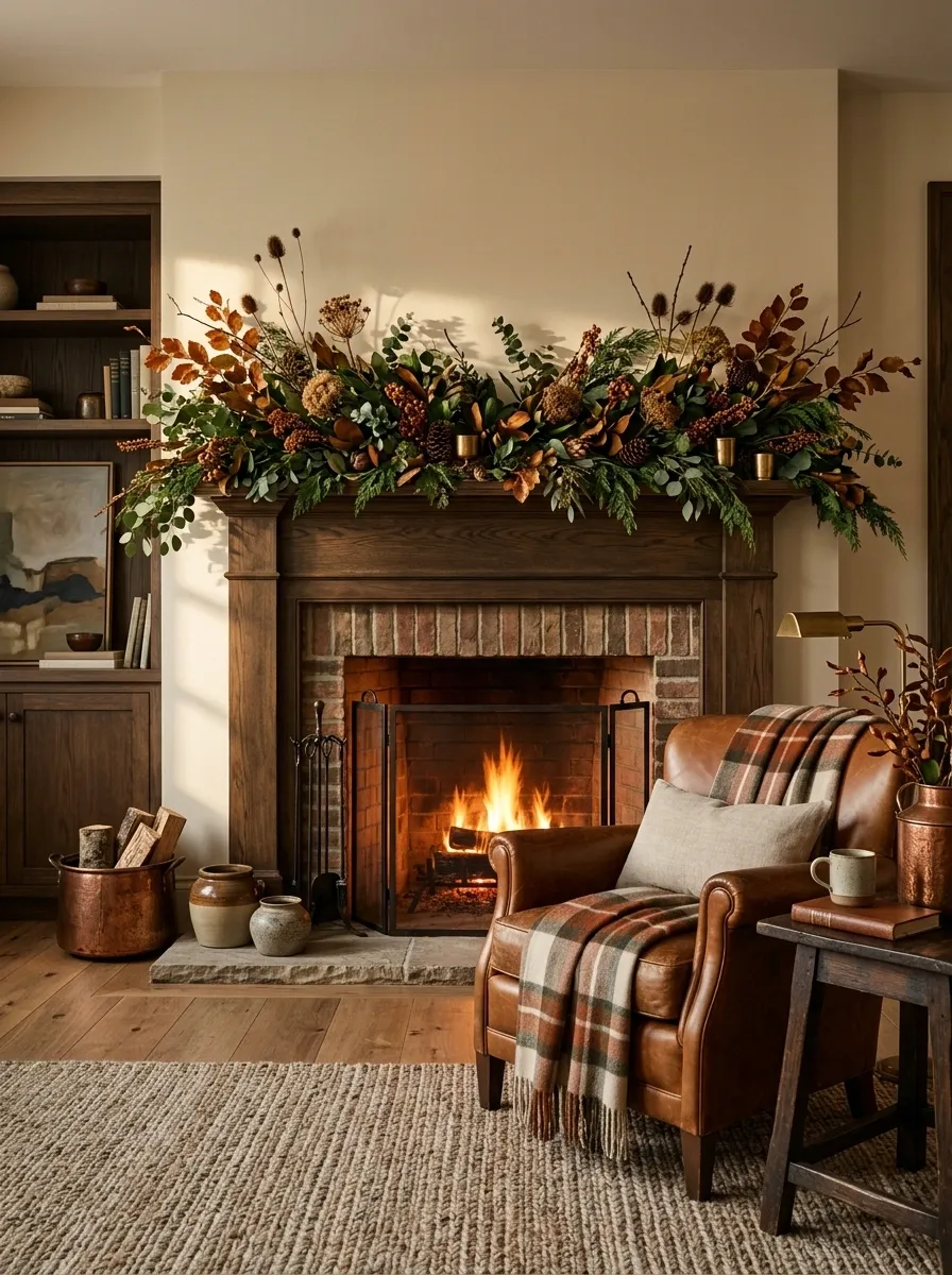
This fireplace takes a warmer, slightly more masculine route. A dark wood mantel supports a full garland of deep green foliage, coppery leaves, dried seed heads, and a few rust-toned berries.
Below it, a cognac leather chair faces the fire beside a small wooden table. A wool plaid throw repeats the rust and cream tones, while aged copper vessels introduce a softer metallic note. The rug stays neutral with a little woven texture.
The composition works because the materials carry as much interest as the color. Leather, wool, wood, copper, and foliage all have different surfaces, so the room doesn’t need piles of small decorations.
I’d keep the mantel accessories low. The garland already supplies enough height and movement.
Romantic Bedroom With Headboard Garland and Candlelight
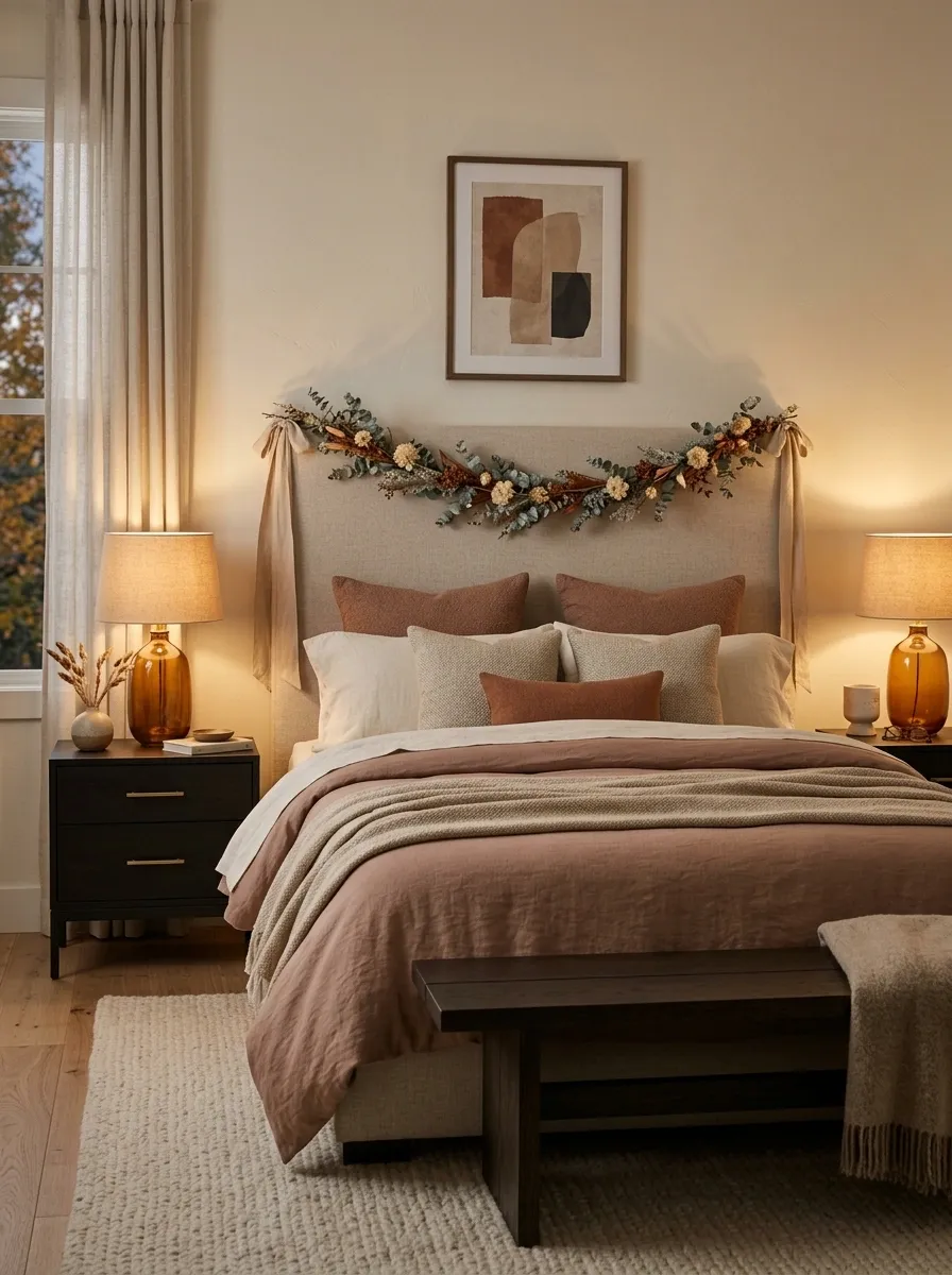
Most bedroom garlands end up looking like Christmas decorations that arrived early. This one stays much softer.
A neutral upholstered headboard sits against a warm cream wall, with a narrow garland of eucalyptus, dried cream flowers, faded rust stems, and linen ribbon draped loosely across the top. The bedding is layered in ivory, warm beige, and muted clay. Two amber bedside lamps create a low evening glow.
There are no pumpkins on the nightstands. No seasonal signs. No overloaded shelves.
The bedroom feels autumnal because of the materials and lighting rather than obvious symbols of the season. That’s what makes it easy to live with.
Keep the garland narrow enough that the headboard still reads as the main architectural shape.
Outdoor Covered Porch With Rustic Harvest Garland
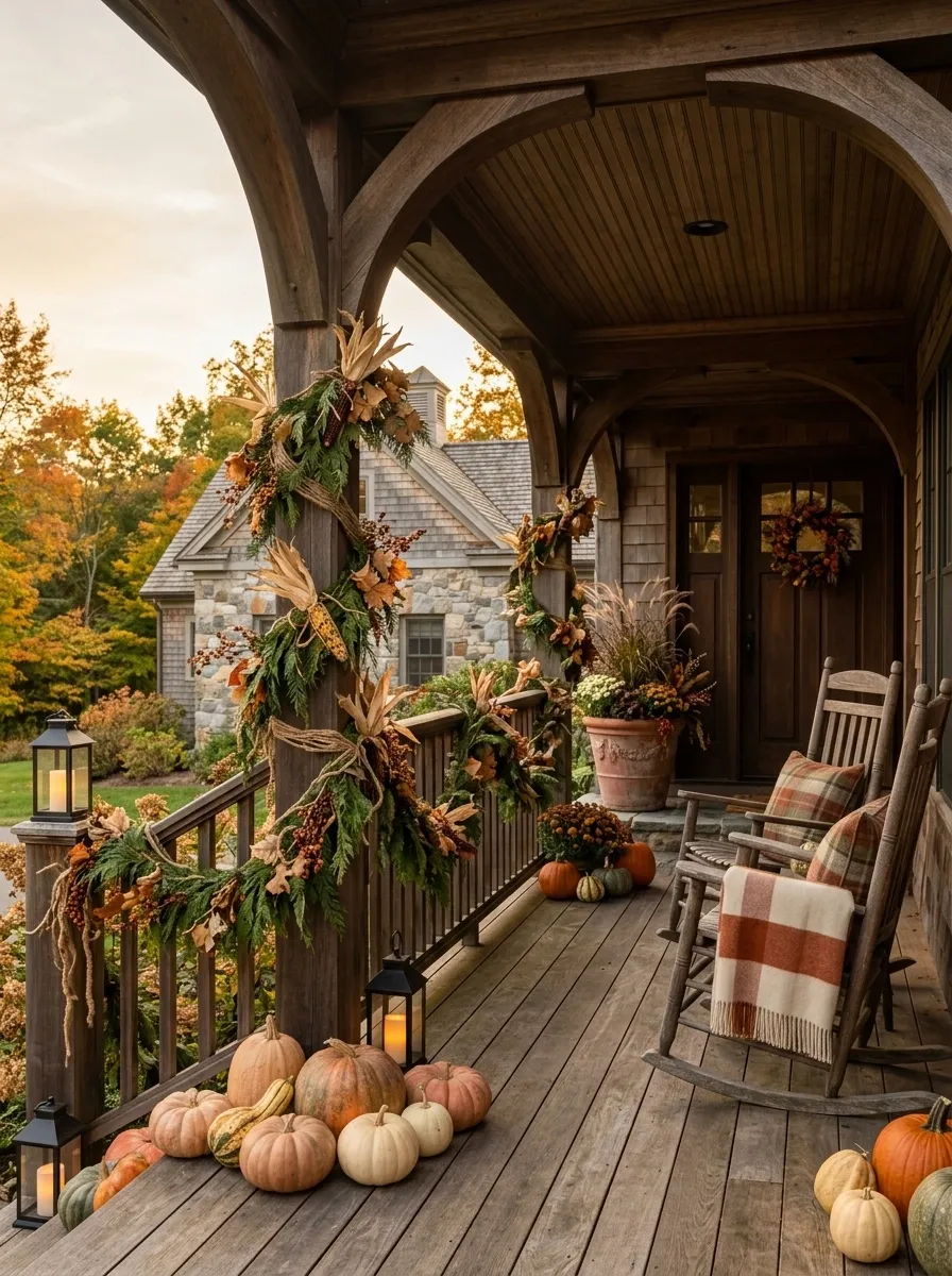
A covered porch gives fall garland a completely different job. Here, it needs to connect the architecture, seating, and seasonal entry styling into one outdoor scene.
A long cedar garland follows the porch railing and posts, mixed with dried corn husks, faded leaves, berry branches, and natural twine. Below it sit two wooden rocking chairs with plaid cushions and a folded throw. Large neutral planters frame the doorway, while a few pumpkins sit low around the steps.
Lanterns add warm evening light without competing with the garland.
The palette stays grounded in cedar green, muted orange, brown, cream, and weathered wood. Nothing feels overly polished, which is exactly right for an outdoor setting.
The important part is keeping the seasonal pieces at different heights. Garland overhead, planters at the sides, and pumpkins low to the ground create a layered composition.
Double Front Doors Framed in Loose Autumn Greenery
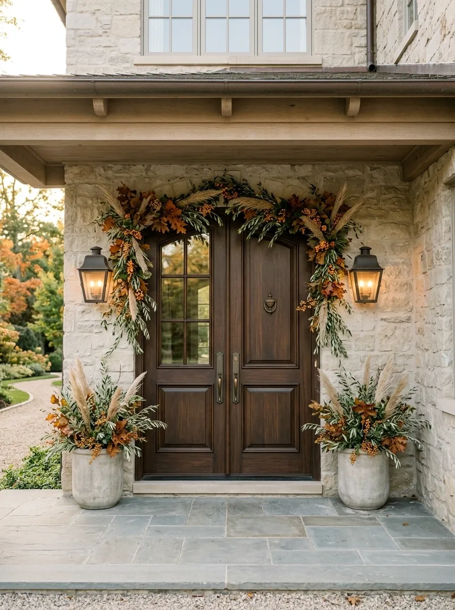
Symmetry makes a front entry feel deliberate, and this design leans into it. Two tall doors sit beneath a simple porch roof, with matching lanterns and large planters balancing either side.
The garland follows the top of both doors and extends slightly down the outer edges. Olive leaves, rust foliage, dried grasses, and small amber berries keep the composition seasonal without becoming overly colorful.
The planters repeat the same greenery, but in a much simpler form. That small relationship ties the whole entrance together.
The mistake here would be adding a huge wreath, oversized signs, several pumpkin stacks, and more garland on every surface. The architecture has already provided the drama.
Let the doors breathe. The symmetry does most of the work.
Dining Table Garland With Long Farmhouse Centerpiece
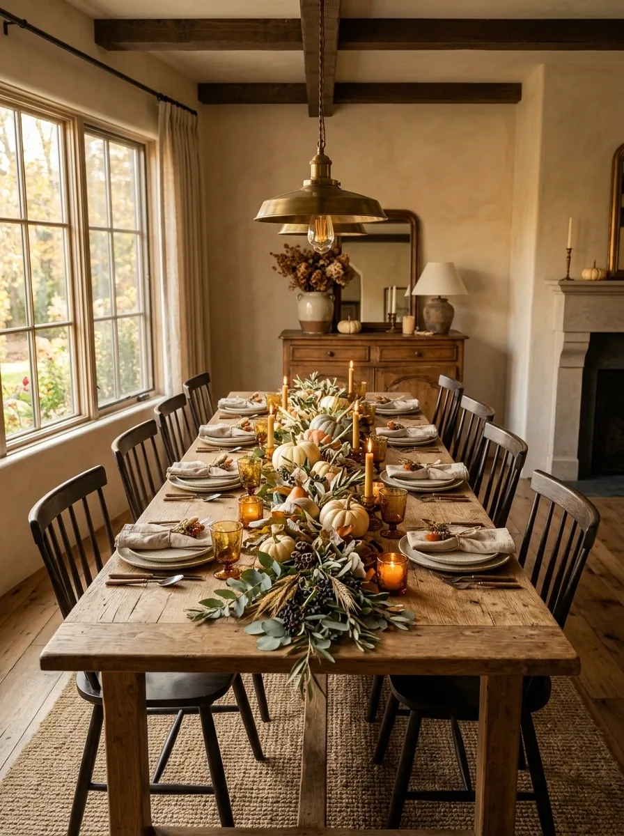
A long dining table gives fall greenery room to spread horizontally, so this arrangement keeps everything low and elongated. A loose eucalyptus and olive garland runs through the center, with small cream and muted orange pumpkins tucked between the foliage rather than stacked in a line.
Amber glass candleholders add warmth, while stoneware plates, natural linen napkins, and a worn wood table keep the setting grounded. The surrounding dining room uses warm plaster walls, simple wooden chairs, and a soft vintage pendant.
The centerpiece works because it doesn’t interrupt conversation or dominate the table. Everything stays close to the surface, while the different textures create enough interest.
A tall arrangement would change the whole mood. Here, low and sprawling is the smarter choice.
Contemporary TV Wall With Understated Fall Foliage
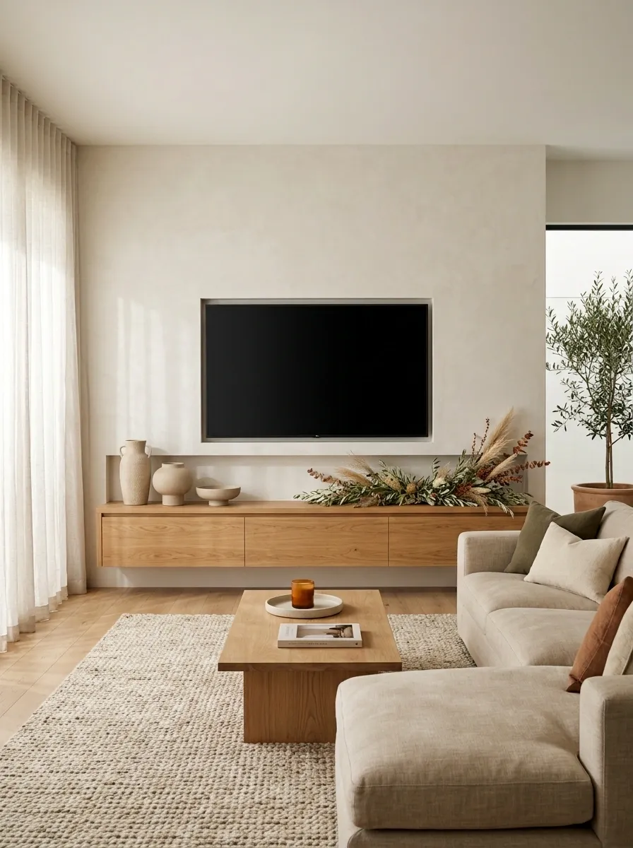
A modern TV wall doesn’t need a giant autumn arrangement hanging beside it. That usually creates more visual competition, not better styling.
This version uses a long warm-oak media console beneath a clean plaster wall. A narrow fall garland runs along one section of the console, made from olive leaves, dried grasses, and just a few rust-toned stems. Sculptural ceramics sit at the opposite end, while a soft beige sofa, low coffee table, and textured rug complete the living room.
The television remains the functional center, while the seasonal greenery adds warmth without demanding attention.
This is where scale matters. The garland is intentionally shorter than the console, leaving breathing room on both sides. It looks like part of the room rather than a decoration pasted onto it.
Seasonal contrast → olive foliage with restrained rust
Softening texture → linen, wool, and woven surfaces
Controlled focal point → television remains visually dominant
Layered Entryway With Vintage Autumn Maximalism
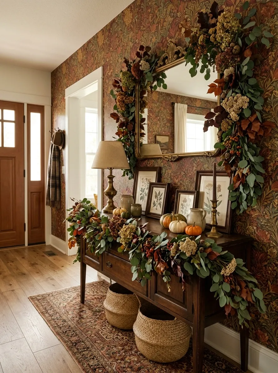
The final look goes in the opposite direction from the minimalist designs. This entryway is intentionally layered, but every layer belongs to the same visual story.
Patterned wallpaper creates a warm backdrop for an antique wood console, brass mirror, vintage artwork, woven baskets, and an aged table lamp. A generous garland winds across the console and partly around the mirror, combining eucalyptus, dried flowers, burgundy leaves, rust foliage, and small berries.
A runner adds another pattern beneath the furniture, while a few small pumpkins and ceramic vessels connect the autumn palette to the rest of the room. Nothing is perfectly matched, and that is part of the appeal.
The design works because the pieces share similar warmth and age. The room feels collected instead of randomly decorated.
This is maximalism with boundaries. There is plenty happening, but the palette keeps everything speaking the same language.
The Best Fall Garland Is the One That Belongs to the Room
There isn’t one correct way to decorate with fall garland. A moody fireplace can handle a heavy, dramatic arrangement. A modern kitchen usually needs the opposite. A staircase wants movement, while a dining table needs something low enough to keep the room practical.
That’s the useful distinction. Don’t start with the garland and then try to force the rest of the room around it. Start with the space. Look at the dominant lines, the strongest materials, the colors already present, and the place where you want the eye to land.
Then let the seasonal greenery support that story.
Before buying anything, save the references that genuinely look like your home. A good collection of visual references will tell you far more about the direction you want than a cart full of random fall decorations.
Save the designs that feel closest to your style now. When you start decorating, you’ll have a much clearer idea of what belongs and what really doesn’t.