

Green bedrooms can go wrong fast. Pick the wrong undertone and the walls look muddy. Add too many matching green pieces and the room starts feeling themed. Pair a beautiful green with cold gray furniture and suddenly the whole bedroom loses the warmth that made the color appealing in the first place.
The trick isn’t finding one magical shade of green. It’s knowing what that green needs around it.
A soft sage wants warm white and natural wood. Olive comes alive beside walnut. Deep forest green needs lighter bedding and carefully placed lighting. Even a neutral bedroom can carry plenty of green without touching a paint roller.
Find Your Green Bedroom Direction
Green doesn’t have one look. Sage can feel airy and quiet, olive can feel warm and grounded, while a deep forest shade can make the same bedroom feel dramatic.
Start with the mood, then build the room around it.
Green Bedroom Ideas
Embrace Bold Velvet Green Accents
A rich velvet green duvet introduces an instant layer of luxury that anchors the entire sleeping space. The deep jewel tone reflects light differently throughout the day, giving the bed a plush, inviting focal point without overwhelming the surrounding decor.
Pair this texture with sleek black furniture, warm gold accents, and patterned rugs to tie the eclectic elements together seamlessly. The combination creates a moody, sophisticated atmosphere that feels deliberate and high-end.
Finish the look with crisp white sheets peeking out from beneath the heavy throw to keep the heavy dark tones from feeling too closed in.
Paint the Headboard Wall in a Soft, Dusty Sage
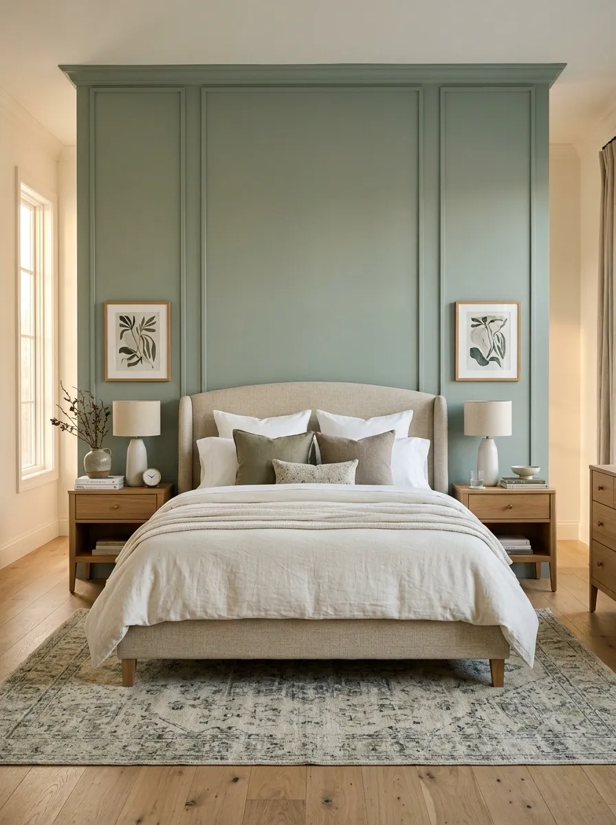
The wall behind the bed gets the first look, so it deserves the strongest color decision.
A dusty sage works especially well here because it has enough depth to define the bed without swallowing the room. Keep the other walls quieter and let the headboard sit comfortably against the color instead of competing with it.
Use this combination:
- Dusty sage behind the bed
- Cream or oatmeal bedding
- Medium-tone wood
- Warm bedside lighting
That mix keeps the wall interesting while leaving plenty of visual breathing room. The result feels layered, not painted for the sake of having a green room.
Layer Botanical Wallpaper and Textiles
Patterned green wallpaper featuring delicate botanical illustrations brings traditional charm and architectural depth to a bedroom wall. It creates a rich backdrop that makes framed artwork and wall sconces feel completely integrated into the space.
Continue the green palette downward by dressing the bed in quilted olive textiles and patterned accent pillows. Sticking to a cohesive range of earthy green shades prevents the pattern mixing from becoming visually chaotic.
Anchor the vintage-inspired styling with classic dark wood nightstands and fresh floral arrangements to complete the timeless, garden-like sanctuary.
Pair Olive Green With Warm Walnut Furniture
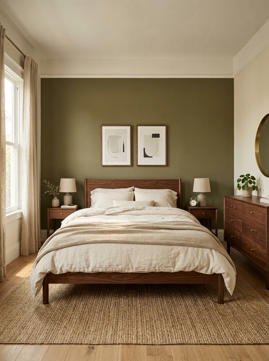
Olive and walnut belong together. The green has an earthy yellow undertone, while walnut brings the deeper brown warmth that keeps the room from feeling cold.
Keep the furniture simple. A walnut bed frame, two slim nightstands, and one low dresser are enough. Don’t add five more brown accessories just because the palette works.
A softer cream duvet makes the contrast cleaner, while woven textures keep the darker wood from looking heavy.
Best pairing: olive walls, walnut furniture, cream bedding, muted brass.
Keep Simple Emerald Silk Bedding
Silky emerald green bedding offers a sleek, minimalist approach to incorporating bold color into a neutral bedroom. The smooth drape of the fabric adds a subtle sheen that catches the natural light beautifully.
Keep the surrounding walls and furniture simple with soft off-whites and clean lines. This lets the vibrant green duvet and matching pillows act as the uncontested star of the room without needing extra styling.
Add a single potted olive tree in a textured ceramic pot to echo the organic tones of the bedding and complete the serene, uncluttered aesthetic.
Use Deep Forest Green Behind a Low Bed
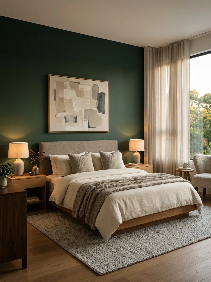
Deep forest green needs something low and visually calm in front of it.
A low bed works because it leaves more of the wall visible, giving the color room to become part of the architecture instead of just sitting behind furniture. Keep the headboard modest and use bedding in warm cream, stone, or muted taupe.
Lighting matters here. Two warm bedside lamps soften the dark wall after sunset and stop the green from reading flat.
Skip a pile of small wall decorations. One oversized artwork or a clean pendant is enough.
Frame the Bed With Built-In Bookshelves
Built-in dark green bookshelves framing the bed create a stunning architectural alcove that makes the entire room feel custom-designed. The surrounding shelves provide ample space for books, trailing plants, and treasured objects while framing the headboard.
Soften the substantial dark cabinetry with a tufted headboard, patterned bedding, and a whimsical floral mural painted behind the bed. The interplay between structured shelving and organic wall art strikes the ideal balance.
Add a small wooden accent table and warm task lighting to make the cozy reading nook functional as well as breathtakingly beautiful.
Keep Crisp White Bedding Against a Muted Green Wall
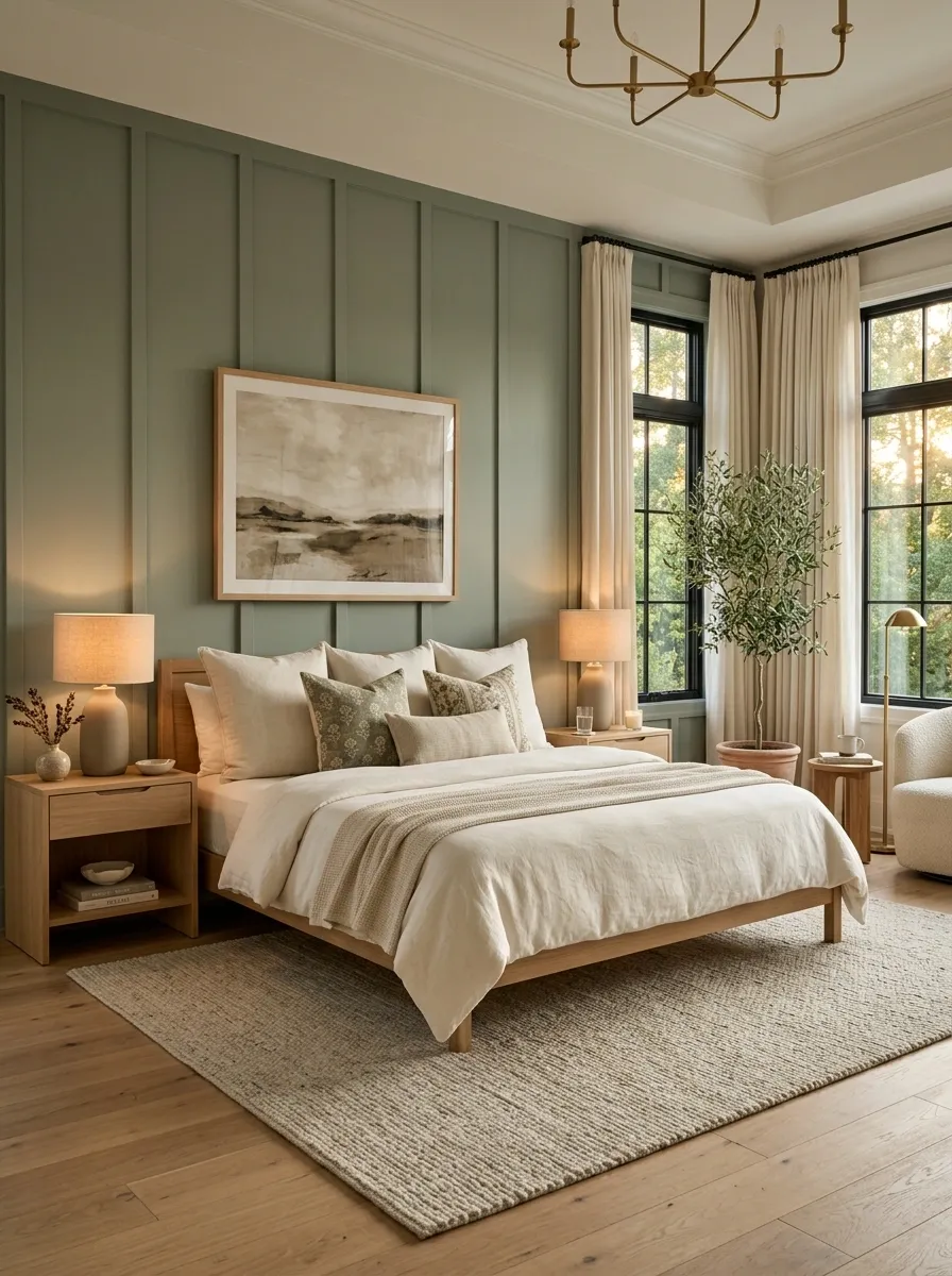
White bedding can make green walls look cleaner, but stark blue-white sheets can make an earthy green feel strangely cold.
Choose a softer white with a warm undertone. Then repeat that warmth in the curtains, rug, or bedside lamp so the bedding doesn’t look disconnected from the rest of the room.
The easiest formula is simple:
- Muted green wall
- Warm white duvet
- Cream or beige throw
- Natural wood beside the bed
The trick is contrast, not more decoration.
Add Green Through Floor-Length Curtains Instead of Paint
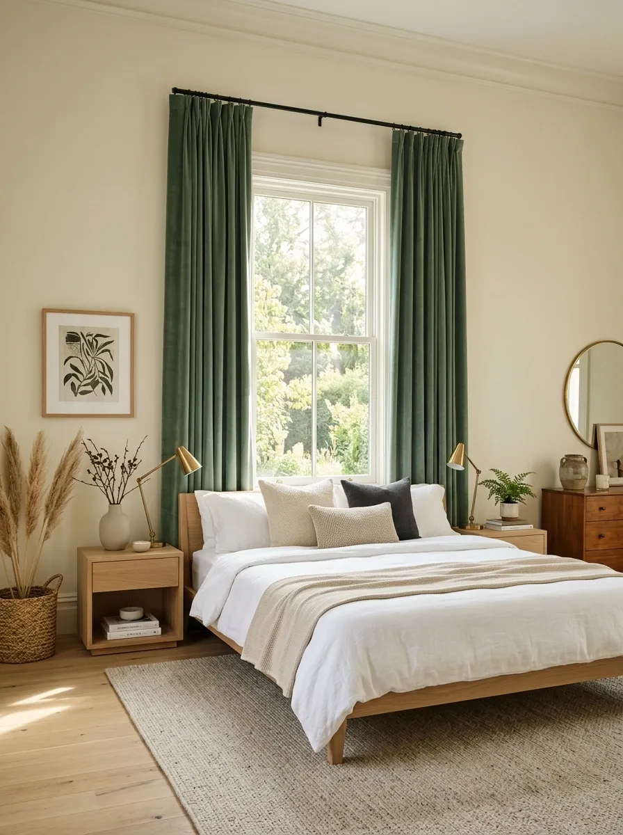
Paint isn’t the only way to make green the room’s main visual color.
Full-length green curtains create a tall vertical sweep that can feel softer than a saturated wall. Hang the rod close to the ceiling and let the fabric fall all the way to the floor. The extra height gives the room more presence without adding another bulky piece of furniture.
Muted eucalyptus or deep olive works particularly well here. Keep the walls lighter so the curtains remain the feature.
This approach also makes seasonal changes easy. The green can stay while bedding and smaller accessories change.
Build a Green Bedroom Around Natural Linen
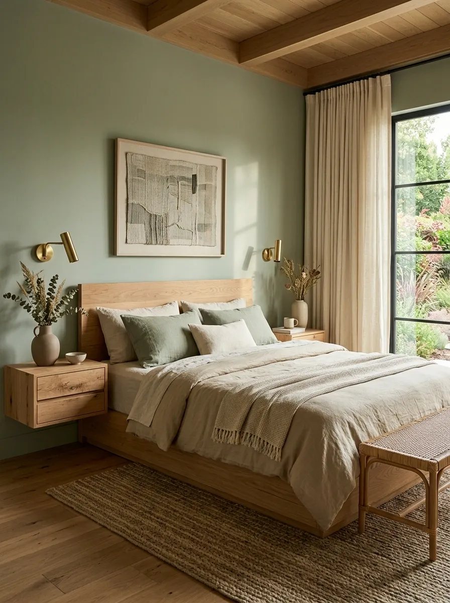
The fastest way to stop green from feeling too polished is to bring in linen.
Its slightly rumpled texture breaks up smooth painted walls, crisp bedding, and hard furniture edges. A natural flax duvet cover or pair of loose curtain panels adds warmth without introducing another loud color.
Keep the palette restrained. Green should stay dominant, while linen, unfinished wood, and woven pieces handle the texture.
Gather these materials:
- Natural linen bedding
- Pale or medium wood
- One woven basket or bench
- Matte ceramic bedside pieces
The room should feel touchable. That’s what keeps a green palette from becoming visually stiff.
Use Two Green Tones Instead of Matching Everything
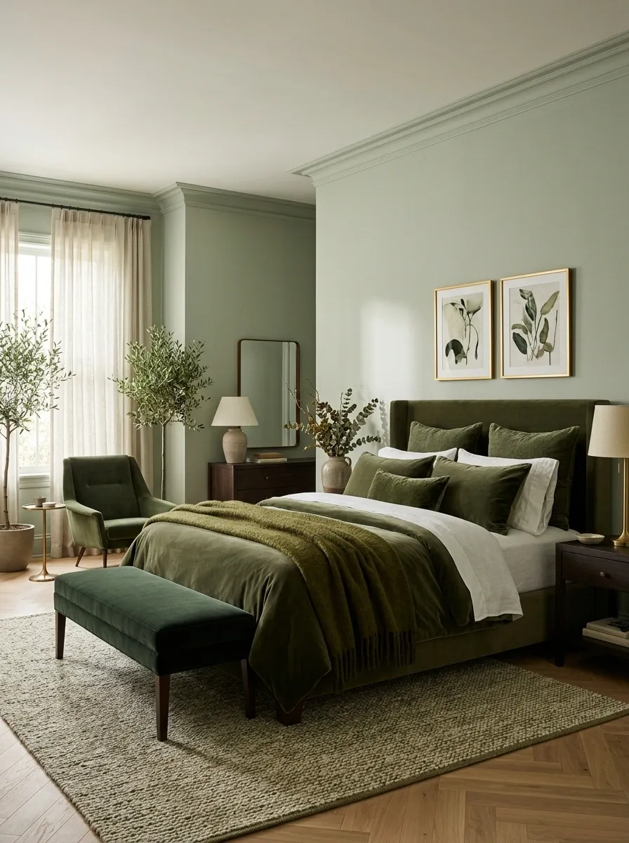
Matching every green element to the exact same shade makes a bedroom look flat.
Use a lighter green on the largest surface, then bring in a deeper version through the bedding, bench, artwork, or a single chair. The colors should clearly belong together without being identical.
A soft sage wall with an olive throw feels layered. A sage wall with sage curtains, sage pillows, sage bedding, and sage furniture feels like a color chart.
Simple rule: keep the lightest green on the largest surface and save the darkest green for smaller pieces.
Let a Dark Green Ceiling Change the Room Completely
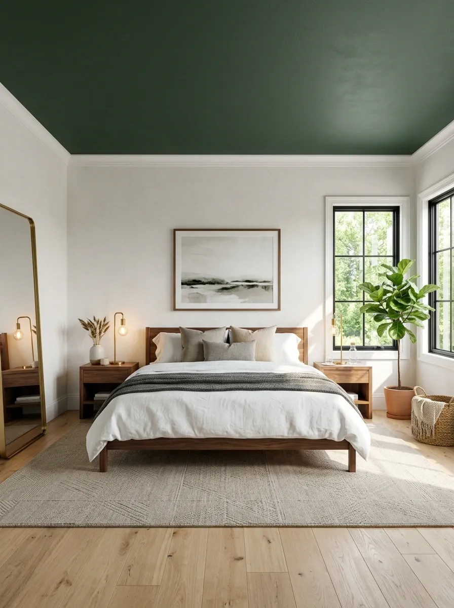
A green ceiling isn’t a gimmick. It changes where the eye lands.
This works best when the walls stay relatively quiet and the ceiling carries the stronger color. The effect becomes especially striking with simple white trim, warm lamps, and furniture that doesn’t compete for attention.
Don’t use a dark ceiling with a room full of tiny decorative pieces. The ceiling already creates drama.
Best approach: make the ceiling the boldest surface, then keep everything underneath calmer.
| Room condition | Better ceiling choice |
|---|---|
| Bright natural light | Deep olive or forest |
| Low natural light | Muted medium green |
| Low ceiling | Softer, lighter green |
| Tall ceiling | Deeper saturated green |
The important part is restraint. One dramatic plane is enough.
Mix Emerald Green With Small Brass Accents
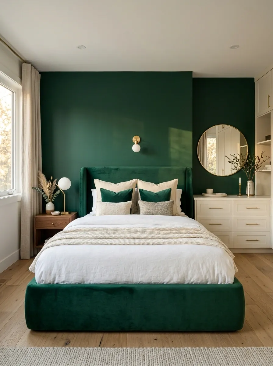
Emerald green already has presence. Brass should sharpen it, not compete with it.
Use brass where the eye naturally expects a functional detail: a pendant, lamp base, mirror frame, or drawer pull. A few warm metallic moments can make a rich green wall feel more deliberate without turning the bedroom into a showroom.
Keep large metallic surfaces out of the mix. Emerald looks stronger when the brass appears in small flashes.
Best spots for brass:
- Bedside lamp
- Pendant light
- Small mirror frame
- Two or three drawer pulls
The contrast comes from repetition, not quantity.
Make a Small Bedroom Feel Rich With Moss Green
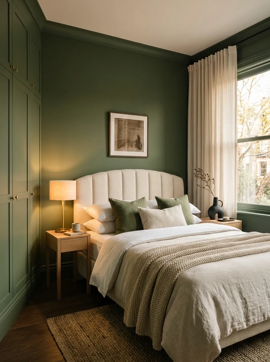
Small bedrooms don’t need pale walls by default.
A muted moss green can make a compact room feel intentionally enveloped, especially when the color continues onto the trim or wardrobe doors. The key is reducing visual noise around it.
Choose one dominant bed silhouette. Keep the nightstands narrow. Let the curtains hang cleanly rather than introducing another pattern.
Skip the tiny-accessory trap. Small rooms already have enough visual information from furniture, windows, doors, and storage.
A deeper muted color can actually make those elements feel more unified.
Use Green Upholstery as the Main Bedroom Statement
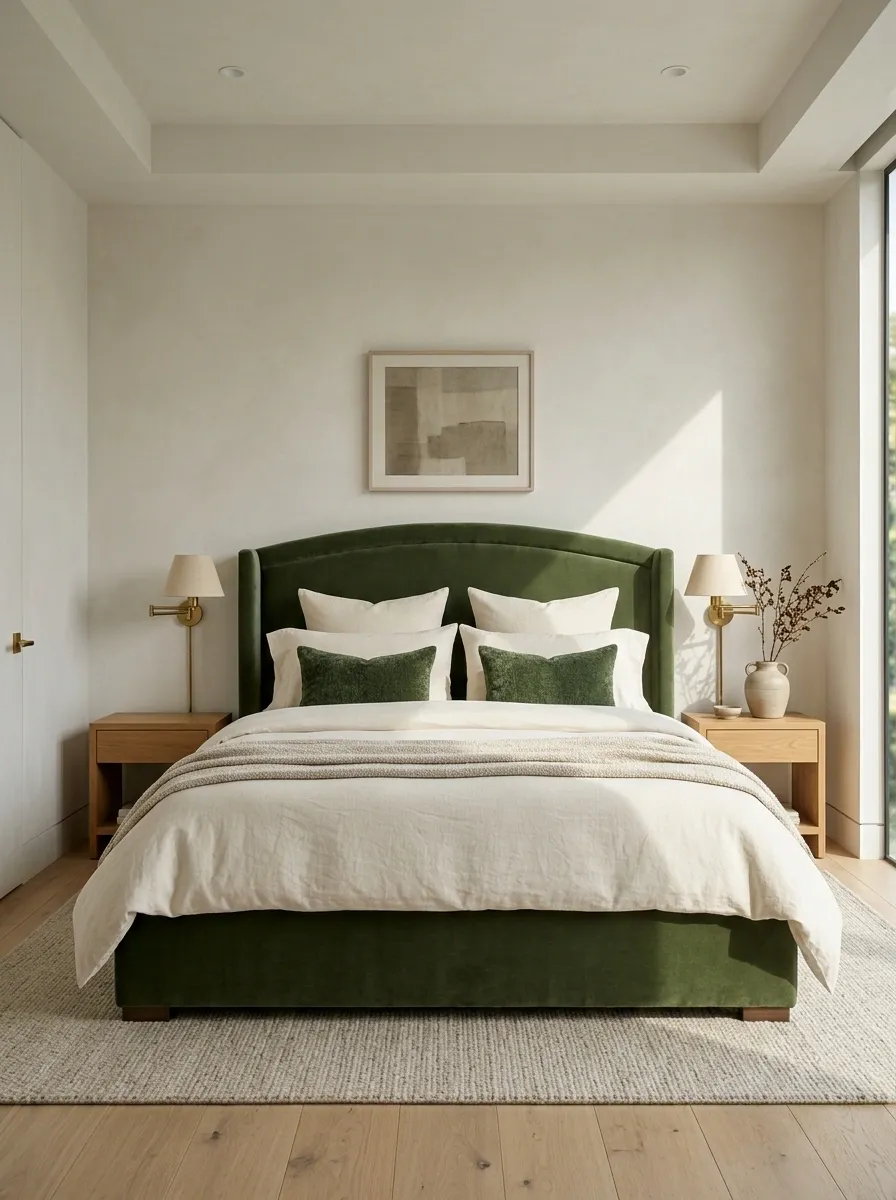
A green bed can carry the entire room without a single green wall.
Choose upholstery in a muted olive, eucalyptus, or deep moss and let the headboard become the visual anchor. Keep the wall behind it simple. Cream bedding, pale plaster tones, and warm wood give the saturated fabric enough space to stand out.
The mistake is adding green everywhere else. Once the bed has a strong color and shape, the rest of the room should support it rather than compete with it.
Best balance: one green upholstered focal point, quiet walls, restrained accessories.
Warm Up Sage Green With Terracotta Details
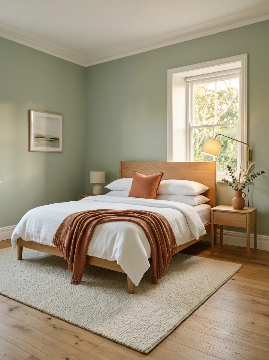
Sage can drift too cool when the room contains lots of pale gray, white, and chrome.
Terracotta fixes that immediately.
A clay-colored cushion, bedside vase, small artwork, or woven throw gives sage a warm counterpoint without taking over the palette. Keep the terracotta muted rather than bright orange. The goal is warmth, not a second focal color.
Use the accent in small places that the eye discovers naturally.
Easy placements:
- One lumbar cushion
- A ceramic vase
- A framed print
- A small bedside object
Three or four related terracotta details are enough to connect the room.
Create a Moody Green Bedroom With Charcoal
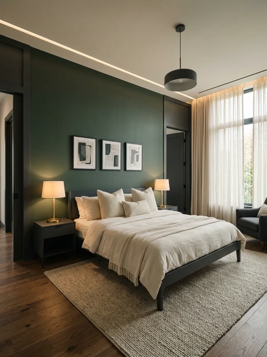
Charcoal gives deep green a sharper edge.
Use the pairing on the bed frame, bedside furniture, artwork frames, or a single accent wall detail. Then soften the darker combination with cream bedding and warm lamps.
The room shouldn’t be dark in every direction. That’s what makes this palette work. Green provides color, charcoal provides structure, and lighter textiles keep the whole composition from closing in.
Keep this ratio in mind: dark green should feel like the atmosphere, while charcoal acts as the outline.
Use Botanical Prints Without Making the Room Look Themed
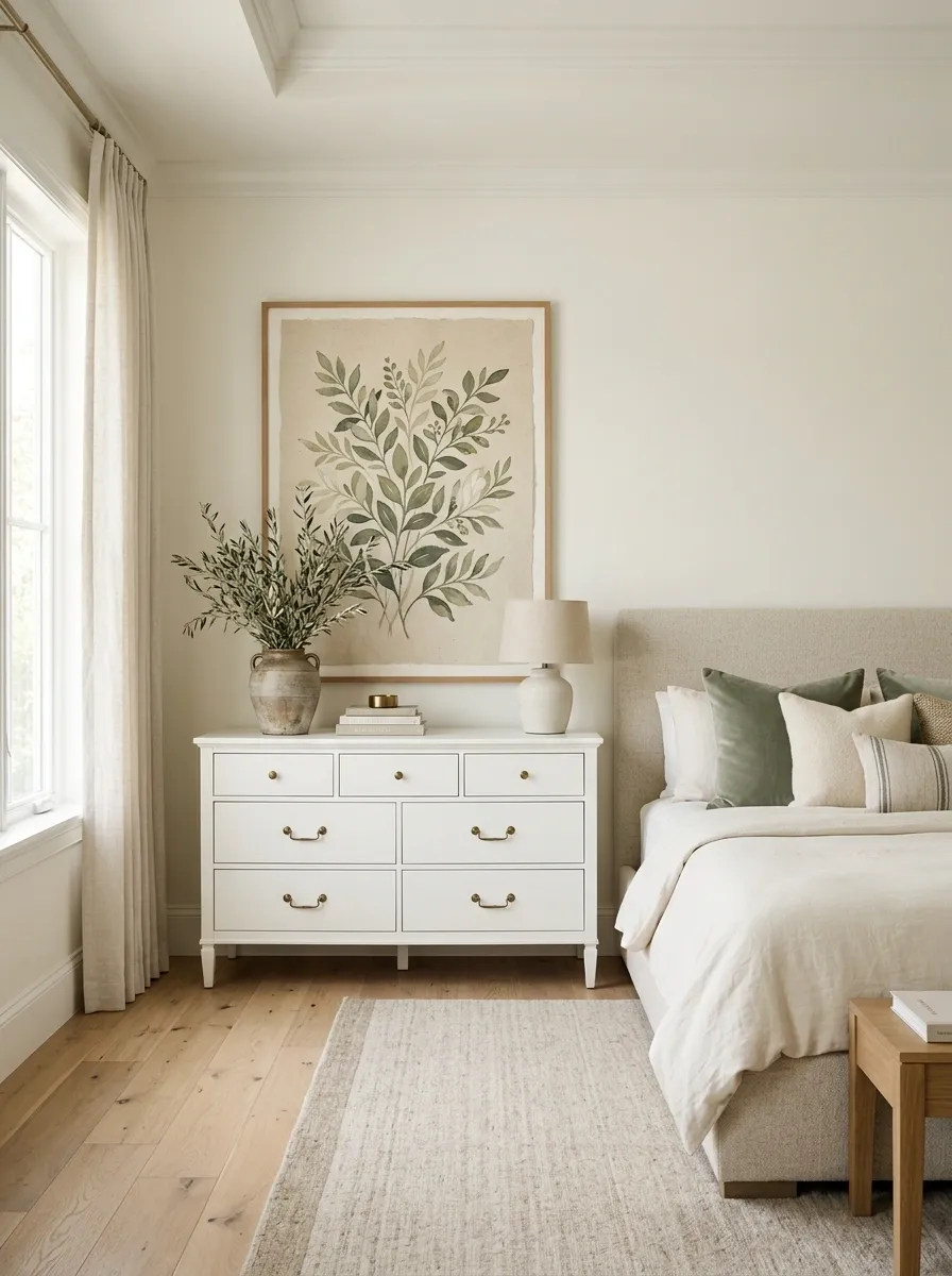
Botanical artwork works with green, but filling the bedroom with leafy patterns is where the idea goes wrong.
Choose one botanical print with an imperfect, illustrated quality rather than repeating the same leaf motif on curtains, bedding, cushions, and wallpaper.
A large framed print above the dresser can be enough. Keep the bedding mostly solid so the artwork has somewhere to land visually.
Use: one large botanical statement, natural wood frame, quiet bedding.
Skip: matching leaf print on every soft surface.
The room should reference nature, not imitate a greenhouse.
Add a Green Bench at the Foot of the Bed
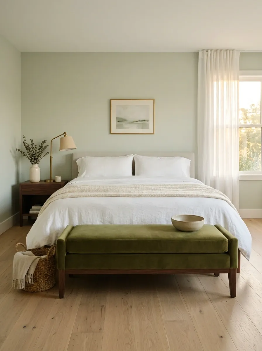
A bench is one of the easiest places to introduce green without repainting anything.
Choose upholstery that is one step deeper or softer than the main room color. An olive bench against a pale sage wall creates enough tonal contrast to look intentional, while a muted moss bench can sit comfortably in a neutral bedroom.
Keep the bench low and visually light. A bulky piece at the foot of the bed makes the room feel shorter and blocks the clean line from bed to floor.
The rule is simple: the bench should finish the bed composition, not become another piece demanding attention.
Layer Several Greens Through Bedding
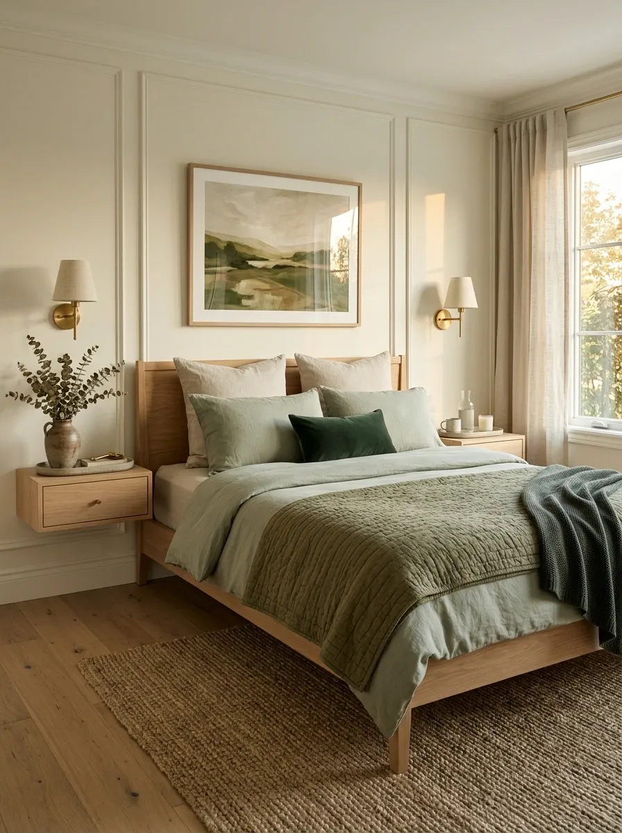
A single green shade can look surprisingly flat once it’s spread across a large bed.
Layering solves that without adding clutter. Start with a quiet neutral base, bring in a soft green duvet or quilt, then add a deeper green cushion or folded throw at the foot. The shades should shift gradually rather than jump from pale mint to nearly black.
The bed becomes richer because each layer has a slightly different depth.
Simple bed formula:
- Neutral base
- Soft green main layer
- Mid-tone green accent
- Deep green detail
Keep the darkest shade small. That’s what makes it feel like an accent instead of a heavy block of color.
Choose Eucalyptus Green for a Calm, Airy Bedroom
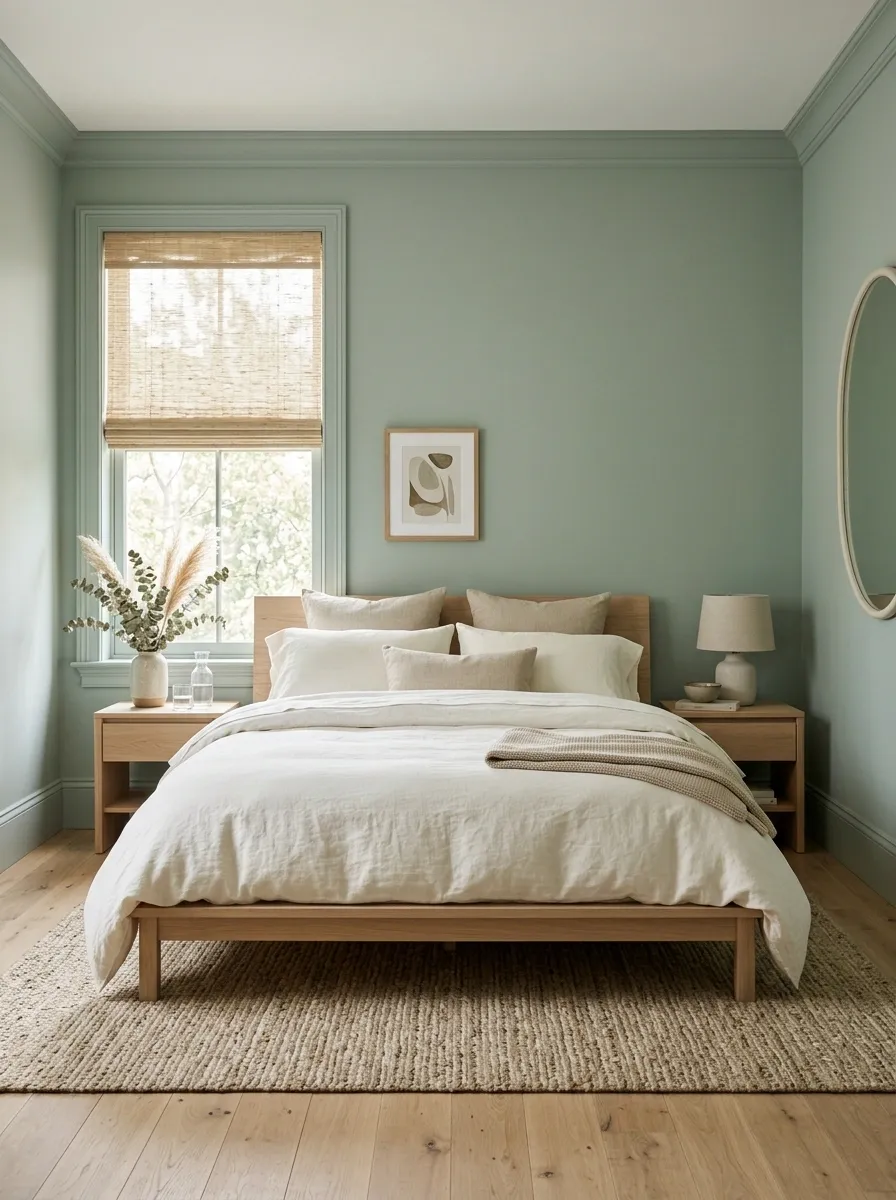
Eucalyptus green is the answer when a room needs color without losing its light feel.
It sits comfortably between gray, sage, and soft blue-green, which makes it easy to pair with creamy whites and pale timber. Use it on the walls, then let natural materials keep the room from becoming too cool.
A pale oak nightstand, cotton bedding, and a simple woven shade are enough to finish the palette.
There’s no need for a collection of matching green accessories. The wall already handles the color work.
Contrast a Green Wall With Dark Wood
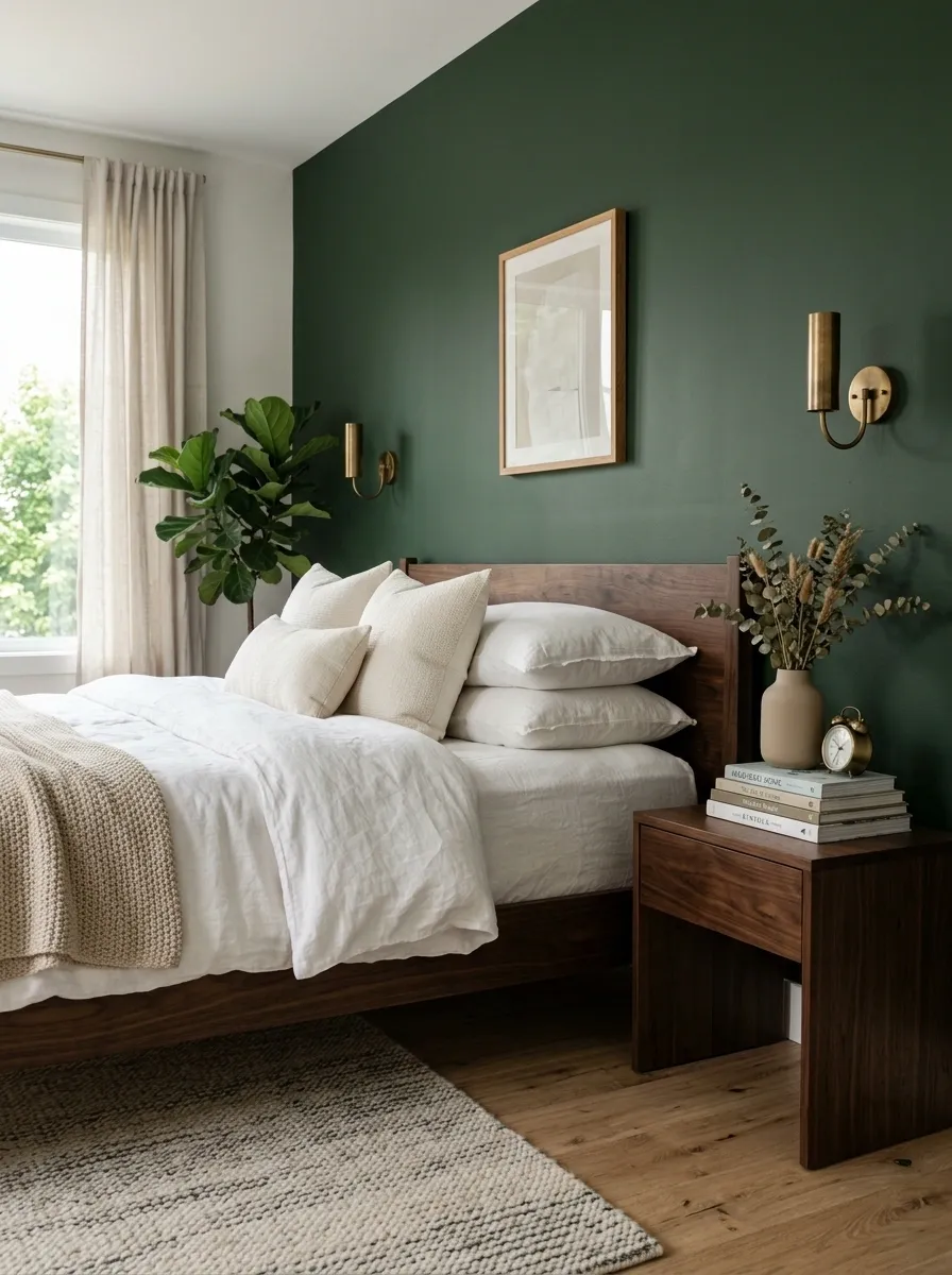
Green and wood aren’t automatically a match. The depth of the wood matters.
Against a light or medium green wall, dark wood adds enough weight to make the wall color feel richer. A deep walnut nightstand or dark-stained bed frame works particularly well because the contrast is clear without introducing another bright color.
Keep the floor slightly lighter when possible. That creates a visual middle ground between the dark furniture and the green wall.
| Green wall | Wood choice | Overall effect |
|---|---|---|
| Pale sage | Medium walnut | Warm and balanced |
| Dusty olive | Dark walnut | Rich and grounded |
| Muted eucalyptus | Deep brown | Crisp contrast |
| Forest green | Dark wood | Dramatic, so use more cream |
The darker the green, the more important lighter bedding becomes.
Use Green Artwork Instead of More Green Furniture
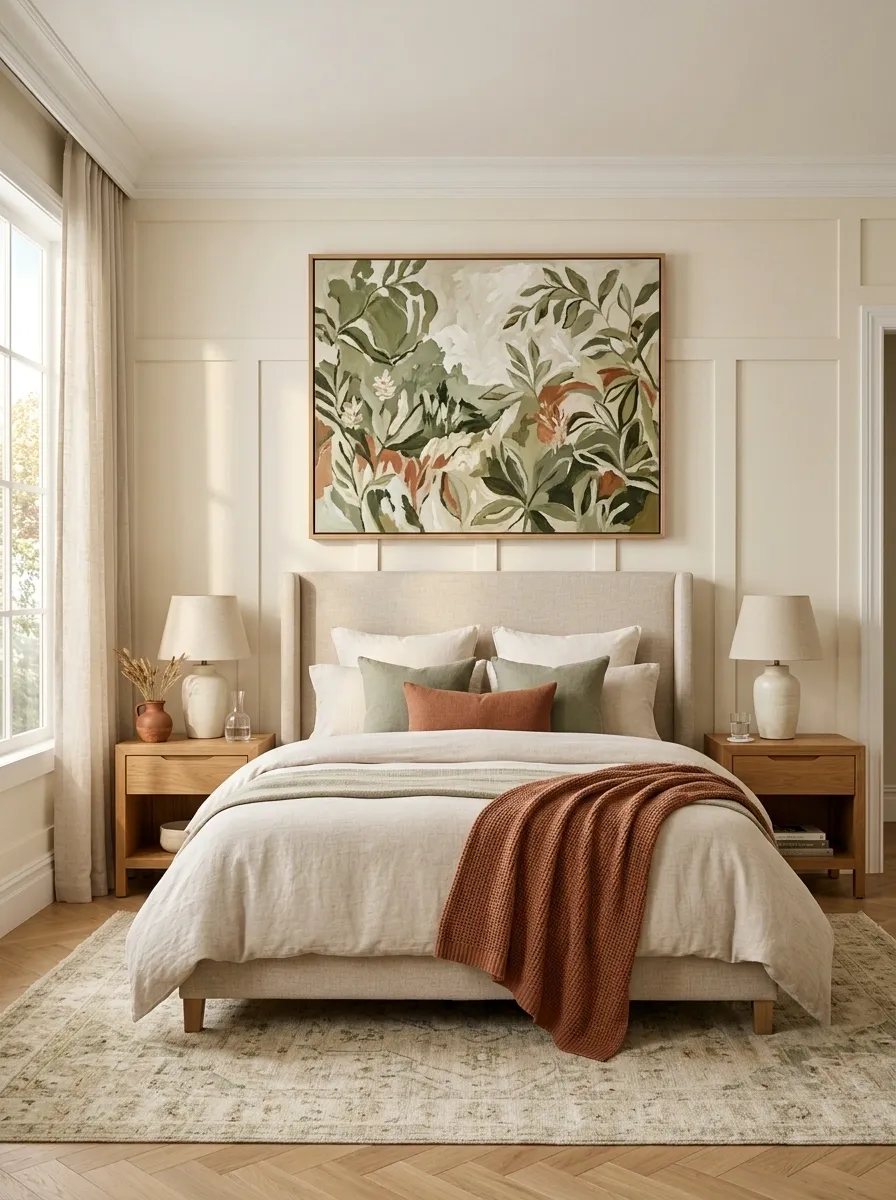
Sometimes the room already has enough green.
A better move is to introduce the color on the wall through artwork rather than adding another green chair, bench, or cabinet. This keeps the room visually varied while still repeating the main color.
Choose artwork where green appears as part of a larger composition. Abstract landscapes, botanical sketches, architectural prints, or muted painted forms all work.
Then repeat one tiny supporting color from the artwork somewhere else, such as the throw or bedside ceramic.
The artwork connects the palette. It doesn’t need to match the bedding.
Bring Green Into a Neutral Bedroom Through One Large Rug
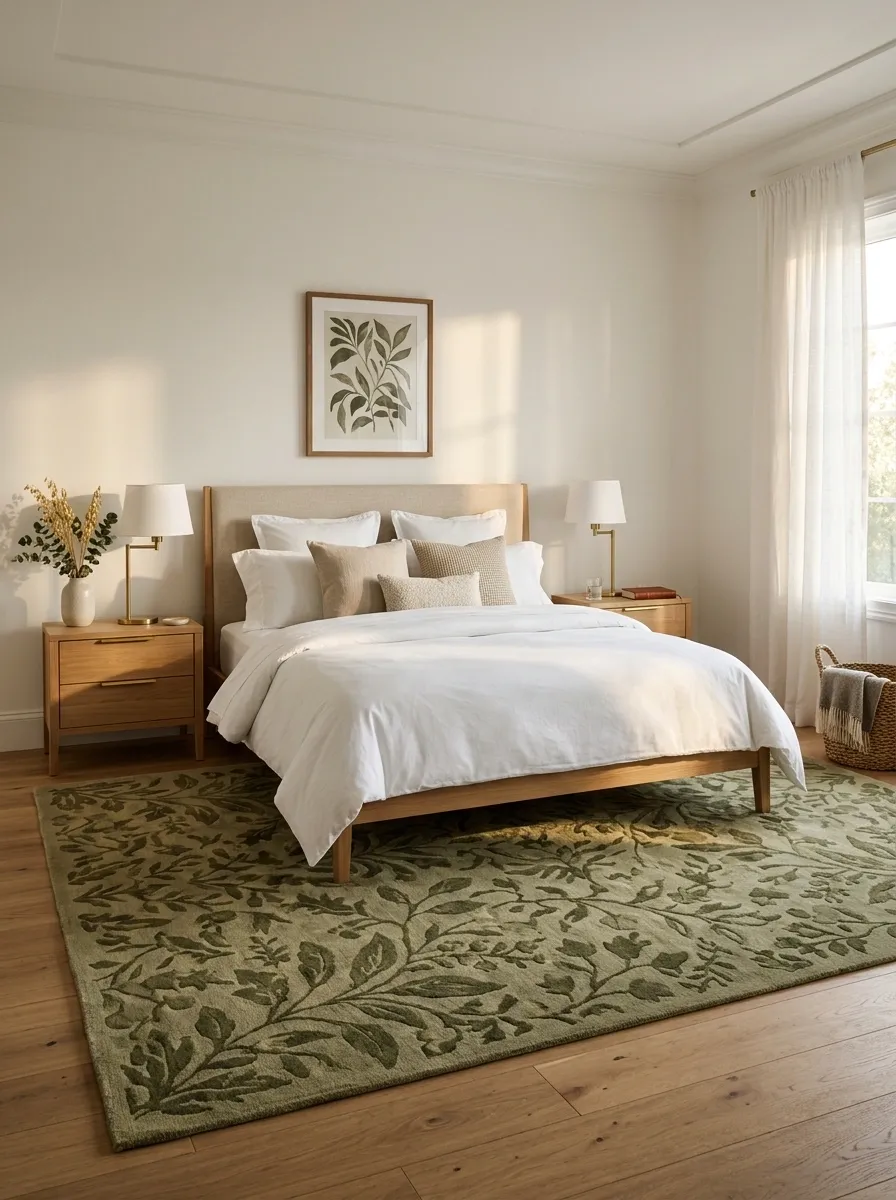
A green rug works when the walls don’t need another color.
Go large enough for the rug to connect the bed, nightstands, and surrounding floor. A small green rectangle floating underneath the bed looks accidental. A larger rug creates an actual zone.
Look for muted olive, moss, or faded botanical tones rather than a bright solid green. The rug can carry more pattern because everything above it can stay quiet.
Check the undertone before buying. A yellow-green rug needs warmer furniture. A blue-green rug sits more comfortably with cooler neutrals.
Try a Deep Olive Bedroom With Cream Textiles
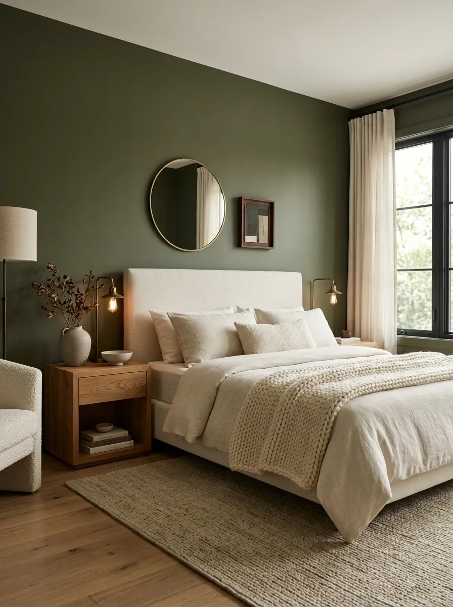
Deep olive looks expensive when the rest of the room knows when to stay quiet.
Cover the walls in a rich, muted olive, then use cream textiles to break up the depth. A chunky cream throw, upholstered headboard, or full linen duvet gives the eye a lighter surface while preserving the dramatic wall color.
Warm wood works better here than bright white furniture. The room needs some earthy weight to connect with the olive.
Keep decorative objects sparse. Deep color already creates plenty of visual interest.
Best combination: deep olive, warm cream, natural wood, aged metal, soft warm light.
Use Green on Built-Ins for a Custom Look
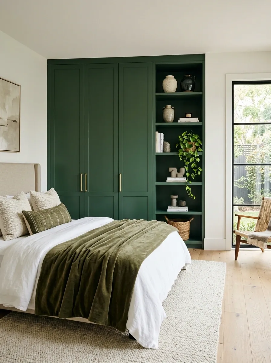
Built-ins already read as part of the architecture, so they’re an excellent place to put a stronger green.
Paint a wardrobe wall, shelving unit, or recessed storage in a deeper green while keeping the surrounding walls quieter. The color then feels intentional instead of looking like another decorative layer added to the room.
This works especially well with simple hardware. Brushed brass, aged bronze, or even plain black pulls can give the cabinetry a finished look without competing with the paint.
Best move: use the same green across connected doors, shelves, and panels so the storage reads as one large composition.
Add Green Lampshades for a Smaller Commitment
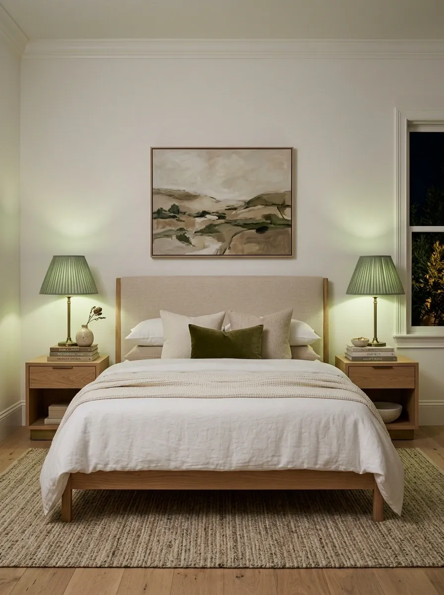
A room doesn’t need green walls to feel distinctly green.
Green lampshades are a smarter choice when the space already has a strong wall color, rental restrictions, or furniture that shouldn’t be repainted. The color sits at eye level and becomes especially noticeable once the lamps are switched on.
Choose a shade that relates to the room’s existing green rather than introducing a completely different hue.
Keep the lamp bases quiet. Black, aged brass, ceramic, or natural wood lets the shade do the visual work.
Small change, clear payoff: the green appears twice each night, once as an object and again as a warm pool of light.
Make Pale Green Work With Black Accents
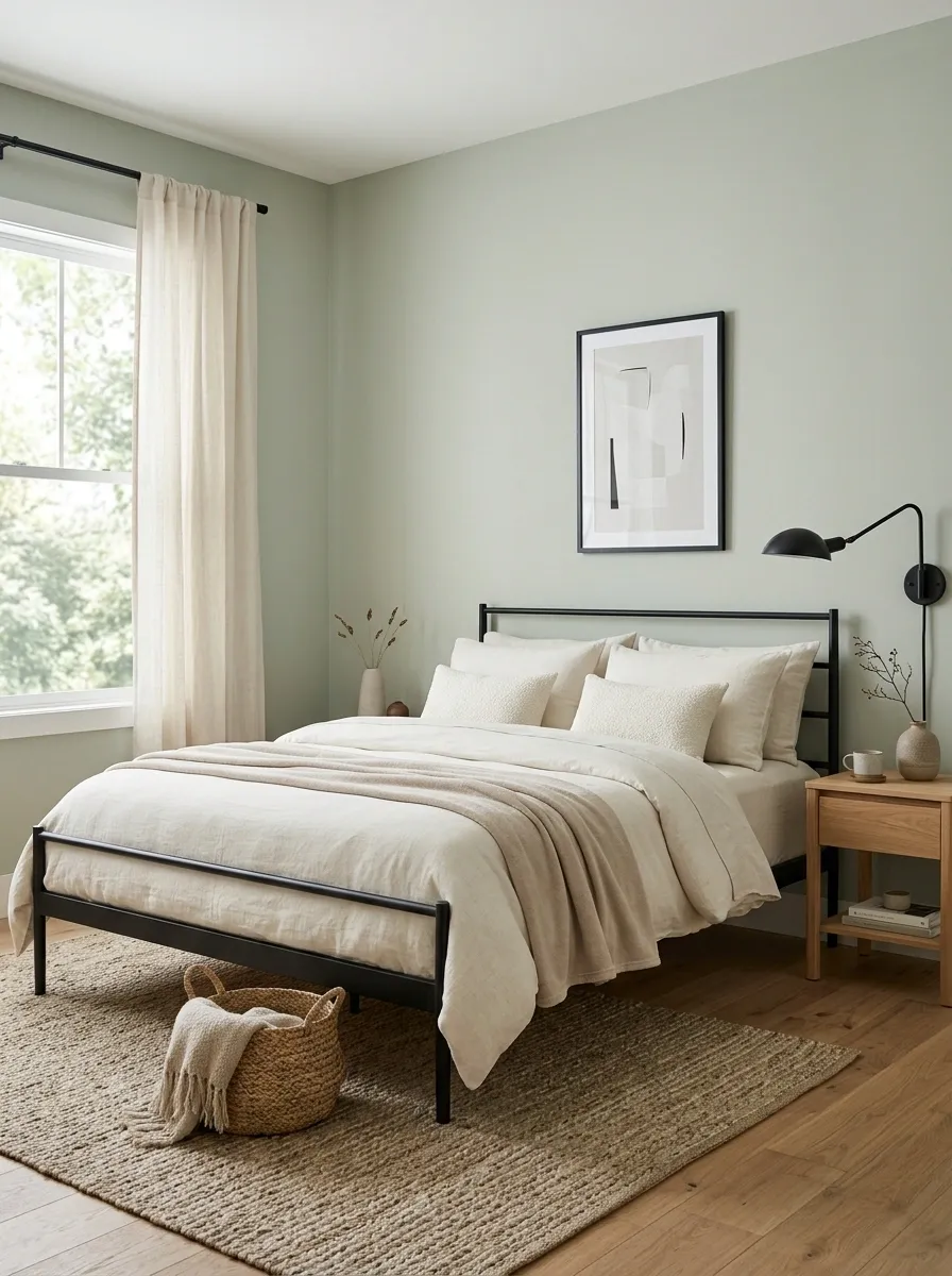
Pale green and black create a clean contrast, but the black needs a job.
Use it to define edges: a slim picture frame, a curtain rod, a bedside sconce, or a simple bed frame. Those dark lines give pale green enough structure to avoid looking washed out.
Don’t scatter black objects around the entire room. Pick two or three connected elements and repeat them.
A pale green wall, black metal bed, cream bedding, and natural wood already create enough variation. More black would only make the scheme harsher.
Think outlines, not blocks. Black works best here when it draws the room rather than fills it.
Create a Layered Green Bedroom With One Dark Anchor
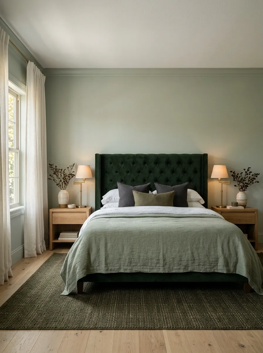
The strongest green bedrooms usually have one element that sits noticeably deeper than everything around it.
That anchor might be a forest-green headboard, dark olive rug, deep green curtains, or a single painted wall. The surrounding greens can stay lighter and quieter.
This gives the eye somewhere to land.
A room filled with equal-strength greens doesn’t have a clear focal point. A layered room with one deep anchor feels more intentional because the colors have a hierarchy.
Use the darkest green once, then let the rest of the palette breathe.
Finish With Green Details That Tie the Room Together
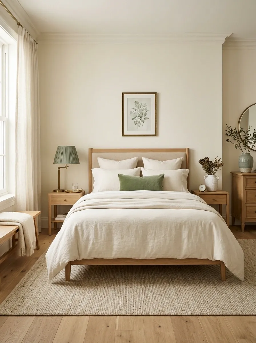
The final layer shouldn’t introduce another idea. It should make the existing palette feel intentional.
Look around the room and find where the green already appears. Then repeat that color in two or three small places that are visually separated, such as a cushion near the bed, artwork across the room, and a ceramic piece on the dresser.
Don’t buy more simply because the room still feels unfinished. Remove anything that doesn’t support the main color story first.
A finished bedroom has repetition, contrast, texture, and breathing room. That’s what makes the green feel built into the room instead of sprinkled across it.
Final Take
A green bedroom doesn’t need more decoration. It needs better relationships between the things already in it.
The wall color should make sense beside the wood. The bedding should give the eye somewhere to rest. Darker greens should have a clear purpose instead of appearing on every available surface. Even the smallest choices, such as a lamp shade or framed print, should connect back to the main palette.