
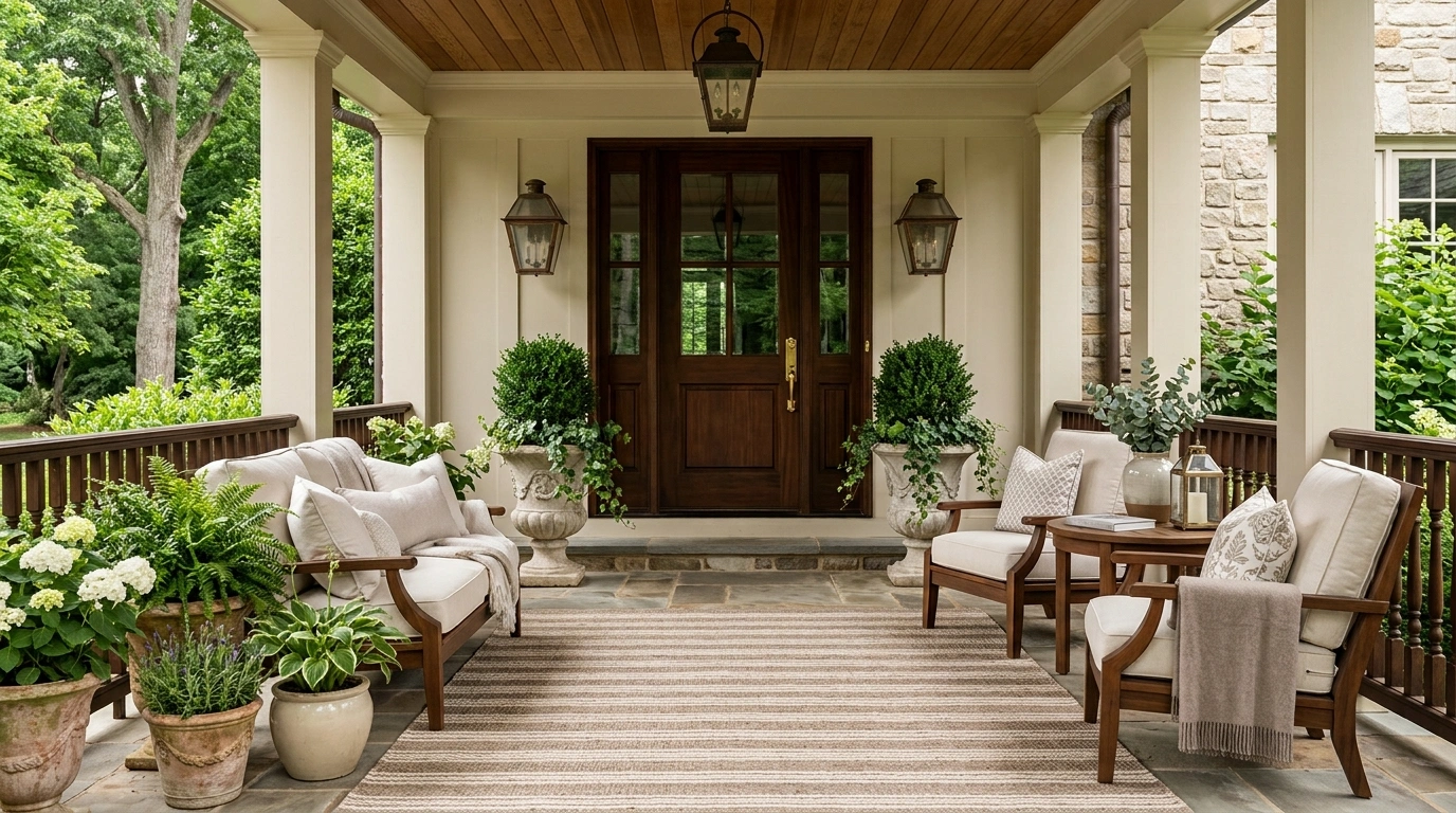
A porch doesn’t look elegant because it has more stuff on it. In fact, that’s usually the problem.
A few undersized planters, a crowded doormat, too many cushions, and furniture squeezed into every corner can make a porch feel strangely unfinished even when you’ve spent plenty of money on it. The eye has nowhere to settle, and the entrance loses its sense of structure.
The fix is much simpler than another shopping trip. Good porch design comes down to proportion, repetition, and restraint. The door should feel important. The furniture should fit the space. The materials should relate to one another, and there should be enough empty floor for the whole arrangement to breathe.
Why Some Porches Look Elegant While Others Look Overdecorated
Elegance Starts With Proportion, Not Accessories
The first thing to check is scale. A wide porch can handle a deep sofa, substantial planters, and a larger light fixture. A narrow stoop can’t.
When furniture is too small, the porch looks sparse. When accessories are too small, they create visual noise instead of making the space feel finished.
Start with the largest architectural features. Measure the usable floor area, note the door width, and identify the walking path before shopping. Your decor should support those features rather than compete with them.
The Biggest Mistake Is Filling Every Empty Spot
Empty space isn’t wasted space. It gives the eye somewhere to rest and makes the pieces you chose look more deliberate.
A porch needs room for people to walk, open the door, carry groceries, and sit without bumping into a planter. That’s why three well-placed objects often look stronger than ten scattered ones.
Keep the center of the porch open when possible. Put your strongest decorative pieces near the entry, seating zone, or edges where they can frame the space without blocking it.
Choose A Few Materials And Repeat Them
A porch looks connected when its materials speak the same visual language. Natural wood can appear in a chair and a small table. Black metal can repeat in a lantern and planter frame. Woven texture can link a rug with a cushion.
Don’t introduce a new finish every time you add something.
Pick two or three main materials, then repeat them. That simple rule makes separate purchases look like they were chosen together.
Now let’s get into the specific moves that make the biggest difference.
Elegant Porch Decor Ideas
Integrate Nature With Clean Modern Hardscaping
A contemporary porch looks its absolute best when the architectural lines are softened by organic textures right at the threshold.
Keep the approach engaging by pairing crisp white stepping stones with warm wood decking and sleek planters. A small, minimalist water feature adds a touch of movement without cluttering the clean aesthetic of the entrance.
The secret is restraint. Let the natural materials do the talking while keeping the layout entirely open and uncluttered.
Frame the Front Door With Matching Tall Planters
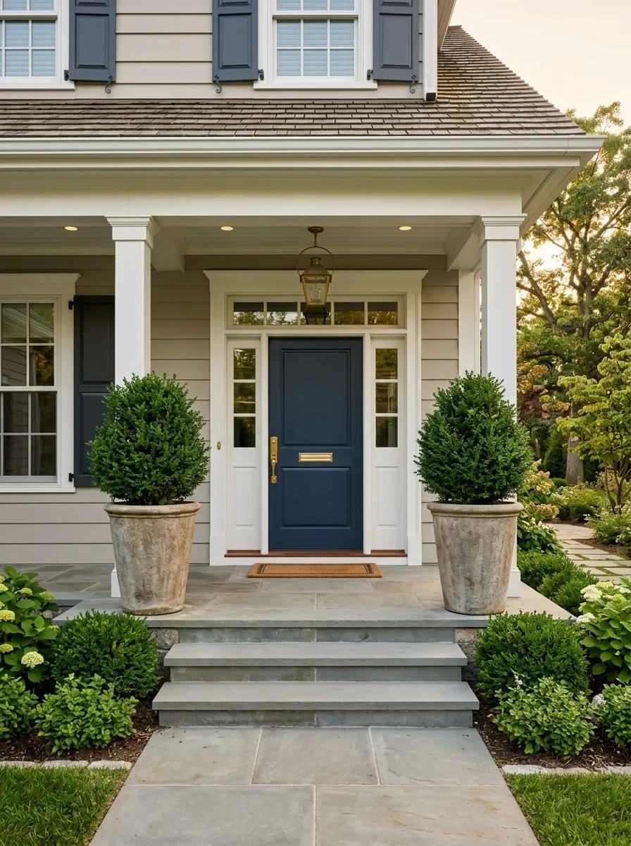
The fastest way to give a front entrance more presence is to work with the door instead of decorating around it.
Place two tall planters on either side of the entrance, keeping them close enough to frame the door without narrowing the walkway. Choose containers with a substantial shape and plants that won’t disappear against the architecture.
Matching planters create instant order. Keep the plant style simple rather than mixing several varieties.
Best placement: Keep both containers visually aligned with the door edges.
Layer Warm Lighting and Seasonal Textures
Transitioning your entryway for cooler weather relies entirely on rich textures and a warm, glowing ambiance that welcomes visitors from the street.
Cluster oversized lanterns of varying heights beside woven baskets filled with ornamental grasses and neutral pumpkins. The rich black door acts as a striking backdrop, making the natural beige tones pop without feeling overly decorated or frantic.
Stick to a cohesive, earthy palette. That keeps the arrangement sophisticated and ensures the entrance feels inviting rather than chaotic.
Use a Narrow Console to Give the Entry More Structure
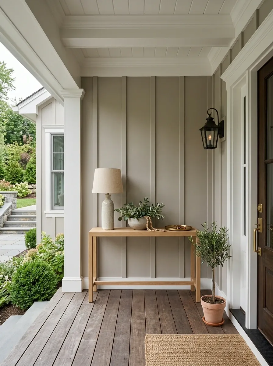
A slim console turns a blank porch wall into a useful visual anchor.
Choose one that’s shallow enough to leave the walkway comfortable. Then keep the styling restrained: one lamp, one low arrangement, and perhaps a small tray for keys if the area is covered.
Don’t fill every inch of the top.
Quick setup
- Center the console on the wall.
- Leave clear space beside the door swing.
- Use objects at different heights.
- Keep the surface easy to wipe down.
This works especially well on covered porches where a full seating arrangement would crowd the entrance.
Create a Romantic Soft Pink Haven
A pastel front door instantly sets a charming, cheerful tone that feels both whimsical and remarkably polished when styled with intention.
Frame the entrance with an abundant floral garland that mirrors the soft pink hue of the door. Add matching petite seating and delicate floral accents to tie the entire pastel palette together seamlessly without overwhelming the porch.
Proportion is everything here. Keep the surrounding decor airy and light so the charming color choice remains the undisputed star of the space.
Build a Seating Area Around One Properly Sized Sofa
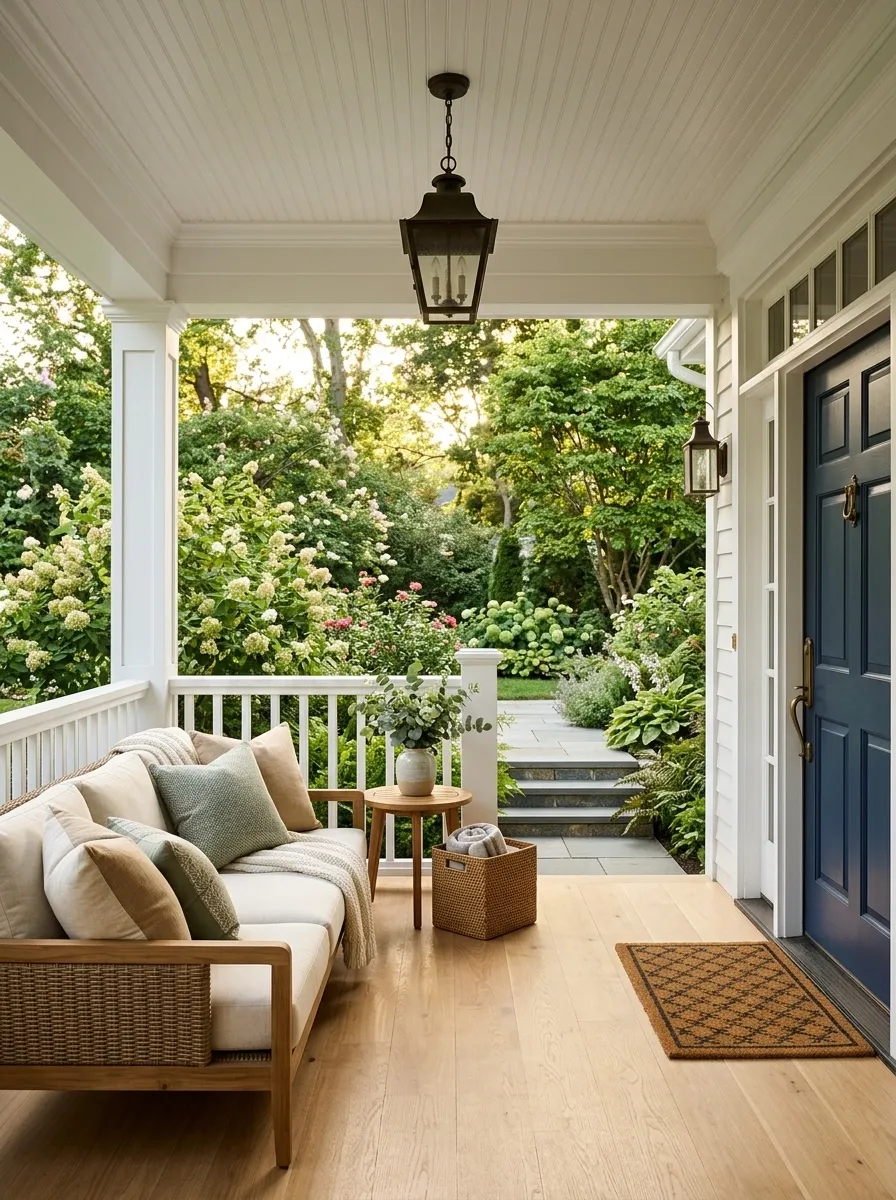
A sofa gives a porch more visual weight than a collection of small chairs, and that’s exactly why it works.
Set the sofa where it can face the garden, street, or another seating piece without interrupting the main route to the door. Add a compact table within easy reach. Then use cushions to soften the arrangement rather than adding more furniture.
The key is proportion. A tiny sofa on a deep porch looks lost, while an oversized one can make a narrow porch feel blocked.
The finished arrangement should have one clear purpose: sit, relax, and talk.
Ground the Space With a Bold Patterned Rug
A high-contrast outdoor rug instantly defines a sprawling porch, anchoring the seating area and adding a layer of tailored sophistication.
Pair dark wicker armchairs with crisp neutral cushions, allowing the bold geometric floor covering to provide the main visual statement. Lush potted greenery along the perimeter bridges the gap between the dark structural columns and the lively flooring.
Keep the accessories minimal. When a rug carries this much graphic weight, the rest of the porch can afford to keep things delightfully simple.
Choose Cushions in One Quiet Color Family
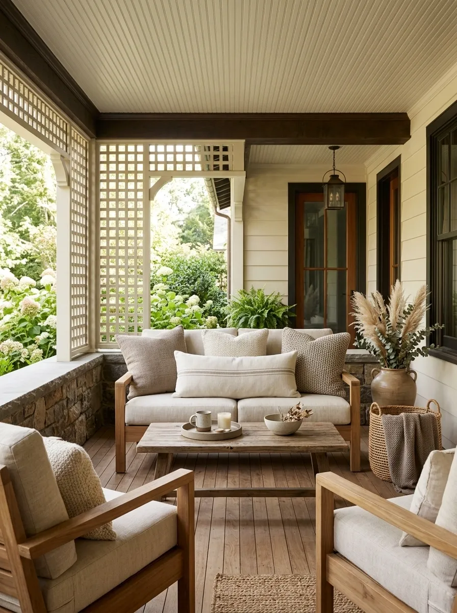
Cushions shouldn’t become the loudest thing on an elegant porch.
Pick one color family and vary the texture instead. Cream with warm beige works beautifully with wood. Olive and muted sage sit naturally beside greenery. Soft charcoal works when the porch already has darker architectural details.
Mix solids with one subtle pattern, but keep the colors related.
Simple rule: change the texture before you change the color.
That keeps the seating interesting while stopping the porch from looking like an indoor room that happened to be moved outside.
| Base | Texture | Pattern |
|---|---|---|
| Warm cream | Woven linen | Small taupe stripe |
| Soft beige | Textured cotton | Muted botanical |
| Sage green | Chunky weave | Narrow neutral stripe |
Hang an Oversized Lantern Where the Porch Can Carry It
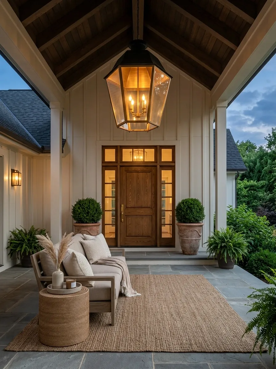
A small light fixture gets visually swallowed on a wide porch. A larger lantern gives the ceiling or entry zone enough presence to feel intentional.
Hang it over the main seating area or near the front door, depending on the porch layout. The fixture should feel substantial without forcing people to duck underneath it.
Warm-toned bulbs keep the evening light comfortable and help wood, stone, and neutral fabrics look richer.
Don’t crowd the ceiling with several unrelated fixtures. Let one strong light do the visual work.
Best rule: choose the fixture after you understand the scale of the porch, not before.
Add a Small Outdoor Rug That Anchors the Entry
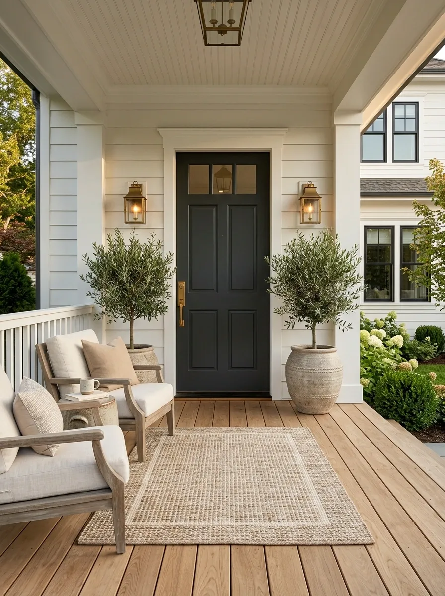
A bare porch floor can make even good furniture look disconnected. A rug fixes that by giving the entry a visual boundary.
Choose an outdoor rug that sits comfortably under the front door area without becoming a tripping hazard. Keep the pattern restrained if the door or siding already has strong detail.
Use this quick check before buying:
- The rug shouldn’t interfere with the door swing.
- The edges should stay clear of the main walking route.
- The pattern should support, not fight, the furniture.
A simple woven texture usually looks more refined than a busy print.
Repeat Black Metal in Three Small Places
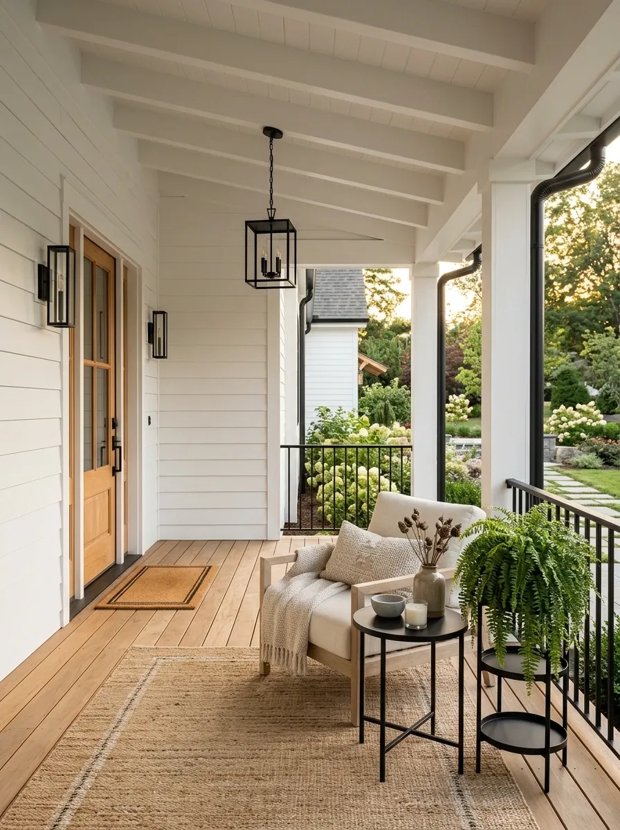
Black metal looks intentional when it appears more than once. The mistake is using it on every surface.
Pick three places, then stop. A lantern, a small side table, and a planter stand are enough to connect the porch without making it feel heavy.
The repetition matters more than the size of each object.
A clean trio could be:
- Black lantern
- Slim metal table
- Dark planter frame
Keep the shapes related, too. Rounded metal paired with severe square forms can make the mix feel accidental.
Light
Table
Stand
Swap Tiny Chairs for One Statement Rocking Chair
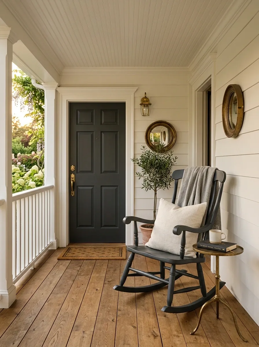
Two little chairs can make a porch look busier than it needs to be.
A single rocking chair gives you a clearer focal point, especially on a narrow porch where paired seating leaves awkward gaps.
Choose one with a substantial frame, then place it where someone can actually use it. A cushion and one small side table are enough.
The difference is simple:
| Small-chair setup | Statement-chair setup |
|---|---|
| Several visual breaks | One clear focal point |
| More furniture to arrange | Easier to keep edited |
| Can crowd narrow porches | Leaves more breathing room |
This is particularly strong beside a front door or at the far end of a long covered porch.
Use a Bench Under the Windows Instead of Against the Door
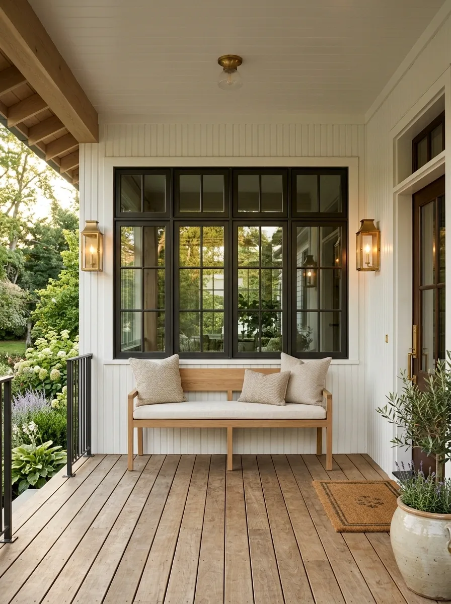
A bench is useful when its placement follows the architecture.
Set it beneath a window or along a solid wall where it won’t interrupt the entry. That gives the porch a seating destination while keeping the door area open and visually calm.
Keep the bench relatively simple. One seat cushion and perhaps two pillows are enough.
Placement rule: the bench should read as part of the wall, not as an obstacle placed in the walkway.
This move works especially well on long porches with large windows because it fills an otherwise awkward stretch without creating another bulky furniture zone.
Bring in One Large Plant Instead of Several Small Pots
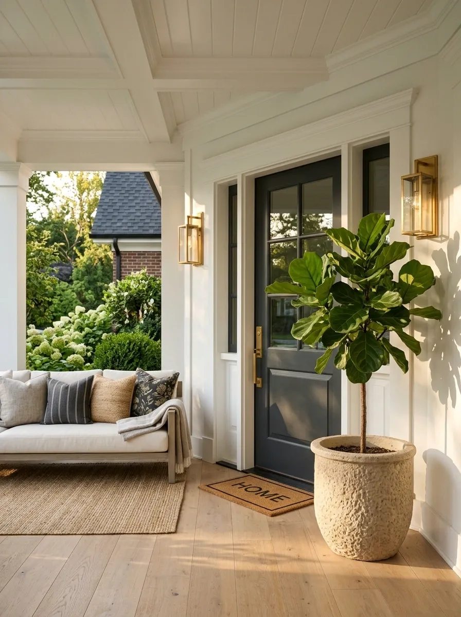
A cluster of tiny pots rarely looks intentional. One large plant has the visual weight an elegant porch needs.
Choose a container that can hold its own beside the door, sofa, or windows. A tall leafy plant works well in a sheltered corner, while a fuller floor plant can soften a hard architectural edge.
The container matters just as much as the greenery. A substantial ceramic, stone, or textured planter makes the plant look like part of the design instead of an afterthought.
Think scale first: one strong plant should be easy to notice from the walkway.
Keep Throw Blankets Folded and Contained
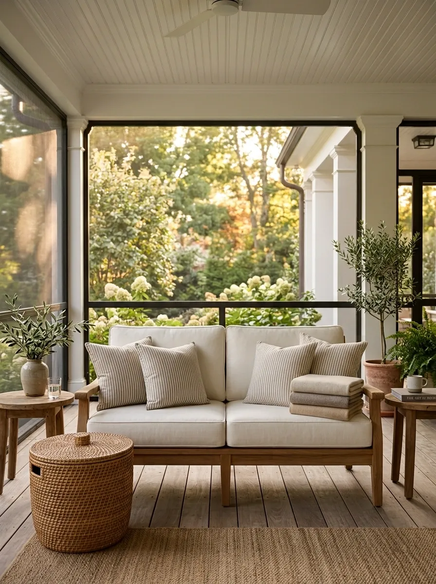
A blanket tossed over a chair can look casual in a living room. Outdoors, it can quickly look messy.
Keep one blanket neatly folded over the arm of a sofa or inside a covered storage basket nearby. Pick a solid color or quiet stripe that connects with the cushions.
Don’t drape several blankets over every seat.
The simple formula:
- One blanket
- One visible fold
- One useful location
That small restraint makes the porch feel maintained without making it feel staged. It’s especially useful on cooler evenings when you want comfort without leaving textiles scattered around.
- Fold one blanket neatly before placing it.
- Use a color already present in the seating.
- Store extras out of sight instead of stacking them on furniture.
Use Natural Wood to Warm Up a Pale Porch
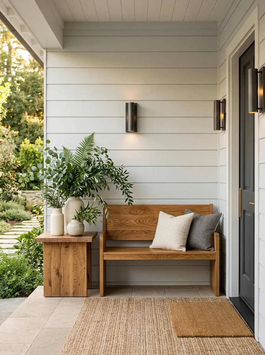
White, cream, and light gray porches need something with visual warmth. Natural wood does that without forcing you to add stronger colors.
Bring it in through a bench, side table, rocking chair, or simple wall shelf. Let the grain remain visible. Painted wood can work too, but raw or lightly finished tones give pale surfaces more depth.
The strongest combinations are usually simple: pale walls, medium wood, dark metal, and greenery.
Give the Door Hardware a Stronger Finish
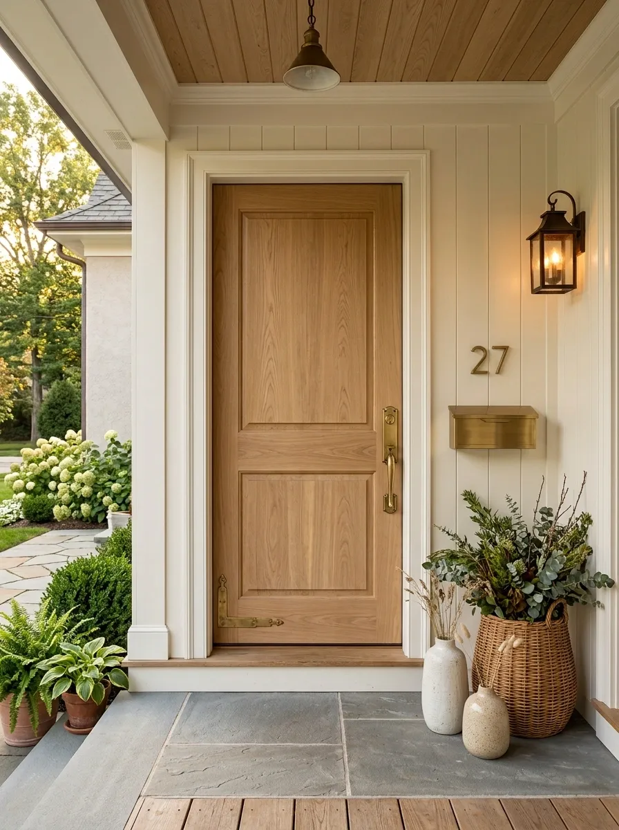
Sometimes the porch doesn’t need more decor. It needs a better detail at eye level.
Upgrade the door hardware, house numbers, or mailbox finish so the entry has a deliberate focal point. Matte black works well with many exterior palettes, while aged brass brings warmth to traditional architecture.
Don’t mix several competing metals just because each one looks good alone.
Before buying, compare the finish with:
| Existing detail | Hardware direction |
|---|---|
| Dark light fixtures | Black or dark bronze |
| Warm wood | Aged brass |
| Pale traditional trim | Soft bronze or brass |
| Modern neutral exterior | Clean matte metal |
The entry should read as one composition, not a collection of separate purchases.
| Porch Detail | Best Direction | Why It Works |
|---|---|---|
| Dark exterior lighting | Black or dark bronze | Repeats the existing dark accent |
| Natural wood door | Aged brass | Adds warmth without adding more color |
| Minimal modern entry | Simple matte metal | Keeps the lines clean |
Create a Symmetrical Welcome With Twin Sconces or Lamps
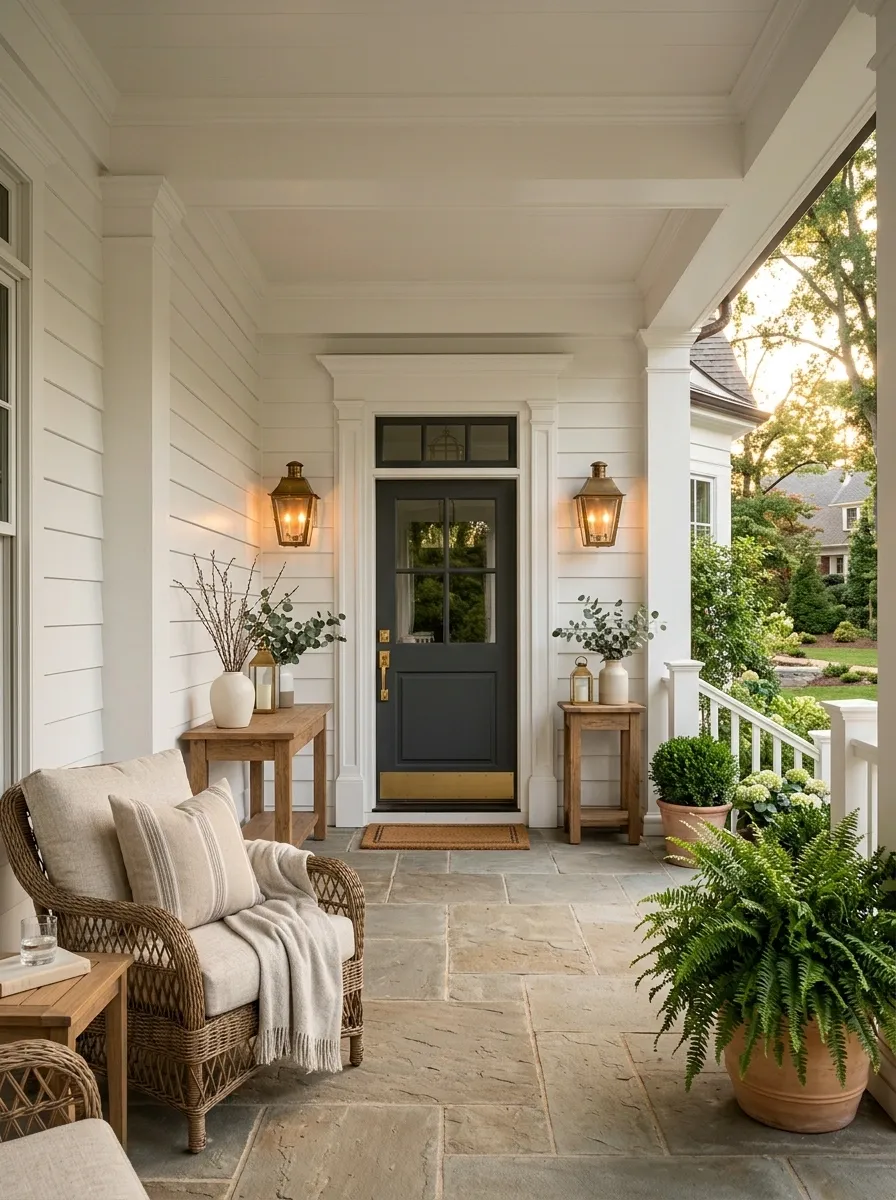
Symmetry earns its place on a front porch because the architecture usually gives you a natural centerline.
Use matching sconces beside the door, or matching lanterns on both sides of an entrance console. The repeated shapes create order immediately.
This doesn’t mean every object has to match. Keep the symmetry around the entry, then let the seating and plants become slightly more relaxed farther out.
The trick is to establish one strong center first.
Once the doorway feels balanced, the rest of the porch has much less work to do.
Choose a Door Mat With Enough Weight to Look Intentional
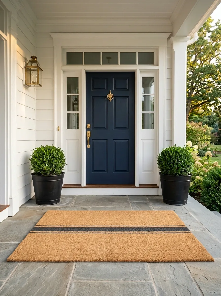
The doormat is one of the first things people see, yet it often gets treated like an afterthought.
Skip flimsy mats with tiny patterns. Choose a substantial outdoor mat that visually fills the entry without swallowing the threshold.
Natural fiber textures, restrained stripes, and simple monograms work well when the rest of the porch is calm.
Before you buy, check:
- The mat sits flat.
- The door clears it easily.
- The width feels connected to the doorway.
- The material suits the amount of outdoor exposure.
A good mat should finish the entrance, not become the main attraction.
Use One Seasonal Arrangement Instead of Seasonal Clutter
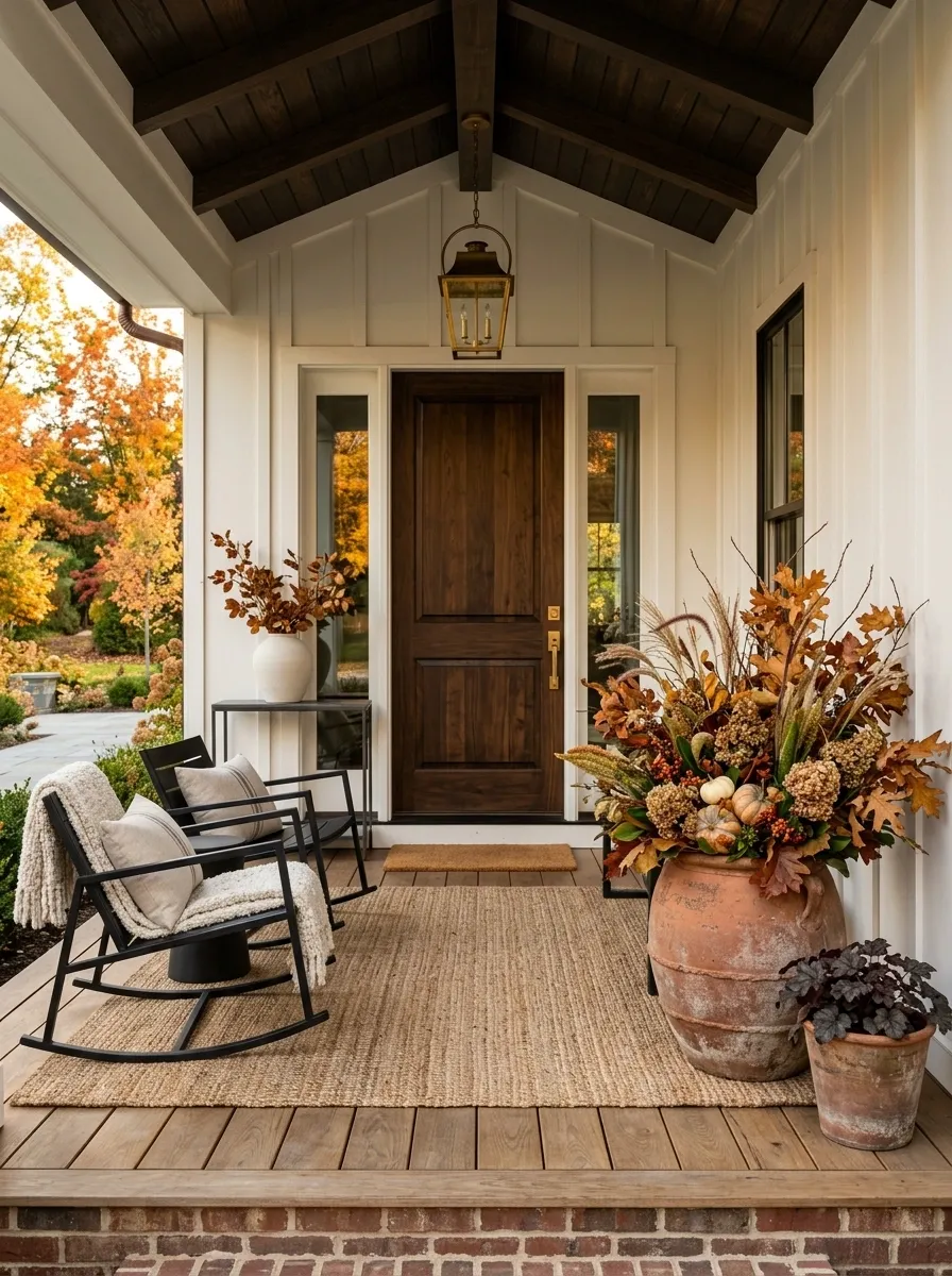
Seasonal decorating gets messy when every surface receives a new theme.
Pick one strong seasonal arrangement and give it a clear home. A large planter, a doorway basket, or a substantial wreath can carry the seasonal change without covering the entire porch in decorations.
For fall, use one fuller plant arrangement. For winter, switch to evergreen branches. For spring, bring in fresh greenery or restrained flowers.
The rest of the porch can stay exactly as it is.
The smart approach is a seasonal swap, not a seasonal overhaul.
Style the Porch Table With Three Useful Objects
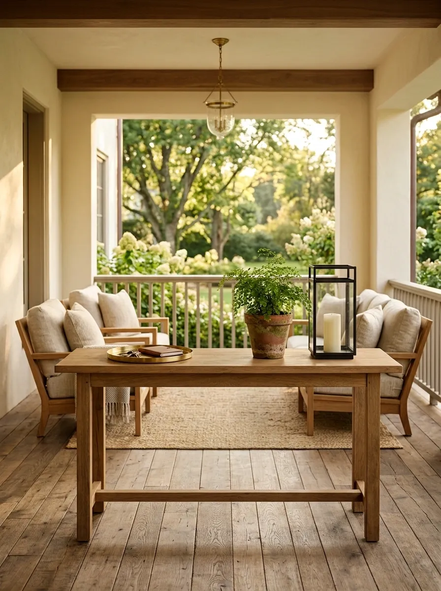
A porch table doesn’t need a decorative pile.
Keep three things on it: something useful, something natural, and one object that adds shape. A small tray, a potted plant, and a lantern are enough.
This formula keeps the surface interesting while leaving plenty of room for an actual drink or book.
The three-piece test:
- Practical
- Organic
- Sculptural
Once those jobs are filled, stop decorating the table. The empty space around them is part of the design.
- Useful: tray, coaster, or serving piece
- Organic: small plant or fresh greenery
- Shape: lantern, ceramic object, or other solid form
Bring Woven Texture Through One Strong Accent Piece
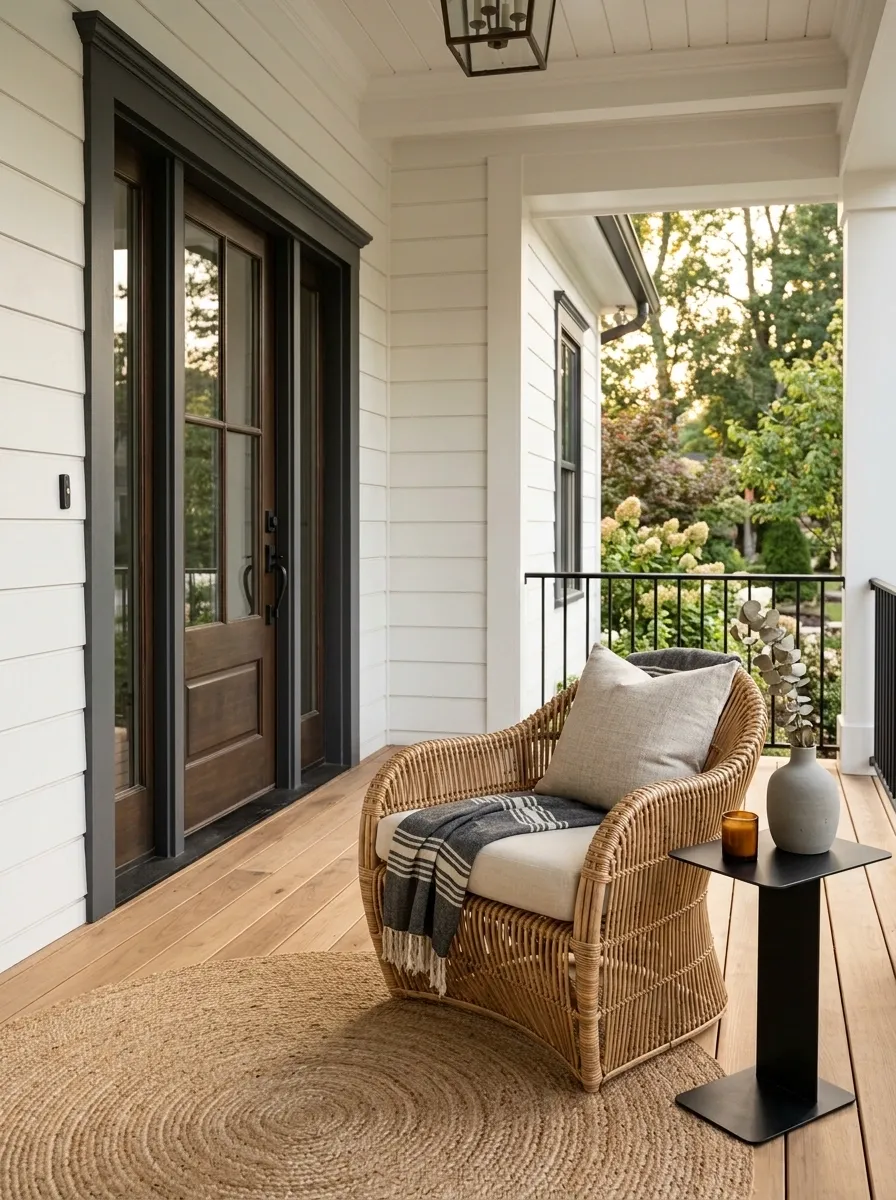
Smooth wood, metal, and painted surfaces can make a porch feel a little hard. Woven texture breaks that up immediately.
The trick is to use one substantial piece rather than scattering wicker everywhere.
Try a woven lounge chair, oversized basket, pendant shade, or textured planter cover. Let that piece carry the texture.
A single woven element gives the eye something tactile to notice without turning the porch into a matching outdoor set.
Best move: choose one woven item with a strong silhouette and keep the rest of the materials quieter.
Keep Outdoor Curtains Full and High
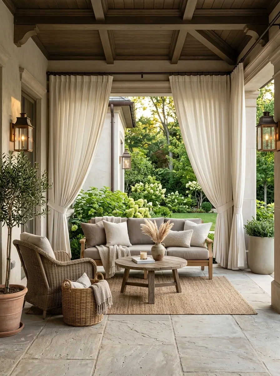
Curtains look cheap when they’re hung low and barely wide enough to cover a window.
Mount them high and let the fabric fall generously. Choose a sturdy outdoor fabric in a neutral shade, then keep the panels simple.
They work best when they frame the porch rather than block the whole view.
Before installing them, check:
- The rod extends beyond the opening.
- The panels can move fully aside.
- The hem doesn’t drag on the floor.
- The fabric can handle your porch conditions.
The result should soften the architecture, not create another focal point.
Use Stone or Ceramic Planters for a Heavier Look
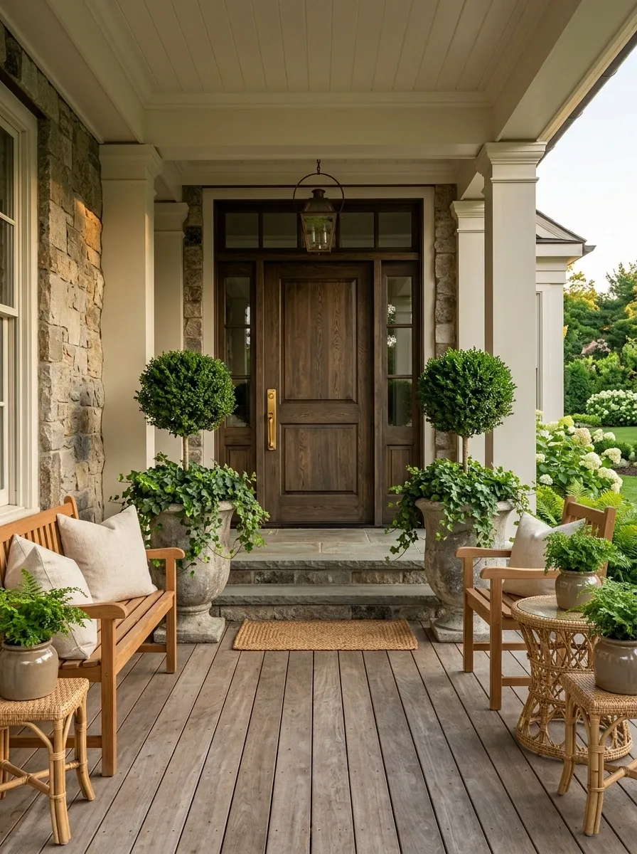
Light plastic containers often disappear beside substantial columns, steps, and masonry.
Stone and ceramic planters have more visual weight, which makes them especially useful around broad entries and large seating areas.
You don’t need several of them. One oversized planter can ground a corner. Two matching containers can frame a door.
Material comparison:
| Material | Visual effect | Best use |
|---|---|---|
| Stone | Heavy and grounded | Large entries |
| Ceramic | Refined and clean | Covered porches |
| Metal | Crisp and structured | Modern accents |
Choose the material that supports the architecture already there.
Create a Quiet Color Story With Cream, Taupe, and Green
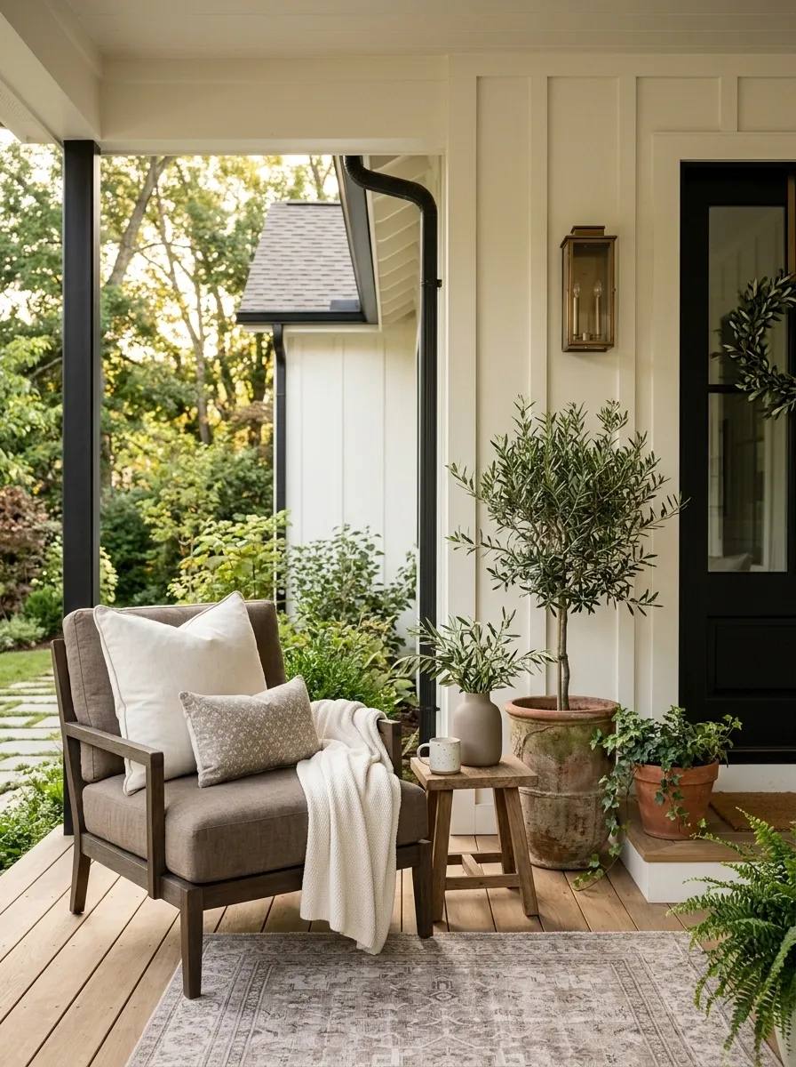
An elegant porch doesn’t need a complicated color scheme.
Cream keeps the larger surfaces light. Taupe gives the furniture and accessories enough depth. Green comes naturally from plants, so it doesn’t feel forced.
Use those colors at different visual levels rather than giving every object the same tone.
Try this balance:
- Cream for cushions or larger textiles
- Taupe for furniture, pottery, or rugs
- Green for planting and small accents
Keep black or bronze as a structural accent when the architecture needs stronger contrast.
Leave a Clear Path From the Steps to the Door
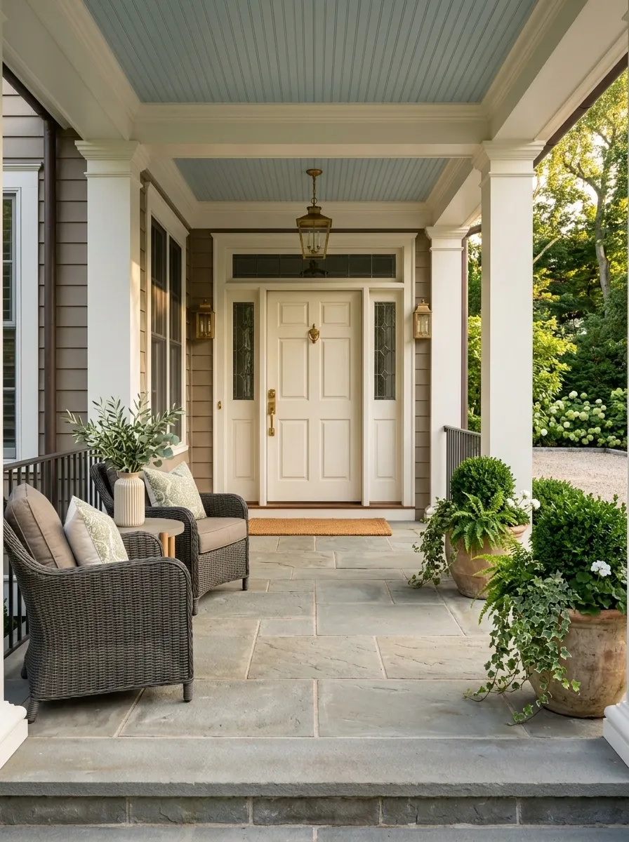
Nothing ruins a polished porch faster than furniture that makes people walk sideways.
Mark the natural route from the steps to the door first. Then place furniture and planters around that path.
This is one of those details that’s easy to ignore while decorating because everything looks fine when you’re standing still. Walk the porch with your hands full. That’s the real test.
Layout priority:
- Clear entry route
- Functional seating
- Decorative objects
- Extra accessories
The porch should still work when someone arrives carrying groceries, packages, or a bag.
Finish the Porch With One Personal Detail
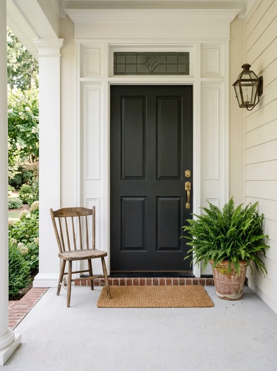
A polished porch shouldn’t feel anonymous.
Choose one detail that belongs specifically to your home. It could be a simple house number plaque, a family name sign, a favorite plant in a distinctive pot, or a small vintage chair you’ve kept for years.
The important word is one.
Personal pieces carry more weight when they’re surrounded by restraint. You don’t need a collection of signs and seasonal messages to make the entrance feel welcoming.
Pick the object with a story, then give it enough space to be noticed.
- A meaningful house number
- A favorite planter
- A small inherited or vintage piece
Pull Every Element Together With Repeated Shapes
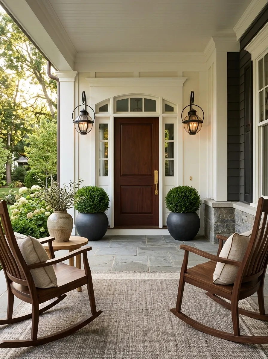
The final detail is repetition.
Look around the porch and find a shape that appears more than once. It could be rounded lanterns, square planters, curved chair backs, rectangular cushions, or arched details.
Repeat that shape in at least two other places where it makes sense.
This creates a quiet visual connection between pieces that don’t actually match.
That’s the difference between coordinated and merely decorated.
When the materials, colors, and shapes repeat with restraint, the whole porch finally reads as one design.
Conclusion
A polished porch doesn’t come from finding one magical accessory. It comes from making a series of good decisions that agree with each other.
Start at the front door. Give it enough weight to feel intentional, then build outward with furniture that fits, greenery that has scale, lighting that works after sunset, and textures that soften the hard surfaces.
Don’t fill every empty corner just because you can. Don’t keep adding color when the room already has enough. And don’t buy five small things when one substantial piece will do the job better.
The strongest porches feel settled. Nothing is fighting for attention, yet nothing feels forgotten.
Choose fewer pieces, make them count, and let the architecture do some of the decorating.