
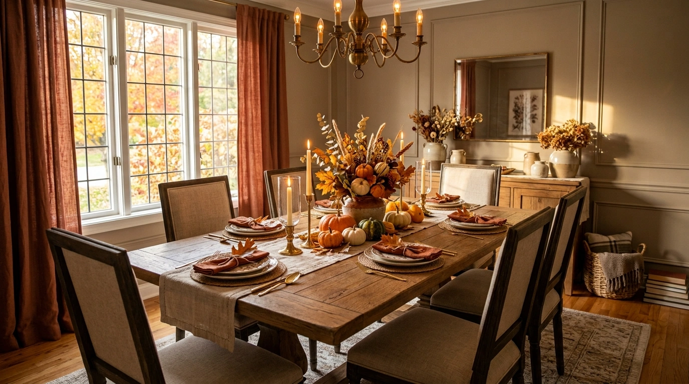
A dining table can have all the right fall ingredients and still look strangely unfinished. The problem usually isn’t a missing pumpkin, candle, or floral arrangement. It’s that the pieces were chosen one at a time without deciding how the entire table should look together.
Autumn styling works better when the table has a clear visual direction. Warm wood can set the foundation, while linens, dinnerware, glassware, foliage, candlelight, and the surrounding dining room build on that foundation. Even a simple table can feel thoughtfully designed when those relationships make sense.
The ideas below focus on complete tablescapes rather than isolated decorating tricks. Some lean traditional and harvest-inspired. Others are restrained, modern, nostalgic, earthy, or unexpectedly colorful. Each one is a finished visual direction you can save as a reference and adapt to your own dining room.
What Makes a Fall Dining Table Feel Complete?
The best autumn tables don’t depend on a pile of seasonal decorations. They have a clear hierarchy, a controlled palette, and enough empty space for the table to remain useful.
Start With the Table’s Overall Mood
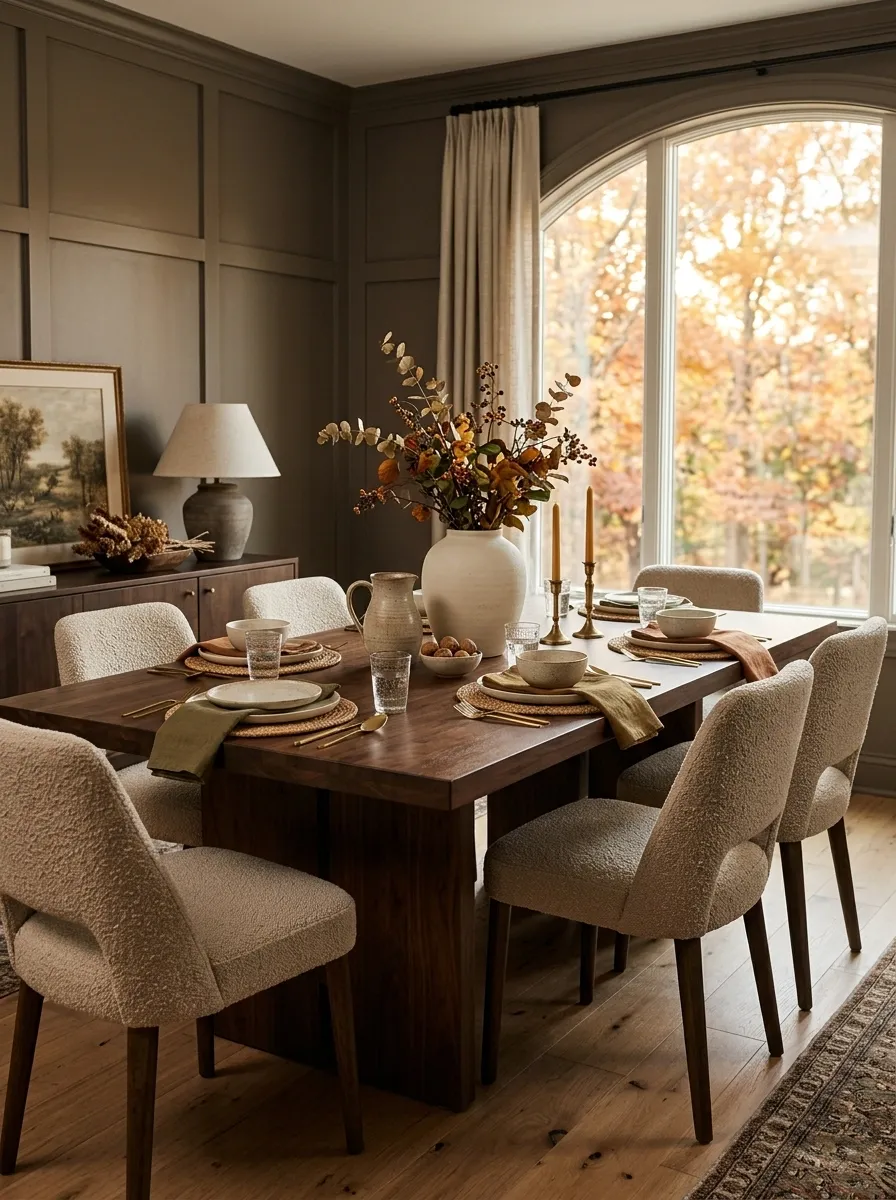
Decide whether the room calls for something rustic, traditional, modern, collected, or quietly organic. That choice affects everything from the centerpiece to the dinnerware.
A dark walnut table handles a different styling language than a pale oak table. The same is true of a formal dining room compared with a small breakfast nook.
Build Around One Visual Anchor
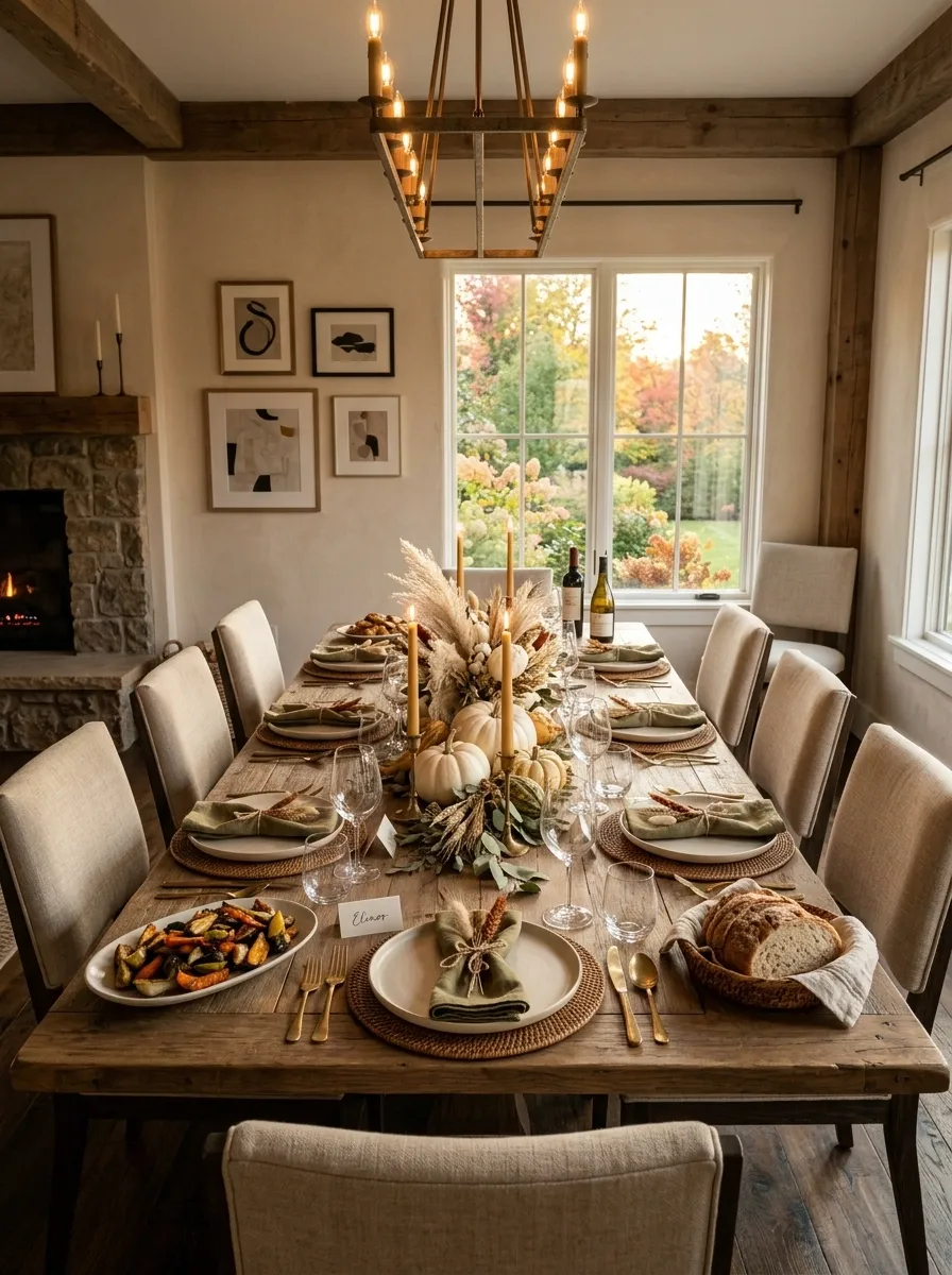
A strong table usually has one feature that establishes the composition. It might be a low floral arrangement, a row of candles, several small vessels, or a restrained harvest display.
The rest of the table should support that focal point rather than compete with it.
Let the Dining Room Join the Tablescape
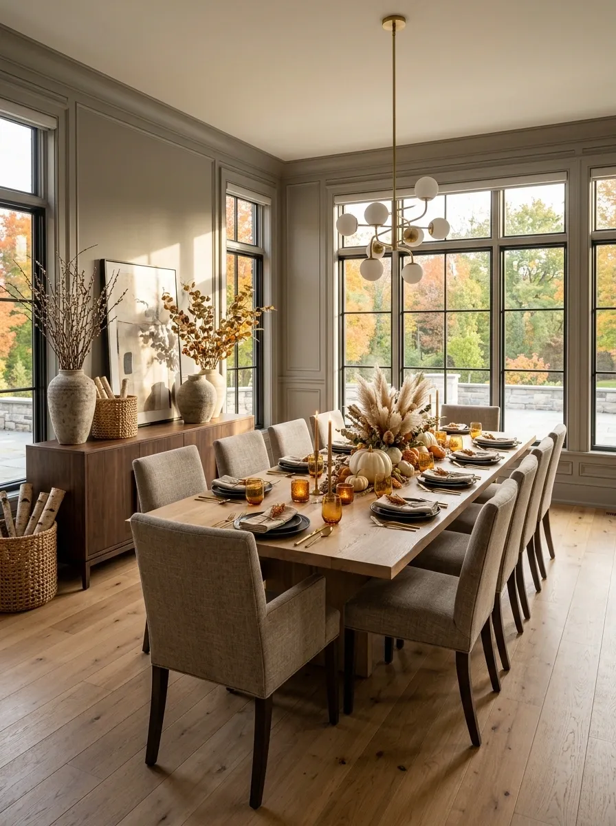
Don’t style the tabletop as though it exists in isolation.
Chair upholstery, flooring, wall color, lighting, nearby furniture, and even the amount of natural light affect how the finished arrangement reads. A table can be gorgeous on its own and still feel wrong in the room.
Fall Dining Table Decor Ideas
Amber Candlelit Table With Dried Leaves and Aged Brass
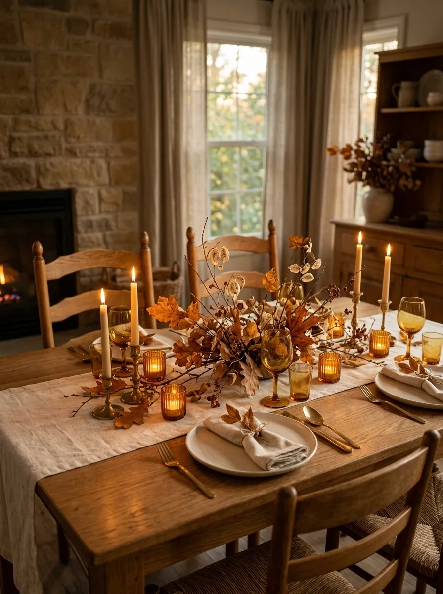
The easiest way to make this table feel distinctly autumnal is through warmth rather than a pile of seasonal objects. A medium-toned wood table carries a simple linen runner, while amber glass candleholders create pools of golden color along the center.
Ivory stoneware keeps the place settings light. Small clusters of dried leaves, seed pods, and thin branches fill in the gaps without making the centerpiece feel bulky. Aged brass candlesticks add another warm surface, but their muted finish keeps the setting from looking shiny or formal.
I’d keep the surrounding furniture relatively quiet here. The magic comes from the combination of amber, wood, cream, and brass, especially once the evening light starts doing some of the styling for you.
Organic Woodland Tablescape With Mossy Green and Natural Linen
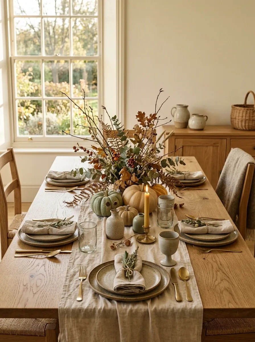
This version takes autumn in a quieter direction. Instead of orange dominating the table, the composition starts with warm oak, natural linen, stoneware, and layers of subdued greenery.
A loose arrangement of branches and foliage runs through the center in an intentionally relaxed way. Small green and tan pumpkins can sit among the stems, but they should feel like part of the natural palette rather than the main event.
The roughness of the wood and stoneware gives the table character, while linen softens the overall composition. I’d leave plenty of the tabletop visible. That exposed wood is doing as much visual work as the centerpiece.
Moody Plum and Burgundy Thanksgiving-Inspired Table
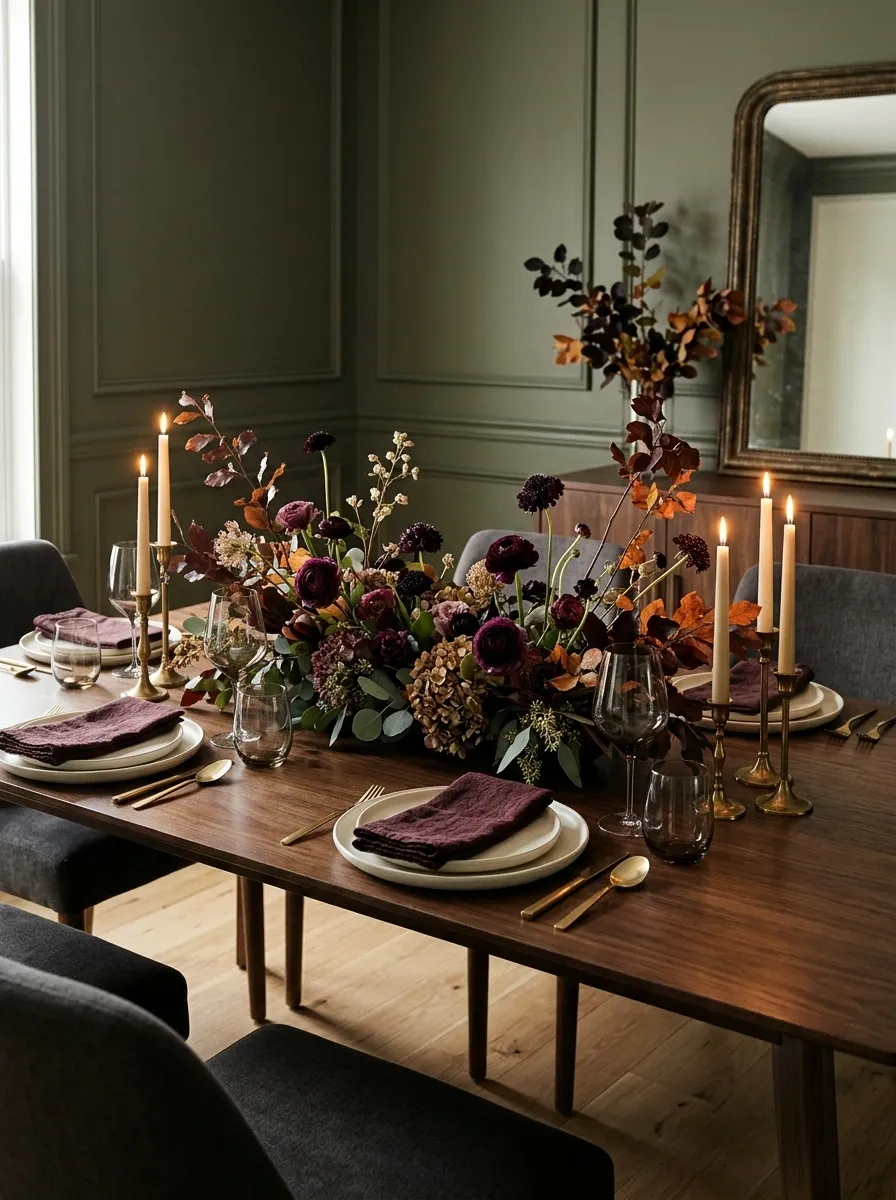
For a dining room that can handle deeper color, this composition has much more drama. Picture a walnut table beneath warm lighting, with burgundy napkins, plum-toned flowers, smoked glassware, ivory plates, and antique brass candleholders.
The centerpiece should stay low and spread outward rather than becoming one tall block in the middle. That makes the table feel abundant without interrupting conversation.
What makes the palette work is the amount of light color underneath it. Ivory ceramics and a few lighter stems keep the burgundy and plum from becoming visually heavy. I’d resist adding bright orange pumpkins here. The darker palette is the point.
Cream and Terracotta Farmhouse Table With Heirloom Details
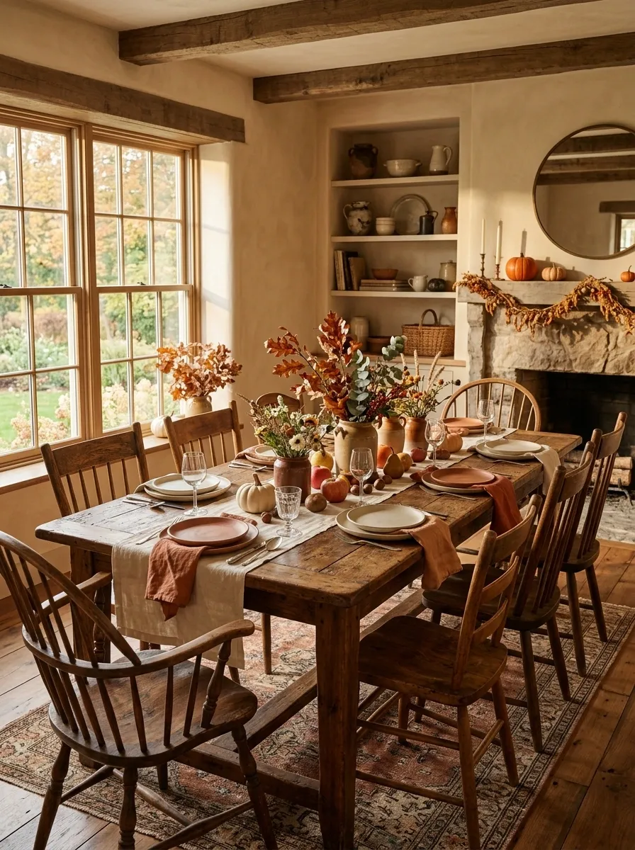
This table feels comfortable because nothing is trying too hard to look new. A substantial wood tabletop becomes the foundation for cream linens, terracotta napkins, old-fashioned serving pieces, ceramic pumpkins, and a mix of dining chairs that share a similar visual weight.
The centerpiece can stay fairly low, with a few vessels, branches, and seasonal fruit spread through the middle. That leaves the individual place settings looking connected instead of overly formal.
The strongest detail here is the contrast between simple new textiles and pieces that look as though they’ve been collected over time. Keep the palette controlled and let the mismatched elements provide the character.
Warm, substantial, slightly worn
Cream and terracotta variations
Simple linen with restrained pattern
Minimal Fall Table With Sculptural Branches and White Ceramics
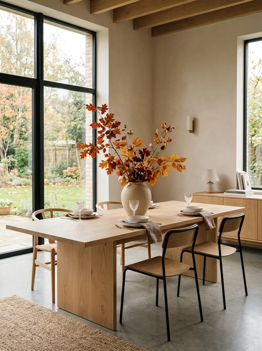
Not every autumn table needs to look full. This one is deliberately edited.
A pale oak dining table sits in a bright contemporary room, surrounded by simple chairs and clean architectural lines. The centerpiece is a single sculptural branch arrangement in a large understated vessel. Around it, matte white dinnerware, taupe napkins, clear glassware, and a few restrained candleholders create a calm setting.
The empty tabletop matters as much as the objects. That negative space gives the arrangement scale and makes the branches feel intentional rather than sparse.
I’d choose this direction when the dining room already has strong architecture or plenty of natural light. Adding more seasonal decor would weaken the composition.
Classic Harvest Table With Apples, Pears, and Warm Plaid
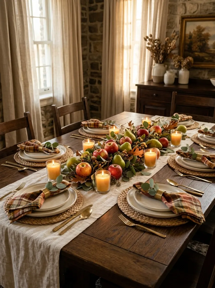
Nothing feels overly decorative on this table. Instead, the autumn character comes from a simple harvest palette of warm wood, cream, amber, and muted red.
A traditional wood table is dressed with a soft cream runner, woven placemats, warm plaid napkins, and ivory dinnerware. Small bowls of apples and pears run through the center beside short candles and loose seasonal greenery. The fruit makes the centerpiece feel abundant while still being practical enough for a family meal.
The trick is keeping the colors related. Choose fruit and textiles that sit close together in tone instead of introducing a different bright color for every piece. The result feels like a real autumn table rather than a decorated display.
Soft Blue and Pumpkin Fall Table
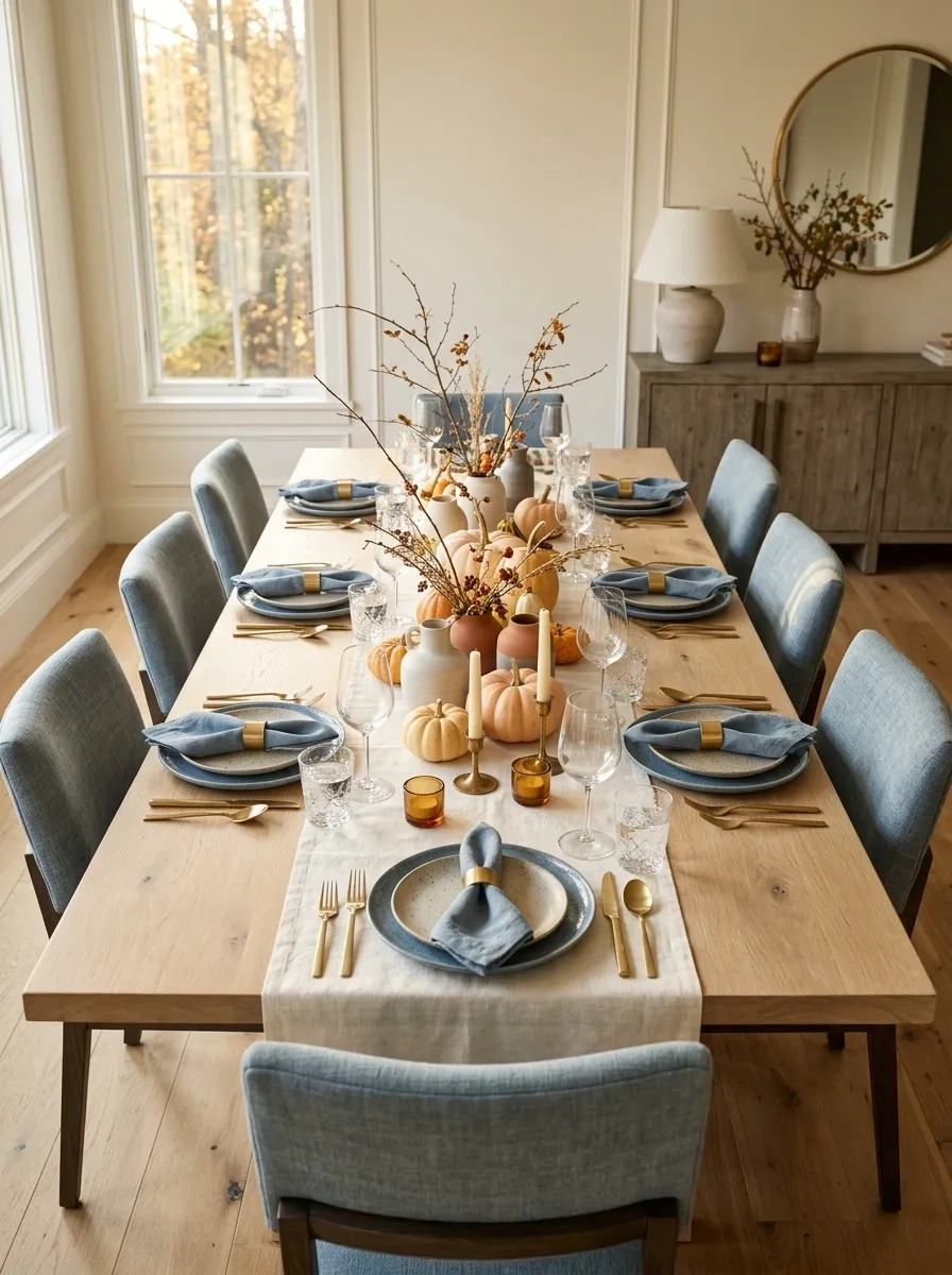
Blue isn’t the first color most people associate with autumn, which is exactly why this tablescape stands out.
The setting pairs pale oak, creamy linens, dusty blue dinnerware, and soft blue-gray upholstery with a small collection of pale orange pumpkins. Brushed brass provides a warm bridge between the cool and warm sides of the palette. The centerpiece stays low, using pumpkins, delicate branches, and a few neutral vessels rather than a dense floral arrangement.
The blue does something important here: it stops the pumpkin tones from taking over. I’d keep the orange relatively concentrated and let the rest of the room stay quiet. That contrast gives the table its personality.
Rustic Stone Table With Oversized Dried Florals
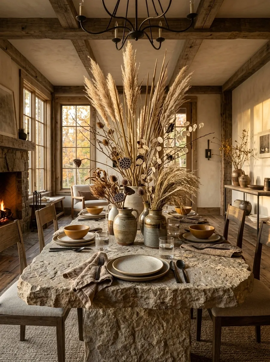
This composition is about scale. A substantial rustic table can handle a centerpiece that would overwhelm a smaller dining surface.
The base is rough wood or stone, paired with earthenware plates, chunky linen napkins, simple vessels, and tall dried grasses or seed pods. Instead of filling the entire center with small decorations, the arrangement rises vertically and leaves the tabletop around it relatively open.
That contrast between rough materials and delicate dried stems gives the room a more architectural feel. Use only a few vessels with varied heights. Too many small containers would compete with the strong silhouette of the branches.
Elegant Neutral Table With Black Candlesticks
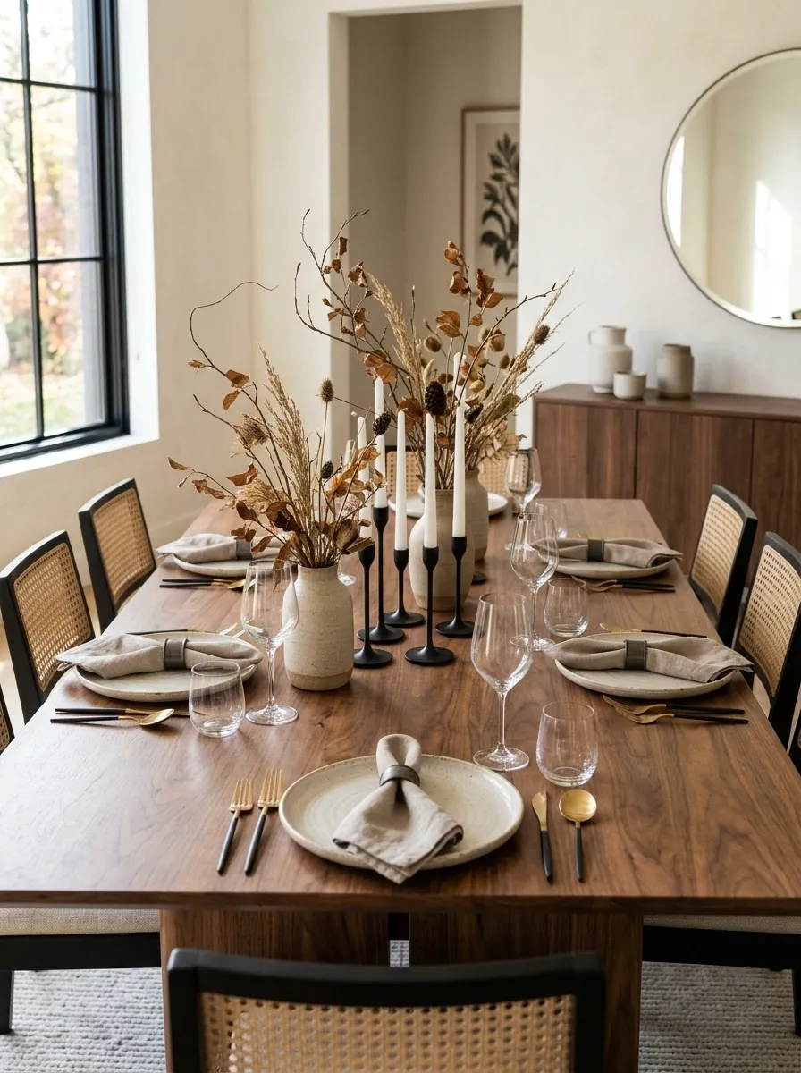
A restrained neutral palette can feel much more sophisticated when one dark element gives the composition structure.
Here, a walnut table carries ivory ceramics, taupe linen napkins, clear glassware, and a narrow arrangement of dried branches. Matte black taper holders repeat through the center, creating a sharp visual line against the softer colors. The chairs and surrounding furniture stay understated so the table doesn’t become visually fragmented.
The important relationship is between the warm walnut and cool black. The ivory plates sit between them and keep the overall setting from becoming too dark. I’d avoid adding several other metallic finishes. The simplicity is what gives this table its polished character.
Vintage Autumn Table With Copper, Glass, and Amber
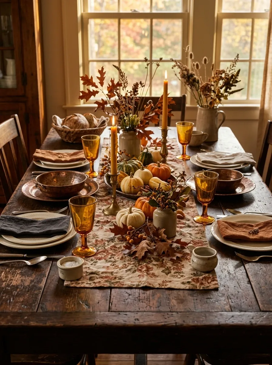
This tablescape looks collected rather than newly assembled. A dark wood table provides the foundation, while amber goblets, copper-toned serving pieces, faded floral textiles, and antique-looking candleholders introduce layers of age and color.
The seasonal arrangement stays loose. Instead of one polished bouquet, use scattered stems, fruit, and a few low vessels so the eye moves around the table. The different surfaces should show some variation because that’s what makes a vintage composition believable.
I’d let one or two pieces look slightly imperfect. Matching every finish too closely would remove the character. The strongest version feels like a table assembled from things that already belonged in the home.
Long Farm Table With Repeated Miniature Centerpieces
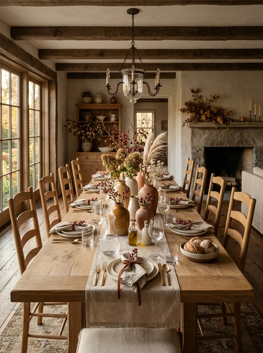
A long farmhouse table looks more balanced when the seasonal styling is allowed to travel across its full length. Instead of one oversized centerpiece, this arrangement uses several small vessels filled with foliage, berries, dried stems, and tiny autumn accents.
The repeated groupings create rhythm without blocking sightlines between guests. Between them, open sections of tabletop can hold serving dishes, carafes, or shared food.
This approach is especially effective on a long rectangular table because the decoration follows the proportions of the furniture. Keep the vessels related in color or material, but vary their shapes slightly so the arrangement doesn’t look mechanically repeated.
Modern Black Table With Burnt Orange Linen
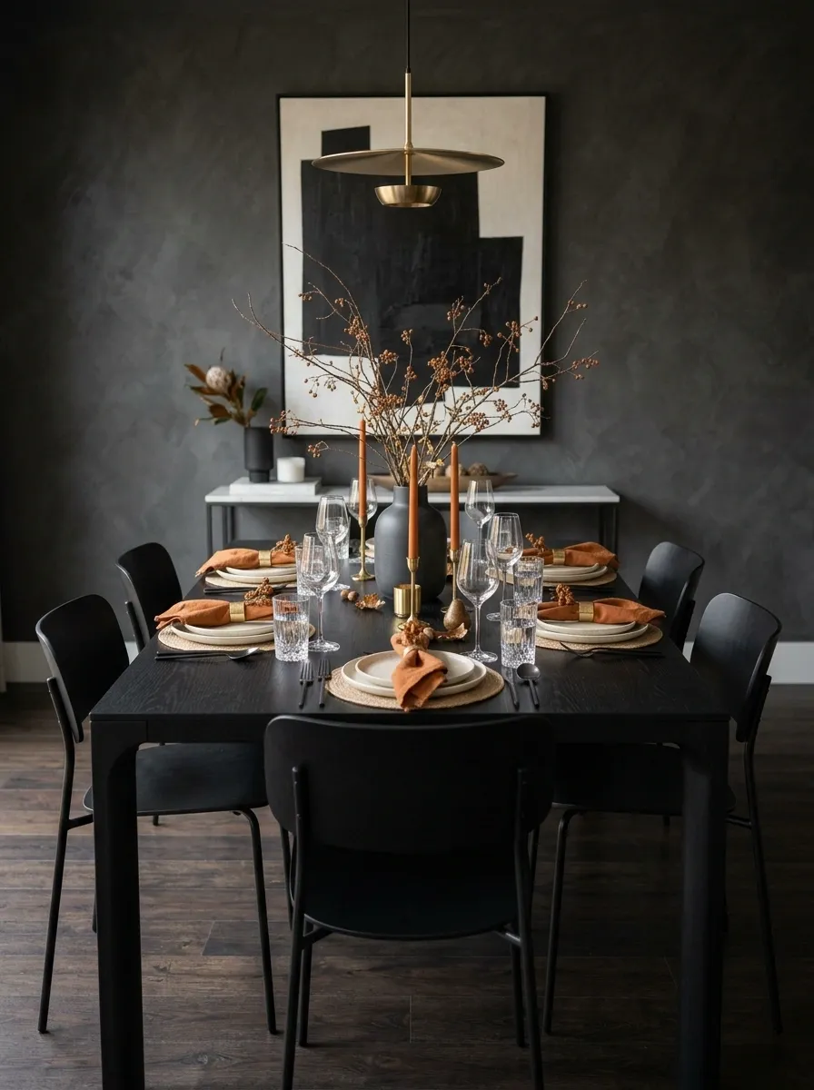
This is a much sharper interpretation of fall. A black dining table gives the room a strong architectural foundation, while sculptural chairs, pale ceramics, clear glassware, and burnt orange textiles introduce the seasonal layer.
Rather than scattering orange throughout the room, keep it concentrated in the napkins and perhaps one or two small elements in the centerpiece. That makes the color feel deliberate.
A simple arrangement of branches can sit in a dark vessel at the center. The strongest contrast comes from the black table against lighter dinnerware, with orange appearing as punctuation. Skip bright red or yellow accents. They would pull the palette in too many directions.
Cottage Dining Table With Wildflower-Style Autumn Arrangement
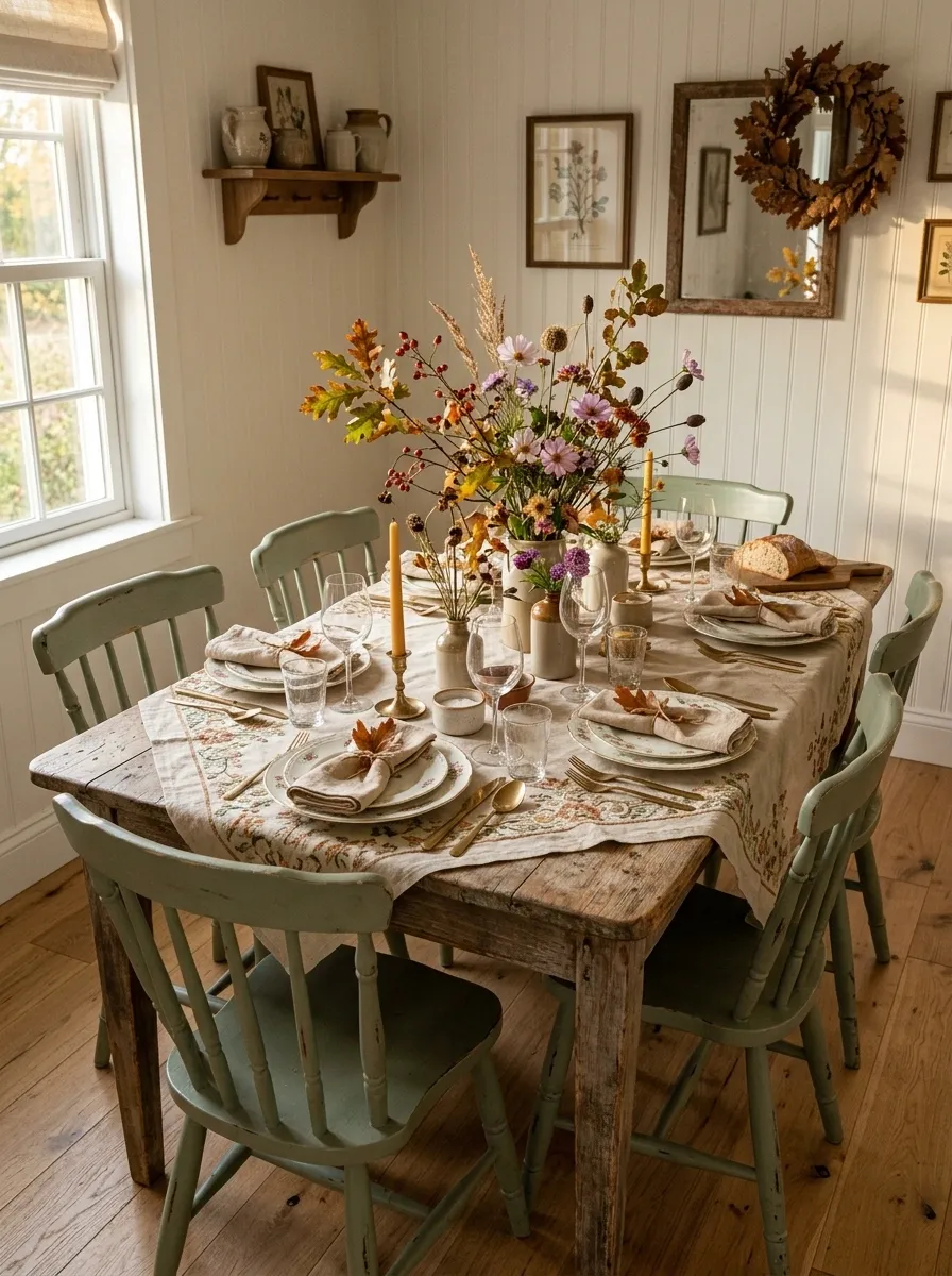
A cottage table benefits from a little imperfection. Here, painted dining furniture, floral plates, embroidered or patterned linens, small ceramic vessels, and loose autumn stems create a softer, more collected setting.
The flowers shouldn’t look like a formal florist arrangement. Think loosely gathered branches and seasonal stems placed at different heights. A few vintage-looking dishes can join the table without matching exactly.
The key is controlling the pattern. Let the plates or textiles carry most of the visual detail, then keep the centerpiece colors muted. That prevents the table from becoming busy despite having several patterns in the composition.
Chocolate Brown and Cream Tablescape With Layered Textiles
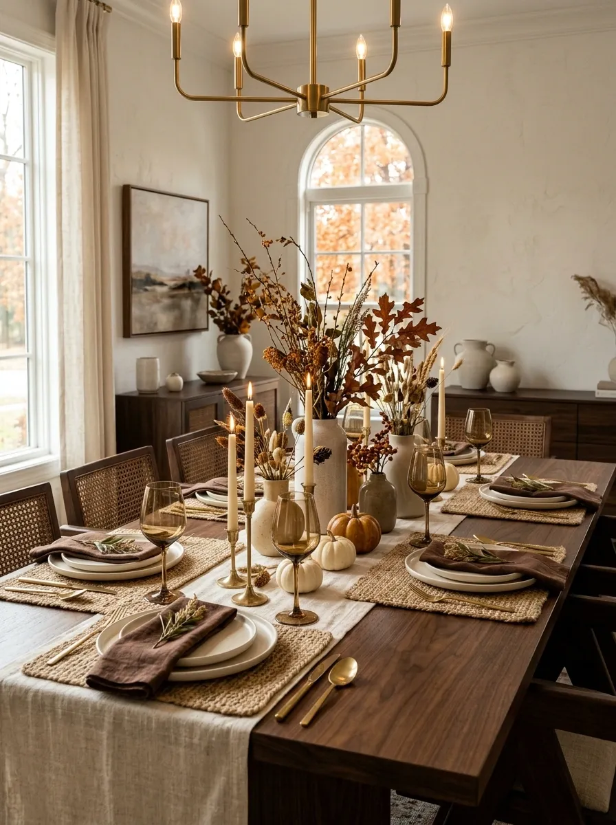
Deep brown and cream create one of the richest combinations in the collection without requiring a dramatic centerpiece. The table itself can be walnut or another dark wood, with a cream runner layered over woven placemats and chocolate-toned linen napkins.
Ivory or warm white ceramics keep the place settings from disappearing into the darker surface. Smoked amber glasses add a subtle glow, while dried foliage introduces a little variation in texture.
The strongest part of this design is tactile rather than decorative. Smooth ceramics, coarse woven fibers, soft linen, and irregular dried stems give the table depth. Don’t add too many shiny finishes. The beauty is in the contrast between matte, rough, and soft surfaces.
Small Round Table With One Central Autumn Arrangement
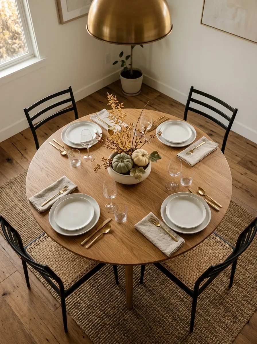
A small dining table needs restraint more than decoration. This composition uses the shape of the round table to create a simple, balanced focal point.
A light or medium wood tabletop is surrounded by slim dining chairs, with four place settings arranged around one shallow vessel in the center. The arrangement combines foliage with a few small pumpkins or seasonal stems, staying low enough that the center doesn’t swallow the usable surface.
The rest of the room stays uncomplicated, perhaps with a warm pendant overhead and minimal wall decor. I’d avoid runners on a small round table. A centered arrangement works better here because it reinforces the geometry without adding another visual layer.
CENTER
Scandinavian Fall Table With Pale Wood and Muted Rust
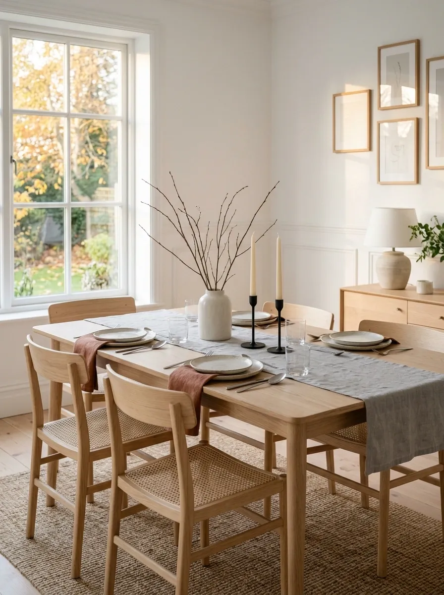
A Scandinavian dining room needs very little seasonal decoration because its clean materials already provide the structure. Start with a pale oak table, simple light-toned chairs, and an airy room with plenty of daylight.
Off-white ceramics, soft gray linen, and understated candleholders create the foundation. Muted rust napkins bring autumn into the composition without turning the table orange. A few slender branches in a simple ceramic vessel complete the center.
The important detail is restraint. The seasonal feeling comes from texture, warmth, and a small change in color rather than a crowded centerpiece. Keep the table surface visible and let the pale wood remain one of the main visual elements.
More texture.
Deep Green Table With Fig, Olive, and Candle Tones
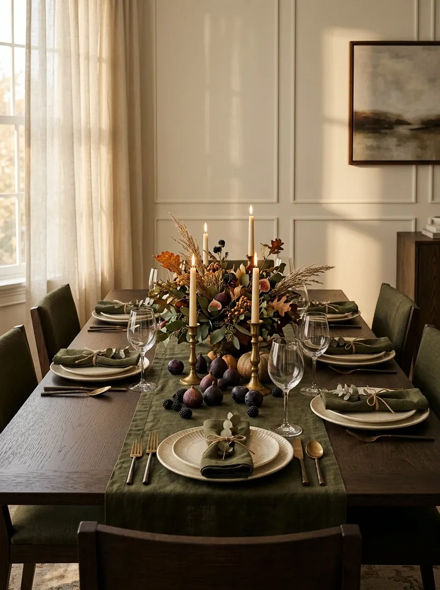
Autumn doesn’t have to mean orange, and this table makes the case beautifully. Deep olive-green textiles anchor a dark wood dining table, while ivory dinnerware provides a necessary break from the darker palette.
A few figs or other deep purple-toned fruit can sit among muted foliage and warm brass candleholders. The centerpiece remains fairly low, allowing the strong color relationships to carry the design.
This works because every shade has a job. Olive gives the table its seasonal identity, cream creates breathing room, dark wood adds weight, and the fig tones bring just enough contrast. Leave bright orange out of this one. Keeping it absent makes the palette feel intentional.
Traditional Red and Tartan Fall Dining Room
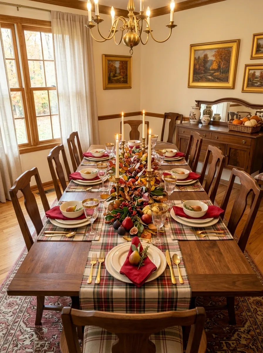
This is the table for readers who love a more classic interpretation of autumn. Warm walnut furniture, muted tartan textiles, cranberry and red accents, ivory dinnerware, and brass candleholders create a traditional setting that feels especially appropriate for a long family meal.
A loose branch arrangement can run through the center, with a few seasonal fruits tucked into the composition. The surrounding dining room should share some of the same tones, perhaps through chair upholstery, artwork, or a nearby rug.
That’s what keeps the table from looking pasted into the room. Don’t add every traditional fall color at once. Let cranberry, walnut, cream, and brass carry most of the visual story.
Earth-Toned Table With Handmade Ceramic Centerpieces
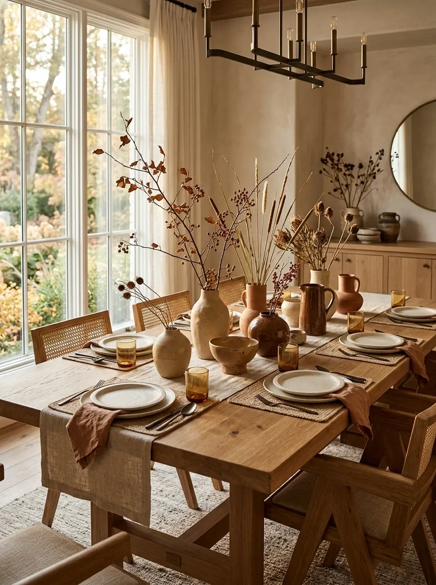
This design feels grounded because the decoration has an unmistakably handmade quality. A substantial wood table is paired with sand-colored, clay, and brown ceramics, natural linen, irregular vessels, and loosely arranged branches.
Instead of searching for identical pieces, use vessels that share a finish or general palette but differ slightly in shape. Those small imperfections keep the centerpiece from looking mass-produced.
The place settings should remain simple so the ceramics get the attention. Cream or warm stoneware works especially well. I’d also keep the foliage sparse. The beauty of this table comes from material variation, not a large amount of decoration.
Glass-and-Candle Fall Table With a Light, Airy Finish
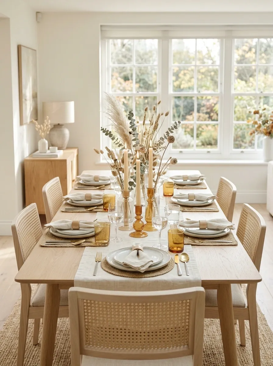
For a bright dining room, heavy autumn colors can work against the architecture. This version keeps the seasonal mood but lets light remain the star.
Picture a pale wood table, cream textiles, white ceramics, clear candleholders, translucent amber glass, and delicate dried stems. The centerpiece is open and loosely arranged so daylight can move through it. Warm candlelight then adds another layer after sunset.
The transparent materials are doing something practical as well as decorative. They introduce color and reflection without creating a visual wall across the table. I’d keep the vessels varied in height but avoid filling every gap between them.
Rustic Lodge Table With Leather and Dark Wood
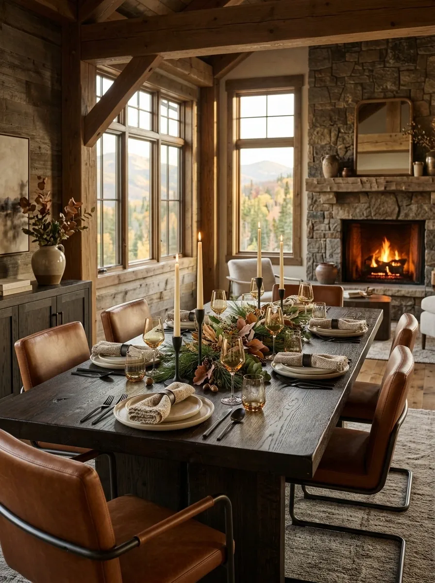
This table leans into the deeper, woodsy side of fall without turning the dining room into a themed cabin. A substantial dark wood table anchors the room, surrounded by leather or leather-look chairs, warm textiles, stoneware, and simple iron candleholders.
A loose arrangement of pine-like branches and muted autumn foliage runs through the center. Wool or woven napkins add softness against the harder materials, while cream-toned plates keep the place settings from disappearing into the dark palette.
The important balance is between heavy and light surfaces. Dark wood, leather, iron, and stoneware provide weight, but foliage and lighter ceramics stop the room from feeling dense. Keep the seasonal greenery natural and restrained.
Romantic Fall Table With Soft Mauve and Antique Gold
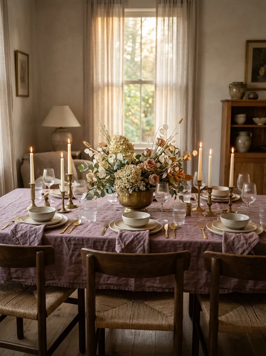
Instead of leaning into orange and brown, this tablescape uses the quieter colors of late autumn. Dusty mauve linen, warm cream ceramics, pale flowers, soft foliage, and antique gold details create a romantic dining room with plenty of depth.
The table itself can be light or medium wood, giving the muted textiles room to stand out. A loose floral arrangement works better than a formal centerpiece because the overall mood is relaxed rather than ceremonial.
Antique gold adds warmth, but it should look softly aged rather than highly polished. That’s what prevents the palette from feeling too precious. Keep the surrounding walls and furniture simple so the subtle colors have enough room to register.
Casual Family Table With Layered Serveware and Simple Greenery
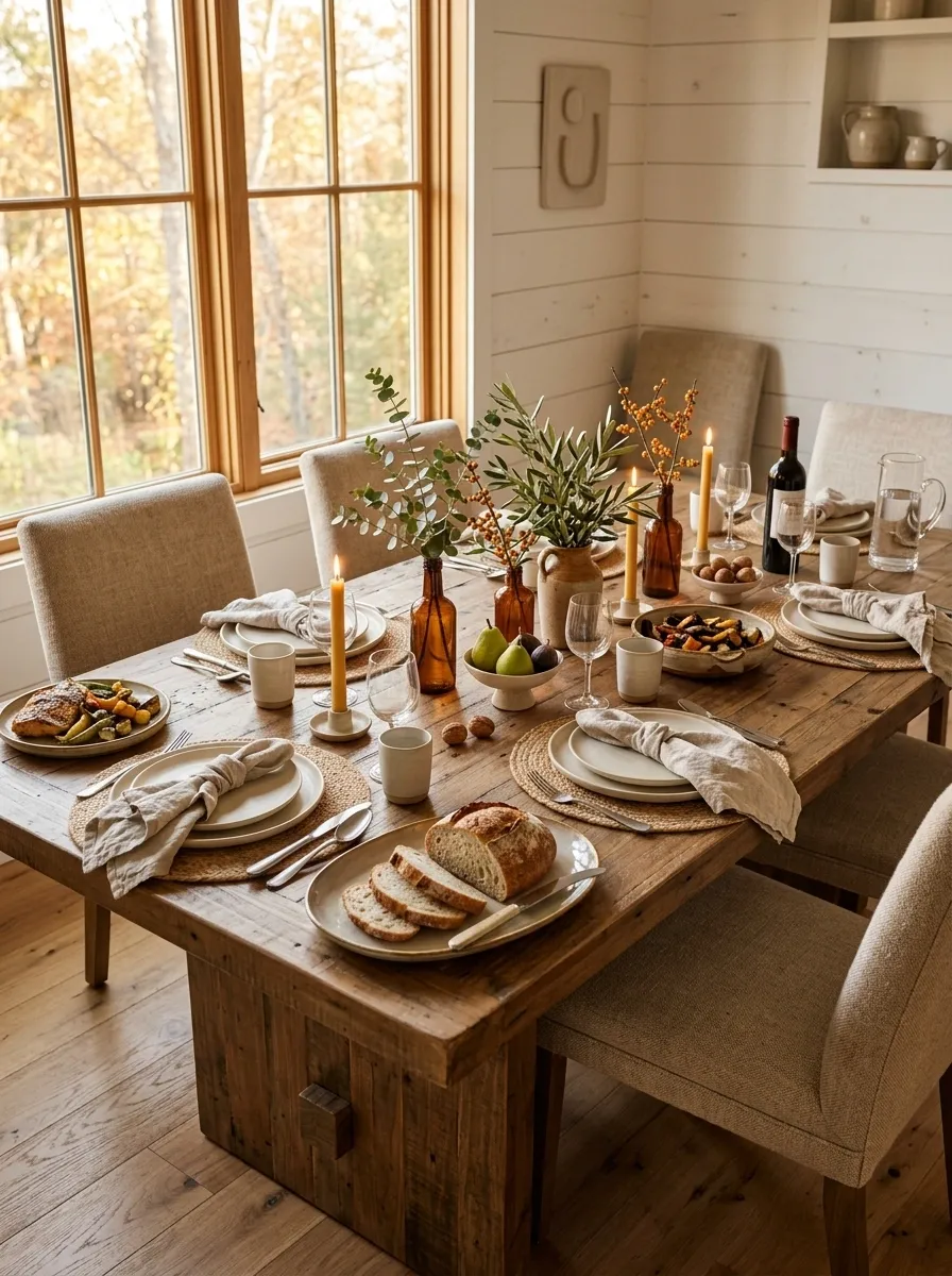
A family dining table needs to look inviting without becoming so decorated that there’s nowhere to put the food. This version treats serving pieces as part of the finished composition.
The table is dressed with practical stoneware, woven placemats, casually folded linen napkins, small bowls of fruit, and low greenery. Larger serving dishes sit naturally among the place settings, giving the arrangement a sense of purpose.
The centerpiece stays low and broken into small sections so guests can see across the table. That’s the feature I’d protect most carefully. A beautiful table stops working when people have to move decorations every time dinner is served.
Dramatic Black, Cream, and Ochre Autumn Tablescape
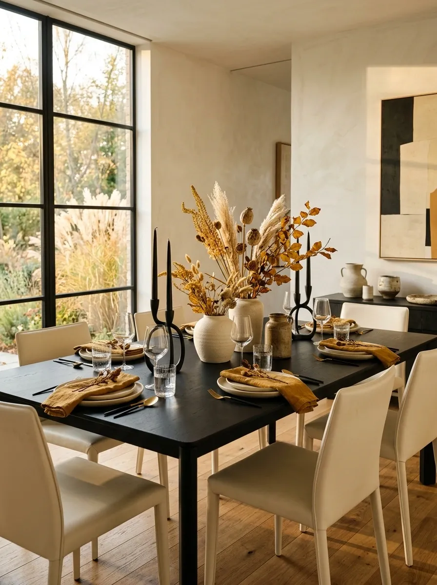
This is one of the strongest high-contrast looks in the collection. A black dining table creates a dramatic base, while cream chairs or upholstery and pale ceramics give the room relief.
Ochre linens introduce the autumn note. Rather than spreading the color everywhere, use it on the napkins and perhaps a few dried golden stems in the centerpiece. Sculptural black candleholders repeat the table’s dark geometry and give the arrangement a more graphic quality.
The palette works because the three dominant tones have clear roles. Black provides structure, cream creates space, and ochre carries the season. Resist adding another strong accent color. The restraint is what makes the composition feel editorial.
structure
relief
season
Collected Grandmother-Style Fall Table With Mixed China
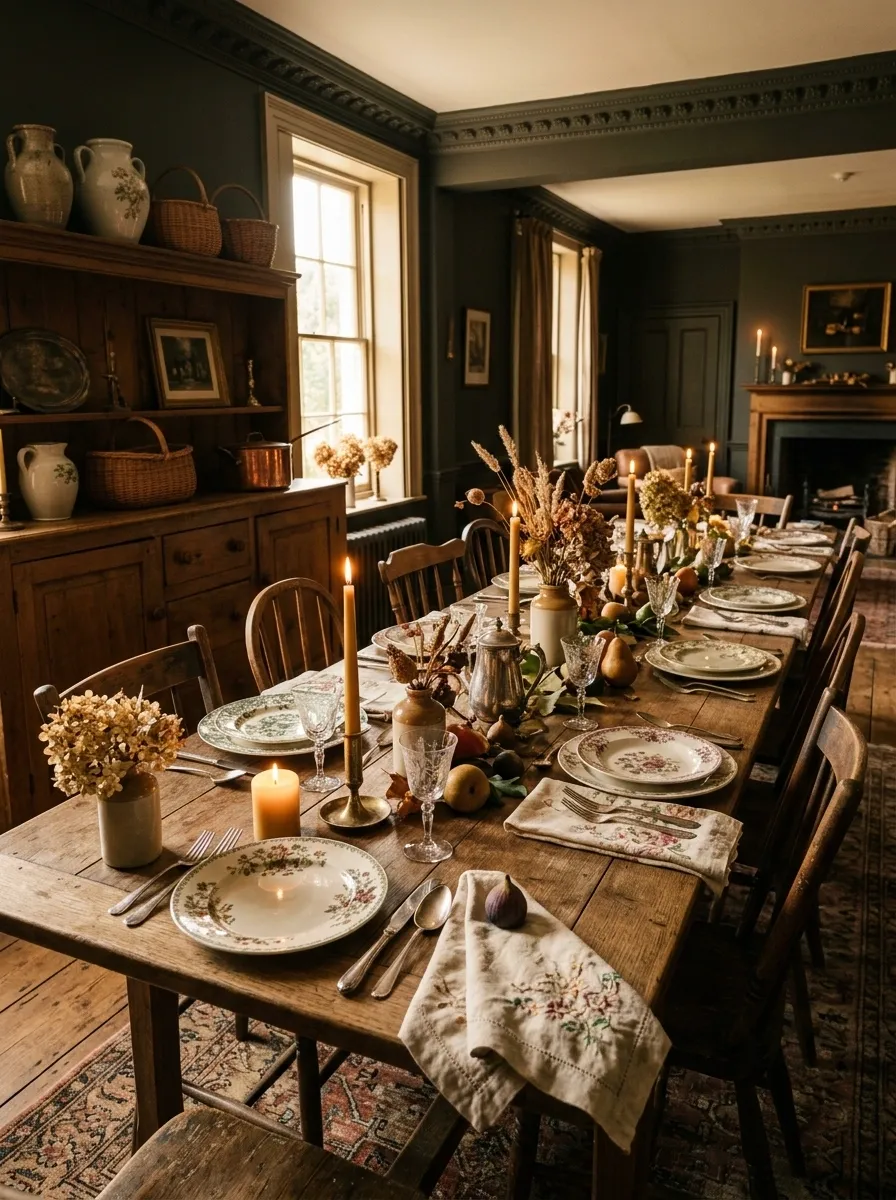
The final concept is intentionally nostalgic. A traditional wood table holds mismatched china, embroidered or vintage-style napkins, silver or silver-toned serving pieces, taper candles, faded flowers, and autumn fruit.
The patterns don’t need to match. In fact, matching everything would make the table lose the collected quality that gives it charm. The unifying element should be the color family, with creams, muted floral tones, faded greens, and warm wood tying the individual pieces together.
Let some objects look slightly worn. That history is part of the visual story. The finished table should feel as though it has evolved over years rather than being assembled from one shopping trip.
Shared visual language.
Choosing the Right Fall Table Direction
The strongest tablescape is usually the one that responds to the room instead of fighting it. A dark dining room can handle richer plum, burgundy, walnut, and brass. A bright Scandinavian space benefits from pale wood, cream, muted rust, and restrained greenery.
Table size matters too. Long tables can support repeated centerpieces and open serving zones, while small round tables usually look better with one compact focal arrangement.
Most importantly, choose the whole visual direction first. Once the palette, material mix, centerpiece scale, and surrounding room feel connected, the individual decorating decisions become much easier.