
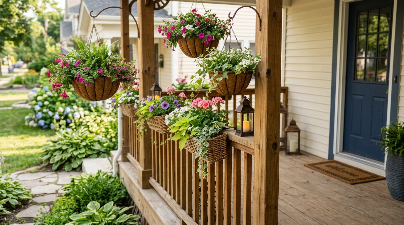
A porch railing can look perfectly fine on its own and still make the whole front of a house feel disconnected. The problem usually isn’t the railing itself. It’s the relationship between the railing, the porch floor, exterior paint, front door, furniture, lighting, and planting.
That is why browsing isolated railing ideas can be frustrating. A railing may look great in a close-up photograph, but that doesn’t tell you how it will feel when paired with your home’s architecture or the furniture you actually want to use.
Porch Railing Styling Ideas
Classic White Porch With Black Railings and Symmetrical Planters
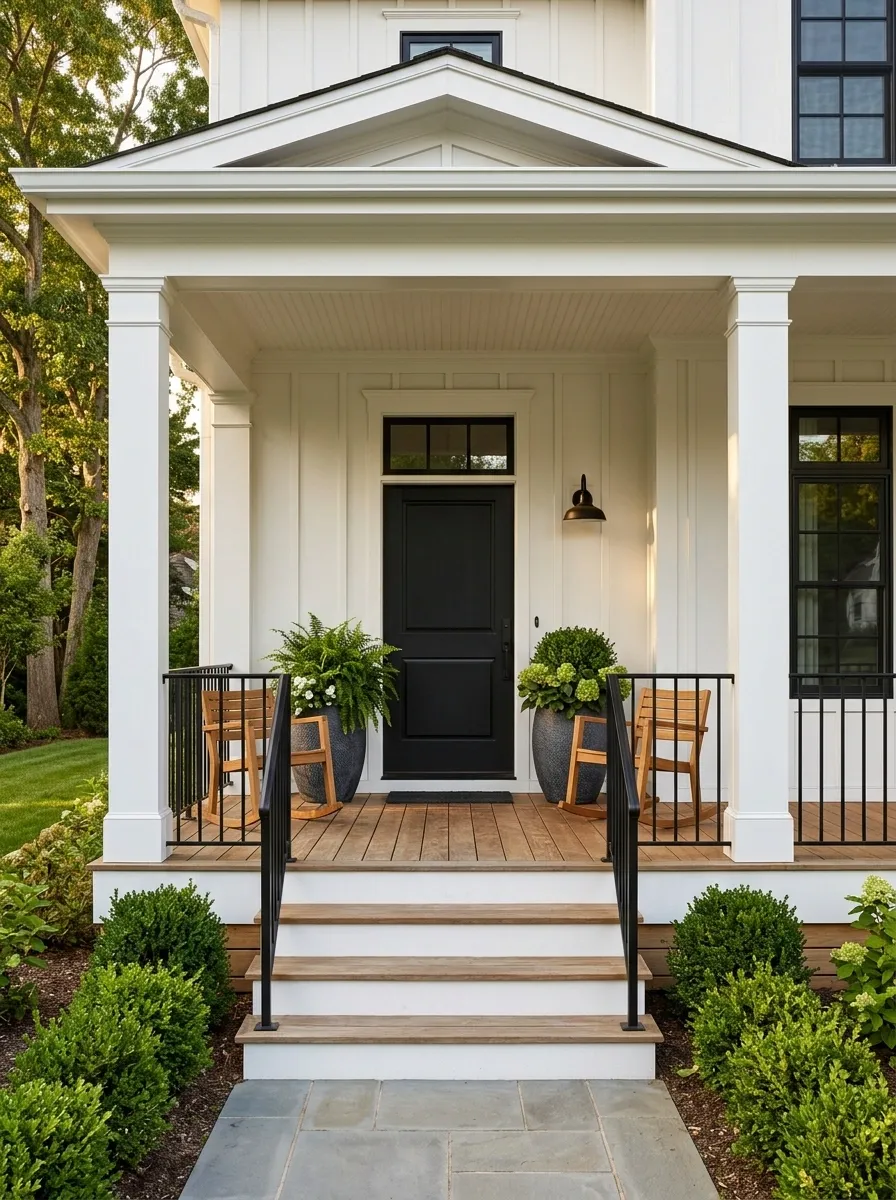
Crisp white posts and trim give this traditional porch its structure, while slim matte black railings create a sharper outline at the edge. Warm medium-tone decking keeps the contrast from feeling cold. A centered front door, matching rocking chairs, and two substantial planters create an intentionally balanced facade.
The important detail is restraint. The black railing has enough presence to frame the porch, but the furniture stays simple so the architecture remains visible.
I’d repeat the black only in a few places, such as the light fixtures or door hardware. Too much black would compete with the railing.
The visual formula
Warm Craftsman Porch With Cedar Railings and Deep Green Trim
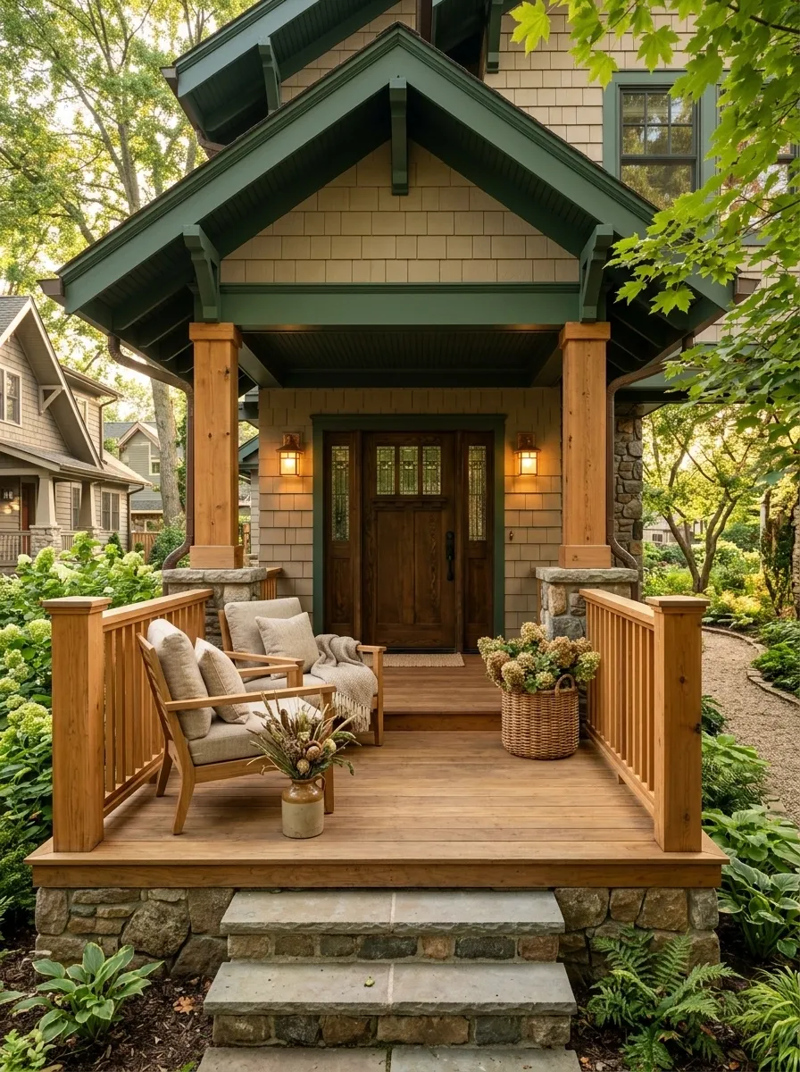
This porch leans into the natural weight of craftsman architecture. Clear cedar railings sit between chunky square posts, while stained decking, deep green trim, and simple wood-framed chairs keep the palette earthy. Stone or masonry at the base gives the lower part of the house visual weight.
The cedar is the key because it bridges the painted exterior and the surrounding landscape. Keep the finish relatively natural instead of covering the grain with a heavy color.
Warm lantern lighting works especially well here because it brings out the wood tones after dark.
Let the materials carry the design
Modern Farmhouse Porch With Horizontal Black Slat Railings
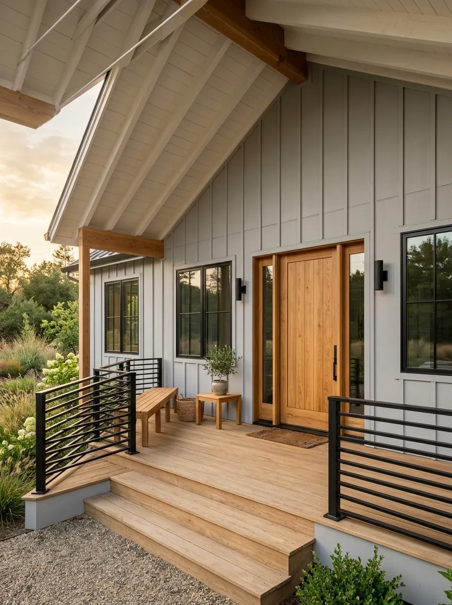
Long horizontal slats change the character of a farmhouse porch immediately. Here, the railing runs beneath pale siding and a broad facade, with natural oak decking and black-framed windows reinforcing the same horizontal rhythm.
A substantial timber door gives the front elevation a warm focal point. A long bench and a compact table keep the furniture aligned with the architecture instead of breaking it into lots of small shapes.
The railing works because it supports the width of the house. On a narrow facade, the same treatment could feel visually heavy, so this concept is strongest when the porch has enough length to carry the lines.
A proportion cue for the finished composition
Soft Cottage Porch With Painted Sage Railings and Flower-Filled Containers
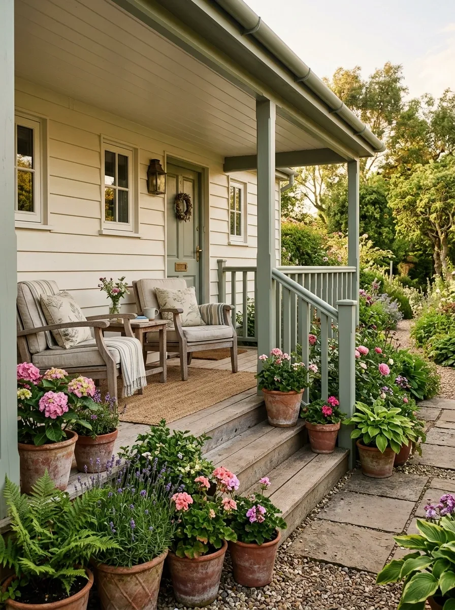
Muted sage railings give this cottage porch a softer architectural edge than black or bright white. Cream siding, weathered decking, vintage-inspired seating, and flower-filled containers continue the gentle palette.
The planting is important because it connects the railing with the garden beyond the porch. Instead of adding flowers in every available corner, concentrate them around the steps and seating so the structure remains readable.
I’d keep the textiles quiet here. Small botanical or faded striped patterns can work, but too many competing prints would make the already detailed cottage architecture feel busy.
Palette relationship
Coastal Porch With White Railings, Pale Wood, and Blue Accents
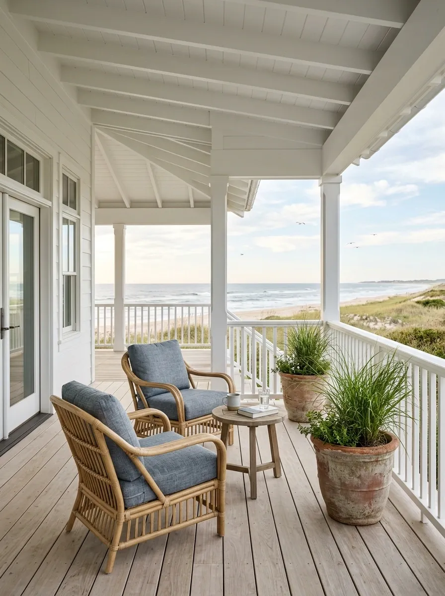
This coastal porch stays light without becoming featureless. White railings and pale timber flooring form the clean architectural base, while woven furniture, blue-gray cushions, and weathered planters introduce texture and contrast.
The trick is to avoid making every surface equally pale. The woven seating provides warmer texture, while the blue accents give the eye somewhere to settle.
A simple arrangement of two chairs and a small table is enough. The open railing and light palette already provide plenty of visual information.
Three levels of visual weight
Moody Victorian Porch With Charcoal Railings and a Jewel-Toned Door
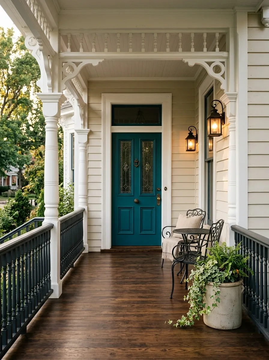
Charcoal railings give this Victorian porch a stronger architectural outline without competing with its detailed trim. Dark stained flooring continues the depth, while a rich burgundy or deep teal front door provides one concentrated hit of color. Antique-style lanterns and compact furniture finish the setting.
The balance comes from keeping the surrounding architecture lighter than the railing and floor. That lets the intricate posts, brackets, and trim remain visible instead of disappearing into a dark mass.
I’d avoid adding several jewel tones. One saturated door color is enough to make the composition memorable.
Where the contrast belongs
Southern Porch With Traditional White Spindles and Ceiling Fan
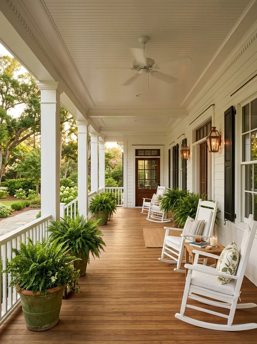
A generous covered porch looks distinctly Southern when classic white spindle railings run beneath painted columns and a broad roofline. Medium-tone wood flooring, rocking chairs, a central ceiling fan, and generous green planters create the relaxed setting.
The furniture works because it repeats the porch’s traditional rhythm rather than introducing modern shapes. The railing remains decorative but not fussy.
Keep the path to the front door open. A comfortable porch should still read clearly as an entrance, not a room packed edge to edge with chairs.
A simple zoning plan
Scandinavian-Inspired Porch With Natural Wood Railings
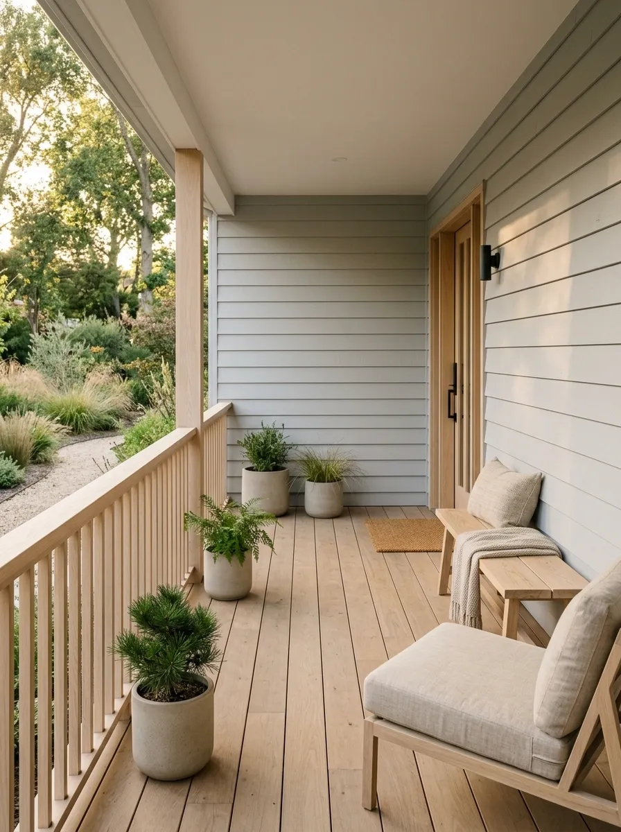
Pale natural wood gives this porch a quieter, more contemporary interpretation of a traditional railing. Light gray siding, simple timber furniture, neutral cushions, and restrained planting keep the scene calm without making it feel empty.
The clever move is using a related wood tone for both railing and furniture. They don’t need to match perfectly, but they should feel like part of the same material family.
This concept benefits from negative space. Leave some of the porch edge open rather than filling every section with furniture or containers.
Warmth enters through material, not clutter
Black-and-White Farmhouse Porch With Board-and-Batten Siding
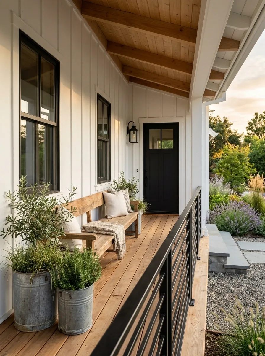
This farmhouse porch relies on a simple, high-contrast exterior rather than lots of decoration. White board-and-batten siding forms the backdrop, while black railings, a black front door, and dark window frames create a strong graphic outline. Warm timber flooring keeps the porch from feeling too stark.
A long bench works better here than several small chairs because it follows the broad horizontal character of the facade. Large galvanized-style planters add a little texture without disrupting the clean palette.
The wood floor is doing important visual work. Keep some warmth in the composition instead of making every hard surface black or white.
Three finishes, three jobs
Natural Modern Porch With Walnut Railings and Stone Flooring
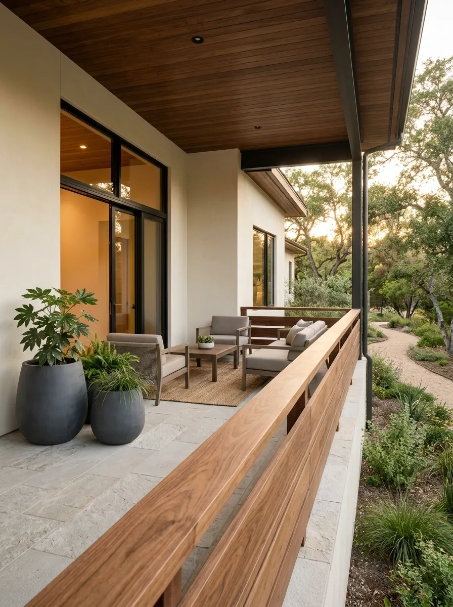
Walnut-toned railing brings warmth to an otherwise clean contemporary porch. Pale natural stone flooring, warm white walls, low modern seating, and oversized planters create a composition that feels polished without looking overly formal.
The contrast between the deep wood and pale stone is enough to carry the design. Keep the furnishings quiet and avoid introducing a third strong material such as shiny metal or patterned tile.
This approach works especially well when the architecture already has simple lines. The railing becomes part of the home’s material story instead of acting as a decorative afterthought.
The material conversation
Tiny Front Porch With Open Black Cable Railings
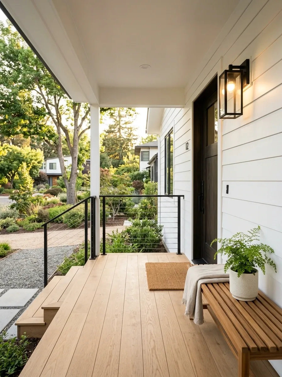
A small porch has little room for visual bulk, so this concept keeps the boundary as open as possible. Thin black cable railings preserve the view while a narrow bench, compact planter, wall-mounted light, and simple welcome mat provide just enough function.
The floor remains mostly clear, making the entrance feel larger than it actually is. That’s the key to this composition.
Don’t push large furniture against the railing just because the edge is available. A small porch needs usable circulation more than another decorative object.
Small-space layout logic
Wraparound Country Porch With White Railings and Woven Seating
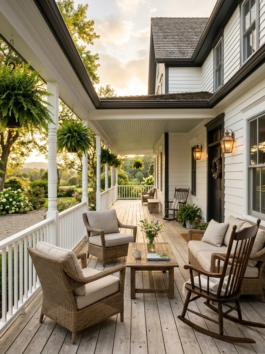
A wraparound porch can easily become visually scattered because there is so much perimeter to furnish. This version solves that problem by treating the white railing as a continuous frame around the house. Pale weathered boards, woven chairs, hanging plants, and warm lanterns repeat that relaxed country language.
Separate seating areas are arranged along the porch rather than clustered in one spot. One area can handle conversation while another faces the garden.
The important decision is repetition. Use the same railing finish and a related furniture language around the corners so the long porch still reads as one space.
One porch, several uses
Desert Modern Porch With Sand-Toned Walls and Dark Metal Railings
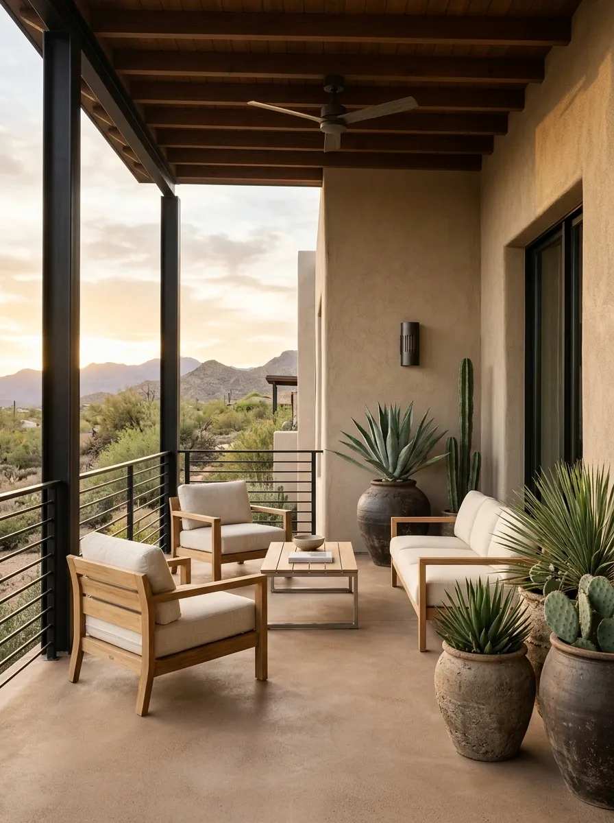
This desert-inspired porch depends on strong shapes and controlled materials. Sandy stucco walls meet dark metal railings, warm concrete flooring, sculptural drought-tolerant planting, and low wood furniture. The palette stays restrained so the architecture does most of the work.
The dark railing provides enough definition to keep the pale exterior from looking flat. Meanwhile, the plants add irregular shapes that soften the straight architectural lines.
There is no need for lots of accessories here. A few large forms have more impact than a collection of small decorative pieces.
How the colors distribute themselves
English Cottage Porch With Dark Green Railings and a Stone Path
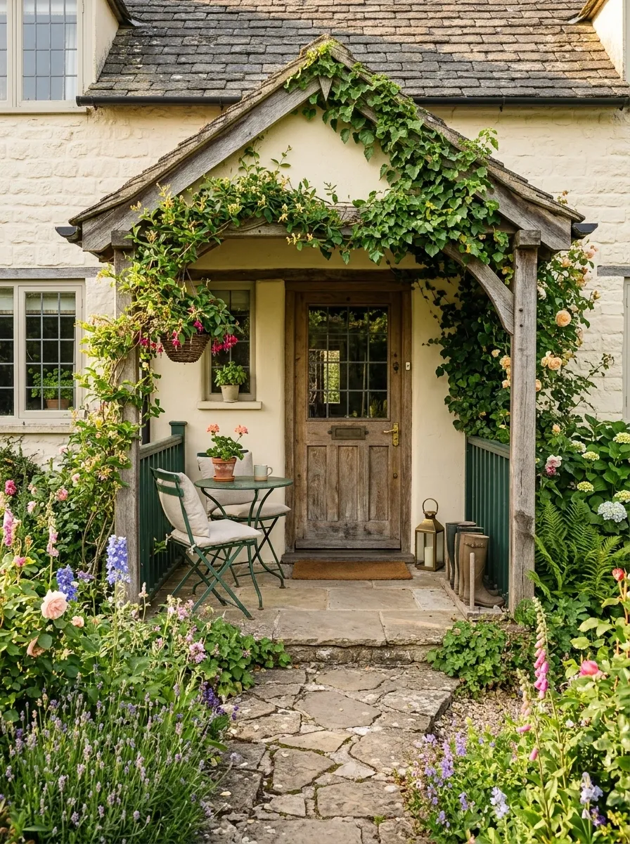
Deep green railings give this cottage porch a strong connection to the garden. Cream siding or masonry keeps the background soft, while a weathered timber door, stone path, climbing greenery, and compact vintage seating create a relaxed transition from house to landscape.
The railing is important because it visually bridges those two worlds. Its dark green tone echoes foliage without simply disappearing into it.
Keep the planting slightly informal, but give the furniture clear placement. The porch should feel grown-in, not neglected.
Let the garden and architecture share one palette
Transitional Porch With Warm Gray Railings and Oversized Lanterns
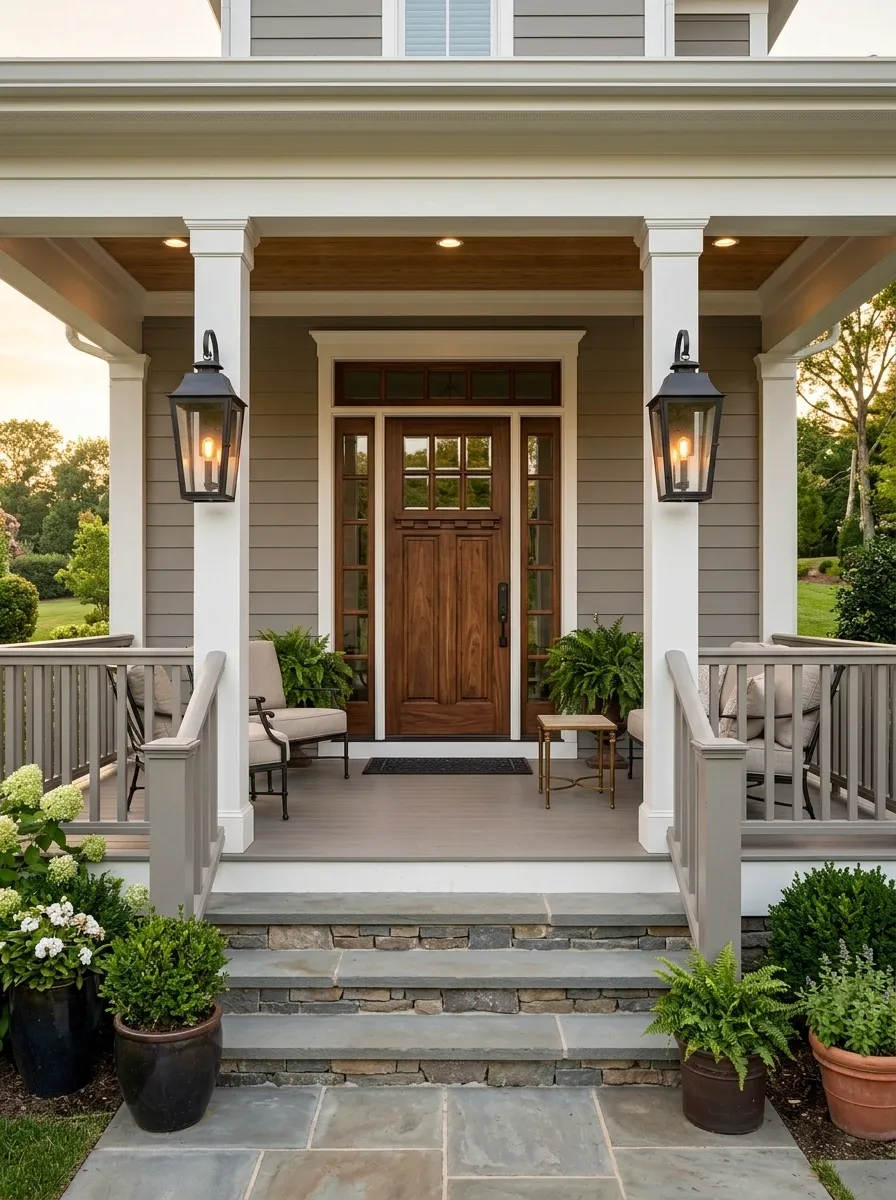
Warm gray railings give this transitional porch a polished middle ground between stark white and dramatic black. White trim, natural stone steps, a substantial wood door, tailored outdoor seating, and oversized lanterns complete the more refined composition.
The large lanterns are deliberately bold, but they work because the railing and trim stay quiet. Together, the pieces create a controlled hierarchy instead of several competing focal points.
This look suits a house with strong architectural proportions. Keep accessories simple and let the door, lighting, and stone steps provide most of the character.
Control the visual weight
Elevated Porch With Glass Panels and Minimal Wood Framing
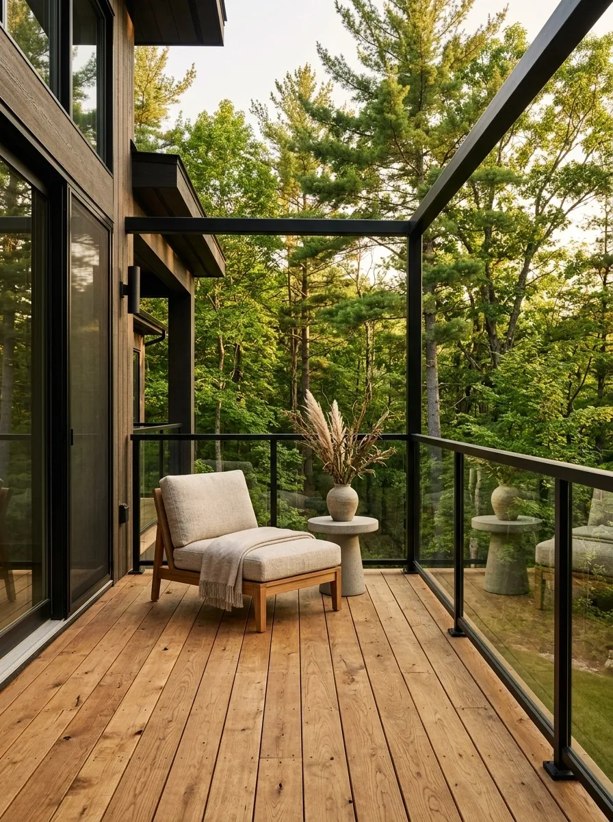
For an elevated porch where the surrounding view matters, glass panels preserve sightlines while slim dark framing provides enough definition to make the boundary visible. Warm wood flooring and furniture soften the modern structure.
The finished porch feels connected to the landscape because the railing doesn’t create a heavy visual wall. That makes the surrounding trees, garden, or distant view part of the composition.
Keep the furniture low and simple. A busy arrangement would undermine the openness that makes this design distinctive.
Openness versus enclosure
Blue Cottage Porch With White Railings and Patterned Cushions
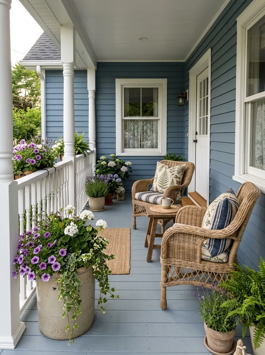
Muted blue siding and bright white railings create a familiar cottage combination, but the patterned cushions make this version feel more personal. Painted flooring, wicker or woven seating, and flower-filled containers complete the scene without competing with the facade.
Pattern belongs mostly around the seating area. That keeps the architecture calm while giving the porch a lived-in focal point.
Striped or botanical fabrics work naturally here. I’d use one main pattern and let the remaining cushions, planters, and furniture stay relatively quiet.
Distribute pattern instead of spreading it everywhere
A well-styled porch rarely comes together because of one special railing detail. The stronger result usually comes from a clear relationship between the railing and everything around it. Material, color, scale, lighting, furniture, and planting all contribute to the finished impression.
That’s also why the complete scene matters more than a close-up reference. A railing can look great in isolation and still feel wrong once it’s attached to the house. Looking at the whole composition makes it easier to decide which direction actually suits your architecture and how you want the porch to function.