
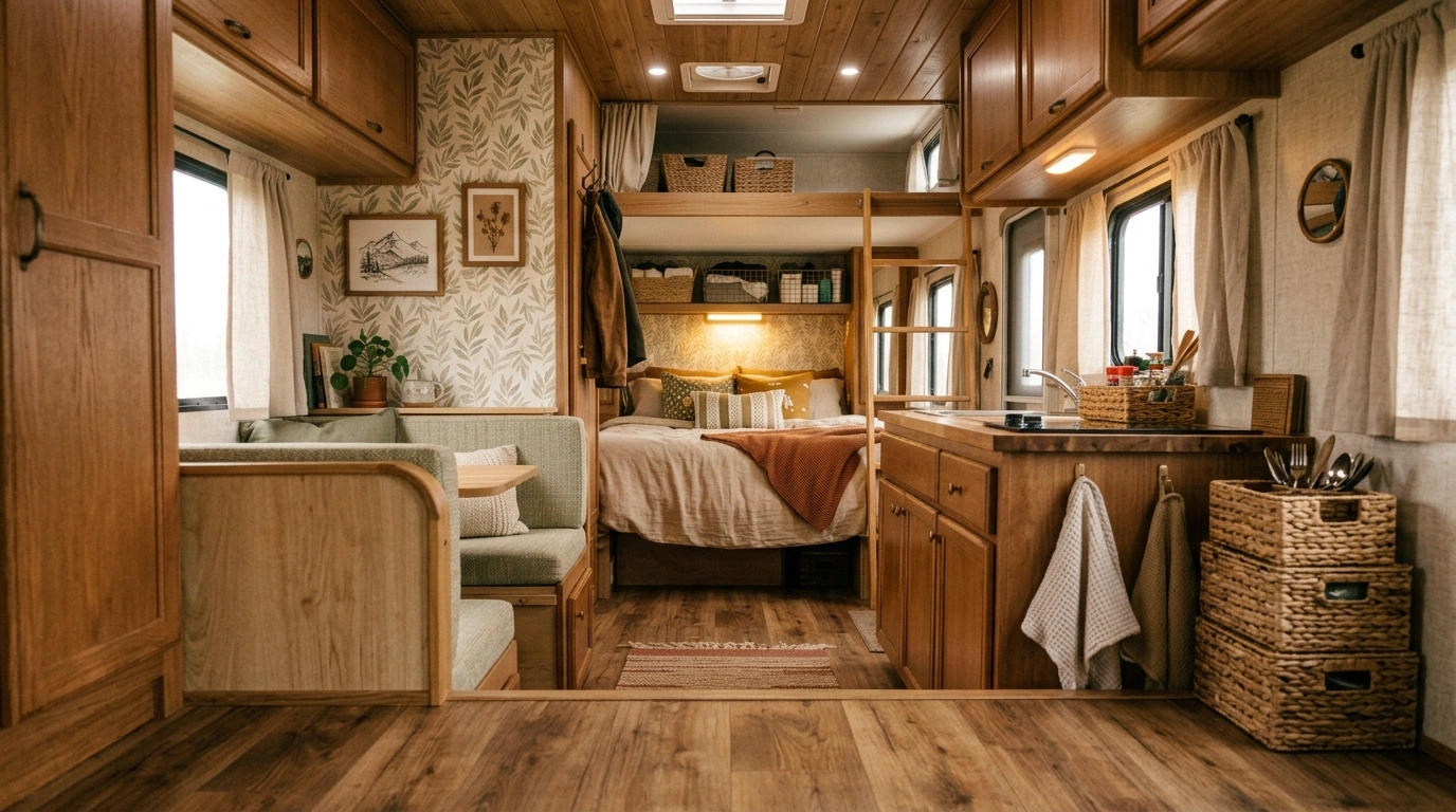
An RV can look perfectly fine until everything gets put together. Then the striped cushions are fighting the curtains, the fake farmhouse sign is yelling from the wall, three different wood tones are somehow sharing one kitchen, and the whole thing starts feeling less like a home and more like a very determined storage unit.
That’s why RV decorating ideas work better when they’re treated as complete designs instead of a shopping list of little things to add. A lamp won’t fix a confused color palette. Another basket won’t solve awkward furniture placement. And no amount of decorative signs will make unrelated finishes suddenly cooperate.
A finished RV needs a clear visual direction. The cabinetry, upholstery, flooring, lighting, textiles, storage, and small decorative pieces should look as though they were chosen for the same space.
What Makes an RV Interior Actually Feel Finished?
Start With the RV’s Shape
An RV already has a fixed architecture, so pretending it’s a completely blank room usually leads to bad decisions. Work with the windows, cabinetry, ceiling height, built-ins, and narrow walkways instead of fighting them.
A good design makes those limitations feel intentional.
Give One Style the Lead
Mixing styles can work, but mixing everything rarely does. Choose one dominant direction, then let smaller details support it. A modern RV can handle vintage artwork. A coastal RV can handle dark hardware. The trick is knowing which style is driving the bus.
Let Small Details Support the Bigger Picture
Textiles, lamps, baskets, artwork, and accessories matter, but they’re supporting actors. When the larger composition is right, you won’t need twenty little objects to convince anyone that the space is decorated.
RV Decorating Ideas
Cozy Boho RV With Fairy Lights
This dreamy camper leans all the way into soft textures and ambient lighting. Layers of cream textiles, warm fairy lights, macrame details, and fresh flowers turn a compact interior into a genuinely romantic escape. The pale color palette keeps the thousands of tiny twinkling lights from feeling overwhelming.
The layout makes the most of the lounge space by turning the entire back area into an inviting daybed loaded with plush pillows. A tiny wooden table set with candles and fresh blooms adds just enough structure without breaking the dreamy mood.
It works because every single element serves the vibe. When you commit to a soft, glowing aesthetic this completely, you don’t need complicated architecture to make an RV feel magical.
Warm Modern RV With Natural Oak and Cream
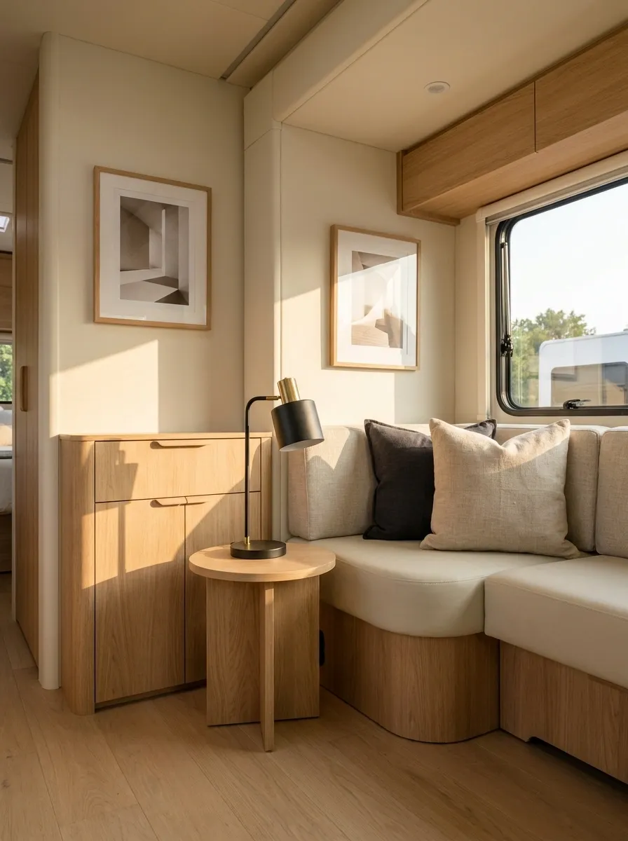
Warm oak changes the entire attitude of a small RV. Here, light cream upholstery, oak cabinetry, soft beige textiles, and a few charcoal accents create a space that feels relaxed without becoming bland. A simple black table lamp and slim hardware give the warmer materials enough definition.
The furniture stays visually quiet, which is important in a compact lounge. Instead of fighting the cabinetry with another wood tone, the design repeats the same oak family through a small side table and framed details.
The result feels polished because the palette is doing most of the work. No decorative avalanche required.
Retro Pink Camper With Playful Charm
A heavy dose of pastel pink gives this retro RV an unforgettable personality. Pale pink cabinetry, matching gingham curtains, fluffy faux-fur seating, and a playful sprinkle-patterned floor create a space that is joyful and completely intentional. The crisp white ceiling balances the punchy color so the room keeps its breathing room.
The vintage chandelier and matching pink radio bring a nostalgic charm that makes the compact dining nook feel like a proper destination. Warm lighting catches the pastel surfaces to give the interior a soft, welcoming glow.
The secret here is commitment. Instead of hiding the theme behind neutral walls, the design embraces the pink fully and lets the cheerful details carry the entire camper.
Moody Green RV Retreat
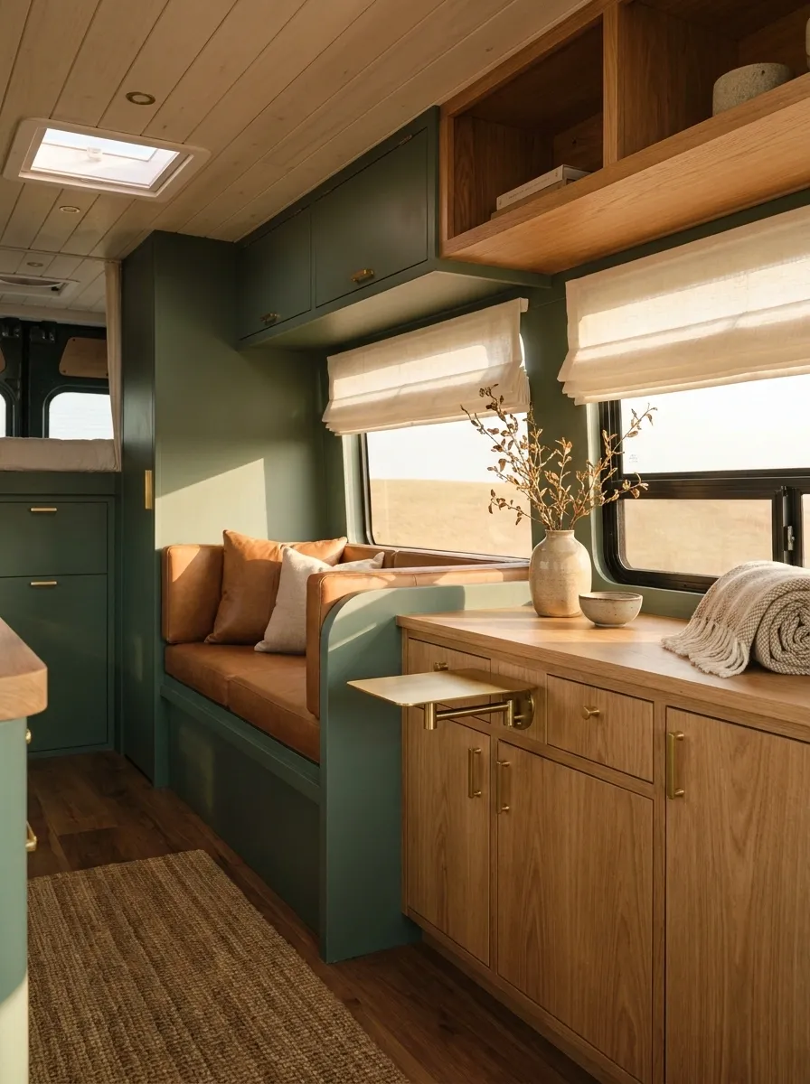
Dark green works surprisingly well in an RV when the rest of the room gives it somewhere to land. This version uses a deep sage and forest-green backdrop, warm wood cabinetry, caramel seating, and small brass fixtures. The ceiling and window treatments stay lighter so the interior doesn’t collapse into one dark block.
The green is strongest around the lounge, where it creates a visual destination instead of spreading evenly across every surface. Warm wood breaks up the darker wall color and keeps the room from feeling overly formal.
And that’s the trick. Dark color isn’t the problem. Dark color with no contrast is.
Mint Green Cottage on Wheels
Fresh mint green exterior paint paired with crisp white trim gives this vintage camper the ultimate fairytale cottage feel. Window boxes overflowing with vibrant red geraniums and a festive bunting banner make the outside as welcoming as a permanent front porch. The classic color blocking highlights the retro curves of the aluminum body beautifully.
A matching mint green door with a charming multi-pane window invites you right inside, while carefully chosen potted flowers on the ground frame the entrance. Simple vintage details like a rustic wooden step stool complete the scene without looking forced.
It reads like a storybook because the styling matches the architecture. When your exterior has this much character, you barely need to touch the landscape to make it look completely at home.
Soft Coastal RV Without the Beach-Themed Clutter
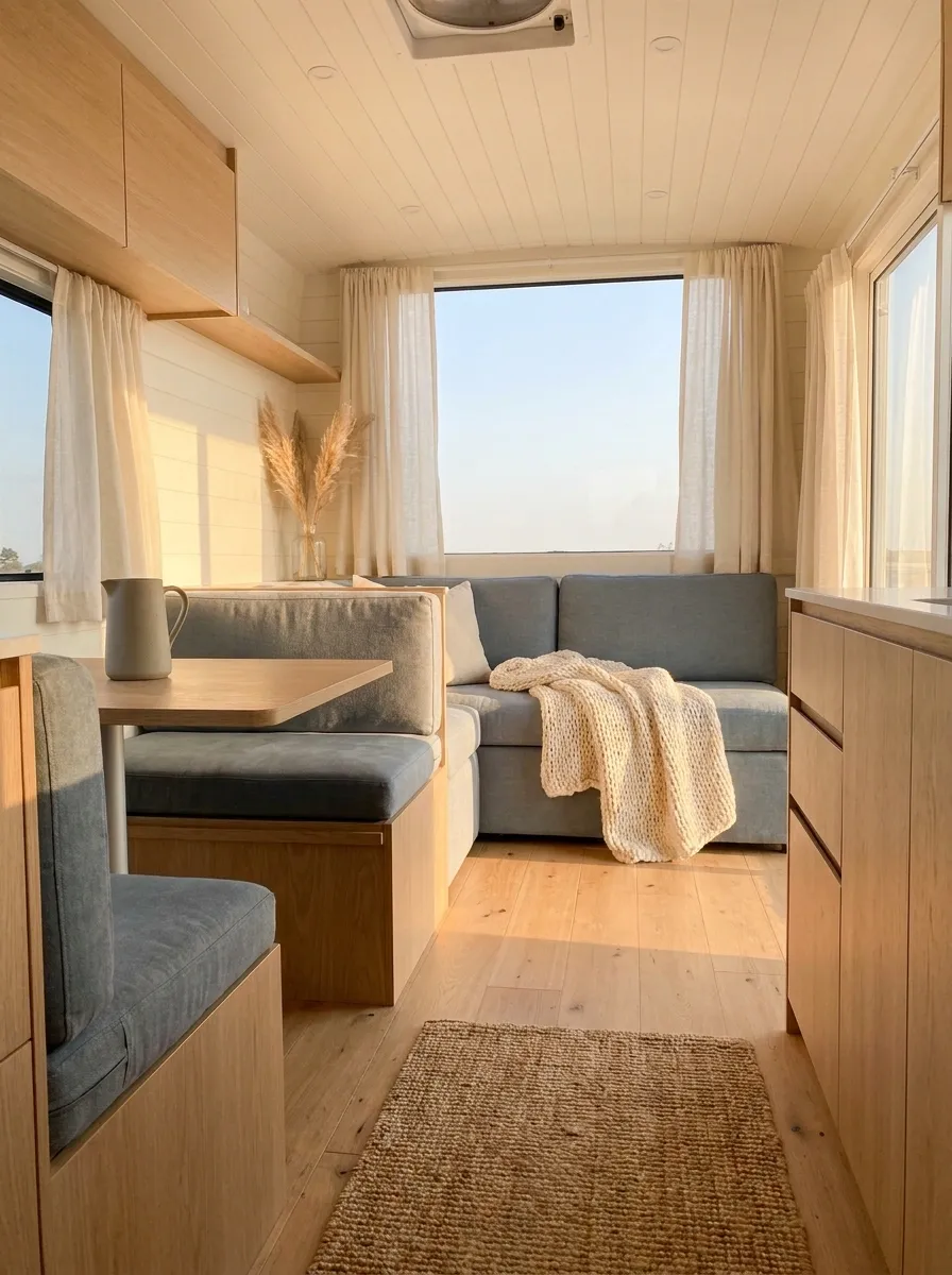
This coastal RV skips the predictable anchors and looks better because of it. Light oak cabinetry sits beside warm white walls, faded blue upholstery, relaxed linen curtains, and soft woven textures. The color comes from the upholstery and a few smaller textiles rather than a collection of shells, anchors, and signs announcing that the ocean exists.
The layout remains open, with the dining area visually connected to the lounge through the same pale wood and blue-gray palette.
It reads coastal because of proportion, color, texture, and light. That’s much more convincing than covering the RV in nautical souvenirs.
Romantic Neutral RV With Vintage Details
Soft neutrals and delicate botanical touches make this RV feel like a quiet countryside cottage. Creamy upholstery, vintage floral wallpaper borders, trailing faux greenery, and woven jute runners bring layers of tactile warmth to the compact space. A simple tiered pendant light casts a warm, domestic glow over the central seating area.
The clever use of light fabrics around the windows keeps the interior feeling airy rather than cramped. Every seating zone flows naturally into the next through a shared palette of oatmeal, beige, and rustic wood tones.
The real charm comes from the thoughtful details. Instead of loud decor, the space relies on natural textures, soft fabrics, and subtle vintage patterns to feel utterly peaceful.
Scandinavian Cabin Feel in a Compact RV
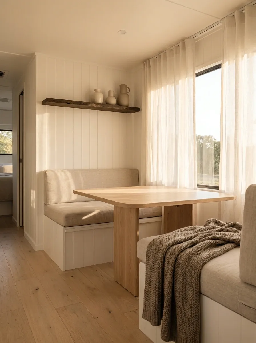
Pale wood, warm white surfaces, and simple furniture make this RV feel more like a small mountain cabin than a cramped vehicle. The dining table has clean lines, the seating uses soft oatmeal fabric, and the window treatment stays almost invisible so daylight can travel through the interior.
A muted brown throw and one darker timber detail give the room enough contrast to stop it becoming a featureless beige box.
The best part is the restraint. There isn’t a decorative object fighting for attention in every corner. The architecture, wood grain, and natural light are allowed to carry the room.
Charming Retro Door With Boho Storage
The entryway of this camper proves that even functional spots deserve great design. A creamy arched door holds a clever hanging macrame organizer filled with fresh greenery and a sweet wooden sign, turning a basic travel trailer portal into a styled welcome statement. The crisp red and white aluminum siding frames the entrance with classic roadside nostalgia.
A spotless white retro wheel and clean detailing ground the exterior look, keeping the focus on the vintage lines of the camper body. The warm wooden flooring visible through the open door hints at the cozy aesthetic waiting inside.
It succeeds through pure styling restraint and charm. A single hanging planter adds life to the door without getting in the way of daily camp life.
Black, Walnut, and Cream Contemporary RV
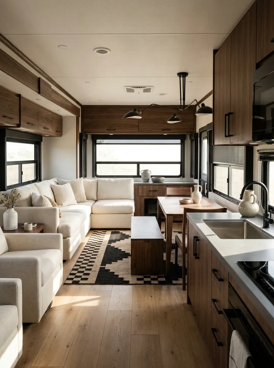
This is the sharper option. Rich walnut cabinetry anchors the interior while cream seating keeps the space from becoming too severe. Matte black hardware, black-framed lighting, and a restrained geometric rug bring a clean architectural edge.
The camera-facing lounge gets the strongest contrast, while the rear dining area repeats the same walnut and cream relationship. That repetition is what ties the zones together without making them look identical.
There is very little decorative clutter here, and that’s deliberate. The cabinetry, lighting, and furniture already create enough visual structure. Adding a shelf full of random little objects would only get in the way.
Vintage-Inspired RV With Dusty Blue Cabinetry
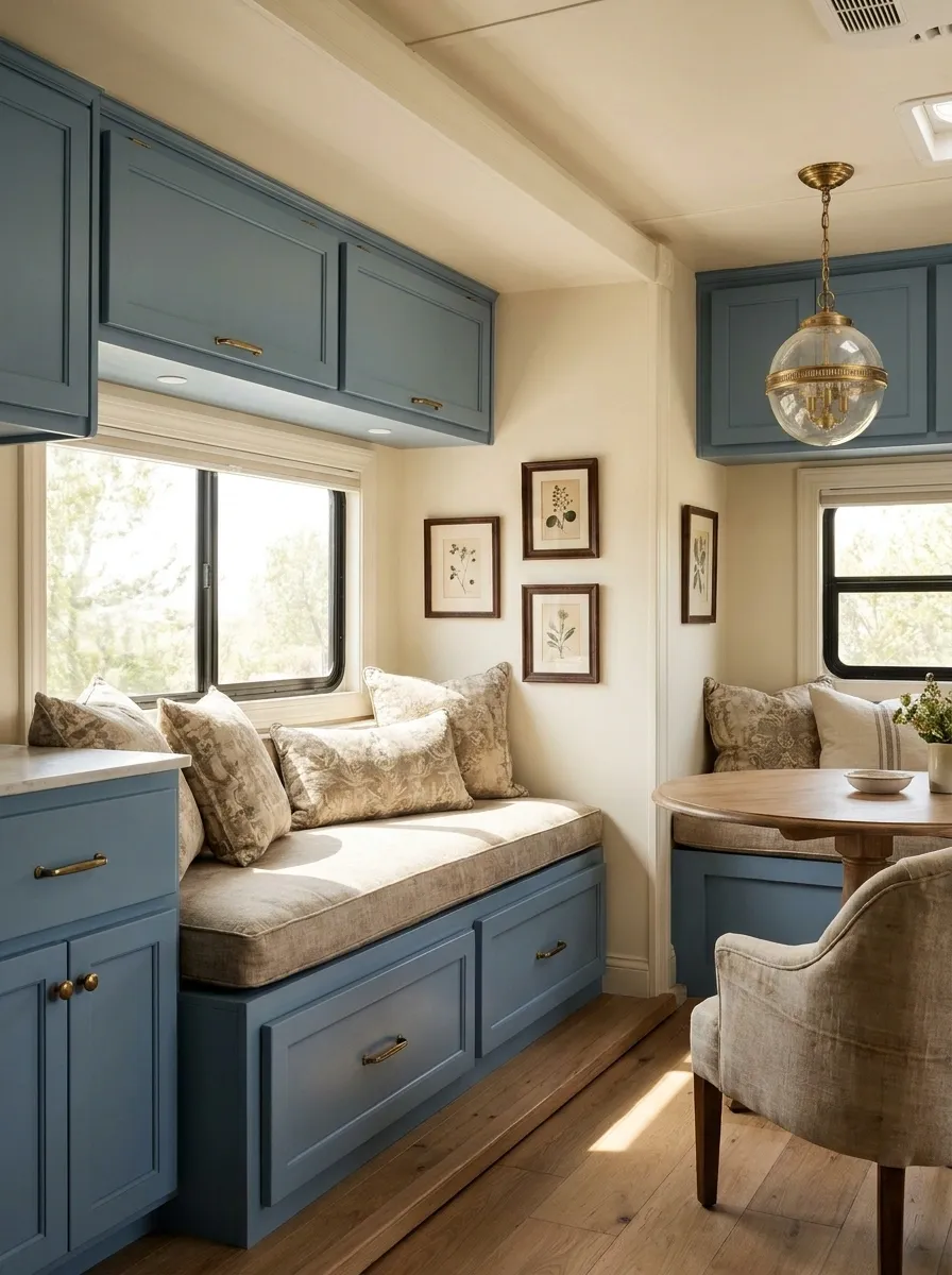
Dusty blue cabinetry gives this RV a softer, slightly nostalgic character without pushing it into full farmhouse territory. Warm cream walls, aged-looking hardware, and simple patterned cushions keep the palette grounded. A vintage-style pendant over the dining area adds another period-inspired note, while the upholstery stays plain enough to prevent the room from looking busy.
The wood floor provides just enough warmth underneath the cooler cabinet color. Artwork is kept small and selective, so the walls still have room to breathe.
This works especially well in an RV with traditional cabinet profiles. The design leans into them instead of pretending they’re modern flat-front boxes.
Earth-Tone RV With Terracotta and Olive
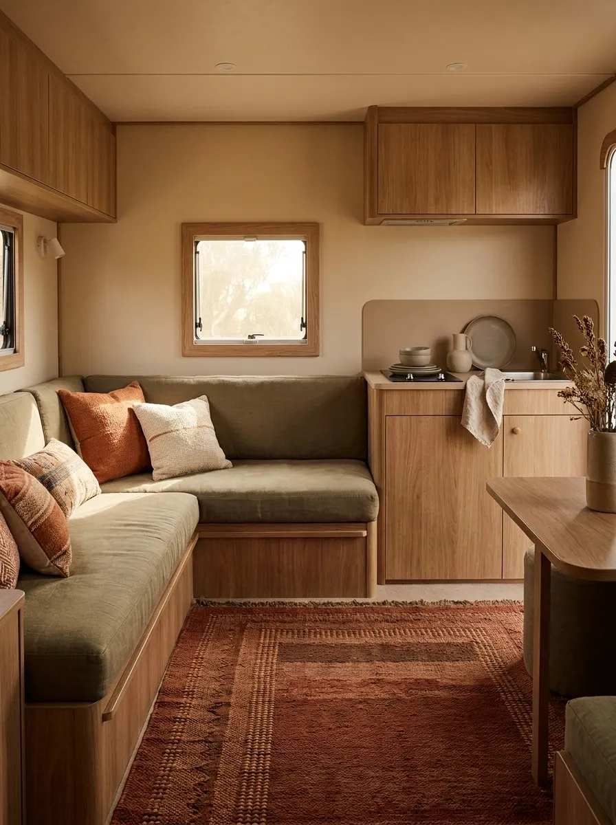
Terracotta and olive give this interior a grounded look without relying on the usual gray-and-white RV formula. The seating is upholstered in muted olive, while terracotta appears through cushions, a rug, and a few carefully placed textiles. Warm beige walls and medium wood cabinetry connect the colors rather than allowing them to compete.
The strongest color sits around the lounge, where it creates a natural focal point. The kitchen remains quieter, using the same wood and beige tones so the two areas still feel like one interior.
The palette has personality, but none of the colors are screaming for attention. That’s what keeps the whole thing grown-up.
Bright White RV With One Strong Wood Tone
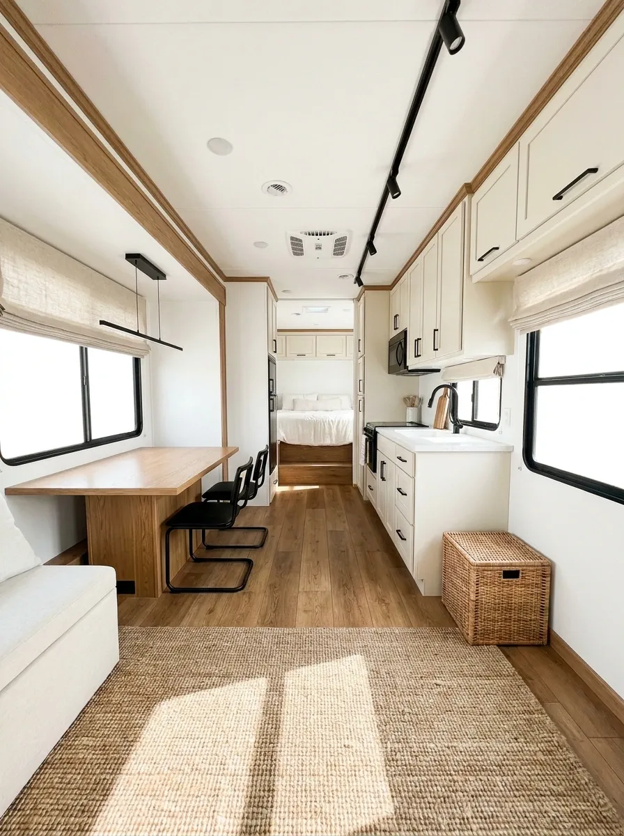
White interiors can look excellent in an RV, but only when the wood is controlled. This design uses bright white walls and cabinetry with one consistent medium oak tone across the floor, dining table, and selected trim. Black hardware and slim lighting fixtures provide a clean edge.
There aren’t four different wood finishes competing in the same narrow space. That’s important. The repeated oak creates continuity from the front lounge into the kitchen and sleeping area.
A few woven textures soften the harder white surfaces, while the windows remain mostly unobstructed to keep the room feeling open.
The restraint is the feature here. White works best when it has something strong enough to anchor it.
Cozy RV Bedroom With Layered Neutrals
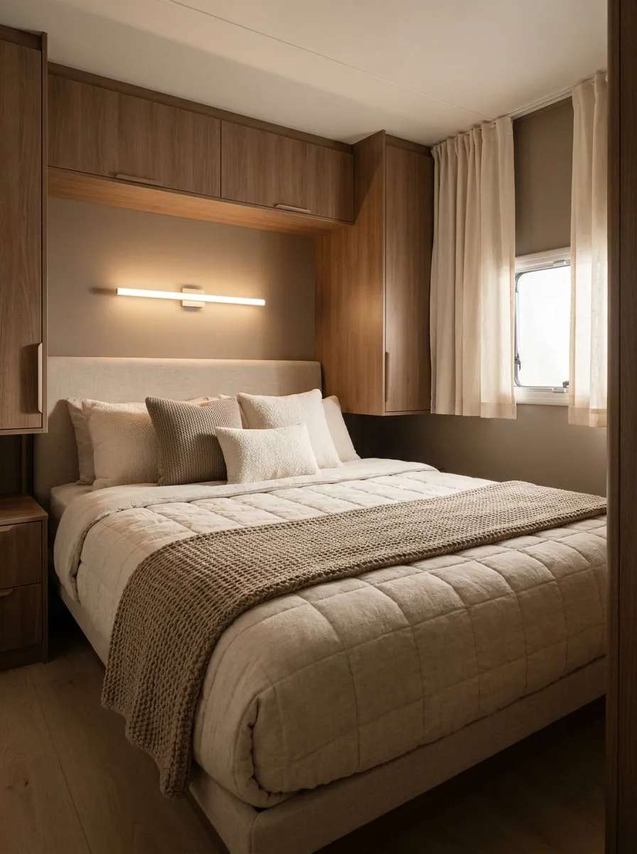
The bedroom takes a quieter route, using oatmeal bedding, warm taupe walls, medium wood storage, and soft cream curtains. Instead of relying on lots of decoration, the depth comes from layering materials: quilted bedding, a woven runner, textured cushions, and a simple upholstered headboard.
The lighting sits low and warm, which makes the sleeping zone feel separate from the brighter main living area. Storage remains mostly closed so the narrow room doesn’t become a visual dumping ground.
The palette isn’t exciting on paper. That’s fine. Texture and proportion are doing the heavy lifting, and the room proves that neutrals only become boring when nothing else has been considered.
RV Lounge Built Around a Deep Rust Sofa
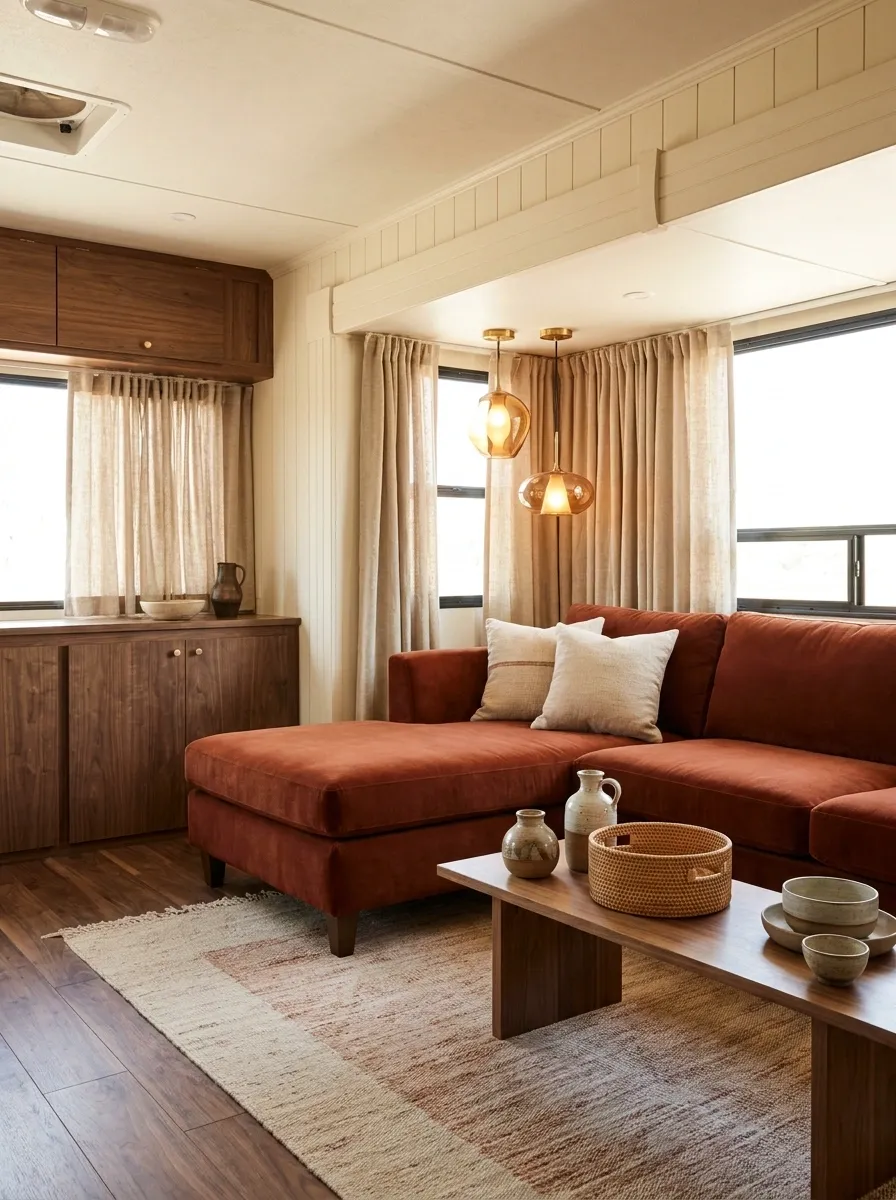
The sofa is the anchor here, but the room isn’t merely “a room with a colorful sofa.” Deep rust upholstery sets the direction for the entire interior. Warm ivory walls, walnut accents, textured beige curtains, and a muted patterned rug support the color without competing with it.
The dining area repeats small touches of rust, which visually connects it to the lounge without duplicating the seating. Lighting stays warm and fairly sculptural, adding shape above the seating zone.
This kind of strong focal color is especially useful when the RV itself has bland factory finishes. Instead of fighting every cabinet, give the room one memorable center and build around it.
Minimal RV Interior With Almost Nothing on the Counters
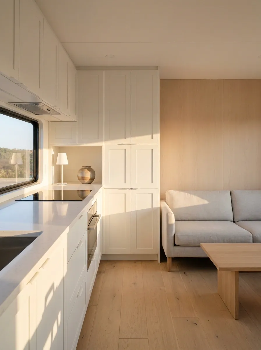
There is something refreshing about an RV where the kitchen counter is actually visible. This design uses warm white cabinetry, pale gray-beige upholstery, simple wood accents, and almost completely clear work surfaces.
Storage is doing the hidden work. Everyday items disappear behind doors, leaving only a lamp, one small decorative piece, and the essentials visible. The same restraint continues in the lounge, where furniture has clean lines and the walls aren’t covered in tiny decorations.
The space doesn’t feel unfinished. It feels deliberate.
That distinction matters. Minimalism isn’t an empty room. It’s knowing which things deserve to remain visible.
Farmhouse RV With Warm Cream and Aged Wood
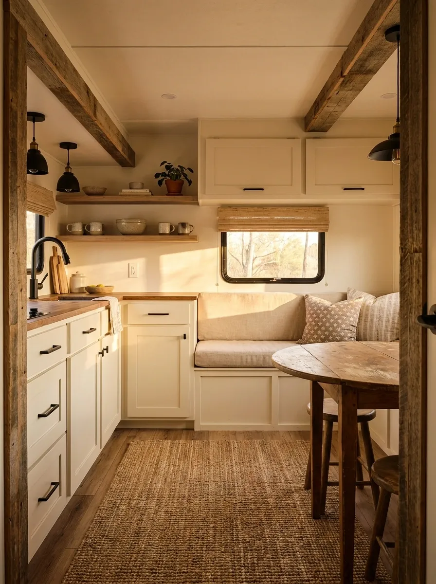
This farmhouse-inspired interior avoids the overly polished version that looks like a staged kitchen showroom. Warm cream cabinetry, aged wood accents, black metal details, and soft patterned textiles give it more character.
The seating uses a muted neutral fabric, while the dining area gets a little more pattern through cushions and a simple rug. Open storage is limited, so the room still feels orderly despite the more traditional styling.
Aged timber keeps the cream palette from becoming too sweet. That’s important here. The darker details add structure, while the softer fabrics make the hard surfaces feel approachable.
It has farmhouse character without turning every available surface into a place for a sign.
softens the cabinetry Aged Wood
adds depth and age Black Metal
defines the edges
Modern RV With a Built-In Banquette Look
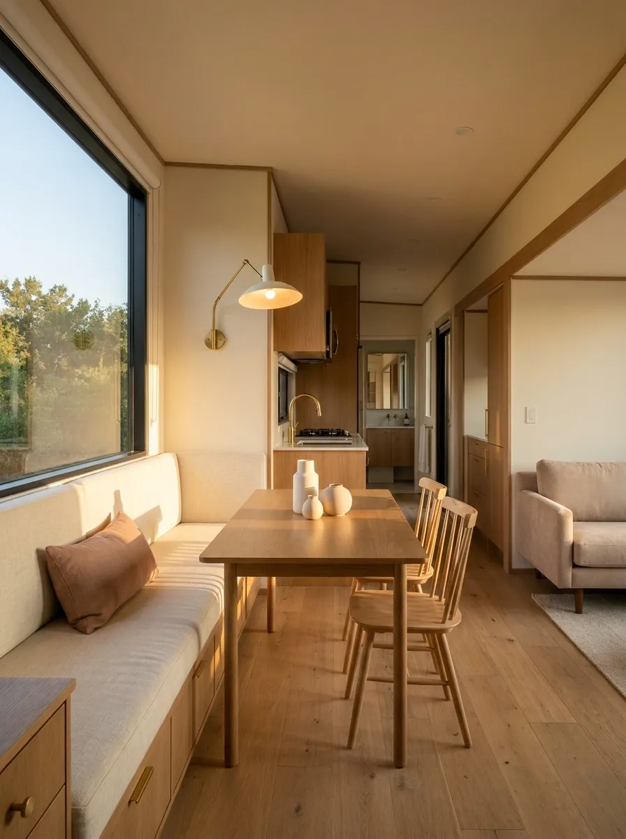
A compact dining area can feel surprisingly substantial when it looks built into the architecture. This RV uses a long upholstered banquette against one wall, paired with a slim wood table and a pair of lightweight chairs. The seating follows the wall instead of interrupting the center of the room, leaving a clearer path between the kitchen and lounge.
Warm cream upholstery, medium oak, and a muted clay-colored cushion tie the dining zone into the rest of the interior. A simple wall light replaces the need for bulky table lighting.
The important part isn’t the bench itself. It’s the sense of continuity. The furniture looks like it belongs to the RV rather than being squeezed into it five minutes before a road trip.
Retro RV With Mustard, Walnut, and Cream
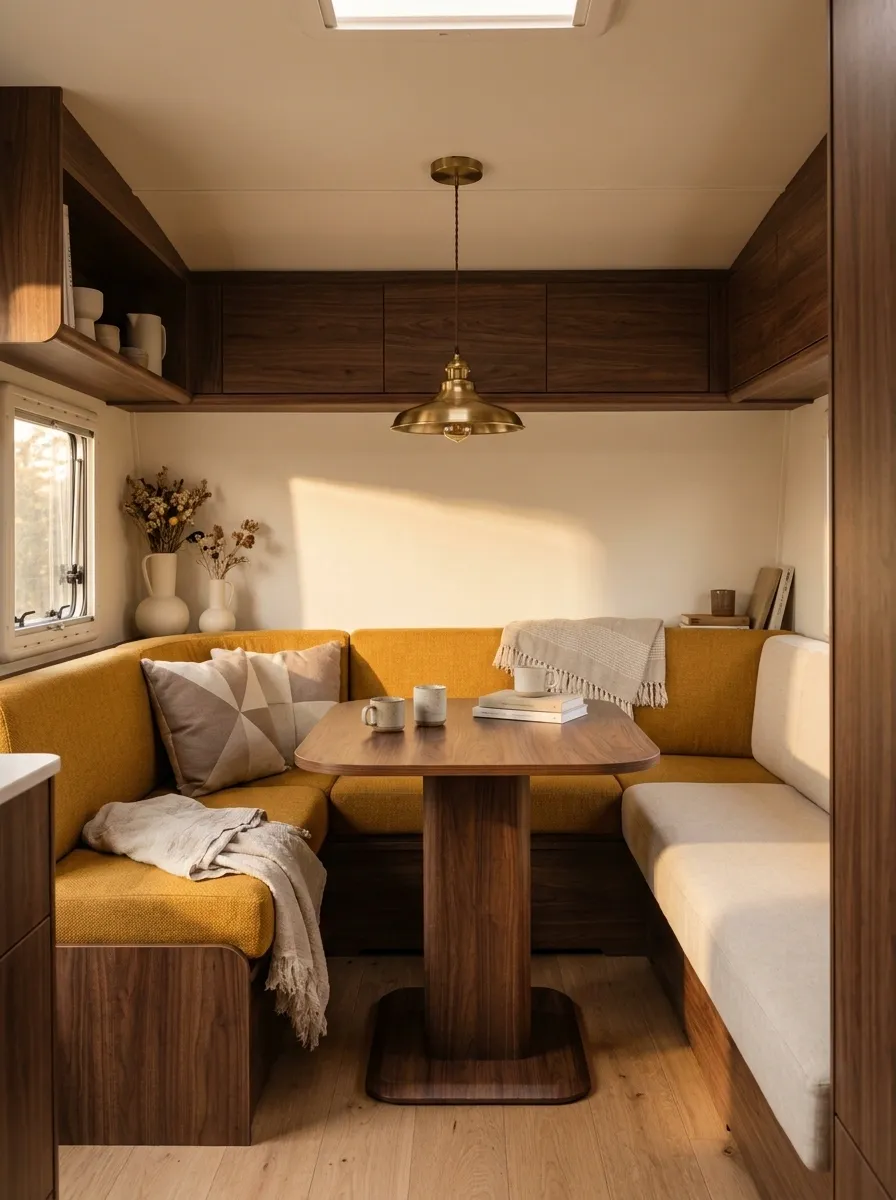
Mustard yellow gets the spotlight in this retro-inspired interior, but walnut keeps it from drifting into children’s playroom territory. The sofa carries the strongest mustard tone, while cream walls and upholstery keep the rest of the room relatively quiet. Rounded furniture edges, a compact vintage-style pendant, and simple geometric textiles reinforce the mid-century direction.
The walnut appears repeatedly through the dining table, cabinetry accents, and small shelving details. That repetition matters because it gives the brighter color something grounded to sit against.
This design has personality without depending on a collection of retro signs and novelty objects. The furniture shapes and color relationships already do the talking.
Soft Luxury RV With Taupe and Brass
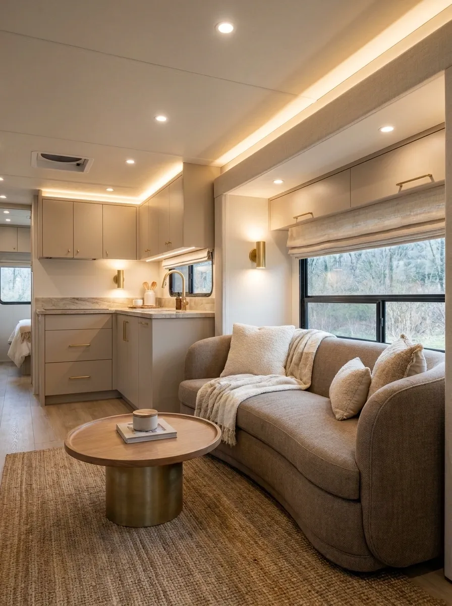
Luxury doesn’t require covering the RV in marble-look surfaces and gold-colored accessories. This version uses warm taupe upholstery, beige cabinetry, brushed brass lighting, and plush but restrained textiles. The furniture has rounded edges, giving the compact room a softer silhouette.
A deeper taupe appears around the lounge while the kitchen stays lighter. Brass is used sparingly on lighting and hardware so it reads as a deliberate finish rather than a theme.
The whole composition feels richer because the materials are quietly layered. There are no fussy patterns competing with them.
This is the RV for anyone who wants polish without making the interior look like it was designed by a hotel lobby committee.
Black-and-White RV With Warm Wood Keeping It Human
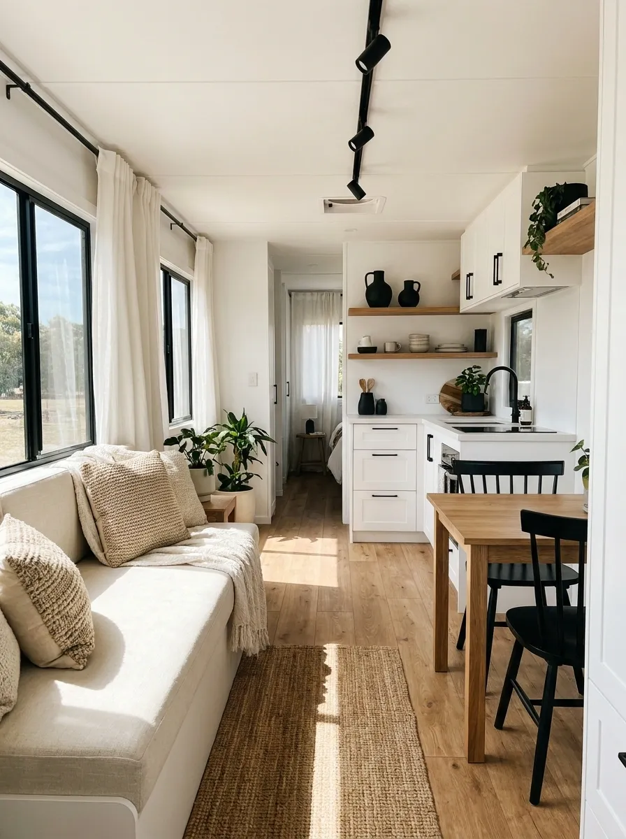
Black and white create a crisp foundation, but the medium wood is what stops this RV from feeling cold. White cabinetry keeps the interior bright, while black pulls appear on hardware, lighting, window frames, and a few furniture details. The wood floor and dining table then soften the contrast.
The lounge uses cream rather than stark white upholstery, creating one more subtle layer between the two extremes. Textured cushions and curtains add warmth without introducing another major color.
This composition works because every dark element has an echo somewhere else. Nothing looks randomly dropped into the room.
Without the wood, it would be sharp. With it, the room actually feels livable.
Compact RV With a Japandi-Inspired Calm
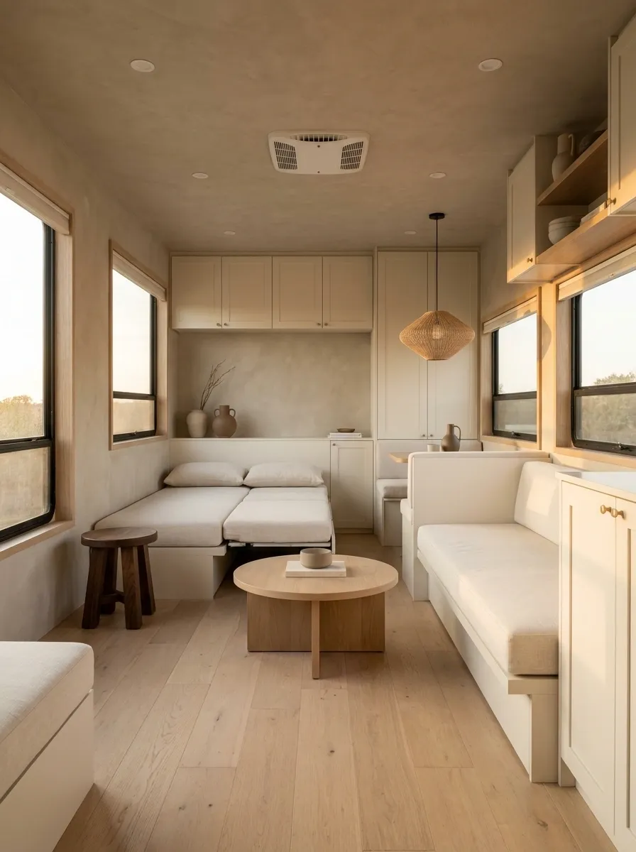
This interior keeps its visual language quiet from floor to ceiling. Pale oak, warm greige walls, cream upholstery, and simple low-profile furniture establish the base. Decorative pieces are spaced rather than clustered, leaving clear areas around the windows and upper cabinetry.
The sleeping and living zones share the same restrained palette, so the RV feels larger because the eye isn’t constantly hitting a new color or pattern. A darker timber stool and one sculptural light fixture provide small moments of contrast.
There is no shortage of personality here. It simply isn’t shouting.
The design suits an RV where calm matters more than maximal decoration, especially when the existing architecture already feels busy.
Colorful RV With Muted Jewel Tones

A little more color can make an RV feel far more personal, as long as the colors aren’t all fighting for first place. This interior uses deep teal on the main seating, muted burgundy through cushions and curtains, warm cream across the larger surfaces, and walnut cabinetry to keep everything grounded.
The trick is distribution. The strongest colors stay low and around the lounge, while the ceiling and upper walls remain light. That keeps the interior colorful without making the narrow space feel boxed in.
A few pieces of patterned fabric add character, but the patterns share the same muted palette. Nothing looks randomly imported from three different homes.
Tiny RV Kitchen With a Collected Vintage Look
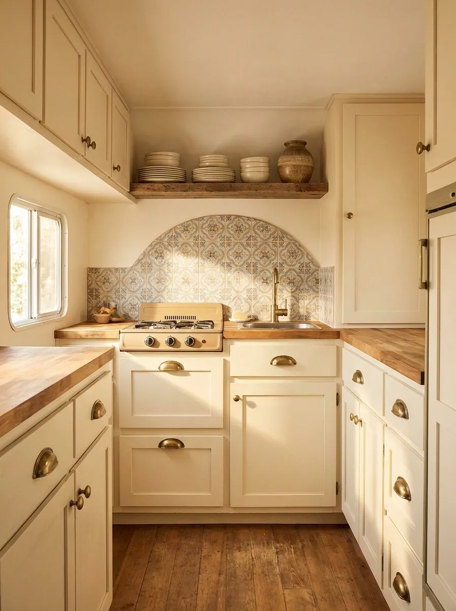
This kitchen makes the compact cooking zone feel intentional through materials rather than size. Warm cream cabinets pair with a softly patterned backsplash, wood counters, aged brass hardware, and a small amount of open storage for everyday pieces.
The important visual move is keeping the open shelving selective. A couple of useful dishes and one textured container are enough. Fill every inch and the kitchen instantly looks smaller.
The backsplash carries a subtle pattern, but everything around it stays calm. That gives the kitchen one recognizable focal point without turning a narrow workspace into visual chaos.
Vintage character works especially well here because the warm finishes soften the hard, manufactured feel many RV kitchens start with.
Light-Filled RV With Soft Blue and Natural Linen
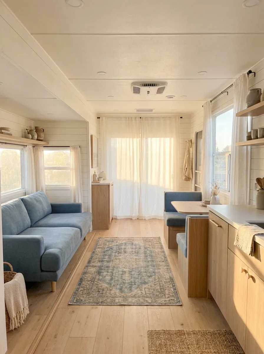
This design is built around daylight. Soft blue upholstery, warm white walls, pale wood, and linen-like curtains create an airy interior where the windows remain visually important. The curtains are light enough to filter sunlight without swallowing the openings.
Furniture stays low and fairly streamlined, allowing the eye to move through the RV instead of stopping at bulky shapes. A faded blue rug connects the lounge to the dining area, while small wood details repeat the cabinetry.
There’s no need to overdecorate a space like this. The natural light is already one of the strongest features in the room.
The result feels relaxed because the palette works with the architecture instead of trying to overpower it.
Dark RV With Dramatic Charcoal Walls
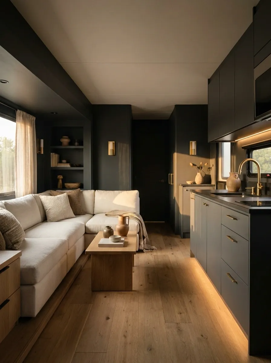
Charcoal walls give this RV a completely different personality. Instead of trying to make every surface brighter, the design embraces the darker envelope and uses warm oak, cream seating, and focused lighting to create contrast.
The strongest dark color sits around the lounge, while the kitchen cabinetry remains slightly lighter. Oak appears through the floor and furniture, adding warmth between the charcoal and cream. Small metallic accents are kept subdued so they don’t compete with the lighting.
This works best when the room has enough light sources to prevent the darker walls from becoming flat. Layered lighting gives the surfaces dimension after sunset.
The result feels intimate rather than gloomy because the light and materials have been planned together.
Charcoal walls create depth.
Oak prevents the palette feeling cold.
Cream upholstery restores brightness.
Boho RV That Still Looks Controlled
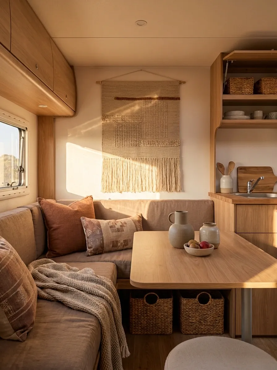
Bohemian styling can work beautifully inside an RV, but the usual temptation is to keep adding more texture until the room stops having a focal point. This version keeps the palette narrow: warm beige, rust, natural wood, and muted brown.
The lounge gets patterned cushions and a woven textile, while the kitchen and dining area stay relatively plain. Baskets provide texture and storage at the same time, which earns their visual space.
A few handmade-looking ceramic pieces and one larger textile wall accent complete the composition. That’s enough.
The room feels collected because different textures are working together. It doesn’t need twelve decorative baskets competing for employment.
Family-Friendly RV With Materials That Can Take Real Life
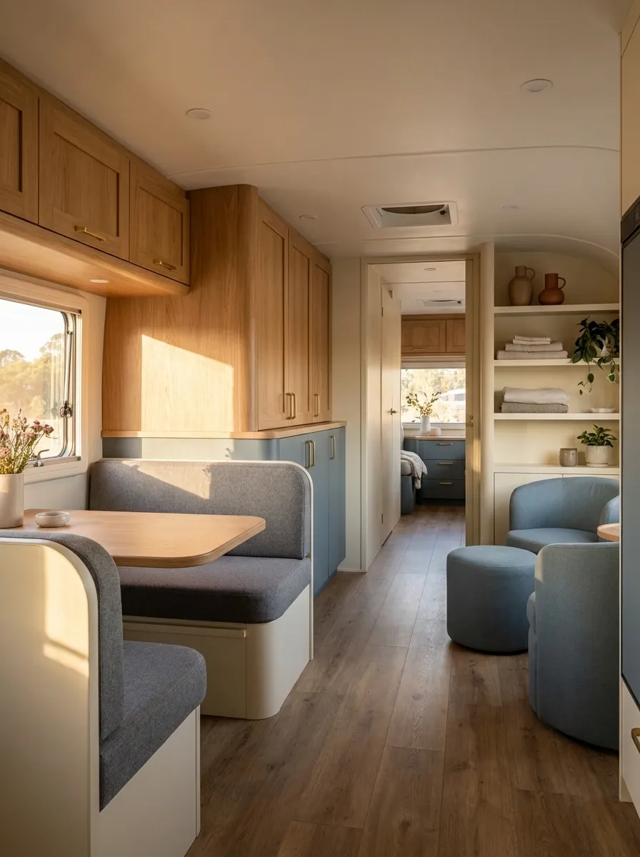
A family RV needs to look good without behaving like a museum. This interior uses medium-tone upholstery, warm wood, muted blue-gray accents, and mostly closed storage so everyday mess has somewhere to disappear.
The dining bench uses practical-looking fabric that doesn’t make every dropped snack feel like a design emergency. Rounded furniture edges keep the room visually soft, while the floor and larger surfaces stay mid-tone enough to hide the inevitable evidence of actual humans using the space.
The palette is intentionally forgiving, too. Warm gray, wood, muted blue, and cream don’t demand perfect tidiness every second.
Good family design isn’t about pretending mess doesn’t happen. It’s about making the room recover from it quickly.
Modern Desert Palette With Sand, Clay, and Olive
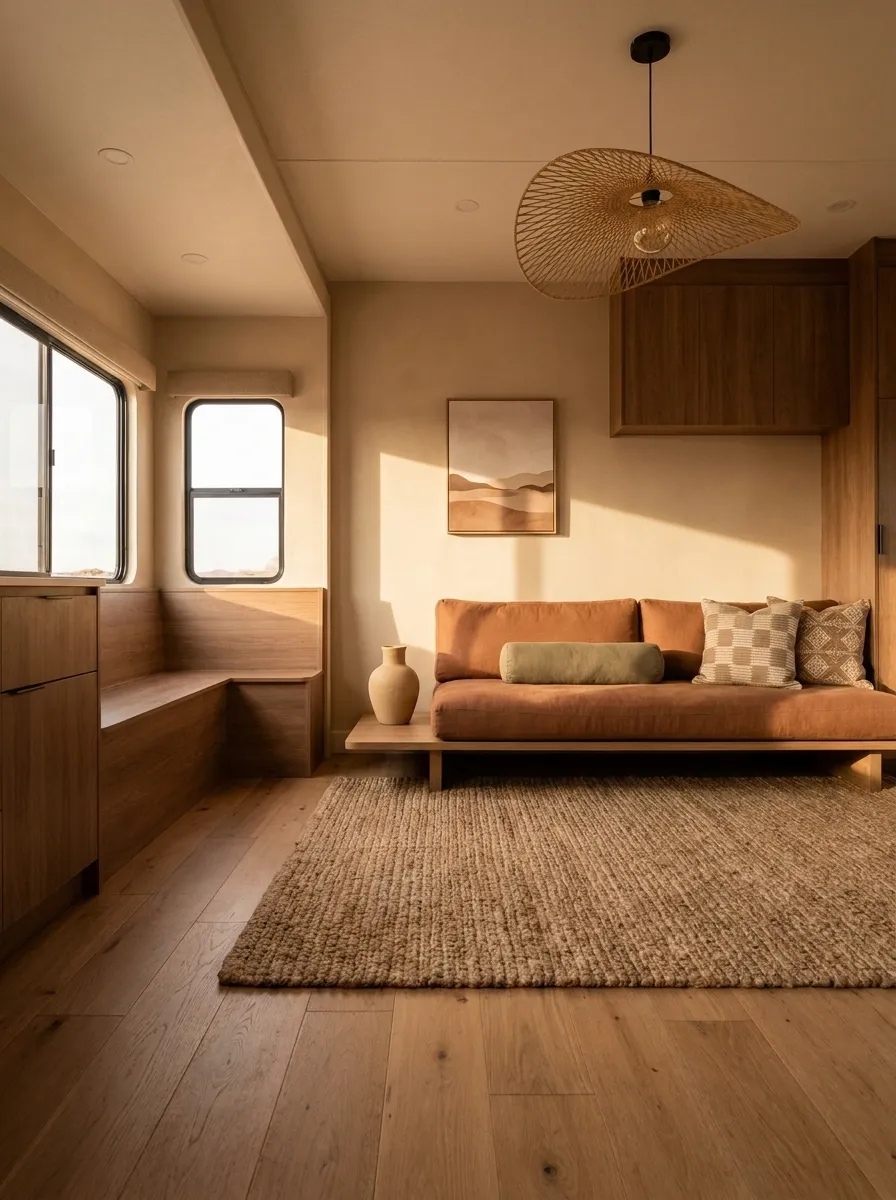
This RV draws from desert landscapes without turning the interior into a southwestern souvenir shop. Sandy beige forms the base, clay appears through upholstery and textiles, olive adds a muted green note, and warm brown wood grounds the palette.
The front lounge uses the strongest color contrast, while the kitchen remains lighter and quieter. A sculptural pendant gives the ceiling some character, and a large textured rug visually anchors the seating.
Pattern appears sparingly through cushions and artwork, with the colors doing more work than the motifs.
The design feels warm and distinctive because the palette has a clear relationship to itself. Every shade looks like it belongs with the next one.
Light-Filled RV With Soft Blue and Natural Linen
This design is built around daylight. Soft blue upholstery, warm white walls, pale wood, and linen-like curtains create an airy interior where the windows remain visually important. The curtains are light enough to filter sunlight without swallowing the openings.
Furniture stays low and fairly streamlined, allowing the eye to move through the RV instead of stopping at bulky shapes. A faded blue rug connects the lounge to the dining area, while small wood details repeat the cabinetry.
There’s no need to overdecorate a space like this. The natural light is already one of the strongest features in the room.
The result feels relaxed because the palette works with the architecture instead of trying to overpower it.
Collected RV That Looks Like It Evolved Over Time
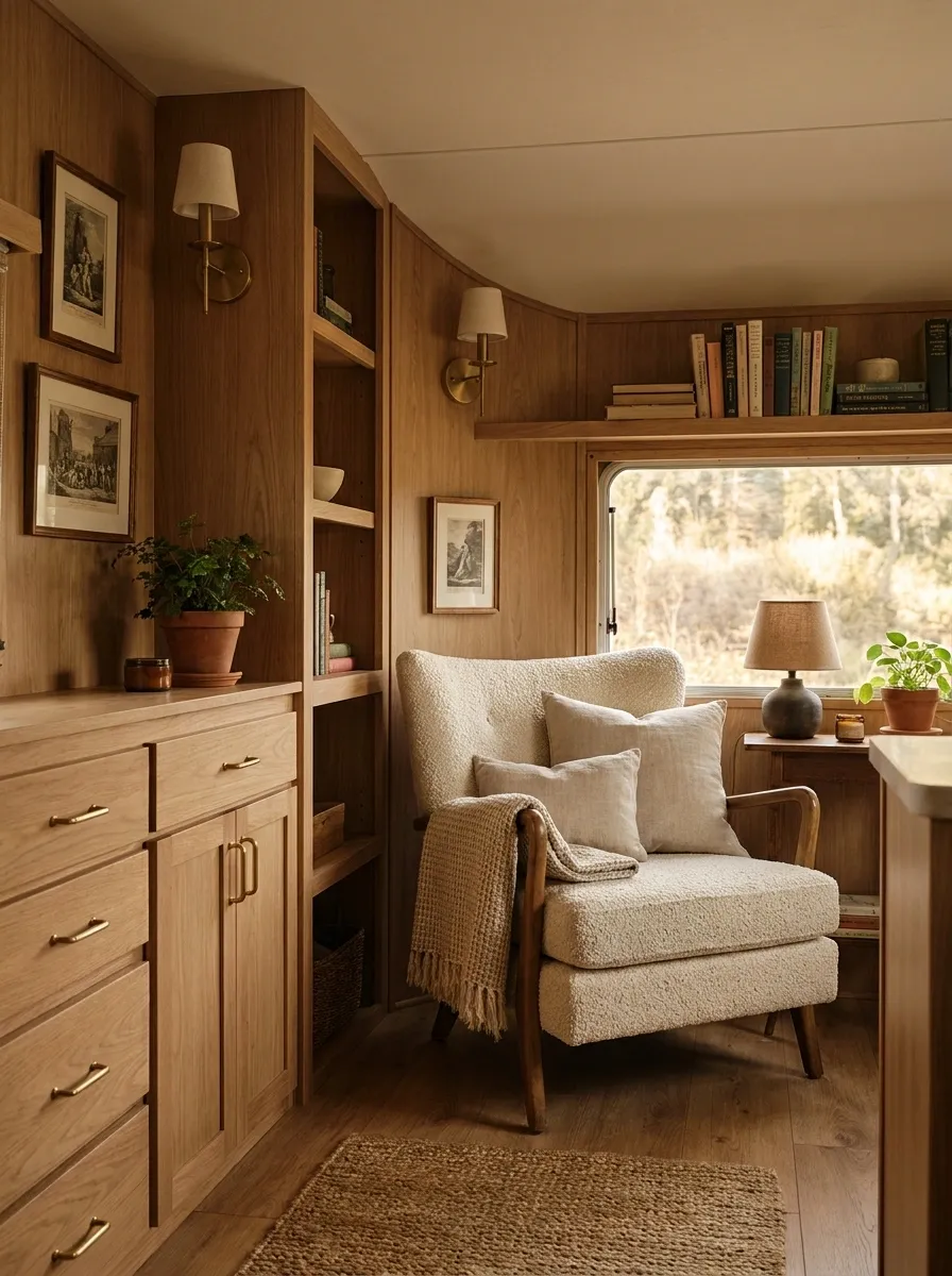
This final direction is less about one strict decorating style and more about making the RV feel personal without losing visual control. A warm vintage-style chair sits beside modern cabinetry, layered textiles bring softness, and framed artwork gives the walls some history.
Wood tones stay within a close family, while cream and muted brown connect furniture from different periods. Lighting comes from several smaller sources rather than one aggressive ceiling fixture.
The important thing is repetition. Similar wood, warm neutrals, and related textile colors appear throughout the RV, quietly tying the mismatched pieces together.
Collected doesn’t mean random. The room can look as though it accumulated character over years while still having a very clear visual spine.
A Finished RV Starts With Editing
The difference between a memorable RV interior and a cluttered one usually isn’t the budget. It’s the number of competing decisions.
Pick the direction before the accessories. Let the cabinetry, upholstery, floor, curtains, lighting, and larger furniture establish the visual language. Then bring in smaller pieces that actually belong there.
That last part is where a lot of interiors fall apart. A space doesn’t become better because an empty surface exists. Sometimes the best decision is leaving it alone.